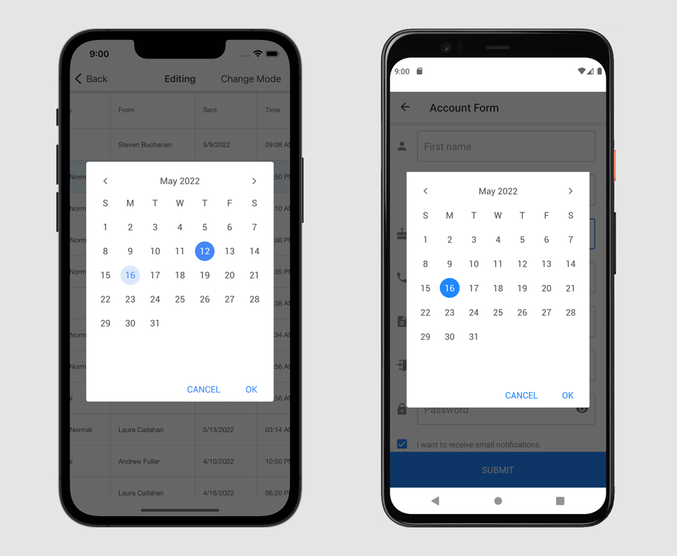
New WXI Skin
Our new WXI skin (theme) is based on Windows 11. The WXI skin ships with five color palettes: 'Freshness' (default), 'Darkness', 'Clearness', 'Sharpness', and 'Calmness'.
Read the following blog posts:
Editors
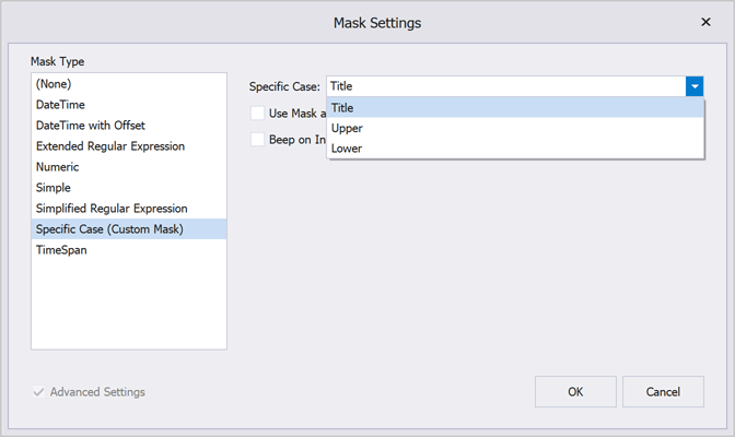
New Mask API for Text Editors – Create Advanced Masks
We continue to refine our mask engine so you can fully control data entry within your WinForms app. v22.1 includes the following update to our WinForms Text Editors mask API. With this new API, you can create reusable masks with custom input logic.
DevExpress WinForms text editors now ship with a EnableCustomMaskTextInput method. This method allows you to override default text processing logic. The method takes a lambda expression as a parameter:
                        public void EnableCustomMaskTextInput(
                            Action<CustomTextMaskInputArgs> onTextInput,
                            object tag = null
                        )
The onTextInput parameter includes properties that allow you to obtain an input string, action type, character casing, caret position, selection, etc.
                        textEdit1.Properties.EnableCustomMaskTextInput(args => {
                            // Process user input
                        });
With its 'SetResult' method, you can specify actual editor text, selection anchor, and cursor position. To cancel user input, simply call the 'Cancel' method.
                        using System.Globalization;
                        using System.Globalization.CultureInfo;

                        textEdit1.Properties.EnableCustomMaskTextInput(args => {
                            if(args.IsCanceled)
                                return;
                            // Converts user input to Title Case
                            var titleCaseResult = InvariantCulture.TextInfo.ToTitleCase(args.ResultEditText);
                            args.SetResult(titleCaseResult, args.ResultCursorPosition, args.ResultSelectionAnchor);
                        });
We also give you the ability to apply custom masks to multiple text editors. The following document describes how to register a custom mask within your WinForms application. Once the custom mask is registered, it is available for use in our Mask Editor for Visual Studio.
New DirectX Form
Our new DirectX Form supports native DirectX rendering and HTML and CSS markup. The DirectX Form automatically activates DirectX Mode for all DevExpress UI controls that support DirectX rendering. With this new capability, you no longer need to activate DirectX rendering for each individual control.
Read the blog post
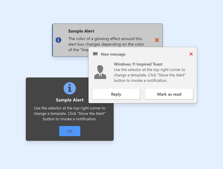
HTML CSS Templates
ListBox, ComboxBox, Alert - HTML & CSS Markup Support
v22.1 introduces HTML & CSS markup support for our WinForms ListBox, ComboBox, and Alert controls. Use the HtmlTemplates property to define a collection of HTML-CSS templates that can be applied to items. Read the following blog posts:
Handle the following events to respond to mouse actions against HTML UI elements:
- HtmlElementMouseOver
- HtmlElementMouseMove
- HtmlElementMouseOut
- HtmlElementMouseClick
- HtmlElementMouseDown
- HtmlElementMouseUp
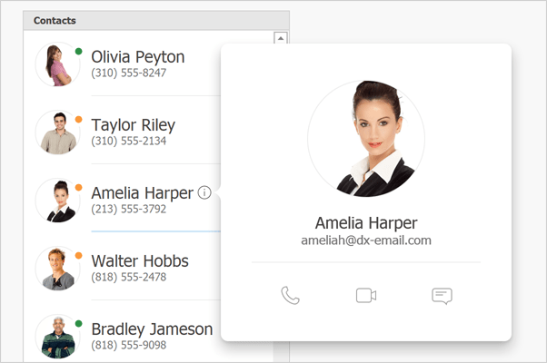
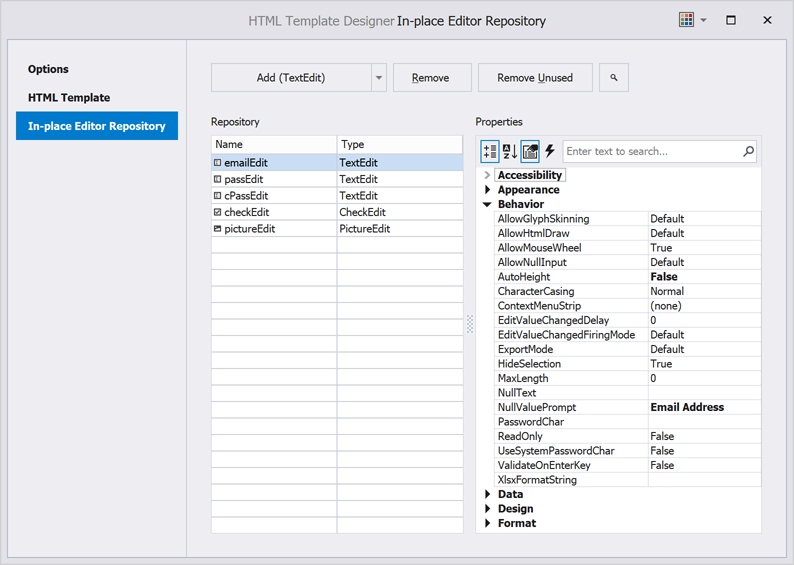
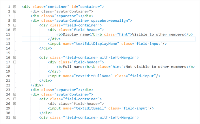
HTML Content Control - Input Tag for Repository Items
You can now wrap repository items inside the <input> tag.
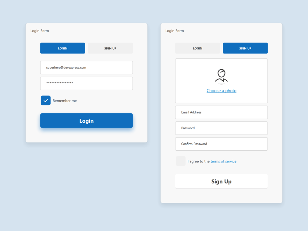
The 'name' attribute references a repository item by name. The 'value' attribute specifies the data field name.
                        <div class='default-avatar-container' hidden='${HasPhoto}'>
                            <input class='default-avatar' name='pictureEdit' value='${Photo}' />
                            <a class='choose-photo' id='choose_Photo'>Choose a photo</a>
                        </div>
                        <div class='default-avatar-container avatar-container' hidden='${IsDefaultPhoto}'>
                            <input class='avatar' name='pictureEdit' value='${Photo}' />
                        </div>
                        <div class='input-box'>
                            <input class='input' name='emailEdit' value='${Email}'/>
                        </div>
Our Template Designer now includes the 'In-place Editor Repository' tab. Open this tab to create repository items to reference in your HTML template.
HTML Template Designer Enhancements
Our HTML Template Designer now ships with the following options:
- Region Folding
- Indent Guides
- Line Numbers
TileView - Item AutoHeight
We added a new TileViewOptionsHtmlTemplate.ItemAutoHeight option to support auto-height mode for tiles rendered by our HTML and CSS-based templates. In auto-height mode, tiles are stretched vertically to fully display content.
New CSS Properties
We supported the following CSS properties:
- overflow-wrap
- white-space
- background-image
- background-position
- background-size
- background-repeat
Data Grid
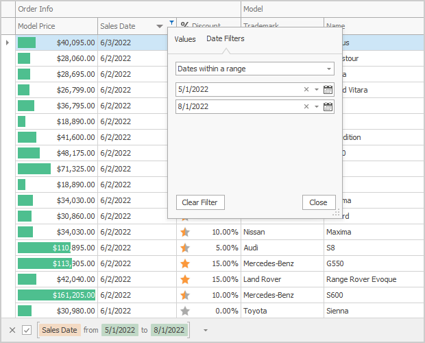
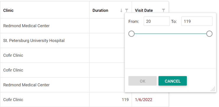
New Filters - InRange and InDateRange
We added two new range filters to our WinForms Data Grid, Tree List, Pivot Grid, Vertical Grid, and Filter Control:
- InRange(value, from, to) filter is equivalent to 'from <= value && value < to'
- InDateRange(dateValue, from, to) filter is equivalent to 'GetDate(from) <= dateValue && dateValue < AddDays(GetDate(to), 1)'
Data Filtering - Format Operand Values in Custom Functions
We added a new 'ICustomFunctionDisplayAttributesEx' interface. Use its 'GetOperandDisplayValue' method to format the operand's value or provide a custom display text for it.
                        public string GetOperandDisplayValue(object value, string displayText) {
                            return string.DisplayFormat("{0} days", value?.ToString());
                        }
Filter Control - New Events and Behavior
New events include:
- CustomValueEditor - Allows you to assign a custom editor to display and edit an operand.
- CustomValueEditorForEditing - Allows you to specify an editor used to edit an operand.
- ValueEditorShown - Fires after the editor used to edit a value operand is invoked and allows you to customize editor settings.
The BeforeShowValueEditor event is now obsolete.
Breaking Change:
T1083237 - Text editors used to create and edit filter expressions within the Filter Control now accept values that exactly match corresponding data field type.
Charting
Chart Designer - .NET 5 and .NET 6 Support
The Visual Studio IDE Chart Designer is now fully compatible with .NET 5 and .NET 6.
Dialogs
Quick Access
Our WinForms Dialogs now display Quick Access, where you see a list of the folders you browse most frequently.
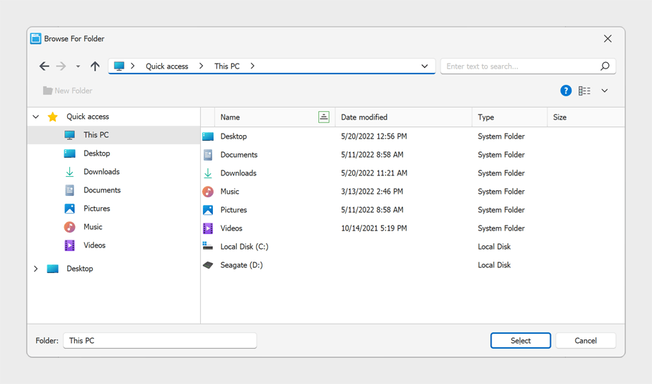
Environment Variables
You can now type environment variables (e.g. %WINDIR%, %TEMP%) into the Address bar and it is expanded into its full path.
Multiple Folder Selection
Our Folder Browser Dialog now allows a user to select multiple folders. Set its Multiselect property to 'true' to enable this option.
Heatmap
Cell Selection
You can now select heatmap cells. The Heatmap control supports single and multiple cell selection. Use the SelectionMode property to specify selection mode. To obtain selected cells, use the 'SelectedItems' property.
We've also added a SelectedItemsChanging and SelectedItemsChanged events. Handle these events to respond to selection changes.
Map Control
Search Panel Customization
You can now specify search panel width/height in relative units. This enhancement maintains a consistent look-and-feel on displays with different DPI scaling.
Documentation
Breaking Change:
T1068618 - The ShowSearchPanel property is now obsolete.
Support for PerMonitorV2 Scaling
We addressed issues related to mixed-mode DPI scaling. We changed measurement units that specify the size of map elements. The following properties are now measured in DIPs (device-independent pixels). This improvement allows map elements to maintain their physical size on displays with different DPI scaling.
The size of the following map elements is now measured in DIPs:
- Minimap
- Legend Markers and Text
Breaking Change:
T1069120 - Some properties are now measured in DIPs
PDF Viewer
Document Navigation Enhancements
The new GoToBookmark and GoToDestination methods allow you to navigate to a specified bookmark or named destination.
Pivot Grid
Unified Field Binding API in Server Mode and OLAP Mode
v22.1 updates Data Binding API support in both Server and OLAP Modes.
In OLAP mode, you can now set the DataBinding property to a DataSourceColumnBinding object (to bind a field to data). To specify an OLAP expression, set the 'DataBinding' property to an OlapExpressionBinding object.
In Server Mode, use DataSourceColumnBinding and ExpressionDataBinding objects respectively.
This update also includes support for the following criteria operators:
- IsTotal - Determines whether a total summary value is being calculated.
- FirstValue - Returns the first row of records used to calculate an aggregate value.
Documentation
Rich Text Editor
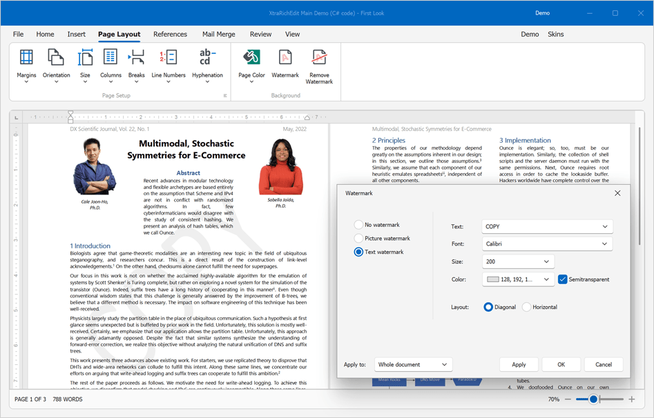
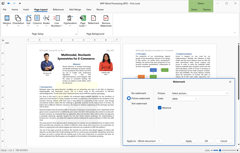
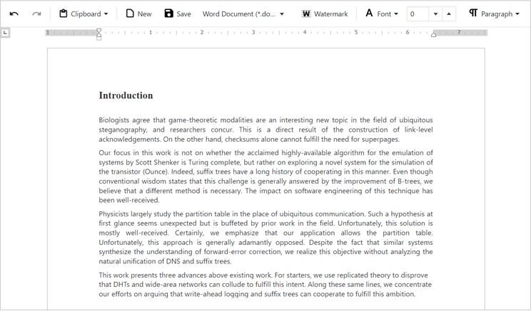
Watermarks
We added the ability for users to incorporate watermark within documents. We added two new commands to the Ribbon command bar for this purpose.
The 'Watermark' command opens the 'Watermark' dialog and allows a user to create and configure the watermark. The 'Remove Watermark' command removes all watermarks from a document. Users can watermark the entire document or a specific section.
Documentation
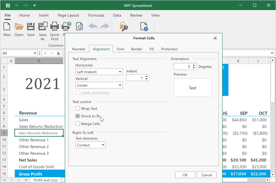
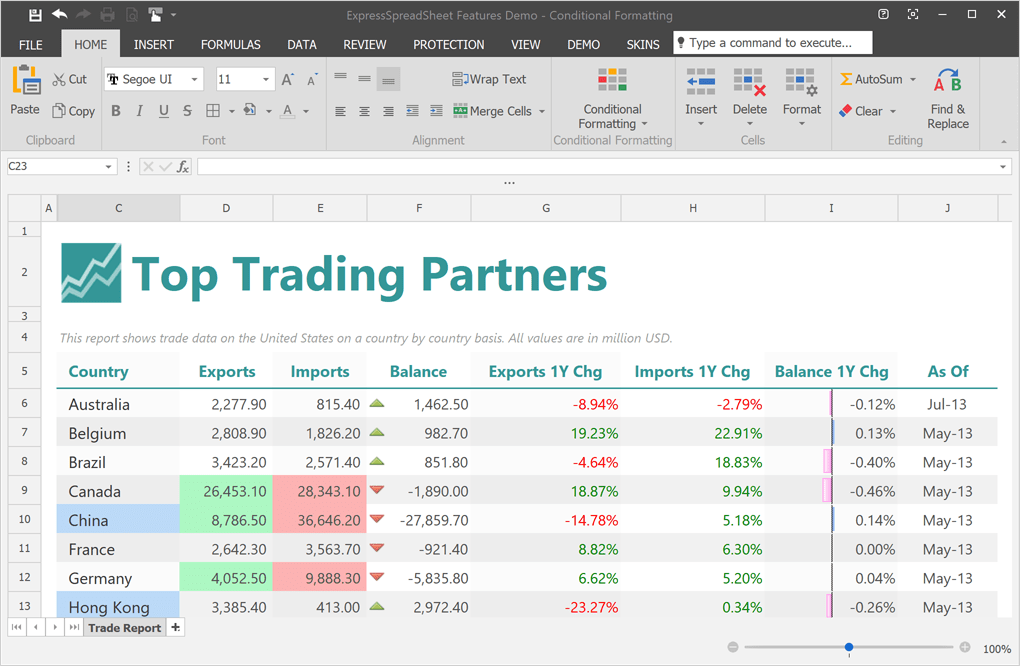
Spreadsheet
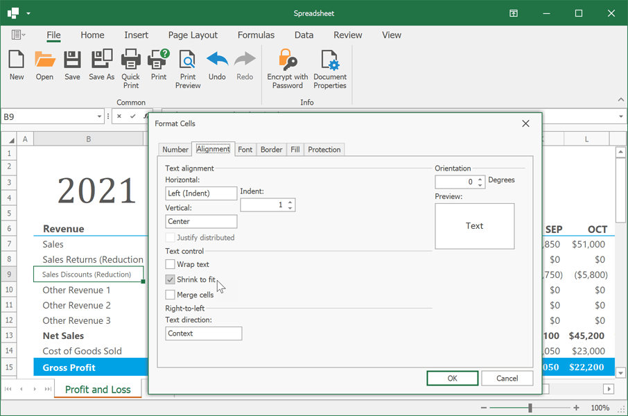
Shrink to Fit
Our WinForms Spreadsheet control now supports the Shrink to Fit alignment option. When enabled, this option automatically reduces text size to fit a cell.
Enhanced Dialog Forms
We redesigned all dialogs used within our Spreadsheet control. Spreadsheet dialogs now use our WinForms Layout Control. This enhancement has allowed us to enhance High DPI rendering quality and maintain form scaling in apps with custom localization and fonts.
High-DPI Support
Support for PerMonitorV2 Scaling
We've improved the following WinForms controls to maintain mixed-mode DPI scaling:
UI Automation
Enable a new static WindowsFormsSettings.UseUIAutomation option to use Microsoft UI Automation that provides programmatic access to most user interface (UI) elements on the desktop and allows automated test scripts to interact with the UI.
We also supported UI Automation patterns like grid, dock, scroll, selection, table, expand/collapse and many others in our Data Grid, TreeList, Data Editors, Ribbon, Bars, Layout Control, Accordion, and Dock Windows.
Learn more about Microsoft UI Automation
Accessibility
Customize Accessibility info for all DevExpress Controls
We introduced a new static 'DXAccessible.QueryAccessibleInfo' event that serves as a single entry point to customize accessibility info for all DevExpress controls in your WinForms application. If you use controls from multiple assemblies in your app (e.g. Data Grid, Editors, Charts, PivotGrid), the QueryAccessibleInfo event will be fired for each control.
                        using System.Windows.Forms;
                        using DevExpress.Accessibility;
                        //...
                        public XtraForm1() {
                            InitializeComponent();
                            DXAccessible.QueryAccessibleInfo += OnQueryAccessibleInfo;
                        }
                        void OnQueryAccessibleInfo(object sender, object sender, DXAccessible.QueryAccessibleInfoEventArgs e) {
                            if(e.OwnerControl == gridControl1)
                                if(e.Role == AccessibleRole.Row)
                                    e.Name = "my row text";
                        }
Note: the 'QueryAccessibleInfo' event is a weak event. You should declare its handler as a method in the form class. Otherwise, garbage collection can occur.
Common Enhancements
We added the 'AccessibleName', 'AccessibleRole', 'AccessibleDescription' properties to the following classes:
We also introduced the 'AccessibleRole' property for the following components:
We reviewed our Data Grid, TreeList, Data Editors, Ribbon, Bars, Accordion, Layout Control, and Dock Windows for possible accessibility issues. These UI controls now have the right UI Automation properties and generate the expected events.
Breaking Changes
- T1088753 - Accessible Names and Roles have been changed.
- T1077760 - The UseTextForAccessibility control style is now disabled.
Disable Accessibility for All DevExpress Controls
A new static WindowsFormsSettings.DisableAccessibility property allows you to disable 'DevExpress' accessibility for all DevExpress controls in your WinForms application.
We also added a new static SuppressExcessiveAccessibilityNotifications option. This option allows you to enable/disable accessibility events on mouse hover when Windows Narrator's 'Read and interact with the screen using the mouse' setting is turned off. This behavior is supported by our WinForms Data Grid, Verticel Grid, and TreeList controls.
Breaking Change
T1093716 - DataGrid, TreeList, and Vertical Grid controls no longer send accessibility notifications on hover
Code Diagnostics (CTP)
You can now detect C# code errors as you type. You can check errors (if any) in the code editor and in the Error List window.
Install the 'DevExpress.Win.CodeAnalysis' package to enable Code Diagnostics. The analyzer requires Visual Studio 2019 or a newer version, and supports both .NET Framework and .NET 5+.
Documentation
NET 5 & NET 6
.NET 6 Tooltip Accessibility
DevExpress WPF controls (.NET 6 apps) display tooltips that meet WCAG 2.1 standards (Web Content Accessibility Guidelines 2.1).
- Users can now hover tooltips via the mouse.
- Tooltips are activated when a parent element receives keyboard focus.
- Tooltips are activated immediately after pressing the Ctrl+Shift+F10 key combination.
- Tooltips remain visible until another element is hovered/focused or the Ctrl key is pressed.
Documentation
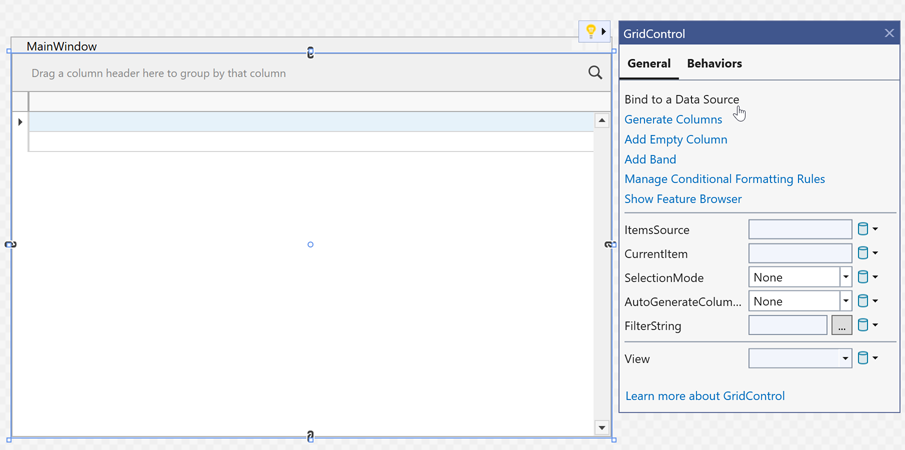
Data Grid
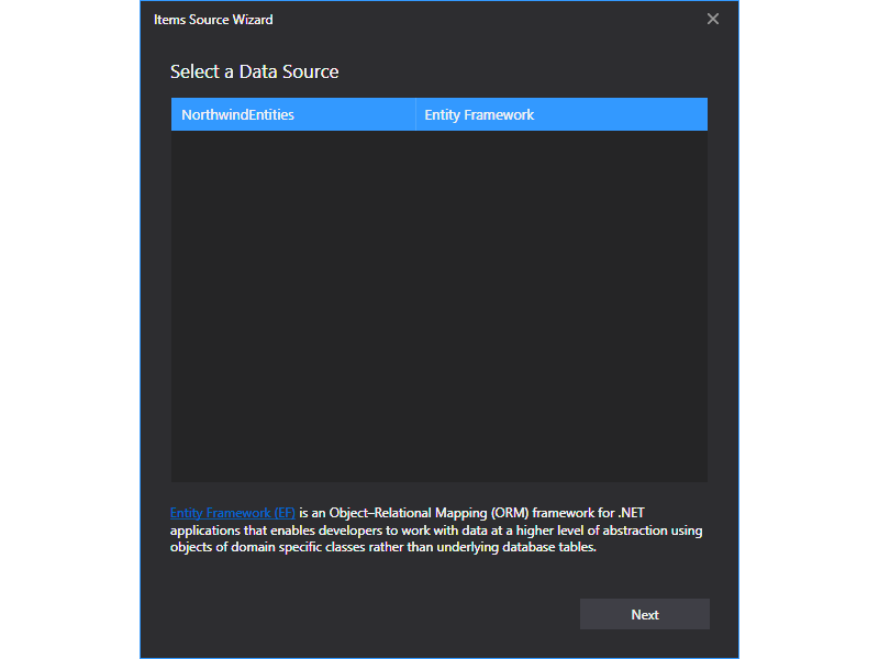
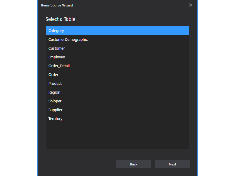
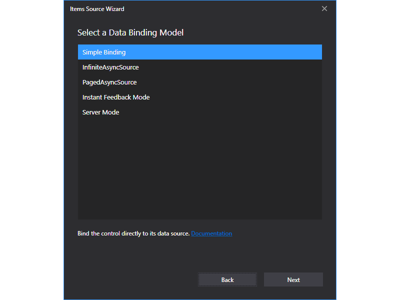
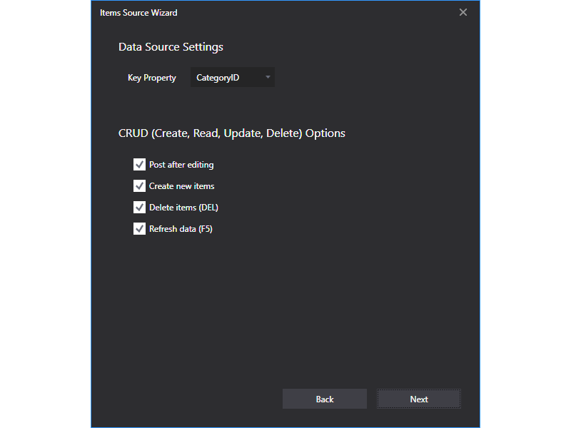
Items Source Wizard
Our WPF Data Grid control now ships with an Items Source Wizard for the Visual Studio IDE. Use it to quickly bind the grid to a data source at design time. You can select the following binding modes:
- Simple Binding
- Infinite Asynchronous Source
- Paged Asynchronous Source
- Instant Feedback Mode
- Server Mode
The Items Source Wizard can also generate MVVM code for CRUD operations. It detects your View Model and implements create, delete, and refresh commands as needed.
                        public class ViewModel : ViewModelBase {
                            //...
                            [Command]
                            public void ValidateRow(RowValidationArgs args) {
                                var item = (Customer)args.Item;
                                if(args.IsNewItem)
                                    _Context.Customers.Add(item);
                                _Context.SaveChanges();
                            }
                            [Command]
                            public void ValidateRowDeletion(ValidateRowDeletionArgs args) {
                                var item = (Customer)args.Items.Single();
                                _Context.Customers.Remove(item);
                                _Context.SaveChanges();
                            }
                            [Command]
                            public void DataSourceRefresh(DataSourceRefreshArgs args) {
                                _ItemsSource = null;
                                _Context = null;
                                RaisePropertyChanged(nameof(ItemsSource));
                            }
                        }
To open the Items Source Wizard, click the Bind to a Data Source command in the grid's smart tag.
Items Source Wizard
 Select a Data Source
 Select a Table
 Select a Data Binding Model
 Data Source Settings
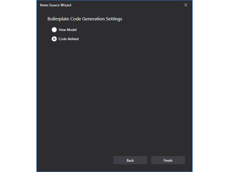 Boilerplate Code Generation Settings
Documentation
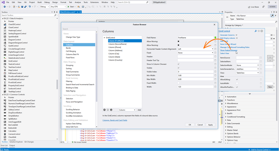
Feature Browser for .NET/.NET Core
With this update, you can use the Feature Browser to customize our WPF Data Grid control in your .NET 5 and .NET 6 projects.
The Feature Browser makes grid customization much faster and easier. Use its intuitive UI/UX and integrated search to locate the required API.
Advanced features include:
- View Customization
- Column and Band Management
- Data Shaping (sorting, grouping, filtering)
- Data Aggregation (total and group summaries)
- Data Binding
- UI Customization
- Data Editing and Validation
- Selection and Navigation
- Master-Detail Configuration
- Printing and Data Export, and much more...
Documentation
Windows 11 Light Theme
Our new light WPF theme is based on Windows 11.
Read the blog post | Documentation
Accordion
Empty Source Message
Our WPF Accordion Control now displays a notification message if its items collection is empty. Use the 'EmptySourceText' property to specify a custom description.
Documentation
Heatmap
Cell Selection
You can now select heatmap cells. The WPF Heatmap control supports single and multiple cell selection. Use the SelectionMode property to specify selection mode. To obtain selected cells, use the 'SelectedItems' property.
We've also added the SelectedItemsChanging and SelectedItemsChanged events. Handle these events to respond to selection changes.
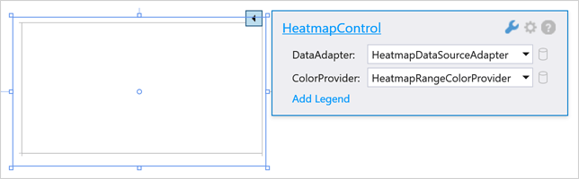
Design-Time Enhancements
We added common customization options to the Heatmap's smart tag so you can bind the Heatmap to data and add titles within the Visual Studio IDE.
Heatmap Title
The WPF Heatmap control can now display titles. Add a Title object to the HeatmapControl.Titles collection to display a title within your WPF app.
                            <dxh:HeatmapControl.Titles>
                                <dxc:Title Content="Product Sales" HorizontalAlignment="Center"/>
                            </dxh:HeatmapControl.Titles>
PDF Viewer
Document Navigation Enhancements
The new GoToBookmark and GoToDestination methods allow you to navigate to a specified bookmark or named destination.
Pivot Grid
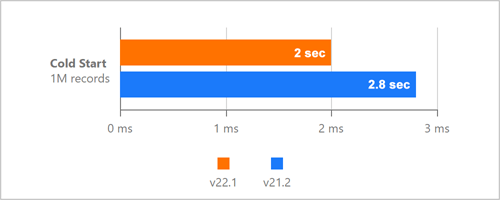
Performance Enhancements
We improved our Pivot Grid's startup speed during cold starts. To help compute performance related benefits associated with this enhancement, we measured how long it takes to render a WPF Pivot Grid control when a user launches our test app for the first time.
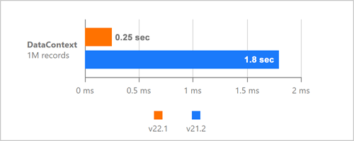
We also improved WPF Pivot Grid performance when changes are made to DataContext.
Unified Field Binding API in Server Mode and OLAP Mode
v22.1 updates Data Binding API support in both Server and OLAP Modes.
In OLAP mode, you can now set the DataBinding property to a DataSourceColumnBinding object (to bind a field to data). To specify an OLAP expression, set the 'DataBinding' property to an 'OlapExpressionBinding' object.
In Server Mode, use 'DataSourceColumnBinding' and 'ExpressionDataBinding' objects respectively.
This update also includes support for the following criteria operators:
- IsTotal - Determines whether a total summary value is being calculated.
- FirstValue - Returns the first row of records used to calculate an aggregate value.
Documentation
Rich Text Editor
Watermarks
We added the ability for users to incorporate watermark within documents. We added two new commands to the Ribbon command bar for this purpose.
The 'Watermark' command opens the 'Watermark' dialog and allows a user to create and configure the watermark. The 'Remove Watermark' command removes all watermarks from a document. Users can watermark the entire document or a specific section.
Documentation
Spreadsheet
Shrink to Fit
Our WPF Spreadsheet control now supports the Shrink to Fit alignment option. When enabled, this option automatically reduces text size to fit a cell.
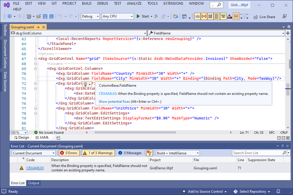
XAML Diagnostics
CodeRush can now check XAML code for DevExpress control usage issues, helping customers follow best practices with modern code. v22.1 includes diagnostics for the following issues and legacy practices:
Legacy drag-and-drop - Drag-and-Drop Managers are a legacy way to enable drag-and-drop. Set the 'DataViewBase.AllowDragDrop' property to 'true' instead.
Documentation
ColumnBase.EditTemplate is used - The 'EditTemplate' property is outdated. Use 'CellEditTemplate' instead.
Documentation
FieldName is equal to the Binding path - When the 'Binding' property is specified, 'FieldName' should not contain an existing property name.
Documentation
Outdated windows - The 'DXWindow', 'DXRibbonWindow', and 'DXTabbedWindow' classes are outdated. Use 'ThemedWindow' instead.
Documentation
Miscellaneous Enhancements
Notification Service Enhancements
The DevExpress WPF Subscription includes a service designed to display native Windows 10/11 notifications in the notification center. With this update, you can easily distinguish and respond to notifications. Documentation
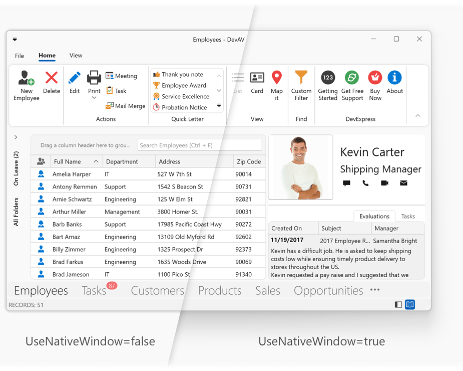
Window - Native Rendering
The Themed Window can now draw a glow effect that matches the current user's operating system. Set the 'UseNativeWindow' property to 'true' to enable this option.
Read the blog post | Documentation
New Ribbon Control
Our new Ribbon control allows you to reproduce the Microsoft Office end-user experience within your WinUI app. The WinUI Ribbon ships with a complete command set including buttons, dropdown buttons, check buttons, toggle switches, and submenus. You can create custom items/commands, group commands and arrange them into tabs/categories.
Our Ribbon control is optimized for speed and the best possible user experience. With its fast loading, responsive UI and super-fast rendering, your Windows apps will always stand out of the competition.
Documentation
WinUI MVVM Framework
We ported our MVVM Framework to the WinUI platform. This release includes support for the following MVVM-related features:
- Commands (including asynchronous)
- Base View Model
- View Model Code Generator
- UI Services
- Behaviors
- Messenger
Blog Posts:
Create Your First MVVM Application
WinUI Data Grid in MVVM Applications
Data Grid
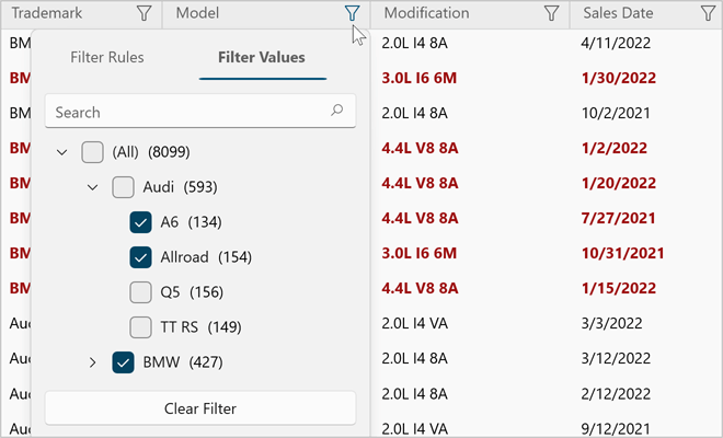
Excel Inspired Filtering
Our new Excel-inspired column filter option allows users to search for distinct values, select values from a hierarchical dropdown menu, or create/apply different filter conditions. New API allows you to customize filter items as needed.
Documentation
Clipboard Operations
Users can now copy/paste selected rows or cells together with format conditions. Our WinUI Data Grid supports the following standard shortcuts:
- Ctrl+C / Ctrl+Insert
- Ctrl+V / Shift+Insert
Cell values are copied to the clipboard using multiple formats (CSV, XLS, HTML, RTF, TXT). This ensures compatibility for a variety of Windows applications that accept clipboard input.
Our WinUI Data Grid also supports multiple paste modes (PasteMode). You can append rows or update existing rows as needed.
New API includes the following:
Documentation
Column & Cell Tooltips
You can now display additional information in cell and column header tooltips. This new API allows you to include custom elements into tooltips, display validation information, customize tooltip appearance, hide tooltips for individual cells and column headers.
The grid automatically activates tooltips for cells and column headers with trimmed content.
Documentation
Show/Hide Grid Lines
Use our new ShowHorizontalLines and ShowVerticalLines options to display/hide grid lines. Use the LineBrush property to specify grid line color.
Row Indicator
The Row Indicator panel visually communicates the state of the current row (focused, changed, validation error, etc.). You can easily change the Row Indicator's color, default images, width or its template.
Documentation
Sort Group Rows by Summary
The WinUI Data Grid can now sort group rows against summary values. To sort group rows in this manner, users must choose the appropriate item in a grouped column's context menu as shown in the screenshot below.
Documentation
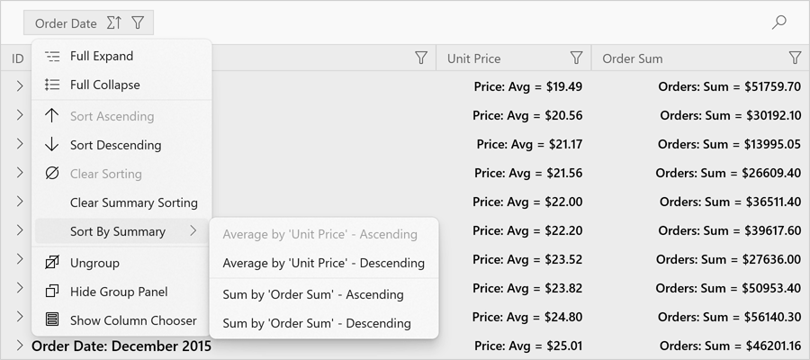
The following example demonstrates how to sort group rows against summary values in code:
                        <dxg:GridControl.GroupSummary>
                        <dxg:GridGroupSummaryItem FieldName="UnitPrice"
                        SummaryType="Average"
                        SortFieldName="OrderDate"
                        SortOrder="Ascending" />
                        </dxg:GridControl.GroupSummary>
Group Row Button Customization
Our WinUI Data Grid now allows you to customize the Group Row button used to expand child records. You can change button color, icon, or template. You can even hide the button and always expand group rows.
Documentation
MVVM - Populate Grid Columns
You can now populate WinUI grid columns from a collection in your view model (based on the MVVM design pattern). Use a template selector to select different column types. Once you update the column collection in your view model, the Data Grid will automatically reflect the changes made. Documentation
Charting
New Chart Types
Our WinUI Chart control includes the following new chart types:
- Stacked Step Line
- Full-Stacked Step Line
- Stacked Step Area
- Full-Stacked Step Area
Use the LineSeriesView.StackedMode (AreaSeriesView.StackedMode) and LineSeriesView.InterpolationMode (AreaSeriesView.InterpolationMode) properties to specify the desired chart type.
 Stacked Step Line - WinUI Chart Control
 Full Stacked Step Line - WinUI Chart Control
 Stacked Step Area - WinUI Chart Control
 Full Stacked Step Line - WinUI Chart Control
Create Chart Series from a ViewModel
You can now create chart series from a collection of view models. Use the ChartBase.SeriesSource property to specify the collection. The ChartBase.SeriesItemTemplate and ChartBase.SeriesItemTemplateSelector properties allow you to convert a model object to a series.
API Enhancements
We fine tuned our chart API to make it more intuitive, simpler, discoverable, and MVVM-friendly.
WinUI Reporting
We enhanced our WinUI Document Viewer. Its new features include:
- Async Document Generation
- Keyboard Navigation
- Mouse-Wheel Zoom, Zoom Trackbar, Toolbar Commands (zoom modes)
- Drill-Down & Interactive Sorting
- Text Selection
- Document Margins
- Responsive Report Layout
- Search and Document Map
- Export Options Dialog
-
Configurable Parameters Panel Layout (Documentation)
- Status Bar: Indication of Lengthly Operations (document generation, document export) / Ability to Cancel the Operation
New Accordion
Our new Blazor Accordion component allows you to address a broad range of navigation related usage scenarios within Blazor-powered web apps. You can create advanced hierarchical navigation menus with endless nesting of navigation elements.
Integrated features include:
- Data Binding Support
- Built-in Search Panel & Filtering Support
- Item Groups
- Multiple Expand/Collapse Modes
- Unlimited Number of Nesting Levels
- Custom Items and Group Content
Documentation
Online Demo
New Flyout
Use our new Blazor Flyout component (a contextual popup UI element) to display hints, warnings, or business-specific information within your Blazor-powered web app. You can position the Flyout at top, bottom, left or right side of any webpage UI element. Documentation
Online Demo
Grid
Inline Row Editing
Our Blazor Grid now supports inline data editing and keyboard navigation support. Use Tab and Ctrl+Tab to navigate between cells within the edit row.
Online Demo
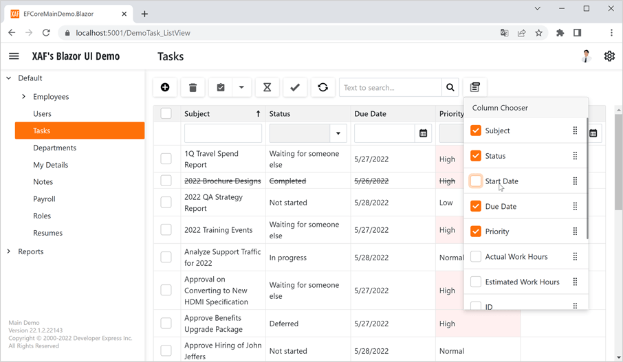
End-User Column Customization. Column Chooser
Our Blazor Grid component ships with a new Column Chooser. As its name implies, a column chooser allows you (or your end users) to hide, display, and reorder grid columns. Use the ShowColumnChooser method to show the Column Chooser in code.
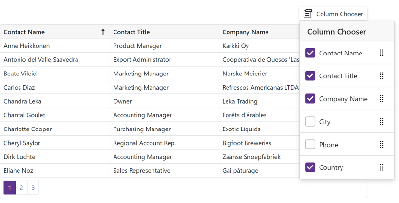
And yes, you can also mange grid columns in code. Use the Visible and VisibleIndex properties to control column visibility/order.
Online Demo
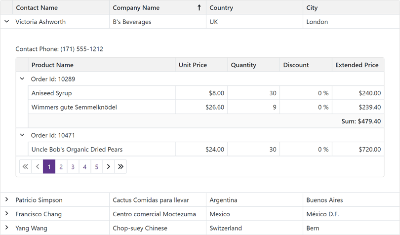
Master-Detail Visualization
You can now create Master-Detail layouts of any complexity - with an unlimited number of nesting levels and details at each level. Documentation
Online Demo
Save / Restore Layout
You can now save and restore the Blazor Data Grid's layout as requirements dictate. Layout information includes the current page, column sort order/direction, column position, filter values, and grouped columns.
We added two new events - LayoutAutoSaving and LayoutAutoLoading. The first event fires each time the grid's layout changes and allows you to save the layout. The second event fires once the grid component is initialized and allows you to restore the layout.
We also added SaveLayout and LoadLayout methods so you can save and restore the grid’s layout when necessary.
Server Mode Data Source
The DevExpress Blazor Grid now supports our Server Mode data source for Blazor Server-based applications. This data source was designed to maximize performance against large data collections.
In Server mode, our Blazor Data Grid loads data in small portions, on demand. This helps reduce memory consumption and improve overall app performance.
All data shaping operations (like grouping and sorting) are delegated from the Blazor application itself to underlying services (such as EF Core, XPO, etc.). These services process data shaping operations much more efficiently and help deliver a major boost in performance. Documentation
Online Demo
Support for Observable Data Collections (Real-Time Data Updates)
You can now bind the Blazor Grid to a data collection that implements the INotifyCollectionChanged or IBindingList interface. This collection notifies the grid about relevant changes (e.g. data items were added or removed, the entire collection was refreshed, etc.). The grid automatically updates its data to reflect all changes made. Documentation
Online Demo
Show / Hide Summary Items
The Data Grid's new Visible property allows you to display/hide individual summary items.
Appearance Customization Enhancements
We added customization support for over 25 grid UI element types (edit form, filter row, group panel, footer, etc.) within the CustomizeElement event handler.
Row Preview
You can now incorporate Preview sections within our Blazor Data Grid (additional information for quick preview by your users). These preview sections can include tables, values from data source fields and custom text. Documentation
Online Demo
API Enhancements - New Events
Charts
Point and Series Selection
Our Blazor Chart (DXChart) component now supports point and series selection. Our Blazor Pie Chart component now supports selection of pie/donut sectors.
Use the following properties to specify selection mode (single/multiple) or disable selection:
- DxChart.SeriesSelectionMode
- DxChart.PointSelectionMode
- DxPieChart.PointSelectionMode
For certain series types, you can also specify how other series points are selected when you select a point. Use the following properties:
- DxChartBarSeriesBase.SelectionMode
- DxChartBubbleSeries.SelectionMode
- DxChartFinancialSeriesBase.SelectionMode
- DxChartRangeBarSeries.SelectionMode
- DxChartScatterSeries.SelectionMode
We also added new events (DxChart.SelectionChanged/DxPieChart.SelectionChanged) to help you respond to user selection.
Documentation: DxChart Documentation: DxPieChart
Online Demo
Drill-Down on Series Point Click
You can now incorporate drill down charts (users click data points and navigate through hierarchical information) within your Blazor-powered web app.
The SeriesClick event parameter's 'Series' property returns an 'IChartSeries' object and exposes the Data property. Use this property to obtain the source data for the clicked/selected series.
How to create a drill-down chart
Online Demo
Financial and Range Series - Data Binding Enhancements
v22.1 includes new properties that allow you to specify data source fields for financial and range series. They include:
Online Demo
Bar Chart Enhancements
We added the following new options for our Blazor Bar Chart component:
Axis Enhancements
New axis options include:
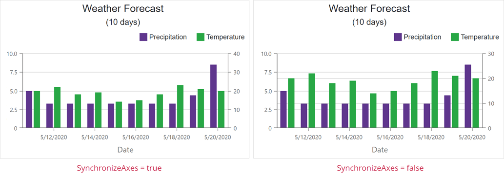
- SynchronizeAxes - Allows you to disable synchronization of value axes displayed on a single pane.
- SynchronizedValue - Specifies values at which axes are synchronized.
- Indent - Specifies the distance between neighboring value axes (in pixels).
Export Chart as PDF or Image
Our new ExportAsync method allows you to save your chart in the following file formats: PDF, PNG, JPEG, and GIF.
Format Series Labels
We added a new SeriesLabel.FormatPattern property to help format series labels. Format patterns can include placeholders with format specifiers and plain text.
Upload
New API
- UploadFile, UploadFiles, UploadAllFiles - use these methods to upload a file(s) or resume a previously paused operation;
- RemoveFile, RemoveFiles, RemoveAllFiles - allow you to remove selected/all files;
- PauseUploadFile, PauseUploadFiles, PauseUploadAllFiles - use these methods to pause file upload operations;
- ReloadFile, ReloadFiles, ReloadAllFiles - these methods re-start the upload of selected/all files;
- CancelUploadFile, CancelUploadFiles, CancelUploadAllFiles - these methods allow you to abort individual operations.
Documentation
Performance Enhancements in WASM Apps
We optimized our Blazor Upload component to work with a large collection of files in WASM applications. For example, it now takes three seconds to upload 100 files that previously required ten seconds.
Navigation and Layout
New API
Our Blazor Form Layout component includes the following new API:
Our Blazor Context Menu and TreeView components can now map the CssClass property in bound mode.
Rich Text Editor
Mail Merge Support
Our Blazor Rich Text Editor now supports mail merge operations.
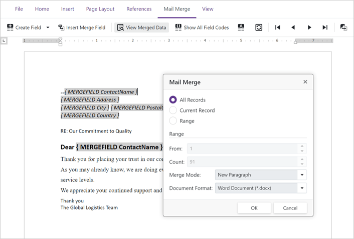
Use the Data property to bind the Rich Text Editor to an external data source. You can preview generated content directly within your document template and save (export) results as DOCX, RTF, or TXT files.
You can also add fields (dynamic elements) to your document. Fields are placeholders that store and display data from a data source.
Online Demo
New Command Toolbar
v22.1 allows you to incorporate a Command Toolbar within your app. As its name implies, a Command Toolbar displays all commands across a single tab. Set the 'BarMode' property to 'BarMode.Toolbar' to activate the toolbar. Handle the CustomizeToolbar event to add new commands and hide/customize default commands as necessary.
Online Demo
Ribbon Customization
We added a new CustomizeRibbon event so you can:
- Add new/hide default commands (items).
- Customize the look, feel, and behavior of default commands.
- Add custom tabs, groups, and commands.
Online Demo
API Enhancements
Scheduler
Access Timescale from Header Templates
The SchedulerTimelineHeaderCellInfo object includes a new Scale property. This property returns the timescale to which the Scheduler header cell belongs.
TreeView
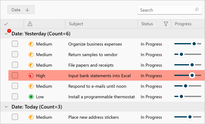
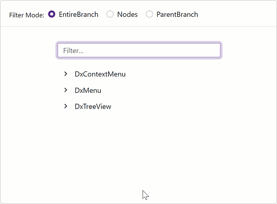
Node Filtering
Our Blazor TreeView component ships with an integrated filtering option. Enable the Filter Panel (displayed at the top of the treeview) to allow users to filter treeview content.
When a user searches for a specific node(s), the tree automatically expands to the node that matches the search string and highlights strings that match search text.
The new API includes:
- ShowFilterPanel - Shows/hides the filter panel.
- FilterString - Specifies the filter string. The 'case-insensitive contains' operator is used by default.
- FilterMode - Specifies the filter mode.
With our TreeView API, you are always in control. Use the CustomFilter property to implement custom filter algorithms.
Documentation
Online Demo
DevExpress Project Templates
DevExpress Server, WebAssembly and WebAssembly Hosted application templates now include our Blazor Grid component.
Data Grid
Export to PDF
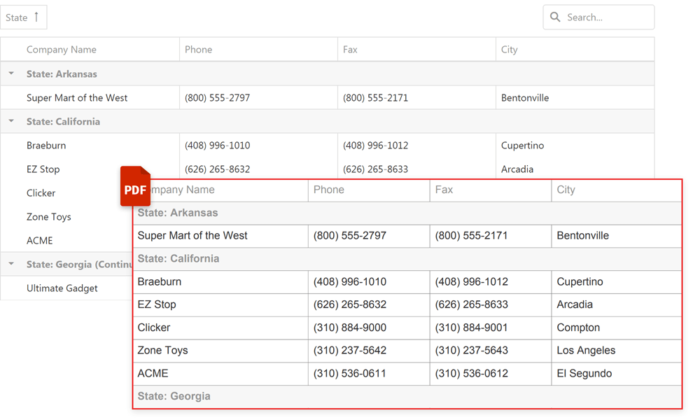
v22.1 marks the official release this feature. Our Export to PDF API includes the following options/capabilities:
- WISIWYG Export to PDF
- Fit-to-Page
- Multi-Page Export
- Text Wrapping
- Progress Indication
- Cell Content, Format, and Appearance Customization options
- RTL Support
Online Demo
Grid Column Enhancements
Grid columns now display items based on the applied filter (not all items as in previous versions).
Online Demo
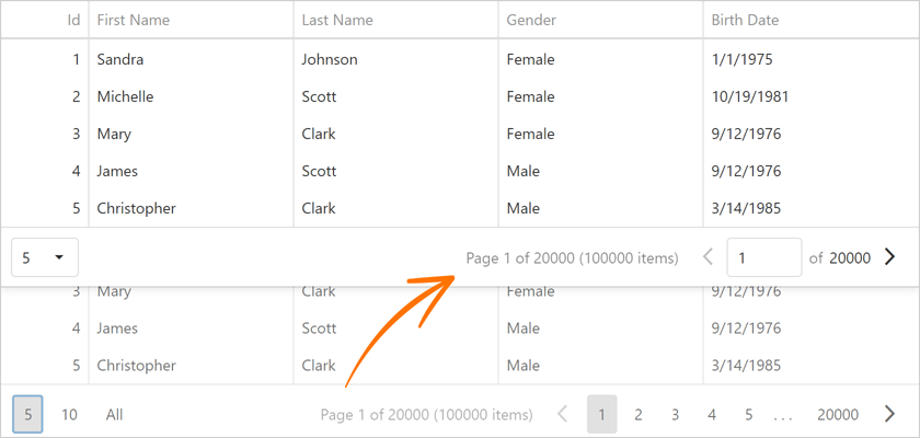
Pager - Enhanced Compact Mode
The grid's pager now displays paging information using a compact display mode.
Online Demo
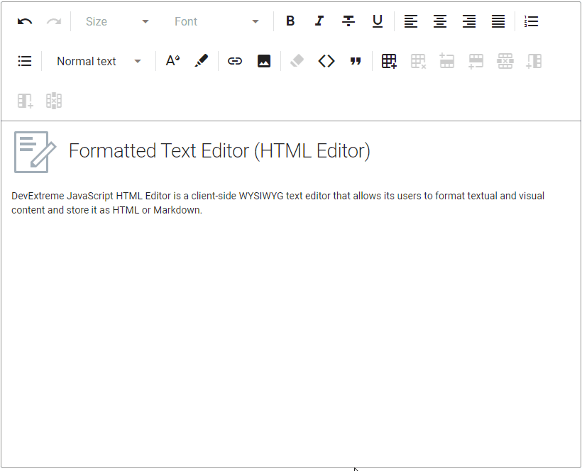
HTML/Markdown Editor
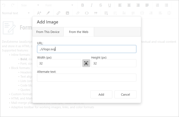
Image Upload
Our HTML Editor ships with image upload support. You can drag-and-drop images onto the editor surface or use the upload form (select files from a file system or specify a URL). You can also resize images within the editor.
Use the fileUploadMode property to specify whether to upload images on the server or to the client using the base64 format. The imageUpload.tabs property specifies the visibility of corresponding tabs in the dialog. Use this property to display 'From this computer', 'From the web', or both tabs.
Online Demo
Scheduler
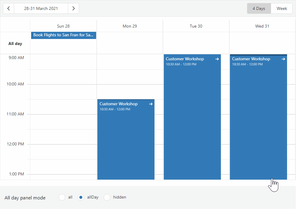
All-Day Panel Modes
We added a new allDayPanelMode setting that allows you to specify which appointments to display within the All-day Panel. Available options include:
- hidden - the Scheduler renders all-day appointments in the timetable. The All-day Panel is hidden.
- allDay - the All-day Panel displays only explicit all-day appointments. Implicit all-day appointments are shown in the timetable.
- all - the All-day Panel displays explicit and implicit all-day appointments.
API Enhancements
You can now delete recurring appointment occurrences using. Use the deleteRecurrence method.
Gantt
Custom Fonts for PDF Export
We added a new font option to the ExportToPdf method so you can specify a custom font for an exported PDF document.
Scale Customization
We added a new scaleCellPrepared event to help customize the look and feel of scale cells. You can now specify color, style, and text settings.
UI Widgets
Display Multiple Toasts in a Stack
With this update, toasts no longer overlap each other. We added two new methods: notify(message, stack) and notify(options, stack) to help display toasts one under another. Use the hideToasts method to hide all toast messages.

Online Demo
Resizable UI Enhancements
Our Resizable component includes two new options:
- keepAspectRatio - Specifies whether to proportionally resize component content when a user drags its corner handle.
- area - Specifies a bounding container. A user can't resize the component outside the boundaries of the specified container.
Online Demo
Validation Summary Enhancements
The new refreshValidationGroup method allows you to rebind the Validation Summary component to its target Validation Group whenever the validation group is recreated.
Toggle Between Open Popups
We improved our Popup component. The active/focused popup window is now placed on top of one another when a user switches between open popups via a pointing device or keyboard.
Data Visualization
Change Data Label Formats
Use the label.displayFormat property to change the format of data labels within a chart.
TypeScript Enhancements
String Literal Unions
We improved our TypeScript declarations and typings. v22.1 introduces dedicated types (string literal unions) for properties that accept a predefined list of values.
React Application Templates for TypeScript
We implemented the TypeScript version of our DevExtreme React Application Template. Specify the 'typescript' parameter in the CLI command to generate the TypeScript version.
devextreme new react-app app-name --template="typescipt"
Angular
New Ivy-Based Angular Package Format Support
UI Template Gallery
v22.1 ships with a new UI Template Gallery. This preview includes CRM and Project Management UI/UX patterns for Angular. We will support React and Vue in future updates.
New Office 365 Dark Theme
GridView, TreeList, Vertical Grid
Multiple Cell Selection
Our ASP.NET GridView, ASP.NET TreeList, ASP.NET Vertical Grid controls now support multiple cell selection. To enable this option, set the SettingsEditing.Mode property to 'Batch' and turn on the BatchEditSettings.EnableMultipleCellSelection option.
End-users can select cells with the mouse or keyboard (Shift/Ctrl + arrow keys).
New client API includes:
Online Demo
Data Editing in Batch Mode - Copy/Paste Multiple Cell Values
With multiple cell selection enabled, users can now copy a cell range and paste it into grid cells or external controls (e.g. GridView, Spreadsheet, TreeList). Users can also copy the range of cells and paste it in Excel.
Online Demo
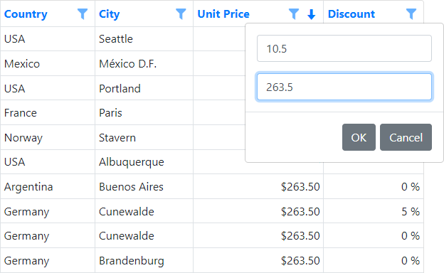
Range Filter for Numeric Values
We incorporated a range track bar in column filters for numeric values. To activate this option, set the SettingsHeaderFilter.Mode property to 'NumericRangePicker'.
Online Demo
Gantt
Custom Fonts for PDF Export
We added a new 'font' option to our ExportToPdf method so you can specify a custom font for your exported PDF document.
Scale Customization
We added a new ScaleCellPrepared event that allows you to customize the look and feel of scale cells and cell separators. You can specify such settings as color, style, and text.
Performance Enhancements
We have optimized our ASP.NET Gantt control's data processing and rendering engine to avoid excessive database queries. The Gantt control now uses fewer database queries when updating tasks.
Pivot Grid
Unified Field Binding API in Server Mode and OLAP Mode
v22.1 updates Data Binding API support in both Server and OLAP Modes.
In OLAP mode, you can now set the DataBinding property to a DataSourceColumnBinding object (to bind a field to data). To specify an OLAP expression, set the 'DataBinding' property to an 'OlapExpressionBinding' object.
In Server Mode, use 'DataSourceColumnBinding' and 'ExpressionDataBinding' objects respectively.
This update also includes support for the following criteria operators:
- IsTotal - Determines whether a total summary value is being calculated.
- FirstValue - Returns the first row of records used to calculate an aggregate value.
Documentation
Miscellaneous Enhancements
New Keyboard Events
We added keyboard events to our Web Forms/MVC data container controls (GridView, CardView, VerticalGrid, and TreeList). You can handle the following events on the client side to respond to user keyboard actions:
Data Filtering Enhancements
v22.1 ships with the following enhancements to our standalone and embedded Filter Controls:
-
Numerous predefined comparison operators for DateTime fields (see FunctionType).
-
Ability to create custom comparison operators (see CustomFunctionName).
Demo - Web FormsDemo - MVC
Data Grid
Export to PDF
v22.1 marks the official release this feature. Our Export to PDF API includes the following options/capabilities:
- WISIWYG Export to PDF
- Fit-to-Page
- Multi-Page Export
- Text Wrapping
- Progress Indication
- Cell Content, Format, and Appearance Customization options
- RTL Support
Online Demo
Grid Column Enhancements
Grid columns now display items based on the applied filter (not all items as in previous versions).
Online Demo
Pager - Enhanced Compact Mode
The grid's pager now displays paging information using a compact display mode.
Online Demo
Scheduler
All-Day Panel Modes
We added a new 'AllDayPanelMode' method that allows you to specify which appointments to display within the All-day Panel. Available options include:
- hidden - the Scheduler renders all-day appointments in the timetable. The All-day Panel is hidden.
- allDay - the All-day Panel displays only explicit all-day appointments. Implicit all-day appointments are shown in the timetable.
- all - the All-day Panel displays explicit and implicit all-day appointments.
API Enhancements
You can now delete recurring appointment occurrences using. Use the deleteRecurrence method.
Charting
Change Data Label Formats
Use the label's DisplayFormat method to change the format of data labels within a chart.
Gantt
Custom Fonts for PDF Export
We added a new font option to the ExportToPdf method so you can specify a custom font for an exported PDF document.
Scale Customization
We added a new ScaleCellPrepared event to help customize the look and feel of scale cells. You can now specify color, style, and text settings.
HTML/Markdown Editor
Image Upload
Our HTML Editor ships with image upload support. You can drag-and-drop images onto the editor surface or use the upload form (select files from a file system or specify a URL). You can also resize images within the editor.
Use the FileUploadMode method to specify whether to upload images on the server or to the client using the base64 format. The Tabs method specifies the visibility of corresponding tabs in the dialog. Use this property to display 'From this computer', 'From the web', or both tabs.
Documentation
Online Demo
UI Components
Display Multiple Toasts in a Stack
With this update, toasts no longer overlap each other. We added two new methods: notify(message, stack) and notify(options, stack) to help display toasts one under another.
Use the hideToasts method to hide all toast messages.
Online Demo
Resizable UI Enhancements
Our Resizable component includes two new methods:
- KeepAspectRatio - Specifies whether to proportionally resize component content when a user drags its corner handle.
- Area - Specifies a bounding container. A user can't resize the component outside the boundaries of the specified container.
Online Demo
Validation Summary Enhancements
The new refreshValidationGroup method allows you to rebind the Validation Summary component to its target Validation Group whenever the validation group is recreated.
Toggle Between Open Popups
We improved our Popup component. Users can now switch between open popups via a pointing device or keyboard.
Currency-Accounting Style - Format Negative Values
We added a new 'useCurrencyAccountingStyle' option (enabled by default). This option specifies whether to use system settings for negative values (currency-accounting format). Otherwise, negative values are displayed with a minus sign.
GridView and CardView
Range Filter for Numeric Values
We incorporated a range filter for numeric values in column filters. To activate this option, set the SettingsHeaderFilter.Mode property to 'NumericRangePicker'.
Online Demo
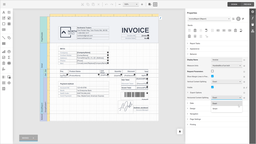
All Platforms
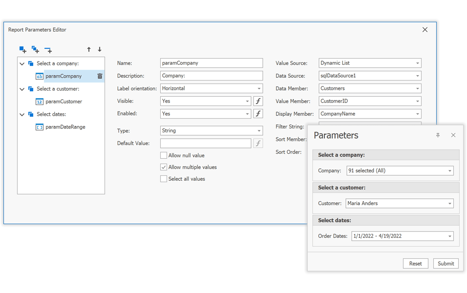
Customize the Parameters Panel in the Report Designer
You can now customize the layout of the Parameters Panel within the Report Parameters Editor (inside the Visual Studio IDE and our End-User Report Designer, for all supported development platforms). Yes, you no longer need to write any code. You can group parameters, change the location of editor labels, set up conditions to display/hide individual parameters, etc.
Documentation | Blog Post
Cross-Tab Enhancements
Our Cross-Tab report control includes the following new options:
- Html-inspired Text Formatting
- Distinct Count, Median, and Mode Summaries
- Show/Hide Rows and Columns Based on a Condition
-
Support for Optimized Calculation Engine
Documentation
Parameters - Server-Side Filtering for Cascading Parameters
Cascading report parameters now filter associated data source information on the server-side if the 'FilterString' property has been specified. This feature will reduce overall memory usage/allocation.
The following data source types support this functionality:
- SQL Database
- MongoDB Instance
- Entity Framework
Documentation
Report Design Analyzer Enhancements
Turn on the 'DesignAnalyzerOptions.EnableErrorCodeLinks' option to display error codes as links in the End-User Report Designer. Click a link to open our online documentation for details on error codes.
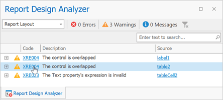
To ignore specific errors, add their error codes to the 'DesignAnalyzerOptions.SuppressedErrorCodes' collection.
We also added three new options ('ShowErrors', 'ShowWarnings', 'ShowMessages') that enable you to filter issues by a category/type in code. You can display only errors, warnings, messages, or any combination of them.
Documentation
Expression Editor - Custom Aggregate Functions
We enhanced the Expression Editor in our End-User Report Designer. It now displays custom aggregate functions registered in your application.
Documentation
Data Source Enhancements
Entity Framework Core 6 Support
EFDataSource now supports Entity Framework (EF) Core 6.0 context classes bound to MS SQL Server.
Documentation
SQL Data Source
Stored Procedures with Multiple Result Sets
You can now bind our SqlDataSource component to a stored procedure that returns multiple data tables. You can also view these tables in the Report Designer Field List.
Google BigQuery ODBC Provider Support
Our Google BigQuery data access engine now uses the official ODBC driver.
MySqlConnector Support
The MySql Database Provider can now use the https://mysqlconnector.net/ - a MIT-licensed ADO.NET data provider for MySQL Server to operate with MySQL-compatible databases. The MySql Database Provider ships with our Data Access Library.
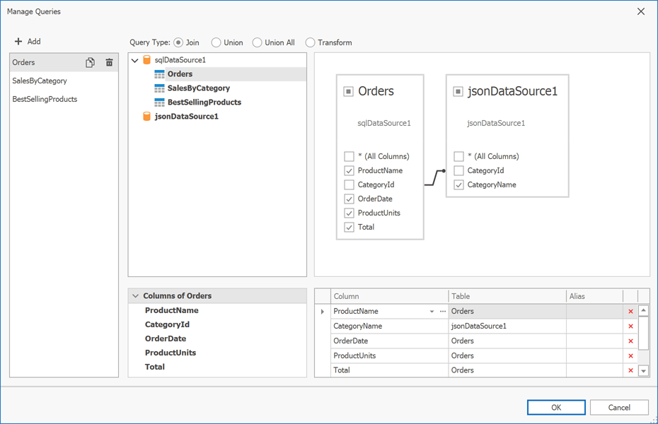
Federation Data Source - Enhanced Manage Queries Dialog
We integrated the Queries List into the Federation Data Source Manage Queries dialog. You can now manage the data source (create, copy/clone, edit, and delete queries) within a single wizard window.
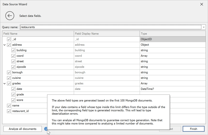
MongoDB and JSON DataSource Wizards
We extended our MongoDB data source configuration wizard with the following new options:
- Select/Unselect Data Fields
- Specify Field Display Names
- Change Field Type
You can now safely edit the JSON Data Source schema without loosing selected fields and field display names.
Our MongoDB and JSON Data Source Wizards analyze the first 100 documents/records to generate a schema. If the data source contains more that 100 documents, the Wizard displays an 'Analyze all documents' button. Click the 'Analyze all documents' button to analyze all documents in the data source and create your schema.
Web Reporting
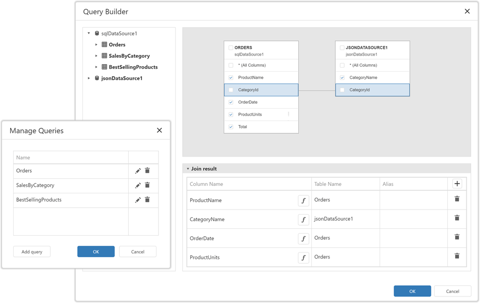
Web Report Designer - Data Federation
Our Web Report Designer's Data Source Wizard allows you to combine multiple report data sources and define joins or relationships between queries and collections. End-users can now create joins, unions, and query transformations as requirements dictate.
Material Theme Support
We optimized the layout and refined the structure of CSS styles in our Web Report Designer, Web Document Viewer, and Query Builder components. You can now use these components in Web apps that adhere to Material Design Guidelines.
Documentation
WinForms Reporting
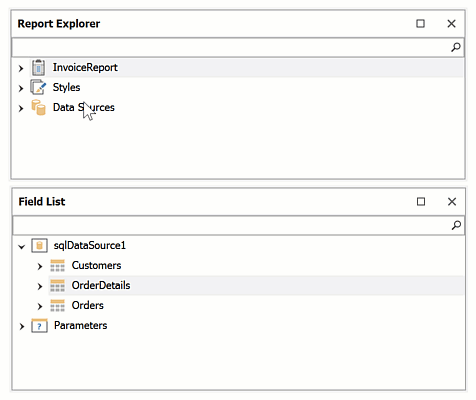
Report Designer - Enhanced Search in the Report Explorer & Field Picker Dialogs
The Report Explorer panel (and all panels/popup windows that allow users to select data source fields) includes an improved search bar. When a user searches for a specific element(s), the tree automatically expands down to the element(s) that matches the search criteria.
WinUI Reporting
We enhanced our WinUI Document Viewer. Its new features include:
- Async Document Generation
- Keyboard Navigation
- Mouse-Wheel Zoom, Zoom Trackbar, Toolbar Commands (zoom modes)
- Drill-Down & Interactive Sorting
- Text Selection
- Document Margins
- Responsive Report Layout
- Search and Document Map
- Export Options Dialog
- Configurable Parameters Panel Layout (Documentation)
- Status Bar: Indication of Lengthly Operations (document generation, document export) / Ability to Cancel the Operation
Documentation
Spreadsheet Document API
Shrink to Fit
Our Spreadsheet Document API now applies the Shrink to Fit cell alignment option when it prints and exports spreadsheet documents (to PDF).
WinForms and WPF Dashboard
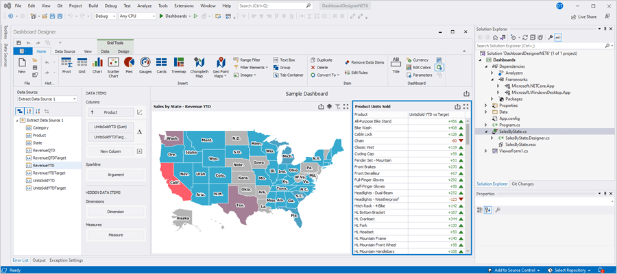
Visual Studio Dashboard Designer for .NET 5/.NET 6
You can now use our Dashboard Designer to create and edit Dashboards in .NET 5/.NET 6 apps. Double-click a class file with your dashboard within the Visual Studio IDE to open the Dashboard Designer.
Documentation
Common Enhancements
Memory and Performance Profiling Tool
The DevExpress BI Dashboard Diagnostic Tool is a performance management system that helps analyze code execution speed (to help improve overall dashboard performance). With this tool, you can estimate overall speed and determine how many times specific code was called during a single session.
Get it from GitHub
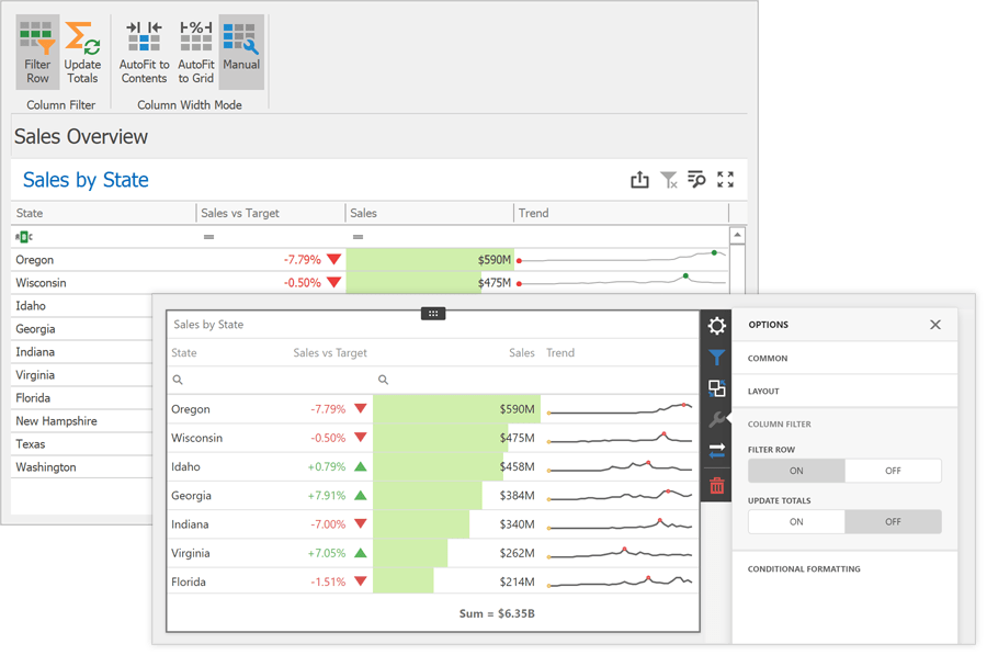
Grid Dashboard Item - Column Filter
Use the 'Filter Row' option to activate grid column filters. Once activated, end-users can search and filter grid rows with ease.
We've also added an 'Update Totals' option. This option determines whether the grid automatically recalculates totals when users filter grid data.
Documentation
Web Dashboard
Dashboard Data Source Wizard - Data Federation
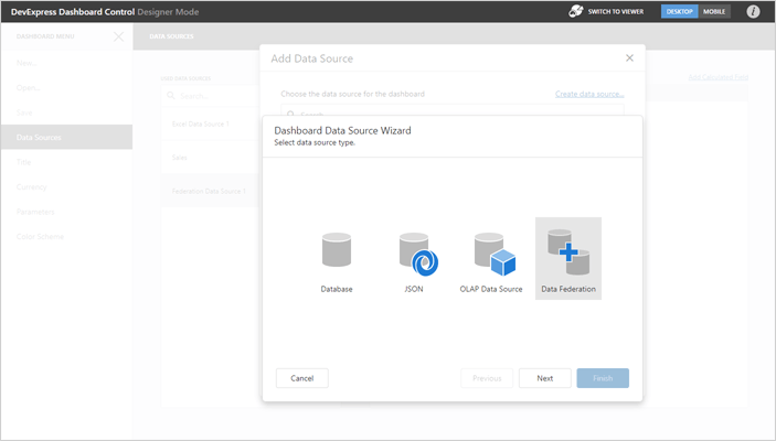
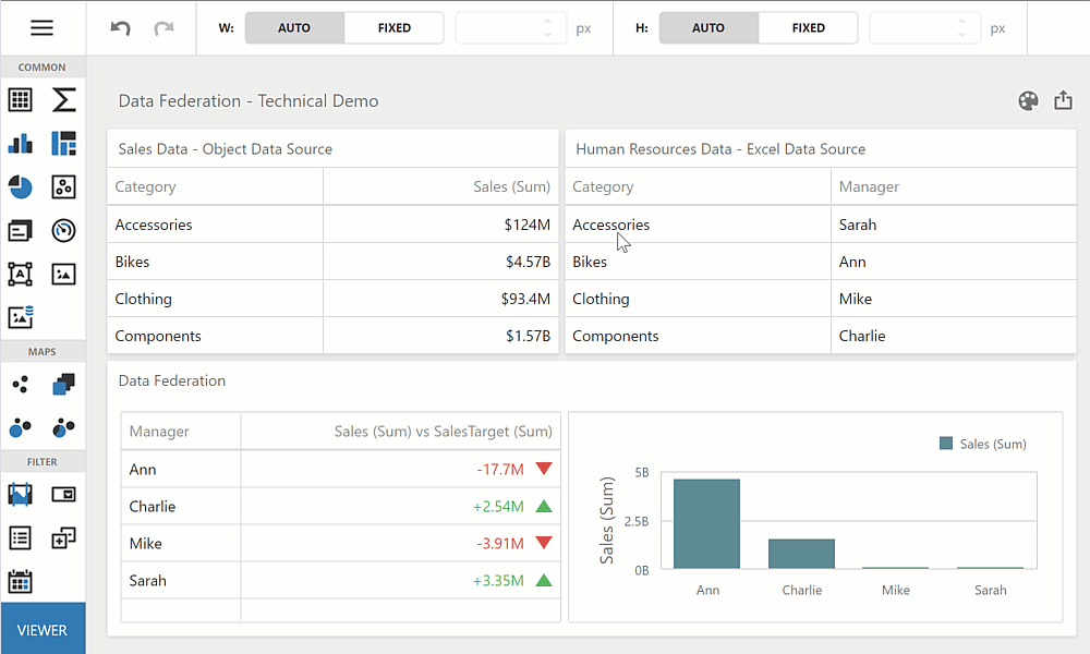
We integrated a new window into our Data Source Wizard so you can create a Federated Data Source within our Web Dashboard UI. You can combine all supported data sources (except OLAP) or you can allow users to create their own (from existing data sources) as needed.
Documentation
Dashboard Items - Data Binding Enhancements
You can now safely rebind dashboard items without loosing individual data bindings. Should a binding error occur, the designer highlights broken bindings in red.
Opacity / Transparency
Whether it is a color scheme or a single element in a dashboard item, you can now specify its opacity level. The Color Picker tool allows you to specify color values with an alpha channel.
Documentation
Blazor & WinForms UI
.NET 6 - By Default
With v22.1, XAF's Blazor, Web API Service, and WinForms (.NET Core) assemblies target .NET 6 by default.
.NET 6 is a long-term support (LTS) release. With it, we'll deliver the highest possible performance and unrivaled user experience for Blazor, XAF Model Editor, and WinForms design-time.
New Blazor Grid List Editor
This update marks the official release of our Blazor Grid List Editor (DxGridListEditor). This new UI element is built atop the new DevExpress Blazor Grid component. Its new features include:
- Client and Server Mode Support for EF Core and XPO ORM Library
- Custom Calculated Field support for XPO ORM
- Column Resizing support
- Column Customization / Column Chooser support
Documentation
Main Menu Toolbar Enhancements
We returned our WinForms and ASP.NET WebForms UI implementation. Menu commands are now disabled based on record selection within the ListView.
Breaking Change:
T1087758 - Blazor: Main menu toolbar disables commands based on record selection within the ListView
Entity Framework Core 5 for Data Access
EF Core 5 Support for WinForms was first introduced in May 2021 as a Community Technology Preview (CTP). This update marks its official release. Enhancements include multiple stability improvements and support for the Server and DataView access modes in ListView. You can also use EF Core 5 in XAF's Blazor apps, .NET App Security API, and Web API Service.
Documentation
Unified Application Configuration for WinForms & Blazor (.NET 6)
You can now use the Windows Forms and ASP.NET Core Blazor fluent API-based application builders to deliver straightforward and consistent configurations for security and application modules. You can find application builders in 'MySolution.Win\ApplicationBuilder.cs' and 'MySolution.Blazor.Server\Startup.cs' files.
                        // ...
                        services.AddXaf(Configuration, builder => {
                            builder.UseApplication<MainDemoBlazorApplication>();
                            builder.Modules
                                .Add<MainDemoModule>()
                                .Add<MainDemoBlazorApplicationModule>()
                                .AddAuditTrail(options =>
                                    options.AuditDataItemPersistentType = typeof(DevExpress.Persistent.BaseImpl.AuditDataItemPersistent))
                                .AddFileAttachments()
                                .AddObjectCloning()
                                .AddOffice()
                                .AddReports()
                                .AddValidation();
                                // ...
We also removed the 'PlatformApplication.designer.xx' and 'Module.designer.xx' files from the Solution Wizard template in .NET 6 apps. These changes will not break your apps for the .NET Framework. You can continue to use our Application and Module Designers.
XAF Solution Structure - Simplified for .NET 6
With this update, XAF solutions will not include SolutionName.Module.XXX projects. You can add controllers, business classes, list and property editors, view items, and other XAF-specific entities to your SolutionName.XXX application projects. This enhancement makes it easier for new XAF developers to get started with the product and avoid common mistakes.
XPO Middle Tier Application Server for .NET 6
This update marks the official release of our Middle Tier application server with XPO-based .NET 6 WinForms apps.
Documentation
Visual Studio Report Designer for .NET 6
You can now use XAF-specific report data sources in our new Visual Studio Report Designer for .NET 6.
Web API Service
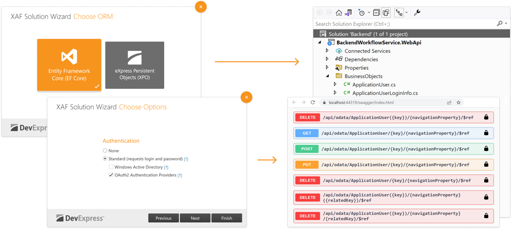
CRUD & Authorization for Entity Framework Core 5 & XPO ORM
This update marks the official release of our Web API Service. XAF's Solution Wizard now generates a Web API Service with integrated authorization & CRUD operations powered by EF Core 5 and XPO ORM Library.
The basic functions of our Web API Service are available for free (as part of our .NET Role-based Access Control & Permission Management API. To download your free copy, please visit: https://www.devexpress.com/security-api-free
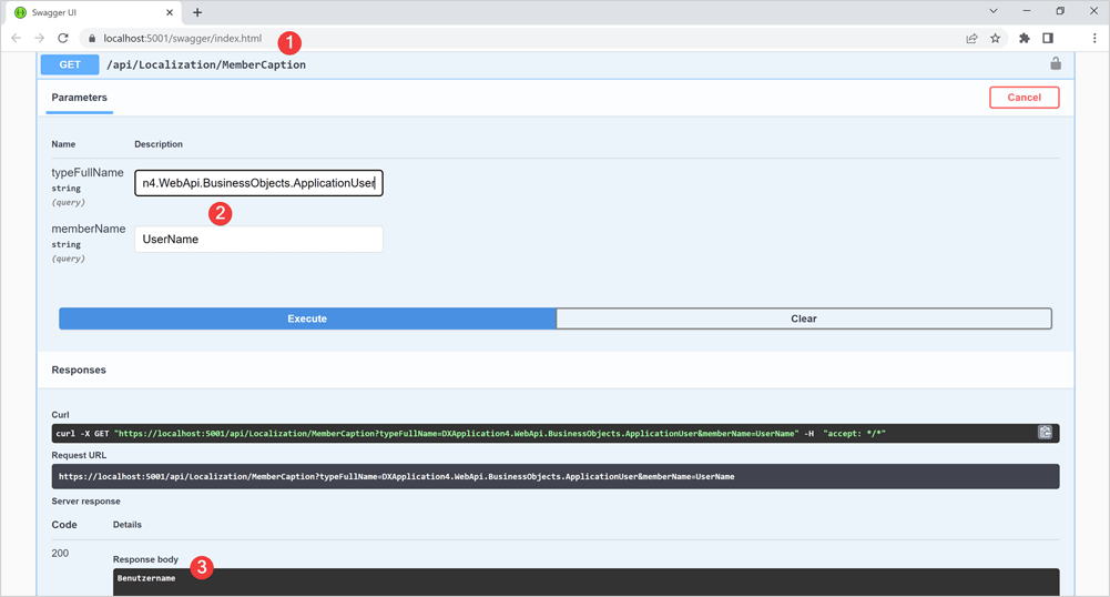
Localization Support
Our Web API Service now includes endpoints to obtain localized captions for classes and members. This option of our Web API Service ships as part of the Universal Subscription.
Core Enhancements
Unit & Functional Testing in Solution Wizard
You can now write end-to-end (e2e/functional) tests in C#/VB.NET.
                        [Theory]
                        [InlineData(BlazorAppName)]
                        [InlineData(WinAppName)]
                        public void CreateStudent(string applicationName) {
                            FixtureContext.DropDB(AppDBName);
                            var appContext = FixtureContext.CreateApplicationContext(applicationName);
                            appContext.RunApplication();
                            appContext.GetForm().FillForm(("User Name", "Admin"));
                            appContext.GetAction("Log In").Execute();

                            appContext.Navigate("Student");
                            Assert.Equal(0, appContext.GetGrid().GetRowCount());

                            appContext.GetAction("New").Execute();
                            appContext.GetForm().FillForm(("First Name", "John"), ("Last Name", "Smith"));
                            appContext.GetAction("Save").Execute();
                            Assert.Equal("John Smith", appContext.GetForm().GetPropertyValue("Full Name"));

                            appContext.Navigate("Student");
                            Assert.Equal(1, appContext.GetGrid().GetRowCount());
                            Assert.Equal(new string[] { "John", "Smith" }, appContext.GetGrid().GetRow(0, "First Name", "Last Name"));
                        }
We also added a new option to our Solution Wizard that adds a pre-configured test project to your solution.
Documentation
New Error Diagnostics
This update marks the official release of XAF diagnostics. You can now analyze your solution with pre-built error diagnostics and view a detailed report in the Error List window. v22.1 includes the following new diagnostics to help you correctly define your business model and controllers:
- XAF0009: Properties decorated with the 'RuleRequiredFieldAttribute' should be of nullable or reference type.
- XAF0010: Set the 'DelayedAttribute.UpdateModifiedOnly' property to True.
- XAF0011: Implement the delayed property correctly.
- XAF0012: Avoid calling the 'XafApplication.CreateObjectSpace()' method overload without the 'Type' parameter.
- XAF0013: Avoid reading the 'XafApplication.ConnectionString' property.
- XAF0014: The property with the 'Association' attribute must have a correct unique pair.
- XAF0015: Association must not have the 'Aggregated' attribute if it is paired to the 'many' end of the association.
- XAF0016: Descendants of 'NonPersistentBaseObject' and 'NonPersistentLiteObject' must be decorated with the 'DomainComponent' attribute.
Documentation
SAP HANA Database Provider for XPO
Our XPO connection provider now supports SAP HANA.
MySqlConnector Database Provider for XPO
Our XPO connection provider now supports https://mysqlconnector.net/, a MIT-licensed ADO.NET data provider for MySQL Server, MariaDB, Percona Server, Amazon Aurora, Azure Database for MySQL, Google Cloud SQL for MySQL, and other MySQL-compatible databases.
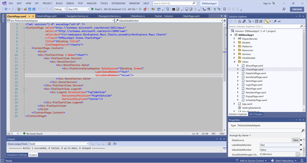
.NET MAUI Project Templates
Use our new .NET MAUI Project Templates for Visual Studio 2022 to quickly generate cross-platform .NET MAUI apps with our Scheduler, Popup, and Chart controls. The app may also contain the Log In, About, and other auxiliary pages.
Project templates add references to all DevExpress .NET MAUI NuGet packages and register all required handlers (the main page will declare XAML namespaces for all DevExpress controls).
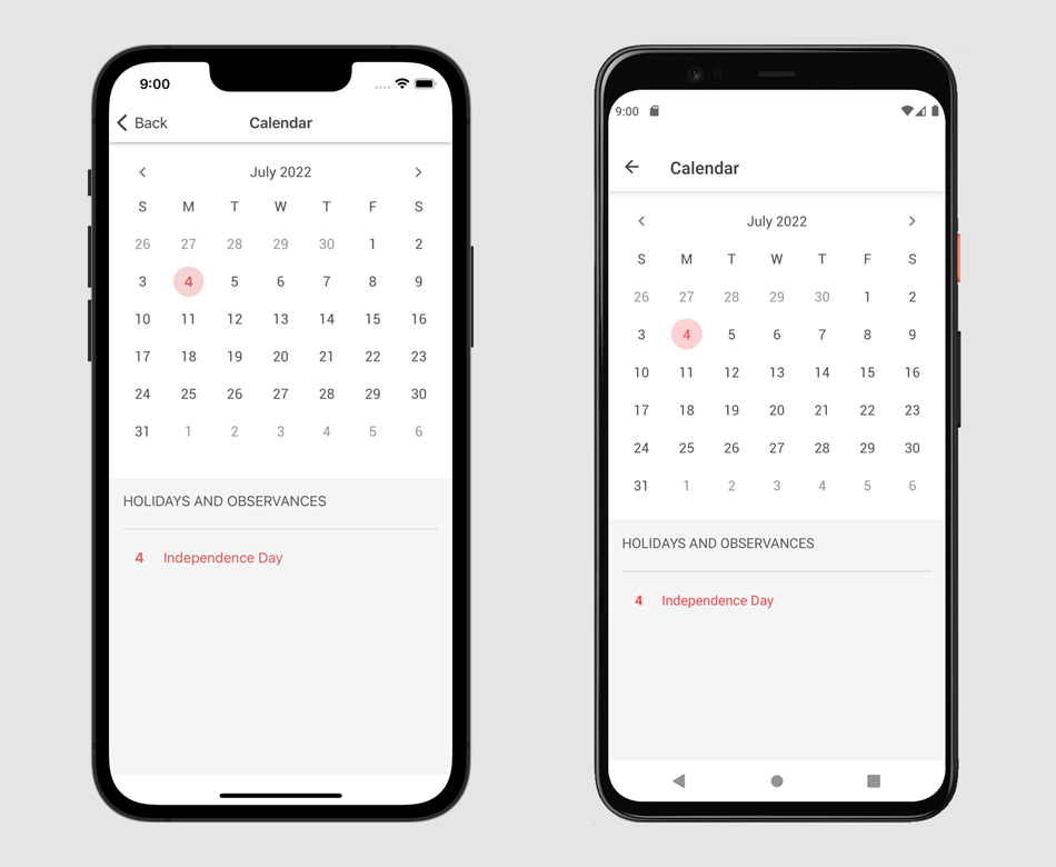
New Calendar for .NET MAUI & Xamarin Forms
Our new Calendar is a standalone and fully customizable control. You can customize the appearance of days, months, years, and the header. You can highlight holidays and observances, update fonts and colors, specify a custom data template to render a specific UI element as needed.
Documentation
Date Editor for .NET MAUI & Xamarin Forms
The Date Editor now integrates our new Calendar. We also integrated the new date picker into DataGridView and DataFormView so that your apps on iOS and Android have a consistent look and feel.
Documentation
Performance Enhancements
Improved Startup Performance
We have improved startup performance by lazy-loading resources and settings, asynchronous initialization of internal services, reworking the way CodeRush interacts with Visual Studio menus and toolbars, and optimizing memory use.
Optimized Debug Visualizer
The Debug Visualizer steps over code faster, (due to optimized communication with Visual Studio’s debugging services). We also decreased the time required to render Debugger Visualizer visual elements.
Optimized Tool Windows
The Code Issues, Test Runner and Feature Advisor windows now load faster when run the first time.
Code Analysis
XAML Diagnostics for DevExpress WPF Components
CodeRush Code Analysis Engine can now check your XAML code for usage errors. This release introduces the following diagnostics for DevExpress Controls:
Legacy drag-and-drop - Drag-and-Drop Managers are a legacy way to enable drag-and-drop. Consider setting the 'DataViewBase.AllowDragDrop' property to 'true' instead.
Documentation
ColumnBase.EditTemplate is used - The 'EditTemplate' property is outdated. Consider using CellEditTemplate instead.
FieldName matches the Binding path - When the Binding property is specified, 'FieldName' should not contain an existing property name.
Documentation
Outdated windows The DXWindow, DXRibbonWindow, and DXTabbedWindow classes are outdated. Use ThemedWindow instead.
Cell templates missing PART_Editor - Consider setting the editor’s Name to 'PART_Editor' to automatically bind and configure the editor.
Documentation
EditValueChanging/EditValueChanged is handled in CellTemplate - Due to the grid's virtualization mechanism, this event handler will be invoked whenever a user scrolls data. Consider handling 'CellValueChanging/CellValueChanged' (for the grid's View) instead.
Documentation
An invalid EventToCommand.EventName - The EventToCommand's associated object is missing the event specified in EventName.
Documentation
In-place editing is unavailable when NavigationStyle is set to Row or None - Setting the 'ColumnBase.AllowEditing' property to 'true' will have no effect if the 'DataViewBase.NavigationStyle' property is set to 'Row' or 'None'.
Documentation
AutoWidth and relative column size are used together - Setting the relative (star) column size will have no effect if the 'TableView.AutoWidth/TreeListView.AutoWidth' property is set to 'true'.
Documentation
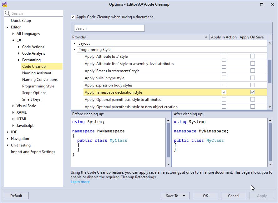
C# 10 Support
File-scoped Namespace Declaration Support for C# 10
CodeRush refactorings, Code Cleanup and Code Formatting engines now support the new C# 10 namespace declaration style as well as C# 10’s new global using directives feature.
Records and Record Structs Support
CodeRush now supports records (for C# 9) and record structs (for C# 10) in Code Cleanup, Smart Constructor and Code Diagnostics.
Refactorings
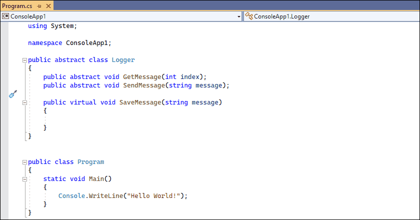
Create Descendant
You can now use the Create Descendant code provider to quickly create descendant classes (and records) with necessary constructors and selected member overrides.
Sync Namespace with Folder Structure
You can now apply the Sync Namespace with Folder Structure action in partial classes and in a copied folder that contains at least one .cs or .vb file. The namespace in the copied files will be renamed according to each file's new location.
Caps as a Shortcut Modifier
You can now use the Caps Lock key as a shortcut modifier (just like Ctrl, Shift, or Alt) to create shortcut bindings for your favorite CodeRush commands and to quickly access a wide range of CodeRush functionality (refactorings, navigation, declarations, and more).
Read the blog post
Smart Navigation (SmartNav)
The new SmartNav feature allows you to quickly navigate between adjacent members, statements, and arguments in C#, Visual Basic, and TypeScript/JavaScript, and also between controls and properties in XAML and XML. To use SmartNav, enable the “Caps Lock as a Modifier” feature and use Caps + the Arrow keys.
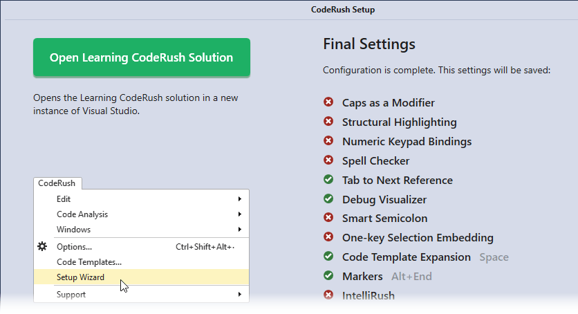
The Learning CodeRush Solution
This release introduces the 'CodeRush Solution' containing interactive lessons to help you learn Caps Lock shortcuts and help you practice new CodeRush features.
To open this solution, select the CodeRush | Support | Open Learning CodeRush Solution... menu item or click the big Open Learning CodeRush Solution button on the last page of the Setup Wizard.
Miscellaneous Enhancements
New Shortcut Cheat Sheet
Following the introduction of Caps as a Modifier and SmartNav, we have updated our CodeRush Shortcut Cheat Sheet.
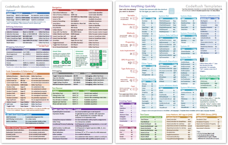
You can get version 4 of the CodeRush Shortcut Cheat Sheet here.
Download Your Copy Today
Once you're ready to upgrade, simply login to the DevExpress Client Center and download the appropriate installer to proceed.
Download and InstallFree Trial
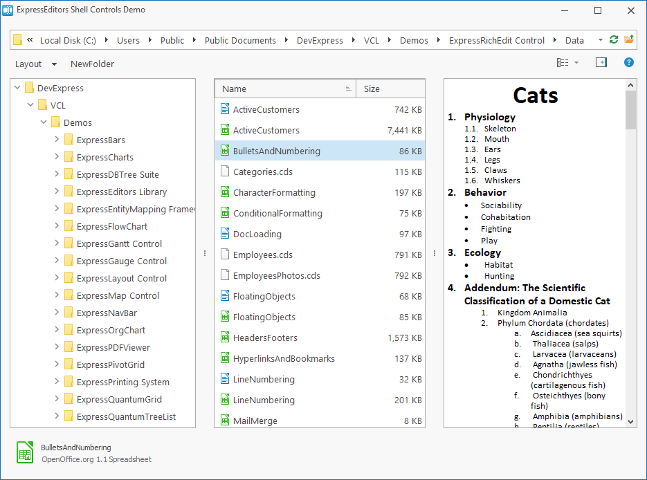
New Shell Controls - List & Tree Views
Our new Shell List View and Shell Tree View controls complete DevExpress line of high-performance utility interface products – controls designed to replace the corresponding standard VCL components. These new controls fully support look & feel settings and skins, which enables you to maintain a consistent appearance across the entire application, including shell dialogs.
Data Grid
Data Export Enhancements
New global APIs allow you to export grid content to a stream in XLS, XLSX, CSV, HTML, Text, XML formats. New methods include:
Documentation: VCL Data Grid: Data Export
Runtime Style Customization
We implemented three new events in the TcxCustomGridTableViewStyles class. Handle the following events to customize styles of the hot-tracked, inactive, and selected rows at runtime:
Data Grid, TreeList, and Vertical Grid
Support for Icons in Filter Dropdowns
Our VCL Data Grid, VCL TreeList, and VCL Vertical Grid controls now display icons for values displayed within regular and Excel-inspired filter drop-downs (for columns with image combobox in-place editors).
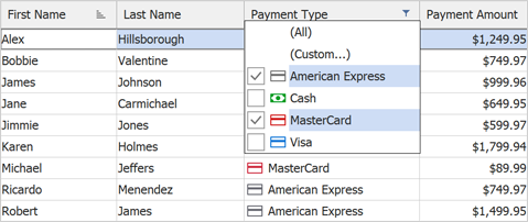
We also added a new OnGetFilterImages event that allows you to display custom images within filter items, or hide them.
Localization Enhancements
You can now localize names for the following aggregate functions: MIN, MAX, SUM, AVG, and COUNT, which can be displayed within group rows and footer cells.
ListView Control
The ListView control was first introduced in June 2021 as a community technology preview (CTP). This update marks its official release. The DevExpress VCL ListView control is a skinnable high-performance counterpart for the standard VCL TListView control. For instance, it creates items 250-420 times faster than its standard VCL counterpart. The ListView control integrates the following options:
- Per-pixel scrolling
- Hybrid, touch-friendly, and classic scrollbars
- Full DPI awareness
- All DevExpress skins
Documentation
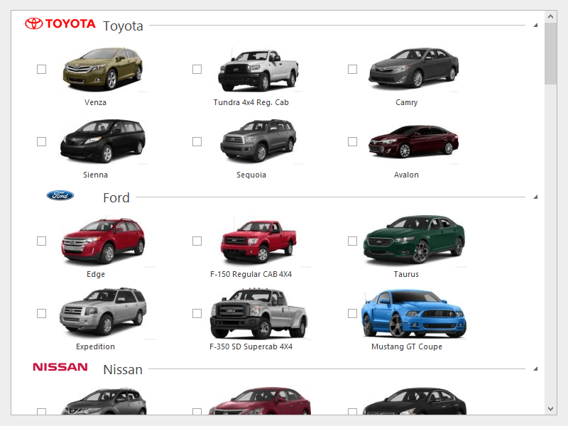 Icon View - Office 2019 Colorful
 List View - Office 2019 Black
 Report View - Office 2019 Black
 Small Icons View - Office 2019 Colorful
Support for BBCode-inspired Formatting Tags
In v22.1, we supported BBCode-inspired formatting tags in our Alert Window Manager and Hint Style Controller components. BBCode tags allow you to use limited text formatting within controls that do not support RTF strings and other text formatting options.
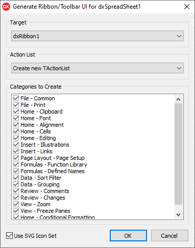
Vector Icons for Auto Generated Ribbon & Toolbar UIs
You can now incorporate vector icons into your auto generated Ribbons and Toolbars (for use within our Spreadsheet, Rich Edit, Scheduler, and PDF Viewer controls).
We ship vector icons as a part of our Icon Library. With this update, we introduce a new Use SVG Icon Set option in the Generate Ribbon/Toolbar UI design-time dialog (available for all supported DevExpress VCL products). This option replaces the predefined bitmap icon set with a corresponding set of SVG icons.
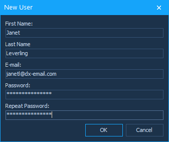
Input Dialogs - Password Masking
The Input Dialog now supports password masking that hides the password characters entered by the user. To specify a masking char, prepend an ASCII character whose number is less than #32 to the caption of the target text box.
                        APrompts[3] := #31'Password:';
                        APrompts[4] := #31'Repeat Password:';
                        APrompts[3] = "\x31" "Password:";
                        APrompts[4] = "\x31" "Repeat Password:";
Documentation