DevExpress Drawing Graphics Library
The DevExpress.Drawing Graphics Library was first introduced in November 2022 as a Community Technology Preview (CTP). This update marks its official release. The following drawing library-related capabilities and features are now available in non-Windows environments:
Reports:
- Render justified text in labels.
-
Respect source image resolution (dpi) within
XRPictureBox
-
Embed PDFs into report documents using the
XRPdfContent -
Display and print gauges within reports using the
XRGauge -
Use the
ImageExportOptions.Resolution -
Export all report pages to a single TIFF image (
SingleFile - Automatically replace missing font glyphs for reports exported to PDF / Image and drawn in the Web Viewer.
BI Dashboard:
- Gauges and Treemaps Export
Office File API:
- Shapes in Word Processing and Spreadsheet Document API
- PDF Graphics API
- Treemap and Sunburst Visualizations in Word Processing and Spreadsheet Document API
- Export to Bitmap and Image Extraction in PDF Document API
- Improved Barcode Export in Barcode Generation API
We also replaced all System.Drawing
Read the following breaking change advisory for detailed information related to this update:
Office-Inspired Products, Barcode Generation API, Reporting, and Printing - Members changed their types and signatures.
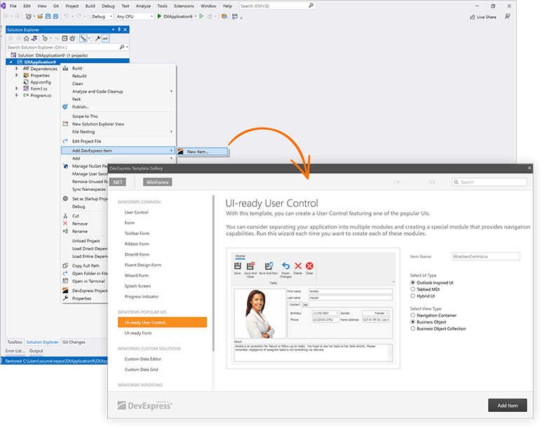
Windows Forms Designer for .NET - Enhancements
#WinForms Template Gallery
Item Templates for .NET Applications
You can now use the following Item Templates within .NET applications:
- UI-Ready User Control
- UI-Ready Form
- Custom Data Editor
- Custom Data Grid
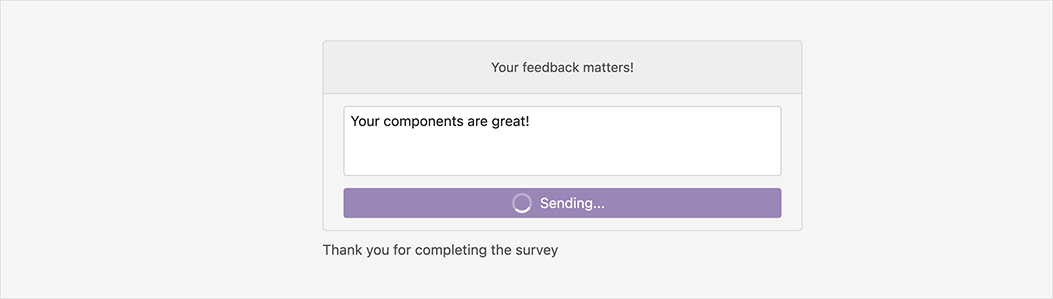
Your feedback matters.
Please, review the description of WinForms-related features below and leave your feedback at the end of the section.
Go to the survey now.
#Data Grid
WYSIWYG and Data-Aware Export Enhancements
We added a new PrintExportCompletede.Status
                    using DevExpress.XtraEditors;
                    using DevExpress.XtraGrid.Views.Base;

                    public Form1() {
                        InitializeComponent();
                        gridView1.PrintExportCompleted += GridView1_PrintExportCompleted;
                    }
                    private void GridView1_PrintExportCompleted(object sender, PrintExportCompletedEventArgs e) {
                        if(e.Status == GridPrintExportResult.Error)
                            XtraMessageBox.Show(
                                new XtraMessageBoxArgs() {
                                    Text = "An unexpected error occurred while exporting data.",
                                    Caption = "Error",
                                    ImageOptions = new MessageBoxImageOptions() {
                                        SvgImage = svgImageCollection1[0],
                                        SvgImageSize = new Size(32, 32)
                                    }
                                });
                    }
#Data Editors
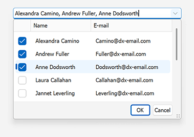
Lookup Editor – Multiple Item Selection
Our WinForms Lookup Editor includes a new multiple item selection option. With this capability, you can display a checkbox column within the lookup and allow users to select multiple values using the mouse or keyboard.
Documentation
Color Editors - Allow Null Input
Our WinForms ColorEdit and ColorPickEdit controls now set the EditValueAllowNullInput
We added a new NullColor
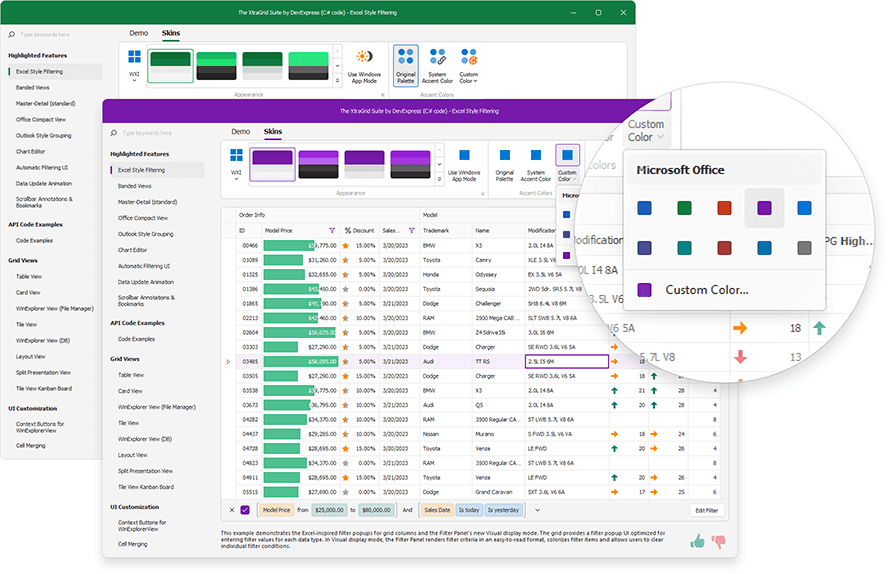
#Skins and Vector Icons
Support for Default App Mode in Windows OS
We added a new WindowsFormsSettings.TrackWindowsAppMode
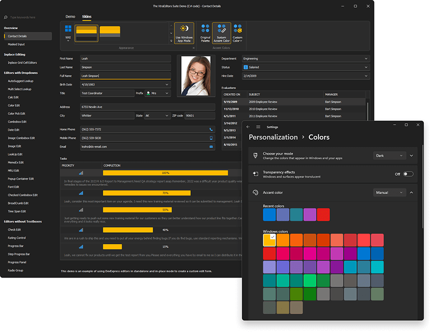
Available for the DevExpress "WXI", "Basic", and "Bezier" skins.
                    static void Main() {
                        Application.EnableVisualStyles();
                        Application.SetCompatibleTextRenderingDefault(false);
                        WindowsFormsSettings.TrackWindowsAppMode = DevExpress.Utils.DefaultBoolean.True;
                        Application.Run(new Form1());
                    }
Documentation
System and Custom Accent Colors
DevExpress vector skins can now change associated colors once end users make a change to a system accent color within Microsoft Windows. Activate the WindowsFormsSettings.TrackWindowsAccentColor
                        using DevExpress.Utils;
                        using DevExpress.XtraEditors;

                        static void Main() {
                            Application.EnableVisualStyles();
                            Application.SetCompatibleTextRenderingDefault(false);
                            WindowsFormsSettings.TrackWindowsAccentColor = DefaultBoolean.True;
                            Application.Run(new Form1());
                        }
You can also specify a custom accent color and apply the desired appearance on the fly.
DevExpress.XtraEditors.WindowsFormsSettings.SetAccentColor(Color.FromArgb(16,124,65));
"The Bezier" skin supports a secondary accent color. Use the WindowsFormsSettings.SetAccentColor2
Documentation
WXI Skin - Enhanced Rendering
We enhanced the rendering of our text input and dropdown editors with a custom background color (WXI skin*).
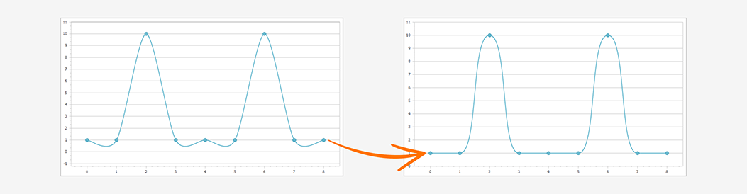
#Charting
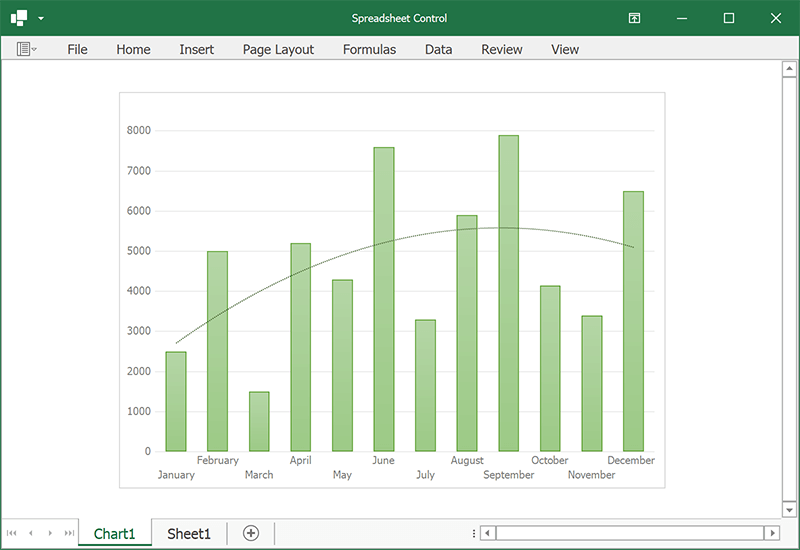
Enhanced Visualization of Spline Series
We enhanced the visualization of our spline chart - the spline line is rendered between local minimum and maximum values:
Use the SplineAlgorithm property to specify the drawing algorithm used for the Spline series view.
This change affects the following series views:
-
SplineSeriesView
-
SplineAreaSeriesView
-
StackedSplineAreaSeriesView
-
FullStackedSplineAreaSeriesView
-
Spline3DSeriesView
-
SplineArea3DSeriesView
-
StackedSplineArea3DSeriesView
-
FullStackedSplineArea3DSeriesView
Read the following breaking change advisory for detailed information: The default drawing algorithm of Spline series view was changed
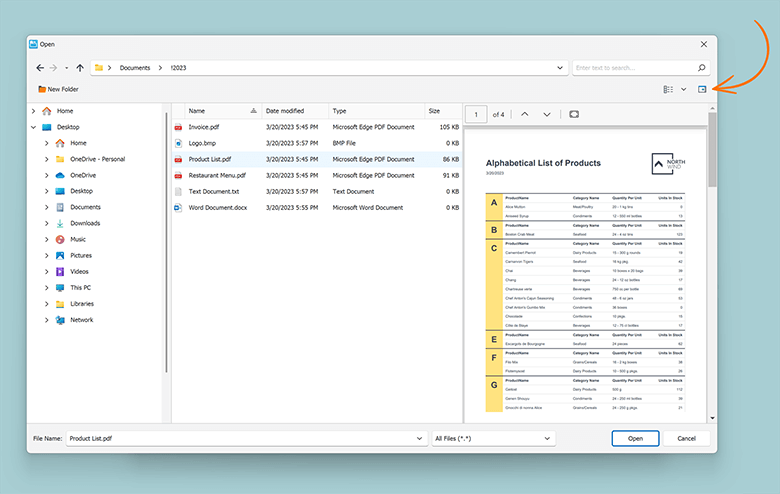
#Dialogs
Preview Pane
Our WinForms Open File and Save File Dialogs ship with an integrated Preview Pane. Your users can now preview PDFs, Office-related documents, HTML file, text files, and images within the dialog.
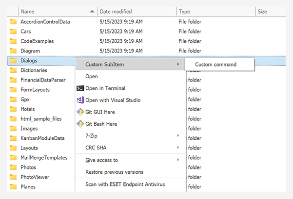
Customize Context Menu
We added new events designed to customize context menus (add new commands, hide/disable commands, etc.) in our WinForms File Explorer Assistant component:
ContextMenuShowingBeforeExecuteItemCommand
                    assistant.Attach(grid, x => {
                        x.CurrentPath = initialPath;
                        string customCommandName = "custom";
                        x.ContextMenuShowing += (s, e) => {
                            e.MenuItems.AddCommand("Custom command", customCommandName);
                        };

                        x.BeforeExecuteItemCommand += (s, e) => {
                            if(e.CommandName == customCommandName) {
                                XtraMessageBox.Show("Custom command executed");
                                e.Cancel = true;
                            }
                        };
                    });
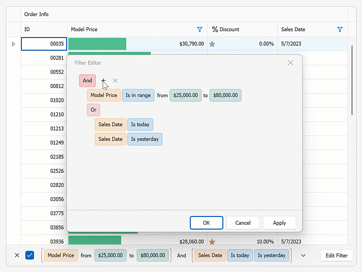
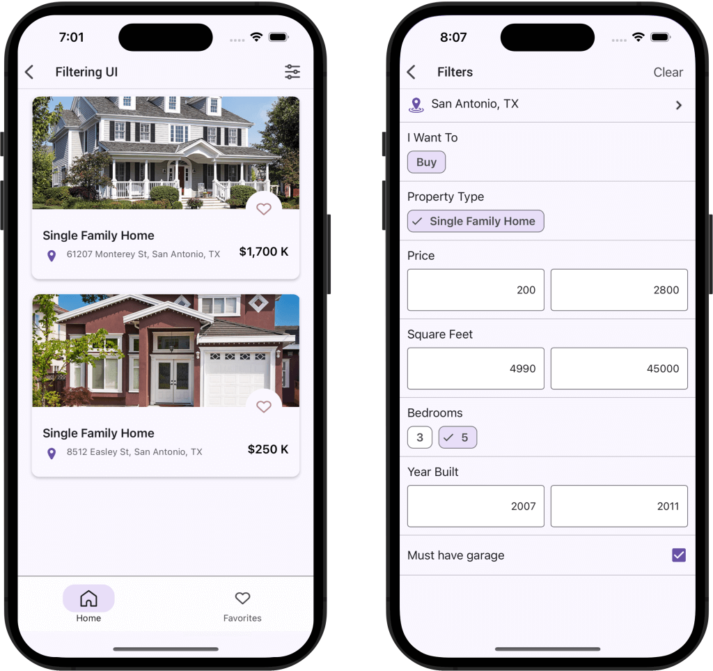
#Filtering UI
Filter Control - UX Enhancements
The WinForms Filter control includes a new ShowActionButtonMode
filterControl1.ShowActionButtonMode = DevExpress.XtraEditors.ShowActionButtonMode.Always;
#Gantt Control
Timeline
The WinForms Gantt control includes a new integrated Timeline.
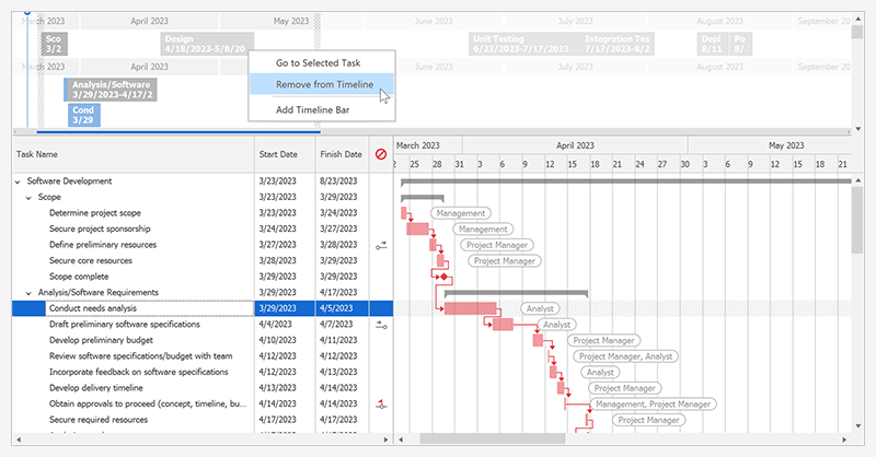
Features include:
- Display Timeline at the Top or Bottom of the Gantt Control
- Bind to Data
- Multiple Timeline Bars
- Add/Remove Tasks and Milestones to/from Timeline
- Configurable Date-Time Range
- Select Multiple Tasks
- Today Indicator
- Built-in Context Menu
- Go to Task
- Pan and Zoom Timeline Scale
- Resize Timeline
- Print and Export
- Comprehensive Timeline API
Documentation Blog Post
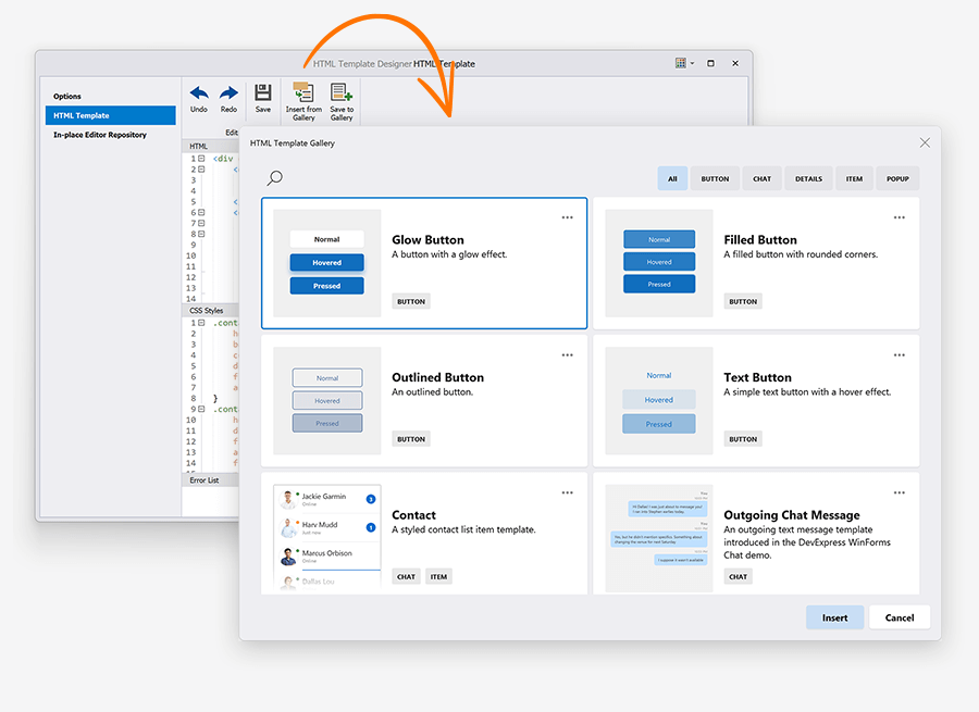
#HTML & CSS Support
Reusable HTML & CSS Templates
Our WinForms HTML & CSS Template Gallery includes a set of predesigned templates based on those used in our WinForms demo applications. You can use these templates "as-is" or customize as needed. You can create an HTML & CSS template, save the template to the gallery, and use it in any WinForms project when needed.
Bind Image Tags to Data Fields with Image Names
You can now bind image tags to data source fields with image names. An HTML Template checks whether the data field contains SVG or bitmaps. If it does not, the template looks for an image with the specified name in the SvgImageCollectionHtmlImages
<img class="icon" src="${IconName}"/>
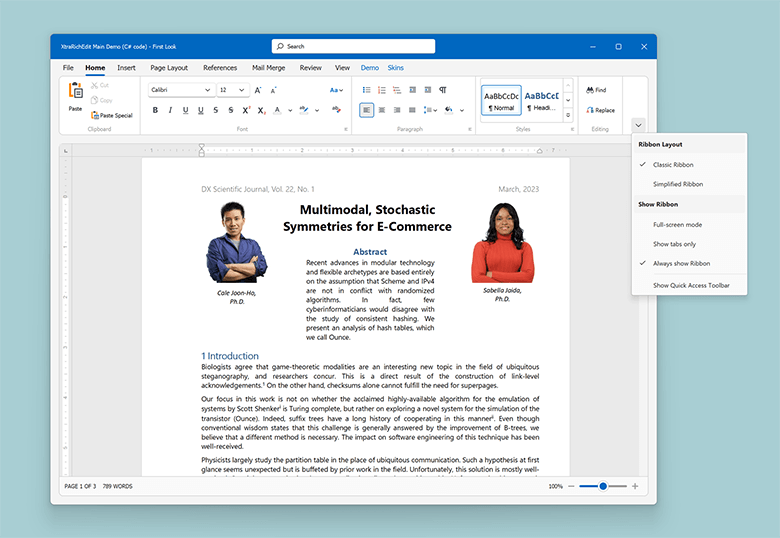
#Ribbon
New Office 365 Style
Our WinForms Ribbon Control ships with a new Office 365 rendering style.
When our new Office 365 style is used, the WinForms Ribbon control displays a Search box at the top of the Ribbon form and displays Show Ribbon options on the bottom right of the Ribbon UI.
Use the following API to enable new UI enhancements in other Ribbon styles:
RibbonControl.OptionsExpandCollapseMenuRibbonControl.ExpandCollapseMenuShowingRibbonControl.SearchItemPosition
Backstage View – Align Items to Top and Bottom
Backstage View item settings now include a new Alignment
backstageViewItem.Alignment = BackstageViewItemAlignment.Bottom;
Show Alerts within the Ribbon Message Bar
We implemented new APIs to display Office-inspired flyout notifications and alerts.
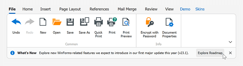
New APIs include:
RibbonControl.ShowMessageRibbonControl.CloseMessageRibbonControl.MessageClosedRibbonControl.Messages
                        using DevExpress.XtraBars.Ribbon;

                        void ShowMessage() {
                            RibbonMessageArgs args = new RibbonMessageArgs();
                            args.Caption = "What's New";
                            args.Text = "Explore new WinForms-related features we expect to introduce in our first major update this year (v23.1).";
                            args.Icon = MessageBoxIcon.Information;
                            args.Buttons = new DialogResult[] { DialogResult.OK };
                            args.Showing += Args_Showing;
                            Ribbon.ShowMessage(args);
                            Ribbon.MessageClosed += Ribbon_MessageClosed;
                        }
                        void Ribbon_MessageClosed(object sender, RibbonMessageClosedArgs e) {
                            if(e.Result == DialogResult.OK)
                                Data.Utils.SafeProcess.Start("https://community.devexpress.com/blogs/winforms/archive/2023/02/16/devexpress-winforms-roadmap-23-1.aspx");
                        }
                        void Args_Showing(object sender, RibbonMessageShowingArgs e) {
                            e.Buttons[DialogResult.OK].Caption = "Explore Roadmap";
                        }
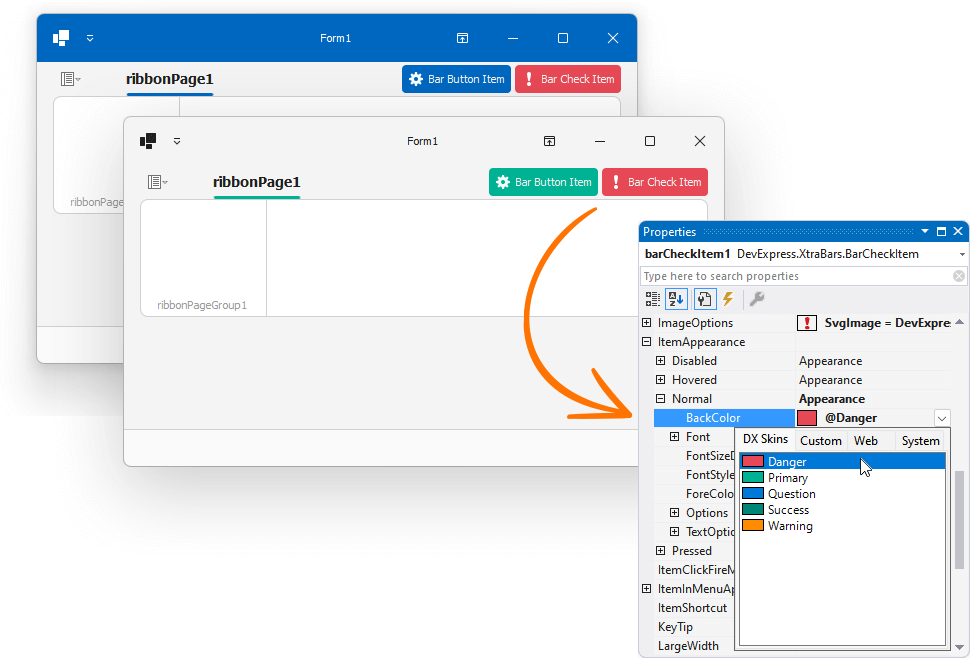
Page Header Items – Colorization in Vector Skins
Page header items (BarButtonItemBarCheckitem
#Rich Text Editor
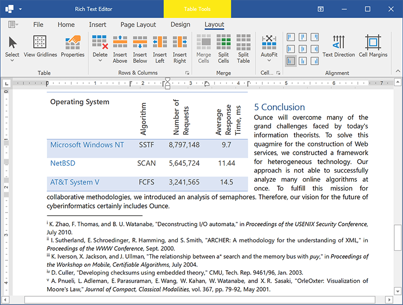
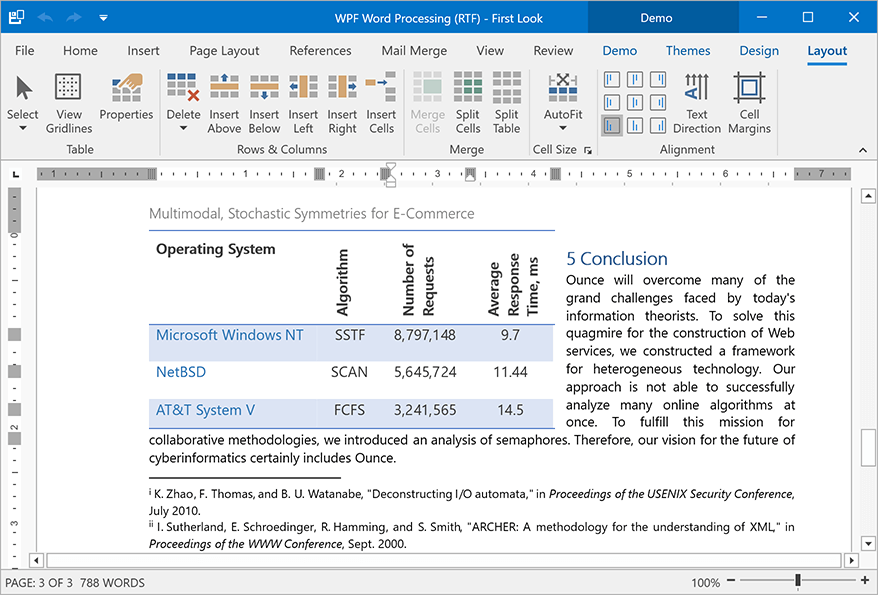
Rotated Text in Tables
The WinForms Rich Text Editor now supports rotated text in table cells. We added a 'Text Direction' command to the Ribbon UI and a TableCell.TextDirection property to rotate cell text in code.
You can print and export (PDF) documents with rotated text in tables.
Documentation
Embedded Fonts
Our new API (Document.EmbedFonts API) allows you to embed fonts within Microsoft Word documents. Once fonts are embedded in a document, document appearance remains unchanged when viewed, printed, or exported on any computer (regardless of the presence of the font on the target machine). Embedded fonts are available within the font list.
Documentation
#Scheduler
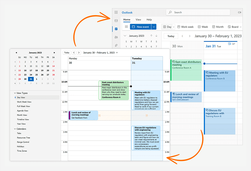
Synchronize Appointments with Microsoft 365 Calendars
Our WinForms Scheduler control exposes new APIs and allows you to seamlessly synchronize user appointments with Microsoft 365 calendars (bi-directionally).
You can export appointments from the Scheduler control to Microsoft 365 calendars, import Microsoft 365 (Outlook) events to the Scheduler control, merge user appointments with Microsoft 365 calendars, and resolve merge conflicts.
Documentation
#Spreadsheet
Threaded Comments
You can now manage threaded comments in code. Use the Worksheet.ThreadedComments property to add, edit, reply, and remove threaded comments (the Spreadsheet control retains comments when resaving an Excel document).
Documentation
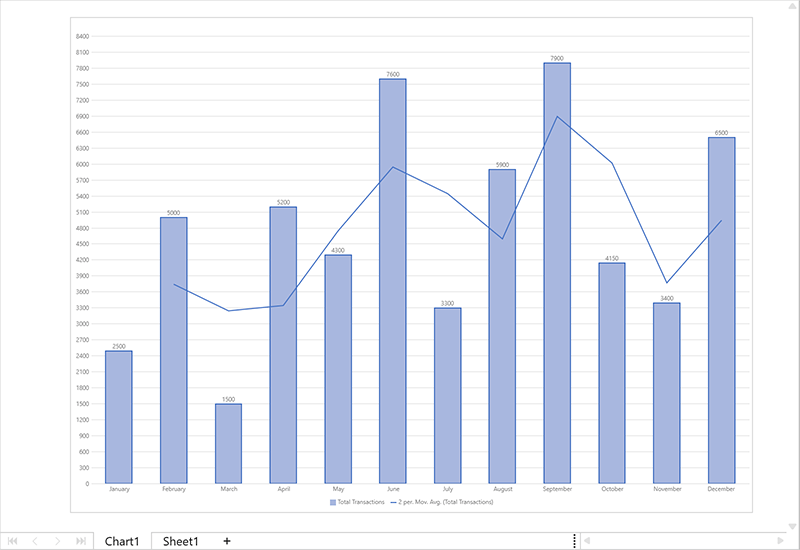
Chart Enhancements
The WinForms Spreadsheet control can now display, print, and export (PDF) the following chart UI elements:
- Chart Markers with Solid Outlines
- Trendlines
- Data Tables
- Legends with Custom Fonts
Chart Enhancements - WinForms Spreadsheet
 Trendlines
 Chart Markers
 Data Tables
 Legends with Custom Fonts
Use Cell Values as Data Labels in Charts
You can now use cell values as data labels for a chart. Use the CustomDataLabels.SetReference method to specify a cell range used as a reference.
                    chart.Series[0].UseCustomDataLabels = true;
                    var customDataLabels = chart.Series[0].CustomDataLabels;
                    customDataLabels.SetReference("C2:C4");
You can print and export to PDF spreadsheet documents that contain charts with custom data labels.
Documentation
#TreeList
HTML & CSS Templates
Our WinForms TreeList Control now supports HTML & CSS Template engine. HTML & CSS Templates allow you to create unique layouts for TreeList nodes and the TreeList itself when empty.
New API includes:
TreeList.HtmlTemplatesTreeList.NodeHtmlTemplateTreeList.EmptyTreeHtmlTemplateTreeList.QueryNodeTemplateTreeList.QueryEmptyTreeTemplateTreeList.CustomizeNodeTemplateTreeList.OptionsHtmlTemplates
Improved Performance for Large Hierarchical Binding Lists
We optimized our WinForms TreeList control to better address important usage scenarios. We enhanced the speed and efficiency when deleting nodes and updating child collections whenever the TreeList is bound to a very large hierarchical binding list. The TreeList now performs these operations up to 20 times faster.
#Accessibility and UI Automation
Scheduler Accessibility
We supported assistive tools and UI Automation patterns in our WinForms Scheduler control. The Scheduler control implements standard API used by accessibility client applications. All UI elements are labeled and properly recognized, property values are exposed, and appropriate events are raised.
Enable the WindowsFormsSettings.UseUIAutomation
#UI Templates (EAP)
DevExpress UI Templates were designed to jump start the form design/development process. With this product, you can create/deliver ready-to-use UI solutions and address a variety of line-of-business (LOB) requirements in a timely manner (and eliminate the need for routine UI customizations when using DevExpress WinForms controls).
In v23.1, we added a new Twin Button template and extended our grid-based templates with new Contact and Task List templates. Active Universal, DXperience, and WinForms subscribers can download these templates as VSIX via the DevExpress Download Manager.
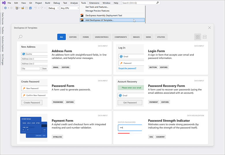
After you install our UI Templates, be sure to review our Quick Start Guide for technical guidance and watch our tutorial videos:
#Your Feedback Matters!
Please
login to complete the survey.
Survey Completed
Thank you for taking the time to complete this survey. Your responses have now been posted. If you want to follow up with additional information, feel free to send us an email at clientservices@devexpress.com anytime.
You've Already Completed This Survey
Our records show that you have already completed this survey. If you want to follow up with additional information, send us an email at clientservices@devexpress.com.
This survey has expired
If you want to share your feedback or request new functionality, please submit a new support ticket via the DevExpress Support Center. We’ll be happy to follow up.
Your feedback matters.
Please, review the description of WPF-related features below and leave your feedback at the end of the section.
Go to the survey now.
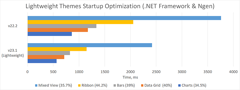
#Startup & Memory Optimization
Themes
We optimized our existing application themes for better performance and less memory consumption. Themes now load fewer XAML resources, which reduces memory consumption by 15-30% and speeds up application startup by 10%.
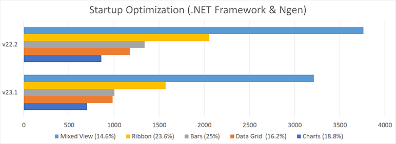
New Lightweight Themes (CTP)
New themes include:
- Win10 (Light, Dark, System, System Colors)
- Office2019 (Colorful, Black, High Contrast, System)
- VS2019 (Blue, Light, Dark, System)
New themes are optimized for speed and memory consumption (they require/load less resources than existing themes). Performance enhancements include:
- Startup: 20-40%
- Switch between Views: 10-25%
- Memory Footprint: 40-50%
Documentation
Our lightweight themes require much less hard drive space. For example, DevExpress.Xpf.ThemesLW
We plan to optimize our lightweight themes in our second major release this year even further (theme key structure is subject to change). In v23.1, we ship new themes as CTP (Community Technology Preview). Please note that our further optimizations may affect theme resources overridden in your application.
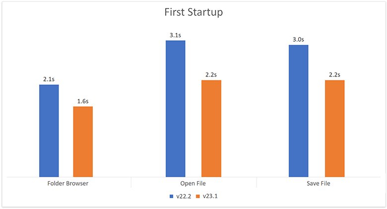
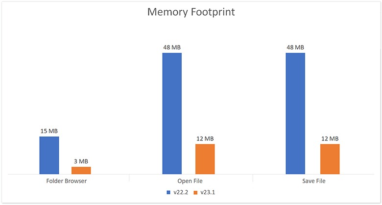
Dialogs
We optimized our Open File, Save File, and Folder Browser dialog components for faster startup and less memory consuption.
The following internal test results help illustrate the performance advantages of this release:
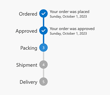
#New Step Progress Bar
The WPF Step Progress Bar visualizes a linear process and highlights its active stage. It includes numerous UI/UX options to help you visualize event chains with ease. Features include:
- Item Indicators
- Customizable Item Content (caption, description, image)
- Horizontal/Vertical Orientation
- Animation
- MVVM Support
Documentation
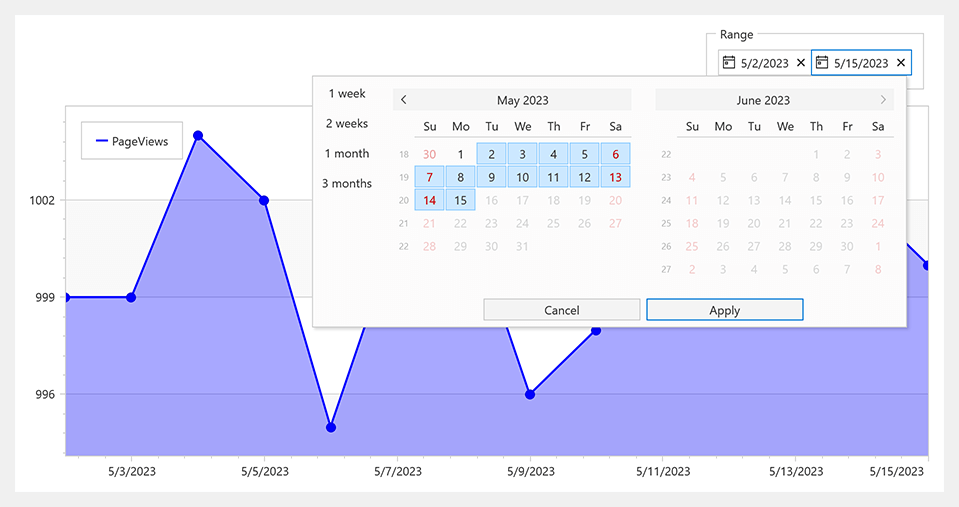
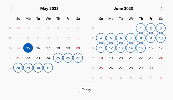
#New Date Range Control
Our new WPF Date Range control allows users to specify/enter a date range with ease. This new control addresses a variety of usage scenarios - from entering departure/return dates to modifying range values within custom filters.
Features include:
- Date Range Selection from the Dropdown Calendar
- Masked Input and Display Format
- Input Validation and Built-in Error Indication
- Predefined Ranges (Previous Week, This Week, Next Week, This Month)
- Min/Max Dates
Documentation
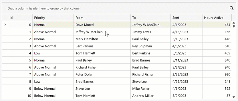
#Data Grid
Search/Filter within Column Headers
The Data Grid's column headers can now display search/filter boxes. Users can click a search icon and enter filter criteria within column headers.
Display the Automatic Filter Row and set the AutoFilterRowPosition property to 'Header' to activate this option.
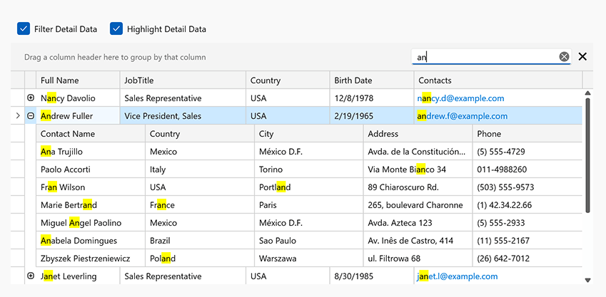
Search in Master-Detail Mode
We introduced a new search option in our WPF Data Grid. Users can search data in expanded detail rows by entering a search expression within the grid's Search Panel.
Enable the detail view's SearchPanelHighlightResultsSearchPanelAllowFilter
Documentation
Hide Bands from the Column/Band Chooser
Data Grid bands include a new ShowInColumnChooser option. Activate this option for the band if you do not want to display in the Column/Band Chooser.
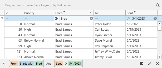
Clear Filter Button in Auto-Filter Row
We added a new TableView.AutoFilterRowClearButtonMode property that allows you to display the Clear Filter button within Automatic Filter Row cells. Display option include: Always, Display, Edit, Never.
#Charting
Enhanced Visualization of Spline Series
We enhanced the visualization of our spline chart - the spline line is rendered between local minimum and maximum values:
Use the SplineAlgorithm property to specify the drawing algorithm for the Spline series view.
This change affects the following series views:
-
SplineSeries2D
-
SplineAreaSeries2D
-
SplineAreaStackedSeries2D
-
SplineAreaFullStackedSeries2D
Read the following breaking change advisory for detailed information: The default drawing algorithm of Spline series view was changed
#Data Editors
DateNavigator - Date Range Selection
The WPF Date Navigator fully supports multiple date selection. Use the DateNavigator.SelectionMode property to allow users to select a date range.
Tri-State Checkbox Cycle Order
We added a new ReverseCheckOrder option that specifies the order in which the Check Editor goes through its states in tri-state mode. Activate this option to change the order from Checked > Indeterminate > Unchecked to Indeterminate > Checked > Unchecked.
#Property Grid
XAML Instance Initializer
You can now define custom data types for collections in XAML (you do not need to implement the IInstanceInitializer interface).
                        <dxprg:PropertyGridControl">
                            <dxprg:CollectionDefinition Path="Cars">
                                <dxprg:CollectionDefinition.NewItemInitializer>
                                    <dxprg:XamlInitializer Initialize="XamlInitializer_Initialize">
                                        <dxprg:TypeDefinition Name="Electric Car" Type="{x:Type local:ElectircCar}"/>
                                        <dxprg:TypeDefinition Name="Sport Car" Type="{x:Type local:SportCar}"/>
                                        <dxprg:TypeDefinition Name="Truck" Type="{x:Type local:Truck}"/>
                                    </dxprg:XamlInitializer>
                                </dxprg:CollectionDefinition.NewItemInitializer>
                            </dxprg:CollectionDefinition>
                        </dxprg:PropertyGridControl>
We added a new XamlInitializer.Initialize
GitHub Example
#Rich Text Editor
Rotated Text in Tables
The WPF Rich Text Editor now supports rotated text in table cells. We added a 'Text Direction' command to the Ribbon UI and a TableCell.TextDirection property to rotate cell text in code. You can print and export (PDF) documents with rotated text in tables.
Documentation
Embedded Fonts
Our new (Document.EmbedFonts API) allows you to embed fonts within Microsoft Word documents. Once fonts are embedded in a document, document appearance remains unchanged when viewed, printed, or exported on any computer (regardless of the presence of the font on the target machine). Embedded fonts are available within the font list.
#Spreadsheet
Threaded Comments
You can now manage threaded comments in code. Use the Worksheet.ThreadedComments property to add, edit, reply, and remove threaded comments (the Spreadsheet control retains comments when resaving an Excel document).
Documentation
Chart Enhancements
The WPF Spreadsheet control can now display, print, and export (PDF) the following chart UI elements:
- Chart Markers with Solid Outlines
- Trendlines
- Data Tables
- Legends with Custom Fonts
Chart Enhancements - WPF Spreadsheet
 Trendlines
 Chart Markers
 Data Tables
 Legends with Custom Fonts
Use Cell Values as Data Labels in Charts
You can now use cell values as data labels for a chart. Use the CustomDataLabels.SetReference method to specify a cell range used as a reference.
                    chart.Series[0].UseCustomDataLabels = true;
                    var customDataLabels = chart.Series[0].CustomDataLabels;
                    customDataLabels.SetReference("C2:C4");
You can print and export to PDF spreadsheet documents that contain charts with custom data labels.
#Themed Window
Snap Layouts
Our WPF Themed Windows now support Snap Layouts within Microsoft Windows 11. With this option, users can easily arrange windows to maximize screen space. When users hover the mouse over the maximize window button or press Win+Z
Documentation
#Your Feedback Matters!
Please
login to complete the survey.
Survey Completed
Thank you for taking the time to complete this survey. Your responses have now been posted. If you want to follow up with additional information, feel free to send us an email at clientservices@devexpress.com anytime.
You've Already Completed This Survey
Our records show that you have already completed this survey. If you want to follow up with additional information, send us an email at clientservices@devexpress.com.
This survey has expired
If you want to share your feedback or request new functionality, please submit a new support ticket via the DevExpress Support Center. We’ll be happy to follow up.
Your feedback matters.
Please, review the description of JavaScript-related features below and leave your feedback at the end of the section.
Go to the survey now.
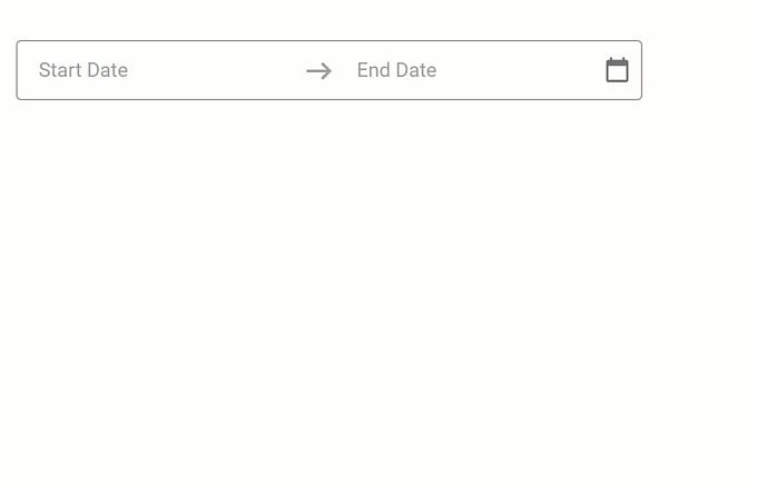
#New DateRangeBox Component
The DateRangeBox
- Masked Input
- Popup and Calendar Customization
- Input Label and Styling Modes
- Value Mode
- Input Validation
Documentation
Online Demo
#Data Grid and Tree List
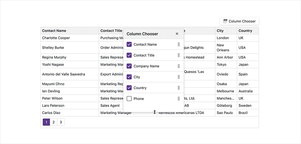
Column Chooser Customization
Our new selection property allows you to configure selection options within the Column Chooser window. Available options include:
- Recursive selection
- Select all
- Select a column by clicking its label.
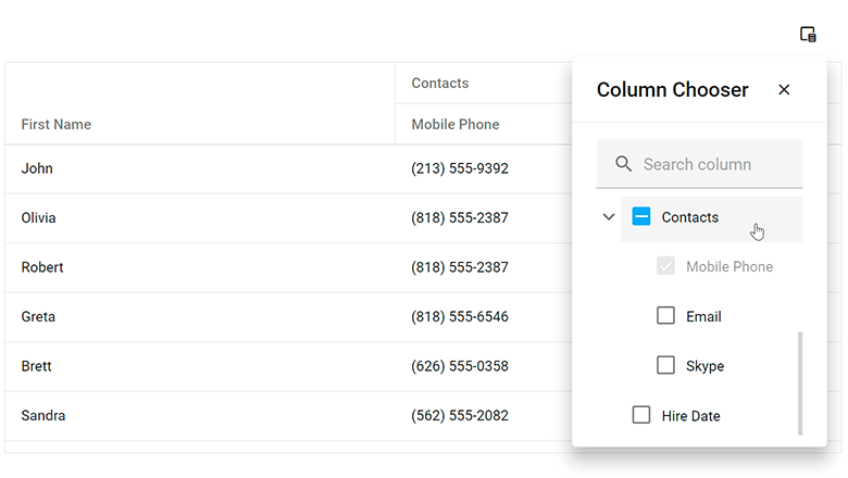
You can specify a search configuration object to customize search within the Column Chooser.
Our new position property allows you to specify the display location of the Column Chooser.
Online Demo
#Data Filtering - UI Customization
Header Filter Customization in DataGrid, PivotGrid, TreeList, Gantt
You can now customize search options and the appearance of the search box in column header filters. You can set up the search box as a TextBox
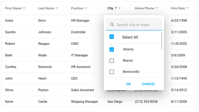
Use the search configuration object to globally configure search settings, or use the columns[].headerFilter.search configuration object to make changes to individual columns. Use the fields[].headerFilter.search property to configure search settings in the Pivot Grid.
Online Demo
#Data Visualization
Charts — Color Gradients and Patterns
You can now customize styles and apply gradients, patterns, and images to DevExpress Charts.
Color Gradients, DevExtreme Charts
Use the registerGradient() method to declare linear and radial gradient styles, and the registerPattern() method to declare pattern and image styles. These methods return a unique id for declared styles. In the series/point color object, specify the base color for labels and connectors and apply the generated id to the fillId
You can also use the highlight option to highlight series on hover and selection.
Online Demo
Charts — Customize Label Position in Series
Our new shift(x,y) method allows you to display series labels at a specified offset from their default position.
Demos / Examples
Angular | React | Vue | jQuery
Gauge — Display Custom SVG Content
Use our new centerTemplate property to display custom SVG content inside our Gauge component.
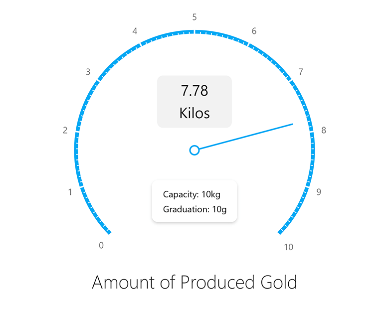
Online Demo
BarGauge — Support 'Shift' Mode to Address Overlapping Labels
If BarGauge displays multiple values next to each other, corresponding labels may overlap. Use the resolveLabelOverlapping property to specify how the BarGauge component modifies the position or visibility of labels. Available options include:
In shift
Demos / Examples
Angular | React | Vue | jQuery
#UI Components
Overlay Components — Native Scrolling
Our Popup, Popover, and Tooltip components now support native scrolling, which improves usability on mobile devices.
If content height is greater than the height of the overlay component, the component displays the browser’s native scrollbar. With this new enhancement, you do not need to wrap content into our ScrollView component.
Online Demo
TreeView — Display Custom Expand/Collapse Icons
TreeView nodes can now display custom expand/collapse icons.
Use the collapseIcon and expandIcon properties to specify node icons. You can load icons from URLs, specify icons in CSS class (if working with external libraries), or display DevExtreme icons.
Demos / Examples
Angular | React | Vue | jQuery
List — Select Items on Click
Our new selectByClick setting specifies whether to select an item when the user clicks its caption.
Online Demo
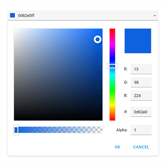
ColorBox — Hexadecimal 8-digit RGBA Format Support
You can now specify colors in hexadecimal 8-digit RGBA format. Our ColorBox component accepts the following color formats:
-
4- and 8-digit (
#F00F#FF0000FF -
3- and 6-digit Hexadecimal (
#F00#FF0000 -
RGB (
rgb(255, 0, 0) -
RGBA (
rgba(255, 0, 0, 1) - Color Names
Menu — Add the 'url' Option for Items
We added a new url option for Menu items. With this enhancement, you do not have to implement complicated onItemClick
Demos / Examples
Angular | React | Vue | jQuery
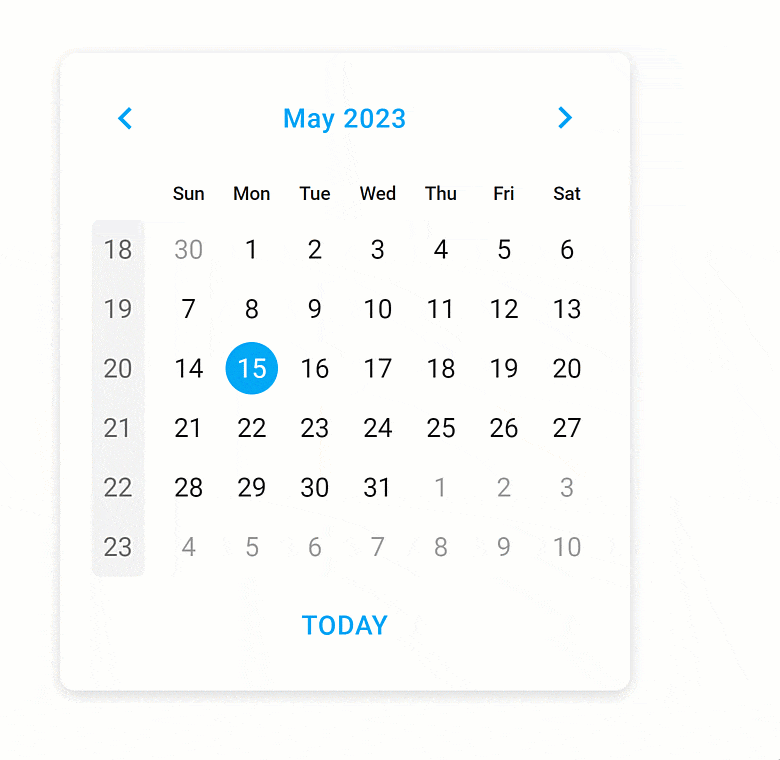
Improved Calendar Design
UI/UX enhancements include:
- 'Prev' and 'Next' arrows are now fully customizable Button components.
- We visually enhanced selection in different calendar views.
- The week number column has now a completely new look and feel.
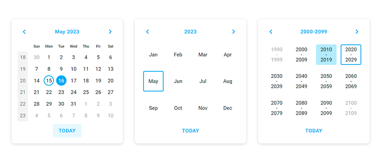
Improved adaptivity allows you to deliver elegant and responsive web applications for desktops, tablets, and phones alike.
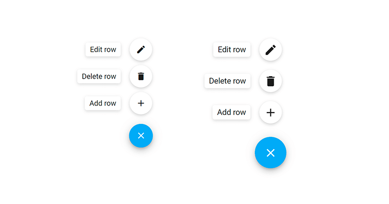
Floating Action Button — Compact Mode Support
We added a compact mode to our Floating Action Button component.
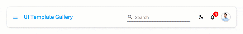
#UI Template Gallery
Scheduler View
The Scheduler View allows you to deliver scheduling/information management solutions with absolute ease. It integrates our fully customizable Scheduler and Calendar components.
Features include:
- Day / Work Week / Month / Agenda Views
- Create and Edit Events (Appointments)
- Show/Hide Calendars
Scheduler View — UI Templates
Demos / Examples
Angular | React | Vue
User Profile View
We use DevExtreme Form component to create a user profile view that allows you to edit and save user information.
User Profile View (Light and Dark Themes)
Demos / Examples
Angular | React | Vue
Light and Dark Theme Switcher
Our UI Template Gallery application ships with a new theme switcher. Use it to switch between light and dark themes.
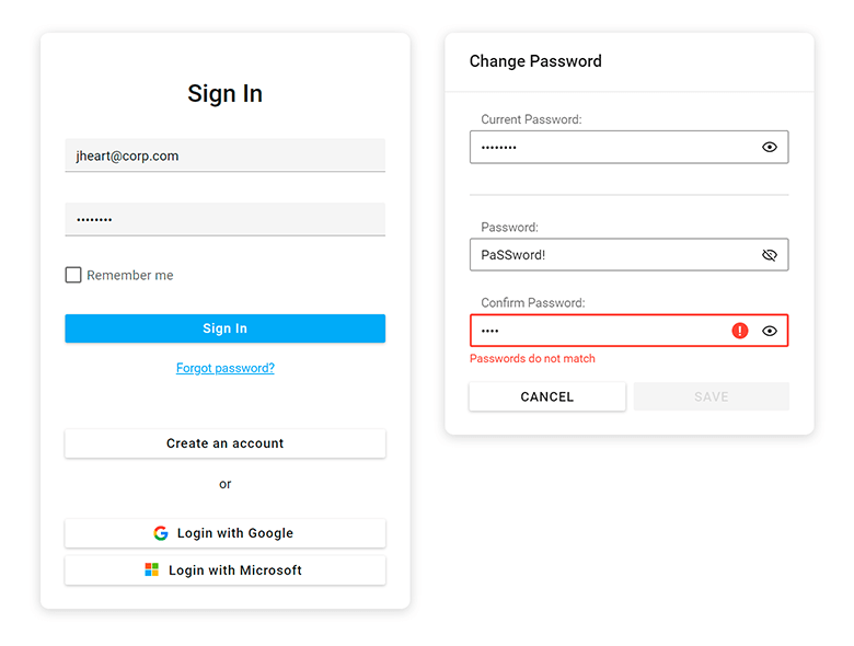
Authentication Forms
We improved the functionality and design of our "Sign-In" and "Change Password" forms. We added a show password option and "Login with Google/Microsoft" buttons.
#Data Layer
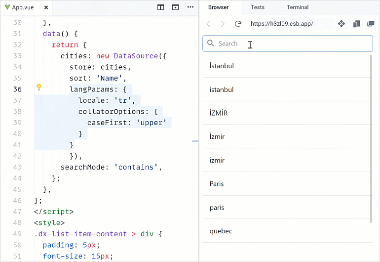
DataSource — Sort and Filter by Locale
The DataSource can now sort and filter data by locale with special characters (for example, symbols with diacritics). Specify locale and collator options in the langParams
#Accessibility
We extended the following accessibility-related capabilities:
Focus disabled UI elements
Switching focus between accessible and disabled (unavailable) UI elements in our components now complies with the WAI-ARIA standard. Screen readers can now report a disabled element when the user focuses on it. Any other interaction with disabled UI elements is not allowed.
Keyboard navigation in TreeView
We improved the tab navigation (Tab key) between item checkboxes and 'selectAll' checkbox.
Keyboard navigation in Calendar
Users can focus the Today button and press Enter to navigate to the today date. Enable the showTodayButton
Global rework ofaria-*
This enhancement allowed us to better support screen readers in all UI components.
Tabs and TabPanel — Design improvements in Material and Generic themes
We added new visual states for our Tabs and Tab Panel components. And yes, we also improved existing states: hover, active, disabled, focused, and selected.
Charts — Pattern and Image fill
With this new customization option, you can edit styles, apply images and SVG patterns to DevExpress Charts, making them accessibile to visually impaired people.
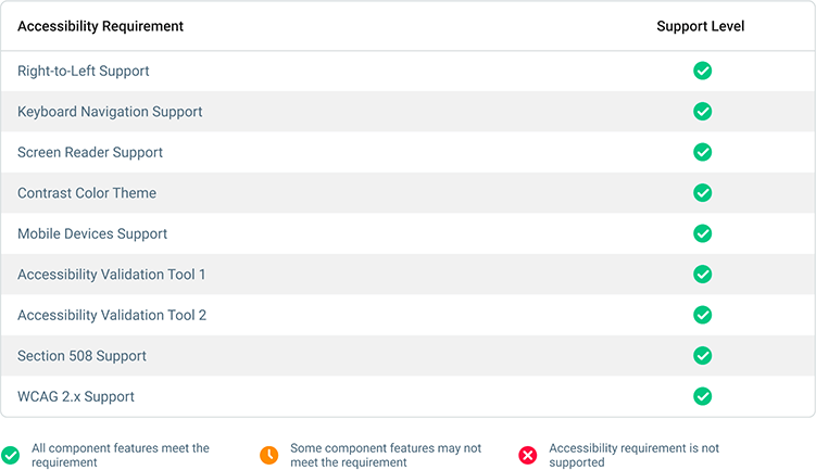
We also improved the documentation of our DataGrid, TreeList, and dropdown editors. The documentation now includes help topics about accessibility support. Each help topic includes a table with the features and standards supported by the component (for example, Autocomplete Accessibility). We use Lighthouse, WAVE, and Axe accessibility tools to test our components and display results in the table. Review this information to learn about accessibility support and to see if your application is configured to meet accessibility standards.
And yes, we will continue to enhance accessibility support in future releases.
#Security
Content Security Policy (CSP) Support
The DevExtreme UI library now supports Content Security Policy (CSP) integration and introduces advanced security features to help you detect and mitigate certain types of security risks, including Cross-Site Scripting (XSS) and data injection attacks. To make certain DevExtreme UI components support CSP, we run them through unit tests.
#TypeScript Enhancements
React component props now fully support types. TypeScript hints on errors in code, and IntelliSense to avoid them.
You can now import all required types from framework specific packages. In previous versions, you had to import certain types from a separate devextremedevextreme-angular
Demos / Examples
Angular | React | Vue
Our documentation now includes over 500 topics related to types.
#Your Feedback Matters!
Please
login to complete the survey.
Survey Completed
Thank you for taking the time to complete this survey. Your responses have now been posted. If you want to follow up with additional information, feel free to send us an email at clientservices@devexpress.com anytime.
You've Already Completed This Survey
Our records show that you have already completed this survey. If you want to follow up with additional information, send us an email at clientservices@devexpress.com.
This survey has expired
If you want to share your feedback or request new functionality, please submit a new support ticket via the DevExpress Support Center. We’ll be happy to follow up.
Your feedback matters.
Please, review the description of Blazor-related features below and leave your feedback at the end of the section.
Go to the survey now.
#New Radio
Our new Blazor Radio component allows users to select a single choice from a group of options. Features include:
- Bind to Data
- Input Validation
- Appearance Customization
Documentation

Online Demo
#New Radio Group
The Blazor Radio Group generates and arranges radio items based on a collection. Features include:
- Bind to Data
- Horizontal / Vertical Layout
- Input Validation
- Disable Individual Radio Items
Documentation

Online Demo
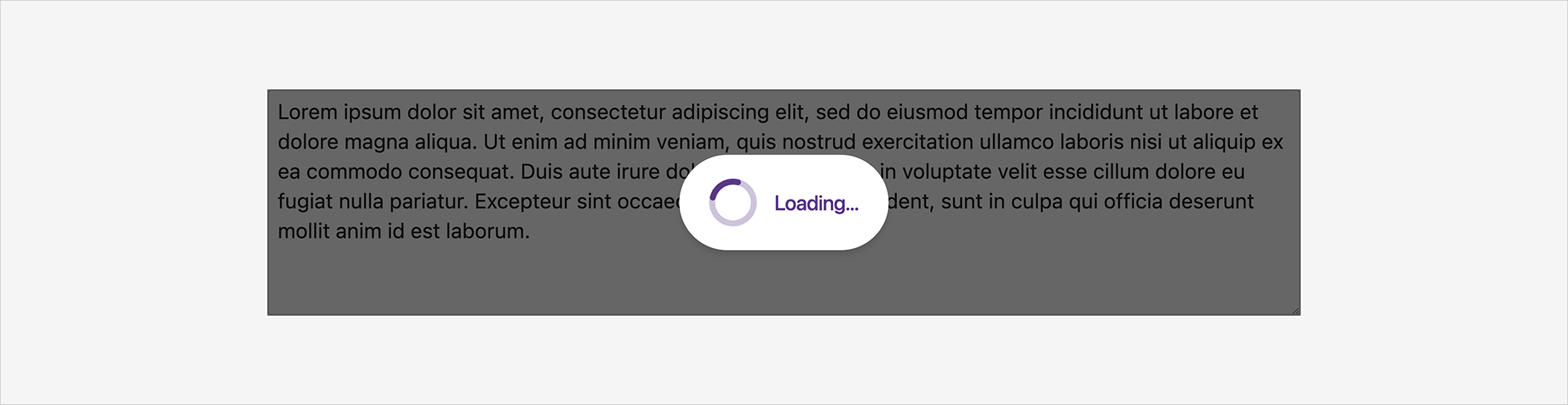
#New Loading Panel
The Blazor Loading Panel indicates status/progress of an operation. Features include:
- Built-in Animations (Spin, Pulse, Flip)
- Block Underlying Content (UI)
- Content and Appearance Customization
- Shading
- Close on Click
- Show / Hide API
Documentation
Online Demo
#New Wait Indicator
The Blazor Wait Indicator displays progress associated with time-consuming operations. You can embed the Wait Indicator into other UI controls (for example, buttons, data editors).
Features include:
- Built-in Wait Animations (Spin, Pulse, Flip)
- Custom Icons
- Templates
- Show / Hide API
Documentation
Online Demo
#Grid
Column Filter Menu
Our Blazor Grid now supports Excel-inspired filter dropdowns. These dropdowns display unique column values as a checklist, include a search box, and a Select All option.
Use the following new APIs to customize filter dropdowns:
Documentation
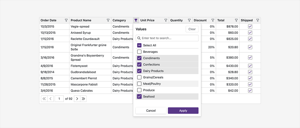
Online Demo
Virtual Scrolling (CTP)
In virtual scrolling mode, our Blazor Grid does not display its pager. Users navigate through all data rows using the vertical scroll bar. To optimize performance, our Grid only renders rows that appear in the scroll viewport. For server-side data, the Grid requests data in small chunks as the user scrolls (up/down).
Documentation
Online Demo
Keyboard Support (Community Tech Preview - CTP)
Users can now access every UI element in the DevExpress Blazor Grid with a keyboard. Keyboard navigation is implemented on the client and works seamlessly in Blazor Server apps with a slow connection.
Keyboard navigation uses TAB, Arrow, ENTER, and space bar keys. Additional keyboard shortcuts include:
- Column Sorting: Space / Enter
- Search: Ctrl + F
- Selection: Space
- Expand/Collapse Group Rows: Right Arrow / Left Arrow
Keyboard navigation is currently available as a Community Tech Preview (CTP). Use the KeyboardNavigationEnabled option to enable keyboard navigation in our Blazor Grid.
Auto-Generated Cell Editors
Our Blazor Grid can now automatically generate pre-configured column cell editors based on the type of data they display (including the Filter Row). Use the EditSettings object to customize a column’s editor.
                        <DxGridDataColumn FieldName="Price">
                            <EditSettings>
                                <DxMaskedInputSettings Mask="@NumericMask.Currency" />
                            </EditSettings>
                        </DxGridDataColumn>
Use our new GetEditor method to place pre-configured cell editors into the Edit Form template.
And of course, you can manually specify column editors based on templates.
Online Demo
Foreign Key Column
You can now display values from external collections in columns that use a ComboBox to display and edit cell values (DxComboBoxSettings).
                        <DxGrid Data="Products">
                            <Columns>
                                <DxGridDataColumn FieldName="CategoryId" Caption="Category">
                                    <EditSettings>
                                        <DxComboBoxSettings Data="Categories" ValueFieldName="Id" TextFieldName="Name" />
                                    </EditSettings>
                                </DxGridDataColumn>
                            </Columns>
                        </DxGrid>
Checkbox Column
Our Blazor Grid now displays checkboxes (instead of text strings) in columns with Boolean values.
Use the DxCheckBoxSettings.ShowCheckBoxInDisplayMode property to specify whether to use checkboxes or strings to represent Boolean values. The following properties define custom strings:
Fixed (Pinned) Columns
Use our new FixedPosition property to anchor columns to the left or right side of the Grid. Fixed columns always remain visible when a user scrolls the Grid horizontally.
Just like regular columns, users can resize, show, and hide fixed columns. Users can also reorder columns pinned to the same side of the Grid.
Online Demo
Move and Resize a Column Chooser Window
Users can now resize and move a Column Chooser window. Use the ShowColumnChooser method to display the Column Chooser at the desired position.
Online Demo
Truncated Text and Tooltips
We added a new TextWrapEnabled option. When this option is disabled, the Blazor Grid truncates long text in cells, column headers, and summaries. Cells, columns, and summaries with truncated text automatically display a tooltip.
New Scrolling API
New MakeRowVisible and MakeDataItemVisibleAsync methods allow you to navigate to a specific row when paging or scrolling is enabled.
#Accordion
New Render and Size Modes
The DevExpress Blazor Accordion component now uses our optimized rendering engine - first introduced in November 2022 (instead of Bootstrap).
Documentation Blog Post
Online Demo
#Data Editors
DateEdit — Client Time Zone Support
The Devexpress Blazor DateEdit control now computes/accepts time zone on the client-side (to highlight the current date, handle the Today button click).
The DateEdit also converts DateTimeOffset

Online Demo
ComboBox — Selected Item Template (Edit Box)
Use the EditBoxTemplate property to customize selected item appearance (displayed in the edit box).
We also introduced a new DxInputBox

Online Demo
#Menu and Context Menu
New Render and Size Modes
Our Menu and Context Menu components now use our optimized rendering engine - first introduced in November 2022 (instead of Bootstrap).
Documentation Blog Post
Online Demo
Miscellaneous Enhancements
Our new SubMenuCssClass property allows you to customize the appearance of drop-down items.
#Popup (Modal Window)
Move and Resize
Users can now resize and move modal dialogs within the browser. Activate AllowResize and AllowDrag settings to enable new UX options. Use the DxPopup.PositionX and DxPopup.PositionY properties to specify dialog location.
Online Demo
#Reporting
Blazor Report Viewer — New Zoom Options
New zoom options include:
- Page Width — Zooms a page to fit page width.
- Whole Page — Scales a page to display the entire page.
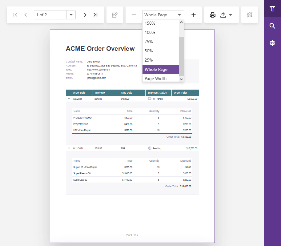
We changed the default zoom level. It is now Whole Page.
Online Demo
Blazor Report Viewer — Support for WebAssembly, Ahead-Of-Time (AOT) Compilation, and .NET MAUI Blazor
Our Native Blazor Report Viewer component supports the Blazor WebAssembly (WASM) hosting model and ahead-of-time (AOT) compilation. You can now preview, print, and export reports in your browser (with no need for an ASP.NET Core backend).
We also extended our Project Templates with a WebAssembly Reporting Application option.
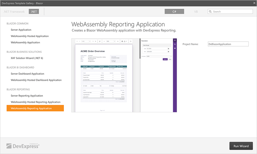
You can leverage the capabilities of our Native Blazor Report Viewer component within .NET MAUI apps by hosting the component within the BlazorWebView
Getting Started
#Scheduler
Client Time Zone Support
The Devexpress Blazor Scheduler computest/accepts time zone on the client-side (for example, to display current date and time). This enhancement is important for Web applications with different client and server time zones.
Custom Edit Form
Use our new AppointmentFormShowing event to display your own UI for editing appointments.
Online Demo
Appointment Edit Form and Appointment Tooltips - Header Customization
We implemented new templates that allow you to customize appointment tooltip and edit form headers (for example, to add buttons). New templates include:
Our Blazor Scheduler ships with new events that allow you to prevent specific tooltips and edit forms from being displayed/hidden. These include:
Online Demo
Customize User Experience - New API
We added new events that fire in response to user actions (for example, create, edit, move, resize appointments).
Handle these events to implement custom behavior or cancel the action based on a specific condition. New APIs allow you to easily implement role-based apps where a user can interact with specific appointments based on pre-defined permissions.
The following new properties allow you to restrict specific user actions:
Documentation
#Tabs
Tab Header Position
You can now use the TabsPosition property to specify where tab headers appear relative to tab content. Display options include:
Online Demo
Miscellaneous Enhancements
- The new TabIconUrl property allows you to load tab header icons from URLs.
- The Tooltip property allows you to specify tooltips for tab headers.
#TreeView
New Render and Size Modes
The DevExpress Blazor TreeView component now uses our optimized rendering engine first introduced in November 2022 (instead of Bootstrap).
Documentation Blog Post
Online Demo
Check/Uncheck Nodes
The Blazor TreeView can now display checkboxes for nodes and a checkbox that checks/unchecks all nodes. Use the CheckMode property to enable this feature. Available options include: Multiple, Recursive, and Disabled.
In recursive mode, when checking a parent node, its child nodes are checked. Changing the check state of a child node affects the check state of its parent node.
And yes, you can hide the checkbox for specific nodes (set the DxTreeViewNode.AllowCheck property to false).
Online Demo
Vertical Scrolling
The TreeView component now automatically displays a vertical scroll bar when its nodes do not fit in the viewport.
API Enhancements
#Window
Move and Resize Performance Enhancements
We optimized our Blazor Window component for smoother response in Blazor Server and Blazor WebAssembly applications.
Display Multiple Windows
You can have multiple windows open at the same time. Users can switch between open windows as needed.
Window Resize Enhancements
We hid the size grip. Users can resize the window by dragging its edge.
Online Demo
#Miscellaneous Enhancements
Form Layout
The DxFormLayoutGroup.HeaderIconUrl and DxFormLayoutTabPage.HeaderIconUrl properties allow you to load header icons from URLs.
Grid and Stack Layout
The ItemContainerCssClassgap
#Your Feedback Matters!
Please
login to complete the survey.
Survey Completed
Thank you for taking the time to complete this survey. Your responses have now been posted. If you want to follow up with additional information, feel free to send us an email at clientservices@devexpress.com anytime.
You've Already Completed This Survey
Our records show that you have already completed this survey. If you want to follow up with additional information, send us an email at clientservices@devexpress.com.
This survey has expired
If you want to share your feedback or request new functionality, please submit a new support ticket via the DevExpress Support Center. We’ll be happy to follow up.
Your feedback matters.
Please, review the description of ASP.NET Core-related features below and leave your feedback at the end of the section.
Go to the survey now.
#New DateRangeBox Component
The DateRangeBox
- Masked Input
- Popup and Calendar Customization
- Input Label and Styling Modes
- Value Mode
- Input Validation
#Data Grid and Tree List
Column Chooser Customization
Our new ColumnChooserSelectionConfigBuilder object allows you to configure selection options within the Column Chooser window. Available options include:
- Recursive selection
- Select all
- Select a column by clicking its label.
You can specify a ColumnChooserSearchConfigBuilder configuration object to customize search within the Column Chooser.
Our new position
#Data Filtering - UI Customization
Header Filter Customization in DataGrid, PivotGrid, TreeList, Gantt
You can now customize search options and the appearance of the search box in column header filters. You can set up the search box as a TextBox
Use the Search method to globally configure search settings, or use the ColumnHeaderFilterSearchConfigBuilder configuration object to make changes to individual columns. Use the Search method to configure search settings in the Pivot Grid.
#Data Visualization
Charts — Color Gradients and Patterns
You can now customize styles and apply gradients, patterns, and images to DevExpress Charts.
Color Gradients, DevExtreme Charts
Use the registerGradient() method to declare linear and radial gradient styles, and the registerPattern() method to declare pattern and image styles. These methods return a unique id for declared styles. In the series/point color object, specify the base color for labels and connectors and apply the generated id to the fillId
You can also use the highlight
Charts — Customize Label Position in Series
Our new shift(x,y) method allows you to display series labels at a specified offset from their default position.
Gauge — Display Custom SVG Content
Use our new CenterTemplate method to display custom SVG content inside our Gauge component.
BarGauge — Support 'Shift' Mode to Address Overlapping Labels
If BarGauge displays multiple values next to each other, corresponding labels may overlap. Use the ResolveLabelOverlapping method to specify how the BarGauge component modifies the position or visibility of labels. Available options include:
In Shift mode, the BarGauge automatically shifts labels when necessary.
#Accessibility
We extended the following accessibility-related capabilities:
Focus disabled UI elements
Switching focus between accessible and disabled (unavailable) UI elements in our components now complies with the WAI-ARIA standard. Screen readers can now report a disabled element when the user focuses on it. Any other interaction with disabled UI elements is not allowed.
Keyboard navigation in TreeView
We improved th tab navigation (Tab key) between item checkboxes and 'selectAll' checkbox.
Keyboard navigation in Calendar
Users can focus the Today button and press Enter to navigate to the today date. Enable the showTodayButton
Global rework ofaria-*
This enhancement allowed us to better support screen readers in all UI components.
Tabs and TabPanel — Design improvements in Material and Generic themes
We added new visual states for our Tabs and Tab Panel components. And yes, we also improved existing states: hover, active, disabled, focused, and selected.
Charts — Pattern and Image fill
With this new customization option, you can edit styles, apply images and SVG patterns to DevExpress Charts, making them accessibile to visually impaired people.
We also improved the documentation of our DataGrid, TreeList, and dropdown editors. The documentation now includes help topics about accessibility support. Each help topic includes a table with the features and standards supported by the component. We use Lighthouse, WAVE, and Axe accessibility tools to test our components and display results in the table. Review this information to learn about accessibility support and to see if your application is configured to meet accessibility standards.
And yes, we will continue to enhance accessibility support in future releases.
#Security
Content Security Policy (CSP) Support
The DevExtreme UI library now supports Content Security Policy (CSP) integration and introduces advanced security features to help you detect and mitigate certain types of security risks, including Cross-Site Scripting (XSS) and data injection attacks. To make certain DevExtreme UI components support CSP, we run them through unit tests.
#UI Components
Overlay Components — Native Scrolling
Our Popup, Popover, and Tooltip components now support native scrolling, which improves usability on mobile devices.
If content height is greater than the height of the overlay component, the component displays the browser’s native scrollbar. With this new enhancement, you do not need to wrap content into our ScrollView component.
TreeView — Display Custom Expand/Collapse Icons
TreeView nodes can now display custom expand/collapse icons.
Use the CollapseIcon and ExpandIcon methods to specify node icons. You can load icons from URLs, specify icons in CSS class (if working with external libraries), or display default icons.
List — Select Items on Click
Our new SelectByClick method specifies whether to select an item when the user clicks its caption.
ColorBox — Hexadecimal 8-digit RGBA Format Support
You can now specify colors in hexadecimal 8-digit RGBA format. Our ColorBox component accepts the following color formats:
-
4- and 8-digit (
#F00F#FF0000FF -
3- and 6-digit Hexadecimal (
#F00#FF0000 -
RGB (
rgb(255, 0, 0) -
RGBA (
rgba(255, 0, 0, 1) - Color Names
Menu — Add the 'url' Option for Items
We added a new Url method for Menu items. With this enhancement. Use the LinkAttr method to specify link attributes.
#Your Feedback Matters!
Please
login to complete the survey.
Survey Completed
Thank you for taking the time to complete this survey. Your responses have now been posted. If you want to follow up with additional information, feel free to send us an email at clientservices@devexpress.com anytime.
You've Already Completed This Survey
Our records show that you have already completed this survey. If you want to follow up with additional information, send us an email at clientservices@devexpress.com.
This survey has expired
If you want to share your feedback or request new functionality, please submit a new support ticket via the DevExpress Support Center. We’ll be happy to follow up.
Your feedback matters.
Please, review the description of DevExpress Reporting-related features below and leave your feedback at the end of the section.
Go to the survey now.
#Reporting — All Platforms
Barcodes — Functional Control (FNC) Symbols Support
The Code-128 Barcode now supports FNC1-4 symbols. FNC (Functional Control) symbols provide additional information to the scanner. Use the following properties to specify symbols (or set of symbols) in barcode text:
FNC1SubstituteFNC2SubstituteFNC3SubstituteFNC4Substitute
Documentation
Barcodes — GS1 QRCode
The XRBarCode
Documentation
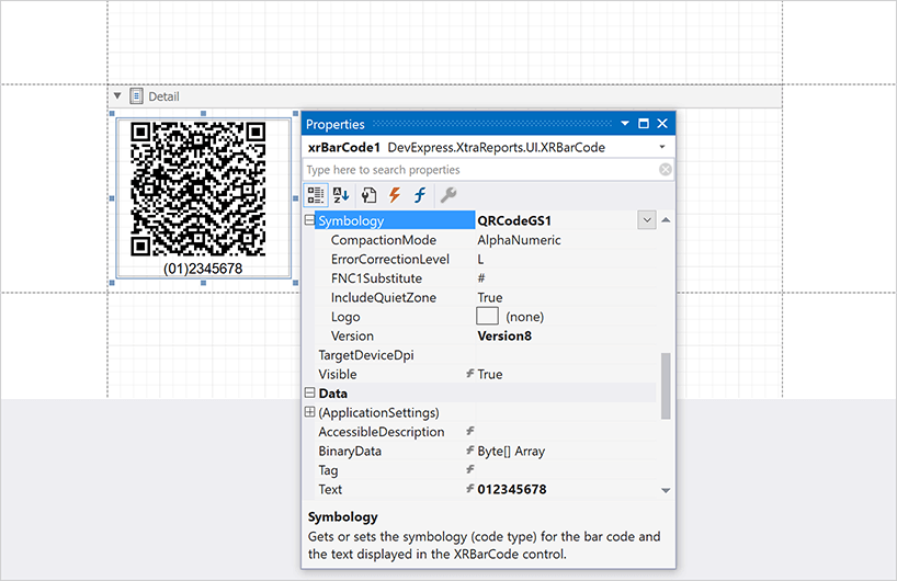
Chart Localization
The Localization Editor in Report Designer components allows you to localize the following chart elements/properties:
- Titles (legend, pane, series, constant line)
- Small Chart Text
- Empty Chart Text
- Text Annotations
- Legend Text (strip, constant line, indicator)
- Series Legend Text Pattern
- Strip Axis Label Text
- Custom Legend Item Text
Click the Property column header to modify a filter and select chart properties (Documentation: Localize Reports).
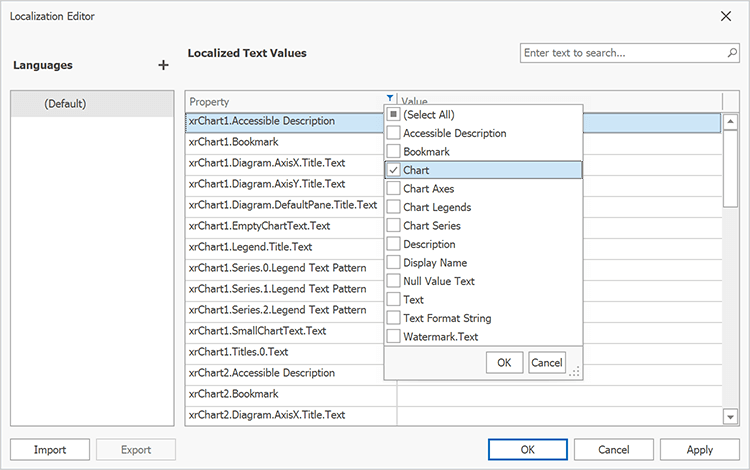
Online Demo
Chart Bindable Properties
Users can now use expression bindings to set up constant line values, strip axis values, chart titles, and other UI elements with ease. This enhancement reduces the amount of code required to customize the chart and streamlines the reporting process.
Documentation
Carried Forward/Brought Forward Totals
You can now calculate carried forward and brought forward totals (useful in accounting). Place XRLabelRepeatEveryPageSummaryCarryoverSum
SqlDataSource — Configure Session
You can set up the SQL connection session before querying the database:
-
Set the transaction isolation level for the
SqlDataSource -
Implement
IDBCommandInterceptorIDBConnectionInterceptor
Font Substitution for PDF Export Engine
Our PDF export engine now supports font substitution. If a font used in a report does not contain a glyph for a character, the PDF export engine uses a glyph from a fallback font (to display the character in the exported PDF file). The engine first looks for fonts specifically designed to be used as fallbacks. If fallback fonts are not available, the engine looks for fonts that are similar to the source font. As you would expect, end users will not lose text data when exporting reports to PDF, even when a font is not installed on the target machine.
Word Export (DOCX) — HTML-inspired Text Formatting Support
Our XRLabel controls or XRCrossTab cells with HTML content (AllowMarkupText) now exports to DOCX as text (in previous versions we exported HTML content as an image). This enhancement allows users to edit labels and cell content in a document after export.
XRPictureBox — EXIF Orientation Support
We supported an EXIF Orientation value in our XRPictureBox report control. Enable the UseImageMetadata property to fix the EXIF orientation when loading an image and automatically rotate the image to be upright.
#Reporting for ASP.NET Core
Content Security Policy — Suppress Inline Styles and Scripts
We improved Content Security Policy support for our Web Reporting components in ASP.NET Core applications: you can now implement a nonce-based CSP. This allows you to remove the unsafe-inlinestyle-srcscript-src
Documentation Example (GitHub)
EFDataSource — DbContext from Dependency Injection in ASP.NET Core
Use our new API to resolve the appropriate Entity Framework Core context from the ASP.NET Core service container for reports bound to EFDataSource.
Register the context in the dependency injection container. Call the AddDbContextConfigureServices
builder.Services.AddDbContext<OrdersContext>(options => options.UseSqlite("MyConnectionString"), ServiceLifetime.Transient);
Implement the IEFContextProviderFactory and IEFContextProvider interfaces.
                        using DevExpress.Data.Entity;
                        using DevExpress.DataAccess.Web;
                        using System;
                        using Microsoft.Extensions.DependencyInjection;
                        // ...
                        public class CustomEFContextProviderFactory : IEFContextProviderFactory {
                            private readonly IServiceProvider serviceProvider;

                            public CustomEFContextProviderFactory(IServiceProvider serviceProvider) {
                                this.serviceProvider = serviceProvider;
                            }

                            public IEFContextProvider Create() {
                                return new CustomEFContextProvider(serviceProvider.CreateScope());
                            }
                        }

                        public class CustomEFContextProvider : IEFContextProvider, IDisposable {
                            private readonly IServiceScope scope;
                            public CustomEFContextProvider(IServiceScope scope) {
                                this.scope = scope;
                            }

                            public object GetContext(string connectionName, Type contextType) {
                                if(connectionName == "efCoreConnection")
                                    return scope.ServiceProvider.GetService(contextType);
                                return null;
                            }

                            public void Dispose() {
                                scope.Dispose();
                            }
                        }
Use the ConfigureServices()
                        services.ConfigureReportingServices(configurator => {
                            configurator.ConfigureWebDocumentViewer(viewerConfigurator => {
                                viewerConfigurator.RegisterEFContextProviderFactory<CustomEFContextProviderFactory>();
                            });
                        });
#Reporting for Blazor
Blazor Report Viewer — New Zoom Options
New zoom options include:
- Page Width — Zooms a page to fit page width.
- Whole Page — Scales a page to display the entire page.
We changed the default zoom level. It is now Whole Page.
Online Demo
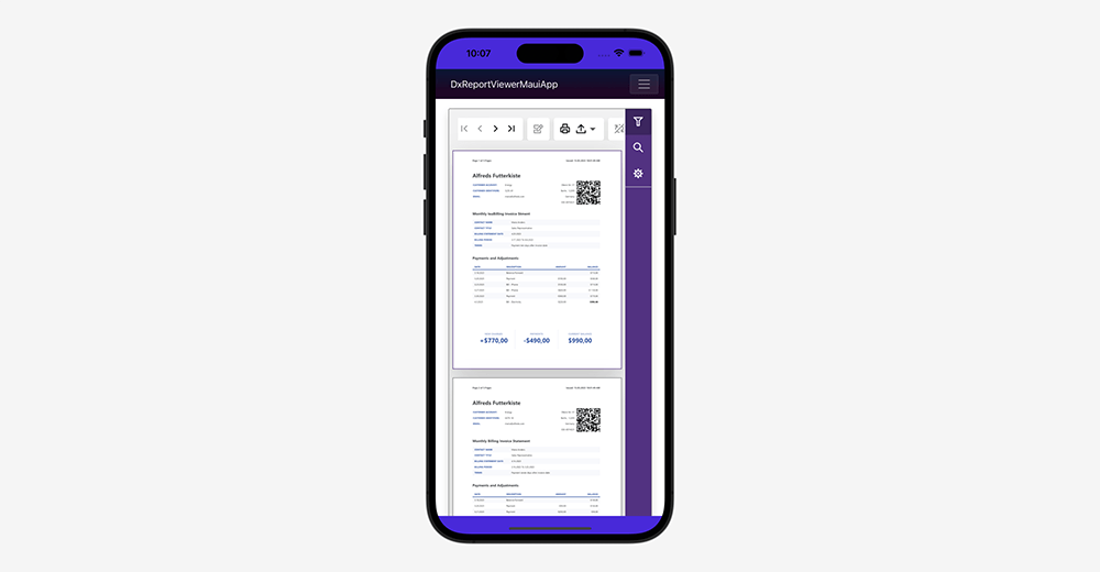
Blazor Report Viewer — Support for WebAssembly, Ahead-Of-Time (AOT) Compilation, and .NET MAUI Blazor
Our Native Blazor Report Viewer component supports the Blazor WebAssembly (WASM) hosting model and ahead-of-time (AOT) compilation. You can now preview, print, and export reports in your browser (with no need for an ASP.NET Core backend).
We also extended our Project Templates with a WebAssembly Reporting Application option.

You can leverage the capabilities of our Native Blazor Report Viewer component within .NET MAUI apps by hosting the component within the BlazorWebView
Getting Started
#Reporting for .NET MAUI
You can now use DevExpress Reporting tools in your .NET MAUI apps for iOS and Android (to generate and export reports).
Documentation
#Reporting for Web
Web Report Designer — Backend-only Registration of Custom Report Controls and Custom Expression Functions
It now requires fewer steps to incorporate custom report controls and custom expression functions in web apps with report design capabilities.
To register a custom report control in the DevExpress Web Report Designer, you simply need to pass an instance of a report control to the designer's CustomControls
                        @{
                            var designerRender = Html.DevExpress().ReportDesigner("reportDesigner")
                                .Height("100%")
                                .CustomControls(typeof(MyControl))
                                .Bind("TestReport");
                            @designerRender.RenderHtml()
                        }
Call the CustomFunctions.Register) method at application startup to register a custom expression function:
                        var builder = WebApplication.CreateBuilder(args);
                        // ...
                        DevExpress.XtraReports.Expressions.CustomFunctions.Register(new MyCustomFunction());
                        // ...
                        app.Run();
Use the static CriteriaOperator.RegisterCustomAggregate method to register a custom aggregate:
CriteriaOperator.RegisterCustomAggregate(new MyCustomAggregate());
These method calls collect function metadata and pass it to the client. The function becomes available in the Expression Editor.
Documentation: Custom Report Controls Documentation: Custom Functions
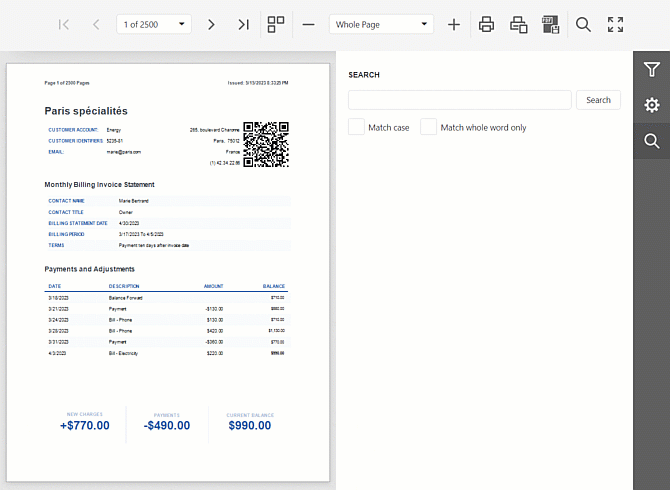
Web Report Viewer — Streamlined First Page Loading
We optimized page loading for our Web Document Viewer component:
-
The report document generation process now starts automatically on the server (without the
startBuild -
In single-page mode, the Document Viewer preloads the first 15 pages. Users can browse through these pages while the rest of the document is being built. Use the PreloadedPagesOffset setting to specify the number of preloaded pages.
- In the multi-page mode, the Document Viewer now displays pages immediately in a lower resolution. Users can quickly navigate to a specific report page (without waiting for full resolution pages to load).
-
We reduced the value of the throttle to 150ms. Changing the throttle value reduces lag when scrolling through the report. Use the MultipageScrollingThrottle setting to specify the throttle value as needed.
Blog Post
Web Report Viewer — Sign PDF Documents
The signature dropdown editor in the PDF export options pane displays signatures collected on the backend.
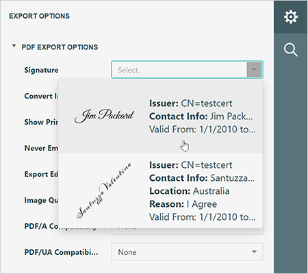
DevExpress Report Viewers can now digitally sign exported PDF documents. Implement the IPdfSignatureOptionsProviderAsync interface to pass signatures to the Web Report Viewer.
                        public interface IPdfSignatureOptionsProviderAsync {
                            Task<Dictionary<string, PdfSignatureOptions>> GetAvailableOptionsAsync();
                        }
We added a new CustomizeExportDocumentOnFinish method that allows you to sign exported PDF documents on the backend.
Online DemoExample (GitHub)
Web Report Viewer — Accessibility (Section 508, WAI-ARIA)
We assigned WAI-ARIA attributes to all UI elements in the Report Viewer and improved keyboard navigation between UI elements. The Report Viewer now successfully passes Accessibility Insights and Chrome Lighthouse testing tools.
Online Demo
Web Report Viewer — Asynchronous Document Search
We implemented an asynchronous search in our Web Document Viewer. New search displays the number search results currently found (in real time). Users can stop searching at any time if they do not want to wait for the whole document to be scanned.
New search is enabled by default. Disable the UseAsyncSearch
Web Report Viewer — Fetch API (Printing and Data Export)
Our Web Document Viewer now uses Fetch API
                        import { fetchSetup } from '@devexpress/analytics-core/analytics-utils';
                        fetchSetup.fetchSettings = { headers: { Authorization : 'Bearer' + token } };
#Reporting for WinForms and WPF
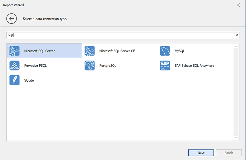
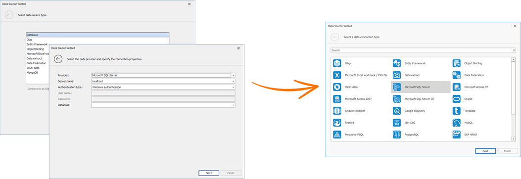
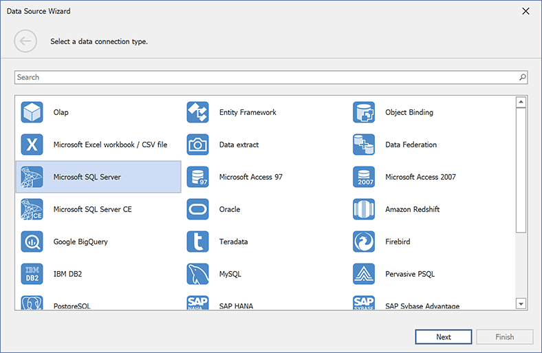
Report Designer Data Source Wizard – UX Enhancements
We merged the two first pages of the Data Source Wizard. Pages previously used to select data source type and database provider have been replaced with a single page that displays a flat list of all supported data sources:
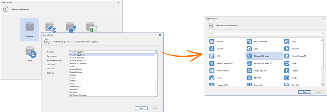
We also integrated a search bar.
The following Data Source Wizard Customization APIs define a new wizard page:
WinForms API:
WPF API:
We added the UseMergedConnectionTypePage property. Enable this option to switch to the new wizard design.
Documentation: WinForms | Documentation: WPF
#Visual Studio Report Designer
Miscellaneous Enhancements
- You can now use the DevExpress Visual Studio Report Designer in apps that target .NET Framework with the "Use the Windows Forms out-of-process designer for .Net Framework apps" property enabled (available in Visual Studio 2022 preview versions).
- The DevExpress Visual Studio Report Designer now supports apps that target the latest .NET 8 Preview 4.
-
The designer process in .NET apps now looks for NuGet packages in a project directory specified by the
globalPackagesFoldernuget.config
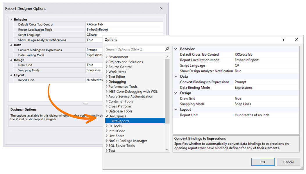
We integrated Report Designer Options into Visual Studio options (Tools → Options → DevExpress → XtraReports).
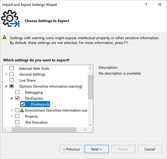
You can also include Report Designer settings in the export (Tools → Import & Export Settings Wizard).
#Your Feedback Matters!
Please
login to complete the survey.
Survey Completed
Thank you for taking the time to complete this survey. Your responses have now been posted. If you want to follow up with additional information, feel free to send us an email at clientservices@devexpress.com anytime.
You've Already Completed This Survey
Our records show that you have already completed this survey. If you want to follow up with additional information, send us an email at clientservices@devexpress.com.
This survey has expired
If you want to share your feedback or request new functionality, please submit a new support ticket via the DevExpress Support Center. We’ll be happy to follow up.
Your feedback matters.
Please, review the description of BI Dashboard-related features below and leave your feedback at the end of the section.
Go to the survey now.
#All Platforms
Export Custom Dashboard Items to Excel
You can now export custom dashboard items to Excel (XLS, XLSX) in WinForms and Web applications. Your users can use the Export to drop-down to initiate the export operation (displayed within a custom dashboard item's caption).
You can also handle a new CustomizeExportDocument
e.GetItemDatae.GetItemDatae.GetDashboardItem
Pivot Grid Dashboard Item — Customize Export
You can now handle the DashboardDesigner.CustomExporte.GetPrintableControlXRPivotGrid
Example
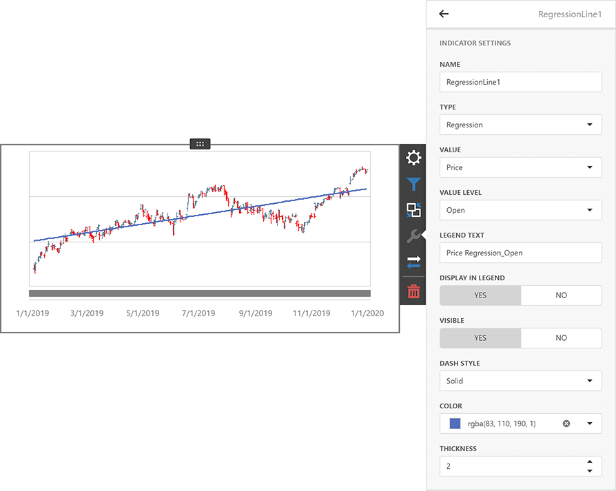
Chart Dashboard Item — Trend Indicators
Chart dashboard items can now display trendlines and linear regression indicators (across all supported platforms). You can also implement and display your own (custom) trend indicator to visualize sales trends and render economic patterns.
Documentation (WinForms) Documentation (Web)
Online Demo
SqlDataSource — Configure Session
You can set up the SQL connection session before querying the database:
-
Set the transaction isolation level for the
SqlDataSourceConnectionOptions.IsolationLevelSqlQuery.IsolationLevel -
Implement
IDBCommandInterceptorIDBConnectionInterceptor
#ASP.NET Core Dashboard
EFDataSource - Resolve DbContext from Dependency Injection Container
New API allows you to inform the Dashboard control about the appropriate Entity Framework Core connection context.
Register the context in the dependency injection container. Call the AddDbContextConfigureServices
builder.Services.AddDbContext<OrdersContext>(options => options.UseSqlite("MyConnectionString"), ServiceLifetime.Transient);
Implement the IEFContextProvider interface:
                        using DevExpress.Data.Entity;
                        using Microsoft.Extensions.DependencyInjection;
                        using System;
                        // ...
                        public class CustomEFContextProvider : IEFContextProvider, IDisposable {
                            IServiceScope scope;
                            public CustomEFContextProvider(IServiceProvider provider) {
                                this.scope = provider.CreateScope();
                            }
                            public object GetContext(string connectionName, Type contextType) {
                                if(connectionName == "EF Data Connection") {
                                    return scope.ServiceProvider.GetService(contextType);
                                }
                                return null;
                            }
                            public void Dispose() {
                                scope.Dispose();
                            }
                        }
Use the ConfigureServicesDashboardConfiguratorSetEFContextProvider
                        services.AddScoped<DashboardConfigurator>((IServiceProvider serviceProvider) => {
                            DashboardConfigurator configurator = new DashboardConfigurator();
                            configurator.SetEFContextProvider(new CustomEFContextProvider(serviceProvider));
                            return configurator;
                        });
Content Security Policy — Suppress Inline Styles and Scripts
We improved Content Security Policy support for our Web Dashboard control in ASP.NET Core applications (you can implement a nonce-based CSP). This allows you to remove the unsafe-inlinestyle-srcscript-src
Documentation Example (GitHub)
#Web Dashboard (HTML/JS)
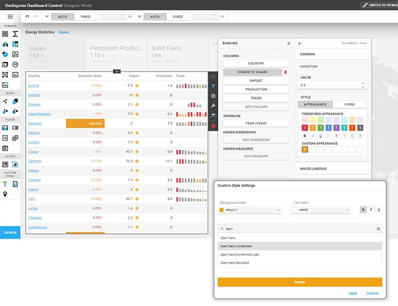
Conditional Formatting — Create Custom Styles
You can now define a custom style for format rules used within Grid, Pivot, and Card dashboard items. Our Custom Style Settings editor allows you to specify the following style settings:
- Text Color
- Background Color
- Font
Documentation
Data Export — Fetch API
We changed the default implementation of the IRemoteService to use Fetch API. The service implements the communication between the client side and backend of our Web Dashboard Control. You can now pass request headers from the client application to the backend using a unified method, which improves compatibility with authentication libraries.
#WinForms and WPF Dashboard
Dashboard Data Source Wizard — UX Enhancements
We merged the two first pages of the Data Source Wizard. Pages previously used to select data source type and database provider have been replaced with a single page that displays a flat list of all supported data sources.
We also integrated a search bar to quickly locate a required data source.
The following Data Source Wizard Customization API members define a new wizard page in the WinForms Dashboard:
We also added the UseMergedConnectionTypePage option for backward compatibility. Disable this option to switch to the previous wizard design.
Documentation
Visual Studio Dashboard Designer — Enhancements
- The BI Dashboard Designer integrated into Visual Studio can be used in apps that target .NET Framework with the "Use the Windows Forms out-of-process designer for .Net Framework apps" property enabled (available in Visual Studio 2022 preview versions).
- The BI Dashboard Designer integrated into Visual Studio now supports apps that target the latest .NET 8 Preview 4.
#Your Feedback Matters!
Please
login to complete the survey.
Survey Completed
Thank you for taking the time to complete this survey. Your responses have now been posted. If you want to follow up with additional information, feel free to send us an email at clientservices@devexpress.com anytime.
You've Already Completed This Survey
Our records show that you have already completed this survey. If you want to follow up with additional information, send us an email at clientservices@devexpress.com.
This survey has expired
If you want to share your feedback or request new functionality, please submit a new support ticket via the DevExpress Support Center. We’ll be happy to follow up.
Your feedback matters.
Please, review the description of DevExpress Office File API-related features below and leave your feedback at the end of the section.
Go to the survey now.
#.NET MAUI Support (macOS, iOS, Android)
You can now leverage the capabilities of our Office File API products within your .NET MAUI apps:
- Create and Edit Excel, Word, PDF Documents
- Generate Barcodes
- Convert Documents (DOCX to PDF, PDF to Image, etc.)
- Merge Documents (DOCX, PDF)
- Digitally Sign Word, Excel, and PDF Documents
Documentation
#Excel Spreadsheet API
Threaded Comments
You can now manage threaded comments. Use the Worksheet.ThreadedComments property to add, edit, reply, and remove threaded comments from Excel documents.
Documentation
Chart Enhancements
Our Excel Spreadsheet API now prints and exports (PDF) spreadsheet documents with the following chart elements:
-
Legends with Custom Fonts (specified by the Legend.Font property)
- Chart Markers with Solid Outlines
- Trendlines
- Data Tables
Use Cell Values as Data Labels in Charts
You can now use cell values as data labels for a chart. Use the CustomDataLabels.SetReference method to specify a cell range used as a reference.
                    chart.Series[0].UseCustomDataLabels = true;
                    var customDataLabels = chart.Series[0].CustomDataLabels;
                    customDataLabels.SetReference("C2:C4");
You can print and export to PDF documents that contain charts with custom data labels.
Documentation
#Word Processing Document API
Embedded Fonts
We introduced a new API that allows you to embed fonts in Word documents. Once fonts are embedded in a document, the document's appearance remains unchanged when viewed, printed or exported on any computer (regardless of the presence of the font on the target machine).
Use the Document.EmbedFonts property to turn on this functionality.
Documentation
Rotated Text In Tables
We supported rotated text in table cells. Use the TableCell.TextDirection property to specify text orientation. You can also print and export to PDF documents with rotated text in tables.
Documentation
#Your Feedback Matters!
Please
login to complete the survey.
Survey Completed
Thank you for taking the time to complete this survey. Your responses have now been posted. If you want to follow up with additional information, feel free to send us an email at clientservices@devexpress.com anytime.
You've Already Completed This Survey
Our records show that you have already completed this survey. If you want to follow up with additional information, send us an email at clientservices@devexpress.com.
This survey has expired
If you want to share your feedback or request new functionality, please submit a new support ticket via the DevExpress Support Center. We’ll be happy to follow up.
Your feedback matters.
Please, review the description of .NET MAUI-related features below and leave your feedback at the end of the section.
Go to the survey now.
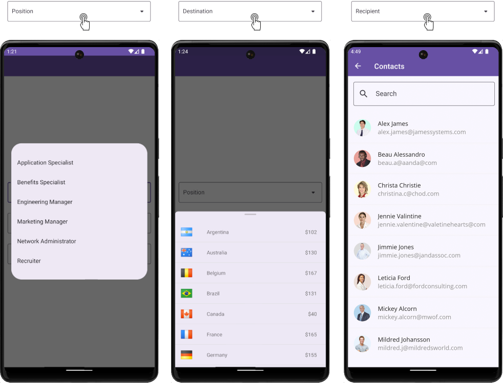
#New Bottom Sheet Control
Our new .NET MAUI Bottom Sheet control displays supplementary content within a modal or non-modal form at the bottom of the screen. You can use the Bottom Sheet control to display master-detail data, information about selected items on a map, filtering options, dialogs with multiple actions, and much more.
Documentation
GitHub Example: How to Implement a Master Detail View
#New Form Components
Our .NET MAUI library ships with new components designed to simplify the development of data entry forms for mobile applications. These include:
- Form
- Picker
- Check
- Toggle Switch
Our Group component allows you to arrange form components into groups and specify common group settings.
Documentation
#New Image Control
Our new DXImage control allows you to draw an SVG image with a specified color. With this feature, you no longer need to create two separate images for dark and light themes. You may also find it useful to style an image based on a design palette. Set the TintColor property and your image will be drawn using the specified color.
Documentation
#New Shimmer Control
The ShimmerView control allows you to add a shimmer effect when loading data in your mobile app. Features include:
- Shimmer Animation
- Configurable Shimmer Layout
- Appearance Customization of Waves (width, angle, and background)
Documentation
#DataGridView and CollectionView
Filter UI
Filter items are separate controls that allow you to filter data in our DXCollectionView and DataGridView controls. Filter items automatically retrieve values, formatting settings, and other information from controls to which they are connected.
Filter items include:
- Check Box
- Switch
- Radio List
- Checked List
- Numeric Range
- Date Range
Documentation (DataGridView) Documentation (CollectionView)
CRUD Operations — Edit Forms and API
Built-in edit forms and comprehensive API allow you to easily build intuitive data-driven mobile solutions with DevExpress DataGridView and CollectionView. Data editing featured include:
- Add New Item
- Detail and Edit Views
- Data Validation (local / datadase)
- Update the Database
- Refresh UI
Documentation
Export Data
The DataGridView now exports data as PDF, XLS/XLSX, MHT, CSV, HTML, RTF, DOCX, TXT, or as an Image file.
Documentation
CollectionView — Long Press
Our Collection View component allows you to handle long taps. For example, you can enable multiple item selection on long taps and execute specific actions for a selected item group.
Documentation
#Data Editors
ComboBox — New Item List Containers
Our .NET MAUI ComboBox ships with new display options: Popup, Bottom Sheet, Page.
#Device Specific Settings
We implemented new API (helper classes and XAML extensions) to simplify app configuration (based on mobile device settings). With it, you can easily target the following device settings in your code:
- Platform (Android, iOS)
- Idiom (phone, tablet)
- Orientation (landscape, portrait)
- Display Size (extra small, small, medium, large, extra large)
- Device Type (physical, virtual)
Documentation
#Examples — Featured Mobile Scenarios
We prepared examples of popular mobile scenarios to help you get started with our .NET MAUI controls. Each example follows Material Design 3 guidelines and supports both light and dark themes.
Examples include:
- Form-Based Authentication
- Role-based Access Control (RBAC) & Permission Management
- Search and CRUD Operations in Data Grid
- Master-Detail Data Visualization using Collection View
- Single Column Kanban View with Drag&Drop
- Expandable Cards and Cards with Custom Content
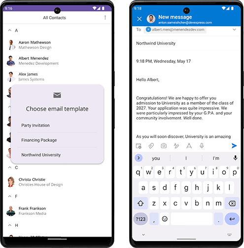
- Send Template Messages (Mail-Merge), and more…
Documentation
#Office File API Support
You can now use the DevExpress Office File API in your .NET MAUI apps to create, manage, convert, merge, and digitally sign Word, Excel, and PDF documents (non-visually). Documentation
GitHub Example: How to Send Template Messages (Mail-Merge)
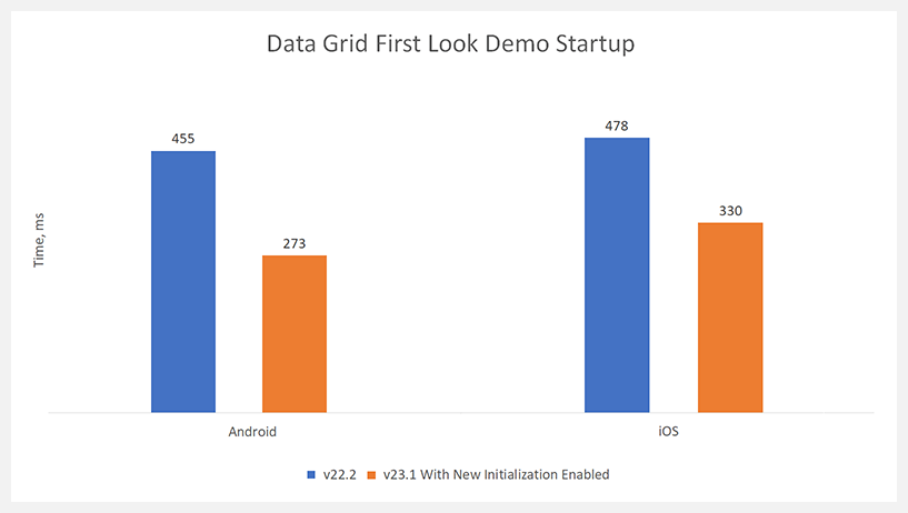
#Performance Optimization
New Startup API
We implemented new methods that speed up startup of the view (when the view is opened for the first time). New API includes:
DevExpress.Maui.Charts.Initializer.InitDevExpress.Maui.CollectionView.Initializer.InitDevExpress.Maui.Controls.Initializer.InitDevExpress.Maui.Editors.Initializer.InitDevExpress.Maui.DataGrid.Initializer.InitDevExpress.Maui.Scheduler.Initializer.Init
                    public static MauiApp CreateMauiApp() {
                        var builder = MauiApp.CreateBuilder();
                        builder
                            .UseMauiApp<App>()
                            .UseDevExpress();
                        DevExpress.Maui.Charts.Initializer.Init();
                        DevExpress.Maui.CollectionView.Initializer.Init();
                        return builder.Build();
                    }
DataGridView — Optimized Vertical Scrolling
Vertical scrolling is now up to 70% faster than previous versions.
#Your Feedback Matters!
Please
login to complete the survey.
Survey Completed
Thank you for taking the time to complete this survey. Your responses have now been posted. If you want to follow up with additional information, feel free to send us an email at clientservices@devexpress.com anytime.
You've Already Completed This Survey
Our records show that you have already completed this survey. If you want to follow up with additional information, send us an email at clientservices@devexpress.com.
This survey has expired
If you want to share your feedback or request new functionality, please submit a new support ticket via the DevExpress Support Center. We’ll be happy to follow up.
Your feedback matters.
Please, review the description of Cross-Platform .NET App UI (XAF)-related features below and leave your feedback at the end of the section.
Go to the survey now.
#XAF Blazor UI
New Scheduler Module (CTP)
We integrated our Blazor Scheduler component (DxScheduler) within XAF's Blazor UI. Use the Scheduler Module to display and manage XAF Event and Resource business objects within a calendar.
The Scheduler Module is currently available as a Community Tech Preview (CTP).
Getting Started
Form Layout End-User Customization in Detail View
With this new UI/UX option, your users can create and manage their own UI right directly in the Web browser. UI customization (for both developers and users) can be a time saver - customizable Web apps can address changing business requirements without the need for redeployment.
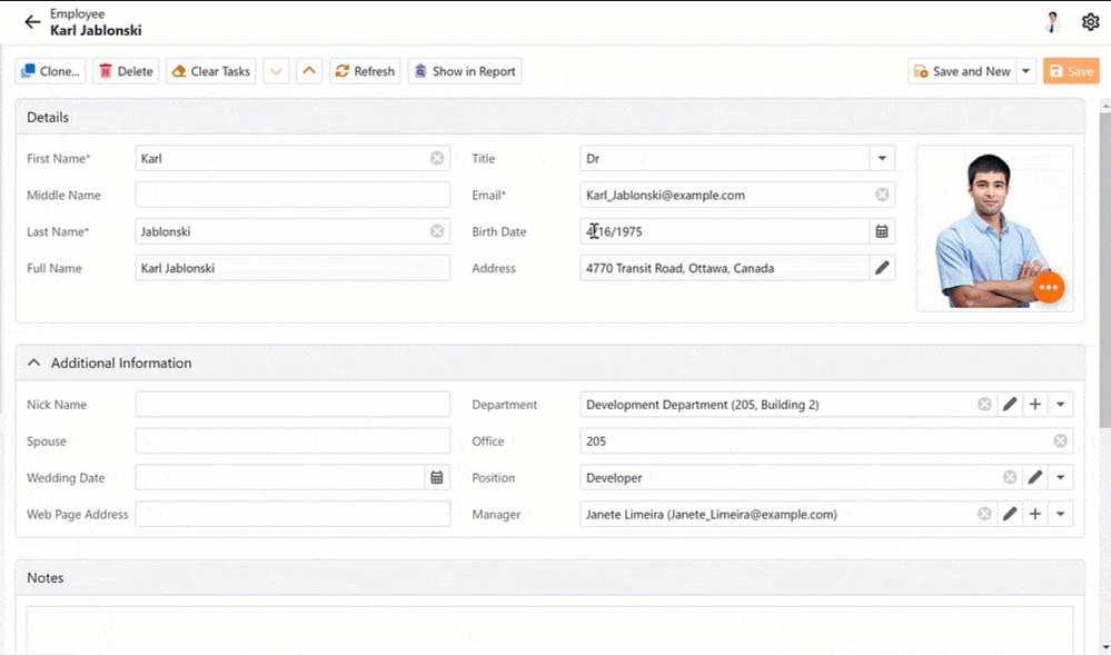
As you would expect, you can disable these advanced customization capabilities for specific users. Use the CustomizationEnabled property in the Model Editor or in code.
Documentation
Filter Editor, Find Panel, and Column Header Filters
XAF's DxGridListEditor and FilterPropertyEditor now integrate a JavaScript-based Data Filtering UI (Filter Criteria Editor), first introduced in our Web Reporting and BI Dashboard products. This new feature supports popular criteria language options based on reference, collection, and scalar/value type properties such as strings, numbers, etc.
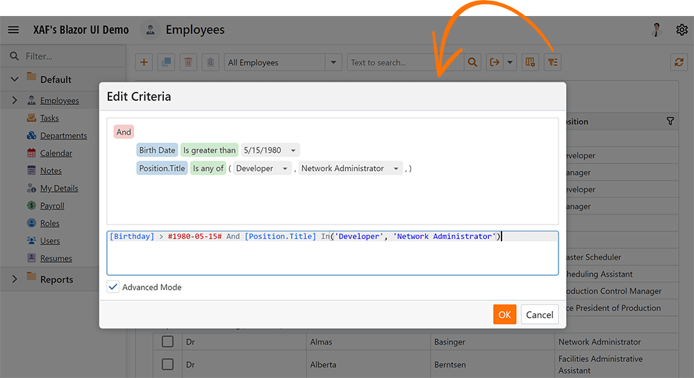
The Blazor DxGridListEditor also incorporates the following new filtering options:
- Find Panel
- Column Header Filters.
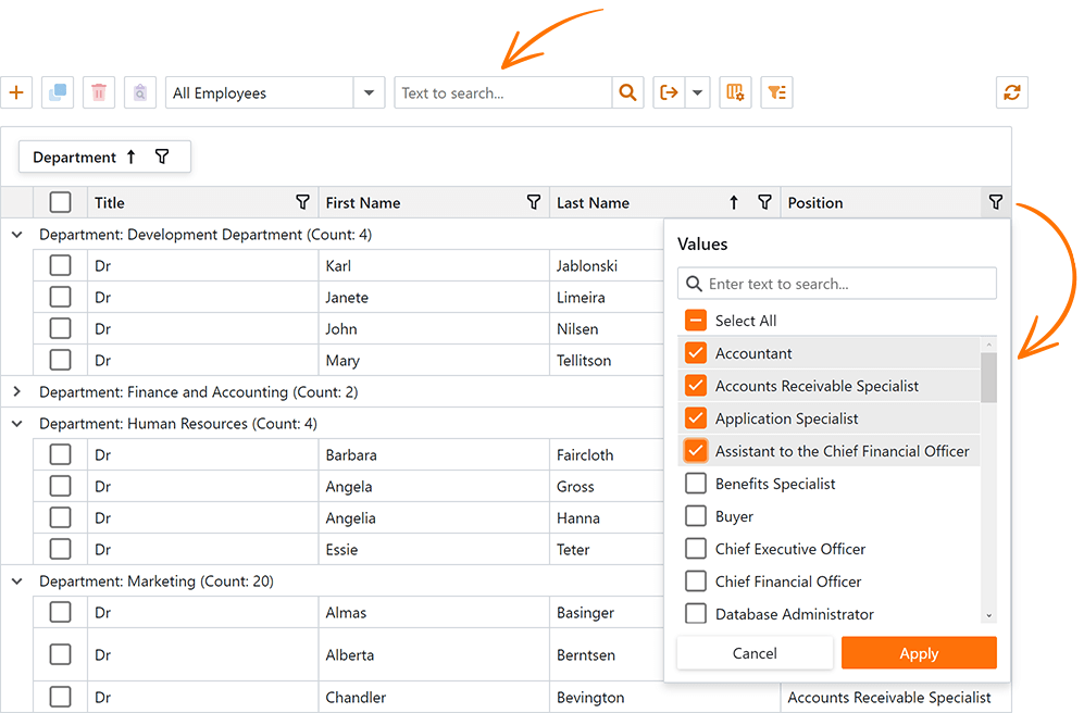
Multi-Tenancy Module for Blazor (CTP)
It is now easier to create multi-tenant or SaaS-ready XAF Blazor applications (.NET 6+) that target a single database or one database per tenant. You need to write a few declarative lines of code and use a new Multi-Tenancy reusable module (instead of writing hundreds of lines of code).
In v23.1, the DevExpress.ExpressApp.MultiTenancy
Documentation
Colored Icons to Distinguish Key UI Commands
We introduced colored icon support within the main menu toolbar, layout groups and tabs, and the view header (much like XAF WinForms/WebForms counterparts).
We also improved the image picker in the Model Editor and migrated our XAF Blazor images to the DevExpress.Images
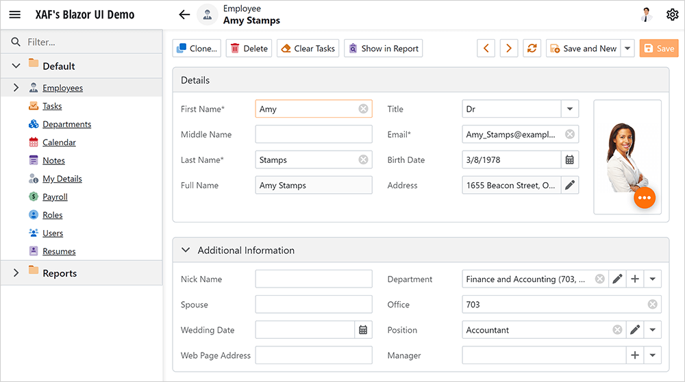
CRUD Enhancements
-
We removed New and Close commands from the root DetailView to save space.
-
We added Save & New and Save & Close commands to the root DetailView, keeping the last selection.
-
We added new Next/Previous commands for navigating through data records (much like XAF WinForms/WebForms counterparts).
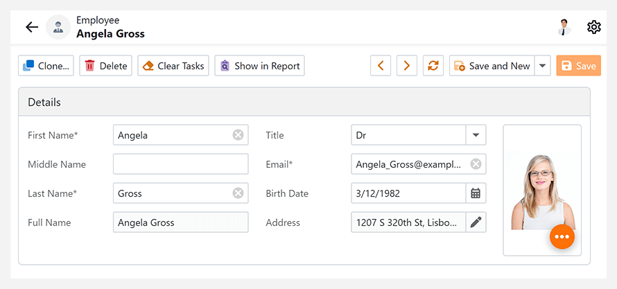
We also added the QuickAccess and Notifications command (action) containers, so you can display built-in or custom commands at the top right corner of your Web application.
Documentation
Form Layout Customization - New API
We implemented a new BlazorLayoutManager.ItemCreated event that allows you to customize DxFormLayout, DxFormLayoutTabPage, DxFormLayoutGroup, and DxFormLayoutItem on creation.
                    private void OnItemCreated(object sender, BlazorLayoutManager.ItemCreatedEventArgs e) {
                        if (e.ModelLayoutElement.Id == "MyTabbedGroup" && e.LayoutControlItem is DxFormLayoutTabPagesModel tabbedGroup) {
                            tabbedGroup.ActiveTabIndexChanged = EventCallback.Factory.Create<int>(this, index => tabbedGroup.ActiveTabIndex = index);
                        }
                    }
And yes, our Blazor Layout Manager now preserves active tab state between sessions.
Documentation
Mail Merge in Rich Text Editor
The Office Module for Blazor now supports mail merge operations within the ASP.NET Core Blazor Rich Text Editor.
Documentation
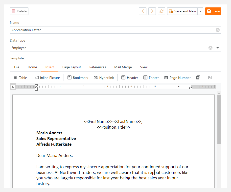
Grid List Editor Enhancements
XAF Blazor now supports the following Application Model properties for the ListView node:
IModelListView.FilterIModelListView.IsFooterVisibleIModelListViewShowFindPanel.ShowFindPanelIModelListViewPreviewColumn.PreviewColumn
Property Editor Enhancements
We supported icons in the Enumeration and Boolean Property Editors - this is helpful to distinguish various event states, priorities, and mode.
Our new Color Property Editor allows you to customize Color properties, for instance, in scheduler resources.
We supported Property Editors for the Label, Status, and Recurrence properties in XAF’s Event detail form.
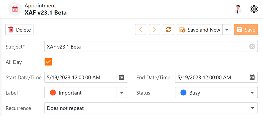
XAF Blazor v23.1 supports hints for Detail View editors. You can specify the Tooltip property in the Model Editor or mark your business class property with ToolTipAttribute in code.
Content Security Policy (CSP) Support
XAF Blazor UI now supports Content Security Policy (CSP) integration and introduces advanced security features to help you to detect and mitigate certain types of security risks, including Cross-Site Scripting (XSS) and data injection attacks. To make sure XAF Blazor UI supports CSP, we test it through Selenium and internal tests.
Documentation
#XAF WinForms UI
Form Designer Support for XAF Templates
We added support for XAF form template designers in .NET 6+. If you use .NET 6+, make sure that the DevExpress.ExpressApp.Win.Design
Documentation: Create a Custom Ribbon Template
Middle Tier Security for EF Core
We added support for Middle Tier Security in EF Core 6.x and 7.x for XAF WinForms and non-XAF apps. As part of this enhancement, we ship our own database provider for EF Core that can work with a remote Middle Tier application server as a database (much like XPO-based Middle Tier Security).
NOTE: XAF WinForms client apps for both EF Core and XPO ORM will enable Middle Tier Security by default in v23.2 for security reasons (to avoid direct database connections and the need for additional protection).
Documentation
Multi-Tenancy Module for WinForms (CTP)
It is now much easier to create multi-tenant or SaaS-ready XAF WinForms applications (.NET 6+) that target a single database or one database per tenant. You need to write a few declarative lines of code and use a new Multi-Tenancy reusable module (instead of writing hundreds of lines of code).
In v23.1, the DevExpress.ExpressApp.MultiTenancy
Documentation
#Common Enhancements
Support for EF Core 7
We introduced Entity Framework Core 7 (EF Core 7) support. EF Core 7 offers numerous advantages over its predecessor (performance and customization included). And yes, XAF also continues to support EF Core 6.
Why we recommend EF Core over XPO for new development
Dependency Injection in XAF Controllers
We extended support for Dependency Injection (DI) in XAF Blazor and WinForms apps (.NET 6+). With this addition, you can inject arbitrary services into custom constructors of XAF View and Window Controllers.
XAF WinForms apps now provide access to IServiceProvider through XafApplication.ServiceProvider – much like ASP.NET Core Blazor apps. Dependency Injection capabilities are available in a cross-platform module, which simplifies user customizations.
                    using Microsoft.Extensions.DependencyInjection;

                    namespace MainDemo.Module.Controllers;

                    public class TaskActionsController : ObjectViewController<ObjectView, DemoTask> {
                        public TaskActionsController() {
                            new SimpleAction(this, "My Top Right Corner Action", "QuickAccess");
                        }
                        [ActivatorUtilitiesConstructor]
                        public TaskActionsController(ITaskActionsService taskActionsService) : this() {
                            TaskActionsService = taskActionsService;
                        }
                        protected ITaskActionsService TaskActionsService { get; }
                    }
Documentation
Dependency Injection in EF Core and XPO Data Model
We added support for Dependency Injection (DI) at your ORM data model level in XAF Blazor, WinForms, and Web API Service apps (.NET 6+). With this addition, you can use IServiceProvider to access arbitrary services from XAF business classes.
EF Core - Use the IObjectSpace.ServiceProvider property
                    // ObjectSpace in EF Core classes now has the ServiceProvider property.
                    public class Task : BaseObject {
                        public virtual ApplicationUser? CreatedBy { get; set; }
                        public override void OnCreated() {
                            base.OnCreated();
                            var security = ObjectSpace.ServiceProvider.GetRequiredService<ISecurityStrategyBase>();
                            CreatedBy = ObjectSpace.GetObjectByKey<ApplicationUser>(((ApplicationUser)security.User).ID);
                        }
                    }
XPO - Use the Session.ServiceProvider property
                    // Session in XPO classes now has the ServiceProvider property.
                    public override void AfterConstruction() {
                        base.AfterConstruction();
                        var security = Session.ServiceProvider.GetRequiredService<ISecurityStrategyBase>();
                        CreatedBy = Session.GetObjectByKey<ApplicationUser>(((ApplicationUser)security.User).Oid);
                    }
Documentation
Dependency Injection with 3rd-party Inversion of Control (IoC) Service Containers
XAF Blazor, Web API Service, and WinForms .NET 6+ apps can now register their favorite .NET IoC library instead of Microsoft's IServiceProvider. Use the UseServiceProviderFactory
                        var builder = WinApplication.CreateBuilder();
                        builder.UseServiceProviderFactory(new AutofacServiceProviderFactory());
                        // OR
                        // builder.UseServiceProviderFactory(new DryIocServiceProviderFactory());
#Your Feedback Matters!
Please
login to complete the survey.
Survey Completed
Thank you for taking the time to complete this survey. Your responses have now been posted. If you want to follow up with additional information, feel free to send us an email at clientservices@devexpress.com anytime.
You've Already Completed This Survey
Our records show that you have already completed this survey. If you want to follow up with additional information, send us an email at clientservices@devexpress.com.
This survey has expired
If you want to share your feedback or request new functionality, please submit a new support ticket via the DevExpress Support Center. We’ll be happy to follow up.
Your feedback matters.
Please, review the description of DevExpress Web API Service features below and leave your feedback at the end of the section.
Go to the survey now.
Swagger Schema Support
DevExpress Web API Service now natively supports the Swagger schema. We also cleared unnecessary/service schemas from the Swagger UI and enhanced overall Swagger UI performance, usability, and ease of use with example input in endpoint descriptions.
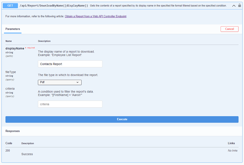
OData Entity Model Customization Made Easy
Our Web API Service now includes Fluent-like extensions, which simplifies the following Web API configuration tasks (write a few configuration code lines instead of dozens).
Expose or hide business object properties.
                            // MySolution.WebApi\Startup.cs (MySolution.Blazor.Server\Startup.cs)
                            services.AddXafWebApi(Configuration, options => {
                                options.BusinessObject<Contact>().ConfigureEntityType(b => {
                                    // Ignore the property of this class.
                                    b.IgnoreProperty(o => o.Email);
                                    // Ignore the property of the parrent `Person` class.
                                    b.IgnoreProperty(o => o.Company);
                                });
                            });
Limit or set available HTTP methods/verbs/OData actions for a business object.
                            // MySolution.WebApi\Startup.cs (MySolution.Blazor.Server\Startup.cs)
                            options.BusinessObject<MyEntity>().ConfigureController(b => {
                                b.ReadOnly();
                                // The above line is equivalent to:
                                // b.WithActions(WebApiActions.ReadOnly);
                            });
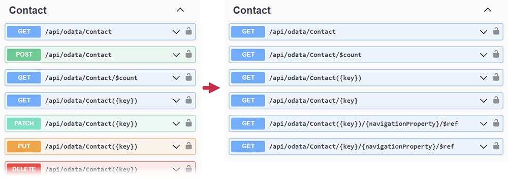
Documentation
New Examples and Tutorials for Paid Features
As you may already know, our .NET App Security & Web API Service includes basic CRUD and authorization functionality for FREE. Advanced/enterprise functions of our Web API Service such as audit trail, endpoints to download reports, file attachments, check validation, and many more ship as part of our Universal Subscription.
We prepared examples and step-by-step tutorials that demonstrate advanced features and published them on GitHub:
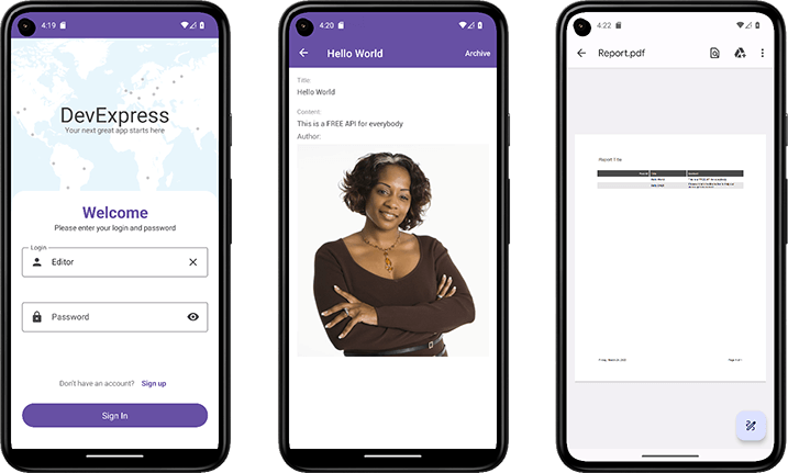
#Your Feedback Matters!
Please
login to complete the survey.
Survey Completed
Thank you for taking the time to complete this survey. Your responses have now been posted. If you want to follow up with additional information, feel free to send us an email at clientservices@devexpress.com anytime.
You've Already Completed This Survey
Our records show that you have already completed this survey. If you want to follow up with additional information, send us an email at clientservices@devexpress.com.
This survey has expired
If you want to share your feedback or request new functionality, please submit a new support ticket via the DevExpress Support Center. We’ll be happy to follow up.
#Visual Studio ARM Support
CodeRush can now be installed into Visual Studio ARM. ARM support is in beta in this release.
#Code Analysis
New Diagnostics for DevExpress WPF Components
Use DependencyObjectExtensions.DataContext to define bindings for generated columns
This diagnostic helps improve performance by defining bindings in column templates using the DependencyObjectExtensions.DataContext
Documentation
The column's FieldName or Binding property is not defined
This diagnostic shows when you need to specify the FieldNameBindingFieldName
Documentation
Columns with the specified Binding property are read-only
This diagnostic reveals read-only columns. You can set the binding's Mode
Missing EndUpdate call
This diagnostic shows BeginUpdateEndUpdate
Missing BeginUpdate and EndUpdate calls
This diagnostic helps improve performance by calling BeginUpdateEndUpdate
BeginUpdate call in a loop
This diagnostic finds BeginUpdateEndUpdate
Spell Checker Improvements
Custom spell checker dictionaries stored in the solution-level layer can now be shared among all team members working on that solution (even if their solution root folders are different).
#Navigation
Camel Case Navigation and Selection
Camel Case navigation and selection features now work inside TextBoxes everywhere in Visual Studio, including the following locations:
- Visual Studio's new "Inline Rename" window
- The Solution Explorer (when renaming files)
- The Properties windows (for text properties)
- Search filters
Documentation
Jump Codes
We've released Jump Codes, a new navigation feature for CodeRush that helps you move to any code (in any programming language) that you can see onscreen in just a few keystrokes. Jump Codes can also select code with fewer keystrokes.
Here's how it works:
1. Look (inside any visible code window) where you would like to be.
2. Press Caps+Tab to bring up the UI (enable the Caps as a Modifier if needed).
3. Enter the jump code shown at the target location.
4. Press Enter to land the caret on the target.
Simple enough.
Caps + Tab to invoke, Enter to land the caret (and a jump code in between).
Landing Variations
You can hold down modifier keys to fine-tune your landing, selecting the target, landing on the right side or even inside subsequent parens or brackets.
Multi-monitor Support
The feature lets you jump to any visible code window (from your Visual Studio session), even across multiple monitors. Once the Jump Codes UI is active, you can press Tab to move from monitor to monitor.
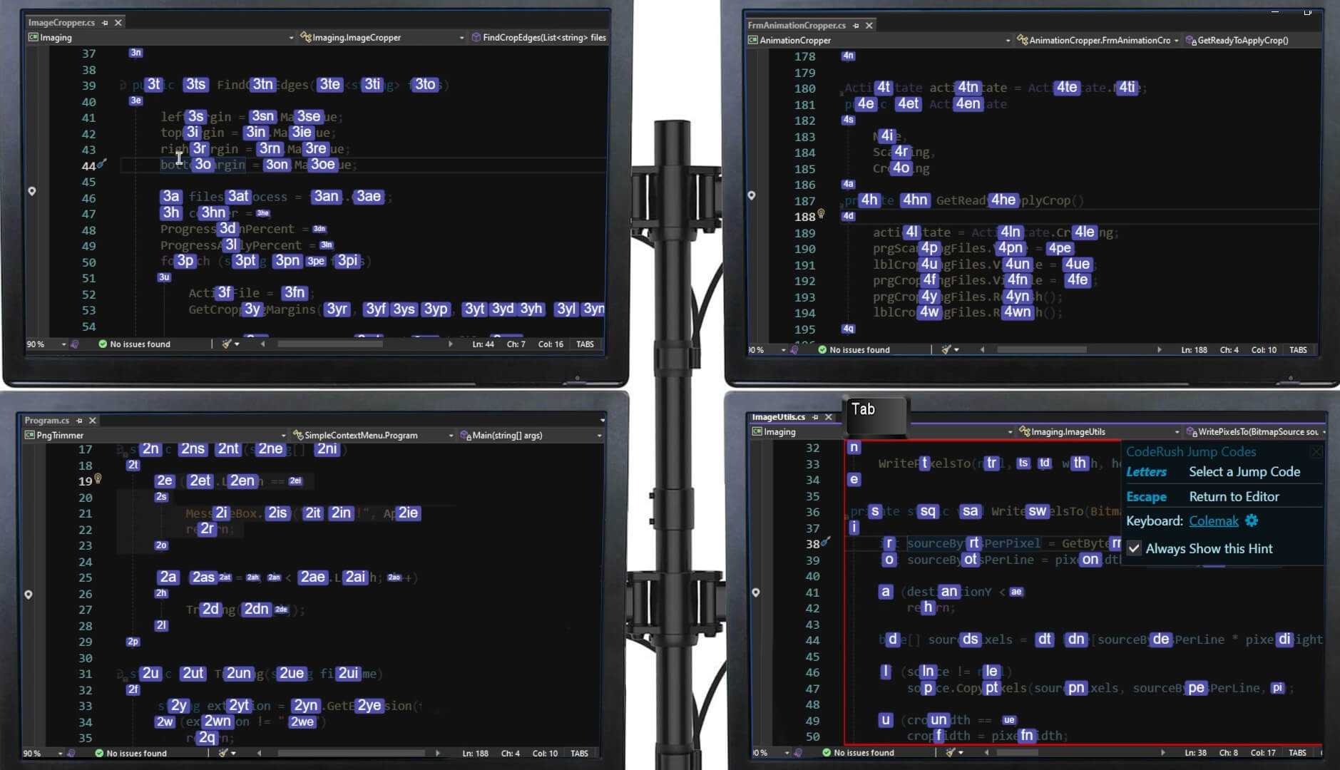
Highly Optimized Efficiency
Landing shortcuts are highly optimized and designed to get you get anywhere inside any code window you can see with the smallest amount of physical effort. So not only can you get anywhere using the fewest key presses, you do this with the shortest finger travel distance. That means for many target locations your fingertips will remain on the home row.
And a single letter key press on the home row is all it takes to move the caret to the beginning of most lines in view.
If you are working with a non-Qwerty keyboard layout (such as Dvorak or Colemak), you will want to select your keyboard layout on the Jump Codes options page.
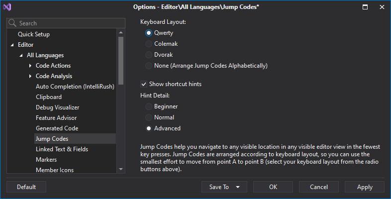
There's more to this feature than just moving the caret. Read Blog Post
#Programming Style
You can now specify whether CodeRush should emit optional parenthesis around switch expression operands (C# 8.0+).
This setting is currently used by CodeRush's "Apply the Optional parentheses style to explicitly specify the order of operations" code cleanup rule.
#Download Your Copy Today
Once you're ready to upgrade, simply login to the DevExpress Client Center and download the appropriate installer to proceed.
Download and InstallDownload Free TrialVCL Demos v23.1
Your feedback matters.
Please, review the description of VCL-related features below and leave your feedback at the end of the section.
Go to the survey now.
#Enhanced High DPI Resolution Support
We enabled SVG icons by default across all supported UI controls.
If you prefer PNG icons and want to use them in v23.1+, disable the dxUseVectorIcons option in the initialization section of the main application unit:
                        uses
                            Forms,
                            cxLookAndFeels,
                            // ...
                        begin
                            dxUseVectorIcons := True;
                            Application.Initialize;
                            Application.MainFormOnTaskbar := True;
                            Application.CreateForm(TMyForm, MyForm);
                            Application.Run;
                        end.
In addition to built-in icons displayed at runtime, we replaced numerous PNG icons with SVG equivalents in design-time editors. Please note that this change primarily affects RAD Studio Alexandria 11 IDE because only its latest versions support High DPI environments.
#"Light" Style Rendering
We enabled our "Light" Style rendering mode by default (TdxVisualRefinements.LightBorders := True;
The following UI controls now support "Light" style rendering:
-
TdxListViewControl and TdxShellListView
-
TcxPivotGrid and TcxDBPivotGrid
-
TcxTreeList, TcxVirtualTreeList, and TcxDBTreeList
-
TcxDBVerticalGrid, TcxRTTIInspector, TcxVirtualVerticalGrid, and TcxVerticalGrid
- TcxScheduler
- TcxMCListBox
- TcxListView
#New Windows 11 Theme
Our new WXI skin (theme) is based on Windows 11.
Our WXI theme ships with advanced visual effects and animations. We optimized our rendering engine to address rendering performance and UI/UX flexibility. With this new rendering engine, we'll be able to deliver new vector skins faster and help you ship more modern and elegant user interfaces.
#Chart Control
The DevExpress VCL Chart Control allows you to transform data into its most concise and readable visual representation. This update marks the official release of our VCL Chart Library and incorporates a handful of new features.
If you are ready to explore the capabilities of our VCL Chart control…ready to create/customize your first DevExpress-powered VCL Chart, please review our online documentation for additional information/examples.
Getting StartedBlog Post: Tips & Tricks
Scroll & Zoom
The Chart Control now supports “out-of-the-box” zoom, scroll, and pan operations for XY diagrams.
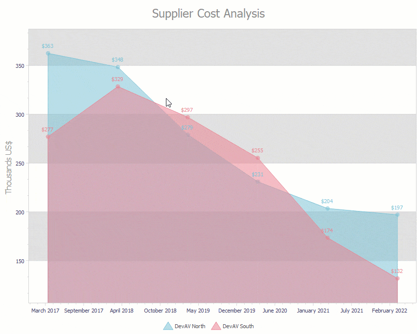
Resolve Overlapping Labels
The Chart Control can now resolve overlapping labels for pie and doughnut series Views. Use the ValueLabels.ResolveOverlappingMode
Hit-Testing
New API allows you to identify chart UI elements under the mouse pointer. For example, you can handle the OnHotTrackElementOnMouseMove
                    procedure TFeaturesDemoMainForm.ccDiagramsHotTrackElement(Sender: TObject;  const AArgs: TdxChartHotTrackElementEventArgs);
                    var
                      BarView: TdxChartXYSeriesBarView;
                    begin
                      if (AArgs.HitTest.Diagram = cdVisitors) and (AArgs.HitTest.HitCode = TdxChartHitCode.SeriesPoint) then
                      begin
                        BarView := TdxChartXYSeriesBarView(AArgs.HitTest.SeriesPoint.Series.View); // Active view.
                        // ...
                      end;
                    end;
Value, Label, and Marker Display Text Customization
Our new OnGetAxisValueLabelDrawParameters
                        procedure TFeaturesDemoMainForm.cdAreaGetAxisValueLabelDrawParameters(Sender: TdxChartCustomDiagram; AArgs: TdxChartGetAxisValueLabelDrawParametersEventArgs);
                        begin
                          if AArgs.Axis is TdxChartAxisY then
                            AArgs.Text := FormatSalesAmount(AArgs.Value);
                        end;
#Your Feedback Matters!
Please
login to complete the survey.
Survey Completed
Thank you for taking the time to complete this survey. Your responses have now been posted. If you want to follow up with additional information, feel free to send us an email at clientservices@devexpress.com anytime.
You've Already Completed This Survey
Our records show that you have already completed this survey. If you want to follow up with additional information, send us an email at clientservices@devexpress.com.
This survey has expired
If you want to share your feedback or request new functionality, please submit a new support ticket via the DevExpress Support Center. We’ll be happy to follow up.