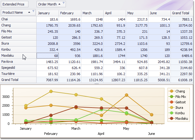
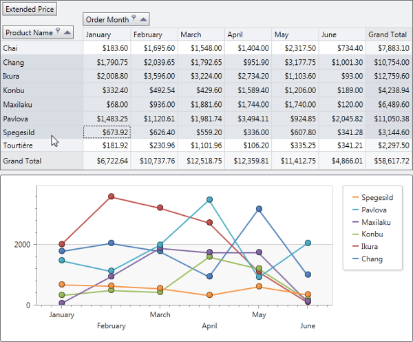
Data Grid Control
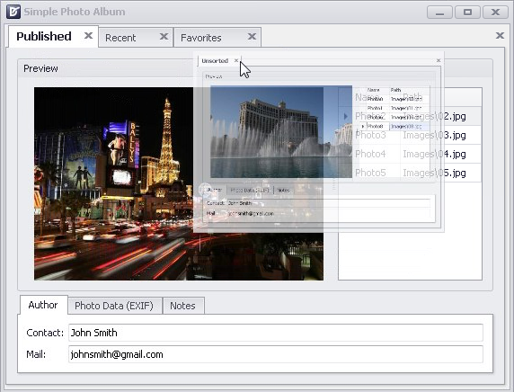
Find Panel
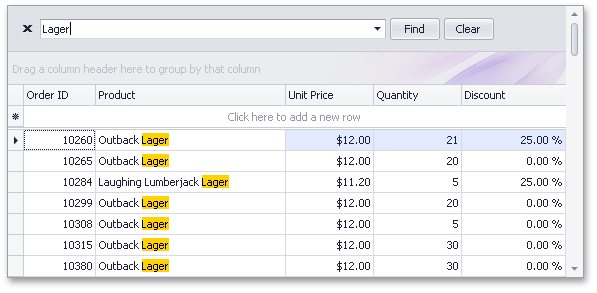
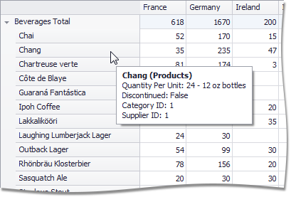
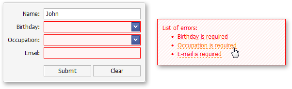
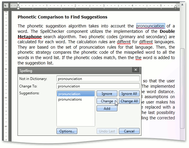
With this release, our WinForms Grid Control introduces a Find Panel – delivering an easy and straightforward way for end-users to locate information within the control.
To execute a search, simply enter text within the Find box and the grid will display those records that have matching values:
The Find Panel is available within all Grid Control's Views: grid, banded grid, card and layout Views.
The Find Panel can be enabled at any time by using the CTRL+F shortcut.
Various options are available to control the display and behavior of the Find Panel. You can specify search columns, choose between automatic and manual search modes, allow search strings to be highlighted within located records, etc
Ease of use and flexibility are at the heart of this new feature.
If your application requires a Find Box to be positioned within the toolbar, you can disable the Find Panel in the Grid and place a text box within your toolbar and call the appropriate Grid methods to execute your search.
Instant Feedback™ UI
Prior to this release, there were two data binding modes for our WinForms Grid Control: standard data binding mode (designed to work with small and medium sized data sources) and server mode (tailored to work with large data sources).
Each of these data binding modes addresses specific business use scenarios...
When in server mode, the XtraGrid loads data in small portions and delegates all data operations (sorting, grouping, filtering and calculating summaries) to the data server.
This is the key to the server mode's high efficiency when working with large volumes of data.
The only drawback to using server mode involved data operations when the connection to the server is slow.
As you might expect, the Grid Control freezes until the data server completes operations and retrieves results for the Grid Control...
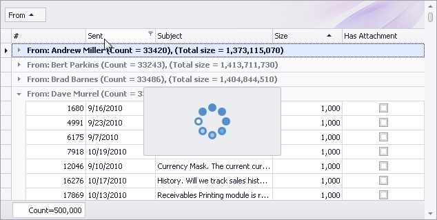
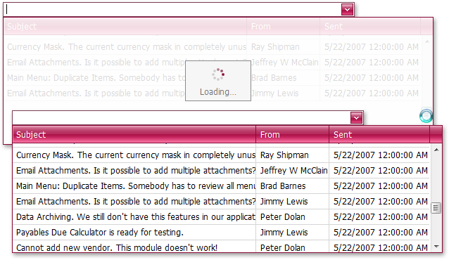
With our new Instant Feedback binding mode, you'll no longer experience any UI freezing.
Data operations will be performed asynchronously, in a background thread and both the Grid Control and your application will be always highly responsive.
View the following video to see how the XtraGrid functions in Instant Feedback mode.
The number of records in the underlying data source is 500,000 – and as such - it takes some time for the data server to process the Grid's requests and retrieve data.
While data is being retrieved in a background thread, the Grid can optionally display a progress indicator within a panel.
To record the video above, we used a spinning wheel panel to describe the state of async data operations.
This is an option available to you - by default, the progress indiator appears in the top left corner of the Grid:
Instant Feedback™ mode is also supported by our new SearchLookUpEdit control.
To activate this feature in either the Grid and/or SearchLookUpEdit Controls, use our specially designed data source controls - LinqInstantFeedbackSource or XPInstantFeedbackSource shipping with the eXpress Persistent Objects Library.
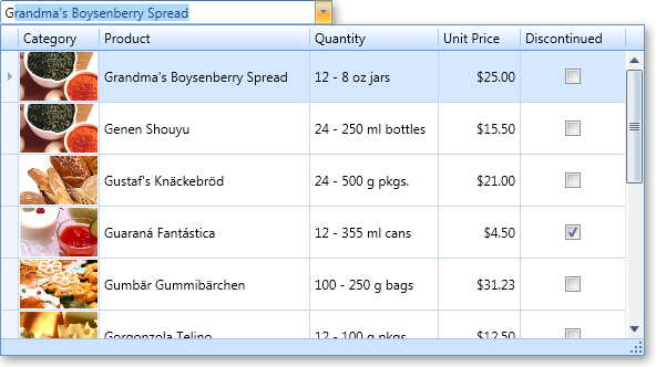
Search LookUp Editor
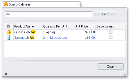
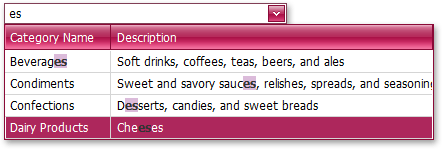
This new editor combines lookup functionality with our new Find feature.
Like the GridLookUpEdit control, the Search LookUp Editor embeds a grid control in the dropdown, and provides numerous grid customization features.
The built-in Find box allows you to quickly locate data.
The control provides a set of options and events that allow you to:
-
Choose automatic or manual search mode
-
Use the Starts With or Contains comparison operator
-
Specify search columns
-
Implement support for adding new records via the dropdown window, etc.
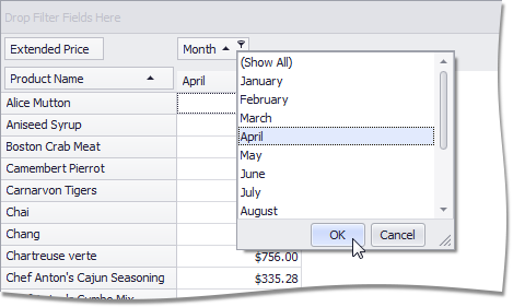
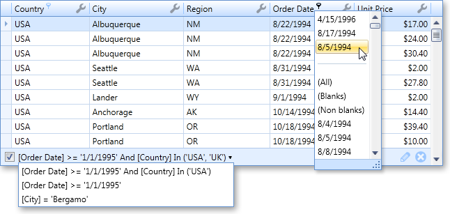
To locate data in the lookup, simply enter characters into the Find box and the control will filter records accordingly (those that meet the search criteria):
Miscellaneous
-
New 'Filter Mode' menu item is available for look up grid columns. End-users can now select whether to filter a column by edit values or display text.
-
New 'Show/Hide Auto Filter Row' menu item is available in a grid column's menu, allowing end-users to display/hide this row.
-
Grid Designer - Hidden columns are now painted using an italic font, making it easier to identify these columns.
-
Grid Lookup Editor – Performance has been improved in server mode.
Bars
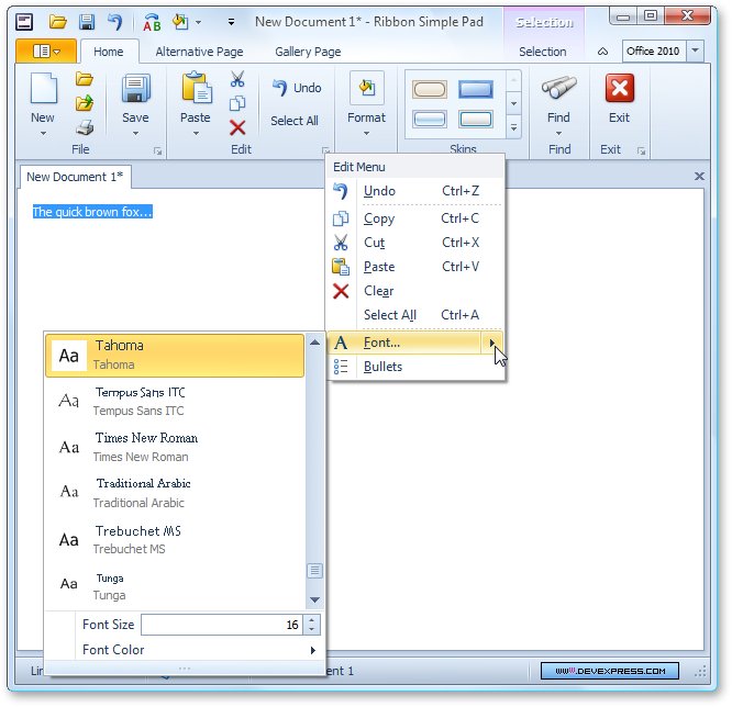
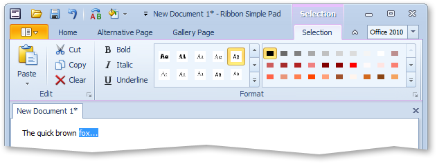
Office 2010 Style Ribbon
The DevExpress WinForms Ribbon Control incorporates changes that are planned for the Microsoft Office 2010 Ribbon. The primary differences from previous versions of the Ribbon are the Application Button's location/shape and updated visual styles. You’ll have access to both these features when using the newly introduced Office 2010 skin available throughout our entire WinForms product line.
Aero Theme title bar
The Aero Theme title bar shown above is just one of your options. By toggling one property, you can enable a fully-skinned style demonstrated in the following screenshot.
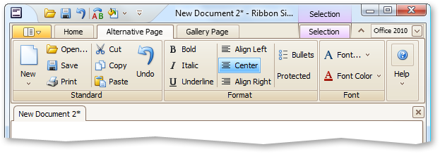
WinForms Application Skin support
The new behaviors of the Ribbon is not limited to the Office 2010 visual style. You can use the same layout with every WinForms Application Skin we support. The following screenshot demonstrates a Microsoft Office 2010 Ribbon with the Caramel skin.
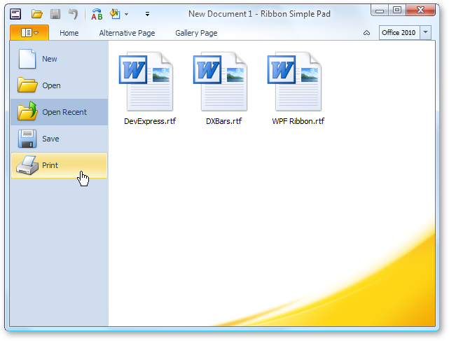
Office 2010 Application Menu behavior
We now also allow you to emulate Office 2010 Application Menu behavior via a menu content property - if you assign a menu to the property, you'll be able to maintain Office 2007 behaviors. If you assign any other control to the property, you'll have an Office 2010 full page view with the control embedded into it (for instance, place anything on a panel and then set the panel as the dropdown control).
The following image demonstrates how this will look at runtime - note the orange effect in the right-bottom corner - it is a DevExpress Skin element. It will appear automatically (if not overlapped by non-transparent items).
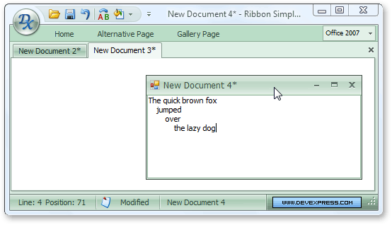
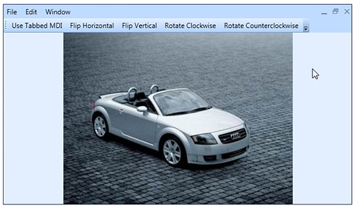
Tabbed MDI Improvements
With our WinForms MDI Tabbed Manager, end-users can now double-click or drag a tab to move the corresponding document to a separate floating window. These documents can be easily docked back into the tabbed container by dragging the appropriate window onto the tab header panel.
Alert Control Improvements
Our Outlook style Alert Window control can now automatically determine the height required to fully display its contents.
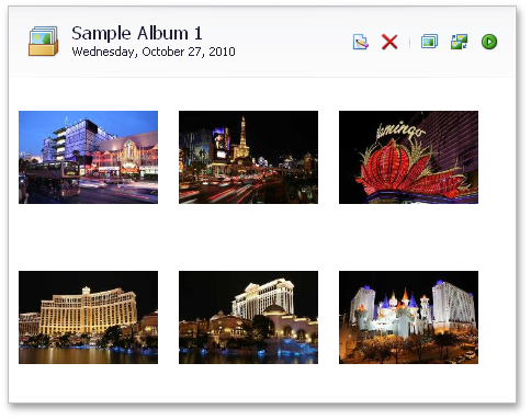
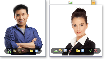
Standalone Gallery Control
The new WinForms Gallery Control allows you to create a photo viewer or simply display a collection of images within your application - It is a scrollable control that can display images with the option of categorizing them into groups.
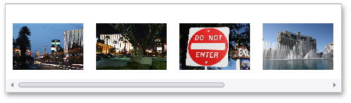
The Gallery Control's default orientation is vertical - items are arranged across one or more columns. To arrange items in rows, you can set the control's orientation to horizontal.
For example, this allows you to implement a scrollable horizontal strip of images:
Gallery items also allow you to display custom captions and descriptions. There are numerous settings controlling the layout of item images and text.
Note that gallery items are more than static images. The Gallery Control supports item selection/checking.
Clicking and double-clicking items fires corresponding events, which you can handle to respond to an end-user's actions.
You can enable hover images for gallery items. While hovering over an item, an enlarged version of the item's image appears on-screen:

For gallery groups, you can display custom controls in the header region. This provides a flexible way to extend the Gallery Control's feature set.
The following is a summary of features available to you:
-
Ability to control image display size
-
Ability to display captions and descriptions for gallery items
-
Customizable positions of item text relative to images
-
Stretching, zooming or clipping item images
-
Customizing item layout options
-
Ability to display group captions
-
Custom controls within group captions
-
Providing hover images for gallery items
-
Changing the Gallery Control's orientation from vertical to horizontal
-
Multiple item check state/selection modes
-
Standard and smooth scrolling
-
Ability to specify a background image and appearance settings for the control
-
Filtering groups via a context menu
-
Customizing the group filter context menu via an event.
-
Custom drawing gallery item images and captions
-
Responding to item click events, checking and double-clicking via dedicated events.
When necessary, you can display image galleries within the Ribbon Control. This can be accomplished via a dedicated bar item.
Tabbed MDI Manager - Document Selector
The Document Selector allows you to switch between tab pages much like Microsoft Visual Studio. Press CTRL+TAB or CTRL+SHIFT+TAB to invoke the Document Selector:
Tabbed MDI Manager - Show Tab Contents While Dragging
DXperience v2010 vol 2 improves the tab dragging capabilities within the XtraTabbedMDIManager.
When you drag a tab outside the header region, a preview of the tab is displayed.
Dragging tabs within the header region is also more intuitive (blue hints are displayed to help a user visualize window position when dropped).
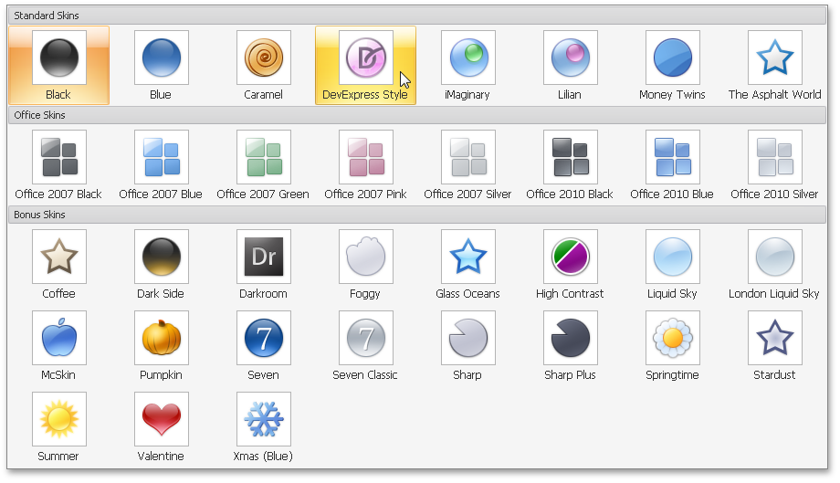
Add Skin Chooser to Your Application
With this release, we’ve introduced a new SkinHelper class that allows you to incorporate straightforward skin “switching” to your application.
By calling a single method, you can populate a menu or Ribbon gallery with all available DevExpress skins - No additional code is required.
When an end-user selects a skin from this menu/Ribbon gallery, the skin is automatically applied to all DevExpress controls on your form (via the Default Look And Feel mechanism).
Skin Dropdown Gallery (can be displayed in Ribbon, and also associated with a bar's button):
Animated Images within Alert Windows
Alert Controls can now display animated images.
Chart Control
New Series View Types
Side-by-Side Stacked and Side-by-Side Full-Stacked Bar series are now available for both 2D and 3D Charts.
Annotation Support
You can now create text or image annotations anchored to a chart, pane, or series point. You can fully customize layout, positioning and appearance by using the chart's repository.
As you can see in the following screenshot, end-users can easily move, resize and rotate annotation items.
Date-Time Scale - The Custom Week Feature
Blog Post
Financial Analysis - New Technical Indicators
With this release, the following types of Moving Average indicator have been added:
-
Simple Moving Average
-
Exponential Moving Average
-
Weighted Moving Average
-
Triangular Moving Average
And, any Moving Average indicator can be accompanied by a corresponding Envelope.
Blog Post
Extended Interactive Capabilities
Legend Enhancements
You can now change a legend marker’s appearance by customizing marker colors, fill style, size, visibility, and specifying a custom marker image. You can additionally customize font, color and visibility of legend text using event handlers.
Miscellaneous Improvements
- A new event allows you to display custom mouse cursors.
- You can display custom text when a chart is too small to accommodate the diagram, or when series have no data thus resulting in an empty diagram.
- You can display only minor axis tick marks.
- You can specify an image format (bitmap or metafile) that will be used when exporting or printing a chart.
-
The ability to define a separate palette for painting a chart's indicators (via the IndicatorsPaletteName property).
Editors
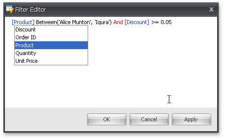
New Filter Editor - Edit Filter Criteria in Text and Tree-Like Form
Shipping as part of our Rich Text Editor library (XtraRichEdit), the new Filter Editor control has been designed to provide you with extended filter editing capabilities.
It is a hybrid of our current Filter Control (Tree-like data filter) and a text-based filter editor.
In text mode, the Filter Editor embeds a Rich Text Editor that implements the following filter editing capabilities:
-
Syntax highlighting
-
Intellisense
-
Support for in-place editors
You can choose whether to use text editing, visual Tree-Like editing, or both.
The control can be used on a standalone basis or can be invoked from the XtraGrid to filter against its columns.
Miscellaneous Features
-
Label Control - Different images can be associated with a label's different states (normal, hover, disabled and pressed).
-
DXMenuItem - Ability to specify an image to represent a menu item's disabled state.
-
Added the ISupportXtraSerializer interface to unify work with layout serialization methods (SaveLayoutTo.. and RestoreLayoutFrom...) in all DevExpress controls: GridControl, PivotGridControl, BarManager, etc.
Rich Text Editor
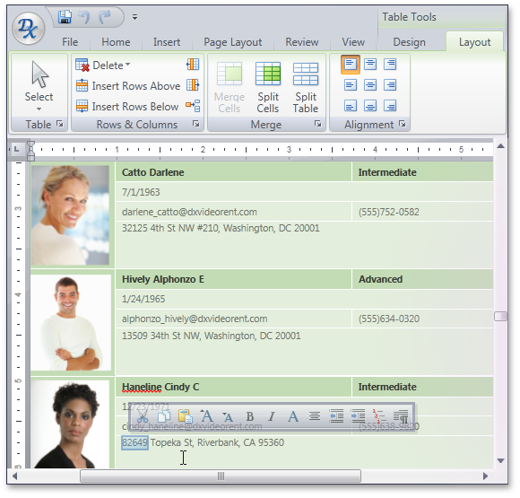
Extensive Table Support
The DevExpress Rich Text Editor delivers a comprehensive set of options for managing tables within a document. End-users can easily add tables and customize its layout and organize information for improved readability.
With the extended table support available to you in our WinForms Rich Text Editor, you can:
-
Insert rows, columns and cells.
-
Resize columns and rows.
-
Split and merge cells and split the table.
-
Align cell content horizontally and vertically.
-
Delete cells, columns and rows.
To enhance the appearance of the text in a table, you can add a border and shading to selected cells. When you add a border, you can specify the sides you want to feature or exclude, line style and color.
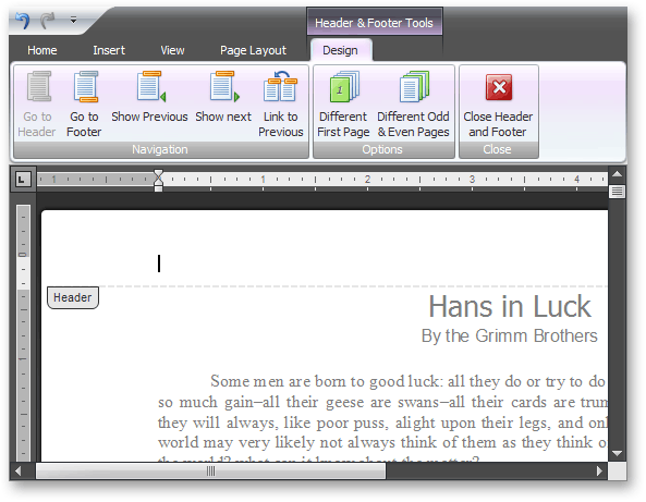
Headers and Footers
Rich Editor controls fully support Header and Footer section editing. You can provide common headers and footers for all pages within a document or you can specify different content for odd/even pages and change the first page’s header and footer individually.
Both WinForms and Silverlight editors now ship with built-in toolbars and Ribbon groups allowing you to easily embed a Header/Footer editing UI into your editor.
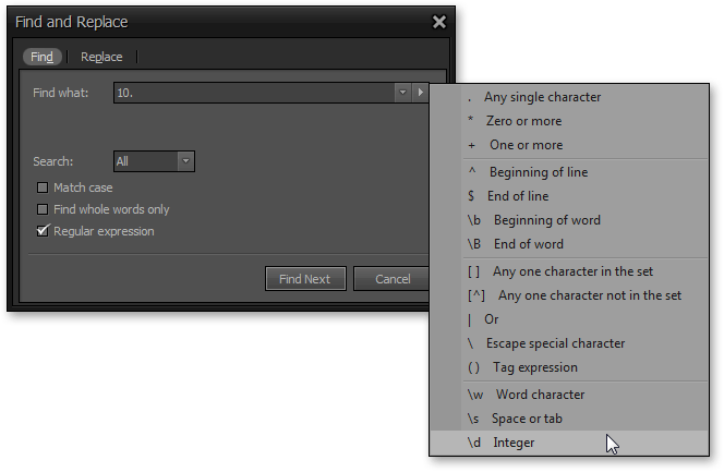
Regular Expressions for Find and Replace Operations
WinForms and Silverlight Rich Editors now allow you to use Regular Expressions when searching for text. This feature is similar to Microsoft Word’s Use Wildcards search option.
When the Find/Replace dialog is invoked, you can check the Regular Expressions option and then build your expression manually or use the expression elements dropdown shown in the screenshot below.
Opening Documents via Drag and Drop
End-users can now drag documents into the DevExpress Rich Editor Controls to open them.
Restrictions
-
Document Restrictions
You can now deactivate specific functionality (such as formatting, pictures etc.) and can determine whether restrictions are enforced immediately or after document reload. If restrictions are applied on reload, changes which are considered restricted won't be imposed on the document content. For instance, if character formatting is restricted, the document will be loaded with all characters formatted with the default font.
-
User Restrictions
You can specify which operations can be performed thus preventing users from copying and pasting, printing, saving etc.
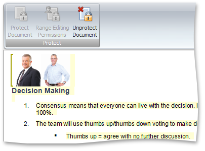
Document Protection
With this release, you can password protect the entire document against editing and selectively restrict the editing of certain document ranges. This new capability is a significant enhancement to the previously available option to specify document and operation restrictions for end-users.
When document protection is activated, a document is read-only except for certain ranges that authenticated users are able to modify. Editable ranges can be highlighted and enclosed in brackets.
Our document protection model is based on the RTF 1.9.1 specification (read-only password protection and protection exceptions sections) and is therefore compatible with the Microsoft® Word® document protection feature.
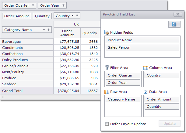
Pivot Grid Contol
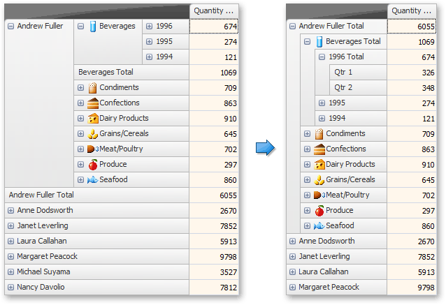
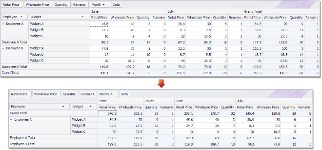
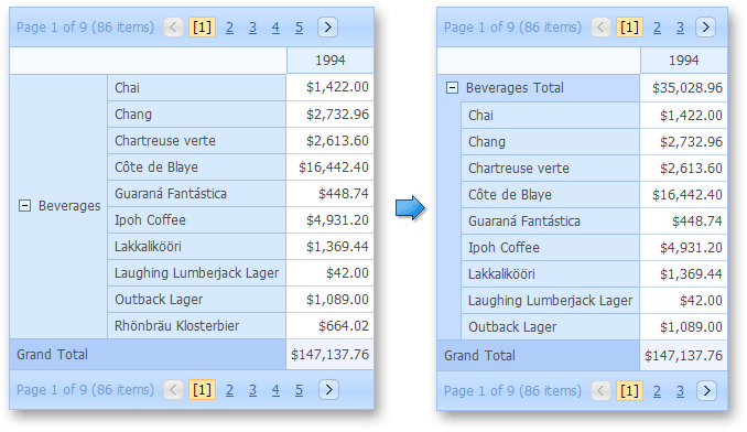
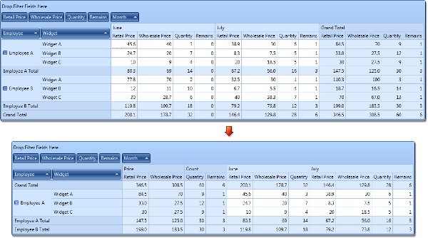
Compact Layout for Hierarchical Row Values
In addition to the features listed above, we now allow you to create compact layouts for hierarchical pivot table row values (this capability is also available in the WinForms and ASP.NET versions of this control).
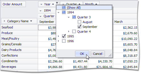
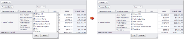
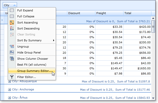
New Filtering Mode for Grouped Fields
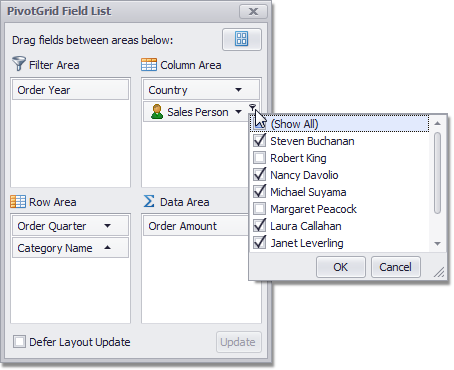
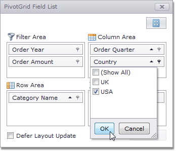
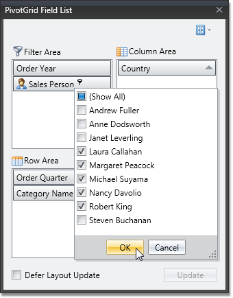
DXperience v2010 vol 2 introduces a new Group Filter feature, which provides a new default filtering mechanism for field groups. Each group of fields has a single filter drop-down invoked when clicking the filter button in the header of the first field within the group. The drop-down presents values for all group fields in a tree-like manner, allowing end-users to distinguish between equal field values that correspond to different values of a parent field.
The Pivot Grid Control also introduces a new option allowing you to switch to the filter dropdown behavior available in previous versions of the control.
ADOMD.NET Support for OLAP Binding
Previously, the WinForms Pivot Table Control was able to connect to OLAP cubes using the OLE DB data provider. With this release, we have introduced full support for Microsoft ADOMD.NET. In addition to performance benefits, ADOMD.NET allows you to retrieve format strings and properties of OLAP members from the server. Switching from OLE DB to ADOMD.NET does not require much effort. Simply create an appropriate data source object, specify the connection string (the same you used with OLE DB) and assign the data source to the Pivot Grid Control.
Filtering and Sorting in the Customization Form
Field headers displayed in the Customization Form now display sort glyphs and filter buttons to allow data shaping operations directly from the Field List.
Adding and Removing Filter Items
By default, filter drop-downs display unique values from the underlying data field. In DXperience v2010 vol 2, we have introduced two new events allowing you to manage these drop-down lists. With these events, you can add or remove items, edit their captions and change their checked state.

Single-Item Selection Mode for Filter Drop-Down Lists
You can now force filter drop-down lists to behave like simple combo boxes – thus prohibiting end-users from making multiple selections.
Customizing Column and Row Headers
By handling a newly introduced event, you can perform the following:
-
Delete individual column and row headers (together with their columns/rows),
-
Split header cells (if a header has several nested columns or rows),
-
Define the location of grand total columns and rows.
Delayed Updates of the Bound Chart Control
When the Pivot Grid Control is bridged with the Chart Control, it can be set to export data only from selected cells. In this instance, the Chart Control is updated immediately each time the selection in the Pivot Grid Control is changed. Rapid selection changing (for instance, when an end-user is expanding selection with the mouse) causes a sequence of frequent Chart Control updates.
You can now optionally set a delay between changes to the pivot grid’s selection and updates of the bound Chart Control to allow end-users to select the required cell blocks without updating the chart until the selection is complete.
Limiting the Number of Series and Points in a Chart Data Source
With this release, we have added the ability to limit the number of series in the data source passed to the Chart Control, as well as the number of points in a series.
Disabling Specific Customization Form Layouts
You can now specify which Customization Form layouts are available to end-users via the Layout menu.
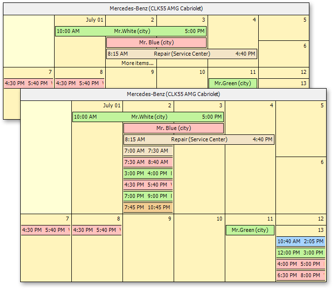
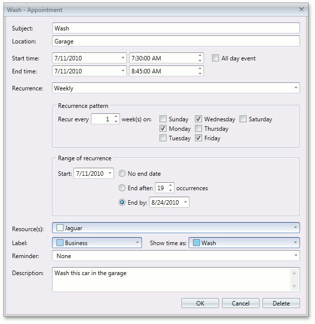
Scheduler Control
Automatic Time Cell Sizing in Scheduler Reports
Time cells can now automatically adjust size depending on content. You can control whether cells should be shrink so that no empty space is used and whether they can be automatically enlarged to fit all available appointments.
The following image demonstrates how a calendar changes when you activate Auto Time Cell Sizing.
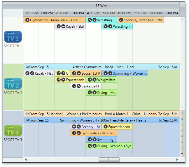
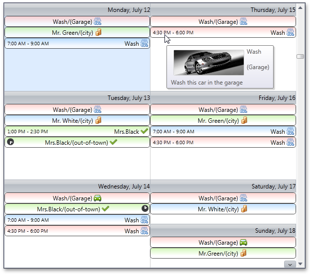
Smart Synchronization in Scheduler Reports
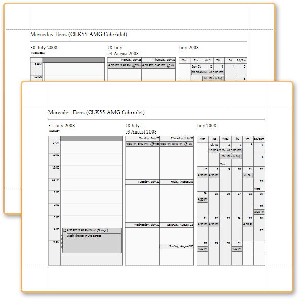
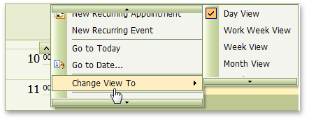
If several Scheduler Report controls are placed onto the same report, the Scheduler Adapter can coordinate how controls traverse through data. For instance, you can place a Day and Week View onto the same report and keep them synchronized on every report page.
This feature is indispensible for Tri-Fold Scheduling Reports shown in the following image. Notice that though the date changes on the next page, the Week and Month Views remain the same.
Scheduler Color Schemes Adjusted to Match Skins
In previous versions, resource color schemas used predefined colors and were the same regardless of the selected skin. With this release, they are automatically modified to match the specified skin.
Scheduler Reporting Enhancements
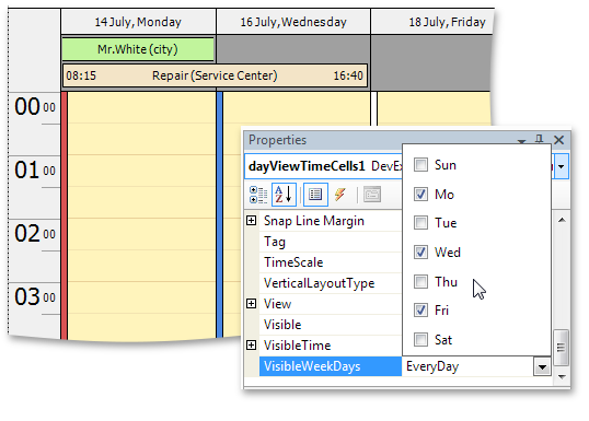
VisibleWeekdays - This new option allows you to specify the days of the week to be displayed within the DayViewTimeCells control. By using the VisibleWeekDays property, you no longer have to filter time intervals manually.
VisibleIntervalsSplitting - This new option allows you to control how time cells are split across printed pages and can be used when the number of displayed intervals differs from one page to another. A typical scenario features printing each month on a separate page, as illustrated below:
ReportResourceHeaderOptions - Resource headers gain the ability to specify text direction for captions and display images specifying alignment and image interpolation mode. Now resource pictures in reports can be printed with much better quality. To take advantage of the new feature, use the Options property of the VerticalResourceHeaders and HorizontalResourceHeaders reporting controls.
Better Control over Import/Export Operations
This release introduces the ability to better handle errors during import/export operations. If a problem occurs when our exchanger object processes data, the OnException event fires. You can analyze the reason behind an exception and determine whether the entire operation should be rolled back.
This functionality works with Microsoft® Outlook®, iCalendar and VCalendar appointment exchangers (i.e. used to import and/or export appointment to and from these formats).
Blog Post
Better Support for iCalendar
Our iCalendar exporter is now able to export custom VEVENT properties, such as ATTENDEE - used to send out meeting invitations.
Blog Post
Vertical Grid Control
Fixed Rows
Fixed rows give you the ability to fix data rows in much the same way as you fix columns within the XtraGrid.
These "fixed" rows are not scrolled vertically.
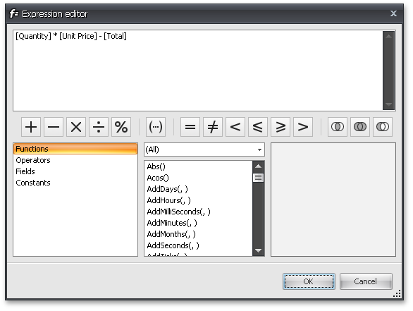
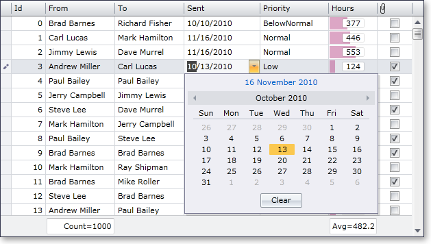
Unbound Expressions
You can create an unbound row and populate it with data via an event.
Unbound rows can now be populated with data by specifying a string expression (formula).
The Expression Editor can be used to build expressions.
Miscellaneous
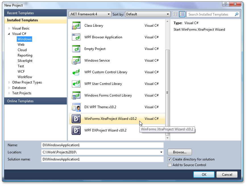
WinForms Project Wizard for C#
With this release, we’ve introduced a new Wizard to help you get started building C# based applications when using DevExpress WinForms controls.
How it works - Start by creating a new project in Visual Studio and select the "XtraProject Wizard" template:
This template then runs the wizard, which allows you to:
-
Specify the container (XtraForm, RibbonForm or standard Form) for your application
-
Choose and customize DevExpress controls to be used in the form's commands, navigation and client areas
-
Specify an application skin
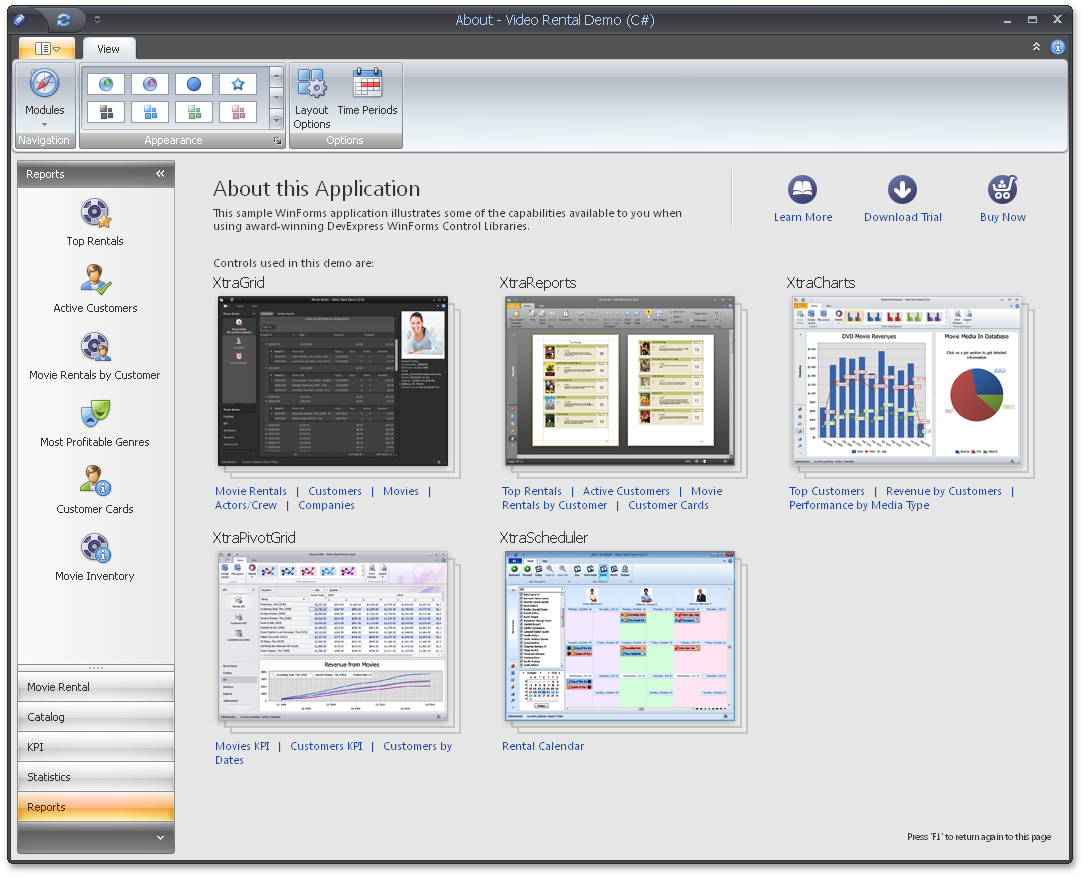
Video Rental Demo
This release introduces the first iteration of our Video Rental App – demonstrating the use of our WinForms controls in practical terms.
A wide range of DevExpress controls and libraries (XtraGrid, XPO, XtraPivotGrid, XtraLayoutControl, XtraCharts, XtraReports, XtraScheduler, XPO, XtraBars, XtraTreeList, XtraNavBar and XtraVerticalGrid) are used in the application and offer you insights into ways to address common requirements, including:
-
Data binding
-
Data shaping operations (summaries, sorting, grouping and filtering data)
-
Control customization
-
Layout persistence
-
Look and Feel management
-
Master-detail support
-
Calculating statistical information
-
Key Performance Indicators (KPI)
-
Scheduling
-
Generating reports
-
Printing and Exporting
-
Control layout management within detail forms
Take note of the application's modular structure which is the key to easy maintenance and scalability.
New colors have been added to DevExpress Skins
Each skin has a set or predefined colors used by our WinForms controls for different scenarios.
In DXperinence v2010 vol 2, four new colors have been added – they are called Question, Warning, Information and Critical.
The default color values have been chosen to match the skin's color gamma and may be different for different skins.
You can easily obtain these colors and then use them within your application. For instance, you can paint invalid grid cell values by using the color assigned to Critical (a shade of red).
MVC Extensions (Beta)
DXperience v2010 vol 1 features a Beta version of DevExpress MVC Extensions. These are native MVC controls that use .NET Framework 3.5 plus jQuery and produce no ViewState.
-
Five New Native MVC Controls
DevExpress MVC Extensions feature a data grid, menu, navigation bar, tab control and round panel.
-
Integrated jQuery
Our MVC Extensions take full advantage of the jQuery library.
-
Supports MVC 2.0 and VS2010
Our MVC extensions support ASP.NET MVC 2.0 which you can use in either Visual Studio 2008 or Visual Studio 2010.
-
Semantic Rendering
Three of the DevExpress MVC Extensions - Pager, Menu and NavBar use semantic rendering combined with advanced CSS styles, which results in a dramatic decrease of HTML output, improved performance and a reduction in the server’s workload.
-
Shared Functionality with Existing DevExpress ASP.NET Controls
DevExpress MVC Extensions offer many of the same features and functionality as those found in our Web Forms controls without producing any ViewState.
-
Built on .NET Framework 3.5
DevExpress MVC Extensions assembly code and demos are created using .NET Framework 3.5. As such, we use many Framework 3.5 technologies such as auto-properties, lambda expressions, LINQ, etc.
DevExpress MVC Extensions are available free of charge to those who have an active (non-expired) DXperience Universal, Enterprise, and ASP.NET Subscription.
MVC GridView Control
Key features feature the following:
- Unlimited data sorting
- Unlimited data grouping
- Microsoft Excel style filter dropdowns
- Pager support
- Horizontal and vertical scrollbars
- Row preview sections
- Total and group summaries
- Full support for templates
MVC Menu Control
Key features feature the following:
- Data binding
- Animation effects
- Optional selected and hot-tracked states for items
- Full support for templates
- Client-side API

MVC NavBar Control
Key features feature the following:
- Data binding
- Animation effects
- Saving control state to cookies
- Full support for templates
- Loading group content on callbacks
- Client-side API
MVC Tab Control
Key features feature the following:
- Data binding
- Customizable tab position and alignment
- Hover tabs to active them
- Saving control state to cookies
- Full support for templates
- Loading group content on callbacks
- Client-side API
New Lookup Control
New Grid-Based ASP.NET Lookup Control
By combining the functionality of our ASP.NET Dropdown Editor and Grid controls, we've implemented a new editor that allows end-users to easily locate and select values from a dropdown grid which contains lookup items. The ASP.NET Grid control is seamlessly embedded into the editor's dropdown window, providing powerful and customizable data-processing/data-representation options to your lookups (such as sorting, grouping, multi-selection, filtering, templates, etc.).
The embedded Grid control can be fully customized via the settings exposed at the editor's level.
Blog Post
New Tree View Control
This control allows you to display hierarchical data as a simple tree and can be used to present menu-like information or to iterate through hierarchically organized pages/information structures.
Blog Post
New File Manager Control
The DevExpress ASP.NET File Manager is an Explorer-like control giving your end-users the ability to manage files and folders. This control allows individuals to easily select files, upload files and change folder structures (by renaming, moving and deleting files or folders). File and folder management capabilities are fully customizable and can be switched off whenever necessary.
The File Manager is also used within the ASP.NET Html Editor as a built-in Image Selector allowing end-users to select images visually.
Blog Post
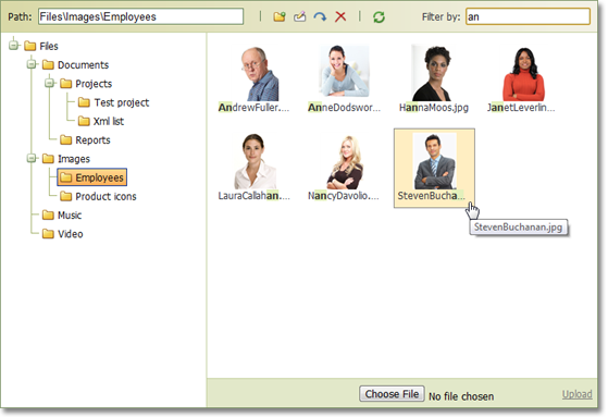
Chart Control
New Series View Types
Side-by-Side Stacked and Side-by-Side Full-Stacked Bar series are now available for both 2D and 3D Charts.
Annotation Support
You can now create text or image annotations anchored to a chart, pane, or series point. You can fully customize layout, positioning and appearance by using the chart's repository.
As you can see in the following screenshot, end-users can easily move, resize and rotate annotation items.
Date-Time Scale - The Custom Week Feature
Blog Post
Financial Analysis - New Technical Indicators
With this release, the following types of Moving Average indicator have been added:
-
Simple Moving Average
-
Exponential Moving Average
-
Weighted Moving Average
-
Triangular Moving Average
And, any Moving Average indicator can be accompanied by a corresponding Envelope.
Blog Post
Extended Interactive Capabilities
Legend Enhancements
You can now change a legend marker’s appearance by customizing marker colors, fill style, size, visibility, and specifying a custom marker image. You can additionally customize font, color and visibility of legend text using event handlers.
Miscellaneous Improvements
- A new event allows you to display custom mouse cursors.
- You can display custom text when a chart is too small to accommodate the diagram, or when series have no data thus resulting in an empty diagram.
- You can display only minor axis tick marks.
- You can specify an image format (bitmap or metafile) that will be used when exporting or printing a chart.
-
The ability to define a separate palette for painting a chart's indicators (via the IndicatorsPaletteName property).
Editors
Combo Box
When the DevExpress ASP.NET Combo Box is in incremental filtering mode, it is now able to start filtering once an end-user has entered a specific number of characters into the editor's text box. Once you define the minimum length for filter string input, filtering operations will be initiated.
This behavior is useful when the Combo Box contains large amounts of data. In such instances, filtering on each entered character is not the best option - due to the large size of the resulting data set. By pausing the start of filter operations, you can provide end-users with more accurate and effective results, and improve the performance of your application.
Blog Post
HTML Editor Control
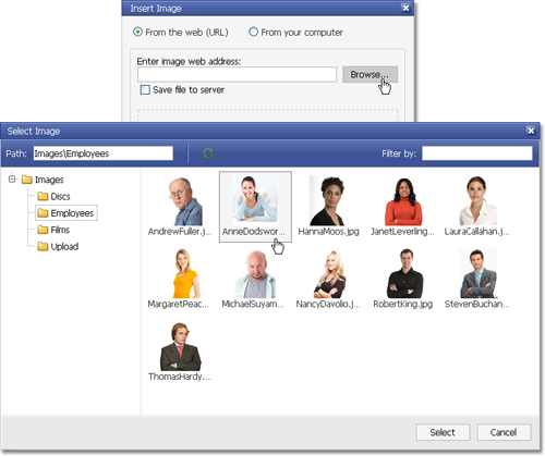
Image Selector
We have enhanced the Insert Image and Change Image dialogs with the ability to invoke a Select Image dialog - allowing end-users to manage content images via a point-and-click UI, rather than typing image web addresses manually. Because our Blog Post is integrated into the Select Image dialog, all file/folder management and upload capabilities are available to you out-of-the-box... with full customization.
Blog Post
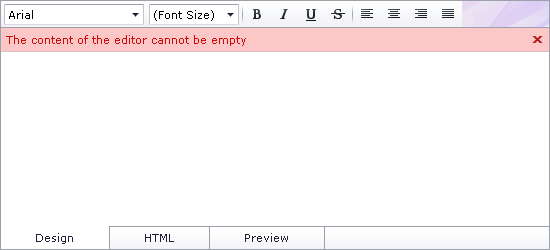
Content Validation
This release introduces a comprehensive API enabling you to validate editor content, both on the client and server. Among the newly introduced members are validation events and various settings for a built-in frame that displays validation errors.
Blog Post
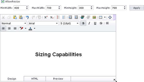
Sizing Capabilities
With this release, end-users can change the ASPxHtmlEditor's size using a size grip. You can opt to disable this feature or specify size limits via the SettingsResize property set.
Blog Post
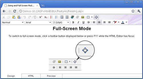
Full-Screen Mode
In addition, the DevExpress ASP.NET HTML Editor now offers a full-screen mode option, which makes editing in the Design View easier. When active, the editor's Design View occupies the entire client region of the browser. To activate, end-users can click the corresponding toolbar button or press F11 when the editor has focus.
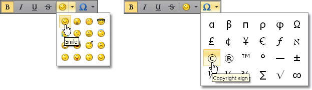
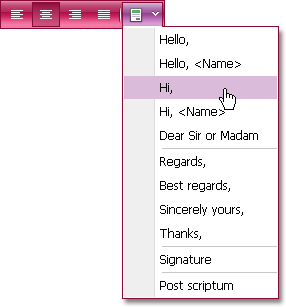
New Custom Toolbar Items
You can now extend toolbars with custom content and functionality using the following new items:
Dropdown Item Picker
A button with a dropdown containing a list of selectable items. With dropdown item pickers, you can easily introduce item galleries allowing users to insert smilies, special characters, or any other custom data into the editor.
Dropdown Menu
A button that displays a dropdown menu when clicked. This toolbar item is a perfect choice to display single level menus.
Combo Box
A dropdown list with a choice of selectable items - much like a standard combo box.
You can populate these toolbar items with data directly in the ASPX markup or bind them to a data source.
Blog Post
Custom Dialogs
You can now use any number of custom dialogs in addition to built-in dialogs available within the ASPxHtmlEditor. The editor has been extended with a CustomDialogs collection, allowing you to add and remove custom dialogs at both design and runtime. Collection elements provide a comprehensive API, enabling you to implement fully-featured dialogs with ease.
Blog Post

Client-Side Selection API
The ASPxHtmlEditor now exposes a client-side API, allowing you to access and modify currently selected content - its HTML markup, individual HTML elements (XML DOM nodes) or text. With this API, in-depth selection processing is now a breeze.
Blog Post
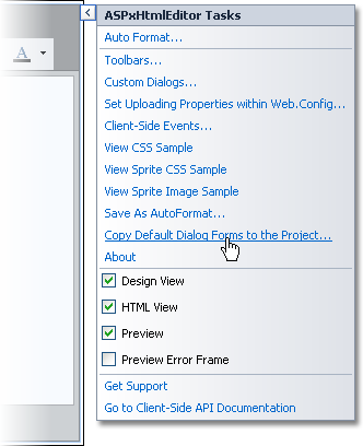
Re-Using Customized Dialog Forms
With this release, we have simplified the way you apply customized dialog forms. Since dialog forms are now stored as resources within the ASPxHtmlEditor's assembly, they are not added to your web projects by default. To customize them, you need to first add these forms to a web project via a Smart Tag item.
To make things simple, you can now store modified dialog forms at any custom location and point the editor to it via a new SettingsForms property set. This allows you to create versatile dialogs and easily re-use them within your project.
Performance Improvements
-
Faster Design-Time Project Opening and Runtime Page Loading
The ASPxHtmlEditor and built-in HTML Spell Checker now embed dialog forms - in a pre-compiled state - within their respective assemblies. Dialog forms are not copied to your site by default, unless you want to modify them.
-
Smaller Render Size
The ASPxHtmlEditor now uses a lightweight menu for its toolbars. The embedded Spell Checker now loads on demand.
-
Scripts Optimized for Editor Initialization
The JavaScript files have been optimized to reduce load times and boost percentage width/height evaluation.
Blog Post
Miscellaneous Enhancements
Menu Control
ASP.NET Menu, Popup Menu and Filter Control - Submenu Content Scrolling
In this release, we have introduced a new sub menu scrolling feature - making it easier for end-users to navigate large lists.
Blog Post
Navigation Controls
Semantic Rendering for Navigation Controls
In this release, we've further optimized the rendering of our ASP.NET AJAX Menu, Navigation Pane and Pager controls. The controls now use semantic rendering combined with advanced CSS styles, which results in a dramatic decrease of HTML output, improved performance and a reduction in the server’s workload.
The primary advantages of using Semantic HTML Rendering are:
- Performance is increased because the amount of HTML output is reduced.
- Accessibility is improved because screen readers understand semantic HTML.
- SEO is improved because search engines prefer semantic HTML.
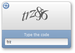
Captcha Control
With this release, we've added an ASP.NET CAPTCHA control to the ASPxEditors Library.
As you can imagine, the ASPxCaptcha (Completely Automated Public Turing test to tell Computers and Humans Apart) Control is used to verify that submitted data came from a human and not a robot or script. The ASPxCaptcha control can be used to effectively prevent comment spam on blogs, voting polls, or the creation of user accounts.
To learn how this new controls creates Captcha images, why ASPxCaptcha doesn’t use background noise and how it performed in an OCR test versus a competitor’s Captcha control, read the following blog post on our Commmunity Site:
Blog Post
Validation Summary Control
This new controls summarizes validation errors from multiple controls and displays them in a single block. This allows you to organize screen space more effectively whenever validation is required for multiple editors.
Error entries can be displayed as a table, bulleted or ordered list. Each entry can be presented as a link that moves focus to the corresponding editor.
Combo Box - Incremental Filtering
The ASPxComboBox editor enables end-users to filter list items dynamically based on text entered into the editor's input box on the client side (find-as-you-type filtering). The following filter modes are available:
-
None
Filtering is not applied to list items.
-
StartsWith
The editor is filtered for list items that begin with the search string.
-
Contains (implemented in v2010 vol 1)
The editor is filtered for list items that contain the search string. The located search string is highlighted within items for usability purposes.
The following image shows the newly implemented Contains filter in action:
Combo Box - Higher Performance via On-Demand Population
You can now populate dropdown lists with items based on the currently applied filter criteria thus implementing on-demand data loading. This means that you can significantly decrease web server workload by loading only a subset of all items when working with large datasets. For instance, when using a large data source, you can only request a few records to be visible on screen. The remaining items can be loaded on demand as a user scrolls the list.
Pivot Grid Control
Filtering and Sorting in the Customization Form
Field headers displayed in the Customization Form now display sort glyphs and filter buttons to allow data shaping operations directly from the Field List.
Blog Post
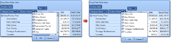
MS Excel® Style Customization Form
With this release, a Microsoft Excel style Customization Form can be used within the ASP.NET Pivot Control. This form allows end-users to hide, restore and reorder fields, drag them between areas and sort/filter data against specific fields.
A standalone Customization Control with the same functionality is also available.
Blog Post
Adding and Removing Filter Items
By default, filter drop-downs display unique values from the underlying data field. In DXperience v2010 vol 2, we have introduced two new events allowing you to manage these drop-down lists. With these events, you can add or remove items, edit their captions and change their checked state.
Blog Post
Customizing Column and Row Headers
By handling a newly introduced event, you can perform the following:
-
Delete individual column and row headers (together with their columns/rows),
-
Split header cells (if a header has several nested columns or rows),
-
Define the location of grand total columns and rows.
Blog Post
Limiting the Number of Series and Points in a Chart Data Source
With this release, we have added the ability to limit the number of series in the data source passed to the Chart Control, as well as the number of points in a series.
Blog Post
Disabling Specific Customization Form Layouts
You can now specify which Customization Form layouts are available to end-users via the Layout menu.
Blog Post
Compact Layout for Hierarchical Row Values
In addition to the features listed above, we now allow you to create compact layouts for hierarchical pivot table row values (this capability is also available in the WinForms and ASP.NET versions of this control).
Popup Control
On-Demand Content Loading
The ASP.NET Popup Control now provides the ability to load the content of popup windows on demand. The following content loading modes are available:
- Always
Content is always (initially) rendered inside popup windows (default behavior);
- On page load
Loading of popup window content starts immediately after the entire page has been loaded;
- On first show
Loading of popup window content starts when a popup window is invoked for the first time.
By using the postponed load of popup window content, you can enhance the response time of your web page on its initial load. You can also update the content of popup windows programmatically - on demand.
Blog Post
Scheduler Control
Scrollable Menu
A new feature makes life easier for end-users. When a popup menu does not fit the browser window, it displays scroll holders that enable you to navigate to the hidden menu items. To activate scrollable menus set the OptionsMenu.EnableMenuScrolling property to true.
Better Control over Import/Export Operations
A new functionality of the Scheduler Core library allows you to handle errors during import/export operations. If a problem occurs when our exchanger object processes data, the OnException event fires. You can analyze the reason for an exception thrown and decide whether the entire operation should be rolled back. If so, call the Terminate method to interrupt the process and leave data unmodified.
This functionality works with Microsoft® Outlook®, iCalendar and VCalendar appointment exchangers (i.e. used to import and/or export appointment to and from those formats).
Blog Post
Better Support for iCalendar
Our iCalendar exporter in the Scheduler Core library gains the ability to export custom VEVENT properties, such as ATTENDEE, that is used to send out meeting invites.
Blog Post
Automatic Time Cell Sizing in Scheduler Reports
Time cells can now automatically adjust size depending on content. You can control whether cells should be shrink so that no empty space is used and whether they can be automatically enlarged to fit all available appointments.
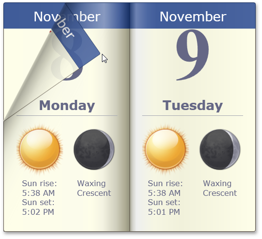
The following image demonstrates how a calendar changes when you activate Auto Time Cell Sizing.
Smart Synchronization in Scheduler Reports
If several Scheduler Report controls are placed onto the same report, the Scheduler Adapter can coordinate how controls traverse through data. For instance, you can place a Day and Week View onto the same report and keep them synchronized on every report page.
This feature is indispensible for Tri-Fold Scheduling Reports shown in the following image. Notice that though the date changes on the next page, the Week and Month Views remain the same.
Spell Checker Control
Faster Design-Time Project Opening and Runtime Page Loading
Like the ASPxHtmlEditor, the ASPxSpellChecker now embeds dialog forms - in a pre-compiled state - within its assembly. Dialog forms are not copied to your site by default, unless you want to customize them.
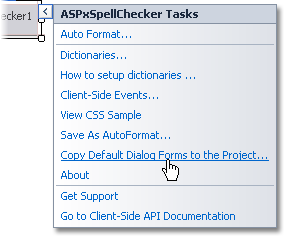
Re-Using Customized Dialog Forms
With a new SettingsForms property set, you can store modified dialog forms at any custom location and point the spell checker to it via SettingsForms. This allows you to easily re-use customized dialog forms within your web project.
TreeList Control
Popup Edit Form
In addition to using the in-line Edit Row and/or built-in Edit Form, Tree List control cell values can now be edited via a fully customizable Popup Edit Form.
Though by default it is displayed near the node whose values are currently being edited, you can easily define a custom position and layout of the Popup Edit Form.
Support for Right-To-Left Layout
We have added support for right-to-left data presentation to most visual controls shipped in our ASP.NET product line. You can now rely on DevExpress web controls when creating international web pages that require right-to-left reading order support, and mirroring of UI elements.
By changing a single option, you can invert a control's layout and text direction. Moreover, we have implemented configuration options allowing you to switch all DevExpress controls used within a web application to right-to-left representation.
Note that not all DevExpress web controls support right-to-left layout in this release. This will be addressed in upcoming updates.
Tab and Page Controls
We have improved the functionality of the Tab and Page Controls with the following new features:
-
Multi-Row Tabs
Our ASP.NET Tab and Page Controls can present tabs across multiple rows.
-
Tab Scrolling
With this release, we have implemented support for scroll-able tabs within the ASP.NET Tab and Page Controls. When active, this feature displays scroll buttons whenever the tab control's size prevents all tabs from being displayed within the tab header at the same time.
Multi-row tab representation and tab scrolling features are active only when the tab header is positioned on the control's top or bottom.
Blog Post
-
Semantic Html Rendering
We have changed the rendering of our ASP.NET Page and Tab controls. These controls now use semantic rendering. Combined with advanced CSS styles, this results in a significant decrease of HTML output, improved performance and a reduction of the server's workload.
Performance Improvements for ASP.NET Page and Tab Controls
New Themes
In our continuing effort to address your business needs, we have introduced four new application wide themes including three Microsoft Office 2010-like styles.
New Demos
We have redesigned all DevExpress ASP.NET demos so you can more easily explore the myriad of customization options available to you.
Miscellaneous
Intellisense Support for JavaScript
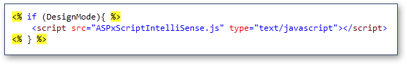
DXperience v2010 vol 1 introduces Intellisense support for the Client-Side API used in DevExpress ASP.NET AJAX Controls. Intellisense activation procedure varies depending upon where you plan on using our client-side API - but it's mainly a matter of adding a reference to a JS file featured with our installation. This is the ASPxScriptIntelliSense.js file located in the <DevExpress>/Components/Sources/DevExpress.Web.ASPxScriptIntelliSense folder.
If you want to add Intellisense support, add the JS file mentioned above using the Add Existing Item dialog. Once the file has been added, you need to reference that file in the pages where you want to use Intellisense.
That's it - you now have full Intellisense support for our client controls:
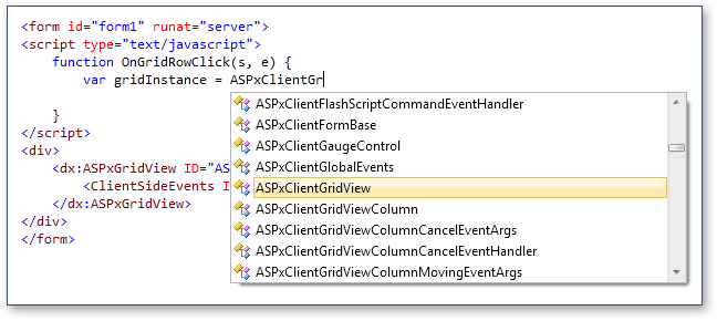
If you want to enable Intellisense for our controls in a standalone JS file, simply add a reference to our ASPxScriptIntelliSense.js file at the top:
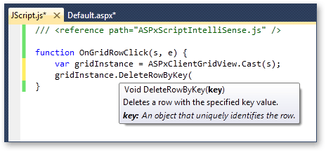
As you can see in the image above, we've added special static Cast methods that allow you to indicate a client-side object and thus enable Intellisense for it. In event handlers, you can simply pass event sender to this method. You can also cast any client instance by passing a string with the client-side ID. Intellisense will then be enabled for the Cast method's return value.
Note: This feature is only available in Visual Studio 2008 and 2010.
Keyboard Navigation Support in Grid Controls
In a continuing effort to improve accessibility within our ASP.NET controls, we've added keyboard navigation support to our ASP.NET GridView and TreeList controls. By changing a single option, you will enable the following navigation features:
-
Control Acivation Key
You can now specify an access key for our grid controls. By doing so, you allow end-users to press CTRL+SHIFT+AccessKey to move input focus to the corresponding grid control.
-
Focused Row
Press UP and DOWN arrow keys to move row focus.
-
Multiple Row Selection
Press SPACE to select an individual row. Sequential rows can be selected by pressing SHIFT while moving row focus.
-
Expand/Collapse Group Rows or Tree Nodes
Press PLUS/MINUS or RIGHT/LEFT arrow keys to expand/collapse rows respectively.
-
Paging
Press SHIFT+PAGE UP and SHIFT+PAGE DOWN to navigate to the previous or next page respectively.
New Book Control
As the name implies, the DevExpress WPF Book Control uses a book metaphor to display information on screen.
To navigate contents within the book, you "drag" individual pages to one side or the other.
You can populate individual pages with info using content templates and bind the control to data, so that each page represents a single record.
Blog Post
New Spell Checker Control
The new WPF Spell Checker Control provides you with a straightforward way in which to add Microsoft® Office® style spell checking capabilities into your WPF applications and offers you built-in suggestion forms that replicate corresponding forms found in Microsoft Outlook®. Because these forms were built using our application-wide themes, they will seamlessly integrate into any application powered by DevExpress Control Libraries.
DXSpellChecker for WPF features the following features:
-
Support for a wide range of standard and DevExpress text-aware controls.
-
The ability to use "check-as-you-type" mode, when checking spelling within the Blog Post.
-
Built-in support for the most popular dictionary formats: Blog Post.
-
Support for custom dictionaries that can be extended by an end-user while checking text.
-
The ability to perform mixed language text checking.
-
Pre-built spelling dialog containing a list of suggestions to correct a misspelled word.
-
Pre-built spelling options dialog allowing end-users to specify different text processing options.
Data Grid Control
Most Recently Used Filter List
With this release, we are introducing a Most Recently Used (MRU) Filter List for the WPF Grid control. The MRU list keeps track of filter conditions applied at runtime so that end-users no longer have to re-construct past criteria. The list can be displayed within the filter panel for criteria applied to a view or within a single column's filter dropdown.
Miscellaneous Enhancements
-
Smart Scrolling of Cards
A scrollbar is automatically shown if a card's content does not fit in a Card View. For instance, if cards are arranged across columns and a card's height is greater than the height of a Card View, a vertical scrollbar is automatically displayed.
-
Freeze Scrollbar Position on Data Sorting
A new option allows you to deactivate automatic scrolling to the focused row when sorting data.
-
Data Annotations Support
The grid recognizes several data source field (property) attributes that can specify column caption, read-only state, header tooltip, order, etc.
-
Un-focusable Columns
You can prevent individual columns from being focused.
Bars
Miscellaneous Features
The DXBars Suite is a multi-purpose Toolbar, Menu and Ribbon Control Library.
In addition to enhancements to the Ribbon Control, DXperience v2010 vol 2 introduces the following features to our standard toolbar-menu control.
With this release, you can align bar items to the right edge of the container when using a standard toolbar-menu.
We’ve introduced a new BarSplitCheckItem bar item, which combines a checkbox and dropdown buttons in one item:
The default appearance of bar item tooltips has been changed
Super Tip objects are now used to create default bar item tooltips. A tooltip displays caption and description regions without an image:
When necessary, you can override default tooltips and provide your own Super Tips for individual bar items.
A Super Tip allows you to display multiple tooltip regions, with custom images and text regions.
Chart Control
Support for Series and Point Animation
With this release, we introduce extended support for series and point animations. You can now choose from a variety of presets available for each series type or create your own custom animation.
Silverlight Compatibility
We have optimized our WPF Charting Library to create a user interface (XAML markup, and user code) that is very similar to our newly introduced Silverlight Chart Control. As such, you can write code once and painlessly port that code between the two platforms.
Hit-Testing for All Chart Elements
You can now obtain access to any of your chart's visual elements – allowing you to address complex user interaction requirements.
Extended Support for Custom Models
With this release, DXCharts provides extended custom models support. You can use your own visual models (at any level of complexity) and exploit all the benefits of both WPF and Silverlight platforms.
Blog Post
Docking Control
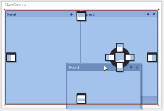
Design-time Support
To create and customize a dock UI, you no longer need to manually write XAML code. You can now create a docked UI at design time.
The DXDocking library for WPF supports full design-time customization via drag and drop.
Start by dragging a DockLayoutManager component onto the design surface. Two panels will be auto-generated.
You can then use a context menu to add more panels.
Using drag and drop, you can rearrange panels as needed, creating split and tab containers. To add content to a panel, drag and drop controls onto the panel:
With the help of our new Customization Window, you can easily rename, focus and add panels, save and load layouts, and see the hierarchical structure of your current layout.
All your design-time customization actions are automatically reflected in XAML code.
MDI Menu Merging
By using DXDocking, you can easily create an MDI UI for your application - where a parent container displays child windows.
Both the parent and child windows can contain their own menus and toolbars. With v2010 vol 2, we’ve added support for menu and toolbar merging.
When a child window is maximized, its main menu is merged into the parent's main menu. You can also merge toolbars when necessary:
Miscellaneous
Here is a list of other improvements:
-
Built-in splitters can now be used when creating layouts of controls within panels.
-
Ability to hide and disable dock hints via a dedicated event.
-
Choose whether to display auto-hidden panels on mouse click or mouse hover events.
-
Added properties to directly control the appearance of panels and layout items, without the need to override corresponding templates.
Editors
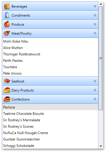
New Multi-Column WPF Lookup
DXperience v2010 vol 2 introduces a new WPF multi-column combo box that provides lookup functionality by using an embedded DXGrid control within the drop down window.
-
Display and edit values can be taken from separate data fields
-
Automatic completion and incremental filtering
-
Custom processing for entering 'not-in-list' values
-
Embedded DXGrid control
-
A large number of options to customize the dropdown list by exploiting the features provided by the DXGrid control. These feature customizable columns collection, data summaries, sorting, grouping and filtering dropdown list data by column values, etc.
The WPF Lookup Control can be used on a standalone basis or as an in-place editor within container controls such as the DevExpress Data Grid Contol.
Blog Post
New WPF Calculators
With this release, we extend the capabilities of our WPF Data Editors Library, with the two variations of a calculator control.
-
Basic Math Functions
-
Memory Operations
-
Keyboard and Mouse Wheel Support
-
Configurable Display Format (currency, percentage, etc.)
-
Calculation History
-
Customizable Error Descriptions
Like other DevExpress WPF Data Editors, both standalone and in-cell (for container controls such as the DXGrid) versions are available.
New Image Editor
In addition to our calculator control, the DevExpress WPF Data Editors Library introduces two new WPF image editor controls that are designed to quickly load and display image files. The WPF Image Edit is a standalone image editor. The WPF Dropdown Image Edit displays an image within a dropdown window.
Key features feature:
-
Supported Image Formats
Bitmap, JPEG, GIF and PNG
-
Configurable Image Size
An image can be proportionally resized to populate the image box, stretched or shrunk to fit box size.
-
Built-in Toolbar
End-users can cut, copy, paste, delete, load or save an image. You can also remove default commands and/or add custom commands as your needs dictate.
-
Easy Image Loading
When clicking within an image editor, an Open File dialog is activated allowing you to select and load an image file.
-
Auto-Sizing Image Popup
If the size of an image is smaller than the size of an editor's dropdown window, the image popup is automatically resized to fit the image size.
Like other DevExpress WPF Data Editors, both standalone and in-cell (for container controls such as the DXGrid) versions are available.
New Color Picker
The third set of new WPF Data Editors in this release are the DevExpress WPF Color Picker Controls – allowing you to specify colors from the standard color palette or from the RGBA color space.
The WPF Color Edit is a standalone color picker.
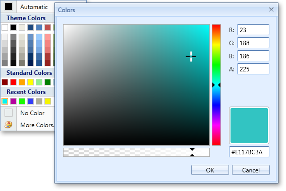
The WPF Dropdown Color Edit displays a color picker within a dropdown window.
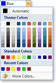
Key features feature:
-
20 Preset Color Palettes
Apex, Aspect, Civic, Office, Grayscale, Urban, etc.
-
Standard Colors Palette
features standard colors (e.g. Red, Green, Yellow, etc). -
Recent Colors Palette
features custom colors which can be added via the More Colors dialog.
-
Unlimited Number of Color Palettes
You can replace default palettes (Theme Colors, Gradient Theme Colors and Standard Colors) or append any number of custom color palettes.
-
Configurable Palette Layout
You can manually specify the number of color columns. Alternatively, the number of columns is automatically calculated.
-
Customizable Default Color
-
Optional Empty Color
Like other DevExpress WPF Data Editors, both standalone and in-cell (for container controls such as the DXGrid) versions are available.
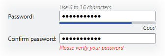
New WPF Password Box
The fourth new WPF Data Editor shipping in DXperience v2010 vol 2 is our new WPF Password Editor.
Key features feature:
-
Configurable Password Character
-
Maximum Password Length
-
Built-in Password Strength Estimation
-
Input Validation
Like other DevExpress WPF Data Editors, both standalone and in-cell (for container controls such as the DXGrid) versions are available.
Combo Box Enhancement
-
Incremental Filtering
Allows you to display only those items that match characters entered within the edit box.
-
Custom processing for entering not-in-list values
A specially designed event allows you to insert new records into the underlying data source.
NavBar Control
Scrollbar Support
In previous versions, the DXNavBar control supported only one scroll mode – by using scroll buttons. With v2010 vol 2, we've added support for standard scrolling. You can now enable scroll bars when necessary:
Blog Post
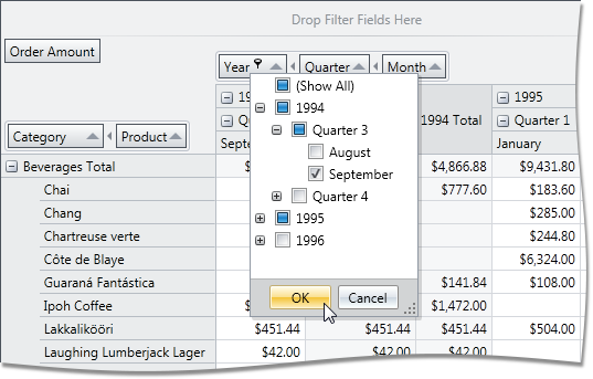
Pivot Grid Control
New Filtering Mode for Grouped Fields
DXperience v2010 vol 2 introduces a new Group Filter feature, which provides a new default filtering mechanism for field groups. Each group of fields has a single filter drop-down invoked when clicking the filter button in the header of the first field within the group. The drop-down presents values for all group fields in a tree-like manner, allowing end-users to distinguish between equal field values that correspond to different values of a parent field.
The Pivot Grid Control also introduces a new option allowing you to switch to the filter dropdown behavior available in previous versions of the control.
ADOMD.NET Support for OLAP Binding
Previously, the WPF Pivot Table Control was able to connect to OLAP cubes using the OLE DB data provider. With this release, we have introduced full support for Microsoft ADOMD.NET. In addition to performance benefits, ADOMD.NET allows you to retrieve format strings and properties of OLAP members from the server. Switching from OLE DB to ADOMD.NET does not require much effort. Simply create an appropriate data source object, specify the connection string (the same you used with OLE DB) and assign the data source to the Pivot Grid Control.

Filtering and Sorting in the Customization Form
Field headers displayed in the Customization Form now display sort glyphs and filter buttons to allow data shaping operations directly from the Field List.
Printing and Exporting
You can now easily print and/or export the DevExpress WPF Pivot Table Control into numerous formats (including PDF, HTML, RTF, TXT, XLS, XLSX, CSV, MHT and popular image formats). You can choose which of the two layout modes to use when exporting the pivot grid. The layout modes affect the manner in which the pivot grid is split across multiple pages. If the first is used, the Pivot Grid is represented by several tables, so that the output document can be split into multiple pages. This mode is preferred when the DXPivotGrid is exported to a paged format or printed. The second mode is used to present the Pivot Grid as a single table and the resulting document cannot be split across multiple pages. Use this mode when the DXPivotGrid is exported to an image or a spreadsheet format.
Blog Post
Grouping Fields in Field List
If a Pivot Grid is bound to an OLAP cube, the Field List window can now group OLAP members by their dimensions and display measure members in a separate group.
List of Most Recently Used Filter Criteria
You can now invoke a Most Recently Used filter criteria list in the filter panel (displayed when data filtering is applied).

Adding and Removing Filter Items
By default, filter drop-downs display unique values from the underlying data field. In DXperience v2010 vol 2, we have introduced two new events allowing you to manage these drop-down lists. With these events, you can add or remove items, edit their captions and change their checked state.
Customizing Column and Row Headers
By handling a newly introduced event, you can perform the following:
-
Delete individual column and row headers (together with their columns/rows),
-
Split header cells (if a header has several nested columns or rows),
-
Define the location of grand total columns and rows.
Delayed Updates of the Bound Chart Control
When the Pivot Grid Control is bridged with the Chart Control, it can be set to export data only from selected cells. In this instance, the Chart Control is updated immediately each time the selection in the Pivot Grid Control is changed. Rapid selection changing (for instance, when an end-user is expanding selection with the mouse) causes a sequence of frequent Chart Control updates.
You can now optionally set a delay between changes to the pivot grid’s selection and updates of the bound Chart Control to allow end-users to select the required cell blocks without updating the chart until the selection is complete.
Limiting the Number of Series and Points in a Chart Data Source
With this release, we have added the ability to limit the number of series in the data source passed to the Chart Control, as well as the number of points in a series.
Disabling Specific Customization Form Layouts
You can now specify which Customization Form layouts are available to end-users via the Layout menu.
Printing
Data Printing Performance and Memory Usage Optimization
In this version, we have substantially improved our WPF printing engine to make it faster and more effective at memory utilization.
Blog Post
Ribbon Control
Key Tips
With this version, support for Key Tips has been added to the DevExpress WPF Ribbon Control. Now, an end-user can use keyboard to navigate through Ribbon elements and activate any Ribbon command.
Our Key Tips feature emulates keyboard navigation found in MS Office 2007 and 2010.
It's also possible to use arrow keys on the keyboard to navigate through the Ribbon control.
If needed, you can specify key tips manually or allow the Ribbon control to generate shortcuts automatically.
Rich Text Editor
DXperience v2010 vol 2 introduces yet another new DevExpress WPF Control - the WPF Rich Text Editor – allowing you to introduce Microsoft® Word® like text editing capabilities into your WPF application with ease. The DXRichEdit for WPF provides advanced text formatting capabilities, data merging and table support.
Key features include:
- Extended Text Formatting
- Multilevel Bullets and Numbering
- Table Support
- Document Protection
- Integrated Spell Checker
- Support for Multiple Document Formats
- Comprehensive Text Editing with Styles
- Search and Replace with Regular Expressions
- Bookmarks and Hyperlinks
- Document and Operation Restrictions
- Mail Merge with Field Support
- Comprehensive Developer API
The DXRichEdit control is based on our Rich Edit Core Library which provides a solid and extensible foundation for rich text editing across multiple platforms including: WPF, WinForms and Silverlight. As such, code that uses the DevExpress RichEdit API can be ported to any platform with minimum hassle.
Blog Post
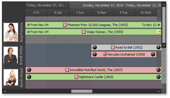
DXperience v2010 vol 2 introduces an entirely new product for the WPF platform – our WPF Scheduler Control. By leveraging the capabilities of this new library, you can introduce scheduling/calendar functionality to your WPF applications with minimal effort.
Built-In Views
Day View, Work Week View, Week View, Month View (Multi-Week View), Timeline View.
Data Binding
- Binding to a database - The scheduler can store its data in a database so that other data-aware controls can access associated data.
- Binding to an object data source which provides an IList interface - The scheduler can store and retrieve data from a list of business objects.
- Binding in XAML via an ObjectDataProvider.
- Unbound data - If you do not need to store your data in a database, you can load the scheduler's data in XML format.
- Binding custom fields to an appointment – You are never limited to default data fields used to manage appointments - You can specify as many fields as required. If you specify custom fields, you can allow your end-users to modify field values via custom dialogs, or initialize these fields in code. With this approach, you do not have to create any additional data storage to maintain extended data for individual appointments.
Appointment Features
- Status representation - Four different time display options for the Day View.
- Label representation - Eleven appointment color types to indicate an appointment's type/importance.
- Resources - An appointment can be assigned to one or multiple resources.
- Recurrence - Recurring appointments are an important part of any scheduling application. We provide you with a comprehensive toolset for handling recurring appointments, series and exceptions.
- Reminders - One or more reminders can be associated with an appointment with the ability to perform any custom action.
- Conflict checking - The scheduler can indicate appointment conflicts. Conflicts may arise when appointments share the same time or the same resource. The scheduler can resolve them by firing a specific event for you to make a decision, and by prohibiting or allowing associated conflicts.
- Show time as clock - Appointment start and end times can be shown as digital or analog clocks.
- Start and End time suppression - Optional suppression of the start and end times of appointments.
Resource Features
- Group by Date - Appointments can be grouped by dates.
- Group by Resource - Appointments can be grouped by associated resources.
- Resource Filtering - Filter data by resources.
- Resource Navigation - To allow scrolling between resources, an embedded ResourceNavigator control is available.
- Resource Sharing - Multiple resources can be assigned to one appointment. This appointment will be displayed in time cells corresponding to all associated resources.
Customization
- Element customization using WPF templates - The content of scheduler elements - appointments, headers, time cells etc. - can be fully customized using templates.
- Multiple built-in skins/themes.
- Localization (adapting to different languages) - The scheduler displays text strings in dialogs and captions that can be modified or substituted with corresponding translations.
- Set of native controls – A collection of editors ship with DXScheduler - AppointmentResourceEdit, TimeZoneEdit, multiple recurrence controls e.g. WeeklyRecurrenceControl – allowing you to create custom forms using native DXScheduler edit controls.
- Custom in-place editor - You can implement a custom form and use this form as an in-place editor for appointments. This means that end-users will see your custom form instead of a simple subject editor.
- Custom appointment editing form - You can implement a custom form and use this form instead of the default editing dialog for appointments.
Extensions
- Bar and Ribbon navigation - Using the DXBars and DXRibbon controls, you can provide view switching and view navigation capabilities for DXScheduler in two ways - Bar and Ribbon.
End-User Capabilities
- Resizing and moving appointments - The scheduler provides an easy-to-use appointment organization mechanism, with full support for resizing and moving of appointments.
- Built-in popup menus - The scheduler implements a number of built-in context menus. All these menus are controlled by the scheduler's properties, which allow you to disable particular items or substitute a menu with your own. You can also customize these menus as required.
- Built-in dialogs - Our scheduler control delivers a complete UI - we've integrated all the dialogs needed by end users to navigate and edit their calendars. You can also customize these dialogs as required.
- Zooming - You can zoom in and out using standard key combinations CTRL+Add or CTRL+Subtract.
- End-user restrictions - You can easily prevent end-users from editing (copy, delete, drag and drop) an appointment. Additionally, you can intercept these actions, and provide a custom action instead.
Blog Post
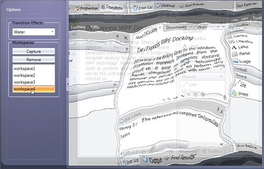
Workspace Manager
Additionally, the WorkspaceManager supports multiple visual transition effects, applied when loading a selected layout:
Blog Post
Miscellaneous
Nearly all DevExpress controls allow end-users to change their layouts (states).
For example, the DXDocking and DXBars libraries allow you to rearrange panels, toolbars, and commands within toolbars.
The DXGrid control allows you to change the order of columns, sort, group data, etc.
The layouts of these controls can be saved to a data store and then restored later.
With the release of v2010 vol 2, we feature a new WorkspaceManager component that makes manipulating layouts of DevExpress WPF and Silverlight controls much easier.
You can create multiple layouts for visual controls in advance and then use the WorkspaceManager to instantly switch between them at runtime.
The WorkspaceManager can be used with any DevExpress visual control that support serialization (e.g. BarManager, DockLayoutManager, DXGrid, etc.)
The target visual control may also contain other serializable DevExpress controls as children. For instance, the BarManager may contain a DockLayoutManager child object.
In this example, the WorkspaceManager will manipulate the layouts of the child controls as well.
New Ribbon Control
DXperience v2010 vol 2 introduces a Microsoft Office style Ribbon Control for Silverlight. The control's feature set is identical to that of its WPF Ribbon counterpart. By exploiting its advanced features - including Context Tabs or In-Ribbon Galleries - you can deliver navigation systems with a highly effective command-based layout for enhanced usability.
-
Full support for Office 2007 and 2010 Visual Styles
-
Both Regular and Contextual Pages
-
Application Button and Menu
-
Quick Access Toolbar - QAT
-
Ribbon Context (Popup) Menu
-
Minimize and restore Ribbon at runtime
-
In-Ribbon and Dropdown Galleries
-
Gallery Hover Images
-
Support for Super Tips
-
Automatic Layout Adaptation on container resize
-
Ribbon Status Bar, allowing left and right aligned commands
New File Upload Control
Our Silverlight Upload Control allows end-users to upload one or more files to the web application's server. The control provides numerous settings allowing you to specify the maximum number of files that can be uploaded at a given time, the maximum file size, associated file filters, etc.
The control's elements allow users to perform the following: add or remove files; start, suspend, resume or stop the file upload process.

New Mirror Control
The new Silverlight Mirror Control applies a perspective view to images and displays a reflection next to the image. Individual settings allow you to rotate the image in 3D and specify numerous settings, including mirror position and offset, reflection opacity, appearance and animation effects.
Data Grid Control
Data Shaping and Presentation Features
- Data can be filtered, sorted and grouped against an unlimited number of columns.
- Unmatched data management capabilities including: Custom Grouping, Sorting, Filtering, Group Intervals support, Total and Group Summary computation and More...
- Advanced end-user filtering capabilities including: Filter Editor, column filter and automatic filter row.
- User-customizable group and total summaries with the ability to sort group rows by summary values.
- Editable unbound and calculated columns support.
- Expression Editor for unbound columns.
- Horizontal scrolling virtualization allows an unlimited number of columns to be handled with no impact on performance.
- Microsoft Excel style frozen columns.
Data Editing Features
- Over 15 in-place data editors which fully support masked input, input validation, display value formatting, etc.
- Advanced Data Input Validation including Error Notification support.
- Adding new records via the new item row.
Full Template and Style Support
The DevExpress Grid Control for Silverlight supports the DevExpress Application Theme and Style Engine that ships with a number of predefined visual styles: Deep Blue, Light Gray, Office 2007 Black, Office 2007 Blue, and Office 2007 Silver. With templates supported throughout the DevExpress Grid Control for Silverlight, you can design custom interfaces to satisfy your most demanding users.
Instant Rendering of Printed Reports
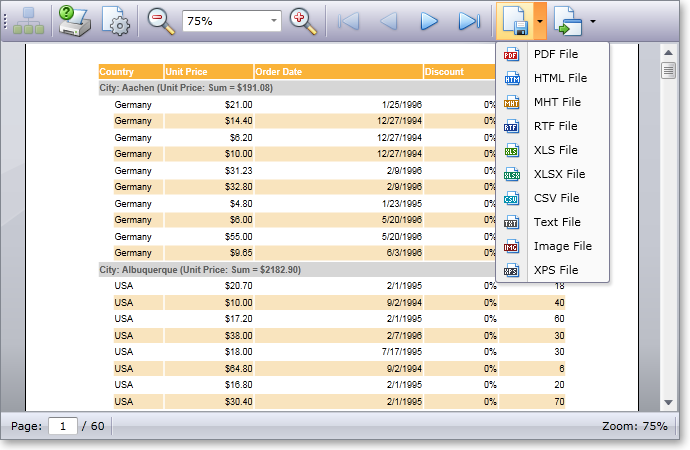
The DevExpress Grid Control for Silverlight supports client-side printing. A complete set of templates and styles allow you to customize the appearance and layout of grid rows and cells in a printed document. A grid can also be exported to popular formats such as PDF, Excel, RTF, XPS, Text, CSV, MHT, HTML, Image (PNG, BMP, etc).
Working with Data
Advanced data connectivity and management is built into the core of the DevExpress Grid Control for Silverlight. Built-in support for the Windows Communication Foundation’s RIA Services fills in the void between the presentation layer and the data access layer enabling you to easily link client and server projects within the same solution to create a data binding mechanism. Loaded data can then be customized at runtime using powerful data shaping features (filtering, grouping, sorting and summary).
End-User Customization and Usability Features
- Row and cell multi-selection and Clipboard support.
- Full end-user customization using built-in dialogs (filter editor, unbound expression editor, group and total summary editors, column chooser window).
- Extendable context menu to enhance end-user customization capabilities.
- Hit-Testing allows you to determine which grid element is located at a specified point on the screen.
- Full UI Localization.
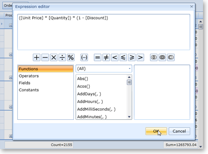
Layout Serialization
With this feature, you can save and restore grid layout and maintain layouts between application runs. This feature can also be used to provide end-users with multiple predefined layouts so that they can switch from one to another based on their business requirements.
Performance Improvements
The following is a summary of performance related improvements introduced in the DevExpress Silverlight Grid 2010 vol 1.
- Re-designed grid loading procedure reduced load times by 50%
- Content scrolling is now twice as fast as previous versions
- No intermediate objects are now used for data binding.
Filter Control
Our Silverlight Grid control, much like its WPF counterpart, now allows you to specify filter conditions of any complexity using an advanced Filter Editor dialog ported from our WinForms and ASP.NET platforms.
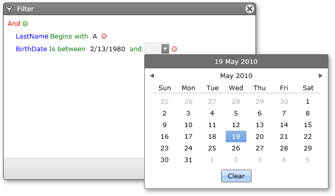
Unbound Columns and Expression Editor
In previous versions, the only way to specify unbound column values was to handle an event and write the appropriate code. With this new release, the DevExpress Silverlight Grid control allows you to address this requirement using an intuitive design-time editor.
You can also enable end-user customization of expressions. Simply activate the appropriate option and the column's header menu will feature a link to the Expression Editor.
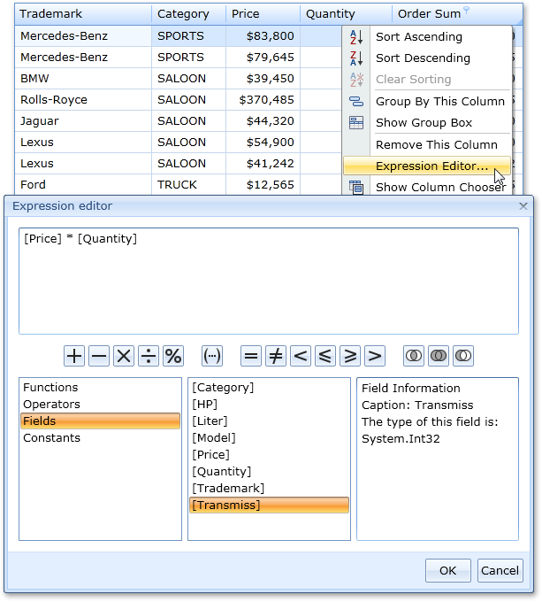
Miscellaneous Features
-
Full UI Localization
Text in all UI elements can now be translated to multiple languages.
-
Custom Sorting
You can manually sort grid rows by handling a specially designed event.
-
Data Annotations Support
The grid recognizes several data source field (property) attributes that can specify column caption, read-only state, header tooltip, order, etc.
Bars
DXperience v2010 vol 1 introduces a new Silverlight Toolbar-Menu Library with a shared codebase with the DevExpress Toolbar-Menu System for WPF. By using this new product, you can easily emulate Microsoft Office style main menus, toolbars, status bars and context menus.
This also applies to end-user customization options, including toolbar drag-and-drop and Office style Customization dialog.
Key features feature:
- Sharing items between toolbars, main menu, status bar and context menus
- Floating state for toolbars
- Multiple item types including check buttons, dropdown menus and embedded data editors from the AgEditors Library
- Vertical toolbar orientation
- Microsoft Office style Customization Window
- Reusable Command Containers
- Toolbar List item allowing end-users to manage toolbar visibility
- Small or large icons views
- Command tooltips
- And much more
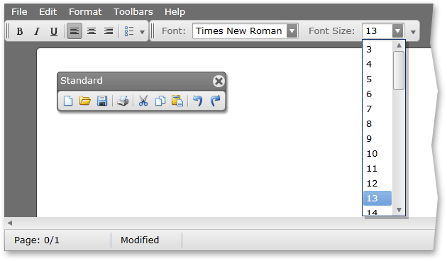
New Gallery Control
The DevExpress Silverlight Gallery Control displays images which are categorized into groups. It provides powerful customization capabilities, allowing you to modify the control's appearance and behavior as needed.
Features feature:
-
Display of captions and descriptions for individual images
-
Custom layout options for text regions
-
Ability to customize the number of visible columns
-
Flexibility to categorizing images into groups
-
When using multiple groups, you can enable group filtering via a context menu
-
Hover images for gallery items, which appear when hovering over standard images
-
Ability to customize templates used to represent gallery items and group headers
-
Item selection
-
Multiple selection modes
-
Execute custom actions when clicking items
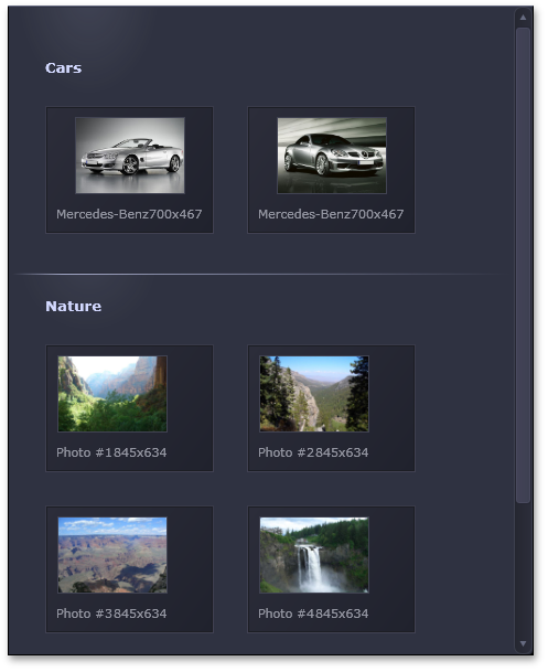
Toolbar and Menu Library for Silverlight - Layout Persistence
When using DXBars for Silverlight, you'll now be able to implement full support for runtime layout persistence and loading.
This means that you have the ability to save the layout of your toolbars and menu controls to a data store for future use.
The layout can be persisted to a memory stream, an external file as well as Silverlight isolated storage.
Chart Control
DXperience v2010 vol 2 ships with a complete range of charts and diagrams for Silverlight. DXCharts for Silverlight features the same 2D series views as its WPF counterpart (such as various Bars, Pie and Financial views), with comprehensive animation support. DXCharts for Silverlight supports series template binding, smart series point labels, secondary axes, constant lines, and custom draw.
Our focus in this release has been to establish a solid foundation for the Silverlight platform, and deliver a flexible and extensible architecture.
By creating a user interface (XAML markup, and user code) that is very similar to our WPF Charts, you can write code once and painlessly port that code between the two platforms.
Hit-Testing for All Chart Elements
You can now obtain access to any of your chart's visual elements – allowing you to address complex user interaction requirements.
Extended Support for Custom Models
With this release, DXCharts provides extended custom models support. You can use your own visual models (at any level of complexity) and exploit all the benefits of both WPF and Silverlight platforms.
Docking Control
The new DevExpress Silverlight Docking Library allows you to deliver dock-based interfaces for Silverlight.
Though in beta, the control ships with key features designed to create dock and floating panels, and emulate IDE interfaces.
Features feature:
-
Panel drag and drop support. Dock panels can be combined into split and tab containers or made to float.
-
Visual Studio style dock hints
-
Use Pin buttons to enable the auto-hide feature.
-
Reordering Tabs Using Drag and Drop
-
Automatic splitters between panels allow users to resize panels at runtime.
-
Built-in Context Menus
-
Document Tabbed Interface
-
Layout Persistence
-
Ability to add toolbars to panels
-
Built-in layout manager allows you to create consistent layouts of controls within panels
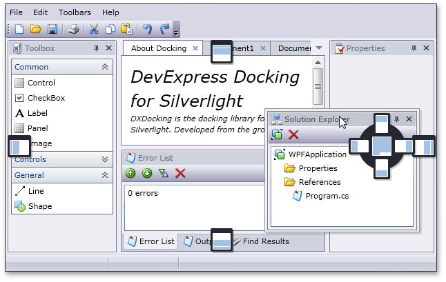
Editors
New Memo Editor
With DXperience v2010 vol 1, we’ve extended our Silverlight Data Editors Library with the introduction of the MemoEdit control - a dropdown multi-line text editor.
In addition to the text input features derived from our TextEdit control, it offers the following multi-line text management options:
- Optional ENTER and TAB key processing
- Customizable visibility for vertical and horizontal scrollbars
- Optional text word-wrapping
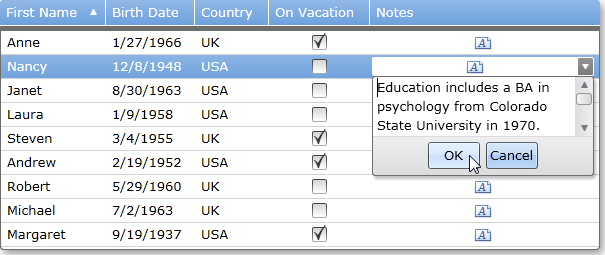
New Spin (Up-Down) Editor
The DevExpress Editors Library for Silverlight now features a spin edit control. Like other DevExpress data editors, this control can be used on a standalone basis or within grid cells.
Key features feature:
- Horizontal or vertical spin button orientation.
- Customizable increment/decrement value.
- Properties specifying minimum and maximum allowed values.
- Ability to disable the text box and only allow modifications via the spin buttons.
- Built-in numeric mask that only allows entry of numeric values.
- Value increment acceleration - the longer you press the button, the faster the value changes.
New List Box Control
Our Silverlight Data Editors Library introduces a new List Box control that can be used as a standard list box, checked list box or a radio group control. This control can be used on a standalone basis or embedded within our container controls like the AgDataGrid for Silverlight.
Key features feature:
- Lookup functionality. The editor can load values for its list from a data field. The actual edit value (usually, ID) is fetched from a different field.
- Optional item highlighting
- Multiple item selection
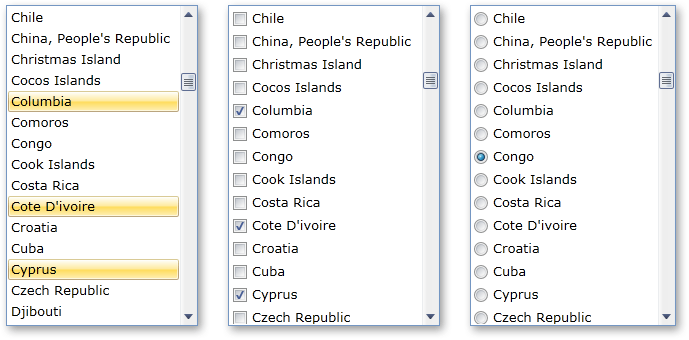
New Multi-Purpose Track Bar
This new editor has four different display styles including Track Bar, Range Track Bar, Microsoft Office style Zoom Track Bar, and Zoom-Range Track Bar. Once again, both standalone and embedded versions are available.
Key features feature:
- Customizable maximum and minimum values
- Horizontal or vertical orientation
Layout Control
Collapsible Groups
Each layout group now exposes a property that allows you to turn a group into a collapsible panel. In this instance, end-users can click the Collapse/Expand button within the group header to minimize the group and then restore its initial size. When doing so, the layout is automatically updated to properly accommodate neighboring elements.
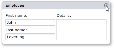
Tabbed Groups
With this release, you can convert a group into a tabbed container. By doing so, each next-level nested group will be moved into an individual tab without any architectural changes - you continue to work with a simple layout group and item tree, while generating a more effective UI layout.
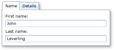
Design-Time Support in Visual Studio 2010
In previous version of the our Silverlight Layout Control, we announced full support for design-time customization in Microsoft Blend. The same level of design-time support is now available in Microsoft Visual Studio 2010.
Hiding Items and Access Hidden Items
With DXperience v2010 vol 2, hiding items and accessing hidden items in Customization Mode has been simplified. Click any item to display the DevExpress contextual customization toolbar. To hide an item, click the corresponding button:
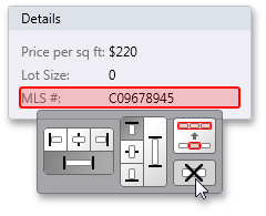
All hidden items can now be accessed in Customization Mode using the DevExpress Available Items window. To open it, click the button at the control's top left corner and drag and drop items from the Available Items window to the layout.
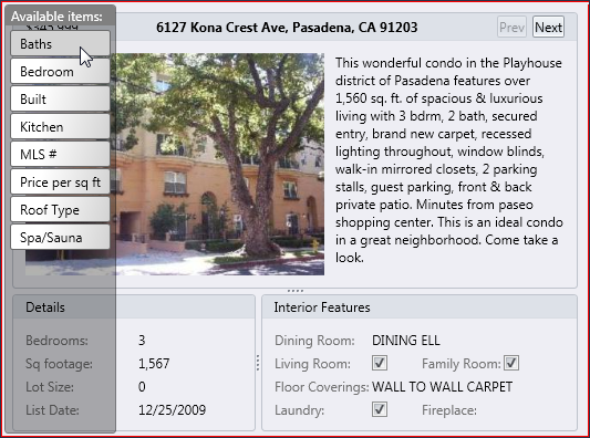
You can also hide groups and access hidden groups in the same manner.
The Layout Control's design-time experience has also been improved to support hidden items.
At design-time you can hide an item or group by moving it to the Available Items list via a context menu:
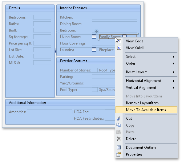
...And then restore an item or group via a group's context menu:
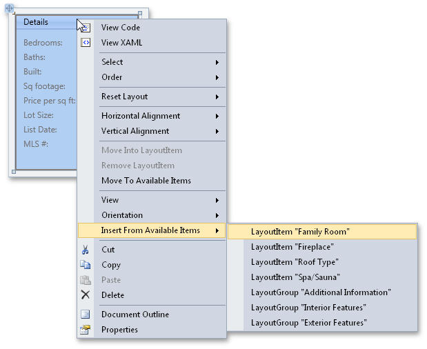
There is also a collection editor for the Available Items list. You can access it via the Properties window:
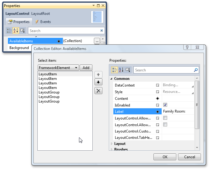
Miscellaneous
-
A red rectangle is painted around Layout Control to indicate that it's in Customization Mode.
-
Support for scrolling using the mouse wheel.
-
GroupBox - Support for transparent backgrounds.
-
Events have been added that allow you to save and load custom properties of layout groups and their children when saving/restoring layouts.
NavBar Control
New Nav Bar Control
DXperience v2010 vol 1 introduces a Silverlight NavBar Control. The following layout styles are featured in this release:
- Outlook® style Side Bar
- Windows® style Explorer Bar
- Office® 2007 style Navigation Pane
While each layout type has its own unique customization features and end-user capabilities, they all have common options which feature the following:
-
Content scrolling support
- Built-in animation effects for the following operations: content scrolling, expanding and collapsing of the navigation pane, expanding and collapsing of individual groups
-
Different item arrangement styles implemented by using various panel controls within groups
-
Freely customizable group content - you can display a set of items or any embedded controls
- Groups and items can be read from a bound data source
- Item selection support
- Saving and restoring layout. This allows you to persist group expansion states and scrolling between application runs.
Horizontal Orientation
Like its WPF counterpart, DXNavBar for Silverlight now allows you to change its orientation and the orientation of its items to horizontal. In addition, you can change these settings independently. For example, you can arrange items vertically within a horizontally oriented control (groups are arranged in a row, rather than in a column) and vice versa.
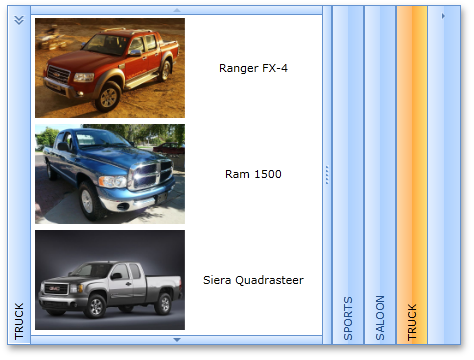
Rich Text Editor
Extensive Table Support
The DevExpress Rich Text Editor delivers a comprehensive set of options for managing tables within a document. End-users can easily add tables and customize its layout and organize information for improved readability.
With the extended table support available to you in our Silverlight Rich Text Editor, you can:
-
Insert rows, columns and cells.
-
Resize columns and rows.
-
Split and merge cells and split the table.
-
Align cell contents both horizontally and vertically.
-
Delete cells, columns and rows.
To enhance the appearance of the text in a table, you can add a border and shading to selected cells. When you add a border, you can specify which sides you want to feature or exclude, line style and color.
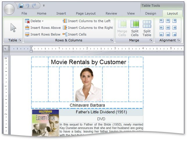
Document Protection
With this release, you can password protect the entire document against editing and selectively restrict the editing of certain document ranges. This new capability is a significant enhancement to the previously available option to specify document and operation restrictions for end-users.
When document protection is activated, a document is read-only except for certain ranges that authenticated users are able to modify. Editable ranges can be highlighted and enclosed in brackets.
Our document protection model is based on the RTF 1.9.1 specification (read-only password protection and protection exceptions sections) and is therefore compatible with the Microsoft® Word® document protection feature.
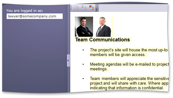
Creating Toolbar and Ribbon at Design Time
We have significantly improved how the Rich Text Edit Control interacts with the Toolbar/Menu System and the DevExpress Ribbon Control. You can now create a complete Ribbon UI inside the Visual Studio Designer with a few mouse clicks:
Native Printing Support in Silverlight Rich Editor
Our Silverlight Rich Editor control now takes full advantage of the Printing features introduced in Silverlight 4. Native printing support replaces our previous workaround that involved JavaScript processing to print browser contents.
Miscellaneous
-
Clipboard operations now support rich text format. You can also copy/paste formatted text from the DevExpress Rich Editor to the standard Silverlight control, and vice versa.
-
Context menu is now invoked with a right-click, as opposed to the CTRL+Click combination used in previous versions.
Workspace Manager
Additionally, the WorkspaceManager supports multiple visual transition effects, applied when loading a selected layout:
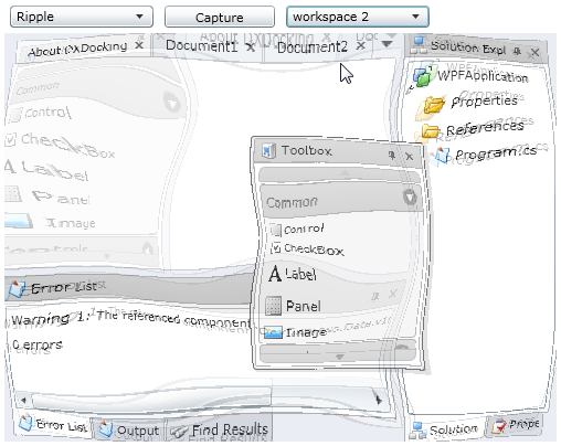
Miscellaneous
Super Tips
Super Tips are extended versions of standard tooltips. They support multiple tooltip regions and can display custom images with full text formatting.
WinForms Reporting
MDI Interface
We have upgraded our End-User Report Designer to support the Multiple-Document Interface (MDI). You can now load as many reports as you'd like into the same instance of the report designer (allowing you to switch between them and copy/paste data and controls across multiple report layouts).
If the End-User Report Designer uses a toolbar-menu interface, you can choose between "classic" or tabbed MDI. When using a Ribbon, only tabbed MDI option is available.
In addition, end-users are now able to edit subreports in the same designer with the master report. Right-clicking a subreport control at design time invokes a new tab (or window) with the subreport within it.
Blog Post
Report Storage
In this version we have made it easier to save and load reports to any data source in the end-user report designer. Depending upon the architecture of your application, you can define a custom report storage to save reports either as files on a disk, a zip archive, or directly to a database.
Blog Post
Script Editor Improvements
DXperience v2010 vol 2 introduces a number or key features to our script editor – all designed to enhance the developer experience. These features feature:
-
Syntax Highlighting (1)
-
Line Numbering (2)
-
Matching Bracket Identification (3)
-
Error Highlighting (4)
- Inclusion of the "Find" and "Replace" items in the context menu (5)
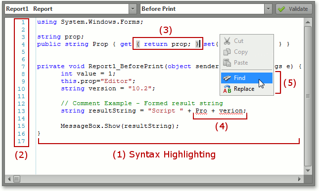
Code Analysis
This release also incorporates a lightweight code analysis feature that allows XtraReports to determine if methods with an appropriate signature exist. If so, XtraReports will add these methods to the combo-box of the corresponding event in the Property Grid.
Blog Post
Custom Icons in a Field List
You can now provide custom images for Field List elements (e.g. a "house" icon for a home address field or a "phone" icon for a home phone field).
Blog Post
Improved Support for Enums and Complex Types in User Interfaces
In this version we have improved the manner in which XtraReports represents enumerations and complex types in the parameters pane of the Print Preview and the Filter String dialog of the End-User Report Designer. When adding parameters, the combo-box for the enum value contains actual values available in the enum, and for complex type objects it can display a corresponding editor.
This feature is also available in the report's Filter String Editor.
Blog Post
Sort Groups by Summary
DXperience v2010 vol 2, introduces the ability to sort report groups based on aggregate data (Sum, Count, Max, etc.) contained in a group. A group header now provides a SortingSummary property that specifies a field name, a summary function to calculate for field values, as well as sort order (ascending/descending).
The following is a sales report grouped by product category and sorted by cumulative sales in each category (descending).
Blog Post
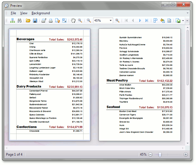
Dash Style for Control Borders
We have improved the appearance of borders for all report controls. It is now possible to choose one of the predefined dash styles for borders.
Blog Post
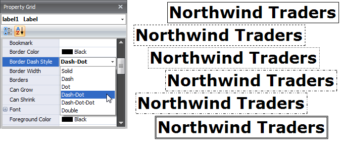
Miscellaneous Enhancements
- XRChart and XRPivotGrid controls integration has been improved. It is now possible to define the XRPivotGrid control as a data source for the XRChart control, much like XtraCharts and XtraPivotGrid WinForms controls.
- In addition to all common .NET types, report summaries can be also calculated for System.TimeSpan values.
- It is now possible to save a report's print settings to the system registry, xml file or a stream and read them again, when necessary. This is useful when saving user preferences between sessions.
- XRPictureBox now has a new "Squeeze" option - and can be used when image size is unknown at design time and you wish to maintain image quality at runtime. This option allows you to maintain the original image size if it is small, and to shrink it if the image is too big.
- New Option: Disable document generation if a report's datasource is empty. This can be employed when a master report contains multiple subreports and you wish to prevent printing of those subreports that do not have data.
WPF Reporting
Interactive Document Preview
You can introduce end-user interactivity to your Document Preview by using the following new events: PreviewClick , PreviewDoubleClick and PreviewMouseMove .
Once implemented, your end-users can drill-down and drill-through reports, and execute other operations (such as sorting) within the Document Preview.
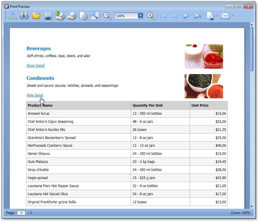
Searching within the Document Preview
With this release, the WPF Document Preview allows you to search for an occurrence of a specified text string within the document.
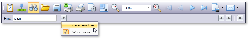
Report Scaling in Document Preview
The WPF Document Preview now allows you to scale documents displayed within it.
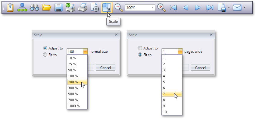
Mouse and Keyboard Shortcuts for Most Frequently Used Commands in Document Preview
New Zooming Modes
The following new document zooming modes are available:
- Fit to whole page
- Fit to page height
- Fit to page width
Silverlight Reporting
Native Silverlight Printing
When we first released our Silverlight printing engine, native print support did not exist within the platform. As such, we adopted the proven approach used in ASP.NET - generate a PDF file on the server side and then send it back to the client's browser.
Silverlight 4 offers a native API for print operations and the DevExpress Printing Library has evolved to take advantage of it - v2010 vol 2, provides native Silverlight print operations, which allows you to use our printing library inside browser and also "out-of-browser" applications.
Silverlight Viewer Improvement - Export Options
With this release, our Silverlight Viewer introduces new report export options:
Blog Post
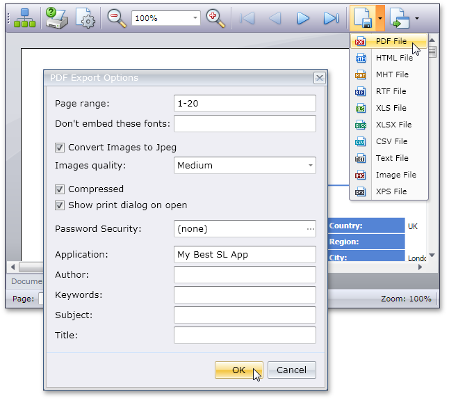
Silverlight Viewer Improvement - Progress Indicator
The Print Previewer now displays a progress bar.
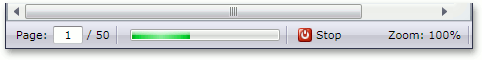
Silverlight Viewer Improvement - Document Map
The Silverlight Print Preview can display a document map - built upon the tree of report bookmarks. This structure can be used to view the report's entire hierarchy and make it easier to navigate through the report (these bookmarks are also exported to PDF).
Blog Post
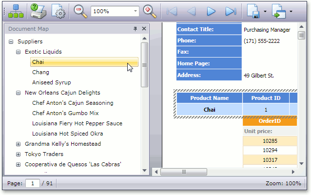
Silverlight Viewer Improvement - Parameters Pane
Parameters are an essential part of any complex real-life report, allowing end-users to generate a document based on their business requirements. End-users can specify report parameter values directly from the Print Preview, using our newly added parameters pane.
Blog Post
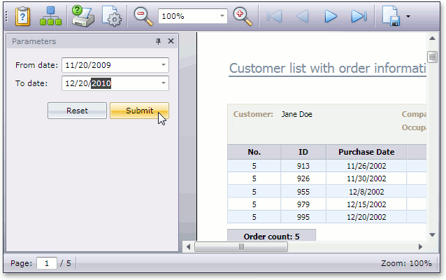
Windows Azure Support
DevExpress Reporting offers Windows Azure support - even under a medium-trust environment with a few caveats:
- Running end-user scripts, or loading a report from a REPX file or a stylesheet from a REPSS field is not allowed under medium trust (these involve code compilation which is not allowed in medium trust).
- Creating 3D Charts is not allowed because we use OpenGL rendering.
- Exporting to a metafile or rendering an XRChart control as a metafile (its XRChart.ImageType property must be set to ChartImageType.Bitmap).
- Exporting to a PDF when you have to embed fonts. Only characters from 32 to 255 are allowed in medium trust.
- XRRichText and XRPivotGrid controls aren't supported.
Under full-trust, you will be able to use all features without modification.
Blog Post
New Report Viewer for WPF
You can now integrate reports generated with the XtraReports Suite into your WPF application by using our new Report Viewer for WPF.
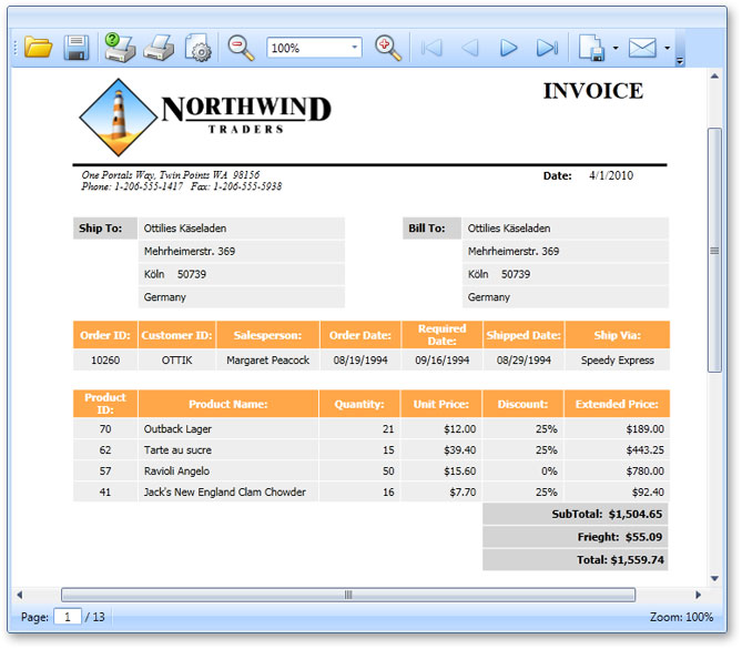
Full Visual Studio 2010 Support
The XtraReports Suite fully supports the new Microsoft IDE. You can create new reports using templates available through the Add New Item dialog, use our fully-integrated report designer with native toolbars and service windows, view HTML output and preview reports within the IDE.
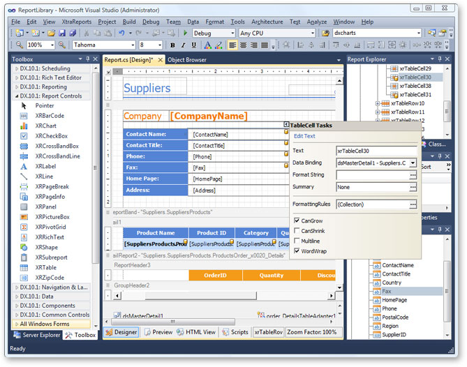
New Report Viewer for Silverlight
Your Silverlight applications can now display reports created with the XtraReports Suite via our new Silverlight Report Viewer.
Because Silverlight applications provide a different data access model, we've also introduced a new Report Data Provider service that transmits report data to the client application's Report Viewer.
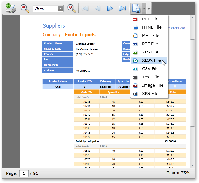
Complete Support for Visual Studio 2010
The XtraReports Suite fully supports the new Microsoft IDE providing the same feature set as that found in previous versions. You can create new reports using templates available through the Add New Item dialog, use our fully-integrated report designer with native toolbars and service windows, view HTML output and preview reports within the IDE.
Actions in Detail View Layout
With this release, Actions can be displayed both within toolbars and the Detail View layout via the new ActionContainerViewItem class - which represents a View Item displaying an Action Container.
Typed Application Model
The XAF Application Model has been completely rewritten. The new Typed Application Model has the following advantages:
- Significantly faster because it uses lazy initialization.
- Consumes less memory because node properties now hold references and not values - and a single Application Model instance is now automatically shared between users in ASP.NET Web XAF applications.
- Using the Application Model in code is easier because the new Application Model is typed - there is no need for string conversions and use of additional artificial wrappers.
- Both tasks - extending the Application Model elements with custom attributes and providing custom behavior for them - can now be easily accomplished with the same familiar technology used to implement business logic in your classes. For instance, to filter an Application Model element's value list, you can now use the DataSourceProperty attribute. It’s now also possible to utilize the new Domain Components technology for this purpose.
To learn how to migrate an existing XAF application to the new Application Model, refer to the eXpressApp Framework v10.1 Application Model Migration Guidelines knowledge base article.
Domain Components Technology
Domain Components (beta) has been designed to dramatically simplify data reusability by providing a much more flexible and abstracted approach to business object design.
With Domain Components, you define interfaces instead of regular business objects inherited from XPO classes. These interfaces will declare required properties or data fields. The way this data should be processed - Domain Logic - is then defined by creating special classes that determine how interface members behave when the object is constructed, when properties are changed, etc. Actual business classes are automatically generated by XAF at runtime, based on specified logic and interfaces.
You can then package interfaces and domain logic in an assembly and use it as a domain library. If you are creating a new XAF application, you can reference the domain library and reuse the domain components. Since interfaces support multiple inheritance, the required "business objects" can be combined into new domain components.
Windows Forms UI and Usability
Easy Ribbon UI
In previous versions, the Ribbon UI was supported via a special module which needed to be included in the application and required manual configuration. With this release, the Ribbon UI is automatically supported in all WinForms XAF applications. To enable or disable the Ribbon UI, you need only to specify a single Application Model property.
Easy MDI and Docking
XAF now includes a new MDI Show View strategy which can enable MDI with just a single line of code or via an option in the Model Editor. This new option allows you to enable one of the following UI strategies - Tabbed MDI, Standard MDI, Multiple-Window SDI or Single-Window SDI. The resulting UI is based on the DevExpress WinForms Docking Library, which allows you dock and undock individual Views. This basically means that root List Views can now be opened in separate windows.
If end-users press SHIFT and click on a List View item in the navigation bar, then the List View will be opened in a separate main window. If they use CTRL+Click, then it will be opened as a tab. The Model Editor exposes an option to control default window position, thus giving end-users total control over this new multi-window UI behavior.
View Variants
Detail Views Support
You can now provide several versions for each Detail View thus allowing end-users to switch between different layouts at runtime. Much like the List View implementation available in previous versions, Detail View Variants can be controlled via the Model Editor.
List Views have been updated too to provide faster switching between different variants.
EasyTest Script Recorder
We have updated our functional testing library and now one of its most important components - Script Recorder - ships within standard XAF modules:
- DevExpress.ExpressApp.ScriptRecorder
- DevExpress.ExpressApp.ScriptRecorder.Win
- DevExpress.ExpressApp.ScriptRecorder.Web
This means that the Script Recorder functionality isn't now included by default, but can be easily added by dragging a module from the Toolbox. This gives much more flexibility compared to the previous version where the Script Recorder was always included into new applications and disabling it wasn't as easy as deleting a module from your application.
Conditional Appearance Module
This new module allows you to dynamically configure a user interface, and is designed to supersede the Conditional Formatting and Conditional Editor State modules. UI customizations are performed on the basis of predefined business rules. The rules can be declared in business class code via the Appearance attribute and in the Model Editor under the Class | AppearanceRules node.
Currently, the Conditional Appearance Module can execute the following:
- Disable/enable/hide/show Property Editors
- Disable/enable/hide/show Actions
- Change the font style and color of the text displayed by a Property Editor.
Previously, the Context parameter of an appearance rule could only have one of three predefined values - DetailView, ListView or Any. You can now create View-specific rules and can specify Views where a rule should be activated - you also have the option to exclude a particular View from an appearance rule's scope.
The module now offers support for custom appearance customization. This option is useful in situations where you want to perform additional customization of disabled Property Editors. Another example would be the suppression of tab stops on disabled Property Editors.
In previous versions, appearance rules could only affect Property Editors and Actions. You can now also customize layout items (Property Editor captions) and layout groups.
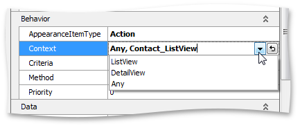
ASP.NET Theme Support
Just like DevExpress ASP.NET components, XAF now support themes and has more than a dozen available out of the box. In addition, end-users can switch between deployed themes via the new Choose Theme Action.

Chart Module
This newly introduced module contains Windows Forms and ASP.NET Web List Editors that allow you visualize data using the XtraCharts suite. The ChartListEditor and ASPxChartListEditor implemented in the module, display data in the form of a chart. No modifications to your business classes are required as these List Editors are designed to visualize arbitrary object types.
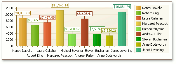
Dashboard Views
A new DashboardView View type has been introduced - designed specifically to display any number of unrelated Views in a single Frame. End-users can easily create and organize Dashboard Views at run time.
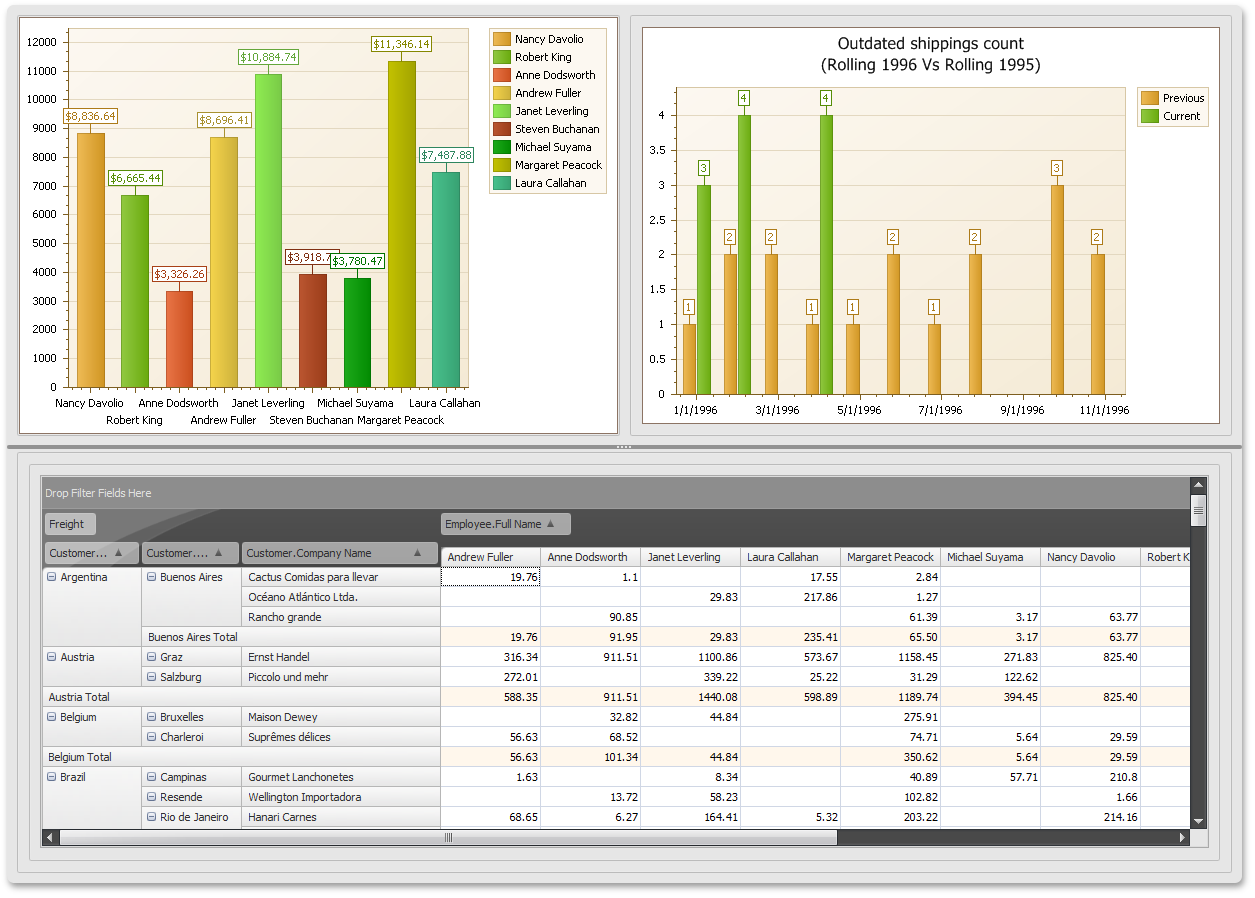
ASP.NET UI Enhancements
To improve the overall usability and end-user experience, ASP.NET templates have been redesigned in this release.
New Visual Theme for ASP.NET Applications
We have refactored our framework's core components and web pages templates so that standard DevExpress ASP.NET Visual Themes can be used in XAF ASP.NET applications. This release introduces support for the Aqua theme that is used in new applications by default. Support for the rest DevExpress ASP.NET Themes will be implemented in forthcoming updates.
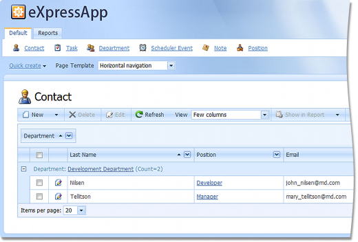
'Quick Access' Navigation Items
Previously, all navigation items were duplicated at the bottom of web pages and thus could occupy a lot of space, depending on the item count. In the current version, we've implemented a new navigation item container allowing you to show only necessary items. The items to be shown in that container are chosen based on a newly implemented attribute's value.
Rendering Custom ASP.NET Property Editors in List Views
In previous versions, custom ASP.NET Property Editors were only rendered in edit mode. When viewing data, different built-in templates were used for appropriate data types. The new version correctly renders custom Property Editors in List Views in both edit and view modes.
Miscellaneous
- The general layout of elements on the page is now more compact with functional regions having clearly defined borders.
- A newly introduced splitter now separates the left panel and working area. This splitter allows you to collapse the left panel, enlarging the working area and allowing you to view more data. The splitter also allows you to fine-tune the width of the left panel.
- Additional work area space has been freed by moving the breadcrumb navigation under the view title, thus consolidating two related items - the view and the path to it.
- Object navigation Actions have been removed from the main toolbar and their appearance have been compacted and accented.
- Actions from the Save category have been removed from the main toolbar and are now available in a separate Action group.
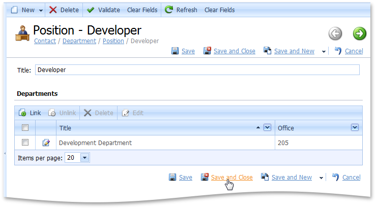
Detail View in WinForms Apps
A new DelayedViewItemsInitialization property has been introduced to the XafApplication class. When set to True, it forces View Items controls to be initialized only once they are visible to end-users and not once a View is created. This noticeably speeds up Detail View creation, however you need to check your applications, to ensure that you do not access View Items until their controls are actually created.
Model Editor
Nodes Tree
In the nodes tree, the drag-and-drop and multiselection is supported. You can:
- Copy/move several child nodes from one parent to another.
- Rearrange child nodes (e.g. List View columns, navigation items, etc).
- Apply a context menu command to several nodes at the same time.
- Change common property values of several nodes at the same time.
In the node context menu, a new Clone command is now available. It creates a duplicate of the selected node(s) at the same hierarchy level. The Id property of the new node is appended with "Copy", and other properties remain intact.
Search Panel
The Search Panel's performance has been improved and a new smart search option has been made available - you can enter text in the search box and view search results as you type.
Mini Toolbar
The property grid now comes with a mini toolbar allowing you to:
- Switch the property grid between categorized and alphabetic view.
- Reset the selected property value.
- Move focus to the node associated with the currently selected value.
- Move focus to the source property of the selected calculated property.
Validation
Validation of property values, specified via the Model Editor, is now supported.
Printing Module
You can now easily print nested List Views - via the Print Preview Action in nested views.
Reports Module
- Until this release, if a collection property did not have the Association attribute applied, the collection was not available in the report designer. This was a drawback as it effectively prohibits use of non-persistent object collections in reports. It was also an issue for persistent object collections, since adding unnecessary associations impacts the performance. With Dxperience v2010 vol 2 we have addressed this issue and now all collection properties are available in the report designer.
- Along with the support for MDI, we have introduced the "New with Wizard" Action into the File menu - you can easily create new reports without leaving the report designer.
- The End-User Reports Designer has been improved to support Multiple-Document Interface (MDI) and Ribbon UI - you can now edit several reports at once, quickly switch between them to copy/paste report data or import/export a layout. The Open command from the File menu now loads the application's report into a new tab.
With this release, the sub-reports are fully supported - you can easily include a particular report structure into many reports, keeping a consistent appearance and functionality.
The XtraReports Suite, used by the Reports module, has native support for creating custom parameters to be used when filtering a report data source. In previous versions, only simple value type parameters such as String or Boolean were supported. With this release, this limitation no longer exists as we have implemented support for enumeration and reference type parameters.
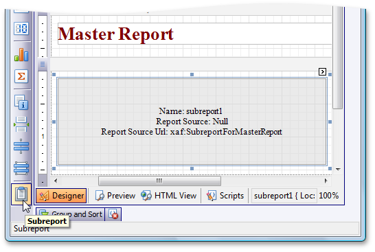
Templates
Up until now, when you have customized templates, all has been well until new version of XAF containing updated has been released. Suddenly you have got to merge your changes in with ours, which is not always an easy task. With this release, templates has been simplified as much as possible. All residual logic has been moved out of the templates and into base and helper classes. The design time support has been improved to ensure that all of our templates can be easily designed. So, now you can easily customize a template and if we update it, we actually will be updating our base classes and will not touch the template code. So, you will not need to perform time-consuming merging.
To learn how to migrate an existing XAF application which uses custom templates to the new release, refer to the eXpressApp Framework v10.2 Custom Templates Migration Guidelines knowledge base article.
Information Panels
With this release we have greatly simplified custom panel creation. Built-in templates have been improved and a new CustomizeTemplateViewControllerBase Controller has been introduced. These combined enhancements allow you to create information panels and place them in a UI where necessary.
Key Performance Indicators (KPI)
Key Performance Indicators, or KPIs, are quantitative measurements of dynamic business processes. For instance, an important performance indicator for a trading company is daily sales, for a developer team - the number of active bugs in their product, etc. For better visualization, KPI value ranges can be split into a "green zone" (everything is OK), "yellow zone" (warning), and "red zone" (things are bad). When the KPI is based on a time range, it can be useful to compare values of different periods (for instance, the current month against the previous one). If a deeper analysis (drilldown) is required, then the objects an indicator was calculated from can be listed.
When the KPI module is used in an XAF application, the KPI navigation group with the Definition and Scorecard navigation items is available. Under the Definition item, end-users can create KPI definitions (KpiDefinition objects):
Under the Scorecard item, end-users can view and analyze collections of KPIs by linking KpiDefinition objects to Scorecard objects. The ShowChart Action provides the ability to view KPI results as a chart.
Localization
Localization Tool
The new Localization Tool is designed to simplify and speed-up the localization of XAF applications. Previously, you had to look through the entire Application Model to find and translate localizable values. The Localization Tool can be invoked from the Model Editor toolbar. It shows all localizable properties in one grid.
Within the Localization Tool, you can:
- Manually translate all the localizable values. If there are several localizable properties with the same values, they can be translated at once.
- Export the localizable properties' values to a CSV file and pass it to a professional translator. This file can be viewed and edited in any spreadsheet or plaintext editor.
- Import the CSV file with the translations.
- Reuse the CSV file with common localizable values, in other XAF applications.
-
Perform an automatic translation via the Microsoft® Translator or another custom translation provider.
- Apply sorting and filters. There are several predefined filters, and you can specify custom filters as well.
You still can localize directly in the Model Editor when required - changes made within the Localization Tool are available in the Model Editor and vice versa.
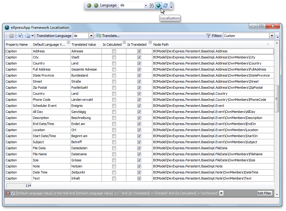
Localization Module via Satellite Assemblies
Previously, the culture-specific resources of each module were stored in the module's assembly, and it was impossible to localize them without rebuilding. You had to localize strings, supplied with the modules, in each new application. Now, the XAF modules localizations are stored in satellite assemblies. You localize in the Model Editor (using our new Localization Tool where appropriate). Changes are saved to an XAFML file like before, but, when building a module project, the localizations are placed into a language-specific satellite assembly.
The ready-to use Chinese (Taiwan), Dutch, German, Hungarian and Russian satellite assemblies for standard XAF modules are already available in the Language resources for the standard XAF modules and DevExpress controls knowledge base article. These satellite assemblies are based on translations kindly sent to us by our customers. You can install these assemblies using instructions available in the article and avoid localizing standard XAF modules manually.
Pivot Grid Module
This newly introduced module contains List Editors, that allow you to analyze data via the XtraPivotGrid and ASPxPivotGrid controls developed by DevExpress. The PivotGridListEditor and ASPxPivotGridListEditor implemented in the module, displays data in the form of a pivot table that can be accompanied by a chart. No modifications to your business classes are required as these List Editors are designed to visualize arbitrary object types.
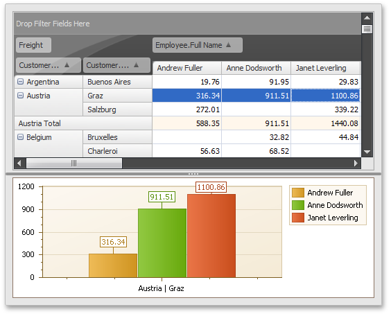
WinForms Logoff Functionality
ASP.NET XAF applications have supported log off and log back in, and now this functionality is available in Windows Forms XAF applications as well. What this means is that now you can log out of an application and log back on using another user's credentials (or have another user log on) without having to restart the application.
Additionally, a couple of new events have been introduced to the XafApplication class - LoggingOff and LoggedOff. You can handle the former, to cancel the log off process and the latter to be notified when a user has logged off.
New Code Provider
The following code provider is now available:
-
Create Event Trigger
Creates an event trigger for the current event.
-
Declare Attribute
Generates a new attribute class for an undeclared attribute.
-
Declare EventArgs Descendant
Generates an EventArgs descendant class for the type reference.
-
Declare Field (read-only)
Generates a read-only field for the element reference with the appropriate type.
-
Seal Class
Makes the class sealed.
Additionally, we have renamed "Declare Property with Initializer" to " Declare Initialized Property " and "Declare Field with Initializer" to
" Declare Initialized Field ", so they would be easier to read.
New Color Picker
New In-source Color Swatch and Picker
CodeRush now highlights color references in the source code with a rectangular color swatch appearing near the start of the color reference.
If you click the color swatch, the CodeRush Color picker appears, allowing you to select a new color (and change the color reference in the code).
New and Enhanced Templates
The new disp template instantly generates IDisposable implementations according to best practices. If the current class contains disposable private fields, the generated implementation includes
code to properly dispose of these fields.
This template is located in the Patterns/IDisposable category on the Editor|Templates option page. The Patterns
category includes also the Serialization subcategory, which was previously located in the root folder.
CodeRush property-building templates are now smarter, and have a new functionality: if your class implements INotifyPropertyChanged and you expand a property template with backing
store, you will get a setter that triggers the PropertyChanged event when that backing store gets a new value.
New Parallelization Refactorings
With this release, we’ve introduced new refactorings which make it easier to create asynchronous statement calls:
-
Execute Statements Asynchronously (FromAsync)
Passes the appropriate Begin... and End... methods (depending on the current statement) to the FromAsync method of Task.Factory, launching an asynchronous operation and returning a handle to the associated Task.
-
Execute Statements Asynchronously (StartNew)
Passes the current statement to the StartNew method of Task.Factory, launching an asynchronous operation and returning a handle to the associated Task.
-
Execute Statements in Parallel
Executes the selected independent statements in parallel.
-
Execute Statements in Serial
Moves the child statements out from the Parallel.Invoke call and executes them serial.
-
Convert to Parallel
Converts the code to run in parallel.
New Refactorings
The following refactorings are now available:
-
Convert to Constant
Converts the variable declaration into a constant declaration.
-
Make Read-only
Makes the field read-only.
-
Set Image Dimensions
Instantly sets the Width and Height attributes to an img tag, according to actual size of the source image.
-
Promote to Parameter (optional)
Removes all references to the local declaration from the method, replacing it with an optional parameter. Calling code is adjusted to pass in the promoted expression.
New Visual Basic Refactorings
-
Collapse Conditional
Converts this conditional to a single line statement.
-
Expand Conditional
Expands the current single line conditional statement to a multiline conditional statement.
-
Use Implicit Line Continuation
Removes redundant line continuation characters from VB source files.
New VS Editor Painting Engine
Our newly implemented Visual Studio Editor Painting Engine has been engineered for plug-in developers - allowing you to add visual elements to the code editor using the same method, regardless of IDE version.
.NET 4.0 contracts support
The Add Contract code provider supports the following .NET 4.0 contracts now:
-
Contract.Assert
-
Contract.Assume
-
Contract.Ensures
-
Contract.Requires
-
Contract.Invariant
Code Analysis
Previously CodeRush’s Code Analysis reported issues in the active file. In 10.2 we have implemented a Fast Solution-wide Analysis , which reports code issues
found throughout the entire solution in a background thread while you work.
The Project File bar in the bottom of the code editor helps you to find the most critical code issues and navigate to them in a few clicks.
Solution Wide Analysis
Note that Solution Wide Analysis is disabled by default. To activate it, check the appropriate option on the Editor|Code Analysis|Code Issues option page,
as shown on the following screenshot:
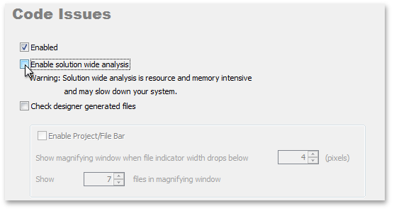
New Code Issues tool window
To help you see all the code issues in one place, we have created the new Code Issues tool window. This window lists code issues contained in the current file, project, or solution.
The tool window also shows the details of each issue, and takes you to the issue in the editor with a double-click.
The list of available code issues has been also increased with the following new code issues:
-
Declaration can be a constant
-
Field can be read-only
-
Implicit variable can be used
-
Redundant ToString() call
-
Virtual call in constructor
-
Base type constructors are not implemented
DXCore Parsers
Working with DXCore parsers is easier than ever, and is no longer limited to DXCore plug-ins, as we have moved the necessary classes into a separate assembly.
You can now access C#, Visual Basic, JavaScript, Html, ASP.NET, CSS, MVC, XAML and XML parsers (and get access to a universal tree, code generation features and more for all these languages)
via the DevExpress.DXCore.Parser assembly.
Full Support for Visual Studio 2010
CodeRush and Refactor! fully support the Visual Studio 2010 IDE – all the capabilities you’ve come to expect from our IDE Productivity Tools are available in Microsoft’s new IDE.
MVC Support
We have added new templates, navigation and code providers to support MVC development.
The MVC templates include these new templates for C# and Visual Basic and these ew templates for aspx code.
As always, you can customize templates on the Editor|Templates options page.
New MVC code providers
-
Declare MVC Action
Declares an MVC action for the reference to an undeclared MVC action.
-
Declare MVC Controller
Declares an MVC controller for the reference to an undeclared MVC controller.
-
Declare MVC View
Declares an MVC view for the reference to an undeclared MVC view.
New MVC navigation providers:
-
Jump to MVC Action
-
Jump to MVC Controller
-
Jump to MVC View
The scope of Tab to Next Reference has been extended to simplify navigation within MVC projects. Now you can navigate among action and controller references,
including references in string arguments passed to the ActionLink, Action, and RenderAction methods. Just place the caret inside an action or controller reference,
and press the Tab key, as shown in the following video:
In addition, the Can Declare MVC View code issue is now available, showing opportunities to declare undeclared MVC views.
Structural Highlighting
We have extended Structural Highlighting functionality to be available in ASP.NET and XAML .
The Editor|Painting|Structural Highlighting option page includes the new XML Elements tab, that enables you to specify the highlight color for any tags.
Unit Test Runner Improvements
We have added Silverlight unit testing support to the CodeRush Unit Test Runner, so now it’s easy to test your Silverlight applications.
We have also optimized the Unit Test Runner API to provide native support for the following testing frameworks:
-
MbUnit
-
NUnit
-
Visual Studio
-
xUnit
To make unit tests management more efficient, and simplify the process of processing testing results, we have implemented the following changes to the Unit Test Runner UI:
-
Test results appearing in the Unit Test Runner Details panel are now rendered in HTML, with syntax-highlighted call stacks, and links to corresponding methods in the code.
A right-click context menu lets you toggle between two different call stack displays, both designed to optimize clarity and ease of consumption.
-
Test run statistics are displayed in the tests tree, next to each parent node.
-
The new Go to Runner editor context menu item takes you from test code in the editor to the corresponding test node in the Unit Test Runner tool window.
You can create unit tests in seconds with unit test templates, which have been moved to the new Testing category (on the Editor|Templates options page). In addition,
we have added code template support for MSTest and Silverlight test frameworks. All of these templates effectively decouple developer from test framework, so if you ever
switch to a different unit test framework, you won’t have to change the keys you press when creating test classes and test methods.
Unit Test Runner shortcuts
We have added new Unit Test Runner shortcuts to let you easily control test execution. These templates are disabled by default after install. If you are accustomed
to using the Visual Studio default shortcuts, you can continue using the same key combinations with the CodeRush Unit Test Runner. Just enable the Visual Studio Style shortcut folder on
the IDE|Shortcuts option page:
Visual Basic and C# Support
New Visual Basic and C# Specifications Support
DXCore parsers now fully support Visual Basic 10.0 and C# 4.0. We've also introduced a few refactorings that support new specifications:
-
Promote to Parameter (optional)
Promotes local declaration to an optional parameter.
-
Use Implicit Line Continuation
Removes redundant line continuation characters in Visual Basic code (“_”).
-
The Convert to Auto-implemented Property refactoring has become available in Visual Basic.