.NET Core 3 Preview 5 Support
In addition to DevExpress assemblies built against .NET Framework 4.5.2, we are releasing new packages built against .NET Core 3. These packages contain the same set of DevExpress WinForms controls and allow you to test your applications in the .NET Core 3 environment even before its official release.
Demos (GitHub) Blog Post
Data Grid
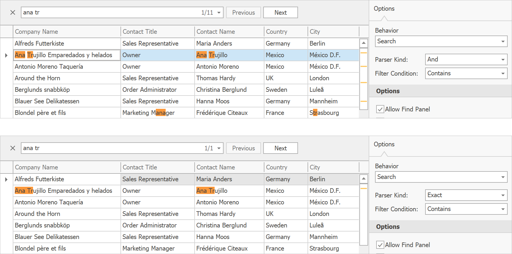
Find Panel - Parser Kind and Filter Condition
We've implemented two new options that let you fine-tune how our data-aware controls (Data Grid, Tree List, Vertical Grid) parse a search string entered into the Find Panel.
Parser Kind. Specifies whether the control should look for all or any of the words in the specified search string.
Filter Condition. Options include: Contains, StartsWith, Equals, Like. (Documentation)
Demo Blog Post Documentation
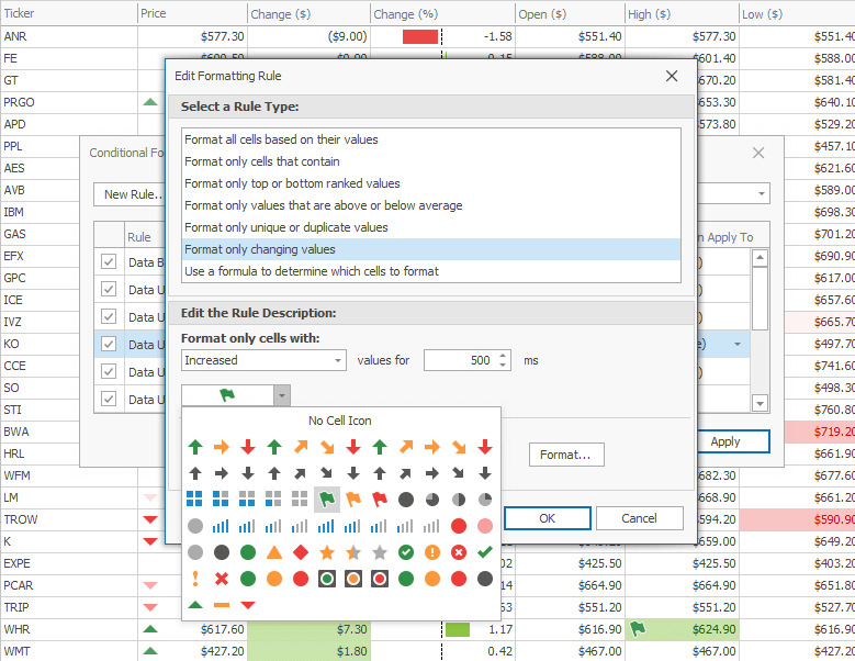
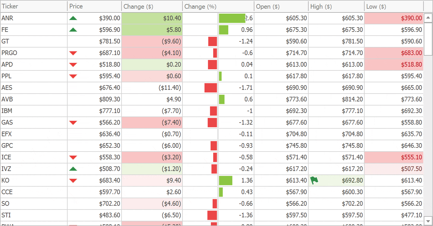
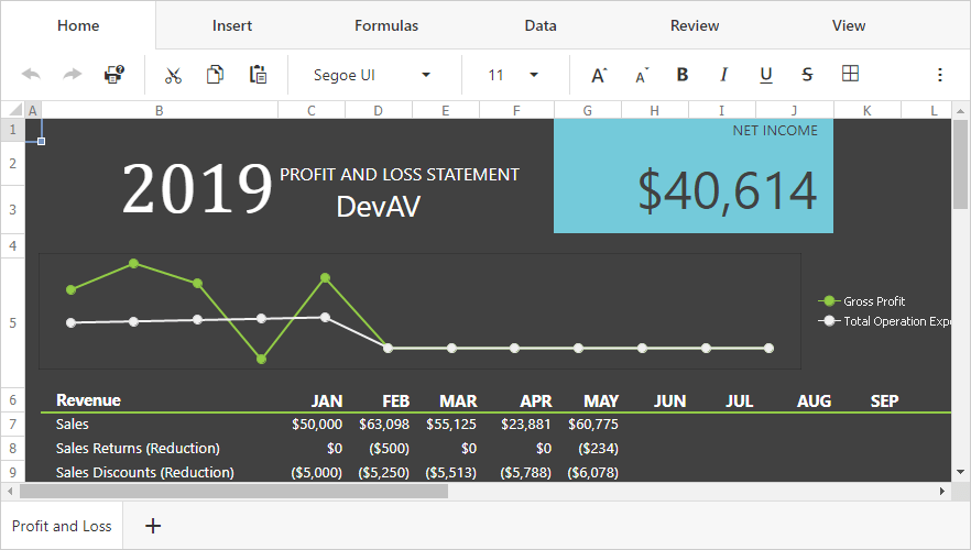
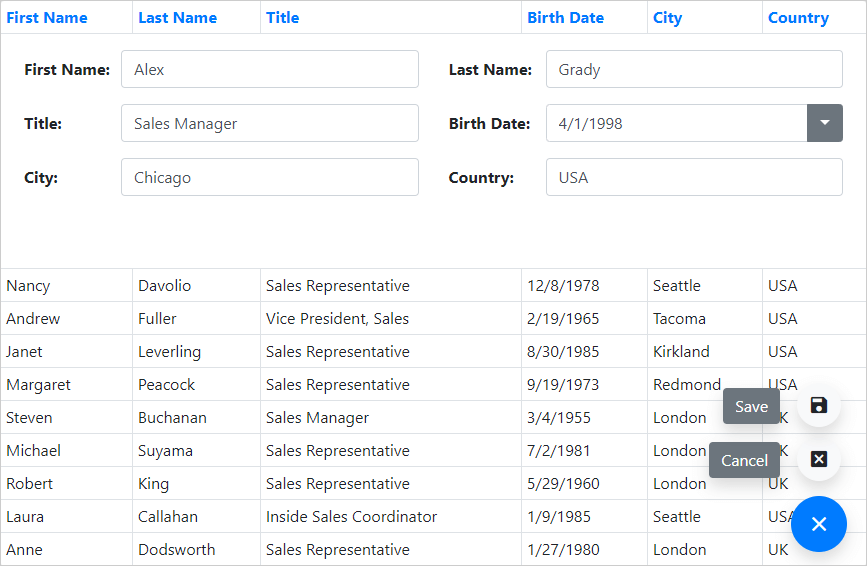
New Format Rules: Highlight Cell Value Changes
Highlight a cell with a custom icon or color if its value increases, decreases, or simply changes. Custom appearance settings will be reset after the specified time interval elapses.
Demo Documentation
Animated Format Rules
If you use a Format Rule to highlight cell value changes, you can enhance the presentation using the following animations effects:
- Fade in / out effects for icons
- Gradual color change
- Animated progress bars
Demo
Documentation
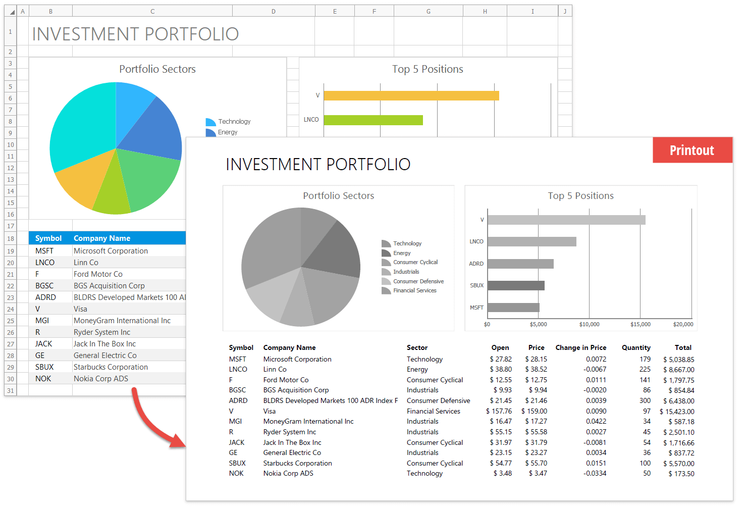
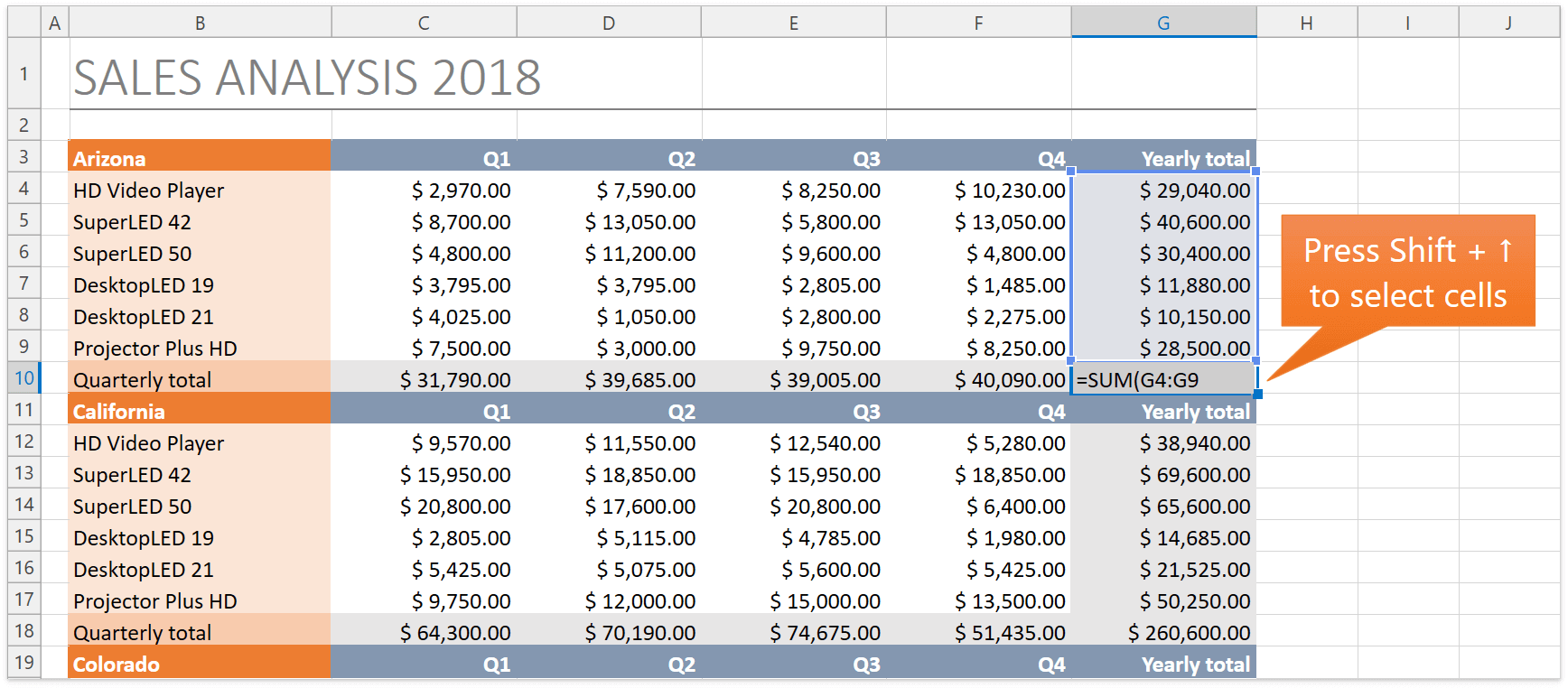
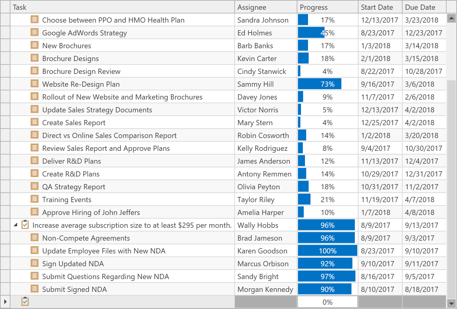
Repeat Fixed Columns on Each Printed Page
We added an option to repeat left-fixed columns and bands if the control is printed out or exported to a page-based format (PDF, DOCX and RTF).
Documentation
Charting
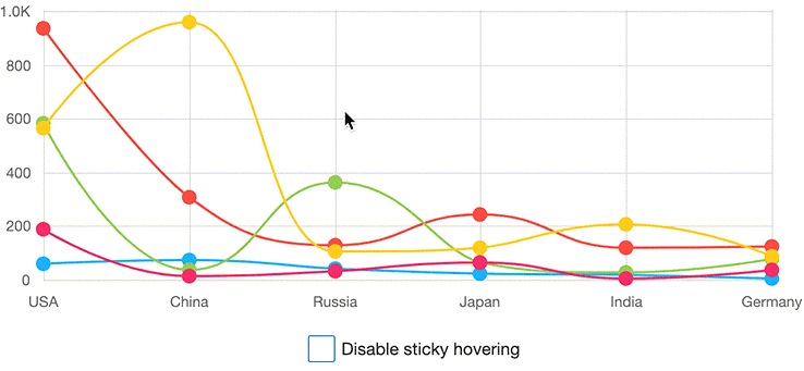
Segment Colorizers
You can now use the following segment colorizers to enhance data visualization.
- Trend Segment Colorizer
- Range Segment Colorizer
- Point-based Segment Colorizer
Demo Blog Post Documentation
Center-Align Axes
The Chart control allows you to center-align axes within the plot area.
Demo Documentation
Y-Axis Label Rotation (Polar and Radar Charts)
Polar and Radar charts now allow you to display Y-axis labels at an angle.
Demo Documentation
Axis Label Position and Alignment
The chart control introduces the following options:
- Display axis labels inside or outside of plot region. Documentation
-
Change label alignment relative to tick marks (Near, Far, Center). Documentation
Histogram
DevExpress Chart control now allows you to generate Histograms. Features include:
- Histogram aggregation function
- Excel-inspired histogram calculation modes (automatic, bin width, bin number)
- Interval information display within axis labels
- Customizable label text for Overflow and Underflow bins
- Ability to align grid lines and tick marks with bins and to center axis labels
Demo Blog Post Documentation
Diagram
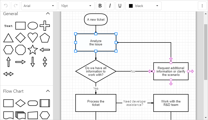
Collapsible Containers
Users can now collapse and expand container content.
Demo Documentation
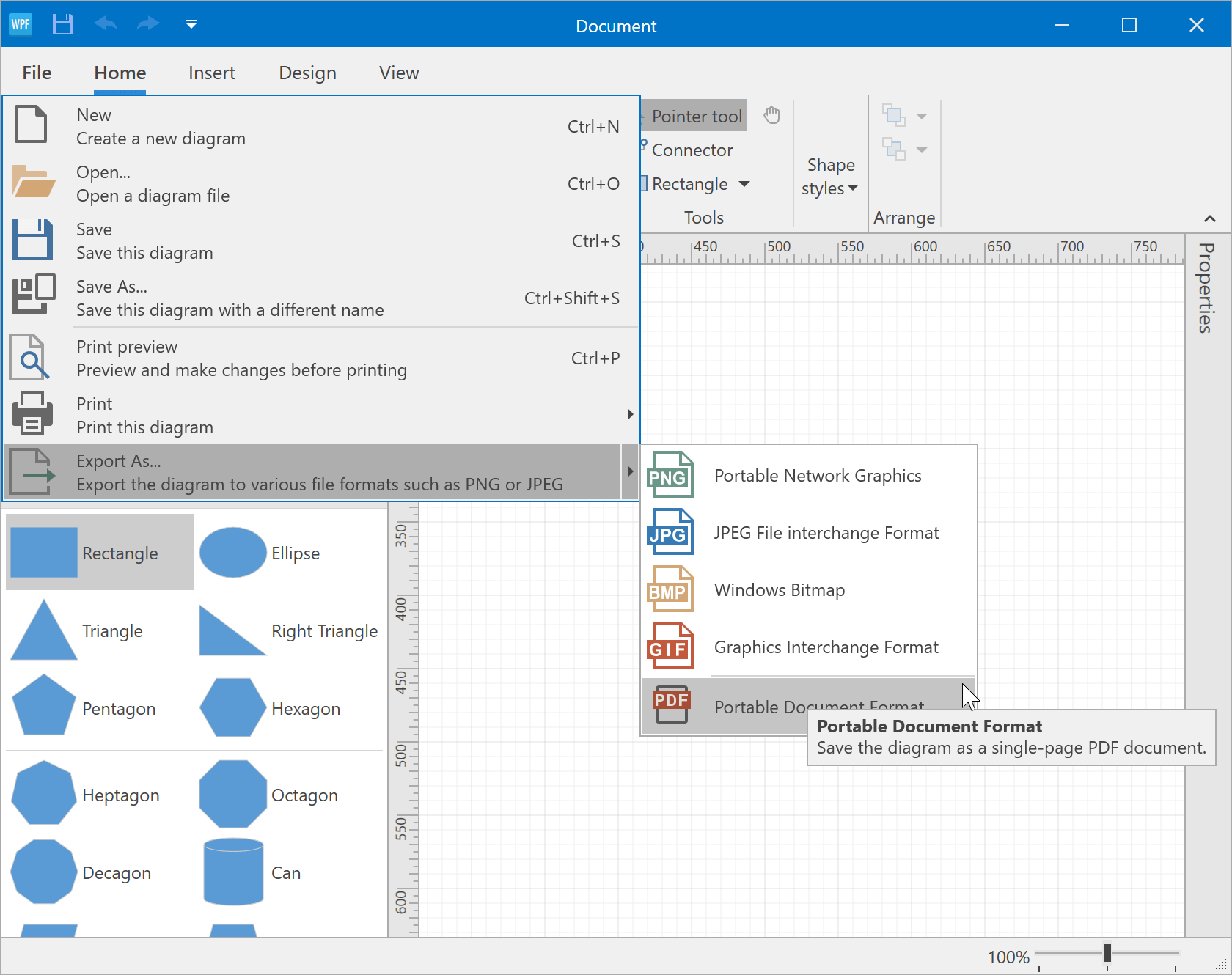
Export to PDF
Demo Documentation
Data Editors
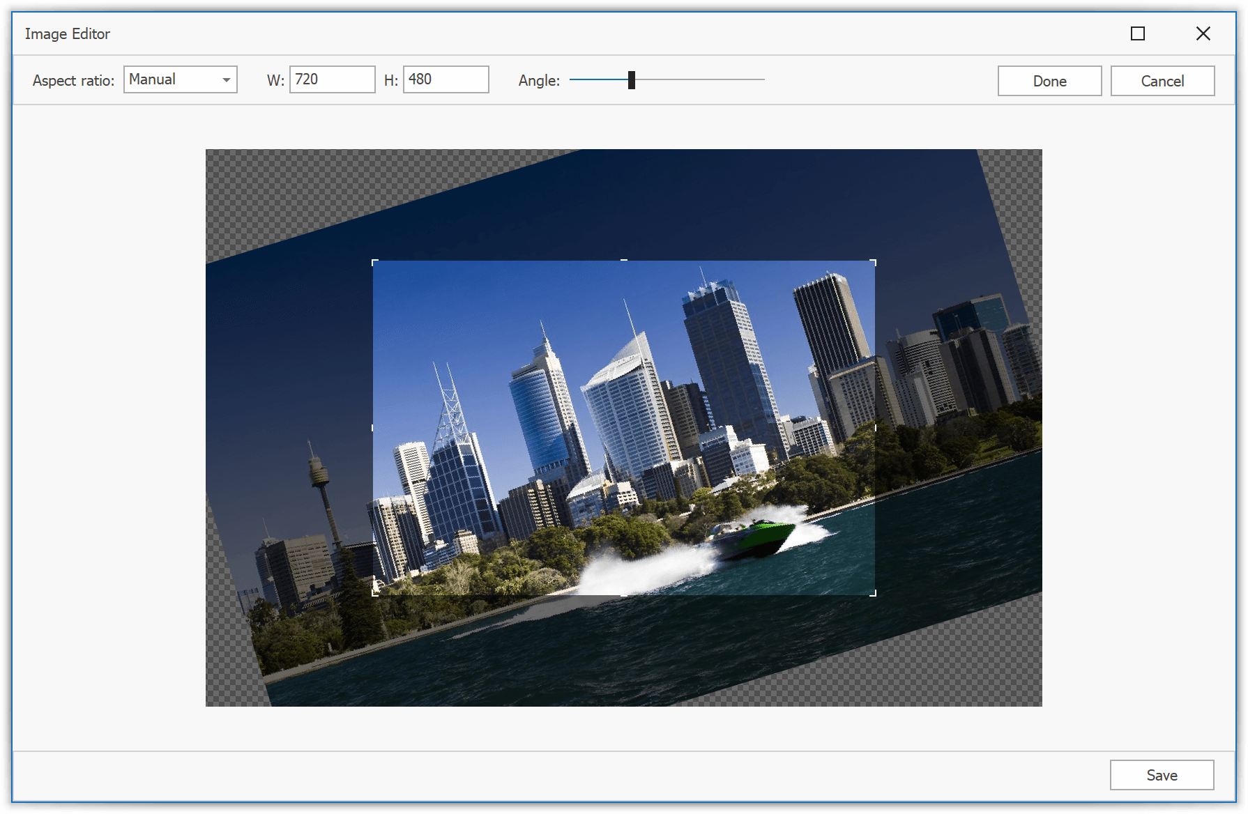
PictureEdit - Image Editor Dialog
PictureEdit now supports simple edit operations in a separate Image Editor dialog: crop, rotate, adjust brightness and contrast, etc. Live preview and undo and redo operations are available.
To invoke the dialog, end-users need to select Edit from the context menu.
Demo Documentation
Simple Button - Light Paint Style
The new Light style was specifically designed so you can create a group of borderless buttons (SimpleButton, CheckButton and DropDownButton). If this new style is enabled, buttons render their background only when hovered or pressed/selected.
Documentation
Clear Text to Reset Edit Value to Null
Users can now clear an editor's text to reset its value to null. This behavior is controlled by the AllowNullInput option and supported by DevExpress data editors with the built-in auto-search functionality (PopupBaseAutoSearchEdit descendants): Combo Boxes, Look-up Editors, MRU Editor, etc.
The new behavior is enabled for in-place cell editors and disabled for standalone editors by default.
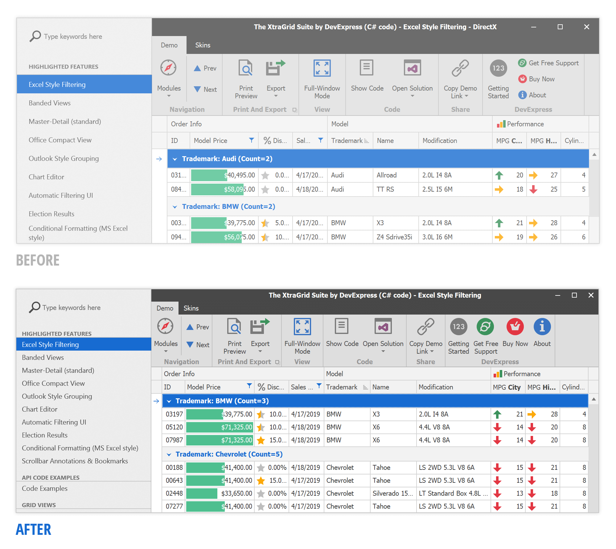
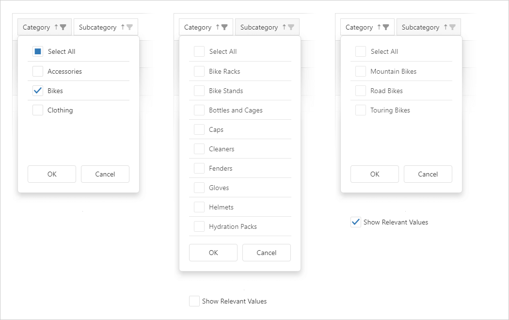
Filtering UI
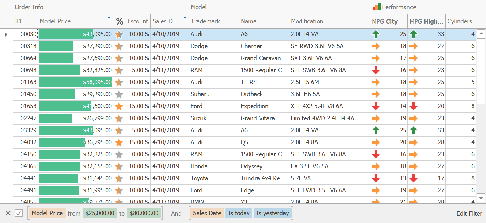
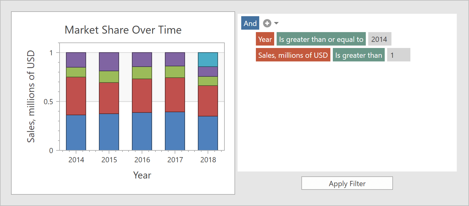
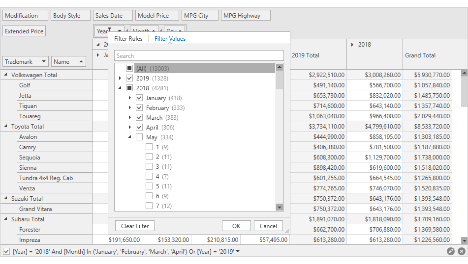
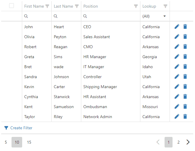
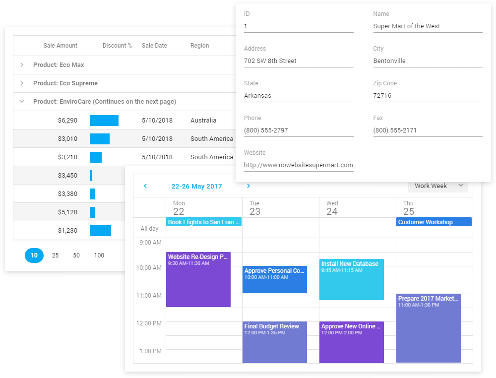
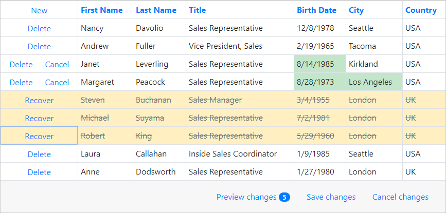
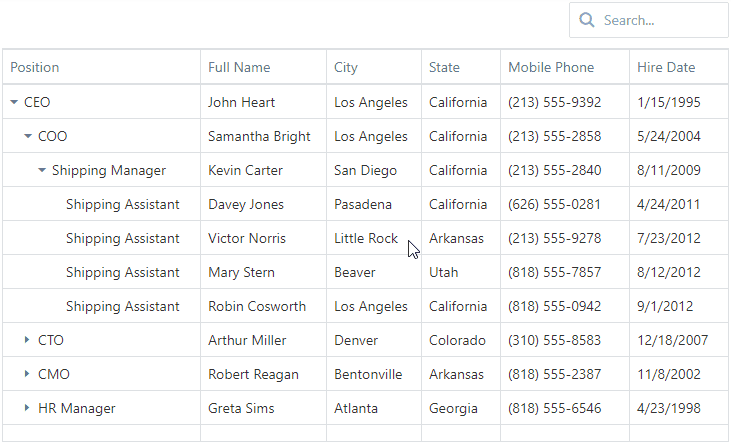
Breadcrumb Style Filter Panel
The Filter Panel now supports a new visual style displayed in the image below. In this format, end-users can easily differentiate between colorized filter items, modify or clear individual filter conditions. This style is available in DevExpress WinForms Data Grid, Pivot Grid, Tree List, and Vertical Grid controls.
Demo Documentation
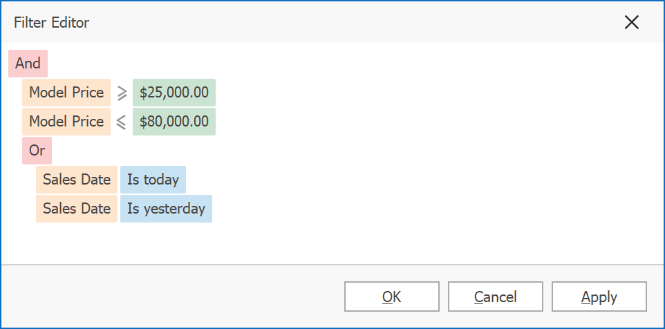
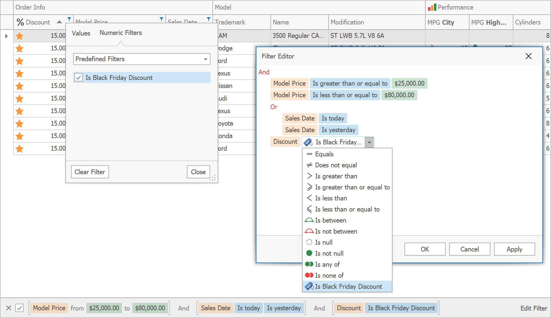
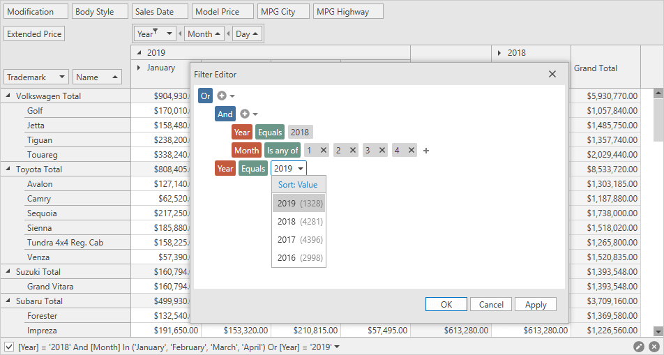
Filter Editor: New Display Style
This release introduces a new display style for standalone and integrated Filter Editors. The new style renders filter conditions in an easy-to-read format and uses skin-defined colors to clearly distinguish between operands and operators.
Demo Documentation
Expression Editor Customization
When end-users apply criteria-based format rules, they use our built-in Expression Editor. Now you can handle the 'FormatRuleExpressionEditorCreated' event to access and customize the this dialog. This event is available in our Data Grid and TreeList controls.
Documentation
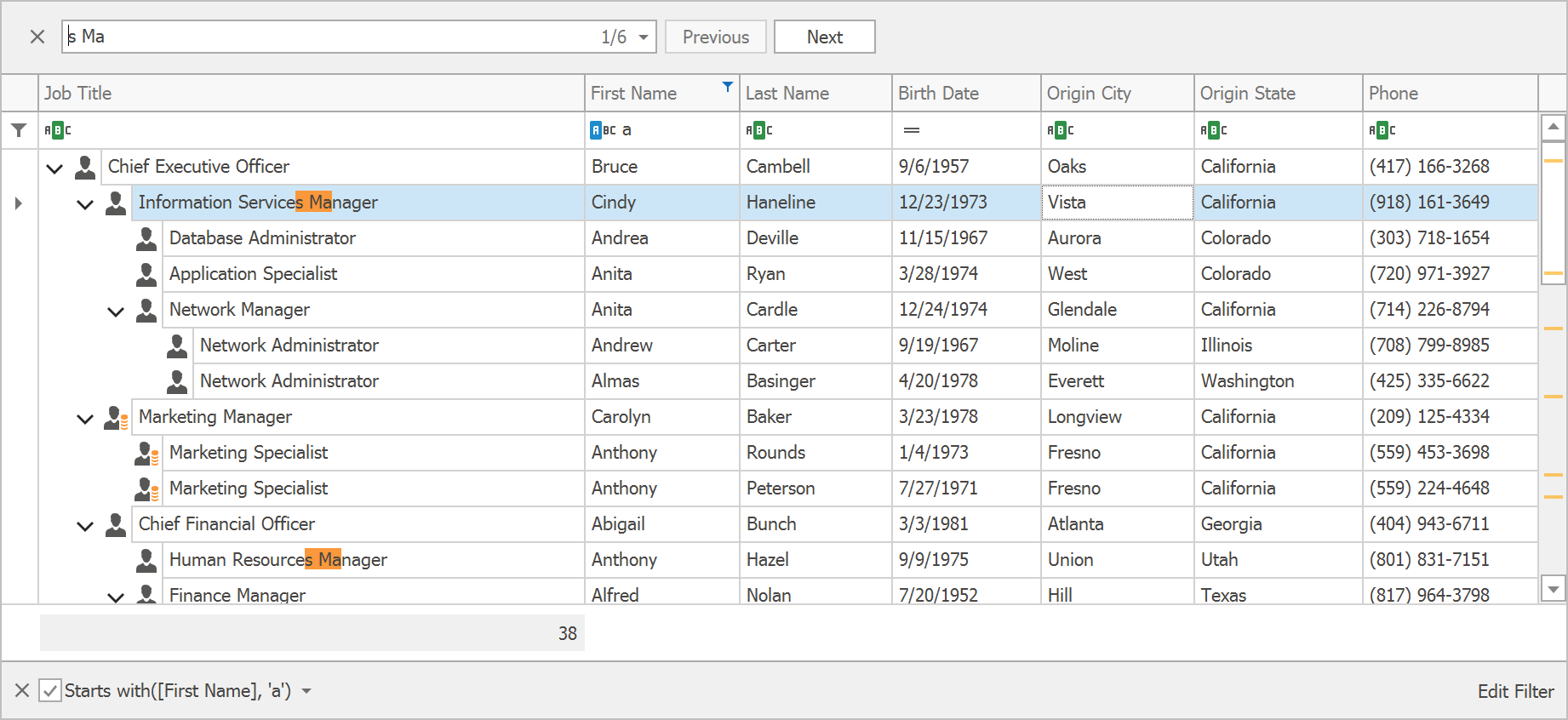
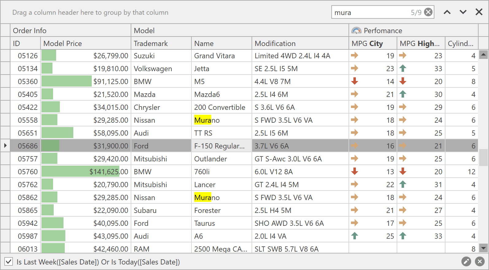
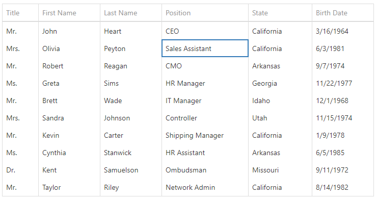
Find Panel - Highlight Result Enhancements
- The Find Panel integrated into our Data Grid, TreeList and Vertical Grid now highlights results in cells, even if cell text is formatted using HTML tags (RepositoryItemHypertextLabel).
- If a search string contains two or more words, all found words are highlighted (even if found within the same cell). In previous versions, only one word was highlighted.
Custom Functions
You can now create custom filter functions. Custom functions will be available to end-users in Excel-Inspred Filter Dropdowns and in "Custom Functions" menu in the Filter Editor.
To add a custom function, enable the 'ColumnView.OptionsFilter.ShowCustomFunctions' property and handle the 'ColumnView.QueryCustomFunctions' event.
Demo Documentation
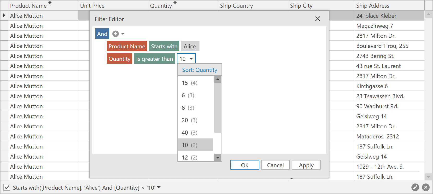
New default editor for operands and operators Filter Builder dialog
Operands and operators in the GridControl's Filter Builder now use scrollable combo boxes as default editors.
Demo Documentation
Layout and Navigation
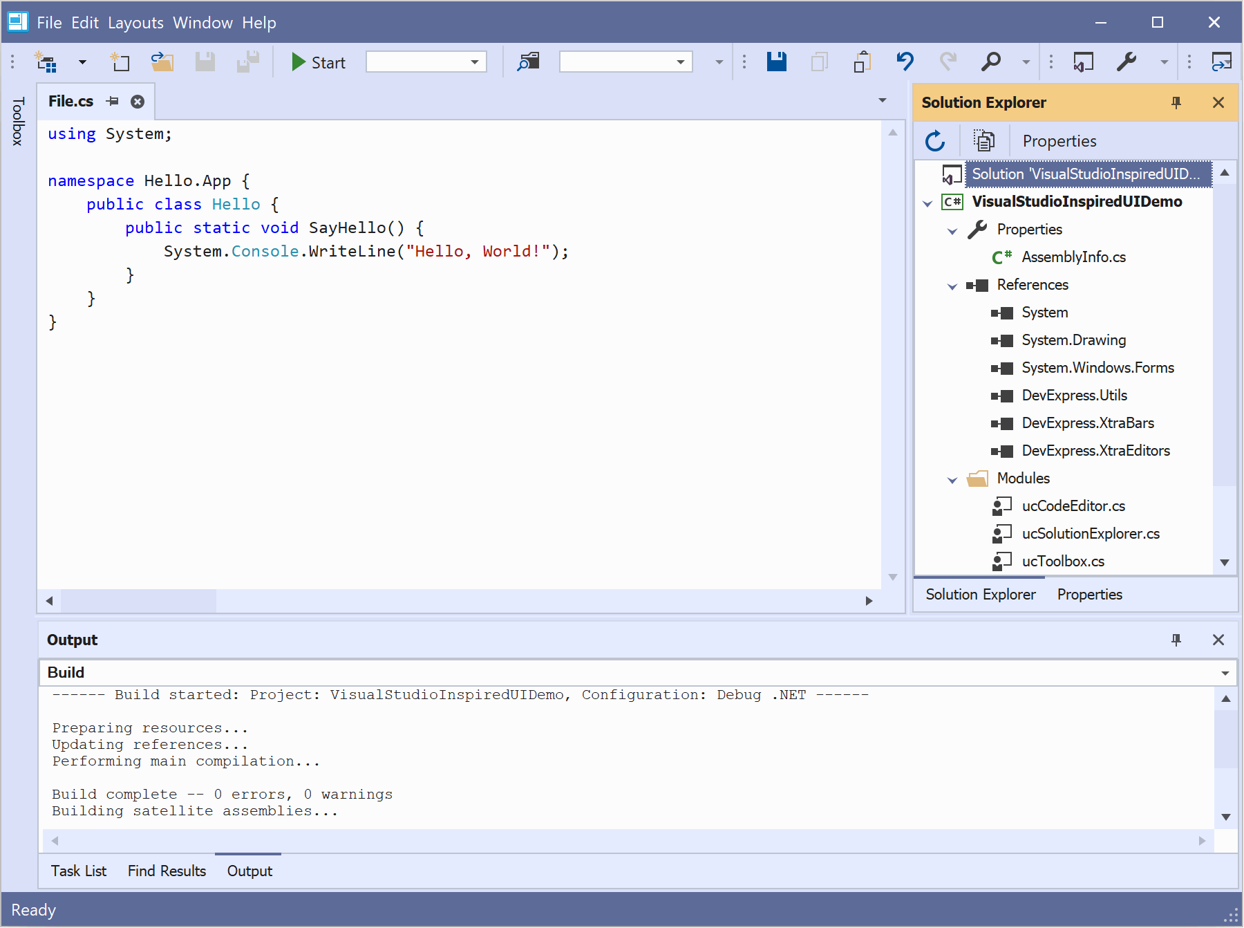
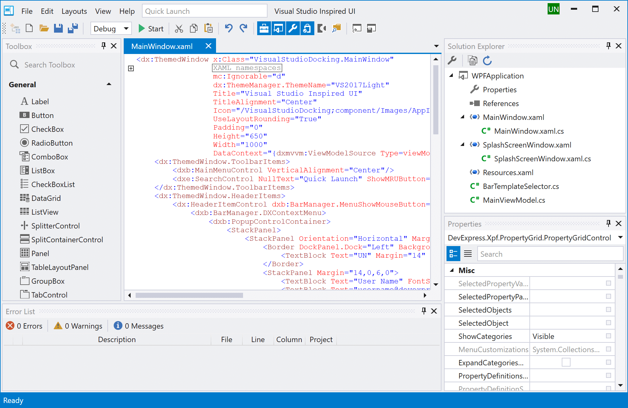
New Toolbar Form
Inspired by Visual Studio 2019 UI, our new ToolbarForm allows you to add bar items (buttons, editors, labels, submenu items) directly into the form's title bar.
Documentation
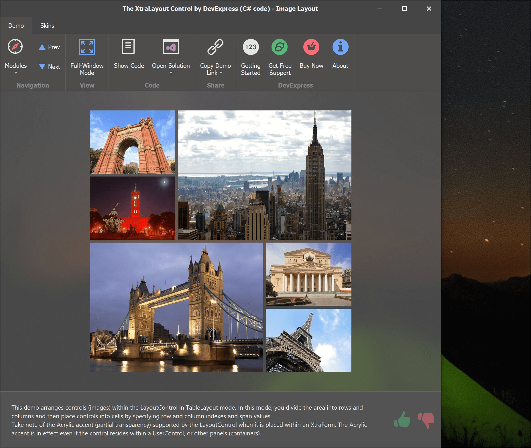
New TablePanel and StackPanel Controls
Two new lightweight panels allow you to build simple data entry forms without employing the Layout Control.
Stack Panel - inspired by the standard WPF StackPanel container, this panel arranges all of its child controls in a single column or row. Any control placed inside this panel can stretch to occupy all available space. Documentation
Table Panel - allows you to create a grid, where each cell can host a control. The grid supports column and row spans, meaning that a control can occupy several consecutive cells. Columns and rows support three sizing modes: absolute, relative, and auto-size. Documentation
Demo Blog Post
Compact Layout Mode
A new Project Settings option reduces padding and/or margin values for all controls that support DevExpress skins/themes. Use this option to display more information on screen in data-intensive applications.
Layout Control - Acrylic Effect Support
Our Layout Control now supports Acrylic accent (partial transparency) when it is placed on a DevExpress form.
Requirements: Windows 10.
Demo Documentation
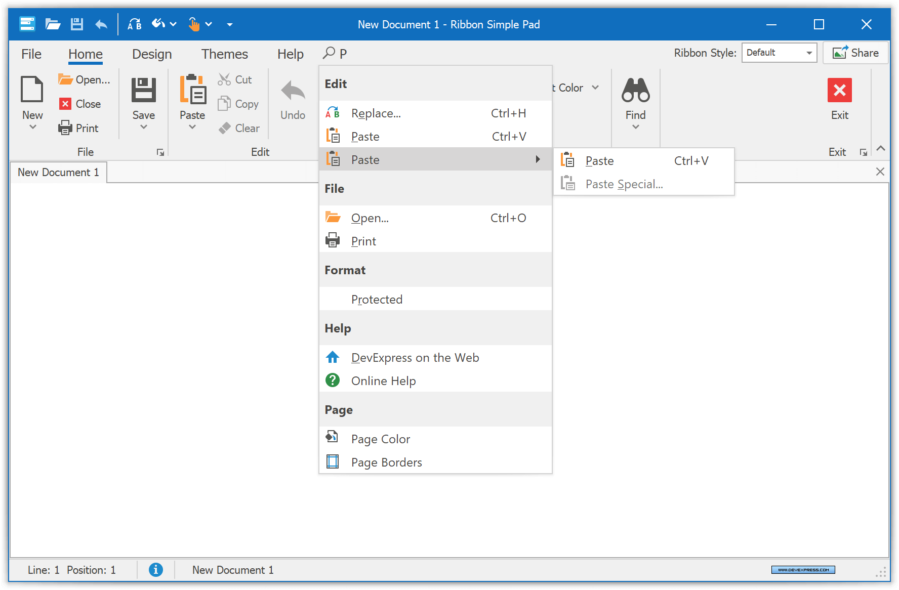
Office 2019 Ribbon Enhancements
-
Ribbon buttons can be displayed within the tab header area. Documentation
- Users can search for Ribbon commands by their names using the Search item. Documentation
Demo
Map Control
The DevExpress Map Control ships with the following new features:
- Ability to specify a custom zoom step (WinForms only).
- Item attributes can be exported to KML.
- Map items can be exported to WKT.
Our Map Editor includes:
- A new notification event (MapEditor.MapItemEditing): Allows you to track actions executed during map shape edit operations.
- Ability to cancel item creation (see the MapItemCreatingEventArgs.Cancel option).
Geometric Measurements
This new API allows you to compute various geometric values based on geo coordinates:
- Areas
- Distance between two points
- The center of two points
- Perimeter
- Angles
Demo Blog Post Documentation
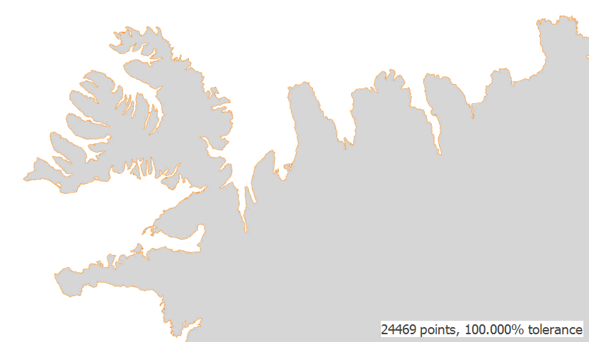
Simplify Map Shapes
You can now simplify high detailed vector shapes before displaying them on a map. This makes our Map Control load and visualize shapes faster, and helps users to get a better experience by reducing CPU and memory consumption without losing map quality on low zoom levels.
Demo Blog Post Documentation
Shapes with Custom Images
You can set a geo-referenced raster image as a map polygon's background. The Map Control can show these images together with image tiles provided by a map provider (Bing or OpenStreetMaps).
Demo Blog Post Documentation

PDF Viewer
Predefined CMaps for CID Fonts Support
The DevExpress PDF Viewer supports CID fonts with predefined CMaps (used for CJK characters). The PDF Viewer displays these fonts when DirectX rendering is enabled.
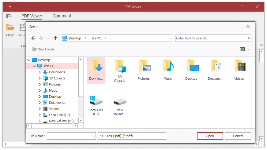
Skinned Save/Open File Dialogs
DevExpress WinForms PDF Viewer now supports skinned 'Open File' and 'Save File' dialogs. Use the 'WindowsFormsSettings.UseDXDialogs' option to enable these dialogs in your application.
Pivot Grid
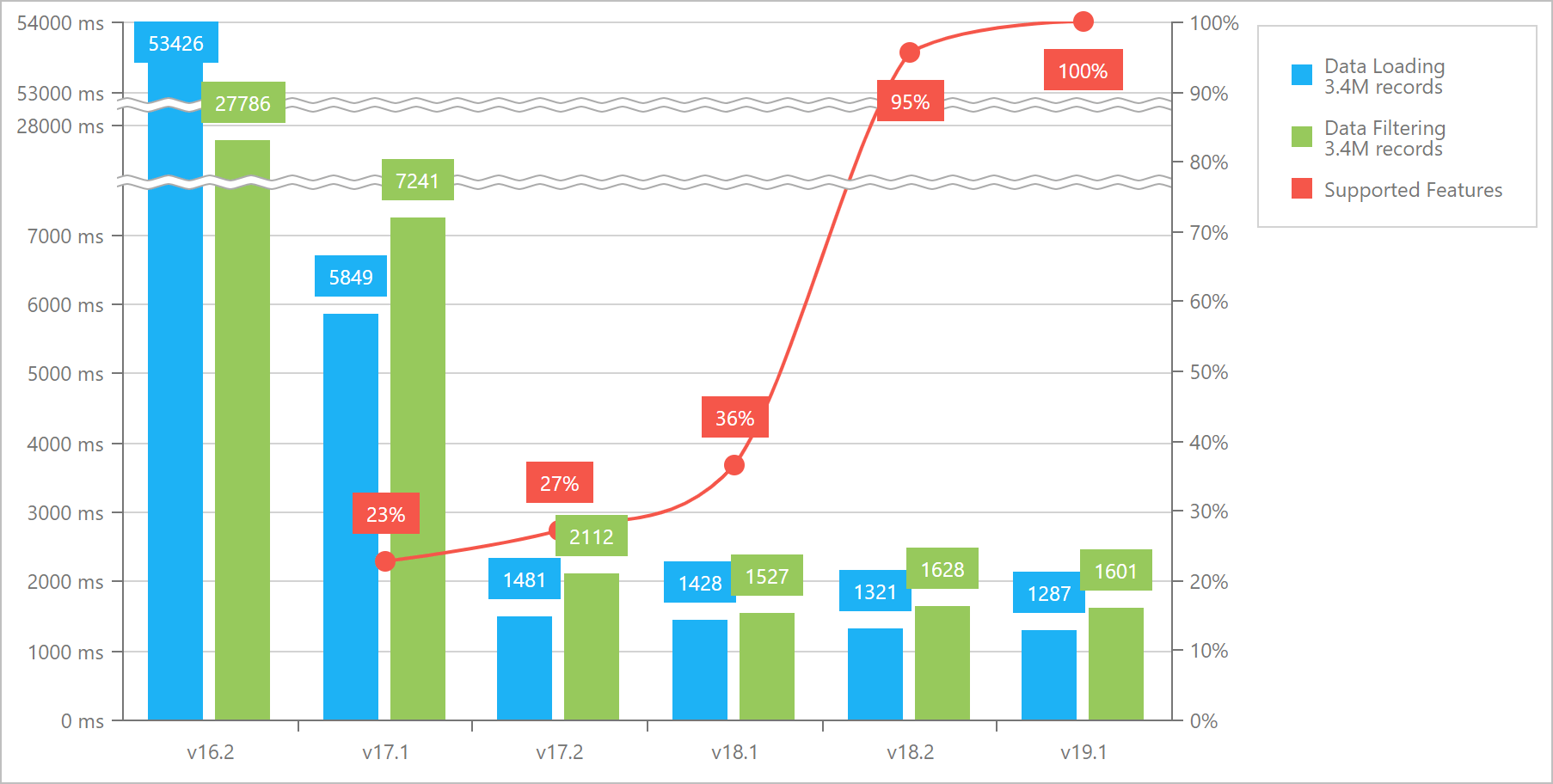
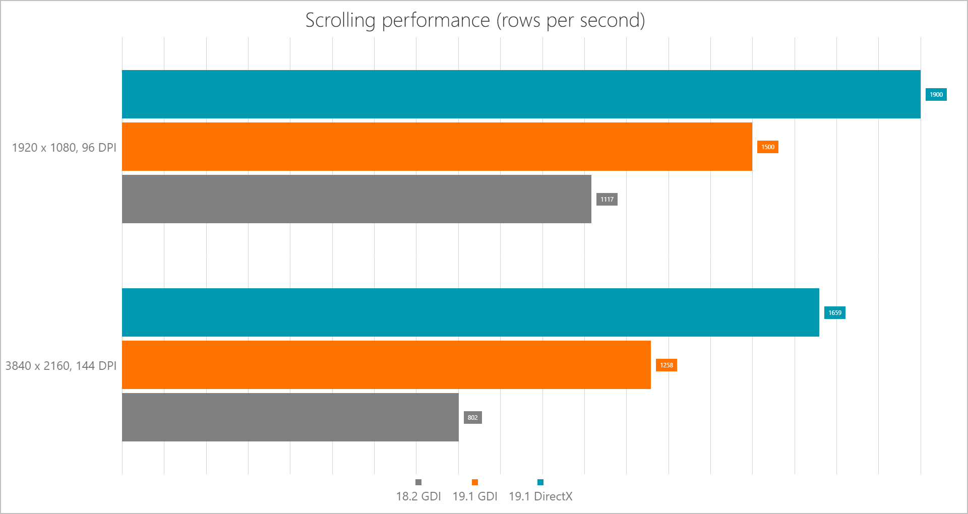
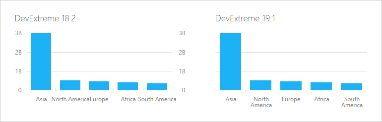
DirectX Support
You can now enable DirectX render in our WinForms PivotGrid Control. See the following chart for performance measurements compared to standard WinForms GDI render.
Demo

Performance Enhancements
The DevExpress in-memory data processing engine is now used by default.
Blog Post
Rich Text Editor
Track Changes Support
You can now load and export documents with revisions made via the Track Changes feature.
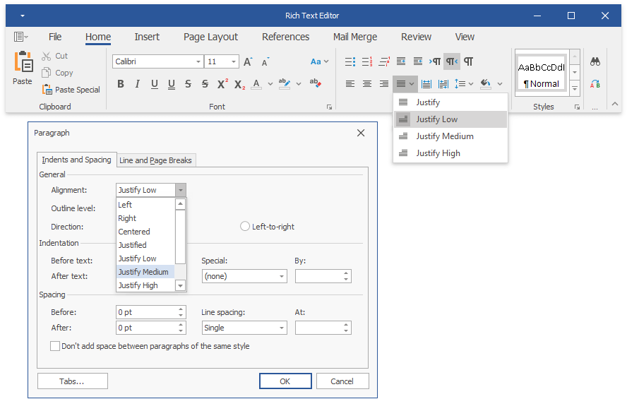
RTL Enhancements
New capabilities supported for Right-to-Left text:
- Paragraph alignment (Justify Low, Justify Medium, Justify High)
- Line numbering
- UI commands: alignment, indents, bulleted and numbered lists
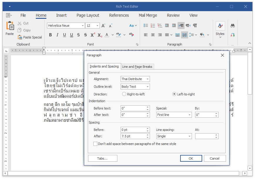
Distributed Paragraph Justification for East-Asian Languages
The control now supports 'Distributed' and 'Thai Distributed' paragraph alignment options.
DOCX and DOC File Encryption
Our WinForms/WPF Rich Text Editors and Word Document API support DOCX and DOC file encryption. You can encrypt documents with standard or agile encryption.
Documentation
HR Tag Support
You can now load, print and export documents with HTML 'HR' tags (a horizontal rule).
Skinned Save/Open File Dialogs
DevExpress WinForms Rich Text Editor now supports skinned DevExpress 'Open File' and 'Save File' dialogs. Use the 'WindowsFormsSettings.UseDXDialogs' option to enable skinned dialogs in your application.
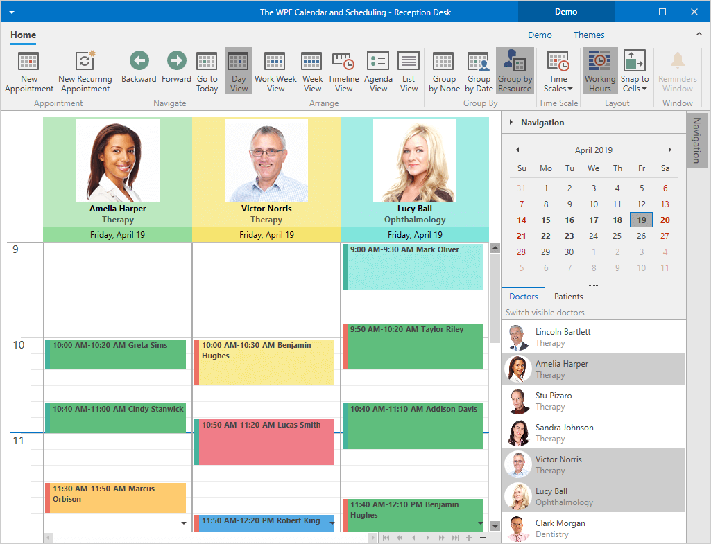
Scheduler
Appointment Slots for Office Hours, Meeting Availability, etc.
Our WinForms Scheduler Control now supports Time Region objects that apply restrictions and appearance settings to time cells. You can use this functionality to disable individual time cells so that users cannot add new or modify existing appointments. For instance, you can block lunch hours or days off.
Time Regions can be Resource-specific.
Demo Documentation
Sort and Group Appointments Using a Custom Algorithm
New events allow you to group and sort appointments using custom algorithms:
- CustomAppointmentGroup
- CustomAppointmentSort
Demo Documentation
Timeline View - Remove Time Intervals
Two new time scales are now available in Timeline Views: WorkHour and WorkDay.
The base TimeScale object now provides a new method that allows you to hide unwanted time intervals from the View.
Documentation
Skins and Vector Icons
New Image Option - Colorization Mode
You can now specify whether SVG icons should be automatically colored based on the active Skin. Set the 'ImageOptions.ImageColorizationMode' property to 'None' to show vector images as in their original colors.
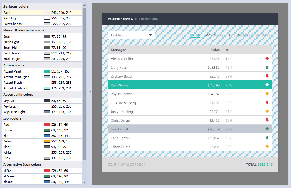
Project Settings Palette Editor
You can now create and modify vector skin palettes using the DevExpress Project Settings page.
- The edit dialog displays hints that explain the purpose of every skin color in the list.
- The preview area highlights the skin elements painted with the selected color.
You can quickly design custom color palettes even if you never used our Skin Editor before and do not have a deep knowledge of DevExpress themes.
Blog Post
Visual Studio 2019 Bezier Palette
v19.1 introduces a new Visual Studio 2019 palette for our vector Bezier skin.
Demo
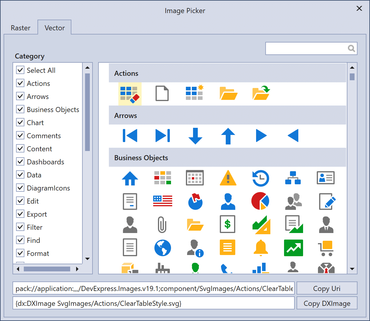
SVG Image Picker - Image Validation
When you assign a custom vector icon to a control, the Image Picker dialog now analyzes the icon you've selected and displays the list of unsupported elements.
Gradient Fills for SVG Icons
Our WinForms controls can display SVG icons with linear and radial gradients.
Documentation
Demo
Design-Time Image Picker - Raster Icons
Our design-time Image Picker was first introduced in November 2018 and allowed you to replace raster graphics with vector images. In v19.1, the Image Picker adds a collection of DevExpress raster icons. SVG and PNG icons are split into two tabs.
Documentation Blog Post
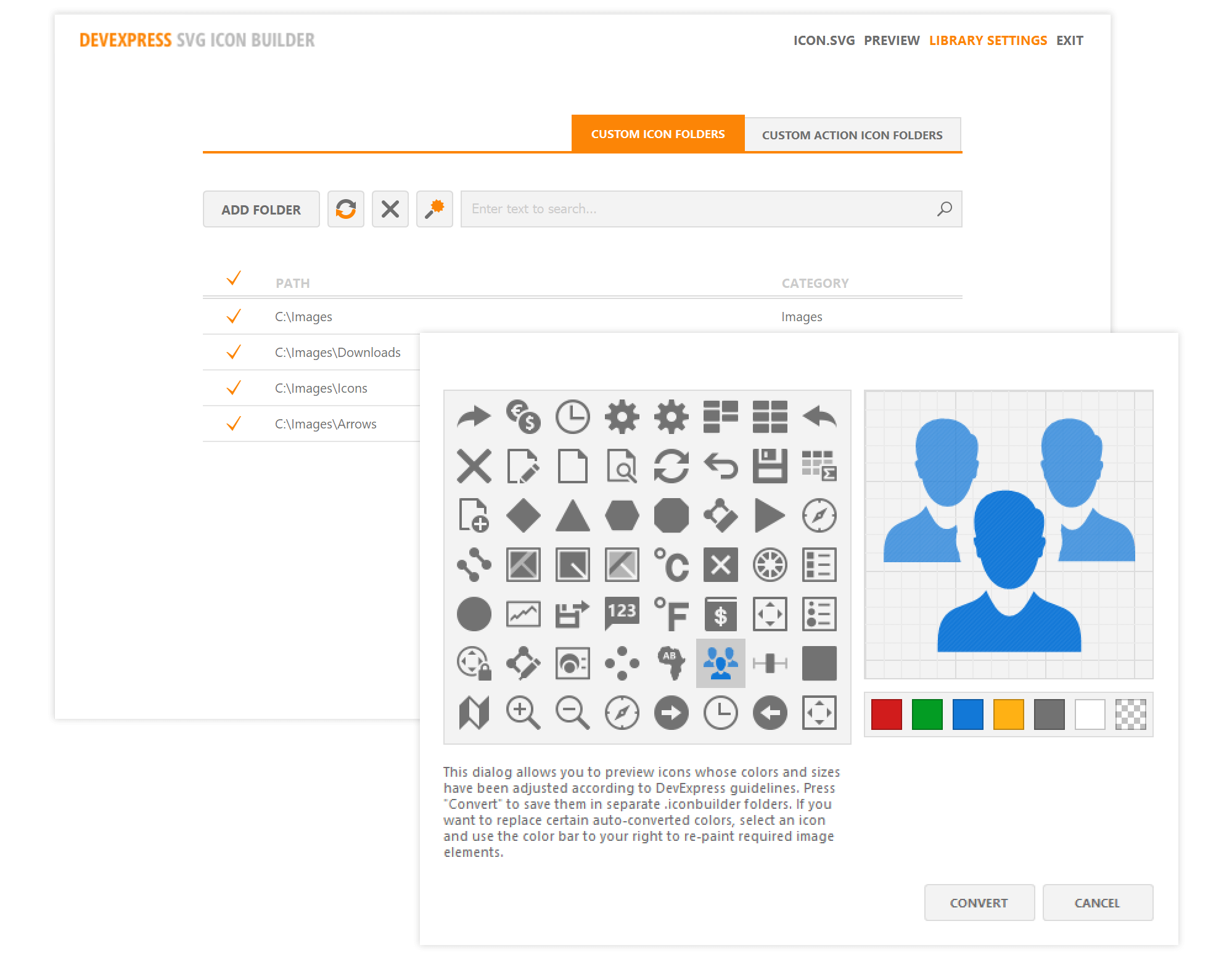
SVG Icon Builder - Custom Icon Support
Our SVG Icon Builder allows you to load and edit custom SVG icons.
Documentation
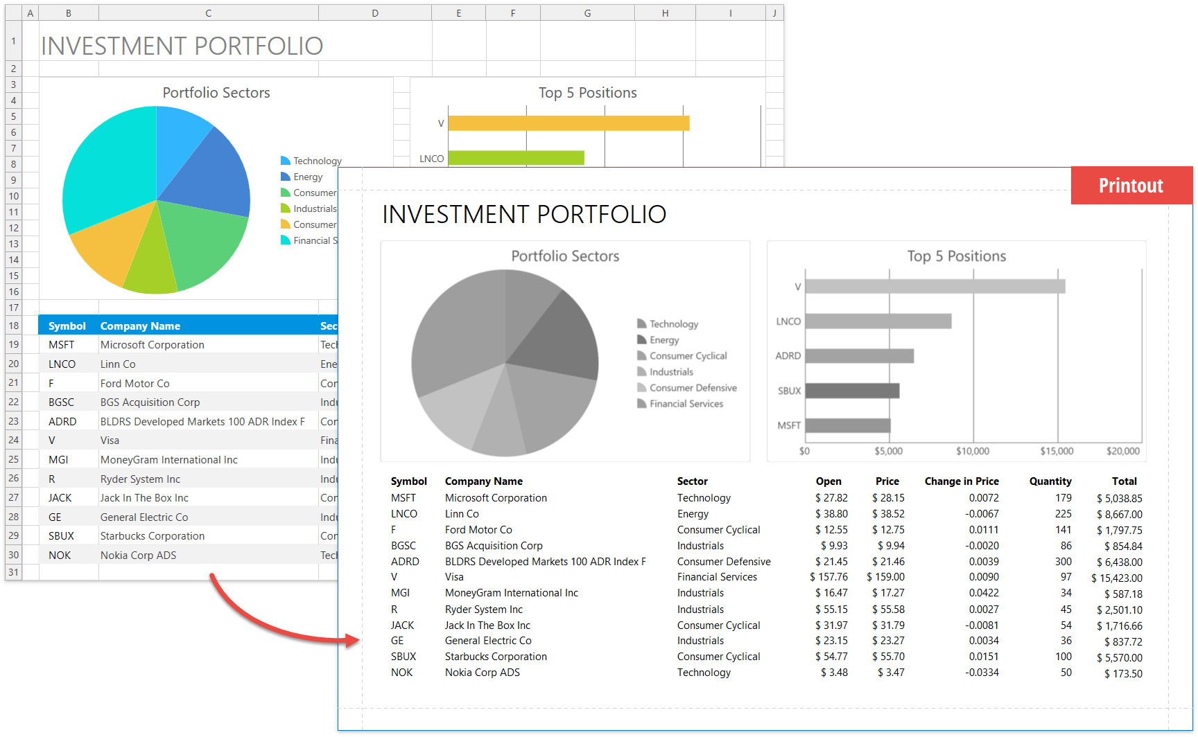
Spreadsheet
New Layout Engine
We have implemented a new layout calculation engine for the Spreadsheet control. The new engine improves layout accuracy, increases render and scroll performance, and enhances printing capabilities.
To switch back to the legacy layout engine, turn on the 'SpreadsheetCompatibilityOption.EnableLegacyLayoutEngine' option.
Blog Post Documentation
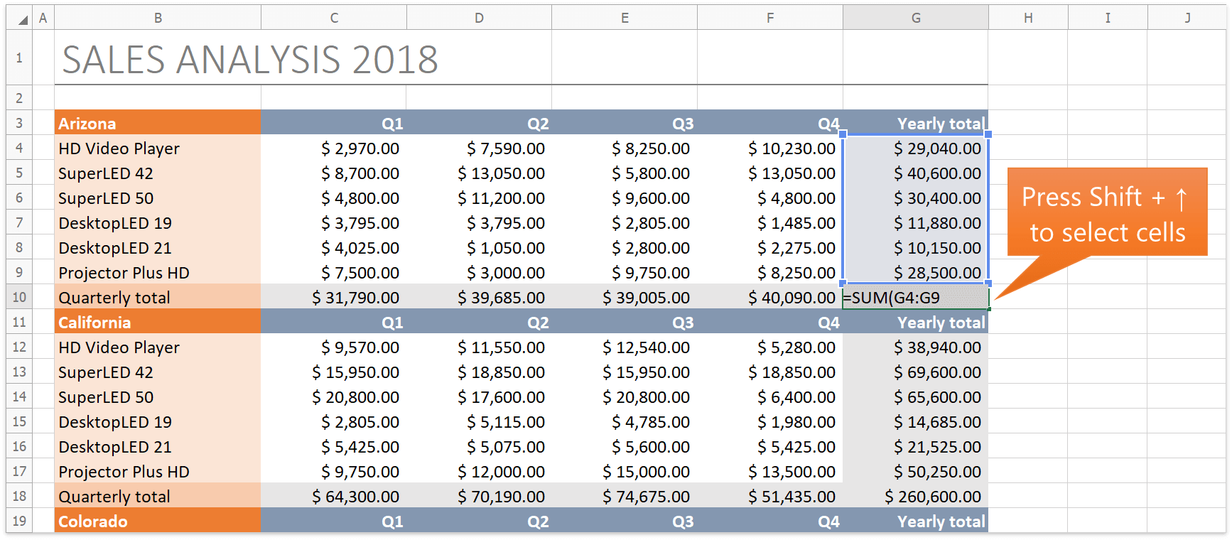
Simplified Formula Creation
You can use cell ranges from other worksheets and select cells with the keyboard when you create or edit formulas.
Multi-Threaded Calculations
Our WinForms and WPF Spreadsheet and our Spreadsheet Document API now support multi-threaded calculations. You can specify the number of calculation threads via the 'CalculationOptions.ThreadCount' property. To disable multi-threaded calculations, disable the 'CalculationOptions.EnableMultiThreading' option.
Excel 2016 Functions
Our WinForms/WPF Spreadsheet controls and Spreadsheet Document API now support the following Excel 2016 functions:
- CONCAT
- TEXTJOIN
- IFS
- SWITCH
- MAXIFS
- MINIFS
Documentation
Rich Text Display
Our WinForms Spreadsheet control can now display rich text within worksheet cells. Documents with rich text can also be printed and exported to PDF. This capability is available only in controls that use the new layout engine.
Documentation
Print / Export Rich Text Headers and Footers
Our WinForms Spreadsheet control and Spreadsheet Document API can now print and export (to PDF) documents that contain rich formatted text and inline pictures within headers and footers.
This capability is only available if the new layout engine is used.
Documentation
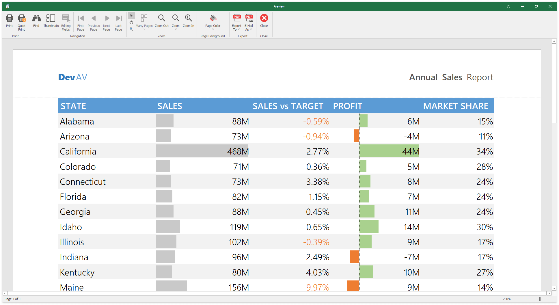
Black and White Print Mode
Our WinForms / WPF Spreadsheet controls and Spreadsheet Document API allow you to print documents in black and white.
Documentation
Custom Comment Indicators
Handle the 'SpreadsheetControl.CustomDrawCommentIndicator' event to customize a comment indicator's appearance.
Documentation
Performance Enhancements
Our formula calculation engine is now nearly five times faster. Insert/delete operations within documents with numerous merged cells are almost six times faster.
Blog Post
Skinned Open/Save Dialogs
The WinForms Spreadsheet control now supports skinned DevExpress Open and Save dialogs. Use the 'WindowsFormsSettings.UseDXDialogs' option to enable these dialogs in your application.
Documentation
API Enhancements
New events allow you to control the drag-and-drop and fill operations for a cell range. New events include:
- BeforeDragRange
- BeforeDropRange
- AfterDropRange
- BeforeFillRange
- AfterFillRange
Sunburst Control
Item Label Layout Enhancements
We added two new item label layouts:
The Sunburst control now supports adaptive label layout. This new functionality automatically adjusts label position depending on available display area (the SunburtLabel.AutoLayout option).
Tree List
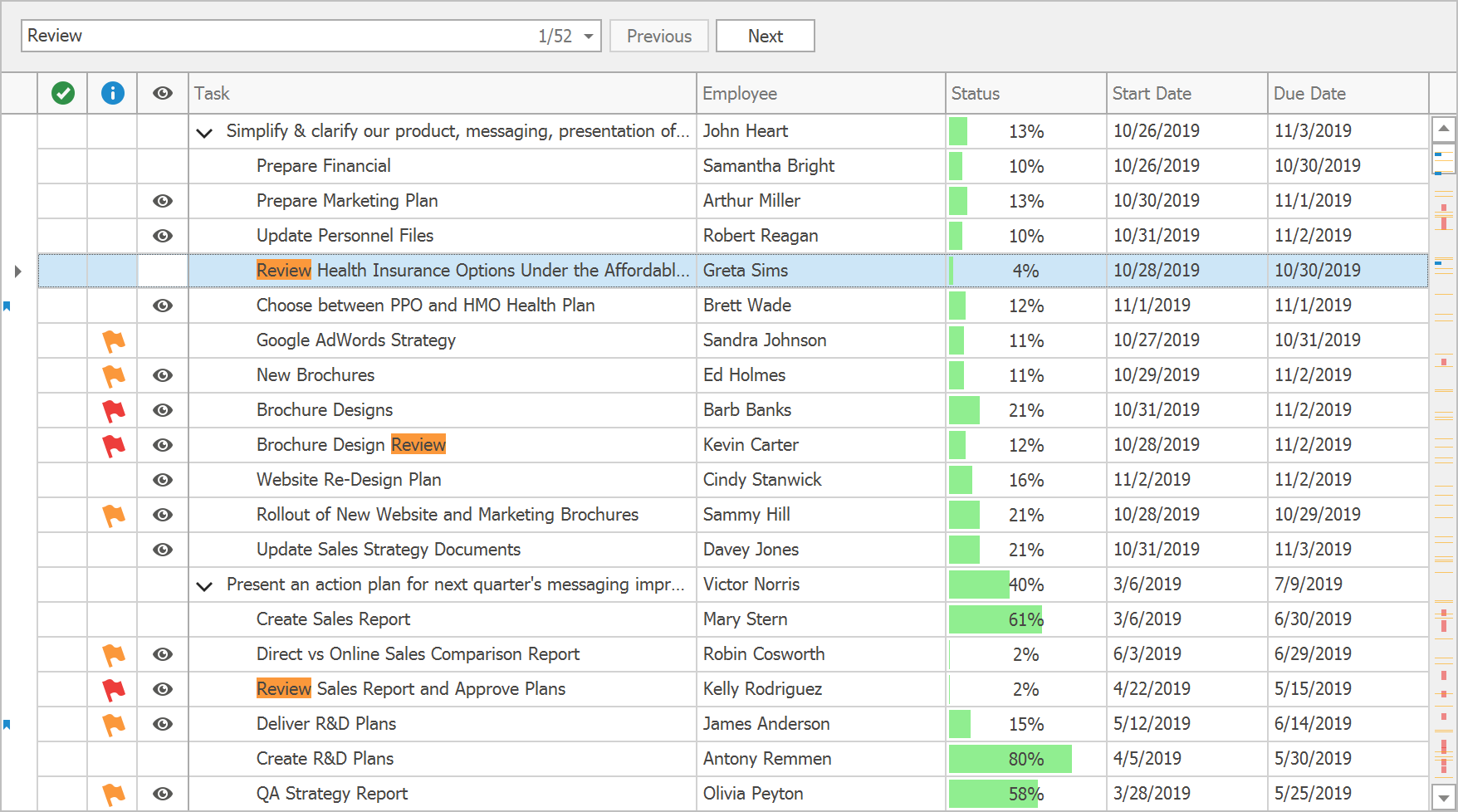
Find Panel: Search Mode
The updated Search Panel, introduced in v18.2 as part of our Data Grid, is now available in the Tree List control. In addition to the "Filter" mode, the Search Panel can operate in the "Search" mode as well. In this new mode, the Tree List highlights matching records, but doesn't hide other nodes. The Next/Previous buttons allow users to quickly navigate between all matches found.
Demo Documentation
Scrollbar Annotations
Our WinForms TreeList control now supports Scrollbar Annotations. They mark the position of invalid values, the focused node, and rows that match the Search Panel condition.
Demo Documentation
Repeat Fixed Columns on Each Printed Page
We added an option to repeat left-fixed columns and bands if the control is printed out or exported to a page-based format (PDF, DOCX and RTF).
Documentation
Vertical Grid
DirectX Support
You can now enable DirectX render in our WinForms Vertical Grid and Property Grid controls.
Documentation
Property Grid Control Enhancements
- You can now paint PropertyGrid values using the UITypeEditor. Enable the AllowPaintValue option to activate the UITypeEditor's PaintValue method.
- PropertyDescriptionControl now supports automatic height adjustment.
Miscellaneous
Transition Manager - DirectX-based Transition Effects
Transition Manager component can now use its DirectX-powered painter to render smoother, higher-quality animation effects.
In addition the previously available "horizontal" effects, we have implemented a new "Zoom" animation. When users navigate to an application module and back, this animation creates an illusion of zooming in and out from the current screen, adding depth to your applications.
Demo Blog Post
Adorner UI Manager Enhancements
Adorner UI Manager now supports the following elements:
- XtraTabbedMdiManager tab headers
- DocumentManager TabbedView tab headers
- LayoutControl group tab headers
Data Deserialization Security Enhancements
To minimize vulnerability risks, we are introducing new data deserialization policies:
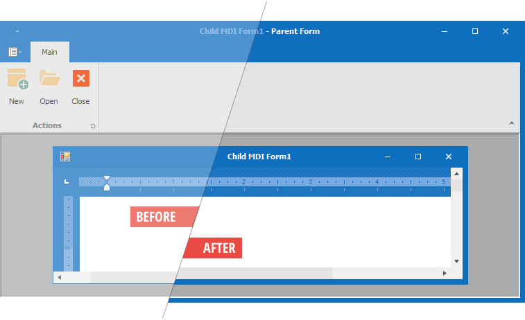
Thick Form Borders
XtraForm and RibbonForm can display think borders to simplify resizing operations when shadow/glow effects are disabled. Forms do not display their shadows in the following cases:
- if accessed through a Remote Desktop connection
- if used as a child MDI window
- if the FormBorderEffect property is set to None
Depending on whether you want to display thick borders on all forms in your application or only on child MDI forms, use one of the following static properties.
- WindowsFormsSettings.FormThickBorder
- WindowsFormsSettings.MdiFormThickBorder
Blog Post
HTML Text Formatting Enhancements (Data Grid, TreeList, and Vertical Grid)
- You can now use HTML formatting to display images in cells (RepositoryItemHypertextLabel). Images can be added to the control's 'HtmlImages' collection.
- Filter popups support HTML value formatting applied to data cells.
Microsoft Office Style Resize Grip Areas
DevExpress WinForms Form controls now ship with enlarged resize grip areas in their corners.
Demo
.NET Core 3 Preview 5 Support
In addition to DevExpress assemblies built against .NET Framework 4.5.2, we are releasing new packages built against .NET Core 3. These packages contain the same set of DevExpress WPF controls and allow you to test your applications in the .NET Core 3 environment even before its official release.
Demos (GitHub) Blog Post
Data Grid and Tree List
Search Panel Enhancements
The Search Panel has been integrated into the Group Panel and made more compact and informative. The Search Panel can display total number of matches and the index of the current match.
Demo Blog Post Documentation
Filter Editor Enhancements
- Band hierarchy within the Field selector.
- New API allows you to customize the field and operator lists, operand template, and prohibit group/condition operations.
- Improved appearance.
Demo Documentation
Excel-Style Drop-Down Filter Customization
You can handle the 'ExcelStyleFilterElement.QueryOperators' event to change the operator list, add custom operators or specify an operand template.
Demo Documentation
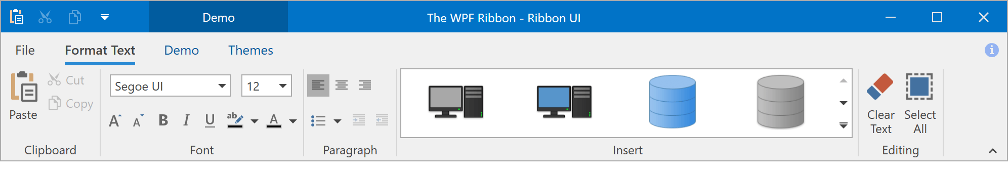
wpf-ribbon-office-2019.png
Excel-inspired Group Filters
Filter dropdowns can now group filter items from two or more columns, and present results as a hierarchical checked list.
Demo Documentation
"No Records Found" Caption
Our WPF Data Grid and Tree List can now display 'No Records Found' when a data source is empty or a filter/search query returns no results. Enable ShowEmptyText to display this caption.
Demo
Miscellaneous Enhancements
Charting
Summary Functions
The WPF Chart control now offers built-in and custom summary functions. For faster rendering, the Chart Control applies a summary function before it generates and draws points.
Built-in summary functions include:
Improved Rendering
We optimized 2D Line Series and Financial Indicators render speed, which results in less stuttering and higher frame rates during interactive operations (zooming and scrolling).
We've previewed a new DirectX surface render mode that speeds up our Line and Spline Series (see the ChartControl.IsDirectXSurfaceRendering option).
Blog Post
Drill-Down
Our WPF Chart Control now supports the Hierarchical data adapter. You can implement drill-down enabled charts easily. You can also create endless drill-down levels and use integrated Breadcrumb navigation bar to move across data hierarchy.
Demo Documentation
Segment Colorizers
You can now use the following segment colorizers to enhance data visualization.
- Trend Segment Colorizer
- Range Segment Colorizer
- Point-based Segment Colorizer
Demo Blog Post Documentation
Axis Alignment
New alignment options include:
- Zero - the axis passes through a zero level of another axis.
- Center - axes are centered in the pane plot area and form four quadrants.
Demo Documentation
Axis Label Position and Alignment
The chart control introduces the following options:
- Display axis labels inside or outside of plot region.
- Change label alignment relative to tick marks (Near, Far, Center).
Histogram
DevExpress Chart control now allows you to generate Histograms. Features include:
- Histogram aggregation function
- Excel-inspired histogram calculation modes (automatic, bin width, bin number)
- Interval information display within axis labels
- Customizable label text for Overflow and Underflow bins
- Ability to align grid lines and tick marks with bins and to center axis labels
Demo Blog Post
Data Editors
New AutoSuggest Editor
Our new AutoSuggest editor provides suggestions based on entered values. The editor raises a 'QuerySubmitted' event when a user enters text and allows you to update the suggestion list on the fly.
Demo Documentation Blog Post
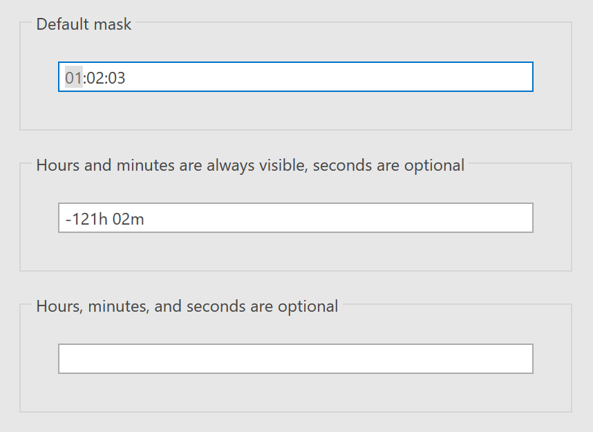
TimeSpan Mask Types
The following new mask types allow our TextEdit and ButtonEdit controls to display TimeSpan values.
- TimeSpan
- TimeSpanAdvancingCaret
Demo Documentation
API Enhancements
- ButtonEdit and its descendants now include a ShowNullValueOnFocusOnly property (only displays a Clear button for a focused editor).
- Popup editors allow you to prevent a popup from being closed using the Cancel property in the PopupClosing event handler. New PopupRoot and PopupElement properties return the root popup element and the control hosted in the popup.
- To simplify appearance customization, ToggleSwitch now ships with SwitchBorderTemplate and SwitchThumbTemplate properties.
- Standalone editors now support a DateTimeMaskOptions.DateTimeKind attached property. This allows you to explicitly set System.DateTime.Kind (UTC, Local time, or neither) for the System.DateTime value returned by the editor.
- ListBoxEdit and ComboBoxEdit with groups now support vertical virtualization and per-item scrolling when the VirtualizingPanel.IsVirtualizingWhenGrouping property is set to true.
- In addition to the edit box, ColorEdit displays a slider for the alpha channel, and provides an option to hide the alpha channel when necessary.
Diagram
Collapsible Containers
Users can now collapse and expand container content. To activate this feature, set the DiagramContainer.CanCollapse property to true.
Demo Documentation
Export to PDF
Demo Documentation
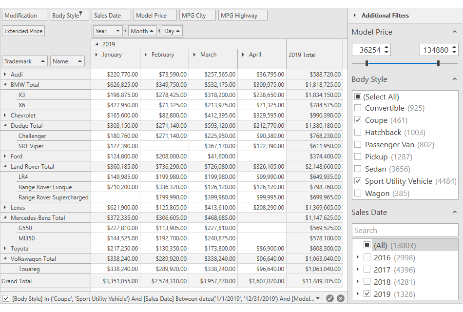
Filtering UI
Date Range Filter
This release includes a new filter element - Date Range. It allows users to specify a date interval.
Demo Documentation
Filter Behavior
Our new Filter Behavior class works with Filter Elements and the Filter Editor. It allows you to configure display fields and associated settings. It creates a CriteriaOperator object used by our data-bound controls. You can assign this CriteriaOperator object to data-bound controls (such as Charts and Data Editors) or use the CriteriaOperator object to filter data in code.
Demo Documentation
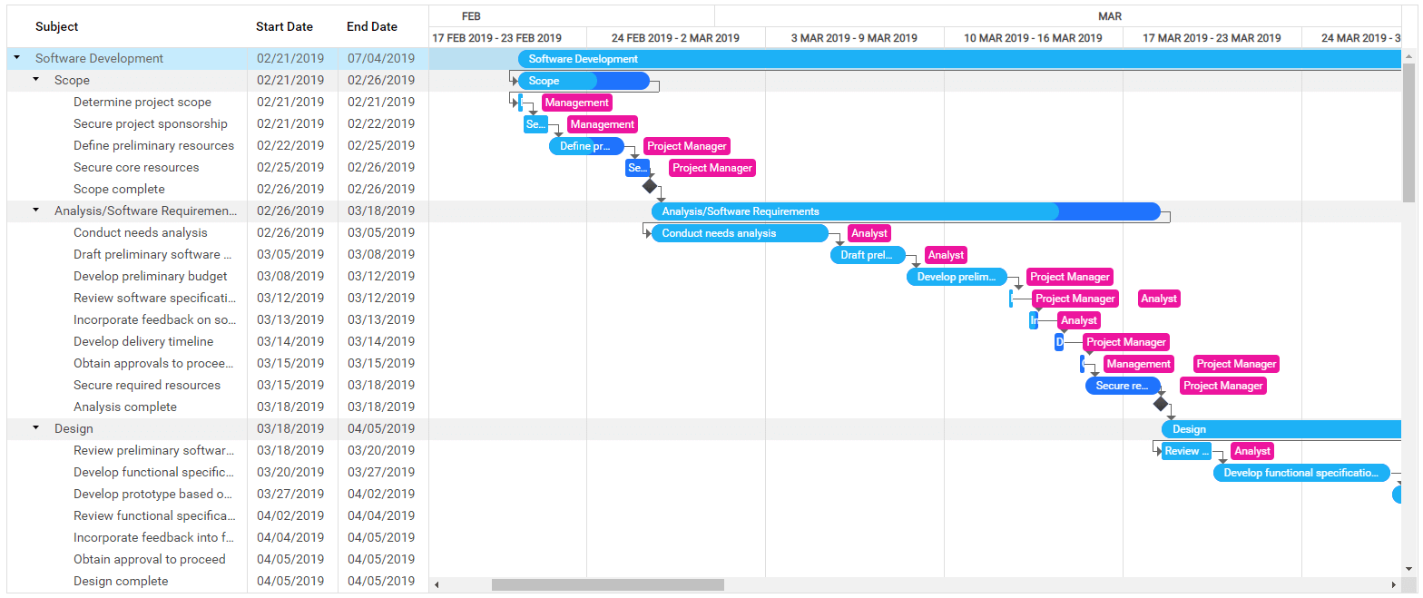
Gantt
Connector and Task Editing
Our Gantt control now fully supports connector and task editing. You can drag and resize tasks in the Gantt area to change both date and duration, modify progress and attach/detach connectors to define predecessor links.
Demo Blog Post Documentation
Automatic Task Scheduling
After editing, the Gantt control automatically recalculates positions for related tasks and updates the position, duration, and progress of summary tasks. If a user changes a task so that it conflicts with defined dependencies, the Gantt control will display these dependencies as invalid.
New API allows you to automatically calculate optimal start dates based on task dependencies and duration.
Demo Blog Post Documentation
Worktime Duration
Our WPF Gantt control now takes non-working hours and holidays into account when it calculates task duration. For example, with a default 8-hour workday, a 16 hour task will span two days on the timeline and will display '2d' in the tree list area.
Blog Post
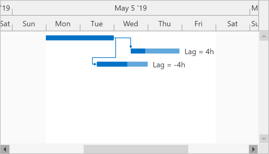
Dependency Lag
Every dependency now stores an optional Lag value (positive or negative) that indicates the amount of time that should pass before the dependency affects a connected task.
Blog Post
Map Control
Map Enhancements
The DevExpress Map Control ships with the following new features:
- Item attributes can be exported to KML.
- Map items can be exported to WKT.
Our Map Editor includes:
- A new notification event (MapEditor.MapItemEditing): Allows you to track actions executed during map shape edit operations.
- Ability to cancel item creation (see the MapItemCreatingEventArgs.Cancel option).
Geometric Measurements
This new API allows you to compute various geometric values based on geo coordinates:
- Areas
- Distance between two points
- The center of two points
- Perimeter
- Angles
Demo Documentation Blog Post
Simplify Map Shapes
You can now simplify high detailed vector shapes before displaying them on a map. This makes our Map Control load and visualize shapes faster, and helps users to get a better experience by reducing CPU and memory consumption without losing map quality on low zoom levels.
Demo Documentation Blog Post
MVVM Framework
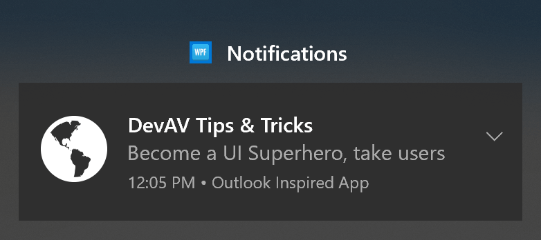
Windows 10 Notification Support
Our Notification Service now supports native Windows 10 notifications. These notifications can be displayed within the Notification Center.
Demo
Async Command Enhancements
Our POCO ViewModels and ViewModelBase descendants can now automatically generate Async Commands for methods marked with the async keyword.
                        [AsyncCommand(UseCommandManager = false)]
                        public async Task Calculate() {
                        for(int i = 0; i <= 100; i++) {
                        Progress = i;
                        await Task.Delay(20);
                        }
                        }
You can also reference your async method when invalidating an auto-generated Async Command:
this.RaiseCanExecuteChanged(x => x.Calculate());
Dynamic Binding Converters - New API
The new 'DelegateConverterFactory' class provides a set of functions to create IValueConverter and IMutliValueConverter instances based on passed delegates.
PDF Viewer
Touch Support
Our WPF PDF Viewer now supports all standard touch gestures (pinch, rotate, hold) and inertia scrolling (pages continue to scroll after a swipe).
Predefined CMaps for CID Fonts Support
The DevExpress PDF Viewer supports CID fonts with predefined CMaps (used for CJK characters). The PDF Viewer displays these fonts when DirectX rendering is enabled.
Pivot Grid
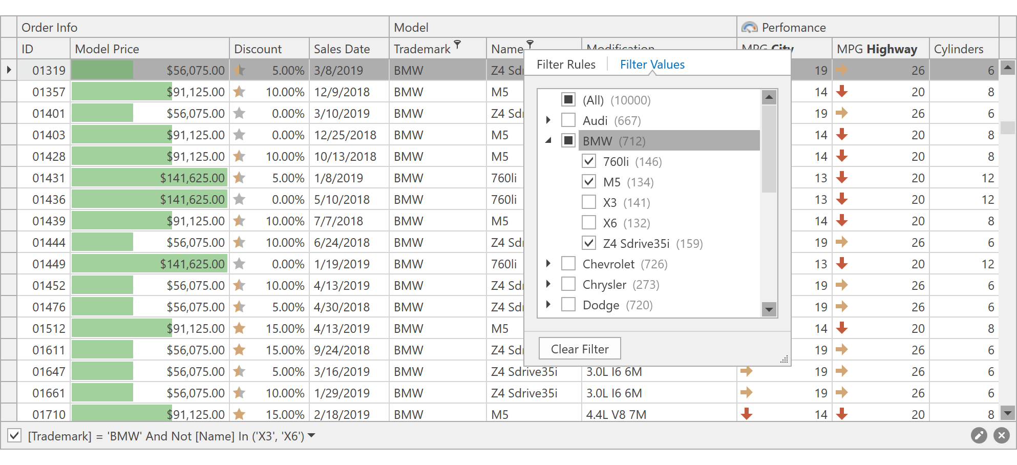
Excel-inspired Field Filter Popup
The DevExpress WPF Pivot Grid now supports our Excel-inspired Field Filter popup. This popup simplifies filter criteria generation. The filter popup consists of two tabs:
- The 'Filter Rules' tab allows you to create a filter expression using a set of filter operators (Equals, Between, Contains, etc.).
- The 'Filter Values' tab allows you to select from among all available values.
End-users can search for filter values, select multiple values simultaneously and display values from multiple columns in a hierarchy.
Demo Documentation
New Filter Editor
Our new WPF Filter Editor ships with a redesigned UX designed to simplify usage and engineered to simplify field and operator selection.
Demo
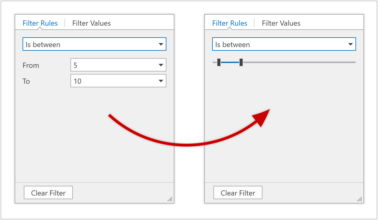
Filtering UI
Our WPF Pivot Grid can now use the Filtering UI that was first introduced in v18.2 for the DevExpress WPF Data Grid.
Filtering UI is represented by separate controls (filter elements) allowing you to filter data within a control. You can create an external filter UI using a wide range of predefined filter elements (a check box, radio group, range, calendar and many more). The filter element automatically retrieves available values, formatting options, and other information from the control to which it is connected.
Demo
Performance Enhancements
The DevExpress in-memory data processing engine is now used by default.
Blog Post
Property Grid
ExpandoObject Support
The WPF Property Grid can now display and edit dynamic properties defined in ExpandoObject.
Ribbon and Navigation
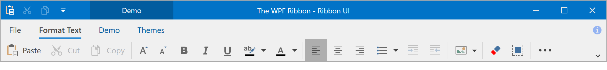
Office 2019 Style and Simplified Ribbon
The DevExpress WPF Ribbon ships with a new Office 2019-inspired display style.
We've also added a new option - Simplified Ribbon. When this option is enabled, Ribbon items are displayed across a single line.
Demo Blog Post Documentation
New Breadcrumb Control
Our new Breadcrumb control allows you to reproduce the Windows File Explorer UX with ease. Its features include:
- Select and Edit modes
- Binding options
- Configurable UI
Demo
Hamburger Menu Events
- PreviewItemClick - Allows you to cancel item clicks.
- Navigating - Allows you to prevent item navigation.
Rich Text Editor
Track Changes Support
You can now load and export documents with revisions made via the Track Changes feature.
RTL Enhancements
- Paragraph alignment for Arabic languages (Justify Low, Justify Medium, Justify Hight)
- Line numbering
- New UI elements (alignment, indents, bulleted and numbered lists).
Distributed Paragraph Justification for East-Asian Languages
Our WPF Rich Text Editor now supports 'Distributed' and 'Thai Distributed' paragraph alignment, which can be specified in code or via Command UI.

DOCX and DOC File Encryption
Our WPF Rich Text Editor supports DOCX and DOC file encryption. You can encrypt documents with standard or agile encryption.
Documentation
HR Tag Support
You can now load, print and export documents with HTML 'HR' tags (a horizontal rule).
Scheduler
Office 2019 Style
The new Outlook 2019 style is now used by default. Visual enhancements include:
- Resource colors are used to paint resource headers, appointments that don't have an assigned label, navigation buttons, and date headers.
- Updated appearance of Scheduler UI elements.
- You can specify a palette for labels and resources for all themes or a specific theme only.
- The label palette now supports the Transparent color. Appointments with the transparent label assigned are colorized with the resource color.
We've also maintained backward compatibility. To enable the previous version, set the DevExpress.Xpf.Core.CompatibilitySettings.SchedulerAppearanceStyle static property to SchedulerAppearanceStyle.Classic.
Blog Post
Date Navigation Panel
The Scheduler now includes a Date Navigation Panel that displays navigation buttons as well as the current time interval, formatted depending on the interval length and the current UI culture.
Blog Post Documentation
Clipboard Operations
Users can now copy appointments to the Clipboard, paste within the Scheduler and any other control or application that supports text input.
New options and events allow you customize or restrict certain Copy/Paste operations.
Documentation
Print Enhancements
Our WPF Scheduler control now ships with an enhanced Print Preview window. New printing options include:
- Printing interval
- Ability to specify the number of resources per page
- Optional calendar display (show/hide)
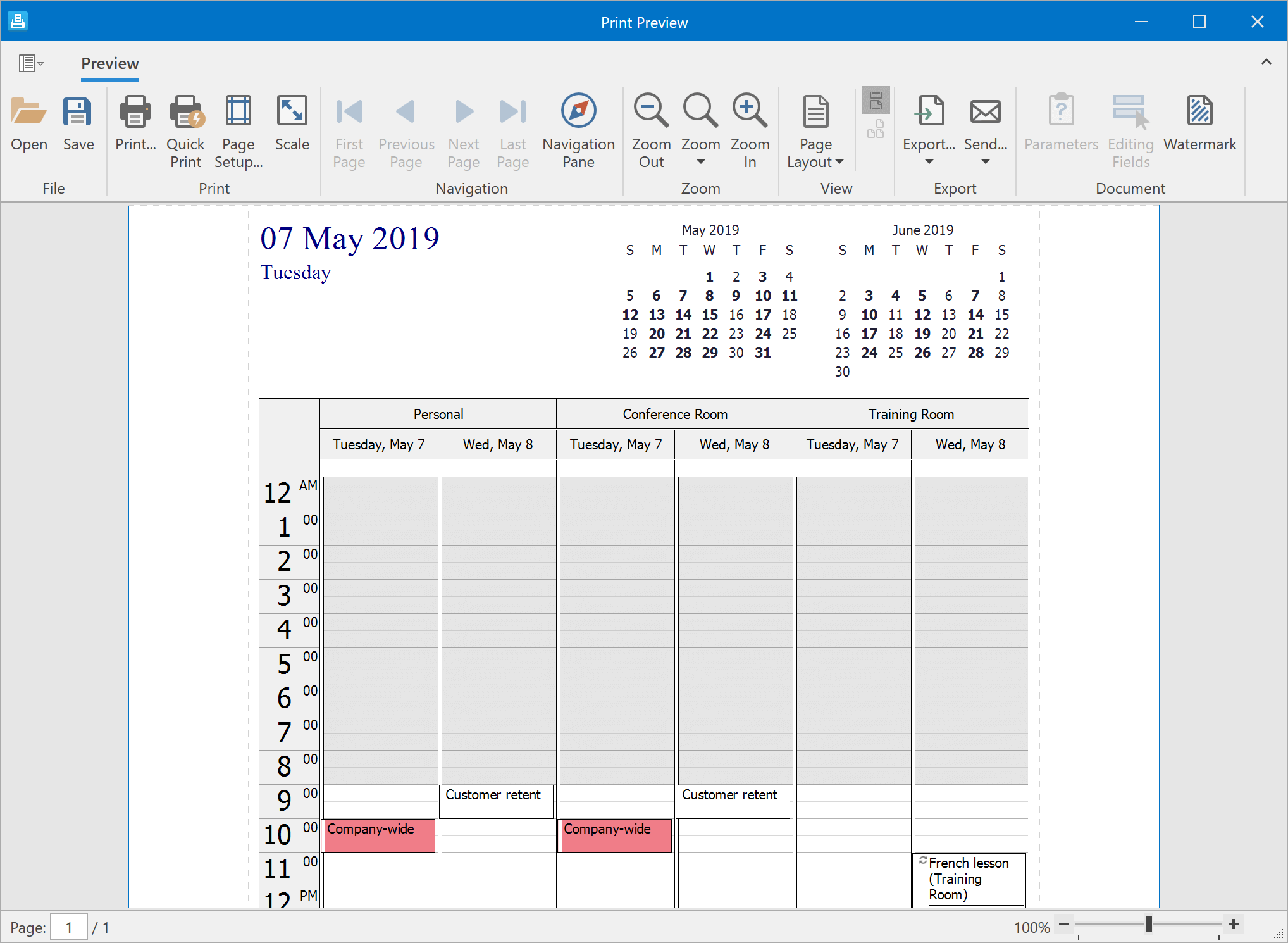
We've also added the following predefined print templates:
- Daily
- Weekly
- Monthly
- Timeline
- Trifold
Demo Documentation
Drag and Drop API Enhancements
New events allow you to control the drag-and-drop process, provide visual feedback, and accept objects dragged from external applications. New events include:
- StartAppointmentDrag
- QueryContinueAppointmentDrag
- DragAppointmentOver
- GiveAppointmentDragFeedback
- DropAppointment
- CompleteAppointmentDragDrop
- StartAppointmentDragFromOutside
Blog Post Documentation
API Enhancements
New API options allow you to disable per-pixel scrolling, customize the date header string format and hide scroll bars. We have also supported Touch Scrollbars.
Spreadsheet
Simplified Formula Creation
You can use cell ranges from other worksheets and select cells with the keyboard when you create or edit formulas.
Multi-Threaded Calculations
Our WPF Spreadsheet now supports multi-threaded calculations. You can specify the number of calculation threads via the 'CalculationOptions.ThreadCount' property. To disable multi-threaded calculations, disable the 'CalculationOptions.EnableMultiThreading' option.
Excel 2016 Functions
Our WPF Spreadsheet control now supports the following Excel 2016 functions:
- CONCAT
- TEXTJOIN
- IFS
- SWITCH
- MAXIFS
- MINIFS
Documentation
Black and White Print Mode
Our WPF Spreadsheet control allows you to print documents in black and white.
Documentation
Performance Improvements
Our formula calculation engine is now nearly five times faster. Insert/delete operations within documents with numerous merged cells are almost six times faster.
Blog Post
API Enhancements
New events allow you to control the drag-and-drop and fill operations for a cell range. New events include:
- BeforeDragRange
- BeforeDropRange
- AfterDropRange
- BeforeFillRange
- AfterFillRange
Themes and Icons
Theme Palettes
v19.1 ships with predefined color palettes for our Office2019, Office2016, and VS2017 themes. Palettes are displayed in our theme gallery.
You can also create custom palettes in code or via our Theme Designer and re-paint the theme at runtime. You can easily create a custom pallete to apply a corporate style to your application.
Blog Post Documentation
New Office 2019 Themes
New Office 2019 themes include:
- White
-
Colorful
-
Dark Gray
- Black
These new themes ship with lightweight templates for our most popular UI controls and include dynamic palette support.
Blog Post
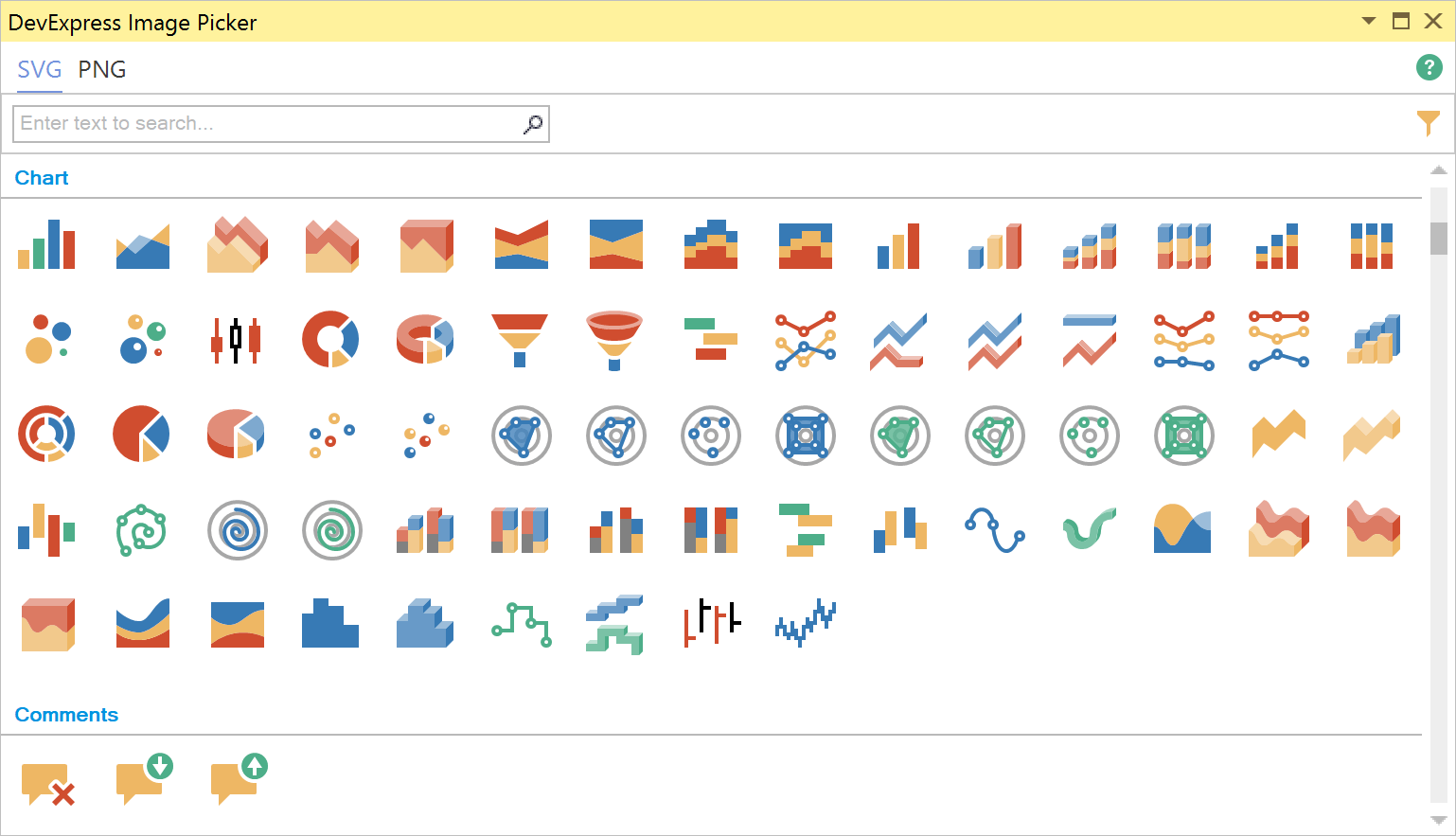
Visual Studio Image Picker
We've integrated our Image Picker dialog into Visual Studio. Available via the DevExpress menu, the Image Picker displays the full collection of DevExpress SVG and PNG icons grouped by categories and styles.
The Image Picker is also available for Image properties in our Smart Tags.
We've also updated our DXImage extension. It can display both SVG and PNG icons using the same syntax:
{dx:DXImage Images/Actions/Add_32x32.png}
{dx:DXImage SvgImages/Actions/New.svg}
Tree List
New Item Row
The New Item Row allows end-users to add new TeeList nodes. It can be displayed above or below data rows.
Demo Documentation
Node Check Boxes - Configurable Enabled State
Our WPF TreeList control can display node check boxes. With this release, you can disable node check boxes individually via the following properties:
New Filter Mode
The new Entire Branch filter mode allows you to display both parents and children of a node that meets the filter criteria.
Demo Documentation
Windows and Dialogs
Themed Window Enhancements
- The Themed Window can now display a toolbar in a straight line with the application icon. This allows you to design UIs inspired by Visual Studio 2019.
- Save and restore the window size, position and state. You can enable the ThemedWindow's DXSerializer.Enabled option and serialize window settings using WorkspaceManager or LayoutSerializationService.
- The ControlBoxButtonSet property allows you to explicitly specify which control box buttons are displayed regardless of the window state.
Demo
Scheduler
Integration with the Date Navigator
The SchedulerDateNavigationBehavior allows you to use our Date Navigator control to display and select visible dates within the Scheduler.
Time Indicators
Appointment CRUD Events
We have implemented new events that allow you to control CRUD operations (create, read, update and delete appointments).
- AppointmentAdding / AppointmentAdded
- AppointmentUpdating / AppointmentUpdated
- AppointmentRemoving / AppointmentRemoved
- EditDialogShowing
- DeleteDialogShowing
Reminders
Our UWP Scheduler control can display reminders for single or recurring events. You can configure alerts by handling the RemindersDialogShowing event.
Drag and Drop
We now support drag and drop operations within the Windows 10 Scheduler control. Users can drag appointments to change date/time or rearrange events between resources. Drag and drop to and from an external source is also supported.
Our new Windows 10 Scheduler API includes the following events:
- AppointmentDragStarting
- SerializeAppointments
- DeserializeAppointments
- AppointmentDragEnter
- AppointmentDragOver
- AppointmentDragLeave
- AppointmentDrop
- AppointmentDropCompleted
New ASP.NET Gantt Control (CTP)
Our new ASP.NET Gantt control is available as a community technology preview. Its features include:
- TreeList and Gantt regions designed to hierarchically display tasks, milestones, dependencies and resources from a corresponding data source
- API to configure custom work time, weekends and special dates
- Built-in scrolling
- Task progress
- Use different time scales (hours to months)
- Ability to specify resources for tasks
Demo Documentation
Charting
Segment Colorizers
You can now use the following segment colorizers to enhance data visualization.
- Trend Segment Colorizer
- Range Segment Colorizer
- Point-based Segment Colorizer
Demo Blog Post Documentation
Center-Align Axes
The Chart control allows you to center-align axes within the plot area.
Demo Documentation
Axis Label Position and Alignment
The chart control introduces the following options:
- Display axis labels inside or outside of plot region. Documentation
-
Change label alignment relative to tick marks (Near, Far, Center). Documentation
Y-Axis Label Rotation (Polar and Radar Charts)
Polar and Radar charts now allow you to display Y-axis labels at an angle.
Histogram
DevExpress Chart control now allows you to generate Histograms. Features include:
- Histogram aggregation function
- Excel-inspired histogram calculation modes (automatic, bin width, bin number)
- Interval information display within axis labels
- Customizable label text for Overflow and Underflow bins
- Ability to align grid lines and tick marks with bins and to center axis labels
Demo Blog Post
GridView
Adaptive Toolbar
DevExpress ASP.NET Web Forms and MVC GridView toolbars now support adaptive layouts.
Batch Edit Mode - Command Button UI Enhancements
New predefined render styles are available for command buttons used in batch edit mode:
Demo
Endless Paging in Batch Edit Mode
Our ASP.NET Web Forms and MVC GridView controls now support endless paging in Batch Edit mode. To enable endless paging, set the 'SettingsPager.Mode' property to 'EndlessPaging'.
Demo
Miscellaneous Enhancements
You can obtain the command name when handing the GridView's EndCallback client event.
Pivot Grid
Performance Enhancements
The DevExpress in-memory data processing engine is now used by default.
Blog Post
Rich Text Editor
Сlient-Side Printing
Our Rich Text Editor supports client-side printing. Your on-screen layouts can now be printed with ease.
Spreadsheet
Culture-Specific Format
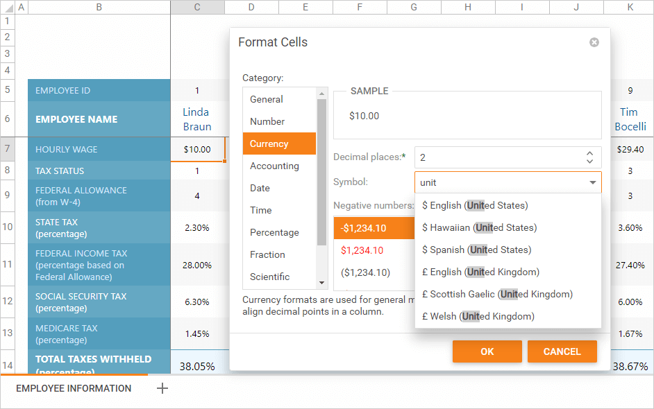
The Format Cells dialog allows you to apply culture-specific formatting to date and numeric values.
Client-Side API Enhancements
We've added a new client-side Print command to invoke the browser's Print dialog. If the browser does not support printing, you can export your workbook to PDF.
New Rich Text Editor
Our new ASP.NET Core Rich Text Editor ships with everything you'll need to quickly incorporate advanced text editing functionality in your ASP.NET Core application. Its features inclu
de:
- Document import/export (docx, rtf, txt)
- Mail merge and fields support
- Native client-side printing
- Client-side API
- Autocorrect
- Customizable UI and document view options
Demo
New Spreadsheet Control
With this release, you can incorporate spreadsheet functionality to any ASP.NET Core application with absolute ease. The DevExpress ASP.NET Core Spreadsheet control ships with the following features:
- Cell Editing and Formatting
- Formulas
- Charts
- Sorting and AutoFilter
- Comments
- Worksheet Protection
- Data Validation
- Read-only Mode
- Built-in Ribbon UI
- Client-side API
- Client-side Events
Demo
New ASP.NET Core Diagram (CTP)
Our new jQuery Diagram allows you to incorporate information-rich diagrams, flow charts and organization charts with ease. Features include:
- 35+ Predefined Shapes
- Custom Shapes
- Shape Sizing
- Shape Drag-and-Drop
- Auto Layout
- Snap to Grid
- External Data Binding
- Configurable Page Settings
- Customizable Shape and Connector Style Settings
- Export to SVG, PNG and JPEG
Demo
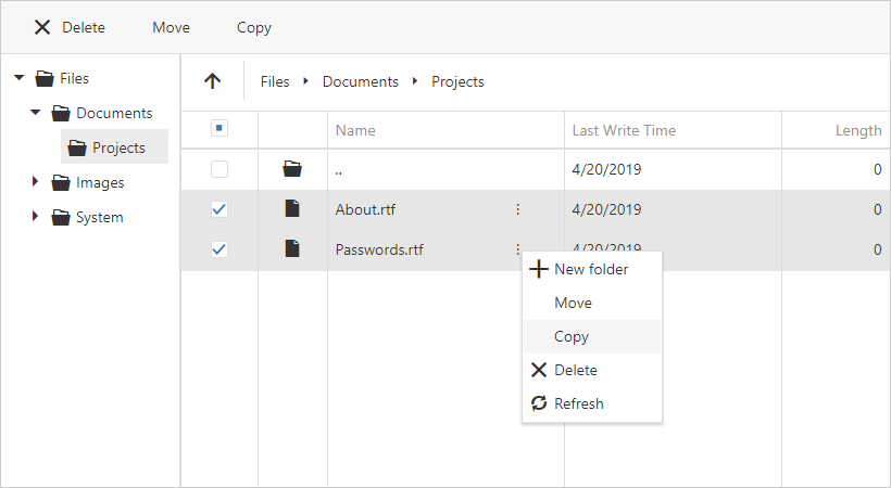
New File Manager (CTP)
Our new ASP.NET Core File Manager control allows you to reproduce the Windows File Explorer UX in your next web app. its features include:
- File and folder structure display options
- File upload options
- Thumbnail and Details view modes
- Client-side responsive UI
- REST API for file operations
- Predefined helpers to connect to a server file system.
Demo
Data Grid and Tree List
Keyboard Navigation Enhancements
This release includes new keyboard behavior options. These options allow you to address a variety of high-speed data entry usage scenarios.
- Start Editing via KeyPress
Users can now instantly edit data - no need to switch to edit mode.
- Configurable Enter Key Action
You can specify whether an Enter key press switches to edit mode or moves focus to the next cell.
- Configurable Enter Key Direction
You can configure an Enter key press to move cell focus to the next column or row (horizontally or vertically).
Accessibility Enhancements
You can now navigate to and interact with DataGrid and TreeList UI elements (such as headers, pager controls, and the command column) via the keyboard.
New DoubleClick Events
- onCellDblClick - fires when a user double clicks a cell.
- onRowDblClick - fires when a user double clicks a row.
Data Editing - New API
- editing.selectTextOnEditStart - Determines whether cell text is auto-selected when a user starts to edit a cell's value.
- editing.startEditAction - Specifies whether a single or double cell click initiates data edit operations.
TreeList - A New Filter Mode
We've extended the filtering capabilities of the TreeList with a new data filter mode. When used, filter results include the children of filtered nodes.
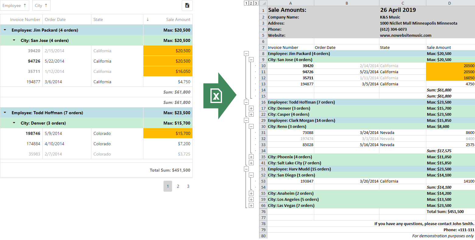
DataGrid - New Export To Excel API (CTP)
This release includes a new, more flexible API based on the ExcelJS library. Features include:
- Ability to add a custom header/footer
- Export multiple grids into a single worksheet
- Export multiple grids into a single document using separate worksheets
- Rename the exported file
- Generate worksheets with custom content
- Display a loading indicator for large datasets
Data Visualization
Chart Annotations
You can now annotate charts with custom labels.
Legend Enhancements
- Customize Legend Items
We added a 'legend.customizeItems' callback so you can change the order, text, and visibility of legend items.
- Legend Title
A legend title can now be specified and configured using the 'legend.title' option. You can customize the title's appearance and its position, and add a subtitle as well. This new option offers the same capabilities as the widget's root title option.
- Add a Legend to the Bar Gauge
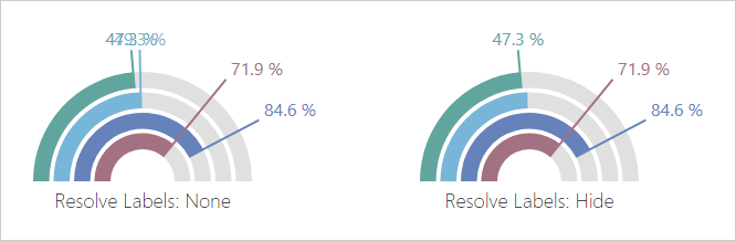
Resolve Label Overlaps
The resolveLabelOverlapping option allows you to specify widget behavior when labels overlap one another.
- Resolve Label Overlaps within a Funnel Chart
In the Funnel, this option accepts 'shift' (default), 'hide' and 'none.' If no room exists to display all labels after a shift, the algorithm hides labels as needed.
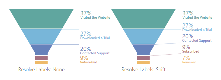
- Resolve Label Overlaps in Bar Gauge
resolveLabelOverlapping accepts 'hide' (default) and 'none'.
Miscellaneous Chart/Gauge Enhancements
Display a tooltip when a point/series is hovered.
Word-wrap Support
Word-wrap is now supported within the Title, Chart axes labels, PieChart and TreeMap labels.
- You can now control exported chart layout (layout by columns, etc.)
- You can now move constant lines behind or in front of other series.
Pivot Grid
Remote Data Paging
Our PivotGrid's data layer can now request the data it needs for an individual page. Remote data paging improves performance against large volumes of aggregated data.
PivotGrid - Cascade Filtering
Our PivotGrid can now apply parent field filters. For instance, if you filter the PivotGrid by the 'Country' field, the 'City' field's filter items will also be filtered against the same Country.
Reporting
XRRichText Control
XRRichText control is now available for use within our ASP.NET Core Reporting platform. It can be used in Windows hosted environments.
TypeScript Definitions
We now include *.d.ts files for TypeScript. As a result, code completion is available within your development environment.
Web Report Designer - Custom Configuration Provider
With this release, you can create individualized configurations from a variety of configuration sources and pass it to the DevExpress Web Report Designer. You can register the configuration globally or only within the Report Designer.
Documentation
Scheduler
Adaptivity and UX Enhancements
We have improved Scheduler usability on mobile devices. In v19.1, the Scheduler control renders a popup appointment list instead of a tooltip. The appointment list is displayed in full screen mode.
The appointment edit form is also rendered in full-screen mode on mobile devices.
In addition, larger appointment markers are now used on mobile devices.
Themes
New Compact Material Design Theme
UI Widgets
New Dropdown Button Widget
v19.1 introduces a new button widget with a built-in dropdown menu. This widget can be used as a stateless set of clickable menu items or as a stateful analog of a SelectBox control (which looks like a button).
New Floating Button Widget
Our new Floating Button Widget is a single button positioned at the bottom corner of the screen. It contains one or more primary screen actions. The floating button widget follows Google's Material Design guidelines.
HTML/Markdown Editor - Resize Media Blocks
You can now resize images and video blocks via mouse operations:
HTML/Markdown Editor - Mentions Support
Mentions allow you to select users or user groups by typing @ when composing rich text content. You can also implement any custom embedded lookups such as issue references using # symbol as a prefix.
Data Editors - Additional Action Buttons
With this release, you can add additional buttons to data editors and reorder built-in actions.
Visual Studio Integration
DevExtreme-based Responsive Visual Studio Project Template
To help you quickly create responsive ASP.NET Core apps, we've added a new project template for Visual Studio 2017 and Visual Studio 2019. This template was inspired by our existing responsive template for Angular.
Blog Post Documentation
Editors
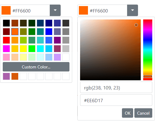
New Color Editor
This release includes a new Bootstrap Color Edit control. Its features include:
- Color indicator
- Custom color picker
- Automatic / favorite color item
- Custom palettes
Demo
Drop-Down Editors - Adaptivity Enhancements
With this release, DevExpress Bootstrap drop-down editors (ComboBox, DateEdit, etc.) can switch to modal mode based upon browser width.
Demo
GridView
Adaptive Toolbar
Our Bootstrap GridView's toolbar is now adaptive and thus better able to adapt to a user's device.
Callback Support in Batch Edit Mode
Our Bootstrap GridView now supports callbacks in batch edit mode. The Grid retains unsaved changes when an end-user filters, groups, sorts data or navigates between pages. You can also preview inserted, edited and deleted rows before your final save operation.
Demo
Navigation
New Floating Action Button
Our new Floating Action button encapsulates popular end-user actions (e.g., CRUD operations, data sorting, filtering, etc.). Floating Action buttons are fully configurable and support custom actions.
Key features include:
- Container indication
- Fixed position
- Customizable appearance
Demo
Rich Text Editor
Сlient-Side Printing
Our Rich Text Editor supports client-side printing. Your on-screen layouts can now be printed with ease.
Scheduler
Date Navigator UI Enhancements
We've redesigned our Bootstrap Date Navigator UI to simplify navigation between individual appointments.
Demo
Date Highlighting in Date Navigator
Our Date Navigator can highlight dates that contain events/appointments. The following highlight modes are available:
Demo
New Responsive Project Template
Our new template allows you to create applications with adaptive mobile-friendly layout based on DevExpress Bootstrap controls.
Demo
New File Manager (CTP)
Our new File Manager control allows you to reproduce the Windows File Explorer UX in your next web app. Its features include:
- File and folder structure display options
- File upload options
- Thumbnail and Details view modes
- Client-side responsive UI
- REST API for file operations
- Predefined helpers to connect to a server file system.
Demo Blog Post
New Diagram Widget (CTP)
Our new jQuery Diagram allows you to incorporate information-rich diagrams, flow charts and organization charts with ease. Features include:
- 35+ Predefined Shapes
- Custom Shapes
- Shape Sizing
- Shape Drag-and-Drop
- Auto Layout
- Snap to Grid
- External Data Binding
- Configurable Page Settings
- Customizable Shape and Connector Style Settings
- Export to SVG, PNG and JPEG
Demo
Data Grid and Tree List
Keyboard Navigation Enhancements
This release includes new keyboard behavior options. These options allow you to address a variety of high-speed data entry usage scenarios.
- Start Editing via KeyPress
Users can now instantly edit data - no need to switch to edit mode.
- Configurable Enter Key Action
You can specify whether an Enter key press switches to edit mode or moves focus to the next cell.
- Configurable Enter Key Direction
You can configure an Enter key press to move cell focus to the next column or row (horizontally or vertically).
Demos Documentation (Data Grid) Documentation (TreeList)
Accessibility Enhancements
You can now navigate to and interact with DataGrid and TreeList UI elements (such as headers, pager controls, and the command column) via the keyboard.
Demos Blog Post
New DoubleClick Events
Data Editing - New API
Demo
TreeList - A New Filter Mode
We've extended the filtering capabilities of the TreeList with a new data filter mode. When used, filter results include the children of filtered nodes.
Demo Documentation
DataGrid - New Export To Excel API (CTP)
This release (available as a CTP) includes a new, more flexible API based on the ExcelJS library. Features include:
- Ability to add a custom header/footer
- Export multiple grids into a single worksheet
- Export multiple grids into a single document using separate worksheets
- Rename the exported file
- Generate worksheets with custom content
- Display a loading indicator for large datasets
Demo
UI Widgets
New Dropdown Button Widget
v19.1 introduces a new button widget with a built-in dropdown menu. This widget can be used as a stateless set of clickable menu items or as a stateful analog of a SelectBox control (which looks like a button).
Demo Documentation
New Floating Button Widget
Our new Floating Button Widget is a single button positioned at the bottom corner of the screen. It contains one or more primary screen actions. The floating button widget follows Google's Material Design guidelines.
Demo Documentation
HTML/Markdown Editor - Resize Media Blocks
You can now resize images and video blocks via mouse operations:
Demo Documentation
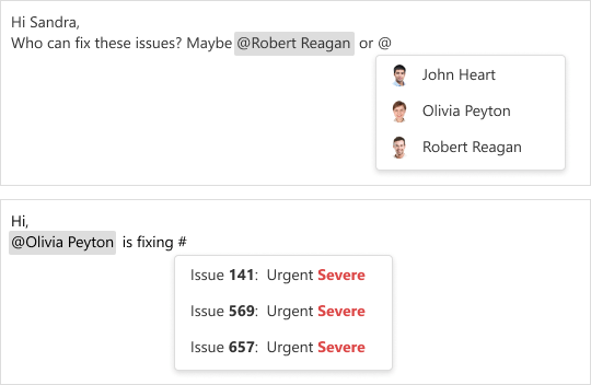
HTML/Markdown Editor - Mentions Support
Mentions allow you to select users or user groups by typing @ when composing rich text content. You can also implement any custom embedded lookups such as issue references using # symbol as a prefix.
Demo Blog Post Documentation
Text Editors - Custom Buttons
With this release, you can add additional buttons to data editors and reorder built-in actions.
Demo Documentation
Pivot Grid
Remote Data Paging
Our PivotGrid’s data layer can now request the data it needs for an individual page. Remote data paging improves performance against large volumes of aggregated data.
Demo Documentation
PivotGrid - Cascade Filtering
Our PivotGrid can now apply parent field filters. For instance, if you filter the PivotGrid by the 'Country' field, the 'City' field's filter items will also be filtered against the same Country.
Demo Documentation
Scheduler
Adaptivity and UX Enhancements
We have improved Scheduler usability on mobile devices. In v19.1, the Scheduler control renders a popup appointment list instead of a tooltip. The appointment list is displayed in full screen mode.
The appointment edit form is also rendered in full-screen mode on mobile devices.
In addition, larger appointment markers are now used on mobile devices.
Demo Documentation
Data Visualization
Chart Annotations
You can now annotate charts with custom labels.
Blog Post Documentation
Legend Enhancements
- Customize Legend Items
We added a 'legend.customizeItems' callback so you can change the order, text, and visibility of legend items.
Demo Documentation
- Legend Title
A legend title can now be specified and configured using the 'legend.title' option. You can customize the title's appearance and its position, and add a subtitle as well. This new option offers the same capabilities as the widget's root title option.
Documentation
- Add a Legend to the Bar Gauge
Demo Documentation
Resolve Label Overlaps
The resolveLabelOverlapping option allows you to specify widget behavior when labels overlap one another.
- Resolve Label Overlaps within a Funnel Chart
In the Funnel, this option accepts 'shift' (default), 'hide' and 'none.' If no room exists to display all labels after a shift, the algorithm hides labels as needed.
Documentation
- Resolve Label Overlaps in Bar Gauge
resolveLabelOverlapping accepts 'hide' (default) and 'none'.
Documentation
Miscellaneous Chart/Gauge Enhancements
Display a tooltip when a point/series is hovered.
Documentation
Word-wrap Support
Word-wrap is now supported within the Title, Chart axes labels, PieChart and TreeMap labels.
-
You can now control exported chart layout (layout by columns, etc.)
Demo Documentation -
You can now move constant lines behind or in front of other series.
Documentation
Documentation
Themes
New Compact Material Design Theme
Demo Blog Post
React Components
Responsive Application Layout Template & CLI Tools
Our new React Application Layout template is based on the DevExtreme Drawer component and integrated with DevExtreme CLI tools. It's ready to use on desktop, tablet, and phone devices.
Demo
CLI Tools - React Apps and View Generation
v19.1 introduces new CLI tools. You can now bootstrap create-react-app based applications that are tightly integrated with DevExtreme. DevExtreme CLI utilizes our new React Application Layout Template and build-time theming capabilities. You can also generate empty React views and add it to application navigation and routing.
Documentation
Native React Grid - Virtual Scrolling with Remote Data: Lazy-loading
We've added virtual scrolling support for the grid when using remote data. Our grid is now more responsive and efficient when working with large remote data sets (only the visible data range is requested from the server when rendered).
Demos and Documentation
Native React Scheduler - Drag-and-Drop Support
You can now modify appointment start/end dates and times via drag-and-drop and resize actions.
Documentation API Reference
Native React Chart - Scrolling & Zooming
Demo Documentation

Vue Components
Responsive Application Layout Template and CLI Tools
Responsive Application Layout Template for Vue
We've introduced a new Vue Application Layout Template that uses our Drawer component to create app navigation and content. We've also integrated this template into our DevExtreme CLI tools.
Our Layout Template can be used when developing apps for desktop, tablet, and mobile devices.
Demo
DevExtreme CLI - Vue Apps and Views Generation
You can now bootstrap Vue CLI based applications that are tightly integrated with DevExtreme. DevExtreme CLI utilizes our new Vue Application Layout Template and build-time theming. You can also generate empty Vue views and add them to app navigation and routing.
Documentation
DevExpress UI for Blazor/ Razor Components ships with 7 user interface components (including a Data Grid and Pivot Grid) so you can design rich user experiences with both Blazor and Razor Components. We've released them as a free "early access" preview through Nuget.
Online Demos Blog Post
Download Free Preview
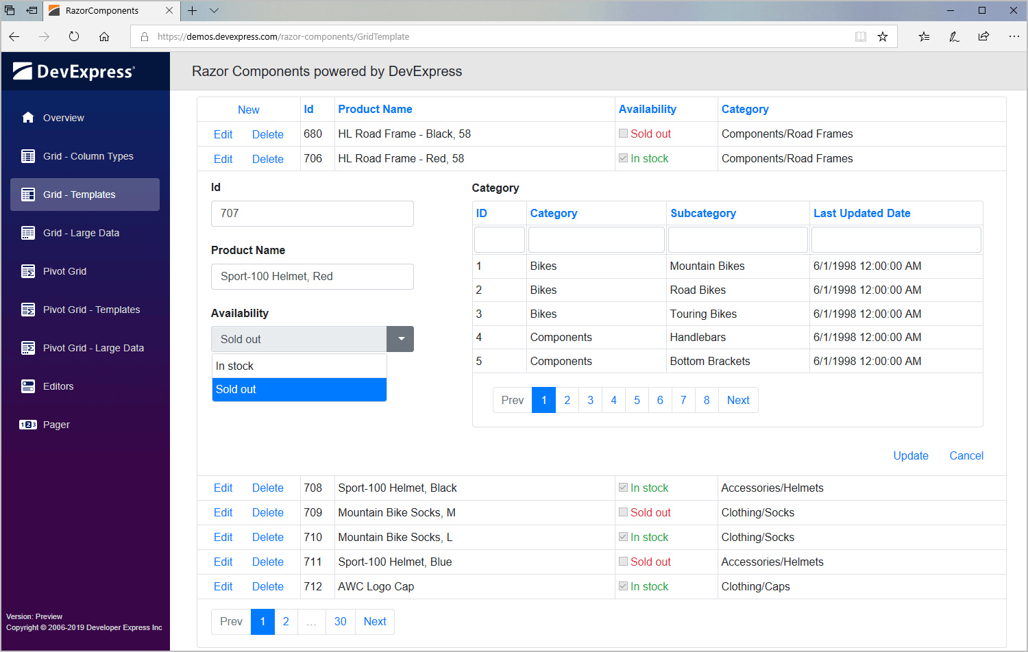
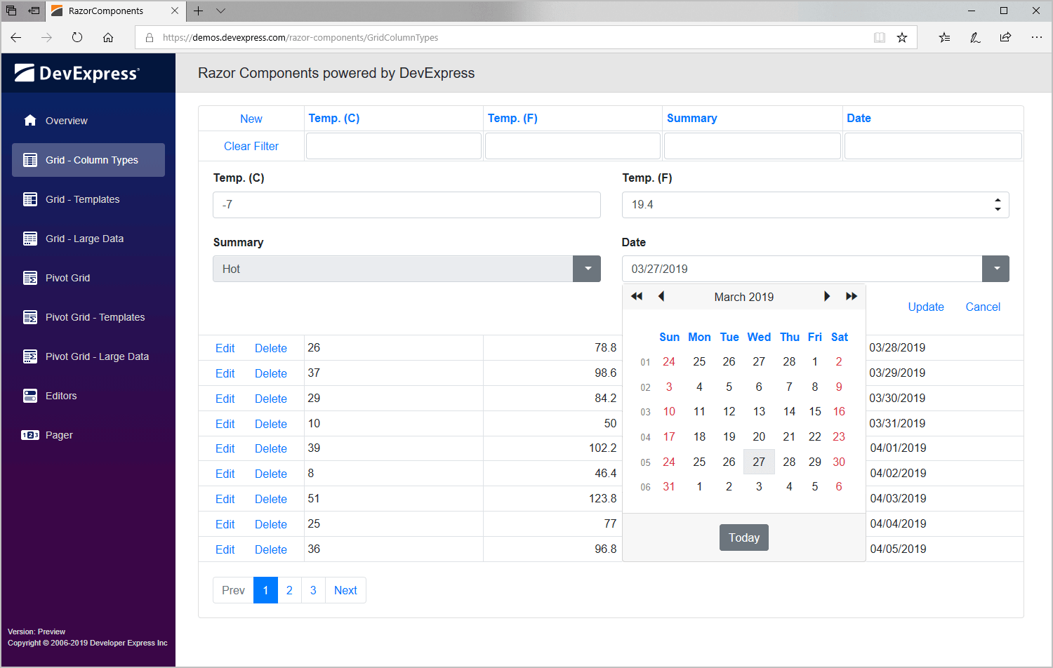
Data Grid
Our new set of native Blazor / Razor Components includes a feature-rich Grid control. Features include:
- Data Binding
- Editing
- Paging
- Filtering
- Row Selection
- Pre-defined Column Types
- Templates
Demo
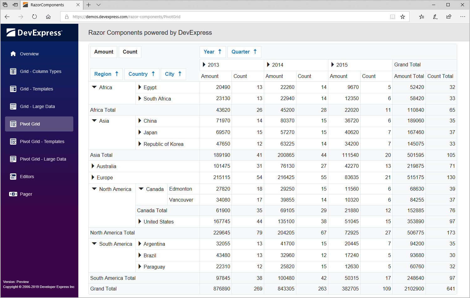
Pivot Grid
An Excel-inspired pivot table control engineered for multi-dimensional data analysis and cross-tab reporting. Features include:
- High performance data loading
- Built-in aggregate functions (Average, Count, Max, Min and Sum)
- Sorting
- Expand/Collapse
- Paging
- Templates
Demo
Data Editors and Pager
Our Data Editors for Blazor / Razor Components include four individual UI controls and a multi-purpose pager. These native Razor components can be used for standalone data editing or to edit Data Grid cell values.
- Combo Box
- Data Edit
- Spin Edit
- Text Box
- Pager
Demo
All Platforms
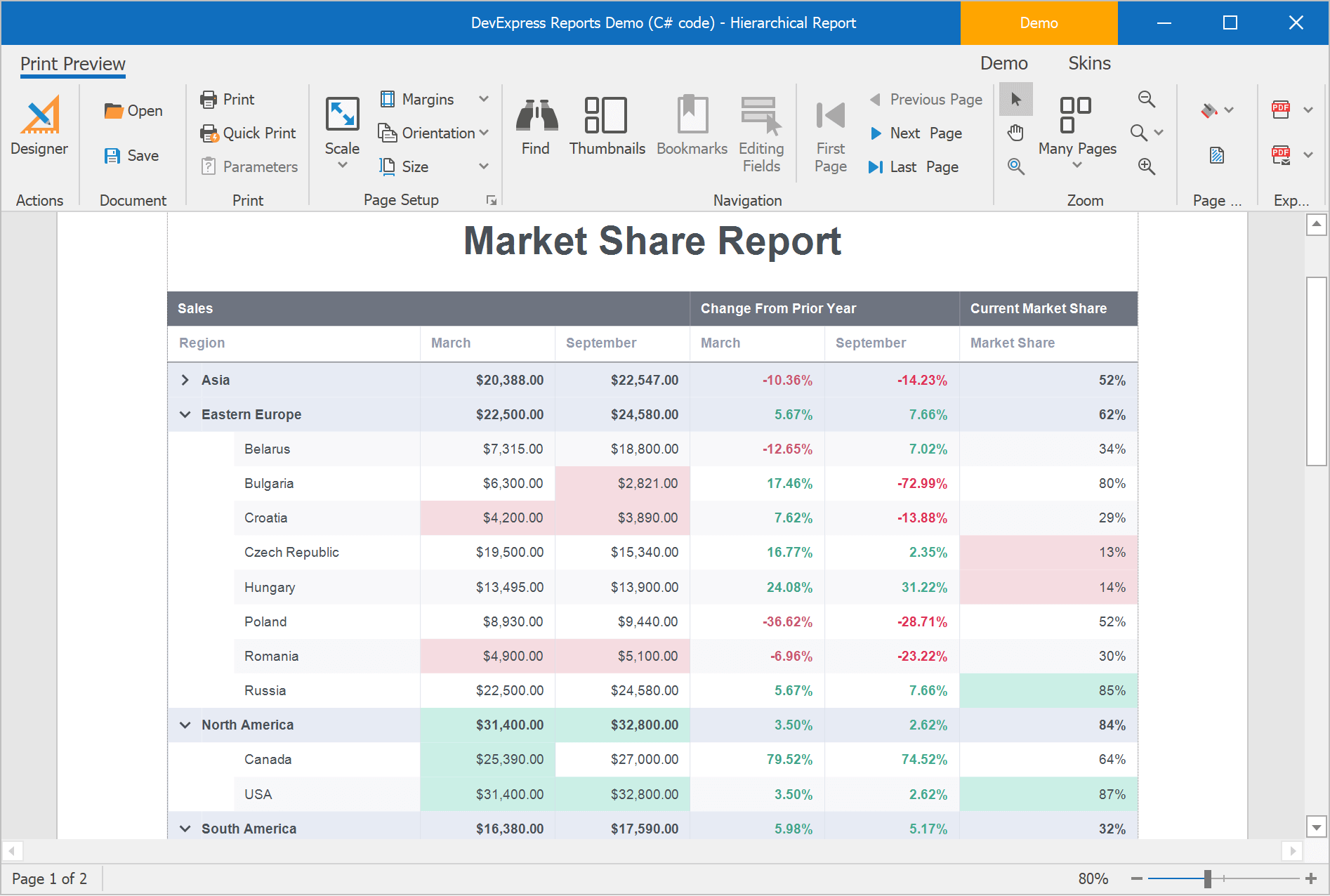
Report Designer - Hierarchical Reports
You can now create hierarchical reports using the new DetailBand.HierarchyPrintOptions property. Our reports support two types of data structures:
- Use KeyFieldName and ParentFieldName properties to create a report from ParentID / ID relationships.
- Use ChildListFieldName to create a report from self-referenced structures.
The Indent property allows you to define child level node offset.
Hierarchical reports provide built-in Drill-Down support using the DetailBand.DrillDownControl property: clicking a control assigned to this property in Print Preview will expand or collapse the corresponding data level.
Demo Blog Post Documentation
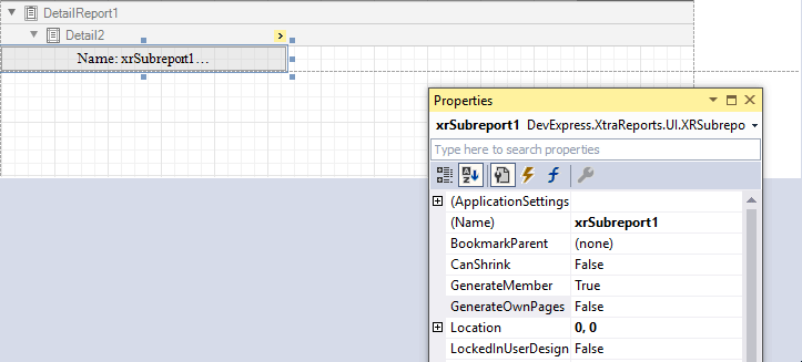
Merge Reports
You no longer need to write code to merge different reports using our XRSubreport control. Enable our new XRSubreport.GenerateOwnPages option to print/export a sub-report across individual pages and retain page settings and orientation.
Blog Post Documentation
Report Designer - JSON Data Source – Authentication Support
The Web Service Endpoint (URI) option of the JSON Data Source Wizard allows you to choose one of the following built-in authentication settings:
- Basic HTTP Authentication
- Token-Based Authentication
- Query String Parameters
Documentation
SqlDataSource - Execute Required Queries
The SqlDataSource component now executes only those queries that the associated report, control, calculated field or parameter uses. This reduces data traffic between your application and database server when you add several queries to the SQLDataSource, but the report uses a single query at a time.
SVG Images in XRCheckBox
The XRCheckBox control can now display SVG files for each state. Use the GlyphOptions.Style property to choose between predefined SVG sets. You can also upload custom SVG images (GlyphOptions.CustomGlyphs), specify image dimensions and alignment.
Demo Blog Post Documentation
XRLabel - HTML-Inspired Text Formatting
The XRLabel now exposes an AllowMarkupText property. You can use the subset of pseudo-HTML tags currently supported by DevExpress WinForms controls to display formatted content in XRLabel.
Blog Post Documentation
New Summary Editor
With our new Summary Editor you can quickly compute summaries with predefined aggregate functions.
Documentation
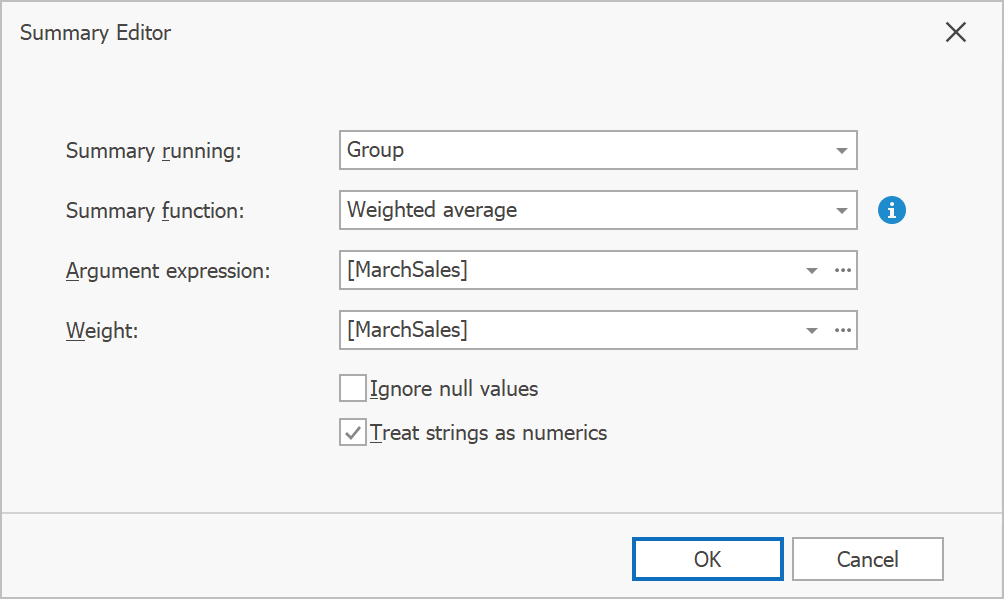
Weighted Average
We've added a new aggregation function to help calculate a weighted average. Choose 'Weighted average' in our Summary Editor or use the 'sumWAvg' function in our Expression Editor.
Documentation
Resource Access Security Settings
We introduced a new 'DevExpress.Security.Resources.AccessSettings' class that allows you to define access rules for different resources:
- Report Specific Resources (Style sheets and report layout serialization files)
- Static Resources (Images)
- Data Resources (JSON and Excel files)
Use 'UrlAccessRule' and 'DirectoryAccessRule' to specify whether resources can be loaded from all/specific URLs and file directories. To provide a custom logic, define a custom rule ('CustomRule'). You can also use the 'SerializationFormatRule' to specify which report layout formats are allowed/denied.
Documentation
XRPivotGrid - Performance Improvements
The DevExpress in-memory data processing engine is now used by default.
Learn more about performance improvements
Visual Studio Report Designer
Image Picker for Image Properties
We now use our Image Picker dialog to edit image properties (e.g. XRPictureBox.ImageSource, XRCheckBox.CustomGlyphs) within Visual Studio. The Image Picker stores images in a project resource file (*.resx), and shares them across different reports. It also provides access to a rich collection of raster and vector icons.
Documentation
ASP.Net Core Reporting
XRRichText Control
XRRichText control is now available for use within our ASP.NET Core Reporting platform. It can be used in Windows hosted environments.
Web Report Designer and HTML5 Document Viewer - Localization
Our Localization Service now provides JSON localization files.
Documentation
TypeScript Definitions
We now include *.d.ts files for TypeScript. As a result, code completion is available within your development environment.
Blog Post
Web Report Designer - Custom Configuration Provider
With this release, you can create individualized configurations from a variety of configuration sources and pass it to the DevExpress Web Report Designer. You can register the configuration globally or only within the Report Designer.
Documentation
WinForms Reporting
Data Federation
This new data source allows you to combine multiple report data sources and define joins or relationships between queries and collections:
Documentation
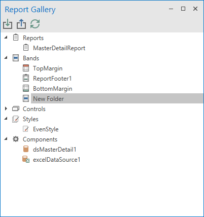
Reusable Band Templates
You can now create reusable band templates (page headers, details, page footers, etc.) and store them within the Report Gallery.
Blog Post Documentation
Report Designer - External Drag and Drop Operations
Our Visual Studio Report Designer and WinForms End-User Report Designer now support clipboard copy/paste actions and drag & drop operations with File Explorer:
-
Сopy an image to the clipboard and paste it onto a report surface, or use drag & drop to create XRPictureBox. You can also select XRPictureBox and copy its image to the clipboard.
-
Copy TXT, RTF, DOCX or HTML content to the clipboard and paste, or drag & drop a file to create XRLabel / XRRichText.
-
Drag & drop a report definition file to the Report Designer's surface to replace the layout of the active report file.
Documentation
End-User Report Designer Enhancements
Configurable default page for a new report.
You can now specify default page settings when creating a new report (via 'New Report' or 'New Report via Wizard' commands). Settings include:
- Report Unit
- Paper Kind
- Page Width and Height
- Landscape
- Roll Paper
- Margins
New options are exposed by the XRDesignMdiController.DefaultReportSettings property.
Documentation
Magnifier Dialog
Use the new Magnifier Dialog to select RGB or HEX colors anywhere on screen (invoke the Magnifier from the Properties Panel).
New Page Settings Tab
We've introduced a new tab to our Properties Panel. The new tab allows end-users to quickly configure page settings for a given report.
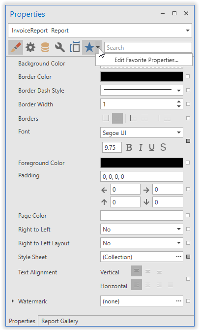
Display Property Expressions via Tooltips
End-users are no longer required to open the Expression Editor to check which expression is assigned to a property. With this release, property expressions are displayed via tooltips.
XRChart - Segment Colorizers
You can now use the following segment colorizers to enhance data visualization.
- Trend Segment Colorizer
- Range Segment Colorizer
- Point-based Segment Colorizer
Print Repeated Pages and Multiple Page Ranges
You can now specify the page numbers and multiple page ranges to print or export. You can specify duplicate page numbers and print multiple copies of the same page.
Web Reporting
Web Report Designer - New Report Wizard
We overhauled our Report Wizard to reduce the number of wizard pages and amount of time required to create a report. The Report Wizard now opens in fullscreen mode.
Web Report Designer - Report Wizard Customization API
Web Report Designer - Vertical Bands
We added Vertical Reports to the Report Wizard.
JSON Data Source and Authentication Support
JSON Data Source with authentication support is now available in our Data Source Wizard.
TypeScript Definitions
We now include *.d.ts files for TypeScript. As a result, code completion is available within your development environment.
Web Document Viewer - Improved Memory Consumption
Report Designer Preview
You can now use the 'CachedReportSourceWeb' service in the Report Designer's Document Viewer. New API includes:
- PreviewReportCustomizationService - enables CachedReportSource in a specific Report Designer's Viewer.
- DefaultWebDocumentViewerContainer.UseCachedReportSourceBuilder - enables CachedReportSource in an application globally for all Document Viewer instances.
Azure Reporting
The new AzureWebDocumentViewerContainer.UseCachedReportSourceBuilder method enables the CachedReportSourceWeb service in Microsoft Azure.
WPF Reporting
Data Federation
This new data source allows you to combine multiple report data sources and define joins or relationships between queries and collections:
Documentation
End-User Report Designer – Report Gallery
Report Gallery is now available within the WPF Report Designer. It ships with all features found in its WinForms counterpart.
Documentation
Reusable Band Templates
You can now create reusable band templates (page headers, details, page footers, etc.) and store them within the Report Gallery.
Blog Post Documentation
End-User Report Designer Enhancements
Categorized Tab in Properties Panel
Documentation
Dock Panel API
Our WPF End-User Report Designer allows you to specify dock panel visibility and behaviors on startup. New API options include:
- FieldListOptions
- ReportExplorerOptions
- PropertyGridOptions
- ReportGalleryOptions
- GroupAndSortPanelOptions
Documentation
Dock Panel Ribbon Drop Down Editor
The WPF End-User Report Designer now allows users to manage dock panel visibility.
Report Gallery
Display Property Expressions via Tooltips
End-users are no longer required to open the Expression Editor to check what expression is assigned to a property. With this release, property expressions are displayed via tooltips.
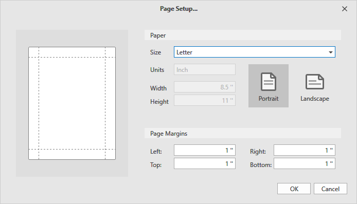
New Page Setup Dialog
With this release, our Page Setup Dialog (Document Viewer, Report Designer) allows you to specify custom paper size.
XRChart - Segment Colorizers
You can now use the following segment colorizers to enhance data visualization.
- Trend Segment Colorizer
- Range Segment Colorizer
- Point-based Segment Colorizer
Export To PDF
OpenType CFF Fonts Support
We now support OpenType CFF fonts for PDF export operations. GDI+ supports OpenType CFF fonts as of Windows 8.1+.
Skip All Fonts
Report and Dashboard Server
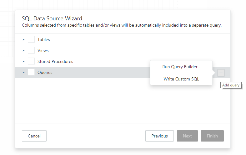
Data Models - Custom SQL Query Support
In addition to Tables, Views and Stored Procedures, your data models can now contain custom SQL queries. Navigate to General Settings to enable the execution of custom SQL statements or add a custom SQL statement at a report or dashboard level.
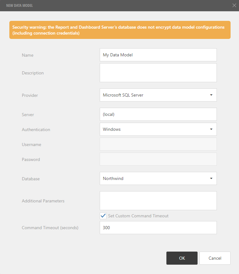
Configurable DBCommand Timeout
You can set a DB Command timeout when creating or editing a Data Model.
Themes - Report and Dashboard Designers
You can now change Report and Dashboard Designer themes. Open the Theme Settings dialog. Select the Report or Dashboard designer. Choose the skin and apply it.
Report Designer themes:
- Dark
- Light
- Carmine
- Dark Moon
- Dark Violet
- Green Mist
- Soft Blue
- Contrast
Dashboard Designer themes:
- Dark
- Dark Compact
- Light
- Light Compact
Documentation
Desktop End-User Report Designer - UI / UX Updates
The DevExpress Desktop End-User Report Designer includes the following UI\UX enhancements:
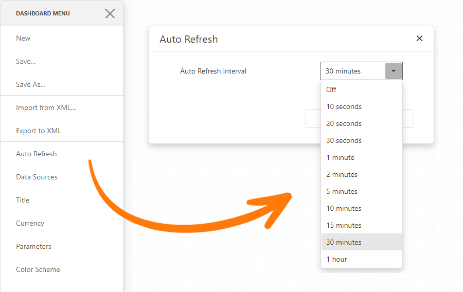
Dashboard - Auto-Refresh
You can now automatically refresh Dashboard data with the specified time interval.
Data Processing
Data Federation
Our new cross-platform Data Federation Data Source aggregates data from distributed sources (databases, Excel files and object data sources). You can now retrieve data and define relationships with a single federated query.
OLAP Range Filter Support
Both the Range Filter item and our new Date Filter item support OLAP data sources.
New Date Filter Dashboard Item
for WinForms, WPF and the Web
Our new Date Filter Dashboard item offers an alternative way to filter date values. You can select an interval between two dates or before/after the specified date. The Date Filter's UI integrates a configurable date picker and quick filter buttons which allow end-users to select a date range with a single click.
Documentation Blog Post
Web Dashboard
Search in Every List
We've enhanced our Dashboard UX to better address large lists. The new and fully integrated search panel provides a simple and quick way to locate list values (parameter values, colors, data sources, etc.).
Web Dashboard Localization Enhancements
- We have excluded duplicated terms and removed strings that are no longer relevant for the current platform.
- We decreased localization traffic to the client.
- The DevExpress Localization Service provides translations in JSON format. JSON localization strings are included in a localization package with standard *.resx files.
Migration to Web Dashboard Control
With this release, we officially end support for our old Web Dashboard Viewer. If you've not yet converted to our new Web Dashboard Viewer, please review the following links to learn more about the conversion/upgrade process.
How to migrate from ASPxDashboardViewer to ASPxDashboard using ViewerOnly mode
How to migrate from MVC DashboardViewerExtension to MVC DashboardExtension using ViewerOnly mode
Blog Post
WinForms Dashboard
State Management
In v19.1, we've incorporated State Management in our WinForms Dashboard. You can save and restore the following end-user actions:
- selected master filter values
- drill-down levels
- parameter values
- a selected tab page
- the range filter
- a selected dashboard item layer (in pie, card, treemap, gauge and maps dashboard items).
.NET Core Support
The DevExpress Office File API v19.1 supports .NET Standard 2.0/ .NET Core 2.1 (LTS) or higher. You can now use our Office File API components in your ASP.NET Core web application to perform various document-processing tasks. Read, write and print rich-text documents and spreadsheets or generate and modify PDF files. All Office File API .NET Core packages are available in our DevExpress NuGet Gallery.
Documentation
PDF Document API
Predefined CMaps for CID Fonts Support
With this release, the DevExpress PDF Document API supports CID fonts with predefined CMaps (used for CJK characters). You can render and print documents with this feature with DirectX enabled.
OpenType CFF Fonts Support
You can now generate and export documents with OpenType CFF fonts.
PDF Export - Unicode Characters for Non-Embedded Fonts
You can now use any Unicode character when you export documents to PDF with non-embedded fonts .
Spreadsheet Document API
Multi-Threaded Calculations
Our Spreadsheet Document API now supports multi-threaded calculations. You can specify the number of calculation threads via the 'CalculationOptions.ThreadCount' property. To disable multi-threaded calculations, disable the 'CalculationOptions.EnableMultiThreading' option.
Excel 2016 Functions
Our WinForms/WPF Spreadsheet controls and Spreadsheet Document API now support the following Excel 2016 functions:
- CONCAT
- TEXTJOIN
- IFS
- SWITCH
- MAXIFS
- MINIFS
Documentation
Print and Export Rich Text
With this release, documents with rich formatted cell text can be printed and exported to PDF.
This feature is only available in our new layout engine.
Documentation
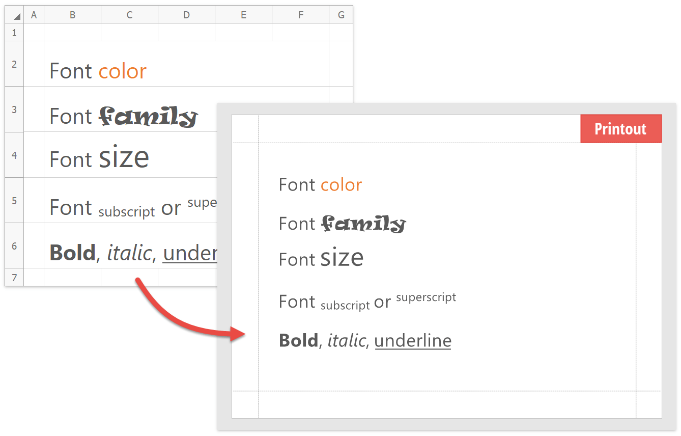
Print / Export Rich Text Headers and Footers
Our WinForms Spreadsheet control and Spreadsheet Document API can now print and export (to PDF) documents that contain rich formatted text and inline pictures within headers and footers.
This capability is only available if the new layout engine is used.
Documentation
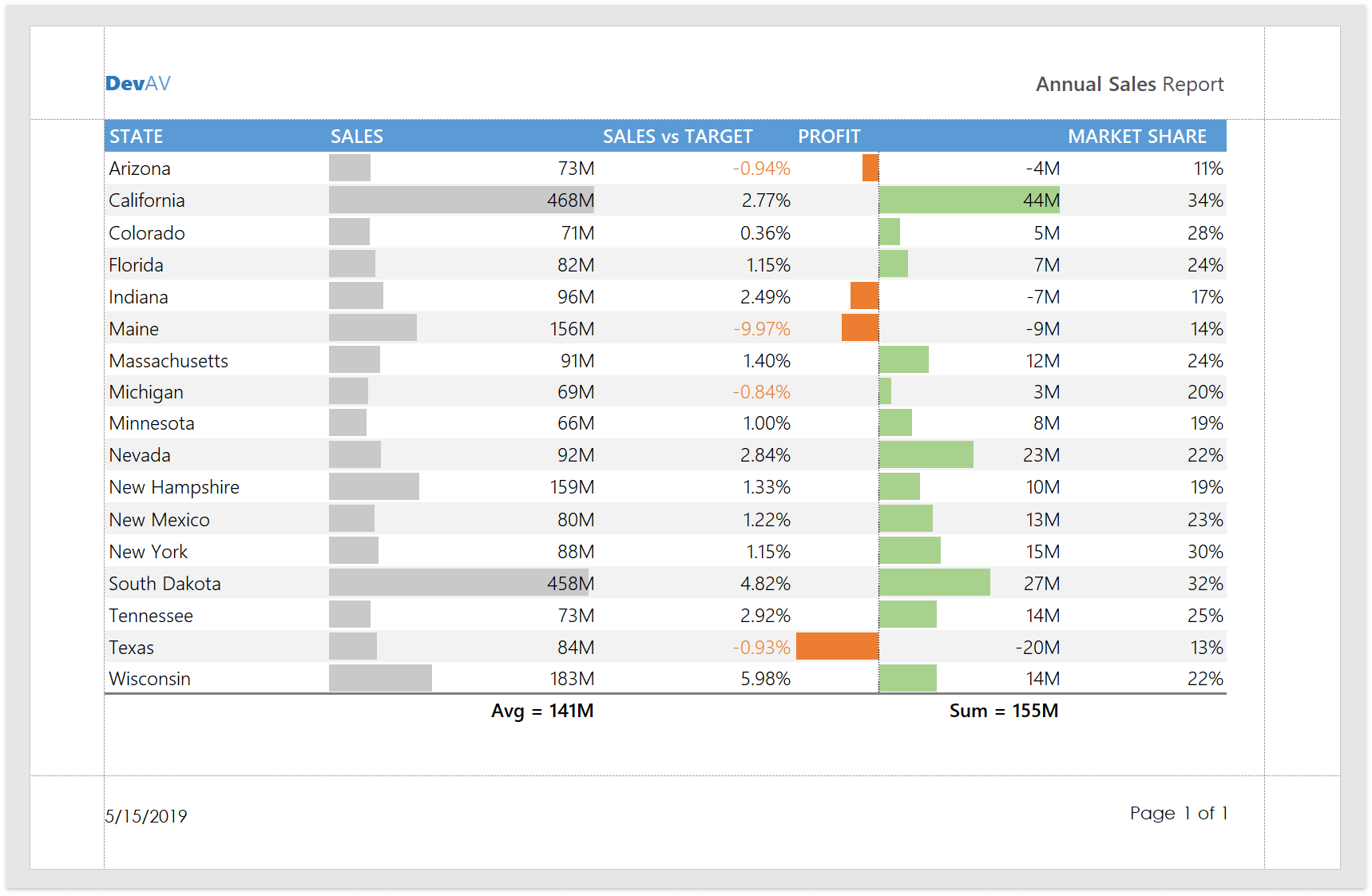
Black and White Print Mode
Our WinForms / WPF Spreadsheet controls and Spreadsheet Document API allow you to print documents in black and white.
Documentation
New Layout Engine
The DevExpress Spreadsheet Document API uses a new layout engine. The new engine improves layout calculation performance, optimizes memory consumption and includes enhanced printing capabilities.
To revert back to our legacy layout engine, activate the 'SpreadsheetCompatibilityOption.EnableLegacyLayoutEngine' option.
Blog Post Documentation
Performance Improvements
Our formula calculation engine is now nearly five times faster. Insert/delete operations within documents with numerous merged cells are almost six times faster.
Blog Post
Word Processing Document API
PDF Export - Unicode Characters for Non-Embedded Fonts
You can now use any Unicode character when you export documents to PDF with non-embedded fonts.
Track Changes Support
You can now load and export documents with revisions made via the Track Changes feature.
RTL Enhancements
- Paragraph alignment for Arabic languages (Justify Low, Justify Medium, Justify Hight)
- Line numbering
Distributed Paragraph Justification for East-Asian Languages
Our Word Processing Document API now supports 'Distributed' and 'Thai Distributed' paragraph alignment. Use the ParagraphProperties.Alignment property to specify alignment in code.
DOCX and DOC File Encryption
Our WinForms/WPF Rich Text Editors and Word Document API support DOCX and DOC file encryption. You can encrypt documents with standard or agile encryption.
Documentation
HR Tag Support
You can now load, print and export documents with HTML 'HR' tags (a horizontal rule).
ASP NET Enhancements
User-Friendly View URLs
New IViewUrlManager API simplifies URL customization for web ListViews and DetailViews. For example, you can now customize URLs to match the following format:
BEFORE: */Default.aspx#ViewID=Contact_ListView */Default.aspx#ViewID=Contact_DetailView&ObjectKey=ContactId
AFTER: */Contact_ListView/ */Contact_DetailView/ContactId/
See Examples on GitHub
Core Enhancements
Performance Enhancements
We've improved application startup speed. In addition, the Solution Wizard and subsequent views will now open faster.
Read the KB article
Visual Studio 2019 and .NET Core 3 (CTP) Support
XAF Solution Wizard, Model Editor, and Application and Module Designers now support Visual Studio 2019.
An XAF preview for Windows .NET Core 3.0 SDK is now available. While some functionality is not supported (for instance, XAF designers do not yet exist due to the platform restrictions), we ask that you review our implementation and tell us how you'd like us to improve our solution.
Read the KB article
Data Analytics Enhancements
ASP.NET Web Forms Rich Text Editor and WinForms Spreadsheet Editor (Beta)
The Office module now includes the DevExpress WinForms Spreadsheet and ASP.NET Web Forms Rich Text editors. You can display and edit Word and Excel documents stored as string or byte array properties of your business objects.
Documentation Blog Post
SPA Platform Enhancements
SPA UI (CTP)
Basic security system functions: logon form for non-authenticated users and automatic data filter based on security permissions.
New property editors for Boolean, enumeration, image, collection and reference properties.
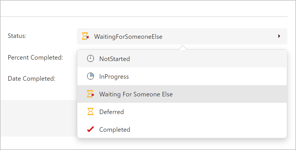
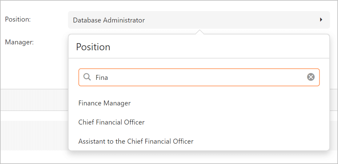
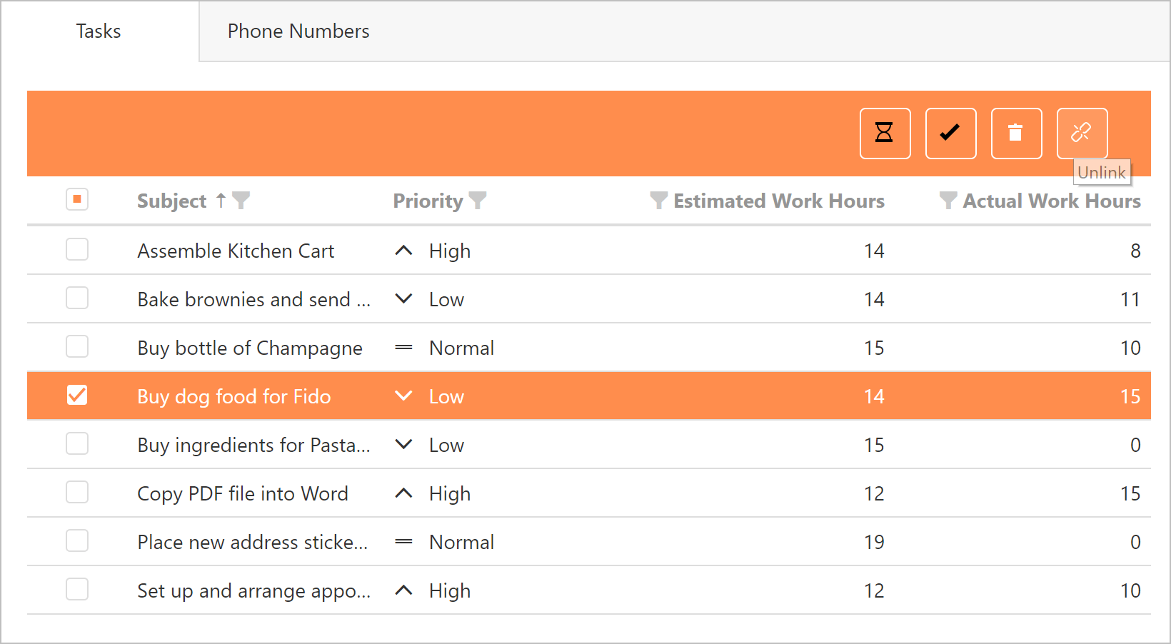
End-users can enable a compact theme and customize its base colors.
Documentation
XPO - ORM Library
XPBindingSource
XPBindingSource is a lightweight data source for WinForms and WPF runtime-only applications. It binds UI controls and uses XPO sources internally (XPCollection, XPQuery, XPView). You can think of it as an XPO analog of the standard BindingSource.
XPBindingSource simplifies development for the following use cases:
-
XPO data sources used on visually inherited Windows Forms and User Controls (T121952).
-
Data refresh in persistent objects and collections (A643).
-
Immediate data refresh for bound UI controls (T685021).
-
Binding to nullable properties (S33566).
-
Binding to object references without complex or custom property descriptors (T319505).
-
Refer to our WinForms code example to get started.
Documentation
XPServerModeView and XPInstantFeedbackView (CTP)
These new read-only server mode components are mixtures of XPServerCollectionSource/XPInstantFeedbackSource and XPView for use with DevExpress Grid controls. They offer the following:
- Ability to handle large data sources with lower memory usage (will not load entire persistent object instance).
- Ability to customize SELECT statements and exclude unused data columns.
- Ability to Include reference property data in the root query to avoid the 1+N problem.
-
Ability to Include custom (virtual) properties calculated on the server side (similar to ViewProperty).
Refer to our WinForms and WPF code examples to get started.
ORM Data Model Wizard and Designer Enhancements
- The ORM Data Model Wizard displays the port field for the DB2, SQL Server, MySQL, Firebird, PostgreSQL and ASE connection providers.
- XAF users can now inherit the BaseObject and other business types from the DevExpress.Persistent.BaseImpl library.
Connection Provider Enhancements
Prepared SQL statements for PostgreSQL can be used to increase INSERT and SELECT operation performance between 40% and 80% (varies based on data model structure and usage scenario). For more information, refer to our implementation and test results in the following KB article.
XPO now supports the PostgreSQL 'date' type and maps it to System.DateTime. Note that we have not introduced any breaking changes into XPO-generated databases. eXpress Persistent Objects continues to map System.DateTime to 'timestamp'.
XPO now supports Oracle Database 18c.
Static methods GetConnectionString() in DB2, SQL Server, MySQL, and Firebird connection providers now support a port parameter.
XPO supports the pre-release version of VistaDB 6 (the final version will be made available once VistaDB 6 is officially released.)
Blog Post
Async/Await Method Enhancements
Asynchronous execution was implemented at the XPO layer in v18.2. Connection providers used synchronous versions of IDbConnection, IDbCommand, IDataReader, and other ADO.NET APIs. We have now propagated our async/await method support to the underlying ADO.NET drivers.
Blog Post
XPO examples for ASP.NET, WinForms, WPF, Xamarin, Blazor and more
We now ship examples for the following UI frameworks: ASP.NET MVC Core and Razor Pages (powered by DevExtreme), Web Forms, WinForms, WPF (both classic and DevExpress MVVM), Xamarin, Blazor. These examples demonstrate how to use XPO to implement CRUD and asynchronous operations to address real usage scenarios.
See Examples on GitHub
CodeRush Server (CTP)
Install Free Preview
Visual Studio 2019 Support
The CodeRush Server Analyze task can now be run on a build agent with Visual Studio 2019 installed.
Code Coverage Enhancements
CodeRush Server can now highlight code lines to indicate code lines which are covered by unit tests.
Code Analysis Enhancements
The set of code analysis rules has been extended, and now CodeRush Server can:
-
Detect unused types, unused members and unused parameters.
-
Highlight complex members (if a member maintenance complexity value is equal to or higher than 400).
-
Identify unprotected code that may unintentionally raise System.NullReferenceException.
Additionally, code analysis rules are now configurable. Just open your solution in Visual Studio and adjust the "Solution Team" settings (use the "CodeRush | Options Layers..." menu to access this options layer) and then push the modified settings to your server, which will be used by the CodeRush Server Analyze task to determine which rules to apply and their severity (hint, warning, error, etc.).
Support For Repository Branches
The CodeRush Server Dashboard now supports repository branching, letting you navigate through your repository's branches and evaluate the health of each branch individually.
Blog Post
Self-Hosted Build Agent Compatibility
The CodeRush Server Analyze task is more lightweight in terms of dependencies: it now depends on Visual Studio Build Tools and no longer requires Visual Studio to be installed on a build agent.
Documentation
Unit Testing Enhancements
The CodeRush Server Analyze task now provides the Exclude tests in categories option, which allows you to ignore tests by category.
Blog Post
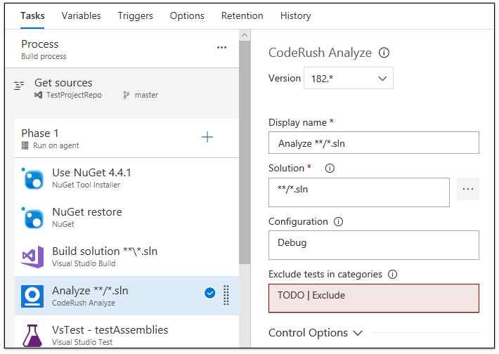
Install Free Preview
Code Places
Code Places helps you find your way through large code bases and quickly explore unfamiliar code. The Code Places window shows type declarations (class, interfaces, delegates, enums), members (methods, properties, events) and regions from the active C# or VB.NET file.
Documentation
String Format Assistant
CodeRush now provides IntelliSense for the String.Format and interpolated string format items. The String Format Assistant window displays a list of available format specifiers, previewing the formatted results for each.
This feature is available in C# and Visual Basic.
Documentation
Unit Test Builder
The Unit Test Builder helps you generate test cases for members of interest, based on live data at debug time, as you step through code. After your debug session ends, test case stub methods will be generated and include any notes entered while debugging. Now you can initialization, asserts, or any other test conditions necessary to complete the units tests with a minimum of effort.
The Unit Test Builder supports NUnit, XUnit and VSTest frameworks.
Documentation
Refactorings and Code Providers
Name Anonymous Type
Name Anonymous Type replaces anonymous types with a new named type declaration.
Documentation
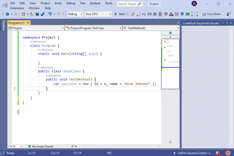
Initialize
The Initialize code provider initializes the variable or the field under the caret with a default initialization for that type.
Documentation
Sync Namespace With Folder Structure
Sync Namespace with Folder Structure quickly renames all namespaces within a project so they match the project’s folder structure.
Code Analysis Enhancements
We have added the following code analysis diagnostics:
These diagnostics identify types and parameters that are never used in your solution (and can be deleted).
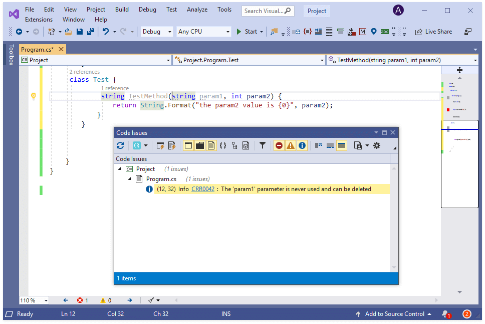
Web Development Support
JavaScript & TypeScript Support
The following features are now available in JavaScript and TypeScript code:
TypeScript Navigation Providers
The following navigation providers are now available in TypeScript code:
- Base Types
- Derived Types
- Members
- Instantiations
- Implementations
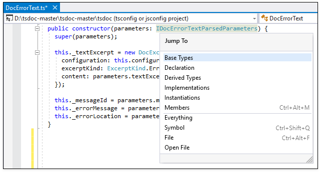
ASP.NET MVC Support
Now, the Jump to Declaration navigation provider supports ASP.NET MVC partial views. You can navigate from a partial view’s reference to the declaration with a single keystroke (F12).
Rich Comments
LaTeX Formula Support (Beta)
CodeRush supports LaTeX formulas in comments. You can view and edit fully-formatted mathematical formulas in source code comments (in C#, Visual Basic, JavaScript, TypeScript, HTML, XAML, CSS, and F# code).
We have also added templates to make it easy to create formatted formulas inside code comments from scratch:
Documentation
Miscellaneous Enhancements
Right-To-Left Support
This release adds Right-to-Left (RTL) support to the following DevExpress VCL components:
- Toolbars, Menus, and Ribbon Control
- Pivot Grid Control
- Vertical Grid Control
- Wizard Control
We plan to extend this list in future releases.
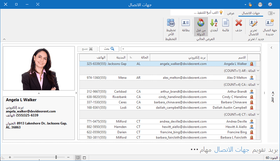
To enable RTL text in your application, switch its BiDiMode property to bdRightToLeft.
Filtering UI
Excel-inspired Filtering
v19.1 introduces new Microsoft Excel-inspired column/row filter dropdowns for our Grid, TreeList, and Vertical Grid controls.
New filter dropdowns provide two tabs:
- The first tab allows users to select from among all available cell values.
- The second tab allows users to create a filter expression using filter operators (Equals, Between, Contains, etc.)
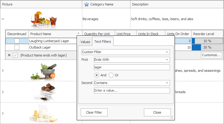
Use the dxDefaultFilterPopupWindowMode global constant in the source code to make the new filtering UI active for all Grid, TreeList, and Vertical Grid controls.
Filter Box Support
Much like the VCL Grid Control, our TreeList and Vertical Grid controls now provide the Filter Box to allow end-users to customize, temporarily disable, and reapply recently used filter criteria.
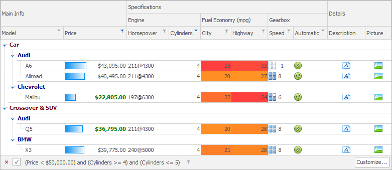
Enhanced SVG Rendering
- SVG images are rendered two times faster when compared to previous versions.
- Image data is loaded and parsed about ten times faster when compared to previous versions.
- We've introduced a dxSVGRenderQuality global variable to let you choose a preferable quality-to-performance ratio.
Ribbon and Toolbars
Office 2019 Style
The DevExpress VCL Ribbon Control now ships with a Ribbon style that replicates the look & feel of the latest Microsoft Office version. This style includes new tab styles and animation effects.
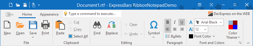
We've also added IDE templates to make it easy to create Office 2019 Ribbon style applications and Ribbon forms from scratch.
Performance Enhancements
Our optimized painting mechanism makes the Ribbon/Toolbar UI more responsive – it's two to three times faster than in previous versions.
Miscellaneous Enhancements
- Ribbon Backstage View galleries can now display KeyTips for their elements: groups, items, and item pins.
- The editor located on the Search Toolbar can optionally display a command's location. It includes the names of the tab, group, and submenu items an end-user has to click to navigate to the command. We've also added an option that enables recursive search for commands in submenus.

- Two new events (OnBeforeMerge and OnAfterMerge) allow you to respond to toolbar merge operations.
Flow Chart
v19.1 adds the following enhancements:
- 30+ new shapes and the ability to load custom shapes from an XML file or stream.
- 20+ new connection arrow styles and 5 predefined connection arrow sizes.
- Ability to apply the layered (Sugiyama) algorithm-based layout. This algorithm minimizes the number of connector crossings and evenly spreads out the shapes.
- Shape transformation support. End-users can transform shapes by dragging yellow handles.
- Ability to custom paint any advanced shape.
- Flow Chart designer: Alignment guides and size arrows make it easier to rearrange and resize chart elements.
- Flow Chart designer: A new pane for quick access to chart element properties.
With this release, the Flow Chart Control uses antialiasing by default. To revert to previous behavior and use aliased graphics instead, set the Antialiasing property to False.
Skins Library
New SVG Office 2019 Colorful Skin
This release ships with a new vector-based skin and associated color palettes - Office 2019 Colorful.
Spreadsheet
API Enhancements
Our new API allows you to:
- Evaluate any formula expressions, not only those stored in a document (the EvaluateExpression function).
- Pass cell ranges in the A1 reference style as string parameters to any cell management method.
- Track visibility changes of cell comments and prevent their display (the OnCommentShow and OnCommentHide events).
- Quickly reset a cell, row, or column to its default style (the IsDefault property).
- Read/write the rich text formatted content directly from/to a cell (the GetAsRTF and SetAsRTF functions).
Pivot Grid
Miscellaneous Enhancements
- A new field option automatically expands group values and keeps them expanded (the AlwaysExpanded property).
- You can now apply the Min and Max summary functions to date-time or string data fields.
- A new event (OnGetCellHint) allows you to customize hints displayed for data cells, field values, and field headers, or suppress them.
- The HitTest property now provides a flag to identify total cells (the HitAtTotalCell property).
PDF Viewer
Attachments
We've extended the Navigation pane with a panel that allows end-users to open and/or save attachments embedded in a document.
Text Markup Annotations
The PDF Viewer now displays markup annotations based on embedded appearance streams.
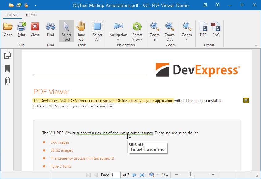
Layout Control
Miscellaneous Enhancements
- End-users can now collapse/expand splitter items to temporarily hide a part of a layout with a mouse click or drag and drop.
- Splitter items now provide an event (OnCanResize) that allows you to dynamically control size operations.
Design-Time Enhancements
With this release, we've replaced all our Ribbon-based application/form IDE template items with two items that allow you to select a Ribbon style for a new application/form and preview it instantly.
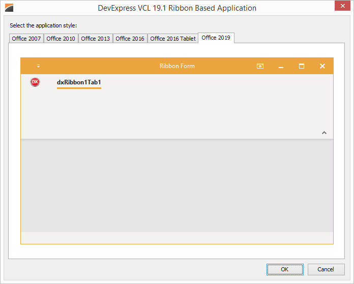
Mobile UI - Data Grid Control
Our new Xamarin.Forms Data Grid ships with dozens of high-impact features:
- High-Performance and Smooth Scrolling
- Large Dataset Support
- Auto Row Height
- Auto Generated Columns
- Multiple Data Type Support (text, numeric, date, image, and Boolean values)
- Template Column - custom views for a given column cell
- Fixed Columns
- Multi-Column Sorting
- Data Grouping and Filtering API
- Data Summaries API
- Data Editing and In-Place Cell Editors
- Pull To Refresh and Load More
- Swipe Support
- Custom Appearance Support
- Built-in Dark and Light Themes
 Data Grid Control for Xamarin.Forms
 Data Editing
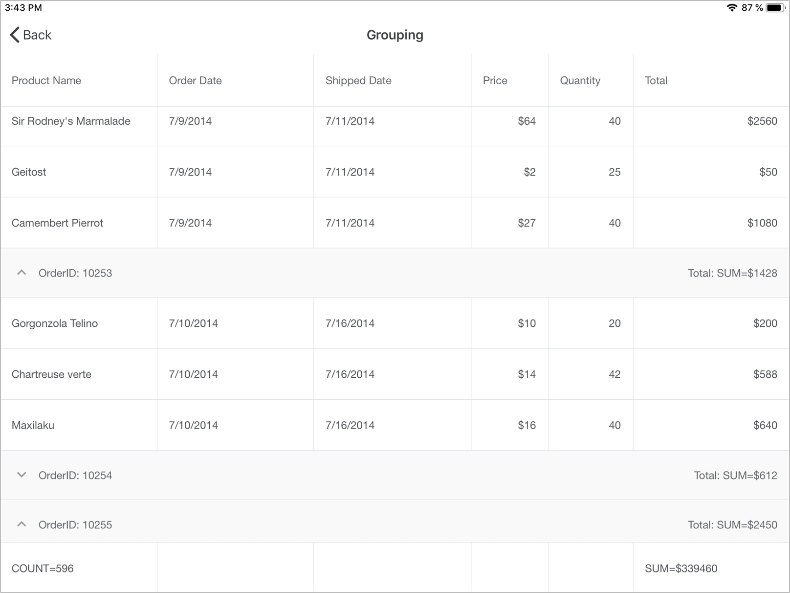 Data Grouping and Summary Calculation
 Light and Dark Themes
Mobile UI - Scheduler Control
Our new Xamarin.Forms Scheduler component ships with the following features:
- Day View
- Work Week View
- Recurring Appointment support
- Appointment Editor
- Custom Appearance support (styles and templates)
- Built-in Dark and Light Themes
 Scheduler Week View
 Scheduler Month View
Tab View
Our new Xamarin.Forms Tab View ships with the following features:
- Built-in Dark and Light Themes
- MVVM-ready - You can specify a custom object collection as the Tab source
- Configurable Tab Headers
 Tab View for Xamarin.Forms
 Nested Tab Views
 Data Binding
Drawer
The Drawer is a simple drop-in view that you can add to your app. You can specify how the drawer appears on the screen, customize its appearance settings, and apply a Dark or Light Theme.