DevExpress UI controls/components, frameworks, and libraries now fully support the latest build of .NET 7.
.NET 7 support is available for the following product lines/platforms:
Read about .NET 7 Support
.NET 7 & Linux Support (CTP)
The DevExpress.Drawing library now utilizes our own cross-platform text and graphics rendering engine based on SkiaSharp. We enable the new engine automatically, once an application references the new DevExpress.Drawing.Skia assembly.
We also revised the public API of the following DevExpress products and implemented their cross-platform counterparts to support non-Windows platforms:
This enhancement will allow you to maintain the functionality of your applications that use the aforementioned DevExpress products when deployed to non-Windows environments with .NET 6/7 (primarily Linux and macOS).
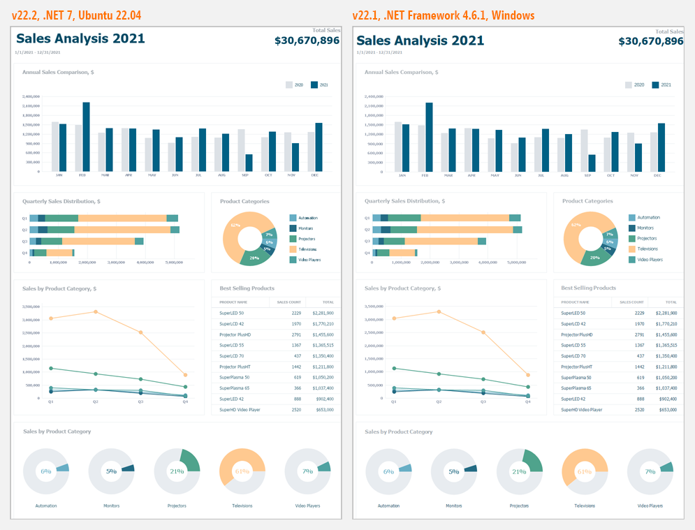
Please review the following screenshot. Note the minor differences in how the same report (Export to Image) is displayed in apps deployed to .NET 7 & Ubuntu versus .NET Framework 4.6.1 and Windows.
Blog Post
We deprecated support for Visual Studio 2012 and 2013. Our demo apps now target .NET Framework 4.7.2 (.NET Framework 4.7.2 targeting pack is available in Visual Studio 2017, 2019, and 2022).
Demo app changes do NOT affect .NET Framework customers in any manner — our product assemblies will continue to target .NET Framework 4.5.2 in this release cycle (v22.2).
Blog Post
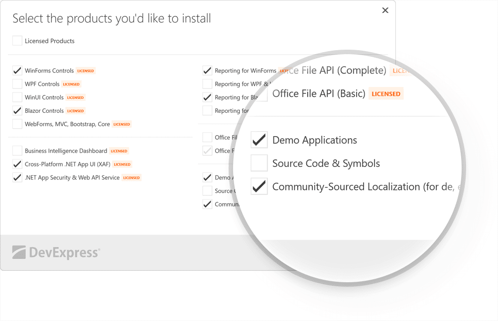
Our Unified Component Installer includes an option to install localized resources for certain languages (DE, ES, JA). We will not install these resources by default – you can install them at your discretion.
Note: localized resources may be incomplete. Navigate to Localization Service to download community sourced localization for other languages.
.NET 6.0/7.0 - Windows
v22.2 requires .NET 6 and Visual Studio 2022 (v17.0) or higher.
v22.2 supports .NET 7.0.
This does NOT affect .NET Framework customers in any manner — our product assemblies will continue to target .NET Framework 4.5.2 in this release cycle (v22.2).
Skins and Vector Icons
New Office Palettes for WXI Skin
We designed new Office-inspired palettes for our Windows 11-inspired WXI skin. These include:
- Office White
- Office Colorful
- Office Dark Gray
- Office Black
Blog Post
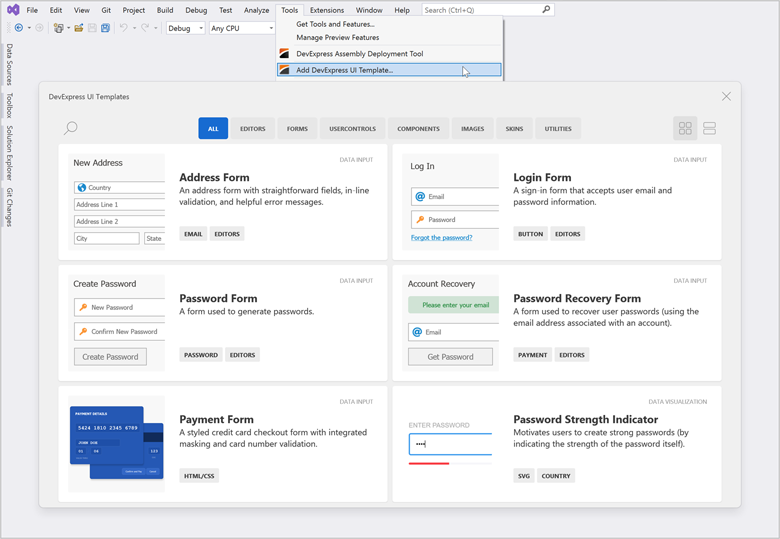
UI Templates (EAP)
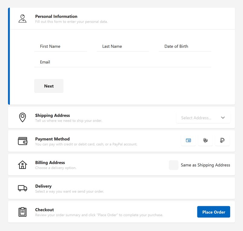
DevExpress UI Templates were designed to increase productivity for both new and experienced developers (built specifically for the Windows Forms platform). With templates, you can add elegant UI forms such as Log-in, Sign-up, Card Payment, and Address forms to your WinForms project in minutes.
Note: this EAP is available to active Universal subscribers and is provided solely for early testing purposes (C# only).
What's Inside
This EAP is limited to 25 templates and includes UI forms, buttons, group controls, standalone data editors, and predesigned side-by-side master-detail CRUD UIs (C# only). Based on feedback/usage scenarios/support requirements, we expect to extend the gallery with new UI templates throughout next year.
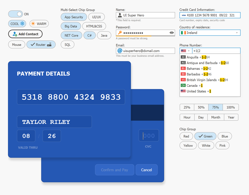
All WinForms UI Templates leverage existing DevExpress WinForms controls, fully support WinForms MVVM, DirectX Hardware Acceleration, DevExpress Application Skins, and HTML & CSS Support. UI Templates are configurable and can be extended as needs dictate.
Side-by-Side Master-Detail Grid/Tree Views with CRUD UI
We also created 6 new UI Templates (User Controls) with ready to use side-by-side master-detail view. All templates ship with the predesigned CRUD UI, support MVVM architecture, and integrate our WinForms Data Grid, TreeList, Layout, and Data Editors.
Try It Now!
All WinForms UI Templates ship as VSIX extension. Active Universal subscribers can download these extensions via the DevExpress Download Manager.
Download VSIX
After you install our UI Templates, be sure to review our Quick Start Guide for technical guidance and watch our tutorial videos:
Tell Us What You Think
We expect to expand/extend our WinForms gallery with new UI Templates once we are certain that UI Templates are of business value to you and your enterprise.
While this EAP is limited to active Universal subscribers for now, we want to hear from everyone targeting the Windows Forms platform.
Please take a moment and read our blog post and take the survey.
Data Grid
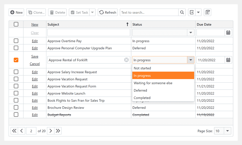
Enable/Disable and Show/Hide Detail Tabs on Demand
New options in the GridView.DetailTabStyle event allow you to enable/disable and display/hide individual detail tabs (in code) based on a specific condition.
                        void GridView_DetailTabStyle(object sender, DetailTabStyleEventArgs e) {
                            if (e.Caption == "Notes" && <CUSTOM_CONDITION>)
                                e.Visible = false;
                            if (e.Caption == "Users" && <CUSTOM_CONDITION>)
                                e.Enabled = false;
                        }
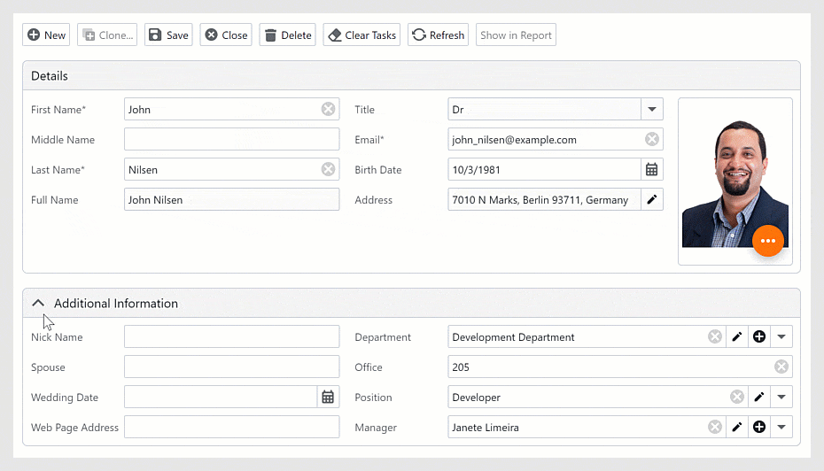
Master-Detail - Apply Display Attribute to List Properties
You can now apply the 'Display' data annotation attribute to list properties within your data objects.
                        public class Category {
                            public int ID { get; set; }
                            public string Name { get; set; }
                            [Display(Name="PRODUCTS")]
                            public List<Product> Products { get; set; }
                            [Display(AutoGenerateField=false)]
                            public List<Note> Notes { get; set; }
                        }
BandPositionChanged Event
The BandPositionChanged event fires when a band changes its position or visibility:
- A user drags the band and drops it to a different position.
- A user hides or drags the band to/from the customization form.
- Band visibility was modified in code.
DirectX Form
Support for Bar Items
The form header can now display Bar Items. Like our Toolbar Form, the DirectX Form header includes two regions that can accept Bar Items. The leftmost region can display Bar Items next to the form's icon. The rightmost region can display Bar Items before the form’s Minimize-Maximize-Close buttons.
Support for Docking
We continue to extend the list of DirectX-compatible controls and components that can be placed/displayed inside our DirectX Form. With v22.2, our DirectX Form supports both the DevExpress Dock and Document Manager components.
Miscellaneous Enhancements
- We enhanced the design-time experience. You can now place controls on various DirectX Form regions.
- <input> tag support in HTML & CSS Templates.
- Enhanced interaction with our WinForms Scheduler control.
Data Editors
Step Progress Bar - Shining Shadows
Our new ShadowDrawMode adds a glow effect to indicators and connectors. You can apply a glow effect to active elements, inactive elements, or both active and inactive elements.
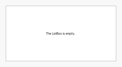
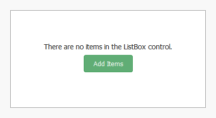
ListBox - Display Custom Content When the List Is Empty
Our new CustomDrawEmptyForeground event allows you to display custom content within the ListBox control when it does not include items. You can use our standard custom draw API or render an HTML Template within the list box.
Example 1 - Traditional Custom Draw
                        void ListBoxControl1_CustomDrawEmptyForeground(object sender, ListBoxDrawEmptyForegroundEventArgs e) {
                            e.Appearance.TextOptions.HAlignment = DevExpress.Utils.HorzAlignment.Center;
                            e.Appearance.DrawString(e.Cache, "The ListBox is empty.", e.Bounds);
                        }
Example 2 - Render HTML Template
                            // Local painting context that contains HTML tree state.
                            DxHtmlPainterContext ctx = new DxHtmlPainterContext();

                            // Draw HTML template.
                            HtmlTemplate htmlTemplate = new HtmlTemplate(LoadTemplate("ListBoxEmptyForeground.html"), LoadTemplate("ListBoxEmptyForeground.css"));
                            void ListBoxControl1_CustomDrawEmptyForeground(object sender, ListBoxDrawEmptyForegroundEventArgs e) {
                                e.DrawHtml(htmlTemplate, ctx);
                            }
                            static string LoadTemplate(string fileName) {
                                return File.ReadAllText(fileName);
                            }
                            void ListBoxControl1_MouseMove(object sender, MouseEventArgs e) {
                                ListBoxControl listControl = sender as ListBoxControl;
                                if(listControl.ItemCount == 0) {
                                    ctx.OnMouseMove(e);
                                    listControl.Cursor = ctx.GetCursor(e.Location);
                                    listControl.Invalidate();
                                } else listControl.Cursor = Cursors.Default;
                            }
                            // Handle the 'Add Items' button's click.
                            void ListBoxControl1_MouseDown(object sender, MouseEventArgs e) {
                                ListBoxControl listControl = sender as ListBoxControl;
                                if(listControl.ItemCount == 0 && e.Button == MouseButtons.Left) {
                                    var clickInfo = ctx.CalcHitInfo(e.Location);
                                    if(clickInfo != null && clickInfo.ParentHasId("btnAdd"))
                                        listControl.Items.AddRange(new string[] {
                                            "Item 1",
                                            "Item 2",
                                            "Item 3"
                                        });
                                }
                            }
                            <div class="container">
                                <div class="title">There are no items in the ListBox control</div>
                                <div class="button" id="btnAdd">Add Items</div>
                            </div>
                            .container {
                                display: flex;
                                flex-direction: column;
                                justify-content: center;
                                align-items: center;
                                height: 100%;
                            }
                            .title {
                                font-size: 14px;
                            }
                            .button {
                                background-color: @green;
                                color: @white;
                                opacity: 0.8;
                                border: 1px solid @green;
                                border-radius: 4px;
                                padding: 8px 18px;
                                font-size: 13px;
                                margin: 8px;
                                text-align: center;
                                cursor: pointer;
                            }
                                .button:hover {
                                    background-color: @green;
                                    box-shadow: 0px 0px 3px @green;
                                    opacity: 0.9;
                                }
List Editors - Sort Items in Ascending, Descending, and Custom Order
Our WinForms CheckedComboBoxEdit now supports sort operations in unbound mode. Use its new SortOrder property to sort items in ascending or descending order.
We also added a CustomSort event to our ListBox, Checked ListBox, Image ListBox, and Checked Combobox controls. Handle this event to sort list items using custom sort logic.
                    using DevExpress.XtraEditors.Controls;

                    void CheckedListBoxControl1_CustomSort(object sender, CheckedListBoxCustomSortEventArgs e) {
                        if(e.Item1.CheckState == e.Item2.CheckState)
                            e.Result = ((string)e.Value1).CompareTo((string)e.Value2);
                        else
                            e.Result = e.Item1.CheckState == CheckState.Checked ? -1 : 1;
                    }
                    void CheckedListBoxControl1_ItemCheck(object sender, DevExpress.XtraEditors.Controls.ItemCheckEventArgs e) {
                        checkedListBoxControl1.Sort();
                    }
                    void Form1_Load(object sender, EventArgs e) {
                        checkedListBoxControl1.Items.AddRange(new CheckedListBoxItem[] {
                            new CheckedListBoxItem(){ Value = "Bart Arnaz" },
                            new CheckedListBoxItem(){ Value = "Leah Simpson" },
                            new CheckedListBoxItem(){ Value = "Arnie Schwartz" },
                            new CheckedListBoxItem(){ Value = "Billy Zimmer" },
                            new CheckedListBoxItem(){ Value = "Samantha Piper" },
                            new CheckedListBoxItem(){ Value = "Maggie Boxter" },
                            new CheckedListBoxItem(){ Value = "Brad Farkus" },
                        });
                        checkedListBoxControl1.CheckOnClick = true;
                    }
LookUp Enhancements
Incompatible Value Type Exception
All lookup editors (LookUpEdit, SearchLookUpEdit, TreeListLookUpEdit, and GridLookUpEdit) now offer warnings when bound to incompatible type values.
You can also enable the ThrowExceptionOnInvalidLookUpEditValueType option to detect data type issues and throw an exception.
Clear Value on Delete/Backspace Press
Users can now clear a lookup's value by pressing Delete or Backspace key if the editor allows the user to reset its value with the keyboard (AllowNullInput option is enabled).
SVG Support in Dropdown Window
The LookUpEdit can now display SVG graphics within its dropdown (out-of-the-box). Documentation
Select First Item on Enter
Our new SelectFirstRowOnEnterKey option allows users to select the first item within the dropdown list when they press the Enter key after a search operation.
New DateOnly/TimeOnly Masks in Text Edit (.NET 6+)
New Date-Time masks help you edit DateOnly and TimeOnly data structures. When one of these masks is used, the text editor automatically converts its EditValue to an appropriate type.
DateOnly and TimeOnly mask types can be used in .NET 6+ apps.
Gauges
DirectX Support
The DevExpress WinForms Gauges control is now rendered using our DirectX engine when placed inside a DirectX Form.
HTML & CSS Support
HTML & CSS Templates for Message Boxes & Dialogs
Our WinForms Message Box and Dialog components now support HTML & CSS Templates.
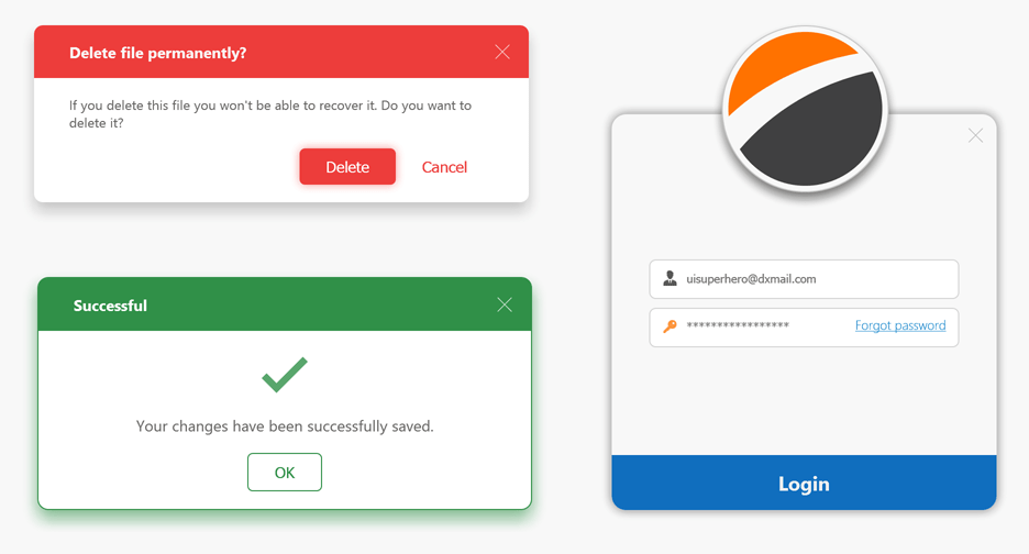
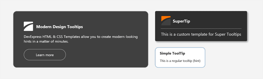
HTML & CSS Templates for Tooltips
Our WinForms ToolTips now support HTML & CSS Templates.
Accordion - Support for HTML & CSS Templates
The WinForms Accordion control now supports our industry-first WinForms HTML & CSS Template engine. HTML & CSS Templates allow you to create fully custom user interfaces in the shortest possible time. New APIs can generate templates for nearly every Accordion UI element.
Documentation
We created a new demo that demonstrates how to transform our WinForms Accordion control into a beautiful Hamburger Menu.
HTML Selection
Users can now select text displayed by HTML templates. HTML selection is available in our HTML Content Control and our WinForms Data Grid's ItemsView, TileView, and WinExplorerView. Use the AllowContentSelection property to enable this feature.
We added a new SelectedText property to store the textual content for a selected region (including text, button captions, images, and other HTML elements).
The SelectedTextChanged event occurs whenever selection changes and allows you to review and change selected text as needs dictate.
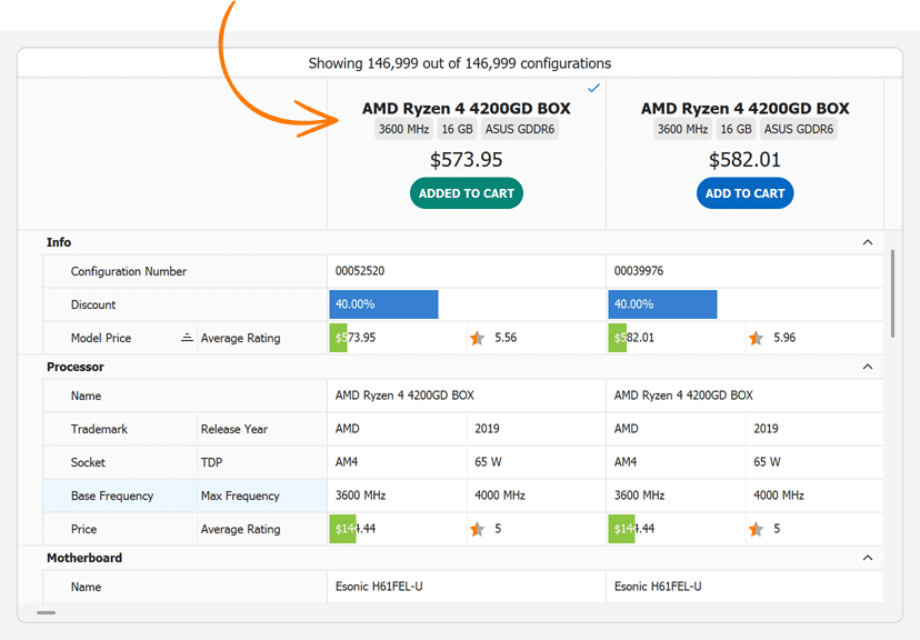
Custom Draw HTML
You can now draw an HTML template within the Custom Draw event handlers. The event parameter includes the e.DrawHtml method. This enhancement was introduced across most of DevExpress WinForms UI controls.
Documentation
                        <div class="container">
                            <div class="cpu-name">${ProcName}</div>
                            <div>
                                <div class="label">${ProcBaseFrequency}</div>
                                <div class="label">${RamMemorySize}</div>
                                <div class="label">${VidTrademark} {VidMemorySize}</div>
                            </div>
                            <div class="price">${ModelPrice}</div>
                            <div id="btn-add" class="btn-add" dx-class="{Added:added}">${AddButtonCaption}</div>
                        </div>
                        .container {
                            text-align:center;
                            padding-top:18px;
                        }
                        .cpu-name {
                            font-size:14px;
                            font-weight:bold;
                        }
                        .label {
                            display:inline-block;
                            background-color:@DisabledText/0.3;
                            padding:4px;
                            border-radius:4px;
                        }
                        .price {
                            margin-top:6px;
                            margin-bottom:6px;
                            font-size:18px;
                        }
                        .btn-add {
                            display:inline-block;
                            background-color:@HighlightAlternate;
                            color:@White;
                            padding:8px;
                            border-radius:18px;
                            font-weight:bold;
                            cursor:pointer;
                        }
                        .added{
                            background-color:@Green;
                        }
                        void OnCustomDrawRecordHeader(object sender, Events.CustomDrawRecordHeaderEventArgs e) {
                            // ...
                            e.DrawHtml(headerTemplate, htmlCtx, (args) => {
                                args.InteractivityKey = dataSourceRowIndex;
                                bool isAddedToCart = orders.Contains(dataSourceRowIndex);
                                args.SetFieldValue("Added", isAddedToCart);
                                args.SetFieldValue("AddButtonCaption", isAddedToCart ? "ADDED TO CART" : "ADD TO CART");
                            });
                        }
Visualize Data Collections
Our new <dx-collection> tag renders a template for each element in a collection. Read the blog post
                        <template id="member-template">
                            <div class="initials">${Initials}</div>
                        </template>
                        ...
                        <dx-collection class="members" Items="${Members}" ItemTemplate="member-template"></dx-collection>
Html Template Collection
We created a new HtmlTemplateCollection component - an external template storage. HTML & CSS templates added to this collection can be used by different UI controls.
CSS Style Selectors
You can now conditionally apply styles directly in HTML markup. The use of HTML markup is both easier and faster than handling events in code behind.
Use our new dx-class attribute to specify CSS selection conditions.
We supported the following syntax options:
                        <!-- Boolean data field -->
                        <div dx-class="{IsUrgent: urgent, normal}">
                            <!-- Applies the 'active' class if the IsActive property is set to true. -->
                            <img dx-class="{IsActive: active}" />

                            <!-- Hides the element if the IsVisible property is set to true. -->
                            <img dx-class="{IsVisible: , hidden}" />
                        </div>

                        <!--
                        Enumeration data field.
                        The 'red' class corresponds to the first element.
                        The 'green' class corresponds to the second element, and so on.
                        -->
                        <div dx-class="{Color: red, green, blue}">
                        ...
                        </div>

                        <!--
                        Enumeration data field.
                        Class names should exactly match enumeration values.
                        -->
                        <div dx-class="{State}">
                        ...
                        </div>

                        <!-- A string data field that matches the class name -->
                        <div dx-class="{ClassName}">
                        ...
                        </div>
You can apply multiple classes in a condition. And, of course, you can use static and conditional classes together.
                        <div class="task" dx-class="{IsUrgent: urgent highlight, normal}">
                        ...
                        </div>
Documentation Blog Post
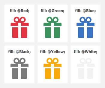
Colorize SVG - 'Fill' CSS Property Support
The <img> tag now supports the fill property. Use this property to set the color for an SVG image. This setting overrides both the presentation attribute <path fill="#fff" ...="" /> and inline style (e.g., <path style="fill: #fff;" ...="" />).
                        img {
                            fill: Gray;
                        }
                            img:hover {
                                fill: Green;
                            }
                            img:active {
                                fill: LightGreen;
                            }
<img src="my-svg-image" />
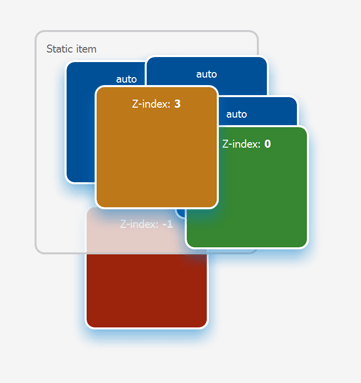
Position and Z-index Properties
Our HTML & CSS engine now supports position and z-index CSS properties - invaluable tools to manage HTML element layout within a template.
The position property specifies the position of an element in a template. This property accepts the following values: 'static', 'relative', 'absolute', and 'fixed'. The element's 'top', 'right', 'bottom', and 'left' properties determine its final location.
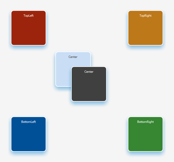
The z-index property specifies the z-order of a positioned HTML element. Use this property to position elements in layers on top of one another. Overlapping elements with a larger z-index cover those with a smaller z-index.
The z-index property only works with elements whose 'position' property is explicitly set to 'absolute', 'fixed', or 'relative'.
Layout Containers
Stack & Layout Panels - Skin-Dependent Indents and Separators
We added a new UseSkinIndents option. When enabled, the Stack and Table Panels use the following settings from the currently active skin:
- panel paddings;
- control margins inside panel cells;
- horizontal and vertical separator width.
Use a panel's Padding and a control's Margin properties to specify custom indents.
You can also create horizontal and vertical separators to arrange UI controls into groups. To arrange controls into groups, create a column or row, and set its Style property to 'Separator'.
Scheduler
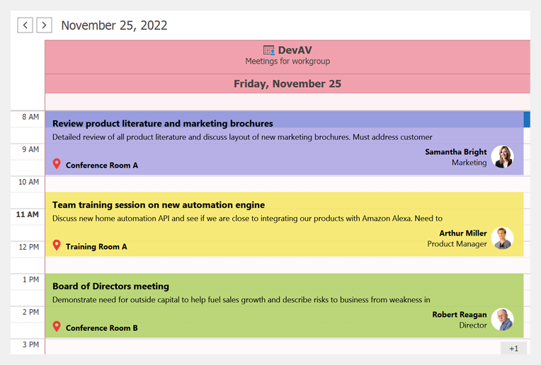
Resource Headers - HTML & CSS Support
Show Popup Menu - New Event Arguments
We added new arguments to the PopupMenuShowingEventArgs class. This class provides data for the PopupMenuShowing event. New arguments include:
- Allow - gets or sets whether to enable a popup menu. Allows you to disable the popup menu as needed.
- HitInfo - identifies the clicked menu UI element.
- MenuType - gets popup menu type.
- Point - gets the position used to invoke the popup menu.
TreeList
Expand/Collapse Nodes Using Right/Left Arrow Keys
Users can now use Right and Left arrow keys to expand/collapse nodes. This is the default behavior in our WinForms TreeList control with one column (in TreeView mode).
Skinned Paddings and Configurable Indent in Preview Sections
We made minor enhancements to TreeList skins to maintain look and feel consistency across all DevExpress "grid-based" UI controls (added padding to content displayed in preview sections).
We also added a new PreviewIndent property. This property allows you to specify left horizontal offset for content displayed in preview sections.
BandPositionChanged Event
The BandPositionChanged event fires when a band changes its position or visibility:
- A user drags the band and drops it to a different position.
- A user hides or drags the band to/from the customization form.
- Band visibility was changed in code.
Accessibility
We continue to improve Accessibility and UI Automation across our WinForms product line. In v22.2, we enhanced support for assistive tools and supported UI Automation patterns in the WinForms Vertical Grid, Property Grid, and NavBar controls. We also optimized our controls for better memory consumption and boundary detection.
Documentation
.NET 6.0/7.0 - Windows
v22.2 requires .NET 6 and Visual Studio 2022 (v17.0) or higher.
v22.2 supports .NET 7.0.
This does NOT affect .NET Framework customers in any manner — our product assemblies will continue to target .NET Framework 4.5.2 in this release cycle (v22.2).
Themes
Windows 11 Dark Theme
Our new Windows 11 Dark theme is based on the Windows 11 Dark Mode.
Automatically Switch a Theme from Light to Dark Mode
We added new System themes that use Windows App Mode and automatically switch the current theme from light to dark mode (and vice versa). This auto-switch option is now available for the following DevExpress themes:
- Windows 11
- Windows 10
- Office 2019 / Office2016SE
- Visual Studio 2019 / 2017
Documentation
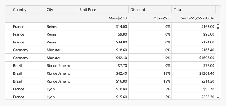
Data Grid
Total Summary Panel Position
Our new TotalSummaryPosition property specifies the location of the Summary Panel within a view. The TableView, TreeListView, and CardView can now display the Summary Panel at the top or bottom as requirements dictate.
In Master-Detail mode, you can set the detail grid's TotalSummaryPosition property to 'Top' to pin the Summary Panel so it remains visible when a user scrolls through individual detail rows.
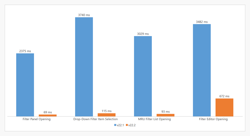
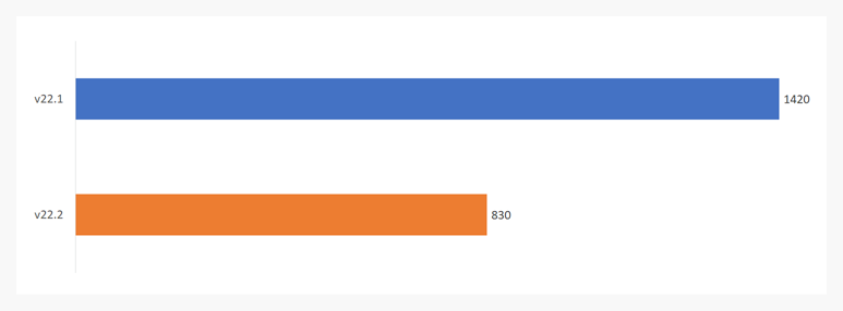
#Data Filtering - Performance Enhancements
Performance attributes for the following UI elements have been enhanced:
-
Filter Editor
-
Drop-down Filter
-
Filter Panel
-
MRU Filter List
The following chart compares performance data between release cycles (filter UI elements contain 500 items).
#Asynchronous Data Editing
You can now incorporate asynchronous data editing within our WPF Data Grid when using Server Mode or Instant Feedback mode. DialogEditFormBehavior allows you to execute the following operations asynchronously:
                        <dxg:GridControl ...>
                            <dxmvvm:Interaction.Behaviors>
                                <dxg:DialogEditFormBehavior x:Name="EditFormBehavior" KeyProperty="Id"
                                    CreateEditItemViewModelCommand="{Binding CreateEditEntityViewModelCommand}"
                                    ValidateRowCommand="{Binding ValidateRowCommand}"
                                    ValidateRowDeletionCommand="{Binding ValidateRowDeletionCommand}"
                                    AllowCancelAsyncOperations="True">
                                    <!-- ... -->
                                </dxg:DialogEditFormBehavior>
                            </dxmvvm:Interaction.Behaviors>
                        </dxg:GridControl>
                        [Command]
                        public void CreateEditEntityViewModel(CreateEditItemViewModelArgs args) {
                        args.GetViewModelAsync = GetViewModel(args);
                        }
                        [Command]
                        public void ValidateRow(EditFormRowValidationArgs args) {
                        args.ValidateAsync = ValidateRow(args);
                        }
                        [Command]
                        public void ValidateRowDeletion(EditFormValidateRowDeletionArgs args) {
                        args.ValidateAsync = ValidateDeletion(args);
                        }
                        async Task<IEditItemViewModel> GetViewModel(CreateEditItemViewModelArgs args) {
                        // ...
                        }
                        async Task ValidateRow(EditFormRowValidationArgs args) {
                        // ...
                        }
                        async Task ValidateDeletion(EditFormValidateRowDeletionArgs args) {
                        // ...
                        }
Documentation
Unbound Columns - Custom Types
Our new UnboundDataType property allows you to set unbound column type explicitly. You can now specify previously unavailable types, such as 'TimeSpan' or 'DateTimeOffset'.
                        <Window ...
                            xmlns:dxg="https://schemas.devexpress.com/winfx/2008/xaml/grid"
                            xmlns:sys="clr-namespace:System;assembly=mscorlib">
                                <dxg:GridControl ...>
                                    <!-- ... -->
                                    <dxg:GridColumn FieldName="RemainingTime"
                                        UnboundDataType="{x:Type sys:TimeSpan}"
                                        UnboundExpression="[RequiredDate]-[OrderDate]"/>
                                </dxg:GridControl>
Tree List
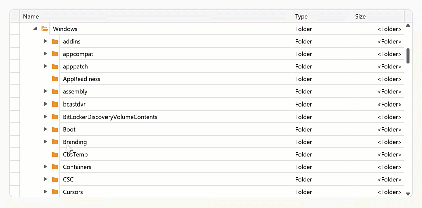
#Asynchronous Loading of Child Nodes
Our WPF TreeList control and TreeListView within the DevExpress WPF Data Grid can now load data asynchronously. The TreeList fetches child nodes in a background thread and displays a wait indicator when the fetch operation is in progress.
As you might imagine, Asynchronous Child Node Loading helps prevent unwanted screen "lock-ups" and allows you to deliver more responsive WPF solutions.
Documentation
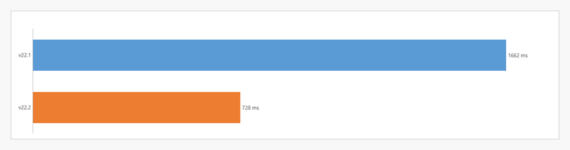
#Performance Improvements
We improved our WPF TreeList control's BeginDataUpdate / EndDataUpdate implementation. Batch modifications are now twice as fast when compared to previous versions. The following internal test results help illustrate the performance advantages of this release (1,000 items added to the TreeList control with 1M loaded nodes).
Data Editors
New Path Editor
Our new Path Editor allows you and your users to easily specify a path to either a file or folder. Users can enter path information within the edit box, browse the file system to select a file/folder, or drop the file/folder within the editor.
Features include:
- Configurable file/folder Browse Dialog (Open File, Save File, Folder Browser)
- File/folder Path Validation
- Drag & drop file/folder support
- Display System and Custom Icons
And yes, you can use the WPF Path Editor within DevExpress container controls like our WPF Data Grid, WPF TreeList, etc.
Documentation
Buttons - Provide Visual Feedback for Async Operations
DevExpress WPF Button Controls (e.g., simple, dropdown, split buttons) can now indicate the progress of bound asynchronous operations (tasks). While the operation is in progress, the button displays a wait indicator. This allows you to offer visual feedback for data-intensive operations.
Use the AsyncDisplayMode property to enable this feature. You can set this property to 'Wait' to display the wait indicator or to 'WaitCancel' 'WaitCancel' allows users to cancel a given operation.

Password Box - Password Reveal
Our WPF Password Box ships with a new password reveal button. Users can click the reveal button to unmask a password. A long press on the button reveals the password until release.
#Date Navigator - Performance Improvements
The Date Navigator can now switch views much faster than ever before. Users will notice a significant performance gain when navigating dates within our WPF Scheduler control (if bound to a multi-month Date Navigator).
Custom Masks for Text Editors
We introduced a new CustomMask event for all WPF Text Editors. Handle this event to incorporate custom patterns when our predefined mask types do not address your business requirements.
Event arguments allow you to obtain input text, user actions that triggered the event (e.g., insert, delete, backspace, etc.), and the result of the action itself. You can also process the editor's selected text/caret position, or cancel the edit operation entirely.
Documentation
<dxe:TextEdit MaskType="Custom" CustomMask="OnCustomMask"/>
                        void OnCustomMask(object sender, DevExpress.Xpf.Editors.CustomMaskEventArgs e) {
                            // Process user input.
                            // This example demonstrates how to allow users to enter only Latin letters and
                            // capitalize entered characters.
                            if (e.ActionType == CustomTextMaskInputAction.Init || e.IsCanceled == true)
                                return;
                            var textInfo = CultureInfo.InvariantCulture.TextInfo;
                            if (!Regex.IsMatch(e.InsertedText, @"^[a-zA-Z]+$") && e.ActionType == CustomTextMaskInputAction.Insert)
                                e.Cancel();
                            else e.SetResult(textInfo.ToUpper(e.ResultEditText), e.ResultCursorPosition);
                        }
New Date-Time Masks in Text Edit
New Date-Time masks help you edit DateTimeOffset, DateOnly, and TimeOnly structures. When one of these masks is used, the text editor automatically converts its EditValue to an appropriate type (to easily bind it to a property within your View Model).
DateOnly and TimeOnly mask types can be used in .NET 6+ apps.
Date Edit - Specify the Default View in Code
Our new SelectionView allows you to specify the default view (Month, Year, Years, or Year Range) in code.
Documentation
Ribbon & Toolbars
Bar Item Menu Header - Show/Hide Caption
Our ShowContentHeader property allows you to display/hide captions for individual bar item menu headers (and by extension, create Windows 11-inspired context menus).
Scheduler
#On-Demand Data Loading
Our WPF Scheduler Control can now load appointments asynchronously. When used, DevExpress-powered WPF scheduling solutions remain responsive.
Documentation
Date Navigation Panel - Dropdown Calendar and View Selector
The Date Navigation Panel can now display new UI elements. The Calendar button opens the dropdown calendar. The View Selector allows users to switch between calendar views.
Use the ShowCalendarButton and ShowViewSelector options to display/hide the corresponding UI elements.
MVVM
New UIObjectService
We added a new UIObjectService service. You can attach this service to any UI element in a View to access the element directly from a ViewModel. Documentation
                        <dxg:GridControl ItemsSource="{Binding Source}" AutoGenerateColumns="AddNew">
                            <dxg:GridControl.View>
                                <dxg:TableView ...>
                                    <dxmvvm:Interaction.Behaviors>
                                        <dxmvvm:UIObjectService/>
                                    </dxmvvm:Interaction.Behaviors>
                                </dxg:TableView>
                            </dxg:GridControl.View>
                        </dxg:GridControl>
                        <Button Content="Export to PDF" Command="{Binding ExportToPdfCommand}"/>
                        using DevExpress.Mvvm;
                        using DevExpress.Mvvm.DataAnnotations;
                        // ...

                        public class MainViewModel : ViewModelBase {
                            // ...
                            public IUIObjectService UIObjectService { get { return GetService<IUIObjectService>(); } }
                            [Command]
                            public void ExportToPDF() {
                                UIObjectService.Object.ExportToPdf(@"C:\Work\Documents\GridExport.pdf");
                            }
                        }
Numeric Mask Attribute - Always Show Decimal Separator
We extended our NumericMaskAttribute with a new AlwaysShowDecimalSeparator option. When enabled for a numeric data field, a bound editor formats its edit value to a string (the display value), and retains the decimal separator (".") even if the fractional portion of the edit value is zero.
                        using DevExpress.Mvvm.DataAnnotations;
                        // ...
                        public class DataItem {
                            public int Id { get; set; }
                            [NumericMask(UseAsDisplayFormat = true, AlwaysShowDecimalSeparator = true)]
                            public double NumericField { get; set; }
                        }
Property Grid
New API for Context Menus
You can show, hide, and customize context menus in code. New API includes:
Collection Buttons - API Enhancements
The WPF Property Grid control now includes CollectionButtonsVisibility and CollectionButtonClick events. These events allow you to set up the Add and Remove collection buttons. You can display/hide these buttons conditionally and process desired add/remove operations.
Documentation
In-Place Editors - Process User Actions
We added the following events:
Miscellaneous
Themed MessageBox - Text Selection, Button Images, Close by Timer
Text Selection
Enable the AllowTextSelection option to select a message and copy it to the clipboard.
                        var parameters = new ThemedMessageBoxParameters() {
                            AllowTextSelection = true
                        };
                        ThemedMessageBox.Show(
                            title: "Error",
                            text: "Error code: DX0001",
                            messageBoxButtons: MessageBoxButton.OK,
                            messageBoxParameters: parameters
                        );
Button Images
Use the Glyph and GlyphAlignment properties to display and alight an image within the button.
                        var buttonApply = new UICommand() {
                            // ...
                            Glyph = new System.Uri("pack://application:,,,/DevExpress.Images.v22.2;component/SvgImages/Icon Builder/Actions_Check.svg")
                        };
                        var buttonCancel = new UICommand() {
                            // ...
                            Glyph = new System.Uri("pack://application:,,,/DevExpress.Images.v22.2;component/SvgImages/Icon Builder/Actions_Delete.svg")
                        };
                        ThemedMessageBox.Show(
                            title: "Dialog Title",
                            text: "Message",
                            icon: MessageBoxImage.Exclamation,
                            messageBoxButtons: new UICommand[] { buttonApply, buttonCancel }
                        );
Close by Timer
Use the TimerTimeout property to specify and enable the timer. The timer is applied to the default button. Use the TimerFormat property to format the timer string displayed in the button.
                        var parameters = new ThemedMessageBoxParameters() {
                            TimerTimeout = new System.TimeSpan(0, 0, 5),
                            TimerFormat = "{0} ({1:%s} sec.)"
                        };
                        ThemedMessageBox.Show(
                            title: "Dialog Title",
                            text: "Message",
                            messageBoxButtons: new UICommand[] { buttonOk, buttonCancel },
                            messageBoxParameters: parameters
                        );
Middle-Click Scroll
Our WPF UI controls now support middle-click scroll operations. Users can now press the middle mouse button and move the mouse to scroll content.
Set the AllowMiddleMouseScrolling property to 'true' to enable this capability. Use the MiddleMouseScrollSpeed and MiddleMouseScrollThreshold properties to customize scroll behaviors.
The following DevExpress WPF UI controls support this feature:
- Data Grid
- Accordion
- Document Preview Control
- Gantt Control
- List Box
- PDF Viewer
- Pivot Grid
- Property Grid
- Rich Text Editor
- Spreadsheet
- TreeList
- TreeView
UI Template Gallery
We extended the capabilities of our DevExtreme component library with a set of responsive UI templates. These ready-to-use UI “blocks” will allow you to focus efforts on application logic and minimize energy spent on app/UI design.
Blog Post GitHub Repository
Responsive UI Templates, DevExtreme
Data Visualization
Range Bar Chart - Minimum Bar Size
Use the new minBarSize property to specify minimum size for bars displayed in the Range Bar Charts.
Online Demo
Data Visualization Components - Adapt to Container Resize
Our Chart, Gauge, and Map controls now automatically adapt to changes in container.
VectorMap - Control Panel Customization
The following options allow you to display/hide the Pan Control and Zoom Bar: panVisible and zoomVisible.
Online Demo
Pivot Grid
Export Field Panel Headers to Excel
You can now include field panel headers in an exported worksheet. The following field header export-related options available:
-
exportColumnFieldHeaders
-
exportDataFieldHeaders
-
exportFilterFieldHeaders
-
exportRowFieldHeaders
Online Demo
Field Chooser - Encode HTML
The new encodeHtml property allows you to process HTML tags as plain text or apply them to header filter values.
UI Components
CSS Styles Enchancements
The following components are now rendered more consistently under different use-case conditions (applies to both our Generic and Material themes):
- Button
- Calendar
- Toolbar
- DateBox
- Scheduler
- FieldSet
- List
For instance, buttons within our Toolbar's overflow menu now reflect specified types and styling modes.
Validation Message Position
Our new validationMessagePosition option specifies the position of a validation message relative to the editor's input region. Available settings include: 'bottom' (default), 'top', 'left', and 'right'.
Online Demo
Show/Hide API Enhancements
The cancel parameter for onShowing/onHiding events now supports the Promise type. This allows you to execute asynchronous actions before components are displayed/hidden. This enhancement is available in the following UI components:
- Popup
- Popover
- Tooltip
- Toast
- LoadPanel
The show/hide methods now return a Promise object, which is resolved once the operation is complete. This Promise is rejected if the operation was cancelled.
Slider & Range Slider - Value Change Mode
The Slider and Range Slider components now include a valueChangeMode option. This option specifies when a slider's value is changed. Available modes include:
- The value changes when the user releases the slider handle.
- The value changes immediately whenever the user moves the slider handle.
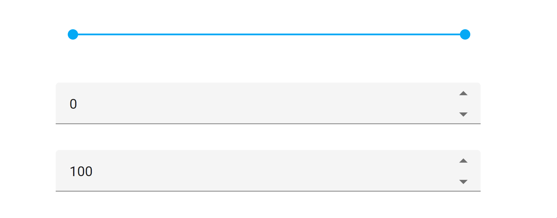
Slider Demo RangeSlider Demo
Toolbar Adaptability - Multiline Mode
Our Toolbar can now wrap across multiple lines when it is wider than its container. Use the multiline property to enable multiline mode.
Online Demo
Accordion - Title Templates for Individual Items
You can now define title templates for individual items. Use the titleTemplate property as requirements dictate.
CheckBox - Cycle Through Three State
We extended the functionality of our CheckBox component. Users can now toggle between all three states by clicking a box (cycling from unchecked to checked and then to an indeterminate state).
Use the enableThreeStateBehavior option to enable this mode.

Online Demo
Calendar - Week Numbers
The Calendar component can now display week numbers. Use the showWeekNumbers property to enable this option.
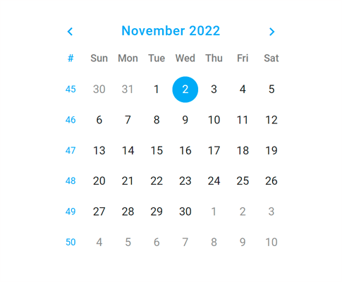
The Calendar automatically sets the first week of the year based on culture (locale). We added the weekNumberRule property to specify the rule used to determine the first week of the year. Available rules include auto, first day, first four days, and full week.
Online Demo
SelectBox and TagBox - Submit Custom Items on Loss of Focus
We enhanced the default behavior of our SelectBox and TagBox components. These components create custom items when the user presses the Enter key or when the component loses focus.
And yes, you can assign a DOM event to the customItemCreateEvent property to change the default behavior as needed.
Form – Custom Label Template
Form labels can now display images and support content formatting. Use the label.template property to define a custom template.
Online Demo
Popup and Popover - Overflow Menu in Toolbar
Toolbars within our Popup and Popover components can now display an overflow menu.
Use the following API to customize the menu and toolbar items:
Online Demo
DateBox - Customize Today Button Text
You can now rename the Today button (which appears in 'date' and 'datetime' modes). The new todayButtonText property specifies the text for the button.
.NET 7 Support
Our Blazor components fully support .NET 7. The DevExpress Template Gallery now includes Blazor project templates for .NET 7.
Ahead-of-Time (AOT) Compilation Support
DevExpress-powered Blazor WebAssembly apps now support ahead-of-time (AOT) compilation. You can compile your .NET code directly to WebAssembly.
Note: AOT compilation improves runtime performance, but it does increase application size.
In the Blazor WebAssembly app's project file, add the RunAOTCompilation property. Set this property to 'true' to enable WebAssembly AOT compilation.
                        <PropertyGroup>
                        <RunAOTCompilation>true</RunAOTCompilation>
                        </PropertyGroup>
Blazor Hybrid Support (CTP)
You can now use DevExpress Blazor UI components in Blazor Hybrid apps. With Blazor Hybrid, Razor components run natively on both mobile and desktop devices. This improves performance and provides access to native device capabilities through the .NET platform.
DevExpress Blazor components support the following platforms with Blazor Hybrid:
- .NET MAUI (Windows, MacOS, Android, iOS)
- WinForms
- WPF
Documentation
Bootstrap v5.2 Support
DevExpress Blazor components now fully support the latest release of Bootstrap v5.2. Set the BootstrapVersion option to v5 to ensure that your app works correctly.
builder.Services.AddDevExpressBlazor(configure => configure.BootstrapVersion = BootstrapVersion.v5);
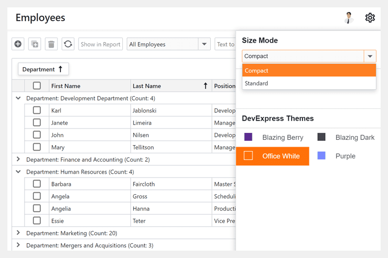
New Render and Size Modes
The DevExpress Blazor Data Grid (DxGrid), Editors, Layout, and Navigation components now use our optimized rendering engine instead of Bootstrap. This change will allow us to extend our Blazor component suite with the following new capabilities/features:
- Improved rendering performance with fewer JavaScript interop calls.
- Consistent appearance across DevExpress Blazor components.
Our new rendering engine significantly improves the capabilities of existing Blazor Size Modes:
- Blazor components (regardless of size mode used) are downsized to address the requirements of "dense" interfaces and display more relevant information on screen. The new Large Size Mode mirrors what used to be “Medium.” The new Medium mode is closer to what used to be “Small.” And our new Small mode allows you to deliver interfaces similar to desktop apps such as Microsoft Outlook.
- New size modes apply to our Blazor Data Grid (DxGrid), Tabs, Flyout, and other UI components that previously did not support the size mode option.
- Size modes now offer a more consistent user experience and affect all spacings/sizes across supported Blazor components. For example, our Blazor Form Layout component adjusts paddings between items/groups based on the selected size mode.
Refer to the following article for instructions on how to update your app: Bootstrap rendering was replaced with a new rendering engine.
New Window Component
Our new Window component is a non-modal window. Its features include:
- Move & Resize
- Header Customization
- Show/Hide Close Button
- Window Positioning (at a specified position or UI element)
- Keyboard Support
- Comprehensive API
Documentation
Online Demo
Data Grid
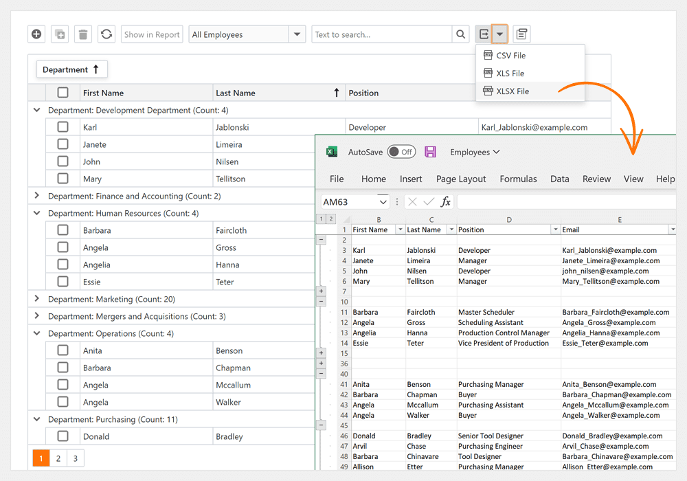
Export Data to Excel
Our Blazor Data Grid can now export data to Excel. With this new API, you can save your data to XLS, XLSX, and CSV files (or stream). Data export operations support grouping, sorting, filtering, totals, and group summaries.
New API includes:
All methods accept the 'options' parameter. This parameter allows you to customize the exported document.
Online Demo
Search Box
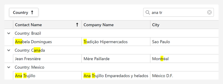
Our Blazor Data Grid component includes a progressive case-insensitive search option (allows you to locate matched text as you type). When you type within the search box, the Data Grid filters data rows, displays those that match the search string, and highlights search results.
Additional features include:
- Support for special characters.
- Configurable input delay.
- Search box placeholder (null text) support.
- Ability to exclude specific columns from search operations.
- Built-in search text parse modes.
- Ability to specify search text in code (Search API).
And yes, you can customize search box appearance settings, render the search box from a template, or use an external editor.
Documentation
Online Demo
Integrated Editor Appearance
DevExpress Data Editors embedded into cells share the same border with the cell itself.
To enable the new mode, set the EditorRenderMode property to Integrated.
Online Demo
Focused Row
Our Blazor Grid now supports row focus. Users can focus a row with the mouse. Set the FocusedRowEnabled property to 'true' to enable this feature.
The SetFocusedDataItemAsync and SetFocusedRowIndex methods allow you to focus a row in code. The Data Grid fires the FocusedRowChanged event after the focused row has changed.
Online Demo
Select All
The new SelectAllCheckboxMode property specifies the behavior of the Select All check box. Available options include:
- Page - selects/deselects all rows on the current page.
- AllPages - selects/deselects all rows across all pages.
- Mixed - selects/deselects all rows on the current page. A drop-down button opens a context menu and allows users to select and deselect all rows across all grid pages.
New API includes:
Online Demo
Filter by Display Text
The new DxGridDataColumn.FilterMode property specifies how to filter column data. Available options include:
- DisplayText - filters data against text displayed within cells.
- Value - filter data against cell values.
Filter Expression API
This new API allows you to filter data in code and implement an external filtering UI tailored to specific usage scenarios:
Online Demo
Fixed and Relative Height
You can explicitly set the height of our Blazor Grid or set the height as a percentage of the height of the container/viewport. The footer element will remain at the bottom regardless of the rows displayed within the Grid.
<DxGrid style="height:100%" Data="@forecasts">
Accordion
Item Selection
Our Blazor Accordion component now supports item selection. Set the SelectionMode property to Single to enable this capability.
Users can click an item header to select the item. The SelectItem method allows you to select an item in code.
Online Demo
URL-match Mode
The Accordion component can automatically select an item if its NavigateUrl property value points to the current URL (which is displayed in the web-browser's address bar). Available modes include Current Path, Prefix, and Exact.
Two new properties allow you to specify how the Accordion component matches URLs:
You can also use the Reason property to identify why selection was changed.
Expand and Collapse Animation
You can now play the slide animation effect when expanding/collapsing Accordion items.
Online Demo
Data Editors
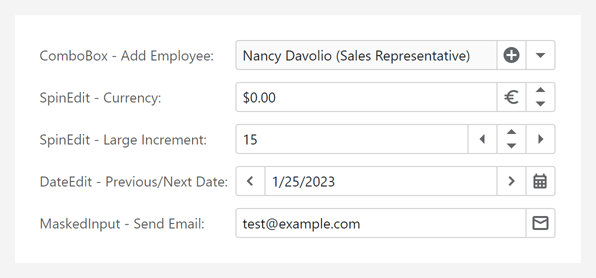
New Mask Types
- Date-Time Offset - allows a user to enter only date and time values, and stores the time's offset from Coordinated Universal Time (UTC) in the editor's value. You can apply this mask to the DxDateEdit and DxMaskedInput components. The DxDateTimeOffsetMaskProperties class allows you to customize the mask settings. Documentation
- Time Span - allows users to enter only time intervals in DxMaskedInput. Use the DxTimeSpanMaskProperties class to configure the mask. Documentation
Online Demo
Validation Icons
Data editors can now display meaningful validation icons (Error or Success) and text-based feedback (tooltips).
You can enable validation icons for all editors in your app or specify icon visibility for each editor individually.
Documentation
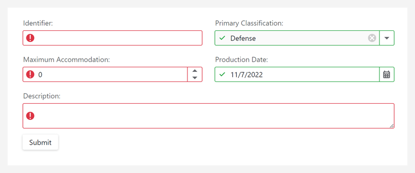
Online Demo
Delayed Input
Our data editors with text input fields (e.g., DxMaskedInput, DxMemo, DxTextBox, DxSpinEdit) can now update associated values with a delay. Enable this option if you wish to reduce value updates (reducing updates improves client-side performance).
We also added a new BindValueMode property. Set it to 'OnDelayedInput' to enable delayed input. You can also use the InputDelay property to specify the delay period.
Online Demo
Focus First Match
Our Blazor ComboBox component automatically highlights the first match after a filter operation. This feature allows users to select values via the keyword.
Online Demo
Command Buttons
Released in v22.2.4
DevExpress Blazor Editors can now display custom command buttons to the left or right of the text input region. You can also hide/customize default command buttons as requirements dictate (such as the button that activates a dropdown).
Documentation
Online Demo
Form Layout
Collapsible Groups
Users can now expand/collapse layout groups. You can use the Expanded property to expand or collapse a group in code.
The new ExpandButtonDisplayMode property allows you to position the expand button within a group header. You can display the expand button to the left or right of the group caption, hide the expand button, or customize its appearance.
You can also play the slide animation effect when expanding/collapsing Form Layout groups.
Documentation
Online Demo
New Templates and Customization API
The Form Layout component now includes new customization options for tab pages and layout groups.
Tab Page API:
Layout Group API:
You can also specify the ColSpanXxl property to define the number of columns a layout item, group, or tab page spans across large screens (1400px or wider).
Online Demo
Menu
API Enhancements
Reporting
New Report Viewer & Designer for WebAssembly (ASP.NET Core Hosted)
Our new DxWasmDocumentViewer and DxWasmReportDesigner WASM components are aimed at minimizing integration efforts and reducing support inquiries. These components ship as part of the DevExpress.Blazor.Reporting.JSBasedControls.WebAssembly Nuget package.
Documentation Blog Post
Native Report Viewer — Parameters Panel Layout
Our Report Viewer component (DxReportViewer) can now render the Parameters panel with a custom layout.
Blog Post
Online Demo
New Project Templates
The DevExpress Blazor App Template Gallery for Visual Studio now includes Reporting templates. Use these templates to jump start the BI application development (be it a Server or WebAssembly Hosted app) process.
Reporting templates allow you to create an application that includes the following:
- Report Designer
- Report Viewer (JS-based)
- Report Viewer (Native)
- Report Storage
- Sample SQL Connection, JSON/Object Data Source
In the CLI, our new templates are available as:
- dx.blazor.reporting.blazorserver
- dx.blazor.reporting.webassembly
Rich Text Editor
WebAssembly Support
Our Blazor Rich Text Editor now supports the Blazor WebAssembly hosting model. This model offers the following advantages (compared to the server hosting model):
- The application remains functional if the server goes offline.
- The application makes full use of the client's resources and capabilities.
- Processing has moved from the server to the client, so your application takes up fewer server resources.
- Serverless deployment scenarios are possible.
In Web Assembly applications, our Rich Text Editor component provides the same functionality and behavior as that of a Blazor Server application.
Spell Check
Our Blazor Rich Text Editor now supports on-demand spell checking. It can detect spelling errors and suggest corrections.
To enable spell checking, call the AddSpellCheck method to register a spell check service and set the CheckSpelling property to 'true'.
The Rich Text Editor integrates a spell check service using an English dictionary and allows you to add other dictionaries (for various languages) as needed.
Note: You are not limited by what's available out-of-the-box. You can implement and use a custom spell-check service if the default service does not address business requirements.
Online Demo
API Enhancements
Tabs
Disabled State
A new Enabled property allows you to enable/disable individual tabs.
Tab Header Template
The new TextTemplate property allows you to define a tab header template, which can include custom UI visuals (such as command buttons).
Toolbar
Bind to Data
You can now bind our Blazor Toolbar component to a data source. To introduce this capability in your Blazor app, use its Data and DataMappings properties. In bound mode, the Toolbar generates items automatically.
Online Demo
API Enhancements
TreeView
URL-match Mode
The Blazor TreeView component can now automatically expand a tree and select a node if its NavigateUrl property value points to the current URL, which is displayed in the web-browser's address bar. Available modes include Current Path, Prefix, and Exact.
Two new properties allow you to specify how the TreeView component matches URLs:
You can also use the Reason property to identify why selection was changed.
Expand and Collapse Animation
You can now play the slide animation effect when expanding/collapsing TreeView nodes.
Online Demo
Node Click Events
.NET 6 Support
.NET 6 - Minimum Supported Framework Version
v22.2 requires .NET 6 and Visual Studio 2022 (v17.0) or higher.
Blog Post
Charting
Range Bar Chart - Minimum Bar Size
Use the new minBarSize property to specify minimum size for bars displayed in the Range Bar Charts.
Online Demo
Data Visualization Components - Adapt to Container Resize
Our Chart, Gauge, and Map controls now automatically adapt to changes in container.
VectorMap - Control Panel Customization
The following options allow you to display/hide the Pan Control and Zoom Bar: panVisible and zoomVisible.
Online Demo
Pivot Grid
Export Field Panel Headers to Excel
You can now include field panel headers in an exported worksheet. The following field header export-related options available:
-
exportColumnFieldHeaders
-
exportDataFieldHeaders
-
exportFilterFieldHeaders
-
exportRowFieldHeaders
Online Demo
Field Chooser - Encode HTML
The new encodeHtml property allows you to process HTML tags as plain text or apply them to header filter values.
UI Components
CSS Styles Enchancements
The following components are now rendered more consistently under different use-case conditions (applies to both our Generic and Material themes):
- Button
- Calendar
- Toolbar
- DateBox
- Scheduler
- FieldSet
- List
For instance, buttons within our Toolbar's overflow menu now reflect specified types and styling modes.
Validation Message Position
Our new validationMessagePosition option specifies the position of a validation message relative to the editor's input region. Available settings include: 'bottom' (default), 'top', 'left', and 'right'.
Online Demo
Show/Hide API Enhancements
The cancel parameter for onShowing/onHiding events now supports the Promise type. This allows you to execute asynchronous actions before components are displayed/hidden. This enhancement is available in the following UI components:
- Popup
- Popover
- Tooltip
- Toast
- LoadPanel
The show/hide methods now return a Promise object, which is resolved once the operation is complete. This Promise is rejected if the operation was cancelled.
Slider & Range Slider - Value Change Mode
The Slider and Range Slider components now include a valueChangeMode option. This option specifies when a slider’s value is changed. Available modes include:
- The value changes when the user releases the slider handle.
- The value changes immediately whenever the user moves the slider handle.
Slider Demo RangeSlider Demo
Toolbar Adaptability- Multiline Mode
Our Toolbar can now wrap across multiple lines when it is wider than its container. Use the multiline property to enable multiline mode.
Online Demo
Accordion - Title Templates for Individual Items
You can now define title templates for individual items. Use the titleTemplate property as requirements dictate.
CheckBox - Cycle Through Three State
We extended the functionality of our CheckBox component. Users can now toggle between all three states by clicking a box (cycling from unchecked to checked and then to an indeterminate state).
Use the enableThreeStateBehavior option to enable this mode.
Online Demo
Calendar - Week Numbers
The Calendar control can now display week numbers. Use the showWeekNumbers property to enable this option.
The Calendar automatically sets the first week of the year based on culture (locale). We added the weekNumberRule property to specify the rule used to determine the first week of the year. Available rules include auto, first day, first four days, and full week.
Online Demo
SelectBox and TagBox - Submit Custom Items on Loss of Focus
We enhanced the default behavior of our SelectBox and TagBox components. These components create custom items when the user presses the Enter key or when the component loses focus.
And yes, you can assign a DOM event to the customItemCreateEvent property to change the default behavior as needed.
Form – Custom Label Template
Form labels can now display images and support content formatting. Use the label.template property to define a custom template.
Online Demo
Popup and Popover - Overflow Menu in Toolbar
Toolbars within our Popup and Popover components can now display an overflow menu.
Use the following API to customize the menu and toolbar items:
Online Demo
DateBox - Customize Today Button Text
You can now rename the Today button (which appears in 'date' and 'datetime' modes). The todayButtonText property specifies the text for the button.
Reporting for Web
Distributed Document Caching
DevExpress Reports now natively supports report document caching in distributed ASP.NET Core apps. DevExpress Reports utilizes the IDistributedCache interface. You can use a cache storage that implements this interface (e.g., SQL Server, Distributed Redis Cache).
                        public void ConfigureServices(IServiceCollection services) {
                            ...
                            services.ConfigureReportingServices(configurator => {
                                configurator.ConfigureWebDocumentViewer(viewerConfigurator => {
                                    services.AddDistributedSqlServerCache(options => {
                                        options.ConnectionString = Configuration.GetConnectionString("SqlCache");
                                        options.SchemaName = "dbo";
                                        options.TableName = "ReportDocumentCache";
                                    });
                                    viewerConfigurator.UseDistributedCache();
                                });
                            })
                            ...
                        }
For supported web platforms (including ASP.NET Web Forms and ASP.NET MVC), we also offer built-in database document storage options (this option uses XPO - our ORM Library and supports all major data sources). See Database Systems Supported by XPO.
ES6 Modules
With this release, we switched our Web Reporting products to ECMAScript 2015 language standard to optimize our development process.
See the following blog post for more information in this regard: Web Reporting — Important Changes in v22.2 — ES6 Support
Content Security Policy (CSP) Support Improvements
We improved Content Security Policy support for our Web Reporting components. You can now safely remove the 'unsafe-eval' directive from web pages that host the DevExpress Web Document Viewer and Web Report Designer.
Documentation
Report Wizard - Customization API & UI Enhancements
The DevExpress Report Wizard’s new customization API allows you to refine auto-generated reports (to brand reports, format headers/footers, and apply desired font settings) as requirements dictate.
Use the TryCreateReport method to create a report (of any type) and apply all settings selected within the Report Wizard. The CustomizeReportOnFinish method allows you to fine-tune the report before it is loaded within the End-User Designer.
We also enhanced the Report Wizard’s start screen. You can now register custom report templates and search across available reports.
Blog Post
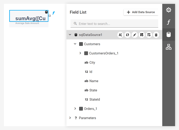
Data Source UI Enhancements & New API
- The 'Add Data Source' button in the Field List now opens the Data Source Wizard (the wizard lists predefined data sources).
- 'Rebuild Schema' and 'Rename Data Source' buttons are now available for each data source in the Field List.
-
The DevExpress.XtraReports.Configuration.DataSourceSettings class contains options that allow you to display/hide UI elements that add, rename, or remove a data source.
Documentation
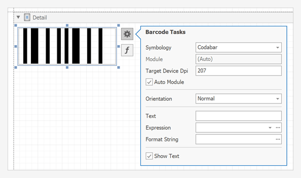
Web Report Designer - Miscellaneous Enhancements
- The Sizing property is now set to 'ZoomImage' by default for a Picture Box added from the Toolbox.
- The Barcode control now renders a real barcode picture according to the selected symbology and specified text data.
- The Gauge controls now renders a real gauge according to the selected type and specified data property values.
- The Angular Web Report Designer now offers configuration API. Use this API to set up its wizard and export settings.
- The Edit Parameters Dialog displays custom report parameter types (based on enums).
- The Data Source Wizard filters out unsupported database connections (with no XpoProvider key defined).
Angular Ivy-Based Package Format Support
This package format helps us to maintain new versions of Angular. It also allows you to speed up the assembly of our components.
jQuery UI Dependency Removed
We optimized/refactored our Web Reporting components. They now do not require the jQuery UI dependency.
Preconfigured Docker Files
Thanks to preconfigured Docker images (that take care of all necessary native dependencies) the deployment of ASP.NET Core applications with reports has become much easier. You can find these images for Ubuntu, Alpine, Debian, and Amazon Linux in the following GitHub repositories:
Reporting for Blazor
New Project Templates
The DevExpress Blazor App Template Gallery for Visual Studio now includes Reporting templates. Use these templates to jump start the BI application development (be it a Server or WebAssembly Hosted app) process.
Reporting templates allow you to create an application that includes the following:
- Report Designer
- Report Viewer (JS-based)
- Report Viewer (Native)
- Report Storage
- Sample SQL Connection, JSON/Object Data Source
In the CLI, our new templates are available as:
- dx.blazor.reporting.blazorserver
- dx.blazor.reporting.webassembly
Documentation
Native Report Viewer — Parameters Panel Layout
Our Report Viewer component (DxReportViewer) can now render the Parameters panel with a custom layout.
Blog Post
Online Demo
New Report Viewer & Designer for WebAssembly (ASP.NET Core Hosted)
Our new DxWasmDocumentViewer and DxWasmReportDesigner WASM components are aimed at minimizing integration efforts and reducing support inquiries. These components ship as part of the DevExpress.Blazor.Reporting.JSBasedControls.WebAssembly Nuget package.
Documentation Blog Post
Visual Studio Report Designer for .NET
Custom Functions in Expressions
Our new 'VSDesignerCustomFunction' attribute allows you to register a custom function and use it in the Expression and Filter Editors.
Documentation
Custom Report Controls
You can now use custom report controls in our Visual Studio Report Designer for .NET. The following design-time and UX options are available out of the box:
- Display Custom Report Controls in the Toolbox
- Customize Settings in the Properties window
- Move and Resize
- Expression Binding
ARM64 Support
You can now create and edit reports on machines with ARM-based processors (using Microsoft Surface Pro X or Mac computers with Apple Silicon processors M1/M2).
All Platforms
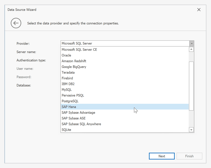
New SAP HANA Data Source
Our Data Source Wizard allows you to bind a report to a SAP HANA database.
Documentation
Entity Framework Core 7 Support
EFDataSource now supports Entity Framework (EF) Core 7.0 context classes bound to MS SQL Server.
Documentation
Barcode Enhancements for Accurate Scanning Results
We added a new 'TargetDeviceDpi' property to the XRBarCode class. This property allows you to specify the DPI of the device on which you wish to print a barcode.
Another new property ('ActualModule') gets the module value for the barcode when using the 'AutoModule' and 'TargetDeviceDpi' properties.
Blog Post
All Platforms
New SAP HANA Data Source
Our Data Source Wizard now allows you to bind a report to a SAP HANA database.
Documentation
Web Dashboard
Material Theme Support
We optimized the layout and refined the structure of CSS styles used in the DevExpress Web Dashboard component (following Material Design guidelines).
Documentation Blog Post
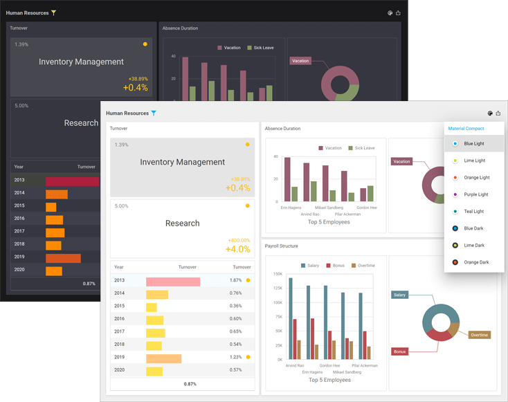
Online Demo
Content Security Policy (CSP) Support Improvements
We improved Content Security Policy support for our Web Dashboard components. You can now safely remove the 'unsafe-eval' directive from web pages that host the DevExpress Dashboard Viewer and Dashboard Designer.
Documentation
XAF Blazor
New Render and Size Modes
The DevExpress Blazor Data Grid (DxGrid), Editors, Layout, and Navigation components now use our optimized rendering engine instead of Bootstrap. This change will allow us to extend our Blazor component suite with the following new capabilities/features:
- Improved rendering performance with fewer JavaScript interop calls.
- Consistent appearance across DevExpress Blazor components.
Our new rendering engine significantly improves the capabilities of existing Blazor Size Modes:
- Blazor components (regardless of size mode used) are downsized to address the requirements of "dense" interfaces and display more relevant information on screen. The new Large Size Mode mirrors what used to be “Medium.” The new Medium mode is closer to what used to be “Small.” And our new Small mode allows you to deliver interfaces similar to desktop apps such as Microsoft Outlook.
- New size modes apply to our Blazor Data Grid (DxGrid), Tabs, Flyout, and other UI components that previously did not support the size mode option.
- Size modes now offer a more consistent user experience and affect all spacings/sizes across supported Blazor components. For example, our Blazor Form Layout component adjusts paddings between items/groups based on the selected size mode.
Refer to the following article to learn more about our new rendering engine: blog post.
Miscellaneous Enhancements in DxGridListEditor
We added the following enhancements to the DxGridListEditor component:
Split View Layout
We introduced a new ListViewAndDetailView display mode for List Views in Blazor applications. Inspired by the Compact View in Microsoft Outlook, this new feature allows you to present data as a synchronized ListView and DetailView (displayed side by side).
Documentation
Layout Tabs - Lazy Loading
Layout tabs now support lazy loading. The content of the tab is rendered when the tab is activated and persisted in the DOM.
Documentation
Multiple Columns in Lookup Property Editor
The Lookup Property Editor can now display multiple columns in the dropdown. The editor gets column information from the Lookup ListView node in the Application Model.
Documentation
Expand/Collapse Layout Groups
You can now expand/collapse Layout groups. Activate the IsCollapsibleGroup option to enable this feature. Use the IsGroupCollapsed property to specify the group's expand/collapse state in code.
Inline Editing in the DxGridListEditor
Users can now edit data inline or use the Edit Form. The Edit Form can be displayed instead of the edited row (or displayed in a floating window). Use the InlineEditMode property to specify edit mode. Documentation
Enhanced Accordion & Tree-like Navigation
We integrated a new DevExpress Blazor Accordion component and supported common control options (e.g., images, view variants, open items in separate browser tabs, etc).
Common Enhancements
.NET 7 Support
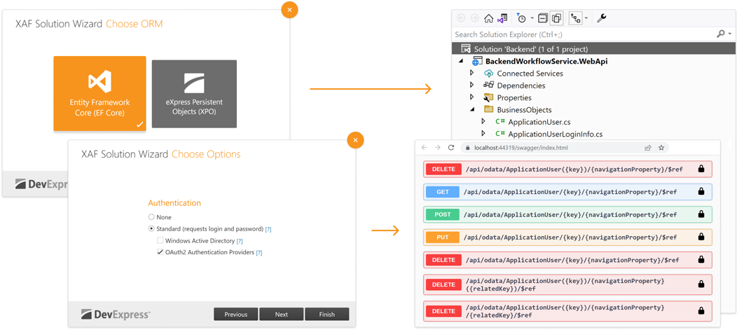
XPO's ORM Data Model Designer, XAF's Model Editor, and Solution Wizard support the latest Visual Studio 2022 and .NET 7 versions in v22.2.
See Breaking Changes
Prevent Read Access for Navigation Permissions
We implemented a new validation rule to improve control over access permissions. With this release, when you deny access to a Navigation Item for a specific role, XAF informs you if there are associated Type Permissions still open for users with the assigned role. The warning can help prevent unauthorized access to specific object types.
Documentation
XPO Connection Provider Enhancements
XPO now supports the latest versions of the following database engines:
- Microsoft SQL Server 2019 and 2022 (Microsoft.Data.SqlClient.dll 5.0.0 and System.Data.SqlClient.dll 4.6.1.4)
- Oracle 21c (Oracle.ManagedDataAccess.Core.dll 3.1.21.1)
- PostgreSQL 15 (Npgsql.dll 6.0.7.0)
- MySQL Server 8 (MySql.Data.dll 8.0.31.0 and MySqlConnector.dll 2.1.13)
- SQLite (Microsoft.Data.SQLite.dll 6.0.10 and ystem.Data.SQLite.dll 1.0.116.0)
- VistaDB 6.4 (VistaDB.6.dll 6.4.0.0)
Documentation
Entity Framework Core
EF Core 6 ORM Support
You can now use Entity Framework Core 6 to access data within all .NET 6-based XAF applications (WinForms, Blazor, and Web API Service).
How to migrate from EF Core 5 Documentation Tutorial
Built-in Property Change Notifications for EF Core
You can now use change-tracking proxies to automatically detect object property changes when accessing data via Entity Framework Core 6. Once you enable the DbContextOptions.UseChangeTrackingProxies option, you no longer need to implement INotifyPropertyChanged and INotifyPropertyChanging to notify clients that a property value has changed.
This new enhancement allows you to simplify business class implementation.
Consider the following example. This is the implementation of a business object in v22.1:
                        public class BusinessObject : INotifyPropertyChanged {
                            int id;
                            string name;
                            public int Id {
                                get { return id; }
                                set {
                                    if (id != value) {
                                        id = value;
                                        OnPropertyChanged();
                                    }
                                }
                            }
                            public string Name {
                                get { return name; }
                                set {
                                    if (name != value) {
                                        name = value;
                                        OnPropertyChanged();
                                    }
                                }
                            }
                            protected void OnPropertyChanged([CallerMemberName]string propertyName = null) {
                                PropertyChanged?.Invoke(this, new PropertyChangedEventArgs(propertyName));
                            }
                            public event PropertyChangedEventHandler PropertyChanged;
                        }
And this is how it can be transformed in v22.2:
                        public class BusinessObject {
                            public virtual int Id { get; set; }
                            public virtual string Name { get; set; }
                        }
The same changes can be done to objects that implement IObjectSpaceLink. For example, this is the implementation of a business object in v22.1.
                        public class BusinessObject : IObjectSpaceLink {
                            // ...
                            public void SomeAction() {
                                // some business-logic uses ObjectSpace
                            }

                            IObjectSpace objectSpace;
                            IObjectSpace IObjectSpaceLink.ObjectSpace {
                                get { return objectSpace; }
                                set { objectSpace = value; }
                            }
                        }
And this is how it looks in v22.2.
                        public class BusinessObject {
                            // ...
                            public void SomeAction() {
                                var objectSpace = ((IObjectSpaceLink)this).ObjectSpace;
                                // some business-logic uses objectSpace
                            }
                        }
When you configure EF Core DbContext, call the DbContextOptionsBuilder.UseObjectSpaceLinkProxies method to enable automatic IObjectSpaceLink implementation for all persistent classes. Read the following MSDN topic to learn more: DbContextOptions.
The UseChangeTrackingProxies option is enabled by default for all new projects created with the XAF Solution Wizard.
Documentation Breaking Changes Tutorial
New Base Class for EF Core Business Objects
The abstract DevExpress.Persistent.BaseImpl.EF.BaseObject class includes a key property and implements IObjectSpaceLink and IXafEntityObject interfaces. Inherit from the 'BaseObject' to avoid boilerplate code and enforce best practices across your business objects.
                        public class BusinessObject : BaseObject {
                            public virtual int MyProperty { get; set;}
                                // The OnCreated() method is a part of the IXafEntityObject interface implementation
                                public override void OnCreated() {
                                    // ObjectSpace is a part of the IObjectSpaceLink interface implementation
                                    MyProperty = ObjectSpace.GetObjectsQuery<BusinessObject>().Count();
                                }
                        }
.NET APP Security & Web API Service
You can now use Entity Framework Core 6 to access data in our backend Web API / REST API apps. The basic functions of our Web API Service (CRUD, authentication, and authorization) are available for free as part of our .NET App Security & Web API Service.
Download Free Copy
Reports Module Support
Download PDF from report templates and filtered data within a database using service endpoints (aka Reports Module). With the api/Report/DownloadByKey, api/Report/DownloadByName endpoints, you can download data from ReportDatav2 containers stored in your database.
Each ReportDatav2 links to an 'XtraReport', report data sources and data models designed in Visual Studio IDE. You can pass a report container identifier, data source criteria, and other parameters as needed.
XAF's Application Wizard adds a ReportController to a new Web API application automatically. You can extend and modify this endpoint to address specific requirements.
Note: This endpoint respects security permissions.
DocumentationTutorial Video
Audit Trail Support
Log database history changes using service endpoints (Audit Trail Module). No data changes made via your ORM in Web API endpoints will be unnoticed. You can view the associated log history within your RDBMS or XAF's administrative UI (WinForms, Blazor, and/or ASP.NET Web Forms).
Documentation
File Attachment Support
Download BLOB data stored within a database using service endpoints (File Attachments Module). With the api/MediaFile/DownloadStream endpoint, you can download data from FileData, MediaDataObject, Image or byte array properties declared in a data model.
Note: This endpoint respects security permissions.
DocumentationTutorial Video
Validation Module Support
Check the state of input data in our Web API Service with either built-in (over 10) or custom validation rules - Validation Module. You can now use our IValidator service to validate input data in your custom endpoints.
Documentation
Non-Persistent Object Support
You can now execute CRUD operations for non-persistent and proxy objects in our Web API Service (in the same manner as other persistent objects). We recommend that you inherit from NonPersistentBaseObject or other classes with a key property to enforce best practices for non-persistent classes.
Documentation
Built-in Unit Test Infrastructure
Our MainDemo app now includes a pre-configured test project with base classes and helpers along with fixtures for the most popular usage scenarios. This project should help API developers write unit tests for CRUD operations and custom Web API Service endpoints.
                        [TestFixture]
                        public class MyWebApiTests : BaseWebApiTest {
                            [Test]
                            public async Task TestPostDelete() {
                                var newResult = await api.PostAsync(
                                    new TestObject { TestProperty = "test" }
                                );
                                Assert.NotNull(await api.GetByKeyAsync<TestObject>(newResult.Oid.ToString()));
                                var deleted = await api.DeleteAsync<TestObject>(newResult.Oid.ToString());
                                Assert.AreEqual(newResult.Oid, deleted.Oid);
                            }
                            [TestCase(typeof(Employee))]
                            [TestCase(typeof(Paycheck))]
                            [TestCase(typeof(Position))]
                            public async Task TestGetBasic(Type objectType) {
                                var result = await api.GetAllAsync(objectType);
                                Assert.Greater(result.Length, 0);
                            }
                        }
New Pre-Built Code & Project Error Diagnostics
We enabled XAF/XPO error diagnostics (shipped as part of the DevExpress.ExpressApp.CodeAnalysis NuGet package) in v22.2.3+ using the Project Converter (Breaking Change). We hope this will save you time in Visual Studio or validate your build quality using your CI/CD workflows.
In this update, we also added the following new diagnostics:
- Internal ShowViewStrategy.ShowView method calls instead of the recommended public ShowViewInPopupWindow, ShowMessage API, or using Actions.
- Detect redundant NonPersistentAttribute for read-only properties (non-public or missing setters).
- Detect redundant ExplicitLoadingAttribute for XPCollection properties.
- Detect redundant IObjectSpaceLink in XPO classes (because the Session property already exists).
- Detect redundant IXafEntityObject in XPO classes (because AfterConstruction, OnSaving, and OnLoaded methods are available).
- Incorrect XAF Controller instantiation like 'new DialogController()'.
- Avoid creating a new Session/UnitOfWork with parameterless constructors in XPO-based XAF projects.
- Detect XPO-specific attributes in Entity Framework or non-persistent POCO classes or their members.
- Use the enclosing property name in XPO method calls.
- Use the supported version of EF Core packages.
-
Use the generic XPCollection<T> class, GetCollection<T> method, and AssociationAttribute without the type parameter to declare your association property.
Documentation
New Material Design 3
From balanced colors to shadows and shapes, and everything in between, our .NET MAUI components now follow the latest Material Design 3 guidelines.
Localization
Our new localization mechanism allows you to deliver international mobile apps easier and faster than ever before. We translated all strings in our UI components to English, German, and French. The language is automatically chosen based on device interface settings.
You can add a 'resx' file with localized resources to the project to support a different language(s).
And yes, you can also implement a custom localization mechanism. For example, you can load translated strings from a JSON file.
Documentation Example (GitHub)
New Token Edit & Auto-Complete Token Edit
Meet our new UI components - TokenEdit and AutoCompleteTokenEdit. With these components, you can easily implement item selection in your mobile apps. Selected items appear as chips in which you can customize color, text, or an entire template.
As its name suggests, the Auto-Complete Token Edit component locates records that match text entered by a user and displays the first item it locates within the data source. It also supports asynchronous item loading. The editor loads items as users enter text without locking the user interface.
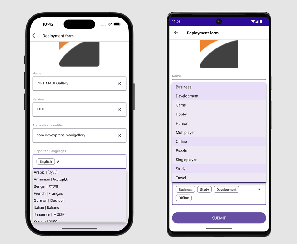
Cross-Platform DevExpress.Data Library
With this update, our .NET MAUI components utilize the DevExpress.Data library to filter, group, and sort data.
This enhancement delivers a seamless user experience (API-wise) for those familiar with our UI components for WinForms, WPF, and ASP.NET.
Data Grid - Custom Filtering, Sorting, Grouping
You can now define custom rules to filter, sort, and group data in our Data Grid component. New API includes:
Our new AllowLiveDataShaping option enables on-demand data recalculation when users filter, group, and sort data. This feature is also available in our CollectionView.
Themes - Performance & Usability Improvements
We optimized our XAML code. You can now use implicit styles and easily customize appearance of our UI controls.
We improved startup speed during cold starts in our UI controls. To help compute performance related benefits associated with this enhancement, we measured how long it takes to render our Data Grid, Scheduler, and Data Editors when a user launches our test app for the first time.
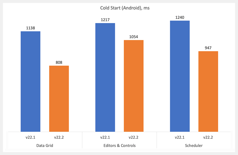
XAML Hot Reload Support
We added support for XAML Hot Reload in Visual Studio. XAML Hot Reload allows you to continue coding XAML while debugging your application and view the result of XAML changes in your running app, without having to rebuild the project.
Compatibility with the Latest Versions of Visual Studio 2022 and C#
CodeRush maintains compatibility with the latest Visual Studio 2022 and C# releases for our most-frequently-used CodeRush features.
Enhancements focus on the following four areas of CodeRush.
Refactoring
-
Import Missing Namespaces
-
Suppress exception messages due to changed API
-
Core performance optimizations and enhancements to a number of CodeRush refactorings (including Reorder Parameters)
Navigation
- Tab To Next Reference now works with IntelliCode suggestions
- Navigation now works with decompiled code in a number of providers
Visualization
- Code Actions Grouping
- Syntax Coloring for TODO Items
- Improved Status Bar
- IntelliRush behaves the same way as IntelliSense when typing keys
Code Quality
- New Roslyn-based Error Diagnostics for XAF
- Enhancements to Built-in Code Analysis Diagnostics
- Code Coverage for MS Tests
- New wrapping and spacing options added to the CodeRush Code Formatter for formatting switch expressions in C# 8.0 and up.
Download Your Copy Today
Once you're ready to upgrade, simply login to the DevExpress Client Center and download the appropriate installer to proceed.
Download and InstallDownload Free TrialVCL Demos v22.2
New Vector Graphics for UI Elements
We continue to enhance our UI controls to better support high DPI (4K+) devices and improve rendering regardless of DPI settings. The following controls can now display SVG graphics within UI elements, menus, and dialogs:
- Chart View in ExpressQuantumGrid
- Data Editors
- PDF Viewer
- Rich Text Editor
- Scheduler
- Spreadsheet
- TreeList
Our VCL controls will display SVG icons by default in v23.1.
Enable our new global dxUseVectorIcons option in the initialization section of the main application unit to display SVG icons. This particular option has been enabled in our demos so you can see the difference when compared to previous versions.
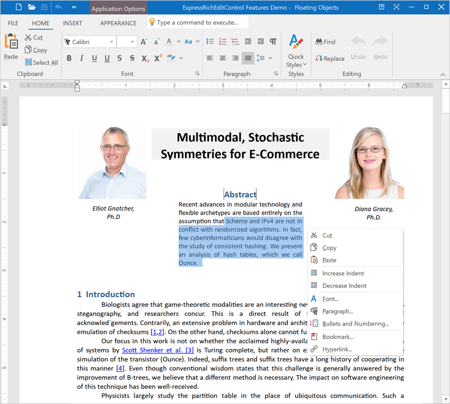
"Light" Style Rendering
Clean, simple, and minimalistic UI design is a trend in modern software development. To address this trend, we added a "light" style rendering mode to our VCL Data Grid (ExpressQuantumGrid), and will support this mode in other UI controls in v23.1. When used, our VCL UI controls are rendered without double or thick borders, extra outlines, and other visual noise.
Call the TdxVisualRefinements.ApplyLightStyle class procedure in the initialization section of the main application unit to enable "light" style rendering.
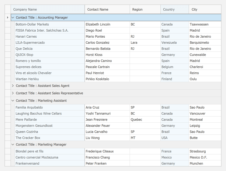
New Sizable Panel
Our new Panel (TdxPanel) control is designed to break down a form into multiple resizable regions divided by one-pixel splitters. You can place a control on such a panel without gaps or double borders and create lightweight application layouts as needs dictate.
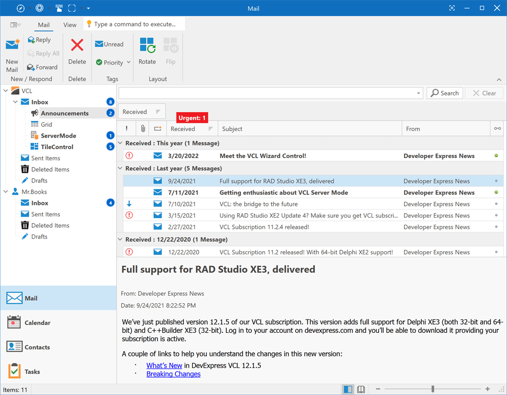
VCL Rendering Engine for Modern App-Design Paradigms and New Skins - Phase #1
Modern app-design trends and new themes like Windows 11 required us to rewrite our rendering engine for both greater performance and UI flexibility - the old schema could not address additional usage scenarios introduced by Windows 11. Our new "Light Style" rendering mode also required updates to old drawing schemas. We expect to deliver our new VCL rendering engine in our next major update (v23.1). Once we ship the new engine, we'll be in position to deliver new vector skins and help you ship more compelling/elegant user interfaces.
With this release (v22.2), we've completed the initial phase of our strategy:
- Fixed 40+ component layout and image-related issues across all VCL product demos and associated UI controls.
- Gathered unsupported UI scenarios and performance requirements for our 2023 rendering engine (to support the Windows 11 skin, new skin and palette selectors, "Light Style" mode, etc).
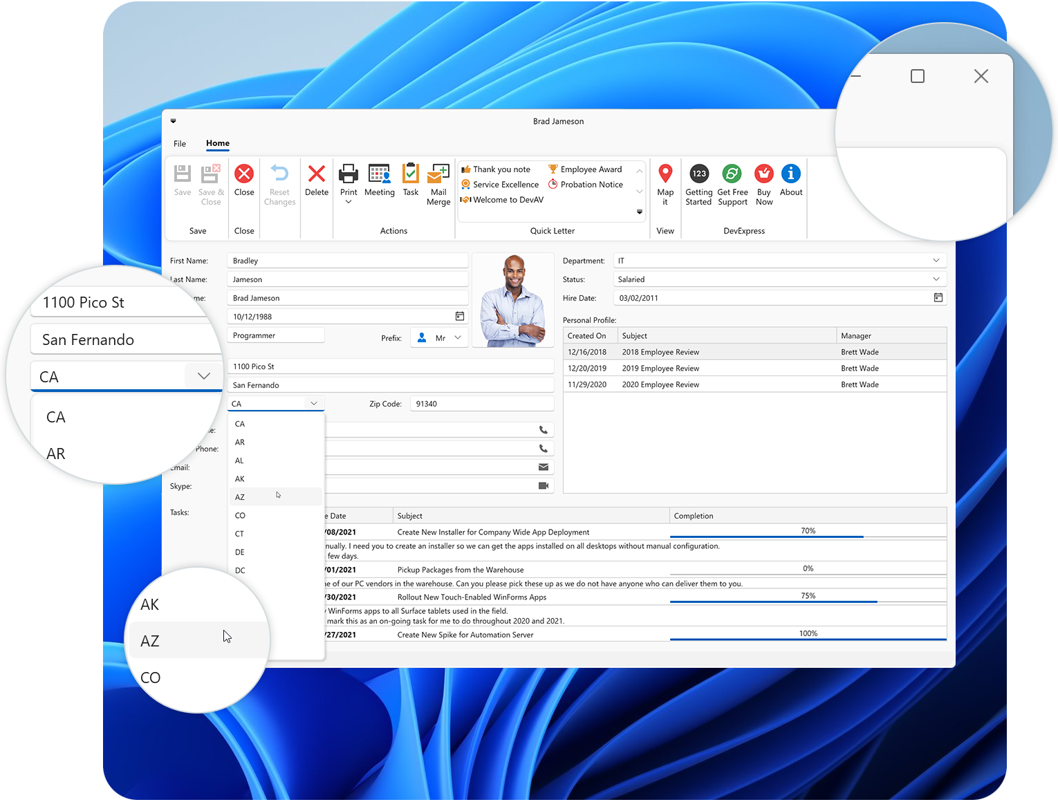
Updated VCL Product Demos
We updated our VCL product demos to demonstrate the potential of the following features: SVG images for all UI Elements, new "Light Style" rendering mode (ExpressQuantumGrid demos only), and the new Sizable Panel.
VCL Demos v22.2