Security
#Environment Policy
We added a new Environment Policy that allows you to apply global environment access restrictions, track app-initiated requests (initiated by a DevExpress UI control) and execute custom actions in response.
You can apply global restrictions using various methods like SuppressAll to block all environment access or more specific options such as preventing DevExpress UI controls from reading or writing environment variables, exiting processes, altering the current directory, or reading paths to system special folders.
Event handlers allow you to track and manage environment operations. For example, you can detect when DevExpress UI controls attempt to read or modify environment variables, process data, or system directories and enable conditional responses based on specific conditions.
Documentation
#Registry Access Policy
DevExpress UI controls can save, read, and modify configuration settings and options in the system registry. These requests can be initiated in code or through the internal control engine. The Registry Access Policy allows you to apply global registry access restrictions, track user/app-initiated requests, and execute custom actions in response.
Documentation
#Microsoft's BinaryFormatter Obsoletion Strategy
As outlined in Microsoft's BinaryFormatter Obsoletion Strategy, the final removal of BinaryFormatter-related infrastructure is planned for .NET 9. We have proactively addressed these changes, ensuring our codebase is compliant and secure while minimizing migration impact for DevExpress customers.
Please review the following post for information on changes we’ve made to date and see what remains to be completed:
Updates On Microsoft's BinaryFormatter Obsoletion Strategy.
Breaking Change | Safe Deserialization (Documentation)
Accessibility (A11Y)
In v24.2, we expanded our accessibility support to include more UI controls and platforms:
.NET 9 Support
DevExpress WinForms, WPF, Blazor, ASP.NET Core, .NET MAUI, BI Dashboard, Office File API, XAF UI, Web Service API, and Reporting UI libraries now support .NET 9.
Supported IDEs & Frameworks
#.NET 8, .NET Framework 4.6.2, Visual Studio 2019 – Minimally Supported Versions
.NET 8, .NET Framework 4.6.2, Visual Studio 2019 are minimally supported versions for DevExpress .NET Core and .NET Framework-based products and libraries (v24.2+). Learn more about this global change in the following announcement: Minimally Supported Target Frameworks.
When you update a DevExpress-powered project targeting .NET Framework 4.5.2/.NET 6 (or earlier), the DevExpress Project Converter will inform you that the conversion process re-targets DevExpress-powered projects to .NET 8 or .NET Framework 4.6.2 and updates 3rd party NuGet packages to most recent compatible versions.
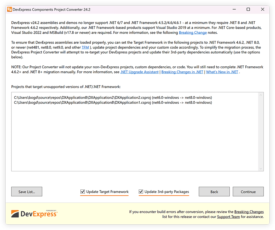
If your DevExpress-powered project targets .NET Framework 4.5.2/.NET 6 or earlier, the DevExpress Project Converter automatically updates the following:
TargetFrameworkVersion, TargetFramework, and TargetFrameworks settings in csproj/vbproj and *.config files.
-
3rd-party NuGet packages for projects with DevExpress dependencies (based on the most recent version compatible with the target framework).
Uncheck the Project Converter's Update Target Framework and Update 3rd-party Dependencies options if you want to update your DevExpress-powered project manually.
NOTE: Our Project Converter does not update the TargetFramework and NuGet packages in non-DevExpress projects (without DevExpress NuGet packages).
Documentation
Upgrade to .NET from .NET Framework
Our Project Converter can now convert DevExpress assembly references in your solution or specific projects to corresponding DevExpress NuGet packages. By selecting the "Convert DevExpress assembly references to NuGet packages" option under Advanced settings, you can easily transition to NuGet-based project management.
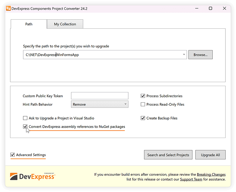
To streamline the upgrade process, our Project Converter automatically creates backup (.bak) files for your CSPROJ and VBPROJ files. Once DevExpress assemblies are converted, complete the upgrade process by using the Microsoft .NET Upgrade Assistant (to migrate your application to the most recent version of .NET).
Review the following help topics for step-by-step instructions (for DevExpress and Microsoft dev tools):
Project Template Gallery
#New Project Template Gallery for .NET 8+
Our Visual Studio Template Gallery includes new project templates for .NET 8+ (not available for projects targeting .NET Framework). The Template Gallery allows you to create projects that target .NET 8 (the default target in v24.2) or .NET Framework 4.6.2 (or higher).

v24.2 includes our new cross-IDE Template Kit for .NET (available as a Community Technology Preview). This new gallery is built atop the dotnet CLI an is available across multiple IDEs. This extension is available for Visual Studio 2022 and Visual Studio Code (VS Code) on Windows, with plans to expand support to Rider for Windows and additional operating systems in the future.
New project templates cover a broader range of usage scenarios when compared to our previous Template Gallery for .NET Framework (shipped as part of the Unified Component Installer). New project templates support hybrid app development and new technologies such as Blazor Hybrid, .NET MAUI, and MVVM.
Download Kit for Visual StudioDownload Kit for VS Code
Source Builder
#.NET Core Support and Usability Enhancements
Our new Source Builder ships as part of the DevExpress Unified Component Installer: “~\DevExpress 24.2\Components\Tools\Components\DevExpress.SourceBuilderTool.exe”. The tool rebuilds the source code used for .NET Core product libraries (previously we supported only .NET Framework).
The DevExpress Source Builder has the following system and environment requirements:
- Visual Studio 2022 and ASP.NET MVC 3 (if you rebuild DevExpress MVC projects)
- .NET 8 SDK and .NET Framework 4.6.2 Developer Pack (download)
- NuGet.exe version 6.0 (or higher) must be in the same folder as DevExpress.SourceBuilderTool.exe (download nuget.exe)
- Node Package Manager (NPM) (install npm)
Run the following command with admin rights to rebuild DevExpress assemblies and NuGet packages (including localized assemblies/packages for German (DE), Japanese (JA), and Spanish (ES)):
DevExpress.SourceBuilderTool.exe path_to_sources [--external] [path_to_external_libraries] [--sg] [--gac] [--nuget]

# Example:
# DevExpress.SourceBuilderTool.exe "c:\program files\devexpress 24.2\components\sources" --nuget
Documentation
Extended .NET DateOnly & TimeOnly Support
v24.2 extends DateOnly and TimeOnly type support to additional data-aware UI controls:
Azure Maps Support
We added Azure Maps service support for the following DevExpress controls:
Important Announcement: Bing Maps for Enterprise Service Deprecation
Your feedback matters.
Please, review the description of AI-related features below and leave your feedback at the end of the section.
Go to the survey now.
AI-powered Extensions
You can now integrate multiple pre-built natural language (NLP) UI elements into your next great DevExpress-powered WinForms, WPF, Blazor and .NET MAUI app. With our lightweight APIs (AI-powered Extensions), your solutions can interact with multiple AI services, including OpenAI, Azure OpenAI, self-hosted models (Ollama) and any other AI services that you can consume via the Semantic Kernel. DevExpress AI-powered Extensions ship with the following features/capabilities:
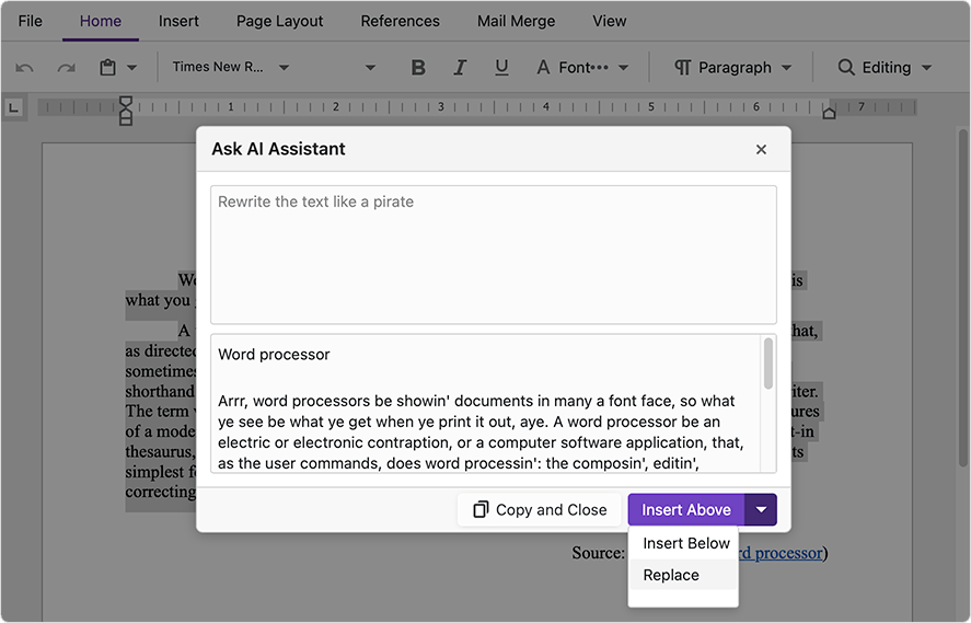
AI-powered Document Editing
Summarization, proofreading, changing tone/writing style, translation, expansion/shortening, and much more, with automatic content chunking for large text blocks.
Smart Actions
Intelligent form fill operations when using the DevExpress WinForms Layout Control and Intelligent Smart Search when using DevExpress WinForms Ribbon and Accordion control.
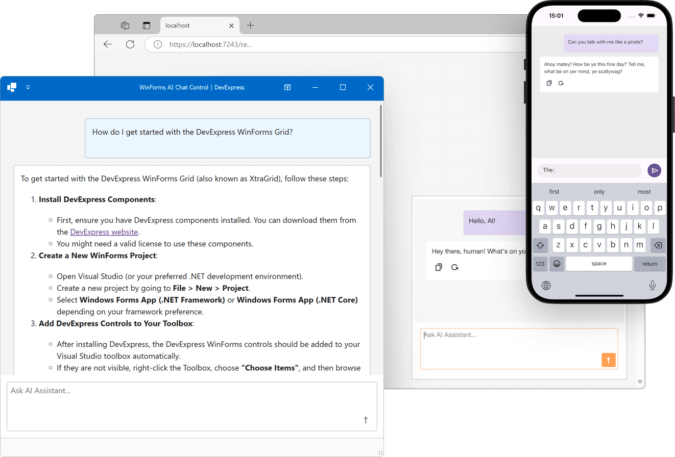
Blazor AI Chat
The new DevExpress Blazor AI Chat Component (DxAIChat) for building Copilot-inspired user interfaces in Blazor, and WinForms, WPF, and .NET MAUI apps via BlazorWebView.
DevExtreme Chat
Our new DevExtreme UI Chat Component can be integrated with multiple AI services. Use it to incorporate natural language processing, automated responses, sentiment analysis, personalized recommendations, and real-time data analysis in Web applications (ASP.NET, Angular, React, Vue). Read more.
Smart Autocomplete
Context-based predictions and relevant text suggestions for sentence completion.
- Retrieval-Augmented Generation (RAG) capabilities (for example, "chat with your own data") via OpenAI Assistants support, and more to come...
NOTE: DevExpress does not offer a REST API or ship any built-in LLMs/SLMs. Instead, we follow the BYOL ("bring your own license") principle. To use these features, you need to have an active subscription to AI services (e.g., Azure, Open AI, Google Gemini, Mistral AI, etc.) and obtain the REST API endpoint, key, and model deployment name. These variables must be specified at runtime to enable DevExpress AI-powered Extensions in your application.
To incorporate DevExpress AI-powered Extensions, your project must meet the following prerequisites:
Our implementation is based on the abstractions from the Microsoft.Extensions.AI library. To enable the AI-powered capabilities in your application, you need to create an instance of the IChatClient interface.
OpenAI
Azure OpenAI
Install Microsoft.Extensions.AI.OpenAI and Azure.AI.OpenAI NuGet packages.
Add the following code to the startup of your application. Replace AZURE_OPENAI_ENDPOINT and AZURE_API_KEY with your Azure OpenAI endpoint, API key and modelId with your deployment name.
using Azure;
using Azure.AI.OpenAI;
using Microsoft.Extensions.AI;

IChatClient client =
    new AzureOpenAIClient(
        new Uri(Environment.GetEnvironmentVariable("AZURE_OPENAI_ENDPOINT")),
        new AzureKeyCredential(Environment.GetEnvironmentVariable("AZURE_API_KEY")))
            .AsChatClient("modelId");
Ollama
Download and install Ollama and a model of your choice.
Install the Microsoft.Extensions.AI.Ollama NuGet package.
Add the following code to the startup of your application. Replace the modelId variable with the name of the downloaded model. Note that the default Ollama port can be configured.
using Microsoft.Extensions.AI;

IChatClient client =
    new OllamaChatClient(new Uri("http://localhost:11434/"), "modelId");
Semantic Kernel
Install the Microsoft.SemanticKernel NuGet package.
Install the connector package for the AI service of your choice. For example, Microsoft.SemanticKernel.Connectors.Google.
Add the following code to the startup of your application to obtain the IChatClient interface instance. Replace the modelId and ApiKey values with yours.
using Microsoft.Extensions.AI;
using Microsoft.SemanticKernel;
using Microsoft.SemanticKernel.Connectors.Google;
using Microsoft.SemanticKernel.ChatCompletion;

var builder = Kernel.CreateBuilder()
    .AddGoogleAIGeminiChatCompletion("modelId", "apiKey", GoogleAIVersion.V1_Beta);

Kernel kernel = builder.Build();
IChatClient googleChatClient = kernel.GetRequiredService<IChatCompletionService>().AsChatClient();
Register a Chat Client
Install the DevExpress.AIIntegration NuGet package. Regardless of the provider used, you must register a chat client within the DevExpress Extensions Container (manages registered AI clients).
- WinForms/WPF
- Blazor/ASP.NET Core
using DevExpress.AIIntegration;
using DevExpress.AIIntegration.Extensions;
using Microsoft.Extensions.AI;

IChatClient myChatClient = GetChatClient();
AIExtensionsContainerDesktop.Default.RegisterChatClient(myChatClient);
using DevExpress.AIIntegration;
using Microsoft.Extensions.AI;
using OpenAI;

IChatClient myChatClient = GetChatClient();

builder.Services.AddSingleton(myChatClient);
//or reference the Microsoft.Extensions.AI NuGet package and use
//builder.Services.AddChatClient(config => config.Use(myChatClient));
builder.Services.AddDevExpressAI();
Documentation
Azure AI Translator & AI Language Support
In addition to AI model access for multiple services, we have implemented APIs designed to interact with Azure AI Language services (including Azure AI Translator and Azure AI Language for text summarization). The choice of service depends on a project's budget. Please note that when calling the following methods, text translation and summarization requests will be sent exclusively to Azure AI Language services.
To use these services, install the DevExpress.AIIntegration.Azure.TextAnalytics and/or DevExpress.AIIntegration.Azure.Translation NuGet packages and create TextTranslationClient and/or TextAnalyticsClient:
using Azure;
using Azure.AI.Translation.Text;
using Azure.AI.TextAnalytics;

string azureTranslatorEndpoint = GetEnvironmentVariable("AZURE_TRANSLATOR_ENDPOINT");
string azureTranslatorKey = GetEnvironmentVariable("AZURE_TRANSLATOR_API_KEY");

var translationClient = new TextTranslationClient(new AzureKeyCredential(azureTranslatorKey), new Uri(azureTranslatorEndpoint));

string azureTextAnalyticsEndpoint = GetEnvironmentVariable("AZURE_TEXT_ANALYTICS_ENDPOINT");
string azureTextAnalyticsKey = GetEnvironmentVariable("AZURE_TEXT_ANALYTICS_API_KEY");

var textAnalyticsClient = new TextAnalyticsClient(new Uri(azureTextAnalyticsEndpoint), new AzureKeyCredential(azureTextAnalyticsKey));
Use the following code to register these services in your application:
- WinForms/WPF
- Blazor/ASP.NET Core
//Register an Azure.TextTranslation client.
AIExtensionsContainerDesktop.Default.RegisterTranslatorAzureAIService(translationClient);
//Register an Azure.TextAnalytics client.
AIExtensionsContainerDesktop.Default.RegisterTextAnalyticsAzureAIService(textAnalyticsClient);
services.AddDevExpressAI(config =>
  config.RegisterTranslatorAzureAIService(translationClient);
  config.RegisterTextAnalyticsAzureAIService(textAnalyticsClient);
);
Enable AI-powered Extensions in the UI
To activate DevExpress AI-powered Extensions, please review the following What's New topics:
Examples
Customize & Extend AI-powered Extensions
Our AI-powered extensions ship with default prompts — we encourage you to customize these prompts as needed. The following example creates a custom WilliamShakespeareStyleExtension (based on ProofreadExtension). To customize the prompt, override the GetSystemPrompt method:
public class WilliamShakespeareStyleExtension : ProofreadExtension {
    public WilliamShakespeareStyleExtension(IServiceProvider serviceProvider) : base(serviceProvider) { }
    protected override string GetSystemPrompt(ProofreadRequest request) {
        return "Rewrite this text using a William Shakespeare style.";
    }
}
To replace the default implementation of the Proofread Extension use the Register method:
- WinForms/WPF
- Blazor/ASP.NET Core
AIExtensionsContainerDesktop.Default.Register<ProofreadRequest, WilliamShakespeareStyleExtension>();
builder.Services.AddDevExpressAI();
builder.Services.GetService<IAIExtensionsContainer>().Register<ProofreadRequest, WilliamShakespeareStyleExtension>();
To implement your own AI-powered extension, create a TextRequest and ChangeTextExtension class descendants:
public class AuthoredStyleRequest : TextRequest {
    public AuthoredStyleRequest(string Author, string Text) : base(Text) {
        this.Author = Author;
    }
    public string Author { get; init; }
}

public class AuthoredStyleExtension : ChangeTextExtension<AuthoredStyleRequest> {
    public AuthoredStyleExtension(IServiceProvider serviceProvider) : base(serviceProvider) { }
    protected override string GetSystemPrompt(AuthoredStyleRequest request) {
        return $"Rewrite this text in the {request.Author} style";
    }
}
//This extension method allows you to resolve the extension from the extensions container at runtime
public static class CustomAIIntegration {
    public static AuthoredStyleExtension CreateAuthoredStyleExtension(this IAIExtensionsContainer container){
        return (AuthoredStyleExtension)container.GetExtension(typeof(AuthoredStyleRequest));
    }
}
Register the extension:
- WinForms/WPF
- Blazor/ASP.NET Core
AIExtensionsContainerDesktop.Default.Register<AuthoredStyleRequest, AuthoredStyleExtension>();
builder.Services.AddDevExpressAI();
builder.Services.GetService<IAIExtensionsContainer>().Register<AuthoredStyleRequest, AuthoredStyleExtension>();
To invoke custom extensions at runtime, use the following code snippet:
- WinForms/WPF
- Blazor/ASP.NET Core
AuthoredStyleExtension extension = AIExtensionsContainerDesktop.Default.CreateAuthoredStyleExtension();

var request = new AuthoredStyleRequest("Mark Twain", textToModify);

//You can also set up the Temperature variable that will be used to execute this particular request
request.Options.Temperature = 0.9f;
string result = await extension.ExecuteAsync(request, CancellationToken.None);
AuthoredStyleExtension extension = builder.Services.GetService<IAIExtensionsContainer>().CreateAuthoredStyleExtension();

var request = new AuthoredStyleRequest("Mark Twain", textToModify);

//You can also set up the Temperature variable that will be used to execute this particular request
request.Options.Temperature = 0.9f;
string result = await extension.ExecuteAsync(request, CancellationToken.None);
Documentation: AI-powered Extensions
Example: Integrate DevExpress AI-powered Text Extensions into Console, WinForms, and WPF Apps
Manage Long Inputs and AI Responses
To prevent resource-heavy operations (both in terms of API costs and processing time), our implementation automatically breaks large content into manageable chunks (including paragraphs, sentences, words, punctuation marks, and other text elements), based on the AIIntegration.ChatMaxTokensDefault property value. When a user selects text that exceeds the defined limit, they are warned that the request cannot be processed in a single operation, and the system calculates the number of stages required to process the task. Once the dialog appears, users can choose to process text sequentially and view results step by step, or complete all operations simultaneously. The following video demonstrates this functionality in action:
You can also use the following static API members to configure size limits for text content and images:
- ChatMaxTokensDefault - Specifies the maximum number of tokens that can be processed by a model request. Applies to all DevExpress AI-powered extensions.
- ChatTemperatureDefault - Specifies the default temperature for chat-based AI-powered extensions.
- ChunkMaxLength - Specifies the maximum number of characters allowed in each text chunk.
- ImageBufferMaxSize - Specifies the maximum size of the Base64 image per request, in bytes.
- TextBufferMaxSize - Specifies the maximum size of the input text per request, in bytes.
Localization
DevExpress AI-powered extensions can be localized. By localizing AI-powered Extensions, you can modify the user interface elements and predefined content to meet the linguistic and cultural preferences. You can also customize prompts based on regional preferences (for example, when using single-language AI models).
Documentation
Error Logging and Handling
To display user-friendly error messages (errors encountered when sending requests/receiving responses from an AI service), implement the IAIExceptionHandler interface and register it in the DevExpress Extensions Container using the RegisterAIExceptionHandler method:
using DevExpress.AIIntegration;
using DevExpress.AIIntegration.Extensions;

public class AIExceptionHandler : IAIExceptionHandler {
    private readonly ILogger _logger;
    public AIExceptionHandler(ILogger logger) {
        this._logger = logger;
    }
    public Exception ProcessException(Exception exception) {
        _logger.LogInformation($"An error occurred: {exception.Message}");
        return new Exception ("Something went wrong. Please try again later.", exception);
    }
}
Register the IAIExceptionHandler interface in the DevExpress Extensions Container:
- WinForms/WPF
- Blazor/ASP.NET Core
AIExtensionsContainerDesktop.Default.RegisterAIExceptionHandler(new AIExceptionHandler(new MyFavoriteLogger()));
builder.Services.AddSingleton<IAIExceptionHandler>(new AIExceptionHandler(new MyFavoriteLogger()));
To log AI service requests and completions in your application, implement the IChatClient as demonstrated in the following GitHub repository: AI Samples for .NET.
Survey - AI-powered Extensions
Your Feedback Matters!
Please
login to complete the survey.
Survey Completed
Thank you for taking the time to complete this survey. Your responses have now been posted. If you want to follow up with additional information, feel free to send us an email at clientservices@devexpress.com anytime.
You've Already Completed This Survey
Our records show that you have already completed this survey. If you want to follow up with additional information, send us an email at clientservices@devexpress.com.
This survey has expired
If you want to share your feedback or request new functionality, please submit a new support ticket via the DevExpress Support Center. We’ll be happy to follow up.
Your feedback matters.
Please, review the description of WinForms-related features below and leave your feedback at the end of the section.
Go to the survey now.
.NET Core / .NET
#.NET 9 Support
DevExpress WinForms component libraries now support .NET 9.
#WinForms .NET Core Designer - Enhanced Performance
We've optimized the way we load DevExpress NuGet packages/Skins and improved form load performance within Visual Studio's .NET/.NET Core WinForms Designer. Startup load time has improved by 20-35% (compared to v24.1). Performance enhancements are most noticeable for complex projects.
The following internal test results illustrate performance enhancements we've made in this release cycle:
| v24.2 (ms) | v24.1 (ms) |
Test #1
'DevExpress.Win.Grid' NuGet package
A form with Ribbon and Data Grid controls.
| 2,424 | 3,929 |
Test #2
'DevExpress.Win.Design' NuGet package
A form with Ribbon and Scheduler controls.
| 3,121 | 4,743 |
Additional design-time improvements and capabilities include:
- Add Behaviors using a smart tag menu.
- Change View type in the WinForms Data Grid.
- Create JSON and MongoDB sources using the Data Source Wizard.
- Customize the ExcelDataSource component using the designer.
- Configure print settings in the DevExpress Designer.
- Open a collection editor by clicking the ellipsis button.
- Improved design-time support for Chart, Layout, Navigation Frame, Navigation Pane, and Step Panel controls.
- Improved smart tag menu in DevExpress WinForms UI controls.
#New Project Template Gallery
Our Visual Studio Template Gallery includes new project templates for .NET 8+ (not available for projects targeting .NET Framework). The Template Gallery allows you to create projects that target .NET 8 (the default target in v24.2) or .NET Framework 4.6.2 (or higher).

v24.2 includes our new cross-IDE Template Kit for .NET (available as a Community Technology Preview). This new gallery is built atop the dotnet CLI and is available across multiple IDEs. This extension is available for Visual Studio 2022 and Visual Studio Code (VS Code) on Windows, with plans to expand support to Rider for Windows and additional operating systems in the future.
New project templates cover a broader range of usage scenarios when compared to our previous Template Gallery for .NET Framework (shipped as part of the Unified Component Installer). New project templates support hybrid app development and new technologies such as Blazor Hybrid, .NET MAUI, and MVVM.
Project templates include:
Common
- Blank Application
- Grid-based Application
- Ribbon-based Application
- Toolbar-based Application
- Fluent Design Application
- DirectX-based Application
Office-Inspired Controls
- Outlook-Inspired Application
- Word Processing Application
- Scheduling Application
- Spreadsheet Application
- PDF Viewer Application
- Map Application
Hybrid & Enterprise Development
- Blazor Hybrid WinForms Application
- JavaScript Hybrid WinForms Application
- HTML Hybrid WinForms Application
- OData-based Application
- MVVM Application
- Shared WinForms & .NET MAUI Application
Navigation & Document Layout
- Tabbed MDI Application
- Modular Application
- Tile Application
- Wizard Application
Download Kit for Visual StudioDownload Kit for VS Code
NOTE: The new DevExpress Template Kit includes project templates for .NET 8+ and C# only.
#Support for Microsoft CommunityToolkit for MVVM
v24.2 supports Microsoft's CommunityToolkit.Mvvm package, allowing developers to create MVVM-powered Windows Forms applications with a choice of two powerful MVVM frameworks: The DevExpress MVVM framework or the CommunityToolkit MVVM framework.
You can now use Fluent API to bind DevExpress WinForms UI controls to CommunityToolkit Observable properties and Relay commands:
var fluent = mvvmContext.OfType<ViewModel>();
fluent.SetBinding(label, lbl => lbl.Text, x => x.Title);
fluent.BindCommand(btnSave, x => x.Save);
With our new Template Gallery for .NET, you can quickly create a WinForms application powered by either the DevExpress or Microsoft (CommunityToolkit.Mvvm) framework (with a separate presentation layer, entity model, and business logic).
#Guidance on New Desktop Development Standards
The architecture of desktop/Windows-based applications has shifted significantly over the last few years - from straightforward two-tier "client/server" models to distributed systems. This shift places new demands on how developers design, secure, and optimize applications:
- Backend and Frontend Separation
- Increased Complexity in Data Persistence
- Asynchronous UI Clients (Frontend)
To help guide our loyal WinForms/WPF/VCL/.NET MAUI/XAF customers through new/tightened security requirements (and associated complexities) for Windows desktop application development, we've written a series of blog posts, docs and created associated demo applications:
TimeOnly Support
#TimeOnly Support in the WinForms TimeEdit
The WinForms TimeEdit control now supports the TimeOnly data type and incorporates a TimeOnly mask within the Mask Settings Editor.
#New TimeOnly Functions
We added new TimeOnly-specific criteria functions to our criteria language and Grid-based UI controls (Data Grid, Vertical Grid, TreeList).
New TimeOnly functions include:
- BeforeMidday - Filters records that occur before 12:00 PM.
- AfterMidday - Filters records that occur after 12:00 PM.
- ThisHour - Filters records that occur during the current hour.
- NextHour - Filters records that occur during the next hour.
- LastHour - Filters records that occurred during the previous hour.
- IsMorning - Filters records that occur between 6:00 AM and 12:00 PM.
- IsAfternoon - Filters records that occur between 12:00 PM and 6:00 PM.
- IsEvening - Filters records that occur between 6:00 PM and 9:00 PM.
- IsNight - Filters records that occur between 9:00 PM and 6:00 AM.
- IsWorkTime - Filters records that occur during work hours (9:00 AM to 5:00 PM).
- IsFreeTime - Filters records that occur outside of work hours (9:00 AM to 5:00 PM).
- IsLunchTime - Filters records that occur during lunch time (12:00 PM to 1:00 PM).
- IsSameHour - Filters records that occur exactly at the specified hour (e.g., 2 PM).
- IsSameMinute - Filters records that occur exactly at the specified hour and minute (2:35 PM).
- TimeOnlyFromParts - Returns the time value for the specified time with a specified precision (hour, minute, [seconds], [milliseconds]).
Applies to:
- Criteria Operators
- Filtering UI (Column Filter Popup, Filter Editor)
- Expression Editor
- Conditional Formatting Rules
- Unbound Columns
You can use new TimeOnly functions in your DevExpress-powered .NET and .NET Framework Windows Forms applications.
#TimeOnly Range Filter within the Filter Popup
The Excel-Style Column Filter ships with a new Time Range Editor (by default). In addition to traditional date filtering options, users can now filter records based on specific time intervals (such as hours, minutes, or custom time ranges).
Features include:
- Full-Day Coverage: The Time Range Editor allows users to specify a From/To range that spans the entire day (00:00 to 23:59).
- Track-Bar Sliders: Users can use intuitive track-bar sliders to modify time range values.
- Text Editors with Time Mask: Range selectors are accompanied by text editors that utilize a TimeOnly mask (passed from column editor settings).
- Fine-Grain Control: The minimum step for modifying slider values is set to a 5-minute interval (offering a balance between ease of use and precision). Users can enter an exact time within text editors.
- Tooltips for Visual Feedback: To enhance usability, tooltips appear over sliders as users modify time range values.
Use the following code for backward compatibility:
ExcelFilterOptions.Default.PreferredTimeValuesTabFilterType = ExcelFilterOptions.TimeValuesTabFilterType.Tree;
#Minute Rounding for TimeOnly Values
Across all DevExpress Filter UI elements (including Column Filter Popups and the Filter Editor), TimeOnly values are rounded to minutes, ignoring seconds and milliseconds.
On the UI side, we automatically simplify interval-based criteria into a more readable format within the Filter Panel and AutoFilter Row. For instance, a condition like [Time] >= 7:44 and [Time] < 7:45 is visually condensed to [Time] = 7:44. This representation improves the user experience by removing unnecessary time components, such as seconds and milliseconds (often irrelevant for everyday use cases).
AI-powered Extensions
#AI Assistant
DevExpress WinForms MemoEdit, Rich Text Editor, and Spreadsheet controls now support NLP-powered text transform extensions (behaviors). AI-powered extensions allow you to enhance the way users interact with and manage text-based content. These DevExpress extensions leverage advanced natural language processing (NLP) technologies and provide automated, intelligent text editing capabilities directly within your DevExpress-powered Windows Forms application.
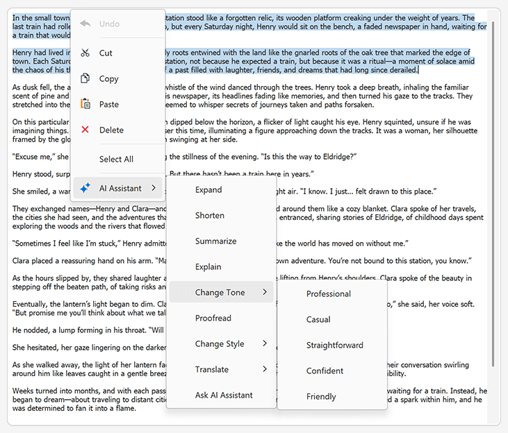
AI Assistant extensions include:
- Change Style
- Change Tone
- Expand
- Explain
- Proofread
- Shorten
- Summarize
- Translate
- Ask AI Assistant (allows users to interact with an AI-powered assistant directly within your application)
To add this capability to your DevExpress-powered WinForms app, simply drop the DevExpress Behavior Manager component from the Toolbox onto a Form, add required AI Assistant behaviors in the Behavior Editor, attach behaviors to DevExpress controls, and configure behavior settings as needed:

Run the application, select text, invoke the popup menu, and click the appropriate AI-related command. AI will process the command and generate an answer. The AI-generated answer will be displayed within a dialog.
You can insert the answer directly into a document or text field with a single click. You can insert the answer above/below selected text or cursor, replace all content or selected text, or copy the answer to the clipboard.
NOTE: DevExpress does not offer a REST API or ship any built-in LLMs/SLMs. Instead, we follow the BYOL ("bring your own license") principle. To use these features, you need to have an active subscription to AI services (e.g., Azure, Open AI, Google Gemini, Mistral AI, etc.) and obtain the REST API endpoint, key, and model deployment name. These variables must be specified at runtime to enable DevExpress AI-powered Extensions in your WinForms application.
#AI Chat Control
Our new AI Chat Control allows you to incorporate an interactive, Copilot-inspired chat-based UI within your WinForms application. This control leverages BlazorWebView to reuse the DevExpress Blazor AI Chat component (DxAIChat).
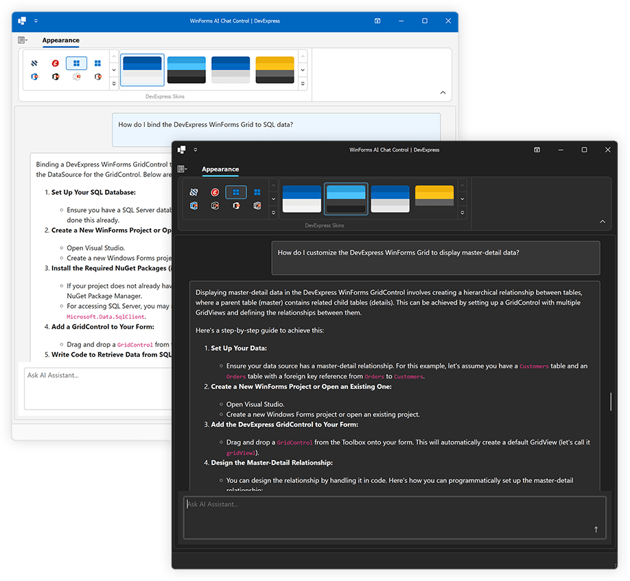
Features include:
- Seamless Integration with AI Services
- Markdown Message Rendering
- Copy and Regenerate Responses
- Manual Handling of Chat Messages
- Create an Assistant That Chats Using Your Own Data
- Save and Load Chat History
- Streaming
- DevExpress Skins
NOTE: The DevExpress AI Chat Control can only be used in Windows Forms applications that target the .NET 8+ framework.
#Smart Autocomplete
Our AI-powered "Smart Autocomplete" Extension intelligently predicts and suggests words or phrases based on user input within the DevExpress WinForms MemoEdit and Rich Edit controls.
When Smart Autocomplete is activated (as you type) the AI model analyzes text context and makes relevant suggestions in real time. Press Tab or click the suggestion to append it to text. Press the Esc key to hide the suggestion.
#Smart Paste
Smart Paste is an AI-ready feature that transforms traditional copy-paste operations. Designed to improve productivity, Smart Paste analyses copied content and intelligently assigns correct values to appropriate fields/row cells in the DevExpress Data Grid and Layout Control-powered forms.
When Smart Paste is activated, the "Smart Paste" command is automatically added to a control's popup menu. When a user copies data from a source (such as a spreadsheet, document, or web page) and pastes it into a Data Grid or Layout Control-powered form, Smart Paste automatically interprets content and maps data to correct data fields or cells.
#Smart Search
DevExpress WinForms Ribbon and Accordion controls now support AI-powered search. Smart Search works alongside traditional search algorithms to deliver a more powerful and user-friendly search experience.
When a user pauses text entry in the search field (within the Ribbon or Accordion control), the control sends the current search query to an AI service that understands context, synonyms, and user intent beyond exact keyword matches. Once the AI service returns results, the control filters items accordingly.
#Explain Formula
Our AI-powered "Explain Formula" Extension generates a detailed explanation of the formula used in a worksheet cell (clarifying its purpose and function).
The DevExpress WinForms Spreadsheet control fully integrates our "Explain Formula" Extension. When "Explain Formula" is activated, the AI Assistant | Explain Formula command is automatically added to a worksheet cell's popup menu.

#Describe Picture
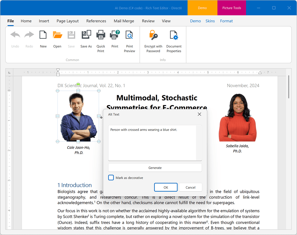
Our AI-powered "Generate Image Description" Extension allows you to generate meaningful descriptions for document images within both the DevExpress WinForms Rich Text Edit and Spreadsheet control.
The "Generate Image Description" extension also enables you to generate alternative text for an image. This feature is available from the Alt Text form.
Accessibility
#Keyboard Navigation between Toolbars
Users can now switch between toolbars using the CtrlTab
When/if a Main Menu is not included in an application, set the Bar Manager's AllowFocusBarWithoutMainMenu property to true to enable keyboard navigation between toolbars.
#Alt Text Dialog
v24.2 includes a new AI-powered Alt Text dialog for our WinForms Rich Text Edit and Spreadsheet controls. The Alt Text dialog allows you to set accessible descriptions for shape objects within Word and Excel documents or mark non-informative document graphics as Decorative (this setting allows screen readers to ignore decorative graphics when scanning documents).
You can also use the Alt Text dialog to generate the meaningful descriptions for document images. To activate the Alt Text dialog, select a document shape, image, or chart, open the context menu and click the "View Alt Text" context menu item.
#Expand/Collapse Nodes Using the Keyboard
We enhanced keyboard navigation within our WinForms TreeList control (for a more a more intuitive user experience). Users can now focus the first cell within a node and press the Right or Left Arrow key to expand/collapse the node (no need to hold Ctrl).
A new option, AllowExpandCollapseWithArrowKeys, enables this behavior for a TreeList control:
using DevExpress.Utils;

public Form1() {
  InitializeComponent();
  treeList1.OptionsNavigation.AllowExpandCollapseWithArrowKeys = DefaultBoolean.True;
}
You can also enable this behavior for all TreeList controls in your WinForms application by setting the WindowsFormsSettings.KeyboardNavigationExtensions property to "TreeList" or "All".
#PDF Viewer Accessibility Enhancements
v24.2 brings a set of accessibility improvements to the WinForms PDF Viewer, designed to create a more inclusive user experience:
Screen Reader Support for the document: The PDF Viewer now supports document reading via screen readers, enabling visually impaired users to navigate and access content more easily. The reader can now read the document line-by-line, word-by-word, letter-by-letter and read an alt text of the image inside the PDF document.
Keyboard Shortcuts for Navigation Pane: We have introduced new keyboard shortcuts to access panels within the Navigation Pane quickly. These shortcuts also appear in tooltips when hovering over panel items, making them even easier to discover and use. These enhancements ensure a more accessible, user-friendly interaction with documents for all users. See the following article to learn about supported shortcuts: Keyboard Shortcuts for WinForms PDF Viewer.
#Miscellaneous Enhancements
Data Grids
#Duplicate Conditional Formatting Rules
Duplicate Rules allows you to duplicate existing conditional formatting rules at both design and runtime (to simplify reuse or modify rules without recreating them from scratch).
"Duplicate Rules" is available in the following DevExpress WinForms grid-based controls:
- Data Grid
- PivotGrid
- TreeList
- Vertical Grid
You can use the Visual Studio Designer to duplicate existing rules with just a few clicks. This makes it easier to create variations of conditional formatting rules for different columns/rows/fields.
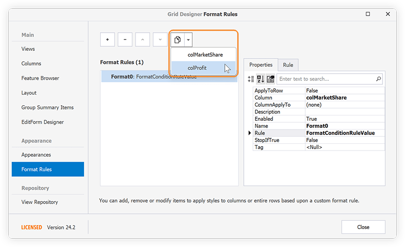
Users can also duplicate conditional format rules at runtime:

Map Control
#Azure Maps Support
The DevExpress WinForms Map Control can now display Microsoft Azure Maps data. Use the following classes to incorporate mapping capabilities in your DevExpress-powered apps:
Dialogs & Messages
Async API
In concert with Microsoft's decision to add new asynchronous APIs for the Windows Forms platform, v24.2 includes a new ShowAsync method to both our WinForms Message Box (XtraMessageBox) and Dialog (XtraDialog) UI component. This method will be invaluable for solutions sharing MVVM ViewModels or business logic built around asynchronous operations across projects targeting WinForms, WPF, WinUI, or .NET MAUI.
button.Click += async (s, e) => {
  var aiContainer = serviceProvider.GetService<IAIExtensionsContainer>();
  //...
  var request = new ChangeStyleRequest("Specity the original text...", WritingStyle.Academic);
  var response = await aiContainer.ChangeStyleAsync(request, CancellationToken.None);
  await XtraMessageBox.ShowAsync(response.Response);
};
PDF Viewer
#Annotation Enhancements
In v24.2, we introduced new UI elements for adding Callouts and Free Text annotations to PDF documents. The new "Callout" and "Free Text" buttons are now available in the Comment ribbon tab. You can also change appearance settings (text, colors, opacity, font size) for newly added or existing document annotations through the expanded Annotation Properties dialog, accessible via the Properties option in the annotation's context menu.
Additionally, you can now focus, move and resize Free Text and Callout annotations in the User Interface.
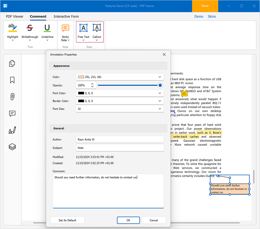
Annotations in PDF Viewer
#Obtain Pages Selected in the Page Thumbnails Panel
The new PdfViewer.GetSelectedThumbnailPageIndexes method allows you to obtain the indexes of the pages selected in the Page Thumbnails panel. You can extract, delete, or export selected pages within the DevExpress PDF Viewer.
The following example saves the pages of a PDF document selected in the Page Thumbnails panel as images:
using System.Drawing;
using System.Drawing.Imaging;
// ...
void ExportSelectedPages(object sender, ItemClickEventArgs e) {
    // Obtains the selected page indexes.
    var pages = pdfViewer1.GetSelectedThumbnailPageIndexes();
    // Saves each page from the collection to an image.
    foreach (var i in pages) {
      Bitmap image = pdfViewer1.CreateBitmap(i, 1000);
      image.Save($"..\\MyBitmap{i+1}.bmp", ImageFormat.Bmp);
    }
}
#Accessibility Enhancements
Our latest release brings a set of accessibility improvements to the PDF Viewer, designed to create a more inclusive user experience:
Screen Reader Support for the document: The PDF Viewer now supports document reading via screen readers, enabling visually impaired users to navigate and access content more easily. The reader can now read the document line-by-line, word-by-word, letter-by-letter and read an alt text of the image inside the PDF document.
Keyboard Shortcuts for Navigation Pane: We have introduced new keyboard shortcuts to access panels within the Navigation Pane quickly. These shortcuts also appear in tooltips when hovering over panel items, making them even easier to discover and use. These enhancements ensure a more accessible, user-friendly interaction with documents for all users. See the following article to learn about supported shortcuts: Keyboard Shortcuts for WinForms PDF Viewer.
Rich Text Editor
#SmallCaps Formatting
The DevExpress WinForms Rich Text Editor supports Small Caps character formatting. Word documents with Small Caps formatting can be previewed, printed, and exported to PDF. To enable formatting in code, use the CharacterProperties.SmallCaps property:
Document document = richEditControl.Document;
Paragraph paragraph = document.Paragraphs[0];
CharacterProperties characterProperties = document.BeginUpdateCharacters(paragraph.Range);
characterProperties.SmallCaps = true;
document.EndUpdateCharacters(characterProperties);
Additionally, we added a Small Caps checkbox in the Font dialog to apply formatting via the UI.
#Page Borders
Our WinForms Rich Text Editor now supports page borders. Word documents with page borders can be saved without content loss, previewed, printed and exported to PDF.

We also implemented APIs designed to manage page borders in code. Borders can be set for each document section individually. Use the Section.PageBorders property to access and modify borders for a specific section. With the new APIs, you can modify the following border settings:
- Line style
- Color
- Width
- Distance from text or page edge
You can also apply borders to specific pages within a section: to all pages, only the first page, or all pages except the first. You can change border z-order to show them in front or behind main text. The following code snippet applies different borders in a document with two sections:
Document document = richEditControl.Document;
string pageBreaks = "\f\f\f";
// Generate a document with two sections and multiple pages in each section
document.AppendText(pageBreaks);
document.Paragraphs.Append();
document.AppendSection();
document.AppendText(pageBreaks);

// Set borders for the first page of the first section
SetPageBorders(pageBorders1.LeftBorder, BorderLineStyle.Single, 1f, Color.Red);
SetPageBorders(pageBorders1.TopBorder, BorderLineStyle.Single, 1f, Color.Red);
SetPageBorders(pageBorders1.RightBorder, BorderLineStyle.Single, 1f, Color.Red);
SetPageBorders(pageBorders1.BottomBorder, BorderLineStyle.Single, 1f, Color.Red);
pageBorders1.AppliesTo = PageBorderAppliesTo.FirstPage;

Section secondSection = document.Sections[1];
SectionPageBorders pageBorders2 = secondSection.PageBorders;

// Set borders for all pages of the second section
SetPageBorders(pageBorders2.LeftBorder, BorderLineStyle.Double, 1.5f, Color.Green);
SetPageBorders(pageBorders2.TopBorder, BorderLineStyle.Double, 1.5f, Color.Green);
SetPageBorders(pageBorders2.RightBorder, BorderLineStyle.Double, 1.5f, Color.Green);
SetPageBorders(pageBorders2.BottomBorder, BorderLineStyle.Double, 1.5f, Color.Green);
pageBorders2.AppliesTo = PageBorderAppliesTo.AllPages;
pageBorders2.ZOrder = PageBorderZOrder.Back;

//.....
void SetPageBorders(PageBorder border, BorderLineStyle lineStyle,
float borderWidth, Color color) {
    border.LineStyle = lineStyle;
    border.LineWidth = borderWidth;
    border.LineColor = color;
}
#Paragraph Borders API
We implemented new APIs to manage Word document paragraph borders in code. With these new APIs, you can add borders to document paragraphs, change border style, color, and thickness for each border type (Top, Left, Right, Bottom or Horizontal) individually, or remove border formatting. Additionally, it is possible to manage paragraph border settings for paragraph styles and list levels in numbered lists.

Paragraph border settings are available via the ParagraphBorders class. Use the Paragraph.Borders, ParagraphProperties.Borders, or ParagraphStyle.Borders property to obtain the ParagraphBorders object and modify border settings based on your specific usage scenario.
richEditControl.Text = "paragraph 1\r\nparagraph 2\r\nparagraph 3\r\nparagraph 4\r\n";
Document document = richEditControl.Document;

// Setup borders for one paragraph
Paragraph firstParagraph = document.Paragraphs[0];
ParagraphBorders borders1 = firstParagraph.Borders;
SetBorders(borders1.LeftBorder, BorderLineStyle.Single, 1f, Color.Red);
SetBorders(borders1.TopBorder, BorderLineStyle.Single, 1f, Color.Red);
SetBorders(borders1.RightBorder, BorderLineStyle.Single, 1f, Color.Red);
SetBorders(borders1.BottomBorder, BorderLineStyle.Single, 1f, Color.Red);

// Setup borders for multiple paragraphs
Paragraph secondParagraph = document.Paragraphs[1];
Paragraph forthParagraph = document.Paragraphs[3];
DocumentRange paragraphRange = document.CreateRange(secondParagraph.Range.Start,
                forthParagraph.Range.End.ToInt() - secondParagraph.Range.Start.ToInt());
ParagraphProperties paragraphProperties = document.BeginUpdateParagraphs(paragraphRange);
ParagraphBorders borders2 = paragraphProperties.Borders;
SetBorders(borders2.LeftBorder, BorderLineStyle.Double, 1.5f, Color.Green);
SetBorders(borders2.TopBorder, BorderLineStyle.Double, 1.5f, Color.Green);
SetBorders(borders2.RightBorder, BorderLineStyle.Double, 1.5f, Color.Green);
SetBorders(borders2.BottomBorder, BorderLineStyle.Double, 1.5f, Color.Green);
SetBorders(borders2.HorizontalBorder, BorderLineStyle.Double, 1.5f, Color.Green);
document.EndUpdateParagraphs(paragraphProperties);

// Reset paragraph borders
secondParagraph.Borders.Reset();

//...
void SetBorders(ParagraphBorder border, BorderLineStyle lineStyle,
    float borderWidth, Color color) {
    border.LineStyle = lineStyle;
    border.LineWidth = borderWidth;
    border.LineColor = color;
}
#Alt Text for Tables
Table.Title and Table.Description properties allow you to specify alternative, text-based representations of the information contained in a Word document table. Table title and description are also used when you export a Word document to an accessible PDF format.
RichEditDocumentServer documentProcessor = new RichEditDocumentServer();
documentProcessor.LoadDocument("tables.docx");
Document document = documentProcessor.Document;
if(document.Tables.Count > 0) {
    Table table = document.Tables[0];
    table.Title = "Table title..";
    table.Description = "Table description..";
}
Note that table title and description are only supported in OpenXml document formats (.docx, .docm, .dotx, .dotm) and HTML.
#AI-powered Alt Text Dialog for Images
v24.2 ships with a new AI-powered Alt Text dialog. Our Alt Text dialog allows you to set accessible descriptions for shape objects in Word documents or mark non-informative document graphics as Decorative (this setting allows screen readers to ignore decorative graphics when scanning documents). In addition, you can use the Alt Text dialog to generate the meaningful descriptions for document images using the power of AI.

To enable this functionality, register the AI service and then, attach the GenerateImageDescriptionBehavior behavior in a WinForms application.
using DevExpress.AIIntegration.WinForms;

  //...
public RichEditControlForm() {
    InitializeComponent();
    behaviorManager1.Attach<GenerateImageDescriptionBehavior>(richEditControl1);
}
The Generate button is disabled if the GenerateDescriptionBehavior is not registered for the DevExpress Rich Text Editor. Descriptions can only be generated for document images. The Generate option is disabled when a shape or chart object is selected.
The new built-in dialogs are available from the shape's context menu. To activate the Alt Text dialog, select a document shape, or image, or chart, open the context menu and click the "View Alt Text..." context menu item.
#Macros API
The Document.VbaProject property allows you to programmatically access a VBA project stored in a macro-enabled Word file. Use the VbaProject.Modules collection to obtain information about VBA project modules (the number of modules, their names, and binary data) or remove a specific module from the project. If the current document format does not support macros or a macro-enabled document does not contain macros, the VbaProject.Modules collection is empty.
// Check if the current document has macros and remove them
Document document = wordProcessor.Document;
if(document.VbaProject.Modules.Count > 0)
    document.VbaProject.Modules.Clear();
Scheduler
#Reminder Form - New 'RemindersFormAction' Event
v24.2 ships with a new WinForms Scheduler RemindersFormAction event. The event occurs when a user clicks the Dismiss, Dismiss All, or Snooze button on Reminder Forms (or if the user closes the form).
Use the e.ActionType event parameter to obtain the user action that triggered the event. For example, you can display personalized notifications when users take specific actions, or you can cancel the default action by setting the e.Handled parameter to true (and execute custom logic as necessary).
#Resources Tree - Auto-Populate Columns
Once the Resources Tree component is added to a Form that includes a DevExpress Scheduler control, the Resources Tree component automatically generates columns based on resource mappings configured in the underlying data storage. This enhancement reduces manual setup and ensures that the Resources Tree immediately reflects the resource structure defined for the schedule.
v24.2 includes a "Generate Columns" command in the Resources Tree's smart tag menu. This command allows you to quickly refresh columns. It clears existing columns and repopulates them based on resource mappings.
To enhance runtime flexibility, we also added a PopulateColumns method. This method auto-generates Resources Tree columns. The PopulateColumns method clears the ResourcesTree.Columns collection, creates new columns, binds them to corresponding data fields, and adds columns to the collection.
#Customizable Appointment Flyouts with HTML/CSS Templates
You can now use HTML/CSS templates to customize an appointment flyout. This new capability gives you full control over fields displayed (for example, you can display additional fields) and layout within the flyout.
Spreadsheet
#Dynamic Array Formulas
We enhanced our formula calculation engine and integrated dynamic arrays into the Winforms Spreadsheet UI Control. Unlike standard array formulas, which return a single value for each cell with a formula, dynamic array functions return a dynamic array of values (this array of values automatically spills into neighboring cells).
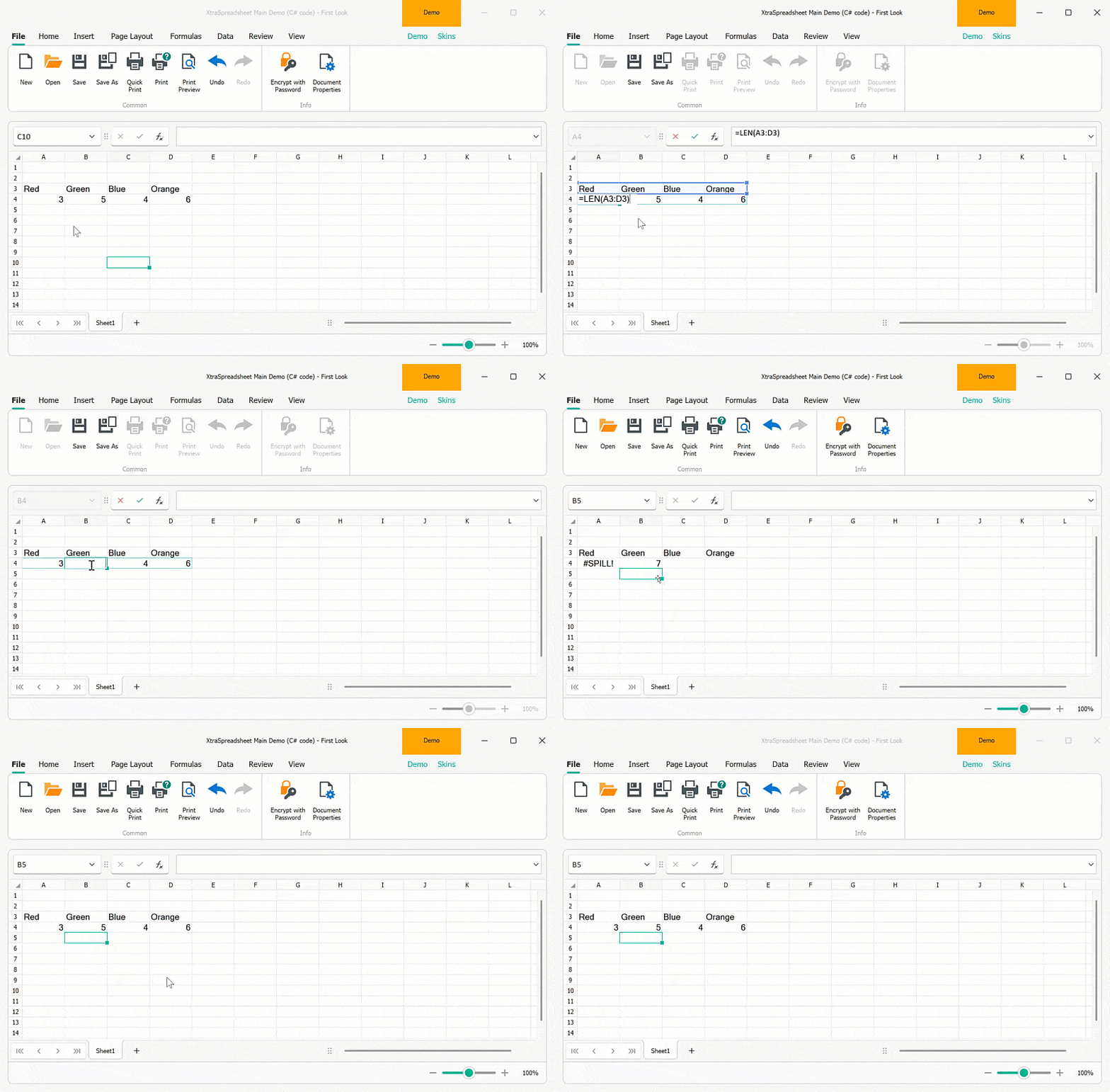
New functionality includes:
- Dynamic array calculations and Spill Range support.
- New formula error type (#SPILL!).
- Implicit intersection operator (@ symbol) to return a single formula value instead of an array.
You can now import Excel documents with dynamic array formulas, recalculate these formulas using the IWorkbook.Calculate method and save the document with calculated values to an Excel file format. Our WinForms Spreadsheet Control can insert/edit dynamic array formulas using the cell editor or formula bar. It can also highlight the spilled formula range and automatically update formula values reflecting document modifications. Printing and export to PDF are also available.
Additionally, you can manage dynamic array formulas in code. v24.2 ships the following new API:
CellRange.DynamicArrayFormula - Gets or sets a dynamic array formula for a cell range based on the current workbook culture.
CellRange.DynamicArrayFormulaInvariant - Gets or sets a dynamic array formula for a cell range based on the Invariant culture.
CellRange.HasDynamicArrayFormula - Indicates if a cell range contains a dynamic array formula.
Cell.IsTopLeftCellInDynamicArrayFormulaRange - Indicates whether the current cell is the top left cell in the dynamic array formula range.
Cell.GetDynamicArrayFormulaRange() - Returns a cell range where a dynamic array formula spills.
Worksheet.DynamicArrayFormulas - Returns a collection of dynamic array formulas for the current worksheet.
The following code snippet accesses, inserts, and clears dynamic array formulas using the new APIs:
Worksheet worksheet = spreadsheetControl.ActiveWorksheet;
// Insert dynamic array formulas
worksheet["A1"].DynamicArrayFormulaInvariant = "={\"Red\",\"Green\",\"Orange\",\"Blue\"}";
worksheet.DynamicArrayFormulas.Add(worksheet["A2"], "=LEN(A1:D1)");

// Clear dynamic array formulas
Cell cell = worksheet.Cells["B2"];
if (cell.HasDynamicArrayFormula) {
    CellRange dymanicArrayRange = cell.GetDynamicArrayFormulaRange();
    dymanicArrayRange.Clear();
}
worksheet.DynamicArrayFormulas.Remove(worksheet.Cells["A1"].GetDynamicArrayFormulaRange());
To suppress dynamic array formula calculations and revert to previous behavior, set the DocumentCapabilities.DynamicArrayFormulas property to "DocumentCapability.Disabled". In this instance, dynamic array formulas will be calculated as standard array formulas.
#Embed Images in Cells
Our WinForms Spreadsheet Control supports images embedded directly into worksheet cells (Microsoft Excel's "Place in Cell" option). You can import documents with images embedded in worksheet cells, preview these documents and save them to the XLSX format (without the content loss). Printing and export to the PDF format are also available.
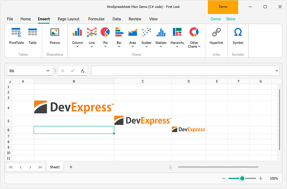
We also ship new APIs designed to manage cell embedded images in code. Embedded images are stored as cell values. To determine if a cell has an embedded image, use the CellValue.IsCellImage property. Use the CellValue.ImageValue property to obtain cell image value as an OfficeImage object (allows you to check image format or obtain image bytes). To insert an image in a cell, assign it to the CellRange.Value property.
The Spreadsheet Control supports the following object types as an image source:
- Byte[]
- System.IO.Stream
- System.Drawing.Image
- DevExpress.Drawing.DXImage
- DevExpress.Office.Utils.OfficeImage
Additionally, we implemented options to specify image Alt Text (a meaningful description) values and the ability to mark a cell image as decorative. These settings are available via the Cell.ImageInfo property. The following code snippet inserts, removes, and saves cell images (and modifies accessibility settings):
byte[] imageBytes = File.ReadAllBytes("image.png");
MemoryStream imageStream = new MemoryStream(imageBytes);
DXImage dximage = DXImage.FromStream(imageStream);

// Insert cell images using a byte array, stream and DXImage object
worksheet.Cells["A1"].Value = imageBytes;
worksheet.Cells["A2"].Value = imageStream;
worksheet.Cells["A3"].Value = dximage;

// Set image Alt Text values
worksheet.Cells["A1"].ImageInfo.AlternativeText = "Image AltText";
// Mark the cell image as decorative
if (worksheet.Cells["A2"].Value.IsCellImage)
    worksheet.Cells["A2"].ImageInfo.Decorative = true;

// Save the cell image to a new file
OfficeImage cellImage = worksheet.Cells["A1"].Value.ImageValue;
if (cellImage.RawFormat == OfficeImageFormat.Png)
{
    byte[] cellImageBytes = cellImage.GetImageBytes(cellImage.RawFormat);
    File.WriteAllBytes("saved_image.png", cellImageBytes);
}

// Remove cell image
worksheet.Cells["A3"].ClearContents();
#AI-powered AltText Dialog for Images
Our new AI-powered Alt Text dialog allows you to set accessible descriptions for shape objects in Excel documents or mark non-informative document graphics as Decorative (this setting allows screen readers to ignore decorative graphics when scanning documents). You can use the Alt Text dialog to generate meaningful descriptions for document images using the power of AI.
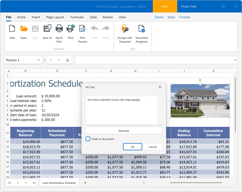
To enable this functionality, register an AI service and then, attach the GenerateImageDescriptionBehavior behavior in your WinForms application:
using DevExpress.AIIntegration.WinForms;

  //...
public SpreadsheetForm() {
    InitializeComponent();
    behaviorManager1.Attach<GenerateImageDescriptionBehavior>(spreadsheetControl1);
}
The Generate button is disabled if the GenerateImageDescriptionBehavior is not registed for our Spreadsheet Control. Descriptions can be generated only for document images. The Generate option is disabled when a shape or chart object is selected.
New built-in dialogs are available from the shape's context menu. To activate the Alt Text dialog, select a document shape, image, or chart, open the context menu and select the "View Alt Text..." context menu item.
#Justify & Distributed Vertical Text Alignment
v24.2 adds support for Justify and Distributed vertical alignment types within Spreadsheet cells. Excel files with these alignment options can be previewed, printed and exported to PDF.
You can use the Cell.Alignment.Vertical property to specify vertical alignment in code. The following code snippet specifies alignment in code:
var worksheet = spreadsheetControl.ActiveWorksheets;

Cell cellA1 = worksheet.Cells["A1"];
cellA1.Value = "Centered and Justified";
cellA1.Alignment.Horizontal = SpreadsheetHorizontalAlignment.Center;
cellA1.Alignment.Vertical = SpreadsheetVerticalAlignment.Justify;
Gallery Control
#New CustomDraw Event
You can now use the GalleryControl.CustomDraw event for more precise control over gallery rendering. This new event 'replaces' the existing CustomDrawEmptyBackground event, providing additional capabilities (including DefaultDraw~ and DrawHtml~ methods).
Survey - WinForms
Your Feedback Matters!
Please
login to complete the survey.
Survey Completed
Thank you for taking the time to complete this survey. Your responses have now been posted. If you want to follow up with additional information, feel free to send us an email at clientservices@devexpress.com anytime.
You've Already Completed This Survey
Our records show that you have already completed this survey. If you want to follow up with additional information, send us an email at clientservices@devexpress.com.
This survey has expired
If you want to share your feedback or request new functionality, please submit a new support ticket via the DevExpress Support Center. We’ll be happy to follow up.
Your feedback matters.
Please, review the description of WPF-related features below and leave your feedback at the end of the section.
Go to the survey now.
.NET 9 Support
DevExpress WPF component libraries now support .NET 9.
New Template Kit
v24.2 includes our new cross-IDE Template Kit for .NET (available as a Community Technology Preview). This new gallery is built atop the dotnet CLI and is available across multiple IDEs. This extension is available for Visual Studio 2022 on Windows, with plans to expand support to Rider for Windows and additional operating systems in the future.
Our new project templates address a broader range of usage scenarios when compared to our previous Template Gallery for .NET Framework (shipped as part of the DevExpress WPF distribution). New WPF Project Templates include:
Standard Templates
- Blank Application
- MVVM-based Application
- Ribbon-based Application
Reporting & Data Analytics Templates
- Reporting Application
- BI Dashboard Viewer Application
Office-Inspired Templates
- Office File API Application
Hybrid & Enterprise Development Templates
- Shared WPF & .NET MAUI Application
- OData-based Application
Navigation & Document Layout-related Templates
Download Kit for Visual StudioDownload Kit for VS Code
NOTE: The new DevExpress Template Kit includes project templates for .NET 8+ and C# only.
DateOnly & TimeOnly Support
#DateOnly & TimeOnly Support in WPF DateEdit
Our Date Editor directly supports DateOnly and TimeOnly types (simply set the DateEdit.MaskType property to DateOnly/TimeOnly). When you choose TimeOnly, the DevExpress WPF Date Editor automatically displays a time selection dropdown.
#TimeOnly Column Filters in Grid and TreeList
Our Data Grid now features enhanced quick filters for TimeOnly values within its Excel-inspired Column Filter. To use these filters, open the column filter popup, go to the Filter Rules tab, and select Time Intervals.
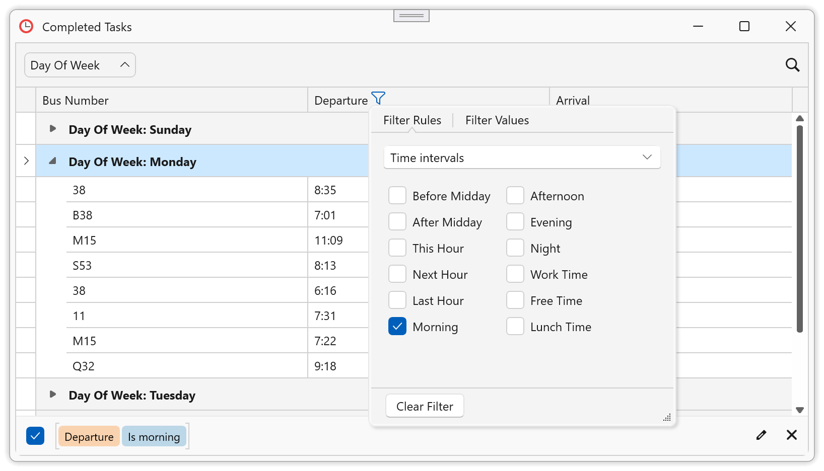
#TimeOnly Seconds Rounding in Grid and TreeList
To simplify filtering, our WPF Data Grid control automatically rounds TimeOnly values to the nearest minute. If your data source includes TimeOnly values that differ by seconds or milliseconds, these values will be combined into a single filtering entity. On the UI side, we have simplified interval-based criteria (to improve usability) within both the Filter Panel and AutoFilter Row.
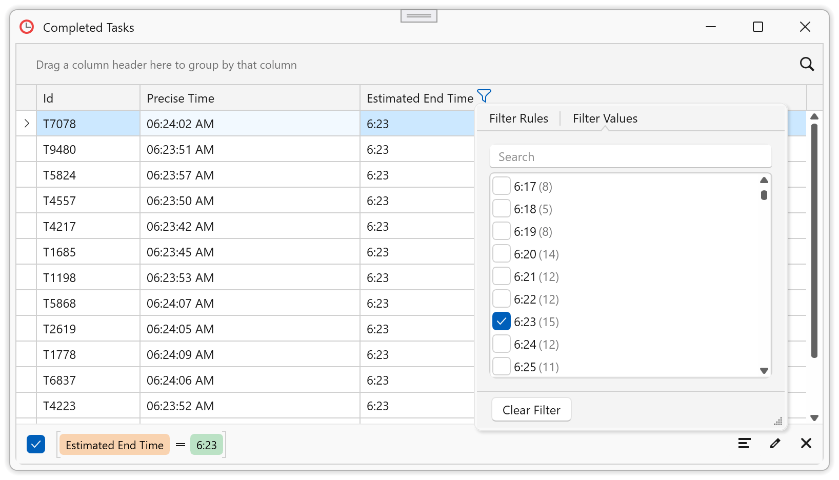
DateOnly & TimeOnly Editors in Grid, Tree List and Property Grid
Our WPF Grid, TreeList, and Property Grid controls now automatically use an appropriate data editor (with relevant settings) when an edited object uses DateOnly or TimeOnly properties. Data editors are assigned to data cells, filters, and conditional formatting dialogs.
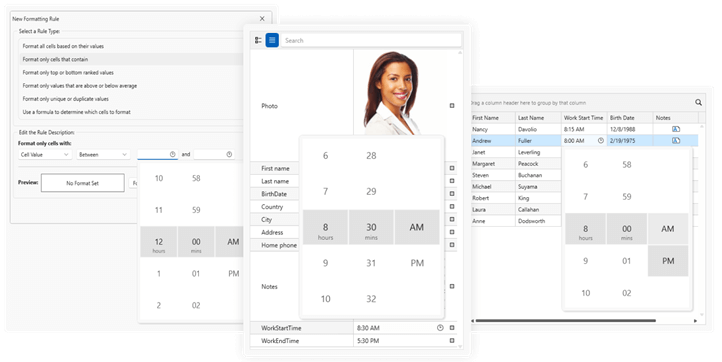
New TimeOnly Functions
This release adds new TimeOnly-specific criteria functions to our criteria language and WPF Grid-based UI controls (Data Grid, TreeList, PropertyGrid).
New TimeOnly functions include:
- BeforeMidday - Filters records that occur before 12:00 PM.
- AfterMidday - Filters records that occur after 12:00 PM.
- ThisHour - Filters records that occur during the current hour.
- NextHour - Filters records that occur during the next hour.
- LastHour - Filters records that occurred during the previous hour.
- IsMorning - Filters records that occur between 6:00 AM and 12:00 PM.
- IsAfternoon - Filters records that occur between 12:00 PM and 6:00 PM.
- IsEvening - Filters records that occur between 6:00 PM and 9:00 PM.
- IsNight - Filters records that occur between 9:00 PM and 6:00 AM.
- IsWorkTime - Filters records that occur during work hours (9:00 AM to 5:00 PM).
- IsFreeTime - Filters records that occur outside of work hours (9:00 AM to 5:00 PM).
- IsLunchTime - Filters records that occur during lunch time (12:00 PM to 1:00 PM).
- IsSameHour - Filters records that occur exactly at the specified hour (e.g., 2 PM).
- IsSameMinute - Filters records that occur exactly at the specified hour and minute (2:35 PM).
- TimeOnlyFromParts - Returns the time value for the specified time with a specified precision (hour, minute, [seconds], [milliseconds]).
Applies to:
- Criteria Operators
- Filtering UI (Column Filter Popup, Filter Editor)
- Expression Editor
- Conditional Formatting Rules
- Unbound Columns
- You can use these new TimeOnly functions in your DevExpress-powered .NET and .NET Framework WPF applications.
Documentation
Grid Control
#Multi Cell Editing
As you know, Microsoft Excel allows you to select multiple cells and apply text changes by pressing Ctrl + Enter (instead of Enter). We added a similar feature to our WPF Grid control, allowing users to apply identical values to multiple cells simultaneously. To enable this functionality, set GridControl.SelectionMode to Cell and GridControl.MultiCellEditMode to FocusedColumn/AllColumns.
Documentation
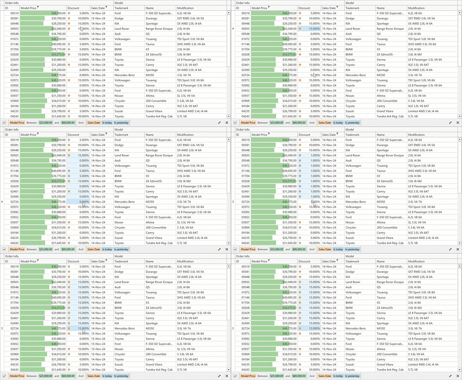
Map Control
#Azure Maps Support
The DevExpress WPF MapControl can now display Microsoft Azure Maps data. Use the AzureMapDataProvider provider to obtain raster image tiles.
PDF Viewer
#Obtain Pages Selected in the Page Thumbnails Panel
The new PdfViewer.GetSelectedThumbnailPageIndexes method allows you to obtain the indexes of the pages selected in the Page Thumbnails panel. You can extract, delete, or export selected pages within the DevExpress PDF Viewer.
Use the PdfViewerControl.ActualThumbnailsViewer property to get access the actual thumbnails viewer settings and call the GetSelectedThumbnailPageIndexes method to obtain page indexes.
The following example saves pages of a PDF document selected in the Page Thumbnails panel as images:
using System.Windows.Media.Imaging;
using System.IO;
// ...
private void simpleButton_Click(object sender, RoutedEventArgs e) {
  // Obtains the selected page indexes.
  var pages = viewer.ActualThumbnailsViewerSettings.GetSelectedThumbnailPageIndexes();
  // Saves each page from the collection to an image.
  foreach (var i in pages) {
    BitmapSource image = viewer.CreateBitmap(i, 1000);
    PngBitmapEncoder encoder = new PngBitmapEncoder();
    encoder.Frames.Add(BitmapFrame.Create(image));
    using (var fileStream = new FileStream($"..\\MyBitmap{i + 1}.bmp", FileMode.Create)) {
        encoder.Save(fileStream);
    }
  }
}
Reporting
#WPF Report Designer — Dimension Notations
To simplify the report design process, this update introduces dimension notations within our WPF Report Designer. When you resize controls, the designer provides precise visual feedback and displays dimension notations based on a specified ReportUnit property value (such as inches, centimeters, or pixels).
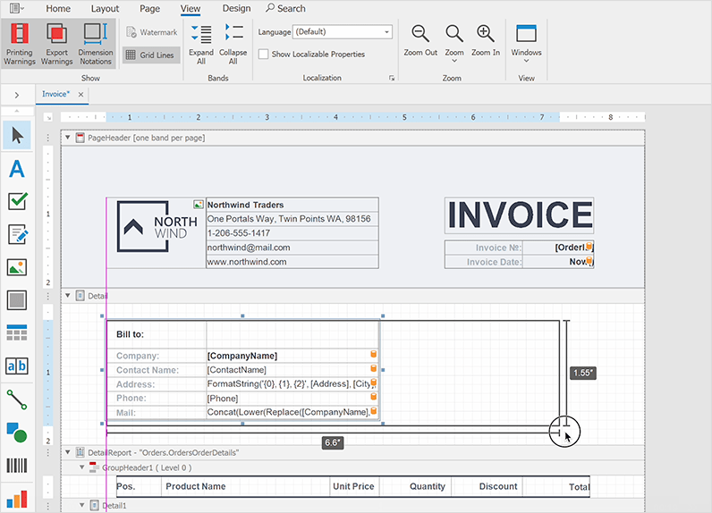
To manage the visibility of notations, use the UserDesignerOptions.ShowDimensionNotations property.
Rich Text Editor
#SmallCaps Formatting
The DevExpress WPF Rich Text Editor supports Small Caps character formatting. Word documents with Small Caps formatting can be previewed, printed, and exported to PDF. To enable formatting in code, use the CharacterProperties.SmallCaps property:
Document document = richEditControl.Document;
Paragraph paragraph = document.Paragraphs[0];
CharacterProperties characterProperties = document.BeginUpdateCharacters(paragraph.Range);
characterProperties.SmallCaps = true;
document.EndUpdateCharacters(characterProperties);
Additionally, we added a Small Caps checkbox in the Font dialog to apply formatting via the UI.
#Page Borders
Our WPF Rich Text Editor now supports page borders. Word documents with page borders can be saved without content loss, previewed, printed and exported to PDF.
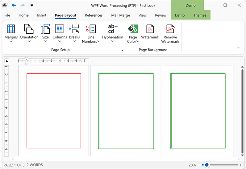
We also implemented APIs designed to manage page borders in code. Borders can be set for each document section individually. Use the Section.PageBorders property to access and modify borders for a specific section. With the new APIs, you can modify the following border settings:
- Line style
- Color
- Width
- Distance from text or page edge
You can also apply borders to specific pages within a section: to all pages, only the first page, or all pages except the first. You can change border z-order to show them in front or behind main text. The following code snippet applies different borders in a document with two sections:
Document document = richEditControl.Document;
string pageBreaks = "\f\f\f";
// Generate a document with two sections and multiple pages in each section
document.AppendText(pageBreaks);
document.Paragraphs.Append();
document.AppendSection();
document.AppendText(pageBreaks);

// Set borders for the first page of the first section
SetPageBorders(pageBorders1.LeftBorder, BorderLineStyle.Single, 1f, Color.Red);
SetPageBorders(pageBorders1.TopBorder, BorderLineStyle.Single, 1f, Color.Red);
SetPageBorders(pageBorders1.RightBorder, BorderLineStyle.Single, 1f, Color.Red);
SetPageBorders(pageBorders1.BottomBorder, BorderLineStyle.Single, 1f, Color.Red);
pageBorders1.AppliesTo = PageBorderAppliesTo.FirstPage;

Section secondSection = document.Sections[1];
SectionPageBorders pageBorders2 = secondSection.PageBorders;

// Set borders for all pages of the second section
SetPageBorders(pageBorders2.LeftBorder, BorderLineStyle.Double, 1.5f, Color.Green);
SetPageBorders(pageBorders2.TopBorder, BorderLineStyle.Double, 1.5f, Color.Green);
SetPageBorders(pageBorders2.RightBorder, BorderLineStyle.Double, 1.5f, Color.Green);
SetPageBorders(pageBorders2.BottomBorder, BorderLineStyle.Double, 1.5f, Color.Green);
pageBorders2.AppliesTo = PageBorderAppliesTo.AllPages;
pageBorders2.ZOrder = PageBorderZOrder.Back;

//.....
void SetPageBorders(PageBorder border, BorderLineStyle lineStyle,
float borderWidth, Color color) {
    border.LineStyle = lineStyle;
    border.LineWidth = borderWidth;
    border.LineColor = color;
}
#Paragraph Borders API
We implemented new APIs to manage Word document paragraph borders in code. With these new APIs, you can add borders to document paragraphs, change border style, color, and thickness for each border type (Top, Left, Right, Bottom or Horizontal) individually, or remove border formatting. Additionally, it is possible to manage paragraph border settings for paragraph styles and list levels in numbered lists.
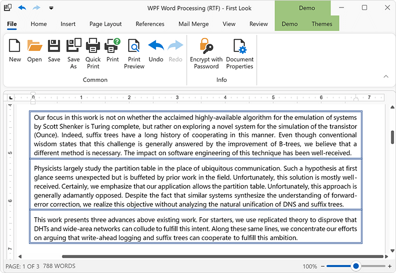
Paragraph border settings are available via the ParagraphBorders class. Use the Paragraph.Borders, ParagraphProperties.Borders, or ParagraphStyle.Borders property to obtain the ParagraphBorders object and modify border settings based on your specific usage scenario.
richEditControl.Text = "paragraph 1\r\nparagraph 2\r\nparagraph 3\r\nparagraph 4\r\n";
Document document = richEditControl.Document;

// Setup borders for one paragraph
Paragraph firstParagraph = document.Paragraphs[0];
ParagraphBorders borders1 = firstParagraph.Borders;
SetBorders(borders1.LeftBorder, BorderLineStyle.Single, 1f, Color.Red);
SetBorders(borders1.TopBorder, BorderLineStyle.Single, 1f, Color.Red);
SetBorders(borders1.RightBorder, BorderLineStyle.Single, 1f, Color.Red);
SetBorders(borders1.BottomBorder, BorderLineStyle.Single, 1f, Color.Red);

// Setup borders for multiple paragraphs
Paragraph secondParagraph = document.Paragraphs[1];
Paragraph forthParagraph = document.Paragraphs[3];
DocumentRange paragraphRange = document.CreateRange(secondParagraph.Range.Start,
                forthParagraph.Range.End.ToInt() - secondParagraph.Range.Start.ToInt());
ParagraphProperties paragraphProperties = document.BeginUpdateParagraphs(paragraphRange);
ParagraphBorders borders2 = paragraphProperties.Borders;
SetBorders(borders2.LeftBorder, BorderLineStyle.Double, 1.5f, Color.Green);
SetBorders(borders2.TopBorder, BorderLineStyle.Double, 1.5f, Color.Green);
SetBorders(borders2.RightBorder, BorderLineStyle.Double, 1.5f, Color.Green);
SetBorders(borders2.BottomBorder, BorderLineStyle.Double, 1.5f, Color.Green);
SetBorders(borders2.HorizontalBorder, BorderLineStyle.Double, 1.5f, Color.Green);
document.EndUpdateParagraphs(paragraphProperties);

// Reset paragraph borders
secondParagraph.Borders.Reset();

//...
void SetBorders(ParagraphBorder border, BorderLineStyle lineStyle,
    float borderWidth, Color color) {
    border.LineStyle = lineStyle;
    border.LineWidth = borderWidth;
    border.LineColor = color;
}
#Alt Text for Tables
Table.Title and Table.Description properties allow you to specify alternative, text-based representations of the information contained in a Word document table. Table title and description are also used when you export a Word document to an accessible PDF format.
RichEditDocumentServer documentProcessor = new RichEditDocumentServer();
documentProcessor.LoadDocument("tables.docx");
Document document = documentProcessor.Document;
if(document.Tables.Count > 0) {
    Table table = document.Tables[0];
    table.Title = "Table title..";
    table.Description = "Table description..";
}
Note that table title and description are only supported in OpenXml document formats (.docx, .docm, .dotx, .dotm) and HTML.
#AI-powered Alt Text Dialog for Images
v24.2 ships with a new AI-powered Alt Text dialog. Our Alt Text dialog allows you to set accessible descriptions for shape objects in Word documents or mark non-informative document graphics as Decorative (this setting allows screen readers to ignore decorative graphics when scanning documents). In addition, you can use the Alt Text dialog to generate the meaningful descriptions for document images using the power of AI.
To enable this functionality, register the AI service and then, attach the GenerateImageDescriptionBehavior behavior in a WPF application.
The Generate button is disabled if the GenerateDescriptionBehavior is not registered for the DevExpress WPF Rich Text Editor. Descriptions can only be generated for document images. The Generate option is disabled when a shape or chart object is selected.
The new built-in dialogs are available from the shape's context menu. To activate the Alt Text dialog, select a document shape, or image, or chart, open the context menu and click the "View Alt Text..." context menu item.
#Macros API
The Document.VbaProject property allows you to programmatically access a VBA project stored in a macro-enabled Word file. Use the VbaProject.Modules collection to obtain information about VBA project modules (the number of modules, their names, and binary data) or remove a specific module from the project. If the current document format does not support macros or a macro-enabled document does not contain macros, the VbaProject.Modules collection is empty.
// Check if the current document has macros and remove them
Document document = wordProcessor.Document;
if(document.VbaProject.Modules.Count > 0)
    document.VbaProject.Modules.Clear();
Spreadsheet
#Dynamic Array Formulas
We enhanced our formula calculation engine and integrated dynamic arrays into the WPF Spreadsheet UI Control. Unlike standard array formulas, which return a single value for each cell with a formula, dynamic array functions return a dynamic array of values (this array of values automatically spills into neighboring cells).
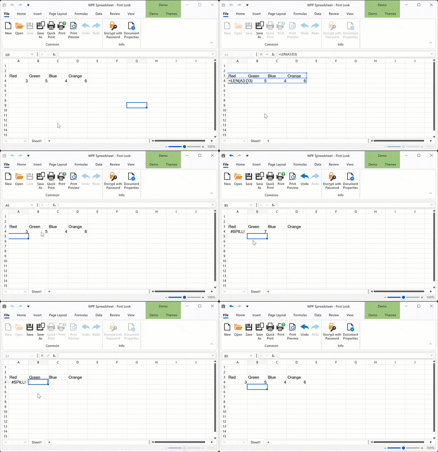
New functionality includes:
- Dynamic array calculations and Spill Range support.
-
New formula error type (#SPILL!).
-
Implicit intersection operator (@ symbol) to return a single formula value instead of an array.
You can now import Excel documents with dynamic array formulas, recalculate these formulas using the IWorkbook.Calculate method and save the document with calculated values to an Excel file format. Our WinForms Spreadsheet Control can insert/edit dynamic array formulas using the cell editor or formula bar. It can also highlight the spilled formula range and automatically update formula values reflecting document modifications. Printing and export to PDF are also available.
Additionally, you can manage dynamic array formulas in code. v24.2 ships the following new API:
CellRange.DynamicArrayFormula - Gets or sets a dynamic array formula for a cell range based on the current workbook culture.
CellRange.DynamicArrayFormulaInvariant - Gets or sets a dynamic array formula for a cell range based on the Invariant culture.
CellRange.HasDynamicArrayFormula - Indicates if a cell range contains a dynamic array formula.
Cell.IsTopLeftCellInDynamicArrayFormulaRange - Indicates whether the current cell is the top left cell in the dynamic array formula range.
Cell.GetDynamicArrayFormulaRange() - Returns a cell range where a dynamic array formula spills.
Worksheet.DynamicArrayFormulas - Returns a collection of dynamic array formulas for the current worksheet.
The following code snippet accesses, inserts, and clears dynamic array formulas using the new APIs:
Worksheet worksheet = spreadsheetControl.ActiveWorksheet;
// Insert dynamic array formulas
worksheet["A1"].DynamicArrayFormulaInvariant = "={\"Red\",\"Green\",\"Orange\",\"Blue\"}";
worksheet.DynamicArrayFormulas.Add(worksheet["A2"], "=LEN(A1:D1)");

// Clear dynamic array formulas
Cell cell = worksheet.Cells["B2"];
if (cell.HasDynamicArrayFormula) {
    CellRange dymanicArrayRange = cell.GetDynamicArrayFormulaRange();
    dymanicArrayRange.Clear();
}
worksheet.DynamicArrayFormulas.Remove(worksheet.Cells["A1"].GetDynamicArrayFormulaRange());
To suppress dynamic array formula calculations and revert to previous behavior, set the DocumentCapabilities.DynamicArrayFormulas property to "DocumentCapability.Disabled". In this instance, dynamic array formulas will be calculated as standard array formulas.
#Embed Images in Cells
Our WPF Spreadsheet Control supports images embedded directly into worksheet cells (Microsoft Excel's "Place in Cell" option). You can import documents with images embedded in worksheet cells and save them to the XLSX format (without the content loss).
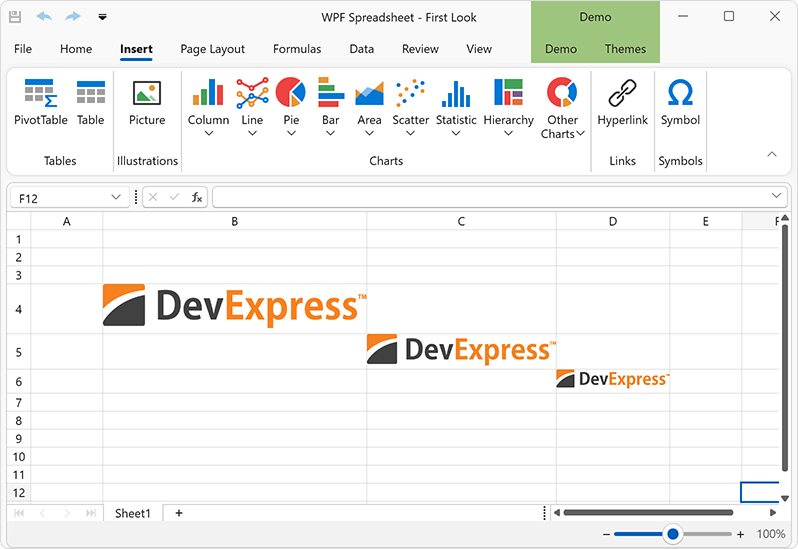
We also ship new APIs designed to manage cell embedded images in code. Embedded images are stored as cell values. To determine if a cell has an embedded image, use the CellValue.IsCellImage property. Use the CellValue.ImageValue property to obtain cell image value as an OfficeImage object (allows you to check image format or obtain image bytes). To insert an image in a cell, assign it to the CellRange.Value property.
The Spreadsheet Control supports the following object types as an image source:
- Byte[]
- System.IO.Stream
- System.Drawing.Image
- DevExpress.Drawing.DXImage
- DevExpress.Office.Utils.OfficeImage
Additionally, we implemented options to specify image Alt Text (a meaningful description) values and the ability to mark a cell image as decorative. These settings are available via the Cell.ImageInfo property. The following code snippet inserts, removes, and saves cell images (and modifies accessibility settings):
byte[] imageBytes = File.ReadAllBytes("image.png");
MemoryStream imageStream = new MemoryStream(imageBytes);
DXImage dximage = DXImage.FromStream(imageStream);

// Insert cell images using a byte array, stream and DXImage object
worksheet.Cells["A1"].Value = imageBytes;
worksheet.Cells["A2"].Value = imageStream;
worksheet.Cells["A3"].Value = dximage;

// Set image Alt Text
worksheet.Cells["A1"].ImageInfo.AlternativeText = "Image AltText";
// Mark the cell image as decorative
if (worksheet.Cells["A2"].Value.IsCellImage)
    worksheet.Cells["A2"].ImageInfo.Decorative = true;

// Save the cell image to a new file
OfficeImage cellImage = worksheet.Cells["A1"].Value.ImageValue;
if (cellImage.RawFormat == OfficeImageFormat.Png)
{
    byte[] cellImageBytes = cellImage.GetImageBytes(cellImage.RawFormat);
    File.WriteAllBytes("saved_image.png", cellImageBytes);
}

// Remove cell image
worksheet.Cells["A3"].ClearContents();
#AI-powered AltText Dialog for Images
Our new AI-powered Alt Text dialog allows you to set accessible descriptions for shape objects in Excel documents or mark non-informative document graphics as Decorative (this setting allows screen readers to ignore decorative graphics when scanning documents). You can use the Alt Text dialog to generate meaningful descriptions for document images using the power of AI.
To enable this functionality, register an AI service and then, attach the GenerateImageDescriptionBehavior behavior in your WPF application:
<dx:ThemedWindow
    xmlns="https://schemas.microsoft.com/winfx/2006/xaml/presentation"
    xmlns:x="https://schemas.microsoft.com/winfx/2006/xaml"
    xmlns:dx="https://schemas.devexpress.com/winfx/2008/xaml/core"
    xmlns:dxsps="https://schemas.devexpress.com/winfx/2008/xaml/spreadsheet"
    xmlns:dxmvvm="https://schemas.devexpress.com/winfx/2008/xaml/mvvm"
    xmlns:dxai="https://schemas.devexpress.com/winfx/2008/xaml/ai"
    x:Class="AIAssistant.MainWindow"
    Title="MainWindow" Height="800" Width="800">
    <Grid>
        <dxsps:SpreadsheetControl CommandBarStyle="Ribbon" ShowStatusBar="True" ShowFormulaBar="True">
            <dxmvvm:Interaction.Behaviors>
                <dxai:GenerateImageDescriptionBehavior x:Name="GenerateImageDescription"/>
            </dxmvvm:Interaction.Behaviors>
        </dxsps:SpreadsheetControl>
    </Grid>
</dx:ThemedWindow>
The Generate button is disabled if the GenerateImageDescriptionBehavior is not registered for our WPF Spreadsheet Control. Descriptions can be generated only for document images. The Generate option is disabled when a shape or chart object is selected.
New built-in dialogs are available from the shape's context menu. To activate the Alt Text dialog, select a document shape, image, or chart, open the context menu and select the "View Alt Text..." context menu item.
#Justify & Distributed Vertical Text Alignment
v24.2 adds support for Justify and Distributed vertical alignment types within Spreadsheet cells. Excel files with these alignment options can be previewed, printed and exported to PDF.
You can use the Cell.Alignment.Vertical property to specify vertical alignment in code. The following code snippet specifies alignment in code:
var worksheet = spreadsheetControl.ActiveWorksheets;

Cell cellA1 = worksheet.Cells["A1"];
cellA1.Value = "Centered and Justified";
cellA1.Alignment.Horizontal = SpreadsheetHorizontalAlignment.Center;
cellA1.Alignment.Vertical = SpreadsheetVerticalAlignment.Justify;
Keyboard Navigation & Screen Reader Enhancements
The following section includes navigation and accessibility-related enhancements (v24.2 release cycle).
#WPF Data Grid - Column Header Navigation
Users can now focus column headers in the Data Grid and execute all header-related actions with the keyboard. To enable header navigation, set TableView.AllowHeaderNavigation to true. This allows you to focus the header panel using arrow keys. To jump to the header of the current cell, press Ctrl + Shift + Tab. Once a header is focused, you can:
-
Apply sort operations (
Space/Enter)
-
Sort against multiple columns (
Shift + Space)
-
Clear sorting (
Ctrl + Space)
-
Display the Column Filter Popup (
Alt + Down)
-
Reorder columns (
Ctrl + Left/Right)
-
Display the Column Context Menu (
Shift+F10)
-
Resize a column (
Shift + Left/Right)
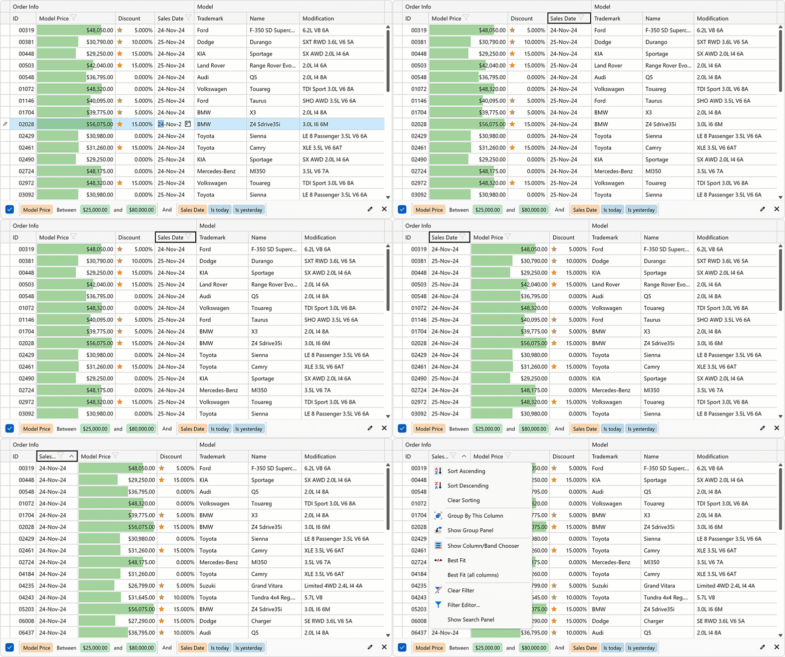
Documentation
#WPF Data Grid - Shortcuts to Expand & Collapse Detail Rows
You can now use the Ctrl + Plus and Ctrl + Minus shortcuts to expand and collapse detail rows in the WPF Data Grid.
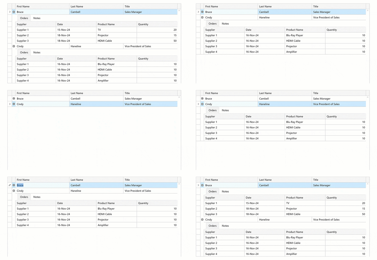
#WPF Data Grid - Shortcuts to Switch Detail Tabs
When multiple tabs are added to row details, you can switch between them using the Ctrl + 1 through Ctrl + 9 shortcuts.
#WPF Card View - Expand & Collapse Shortcuts
We added Ctrl + Plus and Ctrl + Minus shortcuts to expand/collapse cards within our WPF Card View.
#WPF ButtonEdit – Focus Editor Buttons
You can now focus buttons within ButtonEdit descendants and trigger associated actions. To enable this functionality, set ButtonEdit.AllowFocusEditorButtons to true.
#Column Chooser - Keyboard Navigation
Our WPF Data Grid Column Chooser supports keyboard navigation. Use the Space key to select/deselect columns.
#WPF ImageEdit - Toolbox Button Navigation
Users can now navigate toolbar buttons within the ImageEdit and trigger associated actions using the keyboard.
#WPF HyperLinkEdit - Visible Focus State
In previous versions, our WPF HyperLinkEdit did not display a focused state. Users can now see when the control is focused and activate an associated action using the Space key.
#WPF Data Grid - Screen Reader Enhancements
The DevExpress WPF Data Grid ships with the following new capabilities:
-
Update buttons (when using Edit Entire Row mode) are now detectable and can be read by screen readers (you can display these buttons by enabling the TableView.ShowUpdateRowButtons option).
-
Alt text for images exported to Excel. As you know, in our previous update, we added in-place image Excel export support. This release extends the
XlsExportOptionsEx.CustomizeCell event, allowing you to set alt text for exported images.
- Text within group rows is now pronounced when you navigate to a group in a detail grid.
AI-powered Extensions
DevExpress AI-powered APIs allow you to integrate the following AI services into your DevExpress-powered WPF application:
- OpenAI
- Azure OpenAI
- Semantic Kernel
- Ollama
NOTE: DevExpress does not offer a REST API or ship any built-in LLMs/SLMs. Instead, we follow the BYOL ("bring your own license") principle. To use these features, you need to have an active subscription to AI services (e.g., Azure, Open AI, Google Gemini, Mistral AI, etc.) and obtain the REST API endpoint, key, and model deployment name. These variables must be specified at runtime to enable DevExpress AI-powered Extensions in your WPF application.
The following code snippet registers an Azure OpenAI client:
public partial class App : Application {
  public App() {
    //..
    AIExtensionsContainerDesktop.Default.RegisterChatClient(
    new AzureOpenAIClient(
    new Uri("YOUR AZURE ENDPOINT"),
    new System.ClientModel.ApiKeyCredential("YOUR API KEY")))
      .AsChatClient("MODEL ID (e.g. GPT4o)"));
  }
}
Documentation
#AI-powered WPF Text Processing
NLP-powered text transform extensions (behaviors) allow you to enhance the way users interact with and manage text content. These extensions leverage advanced natural language processing (NLP) technologies to provide automated, intelligent text manipulation capabilities directly within your DevExpress-powered WPF application.
AI-powered text transform extensions include:
- Change Style
- Change Tone
- Expand
- Explain
- Explain Formula (in the WPF Spreadsheet control)
- Shorten
- Summarize
- Proofread
- Translate
- Ask AI (Custom Prompt)
AI-powered text transform extensions can be used in the following DevExpress WPF controls:
- MemoEdit
- Rich Text Editor
- Spreadsheet
Each AI transform extension is enabled by a separate behavior (allowing you to include transforms extensions appropriate to your specific usage scenario):
xmlns:dxmvvm="https://schemas.devexpress.com/winfx/2008/xaml/mvvm"
xmlns:dxre="https://schemas.devexpress.com/winfx/2008/xaml/richedit"
xmlns:dxai="https://schemas.devexpress.com/winfx/2008/xaml/ai"
<dxre:RichEditControl>
   <dxmvvm:Interaction.Behaviors>
      <dxai:RichEditExpandBehavior />
      <dxai:RichEditShortenBehavior />
      <dxai:RichEditSummarizeBehavior />
      <dxai:RichEditExplainBehavior />
      <dxai:RichEditToneStyleBehavior />
      <dxai:RichEditProofreadBehavior />
      <dxai:RichEditRewriteStyleBehavior />
      <dxai:RichEditTranslateBehavior >
          <dxai:LanguageInfo Culture="de-DE"/>
      </dxai:RichEditTranslateBehavior>
      <dxai:RichEditCustomRequestBehavior />
      <dxai:RichEditGenerateDescriptionBehavior/>
   </dxmvvm:Interaction.Behaviors>
</dxre:RichEditControl>
Run the application, select text, invoke the popup menu, and click the desired AI-related command. AI processes the command and generates an answer. The AI-generated answer is displayed within a dialog.
You can insert the answer directly into a document or text field with a single click. You can insert the answer above/below selected text or cursor, replace all content or selected text, or copy the answer to the clipboard.
RichEditCustomRequestBehavior includes an "Ask AI" item within the context menu. "Ask AI" invokes a dialog and allows users to directly interact with an AI-powered assistant. Users can enter a question or prompt. The AI assistant will process the query and generate an answer.
Documentation
#WPF Text and Memo Edit - Text Predictions
You can now display smart text suggestions in our Text and Memo Editors. Pressing the Tab key will apply a suggestion, allowing users to enter information faster, avoid spelling errors, etc.
Documentation
#AI Chat Control
Thanks to Blazor Hybrid technology and BlazorWebView, you can incorporate our new Blazor AI Chat (DxAIChat) component within your WPF application. To learn more about the underlying tech, refer to the following help topic: Create a Blazor Hybrid Project.
For more information and to get started, refer to the following example: Blazor AI Chat - How to add the DevExpress Blazor AI Chat component to your next Blazor, MAUI, WPF, and WinForms application.
Things to consider for WPF developers:
-
The
ISelfEncapsulationService interface: This interface allows you to work directly with DxAIChat component instance/properties from within a desktop or mobile app.
-
Built-in
DxAIChat wrappers: These wrapper classes initialize required Blazor Theme scripts.
- Custom CSS classes are used to hide the built-in input field and send button (index.html file).
#WPF Rich Text Editor & Spreadsheet - Alt Text Dialogs
We added new AI-powered Alt Text dialogs for our WPF Rich Text Editor and Spreadsheet Control.
The Alt Text dialog allows you to set accessible descriptions for shape objects used within Word and Excel documents. You can also mark non-informative document graphics as Decorative (when this setting is used, screen readers ignore decorative graphics when scanning documents). In addition, you can use the Alt Text dialog to generate meaningful descriptions for document images using the power of AI.
To introduce this capability within the DevExpress WPF Rich Edit Control, add RichEditGenerateDescriptionBehavior to the Behaviors collection. For the DevExpress WPF Spreadsheet Control, use SpreadsheetGenerateDescriptionBehavior.
<dxre:RichEditControl>
    <dxmvvm:Interaction.Behaviors>
        <wpfo:RichEditGenerateDescriptionBehavior/>
    </dxmvvm:Interaction.Behaviors>
</dxre:RichEditControl>
Documentation
Survey - WPF
Your Feedback Matters!
Please
login to complete the survey.
Survey Completed
Thank you for taking the time to complete this survey. Your responses have now been posted. If you want to follow up with additional information, feel free to send us an email at clientservices@devexpress.com anytime.
You've Already Completed This Survey
Our records show that you have already completed this survey. If you want to follow up with additional information, send us an email at clientservices@devexpress.com.
This survey has expired
If you want to share your feedback or request new functionality, please submit a new support ticket via the DevExpress Support Center. We’ll be happy to follow up.
Your feedback matters.
Please, review the description of JavaScript and ASP.NET Core related features below and leave your feedback at the end of the section.
Go to the survey now.
New Chat Component
Our new DevExtreme Chat Component (v24.2) allows you to address a variety of usage scenarios and introduce real-time communication support in your next DevExpress-powered web app.
With DevExtreme Chat, you can:
- Host intra/interpersonal Interactions (one-on-one or group chats). Ideal for social networking and/or internal collaboration.
- Integrate AI services and/or Chatbots: Connect DevExtreme Chat to AI services or chatbots for around-the-clock support services. Deliver immediate answers and extend engagement with intelligent interactions.
- Introduce instant communication options between support specialists and clients.
The DevExtreme Chat component supports the following options/capabilities:
- AI (artificial intelligence) Extensions
- DataSource support
- Typing status
- Popup integration
- Empty state text customization
- UI Customization
- Message templates
- Error support
- Accessibility compliance
- Keyboard Navigation
- Internationalization (Right-to-Left)
Note: DevExtreme Chat is a client-side component. An independent backend solution is necessary to leverage its potential.
Online Demo
#Set Initial Messages and Render New Messages
To set initial messages, assign the items[] array with your messages or use dataSource to bind the Chat component to data.
To render a new message, you must:
Regardless of the method used, you must send the new message to a backend.
#AI and Chatbot Integration
With the DevExtreme Chat UI component, you can incorporate AI-powered app assistants, implement Copilot-inspired user interfaces, and much more. To introduce these capabilities to your next DevExtreme-powered web app, simply set up appropriate AI services on the backend (Microsoft/OpenAI - GPT, Google - Gemini, self-hosted models via Ollama, or other AI services).
Online Demo
We leveraged the AI-integration potential of DevExtreme Chat in two DevExpress products: Web Report Viewer and Web End-User Report Designer. We also incorporated DevExpress AI-powered APIs in our implementation.
First, we embedded a Copilot-inspired chat window within the DevExpress Web Report Viewer (users can ask natural language questions to analyze report data and obtain AI-powered insights).
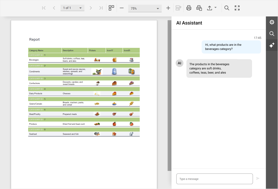
Second, we embedded a virtual assistant in the DevExpress End-User Report Designer (users can submit natural language queries to facilitate the custom report design process).
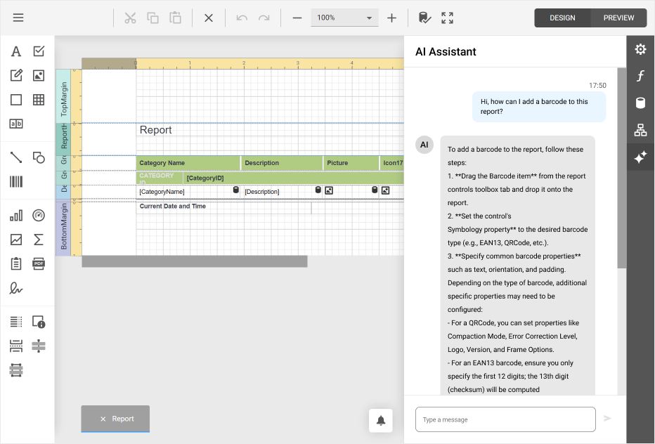
You can download these examples from the following GitHub repository:
Web Reporting - Integrate AI Assistants
Note: DevExpress Reports, DevExpress Web Report Viewer, and the DevExpress End-User Report Designer are included in the following DevExpress Subscriptions: ASP.NET & Blazor, DXperience, Universal, or a standalone DevExpress Reports subscription.
#Manage Users
A DevExtreme Chat instance contains information about its owner in the user property. Owner messages align to the right (or left in RTL mode), without displaying the owner's username and avatar.
Each message includes information about the sender (item.author), and includes name, avatar, and alt avatar text. If no avatar is set, the user's initials are displayed instead. Users without a name are marked as "Unknown User".

#Handle Events
Entering a message triggers the messageEntered event. Use the event handler to perform message post processing (like deleting obscene words, displaying the message in a message feed, and sending the message to the server for storage).
Start typing to raise typingStart, and stop typing for typingEnd. By using these event handlers, you can manage the typingUsers array (it shows which users are typing in the chat UI).

#Customize UI Elements
Control date and time visibility with showDayHeaders and showMessageTimestamp. Modify associated formats with dayHeaderFormat and messageTimestampFormat.
To customize DevExtreme Chat messages, use messageTemplate:
- Display images, charts, tables, links, or any visual element.
- Implement custom buttons, such as "Copy text" or "Regenerate chatbot response".
- Support Markdown.
- Insert custom markup.
Use the alerts array to display runtime errors (such as "You have been disconnected", "The message was not sent", etc).
Online Demo
If you've used DevExtreme Chat or are considering its use in an upcoming DevExpress-powered web project, please share your experiences/requirements with us. We'd love to know about your specific use case and how we can enhance our Chat component in 2025.
New Pagination Component
v24.2 ships with a new Pagination UI component.

Key features/capabilities include:
- Page Navigator: Controls movement between individual pages. You can display/hide navigation buttons as requirements dictate.
- Page Size Selector: Controls the number of records that appear on each page. You can set the allowedPageSizes property to a numbers array that specify available page sizes.
- Page Information: Displays the current page number and total records. You can specify pageIndex to set the initially opened page.
- Responsive Design: Component adapts its layout based on available screen size. Supports full, compact, and adaptive modes.
- Right-to-Left Support.
- Accessibility and Keyboard Navigation support: Fully accessible with integrated keyboard navigation support.
Online Demo
DataGrid and TreeList
#Sticky Columns
As you may know, both the DevExtreme DataGrid and TreeList ship with fixed column support (allowing you to fix columns to a table's edge).
Prior to the availability of advanced CSS positioning tools, our fixed column setup used two separate tables. In v24.2, we overhauled this mechanism: fixed columns are now integrated into the main table.
This update also introduces a new value for the fixedPosition property: sticky. Sticky columns behave initially as regular columns. When scrolling horizontally, they adhere to the left and right edges of the table upon reaching them. This enhances usability by keeping key information visible at all times.
The context menu used to fix columns now includes icons for various fixed positions.
DataGrid DemoTreeList Demo
UI/UX and API
#Tabs/TabPanel/List - onSelectionChanging Event
DevExtreme Tabs, TabPanel, and List share a common feature: selectable items.
Currently, these components include an onSelectionChanged event that triggers once selections are finalized and the selectedItems option updates.
v24.2 includes a new onSelectionChanging event for the aforementioned UI components. The event helps track selection changes more effectively and includes a cancel property (Boolean or JS Promise).
The primary purpose of the onSelectionChanging event is to enable tab/item switching under specific usage conditions. If a condition is not met, you can prevent the switch using the cancel property. Common conditions include:
- The user confirms the switch to another tab/item via a pop-up dialog.
- The result of running validation on the current tab.
- Switching to another item follows a specified order. For example, when a user switches between tabs/items sequentially.
- Other custom conditions unrelated to the current component.
Select one of the following supported dev frameworks to explore the capabilities of this new feature:
Angular | React | Vue | jQuery
#TabPanel/MultiView - Item Visibility Option
The DevExtreme TabPanel and MultiView include a new visible property for individual items. This feature allows you to manage whether an item is visible at runtime.
<dx-tab-panel>
    <dxi-item [visible]="false"></dxi-item>
</dx-tab-panel>
export default function App() {
    return (
        <TabPanel>
            <Item visible={false} />
        </TabPanel>
    );
}
<DxTabPanel>
    <DxItem :visible="false" />
</DxTabPanel>
const tabPanel = $('#tabpanel').dxTabPanel({
    items: [{ visible: false, }],
}).dxTabPanel('instance');
#DataSource - Case Sensitive Filtering
In v23.1, we released langParams for DataSource. This property can be used to include language-specific parameters for sorting and filtering operations performed on a client.
This update includes case sensitivity for the langParams options. As you can see in the image below, you can now introduce case-aware filtering when using DevExtreme UI components with DataSource support (such as DataGrid).
Select one of the following supported dev frameworks to explore the capabilities of this new feature:
Angular | React | Vue | jQuery
#HTML Editor - Advanced Format Conversion
Previously, the DevExtreme HTML Editor included basic HTML & Markdown conversion support (via showdown/turndown dependencies).
With v24.2, we removed this capability and added a converter option for custom conversions. For instance, Markdown lacks strikethrough support (as you expect, HTML Editor with valueType="markdown" did not offer this option). You can now use the unified:remark-gfm plugin to introduce this capability to your DevExtreme-powered app. Unified offers numerous plugins for flexible and enhanced formatting.
This update allows greater control/options for HTML Editor-related formatting operations. You can even add support for other formats such as YAML. You will only need a converter from and to HTML.
Online Demo
Maps
#Azure Maps Support
As you know, Microsoft discontinued availability of Bing Maps for Enterprise and associated APIs. Azure Maps will be Microsoft's single unified enterprise mapping platform moving forward.
Accordingly, DevExtreme Maps now supports Azure Maps (a new map provider).

We recommend use of a supported map provider (either 'azure', 'google', or 'googleStatic') in your DevExtreme-powered solution.
Online Demo
#Advanced Google Markers and mapID Support
DevExtreme Maps now supports advanced Google markers. We also published a new providerConfig configuration object that contains setting specific to 'google' and 'googleStatic' providers. For instance, you can now use the Google Maps mapID option to customize your Map by setting it in our providerConfig.mapId.
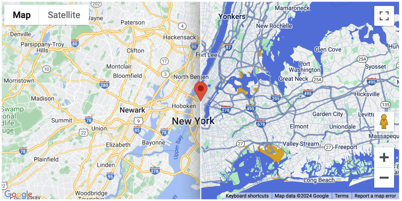
Import Enhancements
#Single Entry-Point for All Imports

Previously, you had to import from two packages - a framework-specific DevExtreme package (devextreme-react/devextreme-angular/devextreme-vue) and the devextreme package itself. The devextreme package included all common/shared imports not specific to any framework. With v24.2, you can now import everything from the appropriate framework package. This change simplifies access to our entire public API.
// Before: DataSource is imported from the devextreme package
import DataSource from 'devextreme/data/data_source';
import { DxDataGridModule, DxDataGridTypes } from 'devextreme-angular/ui/data-grid';

// After: DataSource is imported from the devextreme-angular package
import { DataSource } from 'devextreme-angular/common/data';
import { DxDataGridModule, DxDataGridTypes } from 'devextreme-angular/ui/data-grid';
// Before: DataSource is imported from the devextreme package
import DataSource from 'devextreme/data/data_source';
import { DataGrid, DataGridTypes } from 'devextreme-react/data-grid';

// After: DataSource is imported from the devextreme-react package
import { DataSource } from 'devextreme-react/common/data';
import { DataGrid, DataGridTypes } from 'devextreme-react/data-grid';
// Before: DataSource is imported from the devextreme package
import DataSource from 'devextreme/data/data_source';
import { DxDataGrid, DxDataGridTypes } from 'devextreme-vue/data-grid';

// After: DataSource is imported from the devextreme-vue package
import { DataSource } from 'devextreme-vue/common/data';
import { DxDataGrid, DxDataGridTypes } from 'devextreme-vue/data-grid';
You do not have to update an existing DevExtreme-powered application, but we encourage you to explore our new implementation when considering new app functionality.
Important Note: In past versions, it was possible to import private APIs because it was both accessible and indistinguishable from public items. If you've accidentally used private APIs in your application, you may encounter issues with the DevExtreme v24.2 update. If you do encounter issues, please submit a support ticket via the DevExpress Support Center. We will be happy to follow up.
Accessibility
DevExtreme Scheduler ships with enhanced contrast and keyboard navigation support. It now includes aria-labels for agenda appointments, month view, and recurrence icons.
In addition, other DevExtreme UI components such as DataGrid, TreeList, FilterBuilder, HTML Editor, Calendar, Menu, List and ProgressBar were enhanced as follows:
- Screen readers can now indicate whether a TreeList node is in an expanded or collapsed state.
- Screen readers can now pronounce selected dates when DevExtreme Calendar is in multi select mode.
- DataGrid and TreeList ColumnChooser and HeaderFilters are now visible when receiving focus. The focus is looped now.
- Focus order for a Lookup was modified so that elements are not obscured by a drop-down field.
- HTML Editor Toolbar button states are now pronounced properly.
- You can now collapse and expand List groups with keyboard navigation.
Application Templates

We introduced the following changes to our application templates:
- Newer and more modern design.
- Light/dark theme switcher.
- By default, templates are created using our newest Fluent theme.
To test our updated application templates, you must install devextreme-cli:
npx devextreme-cli new angular-app app-name
npx devextreme-cli new react-app app-name
npx devextreme-cli new vue-app app-name
After installation, run the following commands to start the application:
cd app-name
npm run start
Angular
#Service for Popup Open Operations
Previously, to define a Popup, it was necessary to add the Popup to markup and define a template for its content:
<dx-popup
    title="Popup Title"
    [(visible)]="isPopupVisible"
>
    <div *dxTemplate="let data of 'content'">
        <p>Popup content</p>
    </div>
</dx-popup>
The visible property controlled Popup visibility.
The use of services that display popups is a common practice in Angular libraries. DevExtreme Popup component now includes DxPopupService which allows you to open a Popup and initialize its content using an open method. The open method accepts a component to be displayed and Popup options.
import { DxPopupService } from "devextreme-angular/ui/popup";
// ...
constructor(private popupService: DxPopupService)
// ...
this.popupRef = popupService.open(ContentComponent, { showCloseButton: true });
You can access the Popup instance through DxPopupServiceComponent. Call the hide() method to close the Popup programmatically:
popupRef: DxPopupServiceComponent;
this.popupRef.instance.hide();
Read Full Guide | Demo
#New Configuration Components
If you've used devextreme-angular in the past, you are familiar with our configuration components (they have a dxo- or dxi- prefixes).
Our goal is to augment these components with updated TypeScript definitions. Changing them, however, would affect existing projects. Thus, in v24.2, we launched a new set of devextreme-angular configuration components (these can be used independently).
You can access these new components by appending the parent component's name after the prefix. For example, dxo-editing in DataGrid becomes dxo-data-grid-editing, and dxi-column changes to dxi-data-grid-column, etc.
This "named set" improves usage as follows:
- Each configuration component now displays properties related to its specific parent component only.
- Property values for each configuration component are strictly typed.

Note: You can either use new collection items (dxi- prefix) or the previous in a single parent component, but not both. This limitation does not apply to options (dxo- prefix).
#Angular 19 Support
Angular 19 was recently released. We've tested the 19.0.0 version against our UI components and found no issues.
If you are considering Angular 19 for a current/upcoming project, feel free to share your Angular-specific thoughts/experiences with us.
React
#Custom Configuration Components
You can now extract parts of a component's configuration in a separate React component and reuse these settings across multiple DevExtreme components by simply nesting this custom component.
For example, you can wrap a DataGrid column into a custom component for reuse purposes:
const ReadonlyColumn = (props) => {
    return (
      <Column
        allowEditing={false}
        {...props}
      />
    );
}

function ProductOrders() {
    return (
        <DataGrid ... >
            <ReadonlyColumn dataField="OrderId" />
            <Column dataField="Product" />
            <Column dataField="Customer" />
            <Column dataField="Region" />
            <ReadonlyColumn dataField="Price" />
        </DataGrid>
    );
}
Demo
#React 19 RC Support
We've tested our UI components, demo gallery, and responsive UI templates with React 19 and found no issues.
If you are considering React 19 for a current/upcoming project, feel free to share your React-specific thoughts/experiences with us.
Vue
#Support TypeScript IDE Assistance
DevExtreme Vue component props fully support types. Our components also support TypeScript IDE assistance (IntelliSense) for Vue-based projects.
jQuery 4 Beta Support
jQuery v4.0.0 beta 2 was just released. We've tested this new framework against our UI components and found no significant issues.
If you are considering jQuery v4.0.0 for a current/upcoming project, feel free to share your jQuery-specific thoughts/experiences with us.
ASP.NET Core
#.NET Framework 4.6.2 and .NET 8 Support
DevExpress ASP.NET Core component libraries no longer support .NET 6/7 and .NET Framework 4.5.2, 4.6 and 4.6.1. DevExpress ASP.NET Core also requires .NET 8 and MVC5 - .NET Framework 4.6.2 respectively.
For .NET Core/.NET 8-based products, Visual Studio 2022 is required. Visual Studio 2019 is the minimally supported IDE version for MVC5.
#.NET 9 Support
DevExtreme UI libraries/components now support .NET 9.
#Newtonsoft.Json Has Been Replaced with System.Text.Json
DevExtreme ASP.NET Core/MVC controls (v24.2) now use System.Text.Json library to serialize scripts and deserialize payloads.
#Project Template Enhancements
We introduced a Fluent theme to ASP.NET Core project templates, and enhanced our current Material theme design:

#Rich Text Editor IF Field Support

The Rich Text Editor now supports the IF field and allows you to compare two values and insert a text string related to the comparison. The IF field uses the following syntax:
{ IF expression trueText falseText }{ IF leftExpression operator rightExpression trueText falseText}
Expressions can include character strings, numbers, or nested fields that return values.
To create an IF field, call create(position)executeCommand(commandId)CreateEmpptyIfField
var subDocument = richEdit.selection.activeSubDocument;
subDocument.fields.create(richEdit.selection.active, 'IF 5 < 10 "less than 10" "not less than 10"');

//or

richEdit.executeCommand(DevExpress.RichEdit.MailMergeTabCommandId.CreateEmptyIfField);
Survey - JavaScript & ASP.NET Core
Your Feedback Matters!
Please
login to complete the survey.
Survey Completed
Thank you for taking the time to complete this survey. Your responses have now been posted. If you want to follow up with additional information, feel free to send us an email at clientservices@devexpress.com anytime.
You've Already Completed This Survey
Our records show that you have already completed this survey. If you want to follow up with additional information, send us an email at clientservices@devexpress.com.
This survey has expired
If you want to share your feedback or request new functionality, please submit a new support ticket via the DevExpress Support Center. We’ll be happy to follow up.
Your feedback matters.
Please, review the description of Blazor-related features below and leave your feedback at the end of the section.
Go to the survey now.
.NET 9 Support
DevExpress Blazor UI components/libraries (v24.2) now support .NET 9. To explore features/capabilities of .NET 9 (cloud-native applications and performance-related enhancements), simply create a new .NET 9 web application using the DevExpress Template Gallery, or create a new Microsoft .NET 9 web app and add DevExpress resources as necessary. If you'd like to learn more about Blazor-specific enhancements in .NET 9, please review the following Microsoft article: What's New in ASP.NET Core 9.0.
New Fluent Theme (CTP)
All DevExpress Blazor component libraries support our new Microsoft Fluent 2-inspired UI theme (available as a Community Technology Preview in our v24.2 release cycle). This modern Blazor UI theme aligns visually with Microsoft Office products and offers important usability/accessibility-related benefits.
While the Fluent theme draws inspiration from Microsoft's Fluent Design System, it was designed with data-intensive/information-dense applications in mind. With this new theme, you can create compact data tables that maximize on-screen information display and page layouts that are visually approachable.

#Light and Dark Modes
Our Fluent theme is available in two distinct variants: Light and Dark. Both versions have been designed with accessibility in mind (featuring carefully designed color contrasts to meet WCAG guidelines). To simplify customization, colors and other appearance settings are now structured and stored in CSS variables shared across component libraries.
#Size Modes
Much like standard DevExpress Blazor themes, our new Fluent theme offers three size modes — Small, Medium, and Large. All Fluent theme size modes have been refined for additional flexibility:
- Small is now slightly smaller than in previous DevExpress themes, ideal for dense layouts.
- Medium and Large have been modified to be slightly larger, making them perfect for standard web apps and mobile platforms.
| Size Mode | Editor Height, Blazing Berry | Editor Height, Fluent |
| Small | 26px | 24px |
| Medium | 30px | 32px |
| Large | 34px | 40px |
Additionally, icon sizes now scale with size modes, ensuring a consistent and polished appearance across all component libraries.
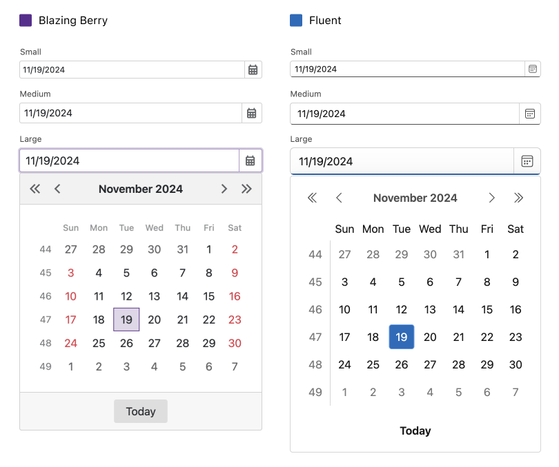
#Fluent Icons
The DevExpress Fluent theme ships with built-in line icons for many of our Blazor component libraries. These icons integrate with Fluent UI System icons and Fluent icons from DevExtreme. An extended Fluent icon set will be published in the future, offering even more options for design customization.
#Preview Available Now, Full Release in v25.1
Our Fluent theme is currently available as a preview (while we gather feedback and refine designs further). Expect further changes in CSS structure/visuals in the official release (v25.1). In addition to planned changes, we are also hoping to introduce the following features next year:
- Additional built-in color presets.
- APIs for accent color customization.
- Fluent-style line icons for all Blazor component libraries.
- Different icons with varying levels of detail for each size mode.
AI-powered Extensions
#New AI Chat
The new DevExpress Blazor AI Chat Component allows you to incorporate AI-driven interactions into your application and ships with the following features/capabilities:
- Straightforward AI Integration: Connect to OpenAI, Azure OpenAI, and self-hosted models running on Ollama.
- OpenAI Assistants Support.
- Streaming Responses: Display AI-generated responses in real-time as they are being processed.
- Copying: Quickly copy chat content (share or store as needed).
- Customizable Message Templates: Define and style your messages using customizable templates.
- Flexible Message Rendering: Display chat responses in plain text or markdown (easily convert to HTML with any Markdown-to-HTML library).
- Error Display: Display error information and improve troubleshooting processes (and of course enhance your app's user experience/engagement).
- Customizable Empty States: Define custom text and descriptions for empty states within the chat interface.
- Manual Message Processing: Handle message processing using custom logic.
ExampleOnline Demo
#HTML Editor & Rich Text Editor — AI-powered Text Commands
DevExpress AI-powered Extensions for the Blazor HTML Editor and Rich Text Editor allow you incorporate AI-related commands to component toolbars. Commands are designed to process text/HTML content. Available commands include:
- Ask AI Assistant: allows users to process text based on a custom prompt.
- Change Style: rewrite text using a specified style.
- Change Tone: rewrite text using a specified tone.
- Describe Picture: generates the description for an image (for Rich Text Editor only).
- Expand: expands text.
- Explain: explains text.
- Proofread: proofreads text.
- Shorten: shortens text.
- Summarize: summarizes text.
- Translate: translates text into the specified language.
Specify DxHtmlEditor's or DxRichEdit's AdditionalItems
<DxHtmlEditor Markup="@markup" Height="500px">
    <AdditionalItems>
        <SummarizeAIToolbarItem />
        <ExpandAIToolbarItem />
        <ProofreadAIToolbarItem/>
        <ExplainAIToolbarItem />
        <ShortenAIToolbarItem />
        <AskAssistantAIToolbarItem />
        <ChangeStyleAIToolbarItem />
        <ChangeToneAIToolbarItem />
        <TranslateAIToolbarItem Languages="@("English, German, French, Chinese")" />
    </AdditionalItems>
</DxHtmlEditor>

New Pivot Table (CTP)
Our new Blazor Pivot Table UI component was designed to replace our current Pivot Grid. This new Blazor Pivot Table component (available as a Community Technology Preview — CTP) leverages the DevExpress data engine (used across other .NET platforms) and is expected to officially ship in 2025.
At present, our Blazor Pivot Table UI component ships with the following features/capabilities:
- High-performance data engine
- Data sorting support
- DateTime, numeric, alphabetic, and custom group intervals
- Configurable totals and grand totals
- Built-in scroll bar and sticky Header/Row Value areas
- Virtual scrolling support
- Value formatting and integrated templates
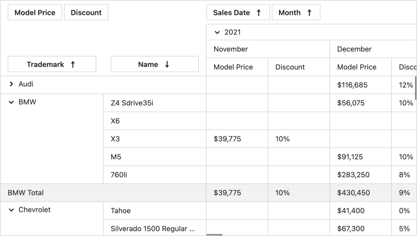
Online Demo
New Buttons
The new DevExpress Blazor DxDropDownButton, DxSplitButton, and DxButtonGroup UI components were designed to extend the capabilities of your DevExpress-powered Blazor app and address a variety of usage scenarios.
#DropDown Button and Split Button
Our Blazor Drop-Down Button and Split Button components combine the functionality of a button and a drop-down and ship with the following features/capabilities:
- Multi-level drop-down lists with customizable items.
- Ability to set a template for dropdown content.
- Predefined button styles (
RenderStyleRenderStyleMode - Icons, tooltips, and drop-down element customization.
- Ability to specify custom button content.

Online Demo: Drop-Down ButtonOnline Demo: Split Button
#Button Group
Our Blazor Button Group component displays a set of buttons and ships with the following features/capabilities:
- Button arrangement support (horizontal or vertical).
- Support for different selection modes.
- Predefined button styles (
RenderModeRenderStyleMode - Icons, tooltips, and CSS customization.
- Ability to specify custom button content.
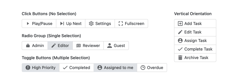
Online Demo
New Carousel
The new DevExpress Blazor Carousel displays an image collection using a carousel UI metaphor. It includes multiple navigation controls and allows users to easily switch images. The Carousel UI component ships with the following built-in capabilities:
- Support for slide show and loop functionality.
- Navigation buttons and dot indicators for intuitive image navigation.
- Flexible item template support for customized content presentation.
- Multiple methods to navigate through items in code.
- Ability to customize component appearance and behavior.
Online Demo
New Color Palette
Our Blazor Color Palette component allows users to select a color from a predefined set. It ships with the support for multiple color groups and a built-in No Color button.
The Color Palette is highly customizable. You are free to choose from multiple built-in color sets:
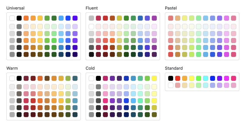
Or define your own colors:
The Color Palette also supports keyboard navigation and integrates well with other DevExpress Blazor UI components including DropDownBox or SplitButton.
Online Demo
New Message Box
Our Blazor Message Box component allows you to display alerts or confirmation dialogs (similar to those in JavaScript), without the need for custom Razor code.
You can place a DxMessageBox component in markup and use the Visible property to display it on screen.
<DxMessageBox @bind-Visible="MessageBoxVisible"
    Type="MessageBoxType.Confirmation"
    Title="Cannot open file"
    Text="The file may have been moved, renamed, or deleted."
    OkButtonText="Show details..."
    CancelButtonText="OK"
    RenderStyle="MessageBoxRenderStyle.Warning">
</DxMessageBox>

<DxButton Text="Show Message Box" Click="@(() => MessageBoxVisible = true)" />

@code {
    bool MessageBoxVisible { get; set; } = false;
}
Alternatively, use the dialog service to create message boxes at runtime.
<DxDialogProvider RenderStyle = MessageBoxRenderStyle.Danger />
<DxButton Text="Show a message box window" Click="@OpenConfirmDialogAsync" />

@code {
    [Inject] IDialogService DialogService { get; set; }

    private async Task OpenConfirmDialogAsync() {
        await DialogService.ConfirmAsync(new MessageBoxOptions() {
            Title = "Cannot open file",
            Text = "The file may have been moved, renamed, or deleted.",
            OkButtonText="Show details...",
            CancelButtonText="OK",
            RenderStyle=MessageBoxRenderStyle.Warning
        });
    }
}
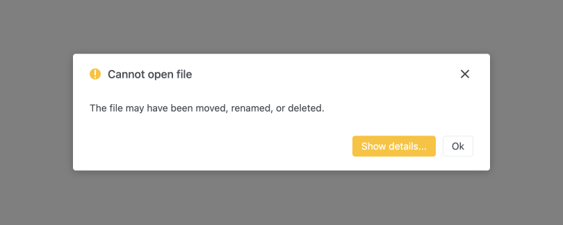
Online Demo
New Range Selector
The new DevExpress Blazor Range Selector allows you to visualize data within its scale. Users can select a range by dragging sliders or using the mouse to select an area on the scale. This control can augment our Blazor Chart library, enhancing data filtering and visual range setting experiences. The DevExpress Blazor Range Selector ships with the following built-in features/capabilities:
- Ability to set a range in code and limit its minimum and maximum length.
- Customization of major/minor scale ticks.
- Scale label customization for a personalized display.
- Customization options for slider handles and markers.
- Configurable background and shutter settings.
- Color customization, including palettes and color settings for individual elements.

Online Demo
New Ribbon (CTP)
Our new Blazor Ribbon UI component leverages a tabbed toolbar UI metaphor to organize command items across different tabs. This component simplifies access to various functions, enhancing both organization and overall user experience.

The DevExpress Blazor Ribbon component (available as a Community Technology Preview — CTP) can address a variety of usage scenarios, including:
- Applications with Comprehensive Functionality: For programs with a rich collection of app tools (graphic editors, word processors, data management systems), the DevExpress Blazor Ribbon organizes tools into logical categories, allowing users to locate what they need quickly.
- Simplified Interfaces: Unlike traditional menus and toolbars, a Ribbon can consolidate multiple functions in one place, minimizing clicks and simplifying access.
- Dynamic Content Interfaces: The Ribbon's tabs can adapt to display context-specific tools based on the current selection or active tool, helping users focus on relevant options for the task at hand.
- Complex Function Hierarchies: For applications with nested menus or intricate toolsets, the Ribbon presents options in logically arranged groups, making navigation easier.
Our Ribbon component draws inspiration from the Microsoft Office Ribbon, a well-known example of a robust and complex Ribbon design.
#Key Features
- Application Button: Like the Microsoft Office Ribbon, ours includes an Application Button, providing quick access to common functions in a dropdown.
- Support for Multiple Built-in Editors: The Ribbon supports various editor types, such as buttons, text boxes, combo boxes, color pickers, and spin editors. This improves code structure and efficiency.
- Advanced Adaptivity: The Ribbon features flexible adaptivity. Each group has its own ellipsis button and can collapse into a compressed state.
- Contextual Tabs: The Ribbon includes contextual tabs that appear dynamically based on the user's actions or selection. These tabs display relevant commands and tools tailored to the current task or content, enhancing user experience and streamlining workflow.
#Adaptivity
Adaptivity includes several tiers, such as:
- Item Text Removal: Text is removed from items right to left (or based on priority settings).
- Local Ellipsis: Items within a group collapse individually, preserving the group structure. Group icons are customizable to suit application requirements.
- Global Ellipsis: Entire groups and their items can collapse under a global button.
Additionally, each item's Global Adaptivity settings let you customize the order of collapsed items, ensuring the most relevant options are displayed regardless of markup order.
Online Demo
New Sankey
The DevExpress Blazor Sankey helps you describe flow magnitude between value sets. You can use Sankeys to display a many-to-many mapping between two domains or multiple paths through a set of stages (e.g., how Google Analytics displays traffic flow between pages on your website). The DevExpress Blazor Sankey component ships with the following capabilities:
- Configurable nodes and links
- Customizable node labels
- User interaction options (hover and clicks)
- Export and printing support
- Sankey element customization: title, subtitle, and tooltips
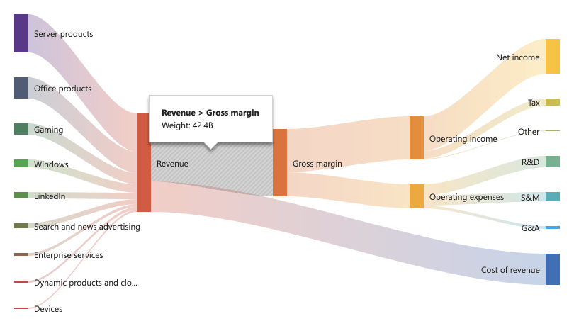
Online Demo
New Search Box
The DevExpress Blazor Search Box allows you to incorporate a search UI/search functions to your DevExpress-powered Blazor app. The Search Box integrates well with other DevExpress Blazor components and ships with the following features/capabilities:
- Search delay
- Appearance customization
- Clear button and placeholder
- Custom command buttons
Online Demo
New Splitter
The DevExpress Blazor Splitter allows you to separate web page content into multiple resizable panes. The component supports nested splitter components, allowing you to create complex layouts with ease.
Key features/capabilities include:
- Ability to specify horizontal or vertical orientation for the splitter.
- Live content refresh during resize operations for the best possible user experience.
- Panes that can be collapsed or expanded with specific buttons.
- Customizable visual appearance of splitter elements.
Online Demo
Script Loading
We reworked our script loading engine and refactored the scripts used by DevExpress Blazor components to improve component loading speed and reduce the size of script files. Depending on the number of components used, your apps will now download up to 11 MB less of JS files on initial load.
Keyboard Support
To address accessibility standards and improve user experiences for those with disabilities, v24.2 adds keyboard navigation support for the following Blazor UI components:
- Date Range Picker
- Form Layout
- Scheduler
- Tabs
- TreeList
- Window
Validation State Visibility
DevExpress Blazor Data Editors, Grid, and TreeList no longer display "success" icons or green outlines if user input is valid. This change was made to maintain UI consistency and avoid unnecessary distractions for end-users. You can enable success state for individual components or the entire app using the new ShowValidationSuccessState
Refer to the following help topic for additional information: Display Validation Results.
Online Demo: Form ValidationOnline Demo: Grid ValidationOnline Demo: TreeList Validation
Grid & TreeList
#Row-based Drag & Drop Operations
Both our Blazor Grid and TreeList components now support row-based drag & drop operations. Users can reorder rows and/or move rows from one table/component to another. Users can also modify Blazor TreeList node hierarchies.
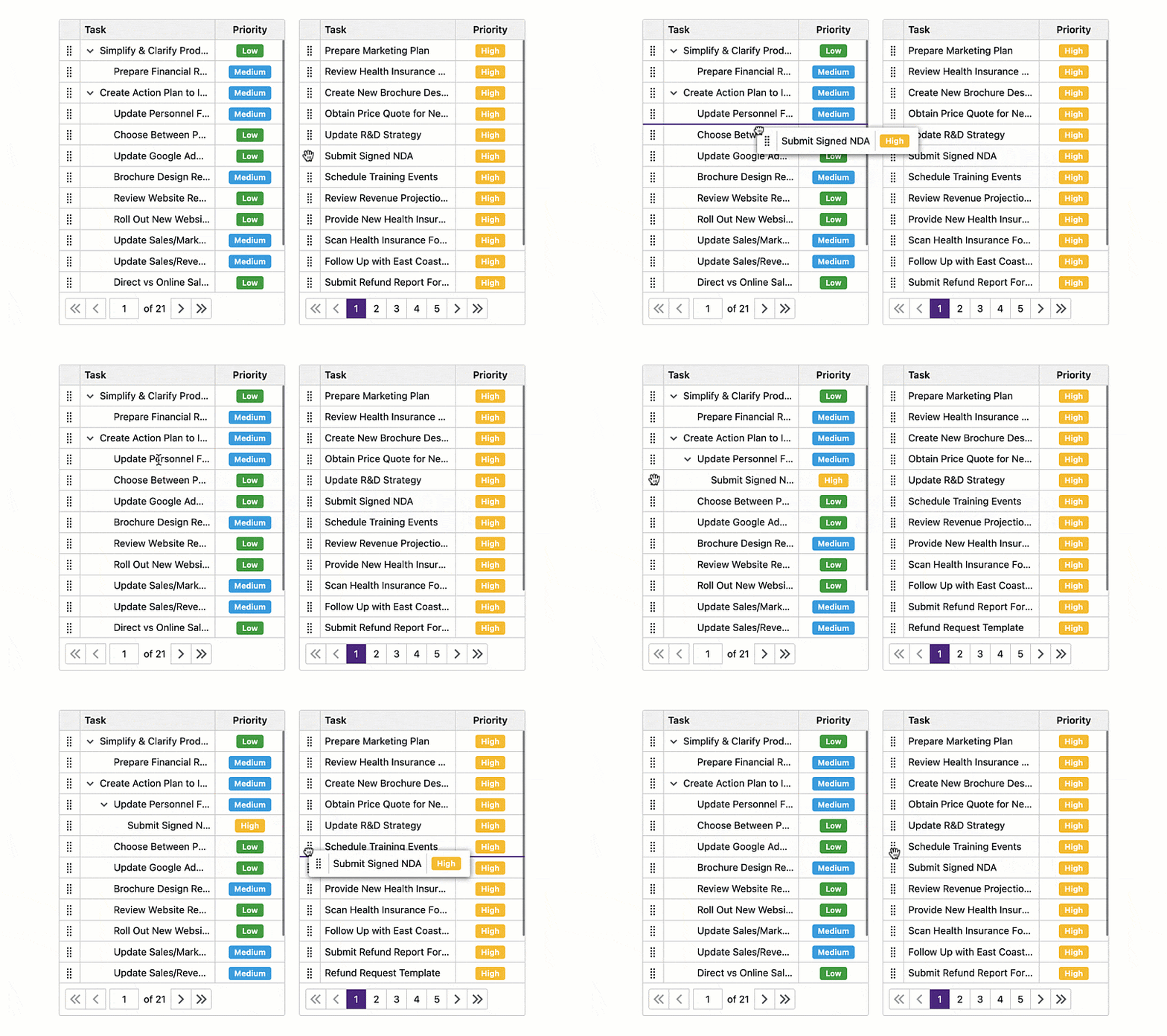
AllowDragRowsAllowedDropTargetItemsDropped
Use the DragHintTextTemplate
Online Demo: GridOnline Demo: TreeList
#New Item Row
The DevExpress Blazor Grid and TreeList allow you to insert rows/records via our New Item Row — an empty row displayed above or below data records.
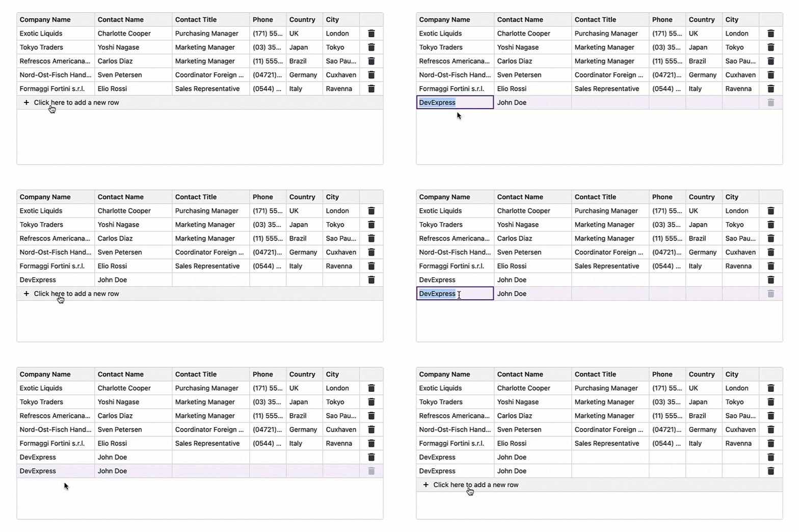
To display this row in our Blazor Grid component, set its EditNewRowPosition
FixedOnTopLastRow
Online Demo: GridOnline Demo: TreeList
TreeList
#Official Release
Our Blazor TreeList is now ready for production use. We finalized its APIs/behaviors and implemented the following new features and enhancements.
#Editing
The DevExpress Blazor TreeList now supports the following edit modes:
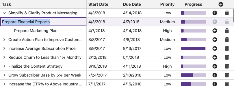
For all edit modes, you can implement input validation via Data Annotation attributes and configure editors using EditSettings and/or templates.
Online Demo
#Column Filter Menu
Our Blazor TreeList now features Excel-inspired filter dropdowns. These menus display all unique column values and include a search box and a Select All option.
Use the following new APIs to customize filter dropdowns:
- CustomizeFilterMenu — Handle this event to customize items in a filter dropdown before it is displayed on-screen.
- FilterMenuTemplate — Use this property to display custom content in a filter dropdown.
- DataColumnFilterMenuTemplate — Use this property to specify a common template for all filter dropdowns in the DevExpress Blazor TreeList.
You can switch between standard and hierarchical views for DateTime columns.
Online Demo
#New Filter Mode — Nodes
When using our Nodes filter mode, the DevExpress Blazor TreeList displays all nodes that meet current filter criteria as a plain list. This improves TreeList performance when it is bound to a large remote dataset and is useful when finding specific records is more important than keeping the node hierarchy visible.

Online Demo
#Export Data to Excel
The DevExpress Blazor TreeList can now export data to Excel. With our new APIs, you can save data to XLS, XLSX, and CSV, or stream. The following methods are available:
Data export operations support sorting, filtering, and total computation. You can also pass the 'options' parameter to export methods. This parameter allows you to customize the exported document.
Online Demo
#Save/Restore Layout
You can now save and restore the Blazor TreeList layout. Layout information includes the current page, column sort order/direction, column position, and filter values.
We added two new events — LayoutAutoSaving and LayoutAutoLoading. The first event fires each time the layout changes and allows you to save the layout. The second event fires once the component is initialized and allows you to restore the layout.
We also introduced SaveLayout and LoadLayout methods so you can save and restore the TreeList's layout when necessary.
Online Demo
#Self-Reference Data Binding Enhancements
Our Blazor TreeList can now automatically detect root nodes — nodes whose ParentID values don't point to other nodes in the source collection. For more precise control, TreeList also exposes a RootValue property. If this property is specified, our TreeList treats all nodes with ParentID values equal to RootValue as root nodes.
#Expand All Nodes Automatically
The new AutoExpandAllNodes property expands all nodes when TreeList data is loaded for the first time.
#Expansion State Persistence
Our Blazor TreeList can now retain node expansion state for in-memory sources. Whenever you call the Reload method or reassign the data source collection, it will automatically find the IDs of previously nodes and restore their original expansion state.
#Shortcuts and Keyboard Support Enhancements
Use the following new shortcuts to expand/collapse rows in our Blazor TreeList:
- PC/Windows — Ctrl+Right Arrow/Ctrl+Left Arrow
- Mac/MacOS — Cmd+Right Arrow/Cmd+Left Arrow
Refer to the following help topic for a complete list of available shortcuts: Blazor TreeList – Keyboard Support.
#Selection API Enhancements
Charts
#SSR Support
DevExpress Blazor Chart components ship with an updated internal DOM hierarchy and now support SSR. This allows you to visualize chart data without additional project configuration in .NET 8. When using Interactive Auto render mode, you can use SSR for initial chart rendering and CSR once the Blazor bundle has been downloaded.
#Crosshair Support
Our new Blazor ChartCrosshair object allows you to display and configure crosshairs — thin vertical and horizontal lines centered on a data point within a chart. This feature helps users identify series point values in a precise manner. When enabled, the crosshair follows the cursor and snaps to the nearest series point, enhancing data analysis and associated user experiences. You can configure common crosshair settings or use DxChartCrosshairVerticalLine and DxChartCrosshairHorizontalLine objects to customize vertical and horizontal lines individually.
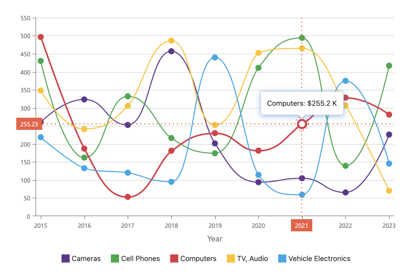
Online Demo
#Aggregation Interval Settings
You can now aggregate series points that fall within the same interval. Use the AggregationInterval property to specify the width of this interval. If the axis displays numeric values, assign a number to this property. If the axis displays date-time values, set this property to a ChartElementFormat value. To specify interval width in pixels instead, use the AggregationGroupWidth property.
<DxChartArgumentAxis AggregationInterval="ChartAxisInterval.Quarter" />
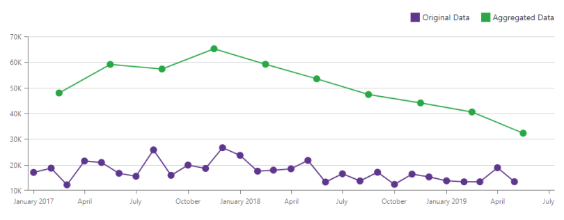
Regardless of how you specify intervals, you can display aggregated points between or aligned to major ticks (AggregatedPointPosition).
<DxChartArgumentAxis AggregationInterval="ChartAxisInterval.Quarter"
                     AggregatedPointPosition="ChartAggregatedPointPosition.BetweenTicks"/>

#Selection API
DevExpress Blazor Chart components now allow you to select series and points programmatically as well as clear selections. New selection APIs include the following methods:
Data Editors
#List Editors — Group Data
DevExpress Blazor list-based data editors (ComboBox, TagBox, and List Box) allow you to organize data items into groups. Groups make lists more readable and help users locate required options more quickly. Groups are not selectable and can't be focused with the keyboard. However, screen reader tools will read the group name for a focused item.
To create groups, use our new GroupFieldNameGroupHeaderDisplayTemplate
<DxListBox  ... >
    <GroupHeaderDisplayTemplate>
        Group: @context.DisplayText
    </GroupHeaderDisplayTemplate>
</DxListBox>
Online Demo: List BoxOnline Demo: ComboBoxOnline Demo: TagBox
#List Editors — Disabled Items
Our list-based editors (ComboBox, TagBox, and List Box) allow you to disable individual data items. To do this, use the new DisabledFieldName property. Disabled items are greyed out and cannot be selected by end-users. However, it is still possible to select a disabled item in code and disable a previously selected item. This behavior is useful when you must indicate to users that a previously selected item is no longer available.
If you wish to customize the appearance of disabled items (e.g., cross out an item), check the IsDisabledItemDisplayTemplate
<ItemDisplayTemplate>
    <span class="@(context.IsDisabled ? "text-decoration-line-through" : "")">
        @context.HighlightedDisplayText
    </span>
</ItemDisplayTemplate>
Online Demo: List BoxOnline Demo: ComboBoxOnline Demo: TagBox
#ListBox — Search
The DevExpress Blazor List Box now includes a built-in search box that allows users to filter items and highlight search results. To enable the search box, set the ShowSearchBox property to true
Online Demo
#Disable Validation
DevExpress Blazor editors automatically display validation errors from bound properties when placed inside EditForm. You can now disable this option for individual editors by setting the ValidationEnabledfalse
Map
#Advanced Google Markers and Map ID Support
DevExpress Blazor Map component APIs now include a GoogleMapId property for both GoogleGoogleStaticGoogleMapId
<DxMap Provider="MapProvider.Google"
       GoogleMapId="{my_google_map_id}">
    <DxMapApiKeys Google="{my_google_api_key}" />
</DxMap>
Note: Google recently migrated to advanced marker support. Create a map ID and specify the GoogleMapIdGoogle
#Azure Maps Support
As you know, Microsoft recently discontinued availability of Bing Maps for Enterprise and its associated APIs. Azure Maps will be Microsoft's single unified enterprise mapping platform moving forward. Accordingly, our Blazor Map UI component now supports Azure Maps (a new map provider). To display Azure Maps in your DevExpress-powered Blazor application, set the DxMap.Provider property to Azure and assign your map API key to the DxMapApiKeys.Azure property.
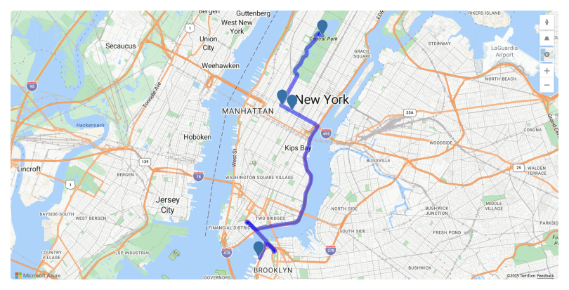
If you are new to Azure Maps and wish to obtain a key, refer to the following article: Manage Your Azure Maps Account.
PDF Viewer
#Official Release
Our Blazor PDF Viewer is now ready for production use. We have tested it across various usage scenarios and made internal changes to improve overall stability.
#Set Document Name
Our new DocumentName property allows you to set a custom name for documents downloaded using the PDF Viewer's toolbar command or via a DownloadAsync method call.
<DxPdfViewer DocumentName="Custom Name" />
Rich Text Editor
#Download Document Enhancements
The DevExpress Blazor Rich Text Editor allows you to set a custom name for a document downloaded using the component's Download Menu. To customize the name of the downloaded document, specify the DocumentName property in the Editor's markup.
<DxRichEdit DocumentName="Custom Name" />
#Horizontal Ruler Visibility
The Rich Text Editor's new HorizontalRulerVisible property allows you to change horizontal ruler visibility in code. To respond to the property change, handle the HorizontalRulerVisibleChanged event.
<p>Is ruler visible — @IsRulerVisible</p>
<DxRichEdit HorizontalRulerVisible="@IsRulerVisible"
            HorizontalRulerVisibleChanged="OnRulerVisibleChanged" />
@code {
    bool IsRulerVisible = true;
    void OnRulerVisibleChanged(bool isVisible) {
        IsRulerVisible = isVisible;
    }
}
#IF Field Support
The DevExpress Rich Text Editor now supports the IF field and allows you to compare two values and insert a text string related to the comparison. The IF field uses the following syntax:
{ IF expression trueText falseText }{ IF leftExpression operator rightExpression trueText falseText}
Expressions can include character strings, numbers, or nested fields that return values.
To create an IF field, call CreateAsync
#BeginTransaction and EndTransaction
In previous versions, our Blazor Rich Text Editor sent data from the server to the client with each individual change made to a document. For complex document structures and/or significant network latency, this could impact the editor's overall performance.
To address this limitation, we added BeginTransaction and EndTransaction methods to the UI library. These methods allow you to accumulate multiple changes on the server and send them to the client in a single transaction.
Scheduler
#Selected Date Formatting
Our new DateNavigatorTextTemplate property allows you to customize how the Scheduler's Date Navigator displays a selected date or a date range.
<DateNavigatorTextTemplate>
    @if (context.ActiveViewType == SchedulerViewType.Month) {
        <div>@context.VisibleTimeRange.Start.ToString("MMM yyyy")</div> }
    else {
         <div>@(context.VisibleTimeRange.Start.ToString("dd") + " ~ " + context.VisibleTimeRange.End.ToString("dd MMM yyyy"))</div> }
</DateNavigatorTextTemplate>

Tabs
#Close Tab Button
Enable the AllowClose property to let users close the tab in the following ways:
- Click the Close button in the tab header.
- Press the Delete key.
Before closing a tab, the component raises the TabClosing event. This event allows you to get information about the tab being processed, identify the action that raises the event, and cancel the action if necessary.
#Tab Reorder
Use the AllowTabReorder property to reorder tabs by dragging them to a desired position. Once a user drops a tab to a new position, the component raises the TabReordering event. You can use event argument properties to get old and new tab indexes and execute custom actions.

Online Demo
TreeView
#Performance Enhancements
We made changes to our Rendering engine (used in our Navigation suite), resulting in a notable reduction of load time — especially in the TreeView component.
We tested three key scenarios and noted consistent performance improvements. Note that each test run may show different results, but the difference between the two versions remains consistent. The following graphics illustrate internal test results (tested on an AMD Ryzen 7 5800H with Radeon Graphics, 32 GB RAM):
Survey - Blazor
Your Feedback Matters!
Please
login to complete the survey.
Survey Completed
Thank you for taking the time to complete this survey. Your responses have now been posted. If you want to follow up with additional information, feel free to send us an email at clientservices@devexpress.com anytime.
You've Already Completed This Survey
Our records show that you have already completed this survey. If you want to follow up with additional information, send us an email at clientservices@devexpress.com.
This survey has expired
If you want to share your feedback or request new functionality, please submit a new support ticket via the DevExpress Support Center. We’ll be happy to follow up.
Your feedback matters.
Please, review the description of DevExpress Reporting-related features below and leave your feedback at the end of the section.
Go to the survey now.
AI-powered Enhancements
#Report Viewers — Summarize & Translate
You can now integrate AI-powered Summarize and Translate features into all DevExpress Report Viewers across all supported platforms.
New UI elements allow users to review "core insights" associated with a given report (using Generative AI summaries) and translate report documents/pages/selected content to a desired language using AI-powered translation tools.
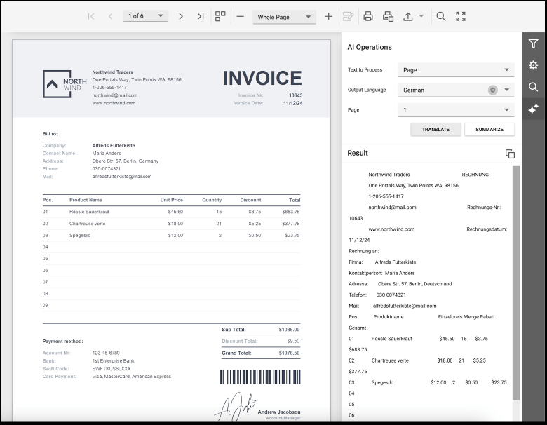
To incorporate DevExpress AI-powered Extensions, your project must meet the prerequisites.
For all models:
- An active DevExpress Subscription
- .NET 8 SDK or .NET Framework v4.7.2
For Open AI:
For Azure Open AI:
For Semantic Kernel:
For self-hosted Models:
Documentation:
Examples:
Run Demo Online
#AI Integration Examples
We have added two new examples that showcase the capabilities of our AI-specific APIs by integrating Open AI Assistants into the DevExpress Web Report Viewer and DevExpress Web End-User Report Designer. These examples also highlight the use of the brand-new DevExtreme JavaScript DxChat component.
The first example embeds a Copilot-inspired chat window within the DevExpress Web Report Viewer. As you would expect, users can ask natural language questions to analyze data and obtain AI-powered insights from the displayed report document.
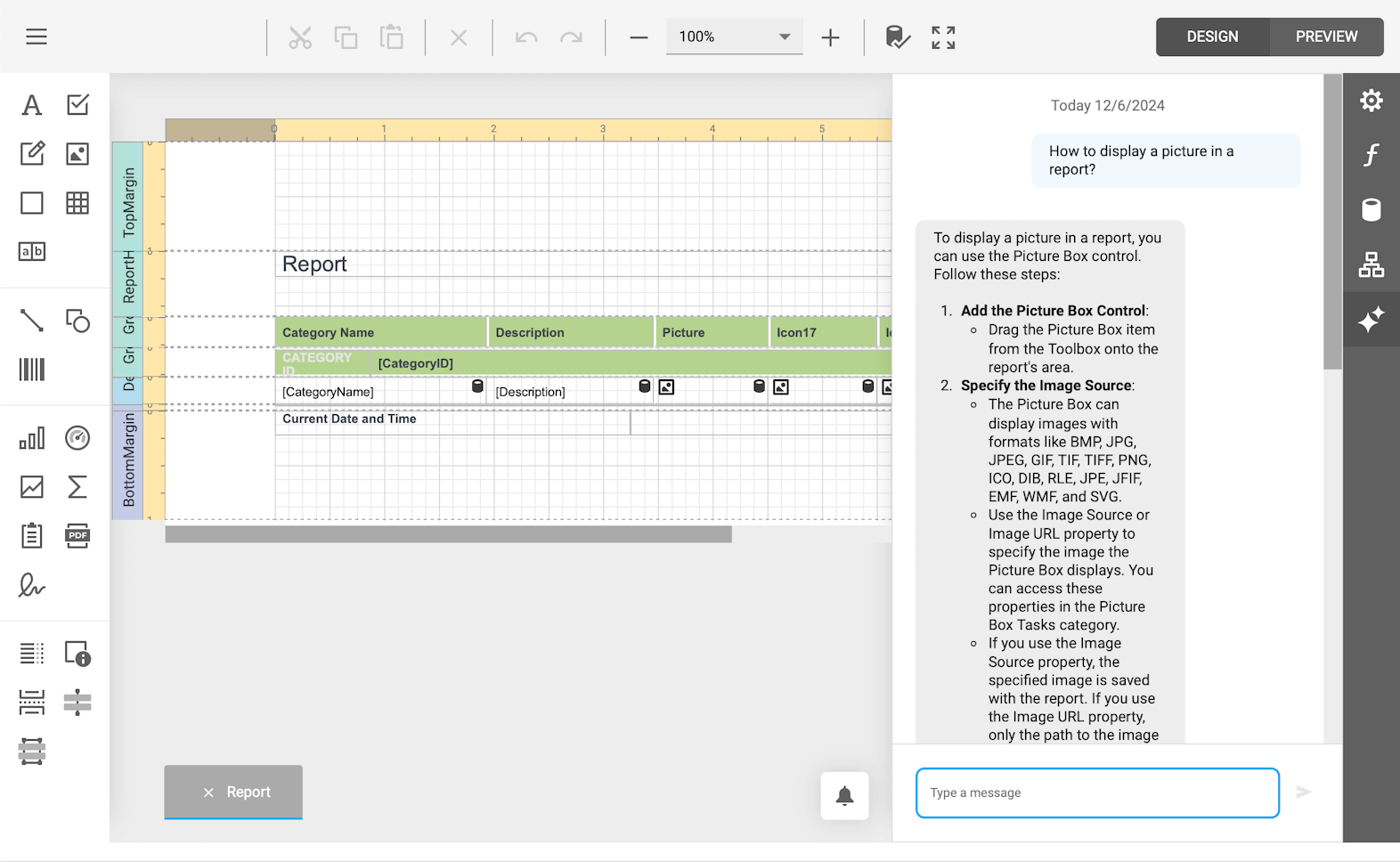
Similarly, our second example embeds a virtual assistant in the DevExpress Web End-User Report Designer. This allows users to ask report design-related language questions.
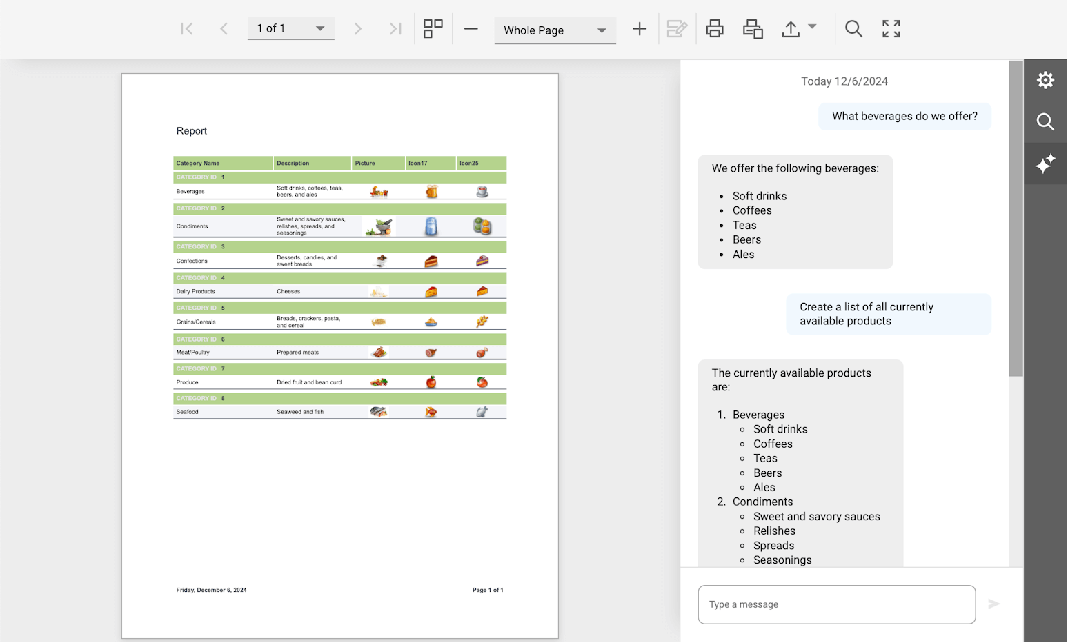
Example
Accessibility
We enhanced keyboard navigation and screen reader support across our Angular, React, and ASP.NET Core Report Viewers:
- Keyboard Navigation Enhancements: Users can more easily navigate through toolbar items, report content, and interactive elements using keyboard shortcuts.
- Improved Screen Reader Compatibility: Popular screen readers (such as Narrator and NVDA) can read additional labels and toolbar elements more clearly.
Documentation
Supported IDEs & Frameworks
#DateOnly & TimeOnly Support
This update enables you to utilize the DateOnly and TimeOnly types when:
- creating expression bindings (to bind report controls to data)
- using report and query parameters
- creating calculated fields
- sorting, grouping, and filtering data
Refer to the What's New in v24.1 to learn more about recent enhancements in this particular space.
#.NET Framework 4.6.2 and .NET 8 Support
With this release, the minimal supported framework and IDE versions are the following:
- .NET 4.6.2 and Visual Studio 2019
- .NET 8 and Visual Studio 2022
Learn more about this global change in this announcement.
#.NET 9 Support
DevExpress Reports is fully compatible with the .NET 9.
#Pango-based Cross-Platform Drawing Engine End-Of-Life
Because of .NET 8 and following the release of our cross-platform SkiaSharp-based engine last year, we refactored our source code to remove all GDI+ method calls in non-Windows environments (libgdiplus>) and the Pango-based engine. The DevExpress.CrossPlatform.Printing.DrawingEngine package is no longer available.
#Support Skia for Windows Environment and Deprecation of the AzureCompatibility Property
Multiple DevExpress products (Reporting, BI Dashboard, and Office File API) ship with printing and data export functionality for restricted environments such as Microsoft Azure (where certain GDI/GDI+ calls related to metafiles and font objects are unavailable). The AzureCompatibility.Enable property manages this functionality.
In our v23.2 release cycle, we ended support for capabilities offered by this property toggle for non-Windows environments. With v24.2, we phase out the AzureCompatibility.Enable toggle for DevExpress Reports in Windows-based environments as well. We recommend that you use our Skia-based Cross-Platform Graphics Engine if targeting cloud/restricted environments.
DevExpress Reports will automatically determine the applicable drawing engine. However, you can switch to the preferred drawing engine manually using the static DevExpress.Drawing.Settings.DrawingEngine option.
DevExpress.Drawing.Settings.DrawingEngine = DevExpress.Drawing.DrawingEngine.Skia;
.NET Aspire Dashboard Integration
.NET Aspire offers real-time development insights, allowing you to see how changes interact with the rest of your stack. You can now use the .NET Aspire Dashboard to monitor DevExpress Reports performance, track metrics, review traces, and access structured logs associated with document creation operations.
Documentation
Get Started
To log, trace, and display metrics in the .NET Aspire Dashboard, start by referencing the following NuGet packages in your application:
- DevExpress.Aspire.Reporting
- DevExpress.Aspire.AspNetCore.Reporting
Once complete, reference your resource application (i.e., the app with DevExpress Reports) from the AppHost/Orchestration project (usually with an _*.AppHost_ suffix) and make a project reference from your resource application to the ServiceDefaults application.
Next, use the .NET Aspire integration methods in the startup configuration of your resource application:
var builder = WebApplication.CreateBuilder(args);
builder.Services.AddDevExpressControls();
// Important note: Enable .NET Aspire integration after an AddDevExpressControls method call
// Enable service discovery and configure OpenTelemetry metrics and tracing for .NET Aspire.
// Learn more at: https://learn.microsoft.com/en-us/dotnet/aspire/fundamentals/service-defaults
builder.AddServiceDefaults();

// Share trace data with the .NET Aspire Dashboard from DevExpress Reports document creation and exporting
builder.AddReporting();
// Share trace and metrics data with the .NET Aspire Dashboard for the DevExpress Reports back end services
builder.AddAspNetCoreReporting();
To only view structured logs of a resource application, you can disable metrics and tracing in the Aspire section of the appSettings.json file:
"Aspire": {
    "DevExpress": {
        "Reporting": {
            "AspNetCore": {
                "DisableMetrics": true,
                "DisableTracing": true
            },
            "DisableTracing": true
        }
    }
}
At this point, navigate to the AppHost project and add a project reference in the Program.cs code unit as shown below:
var builder = DistributedApplication.CreateBuilder(args);

builder.AddProject<Projects.DevExpressReportingApp>("webreporting")
  .WithExternalHttpEndpoints();

builder.Build().Run();
Once you've added a project reference, build and run the solution to view output in the .NET Aspire Dashboard. In the screenshot below, the third row indicates that the resource application (with DevExpress Reports) is running successfully at the https://localhost:64951 endpoint:

At this stage, you can return to your application and execute DevExpress Reports-specific actions (such as viewing or exporting a report document). You can then switch back to the .NET Aspire Dashboard to analyze diagnostic information.
Traces
Open the Traces tab and select the “webreporting” resource from the drop down to view all requests made by the DevExpress Web Report Viewer to the back end. The spans allow you to examine request details, including operational duration/name, and outline each step in the document creation process: data source population, data binding evaluation, page building, export and more:
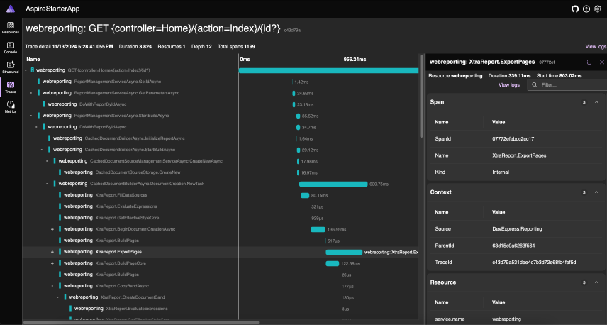
You can find the ID of a recently created document by examining the details of the CachedDocumentBuilderAsync.DocumentCreation.NewTask span:
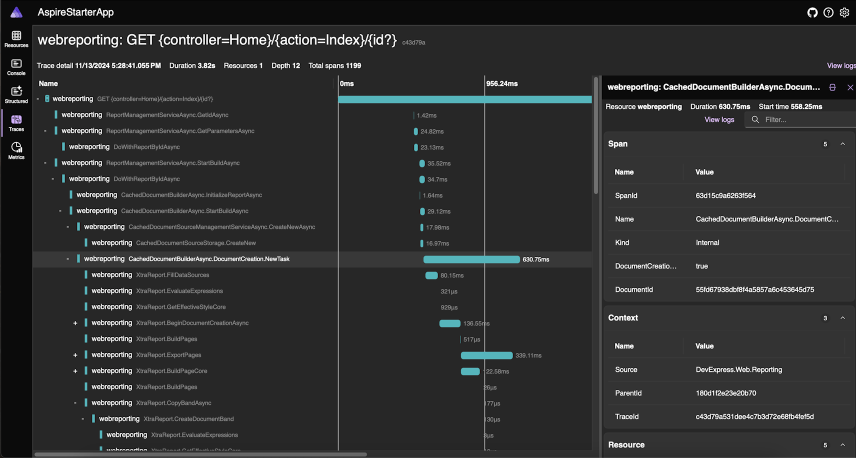
Check ClearCache traces to see when a document with the same ID was released from the cache. This process allows you to monitor memory consumption on your back end.
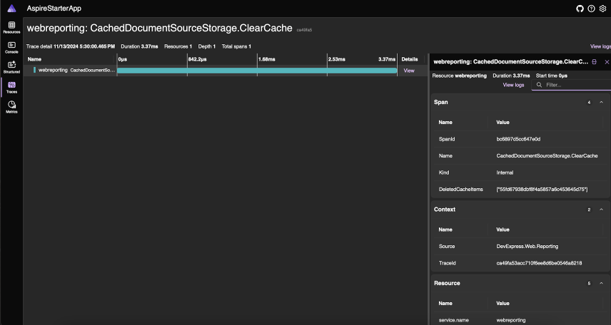
Metrics
In the Metrics tab, select the “webreporting” resource in to view the activity log for DevExpress Reports-related operations:
- The number of documents created and stored in cache within a specific timeframe and associated release times from the cache.
- The number of documents exported.
Use the filter on the right to check if a specific document or export result is still consuming application memory:
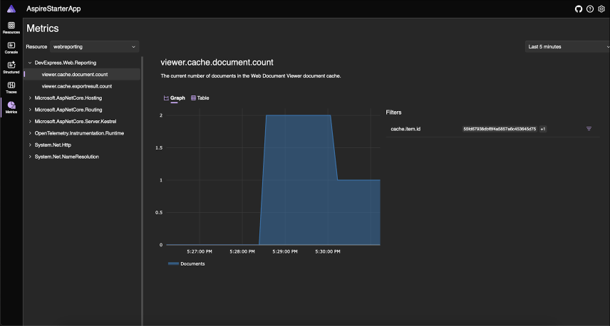
Logs
Go to the Logs tab and filter the grid against the DevExpress.AspNetCore.Reporting.Logger category to view all built-in structured logs. For example, the following warning message indicates that different versions of client-side and back-end libraries are included in the app (potential errors):
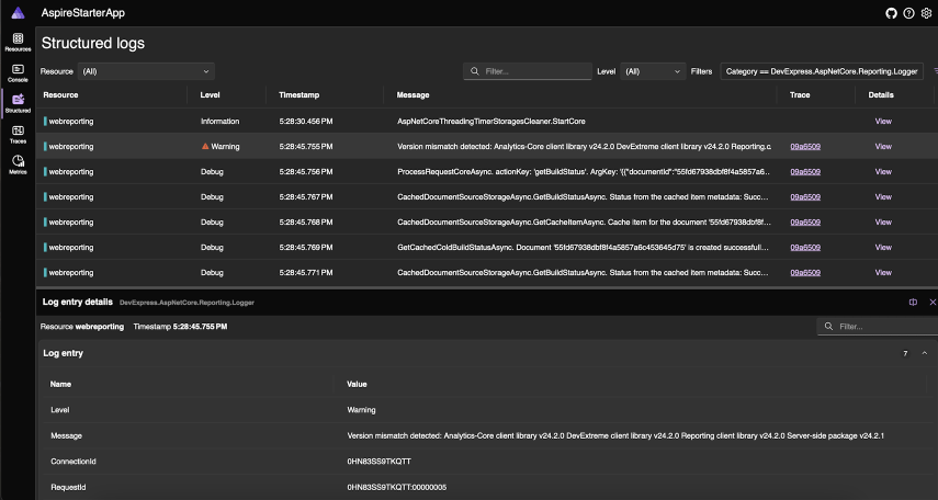
Note: to display detailed logs, change LogLevel in the appSettings.json file to Debug.
Data Sources
#SQL Data Source — Microsoft Azure SQL Support with Microsoft Entra Authentication
We added support for Microsoft Entra (formerly Azure Active Directory) authentication in SqlDataSource for Microsoft Azure SQL databases. This update allows you to seamlessly connect to Azure SQL databases using modern and secure authentication methods. We have extended the MsSqlAuthorizationType enumeration with the following types:
- ActiveDirectoryPassword
- ActiveDirectoryIntegrated
- ActiveDirectoryInteractive
- ActiveDirectoryDefault
The latter three options require the use of the Microsoft.Data.SqlClient NuGet package in your application.
#SQL Data Source — Connection Provider Enhancements
SqlDataSource now supports the most recent versions of the following database engines:
- Microsoft SQL Server 2022 (Microsoft.Data.SqlClient v5.2.2)
- Oracle 23ai (Oracle.ManagedDataAccess.Core v23.6.0)
- MySQL (MySql.Data v9.0.0 and MySqlConnector v2.3.7)
- PostgreSQL 17 (Npgsql.dll 8.0.4)
- Firebird 5.0 (FirebirdSql.Data.FirebirdClient v10.3.1)
Documentation
#JsonDataSource — The Use of The System.Text.Json NuGet Package for .NET Framework Projects
DevExpress Reports now leverages functionality from the System.Text.Json assembly/NuGet package by default. Our decision is primarily influenced by the security risks associated with third-party libraries, as well as the improved performance offered by Microsoft's own library.
If, for any reason, you are unable to utilize the System.Text.Json functionality in your application, you can set the DevExpress.DataAccess.Native.Json.JsonLoaderHelper.JsonProcessingLibrary property to the value NewtonsoftJson to revert the changes and continue using the Newtonsoft.Json library. Please note that we provide this property for backward compatibility purposes. This option will be removed from the source code in future release cycles. For more information, please refer to the following breaking change document: System.Text.Json is now used to process the JsonDataSource (DashboardJsonDataSource) component for .NET Framework platform projects.
New Barcodes
#New Aztec Barcode
We extended barcode generation support and now allow you to create the Aztec code. Aztec barcodes offer a compact/efficient way to encode large amounts of data without requiring a quiet zone, making them ideal for space-constrained documents.
To create an Aztec Barcode, set the XRBarCode.Symbology property value to AztecCode and specify appropriate barcode properties:
You can specify barcode data in code using Text or BinaryData properties as follows:
using DevExpress.XtraPrinting.BarCode;
using DevExpress.XtraReports.UI;
// ...

XRBarCode barCode = new XRBarCode();
barCode.Symbology = new AztecCodeGenerator();
barCode.Text = "YourData";
//OR
//barCode.BinaryData = GetAztecCodeData();
Documentation
#New Micro QR Code
You can now create Micro QR Codes that offer a smaller alternative to traditional QR Codes, suitable for space-limited output, where only small amounts of data (35 characters or 128 bits) require encoding.
To create a Micro QR Code, set the XRBarCode.Symbology property value to MicroQRCode and specify barcode properties:
You can also specify barcode data using Text or BinaryData properties as follows:
using DevExpress.XtraPrinting.BarCode;
using DevExpress.XtraReports.UI;
// ...

XRBarCode barCode = new XRBarCode();
barCode.Symbology = new MicroQRCodeGenerator();
barCode.Text = "123ABC";
//OR
//barCode.BinaryData = GetMicroCodeData();
Documentation
Export
#HTML Export — Preserve Rotated Text
The XRLabel control now preserves the text rotation defined by its Angle property (supported angles are 90 degrees, 180 degrees, and 270 degrees, and their negative counterparts) when exporting reports to HTML files.
#PDF Export — Export Bookmarks
The new PdfExportOptions.ExportBookmarks property allows you to control bookmark visibility in the exported PDF document.
Visual Studio Report Designer for .NET
#Collect Diagnostic Data
You can now collect DevExpress Visual Studio Report Designer for .NET-related diagnostic logs with ease. A new Collect Diagnostic Data option ships inside the DevExpress distribution (accessible from Visual Studio's Extensions → DevExpress → Report Designer sub menu). Once you click this option, all logs are collected and saved in the .zip archive on your machine.
Documentation
All Platforms
#Report Designer — Dimension Notations
To simplify the report design process, this update introduces dimension notations within the DevExpress Report Designer across all supported platforms. When you resize controls, the designer provides precise visual feedback and displays dimension notations based on a specified ReportUnit property value (such as inches, centimeters, or pixels).

To manage the visibility of notations, use the following API members:
#Resolve Missing Fonts
We added a new DXFontRepository.QueryNotFoundFont event for fonts used within a document but missing in an application's hosting environment. With this enhancement, you will be able to identify and address document appearance issues, ensuring that reports appear as designed, regardless of the hosting platform. To resolve missing fonts, add them to DXFontRepository before document generation begins (using the e.FontFileData event argument). In the following code snippet, we use a custom FontCollectorService to add fonts from Google Fonts to DXFontRepository:
DXFontRepository.QueryNotFoundFont+= QueryNotFoundFont;

void QueryNotFoundFont(object sender, NotFoundFontEventArgs e) {
    var service = new FontCollectorService();
    var fontData = service.ProcessFont(e.RequestedFont).Result;
    e.FontFileData = fontData;
}
Our components now also log font names in the application output for debugging purposes so you can identify the missing typeface and its suggested alternative.
Please review the following example for additional information: Reporting - Add missing fonts into DXFontRepository from Google.
Documentation
Reporting for Web
#Web Report Viewer — SVG Preview
The DevExpress Web Document Viewer now ships with a PageRenderFormat property (to enable SVG-based print preview functionality) designed to specify preview rendering format (SVG or PNG). SVG allows users to preview reports with the highest fidelity — maximizing sharpness and clarity at any zoom level.
One of the advantages of this enhancement is its ability to reduce the Web Report Viewer's memory footprint when transferring report page data between the server and client. Our tests indicate that this improvement is most pronounced when zoom level is set above 100%. When rendering mode switches to vector images, zooming is managed by the browser. This strategy eliminates the need to make additional requests to the reporting backend (to re-render the report) and it introduces native text selection within the viewer.
Additionally, we have added a PageRenderFormat.Auto value for the PageRenderFormat property. With this option, the Web Report Viewer automatically switches its rendering mode to SVG when the document zoom exceeds 100% (to optimize performance in multi-page mode). In single-page mode, pages are rendered in SVG.
To illustrate the difference in rendering quality, refer to the following screenshots (comparing bitmap and SVG rendering modes at a zoom level of 500%).
#React Project Templates
To help you deliver React-based Reporting applications in the shortest possible time, we have extended our Application Template gallery to include sample React Reporting Application projects.
Reporting for Blazor
#Native Report Viewer for Blazor — New Fluent Theme Support
You can now apply the new Fluent theme to the DevExpress Blazor Report Viewer.
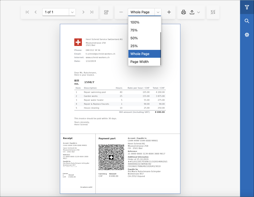
#Native Report Viewer for Blazor — Incremental Parameter Search
Editors for parameters with look-up values now support incremental filtering. Enter search criteria in the editor to display look-up values that include your search criteria. Search string matches are highlighted:
#Native Report Viewer for Blazor — Text Selection and Copying to Clipboard
The Blazor Report Viewer supports text selection and copy-to-clipboard operations using native browser Clipboard API.
#Native Report Viewer for Blazor — Shortcuts for Windows and macOS
We have updated the list of shortcuts for the Blazor Report Viewer to prevent conflicts with default system/browser shortcuts. Additionally, we have introduced new shortcuts for macOS (utilizing the Command (⌘) key).
Please refer to the following help topic for additional information: Keyboard Shortcuts.
#Native Report Viewer for Blazor — Report Parameters Validation
You can now handle the XtraReport.ParametersRequestValueChanged or the ParameterPanelViewModelBase.Validate event to implement validation rules for report parameters in the DevExpress Blazor Report Viewer.
The following code snippet handles the ParametersRequestValueChanged event and applies the following validation rules to report parameters:
- String parameters must not allow empty values
- Integer parameters must be greater than 42
- The start date in date range parameters must be in 2024
@page "/reportviewer/"

@using DevExpress.XtraReports.Parameters
@using DevExpress.XtraReports.UI
@using DxBlazorApplication6.PredefinedReports

<link href="_content/DevExpress.Blazor.Themes/blazing-berry.bs5.css" rel="stylesheet" />
<link href="_content/DevExpress.Blazor.Reporting.Viewer/css/dx-blazor-reporting-components.bs5.css" rel="stylesheet" />

<DxReportViewer @ref="reportViewer" Report="Report" RootCssClasses="w-100 h-100" />

@code {
    DxReportViewer reportViewer;
    XtraReport Report { get; set; }

    protected override async Task OnAfterRenderAsync(bool firstRender) {
        if (firstRender) {
            Report = new TestReport();
            Report.ParametersRequestValueChanged += OnParameterRequestValueChanged;
        }
        await reportViewer.OpenReportAsync(Report);
    }
    void OnParameterRequestValueChanged(object sender, ParametersRequestValueChangedEventArgs e) {
        //Check for string parameters and ensure they are not empty.
        if (e.ChangedParameterInfo?.Parameter.Type == typeof(String) && string.IsNullOrEmpty(e.ChangedParameterInfo?.Value.ToString())) {
            e.ErrorText = "String parameters do not allow empty values.";
        }
        //Check for integer parameters and ensure they are greater than 42.
        else if (e.ChangedParameterInfo?.Parameter.Type == typeof(int) && Int32.Parse(e.ChangedParameterInfo.Value.ToString()) <= 42) {
            e.ErrorText = "The value must be greater than 42.";
        }
        //Check for date range parameters and ensure the start date is within 2024.
        else if ((e.ChangedParameterInfo?.Parameter?.ValueSourceSettings as RangeParametersSettings) != null) {
            Range<DateTime> dateRange = (Range<DateTime>)e.ChangedParameterInfo.Value;
            if (dateRange.Start < new DateTime(2024, 1, 1) || dateRange.Start > new DateTime(2024, 12, 31)) {
                e.ErrorText = "The start date must be in 2024.";
            }
        }
    }
}
If validation fails, the parameter editor is outlined in red, and an error message is displayed on screen:
Documentation
#Blazor Report Designer — In-Place Rich Text Editing
Our XRRichText control allows end-users to modify content using the DevExpress Blazor Rich Text Editor. Double click the control to activate the editor. The editor's popup provides various text formatting options:
- Text Alignment
- Font Style
- Font
- Font Size
- Text Foreground and Background
- Hyperlinks
To enable this feature in your DevExpress-powered Blazor application, simply install the DevExpress.Blazor.RichEdit NuGet package.
Survey - Reporting
Your Feedback Matters!
Please
login to complete the survey.
Survey Completed
Thank you for taking the time to complete this survey. Your responses have now been posted. If you want to follow up with additional information, feel free to send us an email at clientservices@devexpress.com anytime.
You've Already Completed This Survey
Our records show that you have already completed this survey. If you want to follow up with additional information, send us an email at clientservices@devexpress.com.
This survey has expired
If you want to share your feedback or request new functionality, please submit a new support ticket via the DevExpress Support Center. We’ll be happy to follow up.
Supported IDEs & Frameworks
#.NET Framework 4.6.2 and .NET 8 Support
With this release, the minimal supported framework and IDE versions are the following:
- .NET 4.6.2 and Visual Studio 2019
- .NET 8 and Visual Studio 2022
Learn more about this global change in this announcement.
#.NET 9 Support
DevExpress BI Dashboard is fully compatible with the .NET 9.
Data Sources
#SQL Data Source — Microsoft Azure SQL Support with Microsoft Entra Authenticationn
We added support for Microsoft Entra (formerly Azure Active Directory) authentication in SqlDataSource for Microsoft Azure SQL databases. This update allows you to seamlessly connect to Azure SQL databases using modern and secure authentication methods. We have extended the MsSqlAuthorizationType enumeration with the following types:
- ActiveDirectoryPassword
- ActiveDirectoryIntegrated
- ActiveDirectoryInteractive
- ActiveDirectoryDefault
The latter three options require the use of the Microsoft.Data.SqlClient NuGet package in your application.
#SQL Data Source — Connection Provider Enhancements
SqlDataSource now supports the most recent versions of the following database engines:
- Microsoft SQL Server 2022 (Microsoft.Data.SqlClient v5.2.2)
- Oracle 23ai (Oracle.ManagedDataAccess.Core v23.6.0)
- MySQL (MySql.Data v9.0.0 and MySqlConnector v2.3.7)
- PostgreSQL 17 (Npgsql.dll 8.0.4)
- Firebird 5.0 (FirebirdSql.Data.FirebirdClient v10.3.1)
Documentation
#JsonDataSource — The Use of The System.Text.Json NuGet Package
DevExpress BI Dashboard will now utilize functionality from the System.Text.Json assembly/NuGet package by default. Our decision is primarily influenced by the security risks associated with third-party libraries, as well as the improved performance offered by Microsoft's own library.
If, for any reason, you are unable to utilize the System.Text.Json functionality in your application, you can set the DevExpress.DataAccess.Native.Json.JsonLoaderHelper.JsonProcessingLibrary property to the value NewtonsoftJson to revert the changes and continue using the Newtonsoft.Json library. Please note that we provide this property for backward compatibility purposes. This option will be removed from the source code in future release cycles. For more information, please refer to the following breaking change document: System.Text.Json is now used to process the JsonDataSource (DashboardJsonDataSource) component for .NET Framework platform projects.
Your feedback matters.
Please, review the description of DevExpress Office File API-related features below and leave your feedback at the end of the section.
Go to the survey now.
Important Changes
#GDI+ (Libgdiplus) — End of Support for Non Windows-based systems
Because of our commitment to .NET 8 and following the release of our cross-platform SkiaSharp-based engine last year, we refactored our source code and removed all GDI+ related method calls for non-Windows environments (libgdiplus).
using System.IO;
using DevExpress.XtraRichEdit;
// ...
RichEditDocumentServer wordProcessor = new RichEditDocumentServer();
//...
using(FileStream stream =
    new FileStream(resultFilePath, FileMode.Create, FileAccess.Write, FileShare.Read)) {
    PdfExportOptions exportOptions = new PdfExportOptions();
    exportOptions.PdfUACompatibility = PdfUACompatibility.PdfUA1;

    wordProcessor.ExportToPdf(stream, exportOptions);
}
#Support Skia for Windows Environments and Deprecation of the AzureCompatibility Property
Multiple DevExpress products (Reporting, BI Dashboard, and Office File API) ship with printing and data export functionality for restricted environments such as Microsoft Azure (where certain GDI/GDI+ calls related to metafiles and font objects are unavailable). Our AzureCompatibility.Enabled
In our v23.2 release cycle, we ended support for capabilities offered by this property toggle for non-Windows environments. With v24.2, we phased out the AzureCompatibility.Enabled
DevExpress Office File API libraries automatically determine the applicable drawing engine used. You can switch to a different drawing engine manually by using the static DevExpress.Drawing.Settings.DrawingEngine option.
DevExpress.Drawing.Settings.DrawingEngine = DevExpress.Drawing.DrawingEngine.Skia;
Resolve Missing Fonts
We added a new DXFontRepository.QueryNotFoundFont event for fonts used within a document but missing in an application’s hosting environment. This feature allows you to identify and resolve missing fonts by adding them to DXFontRepository
In the following code snippet, we use Google Fonts to locate/add fonts to DXFontRepository:
DXFontRepository.QueryNotFoundFont+= QueryNotFoundFont;

void QueryNotFoundFont(object sender, NotFoundFontEventArgs e) {
    var service = new FontCollectorService();
    var fontData = service.ProcessFont(e.RequestedFont).Result;
    e.FontFileData = fontData;
}
With this enhancement, you are now able to identify and address document appearance issues, ensuring that documents appear as designed, regardless of the hosting platform. Our components will also log font names in the application output for debugging purposes.
Spreadsheet Document API
#Dynamic Array Formulas
We’ve extended our formula calculation engine and integrated dynamic arrays into our Spreadsheet Document API library. Unlike standard array formulas, which return a single value for each cell with a formula, dynamic array functions return a dynamic array of values (this array of values automatically spills into neighboring cells).
New functionality includes:
- Dynamic array calculations and Spill Range support.
- New formula error type (#SPILL!).
- Implicit intersection operator (@ symbol) to return a single formula value instead of an array.

You can now import Excel documents containing dynamic array formulas in the Spreadsheet Document API library, call the Workbook.Calculate method to recalculate these formulas, and save the document calculated with values to Excel formats. Printing and export to PDF are also available.
Additionally, you can manage dynamic array formulas in code. v24.2 ships the following new APIs:
Refer to the following code snippet if you’d like to obtain, insert, or clear dynamic array formulas using our new APIs:
Worksheet worksheet = workbook.Worksheets.ActiveWorksheet;

// Insert dynamic array formulas
worksheet["A1"].DynamicArrayFormulaInvariant = "={\"Red\",\"Green\",\"Orange\",\"Blue\"}";
worksheet.DynamicArrayFormulas.Add(worksheet["A2"], "=LEN(A1:D1)");

// Clear dynamic array formulas
Cell cell = worksheet.Cells["B2"];
if (cell.HasDynamicArrayFormula) {

    CellRange dynamicArrayRange = cell.GetDynamicArrayFormulaRange();
    dynamicArrayRange.Clear();
}

worksheet.DynamicArrayFormulas.Remove(worksheet.Cells["A1"].GetDynamicArrayFormulaRange());
To suppress dynamic array formula calculations and revert to the previous behavior, set the WorkbookCapabilitiesOptions.DynamicArrayFormulasDocumentCapability.Disabled
Array Formulas in Spreadsheet Documents
#Embed Images in Cells
The DevExpress Spreadsheet Document API library (v24.2) allows you to embed images directly into worksheet cells (using Microsoft Excel's "Place in Cell" option). You can import documents with images embedded in worksheet cells, print these documents, export them to the PDF and save them to a supported Excel file (without the content loss).

v24.2 includes new APIs designed to manage cell embedded images in code. Embedded images are stored as cell values. To determine if a cell has an embedded image, use the CellValue.IsCellImage property. Use the CellValue.ImageValue property to obtain the cell image value as a OfficeImage object (allows you to check the image format or obtain image bytes). To insert an image in a cell, assign it to the CellRange.Value
The Spreadsheet Document API library supports the following object types as an image source:
- Byte[]
- System.IO.Stream
- System.Drawing.Image
- DevExpress.Drawing.DXImage
- DevExpress.Office.Utils.OfficeImage
Additionally, we implemented options to specify image Alt Text (a meaningful description) values and mark the cell image as decorative. These settings are available via the Cell.ImageInfo property.
The following code snippet demonstrates this new API in action:
byte[] imageBytes = File.ReadAllBytes("image.png");
MemoryStream imageStream = new MemoryStream(imageBytes);
DXImage dximage = DXImage.FromStream(imageStream);

// Insert cell images from a byte array, stream and DXImage object
worksheet.Cells["A1"].Value = imageBytes;
worksheet.Cells["A2"].Value = imageStream;
worksheet.Cells["A3"].Value = dximage;

// Set image Alt Text values
worksheet.Cells["A1"].ImageInfo.AlternativeText = "Image AltText";

// Mark the cell image as decorative
if (worksheet.Cells["A2"].Value.IsCellImage)
    worksheet.Cells["A2"].ImageInfo.Decorative = true;

// Save the cell image to a new file
OfficeImage cellImage = worksheet.Cells["A1"].Value.ImageValue;

if (cellImage.RawFormat == OfficeImageFormat.Png) {

    byte[] cellImageBytes = cellImage.GetImageBytes(cellImage.RawFormat);
    File.WriteAllBytes("saved_image.png", cellImageBytes);
}

// Remove cell image
worksheet.Cells["A3"].ClearContents();
How to: Place a Picture in a Cell
#Justify & Distributed Vertical Text Alignment
v24.2 adds support for Justify and Distributed vertical alignment types within Spreadsheet cells. Excel files with these alignment options can be printed and exported to PDF.
You can use the Cell.Alignment.Vertical
The following code snippet specifies alignment in code:
var workbook = new Workbook();
var worksheet = workbook.Worksheets[0];

Cell cellA1 = worksheet.Cells["A1"];
cellA1.Value = "Centered and Justified";
cellA1.Alignment.Horizontal = SpreadsheetHorizontalAlignment.Center;
cellA1.Alignment.Vertical = SpreadsheetVerticalAlignment.Justify;

workbook.ExportToPdf("Result.pdf");
PDF Document API
#ZuGFeRD v2.3.2 Support
The DevExpress PDF File API (part of the Office File API Suite) fully supports Germany’s ZuGFeRD e-invoicing standard (ZuGFeRD v2.3.2).
You can attach ZuGFeRD v2.3.2 XML files to your PDF documents by calling the PdfDocument.AttachZugferdInvoice method (using the new PdfZugferdVersion.Version2_3_2
using (var pdfDocumentProcessor = new PdfDocumentProcessor()) {
    pdfDocumentProcessor.LoadDocument("Invoice.pdf");
    pdfDocumentProcessor.Document.AttachZugferdInvoice
        (File.ReadAllBytes("ZUGFeRD-invoice.xml"), PdfZugferdVersion.Version2_3_2, PdfZugferdConformanceLevel.Extended);
    pdfDocumentProcessor.SaveDocument("Invoice_ZuGFeRD.pdf");
}
#Signature Validation Enhancements
v24.2 ships with enhanced PDF Signature Validation APIs. New capabilities include:
- API to verify certificate revocation based on Online Certificate Status Protocol (OCSP) responses.
- API to verify certificate revocation based on Certificate Revocation List (CRL).
- API to validate Long Term Validation (LTV) signatures.
- API to validate Document Level Timestamps.
Call the PdfPkcs7Signature.CheckCertificateRevocation method to obtain information about signature certificate revocation.
using DevExpress.Pdf;

// ...
CheckCertificateRevocationInfo();
// ...

public static void CheckCertificateRevocationInfo() {
    using (PdfDocumentSigner documentSigner = new PdfDocumentSigner("Signed_file.pdf"))
        // Retrieve the list of `PdfSignatureInfo` objects in the document.
        foreach (var signature in documentSigner.GetSignatureInfo()) {
            Console.WriteLine("Signature field name : {0}", signature.FieldName);
            Console.WriteLine("Signer name : {0}", signature.SignerName);
            var pkcs7 = documentSigner.GetPdfPkcs7Signature(signature.FieldName);
            Console.WriteLine("Is signature valid? : {0}", pkcs7.VerifySignature());

            // Check whether the CRL/OCSP responses are embedded in the signature; otherwise, request them online.
            Console.WriteLine("Is CRL embedded?: {0}", pkcs7.CrlList != null);
            Console.WriteLine("Is OCSP embedded?: {0}", pkcs7.OcspList != null);
            PdfRevocationVerificationOptions options = new PdfRevocationVerificationOptions() {
                TryFetchCrlOnline = pkcs7.CrlList == null,
                TryFetchOcspOnline = pkcs7.OcspList == null,
            };

            // Obtain information about the signature certificate revocation.
            var result = pkcs7.CheckCertificateRevocation(DateTime.UtcNow, options);
            Console.WriteLine("Is certificate revoked?: {0}", result.IsCrlRevoked);
            if (result.IsCrlRevoked)
                Console.WriteLine("Is CRL found online?: {0}", result.IsCrlFoundOnline);
            Console.WriteLine("OCSP Response Status: {0}", result.OcspRevocationStatus);

            if (result.OcspRevocationStatus != PdfOcspRevocationStatus.None)
                Console.WriteLine("Is OCSP found online?: {0}", result.IsOcspFoundOnline);

            // Check whether the signature is a TimeStamp.
            Console.WriteLine("Is Document Timestamp?: {0}", pkcs7.IsDocumentTimeStamp);
            Console.WriteLine();
      }
}
Call the PdfDocumentSigner.VerifyLtv to obtain Long Term Validation (LTV) records about the state of the signature certificate.
using DevExpress.Pdf;

// ...
VerifyLTV();
// ...

public static void VerifyLTV() {
    using (PdfDocumentSigner documentSigner = new PdfDocumentSigner("Signed_file.pdf")) {
        PdfLtvOptions options = new PdfLtvOptions() {
            TryFetchCrlOnline = true,
            TryFetchOcspOnline = true,
            VerifyEntireCertificateChain = true,
        };

        var result = documentSigner.VerifyLtv(options);
        foreach (var entry in result) {
            Console.WriteLine("Signature Name: {0}", entry.SignatureFieldName);
            Console.WriteLine("Certificate in chain: {0}", entry.CertificateRevocationResults.Count);

            foreach(var revocation in entry.CertificateRevocationResults) {
                Console.WriteLine("Certificate {0}", revocation.Key.Subject);
                Console.WriteLine("Is certificate revoked?: {0}", revocation.Value.IsCrlRevoked);
                if (revocation.Value.IsCrlRevoked)
                    Console.WriteLine("Is CRL found online?: {0}", revocation.Value.IsCrlFoundOnline);
                Console.WriteLine("OCSP Response Status: {0}", revocation.Value.OcspRevocationStatus);

                if (revocation.Value.OcspRevocationStatus != PdfOcspRevocationStatus.None)
                    Console.WriteLine("Is OCSP found online?: {0}", revocation.Value.IsOcspFoundOnline);
                Console.WriteLine();
            }
          }
      }
  }
We also enhanced internal code designed to validate signatures. We now support the ECDSA (Elliptic Curve Digital Signature Algorithm) validation process. The validation process is implemented using classes from the System.Security.Cryptography
How to: Validate a PDF Document Signature
#Export PDF Documents to SVG
We implemented a PdfDocumentProcessor.CreateSvgImage method designed to convert individual PDF pages to SVG images.
int largestEdgeLength = 1000;

using (PdfDocumentProcessor processor = new PdfDocumentProcessor()) {
    // Load a document
    processor.LoadDocument("..\\..\\Document.pdf");

    for (int i = 1; i <= processor.Document.Pages.Count; i++) {

        // Export pages to SVGs
        DXSvgImage image = processor.CreateSvgImage(i, largestEdgeLength);

        // Save the images
        image.Save("..\\..\\MySvg" + i + ".svg", DXImageFormat.Svg);
      }
  }
Note: SVG export ships with limitations. We do not embed fonts in target SVG files. PDF patterns and shadings are not supported. Limited transparency support.
How to: Export a PDF Page to an SVG Image
#Image Extraction API
To improve user experiences when extracting PDF content and analyzing document structure, we introduced PdfDocumentProcessor.GetImagesInfo method overloads for the PDF Document API library. With our new APIs, you can obtain additional information about PDF page images and determine image size and location on a page.
How to: Extract Images from a Document
Word Processing Document API
#SmallCaps Formatting
Our Word Processing Document API library now supports Small Caps character formatting. Word documents with Small Caps formatting can be previewed, printed, and exported to PDF.
To enable formatting in code, use the CharacterProperties.SmallCaps property:
Document document = wordDocumentProcessor.Document;
Paragraph paragraph = document.Paragraphs[0];

CharacterProperties characterProperties = document.BeginUpdateCharacters(paragraph.Range);
characterProperties.SmallCaps = true;
document.EndUpdateCharacters(characterProperties);
#Page Borders
The DevExpress Word Processing Document API library now supports page borders. Word documents with page borders can be saved without content loss, printed, and exported to PDF.
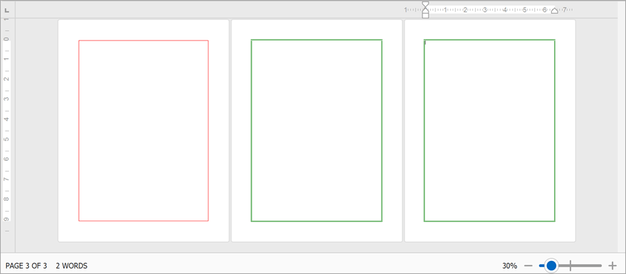
New APIs allow you to manage page borders in code. Borders can be set for each document section individually. Use the Section.PageBorders property to access and modify borders for a specific section. New members help you adjust the following border settings:
- Line style
- Color
- Width
- Distance from text or page edge
You can also apply borders to specific pages within a section: to all pages, only the first page, or all pages except the first. And you can change border z-order to display them in front or behind main text.
The following code snippet applies different borders in a document with two sections:
Document document = wordDocumentProcessor.Document;
string pageBreaks = "\f\f\f";

// Generate a document with two sections and multiple pages in each section
document.AppendText(pageBreaks);
document.Paragraphs.Append();
document.AppendSection();
document.AppendText(pageBreaks);

// Set borders for the first page of the first section
SetPageBorders(pageBorders1.LeftBorder, BorderLineStyle.Single, 1f, Color.Red);
SetPageBorders(pageBorders1.TopBorder, BorderLineStyle.Single, 1f, Color.Red);
SetPageBorders(pageBorders1.RightBorder, BorderLineStyle.Single, 1f, Color.Red);
SetPageBorders(pageBorders1.BottomBorder, BorderLineStyle.Single, 1f, Color.Red);

pageBorders1.AppliesTo = PageBorderAppliesTo.FirstPage;

Section secondSection = document.Sections[1];
SectionPageBorders pageBorders2 = secondSection.PageBorders;

// Set borders for all pages of the second section
SetPageBorders(pageBorders2.LeftBorder, BorderLineStyle.Double, 1.5f, Color.Green);
SetPageBorders(pageBorders2.TopBorder, BorderLineStyle.Double, 1.5f, Color.Green);
SetPageBorders(pageBorders2.RightBorder, BorderLineStyle.Double, 1.5f, Color.Green);
SetPageBorders(pageBorders2.BottomBorder, BorderLineStyle.Double, 1.5f, Color.Green);

pageBorders2.AppliesTo = PageBorderAppliesTo.AllPages;
pageBorders2.ZOrder = PageBorderZOrder.Back;

//...
void SetPageBorders(PageBorder border, BorderLineStyle lineStyle,
  float borderWidth, Color color) {

    border.LineStyle = lineStyle;
    border.LineWidth = borderWidth;
    border.LineColor = color;
}
Documentation: Specify Page Borders
#Paragraph Borders API
v24.2 includes new APIs designed to manage Word document paragraph borders in code. You can now add borders to document paragraphs, change border style, color, and thickness for each border type (Top, Left, Right, Bottom or Horizontal) individually, or remove border formatting as needed. Additionally, you can manage paragraph border settings for paragraph styles and list levels in numbered lists.
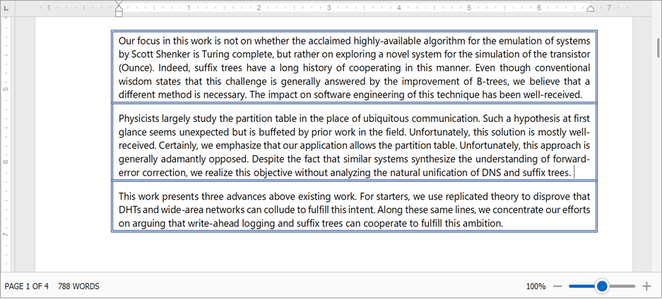
Paragraph border settings are available via the ParagraphBorders class. Use the Paragraph.BordersParagraphProperties.BordersParagraphStyle.BordersParagraphBorders
RichEditDocumentServer documentProcessor = new RichEditDocumentServer();
documentProcessor.Text = "paragraph 1\r\nparagraph 2\r\nparagraph 3\r\nparagraph 4\r\n";

Document document = documentProcessor.Document;

// Setup borders for one paragraph
Paragraph firstParagraph = document.Paragraphs[0];
ParagraphBorders borders1 = firstParagraph.Borders;

SetBorders(borders1.LeftBorder, BorderLineStyle.Single, 1f, Color.Red);
SetBorders(borders1.TopBorder, BorderLineStyle.Single, 1f, Color.Red);
SetBorders(borders1.RightBorder, BorderLineStyle.Single, 1f, Color.Red);
SetBorders(borders1.BottomBorder, BorderLineStyle.Single, 1f, Color.Red);

// Setup borders for multiple paragraphs
Paragraph secondParagraph = document.Paragraphs[1];
Paragraph forthParagraph = document.Paragraphs[3];
DocumentRange paragraphRange = document.CreateRange(secondParagraph.Range.Start,
  forthParagraph.Range.End.ToInt() - secondParagraph.Range.Start.ToInt());

ParagraphProperties paragraphProperties = document.BeginUpdateParagraphs(paragraphRange);
ParagraphBorders borders2 = paragraphProperties.Borders;
SetBorders(borders2.LeftBorder, BorderLineStyle.Double, 1.5f, Color.Green);
SetBorders(borders2.TopBorder, BorderLineStyle.Double, 1.5f, Color.Green);
SetBorders(borders2.RightBorder, BorderLineStyle.Double, 1.5f, Color.Green);
SetBorders(borders2.BottomBorder, BorderLineStyle.Double, 1.5f, Color.Green);
SetBorders(borders2.HorizontalBorder, BorderLineStyle.Double, 1.5f, Color.Green);
document.EndUpdateParagraphs(paragraphProperties);

// Reset paragraph borders
secondParagraph.Borders.Reset();
//...

void SetBorders(ParagraphBorder border, BorderLineStyle lineStyle,
   float borderWidth, Color color) {

  border.LineStyle = lineStyle;
  border.LineWidth = borderWidth;
  border.LineColor = color;
}
#Alt Text for Tables
Table.TitleTable.Description
Table title and description are also in use when you export a Word document to an accessible PDF file.
RichEditDocumentServer documentProcessor = new RichEditDocumentServer();
documentProcessor.LoadDocument("tables.docx");

Document document = documentProcessor.Document;
if(document.Tables.Count > 0) {
  Table table = document.Tables[0];
  table.Title = "Table title..";
  table.Description = "Table description..";
}
Note that table title and description are only supported in OpenXml document formats (.docx, .docm, .dotx, .dotm) and HTML.
#Macros API
We implemented a Document.VbaProject property to programmatically retrieve a VBA project stored in a macro-enabled Word file. Use the VbaProject.Modules
// Check if the current document has macros and remove them
Document document = wordProcessor.Document;

if(document.VbaProject.Modules.Count > 0)
document.VbaProject.Modules.Clear();
VBA Macros in Word Documents
Barcode Generation API
#New Aztec Barcode
You can now generate an Aztec code when using our Barcode Generation library. Aztec barcodes offer a compact/efficient way to encode large amounts of data without requiring a quiet zone, which makes them ideal for space-constrained documents.
To create an Aztec Barcode, set the BarCode.Symbology property value to AztecCode
You can also specify barcode data using CodeTextBinaryData
using DevExpress.BarCodes;
using DevExpress.XtraPrinting.BarCode;
using DevExpress.Drawing;

// ...
BarCode barCode = new BarCode();
barCode.Symbology = Symbology.AztecCode;

barCode.Options.AztecCode.CompactionMode = AztecCodeCompactionMode.Text;
barCode.CodeText = "https://www.devexpress.com/";

// OR
// barCode.Options.AztecCode.CompactionMode = AztecCodeCompactionMode.Binary;
// barCode.CodeBinaryData = Encoding.Default.GetBytes("https://www.devexpress.com/");

barCode.Options.AztecCode.ErrorLevel = AztecCodeErrorCorrectionLevel.Level1;
barCode.Options.AztecCode.ShowCodeText = false;
barCode.DpiX = 72;
barCode.DpiY = 72;
barCode.Module = 2f;

barCode.Save("aztec_code.png", DXImageFormat.Png);
#New Micro QR Code
You can now create Micro QR Codes (a smaller alternative to traditional QR Codes). Micro QR Codes are suitable for space-limited documents, where only small amounts of data (35 characters or 128 bits) require encoding.
To create a Micro QR Code, set the BarCode.Symbology property value to MicroQRCode
You can also specify barcode data using CodeTextBinaryData
using DevExpress.BarCodes;
using DevExpress.XtraPrinting.BarCode;
using DevExpress.Drawing;

// ...
BarCode barCode = new BarCode();
barCode.Symbology = Symbology.MicroQRCode;

barCode.Options.MicroQRCode.CompactionMode = MicroQRCodeCompactionMode.AlphaNumeric;
barCode.CodeText = "123ABC";

//OR
// barCode.Options.MicroQRCode.CompactionMode = MicroQRCodeCompactionMode.Byte;
// barCode.CodeBinaryData = Encoding.Default.GetBytes("123ABC");

barCode.Options.MicroQRCode.ErrorLevel = MicroQRCodeErrorCorrectionLevel.L;
barCode.Options.MicroQRCode.ShowCodeText = false;

barCode.Save("microqr_code.png", DXImageFormat.Png);
Survey - Office File API
Your Feedback Matters!
Please
login to complete the survey.
Survey Completed
Thank you for taking the time to complete this survey. Your responses have now been posted. If you want to follow up with additional information, feel free to send us an email at clientservices@devexpress.com anytime.
You've Already Completed This Survey
Our records show that you have already completed this survey. If you want to follow up with additional information, send us an email at clientservices@devexpress.com.
This survey has expired
If you want to share your feedback or request new functionality, please submit a new support ticket via the DevExpress Support Center. We’ll be happy to follow up.
Your feedback matters.
Please, review the description of .NET MAUI-related features below and leave your feedback at the end of the section.
Go to the survey now.
Ease of Use and IDE Integration
How long does it take to go from a blank page to a fully functional view? While the amount of time varies by project, the process typically involves the following steps:
- Designing a mockup
- Selecting appropriate UI components
- Setting up control APIs
- Implementing a view model to interact with business logic
And of course, each of these steps can be broken down into smaller tasks.
A primary goal in our v24.2 release cycle was to streamline this entire process. To address this productivity/efficiency-related objective, v24.2 includes our new Project Template Gallery and Toolbox extension:
Download Kit for Visual StudioDownload Kit for VS Code
We understand that every app has unique requirements and predefined templates can't address each and every usage scenario. That's why we've made our building blocks flexible - use them as a foundation and customize them to suit your specific needs.
#.NET MAUI Project Template Gallery
v24.2 ships with our new .NET MAUI Project Template Gallery. It includes popular modules and pre-designed pages. With its flexible configuration flow, you can customize your project as necessary (whether it's a simple starter app or a full-featured solution with predefined modules).
Each auto-generated project follows UI-related best practices, includes basic business logic and architectural patterns.
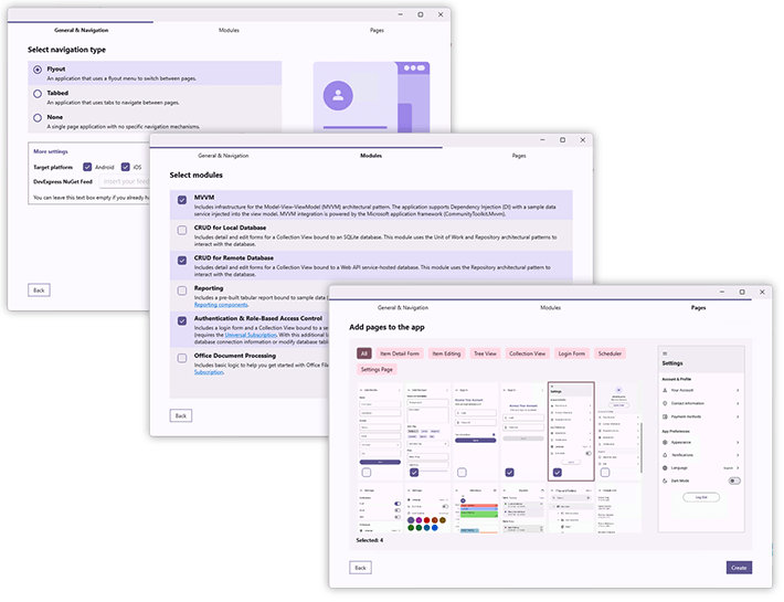
The DevExpress .NET MAUI Project Wizard allows you to specify/configure the following options:
Navigation Type
Define an app's top-level navigation structure - choose from Flyout, Tabbed, or None. Modules/pages selected in later steps are automatically added to the navigation hierarchy.
Modules
Include infrastructure for common mobile app requirements, such as connecting to a local/remote database and managing authentication/authorization. Additionally, modules simplify integration with other DevExpress product libraries, including DevExpress Reports, Office File API, and .NET App Security & Web API Service.
Pages
Choose from almost thirty ready-to-use page designs (Material Design 3 based). Each page includes configured UI components and a basic view model to help you get started quickly.
#Toolbox with Controls and Building Blocks
v24.2 also includes a Toolbox with controls and building blocks to help you create views faster.
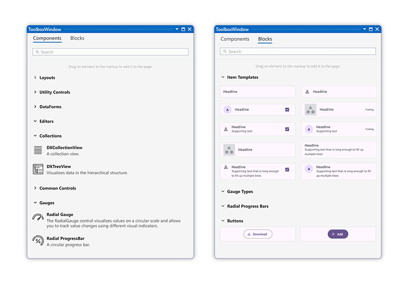
Our Toolbox includes 30+ ready-to-use building blocks (including collection item templates, predefined cards, gauges, form elements, and more).
When you drag an item into XAML, the toolbox automatically adds appropriate NuGet packages, namespaces, and control initializers.
Of course, each app has unique requirements and predefined templates can't address every possible usage scenario. That's why we've made our building blocks flexible - use them as a foundation and customize them to address specific needs.
MVVM Enhancements
We've developed a library of services, helpers, and markup extensions to make it easier to create MVVM-based applications. We did not create our own MVVM framework (as we did for WPF and WinForms components). Instead, we went with the Community Toolkit MVVM. Our library doesn't replace it but enhances it with additional functionality.
#Services
You can now use the following services to simplify MVVM development:
- Popup Dialog Service. Open predefined or custom popup dialogs.
- NavigationService. Navigate between pages directly from your view model.
- PrintService. Launch the default print dialog to print files.
- SaveFilePicker. Open a dialog and allow users to save a file.
- UI Services. Interact with UI components from the view model without breaking MVVM.
These services are automatically added to the default Dependency Injection (DI) container. You simply need to register your view model and define a constructor that accepts corresponding interfaces to access the service within your view model.
public class ViewModel {
    public ViewModel(INavigationService navigationService, IPrintService printService, ISaveFilePicker saveFilePickerService) {
        //navigationService.GoToAsync(...);
        //printService.PrintAsync(...);
        //saveFilePickerService.SaveAsync(...);
    }
}
If you prefer to use your own custom service implementation, you can register it in the DI container to override the default registration:
public static class MauiProgram {
    public static MauiApp CreateMauiApp() {
        //...
        builder.Services.AddSingleton<INavigationService, NavigationServiceEx>();
    }
}
public class NavigationServiceEx : NavigationService { }
#Popup Dialog Service
Our Popup Dialog Service makes it easy to display predefined and custom popup dialogs. The service allows you to return a result based on the button tapped by the user.
Here are the predefined dialogs available in the Popup Dialog Service:
- Alert with text, icon, and buttons.
- Alert with custom content.
- Action sheet with or without the Cancel button.
- Action sheet with radio buttons and single selection.
- Action sheet with checkboxes and multiple selections.
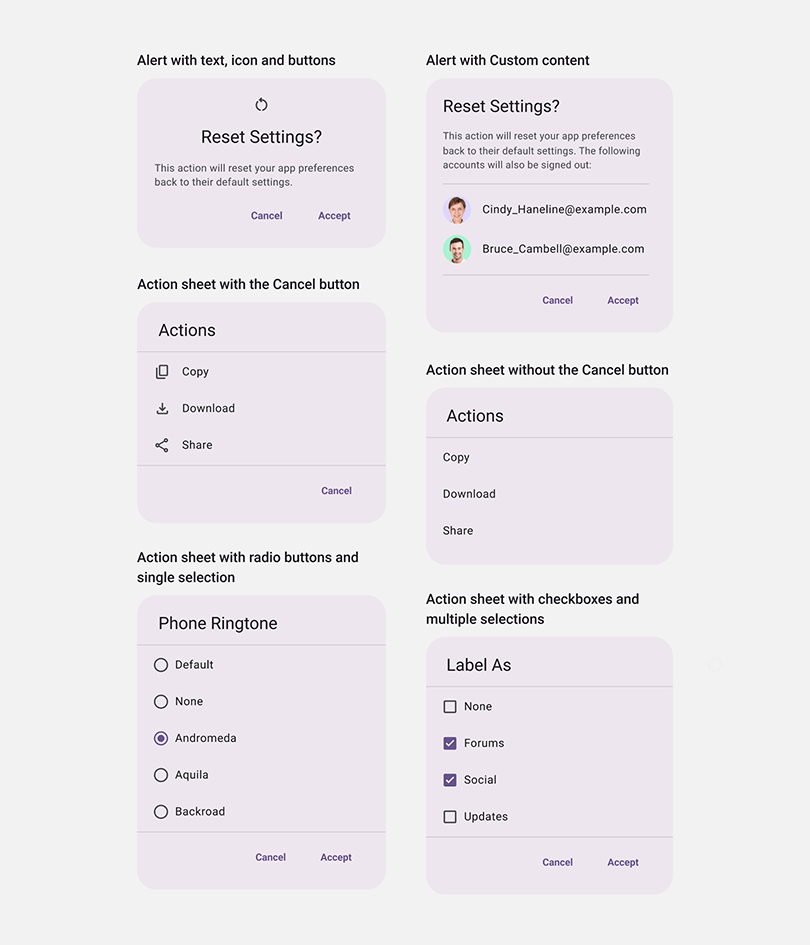
To use these dialogs, simply inject the IDXPopupService into your view model via Dependency Injection, and call one of the following methods:
Here's an example of how you can display an alert with an icon:
public class PopupServiceDemoViewModel {
    readonly IDXPopupService PopupService;

    public PopupServiceDemoViewModel(IDXPopupService popupService) {
        PopupService = popupService;
    }

    Task ShowAlertWithIcon() {
        var res = await popupService.ShowAlert(
            settings: new DXPopupSettings() {
                Title = "Reset Settings ?",
                Message = "This will reset your app preferences back to their default settings.",
                TitleIcon = icon
            },
            ok: "Accept",
            cancel: "Cancel");
    }
}
To display a dialog with custom content, create your own view, register it in a DI container and call ShowPopup:
builder.Services
    .AddTransient<LoginPopup>()
    .AddTransient<LoginPopupViewModel>;

//…

async Task ShowCustomPopup() {
    var vm = await popupService.ShowPopup<LoginPopupViewModel>();
}
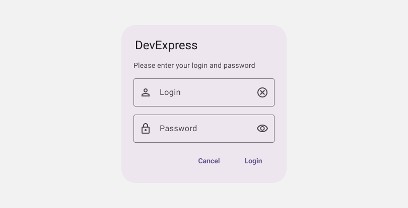
#Navigation Service
In .NET MAUI, the Shell.Current.GoToAsync method allows you to navigate to a view from any class. However, calling this method directly from a view model creates a strong dependency on Shell. This breaks MVVM pattern and complicates unit testing. To address this, we've introduced a navigation service. You can inject it into your view model to navigate to other views in an MVVM-friendly manner:
public class ViewModel {
    INavigationService NavigationService { get; }
    public ViewModel(INavigationService navigationService) {
        NavigationService = navigationService;
    }

    void ShowDetailForm() {
        var parameters = new Dictionary<string, object>();
        parameters["NavigationParameter"] = NavigationParameter;
        NavigationService.GoToAsync("DetailView", parameters, false);
    }
}
Similar to the standard GoToAsync method, NavigationService.GoToAsync allows you to specify target view name and navigation parameters. Additionally, you can obtain the current view by accessing the CurrentLocation property.
#SaveFilePicker Service
Our MVVM library includes a SaveFilePicker service to help you specify the name and location of a saved file. It opens a standard dialog and allows users to choose where and how to save a file:
Like other services, you can inject it using DI and use from the view model:
public class ViewModel {
    ISaveFilePicker SaveFilePicker { get; }
    public ViewModel(ISaveFilePicker saveFilePicker)  {
        SaveFilePicker = saveFilePicker;
    }

    async Task Save() {
        await SaveFilePicker.SaveAsync(fileToSave, "HelloWorld.txt", PredefinedFileType.Any);
    }
}
#Print Service
v24.2 includes a service designed to trigger a printing dialog. Simply call PrintAsync and pass the document name as a parameter:
public class PrintServiceDemoViewModel {
    IPrintService PrintService { get; }

    public PrintServiceDemoViewModel(IPrintService printService) {
        PrintService = printService;
    }
    async Task Print() {
        await PrintService.PrintAsync("BalanceSheet.pdf");
    }
}
#UI Services
The MVVM services mentioned above are designed for use across the entire application. If you need to implement communication logic between a specific view and its view model, you can leverage our new UI Service mechanism. This new service allows you to interact with UI elements directly from your view model - without binding your code to a specific element type.
For instance, to force a CollectionView scroll to the last element, you can create a custom service that calls DXCollectionView.ScrollTo:
public interface IScollService {
    void ScrollToEnd();
}
public class ScollService : UIServiceBase, IScollService {
    public void ScrollToEnd() {
        DXCollectionView collection = (DXCollectionView)AssociatedObject;
        collection.ScrollTo(collection.VisibleItemCount, DXScrollToPosition.End);
    }
}
Once complete, you can attach this service to your DXCollectionView:
<dx:DXCollectionView>
    <dx:DXCollectionView.Behaviors>
        <local:ScollService/>
    </dx:DXCollectionView.Behaviors>
</dx:DXCollectionView>
In your view model, you can access the registered service via the service container and trigger UI-related actions through the service interface:
public partial class ViewModel : IUIServiceClient {
    public IUIServiceContainer ServiceContainer { get; } = new UIServiceContainer();

    void ShowLastItem() {
        var scrollService = ServiceContainer.GetRequiredService<IScollService>();
        scrollService.ScrollToEnd();
    }
}
#Localization
Our localization mechanism allows you to register resources for multiple languages and use them throughout your UI. We've also implemented a Localizer markup extension to help you load localization strings based on the current culture.
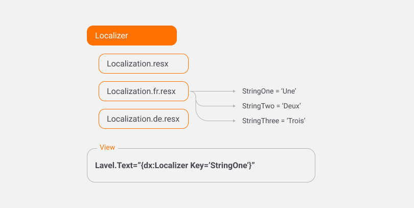
The Localizer markup extension tracks localization changes and updates localization dynamically. You can call Localizer.NotifyCultureChanged to notify the view when the current culture is changed.
public class LocalizationDemoViewModel {
    public LocalizationDemoViewModel(ILocalizer localizer) {
        Localizer = localizer;
    }
    void ChangeLanguageToFr() {
        CultureInfo.CurrentUICulture = CultureInfo.CurrentCulture = new CultureInfo("fr-FR");
        Localizer.NotifyCultureChanged();
    }

}
Additionally, the LocalizableString object allows you to define a property with translated strings at the view model level and bind it to your view:
public class ViewModel {
    public LocalizableString SimpleString { get; }
    public LocalizationDemoViewModel(ILocalizer localizer) {
        SimpleString = new LocalizableString(StringId.SimpleString);
    }

}
#Dependency Injection
To simplify Dependency Injection, we've created a markup extension that allows you to assign a view model from the DI container directly in XAML:
<ContentPage ...
             xmlns:dx="https://schemas.devexpress.com/maui" BindingContext="{dx:Ioc Type={x:Type vm:MainViewModel}}">
public static class MauiProgram {
   public static MauiApp CreateMauiApp() {
       //...
       builder.Services.AddTransient<ViewModel>();
   }
}
With this extension, there's no need to create a constructor in your view to pass the view model and manually assign it to BindingContext :
//not required anymore
public MainPage(ViewModel viewModel) {
	BindingContext = viewModel;
	InitializeComponent();
}
The Ioc extension allows you to inject a view model into a view, even if the view itself isn't registered in the DI container. This will be useful when you have a ContentView embedded within a parent page in XAML.
<ContentPage ... x:Class="MauiExample.MainPage">
  <views:ChildContentView/>
  <!--...-->
</ContentPage>

<ContentView x:Class="MauiExample.Views.ChildContentView">
  <ContentView.BindingContext>
    <BindingContext>
      <local:ChildViewModel />
    </BindingContext>
  </ContentView.BindingContext>
</ContentView>
New Toggle Switch Control
v24.2 ships with a new .NET MAUI Toggle Switch control. As you'd expect, our Toggle Switch allows users to edit Boolean variables using a common mobile UI metaphor.

Our .NET MAUI Toggle Switch follows Material Design 3 guidelines and allows you to easily customize appearance-related settings:
- Thumb icon, size, and color.
- Text font settings.
- Track border background and stroke.
- Color variations for pressed, disabled, and checked states.
The Toggle Switch includes a label that accepts taps. This helps users to invert the value without having to precisely aim at the thumb. Additionally, you can assign a group name to allow checking only one Toggle Switch in a group.
Documentation
Collection View, Data Grid, TreeList
#Collection View & Data Grid - Asynchronous CRUD
As you know, both our .NET MAUI Collection View and .NET MAUI Data Grid controls include CRUD APIs to help you create detail and edit item forms. Since mobile apps often need to connect to remote services for data editing purposes, we've enhanced our CRUD APIs to support asynchronous operations.
Both the Collection View and Data Grid use CRUD view models to automatically transfer information between detail/edit views and handle actions like edit, save, and delete operations. We've made these commands asynchronous, so you can now execute them without freezing the UI. Additionally, we've added an IsAsyncOperationInProgress property. This property allows you to display a loading indicator during asynchronous operations.
#Collection View & Data Grid — Unlimited Height
When displaying a small collection within a scrollable layout, you might need to disable virtualization to ensure the collection takes up the space occupied by its items. This allows you to combine CollectionView with other elements inside a ScrollView, using one vertical scrollbar. We've introduced a new property to disable virtualization in CollectionView, allowing it to expand based on its child items.
Use the ReduceSizeToContent property to enable this feature.
#Collection View & Tree View — Header and Footer
Headers and footers allow you to add custom elements above and below list items. Since they scroll alongside the rest of the view, this new feature helps make efficient use of available screen space. You can define any content for your header/footer (display elements that stand out from the rest of the list).
Here are a few ways to use headers and footers:
- Display favorite items at the top.
- Add a collection title.
- Include a button to add more items or display the full list.
Related APIs:
Header,
HeaderTemplate,
ShowHeader,
Footer,
FooterTemplate,
ShowFooter
#Collection View — Frozen Group Row
You can now keep group row headers visible while scrolling, as long as at least one child row in the group is on screen. Enable the DXCollectionView.AllowFixedGroupHeaders option to incorporate this feature in your DevExpress-powered .NET MAUI app.
#Data Grid — Multiple Selection
You can now enable multiple row selection in our Data Grid. Simply set DataGridView.SelectionMode to Multiple to activate this feature. To retrieve selected rows in your view model, bind DataGridView.SelectedItems to a ObservableCollection<T> property type.
#Data Grid — Best Fit
Our .NET MAUI Data Grid can now automatically calculate optimal column width based on cell content. This feature is useful when it's challenging to specify column width in advance due to dynamic data.
To activate Best Fit, set AutoBestFitColumns to true. Additionally, you can specify the number of rows considered during the Best Fit operation. For this, set the BestFitItemsCount property.
<dx:DataGridView AutoBestFitColumns="True" x:Name="grid">
    <dx:TextColumn FieldName="ID"/>
    <dx:TextColumn FieldName="Name" BestFitItemsCount="100"/>
</dx:DataGridView>
#Data Grid — Immediate Posting
In earlier versions, Data Grid cell data was only posted to the source after the active editor was closed. While this is what you expect when working with text fields, you may prefer to post changes immediately in other column types (such as CheckBox columns). To address this requirement, we've introduced an option that updates the data source instantly when a cell is modified by a user.
To enable this mode, set the EnableImmediatePosting property to true.
PDF Viewer
#Print Command
We implemented APIs to invoke native device printing dialogs. This feature is accessible via a built-in toolbar item in our .NET MAUI PDF Viewer control. You can also call the PdfViewer.PrintDocumentAsync method to invoke the dialog from code.
Optimized Property Initialization
We've reduced the time needed to initialize controls before first use.
Note: The following chart displays the time required for control initialization, not overall application startup or view opening time.
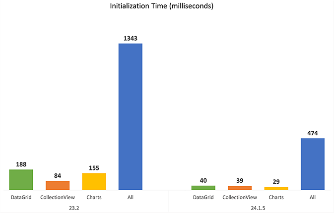
New Filter Range Slider
As you know, DevExpress .NET MAUI Filter UI elements allow you to create advanced filters for the Data Grid and Collection View. In v24.2, we've added filter slider elements to help users quickly filter by numeric values.
Scheduler
#On-Demand Appointment Fetch
Our Scheduler Control can now load data asynchronously based on the visible range.
async Task<object[]> GetAppointments(FetchDataEventArgs args) {
    if (Delay)
        await Task.Delay(millisecondsDelay);
    using (var dbContext = new SchedulingContext())
        return await dbContext
            .AppointmentEntities
            .Where(args.GetFetchExpression<AppointmentEntity>())
            .ToArrayAsync();
}
On-demand appointment loading ensures your application remains responsive, even when handling large datasets.
Text Editor
#Hide Max Text Counter
We've received numerous requests in the DevExpress Support Center to hide the text counter displayed in our .NET MAUI TextEdit and MultilineEdit controls. In our v24.2 release, we introduced a property to hide this counter.
Source Code Building Scripts
Source code for our .NET MAUI UI components is included with the DevExpress Universal Subscription. We've created a script to help you build the source code on your machine. For additional information, refer to the following help topic: Build Controls from Sources.
General-Purpose Chat Control Example
We've created an example of a Chat Control built with our .NET MAUI CollectionView.
The Chat Control includes the following options/capabilities:
- Chat-inspired custom styled visual elements (DXCollectionView, TextEdit, DXButton).
- Buttons for quick responses.
- A fully-functional view model and basic business logic.
You can download the example from the following GitHub repository: Use DevExpress .NET MAUI Components to Build a Chat View
AI Chat Control Example
Thanks to both Blazor Hybrid technology and BlazorWebView, you can reuse our new Blazor AI Chat (DxAIChat) component in a .NET MAUI app. To learn more about the underlying tech, refer to the following help topic: Create a Blazor Hybrid Project.
To help you get started, we created an example that integrates the DevExpress Blazor AI Chat component. You can download the example from our GitHub repository here: Blazor AI Chat - How to add the DevExpress Blazor AI Chat component to your next Blazor, MAUI, WPF, and WinForms application.
Things to consider:
-
The
ISelfEncapsulationService interface: This interface allows you to work directly with aDxAIChat component instance/properties from within a desktop or mobile app.
-
Built-in
DxAIChat wrappers: These wrapper classes initialize required Blazor Theme scripts.
- Custom CSS classes are used to hide the built-in input field and send button (the index.html file).
You can download the example from the following GitHub repository: Use DevExpress .NET MAUI Components to Build a Chat View
Survey - .NET MAUI
Your Feedback Matters!
Please
login to complete the survey.
Survey Completed
Thank you for taking the time to complete this survey. Your responses have now been posted. If you want to follow up with additional information, feel free to send us an email at clientservices@devexpress.com anytime.
You've Already Completed This Survey
Our records show that you have already completed this survey. If you want to follow up with additional information, send us an email at clientservices@devexpress.com.
This survey has expired
If you want to share your feedback or request new functionality, please submit a new support ticket via the DevExpress Support Center. We’ll be happy to follow up.
Your feedback matters.
Please, review the description of Cross-Platform .NET App UI (XAF) and Web API Service related features below and leave your feedback at the end of the section.
Go to the survey now.
.NET 9 Support
XAF UI and Web API Service fully support .NET 9 (v24.2.2+).
#.NET 8, .NET Framework 4.6.2, Visual Studio 2019 - Minimally Supported Versions
Learn more about this global (v24.2+) change in the following announcement.
To simplify the migration process, the DevExpress Project Converter will attempt to re-target your XAF projects to .NET 8 automatically. Documentation | Blog Post
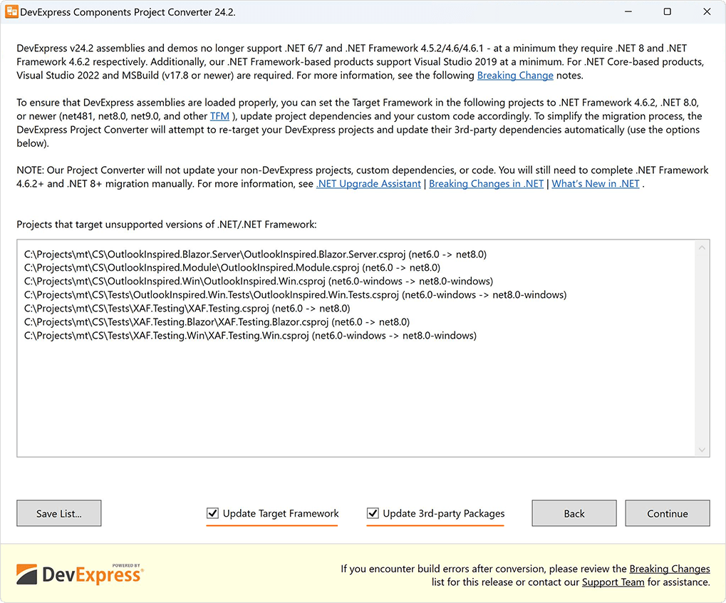
We will also try to update 3rd party packages to the latest compatible versions, where possible (for example, System.Text.Json, Microsoft.AspNetCore.*, Microsoft.EntityFrameworkCore.*, etc.) - almost 200 known dependencies in our Directory.Packages.props file.
This automation should save hours of manual effort especially for those XAF customers with large .NET Framework or .NET solutions. Of course, if your team already uses props files and Central Package Management (CPM), then you can skip our Project Converter and update everything manually.
#Source Builder - .NET Core Support and Usability Enhancements
Our new Source Builder ships as part of the DevExpress Unified Component Installer: “~\DevExpress 24.2\Components\Tools\Components\DevExpress.SourceBuilderTool.exe”. The tool rebuilds the source code used for .NET Core product libraries (previously we supported only .NET Framework).
The DevExpress Source Builder has the following system and environment requirements:
- Visual Studio 2022 and ASP.NET MVC 3 (if you rebuild DevExpress MVC projects)
- .NET 8 SDK and .NET Framework 4.6.2 Developer Pack (download)
-
NuGet.exe version 6.0 (or higher) must be in the same folder as DevExpress.SourceBuilderTool.exe (download nuget.exe)
-
Node Package Manager (NPM) (install npm)
Run the following command with admin rights to rebuild DevExpress assemblies and NuGet packages (including localized assemblies/packages for German (DE), Japanese (JA), and Spanish (ES)):
DevExpress.SourceBuilderTool.exe "c:\program files\devexpress 24.2\components" -nuget
Documentation
EF Core and XPO ORM
#EF Core 9 Support
EF Core 9 support officially ships in v24.2 for XAF and associated Backend Web API Service. EF Core 9 (or EF9) is the latest production-ready version of Entity Framework.
For more information about recent EF Core updates, refer to the following Microsoft documents:
#EF Core - Calculated Fields
We implemented a simpler solution for server-side calculated fields in EF Core. Note that you can sort, group, or filter List View data by calculated properties in Server and InstantFeedback modes.
Use DevExpress.ExpressApp.DC.CalculatedAttribute or DevExpress.ExpressApp.DC.PersistentAliasAttribute to indicate whether a property's value is calculated. The following code snippet demonstrates how to create a class with a calculated property:
using DevExpress.ExpressApp.DC;

public class Product : BaseObject {
  // ...
  public virtual decimal Quantity { get; set; }
  public virtual decimal Price { get; set; }

  [PersistentAlias("Quantity * Price")]
  // or [Calculated("Quantity * Price")]

  public decimal TotalPrice {
    get {  return EvaluateAlias<decimal>();  }
  }
}
Documentation
#EF Core - Soft Deletion
v24.2 supports EF Core soft deletion (aka XPO's Deferred Deletion) for both XAF UI and Web API Service-powered apps.
With soft or deferred object deletion, the ORM marks objects as deleted and does not physically remove them from the database immediately. This technique helps avoid database exceptions when deleting objects referenced by other entities.
We have also created an automatic converter for existing database tables (to add the new GCRecord column). For additional information in this regard, please review the following: Core - Database and data model code changes for XAF EF Core apps to support Soft/Deferred Deletion.
Documentation
#EF Core - Filtering Capabilities Are Now on Par with XPO ORM
v24.2 introduces calculated properties for EF Core in XAF (see above). This change necessitated easy access to custom IsExactType and IsInstanceOfType functions regardless of the ORM used in an application.
To achieve parity, we moved custom IsExactType and IsInstanceOfType functions from the DevExpress.Xpo assembly to the DevExpress.Data assembly (see the following ticket for additional information: XPO - The IsExactType and IsInstanceOfType custom functions has been moved to the DevExpress.Data assembly).
The change allows this feature to work in EF Core. We would also like to mention that you can use the following features in EF Core projects: Upcasting (Combine Data from Base and Derived Classes) and Free Joins (Query Non-Associated Data & Calculate Aggregations). This makes EF Core filtering capabilities no different from what is available in XPO ORM today.
Documentation
#XPO - DateOnly/TimeOnly Support
In v24.2, XAF supports DateOnly/TimeOnly in XPO connection providers for .NET apps. This enhancement benefits XAF/Reporting/Dashboards and other products since XPO is at the core of data access code internally. As part of this, we also changed column mappings for SQL types Date and Time.
For more information on DateOnly/TimeOnly enhancements at the UI level of XAF WinForms apps (in grid and other controls), please review the following articles: v24.1 (WinForms, Blazor), v24.2 (WinForms, Blazor).
#XPO - Connection Provider Updates
We now support the most recent versions of the following database engines (for both .NET and .NET Framework):
- PostgreSQL 17.0
- Microsoft SQL Server 2022+
- Oracle 23ai
- MySQL 9.0
- Firebird 5.0
Documentation
Cross-Platform Enhancements
#Passkeys and MFA Support with Microsoft Entra ID, Google and Other Auth Providers
As you may already know, both XAF UI (Blazor and WinForms) and our Web API Service offer a "1-click" solution to incorporate modern OAuth2 authentication providers with native Single Sign-On (SSO) (such as Microsoft Entra SSO), Multi-Factor Authentication (MFA), and other security features. This works for both EF Core and XPO ORM. For additional information in this regard, refer to Active Directory and OAuth2 Authentication Providers in ASP.NET Core Blazor Applications and related documents.
Passkeys uses your device lock (such as your fingerprint, face, pin or pattern) to sign in to your Microsoft, Google or other authentication provider accounts. For example, Microsoft Authenticator can be used to sign in to any Microsoft Entra ID account without using a password. Microsoft Authenticator uses key-based authentication to enable user credentials tied to a device (where the device uses a PIN or biometrics). Windows Hello for Business uses a similar technology.
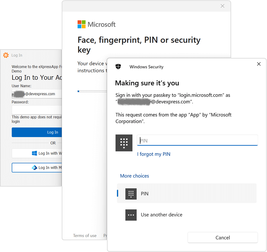
With v24.2, XAF UI (Blazor and WinForms) and our Web API Service will support all Passkey-related usage scenarios. This includes restoring a forgotten password, temporarily blocking access to accounts, account recovery, face recognition login, PIN, fingerprint, OTP, QR codes, or various authenticator apps, using a Middle Tier Application Server or simpler configurations in WinForms, etc.
#Audit Trail Module Enhancements
XAF now automatically excludes all non-persistent properties from the audit trail in XPO-based applications. This enhancement can improve performance if setter methods for non-persistent properties contain extensive logic.
To update existing apps, set the static ObjectAuditProcessor.ExcludeNonPersistentFromAudit property to true. For additional information, please review the following: T1246233 - Audit - Non Persistent Properties are Excluded from the Audit Log (XPO).
#Conditional Appearance Module Enhancements
With v24.2, Appearance rules also apply to nested editors of a reference property expanded into a DetailView or ListView. For example, assume you have a Department class with an Appearance rule set for its Name property (a yellow background color based on a condition), and an Employee class that has a Department reference property marked with the ExpandObjectMembers.Always attribute. If you open an Employee object detail or list form, you will also see that its Department.Name sub-property will include a yellow background (if the same condition is met for the inner Department object).
[Appearance("TextBackColor", AppearanceItemType = "ViewItem", TargetItems = "Name", Criteria = "Office == '1'", BackColor = "LightYellow")]
public class Department: BaseObject {
    public virtual string? Name { get; set; }

}

public class Employee: BaseObject {
    [ExpandObjectMembers(ExpandObjectMembers.Always)]
    public virtual Department? Department { get; set; }
}
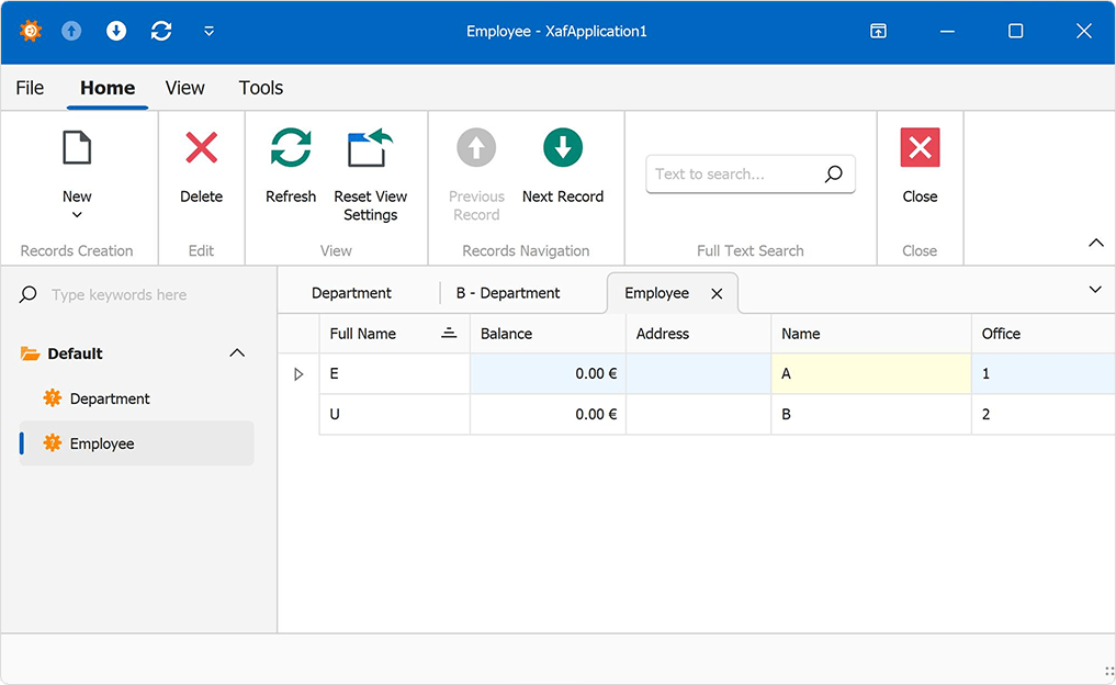
#API Usability Enhancements
The ShowViewInPopupWindow method includes an overload to configure DialogController for advanced use-case scenarios.
XAF v24.2 also includes SignInManager and UserManager APIs - shortcuts to manage user logins and impersonation under different user accounts.
You can now customize a View Item control inside a DashboardView without the ViewItem.ControlCreated event. The CustomizeViewItemControl extension method (like DetailView) helps reduce the amount of code in half. It is also worth noting that the CustomizeViewItemControl method can be used once for both editable ListView and DetailView.
using DevExpress.ExpressApp.Blazor.Editors;
//…
protected override void OnActivated() {
  base.OnActivated();

  View.CustomizeViewItemControl<StaticTextViewItem>(this, item => {
      item.ComponentModel.UseMarkupString = true; });
  }
}
We also added new extension methods to make it easier to create a new Object Space using XafApplication and IObjectSpaceFactory.
// v24.1.3 and earlier
var os = Application.CreateObjectSpace(typeof(Person));

// v24.1.5+ and v24.2+
var os = Application.CreateObjectSpace<Person>();
If you used IObjectSpaceFactory in ASP.NET Core apps (Web API Service controllers, custom Razor components, etc.), please review the following minor breaking change in v24.2: T1254577 - INonSecuredObjectSpaceFactory and IObjectSpaceFactory classes were moved to the DevExpress.ExpressApp namespace.
#Central Package Management (CPM)
XAF v24.2 Solution Wizard includes a Central Package Management (CPM) option. It creates a Directory.Packages.props file at the root of your repository and sets the MSBuild property ManagePackageVersionsCentrally to true. Microsoft describes CPM's main value as follows:
Dependency management is a core feature of NuGet. Managing dependencies for a single project can be easy. Managing dependencies for multi-project solutions can prove to be difficult as they start to scale in size and complexity. In situations where you manage common dependencies for many different projects, you can leverage NuGet's central package management (CPM) features to do all of this from the ease of a single location.
The Directory.Packages.props file (including 3rd party dependencies) can be updated by the DevExpress Project Converter based on known GitHub security advisories (https://github.com/advisories).
Outlook-Inspired Demo
#Control Field Visibility for Various UI Contexts Declaratively
XAF v24.2 includes a new HideInUI attribute for use within business classes. This is a simple declarative way to hide fields from ListView and DetailView, their customization forms and many other UI contexts such as the Field List of the Filter, Report and Dashboard Editor/Designer. You no longer need manual Controller-based solutions or multiple non-flexible VisibleInXXX and Browsable attributes.
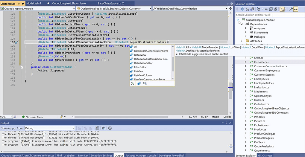
We also unified ways to disable runtime layout customization completely - you can now use 2 CustomizationFormEnabled options (global and View-specific) instead of the former 4 options:
Breaking Change:
EnableColumnChooser and CustomizationEnabled options are replaced by the cross-plarform CustomizationFormEnabled option
#Automatic Error Code Diagnostics
We added 2 more error diagnostics:
-
Detect implicit conversions from
System.String to CriteriaOperator (may lead to hard to diagnose errors such as: CriteriaOperator criteria = "A > B"). To avoid potential issues, we recommend the use of explicit criteria syntax with CriteriaOperator.FromLambda or similar strongly-typed variations.
-
Detect EF Core classes with an accidentally applied DomainComponentAttribute (may lead to errors by mixing such classes with non-persistent classes. We extended the existing XAF0027 diagnostic for XPO.
Documentation
Performance Enhancements
#Blazor Rendering Speed
In v24.2, we eliminated extra page re-rendering operations in multiple XAF Blazor UI scenarios.
- Reduced re-render count for ViewSiteControl and Layout Component (for example, active tab changes in tabbed layout groups or expand/collapse operations in regular layout groups).
- Split View now re-renders only when DetailView is changing.
- Reduced re-render count in MainPageBase and Blazor Templates (the ApplicationWindow and NestedFrame templates render only once).
- Immediate switching tabs in Tabbed MDI and initial View opening from the navigation control.
- Grid renders only once per sorting, grouping, selection and other user interactions.
- Loading dialog is now visible until the main menu toolbar toolbars is loaded.
- No components are re-rendered on the ViewChanging/Frame.Closing events.
- Closing tabs in Tabbed MDI no longer loads the tab content for inactive and unloaded tabs.
- Reduced re-renrer count of ComponentModelObserver for all Razor components.
To see these changes in action, compare our Outlook-Inspired Demo v24.1 vs v24.2:
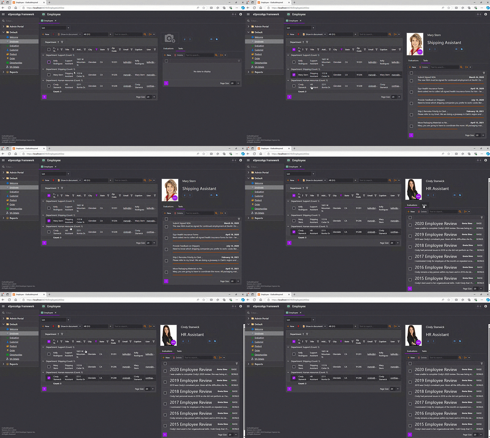
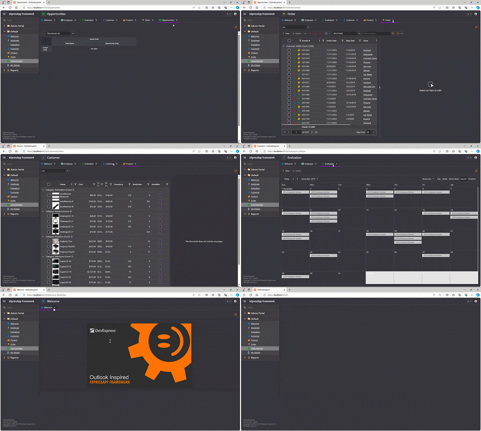
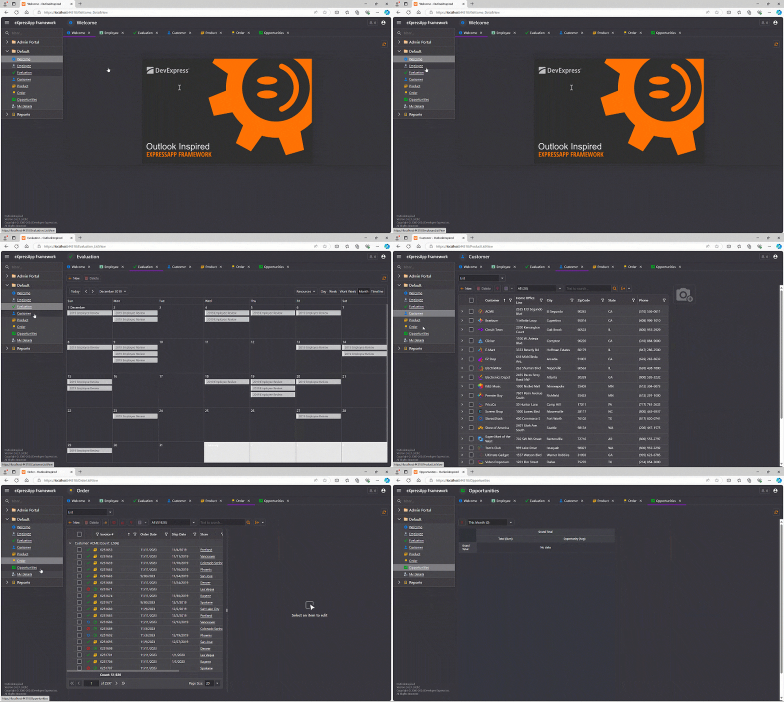
#Blazor Grid List Editors
XAF Blazor DxGridListEditor and WinForms GridListEditor now support DataView, ServerView, and InstantFeedbackView data access modes for the best possible performance against large ListView data sets (for both EF Core and XPO ORM). Сalculated properties are also supported.
#Audit Trail Module for XPO
We optimized indices used for AuditDataItemPersistent and other audit tables in the database. This change will substantially reduce audit-related save operations:
| Sample Usage Scenario | v24.2 (s) | v24.1 (s) |
Test #1 (10 runs)
Small database (<1000 objects and audit records)
| 2.94 | 8.97 |
Test #2 (10 runs)
Large database (1 million objects, 3 million audit records).
| 4.33 | 172.37 |
#Security and Appearance Rules with Criteria Based on Large EF Core Collections
We optimized security system configurations with multiple Member and Object permissions (as well as Conditional Appearance rules) when associated criteria involve large EF Core collections (XPO optimizations may be added in 2025).
Loading 100 objects and calculating security permissions on an associated detail collection (Criteria = "[Collection][Value > 10].Exists()")
Loading 100 objects and calculating security permissions on a non-associated collection with Free Joins (Criteria = "[<SomeType>][Value > 10].Exists()")
Loading a ListView with a complex Appearance rule based on a detail collection (Criteria = "[Collection][Value > 10].Exists()")
#Image Loading
We optimized image/icon load operations across all supported platforms. We noticed improvements in application startup time of up to 2 seconds (or more in complex applications with numerous Actions [>500]).
#CriteriaOperator Evaluation
Internally, we also used CriteriaCompiler instead of CriteriaEvaluator in security Object and Member Permissions (EF Core and XPO ORM) and Calculated Fields (EF Core only). This cut calculation time and memory allocations in half for specific usage scenarios.
ASP.NET Core Blazor UI
#Tree List Editor
XAF Blazor v24.2 includes a DxTreeListEditor (powered by the DevExpress Blazor DxTreeList). The new List Editor is a part of the system DevExpress.ExpressApp.Blazor module (like DxGridListEditor, it offers simpler configuration options for XAF developers).
Like similar List Editors in XAF's WinForms/WebForms UI, DxTreeListEditor works with ITreeNode-based business classes for both EF Core and XPO ORM. It also supports business classes that do not implement ITreeNode (use the KeyFieldName and ParentKeyFieldName properties in the Model Editor).
This new List Editor also supports the following:
- Inline and batch editing (in Client data access mode)
- Data validation
- Unsaved data confirmation
- Conditional Appearance rules
- Data export
- Filtering options (Auto-Filter Row, Column Header Filters, Filter Editor)
- Column Chooser
- Context Menus for rows and column headers
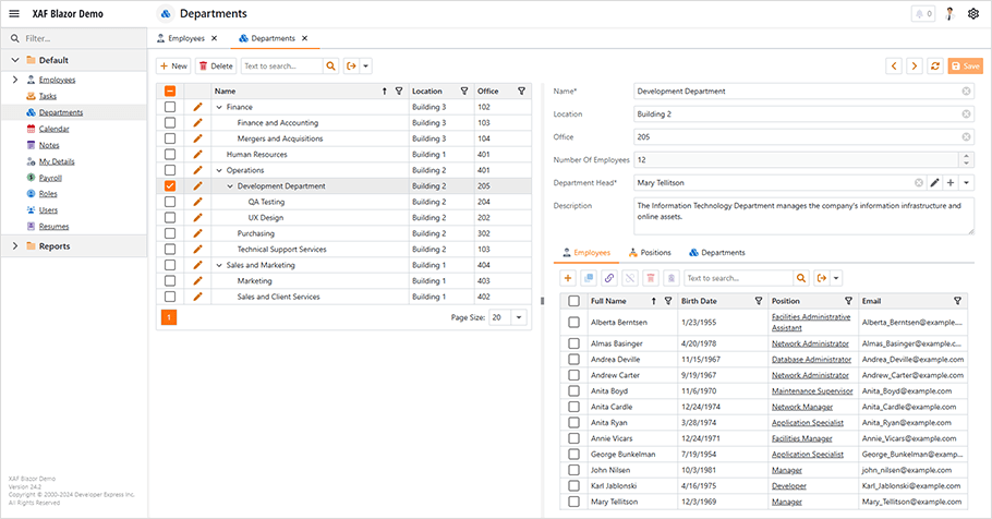
#Lookup Property Editor
We migrated the underlying component used for XAF's Blazor LookupPropertyEditor from DxComboBoxLegacy to DxComboBox (officially released in v24.1). Please review the following behavioral changes for additional information:
You should not notice API-related changes to your LookupPropertyEditor customization code.
#New FileData Type Property Editor
DxFileDataPropertyEditor is the default property editor (for new and existing ASP.NET Core Blazor projects) within the File Attachments module. The previous editor (FileDataPropertyEditor) is now in maintenance mode.
The new DxFileDataPropertyEditor is powered by our Blazor File Input component. It allows users to upload accepted file types using the FileTypeFilter attribute.
Breaking Change
#Nullable Type Support within Property Editors
You can define nullable properties in your data models for both EF Core and XPO ORM (for example: int?, DateTime?, Nullable<TimeOnly>). Built-in Property and List Editors will correctly display these nullable values.
You can also remove custom solutions for non-initialized System.DateTime values (non-nullable), which might unexpectedly display 1/1/0001 (the Blazor Date Property Editor correctly displays an empty string, just as it does in XAF-based WinForms/WebForms apps).
#Extended .NET DateOnly/TimeOnly Support
XAF Blazor's Filter Editor now supports DateOnly/TimeOnly types. At the UI level, DateOnly/TimeOnly work as expected in both EF Core and XPO-based usage contexts.
#Error Handling Enhancements
With v24.2, XAF Blazor apps can output additional error information during debugging (using a browser's developer tools - F12 is no longer needed). In addition, non-critical exceptions do not crash the entire app and display a popup dialog instead (much like XAF WinForms UI). You can also continue execution after encountering errors rather than a complete restart.
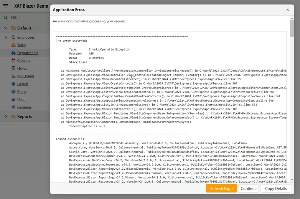
#New Action Type - ActionUrl
XAF Blazor v24.2 includes a new Action type - ActionUrl. ActionUrl redirects a browser to a specified web page and helps you introduce complex navigation scenarios. This Action can reside in both inline (inside List Editors) and standalone Action Containers.
using DevExpress.ExpressApp;
using DevExpress.ExpressApp.Actions;
// ...
public class ActionUrlController : ViewController {
  ActionUrl urlAction;

  public ActionUrlController() {
    urlAction = new ActionUrl(this, "ShowUrlAction", "ListView");
    urlAction.SelectionDependencyType = SelectionDependencyType.RequireSingleObject;
    urlAction.UrlFieldName = "Text";
    urlAction.UrlFormatString = "http://www.google.com/?q={0}";
    urlAction.TextFormatString = "Caption for {0}";
    urlAction.TextFieldName = "Text";
  }
}
#Tabbed MDI Enhancements
Tabbed MDI is the multiple document interface (MDI) metaphor found in many modern applications (including your favorite Web browser or Microsoft Outlook Web). It is a robust interface that maximizes screen real estate, especially when working with multiple documents, email messages, etc. Tabbed MDI is enabled in XAF Blazor and WinForms apps by default.
XAF Blazor v24.2 adds tab context menu support (Close, Close All But This, Close All) and allows users to close a tab by using a middle-mouse click. XAF also stores the last active tab in the Application Model and restores it when you restart the application.
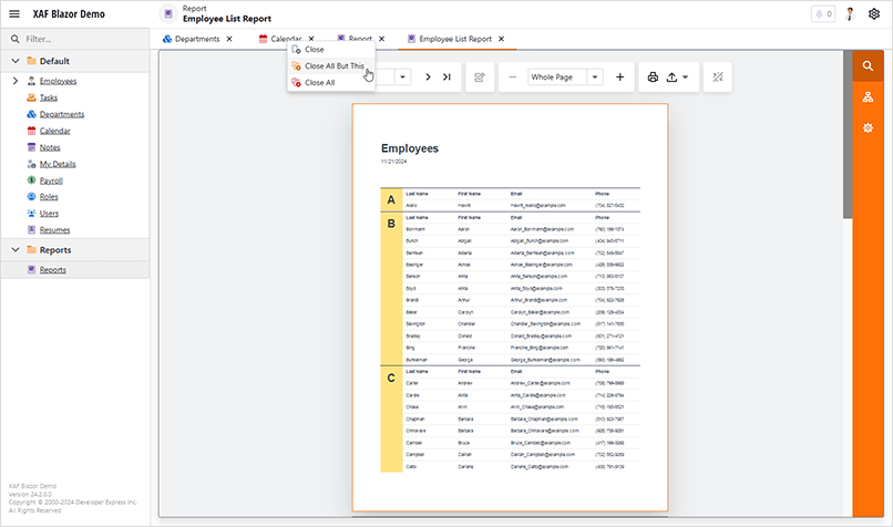
#HTML Markup Support within the Rich Text Property Editor
XAF Blazor v24.2 supports DocumentStorageFormat = Html for the RichTextPropertyEditor. You can change this property via the Model Editor to support HTML markup rather than RTF (default).
#Default Caption or Image in Action Container with Drop-Down Menu
In previous versions, action containers with drop-down menus required a default action which was displayed inside the container. In this instance, when the drop-down menu was opened, it displayed all actions except the default. Based on user feedback, we have changed this behavior in this release cycle.
You can now leave the container without a default action and set a custom caption and image for the container instead. These captions and images will always be displayed regardless of which action is currently selected. In this instance, all actions added to the container are added to the drop-down menu.
Toolbar.AddActionContainer("DropdownContainer", isDropDown: true, caption: "Actions", imageName: "Action_Search");
#New Asynchronous API Shortcuts
In XAF Blazor v24.2, you can safely execute code from a background thread. The new BlazorApplication.InvokeAsync method helps you avoid concurrency issues in XAF Blazor apps:
Task.Run(async () => {
  await blazorApplication.InvokeAsync(async () => {
    await Task.Delay(1000);
    View.ObjectSpace.Refresh();
    Application.ShowViewStrategy.ShowMessage("Data refreshed");
  });
});
AI-powered Enhancements
XAF Blazor and XAF WinForms-powered apps automatically derive all AI-related features available in DevExpress components for each supported UI platform. You can either access underlying UI controls and enable AI features as necessary OR create custom XAF Property Editors/user controls/forms based on AI-powered DevExpress controls like the Chat control.
Examples:
DevExpress AI-powered APIs allow you to integrate the following AI services into your DevExpress-powered application:
NOTE: DevExpress does not offer a REST API or ship any built-in LLMs/SLMs. Instead, we follow the BYOL ("bring your own license") principle. To use these features, you need to have an active subscription to AI services (e.g., Azure, Open AI, Google Gemini, Mistral AI, etc.) and obtain the REST API endpoint, key, and model deployment name. These variables must be specified at runtime to enable DevExpress AI-powered features in your application.
For additional information, please review the following documents: Overview | DevExpress AI-powered Extensions for WinForms | AI-powered Behaviors in Rich Text and Spreadsheet Editors for WinForms | AI-powered Blazor Chat Component.
Survey - XAF & Web API Service
Your Feedback Matters!
Please
login to complete the survey.
Survey Completed
Thank you for taking the time to complete this survey. Your responses have now been posted. If you want to follow up with additional information, feel free to send us an email at clientservices@devexpress.com anytime.
You've Already Completed This Survey
Our records show that you have already completed this survey. If you want to follow up with additional information, send us an email at clientservices@devexpress.com.
This survey has expired
If you want to share your feedback or request new functionality, please submit a new support ticket via the DevExpress Support Center. We’ll be happy to follow up.
Test Runner
CodeRush can now run xUnit.Net v3 tests.
Voice Support
#Voice to Code - Alternate Input Modes
We have added
alternate input modes using the Alt and Shift keys
, which can now be optionally held down while talking to change how the individual spoken words are interpreted.
When the Alt key is pressed while dictating comments or strings, CodeRush switches to code-first mode, and will find and emit matching identifiers into the strings or comments you're dictating. So you can say "
We need a descendant of a composite data bound control here
" (holding Alt down while saying the bolded words) to get "We need a descendant of a CompositeDataBoundControl here" in your comment or string. The symbols referenced while holding down the Alt key must be in scope and visible/accessible from the comment or string dictated.
Inside dictated interpolated strings, you can use the Alt key to emit simple expressions (like "{nameof(PrintOrder)}" or "{myList.Count}" or "{selectedCustomer.Name}"). Curly braces are added automatically.
When the Alt key is held down while dictating code, CodeRush switches to new identifier mode, allowing you to dictate the name of a new identifier or method call. To indicate a method call, after saying the method name release the Alt key and say the word "with", followed by any optional dictated arguments to be passed to the method. For example saying "my new method with three and four
" (holding Alt while saying the bolded words) will generate "MyNewMethod(3, 4)".
And you can use the Shift key to create strings. Words spoken while holding down the Shift key will create string literals in code, escape-quoted sequences of words inside strings, and quoted text in comments.
#More Voice-to-Code Expressions Supported
The Voice to Code engine supports more expressions. All of these examples start by holding down the Ctrl key and speaking (after setting up for voice).
New object creations with the spoken word"new":
-
you can say "my table gets new data table with table name*" to get
myTable = new DataTable(tableName) (assuming myTable, DataTable and tableName are all in scope)
-
you can say ">type value gets new*" will emit
type value = new()
Reference generic types using the spoken word "of" (and optionally "and"). Examples:
-
You can say "hash set of guid" to get
HashSet<Guid>.
-
You can say "new dictionary of string and double" to get
new Dictionary<String, Double>().
New variable declarations and method calls using the Alt input mode:
-
you can say "my new person gets new person with name
" (holding Alt while saying the bolded words) to get
var myNewPerson = new Person(name) (assuming Person and name are both in scope)
-
You can say "
hash set of guid processed orders gets new
" (holding Alt to create a new identifier while saying "processed orders") to get
HashSet<Guid> processedOrders = new().
String literals using the Shift input mode:
-
You can say "
my data table gets new data table with orders" (holding Shift to create a string literal while saying "orders") to get
myDataTable = new DataTable("Orders") - (assuming DataTable is in scope)
-
You can type an open bracket ("[") to create an attribute above an NUnit test fixture and then say "
category voice" (holding Shift while saying "voice") to get
[Category("Voice")]
Use Shift and Alt together. Sometimes you need to declare new variables and assign them a value in a single phrase. For example, you might want to create a new variable that's initialized to a string. You can say "my message gets hello world.", holding down the Alt key while saying "my message", and holding down the Shift key while saying "hello world". This will produce: var myMessage = "hello world."
Simple constant and type matching patterns - "value is null", "value is not null", "value is 4", "value is not 4", "value is string", "value is not string" will generate code with the is pattern syntax or with an equality or inequality check (== or !=), depending on your Visual Studio settings for prefer pattern matching and prefer not pattern.
Automatic indexing of indexable properties, collections, and arrays using the spoken word "of". Examples:
-
you can say "car list of 5" to get
carList[5], - (assuming carList is an indexable symbol in scope)
-
you can say "car list of my indexers of 7" to get
carList[myIndexers[7]] - (assuming carList and myIndexers are both indexable symbols in scope)
Qualified namespaces and namespace aliases:
-
"system numerics vector three one" will produce
System.Numerics.Vector3.One -
"system console write line" will produce
System.Console.WriteLine() -
if the code contains a namespace alias (e.g.,
using WinMedia = System.Windows.Media;), you can reference and work with that alias. For example say "win media brushes cornflower blue" to get WinMedia.Brushes.CornflowerBlue.
While most needed parens are handled automatically by the voice-to-code engine, you can now explicitly dictate parentheses. Insert an open paren using the spoken words "group" or "open paren", and later you can optionally insert the close paren using the spoken word "close". Examples:
-
"
count is greater than two times group three plus four
" produces
count > 2 * (3 + 4). Notice that closing paren is optional - all unmatched open parens will be closed automatically when the code is generated.
-
"group two plus three close times four
" produces
(2 + 3) * 4. Here the closing paren was explicitly added.
#Declaring Fields and Locals
Using the new Alt input mode combined with all new supported expressions, you can now easily dictate field and local declarations. Some of supported patterns include:
-
"type reference variable name"
-
"type reference variable name gets expression"
-
"type reference variable name gets new"
Remember, the Alt key needs to be held down while saying the new variable name.
For example, you can say "
queue of task task queue gets new
" to get Queue<Task> taskQueue = new()
#Overall Quality Improvements
We improved the Voice to Code engine to produce higher quality results when speaking naturally.
For example, when you say "count is less than zero or greater than five
", CodeRush produces count < 0 || count > 5.
Notice that the word count only appears once in the spoken phrase but appears twice in the generated code. CodeRush infers the missing subject in conjoined clauses and explicitly includes it in the corresponding code as needed.
The Voice-to-Code engine also includes a higher degree of type validation for arguments, assignments, and binary expressions when mapping spoken words to code.
For example, if your code contains phonetic ambiguity in the form of two similarly-sounding symbols (for example, int myLocalWon and string myLocal1) variables, and you say "my local one gets 42", the engine produces myLocalWon = 42, because the right side of assignment is an integer, and ambiguity is resolved by using the variable that can accept an integer assignment (int myLocalWon).
#Voice Commands
In this release we added and enhanced voice commands:
-
"View Designer" opens a designer view for the current document.
-
"View Code" opens a code view for the current document.
-
"Identify Monitors" reveals ID numbers for all your monitors. You can use these numbers with the Show Me command to place Visual Studio tool windows on a specified monitor.
"Show Me ToolWindowName {on DislayId {at Position}}" opens the specified Visual Studio tool window on the specified monitor and position. DislayId can be a display number (use the "Identify Monitors" voice command to see the numbers) or it can be a relative location to your main monitor (for example, Left, Top, Right, Bottom-Right, etc). Position can be one of Left, Right, Top, Bottom, Top-right, Top-left, Bottom-left, Bottom-right).
Examples:
"Show me solution explorer on main" will maximize the Solution Explorer on the primary monitor.
"Show me watch 1 on 3 at top right" places the Watch 1 window on monitor 3 in the top right quarter of the screen.
"Show me C# interactive on left at top" places the C# Interactive window on the left monitor in the top half of the screen.
"Show me watch 1 on 3 at left" places the Watch 1 window (if debugging) on monitor 3 in the left half of the screen.
"Show me copilot on right at right" places the GitHub Copilot Chat window on the right monitor aligned to the right half of the screen.
"Show me task list here" places the Task List window on the monitor containing the mouse cursor, aligned with the mouse position (full screen, half screen, or quarter screen depending on where the mouse is on that screen).
Templates
We added a number of new string providers you can use when creating custom templates:
- ?ProjectRelativeFilePath returns the path (relative to the project folder) for the active file.
- ?ProjectRelativeFileName returns the file path and name (relative to the project folder) for the active file.
- ?DefaultProjectNamespace returns the default project namespace for the active project.
- ?DefaultNamespace returns the default namespace for the active file using the project's default namespace and the file's relative location to the project folder.
- ?Substring(text, start, length) calculates a substring from the specified text, starting index, and an optional length.
Download Your Copy Today
Once you're ready to upgrade, simply login to the DevExpress Client Center and download the appropriate installer to proceed.
Download Free Trial (VCL)VCL Demos v24.2
Your feedback matters.
Please, review the description of VCL-related features below and leave your feedback at the end of the section.
Go to the survey now.
RAD Studio 12.2 Support
Starting from v24.1.6, DevExpress VCL libraries officially support Embarcadero's newest IDE (Delphi 12.2 and C++ Builder 12.2 - 32 and 64 bit).
Modern 64-bit C++ Compiler Support
We now support modern C++ compiler-related features. For technical information in this regard, please refer to the following: second Behind the Build webinar and documentation on upgrading with key things to know.
The new toolchain targets Windows 64-bit Intel apps, and is based on Clang 15, with a new STL, a new C++ runtime, and uses the Windows Universal C Runtime (UCRT.) It has a new linker, and uses the COFF and PDB object and debug file formats.
All binaries (the compiler, linker, etc.) are 64-bit EXEs, meaning they can handle large memory requirements - and you'd be surprised how often this is needed for C++. This even includes when compiling in the IDE, where we call out to the external process.
Source: https://blogs.embarcadero.com/the-new-clang-toolchain-in-cbuilder-12-1/
NOTE: We cannot push this capability to v24.1 (and earlier) due to costs and associated risks (new IDEs and standard libraries introduced many changes and affected 40+ source code files).
Deprecation of XE7 and XE8 Support
For additional information about this change refer to the following: The DevExpress VCL installation no longer support XE7 and XE8 (RAD Studio Delphi and C++Builder IDEs)..
Hybrid VCL Development Proof of Concept
As you may already know, hybrid apps (apps that appear as native apps for a given platform but rely on JavaScript (JS) or other technologies inside) are becoming more and more prevalent in the marketplace. Good examples are desktop versions of Microsoft Teams and Visual Studio Code (both rely on a WebView - an embedded browser - component inside a native container app for Windows, macOS, and Linux).
Our GitHub demo application illustrates the benefits of hybrid VCL development - apps that rely on a WebView component (an embedded web browser) within a native container app for Microsoft Windows. VCL developers can configrue this JS widget using Delphi code and integrate JS HTML Editor commands with our VCL Ribbon control. The editor can also switch between light and dark CSS DevExtreme themes in response to changes between corresponding DevExpress VCL Skins and Palettes.
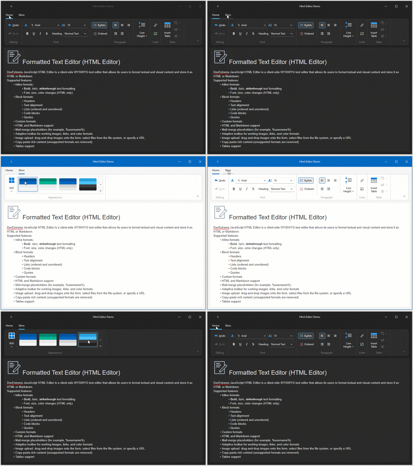
Performance Enhancements
v24.2 includes the following performance-related enhancements (most apply to VCL apps used on 4K or high-resolution displays).
#Faster Rendering for Vector-Based Skin Elements - Up to 40%
Primary optimizations involve use of color fill instead of rendering SVG images (applies to all vector-based skins). Enhancements include the following:
- Approximately 20% rendering improvements for single-color skin elements.
- Up to 40% improvement for WXI and WXI Compact skins (depending on controls used on form).
#Faster Rendering of Different Sized Vector-Based Skin Elements - Up to 50%
v24.2 includes rendering improvements for different sized vector skin elements (such as form borders, bar/ribbon backgrounds, etc). As a result, DevExpress-powered user interfaces are now more responsive: zero or reduced flickering during initial paint operations, window resizing, or moving to a different display. The larger the area of an element, the bigger the improvement. This applies to about 10% of all skin elements. In our tests, rendering speed improved 10% to 50% (depending on controls and skin elements painted on a form).
#WXI Compact Optimizations
Improved rendering time by 5-12%.
#Dark Skins
The key optimization is to delay main form display and skin system color (white) fill.
#Faster Built-in and User Skin Loading
We fixed EXIF-related issues, which slowed down SVG element loading from skins for certain usage scenarios. We also added a cache when loading user skins from files. As a result, apps relying on custom skins execute much faster (you can experience the benefits of this change within DevExpress VCL demos). Skins can also be switched using the DevExpress VCL Skin Selector without delays at runtime.
#Test Results
The following table helps illustrate performance improvements available to you (note: measurements are performed on a 4K/high-resolution display for the first cached render operation):
| Test Case | v24.2, ms | v24.1, ms | Enhancement |
| Initial SVG image load operation for skins | 8-20 | 120-150 | x7 |
| Loading a user skin from a file (as implemented in our demos) | 202 | 1233 | x6 |
Drawing RibbonFormCaption a Ribbon Form caption (2000x86px)
| 0.09 | 1.49 | x16 |
Drawing RibbonTabPanel or a Ribbon background (2000x200px)
| 0.76 | 3.76 | x5 |
| Drawing a button (130x40px) | 0.3305 | 0.3744 | 10% |
To fully appreciate rendering-related benefits available in this release, please review the following videos.
NOTE: Video speed was reduced for demonstration purposes (to better display flickering). Forms open much faster in real-world usage scenarios.
24.2
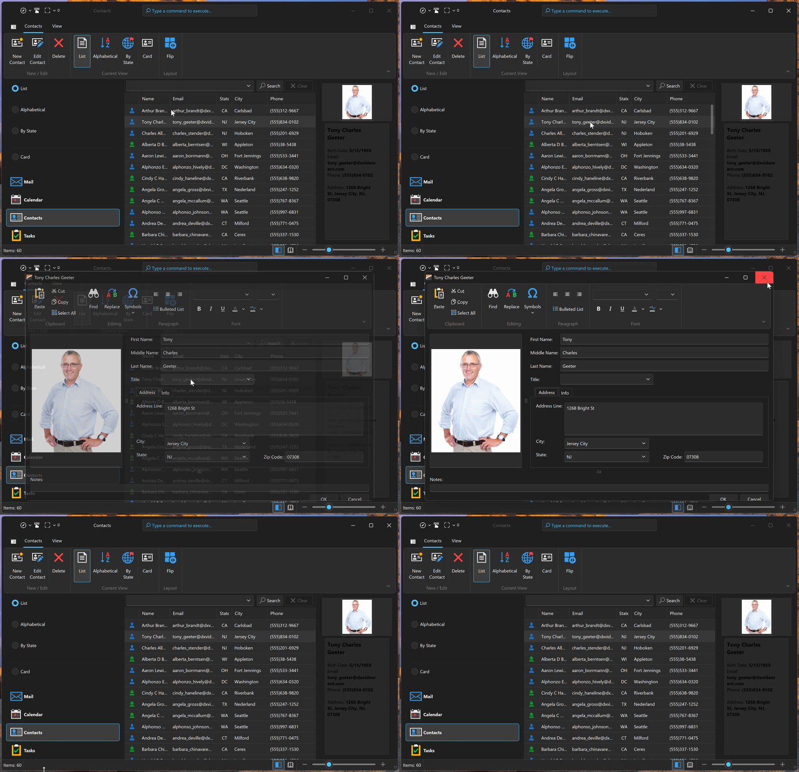
24.1
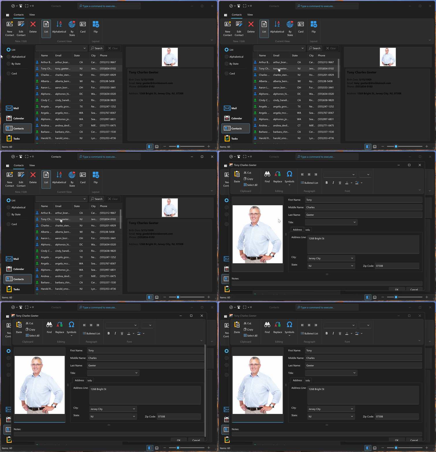
Accessibility Enhancements
Accessibility has been one of our main priorities over recent release cycles. Accordingly, we created a new Microsoft UI Automation (UIA)-powered engine and base component API/infrastructure for ongoing accessibility-related enhancements.
In v24.2, our UIA-powered engine replaced deprecated MSAA support in Bars and Navigation Bar.
Accessibility-related initiatives spill over into our v25.1 release and will include our VCL Data Grid, Tree List, Scheduler, Pivot Grid, and other data editors/data-aware controls. This is a massive undertaking and requires significant/ongoing development resources.
Layout Control
#Layout Splitter
- Close and Open methods were added for TdxLayoutSplitterItem (along with corresponding OnClosed and OnOpened events). As you'd expect, you can now control splitter state in code, without complex inheritance requirements. This change will also impact accessibility support because you'll be able to implement extended keyboard support for this layout item.
-
Our new IsClosed flag allows you to determine
TdxLayoutSplitterItem state.
-
Our new OnMoved event provides information about splitter-related operations. Event arguments (TdxLayoutSplitterItemMovedEventArgs) allow you to access layout items delimited by the splitter (that triggered the movement operation: FarItem, NearItem). You can also determine the boundaries of delimited layout items before (OldFarItemBounds and OldNearItemBounds) and after (NewFarItemBounds and NewNearItemBounds) splitter expand, collapse, and move operations. This will be helpful for advanced usage scenarios where the OnCanResize event is insufficient.
-
New GetFarItem and GetNearItem methods for
TdxLayoutSplitterItem are designed to provide access to both far/near adjacent layout items.

For example, you can use new splitter events to maintain a single layout item expanded within the parent group:
procedure TMyForm.SplitterItemClosed(Sender: TdxLayoutSplitterItem;
  AArgs: TdxLayoutSplitterItemMovedEventArgs);
var
  I: Integer;
begin
  for I := 0 to dxLayoutGroup1.Count - 1 do
    if ((dxLayoutGroup1.Items[I].ClassType = TdxLayoutSplitterItem) and
      (dxLayoutGroup1.Items[I] <> Sender)) then
      if (dxLayoutGroup1.Items[I] as TdxLayoutSplitterItem).IsClosed then
        (dxLayoutGroup1.Items[I] as TdxLayoutSplitterItem).Open;
end;

procedure TMyForm.SplitterItemOpened(Sender: TdxLayoutSplitterItem;
  AArgs: TdxLayoutSplitterItemMovedEventArgs);
var
  I: Integer;
begin
  for I := 0 to dxLayoutGroup1.Count - 1 do
    if ((dxLayoutGroup1.Items[I].ClassType = TdxLayoutSplitterItem) and
       (dxLayoutGroup1.Items[I] <> Sender)) then
       if not (dxLayoutGroup1.Items[I] as TdxLayoutSplitterItem).IsClosed then
         (dxLayoutGroup1.Items[I] as TdxLayoutSplitterItem).Close;
end;

procedure TMyForm.FormCreate(Sender: TObject);
var
  I: Integer;
begin
  for I := 0 to dxLayoutGroup1.Count - 1 do
    if(dxLayoutGroup1.Items[I].ClassType = TdxLayoutSplitterItem) then
    begin
      (dxLayoutGroup1.Items[I] as TdxLayoutSplitterItem).AllowCloseOnClick := True;
      (dxLayoutGroup1.Items[I] as TdxLayoutSplitterItem).OnOpened := SplitterItemOpened;
      (dxLayoutGroup1.Items[I] as TdxLayoutSplitterItem).OnClosed := SplitterItemClosed;
    end;
end;
BBCode
#Full Hyperlink Support in Layout Item Captions
As you know, our VCL Layout control allows you to apply custom formatting to UI element caption text using BBCode-inspired tags. With v24.2, you can also use [URL][/URL] tags to define clickable hyperlinks for layout item and group captions (like Formatted Label Editors).
#Universal Hyperlink Handling Mechanism
v24.2 includes a universal hyperlink interaction engine across all proucts. This new engine allows you to define hyperlinks in text formatted using BBCode-inspired tags. OnHyperlinkClick, OnHyperlinkMouseEnter, OnHyperlinkMouseLeave, and OnShowHyperlinkHint events are now available for both the Layout Control and formatted labels. These events allow you to control all aspects of user interaction with hyperlinks, for example, replace hyperlink hint text or prevent activation of certain hyperlinks:
procedure TMyForm.dxLayoutItem1HyperlinkClick(Sender: TObject; AArgs: TdxHyperlinkClickEventArgs);
begin
  if ContainsText(AArgs.URI, 'mailto') then  // If the clicked hyperlink contains the "mailto" URI scheme
    AArgs.Handled := True;  // Prevents hyperlink activation
end;
Skin Editor
#Usability Enhancements
With v24.2, we made it easier to locate DevExpress VCL Skin elements. You can now use Ctrl+Click key combination to display a list of target UI elements (recommended). You can also use the Highlight Element menu command to highlight a skin element within the Skin Editor preview (replicates our WinForms implementation).
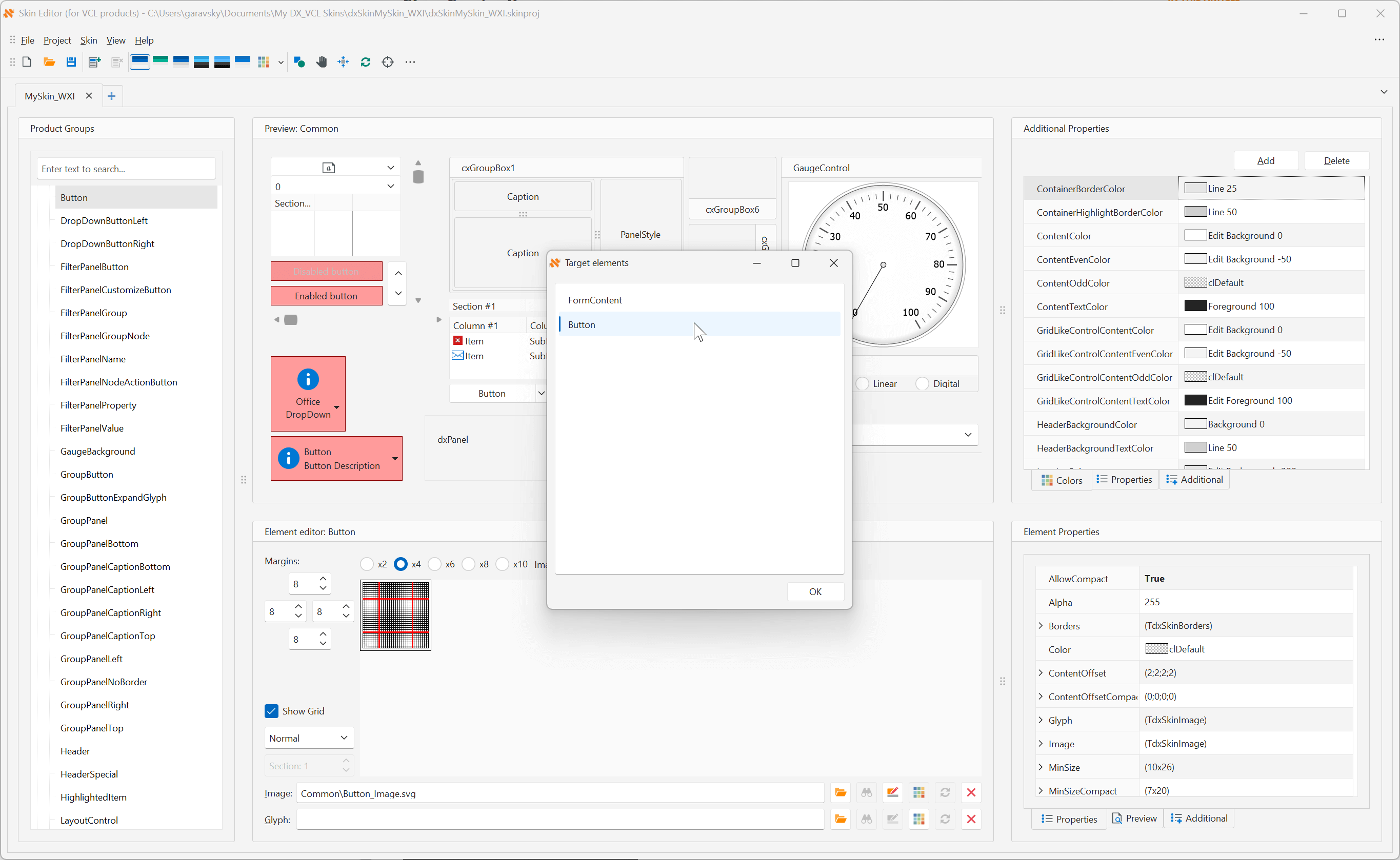
Chart Control
#Configure Bar Text Position
With the introduction of our new Position property (TopInside, BottomInside, Center, Top) you now have full control over the position of TdxChartXYSeriesBarView value labels.
var
  ADiagram: TdxChartXYDiagram;
  AValueLabels: TdxChartXYSeriesStackedBarValueLabels;
  I: Integer;
begin
  ADiagram := dxChartControl1.Diagrams[0] as TdxChartXYDiagram;
  ADiagram.BeginUpdate;  // Initiates the following batch change
  try
    for I := 0 to ADiagram.SeriesCount - 1 do  // Iterates through all series in the diagram
      begin
        AValueLabels := (ADiagram.Series[I].View as TdxChartXYSeriesStackedBarView).ValueLabels;
        AValueLabels.Visible := True;  // Displays value labels for the current series
        AValueLabels.Position := TdxChartStackedBarValueLabelPosition.TopInside;
        AValueLabels.Appearance.FillOptions.Mode := TdxFillOptionsMode.Hatch;
        AValueLabels.Appearance.FillOptions.Color := TdxAlphaColors.AliceBlue;
        AValueLabels.Appearance.FillOptions.Color2 := TdxAlphaColors.LightBlue;
        AValueLabels.Appearance.FillOptions.HatchStyle := TdxFillOptionsHatchStyle.DarkDownwardDiagonal;
        AValueLabels.Appearance.FontOptions.Name := 'Arial';
        AValueLabels.Appearance.FontOptions.Size := 10;
        AValueLabels.Appearance.FontOptions.Bold := True;
        AValueLabels.TextFormat := '{V:0.000} M';  // Defines a custom label formatting pattern
      end;
  finally
    ADiagram.EndUpdate;  // Calls EndUpdate regardless of the batch operation's success
  end;
end;
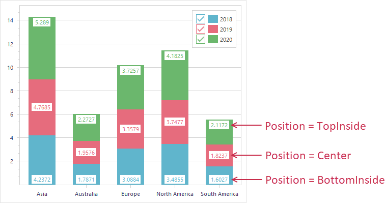
Cloud-Related API
We updated DevExpress Cloud-related APIs for the following VCL libraries:
- VCL Scheduler: Updated Microsoft 365 and Google calendar support
- Cloud Storage-related component updates
- VCL Map Control: Our Map control now supports Microsoft's Azure Map Services (Bing Maps replacement).
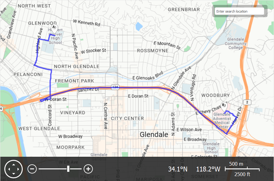
Please refer to the following post for additional Map-related information: Important Announcement: Bing Maps for Enterprise - Service Deprecation.
Skins
#Application-Wide Skins and Associated Global Settings
v24.2 ships with the following DevExpress Project Settings dialog:
The DevExpress Project Settings dialog displays Vector Skins at the top of the Available Skins list view (Raster Skins are displayed in a separate category and disabled by default).
You can use the Project Settings dialog to specify a DevExpress Skin and default palette name (WXI Compact is enabled by default) for your project.
This new dialog and the Object Inspector allow you to add a single dxSettings file and maintain skin/global app settings in one location (no need to duplicate skin registrations in your units under uses).

#DevExpress Skins Are No Longer Applied to Non-DevExpress Forms
Previously, if you did not wish to apply DevExpress VCL Skins to all controls/forms simultaneously, you could handle OnSkinControl and OnSkinForm events for TdxSkinController.
With v24.2, you no longer need to write code for third-party forms/components when using standard VCL contorls from the following list: Third Party Forms/Components. The DevExpress VCL Skin engine uses a predefined ignore list for application forms found in popular third-party UI components.
Survey - VCL
Your Feedback Matters!
Please
login to complete the survey.
Survey Completed
Thank you for taking the time to complete this survey. Your responses have now been posted. If you want to follow up with additional information, feel free to send us an email at clientservices@devexpress.com anytime.
You've Already Completed This Survey
Our records show that you have already completed this survey. If you want to follow up with additional information, send us an email at clientservices@devexpress.com.
This survey has expired
If you want to share your feedback or request new functionality, please submit a new support ticket via the DevExpress Support Center. We’ll be happy to follow up.