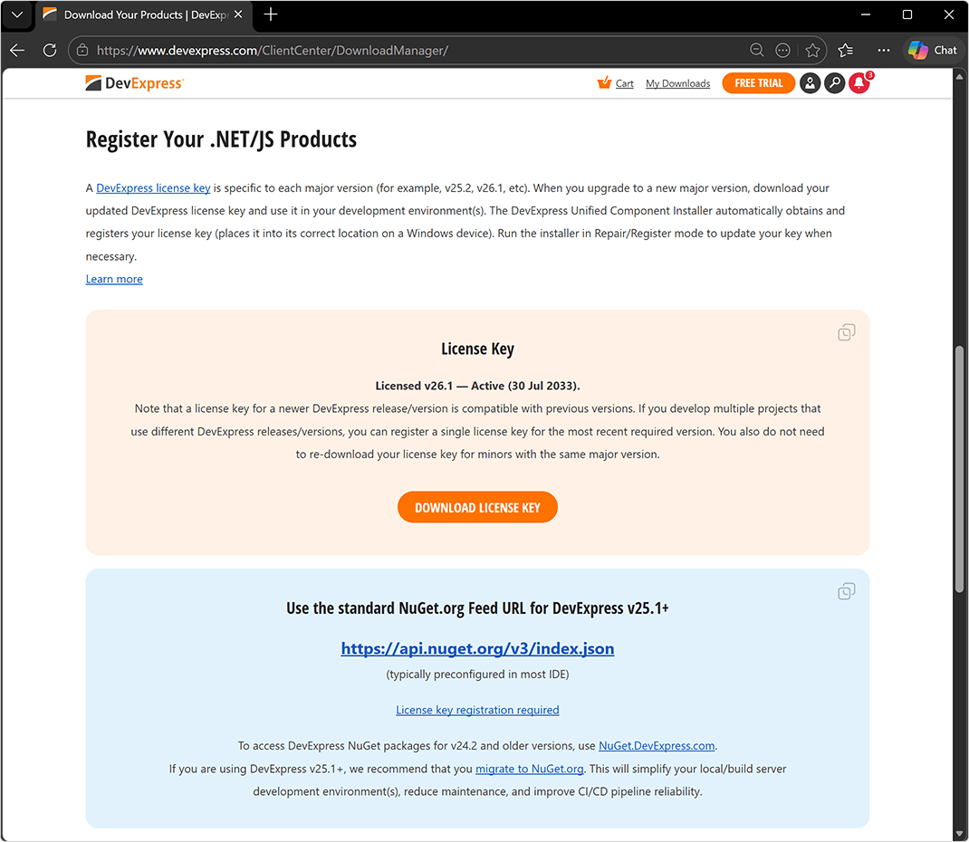
DevExpress .NET/JS License Keys
Every developer/build machine must store a valid DevExpress license key. If you are upgrading to a new major version, download your updated license key and use it in your development environment.
DevExpress Unified Installer (Windows) automatically obtains your License Key and places it into its correct location. Run the installer in Repair/Register mode to update your key when necessary. If you used our Unified Installer before license keys were introduced (prior to v25.1), you should not experience any changes when installing or updating DevExpress products.
If you bypass the DevExpress Unified Installer, you can download your license key and register it in the system manually (via a file on disk or an environment variable). Review detailed instructions in the following help topic: Manual Registration: Obtain and Register Your Key.
For DevExtreme TS / JS components (React, Angular, Vue, jQuery), please refer to the following help topic: Manual Registration: Additional Step for JS/TS Developers (DevExtreme). With v26.1, DevExtreme components share a single license key ("LCXv1...") with .NET product libraries (Learn more).
DevExpress NuGet Packages
#Migrate to NuGet.org
With our major update v26.1, we publish DevExpress NuGet packages to NuGet.org only. We discontinued our own NuGet server (nuget.devexpress.com) for new DevExpress versions ("nuget.devexpress.com" remains operational for v24.2 and earlier versions).
If you are using DevExpress v25.1+, we recommend that you migrate to NuGet.org and register your DevExpress license key. This will simplify your local/build server development environment(s), reduce maintenance, and improve CI/CD pipeline reliability.
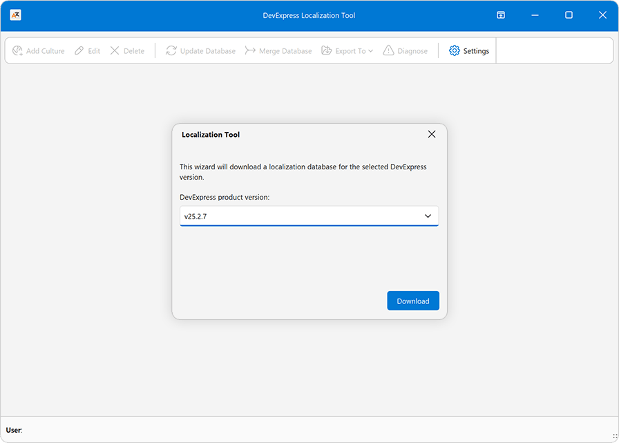
Localization Tool
#Simplified Resource Setup
We simplified initial setup for the DevExpress Localization Tool.
When you launch the tool for the first time, our Localization Tool downloads required localization resources from our GitHub repo and configures source, import, and export paths automatically.
Software Bill of Materials (SBOM) for DevExpress Packages
If you ship apps to customers in the EU, the Cyber Resilience Act (CRA) will require a Software Bill of Materials (SBOM) as part of your conformity documentation. SBOM generation and CRA compliance are top priorities for DevExpress, and CycloneDX SBOM files for our .NET NuGet packages are now available as a preview. We are looking for feedback to help us refine our solution before a broader release.
To get started, please refer to the following article: Software Bill of Materials (SBOM) for DevExpress .NET assemblies/NuGet packages, JavaScript, VCL and other redistributable artifacts.
To request access to DevExpress SBOM files for .NET NuGet packages, please complete the following survey: DevExpress SBOM Survey.
Information Security | Security - What You Need to Know
DevExpress Template Kit
#Rider Support for DevExpress Items
You can now add DevExpress-specific items directly within Rider. Simply use Add → DevExpress Template Kit to access DevExpress project items and templates from the IDE.
#Unified Project Creation Experience
We streamlined the Visual Studio project creation workflow to make it simpler and easier to navigate. Instead of displaying multiple DevExpress entries for individual products, the Create New Project dialog now includes only two DevExpress-specific items (for .NET and .NET Framework apps). Each item serves as a unified access point and includes project templates for the full range of DevExpress products.
#Platform-Specific Enhancements
- Visual Basic support for WinForms and WPF
- ASP.NET Core application templates (Learn more)
- DevExpress Template Kit for VCL (Learn more)
NOTE: DevExpress does not offer a REST API or ship any built-in LLMs/SLMs. Instead, we follow the BYOL ("bring your own license") principle. To use these features, you need to have an active subscription to AI services (e.g., Azure, Open AI, Google Gemini, Mistral AI, etc.) and obtain the REST API endpoint, key, and model deployment name. These variables must be specified at runtime to enable DevExpress AI-powered Extensions in your application.
AI Chat Control Enhancements — Blazor, WinForms, WPF
Microsoft Agent Framework and OpenAI Responses API Support
DevExpress AI Chat Controls support a new IChatResponseProvider abstraction layer. This layer decouples the UI from AI services and allows you to bind the AI Chat Control to different AI backends, including OpenAI Responses API, Azure AI Projects, and Microsoft Agent Framework implementations (agents, executors, and multi-step workflows). You can also create custom IChatResponseProvider implementations for usage scenarios that do not map to standard AI providers.
ASP.NET Core & JavaScript Chat Control
Our JavaScript Chat component includes the following enhancements designed for AI-related usage scenarios:
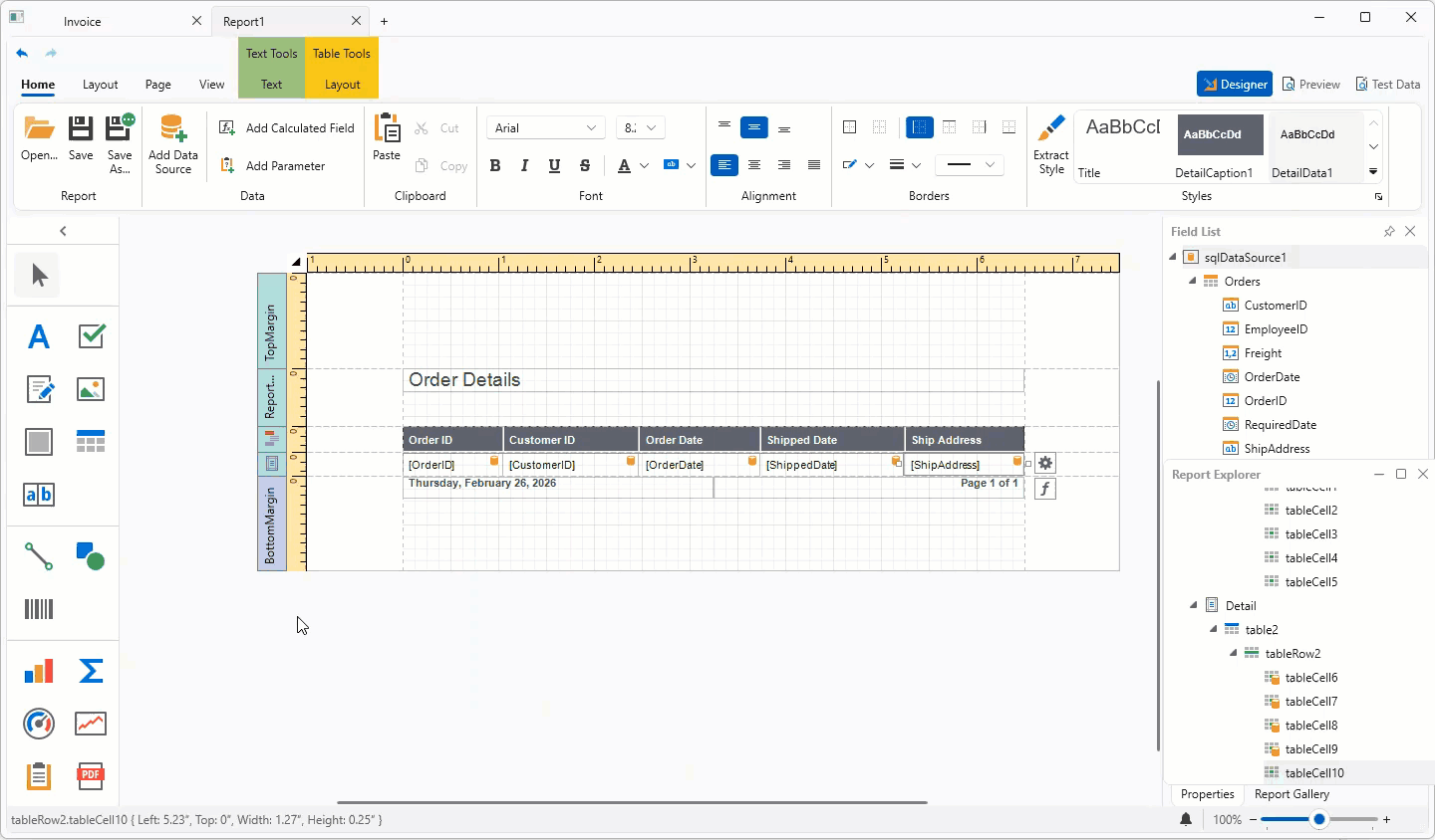
DevExpress Reports — AI Prompt-to-Report Wizard Optimization
Our updated AI Report Wizard introduces an agentic workflow to improve output quality and consistency. The new implementation reduces token usage during natural language report generation.
Refer to the following section for additional information: AI Prompt-to-Report Wizard — Optimized Report Generation.
AI-Powered Extensions
Enhancements include:
Security Enhancements
We expanded internal security diagnostics (including custom analyzers) across engineering workflows.
WinForms AI Chat
#AI Agent Integration
The DevExpress WinForms AI Chat Control ships with a new IChatResponseProvider abstraction layer. This layer decouples the UI from AI services and allows you to bind the AI Chat Control to different AI backends, including:
IChatClient, AIAgent implementations
- OpenAI Responses API
- Azure AI Projects
- Microsoft Agent Framework (including agents and workflows)
-
Custom
IChatResponseProvider implementations
Prerequisites
Install the following NuGet packages to begin:
- DevExpress.AIIntegration.Agents
- DevExpress.AIIntegration.WinForms
- DevExpress.AIIntegration.WinForms.Chat
- Microsoft.Agents.AI.OpenAI (1.0.0-rc1)
- Microsoft.Extensions.AI.OpenAI (10.4.0)
Documentation
#Agent API Demos
Our Demo Center includes new examples that demonstrate real-world AI agent usage scenarios and integration patterns with the DevExpress WinForms AI Chat Control.
New demos include:
- Workflow as Agent
Wraps a multi-step workflow behind the IChatResponseProvider abstraction and exposes it as a chat client.
- Workflow with Executors
Implements a deterministic workflow without AI model calls.
- Stream Workflow Responses
Streams intermediate results from a multi-step workflow.
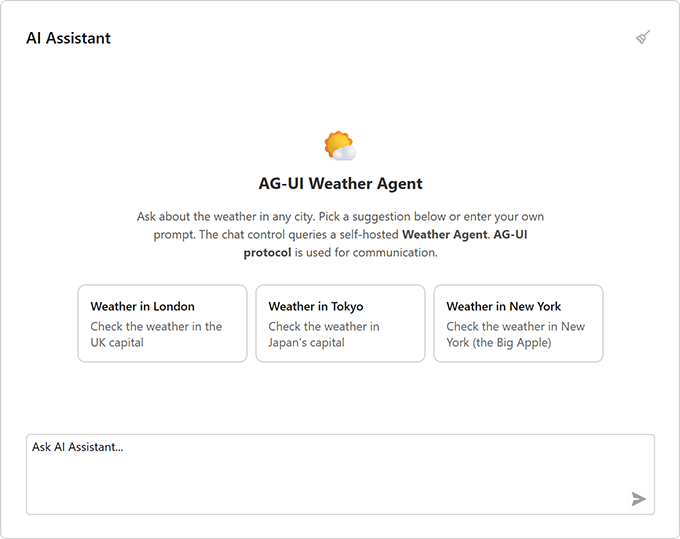
- AG-UI Integration
Connects the AI Chat Control to an external agent server via the AG-UI protocol.
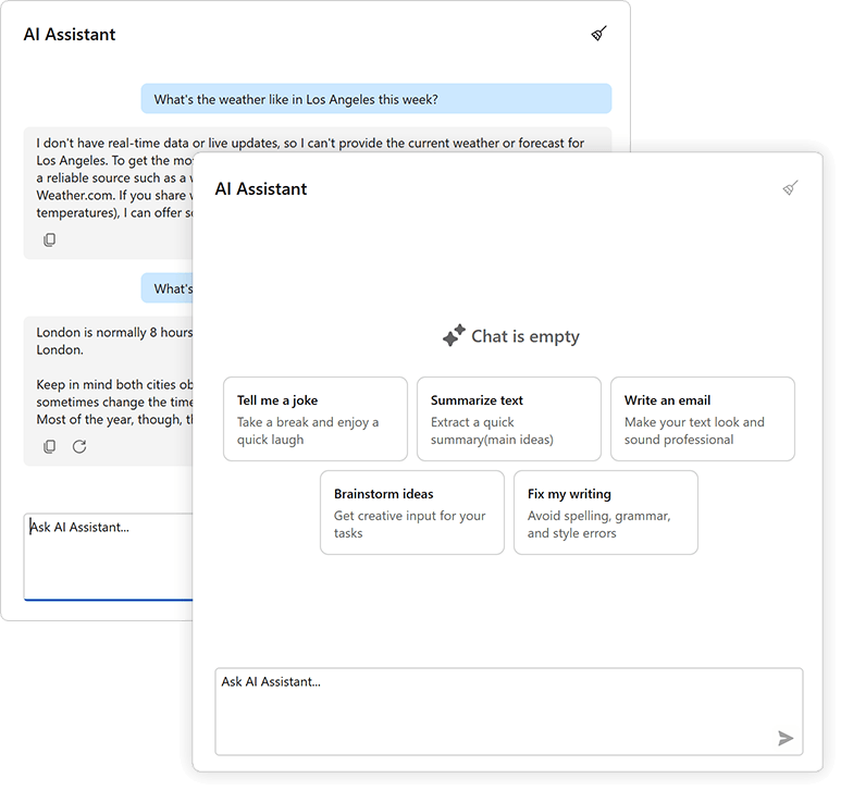
#Chat Fluent UI
Our updated Chat UI aligns with modern Fluent design standards.
Enhancements include:
- Simplified layout
- Updated typography
- Refined spacing
#Customize Chat Input Placeholder
Use the AIChatControl.InputBoxNullText property to specify placeholder text in the input box:
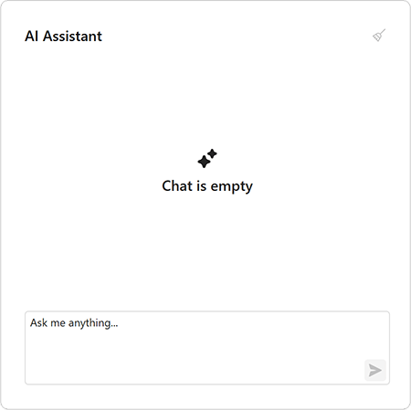
aiChatControl1.InputBoxNullText = "Ask me anything...";
#API Enhancements
We updated message processing APIs and refined naming for consistency.
The MessageSending event replaces MessageSent and includes an e.Cancel parameter. Handle this event to process input before it is added to chat history and sent to the AI service. Set e.Cancel to true to prevent automatic send operations.
async void AiChat_MessageSending(object sender, AIChatControlMessageSendingEventArgs e) {
    // Add a message to chat history without sending it to the AI service.
    await e.Chat.AppendMessageAsync("Translate text to Spanish", ChatRole.System);
}
Accessibility Enhancements
#PDF/UA-2 Format Support
Our PDF export engine now supports the PDF/UA-2 format (for enhanced accessibility compliance). You can specify PDF/UA-2 conformance for exported documents to meet the latest accessibility standards. The new PDF/UA-2 option is available for the following products:
- WinForms Rich Text Editor
- WinForms Spreadsheet Control
Set the PdfExportOptions.PdfUACompatibility property to PdfUA2 to specify PDF/UA-2 conformance for exported documents.
Template Kit
#Visual Basic Support
The DevExpress Template Kit now supports Visual Basic. You can create DevExpress-powered WinForms applications in VB.NET alongside C# templates.
#Updated Template Appearance
We updated our WinForms project templates. Most templates now use the WXI skin and include Rounded Skin Panels.
Updated templates include:
- Application Builder
- Grid-based Application
- Ribbon-Based Application
- Report Viewer Application
- Outlook-Inspired Application
- Spreadsheet Application
- Word Processing Application
- Scheduling Application
- Blazor Hybrid WinForms Application
- HTML Hybrid WinForms Application
- Modular Application
DateTimeOffset Support
#Criteria Operators
DateTimeOffset support is part of our 2026 roadmap. v26.1 adds support to the core criteria engine and date/time CriteriaOperator functions. v26.2 will add support to DevExpress data-aware controls.
New function groups include:
-
Current date/time functions (
LocalDateTimeToday, LocalDateTimeNow, LocalDateTimeThisMonth, etc.) - Outlook-style interval functions (
IsOutlookIntervalToday, IsOutlookIntervalTomorrow, etc.) - Time-frame functions (
IsThisYear, IsYearToDate, etc.) - Comparison functions (
IsSameDay, IsSameHour, etc.) - Date difference functions (
DateDiffDay, DateDiffMonth, etc.) - Date component functions (
GetDate, GetMonth, GetOffset, etc.) - Intraday functions (
BeforeMidday, AfterMidday, etc.) - Date arithmetic functions (
AddDays, AddMonths, etc.) - Range functions (
InRange, InDateRange, etc.)
These functions can evaluate values in a client-specified time zone — you do not need to manually convert DateTimeOffset values to local DateTime values.
#EF Core Server Mode Support
DateTimeOffset functions are now compatible with EF Core Server Mode (Microsoft SQL Server). EntityServerModeSource generates Microsoft SQL Server–compatible LINQ queries for DateTimeOffset properties and processes results using native DateTimeOffset support.
DateOnly & TimeOnly Support
#WinForms Pivot Grid
The DevExpress WinForms Pivot Grid now supports DateOnly and TimeOnly data types for filtering, grouping, and summary operations within DevExpress-powered .NET applications.
WinForms Memo Editors
#Auto Hide Scrollbars
DevExpress WinForms MemoEdit and MemoExEdit controls automatically toggle scrollbar visibility based on content size.
Enable the AutoHideScrollBars option to display scrollbars only when content exceeds the visible area.
memoEdit.Properties.AutoHideScrollBars = DevExpress.Utils.DefaultBoolean.True;
memoEdit.Properties.ScrollBars = ScrollBars.Vertical;
memoEdit.Properties.WordWrap = true;
WXI Skin Enhancements
We updated our WXI skin with the following enhancements:
- Improved control sizing
- Consistent layout across UI elements
- Customizable placeholder text color
- Enhanced text contrast
Rounded Skin Panel
#Runtime Resizing
Our new AllowResize option activates runtime panel resizing.
roundedSkinPanel1.Dock = DockStyle.Left;
roundedSkinPanel1.AllowResize = DevExpress.Utils.DefaultBoolean.True;
WinForms Spreadsheet
#New Excel Functions
The DevExpress Spreadsheet Control v26.1 supports 6 new dynamic array-based Excel functions:
- XLOOKUP
- XMATCH
- SORT
- SORTBY
- FILTER
- UNIQUE
These functions simplify common data analysis tasks, reduce the need for complex formulas, and align calculation behaviors more closely with Microsoft Excel. To insert and evaluate new functions, assign a formula to the CellRange.DynamicArrayFormula property and call the Workbook.Evaluate method.
using DevExpress.Spreadsheet;

// Use XLOOKUP to find product "P1003" by ID and return associated row data.
Worksheet worksheet = spreadsheet.Document.Worksheets.ActiveWorksheet;
worksheet.Import(new object[,] {
    {"Product ID", "Product Name", "Category", "Price" },
    {"P1001", "Wireless Mouse", "Accessories", 25.99 },
    {"P1002", "USB-C Hub", "Accessories", 45.00 },
    {"P1003", "27'' Monitor", "Displays", 299.99 },
}, 0, 0);

worksheet["A7"].Value = "Product P1003";
worksheet["A8"].DynamicArrayFormula = @"XLOOKUP(""P1003"", A2:A5, A2:D5)";

workbook.Calculate();
workbook.SaveDocument(new FileStream("result.xlsx", FileMode.Create), DocumentFormat.Xlsx);
Monaco-Based Code Editor (Demo)
We created an example that wraps the open source Monaco Editor (v0.55.1). The editor is hosted inside Microsoft WebView2 and exposed through a custom, reusable CodeEditor WinForms control.
NOTE: The WinForms CodeEditor control is available as part of the example. It is not included in the DevExpress WinForms UI Control library.
Features include:
- Monaco Editor engine
- WebView2-based hosting with seamless WinForms integration
- 50+ built-in languages (C#, JavaScript, Python, SQL, XML, JSON, and more)
- DevExpress skin integration
- Theme token rule editor
- Configurable editor options (line numbers, minimap, folding, word wrap, sticky scroll, tab size, IntelliSense, scrolling, indentation, and more)
- Read-only mode
- Track changes
- Load/save files
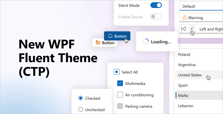
Fluent Theme (CTP)
v26.1 introduces a new Fluent Light Theme for DevExpress-powered WPF applications. The new theme incorporates modern design practices inspired by the latest Microsoft 365 applications.
Features include:
- Improved contrast and readability
- Token-based theme customization
- Semantic resource naming
- Unified styling with DevExpress Blazor for Blazor Hybrid applications
WPF AI Chat
#AI Agent Integration
The DevExpress WPF AI Chat Control ships with a new IChatResponseProvider abstraction layer. This layer decouples the UI from AI services and allows you to bind the AI Chat Control to different AI backends, including:
IChatClient, AIAgent implementations
- OpenAI Responses API
- Azure AI Projects
- Microsoft Agent Framework (including agents and workflows)
-
Custom
IChatResponseProvider implementations
Prerequisites
Install the following NuGet packages to begin:
- DevExpress.AIIntegration.Agents
- DevExpress.AIIntegration.Wpf.Chat
- DevExpress.Wpf.Core
- Microsoft.Agents.AI.OpenAI (1.0.0-rc1)
- Microsoft.Extensions.AI.OpenAI (10.4.0)
Documentation
#Agent API Demos
Our Demo Center includes new examples that demonstrate real-world AI agent usage scenarios and integration patterns with the DevExpress WPF AI Chat Control.
New demos include:
- Workflow as Agent
Wraps a multi-step workflow behind the IChatResponseProvider abstraction and exposes it as a chat client.
- Workflow with Executors
Implements a deterministic workflow without AI model calls.
- Stream Workflow Responses
Streams intermediate results from a multi-step workflow.
- AG-UI Integration
Connects the AI Chat Control to an external agent server via the AG-UI protocol.
#Chat Fluent UI
Our updated Chat UI aligns with modern Fluent design standards. Enhancements include:
- Simplified layout
- Updated typography
- Refined spacing
#Customize Chat Input Placeholder
Use the AIChatControl.InputBoxNullText property to specify placeholder text in the input box:
#API Enhancements
We updated message processing APIs and refined naming for consistency.
The MessageSending event replaces MessageSent and includes an e.Cancel parameter. Handle this event to process input before it is added to chat history and sent to the AI service. Set e.Cancel to true to prevent automatic send operations.
async void AiChat_MessageSending(object sender, AIChatControlMessageSendingEventArgs e) {
    // Add a message to chat history without sending it to the AI service.
    await e.Chat.AppendMessageAsync("Translate text to Spanish", ChatRole.System);
}
AI-powered Extensions
#Prompt to Expression — WPF Filter Editor and Expression Editor
We added AI-powered expression generation to help users create filter and column expressions for DevExpress data-aware WPF controls using natural language.
Users describe the desired logic in plain text. The system sends the prompt to the configured AI service and returns a valid expression. The DevExpress WPF Expression Editor and/or Filter Editor display and validate results immediately.
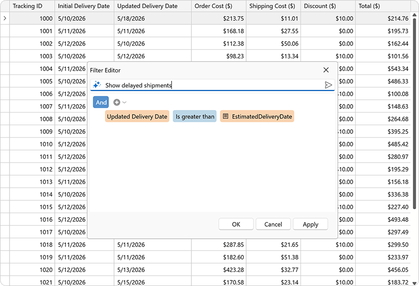
Supported controls include:
- DevExpress WPF Grid Control
- DevExpress WPF TreeList Control
- DevExpress WPF Expression Editor Control
- DevExpress WPF Filter Editor Control
Accessibility Enhancements
#Pivot Grid — Filter Panel Keyboard Navigation
Our WPF Pivot Grid includes full keyboard access to the Filter Panel.
Set the AllowFilterPanelNavigation property to true to activate Filter Panel keyboard navigation:
<dxpg:PivotGridControl
		AllowFilterPanelNavigation="True">
	<dxpg:PivotGridControl.Fields>
		<dxpg:PivotGridField FieldName="Country" Area="RowArea" AreaIndex="0"/>
		<dxpg:PivotGridField FieldName="Name" Area="RowArea" AreaIndex="1"/>
		...
	</dxpg:PivotGridControl.Fields>
</dxpg:PivotGridControl>
Use the following keyboard shortcuts to navigate between the WPF PivotGrid control and the Filter Panel:
| Keyboard Shortcut | Action |
Ctrl+Shift+F | Focus moves to the Filter Panel. |
Ctrl+Tab | Focus moves from the active data cell to the Filter Panel. |
Tab | Shifts focus from the last navigable cell in the data region to the Filter Panel. |
Ctrl+Shift+Tab | Restores focus from the Filter Panel to the previously active data cell. |
Documentation
#Spreadsheet Control - Screen Reader Support
Spreadsheet documents are now accessible to screen readers (Narrator, NVDA). You can navigate through document sheets, rows, columns, and cells. Readers can pronounce all worksheet headings, cell text, comments, text boxes, and alt text for images, charts, and other drawing objects.
#PDF/UA-2 Format Support
Our PDF export engine now supports the PDF/UA-2 format (for enhanced accessibility compliance). You can specify PDF/UA-2 conformance for exported documents to meet the latest accessibility standards. The new PDF/UA-2 option is available for the following products:
- WPF Rich Text Editor
- WPF Spreadsheet Control
Set the PdfExportOptions.PdfUACompatibility property to PdfUA2 to specify PDF/UA-2 conformance for exported documents.
WPF Data Grid
#Expression Editor for Custom Format Conditions
Our Expression Editor (for both the TableView and TreeListView) now supports custom conditional formatting rules. Users can define formatting rules with complex logical expressions beyond predefined rule types.
Use the following properties to enable custom expressions:
When enabled, our Conditional Formatting Rules Manager displays the "Expression Editor" button for formula-based rules.
#Advanced Column and Band Drag-and-Drop
A new ColumnDragOver event allows you to control column and band drag & drop behavior. Handle this event to validate or modify drop operations. You can execute the following:
- Prevent column reordering
- Restrict drop targets
- Apply drag & drop rules for individual grid columns
<ThemedWindow ...
	xmlns="http://schemas.microsoft.com/winfx/2006/xaml/presentation"
	xmlns:x="http://schemas.microsoft.com/winfx/2006/xaml"
	xmlns:dxg="http://schemas.devexpress.com/winfx/2008/xaml/grid" >

	<dxg:GridControl ItemsSource="{Binding Items}">
		<dxg:GridControl.Columns>
			<dxg:GridColumn FieldName="ID" />
			<dxg:GridColumn FieldName="Name" />
			<dxg:GridColumn FieldName="Date" />
		</dxg:GridControl.Columns>
		<dxg:GridControl.View>
			<dxg:TableView ColumnDragOver="TableView_ColumnDragOver" />
		</dxg:GridControl.View>
	</dxg:GridControl>
</ThemedWindow>
void TableView_ColumnDragOver(object sender, ColumnDragOverEventArgs e) {
	// Cancel the drop operation if the user attempts to drop a column onto a column header area.
	e.Cancel = e.TargetArea == HeaderArea.ColumnHeader;
}
#Search Panel Customization
We extended Search Panel customization with the following options:
- Minimum/maximum width
- Display custom content
#Group Panel Customization
Group Panel customization capabilities include:
- Display custom content
- Align Group Panel text
- Customize background color
Enable the ShowGroupPanelColumnsAsSingleRow option to display grouped column headers in a single line without indentation:
#Column Header Customization
New customization options include:
- Display custom sort icons
- Adjust icon size
- Display, hide, or reposition filter icons
- Apply custom templates
#Row Indicator Customization
Row Indicator Panel customization options include:
- Specify foreground and background colors
- Display custom UI elements and icons
#Expand Button Customization
New options allow you to display custom glyphs/icons within expand/collapse buttons in TreeList layouts, group and master-detail rows.
#Filter Panel Customization
New appearance settings allow you to customize Filter Panel UI elements:
- Foreground and background colors for fields, values, and operators
- A color mode that switches between standard appearance and a plain style with transparent backgrounds and inherited text colors
New commands allow you to handle user actions:
WPF TreeViewControl
#API Enhancements
We expanded TreeViewControl API to simplify customization and reduce reliance on implicit styles.
You can now configure view-level settings directly on the control:
New methods and events allow you to manage in-place editors as necessary:
- Display, hide, and close editors
- Control editor activation
- Handle keyboard operations
WPF Spreadsheet Control
#New Excel Functions
The DevExpress Spreadsheet Control v26.1 supports 6 new dynamic array-based Excel functions:
- XLOOKUP
- XMATCH
- SORT
- SORTBY
- FILTER
- UNIQUE
These functions simplify common data analysis tasks, reduce the need for complex formulas, and align calculation behaviors more closely with Microsoft Excel. To insert and evaluate new functions, assign a formula to the CellRange.DynamicArrayFormula property and call the Workbook.Evaluate method.
  using DevExpress.Spreadsheet;

  // Use XLOOKUP to find product "P1003" by ID and return associated row data
  Worksheet worksheet = spreadsheet.Document.Worksheets.ActiveWorksheet;
  worksheet.Import(new object[,] {
      {"Product ID", "Product Name", "Category", "Price" },
      {"P1001", "Wireless Mouse", "Accessories", 25.99 },
      {"P1002", "USB-C Hub", "Accessories", 45.00 },
      {"P1003", "27'' Monitor", "Displays", 299.99 },
  }, 0, 0);

  worksheet["A7"].Value = "Product P1003";
  worksheet["A8"].DynamicArrayFormula = @"XLOOKUP(""P1003"", A2:A5, A2:D5)";

  workbook.Calculate();
  workbook.SaveDocument(new FileStream("result.xlsx", FileMode.Create), DocumentFormat.Xlsx);
Template Kit
#Visual Basic Support
The DevExpress Template Kit now supports Visual Basic. You can create DevExpress-powered WPF applications in VB.NET alongside C# templates.
DateOnly & TimeOnly Support
#WPF Charts
The DevExpress WPF Chart Control supports .NET DateOnly and TimeOnly data types.
Use these types for:
- Arguments and values
- Workday and work time settings
- Strips, constant lines, and scale breaks
- Filtering, sorting, and summaries
#WPF Pivot Grid
The DevExpress WPF Pivot Grid now supports DateOnly and TimeOnly data types for filtering, grouping, and summary operations in .NET applications.
MVVM Enhancements
#Simplified Dependency Injection (DI)
The DevExpress MVVM framework v26.1 includes built-in support for Dependency Injection (DI) directly in XAML.
Use our new IocExtension to resolve objects or services from the configured dependency injection container. The extension uses the global IocServiceProvider.Default service provider to resolve dependencies at runtime.
Prism 9 Support
We added Prism 9 support to our DevExpress adapters. You can integrate Prism regions into the following DevExpress WPF controls:
- LayoutGroup
- DocumentGroup
- TabbedGroup
- LayoutPanel
- DXTabControl
- NavigationFrame
- NavBarControl
- NavBarGroup
Monaco-Based Code Editor (Demo)
We created an example that wraps the open source Monaco Editor (v0.55.1). The editor is hosted inside Microsoft WebView2 and exposed through a custom, reusable CodeEditor WPF control.
NOTE: The WPF CodeEditor control is available as part of the example. It is not included in the DevExpress WPF UI Control library.
Features include:
- Monaco Editor engine
- WebView2-based hosting with seamless WPF integration
- 50+ built-in languages (C#, JavaScript, Python, SQL, XML, JSON, and more)
- DevExpress theme integration
- Theme token rule editor
- Configurable editor options (line numbers, minimap, folding, word wrap, sticky scroll, tab size, IntelliSense, scrolling, indentation, and more)
- Read-only mode
- Track changes
- Load/save files
Migration to a Single License Key for All DevExpress Products
Wth v26.1, all DevExpress product libraries (including DevExtreme) share a single license key. You can now develop different DevExpress-powered applications on one machine using the same key.
Chat Enhancements
#Speech to Text
The DevExtreme Chat interface now supports speech-to-text conversion (allows users to dictate messages instead of typing).
To activate this feature, set the speechToTextEnabled property to true. Once enabled, a microphone icon appears in the chat input field. Users can click the icon to start speech-to-text conversion.
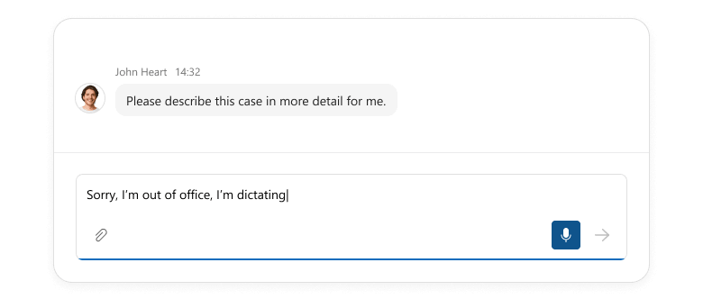
Use the speechToTextOptions property to configure conversion settings. For instance, you can specify the language for speech recognition and set a maximum duration for speech input.
Use the new speech-to-text option to enhance accessibility, improve user-efficiency, and support new interaction scenarios (such as hands-free voice input).
#Suggestions
DevExtreme Chat can now display suggestion buttons above the input field. These buttons remain visible even after a message is entered. Use our new suggestions API to define suggestions and configure each button individually. Usage scenarios include:
- Prompt suggestions in AI chats: Specify ready-to-use prompts and help users understand AI assistant capabilities so they can obtain relevant responses faster.
- Initial message suggestions for new conversations: Allow users to start conversations with a single click to improve the onboarding experience.
- Dynamic, context-aware suggestions: Update suggestions based on conversation flow, user input, or application state to keep interactions relevant and helpful.
- One-time or dismissible suggestions: Hide suggestions after selection or at specific conversation stages to keep the interface clean and focused.
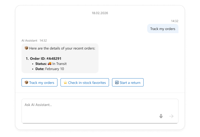
The suggestions API accepts DevExtreme ButtonGroup options and allows you to handle click actions using the onItemClick option. You can update the input field text, send messages immediately, or execute any other action as your needs dictate.
#Message Streaming
With v26.1, you can now stream AI message responses incrementally inside a message bubble.
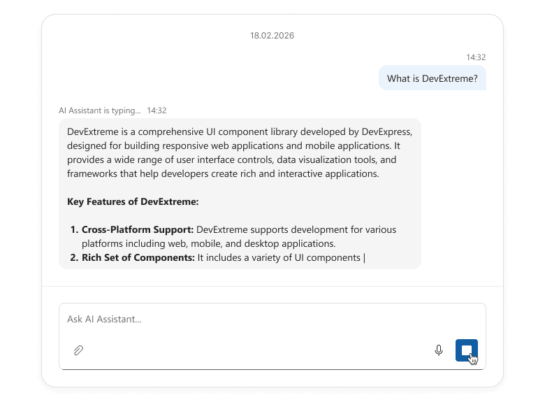
Use our new sendButtonOptions property to implement message streaming. Switch the button to custom mode, customize its icon, and handle click events as needed. In this setup, the button can start an AI request, stream the response into Chat UI in chunks, and act as a Stop button during generation.
Message streaming improves user experience for DevExtreme-powered AI assistants, chatbots, and long-running operations. Conversations feel more dynamic and responsive.
#Input Field Text
Our new inputFieldText property allows you to display custom text within the Chat input field:
- Add a default message (users can modify it before sending).
- Suggest prompts to guide user responses.
- Dynamically pre-populate the input field based on context, such as previous messages.
Scheduler Enhancements
#Handle Appointment Time Overlaps
DevExtreme Scheduler v26.1 allows you to handle appointment time overlaps. The new getOccurrences method retrieves all appointment occurrences across a time range (both recursive and standard).
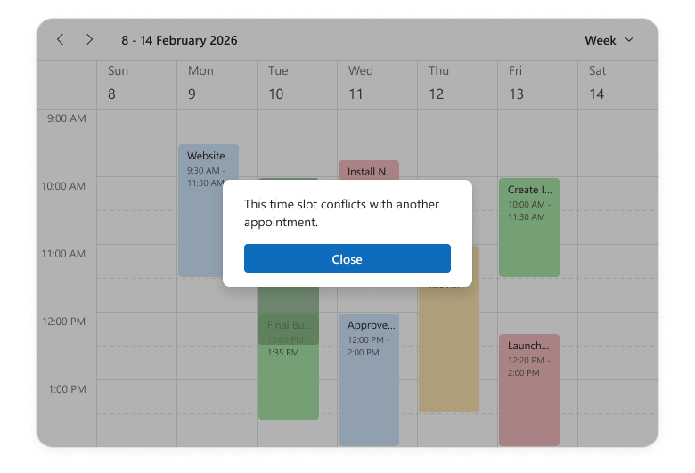
Use this method to detect overlaps when:
- Creating or updating events
- Building custom validation logic (to prevent double-booking)
- Implementing advanced scheduling features such as conflict resolution or alternative time suggestions.
#Appointment Snap Modes
The DevExtreme Scheduler can now align appointments with time cells to ensure a visually consistent layout. Set the snapToCellsMode property to "always" to snap all appointments to the grid, regardless of their duration. In "auto" mode, appointments that occupy less than 2 time cells stretch to cell borders, while the remaining appointments do not stretch.
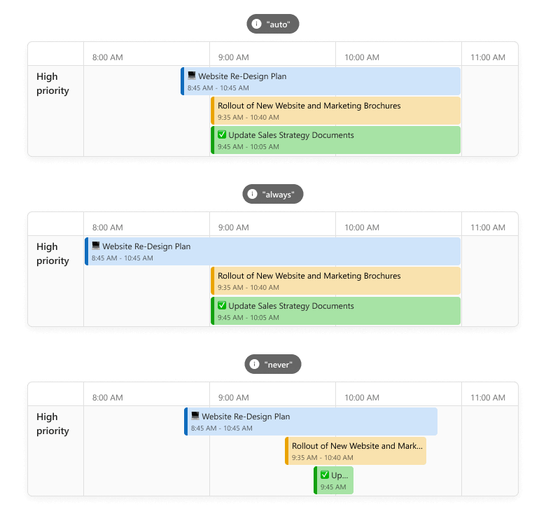
Appointment snapping is particularly useful when displaying a mix of short and long events in the Scheduler component (for instance, in booking systems). When enabled, appointments align neatly within the grid, improving readability and visual balance. It also reduces text truncation and ensures that key details (such as titles or assignees) remain visible.
#Hide Days of the Week
You can hide specific days of the week across the Scheduler component or within individual views. Pass day numbers (0-Sunday through 6-Saturday) to the hiddenWeekDays property.
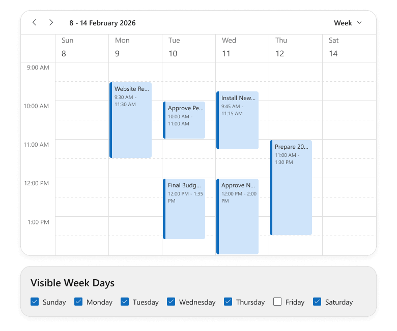
This functionality helps focus UI on relevant days without affecting underlying data. For example, you can hide weekends, exclude specific non-operational days, and tailor views for part-time or shift-based teams.
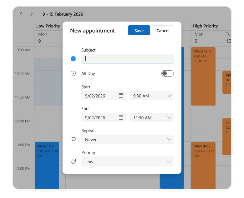
#Handle Cell Selection Completion
The Scheduler component now includes a new onSelectionEnd event handler. This event fires when a user selects cells (on mouse up) and gives you access to selectedCellData, so you can run custom logic at the end of the selection process.
For instance, you can automatically open an appointment creation form when selection is complete. The edit form is pre-populated with the selected time range and resources to simplify scheduling workflows and enhance overall user experience.
UI/UX and API Enhancements
#AI Integration — New Response Language Configuration Option
Our new AIIntegrationOptions allow you to configure services for DevExtreme AI-powered features (such as AI Columns and Smart Paste). v26.1 includes a lang option that you can use to specify the AI response language. We expect to extend AIIntegrationOptions in future release cycles.
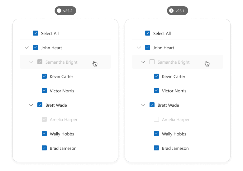
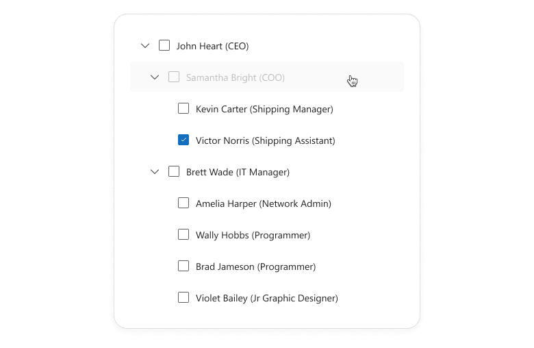
#TreeView — Prevent Selection for Disabled Nodes
Our new disabledNodeSelectionMode property specifies the selection behavior of disabled TreeView nodes. You can prevent selection state changes or allow recursive selection and select all operations to affect disabled nodes.
Use this feature to display items that should not be modified/selected. For instance, if you build a permission management tool where administrators assign directory access privileges to user roles.
#TreeView — Expand/Collapse Disabled Nodes
You can now expand/collapse disabled nodes to explore child items in the DevExtreme TreeView component.
#Form — New getScrollable Method
The DevExtreme Form component includes a new getScrollable() method. The returned Scrollable allows you to save/restore scroll positions, ensuring a smooth user experience across frequent Form re-renders.
Usage scenarios include:
- Long forms with many validation rules (including asynchronous validation).
- Dynamic forms (where field number changes at runtime).
#Form — Rendering Logic Improved
v26.1 ships with improved DevExtreme Form rendering logic. The component is no longer re-rendered once Form size changes and items are repositioned (the number of Form columns changes). Editor states, values, and validation statuses now persist across Form layout changes.
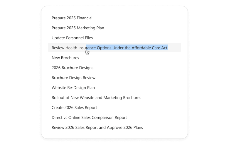
#List — Item Text Selection
Our List component now supports item text selection when swipe actions are disabled (no onItemSwipe handler is defined). Users can easily copy information (such as contact details, notes, or product names) using standard text selection actions.
#Splitter — Enhanced Pane Sizing Logic
The DevExtreme Splitter now preserves configured pane sizes and min/max size constraints across layout changes (when panes are displayed, hidden, or resized). This enhancement improves layout predictability and consistency.
#ODataStore/ODataContext — Updated Date Processing Behavior
ODataStore and ODataContext data requests now store time zone information from date fields. This ensures that components bound to OData services handle time zone-aware values accurately out of the box, both on the client and in requests to the server.
To implement this new behavior, we replaced deserializeDates with a new processDatesAsUtc option in our ODataStore.
#GlobalConfig — New Format Configuration API
DevExtreme v26.1 ships with a new global format configuration API. It allows you to configure date/time/number formats application-wide (globally or per locale) and ensure consistent look and feel across your app.
DevExpress.config({
    dateFormat: {
        default: 'dd.MM.yyyy',
        'en-US': 'MM.dd.yyyy',
    },
});
New configuration options support both custom format strings and predefined DevExtreme formats. You can also override predefined formats as needs dictate.
Centralized formatting logic simplifies maintenance, reduces duplication, and helps adapt your application to different regional requirements.
Accessibility
DevExtreme v26.1 ships with the following accessibility enhancements:
- You can now navigate to first and last appointments in the Scheduler's current view using Home and End keys.
- Use our new tabFocusLoopEnabled option to manage keyboard navigation in the Popup component. When set to true, focus loops inside the Popup. When false, users can tab through elements and exit the Popup.
- Popover and Tooltip can now be canceled and support hover interactions.
#Improved Color Contrast for Fluent and Material Themes
Our Fluent and Material themes now offer enhanced color contrast across all DevExtreme components (improves readability and accessibility). Fluent Blue and Material Blue themes also better align with accessibility contrast guidelines (such as WCAG 2.2, criterion 1.4.3).
These improvements also apply to custom elements that rely on our predefined CSS variables (such as --dx-color-primary).
Angular Version Updates
#Angular 22
Angular 22 was recently released. We've tested this version against our UI components and found no issues.
If you are considering Angular 22 for a current/upcoming project, feel free to share your Angular-specific thoughts/experiences with us.
#Angular 19 — End of Support
Angular 19 recently reached end of support and no longer receives security updates. With v26.1, DevExtreme will support Angular versions 20+.
ASP.NET Core
#UI Template Kit Update
We added new ASP.NET Core application templates to the DevExpress UI Template Kit.
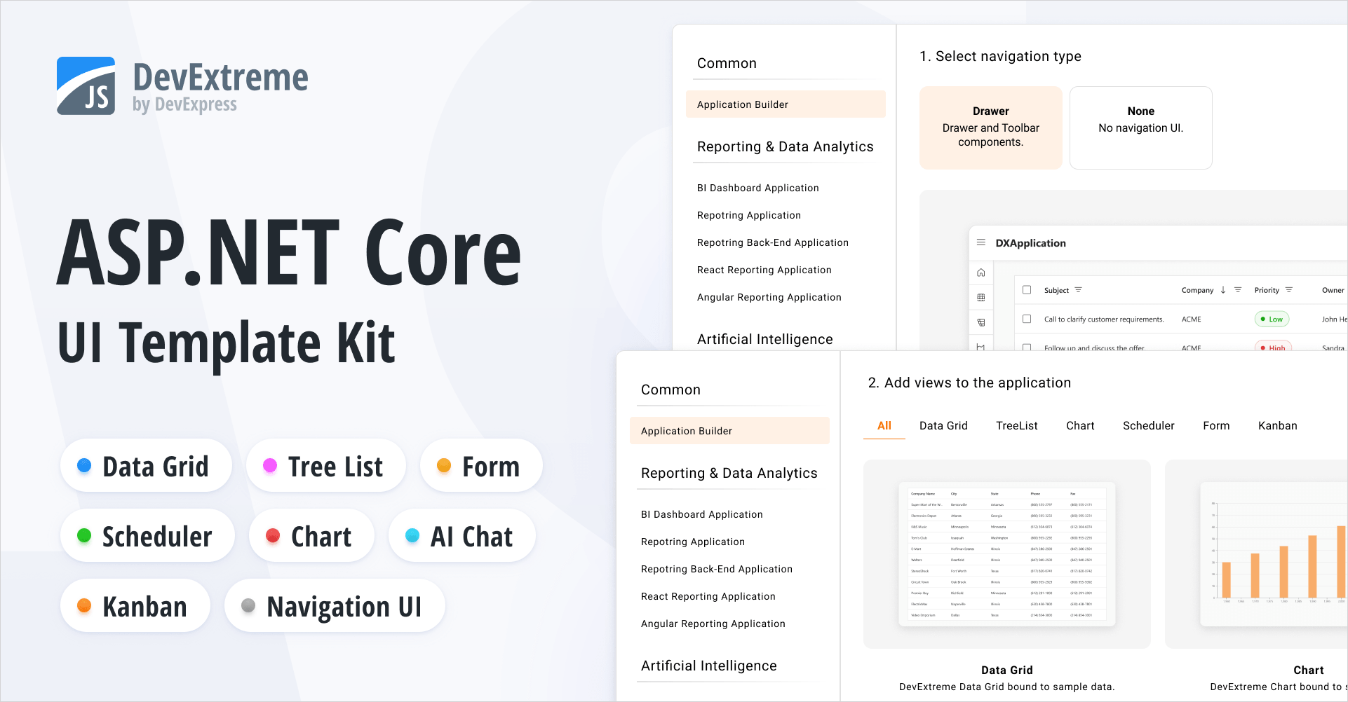
Our new Application Builder template allows you to create a DevExpress-powered ASP.NET Core app with a single click. It includes predefined views for popular DevExtreme-based UI controls (DataGrid, Chart, Scheduler, Form, and TreeList). You can use the built-in page navigation or implement custom navigation UI.
The Template Kit also includes a new AI Chat template designed to simplify AI-powered application development.
All new templates are available for both MVC Views and Razor Pages application patterns. The Template Kit also allows you to select a desired theme and customize app look and feel as needs dictate.
#Rich Text Editor — Screen Reader Support

Screen readers now announce document content as users navigate with the keyboard.
- Read aloud paragraphs, lines, words, and characters.
- Announce and read changes to text selection.
- Notify users about hyperlinks and inline images.
- Read text in table cells.
#Web Reporting
v26.1 adds the following enhancements to DevExpress Reports for Web platforms:
#BI Dashboard

With v26.1, we added the following improvements to the DevExpress BI Dashboard:
End of Bootstrap v4 Support
With the release of v26.1, we completed our transition away from Bootstrap v4 and officially discontinued Bootstrap v4 support:
- The
DevExpress.Blazor.Themes package no longer includes Bootstrap v4-based stylesheets for classic themes (Blazing Berry, Blazing Dark, Office White, Purple). - All remaining Bootstrap v4 theme dependencies/default CSS were removed.
DevExpress Blazor components now support Bootstrap v5.
Blog Post
Icon Library (CTP)
The DevExpress Icon Library is now available to Blazor developers via the DevExpress.Images.Blazor NuGet package. The package includes an extensive icon set, uses a sprite-based delivery model, and exposes consistent APIs for Blazor components.
The DevExpress Icon Library is available as a Community Technology Preview in our v26.1 release cycle. We encourage you to explore its possibilities and share your feedback as we continue to refine our APIs and feature set.
#Extensive Icon Collection
The library includes over 13,000 icons designed to cover a variety of UI requirements. To simplify navigation, icons are grouped by the following attributes:
- Icon Set: Fluent, Desktop, BlazorClassic
- Style: Regular, Light, Filled
- Color: NoColor, Colored
- Size: 12, 16, 20, 24, 28, 32, 48
This structure allows you to select consistent icons that match your application's visual language and layout requirements.
#Optimized Delivery
To minimize performance impact, icons are grouped into ~50 sprites based on associated attributes (set, style, size, and color). Instead of loading sprite files upfront, the application requests them on demand (when a sprite icon is used).
Sprite-based delivery ensures fast startup and low memory usage.
#Icon API
Register the DevExpress.Images.Blazor namespace to use the DevExpress Icon Library in your DevExpress-powered Blazor app.
You can assign icons to our Blazor components using IconUrl properties (such as DxAccordionItem.IconUrl or DxRibbonItem.IconUrl).
We recommend using semantic icon references (metaphors) – specify an icon identifier, and the framework automatically selects the appropriate icon (based on current theme and UI settings).
@using DevExpress.Images.Blazor

<DxRibbon>
    <DxRibbonApplicationTab Text="File">
        <DxRibbonApplicationTabItem Text="New"
                                    IconUrl="@DxIcon.DocumentBlank" />
        <DxRibbonApplicationTabItem Text="Open"
                                    IconUrl="@DxIcon.FolderOpen" />
        <DxRibbonApplicationTabItem Text="Save as"
                                    IconUrl="@DxIcon.Save">
            <DxRibbonApplicationTabItem Text="Plain Text" />
            <DxRibbonApplicationTabItem Text="Word Document" />
            <DxRibbonApplicationTabItem Text="PDF" />
        </DxRibbonApplicationTabItem>
        <DxRibbonApplicationTabItem Text="Share"
                                    IconUrl="@DxIcon.Share" />
        <DxRibbonApplicationTabItem Text="Print"
                                    IconUrl="@DxIcon.Printer" />
    </DxRibbonApplicationTab>
    @* ... *@
</DxRibbon>
This implementation simplifies icon management and helps deliver a consistent user experiences across themes, size modes, and other appearance configurations.
As an alternative, you can reference an icon resource explicitly:
@using DevExpress.Images.Blazor

<DxButton RenderStyle="@ButtonRenderStyle.Primary"
          Text="Undo"
          IconUrl="@DxIcons.Fluent.Filled.NoColor.Size16.ArrowUndo"/>
#Icon Explorer Demo
Blazor demos now include an interactive page to browse and explore icons available in the DevExpress Icon Library.
These new demo includes the following capabilities:
- Icon Search and Filtering
You can easily find icons using the built-in search panel with real-time filtering as you type.
- Predefined Filters Based on Classification
Includes drop-down menus to filter the icon list by structured classification criteria.
- Icon Details
Displays detailed information for selected icons (including API references that you can copy directly into code).
To explore the potential of the DevExpress Icon Library, navigate to locally installed DevExpress Blazor demos and proceed to Icon Library → Icon Explorer.
Performance Enhancements
The following performance-related enhancements were introduced in our v26.1 release cycle:
- For all Blazor components: Eliminated virtual tree nodes generated for empty lines and line breaks. This optimization reduces the size and depth of the virtual tree, resulting in performance gains across multiple layers:
- Server-side — faster tree-diff calculations
- Client-side — faster tree updates
- Network — smaller render size due to fewer nodes
- For Blazor Buttons, CheckBoxes, and other Editors: Optimized rendering and memory usage.
Together, these changes reduce DOM complexity and deliver improved performance, especially in data-intensive usage scenarios.
We measured memory usage on a combined page featuring several components: an Accordion (5 parent items, 8 child items), a Toolbar (10 items), 3 List Boxes (30 items), and 30 Buttons. The page was rendered in Blazor Server mode and tested under a load of 50 concurrent users (SignalR circuits). As a result of our optimizations, memory consumption decreased by approximately 20 percent, with a notable reduction in Gen2, LOH, and POH objects.
Accessibility Enhancements
#General Enhancements
- Improved screen reader support for our AI Chat, ComboBox, Filter Builder, Grid, Popup, TagBox, and TreeList UI components.
- Introduced support for relevant ARIA attributes in our Filter Builder, Grid, HTML Editor, ListBox, Ribbon, Rich Edit, Time Edit, and TreeList UI components.
- Introduced support for the
aria-required attribute in the following Blazor Data Editors: CheckBox, ComboBox, Date Edit, Date Range Picker, List Box, Memo, Radio Group, Spin Edit, TagBox, Text Box, Time Edit. - Improved keyboard navigation in our Pivot Table and Ribbon UI components.
- Added the ability to focus editor command buttons.
- Added id attributes to Form Layout item captions.
- Introduced the resize text requirement in our Ribbon UI component.
- Added colored validation states to our CheckBox, Radio, and Radio Group UI components.
#Windows High Contrast Mode Support
DevExpress Blazor Fluent themes include built-in support for Windows high contrast mode. When activated, Fluent themes automatically adjust colors to enhance readability and comply with modern accessibility standards. This mode guarantees proper contrast ratios across all UI elements and improves usability for users with visual impairments (without additional setup).
#Rich Edit — Screen Reader Support
Screen readers now announce document content as users navigate with the keyboard.
- Read aloud paragraphs, lines, words, and characters.
- Announce and read changes to text selection.
- Notify users about hyperlinks and inline images.
- Read text in table cells.
Blazor AI Chat
#Vendor-Agnostic AI Chat
To improve the overall user experience and align AI Chat with common DevExpress Blazor patterns, we introduced a set of breaking changes in our v26.1. These changes standardize our AI Chat API surface, add integration with agent-based and vendor-agnostic models, and minimize configuration conflicts across components, models, and usage scenarios.
Use the DevExpress Project Converter to update common code patterns automatically. Pay close attention to the following app areas:
- AI service registration
- Component configurations that reference keyed chat services or inference parameters
#Message Flow Enhancements
DevExpress Blazor AI Chat now includes a more flexible MessageSending event model. New APIs give you precise control over long-running operations and custom message workflows. Use them to preprocess user input, call external services, or append an additional response to the chat:
<DxAIChat MessageSending="OnMessageSending" />

@code {
    private async Task OnMessageSending(MessageSendingEventArgs args) {
        args.Cancel = true;
        await args.Chat.ShowLoadingIndicatorAsync("Analyzing attached context...");
        /* ... */
        await args.Chat.HideLoadingIndicatorAsync();
        await args.Chat.AppendMessageAsync($""Processed message: args.Content", ChatRole.Assistant);
        await args.Chat.SendMessageAsync(args.Content);
    }
}
You can handle the MessageSending event to log user messages for diagnostics, telemetry, or audit purposes. The event does not intercept message delivery. Unless you explicitly cancel it, the component continues to send and display the message.
<DxAIChat MessageSending="LogUserMessages"
          FileUploadEnabled="true" />

@code {
    private async Task LogUserMessages(MessageSendingEventArgs args) {
        StringBuilder logMessage = new StringBuilder();
        logMessage.AppendLine($@"User message: ""{args.Content}""");
        if(args.Files != null && args.Files.Count > 0) {
            logMessage.AppendLine($"Attachments: {string.Join(", ", args.Files.Select(f => f.Name))}");
        }
        LogConversationHistory(logMessage.ToString());
    }
}
#Improved AI Chat Typing Experience
DevExpress Blazor AI Chat allows you to control when input text is synchronized with the chat message buffer.
You can update the buffer on every keystroke, when the input box loses focus, or after the user stops typing for a specified interval. Choose the option that best balances responsiveness and processing load for your specific usage scenario. In Interactive WebAssembly and Auto render modes, delayed updates reduce unnecessary state changes when typing and improve chat responsiveness on slower devices or resource-intensive pages.
<DxAIChat BindValueMode="BindValueMode.OnDelayedInput"
          InputDelay="1000" />
#Empty Chat Customization
DevExpress Blazor AI Chat allows you to customize text displayed before a conversation starts:
<DxAIChat EmptyMessageAreaText="How can I help you today?"
          InputBoxNullText="Ask a question or describe a task..." />
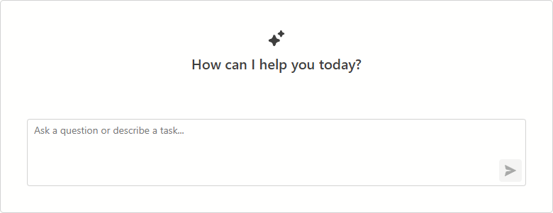
#UI/UX Enhancements
We simplified the empty message area to improve the initial DevExpress Blazor AI Chat experience.
New Blazor Smart Paste
The DevExpress Blazor Form Layout component now supports Smart Paste - a new AI-powered extension that simplifies copying content from external sources. The extension parses unstructured text (such as email content or free-form notes) and automatically populates form fields with relevant data.
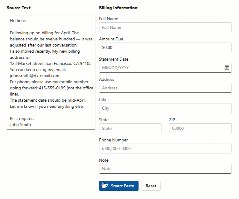
Our new FormLayoutSmartPaste class allows you to customize Smart Paste behavior (map fields, configure AI processing options, and supply additional prompt instructions).
Our Form Layout also includes a SmartPasteAsync method to trigger Smart Paste workflow from any event handler or custom logic.
<DxMemo @bind-Text="SampleText"/>

<DxButton Text="Smart Paste"
          Click="@OnSmartPasteClick" />

<DxFormLayout Data="@model" @ref="FormLayout">
    <Extensions>
        <FormLayoutSmartPaste/>
    </Extensions>
    <ChildContent>
        <DxFormLayoutItem Caption="Full Name" .../>
        <DxFormLayoutItem Caption="Amount Due" .../>
    </ChildContent>
</DxFormLayout>

@code {
    DxFormLayout FormLayout { get; set; }
    BillingFormModel model = new();
    string SampleText { get; set; } =
        "Hi there ... ";
    async Task OnSmartPasteClick() {
        await FormLayout.SmartPasteAsync(SampleText);
    }
}
Documentation
Blazor Pivot Table
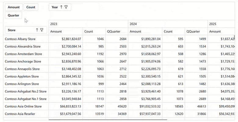
#Server Mode Data Sources
The DevExpress Blazor Pivot Table v26.1 now supports Server Mode data sources for Blazor Server-based applications. These data sources were designed to simplify integration with large data collections (500,000+records) and maximize performance for these usage scenarios.
Server Mode data sources handle data calculations at the database level. This reduces the amount of transferred data, decreases memory consumption, and improves component responsiveness.
Blazor Grid & TreeList
#UI/UX Enhancements
Border and Gridline Visibility
You can now hide column lines (separators between adjacent columns/rows) and component borders when using the DevExpress Blazor Grid and/or TreeList UI components (using the GridlinesVisible property). You can combine available enumeration values as design needs dictate.
<DxGrid Data="Products"
        GridlinesVisible="Gridlines.Horizontal | Gridlines.Outside">
    @* ... *@
</DxGrid>
Filter Menu Button — New On-Hover Display Mode
DevExpress Blazor Grid and TreeList support on-hover display mode for Filter Menu buttons. When enabled, buttons appear after users hover over column headers. This mode helps produce a more effective user experience and avoid column caption truncation.
Empty Column Appearance
We refined empty column appearance (may appear during resize operations) to better align with standard Blazor Grid/TreeList columns.
#Pager Summary
DevExpress Blazor Grid and TreeList UI components include a new PagerSummaryVisible option. Use it to display the current page number, page count, and data row count within our built-in pager.
Blazor TreeList
#Unbound Columns
The DevExpress Blazor TreeList component now supports unbound columns. These columns display values that are not stored in the underlying data source. Use unbound columns to display supplementary/computed data without modifying the original data model.
The following APIs allow you to populate unbound columns with data:
<DxTreeList Data="TreeListData"
            UnboundColumnData="TreeList_UnboundColumnData" ... >
    <Columns>
        <DxTreeListDataColumn FieldName="AprilSales" />
        <DxTreeListDataColumn FieldName="MaySales" />
        <DxTreeListDataColumn FieldName="JuneSales" />
        <DxTreeListDataColumn FieldName="Q2Sales" Caption="Q2 Sales"
                              UnboundType="TreeListUnboundColumnType.Decimal"
                              UnboundExpression="[AprilSales] + [MaySales] + [JuneSales]" />
        <DxTreeListDataColumn FieldName="Q2YoYChange" Caption="Q2 YoY Change (%)"
                              UnboundType="TreeListUnboundColumnType.Decimal" />
    </Columns>
</DxTreeList>

@code {
    // ...
    void TreeList_UnboundColumnData(TreeListUnboundColumnDataEventArgs e) {
        if(e.FieldName == "Q2YoYChange") {
            var sales = ((SalesByRegion) e.DataItem);
            var currentValue = (decimal)e.GetRowValue("Q2Sales");
            var prevValue = sales.AprilSalesPrev + sales.MaySalesPrev + sales.JuneSalesPrev;
            e.Value = (currentValue - prevValue) / currentValue;
        }
    }
}
Blazor Data Editors
#Focusable Buttons
Our Blazor Data Editors include a new Focusable option for command buttons. Once activated, buttons are included in a page's tab sequence, and users can interact with them using the keyboard.
<DxDateEdit @bind-Date="@DateTimeValue"
            ShowDropDownButton="false">
    <Buttons>
        <DxEditorButton IconCssClass="editor-icon editor-icon-chevron-left-small"
                        Tooltip="Previous Date"
                        Position="@EditorButtonPosition.Left"
                        Focusable="true"
                        Click="@(_ => OnChangeDayButtonClick(false))" />
        <DxEditorButton IconCssClass="editor-icon editor-icon-chevron-right-small"
                        Tooltip="Next Date"
                        Position="@EditorButtonPosition.Right"
                        Focusable="@true"
                        Click="@(_ => OnChangeDayButtonClick(true))" />
        <DxDateEditDropDownButton Focusable="true" />
    </Buttons>
</DxDateEdit>

Documentation
#Keyboard and Mouse Wheel Interaction Options
We added new options to control whether users can change editor values using arrow keys and the mouse wheel: AllowArrowKeys and AllowMouseWheel. The following editor classes support these new properties:
Set AllowArrowKeys and AllowMouseWheel properties to false to prevent accidental changes and ensure a more controlled user experience.
<DxSpinEdit @bind-Value="@NumericValue"
            AllowArrowKeys="false" />

<DxDateEdit @bind-Date="@DateTimeValue"
            Mask="@DateTimeMask.ShortDate"
            AllowArrowKeys="false"
            AllowMouseWheel="false" />

<DxGrid Data="@employees" EditMode="GridEditMode.EditRow">
    <Columns>
        @*...*@
        <DxGridDataColumn FieldName="HireDate">
            <EditSettings>
                <DxDateEditSettings AllowArrowKeys="false" AllowMouseWheel="false" />
            </EditSettings>
        </DxGridDataColumn>
    </Columns>
</DxGrid>
#API Enhancements
We added new properties to the DxComboBoxSettings class (contains settings for auto-generated Combo Box editors):
- KeyFieldName/KeyFieldNames — Specify one or more fields to use as identifiers when comparing items.
- DataLoadMode — Specifies how the Combo Box loads data:
Auto - The component caches data when the browser loads the web page.OnDemand - The component loads its data whenever a user opens the drop-down window.
#UI/UX Enhancements
List Editors - Design Updates
We updated the design of our Blazor List Editors (List Box, ComboBox, TagBox) for DevExpress Fluent themes:
- item font size and paddings
- item group style
- disabled/selected item colors
- added spacing between list items
- rounded item corners
- removed extra borders
List Box
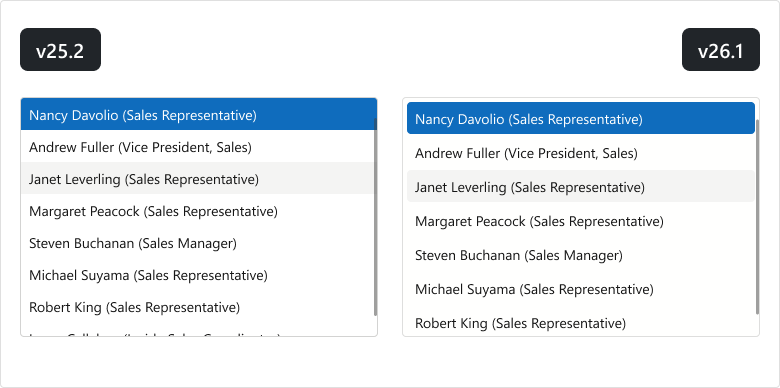
ComboBox
TagBox
Clear Button - Background Color Update
We updated the background color for Clear buttons used in Blazor Editors (Bootstrap and DevExpress Classic themes).
Blazor Navigation
#Ribbon Tab Attributes
The DevExpress Blazor Ribbon Tab now supports standard HTML attributes. Use the Attributes property for the tab header and ContentAttributes for the tab content area.
These properties improve accessibility and ensure stable metadata for UI automation.
<DxRibbon>
    <DxRibbonTab Text="Home"
                Attributes="tabHeaderAttributes"
                ContentAttributes="tabContentAttributes">
        <DxRibbonGroup>
            <DxRibbonItem Text="New" />
        </DxRibbonGroup>
    </DxRibbonTab>
</DxRibbon>

@code {
    Dictionary<string, object> tabHeaderAttributes = new() {
        { "data-testid", "ribbon-tab-home" }
    };
    Dictionary<string, object> tabContentAttributes = new() {
        { "aria-label", "Home tab items" }
    };
}
#Ribbon — UI Enhancements
The DevExpress Blazor Ribbon now more closely aligns with the Microsoft Office ribbon design. The updated UI is more compact and visually consistent.
Blazor Filter Builder
#Customize Count Functions
The DevExpress Filter Builder component allows you to customize Count functions for collection fields. Specify EditSettings or define the ValueEditTemplate to customize the editor used to select the Count value. Use the ValueDisplayTemplate to customize how the selected value is displayed.
The following code snippet adds prompt text to the Count editor displayed for the Orders field:
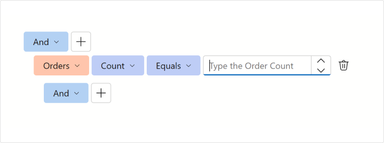
<DxFilterBuilder @bind-FilterCriteria="FilterCriteria">
    <Fields>
        <DxFilterBuilderField FieldName="Orders" Caption="Orders" IsCollection="true">
            <EditSettings>
                <DxSpinEditSettings NullText="Type the Order Count" />
            </EditSettings>
            <Fields>
                <DxFilterBuilderField FieldName="OrderDate" Caption="Order Date" Type="@typeof(DateTime?)" />
                <DxFilterBuilderField FieldName="CustomerName" Caption="Customer" Type="@typeof(string)" />
                <DxFilterBuilderField FieldName="Quantity" Caption="Quantity" Type="@typeof(int)" />
            </Fields>
        </DxFilterBuilderField>
    </Fields>
</DxFilterBuilder>
#Toggle User Interaction
You can temporarily deactivate the DevExpress Blazor Filter Builder component using the Enabled property.
Blazor Themes
#Automatic Style Registration
With v26.1, you no longer need to register PDF Viewer, Report Viewer, and Rich Text Editor stylesheets in the Components/App.razor file — the DxResourceManager.RegisterTheme method adds associated styles automatically.
The following is a v25.2 code snippet…
<head>
    @DxResourceManager.RegisterTheme(Themes.Fluent)
    <link href="_content/DevExpress.Blazor.Reporting.Viewer/css/dx-blazor-reporting-components.fluent.css" rel="stylesheet" />
    <link href="_content/DevExpress.Blazor.Viewer/css/dx-blazor-viewer-components.fluent.css" rel="stylesheet" />
    <link href="_content/DevExpress.Blazor.RichEdit/dx-blazor-richedit.css" rel="stylesheet" />
    @* ... *@
</head>
… with v26.1, it can be replaced with a method call:
<head>
    @DxResourceManager.RegisterTheme(Themes.Fluent)
    @* ... *@
</head>
Documentation
Blazor Buttons
#API Enhancements
We added a new property to the DxButtonBase class (contains base settings for buttons):
- IconUrl — Specifies button icon URL.
Blazor Windows
#Smoother Focus Behavior Across Devices
The following DevExpress Blazor components now adapt focus behavior for the current device:
On desktop devices, focus moves to the first interactive element in the window to support faster keyboard interaction. On mobile phones and tablets, focus moves to the popup/window container to avoid unexpected keyboard activation and viewport shifts.
#DropDown Focus Mode
The FocusOnOpen property specifies whether focus moves to a newly opened DevExpress Blazor DropDown or remains on the current element.
<DxDropDown @bind-IsOpen="isOpen"
            FocusOnOpen="false">
    <BodyContentTemplate>
        @* ... *@
        <DxButton Text="Accept the terms of the EULA" />
    </BodyContentTemplate>
</DxDropDown>
Accessibility Enhancements
#PDF/UA-2 Format Support
Our PDF export engine now supports the PDF/UA-2 format (for enhanced accessibility compliance). You can specify PDF/UA-2 conformance for exported documents to meet the latest accessibility standards. Set the PdfExportOptions.PdfUACompatibility property to PdfUA2 to specify PDF/UA-2 conformance for exported documents.
#PDF/UA Export Enhancements
We improved PDF/UA export for report controls and screen reader interpretation. You can now define semantic roles for XRPageInfo, XRRichText, and XRPanel elements and supply accessible descriptions for digital signatures.
Set PdfExportOptions.PdfUACompatibility to PdfUA1 or PdfUA2 to apply roles and descriptions.
XRPageInfo
Use the AccessibleRole property to define how screen readers interpret XRPageInfo content.
By default, XRPageInfo is exported as an artifact. If the content is meaningful (for example, a date or page number), set AccessibleRole to Paragraph to include it in the document structure.
XRPanel
You can reduce unnecessary noise in the accessibility tree with the AccessibleRole property.
If the panel is used only for layout or visual grouping, set AccessibleRole to Decorative. In this instance, the panel is exported as an artifact and ignored by screen readers.
If the panel conveys meaningful content, retain the default role so it is included in the document structure.
This approach helps assistive technologies focus on meaningful content.
XRRichText
XRRichText content can now be exported as accessible (tagged) PDFs. The export process preserves semantic structure and reading order and improves compatibility with screen readers.
Our export engine maps content to semantic roles:
-
Headings →
H1, H2
, H3 -
Paragraphs →
P -
Lists →
L, LI, LBody -
Images →
Figure -
Tables →
Table, TR, TH, TD
Content is added to the logical structure in the same order as it appears in the document.
#Digital Signature — Accessible Description
You can specify accessible descriptions for the XRPdfSignature control when it is used as a digital signature or as a placeholder.
Document Signature
If SignatureOptions.DisplayDocumentSignature is enabled, use PdfSignatureOptions.AccessibleDescription.
Signature Placeholder
If SignatureOptions.DisplayDocumentSignature is disabled, use XRControl.AccessibleDescription.
The following image displays results:
- The first
XRPdfSignature uses PdfSignatureOptions.AccessibleDescription. - The second uses
XRControl.AccessibleDescription.
If AccessibleDescription is not specified, default text is used ("Digital signature" / "Digital signature placeholder") in accessible PDFs. No description is added during standard PDF export.
AI-powered Extensions
#Report Designer for WPF — Create Expressions with Natural Language
The WPF Report Designer allows users to generate AI-powered Criteria Language expressions within both the DevExpress Expression Editor and Filter String Editor. Users can describe the desired logic in plain text instead of writing complex expressions.
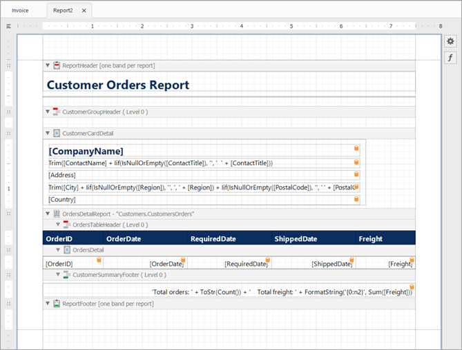
#AI Prompt-to-Report Wizard — Optimized Report Generation
To optimize the report generation process, we added a multi-agent system for the DevExpress AI Report Wizard (introduced in v25.1). This architecture improves result quality, consistency, and predictability, reduces token usage, and scales better for high-volume scenarios.
The Report Wizard can generate complete reports from natural language prompts without detailed descriptions of report structure, controls, bindings, or calculations.
The prompt can now be written as follows:
"Create a clean report that shows customers and their orders from the attached database."
If input is incomplete or ambiguous, the system may request additional information about report structure, such as:
- "What should the report title be?"
- "Would you like to introduce customer address details in the report: yes/no?"
- "Please specify page size and orientation for this report. For example, A4, portrait, letter landscape, or custom dimensions."
Generation resumes automatically once the user supplies appropriate answers.
The following image illustrates results:
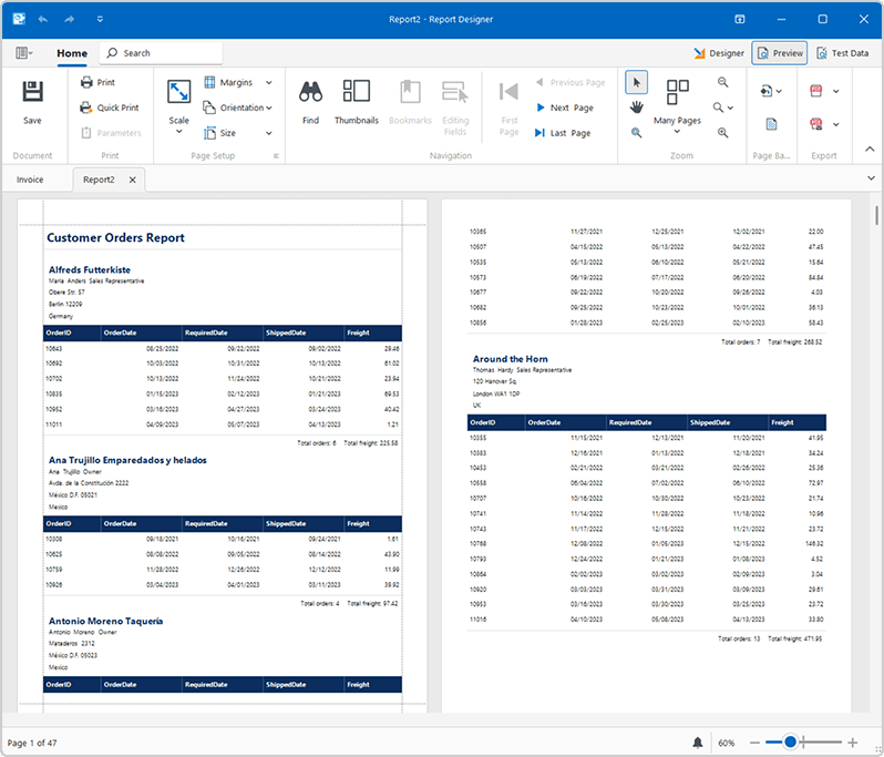
The following image displays a generated report preview:
#AI Prompt-to-Report Cross-Platform API
Our new AI APIs allow you to incorporate an AI-powered report generation engine into agentic workflows. Use it across desktop, web, and service applications and integrate with any AI provider via IChatClient.
- PromptToReportRequest: Describes a "prompt-to-report" operation (user prompt, optional data-source schema, and an optional existing report to update). You can also attach a host to enable interactive generation.
- IAIReportGenerationHost: Defines methods that allow report generation workflows to request prompt clarifications and publish progress updates.
- PromptClarificationQuestion: Stores a clarification question that the AI workflow asks before it continues report generation.
- PromptClarificationAnswer: Stores the result of a prompt clarification request.
To implement report generation in your application:
- Create an
IChatClient for your AI provider. - Create an AI extensions container and register reporting capabilities.
-
Implement and supply a host for interactive workflows. Create a class that implements
IAIReportGenerationHost to handle clarification questions and to surface progress/notifications.
-
Generate the report from a prompt. Create a
PromptToReportRequest with the user prompt and assign the host, then call AIReportingIntegration.GeneratePromptToReportAsync to get an XtraReport.
The following example integrates multi-agent report generation to a .NET 8 console application using Azure OpenAI.
Prerequisites:
- .NET 8 SDK
- Azure OpenAI
- The
DevExpress.AIIntegration.Reporting.Common NuGet package
The following code initializes an AI client, creates a report request, and generates a report based on a user prompt:
using Azure.AI.OpenAI;
using DevExpress.AIIntegration.Reporting;
using DevExpress.XtraReports.UI;
using Microsoft.Extensions.AI;
using System.ClientModel;

// Retrieve the Azure OpenAI endpoint, key, and model from user environment variables.
string endpoint = Environment.GetEnvironmentVariable("AZURE_OPENAI_ENDPOINT", EnvironmentVariableTarget.User)
    ?? throw new InvalidOperationException("AZURE_OPENAI_ENDPOINT is not set.");
string apiKey = Environment.GetEnvironmentVariable("AZURE_OPENAI_API_KEY", EnvironmentVariableTarget.User)
    ?? throw new InvalidOperationException("AZURE_OPENAI_API_KEY is not set.");
string deploymentName = Environment.GetEnvironmentVariable("AZURE_OPENAI_DEPLOYMENT", EnvironmentVariableTarget.User)
    ?? "gpt-5-mini";
/ Create an Azure OpenAI client for the chat agent.
IChatClient chatClient = new AzureOpenAIClient(new Uri(endpoint), new ApiKeyCredential(apiKey))
    .GetChatClient(deploymentName)
    .AsIChatClient();
// Create an AI extension container and enable reporting extensions.
AIExtensionsContainerDefault container = AIExtensionsContainerConsole.CreateDefaultAIExtensionContainer(chatClient);
container.RegisterReportingExtensions();
// Ask the user for a report description in natural language.
Console.WriteLine("Input a prompt for report generation:");
string prompt = Console.ReadLine();
try {
    // Enable interactive clarification questions and progress notifications.
    ConsoleAIReportGenerationHost host = new ConsoleAIReportGenerationHost();

    // Build a generation request from the user prompt.
    PromptToReportRequest generationRequest = new PromptToReportRequest(userPrompt: prompt, dataSourceSchema: null, report: null) {
        ReportGenerationHost = host
    };

    // Generate a report layout and save it to a REPX file.
    XtraReport report = await container.GeneratePromptToReportAsync(generationRequest, default);
    report.SaveLayoutToXml("generatedReport.repx");
}
catch(Exception ex) {
    Console.WriteLine(ex.Message);
}
// Keep the console window open.
Console.ReadLine();
The host implementation receives generation progress and handles clarification questions:
using DevExpress.AIIntegration.Reporting;

namespace Reporting.Generation.Console {
    public class ConsoleAIReportGenerationHost : IAIReportGenerationHost {
        private string lastStatus = string.Empty;

        public Task<PromptClarificationAnswer> ClarifyPromptAsync(PromptClarificationQuestion request) {
            // Render the request in your UI (request.Text and request.Choices),
            // then return PromptClarificationAnswer.FromValue(selectedChoice).

            // Return PromptClarificationAnswer.Canceled()
            // if the user cancels the operation.
        }

        public void NotifyAsync(string status, string reasoning) {
            bool isNewStatus = lastStatus != status;
            lastStatus = status;

            // Surface progress to users (console, logger, status bar, web socket, and so on).
            // Update the status when isNewStatus is true;
            // otherwise refresh the reasoning only.
        }
    }
}
GitHub Example
#Custom GitHub Copilot Agent — DevExpress Report Designer
We created an *.agent.md file that equips Visual Studio's GitHub Copilot with DevExpress Reports expertise. The file contains API patterns, expression syntax rules, common report design examples, troubleshooting guides, and best practices. Developers who use GitHub Copilot in Visual Studio now receive more accurate and context-aware answers when they work with DevExpress Reports.
Documentation
Reporting for Web
#Supported Frameworks
Added support for jQuery 4 and Angular 22.
#Blazor Report Viewer
Automatic Style Registration
With v26.1, you no longer need to register the DxReportViewer stylesheet in the Components/App.razor file – the DxResourceManager.RegisterTheme method adds styles for Report Viewer automatically.
The following v25.2 code snippet…
<head>
    @DxResourceManager.RegisterTheme(Themes.Fluent)
    <link href=@AppendVersion("_content/DevExpress.Blazor.Reporting.Viewer/css/dx-blazor-reporting-components.fluent.css") rel="stylesheet" />
    @* ... *@
</head>
… can now be replaced with a method call only:
<head>
    @DxResourceManager.RegisterTheme(Themes.Fluent)
    @* ... *@
</head>
This change also allows you to switch themes at runtime using the theme change service IThemeChangeService.
Performance
#WinForms End-User Report Designer — Startup Optimization
We optimized the DevExpress WinForms End-User Report Designer's startup sequence to deliver a responsive launch experience. Dock panels and UI elements appear quicker and smoother on initial load, and transitions between Design and Preview tabs produce seamless panel rendering.
Accessibility
#New Palettes for Vision-impaired Users
The following enhancements improve DevExpress Dashboard readability and accessibility:
- New predefined palettes are optimized for users with color vision impairments, including Deuteranopia, Protanopia, and Tritanopia. These palettes improve accessibility without manual adjustments.
- Pie and Donut charts now support segment spacing. Enable this option to visually separate slices and improve readability.
Web Dashboard – Enhanced Navigation & Screen Reader Support
Our Web Dashboard ships with the following accessibility-related capabilities:
Focus management
-
When a dialog (including the Maximize window) closes, keyboard focus returns to the element that opened it.
-
Focused element outline colors are now synchronized with the current theme color.
Screen reader support
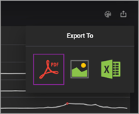
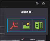
Screen readers now announce options in the export dialog.
Export type button contrast
The active export button now displays a clearly visible highlight across all color themes.
| v26.1 | Previous Versions |
 |  |
Web Dashboard
#Supported Frameworks
Added support for jQuery 4 and Angular 22.
Security Enhancements
To help improve the security posture DevExpress Office & PDF File API based solutions, we introduced the following breaking changes in our v26.1 release cycle. These changes enforce secure document processing best practices and help mitigate risks associated with untrusted documents.
#Secure ZIP Policy
Our new Zip Security Policy (DevExpress.Utils.Zip.SecureZipPolicy) protects applications from ZIP-related attack vectors using resource limits, hard blocks, and encryption rules. You can configure resource limits globally or for individual operations. The SecureZipPolicy.TrustBoundaryViolation event allows you to log, monitor, and audit TrustBoundary violations.
FIPS (Federal Information Processing Standards) Compliance Enforcement
The DevExpress API now detects operating system-level FIPS enforcement and raises an OperatingSystemLevelFipsMode.ComplianceViolationException before document processing begins. The exception includes violation details, resolution recommendations, and is raised early in the workflow to prevent non-compliant cryptographic operations.
Safer Document (DOCx, XLSx…) Processing
v26.1 adds Safer Document Processing for both the DevExpress Word Processing Document API and Spreadsheet API. Both libraries include a dedicated, configurable security layer for applications that load documents from untrusted sources — user uploads, email attachments, and third-party integrations.
Safer Document Processing address three security-related considerations:
- Security Loading Limits — reject documents that exceed structural thresholds before they are fully parsed
- Dangerous Content Removal — strip active threats such as macros, embedded objects, and dangerous links during load operations
- Privacy Sanitization — remove metadata, revision history, and hidden content before you share/archive a document
These capabilities address document security requirements in regulated industries (GDPR, HIPAA, and SOX).
#Security Loading Limits
Use Options.SecurityLoadingLimits to configure document limits. The SecurityLoadingLimitExceeded event fires when a document exceeds a limit. In the event handler, set e.Handled = true to continue loading operation despite violations (useful for log-only scenarios or staged rollouts).
Word Processing API
You can configure thresholds for the following document characteristics:
- Maximum allowed file size in bytes
- Maximum total number of XML elements across all parts of a document
- Maximum nesting depth of any XML element
- Maximum number of paragraphs in the document
- Maximum number of tables
- Maximum number of rows across all tables
- Maximum number of document sections
- Maximum number of sub-documents (headers, footers, text boxes, and similar embedded document elements)
The following code snippet sets security loading limits for the DevExpress Word Processing API:
  using DevExpress.XtraRichEdit;

  var wordProcessor = new RichEditDocumentServer();

  var securityLimits = wordProcessor.Options.SecurityLoadingLimits;
  securityLimits.MaxFileSize = 50 * 1024 * 1024; // 50 MB
  securityLimits.MaxParagraphCount = 100_000;
  securityLimits.MaxTableCount = 1_000;
  securityLimits.MaxXmlElementDepth = 128;

  wordProcessor.SecurityLoadingLimitExceeded += (sender, e) => {
      Console.WriteLine($"Limit exceeded: {e.PropertyName}");
      e.Handled = false; // abort loading
  };

  wordProcessor.LoadDocument("incoming.docx");
Spreadsheet Document API
You can configure thresholds for the following workbook characteristics:
- Maximum allowed file size in bytes
- Maximum total number of XML elements across all parts of a workbook
- Maximum nesting depth of any XML element
- Maximum number of worksheets in the workbook
- Maximum number of rows per worksheet
- Maximum number of columns per worksheet
- Maximum number of cells per worksheet
- Maximum number of charts in the workbook
The following code snippet sets security loading limits for the DevExpress Spreadsheet Document API:
  using DevExpress.Spreadsheet;

  var workbook = new Workbook();
  var securityLimits = workbook.Options.SecurityLoadingLimits;

  securityLimits.MaxFileSize = 150 * 1024 * 1024; // 150 MB
  securityLimits.MaxWorksheetCount = 50;
  securityLimits.MaxSheetCellCount = 500_000;
  securityLimits.MaxChartCount = 10;

  workbook.SecurityLoadingLimitExceeded += (_, e) => {
      Console.WriteLine($"Limit exceeded: {e.PropertyName}");
      e.Handled = false; // abort loading
  };

  workbook.LoadDocument("upload.xlsx");
#Dangerous Content Removal
You can automatically remove dangerous content when loading documents using Options.SecurityLoadingOptions. Each option targets a specific threat category and fires a SecurityLoadingOptionsViolation event when matching content is detected. Set e.Handled = false in the event handler to remove detected content.
Word Processing Document API
The following content types can be removed:
- Hyperlinks with dangerous URL protocols (
javascript:, vbscript:, file:// (direct local file system access), and UNC paths (network share paths such as \\server\share)). You can apply the same protocol safety rules to inline hyperlinks and links within floating objects and images. - Image references that use restricted protocols such as
file:// - OLE (Object Linking and Embedding) objects
- ActiveX controls
- Macros
INCLUDEPICTURE and DDE (Dynamic Data Exchange) fields.- Custom XML
The following code snippet removes potentially dangerous content when using the DevExpress Word Processing API:
  using DevExpress.XtraRichEdit;

  var wordProcessor = new RichEditDocumentServer();
  var securityOptions = wordProcessor.Options.SecurityLoadingOptions;

  securityOptions.RestrictedHyperlinkRemovalMode = RestrictedHyperlinkRemovalMode.Full;
  securityOptions.RemoveRestrictedLinks = true;
  securityOptions.RemoveExternalImages = true;
  securityOptions.RemoveOleObjects = true;
  securityOptions.RemoveActiveXContent = true;
  securityOptions.RemoveMacros = true;
  securityOptions.RemoveDDEFields = true;
  securityOptions.RemoveIncludePictureFields = true;
  securityOptions.RemoveCustomXMLParts = true;

  wordProcessor.SecurityLoadingOptionsViolation += (sender, e) => {
      Console.WriteLine($"Dangerous content found: {e.PropertyName}");
      e.Handled = false; // false = remove the content
  };

  wordProcessor.LoadDocument("external_submission.docm");
Spreadsheet Document API
The following content types can be removed:
- OLE objects
- ActiveX controls
- Macros
- Custom XML parts
- Restricted formulas
- External workbooks
- Pivot caches
- External data connections stored in the workbook (ODBC connections, web queries, etc)
The following code snippet removes potentially dangerous content when using the DevExpress Spreadsheet Document API:
  using DevExpress.Spreadsheet;

  var workbook = new Workbook();
  var securityOptions = workbook.Options.SecurityLoadingOptions;

  securityOptions.RemoveMacros = true;
  securityOptions.RemoveActiveXContent = true;
  securityOptions.RemoveOleObjects = true;
  securityOptions.RemoveRestrictedFormulas = true;
  securityOptions.RemoveExternalWorkbooks = true;
  securityOptions.RemoveExternalConnections = true;
  securityOptions.RemovePivotCaches = true;
  securityOptions.RemoveCustomXMLParts = true;

  workbook.SecurityLoadingOptionsViolation += (_, e) => {
      Console.WriteLine($"Dangerous content found: {e.PropertyName}");
      e.Handled = false; // false = remove the content
  };

  workbook.LoadDocument("financial_model.xlsm");
#Privacy Sanitization
v26.1 includes RichEditDocumentServer.Sanitize(WordProcessingSanitizeOptions) for our Word Processing Document API and Workbook.Sanitize(WorkbookSanitizeOptions) for our Spreadsheet API. Call these methods to strip personal data and internal organizational information from documents before you share, publish, or archive documents/files.
Both methods return structured sanitization results that include detected content types and applied actions (WordProcessingSanitizeResult and WorkbookSanitizeResult).
Sanitization APIs cover the following content categories:
- Metadata — document properties (Author, Title, Company, and custom fields)
- Revision history — tracked changes, comments, and other revision data
- Hidden content — hidden text/rows/columns
The following code snippet sanitizes a Word document before export:
  using DevExpress.XtraRichEdit;

  var wordProcessor = new RichEditDocumentServer();
  wordProcessor.LoadDocument("contract_draft.docx");

  var options = new WordProcessingSanitizeOptions();
  options.TrackChanges = TrackChangesSanitizeMode.Accept;
  options.Metadata = MetadataRemovalScope.All;
  options.RemoveCustomXmlParts = true;
  options.RemoveMacros = true;
  options.HiddenText = HiddenContentSanitizeMode.MakeVisible;
  options.RemoveActiveXContent = true;
  options.RemoveComments = true;
  options.InvisibleText = InvisibleContentSanitizeMode.Remove;
  options.RemoveOleObjects = true;

  var findings = wordProcessor.Sanitize(options);

  foreach (var f in findings)
      Console.WriteLine($"{f.Type}: {f.Action}");

  wordProcessor.SaveDocument("contract_for_distribution.docx", DocumentFormat.OpenXml);
The following code snippet sanitizes a spreadsheet before export:
  using DevExpress.Spreadsheet;

  var workbook = new Workbook();
  workbook.LoadDocument("financial_model.xlsm");

  var options = new WorkbookSanitizeOptions {
      Metadata = MetadataRemovalScope.All,
      HiddenSheets = HiddenContentSanitizeMode.MakeVisible,
      HiddenRows = HiddenContentSanitizeMode.Remove,
      HiddenColumns = HiddenContentSanitizeMode.Remove,
      InvisibleCellText = WhiteOnWhiteContentSanitizeMode.Remove,
      RemoveComments = true,
      RemoveThreadedComments = true,
      RemoveSharedWorkbookHistory = true
  };
  var findings = workbook.Sanitize(options);

  foreach (var f in findings)
      Console.WriteLine($"{f.Type}: {f.Action}");

  workbook.SaveDocument("financial_model_clean.xlsm", DocumentFormat.Xlsx);
#Inspect Document Content Before Sanitization
Before sanitization, inspect a document/workbook to identify content types. Our new RichEditDocumentServer.Inspect(WordProcessingInspectOptions) and Workbook.Inspect(WorkbookInspectOptions) methods scan a loaded file and return the detected set.
Call one of the following methods to create sanitize options based on detected content types:
Pass these options to RichEditDocumentServer.Sanitize() or Workbook.Sanitize() to remove private content.
The following code snippet inspects a Word document for content before sanitization:
  using DevExpress.XtraRichEdit;

  var wordProcessor = new RichEditDocumentServer();
  wordProcessor.LoadDocument("submission.docm");

  // Inspect first — discover what is present without modifying anything
  WordProcessingInspectResult inspectResult =
      wordProcessor.Inspect(WordProcessingInspectOptions.All);

  Console.WriteLine($"Detected: {string.Join(", ", inspectResult.ContentTypes)}");

  // Build sanitize options targeting only what was found
  WordProcessingSanitizeOptions sanitizeOptions = inspectResult.CreateSanitizeOptions();
  var findings = wordProcessor.Sanitize(sanitizeOptions);

  Console.WriteLine($"{findings.Count} finding(s) removed.");
  wordProcessor.SaveDocument("submission_clean.docx", DocumentFormat.OpenXml);
The following code snippet inspects a spreadsheet for content before sanitization:
  using DevExpress.Spreadsheet;

  var workbook = new Workbook();
  workbook.LoadDocument("financial_model.xlsm");

  // Inspect first — discover what is present without modifying anything
  var inspectResult = workbook.Inspect(WorkbookInspectOptions.All);
  Console.WriteLine($"Detected: {string.Join(", ", inspectResult.ContentTypes)}");

  // Build sanitize options targeting only what was found
  var sanitizeOptions = inspectResult.CreateSanitizeOptions();
  var findings = workbook.Sanitize(sanitizeOptions);
  Console.WriteLine($"{findings.Count} finding(s) removed.");
  workbook.SaveDocument("financial_model_clean.xlsm", DocumentFormat.Xlsx);
New PDF Processing API
DevExpress PDF Document API v26.1 introduces a new DevExpress.Docs.Pdf .NET library. It allows you to create, load, modify, secure, and analyze PDF documents using an object-oriented approach.
Our new PDF Document API offers a strongly typed document object model (DOM) and allows you access/modify all parts of a document — pages, content fragments, annotations, form fields, metadata, attachments, and logical structure elements.
IMPORTANT: The new DevExpress PDF Document API Library is currently available as a Community Technology Preview (CTP). Note: We do not recommend that you integrate pre-release libraries into mission-critical software applications. Please explore the capabilities of this new library and share your feedback so that we can make necessary adjustments before official release. To start a conversation, submit a ticket via the DevExpress Support Center — we’d love to hear from you.
#Core Document Model
Use the new PdfDocument class to access the document model and key PDF processing APIs:
PdfDocument.Pages — a mutable Page object collectionPage.Fragments — a FragmentCollection that exposes all visual page contentPage.Annotations — a strongly typed annotation collectionPdfDocument.Fields — a FormFieldCollection for interactive formsPdfDocument.Metadata — document info and structured XMP metadataPdfDocument.StructureTree — the logical structure tree used for tagged PDFsPdfDocument.Attachments — embedded file collectionPdfDocument.Encrypt / RemoveEncryption — document security managementPdfDocument.AppendDocument — document composition and merging
#Get Started
Run the following console command to install the DevExpress.Docs.Pdf NuGet package:
dotnet add package DevExpress.Docs.Pdf
Use this package to work with PDF documents. The following code snippet creates a new PDF document:
  using DevExpress.Docs.Pdf;

  using var document = new PdfDocument();

  // Create and add a page
  Page page = new Page();
  document.Pages.Add(page);

  // Add text content
  page.AddTextFragment("Hello PDF", 72, 720);

  // Save document
  using (var stream = new FileStream("output.pdf", FileMode.Create)) {
      document.Save(stream);
  }
#Key Features
Fragment-Based Page Content Model
The fragment-based model exposes page content as structured typed elements. It allows you to inspect, modify, reorder, or remove fragments without manipulating raw PDF content streams. This structure simplifies complex content transformations such as branding, localization, content normalization, and dynamic document assembly.
Use the FragmentCollection to access page content. The following fragment types are available:
TextFragment — text contentImageFragment — raster and vector imagesPathFragment — shapes and drawing primitivesFormFragment — reusable content blocks
Each TextFragment offers detailed control over typography and layout:
- Font settings:
Font, Bold, Italic - Text decoration:
Underline, Strikeout - Layout properties:
CharacterSpacing, WordSpacing, HorizontalScaling, TextLeading - Appearance:
ForegroundFill
The following example applies the same formatting to all text fragments on a page:
  foreach (TextFragment fragment in page.Fragments.OfType<TextFragment>()) {
      fragment.Font = new TextFont("Arial", TextFontStyle.Bold);
      fragment.ForegroundFill = SolidFill.DarkBlue;
  }
Fluent Text Search and Editing
This new API ships with a structured search mechanism. Use the PdfDocument.FindText method to locate text and retrieve positional and structural information for each match:
TextSearchInfo — encapsulates results per pageTextMatchInfo — describes exact match locationsTextMatchGroup — contains a group of TextFragment objects for multiple matches
You can pass search results to the RemoveText method to remove all matches simultaneously.
The following example removes all occurances of the word "Confidential" from a document:
  using DevExpress.Docs.Pdf;
  using System.Collections.Generic;
  using System.IO;

  using (PdfDocument pdfDocument = new PdfDocument(
      new FileStream(@"Document.pdf",
          FileMode.OpenOrCreate, FileAccess.ReadWrite))){
      IEnumerable<TextSearchInfo> results =
          pdfDocument.FindText("Confidential",
              new TextSearchOptions(true, true), 0, 2);

      // Remove found text string.
      pdfDocument.RemoveText(results);

      using (FileStream outputStream = new FileStream(
          "Result.pdf",
          FileMode.Create, FileAccess.Write))  {
          pdfDocument.Save(outputStream);
      }
  }
Full Annotation Object Model
Document workflows often rely on annotations for review, collaboration, and interaction. Our new API exposes annotations as typed objects, so that you can create and manage them with full control over behavior and appearance.
Annotations are available through the Page.Annotations collection and include:
TextAnnotationFreeTextAnnotationLinkAnnotationInkAnnotationRubberStampAnnotationLineAnnotationPolygonAnnotationSquareAnnotation, CircleAnnotationRedactionAnnotation- and more
All annotations are inherited from the BaseAnnotation class (contains behavior and appearance properties).
The following example creates a free text annotation with custom appearance and border settings:
  page.Annotations.Add(new FreeTextAnnotation(new RectangleF(100, 100, 200, 50)) {
      Content = "Reviewed",
      Title = "Reviewer",
      Color = PdfColor.Yellow,
      Border = new AnnotationBorder { Width = 1 }
  });
Redaction API & Content Clearing
Our new PDF library introduces APIs to create and manage redaction annotations. With this capability, you can hide/remove sensitive or private content from your documents and add a colored text overlay across redacted areas.
The RedactionAnnotation class defines redaction annotations and support:
- Rectangular and quadrilateral redaction regions
- Custom appearance (
FillColor, OverlayText) - Repeating overlay text
- Optional replacement content
The following example creates a redaction annotation that covers a page area, fills it with black, and overlays "REDACTED" across the region:
  var redaction = new RedactionAnnotation(new RectangleF(50, 50, 200, 40)) {
      FillColor = PdfColor.Black,
      OverlayText = "REDACTED",
      RepeatText = true
  };

  page.Annotations.Add(redaction);
  document.ApplyRedaction(0, redaction);
Call the PdfDocument.ApplyRedaction method to apply redactions and permanently remove underlying content from the document.
In addition, the PdfDocument.ClearContent method allows you to remove/replace content in specific regions without affecting the rest of the document. You can selectively remove text, images, graphics, and annotations based on associated coordinates.
You can selectively remove text, images, graphics, and annotations.
The following example removes all content from a specific area on the first page:
  document.ClearContent(
      pageIndex: 0,
      regions: new List<OrientedRectangle>() {
          new OrientedRectangle(new Point(0, 0), 300, 200)
      },
      clearText: true,
      clearImages: true,
      clearGraphics: true,
      clearAnnotations: true);
Page Management & Transformations
The PdfDocument.Pages collection allows you to create, insert, delete, reorder, and clone pages. You can also duplicate pages (with full content) to reuse layouts/templates across documents.
  Page newPage = new Page();
  document.Pages.Add(newPage);

  // Clone an existing page
  Page cloned = document.Pages[0].Clone();
  document.Pages.Add(cloned);

  // Remove a page
  document.Pages.RemoveAt(1);
In addition to structural operations, the API supports content transformations. These operations adjust layout, normalize page size, and align content:
- Page.ScaleContent(double scaleX, double scaleY)
- Page.OffsetContent(double offsetX, double offsetY)
- Page.RotateContent(double centerX, double centerY, double angle)
- Page.Resize(RectangleF bounds, horizontalAlignment, verticalAlignment)
  page.ScaleContent(0.85, 0.85);
  page.OffsetContent(15, 25);
  page.RotateContent(0, 0, 90);
Interactive Form Fields
Forms are a key component of many document workflows. The API exposes all form fields as strongly typed objects. You can create, edit, fill, and remove fields as needed. It's also possible to adjust field appearance using its WidgetAnnotation.
Supported field types include:
- TextBoxField
- CheckBoxField
- RadioGroupField
- ComboBoxField
- ListBoxField
- SignatureField
- ButtonField
The following example finds form fields by name and sets associated values:
  var nameField = (TextBoxField)document.Fields.FindByName("Name");
  nameField.Value = "John Smith";

  var checkBox = (CheckBoxField)document.Fields.FindByName("AcceptTerms");
  checkBox.Checked = true;
Form data can be imported and exported in multiple formats:
  document.ImportFormData(stream, ExportDataFormat.Xfdf);
  document.ExportFormData(stream, ExportDataFormat.Xml);
Document Security
The DevExpress PDF Processing API includes a complete security lifecycle model. The model allows you to inspect, modify, preserve, and remove document encryption.
You can access document encryption settings, including associated algorithm (AES-128 or AES-256), password configuration, and permission flags. Use them to enforce security policies before processing.
Use the PdfDocument.Encrypt method with EncryptionOptions to define both the algorithm used and allowed user actions:
  document.Encrypt(new EncryptionOptions {
      Algorithm = EncryptionAlgorithm.AES256,
      PrintPermissions = PrintPermissions.None,
      ModificationPermissions = ModificationPermissions.None,
      DataExtractionPermissions = DataExtractionPermissions.None
  });
During save operations, the API automatically preserves encryption settings (unless you change them explicitly).
If required, call the RemoveEncryption method to remove encryption:
pdfDocument.RemoveEncryption();
XMP Metadata & Document Info
Metadata plays a critical role in document indexing, searching, and compliance. Our PDF API offers full access to both traditional PDF metadata and structured XMP metadata via a unified interface.
The metadata model includes:
DocumentInfo - standard fields such as Title, Author, Subject, KeywordsXmpMetadata - structured metadata with multiple schemas:
XmpBasicSchemaXmpDublinCoreSchemaXmpPdfSchemaXmpPdfASchemaXmpPdfUASchemaXmpRightsManagementSchemaXmpCustomSchema
To ensure consistency between PDF and XML metadata, use one of the following synchronization strategies:
- Synchronize metadata when opening a document. Specify
LoadOptions.SyncMetadata and LoadOptions.MetadataSyncMode properties and pass the LoadOptions object as a PdfDocument constructor parameter. - Enforce consistency on save. Specify
SaveOptions.SyncMetadata and SaveOptions.MetadataSyncMode properties and pass the SaveOptions object as the PdfDocument.Save method parameter. - Manually synchronize at any point. Call the
Metadata.Synchronize method.
PDF Structure Tree (Tagged PDF / PDF/UA)
The DevExpress PDF API exposes the logical structure of a PDF document through PdfDocument.StructureTree, allowing you to build, inspect, and validate tagged PDFs.
Use the Structure Tree API to generate fully tagged PDFs, ensure compliance with PDF/UA standards, and integrate accessibility into automated document generation pipelines. You can also enhance or repair structure in existing documents.
The structure model is based on a hierarchical StructureElement tree with support for PDF 1.7 and PDF 2.0 structure types:
  var root = pdfDocument.StructureTree.AddChildElement(Pdf20StructureTypeDescriptor.Document);

  var section = root.AddChildElement(Pdf20StructureTypeDescriptor.Sect);
  section.Title = "Section Title";

  var paragraph = section.AddChildElement(Pdf20StructureTypeDescriptor.P);
  paragraph.ActualText = "Accessible paragraph content";
File Attachments
Our new PDF API allows you to embed and manage attachments directly within PDF documents. Each attachment includes metadata such as MIME type, file name, and timestamps.
Use the PdfDocument.Attachments collection to add, remove, and enumerate attachments:
  pdfDocument.Attachments.Add(new Attachment {
      FileName = "data.xml",
      MimeType = "application/xml",
      Data = File.ReadAllBytes("data.xml"),
      ModificationDate = DateTime.Now
  });
ZUGFeRD Electronic Invoices
You can create and process ZUGFeRD-based hybrid PDF/XML invoices (useful for financial and enterprise-related usage scenarios). Our API supports:
- ZUGFeRD 1.0 / 2.0 / 2.1+
- Multiple conformance levels
ZUGFeRD integration can combine human-readable PDF content with machine-readable XML data, compliant with European e-invoicing standards. Call the AttachZugferdInvoice method to attach ZUGFeRD XML data to a PDF document:
  pdfDocument.AttachZugferdInvoice(
      xmlStream,
      ZugferdVersion.Version2_3_2,
      ZugferdConformanceLevel.EN16931);
Merge Documents
The DevExpress PDF API allows you to copy individual pages between documents and append entire PDF files. All pages, annotations, form fields, and metadata are preserved.
Use the PdfDocument.AppendDocument method to append a PDF file to the end of the current document:
pdfDocument.AppendDocument(otherDocument);
Integration & Round-Trip Support
Our PDF API ensures full round-trip fidelity:
- Preserves document elements
- Maintains metadata and structure
- Retains embedded resources and content streams
New Barcode Generation API
DevExpress Office & PDF File API v26.1 introduces a new standalone Barcode Generation library (DevExpress.Docs.Barcode) for modern .NET applications. It uses strongly typed configuration objects, supports async export/cross-platform rendering, and can generate both 1D and 2D barcodes across multiple formats.
#Key Features
- 30+supported barcode symbologies for 1D and 2D barcodes.
- Unified
BarcodeGenerator class — A single, reusable object for all symbologies and output formats. - Fluent-style configuration via object initializers —
BarcodeOptions allow you to declare all appearance, layout, and symbology settings in one expression (without intermediate setup steps). - Multiple export targets — Raster and vector images (PNG, JPEG, BMP, SVG, EMF/WMF), in-memory
DXImage objects, and PDF. - Async API —
ExportAsync and ExportToImageAsync overloads for non-blocking generation in web and desktop applications. - Direct print support — Send a barcode directly to a printer using Print API and
PrintOptions - Binary-data overloads — Use raw byte arrays to encode non-textual payloads (GS1 DataMatrix, PDF417 binary segments).
- Human-readable text control — Configure text visibility, font, alignment, word-wrap, and right-to-left direction independent of the barcode symbol itself.
- Cross-platform rendering — Runs on Windows and Linux/macOS using the Skia rendering engine.
- Runtime options swapping — Update
BarcodeGenerator.Options at runtime to reuse a single generator instance with different configurations. - Add Barcodes to Documents — Insert barcodes directly into Word, Excel, PowerPoint, and PDF documents using the DevExpress Office & PDF File APIs.
#Supported Symbology
- 1D Barcodes: Codabar, Code 11 (USD-8), Code 128, Code 39 (USD-3), Code 39 Extended, Code 93, Code 93 Extended, EAN 8, EAN 13, EAN-128 (UCC), Industrial 2 of 5, Interleaved 2 of 5, Matrix 2 of 5, MSI - Plessey, PostNet, SSCC-18, UPC Supplemental 2, UPC Supplemental 5, UPC-A, UPC-E0, UPC-E1, GS1 DataBar, UPC Shipping Container Symbol (ITF-14)
- 2D Barcodes: Aztec Code, Data Matrix (ECC200), EPC QR Code, Micro QR Code, GS1 - Data Matrix, Intelligent Mail, PDF417, QR Code, GS1 - QR Code
#Get Started with Barcode Generation API
Install the DevExpress.Docs.Barcode NuGet package
dotnet add package DevExpress.Docs.Barcode
Example 1 — Create a Databar and Save to PNG
  using DevExpress.Docs.Barcode;
  using DevExpress.Drawing;
  using System.Drawing;

  var databarOptions = new DataBarOptions();
  databarOptions.ShowText = false;
  databarOptions.Padding = new Padding(5);
  databarOptions.BorderWidth = 1;

  using var databarOptionsStream = new FileStream("databar.png", FileMode.Create);
  using var databarOptionsGenerator = new BarcodeGenerator(databarOptions);
  databarOptionsGenerator.Export("(01)09521234543213", databarOptionsStream, DXImageFormat.Png);
Example 2 — Create a QR Code and Save to PNG (Fluent)
  using DevExpress.Docs.Barcode;
  using DevExpress.Drawing;
  using System.Drawing;

  using var logoStream = new FileStream("logo.png", FileMode.Open);
  var qrcode = QRCodeOptionsBuilder.Create()
      .WithErrorCorrectionLevel(QRCodeErrorCorrectionLevel.H)
      .WithCompactionMode(QRCodeCompactionMode.Auto)
      .WithIncludeQuietZone(true)
      .WithLogo(DXImage.FromStream(logoStream))
      .WithVersion(QRCodeVersion.Version10)
      .WithModuleSize(40)
      .WithBackColor(Color.LightGray)
      .WithShowText(false)
      .WithPadding(5)
      .WithBorderWidth(1)
      .WithBorderColor(Color.Blue)
      .Build();

  using var stream = new FileStream("qrcode.png", FileMode.Create);
  using var generator = new BarcodeGenerator(qrcode);
  generator.Export("https://www.devexpress.com", stream, DXImageFormat.Png);
#Migrate to Our new Barcode Generation API — DevExpress.Docs.Barcode
To migrate from DevExpress.BarCodes to the new DevExpress.Docs.Barcode, you must:
Migration Example
Legacy Barcode Generation API - DevExpress.BarCodes
  using DevExpress.BarCodes;
  using DevExpress.Drawing;

  // Create an Aztec Code
  BarCode barCode = new BarCode();
  barCode.Symbology = Symbology.AztecCode;
  barCode.CodeText = "0123-456789";
  barCode.Options.AztecCode.ErrorLevel = AztecCodeErrorLevel.Level1;
  barCode.Options.AztecCode.Version = AztecCodeVersion.Version45x45;
  // Save the barcode as an image
  barCode.Save("BarCodeImage.png", DXImageFormat.Png);
New Barcode Generation API - DevExpress.Docs.Barcode
  using DevExpress.Docs.Barcode;
  using DevExpress.Drawing;

  // Create an Aztec Code
  var aztecOptions = new AztecCodeOptions();
  aztecOptions.CompactionMode = AztecCodeCompactionMode.Text;
  aztecOptions.ErrorCorrectionLevel = AztecCodeErrorCorrectionLevel.Level1;
  aztecOptions.Version = AztecCodeVersion.Version45x45;

  using var aztecOptionsStream = new FileStream("BarCodeImage.png", FileMode.Create);
  using var aztecOptionsGenerator = new BarcodeGenerator(aztecOptions);
  aztecOptionsGenerator.Export("0123-456789", aztecOptionsStream, DXImageFormat.Png);
Accessibility Enhancements
#PDF Export Engine - PDF/UA-2 Format Support
Our PDF export engine now supports the PDF/UA-2 format (for enhanced accessibility compliance). You can specify PDF/UA-2 conformance for exported documents to meet the latest accessibility standards. The new PDF/UA-2 option is available for the following products:
- Word Processing API
- Spreadsheet API
Set the PdfExportOptions.PdfUACompatibility property to PdfUA2 to specify PDF/UA-2 conformance for exported documents.
Presentation API
#Chart API
The DevExpress Presentation API v26.1 introduces a comprehensive Chart API that allows you to programmatically create, modify, and style charts within PowerPoint presentations.
Chart API supports standard OpenXML and modern Microsoft Office 2016+chart types via two dedicated classes:
- Chart - standard chart types
- ChartEx - Microsoft Office 2016 chart types
You can create both simple data visualizations and advanced analytical charts directly in code.
Documentation
Standard Chart Types
The Chart class allows you to create the following chart types:
- Bar / Bar3D
- Line / Line3D
- Pie / Pie3D
- Area / Area3D
- Surface / Surface3D
- Scatter
- Radar
- Stock
- Doughnut
- Bubble
- Pie-of-Pie / Bar-of-Pie
Microsoft Office 2016+Chart Types
The ChartEx class supports the following modern chart types:
- Waterfall
- Funnel
- Histogram
- Pareto
- Box-and-Whisker
- Sunburst
- Treemap
- Map
Typed Series & Views
Chart and ChartEx use orginize series differently:
- Chart: Series are associated with typed views (for example,
BarSeries and BarChartView). Each view defines settings that apply to all series. The Chart.Views collection stores views, while Chart.Series contains all series. When you add a series to Chart.Series, the API automatically places it into the appropriate view based on series type. If the required view does not exist, the API creates it automatically. - ChartEx: Uses a simplified model where series (for example,
WaterfallSeries or FunnelSeries) are added to ChartEx.Series and do not have associated views.
Both Chart and ChartEx series expose unique settings relevant only to that type (for instance, Explosion for pie-based series or BubbleSize for BubbleSeries).
Supply Data
Our Chart API supports two ways to supply series data:
- Bind chart series to spreadsheet ranges in an embedded workbook.
- Assign inline data arrays directly to series properties.
Use Chart.ChartData to access and edit the embedded workbook associated with a chart. Workbook data is compatible with the Office Open XML chart data model and can be edited in PowerPoint.
Use the Values and Arguments properties to supply data for a series. These properties accept the following data sources:
ChartDataReference — Uses spreadsheet ranges (such as A1:B5) as a data source for series values/arguments.ChartNumericData — Stores an inline double[] array for numeric values or sizes.ChartStringData — Stores an inline string[] array for category labels or arguments.
Inline data arrays are stored directly in chart markup and are useful when you do not need PowerPoint spreadsheet editing for chart data.
Customize Chart Elements
The Chart API supports a broad range of real-world usage scenarios, including generating dynamic reports, embedding analytics into presentations, and building dashboards with rich data visualizations. Developers can fully control the following chart elements and appearance settings:
- Titles and Legends
- Axes (primary and secondary)
- Chart Views and Series
- Data Points and Labels
- Data Tables
- Trendlines and Error Bars
- Chart area and plot area appearance (
Fill, OutlineStyle, PlotArea) - Default font settings for all chart text:
TextProperties - Styles (
ChartStyle / ChartExStyle) - Themed color palettes (
ChartColorPalette) - 3D view settings (
View3DOptions)
Combine Multiple Charts
You can combine multiple chart types within a single Chart using multiple views. Each series specifies its axis via the AxisGroup property (Primary or Secondary). Secondary axes (SecondaryArgumentAxis, SecondaryValueAxis) are fully customizable.
Integration with the Presentation Model
Both Chart and ChartEx derive from the ShapeBase class. You can call the Slide.Shapes.Add method to add charts to PowerPoint slides.
Charts loaded from existing PPTX files are fully round-tripped — all workbook data, styles, user shapes, and unrecognized content are preserved on save. When exporting to PDF, charts are rendered as images, consistent with Presentation API behaviors.
Example - Combine Bars and Line in a Single Chart
  using DevExpress.Docs.Presentation;
  using DevExpress.Docs.Office;
  using System.IO;

  using Presentation presentation = new Presentation();
  presentation.Slides.Clear();

  Slide slide = new Slide(SlideLayoutType.Blank);
  presentation.Slides.Add(slide);

  Chart chart = new Chart(x: 50, y: 50, width: 2100, height: 1260);

  BarSeries revenueSeries = new BarSeries {
      Arguments = new ChartStringData(new[] { "Jan", "Feb", "Mar", "Apr" }),
      Values = new ChartNumericData(new double[] { 400, 520, 480, 610 }),
      AxisGroup = ChartAxisGroupType.Primary
  };
  chart.Series.Add(revenueSeries);
  (chart.Views[0] as BarChartView).BarGrouping = BarChartGrouping.Stacked;

  LineSeries targetSeries = new LineSeries {
      Arguments = new ChartStringData(new[] { "Jan", "Feb", "Mar", "Apr" }),
      Values = new ChartNumericData(new double[] { 450, 450, 500, 600 }),
      AxisGroup = ChartAxisGroupType.Primary
  };
  chart.Series.Add(targetSeries);

  chart.Title = new ChartTitle("Revenue vs. Target");
  chart.Legend = new Legend() { Position = LegendPositionType.Bottom };

  slide.Shapes.Add(chart);

  presentation.SaveDocument(new FileStream("output.pptx", FileMode.Create), DocumentFormat.Pptx);
Example - Create a Waterfall Chart (ChartEx)
  using DevExpress.Docs.Presentation;
  using DevExpress.Docs.Office;
  using System.IO;

  using Presentation presentation = new Presentation();
  presentation.Slides.Clear();

  Slide slide = new Slide(SlideLayoutType.Blank);
  presentation.Slides.Add(slide);

  ChartEx chart = new ChartEx(x: 50, y: 50, width: 2720, height: 1680) {
      Style = ChartExStyle.Style2,
      ColorPalette = ChartColorPalette.Colorful3
  };

  WaterfallSeries series = new WaterfallSeries {
      Arguments = new ChartStringData(
          new[] { "Start", "Revenue", "COGS", "OpEx", "Tax", "Net Profit" }),
      Values = new ChartNumericData(
          new double[] { 0, 500, -200, -120, -40, 0 })
  };
  chart.Series.Add(series);

  chart.Title = new ChartTitleEx("Profit Waterfall - FY 2025");
  chart.Legend = new LegendEx() { Position = LegendPositionType.Right };

  slide.Shapes.Add(chart);

  presentation.SaveDocument(new FileStream("output.pptx", FileMode.Create), DocumentFormat.Pptx);
#Export Slides to Images
The DevExpress PowerPoint Presentation API allows you to export an entire presentation or a subset of slides directly to DXImage objects. Save these objects in raster or vector image formats (PNG, BMP, JPEG, EMF, SVG, and more) and generate presentation previews/thumbnails with full visual fidelity (preserving backgrounds, themes, layouts, and shape types).
Use the Presentation.ExportToImages method to export all/specific slides to a collection of DXImage objects. The ImageExportOptions class allows you to set up output resolution and choose between raster and vector rendering modes.
  using DevExpress.Docs.Presentation;
  using DevExpress.Drawing;
  using System.IO;

  using var presentation = new Presentation(File.ReadAllBytes("Presentation.pptx"));

  DXImage[] images = presentation.ExportToImages();

  for (int i = 0; i < images.Length; i++)
      images[i].Save($"Slide_{i + 1}.png", DXImageFormat.Png);
Documentation
Excel Spreadsheet API
#New Excel Functions
The DevExpress Spreadsheet Document API v26.1 supports 6 new dynamic array-based Excel functions:
- XLOOKUP
- XMATCH
- SORT
- SORTBY
- FILTER
- UNIQUE
These functions simplify common data analysis tasks, reduce the need for complex formulas, and align calculation behaviors more closely with Microsoft Excel. To insert and evaluate new functions, assign a formula to the CellRange.DynamicArrayFormula property and call the Workbook.Evaluate method.
  using DevExpress.Spreadsheet;

  // Use XLOOKUP to find product "P1003" by ID and return associated row data
  using var workbook = new Workbook();
  Worksheet worksheet = workbook.Worksheets[0];
  worksheet.Import(new object[,] {
      {"Product ID", "Product Name", "Category", "Price" },
      {"P1001", "Wireless Mouse", "Accessories", 25.99 },
      {"P1002", "USB-C Hub", "Accessories", 45.00 },
      {"P1003", "27'' Monitor", "Displays", 299.99 },
  }, 0, 0);

  worksheet["A7"].Value = "Product P1003";
  worksheet["A8"].DynamicArrayFormula = @"XLOOKUP(""P1003"", A2:A5, A2:D5)";

  workbook.Calculate();
  workbook.SaveDocument(new FileStream("result.xlsx", FileMode.Create), DocumentFormat.Xlsx);
Security — Stronger Password Hashing
We re-configured standard System.Security.Cryptography.Rfc2898DeriveBytes APIs (powered by PBKDF2) to use a stronger pseudo-random number generator. Previously, Rfc2898DeriveBytes used SHA1 with 20K iterations (introduced in 2017). With this update, APIs use HMACSHA512 with 600K iterations.
All new applications generated with the Template Kit use these settings out of the box. If your application was created prior to v26.1, you can transition as follows:
- Upgrade existing user passwords to the new hashing standard
- Continue using the previous algorithm
- Apply a mixed strategy (legacy passwords remain unchanged, new passwords use updated settings)
Documentation
Breaking Change Article: XAF Security — A stronger password hashing algorithm has been configured
DevExpress Blog Post: Application Security — Stronger Hashes and Safer Passwords
Content Security Policy Enhancements
We removed inline style attributes, <style> tags, and component API style assignments (for instance, Grid.CustomizeElement with e.Style) from XAF Blazor source code. As a result, you no longer need the following content security policy (CSP) requirement: style-src: 'unsafe-inline'.
Documentation
Entity Framework Core 10 for Data Access
v26.1 adds official support for the most recent version of Entity Framework (EF Core 10) to our XAF Blazor/WinForms UI and Web API Service. We also updated our performance benchmarks - comparing EF Core 10 with XPO.
The Template Kit automatically selects EF Core 10 for apps targeting .NET 10. Our MainDemo.NET.EFCore will also use EF Core 10 and .NET 10 in v26.1.
While EF Core 10 introduces performance and customization improvements, it also includes breaking changes that require updates on our side. Not all EF Core database providers currently offer EF Core 10-compatible NuGet packages (for instance, Pomelo.EntityFrameworkCore.MySql). In addition, XAF's Web API Service continues to use an older Swashbuckle.AspNetCore version when targeting .NET 10.
DateTimeOffset Type Support in Microsoft SQL Data Sources (EF Core and XPO)
We implemented DateTimeOffset support in DevExpress.Data, DevExpress.Xpo, and related XAF libraries. For our next step, we plan to support the DateTimeOffset data model properties in key XAF List and Property Editors (by the end of the year). This enchantment will be especially useful for applications with users in multiple time zones.
Scalability & Performance Optimizations
As you may already know from our roadmap, our key focus for the next few release cycles remains scalability (number of concurrent web users). XAF v26.1 includes multiple core/Blazor UI rendering optimizations designed to reduce memory usage and speed up code execution under high load.
#Tab Limit for MDI Applications
You can now specify the maximum number of open tabs in XAF Blazor apps using the BlazorMdiShowViewStrategy.MaxTabLimit property:
File: SolutionName.Blazor.Server\Program.cs
public static int Main(string[] args) {
    BlazorMdiShowViewStrategy.MaxTabLimit = 5;
    BlazorMdiShowViewStrategy.TabOverflowStrategy = TabOverflowStrategy.CloseLeastRecentTab;
    // ...
}
If users exceed the tab limit (10 by default), the framework applies our configured TabOverflowStrategy:
- Close or unload older tabs
- Block the opening of new tabs
This enhancement helps optimize resource usage and maintain application performance for apps with heavy tab usage.
#Lookup Property Editor View Mode
XAF Lookup Property Editor v26.1 now supports View mode for Detail Views. When used, the editor is displayed as a Text Box and switches to a ComboBox when users start editing.
This View Mode improves initial page rendering performance, especially for complex data-intensive views.
Documentation
Breaking Change Article: XAF Blazor – Lookup Property Editor now uses Text Box in Search mode
#Improved XAF Blazor UI Rendering Performance and Reduced Memory Usage Across Multiple UI Elements
We enhanced rendering performance and reduced memory consumption across high-load UI scenarios, especially in applications with numerous Actions and complex Detail Views. Key optimizations include:
- Improved
LookupPropertyEditor performance when loading EF Core reference properties in Detail Views. - Removed unnecessary ViewItem objects and reduced rendering overhead in multi-column
LookupPropertyEditor scenarios - Improved Prev/Next Record navigation speed in layouts that combine List View and Detail View.
- Minimized internal rendering allocations and component rendering overhead to improve startup performance and reduce memory consumption.
- Significantly improved performance for applications that use Toolbar and Ribbon templates with large numbers of Actions and complex Action hierarchies.
Memory usage example:
Scenario 1: 250 SimpleAction items (50 active), 50 SingleChoiceAction items × 5 subitems (10 active), and 200 hidden navigation items
| Template | v25.2 | v26.1 |
| Ribbon | 321.55 MB | 197.26 MB |
| Toolbar | 360.11 MB | 203.10 MB |
Scenario 2: 1000 SimpleAction items (100 active), 100 SingleChoiceAction × 5 subitems (20 active), and 1000 hidden navigation items
| Template | v25.2 | v26.1 |
| Ribbon | 617.83 MB | 338.16 MB |
| Toolbar | 644.04 MB | 358.33 MB |
These enhancements will be especially noticeable in large enterprise applications with action-heavy toolbars and ribbons.
#Security System Performance Optimizations
We optimized Security System performance. In high-volume data read scenarios, performance enhancements can reach up to 25%. Detailed testing methodology, benchmark results, and a comparison between versions 25.2 and 26.1 are available in the following repository: .NET App Security API Benchmark for EF Core and XPO
#Blazor Component Performance Enhancements
We enhanced DevExpress Blazor component rendering to reduce first load time and improve XAF Blazor performance. Learn more…
Blazor UI Enhancements
#Custom Property Editor Buttons
A new Buttons property allows you to add custom buttons to Property Editors in XAF Detail and List Views. You can handle button click events to run custom logic, specify a tooltip, icon, and other settings. Supported editors include:
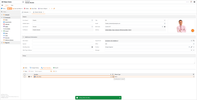
File: SolutionName.Blazor.Server\Controllers\PropertyEditorCustomButtonDetailViewController.cs
using DevExpress.ExpressApp;
using DevExpress.ExpressApp.Blazor.Components.Models;
using DevExpress.ExpressApp.Blazor.Editors;
using DevExpress.ExpressApp.Blazor.Utils;
using SolutionName.Module.BusinessObjects;
using Microsoft.AspNetCore.Components;
using Microsoft.AspNetCore.Components.Web;

namespace SolutionName.Blazor.Server.Controllers;

public class PropertyEditorCustomButtonDetailViewController : ObjectViewController<DetailView, PhoneNumber> {
    protected override void OnActivated() {
        base.OnActivated();
        View.CustomizeViewItemControl<StringPropertyEditor>(this, Customize_PhoneNumberEditor, nameof(PhoneNumber.Number));
    }

    private void Customize_PhoneNumberEditor(StringPropertyEditor editor) {
        var customButtonModel = new DxEditorButtonModel() {
            IconCssClass = "fluent-icon fluent-icon-phone",
            Tooltip = "Call this phone number",
            Click = EventCallback.Factory.Create<MouseEventArgs>(this,
                 (e) => Application.ShowViewStrategy.ShowMessage($"Calling {ViewCurrentObject.Number}..."))
        };
        editor.Buttons.Add(customButtonModel);
    }
}
Documentation
#Report Module Enhancements
Add Data Source at Runtime
DevExpress Blazor Report Designer v26.1 allows you to add and configure a CollectionDataSource at runtime. Use our Add Data Source wizard to specify the following settings for the new data source:
- Object Type Name — binds data source to the specified business object type
- Top Returned Records — limits the number of retrieved records
- Sorting — defines sort order for retrieved records
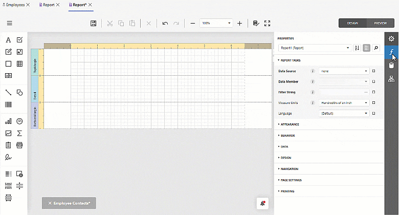
Documentation
Copy Predefined Report: Numbered Counter
You can now identify copied predefined reports at a glance — XAF appends a sequential counter to each copy name in the DevExpress Blazor Report Designer (for instance, "Monthly Sales (2)").
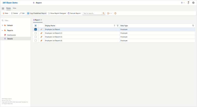
#Native Blazor Filter Builder Integration — Official Release
PopupCriteriaPropertyEditor and CriteriaPropertyEditor are now ready for production use. CriteriaPropertyEditor is based on the new DevExpress Blazor Filter Builder component and delivers simplified localization, improved performance, and native support for Blazor themes/palettes.
Both Property Editors are optimized for complex data models and support collection operations and plain-text criteria input/validation. Also, Filter Panel is now visible in DxGridListEditor and DxTreeListEditor when your List View is filtered (otherwise, it is hidden).
RTM version release also means that our previously-available JS-based PopupFilterPropertyEditor and FilterPropertyEditor are now in maintenance mode. We will not introduce additional functionality and plan to remove these components from our distribution in v26.2. We recommend that you migrate to the new property editors as soon as possible.
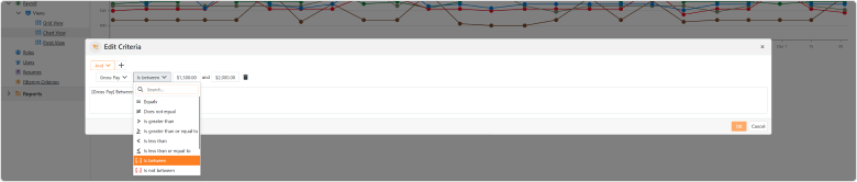
Documentation
#Pivot Grid Module Support (CTP)
XAF Blazor v26.1 includes the DxPivotGridListEditor (powered by the DevExpress Blazor DxPivotTable - key features). DxPivotGridListEditor (Pivot Table) is available as a Community Technology Preview in our v26.1 release cycle.
This new Pivot Table List Editor is a part of our DevExpress.ExpressApp.Blazor module (much like DxGridListEditor). Like XAF WinForms/Blazor UI List Editors, DxPivotGridListEditor supports EF Core and XPO business objects and offers simplified configuration options via the Model Editor.
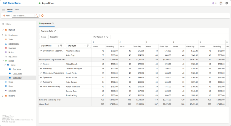
To configure DxPivotGridListEditor for your XAF Blazor ListView, you must:
- Invoke the Model Editor for your ASP.NET Core Blazor project. Under Views, find a node that defines the List View you wish to visualize as a Pivot Grid.
- Set the EditorType node property to
DxPivotGridListEditor. - In the List View node's Columns section, set PivotFieldArea, PivotGroupInterval, PivotSummaryType properties for required columns (a part of the
IModelColumnPivotGridBlazor API). - At runtime, reorder or move Pivot Grid fields between areas, display/hide fields using the Field List. The Pivot Grid will persists layout settings between view openings (using the
IModelListViewPivotGridBlazor.LayoutSettings API).
You can also specify Pivot Grid settings in code:
File: CS\MainDemo.Blazor.Server\Controllers\MyBlazorController.cs
using System;
using DevExpress.ExpressApp;
using DevExpress.ExpressApp.Blazor.Editors;

namespace MainDemo.Blazor.Server.Controllers;

public class MyBlazorController : ViewController {
    protected override void OnViewControlsCreated() {
        base.OnViewControlsCreated();
        if (View.Editor is DxPivotGridListEditor pivotListEditor) {
            // Place your pivot grid configuration code here.
            pivotListEditor.PivotGridModel.AllowDragFields = false;
            // Iterate your pivot grid columns
            // using the 'pivotListEditor.Columns' and DxPivotGridColumnWrapper
            // or pivotListEditor.ColumnModels and DxPivotTableFieldModel API respectively.
        }
    }
}
Documentation
#Miscellaneous
The Detail View for a new XAF Blazor Scheduler appointment now opens a full-sized form as a separate tab when the Options.UIType is set to TabbedMDI. Previously, a narrow popup form was opened.
Popup Detail Views are now wider and no longer override default layout caption position. For example, we display layout item captions to the left of associated editors (DxFormLayout.CaptionPosition = Horizontal in v26.1 instead of Vertical in previous versions).
These changes improve overall XAF UI usability and consistency.
Ready to evaluate DevExpress VCL v26.1?
Once you're ready to upgrade, simply login to the DevExpress Client Center and download the appropriate installer to proceed.
Download BETA and Install
Accessibility, Microsoft UI Automation, and Keyboard Navigation Enhancements
Accessibility (A11Y) support remains a primary focus area across all DevExpress product librariews. v26.1 includes accessibility enhancements for the following VCL UI components:
- VCL Data Grid: Master-detail tables, in-place edit forms, and summary/find/filter panels are now exposed as nested UIA nodes for the Data Grid control.
- VCL Tree List: Bands and summary/find/filter panels are now mapped to corresponding UIA nodes of the Tree List control.
- VCL Data Editors: We added UI Automation support for more in-place and standalone editors. Al newly supported editors allow you to customize UI automation node settings accessible via the Properties.Automation property.
Full VCL accessibility support is a significant undertaking and requires substantial engineering investments. We expect to improve accessibility support for the DevExpress VCL Scheduler, Pivot Grid, remaining Data Editors (and other controls) throughout 2026.
Documentation
VCL BI Dashboard (ExpressDashboards) — Official Release
Our Business Intelligence Dashboard product library (ExpressDashboards) is now ready for production use.
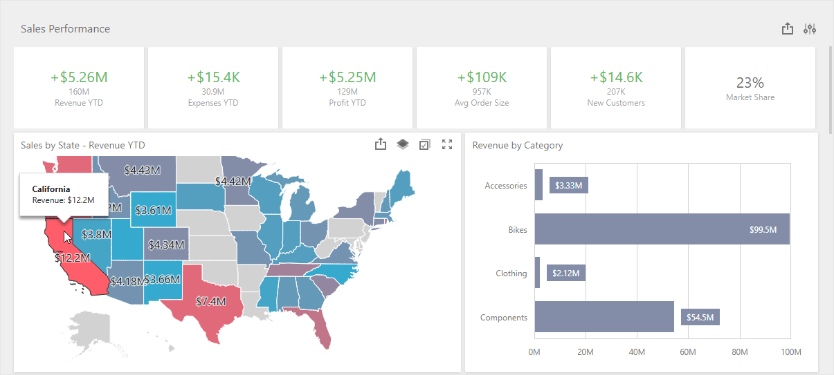
We finalized APIs/behaviors and implemented the following new featues and enhancements.
#New TdxDashboard Class
Use TdxDashboard APIs to generate and export content in headless/non-visual service applications.
#New Export Methods
In addition to ExportTo methods, TdxDashboard/TdxDashboardControl now include methods for exporting dashboard content directly to a file (PDF, XLSX, PNG, etc.). These methods accept a file path as the only parameter and do not require additional export options. Refer to the following help topic for additional information: Dashboard Export.
#VCL BI Dashboard Viewer Application Template
Our new VCL Template Kit includes a template designed to create a BI Dashboard application from scratch with a few clicks. The newly generated RAD Studio project includes minimal component configuration, resources, and sample data.
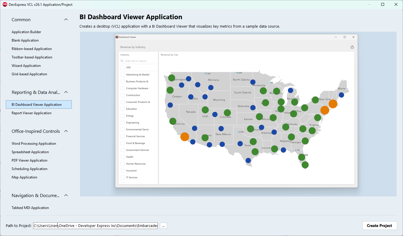
#Learning Material & Demo Enhancements
New and updated help topics:
- Tutorial: Create a dashboard using the Designer dialog
- Bind a Dashboard to a Database/SQL View using standard FireDAC and DataSet components
- Bind a Dashbaord to a parametrized stored procedure
- Dashboard export functionality: image, PDF, and spreadsheet export API/UI
- Supported Database Systems, including detailed guides for Microsoft SQL Server and Azure SQL, PostgreSQL, Oracle, MySQL, SQLite, Firebird, native VCL Datasets, and remote APIs/memory-based data sources
- BI Dashboard application deployment guide
GitHub-hosted examples:
VCL Report Designer & Viewer (ExpressReports) Enhancements
#TdxReportControl — An Embedded VCL Report Viewer for Non-Modal Forms, Tabbed MDI, Page & User Controls
Our non-visual report generator component now ships with a new VCL Report Viewer UI control TdxReportControl. Place it on a form, tab, page, or other container to allow users to preview generated content, just like our ExpressReports Demo.
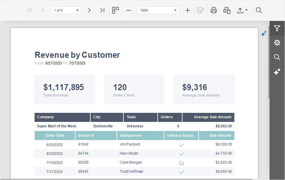
#PRNX Support — Save & Load Report Document Layouts with All Required Data
You can now use LoadDocument and SaveDocument methods to import/export report documents to/from PRNX. PRNX is a zipped XML that describes report layout structure and embeds all required data and images. This format offers additional flexibility for dynamic report generation usage scenarios (using or new TdxReportControl), compared to static/predefined report layouts (REPX) and PDF documents.
Refer to the following topics for additional information:
#New VCL Export Methods
In addition to ExportTo, the TdxReport component includes methods to export report content directly to a file (PDF, XLSX, PNG, etc.). These methods accept a file path as the only parameter and do not require additional export options. Refer to the following help topics for additional information: Report Export.
#VCL Report Viewer Application Template
Our new VCL Template Kit includes a template that allows you to create a Report Viewer/Designer application from scratch with a few clicks. The newly generated RAD Studio project includes minimal component configuration, resources, and sample data.
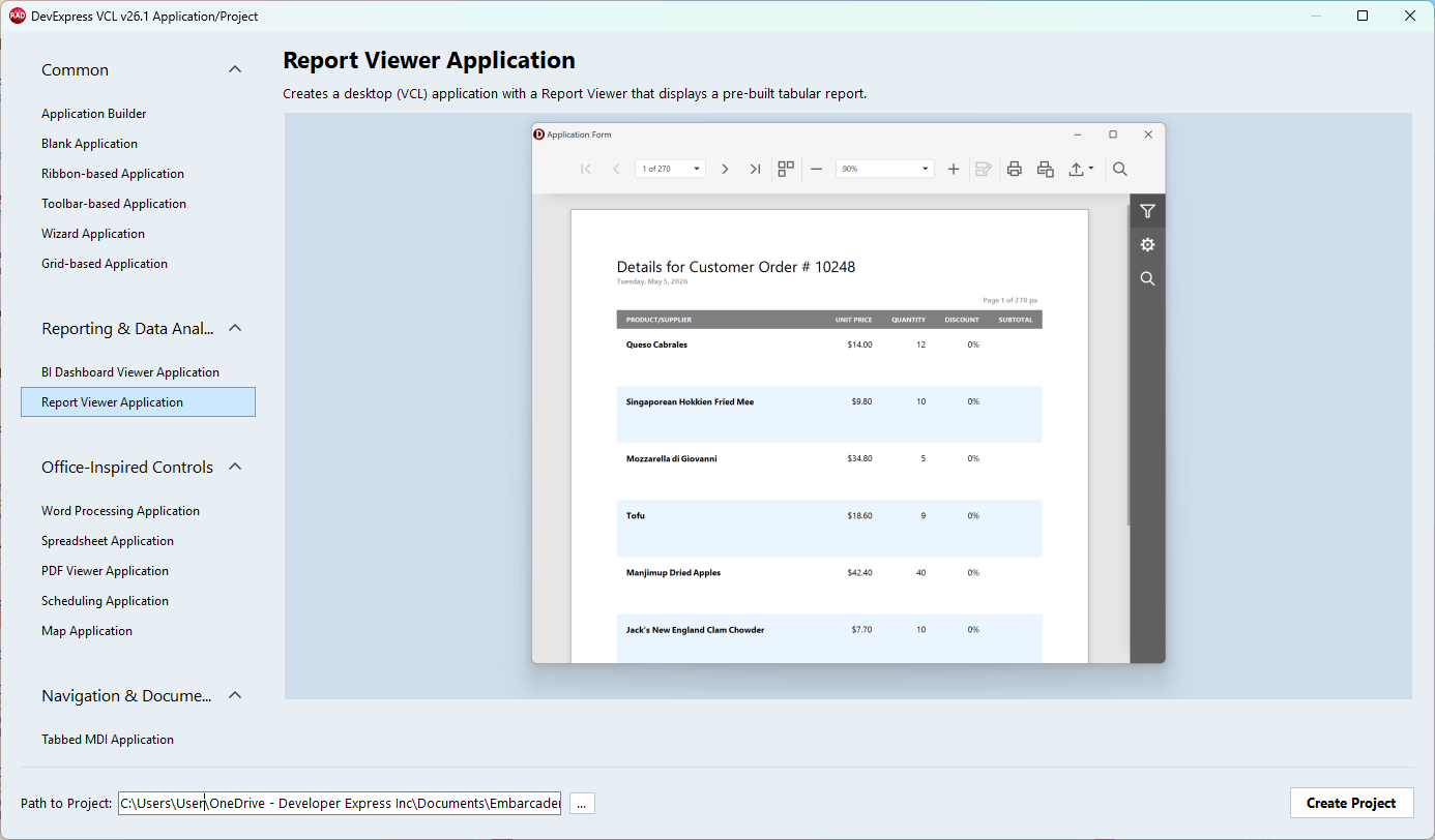
#Learning Material & Demo Enhancements
New and updated help pages:
- Tutorial: Create a table report using the Report Wizard
- Bind a Report to a Database/SQL View using standard FireDAC and DataSet components
- Bind a Report to a parametrized stored procedure
- Report print & export functionality: document, spreadsheet, and image print & export API/UI
- Report Viewer and Designer UI, report templates and content
- Supported Database Systems, including detailed guides for Microsoft SQL Server and Azure SQL, PostgreSQL, Oracle, MySQL, SQLite, Firebird, native VCL Datasets, and remote APIs/memory-based data sources
- ExpressReport application deployment guide
- Report Print and Export
GitHub-hosted examples:
Additional VCL Reports & BI Dashboard Enhancements
TdxReport: Handle OnDesignerFormShow and OnViewerFormShow events to customize Report Designer and Report Viewer form settings. You can change caption, dimensions, position, and other settings as needed:
uses
  dxReport;  // Declares the TdxReport component
//...

procedure TMyForm.dxReport1ViewerFormShow(ASender: TObject; AForm: TForm);
begin
  AForm.Caption := 'My Report Viewer';       // Changes the Report Viewer form caption
  AForm.WindowState := wsNormal;             // Switches from maximized to the normal form state
  AForm.Position := poScreenCenter;          // Centers the dialog on the screen
  AForm.Width := 1200;                       // Specifies the dialog width
  AForm.Height := 800;                       // Specifies the dialog height
end;
TdxBackendDataSetJSONConnection: The new AutoRefreshData property allows you to increase data loading/value population speed if source VCL datasets (TDataSet descendants) remain unchanged during the current session.
TdxBackendDatabaseSQLConnection: The new DefaultEnableCustomSql global option allows you to enable/disable custom SQL queries for all TdxDashboard/TdxDashboardControl and TdxReport/TdxReportControl components in your project. You can override this global setting at the component level using corresponding EnableCustomSql options.
We also aligned TdxReport/TdxReportControl APIs with TdxDashboard/TdxDashboardControl components to ensure consistent functionality and behavior.
#API Simplification & Optimization
We enhanced initial Report and Dashboard component initialization flow so that explicit TdxDashboardControl.Timeout, TdxReport.LoadParametersFromReport, TdxReportParameters.LoadFromLayout calls are no longer necessary. IN addition, we added OnExport events to all our components (instead of internal OnBrowserFileDownload).
#Developer Flow Simplification
-
We removed Show Content/Hide Content and Load Parameters From XXX design time options from TdxReport and TdxDashboardControl components.
-
Dashboard and report components display content immediately after layout or parameter changes (WYSIWYG).
High DPI and Rendering/Performance
v26.1 introduces noticeable performance enhancements for VCL apps running on 4K+ displays:
-
Form resize performance on Windows 11 and WXI Compact is now 30 — 35% better for TdxRibbonForm (with rounded corners and other default settings).
-
We optimized skinned forms and vector-based UI elements. As a result, our Mail Client demo forms are rendered 10 — 20% faster.
-
The new
TdxWindowFrame shadow behaves like the native OS shadow, but is up to 10× faster compared to our previous implementation. It includes an expanded resize zone, distinct rendering for active and inactive forms and is always applied on Windows 11 (and on Windows 10 for forms with square corners).
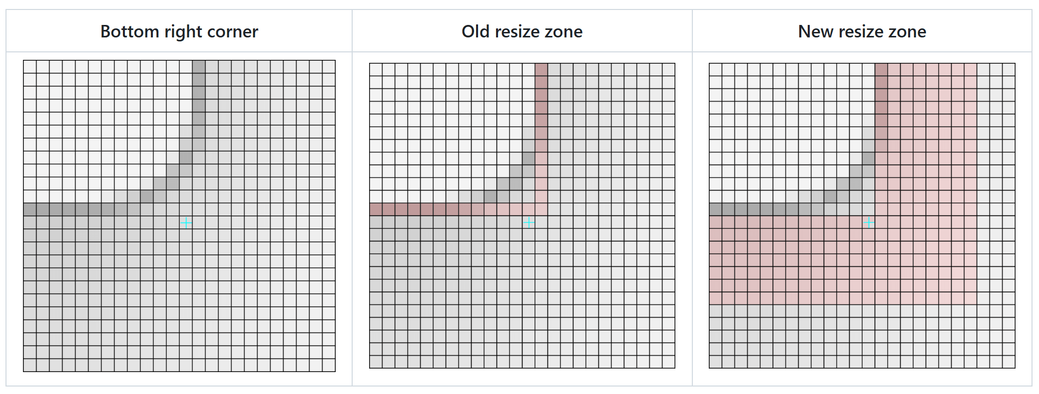
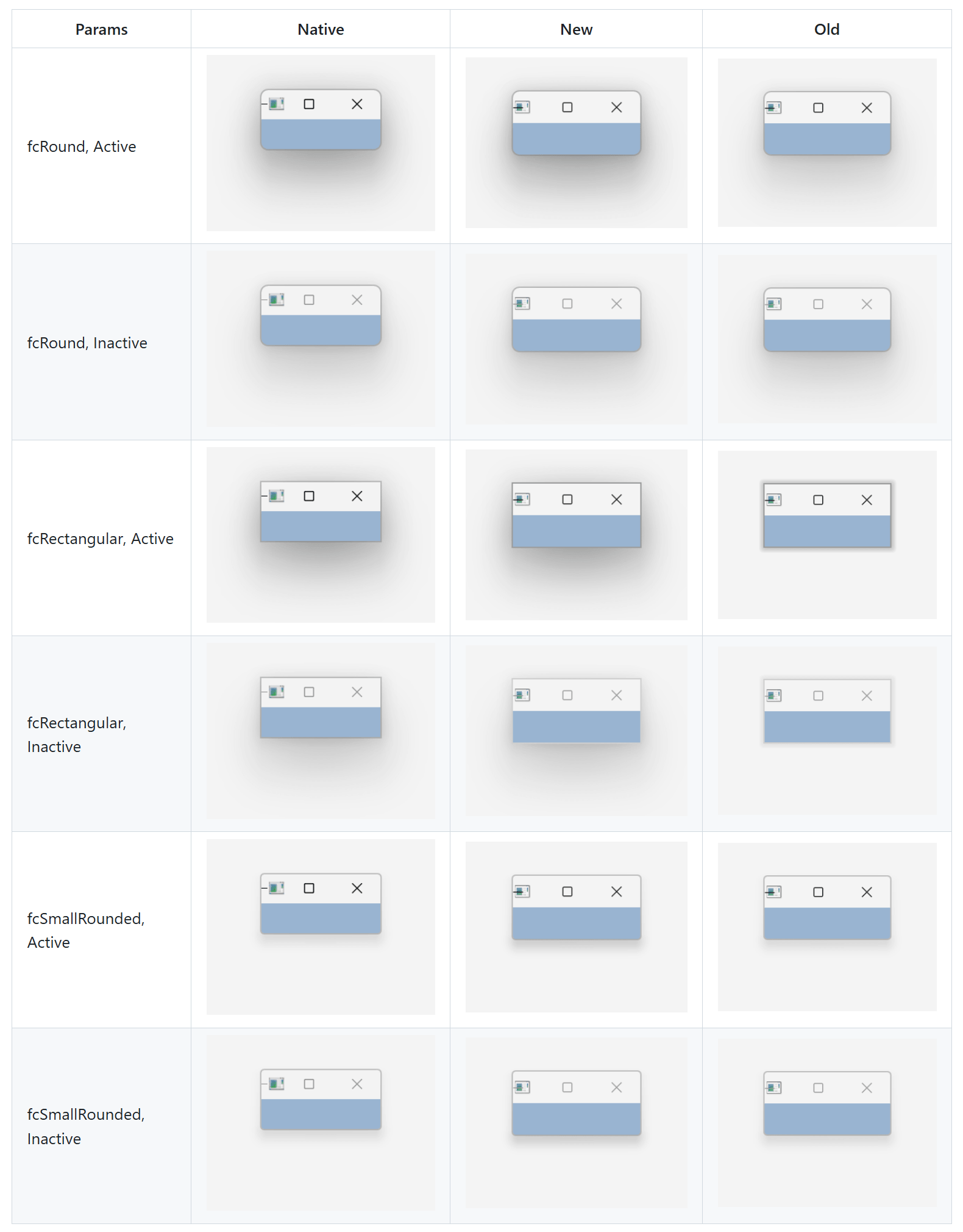
Fluent UI Support — Replicate Modern Microsoft Outlook and Teams User Interfaces
We are working hard to align DevExpress-powered VCL applications with modern UI standards inspired by Microsoft Fluent 2 and recent Outlook and Teams apps. Our goal is to allow VCL developers to adopt modern visual language progressively, without forcing large-scale rewrites or breaking existing user experiences.
#VCL Layout Control — Rounded Mode
The DevExpress Layout Control can now redner rounded corners and padding around individual UI elements (layout groups and embedded controls) whenever the WXI or WXI Compact skin is used.
You can activate Rounded Mode globally or at the individual layout group/item level using the RoundedMode properties.
#VCL Office Navigation Bar Enhancements
Our VCL Office Navigation Bar (TdxNavBarOfficeNavigationBar) can now serve as a side navigation or status panel (Microsoft Outlook-inspired).
Use OptionsView.Orientation and OptionsView.ItemRotation to position the component vertically and change UI/glyph orientation.
#Updated Mail Client Demo
Our Mail Client Demo (shipped as part of our compiled demo set) includes a new Outlook-inspired appearance:
We will continue work on Fluent UI support in our v26.2 release cycle.
VCL Template Kit
v26.1 ships with a VCL Template Kit designed to quickly create common application types and frequently used UI forms. The Template Kit includes both project and form templates, allowing you to scaffold complete applications or add new forms and modules to existing projects. Like its DevExpres .NET counterpart, our VCL Template Kit addresses typical business usage scenarios (such as data-centric forms, master-detail layouts, and common navigation patterns).
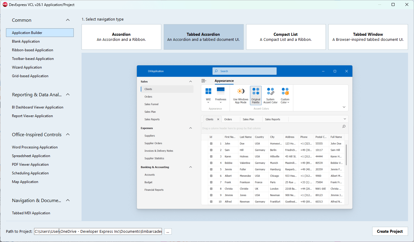
Our goal is to:
-
Reduce time spent on repetitive project and form setup (for example, 1-2 clicks instead of minutes-hours).
-
Encapsulate DevExpress VCL best practices introduced in recent releases. For instance, accessibility, a global Skin controller/vector skins, modern Fluent UI layouts, a single SVG image list for menu and navigation (instead of multiple lists with duplicate images).
-
Improve onboarding for new VCL developers while boosting productivity in experienced teams (for example, get started with our VCL Reporting and BI Dashboard platforms or DevExpress AI-powered smart functions).
#Available App Generation Options
- VCL Application Builder: Allows you to build modular/multi-view applications from scratch — from selecting the desired navigation structure to adding one or more views with pre-configured DevExpress UI controls based on project requirements.
- Toolbar/UI Application Templates: Generate a pre-configured blank form with a Ribbon or Toolbar UI, ready for integration with a DevExpress UI control.
- UI Control-Specific Templates: Generate fully-functional app projects with a Ribbon UI/Navigation Bar and an integrated DevExpress UI control (BI Dashboard Viewer, Rich Text Editor, Spreadsheet, Scheduler, etc.).
- Form Creation Templates: Add a pre-configured form with a Ribbon/Toolbar UI and a DevExpress UI control to an existing app project.
BBCode-Inspired Rich Text Formatting for Additional UI Elements
With v26.1, we extended BBCode support across a wider range of VCL UI elements and captions: TcxButton, TcxGridLayoutView/TcxGridDBLayoutView, and column headers across these views. Use BBCode-inspired formatting to improve visual expressiveness/clarity in your data-centric/information-dense DevExpress-powered VCL application (without the use of custom draw logic). New formatting options are fully backward-compatible with applications that display plain text captions.
#Hints in BBCode-Formatted Text
You can now add hints to BBCode-formatted text using our new HINT markup tag. The tag can be combined with hyperlinks (to redefine hyperlink hints) and other markup tags.
[URL=https://devexpress.com][HINT=DevExpress Website]www.devexpress.com[/HINT][/URL]
New OnHintedTextClick, OnHintedTextMouseEnter, OnHintedTextMouseLeave, and OnShowTextHint events are now available for both the Layout Control and formatted labels. These events allow you to customize hint behavior. For instance, you can replace hint text at runtime.
procedure TMyForm.dxFormattedLabel1PropertiesFormattedTextShowTextHint(
  Sender: TObject; AArgs: TdxShowTextHintEventArgs);
begin
  AArgs.Hint := FormatDateTime('mm/dd/yyyy hh:nn:ss am/pm', Now);
end;
RAD Studio v13.1 Support
Our most recent release (VCL v26.1.2+) officially supports recent versions of RAD Studio (Delphi 13.1 and C++Builder 13.1 for both 32-bit and 64-bit compilers).
We conducted preliminary research on native Windows ARM 64-bit support introduced in RAD Studio 13.1. We will continue research and analysis/testing for our v26.2 major release.