DevExpress License Keys
Every developer/build machine must store a valid DevExpress license key. If you are upgrading to a new major version, download your updated license key and use it in your development environment.
DevExpress Unified Installer (Windows) automatically obtains your License Key and places it into its correct location. Run the installer in Repair/Register mode to update your key when necessary. If you used our Unified Installer before license keys were introduced (prior to v25.1), you should not experience any changes when installing or updating DevExpress products.
If you bypass the DevExpress Unified Installer, you can download your license key and register it in the system manually (via a file on disk or an environment variable). Review detailed instructions in the following help topic: Online NuGet Feeds, CI/CD, and Other Installation Methods (Windows, macOS, Linux).
If using DevExtreme (React, Angular, Vue, JS), please refer to the following DevExtreme-specific licensing help topic: DevExtreme Licensing.
DevExpress NuGet Packages: Now on NuGet.org
If you are using DevExpress v25.1+, you can now obtain DevExpress NuGet packages from NuGet.org. Our own NuGet server remains operational, but we plan to discontinue its use in future versions. When we release our next major update (v26.1), we will publish NuGet packages to NuGet.com only.
We recommend that you migrate from NuGet.DevExpress.com to NuGet.org within the next 6 months. You will need to re-reconfigure your local and build server development environments (CI/CD pipelines).
.NET 10 Support
The following DevExpress component libraries now support .NET 10:
Visual Studio 2026 Support
The following DevExpress component libraries now support Visual Studio 2026:
JetBrains Rider Support
You can do even more when using JetBrains Rider alongside the following DevExpress products:
- All Products: Create new projects using the same rich set of DevExpress templates available in Visual Studio and VS Code.
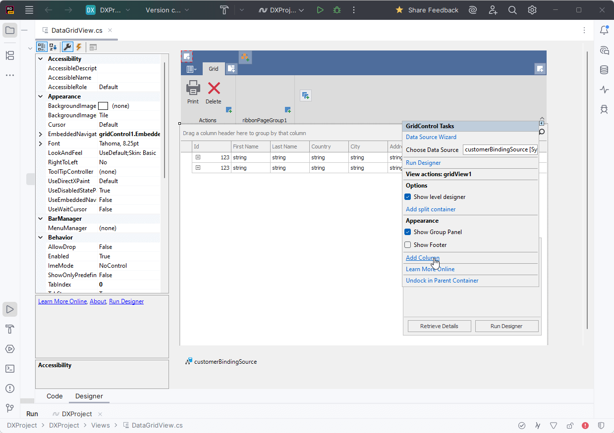
- WinForms: Visually configure and customize major DevExpress WinForms UI components directly within Rider's designer. Learn more
- Reports: Create and customize reports using the DevExpress Report Designer. Learn more
The ability to use DevExpress UI components within Rider was developed in collaboration with the JetBrains team.
Accessibility (A11Y)
In v25.2, we expanded our accessibility support to include more UI controls and platforms:
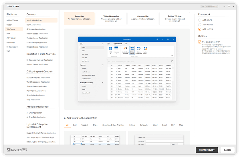
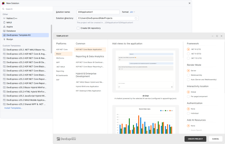
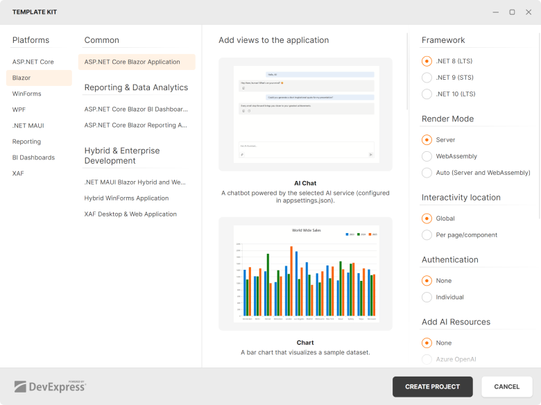
DevExpress Template Kit
We updated the DevExpress Template Kit to support cross-platform development and major IDEs:
- Visual Studio
- Visual Studio Code
- JetBrains Rider
The DevExpress Template Kit for Visual Studio Code and Rider now runs on Windows and macOS and allows you to create projects based on pre-designed templates.
Our Template Kit also includes new project and item templates for WinForms, WPF, Reports, and BI Dashboard:
Download Template Kit
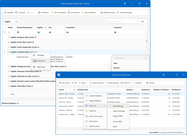
Localization Enhancements
You can try/evaluate the new DevExpress localization platform (designed to replace our existing online service and IDE-based localization wizards). This new tool introduces enhanced collaboration capabilities, easier resource navigation/management, AI-powered translation services, support for multiple DevExpress products/platforms, and much more.
https://github.com/DevExpress/Localization
Available as Available as Community Technology Preview (CTP) in v25.2
Key features:
- Simpler localization string management
Use advanced data shaping capabilities available in our Data Grid control to find resources, filter or group data, and more.
- Enhanced translation consistency and coverage
Locate duplicate strings, find inconsistent translations using a built-in localization validator, review context information, and run batch operations.
- Multiple export types
You can export translations as satellite assemblies, NuGet packages, a single merged RESX file for multiple products (replaces hundreds of assemblies), or JSON files for JS/TS-based products.
- New collaboration capabilities
You can now use change tracking, reviews, import/export capabilities, and built-in backups. All DevExpress product localization resources are available on GitHub. You can either use our Windows-based tool, modify your translations directly in RESX, or build your own tool.
- Support for multiple products/platforms
The current version already supports numerous DevExpress UI libraries (WinForms, WPF, Blazor, ASP.NET Core, Reports, Dashboard, XAF). We plan to add support for .NET MAUI, DevExtreme, and VCL UI Controls in future release cycles.
- AI-powered resource translation
Integrate your favorite AI service into our new Localization client.
Get Started
Your feedback matters.
Please, review the description of AI-related features below and leave your feedback at the end of the section.
Go to the survey now.
New AI-powered Extensions
NOTE: DevExpress does not offer a REST API or ship any built-in LLMs/SLMs. Instead, we follow the BYOL ("bring your own license") principle. To use these features, you need to have an active subscription to AI services (e.g., Azure, Open AI, Google Gemini, Mistral AI, etc.) and obtain the REST API endpoint, key, and model deployment name. These variables must be specified at runtime to enable DevExpress AI-powered Extensions in your application.
AI Tool Calling
Natural Language Control for UI Components
DevExpress v25.2 introduces a cross-platform API that extends Microsoft.Extensions.AI tool-calling capabilities and enables natural-language control over application UI and logic.
The DevExpress AI Tool Calling API accepts any object type as a method argument. Developers can inject UI components (for example, Grid Controls, Forms, User Controls), ViewModels, and custom business services into tool methods. The API resolves target objects at runtime based on context (toolset) and descriptive metadata.
Tools can be grouped into toolsets that you can dynamically enable, disable, or replace at runtime. This design allows the LLM to adapt the available AI actions to the current application state or workflow.
When users interact with the DevExpress AI Chat Control, the language model analyzes each request, selects the appropriate tool, resolves the required instance, and invokes the corresponding method to modify the application in real time.
Documentation
AI Chat Control Enhancements — Blazor, WinForms, WPF
DevExpress AI Chat Controls for Blazor, WinForms, and WPF include the following enhancements designed to improve user interaction and expand integration capabilities:
Display Tool Information
Chat messages can display information about invoked AI functions (Model Context Protocol tools) in chat responses.
Resources
Users can select one or more resources to include in the chat request. Supported resource content types: binary files (images, documents) and non-file resources (for example, logs retrieved from Model Context Protocol servers).
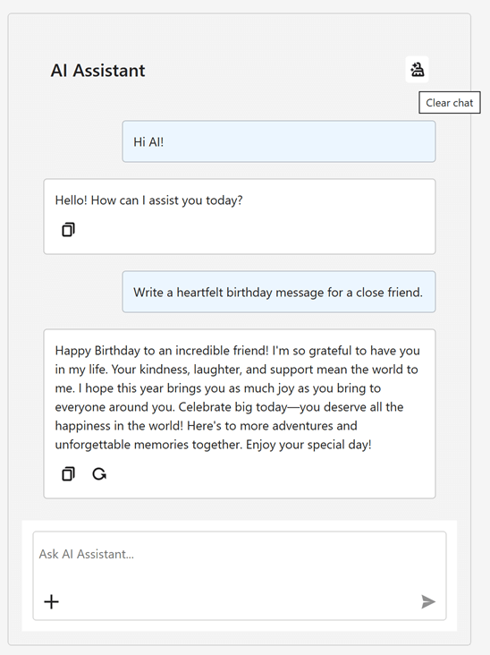
Chat Title and Clear History
The chat UI can display a customizable chat title and a "Clear Chat" button (removes all messages from the conversation history except system messages).
Multiple AI Providers
Applications can use multiple AI providers within the AI Chat Control. Users can switch models at runtime, compare responses side by side, and run independent sessions.
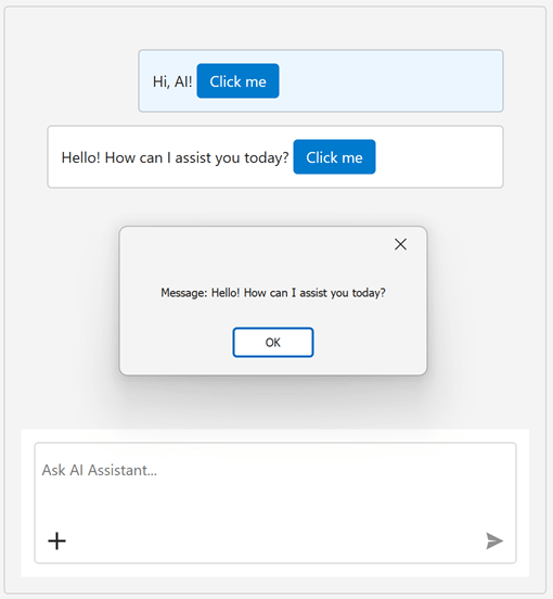
Single-Click Prompt Submission
Users can now send prompt suggestions with a single click.
Resizable Input Area
The chat's input area automatically expands as the user types.
New Project Templates
Our new chat-based project templates incorporate the AI Chat Control within a DevExpress-powered WinForms and/or WPF application. Built-in Retrieval-Augmented Generation (RAG) delivers context-aware answers based on local document data, including PDF, DOCX, RTF, TXT, and HTML files.
Learn more
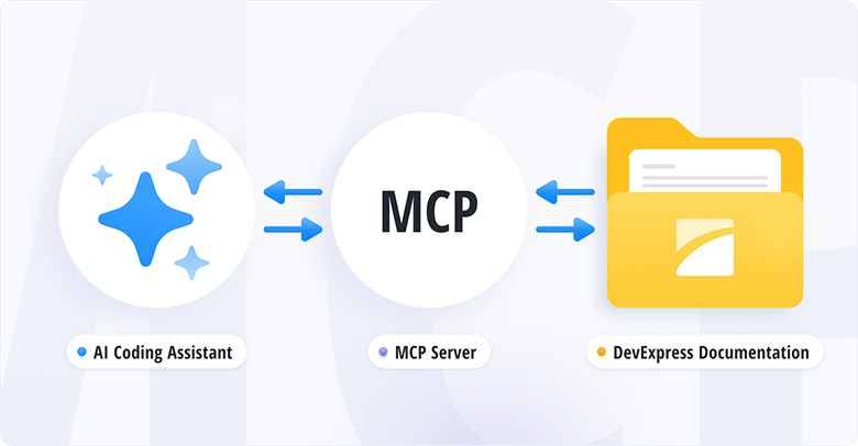
DevExpress Documentation MCP Server
The DevExpress Documentation MCP Server connects GitHub Copilot and other AI-based coding assistants to our comprehensive documentation database and gives you instant access to 300,000+ help topics without leaving your development environment.
With our MCP Server, you can generate code for DevExpress UI components using natural language prompts, get contextual answers about APIs and implementation patterns, search DevExpress help topics with semantic understanding, and more. The MCP Server delivers real-time technical guidance for DevExpress controls across all supported platforms: from WinForms and VCL to Angular and Blazor.
The DevExpress MCP Server works with Visual Studio 2022, VS Code, Cursor, JetBrains Rider, and any MCP-compatible AI assistant (GitHub Copilot, JetBrains AI Assistant) or CLI Agent (Gemini CLI, Claude Code, GitHub Copilot CLI).
DevExpress MCP Server: Configure Your AI-powered Coding Assistant (Documentation)
Transform Your Development Experience with the DevExpress Documentation MCP Server (Blog Post)
AI-Powered Extensions
Please review the following What's New sections for additional information about DevExpress AI-powered extensions:
Survey - AI-powered Extensions
Your Feedback Matters!
Please
login to complete the survey.
Survey Completed
Thank you for taking the time to complete this survey. Your responses have now been posted. If you want to follow up with additional information, feel free to send us an email at clientservices@devexpress.com anytime.
You've Already Completed This Survey
Our records show that you have already completed this survey. If you want to follow up with additional information, send us an email at clientservices@devexpress.com.
This survey has expired
If you want to share your feedback or request new functionality, please submit a new support ticket via the DevExpress Support Center. We’ll be happy to follow up.
Your feedback matters.
Please, review the description of WinForms-related features below and leave your feedback at the end of the section.
Go to the survey now.
.NET 10 and Visual Studio 2026 Support
DevExpress WinForms component libraries now support .NET 10 and Visual Studio 2026.
JetBrains Rider Support
You can now visually configure and customize major DevExpress UI components directly within Rider's designer.
The ability to use DevExpress components within Rider was developed in collaboration with the JetBrains team.
#Project Templates for JetBrains Rider
The DevExpress Template Kit is fully integrated into JetBrains Rider. You can create new projects using the same rich set of DevExpress templates available in Visual Studio and VS Code.
DateOnly & TimeOnly Support in Charts
The DevExpress WinForms Chart Control supports .NET DateOnly and TimeOnly data types. You can use these types to specify arguments, values, workday/work time options, strips, constant lines, and scale breaks, as well as to apply data filters, sorting, and summaries.
Accessibility
#Accessible Column and Band Operations Through Keyboard Input
The DevExpress WinForms Data Grid includes full keyboard access to column headers and bands. Users can execute the following operations using the keyboard:
| Action | Keyboard Shortcut | Notes |
| Focus a column header | Ctrl+Shift+TAB | Focus moves from any row to header row. |
| Unfocus a column header | ↓ | Focus returns to the grid's top row. |
| Unfocus a column header | Ctrl+TAB | Focus returns to the previously selected data row. |
| Focus a band | ↑ (from column headers)
| Moves focus from the column header area to bands. |
| Navigate between column headers/bands | ←, →, TAB, HOME, END | Moves focus across column headers/bands. |
| Resize column/band width | Shift+←, Shift+→ | Decreases/increases column/band width. |
| Reorder columns/bands | Ctrl+←, Ctrl+→, Ctrl+↑, Ctrl+↓ | Moves a column header/band horizontally or vertically based on layout. |
| Sort by the focused column | Space, Enter | Applies sorting in ascending order or reverses sort order. |
| Add/remove a column to/from multi-column sorting | Shift+Space, Ctrl+Space | Adds to or removes from existing sort sequence. |
| Open a column filter popup | Alt+↓, F4 |
Fires FilterPopup-related events.
|
| Open a column/band context menu | Shift+F10, ≣ |
Fires PopupMenuShowing, GridMenuItemClick.
|
You can activate column/band keyboard navigation for all Data Grids used in your application or for individual Views.
The new BandedGridView.FocusedBand property specifies the currently focused band and allows you to set focus programmatically.
Documentation
#Screen Reader Enhancements for Data Editors
DevExpress WinForms Data Editors ship with improved screen reader support for text-based editors. Users can navigate and select text more effectively within the range read by the screen reader.
Enhancements include:
- Select text within the screen reader's reading range.
- Move the cursor to the previous or next character or word.
AI Chat Control
#Manage Multiple Chat Clients
The DevExpress WinForms AI Chat Control supports use of multiple AI services within a single application.
Use cases include:
- Compare responses from different AI providers side by side.
- Run independent sessions with separate histories.
- Allow users to select or switch AI providers at runtime.
Use the AddKeyedChatClient method to register AI chat clients in the service collection with unique keys at application startup. The following code snippet registers Azure OpenAI and Ollama clients:
// Create an Azure OpenAI client.
var azureOpenAiClient = new Azure.AI.OpenAI.AzureOpenAIClient(AzureOpenAIEndpoint, AzureOpenAIKey);

// Create an Ollama API client.
IChatClient ollamaClient = new OllamaApiClient(new Uri("http://localhost:11434/"), "MODEL_NAME");

// Create a service collection to register AI chat clients.
var serviceCollection = new ServiceCollection();

// Register the Azure OpenAI client with a unique key.
serviceCollection.AddKeyedChatClient("azureOpenAIClient", azureOpenAiClient.GetChatClient(ModelId).AsIChatClient());

// Register the Ollama client with a different key.
serviceCollection.AddKeyedChatClient("ollamaClient", ollamaClient);

// Add DevExpress AI Desktop services (required for AIChatControl).
serviceCollection.AddDevExpressAIDesktop();
You can place multiple AI Chat Controls on the same form (for example, to test model quality or host specialized agents) or use a single AI Chat Control and switch between AI providers at runtime.
Set the AIChatControl.ChatClientServiceKey property to select the service:
// Create and configure an Azure OpenAI chat control.
AIChatControl azureChat = new AIChatControl() {
    ChatClientServiceKey = "azureOpenAIClient",
    Dock = DockStyle.Right
};

// Create and configure an Ollama chat control.
AIChatControl ollamaChat = new AIChatControl() {
    ChatClientServiceKey = "ollamaClient",
    Dock = DockStyle.Left
};
Documentation
#Resources
Our WinForms AI Chat Control can now access external data sources (such as MCP (Model Context Protocol) servers) or dynamically generated content through resources. Resources extend the chat context with additional input (for example, local documents, logs, or images). The AI model uses this data to generate more accurate and context-aware responses.
After you assign resources the AI Chat Control displays the Attach Context (+) button. Users can select one or more resources to include in the chat request. A built-in search box helps users quickly locate desired items when the resource list is long.
Supported resource content types:
You can also customize resource appearance. Use the new SetResourceItemTemplate method to supply a Razor-based template for resource items displayed in the chat's "Attach Context" dropdown.
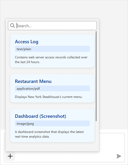
Documentation
#Tool Calling API
AI Tool Calling connects your Windows Forms application logic with natural language input. The WinForms AI Chat Control can invoke methods annotated with metadata that describes purpose, input parameters, and optional target objects.
The DevExpress implementation extends standard function calling with the following enhancements:
Target-Aware Tools
Tools can operate on specific object instances (UI controls, forms, data services, business objects). AI resolves targets from context.
Flexible Tool Contexts
Group tools into contexts. You can add, remove, or disable contexts at runtime.
Seamless Integration with the AI Chat Control
The WinForms AI Chat Control discovers and merges tools from all registered contexts and manages tool selection, target resolution, parameter binding, and invocation.
Documentation
#Display Tool Information
You can display information about invoked tools in chat responses. Enable the AI Chat Control's IncludeFunctionCallInfo option to include metadata about invoked tools/functions (function names and arguments) in response messages.
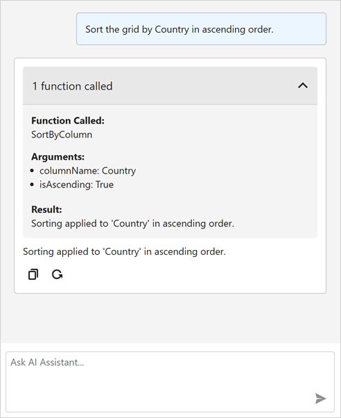
A new ResponseReceived event is triggered when the AI Chat Control receives a response from an AI service. Handle this event to inspect or modify metadata about invoked tools/functions before they are displayed in the chat UI.
The following code snippet removes internal function calls and arguments that are not intended for user display:
void AiChatControl1_ResponseReceived(object sender, AIChatControlResponseReceivedEventArgs e) {
    if (e.Message.FunctionCalls.Count > 0) {
        // Remove information about the GetToolTargets function used internally by the LLM to select a tool target.
        if (e.Message.FunctionCalls.RemoveAll(fcall => fcall.Request.Name == "GetToolTargets") > 0) {
            e.Message.FunctionCalls.ForEach(fcall => {
                foreach (var argument in fcall.Request.Arguments.Keys.ToList())
                    // Remove internal '*_identifier' arguments from function calls.
                    // These arguments specify target selection information and are not intended for user display.
                    if (argument.EndsWith("_identifier"))
                        fcall.Request.Arguments.Remove(argument);
            });
        }
    }
}
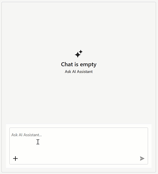
#Message Templates
You can create Razor-based templates for messages, prompt suggestions, and empty chat area to customize the DevExpress WinForms Chat UI.
Documentation
#Title and Clear Chat Button
Our WinForms AI Chat Control can display a header. The header contains a customizable chat title and a "Clear Chat" button (removes all messages from the conversation history except system messages).
To display the chat header, enable the AIChatControl.ShowHeader option. The AIChatControl.HeaderText property specifies the chat title.
#Resize Input Area
Enable the new AIChatControl.AllowResizeInput option to allow users resize the input area. Users can drag the top edge to enlarge the input area or down to display a more detailed chat history.
#Send Prompt Suggestion on Click
The AI Chat Control automatically inserts the selected prompt suggestion into the chat prompt box so users can edit it before sending. Activate the new PromptSuggestion.SendOnClick option to send a prompt suggestion to an AI service immediately after it is clicked and accelerate conversation flows.
#Chat Project Templates — DevExpress Template Kit
The DevExpress Template Kit includes new chat-based project templates for apps targeting .NET 8+.
AI Chat Application
Creates a WinForms chat app that integrates the AI Chat Control. Optionally integrates the DevExpress MCP Server for DevExpress-specific technical guidance (adds an mcp.json configuration file to the application).
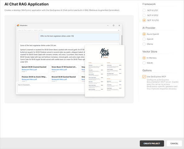
AI Chat (RAG) Application
Creates a desktop WinForms application with the AI Chat Control and built-in Retrieval-Augmented Generation (RAG) for document-grounded conversations:
- Uses local document data for context-aware answers.
- Scans the user's Documents folder and indexes PDF, DOCX, TXT, RTF, and HTML files.
- Extracts, embeds, and semantically searches document text.
- Stores vectors in In-Memory (rebuilds each run) or SQLite (persistent database).
- Merges retrieved content with user prompts to improve accuracy.
- Optionally integrates the DevExpress MCP Server for DevExpress-specific technical guidance.
Documentation
AI-powered Extensions
#Prompt to Expression
We added AI-powered expression generation to our WinForms controls to help users create filter and unbound column expressions for data-aware WinForms controls using natural language prompts. Instead of writing complex expressions, users describe the desired logic in plain text.
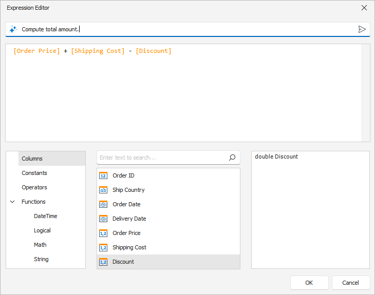
The system sends the prompt to the configured AI service, which generates an expression for the control. The DevExpress Expression Editor or Filter Editor displays and validates the result immediately.
Supported controls:
- Data Grid
- TreeList
- Vertical Grid
See the following animation to see how Prompt to Expression works:
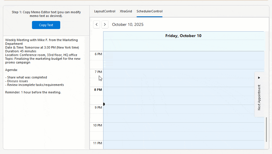
#SmartPaste in WinForms Scheduler Control
The DevExpress WinForms Scheduler Control supports AI-powered SmartPaste. Users can create appointments by pasting text or images from the clipboard. SmartPaste identifies the subject, date, time, location, agenda, and fills appointment fields.
SmartPaste can also detect:
- Recurrence (for example, every Monday at 10 AM until December)
- Time Zone
- Label
- Status
- Resources
Activation steps:
#SmartPaste — AI-powered Image Processing
v25.2 extends SmartPaste to process clipboard images. Enable the ProcessClipboardImage option to extract structured data from images:
behaviorManager1.Attach<SmartPasteBehavior>(gridView, behavior => {
    behavior.Properties.ItemDescriptions.AddRange(new List<AIItemDescription>() {
        new AIItemDescription(gridView.Columns["ProductName"], "Official name or product name."),
        new AIItemDescription(gridView.Columns["Warranty"], "Information related to the product warranty (in years or months).")
    });
    behavior.Properties.ProcessClipboardImage = DevExpress.Utils.DefaultBoolean.True;
});
#Prompt Augmentation
DevExpress AI Assistant and SmartPaste extensions support Prompt Augmentation. Use the AI-powered behavior's PromptAugmentation property to supply additional instructions that modify the default prompt (for example, always translate results into English):
behaviorManager1.Attach<ChangeStyleBehavior>(memoEdit1, behavior => {
    behavior.Properties.Temperature = 0.6f;
    behavior.Properties.PromptAugmentation = "Always translate the result into English.";
});
Documentation
#Flexible Text Selection for AI-powered Features
AI-powered text processing features rely on relevant and contextually complete input to generate high-quality results. In earlier versions, users could only send explicitly selected text to the AI service, which limited flexibility and often required extra manual steps.
The new Flexible Text Selection option in MemoEdit, RichEditControl, and SpreadsheetControl offers configurable text retrieval settings.
Use the TextRetrievalMode property to specify the portion of text that is transmitted to an AI service: selected text, current paragraph, entire document, or entire document if nothing is selected.
#Generate Skin Palettes with AI
Our new demo application leverages AI to create custom skin palettes to personalize an application's appearance on the fly. Users can generate, save, and delete AI-created palettes between application sessions.
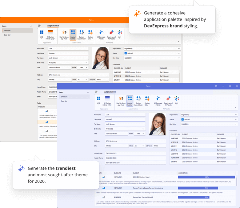
Open Example
Outlook-inspired Side Panel
The DevExpress WinForms Ribbon Form can display a side navigation or status panel (Microsoft Outlook inspired).
You can use the following DevExpress WinForms controls as a side panel to create intuitive, organized interfaces similar to Microsoft Outlook:
- PanelControl
- AccordionControl
- NavigationPane
- WindowsUIButtonPanel
- ToolboxControl
- SidePanel
Use the RibbonForm.SidePane property to display a control on the right side of the Ribbon UI.
using DevExpress.XtraBars.Ribbon;
using DevExpress.XtraEditors;

public partial class MainForm : RibbonForm {
    PanelControl panel;

    public MainForm() {
        InitializeComponent();

        // Create the panel.
        panel = new PanelControl();
        this.Controls.Add(panel);

        // Assign the panel to the 'RibbonForm.SidePane' property.
        this.SidePane = panel;
    }
}
Data Grid & TreeList
#Multi-Cell Editing
Our WinForms Data Grid and TreeList controls ship with multi-cell editing support (users can apply identical values to multiple cells simultaneously). This capability will be useful when working with large datasets or when applying the same change (for example, updating a status, category, or date) across multiple rows.
Activation steps:
Accordion Control
#Search with a Delay
You can filter WinForms Accordion Control items with a delay. Use the FilterDelay property to specify the delay in milliseconds.
SVG Icon Colorization
#CSS Variables
You can now dynamically align SVG icon colors with the current application skin. Use the following CSS variables to colorize custom SVG icons:
var(--dxds-icon-color-red), var(--dxds-icon-color-alt-red)var(--dxds-icon-color-green), var(--dxds-icon-color-alt-green)var(--dxds-icon-color-blue), var(--dxds-icon-color-alt-blue)var(--dxds-icon-color-yellow), var(--dxds-icon-color-alt-yellow)var(--dxds-icon-color-black), var(--dxds-icon-color-alt-black)var(--dxds-icon-color-white), var(--dxds-icon-color-alt-white)var(--dxds-icon-color-purple), var(--dxds-icon-color-alt-purple)
<?xml version="1.0" encoding="utf-8"?>
<svg version="1.1" id="New" xmlns="http://www.w3.org/2000/svg"
     xmlns:xlink="http://www.w3.org/1999/xlink" x="0px" y="0px"
     viewBox="0 0 32 32" style="enable-background:new 0 0 32 32;" xml:space="preserve">
<g id="Add">
    <circle cx="16" cy="16" r="14"
         style="fill: var(--dxds-icon-color-green)"/>
    <polygon points="24,14 18,14 18,8 14,8 14,14 8,14 8,18 14,18 14,24 18,24 18,18 24,18"
         style="fill: var(--dxds-icon-color-white)"/>
</g>
</svg>
Rich Text Editor
#Mail Merge Enhancements — Merge Data with Detail Regions
The mail merge engine used within the DevExpress WinForms Rich Text Editor supports nested regions. You can merge data with any number of hierarchical levels (master–detail–subdetail and beyond) within a single template. Existing MailMerge methods work for both single-level and multi-level documents, no additional settings/toggles required.
Use TableStart:RegionName and TableEnd:RegionName merge fields to mark regions that contain data from a single record (master or detail). Merge regions can be defined within paragraphs or tables. Regions placed in tables automatically expand the table with source data during the merge.
Additional Mail Merge and Field API enhancements:
- Support for major data source types: IList, IList<T>, ArrayList, DataTable, DataSet.
- Added options to define and process custom region tags (instead of default TableStart / TableEnd).
-
Added a new GetRegionHierarchy method to get document region hierarchy. Use it to determine parent and nested regions, obtain region names and ranges, retrieve region fields.
-
Added the IsMergeField flag determining Merge Fields.
-
Introduced the MergeField interface to obtain merge field name and settings.
- Enhanced mail merge-related events with region information arguments.
The following code snippet merges data and handles the MailMergeRecordStarted event to log the merge process:
// Read JSON data to a database object
string dataPath = Path.Combine(AppDomain.CurrentDomain.BaseDirectory, "nwind_data.json");
string json = File.ReadAllText(dataPath);
NWind? nwind;
nwind = JsonSerializer.Deserialize<NWind>(json);

// Load the template into the RichEdiControl instance.
var templatePath = Path.Combine(AppDomain.CurrentDomain.BaseDirectory, "template.docx");
richEditControl.LoadDocument(templatePath);

// Create mail merge options.
MailMergeOptions myMergeOptions = richEditControl.Document.CreateMailMergeOptions();

// Assign the data source.
myMergeOptions.DataSource = nwind?.Customers;

// Register event handlers to customize merge behavior (progress output and dynamic variables).
richEditControl.MailMergeRecordStarted += RichEditControl_OnMailMergeRecordStarted;

// Execute the mail merge.
richEditControl.MailMerge(myMergeOptions, "result.docx", DocumentFormat.Docx);


// Event handler outputs diagnostic info for each mail merge region
// and its sub‑regions when a record merge starts.
void RichEditControl_OnMailMergeRecordStarted(object sender, MailMergeRecordStartedEventArgs e)
{
    var region = e.MailMergeRegionInfo;
    if (region != null)
    {
        Console.WriteLine($"Merging region: {region.Name}\r\n Merge Fields: {region.MergeFields.Count}");
        if (region.Regions != null && region.Regions.Count > 0)
        {

            foreach (var subRegion in region.Regions)
            {
                Console.WriteLine($" Sub-region: {subRegion.Name}\r\n Merge Fields: {subRegion.MergeFields.Count}");
            }
            Console.ReadKey();
        }
    }
}
Spreadsheet Control
#Extended OLE Object Support
DevExpress WinForms Spreadsheet allows you to import/export linked and embedded OLE Objects in binary Excel formats (XLS and XLSB). You can create, edit, or remove OLE objects in Excel documents and save these document to binary formats without content loss.
Survey - WinForms
Your Feedback Matters!
Please
login to complete the survey.
Survey Completed
Thank you for taking the time to complete this survey. Your responses have now been posted. If you want to follow up with additional information, feel free to send us an email at clientservices@devexpress.com anytime.
You've Already Completed This Survey
Our records show that you have already completed this survey. If you want to follow up with additional information, send us an email at clientservices@devexpress.com.
This survey has expired
If you want to share your feedback or request new functionality, please submit a new support ticket via the DevExpress Support Center. We’ll be happy to follow up.
Your feedback matters.
Please, review the description of WPF-related features below and leave your feedback at the end of the section.
Go to the survey now.
.NET 10 and Visual Studio 2026 Support
DevExpress WPF component libraries now support .NET 10 and Visual Studio 2026.
DevExpress Template Kit
#New Item Templates
The DevExpress Template Kit v25.2 includes over 40 item templates for WPF projects, including:
- Kanban View
- Interactive Charts
- Master-detail Data Grid Presentations
- Pre-designed Edit Forms
- Infrastructure for MVVM and Dependency Injection (DI)
- Pre-configured BI Dashboards
- Document Processing (Mail Merge, Import to Excel, Word to PDF Conversion, and more…)
#Project Templates for JetBrains Rider
The DevExpress Template Kit is fully integrated into JetBrains Rider. You can create new projects using the same rich set of DevExpress templates available in Visual Studio and VS Code.
Accessibility Enhancements
#Keyboard Navigation
Filter Editor and Filter Panel
Core WPF Data Grid functionality (including filtering, sorting, and column management) is now fully accessible using the keyboard. Users can navigate, modify, and delete filter nodes in the Grid’s Filter Panel and Filter Editor. When a filter node is focused, the screen reader announces its value and state.
| Property Name | Description |
| AllowFilterPanelNavigation |
When activated, users can navigate between the Grid's View and the Filter Panel using the keyboard.
|
Step Progress Bar
Users can now navigate between StepProgressBar items and activate them using the keyboard.
| Keyboard Shortcut | Action |
Tab |
Moves focus between views on a page.
|
←→↑↓ |
Navigates between StepProgressBar items.
|
Space, Enter |
Activates the focused item.
|
Color Editor
Users can now navigate ColorEdit UI elements and select colors using the keyboard.
Cycle Through Nested Ribbons
With this updated, WPF Ribbon Controls nested within document panels are fully accessible using the keyboard. Pressing the Alt key cycles focus through all Ribbon controls in the View.
Ribbon Gallery
Users can now navigate to the Ribbon Gallery and open it using the Enter key. Screen readers accurately announce gallery item information and state.
#Row and Cell Narrator Text Customization
Our WPF Data Grid, TreeList, and TreeView controls allow you to customize narrator text for rows, cells, and nodes. You can specify the information screen readers announce when users navigate through data elements.
You can handle the new AutomationRequested attached event to override default narrator text for focused rows or cells. This event is useful when default automation text may not fully reflect displayed content (for example, when row-based navigation is enabled or when custom row or detail templates are used).
<dxg:GridControl ItemsSource="{Binding Items}">
    <dxg:GridControl.View>
        <dxg:TableView
            x:Name="tableView"
            NavigationStyle="Row"
            dxg:GridAutomationHelper.AutomationRequested="OnAutomationRequested"/>
    </dxg:GridControl.View>
</dxg:GridControl>
using DevExpress.Xpf.Grid;
using DevExpress.Xpf.Grid.Automation;

void OnAutomationRequested(object sender, AutomationEventArgs e) {
    if (e is RowAutomationEventArgs rowArgs) {
        var grid = rowArgs.DataControl as GridControl;
        var view = grid?.View as TableView;
        if (view == null)
            return;

        // Skip 'special' rows.
        if (rowArgs.RowHandle == DataControlBase.NewItemRowHandle ||
            rowArgs.RowHandle == DataControlBase.InvalidRowHandle)
            return;

        // "Header1 Value1, Header2 Value2, ..."
        var parts = view.VisibleColumns.Select(c => {
            var header = c.HeaderCaption ?? c.FieldName;
            var value  = view.GetCellValue(rowArgs.RowHandle, c);
            return $"{header} {value}";
        });

        e.AutomationValue = string.Join(", ", parts);
    }
}
#Rich Text Editor — Accessibility Enhancements
Screen Reader Support for Word Documents
Rich Text Editor documents are now accessible to screen readers (Narrator, NVDA). You can navigate through document paragraphs, lines, words, and characters. Readers can pronounce all document sections — main text, headers, footers, text boxes, image alt text.
Accessible Dialogs
We improved screen reader support and keyboard navigation in Rich Text Editor dialogs. Screen readers now announce all labels and editor values in major dialogs, and users can navigate between dialog controls using the keyboard.
#TreeList — Level Announcement
The WPF TreeList can announce the hierarchical level of the currently focused node. This enhancement allows screen reader users to better perceive the structure of hierarchical data and navigate the tree more efficiently (ensures full compliance with WCAG 2.2 Success Criterion 1.3.1).
AI Chat Control Enhancements
#Manage Multiple Chat Clients
The DevExpress WPF AI Chat Control supports use of multiple AI services within a single application. You can place multiple AI Chat Controls on the same form (for example, to test model quality or host specialized agents) or use a single AI Chat Control and switch between AI providers at runtime.
Documentation
#Resources
Our WPF AI Chat Control can now access external data sources (such as MCP (Model Context Protocol) servers) or dynamically generated content through resources. After you assign resources the AI Chat Control displays the "Attach Context" (+) button. Users can select one or more resources to include in the chat request (plain text, PDF, image). A built-in search box helps users quickly locate desired items when the resource list is long.
You can also customize resource appearance. Use the AIChatControl.ResourceItemTemplate property to supply a Razor-based template for resource items displayed in the chat's "Attach Context" dropdown.
using DevExpress.AIIntegration.Blazor.Chat;
using Microsoft.AspNetCore.Components;

//...
RenderFragment<AIChatResource> ResourceTemplate;

public MainWindow() {
    InitializeComponent();
    aiChatControl.ChatResources = Resources;

    ResourceTemplate = resource => builder => {
        builder.OpenComponent<Resource>(0);
        builder.AddAttribute(1, "resource", resource);
        builder.CloseComponent();
    };

    // Assign a Razor-based template.
    aiChatControl.ResourceItemTemplate = ResourceTemplate;
}
Documentation
#Tool Calling API
AI Tool Calling connects your WPF application logic with natural language input. The WPF AI Chat Control can invoke methods annotated with metadata that describes purpose, input parameters, and optional target objects.
Attach the AIToolsBehavior to a target control to enable AI tools defined in the specified type. The AIToolsBehavior automatically manages the lifecycle of the tool context:
- Creates and registers the context when the control is initialized.
- Disposes the context when the control is unloaded.
<dxg:GridControl x:Name="gridControl">
    <dxmvvm:Interaction.Behaviors>
        <dxai:AIToolsBehavior
            ToolType="{x:Type local:GridTools}"
            TargetDescription="The grid control that displays contact information." />
    </dxmvvm:Interaction.Behaviors>
</dxg:GridControl>
A tool method must meet the following conditions to be discoverable:
- The method must have the
AIIntegrationTool attribute with a unique identifier. - The method must be public and static.
Documentation
#Display Tool Information
You can display information about invoked tools in chat responses. Enable the AI Chat Control's IncludeFunctionCallInfo option to include metadata about invoked tools/functions (function names and arguments) in response messages.
#Message Templates
You can create Razor-based templates for messages and the empty chat area to customize the chat UI:
AIChatControl.MessageTemplateAIChatControl.MessageContentTemplateAIChatControl.EmptyStateTemplate
Documentation
#Error Message Background
Use the AIChatControl.ErrorMessageBackground property to specify the background color of error messages:
<dxaichat:AIChatControl x:Name="aiChatControl"
                ErrorMessageBackground="LightCoral"
                Margin="10">
</dxaichat:AIChatControl>
Documentation
#Title and Clear Chat Button
Our WPF AI Chat Control can display a header. The header contains a customizable chat title and a "Clear Chat" button (removes all messages from the conversation history except system messages).
To display the chat header, enable the AIChatControl.ShowHeader option. The AIChatControl.HeaderText property specifies the chat title.
#Resize Input Area
Enable the new AIChatControl.AllowResizeInput option to allow users resize the input area. Users can drag the top edge to enlarge the input area or down to display a more detailed chat history.
#Chat Project Templates — DevExpress Template Kit
The DevExpress Template Kit includes new chat-based project templates for apps targeting .NET 8+.
AI Chat Application
Creates a WPF chat app that integrates the AI Chat Control. Optionally integrates the DevExpress MCP Server for DevExpress-specific technical guidance (adds an mcp.json configuration file to the application).
Supported AI providers:
AI Chat (RAG) Application
Creates a desktop WPF application with the AI Chat Control and built-in Retrieval-Augmented Generation (RAG) for document-grounded conversations:
- Uses local document data for context-aware answers.
- Scans the user's Documents folder and indexes PDF, DOCX, TXT, RTF, and HTML files.
- Extracts, embeds, and semantically searches document text.
- Stores vectors in In-Memory (rebuilds each run) or SQLite (persistent database).
- Merges retrieved content with user prompts to improve accuracy.
- Optionally integrates the DevExpress MCP Server for DevExpress-specific technical guidance.
Documentation
AI-powered Extensions
#SmartPaste — AI-powered Image Processing
v25.2 extends SmartPaste to process clipboard images. Enable the ProcessClipboardImage option to extract structured data from images.
#Prompt Augmentation
DevExpress AI Assistant and SmartPaste extensions support Prompt Augmentation. Use the AI-powered behavior's PromptAugmentation property to supply additional instructions that modify the default prompt (for example, always translate results into English):
<dxe:TextEdit TextWrapping="Wrap" AcceptsReturn="True" VerticalContentAlignment="Top">
    <dxmvvm:Interaction.Behaviors>
        <dxai:ChangeStyleBehavior x:Name="ChangeStyle"
                        PromptAugmentation="Always translate the result into English."/>
    </dxmvvm:Interaction.Behaviors>
</dxe:TextEdit>
Data Grid
#Print Width for Export and Print
A new PrintWidth property allows you to specify column width (in pixels) for print and export operations. Use this property to ensure consistent column alignment across PDF, XLSX, and DOCX outputs.
<dxg:GridControl>
    <dxg:GridControl.Columns>
        <dxg:GridColumn FieldName="Email" Header="Email Address" PrintWidth="300"/>
        <dxg:GridColumn FieldName="Name" Header="Full Name" PrintWidth="200"/>
    </dxg:GridControl.Columns>
</dxg:GridControl>
#Checkbox Selector Column Positioning
New API allows you to change the position of the checkbox selector column:
Use the following properties to configure selector column position:
<dxg:GridControl ...
                    SelectionMode="MultipleRow">
    <dxg:GridControl.View>
        <dxg:TableView ShowCheckBoxSelectorColumn="True"
                        ShowCheckBoxSelectorInGroupRow="False"
                        CheckBoxSelectorColumnPosition="None"
                        CheckBoxSelectorColumnVisibleIndex="5"/>
    </dxg:GridControl.View>
</dxg:GridControl>
Available Options
| Value | Description |
None |
Checkbox selector column position is based on the CheckBoxSelectorColumnVisibleIndex property.
|
Left |
The Checkbox selector column occupies the leftmost position within the scrollable content area.
|
Right |
The Checkbox selector column occupies the rightmost position within the scrollable content area.
|
FixedLeft |
The Checkbox selector column is fixed to the left border of the grid view.
|
FixedRight |
The Checkbox selector column is fixed to the right border of the grid view.
|
#Prevent User Changes in Cell Editor
The WPF Data Grid ships with a new CellEditorValueChanging event and allows you to intercept and cancel cell value modifications before they are applied to the UI.
In previous versions, when users edited a cell (for example, by toggling a checkbox), the UI would immediately reflect changes, even if underlying data posting was subsequently canceled in the CellValueChanging event handler. With this update, you can prevent the cell editor value from being changed in the UI itself.
This feature is useful for confirmation dialogs in Boolean columns. For example, you can prompt the user before changing a cell's value, and if the action is canceled, the cell remains unchanged:
void OnIsActiveCellEditorChanging(object sender, CellEditorValueChangingEventArgs e) {
    if (e.Column.FieldName == "IsActive") {
        var result = MessageBox.Show(
            "Would you like to change the Active status?",
            "Warning",
            MessageBoxButton.OKCancel,
            MessageBoxImage.Question,
            MessageBoxResult.OK
        );
        e.Cancel = (result == MessageBoxResult.Cancel);
    }
}
The CellEditorValueChanging event is also available in the WPF TreeList control.
Ribbon Control
#Outlook-inspired Page Header Button
Our WPF Ribbon Control can display the Page Header Button within the page header area. This button can be used to expand or collapse a navigation control, similar to behaviors found in recent versions of Microsoft Outlook.
To enable the Page Header Button:
-
Set the
RibbonControl.ShowPageHeaderButton property to true.
-
Use the
PageHeaderButtonCommand property to assign the associated action.
The Page Header Button is available with the following Ribbon styles:
- Office2019
- OfficeSlim
- TabletOffice
Rich Text Editor
#Mail Merge Enhancements — Merge Data with Detail Regions
The mail merge engine used within the DevExpress WPF Rich Text Editor supports nested regions. You can merge data with any number of hierarchical levels (master–detail–subdetail and beyond) within a single template. Existing MailMerge methods work for both single-level and multi-level documents, no additional settings/toggles required.
Use TableStart:RegionName and TableEnd:RegionName merge fields to mark regions that contain data from a single record (master or detail). Merge regions can be defined within paragraphs or tables. Regions placed in tables automatically expand the table with source data during the merge.
Additional Mail Merge and Field API enhancements:
- Support for major data source types: IList, IList<T>, ArrayList, DataTable, DataSet.
- Added options to define and process custom region tags (instead of default TableStart / TableEnd).
-
Added a new GetRegionHierarchy method to get document region hierarchy. Use it to determine parent and nested regions, obtain region names and ranges, retrieve region fields.
-
Added the IsMergeField flag determining Merge Fields.
-
Introduced the MergeField interface to obtain merge field name and settings.
- Enhanced mail merge-related events with region information arguments.
The following code snippet merges data and handles the MailMergeRecordStarted event to log the merge process:
// Read JSON data to a database object
string dataPath = Path.Combine(AppDomain.CurrentDomain.BaseDirectory, "nwind_data.json");
string json = File.ReadAllText(dataPath);
NWind? nwind;
nwind = JsonSerializer.Deserialize<NWind>(json);

// Load the template into the RichEditControl instance.
var templatePath = Path.Combine(AppDomain.CurrentDomain.BaseDirectory, "template.docx");
richEditControl.LoadDocument(templatePath);

// Create mail merge options.
MailMergeOptions myMergeOptions = richEditControl.Document.CreateMailMergeOptions();

// Assign the data source.
myMergeOptions.DataSource = nwind?.Customers;

// Register event handlers to customize merge behavior (progress output and dynamic variables).
richEditControl.MailMergeRecordStarted += RichEditControl_OnMailMergeRecordStarted;

// Execute the mail merge.
richEditControl.MailMerge(myMergeOptions, "result.docx", DocumentFormat.Docx);


// Event handler outputs diagnostic info for each mail merge region
// and its sub‑regions when a record merge starts.
void RichEditControl_OnMailMergeRecordStarted(object sender, MailMergeRecordStartedEventArgs e)
{
    var region = e.MailMergeRegionInfo;
    if (region != null)
    {
        Console.WriteLine($"Merging region: {region.Name}\r\n Merge Fields: {region.MergeFields.Count}");
        if (region.Regions != null && region.Regions.Count > 0)
        {

            foreach (var subRegion in region.Regions)
            {
                Console.WriteLine($" Sub-region: {subRegion.Name}\r\n Merge Fields: {subRegion.MergeFields.Count}");
            }
            Console.ReadKey();
        }
    }
}
Spreadsheet Control
#Extended OLE Object Support
DevExpress WPF Spreadsheet Control library allows you to import/export linked and embedded OLE Objects in binary Excel formats (XLS and XLSB). You can create, edit, or remove OLE objects in Excel documents and save these document to binary formats without content loss.
Survey - WPF
Your Feedback Matters!
Please
login to complete the survey.
Survey Completed
Thank you for taking the time to complete this survey. Your responses have now been posted. If you want to follow up with additional information, feel free to send us an email at clientservices@devexpress.com anytime.
You've Already Completed This Survey
Our records show that you have already completed this survey. If you want to follow up with additional information, send us an email at clientservices@devexpress.com.
This survey has expired
If you want to share your feedback or request new functionality, please submit a new support ticket via the DevExpress Support Center. We’ll be happy to follow up.
Your feedback matters.
Please, review the description of JavaScript and ASP.NET Core related features below and leave your feedback at the end of the section.
Go to the survey now.
AI-Powered Extensions
#DataGrid/TreeList — AI Columns
v25.2 adds AI Columns support to our DataGrid and TreeList components. AI columns generate meaningful, context-based cell values based on component data and a custom prompt. This feature transforms DevExtreme DataGrid and TreeList components into AI-augmented data exploration tools.
AI columns are perfect for the following scenarios:
- Record categorization: Automatically classify and categorize your data into groups by type, priority, origin, and more.
- AI summaries and insights: Ask AI to summarize information, detect trends, and generate sentiment analyses.
- Transformation and translation: Translate text into multiple languages and transform information to a different format (such as a different address format).
- Recommendations and guidance: Ask AI for recommendations and best practices for your specific set of records.
You can define one or multiple AI Columns in your DataGrid/TreeList to expand the scope of generated insights. AI Columns fully support standard column functionality such as reordering, fixing, resizing, and hiding.
AI columns support two generation modes: auto and manual. In auto mode (default), DataGrid/TreeList generates AI column data each time the data view is updated. In manual mode, users can generate data when needed (helps you control AI token and credit usage). To select a generation mode, specify the new columns[].ai.mode property.
In headers, AI columns display an additional AI menu button. AI drop-down menus include the following elements:
- Prompt Editor: Opens a popup where users can enter/modify the AI prompt and immediately modify how column data is generated.
- Regenerate Data Button: Based on generation mode, generates or refreshes AI values for all visible cells. The button also allows users to reapply the current prompt or fill missing column values (for instance, after adding new rows).
- Clear Data Button: Removes all AI-generated column values.
You can define an initial prompt for each AI column and customize core AI options (such as the LLM model). Moreover, you can configure Popup and TextBox components used in the prompt editor to better address specific needs.
Note: DataGrid/Treelist generate AI column data dynamically for the current view. These values are not saved to the component data source and are excluded from standard sorting and filtering operations.
Online Demo
#Form — AI Smart Paste
DevExtreme Form ships with AI-powered Smart Paste functionality. When a user copies unstructured text (from spreadsheets, documents, emails, web pages, etc.) and activates Smart Paste, AI analyzes clipboard content and populates each form field with relevant data.
This capability helps automate data entry, create CRM records, submit support tickets, and complete survey forms (especially useful when copying information from existing text or documents).
Use the following APIs to enable Smart Paste in our Form component:
- aiIntegration: Contains AI Service settings.
smartPaste: Adds a built-in Smart Paste button to the Form. To initiate this functionality in code, call the smartPaste(text) method. For additional information about predefined Form buttons, refer to the following section: Form - New Predefined Buttons.
<dx-form>
    <dxi-form-item
        itemType="button"
        name="smartPaste"
    >
    </dxi-form-item>
</dx-form>
function App() {
    return (
        <Form>
            <ButtonItem name="smartPaste" />
        </Form>
    );
}
<template>
    <DxForm>
        <DxButtonItem name="smartPaste" />
    </DxForm>
</template>
$('#form').dxForm({
    items: [{
        itemType: 'button',
        name: 'smartPaste',
    }],
});
You can configure the general Smart Paste prompt to modify parsing used for your task.
You can also configure each Form field using aiOptions:
- disabled: Prevents Smart Paste from filling this form item.
- instruction: Adds custom instructions for the AI to improve accuracy and relevance. Specify format, value limits, or other requirements.
Online Demo
#DevExpress MCP Server for AI-Powered Documentation Access
During our v25.2 cycle, we released the DevExpress documentation MCP server. This is a resource that helps AI assistants access information about DevExpress products (including DevExtreme components) more directly. Our MCP server allows you to integrate DevExtreme into your AI-powered workflows and obtain higher-quality results.
Once you configure the DevExpress MCP server in your IDE, an MCP-compatible AI tool in Agent mode can help you with the following:
- Generate and debug DevExtreme component code.
- Configure and customize DevExtreme components.
- Get answers to your DevExpress-related questions.
- Generate code that implements scenarios described in DevExpress documentation.
To get the most out of our MCP server:
- Ensure prompt specificity: Include the name of DevExtreme components and framework your app uses. For instance, start prompts as follows: "I'm working with the DevExtreme DataGrid in Angular".
- Include as much detail as possible: Add relevant project details to your prompts (such as file names or structures). This allows your AI assistant to make more specific MCP queries and generate more accurate results.
To get started with the DevExpress MCP server, refer to the following blog post: DevExpress Documentation MCP Server: Configure an AI-powered Assistant.
New SpeechToText Component
DevExtreme v25.2 ships with a new SpeechToText UI component. This component converts voice input to text in real-time. Use SpeechToText to enhance accessibility, improve user-efficiency, and support new interaction scenarios (such as hands-free voice input). You can use SpeechToText together with any text-based input, including DevExtreme TextArea and HTML Editor components. Moreover, you can integrate SpeechToText inside our Form using item templates.
Our SpeechToText component is ideal for the following usage scenarios:
- Forms and data entry: Simplify input on desktops, tablets, and mobile devices.
- AI assistants: Connect SpeechToText to multimodal AI assistants and allow users to speak context-rich prompts (instead of typing).
- Search bars: Enable instant voice search.
Our SpeechToText component implements the Web Speech API SpeechRecognition interface. The interface is supported across major browsers/devices and recognizes multiple languages (English, Spanish, Portuguese, Hindi, and more). You can customize SpeechToText behavior using the following SpeechRecognition options:
- continuous: Activates continuous transcription mode, where recognition continues after speech ends and stops only when users click the finish button.
- grammars: Allows you to guide speech recognition toward specific words or phrases (unique product names, technical terminology, or user-specific vocabulary).
- interimResults: Returns recognized text as users speak (in addition to final results).
- lang: Allows you to specify the recognition language instead of detecting it automatically.
- maxAlternatives: The number of result alternatives to generate. Alternative results help you to detect certain words/phrases more frequently.
In addition to the Web Speech API, SpeechToText supports custom speech recognizers, including AI-powered transcription services.
You can also customize component appearance in both initial and "listening" states using the component icon (startIcon/stopIcon) and text (startText/stopText) properties. You can configure SpeechToText to display only an icon, or both icon and text.
Online Demo
Chat-Related Enhancements
#File Attachments
With v25.2, users can attach images, documents, and other files when sending messages through DevExtreme Chat.
File attachments address a variety of usage scenarios, including:
- Customer support: Share screenshots, logs, or reports to resolve issues faster.
- Team collaboration: Exchange documents, images, or notes during discussions.
- AI-assisted chats: Upload documents or images for contextual analysis and smarter AI responses.
We redesigned the message input area with a modern, simplified layout. All action buttons (including the new Attach button) are now displayed inside the input field.
The Attach button automatically appears once fileUploaderOptions are specified. Available validation options include:
Previews of uploaded files are displayed in the message box with basic info, upload status, and an icon that corresponds to the file type. Users can review uploaded files and remove unnecessary files before sending.
Once sent, attachments are displayed within message bubbles. Attachment details (name, size) are sent to onMessageEntered along with the message data. Add attachments to the data source at this stage. Include an "attachments" field in the message object to display files in the message bubbles. The Chat component does not update the data source automatically when adding file attachments to a message - you can decide how and when to save files.
Each file displays a Download button when you implement the onAttachmentDownloadClick event, allowing you to handle the download logic.
Attachment layout within a message is fully responsive - adapting automatically to different screen sizes and message lengths.
Online Demo
#Empty View Template
You can now customize the empty view in the DevExtreme Chat component. This container appears when there are no messages in our Chat. Tailor the new chat experience with custom markup (text, visuals, or interactive elements) to create a more personalized first impression for users.
Empty view customization is an invaluable capability for multiple usage scenarios:
- AI assistants: Integrate DevExtreme TileView within our Chat component and display predefined prompt options. These prompts allow users to start guided conversations much like popular AI chat tools (such as Microsoft Copilot).
- Instructions and preliminary info: Display important information before a conversation begins - such as usage instructions or data processing disclaimers.
- Branded experiences: Add brand visuals, mascots, or tone to engage users.
- Context-aware predefined messages: Display dynamic content based on user context (for instance, "Ask me anything about your current order") for a more personalized experience.
To display custom markup in new chats, implement the emptyViewTemplate property (emptyViewRender/emptyViewComponent in React).
Scheduler Enhancements
#Appointment Form Redesign
We redesigned the DevExtreme Scheduler's Appointment Edit Form to align with modern UI/UX standards. The new design ensures consistency across Scheduler visual elements in all our supported themes. The new Appointment Edit Form is fully responsive (across desktops, tablets, and mobile devices).
The new design separates recurrence settings from general appointment details and makes the form easier to navigate. This separation helps users focus on essential information first and edit recurrence options only when needed.
Visual enhancements include new built-in icons. You can also use the new resources[].icon property to define custom icons for resource fields. Configure editing.form.iconsShowMode to change icon visibility.
Online Demo
#Appointment Form Customization
You can customize the new Appointment Edit Form in DevExtreme Scheduler in the following ways:
- Specify appointment fields that users can edit.
- Rearrange and hide individual appointment fields.
- Move fields between recurrence and general information forms.
- Customize icon visibility.
- Add custom fields and save additional appointment details to the Scheduler data source.
- Customize individual form items (using the Form's customizeItem property or itemOption method).
The following code snippet defines a custom items array to display four fields in the main group of the Appointment Edit Form:
<dx-scheduler>
    <dxo-scheduler-editing>
        <dxo-editing-form>
            <dxi-form-item name="mainGroup" itemType="group">
                <dxi-form-item name="subjectEditor"></dxi-form-item>
                <dxi-form-item name="dateGroup"></dxi-form-item>
                <dxi-form-item name="allDayGroup"></dxi-form-item>
                <dxi-form-item name="repeatGroup"></dxi-form-item>
            </dxi-form-item>
        </dxo-editing-form>
    </dxo-scheduler-editing>
</dx-scheduler>
function App() {
    return (
        <Scheduler>
            <Editing>
                <Form>
                    <Item name="mainGroup" itemType="group">
                        <Item name="subjectEditor"/>
                        <Item name="dateGroup"/>
                        <Item name="allDayGroup"/>
                        <Item name="repeatGroup"/>
                    </Item>
                </Form>
            </Editing>
        </Scheduler>
    );
}
<template>
    <DxScheduler>
        <DxEditing>
            <DxForm>
                <DxItem name="mainGroup" itemType="group">
                    <DxItem name="subjectEditor" />
                    <DxItem name="dateGroup" />
                    <DxItem name="allDayGroup" />
                    <DxItem name="repeatGroup" />
                </DxItem>
            </DxForm>
        </DxEditing>
    </DxScheduler>
</template>
$('#scheduler-container').dxScheduler({
    editing: {
        form: {
            items: [{
                name: 'mainGroup',
                itemType: 'group',
                items: ['subjectEditor', 'dateGroup', 'allDayGroup', 'repeatGroup],
            }]
        },
    },
});
DevExtreme Scheduler also allows you to customize Popup and Form components used in the Appointment Edit Form. You can customize the Popup position/dimensions and configure Form validation options. You can even combine recurrence and general settings into a single form and restore the outgoing flow (while keeping the new visual style).
Online Demo
#Timeline Appointment Update
We improved the readability of Scheduler appointments in the DevExtreme Timeline View.
When the appointment text option is empty or undefined, "(No subject)" is now displayed on-screen. For short-duration appointments (10 or 15 min), the layout displays additional information. To help improve readability/usability, appointments with a similar duration communicate key information on-screen.
UI/UX and API Enhancements
#Collection Components — Performance Optimizations
We enhanced reordering behavior for Accordion, Tabs, TabPanel, and List UI components. If the repaintChangesOnly option is true, re-rendering is limited to affected items only.
This change increases rendering speed and reduces DOM updates, especially in large collections.
#Drop-Down Editors — New fieldAddons API
For SelectBox, TagBox, ColorBox, and DropDownBox, we replaced fieldTemplate with the new fieldAddons object. This property allows you to customize the appearance and functionality of our drop-down editors without recreating input logic (no need to define full TextBox component configuration). The fieldTemplate property is deprecated.
Use fieldAddons.beforeTemplate and fieldAddons.afterTemplate properties to specify custom markup before/after the input element. Usage scenarios include:
- Inline action buttons: Integrate buttons to add, delete, or modify drop-down items, or to execute custom actions.
- Status icons and labels: Display important information such as status states, icons, and labels, and update them as selection changes (if required).
- Branding elements: Add brand visuals or mascots.
Online Demo
#Form — New Predefined Buttons
The DevExtreme Form component includes new predefined button items (identified by 'name'):
reset: Resets all values in the Form to their initial state.submit: Submits the form.smartPaste: Populates the Form with AI-generated values based on clipboard text. Requires aiIntegration. For more information in this regard, please review Form - AI Smart Paste section of this page.
These buttons share a consistent design and trigger actions automatically. Add them to your Form as follows:
<dx-form [colCount]="2">
    <dxi-form-item
        itemType="button"
        name="smartPaste"
        horizontalAlignment="left"
    ></dxi-form-item>
    <dxi-form-item
        itemType="group"
        [colCount]="2"
        cssClass="buttons-right"
    >
        <dxi-form-item
            itemType="button"
            name="submit"
        ></dxi-form-item>
        <dxi-form-item
            itemType="button"
            name="reset"
        ></dxi-form-item>
    </dxi-form-item>
</dx-form>
function App() {
    return (
        <Form colCount={2}>
            <ButtonItem
                name="smartPaste"
                horizontalAlignment="left"
            />
            <GroupItem
                colCount={2}
                cssClass="buttons-right"
            >
                <ButtonItem name="submit" />
                <ButtonItem name="reset" />
            </GroupItem>
        </Form>
    );
}
<template>
    <DxForm :col-count="2">
        <DxButtonItem
            name="smartPaste"
            horizontal-alignment="left"
        />
        <DxGroupItem
            :col-count="2"
            css-class="buttons-right"
        >
            <DxButtonItem name="submit" />
            <DxButtonItem name="reset" />
        </DxGroupItem>
    </DxForm>
</template>
$('#form').dxForm({
    colCount: 2,
    items: [{
        itemType: 'button',
        name: 'smartPaste',
        horizontalAlignment: 'left',
    }, {
        itemType: 'group',
        colCount: 2,
        cssClass: 'buttons-right',
        items: [{
            itemType: 'button', name: 'submit'
        }, {
            itemType: 'button', name: 'reset'
        }],
    }],
});
#LoadIndicator — New Animation Type
With v25.2, the LoadIndicator component now supports sparkle animation. This new animationType option allows you to switch between circle and sparkle animation.
The sparkle animation type addresses AI-powered usage scenarios (AI processing state feedback).
The new animation is also available in the DevExtreme LoadPanel (indicatorOptions.animationType) and DataGrid (loadPanel.indicatorOptions.animationType).
#Calendar — Today Button Text
You can now specify custom text for the Today button using the todayButtonText option.
#TabPanel — New keyExpr Property
We introduced a new keyExpr property to the DevExtreme TabPanel component. This property defines the key used to access tab items and ensures reliable selection, efficient updates, and correct behavior with dynamic tabs.
Font Stack Update
We added system fonts to the base font family stack in all DevExtreme themes (Fluent, Material, Generic):
$base-font-family:
    segoe ui,
    -apple-system,
    blinkmacsystemfont,
    avenir next,
    avenir,
    helvetica neue,
    adwaita sans,
    cantarell,
    ubuntu,
    roboto,
    noto,
    helvetica,
    arial,
    sans-serif !default;
$base-font-family:
    roboto,
    -apple-system,
    blinkmacsystemfont,
    avenir next,
    avenir,
    segoe ui,
    helvetica neue,
    adwaita sans,
    cantarell,
    ubuntu,
    noto,
    helvetica,
    arial,
    sans-serif !default;
$base-font-family:
    -apple-system,
    blinkmacsystemfont,
    avenir next,
    avenir,
    segoe ui,
    helvetica neue,
    adwaita sans,
    cantarell,
    ubuntu,
    roboto,
    noto,
    helvetica,
    arial,
    sans-serif !default;
This change ensures consistent appearance across platforms, enhances text rendering, and improves performance.
Accessibility
DevExtreme v25.2 ships with the following accessibility enhancements:
- Our TreeView component now supports item selection using keyboard shortcuts (shift + arrow keys/home/end) when selectionMode is "multiple" and showCheckBoxesMode is "none".
- The Form component correctly prevents screen readers from reading item required marks (the * character).
- Our FileUploader component's file list is now accessible to screen readers via new aria-label properties.
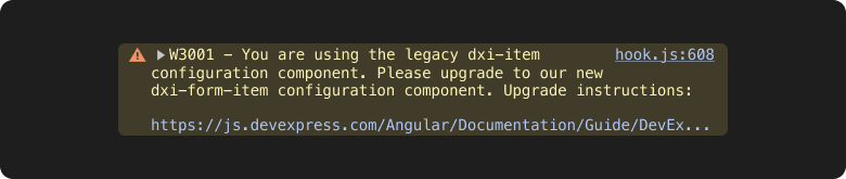
Angular: Automatic Migration to New Configuration Components
With v25.2, we released a new CLI command that helps you seamlessly upgrade your application to our latest Angular configuration components. Unlike the old, generic configuration components, our new components contain only relevant TypeScript types and are specific to each DevExtreme component. For additional information about our new Angular configuration components, refer to the following document: Changes and Future Plans: New Angular Configuration Components.
To get started with our new CLI tool, simply run the following command:
devextreme migrate angular-config-components
The tool detects all old configuration components in your directory and upgrades to the latest, component-specific components. You can run the command on all files within your directory (including TypeScript files if you use inline templates).
The tool also supports dry runs to preview changes and allows you to update your application manually:
devextreme migrate angular-config-components --dry
For additional migration command options, run the following command:
devextreme migrate --help
Note: Starting with v25.2, our generic configuration components throw warnings in the application console. To eliminate these warnings, upgrade your application to our named configuration components.
Angular Version Updates
#Angular 21
Angular 21 was recently released. We've tested this version against our UI components and found no issues.
If you are considering Angular 21 for a current/upcoming project, feel free to share your Angular-specific thoughts/experiences with us.
#Angular 18 — End of Support
Angular 18 recently reached end of support and no longer receives security updates. With v25.2, DevExtreme will only support Angular versions 19+.
DevExtreme Icons — Documentation Library Redesign
We reworked and improved the DevExtreme icon library documentation. The redesigned page allows you to find icons across all our themes using searching and sorting capabilities (implemented via the CardView component).
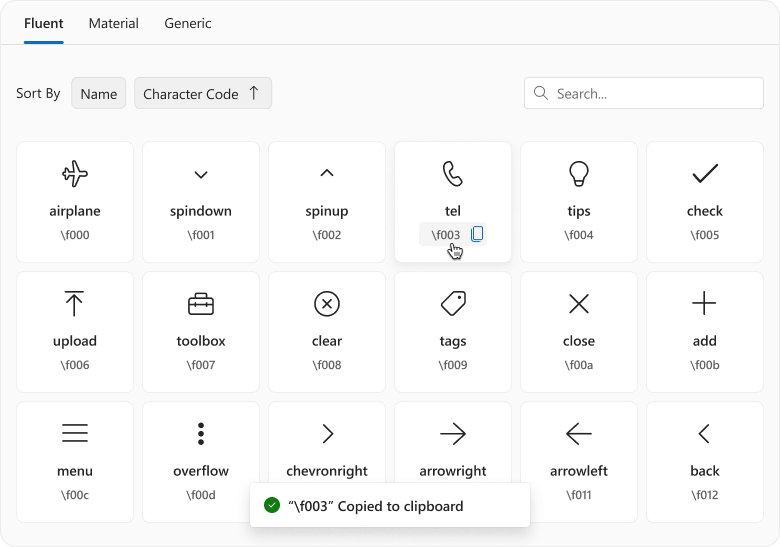
Our Icon Library includes icon names (used in CSS classes, such as "dx-icon-add") and character codes (used in element content, such as "\f00b"). Once you select an icon, you can copy all icon information in one click.
Icon Library
ASP.NET Core
#ASP.NET Core UI Template Gallery
v25.2 ships with our new UI Template Gallery for DevExtreme-based ASP.NET Core UI controls. This UI Template Gallery includes templates for popular SaaS usage scenarios including CRM, dashboard, and analytic-driven apps.
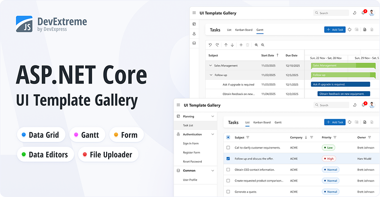
The project is hosted on GitHub. Code is split into folders for controllers, views, models, data processing, utilities, and client-side logic. TypeScript handles client logic, and SCSS covers styles. Navigation runs through a custom router supporting both full- and partial-page updates. Data access relies on Entity Framework Core and SQLite, with user-specific in-memory caches storing demo data.
To run our ASP.NET Core UI Template Gallery, clone its repository and follow installation instructions.
Your feedback matters.
Share your thoughts regarding our ASP.NET Core UI Template Gallery in this short survey.
#.NET 10 Support
DevExtreme-based ASP.NET Core controls now support .NET 10.
#ASP.NET Core Source Builder
With v25.2, the DevExpress Source Builder now supports our DevExtreme-based ASP.NET Core controls.
#ASP.NET Core Rich Text Editor — Scroll API

The DevExpress ASP.NET Core Rich Text Editor allows you to scroll documents programmatically using the following methods:
@{
    var documentContent = System.IO.File.ReadAllBytes(@"C:\Users\Public\example.docx");
}

@(Html.DevExpress().RichEdit("richEdit")
    .Open(documentContent)
)

@(Html.DevExtreme().Button()
    .Text("First page")
    .OnClick("scrollToFirstPage")
)

@(Html.DevExtreme().Button()
    .Text("Footer")
    .OnClick("scrollToFooter")
)

<script>
    var richEdit = RichEdit.get("richEdit");

    function scrollToFirstPage() {
        richEdit.scrollToPage(0);
    }

    function scrollToFooter() {
        var section = richEdit.document.sections.getByIndex(0);
        var footer = section.getFooter();

        if (footer) {
            richEdit.scrollToPosition(0, footer);
        }
    }
</script>
#Web Reporting
v25.2 adds the following enhancements to DevExpress Reports for Web platforms (ASP.NET, Angular, React):
#BI Dashboard

With v25.2, we added the following improvements to the DevExpress BI Dashboard:
Survey - JavaScript & ASP.NET Core
Your Feedback Matters!
Please
login to complete the survey.
Survey Completed
Thank you for taking the time to complete this survey. Your responses have now been posted. If you want to follow up with additional information, feel free to send us an email at clientservices@devexpress.com anytime.
You've Already Completed This Survey
Our records show that you have already completed this survey. If you want to follow up with additional information, send us an email at clientservices@devexpress.com.
This survey has expired
If you want to share your feedback or request new functionality, please submit a new support ticket via the DevExpress Support Center. We’ll be happy to follow up.
Your feedback matters.
Please, review the description of Blazor-related features below and leave your feedback at the end of the section.
Go to the survey now.
.NET 10 Support
DevExpress Blazor UI components support new .NET 10 features.
Visual Studio 2026 Support
DevExpress Blazor UI components fully support Visual Studio 2026.
Content Security Policy (CSP) Enhancements
We improved Content Security Policy (CSP) support across our Blazor component suite. DevExpress Blazor components no longer require the
style-src 'unsafe-inline' directive.
For additional information, refer to the following topic: Content Security Policy.
Project Templates
#JetBrains Rider Support
With v25.2, DevExpress Template Kit is fully integrated into JetBrains Rider. You can create new projects using the same set of DevExpress templates available in Visual Studio and VS Code.
#New Sample Views
To accelerate developer adoption, the DevExpress Template Kit adds sample Blazor component pages to the generated project. Each page includes minimal component configuration, resources, and sample data.
The following DevExpress components are supported:
Performance Enhancements
#Blazor Grid, TreeList & Pivot — Improved Performance with Many Columns
With v25.2, we extended our rendering engine with horizontal virtualization support (in addition to existing vertical virtualization). Column virtualization is now available for DevExpress Blazor Grid, TreeList, and PivotTable UI components. Use it to efficiently handle data sources with hundreds or even thousands of columns.
#Blazor Grid & TreeList — Improved Filter Menu Responsiveness
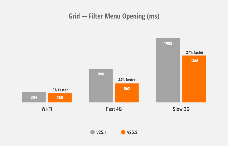
We optimized rendering speed and improved responsiveness for column filter menus used within our Blazor Grid and TreeList components.
#Blazor Ribbon & Toolbar — Faster Popup Opening
DevExpress Blazor Ribbon and Toolbar SubMenus now reuse a single popup instance that initializes on component load. This improves popup activation speed, especially over slower connections.
These optimizations also affect Blazor components that use the DevExpress Blazor Ribbon/Toolbar internally, including the DevExpress Rich Text Editor, HTML Editor, and Scheduler.
#Blazor Scheduler — Resize and Drag & Drop Enhancements
To help improve responsiveness, we optimized our Scheduler's resize/drag & drop engine.
The DevExpress Blazor Scheduler automatically switches to our new client-side mode unless server-side processing is required (when you use template-based appointments or handle server-side events). You can use the AppointmentDragMode property to specify appointment drag/resize operation processing (on client or server).
For client-side processing (AppointmentDragMode is Client), we added a hint that displays appointment start and end times. This change allows the Blazor Scheduler to re-render appointments on the client without server communication.
Demo
#Blazor Filter Builder — Performance Optimizations
We optimized the DevExpress Blazor Filter Builder to handle large data models efficiently. It now supports up to 100,000 fields across multiple hierarchy levels with improved performance.
Accessibility Enhancements
-
Added support for keyboard navigation in both our Pivot Table and Ribbon component. We also improved existing keyboard navigation in our Filter Builder and TagBox.
-
Added an
Alt+Del keyboard shortcut designed to clear values in the Date Edit, Date Range Picker, Memo, Search Box, Spin Edit, Text Box, and Time Edit.
-
Supported relevant accessibility attributes in our Date Edit, Form Layout, Message Box, Time Edit, and Popup components.
-
Improved screen reader support in our Calendar, Color Palette, Time Edit, TagBox, and Popup components.
-
Introduced minimum size requirement for spin buttons used in our Spin Edit component.
New Blazor Smart Autocomplete
We added a Smart Autocomplete option — a new AI-powered Extension designed to accelerate text input. Smart Autocomplete connects to our Blazor Memo and displays gray inline suggestions based on current input. Suggestions appear within the Blazor Memo Editor without interrupting typing flow. Users can accept a suggestion or simply continue typing to dismiss it.
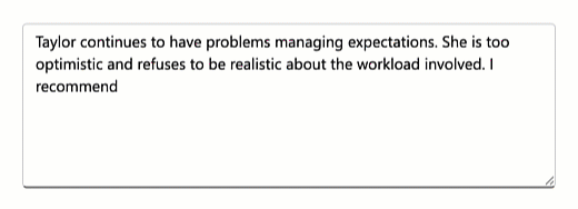
The Smart Autocomplete Extension provides the following API members to help you customize associated behaviors: InputDelay, SuggestionReceived.
<DxMemo @bind-Text=@TextValue>
    <Extensions>
        <MemoSmartAutoComplete InputDelay="1000"
                                  SuggestionReceived="@OnSuggestionReceived" />
    </Extensions>
</DxMemo>

@code {
    string TextValue { get; set; } =
    "Taylor continues to have problems managing expectations. " +
    "She is too optimistic and refuses to be realistic about the workload involved. " +
    "I recommend";

    void OnSuggestionReceived(MemoSmartAutoCompleteSuggestionReceivedEventArgs e) {
        // Handle suggestions
    }
}
Demo
Blazor AI Chat
#Tool Calling API
AI tool calling connects Blazor application logic with natural language input. DevExpress Blazor AI Chat can invoke methods annotated with metadata (called AI tools) to execute any action in the UI or business logic. The AI service automatically resolves a relevant function at runtime based on chat context.
We've added an AI tool calling layer that extends capabilities found in Microsoft.Extensions.AI:
- Target-aware tools: Tools can operate on specific object instances (UI controls, pages, data services, business objects). The API automatically resolves target objects at runtime based on context and descriptions.
- Flexible tool contexts: Tools can be grouped into contexts that can be enabled, disabled, or removed dynamically based on application state or user workflow.
- Seamless integration with the AI Chat Control: The DevExpress Blazor AI Chat Control discovers and merges
tools from all registered contexts and manages tool selection, target resolution, parameter binding, and invocation.
The following code snippet registers DevExpress AI services, defines a contextual AI tool, and integrates an AI tool calling pipeline into an application:
@using DevExpress.AIIntegration.Blazor.Chat
@using DevExpress.AIIntegration.Tools
@inject AIToolsContextContainer container

<DxAIChat />
<DxGrid @ref="grid">
    <!-- ... -->
</DxGrid>

@code {
    DxGrid grid;
    AIToolsContext context;

    protected override void OnAfterRender(bool firstRender) {
        if (firstRender) {
            context = new AIToolsContextBuilder()
                .WithToolMethods(ExpandGroups)
                .Build();
            container.Add(context);
        }
    }
}
using DevExpress.AIIntegration;

/* ... */

[AIIntegrationTool("GridControl_ExpandGroups")]
[Description("Expands all group rows in the grid.")]
public static string ExpandGroups(
    [AIIntegrationToolTarget("The grid with collapsed group rows.")]
    GridControl target_grid
) {
    if (target_grid.GroupCount == 0) return "No grouped rows found.";
    target_grid.ExpandAllGroups();
    return "All groups are expanded.";
}
using Azure.AI.OpenAI;
using DevExpress.AIIntegration;
using Microsoft.Extensions.AI;

// Create Azure OpenAI client
AzureOpenAIClient azureOpenAIClient = new(
      new Uri(azureOpenAiEndpoint),
      new ApiKeyCredential(azureOpenAiKey)
);
IChatClient azureOpenAIChatClient = azureOpenAIClient.GetChatClient(azureOpenAiModel).AsIChatClient();
// Register scoped chat client with DevExpress AI tool calling
builder.Services.AddScoped((sp) => {
    return azureOpenAIChatClient.AsBuilder()
                                .UseDXTools()            // DevExpress AI tool calling
                                .UseFunctionInvocation() // Microsoft.Extensions.AI function invocation
                                .Build(sp);
});
// Register DevExpress AI services
builder.Services.AddDevExpressAI();

Demo
#Tool Call Visualization
DevExpress Blazor AI Chat messages now include information about all AI functions invoked in response to a user's message. Use this information to build custom message templates or use the predefined template to test/debug AI tool calling during development.
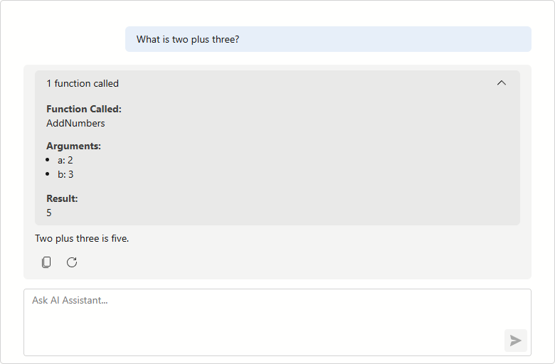
Demo
#Resources
The DevExpress Blazor AI Chat component allows users to attach additional context to chat messages. Resources can include binary files (images, audio, PDFs, documents) and non-file artifacts such as database schemas, structured records, or logs. You can also supply external content retrieved from a Model Context Protocol (MCP) server as a resource.
Use the Resources collection to add or manage resources programmatically.
Resources help the AI model generate more precise answers without fine-tuning and reduce hallucinations.
Demo
#Clear Chat History
DevExpress Blazor AI Chat now displays a customizable chat header and a Clear Chat button (removes all messages from the conversation history, except for system messages).
<DxAIChat ShowHeader="true"
          HeaderText="Chat with AI Assistant" />
#Multiple AI Chat Providers
The DevExpress Blazor AI Chat component can be bound to a specific AI service at runtime. You can allow users to select an AI model or programmatically specify the most suitable model for the current task. For instance, you can use a powerful "thinking" model for complex queries and a faster, more cost-effective model for simpler interactions.
To add multiple services, register each AI model with a unique string key:
// Azure OpenAI client
AzureOpenAIClient azureOpenAIClient = new(
        new Uri(azureOpenAiEndpoint),
        new ApiKeyCredential(azureOpenAiKey)
);
IChatClient azureOpenAIChatClient = azureOpenAIClient.GetChatClient(azureOpenAiModel)
                                                        .AsIChatClient();
// Ollama client
IChatClient ollamaChatClient = new OllamaApiClient("http://localhost:11434", aiModel);
// Register keyed AI services
builder.Services.AddKeyedChatClient("AzureOpenAI", azureOpenAIChatClient);
builder.Services.AddKeyedChatClient("Ollama", ollamaChatClient);
Once registered, use the ChatClientServiceKey property to bind a service to our Blazor AI Chat:
<DxComboBox Data="chatClients"
            TextFieldName="Value"
            ValueFieldName="Key"
            @bind-Value="chatClientServiceKey" />

<DxAIChat ChatClientServiceKey="@chatClientServiceKey" />

@code {
    Dictionary<string, string> chatClients = new()
    {
        { "AzureOpenAI", "Cloud" },
        { "Ollama", "Local" }
    };
    string chatClientServiceKey = "";
    protected override void OnInitialized()
    {
        chatClientServiceKey = chatClients.First().Key;
        base.OnInitialized();
    }
}
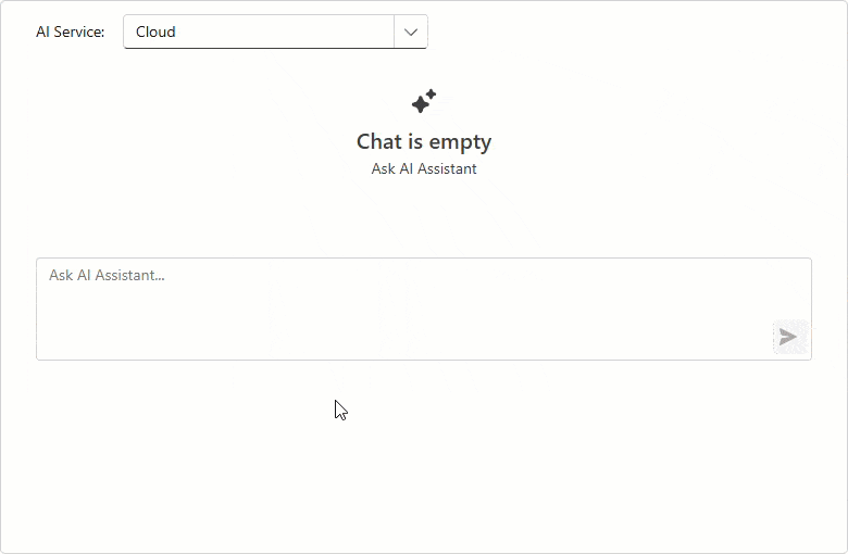
#Send Prompt Suggestion on Click
DevExpress Blazor AI Chat automatically inserts a selected prompt suggestion into the chat prompt box so users can edit it before sending. Activate our new SendOnClick property to send prompt suggestions to the server immediately (once clicked) and accelerate conversation flow.
<DxAIChat>
    <PromptSuggestions>
        <DxAIChatPromptSuggestion Title="Tell me a joke"
                                  Text="Take a break and enjoy a quick laugh"
                                  PromptMessage="Tell me a joke about AI."
                                  SendOnClick="true" />
        <DxAIChatPromptSuggestion Title="Summarize text"
                                  Text="Extract a quick summary (main ideas)"
                                  PromptMessage="Summarize the following text:"
                                  SendOnClick="false" />
    </PromptSuggestions>
</DxAIChat>
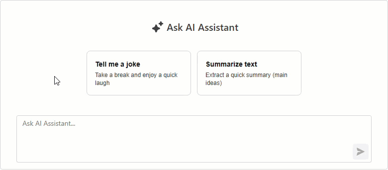
#Resizable Input Box
The Blazor AI Chat input box automatically resizes itself as a user types.
Enable the new AllowResizeInput property to drag the topmost edge of the chat input box: up for additional space, down to display more chat history.
<style>
    .my-ai-chat {
        width: 100%;
        height: 400px;
    }
</style>

<DxAIChat
    CssClass="my-ai-chat"
    AllowResizeInput="true" />
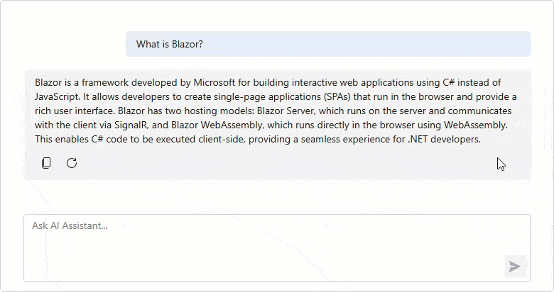
Blazor AI Extensions
#AI Toolbar Item Text
You can now rename Blazor Rich Text Editor and HTML Editor AI toolbar items:
<DxRichEdit>
    <Extensions>
        <SummarizeAIContextMenuItem Text="Σύνοψη" />
    </Extensions>
</DxRichEdit>
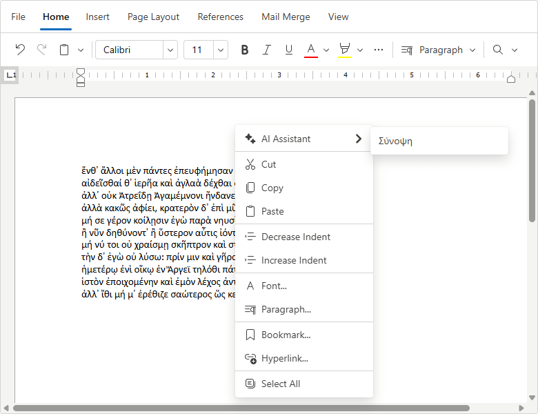
#AI Toolbar Prompt Augmentation
DevExpress AI-powered extensions for the Blazor Rich Text Editor and HTML Editor include pre-built prompts for selected text processing. Using the PromptAugmentation property, you can now add custom instructions to default prompts and enhance AI response relevance/accuracy.
<DxRichEdit>
    <Extensions>
        <SummarizeAIContextMenuItem
            PromptAugmentation="Summarize the text as a humorous limerick." />
    </Extensions>
</DxRichEdit>
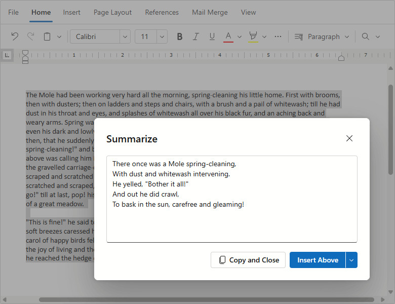
Blazor Grid & TreeList
#Column Virtualization
DevExpress Blazor Grid and TreeList UI components now support column virtualization. Once this feature enabled, the DevExpress Grid and TreeList only render columns within the current viewport. This reduces DOM size and improves component load time.
You can virtualize both rows and columns simultaneously to ensure fast rendering regardless of table size. Users can navigate through cells using horizontal/vertical scroll bars or keyboard shortcuts.
<DxGrid Data="LargeDataSource"
        VirtualScrollingEnabled="true"
        VirtualScrollingMode="GridVirtualScrollingMode.RowsAndColumns">
    @* ... *@
</DxGrid>
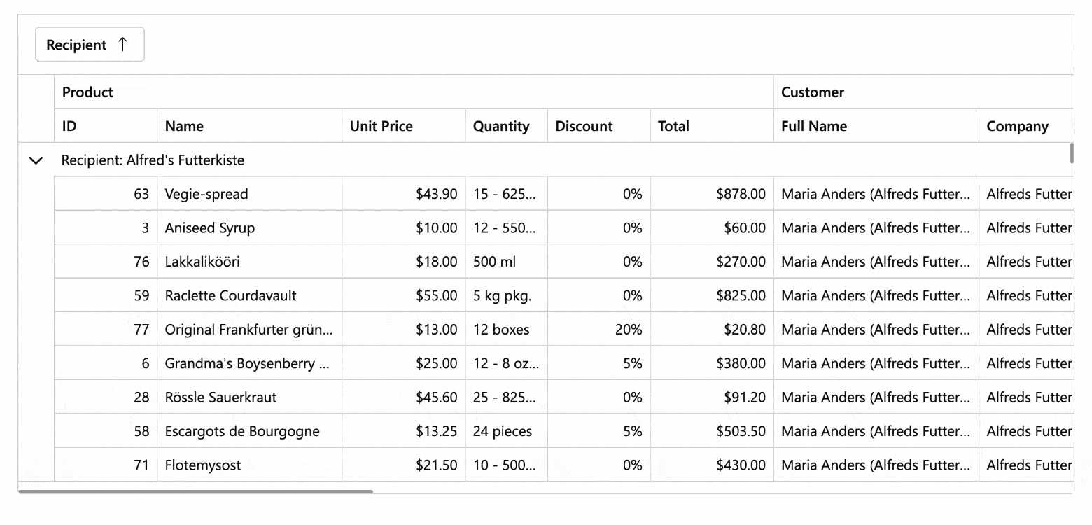
Demo: GridDemo: TreeList
#Context Menu
Both our Blazor Grid and TreeList include an integrated Context Menu. Users can right-click the following regions to access context-specific commands:
- Data Row
- Group Row
- Column Header
- Footer
- Group Panel
- Group Footer
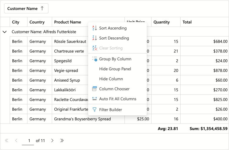
Demo: GridDemo: TreeList
Use the ContextMenus property to enable Context Menu functionality for desired elements.
Predefined Commands
- Auto Fit Columns
- Display/Hide Group Panel
- Expand/Collapse
- Group/Ungroup
- Hide Column
- Open Column Chooser Dialog
- Open Filter Builder Dialog
- Sort Ascending/Sort Descending/Clear Sorting
Item Customization
Handle the CustomizeContextMenu event to customize the menu as requirements dictate:
- Modify predefined items: Change item state, visibility, and appearance.
- Add custom items: Introduce your own commands and actions.
- Customize context menu per element: Example - hide sort commands for a specific column.
The following code snippet hides built-in grouping commands for the Category column and adds custom Fix/Unfix commands for the selection column:
void CustomizeContextMenu(GridCustomizeContextMenuEventArgs args) {
    if (args.Context is GridHeaderCommandContext headerContext) {
        // Customizes context menu commands for the Category column header
        if (headerContext.Column is IGridDataColumn dataColumn && dataColumn.FieldName == "Category") {
            args.Items.Remove(GridContextMenuDefaultItemNames.GroupByColumn);
            args.Items.Remove(GridContextMenuDefaultItemNames.UngroupColumn);
        }
        // Customizes context menu commands for the selection column header
        if (headerContext.Column is IGridSelectionColumn selectionColumn) {
            var isFixed = selectionColumn.FixedPosition != GridColumnFixedPosition.None;
            string itemText = isFixed ? "Unfix Column" : "Fix Column to the Left";
            var newValue = isFixed ? GridColumnFixedPosition.None : GridColumnFixedPosition.Left;

            args.Items.AddCustomItem(itemText, () => {
                headerContext.Grid.BeginUpdate();
                headerContext.Column.FixedPosition = newValue;
                headerContext.Grid.EndUpdate();
            });
        }
    }
}
#Integrated Filter Builder
Users can now create complex filter criteria for the DevExpress Blazor Grid and TreeList using a built-in Filter Builder dialog. Our Grid and TreeList components automatically generate Filter Builder fields based on data columns (no additional code is required). Call the ShowFilterBuilder method to open the Filter Builder dialog from code. Alternatively, users can activate this dialog via the Filter Panel.
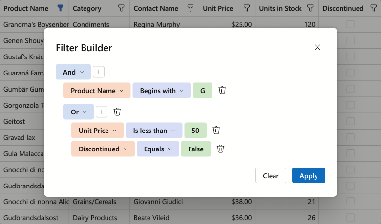
Use the FilterBuilderTemplate to customize the dialog. The template's RenderDefaultFields method allows you to reuse auto-generated fields within your custom Filter Builder control. The following code snippet adds additional filter fields to the Filter Builder dialog:
<FilterBuilderTemplate>
    <DxFilterBuilder @bind-FilterCriteria="context.FilterCriteria">
        <Fields>
            @context.RenderDefaultFields() @* adds auto-generated fields *@
            <DxFilterBuilderField FieldName="ShipCountry" Caption="Country">
                <EditSettings>
                    <DxComboBoxSettings Data="ShipCountries" />
                </EditSettings>
            </DxFilterBuilderField>
            <DxFilterBuilderField FieldName="ShipCity" Caption="City" />
        </Fields>
    </DxFilterBuilder>
</FilterBuilderTemplate>
Demo: GridDemo: TreeList
#Filter Panel
Both DevExpress Blazor Grid and TreeList ship with an integrated Filter Panel. This panel displays the current filter criteria and allows users to:
- Temporarily deactivate the filter
- Open the Filter Builder dialog
- Clear the current filter condition
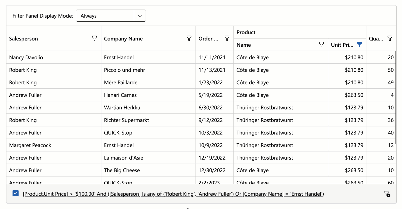
Use the FilterPanelDisplayMode property to add this panel to our Blazor Grid or TreeList component.
Demo: GridDemo: TreeList
#Command Column Icons
With v25.2, the DevExpress Blazor Grid and TreeList display built-in icons for command actions by default. This change reduces column width and produces a cleaner, more modern appearance.
To display captions for command buttons, set the command column's new DisplayMode property to Text or IconsAndText.
#Data Export — Preserve Hierarchy for Selected Rows
When exporting DevExpress Blazor Grid or TreeList data, you can activate the ExportSelectedRowsOnly option and export selected records as flat data. Use our new SelectedRowsExportMode option to preserve selected row hierarchy (export selected records along with parent rows).
The following code snippet exports selected Grid records and corresponding group rows to PDF:
await Grid.ExportToPdfAsync("ExportResult", new GridPdfExportOptions() {
    ExportSelectedRowsOnly = true,
    SelectedRowsExportMode = GridSelectedRowsExportMode.KeepGrouping
});
#New Scrolling API
New MakeCellVisible and MakeCellVisibleAsync methods allow you to navigate to a specific cell when paging or scrolling is enabled.
Blazor Filter Builder
#Official Release
Our Blazor Filter Builder is now ready for production use. We finalized APIs/behaviors and implemented the following new features and enhancements.
#Text Mode for Filter Expressions
The DevExpress Blazor Filter Builder supports text mode for filter expressions. You can use this mode to:
- Copy and paste filter criteria.
- Create flexible conditions incompatible with a tree structure.
- Validate filter syntax and troubleshoot expression errors in real time.
Set the ViewMode property to VisualAndText to activate text mode.
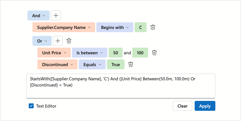
Demo
#Collection Field and Aggregate Function Support
The DevExpress Blazor Filter Builder supports aggregate operators for fields that store object collections. Available functions include:
These functions calculate collection summaries and allow users to create filter conditions based on aggregated results. For instance, users can filter invoices with fewer than 5 items in the Products field. Set the DxFilterBuilderField.IsCollection property to true to create a collection field.
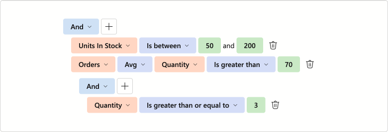
Demo
#Filter Operator UI Enhancements
We finalized available filter operators (for each data type) and implemented the following operator list enhancements:
- A separate Date Ranges operator group for
DateTime and DateOnly field types - Case-insensitive search option
- Icon support
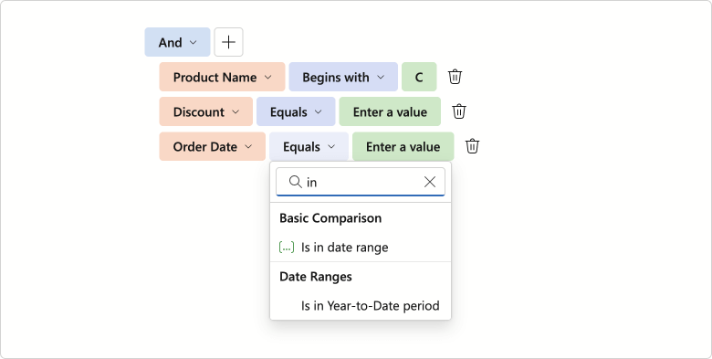
#Keyboard Navigation and Accessibility Support
We added full keyboard navigation support to the DevExpress Blazor Filter Builder UI component. You can navigate between condition rows and individual items, access drop-down lists/value editors without using a mouse. This enhancement improves accessibility and streamlines user workflows, especially for keyboard-centric business solutions.
Documentation
#Operator Customization
v25.2 ships with customization options for operators in the DevExpress Blazor Filter Builder. You can now limit available logical operators using the GroupOperatorTypes property.
<DxFilterBuilder GroupOperatorTypes=@(FilterBuilderGroupOperatorType.And |
                                      FilterBuilderGroupOperatorType.Or)>
    @* ...*@
</DxFilterBuilder>
Our implementation allows you to customize filter operators. Handle the CustomizeOperators event to:
- Manage built-in operator collections
- Add custom criteria functions
- Arrange operators into groups
- Change default operators
- Customize operator captions and icons
- Razor
- CustomFunction.cs
- Program.cs
<DxFilterBuilder CustomizeOperators="CustomizeOperators">
    <Fields>
        <DxFilterBuilderField FieldName="Subject" Caption="Name" Type="@typeof(string)" />
        <DxFilterBuilderField FieldName="CreatedDate" Caption="Created Date" Type="@typeof(DateTime)" />
        <DxFilterBuilderField FieldName="Amount" Caption="Amount" Type="@typeof(int)"/>
        <DxFilterBuilderField FieldName="Discontinued" Type="@typeof(bool)"/>
    </Fields>
</DxFilterBuilder>

@code {
    void CustomizeOperators(FilterBuilderCustomizeOperatorsEventArgs args) {
        if(args.FieldName == "Amount") {
            args.Operators.Clear();
            args.Operators.Add(new FilterBuilderOperatorItem(FilterBuilderOperatorType.Equals));
            args.Operators.Add(new FilterBuilderOperatorItem(FilterBuilderOperatorType.Greater));
            args.Operators.Add(new FilterBuilderOperatorItem(FilterBuilderOperatorType.Less));
            args.DefaultOperator = args.Operators[FilterBuilderOperatorType.Less];
            args.ShowGroups = true;
        }
        if(args.FieldType == typeof(DateTime)) {
            FilterBuilderOperatorItem thisMonthOperator = args.Operators[FilterBuilderOperatorType.IsThisMonth];
            thisMonthOperator.Caption = "Falls in this month";

            var customItem = new FilterBuilderOperatorItem(IsEarlierThisMonth.Instance.Name) {
                GroupName = "Custom functions"
            };
            args.Operators.Add(customItem);
        }
    }
}
using DevExpress.Data.Filtering;

class IsEarlierThisMonth : ICustomFunctionOperator, ICustomFunctionDisplayAttributes {
    public static IsEarlierThisMonth Instance { get; } = new IsEarlierThisMonth();

    public static void Register() => CriteriaOperator.RegisterCustomFunction(Instance);
    public static bool Unregister() => CriteriaOperator.UnregisterCustomFunction(Instance);

    private IsEarlierThisMonth() { }

    public string Name => nameof(IsEarlierThisMonth);
    public string DisplayName => "Is earlier this month";
    public object Image => null;
    public int MinOperandCount => 1;
    public int MaxOperandCount => -1;
    public string Description => "Function description";
    public FunctionCategory Category => FunctionCategory.DateTime;

    public object Evaluate(params object[] operands) {
        DateTime dateTime;
        if(operands[0] is DateOnly dateOnly)
            dateTime = dateOnly.ToDateTime(TimeOnly.MinValue);
        else
            dateTime = Convert.ToDateTime(operands[0]);
        DateTime today = DateTime.Today;
        DateTime startOfMonth = new DateTime(today.Year, today.Month, 1);
        return dateTime >= startOfMonth && dateTime < today;
    }

    public bool IsValidOperandCount(int count) => count == 1;

    public bool IsValidOperandType(int operandIndex, int operandCount, Type type) => type == typeof(DateTime) || type == typeof(DateOnly);

    public Type ResultType(params Type[] operands) => typeof(bool);

}
// ...
IsEarlierThisMonth.Register();
// ...
app.Run();
Documentation
Demo
#Value Templates
The DevExpress Blazor Filter Builder allows you to specify templates used for field values:
Templates implement a context parameter that includes DisplayText and Value properties.
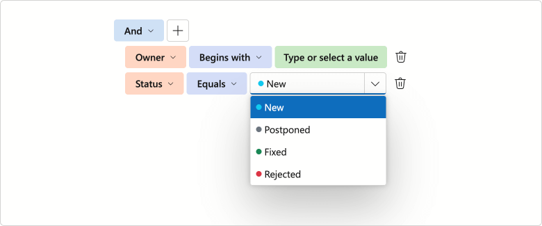
Demo
Blazor HTML Editor
#Updated Toolbar UI
The DevExpress Blazor HTML Editor now uses our Ribbon component for its built-in toolbar. While existing toolbar customization APIs remain unchanged, the Ribbon delivers improved visuals, a more compact layout, and new adaptive priority settings. In addition, the HTML Editor toolbar now displays colored icons when using Fluent themes.
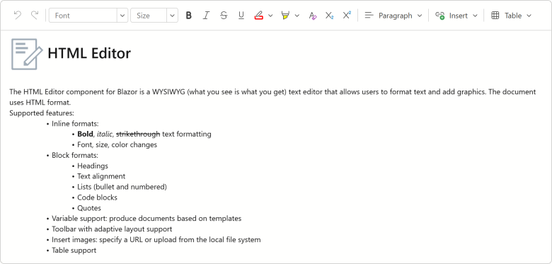
Blazor Data Editors
#Value Changing Events
We added new *Changing events for the following DevExpress Blazor Data Editors.
| Data Editor | New Events |
| ComboBox | TextChanging, ValueChanging |
| DateEdit | DateChanging |
| Drop-Down Box | ValueChanging |
| List Box | ValuesChanging |
| Masked Input | ValueChanging |
| Memo | TextChanging |
| Search Box | TextChanging |
| SpinEdit | TextChanging |
| TagBox | TagsChanging, ValuesChanging |
| Text Box | TextChanging |
These events allow you to validate/cancel user changes before they are applied to editor values.
The following code handles the DateChanging event to prevent weekend day selection in the DateEdit component. If a user tries to select Saturday or Sunday, the Date Edit's value remains unchanged.
<DxDateEdit @bind-Date="@CurrentDate"
            DateChanging="@OnDateChanging" />

@code {
    DateTime CurrentDate { get; set; } = DateTime.Today;

    void OnDateChanging(ParameterValueChangingEventArgs<DateTime> e) {
        if (e.NewValue.DayOfWeek == DayOfWeek.Saturday ||
            e.NewValue.DayOfWeek == DayOfWeek.Sunday) {
            e.NewValue = e.OldValue;
        }
    }
}
#Memo — Adaptive Height Support
The DevExpress Blazor Memo can now automatically adjust height based on content:
-
In Auto mode, Memo height changes dynamically to match content.
-
The MaxRows property allows you to specify maximum component height (applies in
Auto, Vertical, and VerticalAndHorizontal resize modes). When content exceeds this limit, a vertical scrollbar appears on-screen.
<DxMemo @bind-Text="@TextValue"
        ResizeMode="MemoResizeMode.Auto"
        MaxRows="8">
</DxMemo>
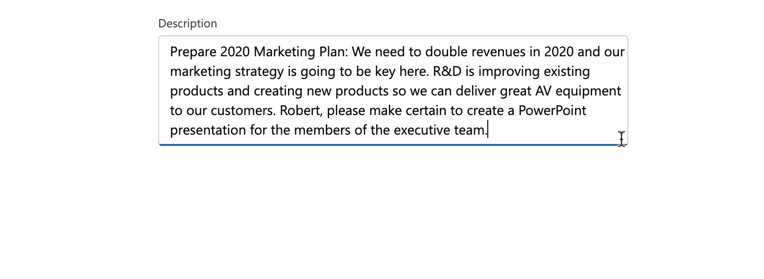
Demo
#Spin Editor — Spin Button Orientation
You can now switch between horizontal and vertical orientations for DevExpress Blazor Spin Editor increment/decrement buttons. Horizontal orientation places spin buttons side by side (improves accessibility), while vertical orientation stacks them on top of each other (more compact).
<DxSpinEdit Value="15" ShowSpinButtons="false">
    <Buttons>
        <DxSpinButtons Orientation="Orientation.Horizontal"/>
    </Buttons>
</DxSpinEdit>

If the Orientation property is not specified, the Spin Edit automatically arranges buttons based on device type: horizontally on mobile and tablet devices, and vertically on other devices.
#TagBox — Keyboard Navigation Enhancements
The DevExpress Blazor TagBox now supports keyboard navigation for tags. Users can use Arrow keys to navigate through tags, and Backspace/Delete to remove them.
Demo
#Date Edit & Time Edit — Time Selection UI Redesign
We reworked the drop-down menu used for DevExpress Blazor Date Edit and Time Edit components as follows:
- Restyled and repositioned Accept and Cancel buttons (to make them more noticeable).
- Removed the Clear button from the drop down. To clear editor values, use our new Alt+Del shortcut or click the corresponding button in the input element.
You can enable the ApplyValueOnOutsideClick option to remove Accept and Cancel buttons from the drop down. Date Edit and Time Edit components will update bound values once a user clicks outside a component's boundaries.
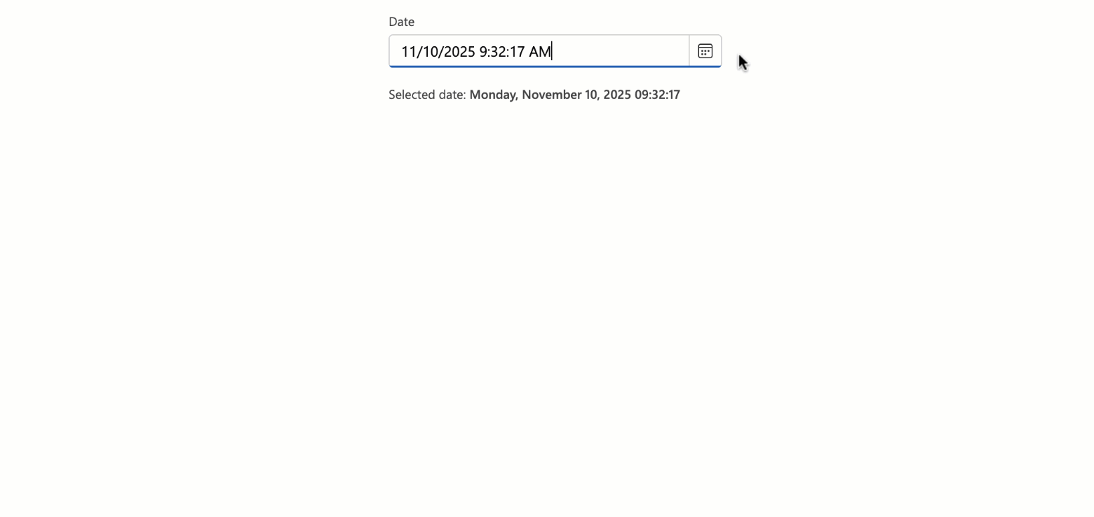
Blazor Navigation
#Maximum Dropdown Height
You can specify maximum dropdown height for DevExpress Blazor Context Menu, Menu, and Toolbar components. When menu/drop-down content exceeds DropDownMaxHeight, a scrollbar appears to ensure all items remain accessible. If total height is less than the DropDownMaxHeight, this property will not have a visible effect.
<DxMenu DropDownMaxHeight="100px">
    <Items>
        <DxMenuItem Text="Products" Expanded="true">
            <Items>
                <DxMenuItem Text="JS / TS" />
                <DxMenuItem Text="Blazor" />
                <DxMenuItem Text="ASP.NET Core" />
                <DxMenuItem Text="ASP.NET Web Forms" />
                <DxMenuItem Text="ASP.NET MVC" />
                <DxMenuItem Text="Bootstrap Web Forms" />
                <DxMenuItem Text="Web Reporting" />
            </Items>
        </DxMenuItem>
    </Items>
</DxMenu>
Blazor Pivot Table
#Official Release
The DevExpress Blazor Pivot Table is now ready for production use. Our Pivot Table includes the following key features and capabilities:
- High-performance data engine for efficient data processing.
- Data sorting and grouping support.
- Configurable totals and grand totals with flexible positioning.
- Built-in horizontal/vertical scroll bars with sticky Column Field Headers and Row Field Headers areas.
- Virtual scrolling support for both rows and columns.
- Value formatting with integrated templates.
- Full keyboard navigation support.
- Customizable field values and data cell appearance.
Pivot Table RTM version release also means that our previously-available Pivot Grid component is now in maintenance mode. We do not work on new Pivot Grid functionality and plan to remove this component from our distribution in v26.2. We recommend that you migrate to the new Pivot Table. Refer to our Migration Guide for guidance.
Documentation
Demo
#Column Virtualization
Our Blazor Pivot Table supports both row and column virtualization. The new column virtualization feature improves performance when the Pivot Table displays a large number of columns (for instance, when displaying one column per day across an entire year). The component now renders only visible columns, reducing DOM size and improving responsiveness. We also performed extensive internal testing to verify performance and stability in high-density scenarios.
The new VirtualScrollingMode property allows you to specify whether to use row virtualization, column virtualization, or both.
<DxPivotTable Data="SalesData"
              VirtualScrollingEnabled="true"
              VirtualScrollingMode="PivotTableVirtualScrollingMode.Horizontal">
    <Fields>
        @*...*@
    </Fields>
</DxPivotTable>
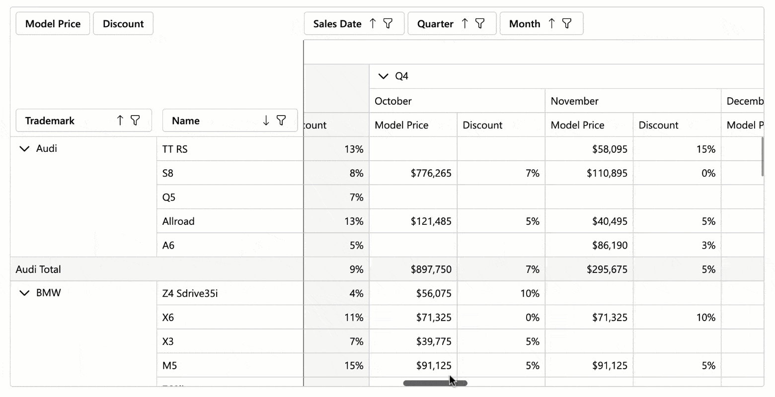
Demo
#Keyboard Navigation
The DevExpress Blazor Pivot Table allows users to access UI elements within the following UI regions using the keyboard:
- Filter Area
- Data Field Headers
- Column Headers
- Row Headers
- Column Field Values
- Row Field Values
- Row Field Values, Data Area, Column Totals, Grand Column Totals, Row Totals
- Row Grand Totals
Supported shortcuts:
Ctrl+Arrow Up/Arrow Down — Move between navigation areas.Arrow keys or Tab/Shift+Tab — Navigate between elements and cells.Home/End — Move to the first/last cell in a row or navigation area.Alt+Arrow keys, Enter — Expand/collapse groups.Shift + scroll wheel — Scroll horizontally.Space — Toggle sort order for a focused field header.Alt + Arrow Down — Open the filter drop-down menu for a focused field header.Enter — Expand/Collapse a focused group.
Demo
Blazor Ribbon
#Official Release
The DevExpress Blazor Ribbon component is now ready for production use. Version 25.2 ships with expanded APIs, improved UI/UX, adaptive layout, and enhanced accessibility.
#Improved UI/UX
Our Blazor Ribbon was redesigned for cleaner visuals, higher contrast, and faster command discovery. New APIs allow you to customize Ribbon appearance as requirements dictate:
- Visually emphasize Ribbon buttons using the
IsPrimary attribute. - Apply custom CSS classes to the Ribbon application tab, buttons, and drop-down menus.
- Limit the maximum height of Ribbon drop-down menus. A scrollbar appears if menu content exceeds the specified value.
Demo
#Toggle Buttons
The new DevExpress Blazor Ribbon DxRibbonToggleItem component adds a button with a persistent selection state. Use it for option buttons that remain active until deactivated.
Combine multiple Toggle Buttons into a Toggle Group and ensure only one button is selected at any one point in time.
<DxRibbon>
    <DxRibbonTab Text="Home">
        <DxRibbonGroup>
            <DxRibbonToggleItem Text="Bold"
                                IconCssClass="dx-icon-bold" />
            <DxRibbonToggleItem Text="Italic"
                                IconCssClass="dx-icon-italic" />
            <DxRibbonToggleItem Text="Underline"
                                IconCssClass="dx-icon-underline" />
        </DxRibbonGroup>
        <DxRibbonGroup>
            <DxRibbonToggleGroup>
                <DxRibbonToggleItem Text="Left"
                                    IconCssClass="dx-icon-alignleft" />
                <DxRibbonToggleItem Text="Center"
                                    IconCssClass="dx-icon-aligncenter" />
                <DxRibbonToggleItem Text="Right"
                                    IconCssClass="dx-icon-alignright" />
            </DxRibbonToggleGroup>
        </DxRibbonGroup>
    </DxRibbonTab>
</DxRibbon>
#Adaptive Layout
DevExpress Blazor Ribbon automatically adapts to available screen space:
- Hides lower-priority details (such as button captions).
- Collapses groups into drop-down menus.
- Moves excess items into structured overflow menus.
The Ribbon offers two adaptivity modes: single overflow menu (collapses all items and groups into one structured menu) and per-group overflow menus (each group uses its own menu). Select a mode using AdaptivityAutoCollapseItemsToGroups.
You can also configure item relative priority so that essential commands remain visible even on narrow screens.
Demo
#Accessibility & Keyboard Navigation
DevExpress Blazor Ribbon offers full keyboard navigation across tabs, groups, and items. Keyboard shortcuts allow users who cannot use a mouse or rely on assistive technologies (like screen readers or switch devices) to interact with application content:
Tab moves focus to the next/previous Ribbon element.Arrow keys move focus between Ribbon elements and open/close drop-down menus.Enter or Space clicks the focused Ribbon item.Home/End focuses the first/last item.Esc closes drop-down menus.
You can also assign HTML and ARIA attributes (roles, states, labels) to Ribbon controls to improve screen reader output and strengthen accessibility compliance.
#API Enhancements
Demo: Toolbar ModeDemo: Custom Application Menu
#Rich Text Editor and HTML Editor Integration
The DevExpress Rich Text Editor and HTML Editor now use our new Ribbon to unify APIs, simplify configuration, and deliver a consistent appearance.
Blazor Rich Text Editor
#Scroll API
The DevExpress Blazor Rich Text Editor allows you to scroll documents programmatically using the following methods:
- ScrollToPageAsync — Scrolls the document to the specified page.
- ScrollToPositionAsync — Scrolls the view to the specified position in the main sub-document or in headers/footers (using optional parameters).
<DxRichEdit @bind-DocumentContent="@documentContent" @ref="richEdit" />

<DxButton Text="First page" Click="@ScrollToFirstPage" />
<DxButton Text="Footer" Click="@ScrollToFooter" />

@code {
    DxRichEdit richEdit;
    byte[] documentContent;
    string filePath = "C:\\Users\\Public\\example.docx";

    protected override async Task OnInitializedAsync() {
        documentContent = await File.ReadAllBytesAsync(filePath);
        await base.OnInitializedAsync();
    }

    async Task ScrollToFirstPage() {
        await richEdit.ScrollToPageAsync(0);
    }
    async Task ScrollToFooter() {
        Section section = await richEdit.DocumentAPI.Sections.GetAsync(0);
        SubDocument footer = await section.GetFooterAsync();
        if (footer != null)
            await richEdit.ScrollToPositionAsync(0, footer);
    }
}
#Updated Ribbon UI
The DevExpress Blazor Rich Text Editor now uses our Ribbon component to display built-in commands. While existing customization APIs remain unchanged, the new Ribbon delivers improved visuals, a more compact layout, and adaptive priority settings for items and groups. In addition, the Rich Text Editor Ribbon now displays colored icons when using Fluent themes.
Blazor Scheduler
#Timeline & Month Views — Compact Cell Size
Our Blazor Scheduler calculates cell height based on the number of appointments and associated size. We also removed the minimum height requirement (160px in Fluent; 150px in classic themes). This change allows you to create more compact interfaces and maximize on-screen information display.
You can use the following properties to modify cell size based on design requirements:
- CellMinHeight: Specifies minimum cell height.
- LastAppointmentIndent: Specifies indent from the last appointment to the cell border.
- ResourceCaptionOrientation: Specifies resource caption arrangement (vertically or horizontally) when appointments are grouped.
- VerticalResourceCellWidth: Specifies resource cell width for horizontally aligned resource captions.
<DxScheduler @bind-StartDate="@StartDate"
             DataStorage="@DataStorage"
             GroupType="SchedulerGroupType.Date">
    <DxSchedulerTimelineView Duration="@TimeSpan.FromHours(48)"
                             CellMinHeight="50"
                             LastAppointmentIndent="3"
                             ResourceCaptionOrientation="Orientation.Horizontal"
                             VerticalResourceCellWidth="120">
        <Scales>
            <DxSchedulerTimeScale Unit="@SchedulerTimeScaleUnit.Day" UnitCount="1" />
        </Scales>
    </DxSchedulerTimelineView>
</DxScheduler>
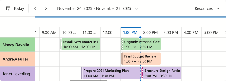
#Time Cells & Appointment Hover Effect
We added a new effect indicating that a hovered cell is interactive:
- For an empty area, the hover effect suggests to create a new appointment.
- For existing appointments, the hover effect signals that the item can be edited or resized.
If you disable appointment generation or editing, hover will not appear on-screen.
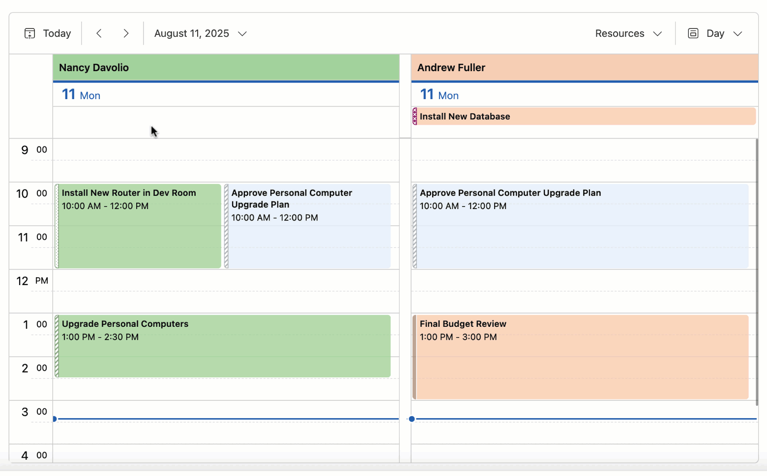
#Appointment Tooltip & Edit Form Layout Changes
We reworked the design of Blazor Scheduler popup elements (tooltip and compact/extended edit form) as follows:
- Introduced dedicated captions for tooltips and creating/editing appointments.
- Replaced solid fill in element headers with less colorful alternatives.
- Redesigned Save, Discard, and Expand buttons in edit forms.
- Removed the Close button tooltip.
- Removed the Resource field placeholder from the edit form.
These changes improve visual structure, reduce unnecessary spacing, and contribute to a cleaner, more consistent UI.
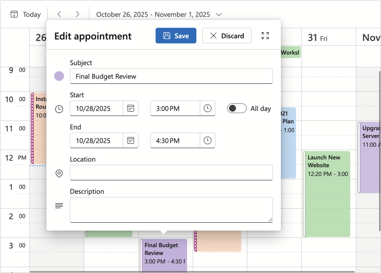
#Recurring Appointment Dialogs — Option Button Redesign
We replaced buttons with a radio group for our Blazor Edit/Delete Recurring Appointment dialogs (improved user experience/design).

Blazor Themes
#Design System Documentation
We documented DevExpress Design System foundations in our v25.2 release cycle. Design System documentation covers key styling principles behind our Fluent themes, including design tokens, their semantic roles, and how they map to UI elements. Blazor Fluent themes implement these tokens (via CSS variables) to apply color, typography, and spacing styles.
Documentation
#Fluent — Public CSS Variables
We finalized CSS variables available in Fluent. You can now use --dxds-* variables to customize Fluent themes or simply reference these variables in your own stylesheets.
<style>
    .my-card {
        position: relative;
        display: flex;
        flex-direction: column;
        min-width: 0;
        overflow-wrap: break-word;
        background-color: var(--dxds-color-surface-neutral-default-rest);
        background-clip: border-box;
        border: var(--dxds-border-width-10) solid var(--dxds-color-border-neutral-default-rest);
        border-radius: var(--dxds-border-radius-40);
    }
</style>
Documentation
#Fluent — Bootstrap Styles
Fluent themes now ship with optional Bootstrap styles for the default color accent (blue) in both light and dark modes. You can include Bootstrap styles as follows:
@DxResourceManager.RegisterTheme(Themes.Fluent.Clone(properties => {
    properties.UseBootstrapStyles = true;
}))
For styles dependent on Fluent accent colors, we recommend using DevExpress CSS variables instead. Due to Bootstrap's CSS architecture, Bootstrap styles will not reflect your accent colors, so use them for non-color customizations.
Blazor Upload & File Input
#File Type Validation Enhancement
The DevExpress Blazor Upload and File Input components include new DxUpload.ValidateByAcceptedFileTypes and DxFileInput.ValidateByAcceptedFileTypes properties designed to disable MIME type validation.
<DxUpload Name="myFile" UploadUrl="https://localhost:10000/api/Upload/Upload/"
          AcceptedFileTypes="@(new List<string> { "image/*"})"
          ValidateByAcceptedFileTypes="false">
</DxUpload>
Blazor Windows
#DropDown & Flyout — Keyboard Navigation Support
DevExpress Blazor DropDown and Flyout components now offer the following accessible keyboard navigation options:
- When a window is open, focus moves to its first interactive element or the Close button.
Tab/Shift+Tab move focus to the next/previous focusable element inside a window. In non-modal windows, focus can exit to surrounding page content or to the next/previous window when you move past the last/first element.- Escape closes the active window.
#Message Box HTML Attributes
The DevExpress Blazor Message Box allows you to add standard HTML attributes at runtime. Use the Attributes property to supply the Attributes collection, or specify individual attributes directly in Message Box markup. Semantic attributes improve screen reader support and strengthen accessibility compliance.
<DxMessageBox @bind-Visible="MessageBoxVisible"
              Title="Error"
              Text="Unable to process the request. Please try again later or contact support."
              OkButtonText="Contact Support"
              CancelButtonText="Try Later"
              RenderStyle="MessageBoxRenderStyle.Danger"
              Type="MessageBoxType.Confirmation"
              data-priority="1" />

@code {
    bool MessageBoxVisible { get; set; } = false;

    protected override void OnInitialized()
    {
        base.OnInitialized();
        MessageBoxVisible = true;
    }
}
Survey - Blazor
Your Feedback Matters!
Please
login to complete the survey.
Survey Completed
Thank you for taking the time to complete this survey. Your responses have now been posted. If you want to follow up with additional information, feel free to send us an email at clientservices@devexpress.com anytime.
You've Already Completed This Survey
Our records show that you have already completed this survey. If you want to follow up with additional information, send us an email at clientservices@devexpress.com.
This survey has expired
If you want to share your feedback or request new functionality, please submit a new support ticket via the DevExpress Support Center. We’ll be happy to follow up.
Your feedback matters.
Please, review the description of DevExpress Reports-related features below and leave your feedback at the end of the section.
Go to the survey now.
.NET 10 & Visual Studio 2026 Support
DevExpress Reports now supports .NET 10 and Visual Studio 2026.
Design Reports in JetBrains Rider (CTP)
DevExpress Reports now offer full design-time integration with JetBrains Rider for .NET Framework projects (ASP.NET, WinForms, and WPF). You can use the built-in DevExpress Report Designer to configure data bindings, build and customize layouts, and preview reports without leaving the IDE.
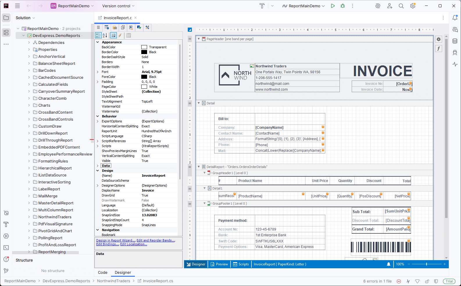
Features include:
- Create new reports and modify existing reports.
- Fully customizable design surface with drag & drop support.
- Preview reports directly in an integrated Report Preview.
- Create and configure data sources using the Data Source Wizard.
Please note that support for .NET projects is planned for early 2026 (likely in a minor update of v25.2).
Documentation
DevExpress Template Kit
#New Project and Item Templates for WinForms
DevExpress Template Kit v25.2 includes the following templates for WinForms-based projects:
Report Viewer Application (Project Template)
Creates a desktop (WinForms) application with a Report Viewer (displays a pre-built tabular report).
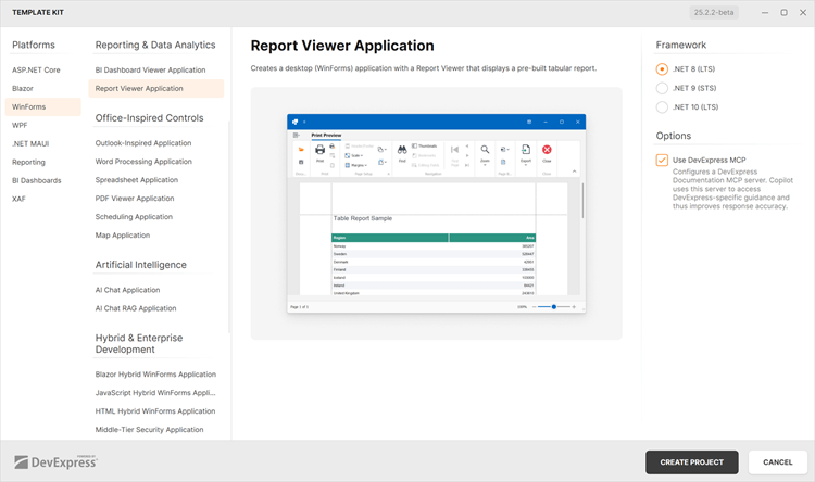
Report (Item Template)
Adds a new DevExpress Report to a WinForms project.
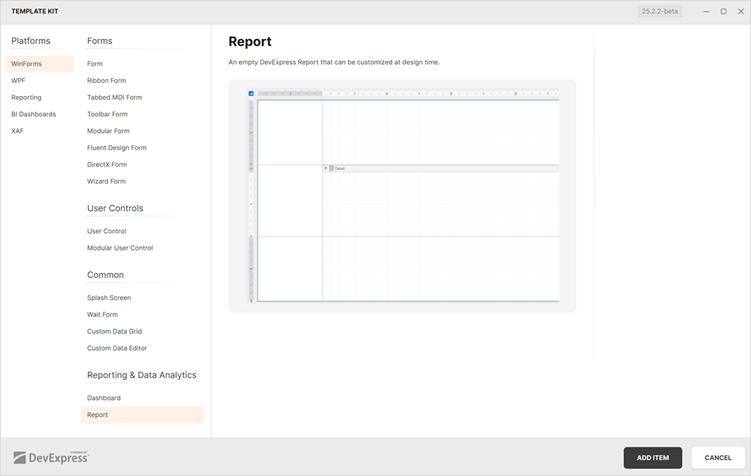
#DevExpress Documentation MCP Server
DevExpress Template Kit project templates now include optional MCP server configuration support for Visual Studio and VS Code.
Documentation
Accessibility Enhancements
#PDF Export — New UI Element Roles
The XRAccessibleRole enumeration includes the following new values:
DecorativeFigureParagraph
Elements marked as Decorative are treated as artifacts and excluded from the logical structure of exported PDF documents. Such elements do not appear in the tag tree, are ignored by assistive technologies, and are considered external to main content.
Use Figure and Paragraph values for report watermarks meant to convey meaningful information and to be announced by assistive technologies.
#PDF Export — Mark Report Controls as Decorative Elements (Artifacts)
Assistive software treats XRPictureBox, XRShape, XRBarCode, and XRZipCode controls in PDF documents as figures (<Figure>). Use the AccessibleRole property to mark these UI elements as artifacts and exclude them from the logical structure of exported PDF documents:
xrShape1.AccessibleRole = XRAccessibleRole.Decorative;
#PDF Export — Add Alternative Text to Report Watermarks
Use the following properties to specify whether to include report watermarks in the logical structure of exported PDF documents:
For image watermarks that convey meaningful information, set the ImageAccessibleRole property to XRAccessibleRole.Figure and use the XRWatermark.ImageAccessibleDescription property to specify alternative text.
For text watermarks, set the TextAccessibleRole property to XRAccessibleRole.Paragraph and use the XRWatermark.TextAccessibleDescription property to specify alternative text.
For purely decorative watermarks, retain the default value to treat the watermark as an artifact.
#Report Design Analyzer — Validate Documents for Accessibility Compliance
The Report Design Analyzer now validates layout, document generation, and export settings for accessibility compliance across all supported platforms.
To enable accessibility validation in the Report Designer for Visual Studio, set the Enable Accessibility Validation option to true to include accessibility-related messages within the displayed message categories in the Error List:
Accessibility messages are added to the appropriate message category depending on their type: Error, Warning, or Information.
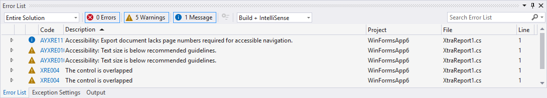
For End-User Report Designers, click the Accessibility bar item in the UI panel to display accessibility-related messages in the Report Design Analyzer.
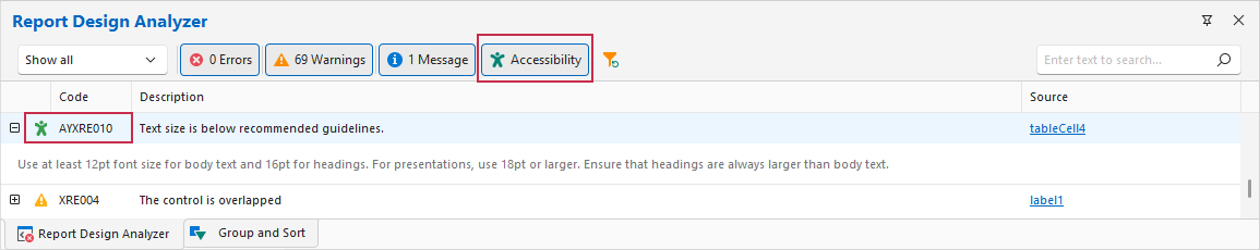
We introduced multiple accessibility issues with error codes starting with the AY prefix to cover the main accessibility issues that arise when creating or exporting a report.
Review the following help topic for the complete error list: Errors, Warnings, and Information Messages.
DateOnly & TimeOnly Support
#Time-Range Parameter Editors
DevExpress Report Viewers for Web, WPF, and Blazor now support TimeOnly range parameters. Users can filter reports against time intervals independent of specific dates.
The following code snippet creates and adds DateOnly and TimeOnly range parameters to a report:
var report = new XtraReport();
// ...
// Add the start interval value.
var p1start = new RangeStartParameter() {
    Type = typeof(DateOnly),
    Value = DateOnly.FromDateTime(DateTime.Today).AddDays(-7),
};

// Add the end interval value.
var p1end = new RangeEndParameter() {
    Type = typeof(DateOnly),
    Value = DateOnly.FromDateTime(DateTime.Today),
};

// Add the range parameter.
var p1 = new Parameter() {
    Type = typeof(DateOnly),
    Value = DateOnly.FromDateTime(DateTime.Today),
    ValueSourceSettings = new RangeParametersSettings(p1start, p1end)
};

report.Parameters.Add(p1);

// Add the start interval value.
var p2start = new RangeStartParameter() {
    Type = typeof(TimeOnly),
    Value = TimeOnly.FromTimeSpan(TimeSpan.FromMinutes(10)),
};

// Add the end interval value.
var p2end = new RangeEndParameter() {
    Type = typeof(TimeOnly),
    Value = TimeOnly.FromTimeSpan(TimeSpan.FromMinutes(30)),
};

// Add the range parameter.
var p2 = new Parameter() {
    Type = typeof(TimeOnly),
    Value = TimeOnly.FromDateTime(DateTime.Today),
    ValueSourceSettings = new RangeParametersSettings(p2start, p2end)
};

report.Parameters.Add(p2);
Our Time Range Parameter Editor supports predefined range customization.
Use the RangeParameterEditorOptions class to programmatically add or modify custom range values within your DevExpress-powered WinForms and WPF application:
RangeParameterEditorOptions.PredefinedTimeRanges.Remove("Lunch Time");
RangeParameterEditorOptions.RegisterTimeRange("CustomTimeInterval", () => new TimeOnly(10, 30, 00), () => new TimeOnly(11, 30, 0));
Review the following help topics for additional information (customize predefined range values in a web application):
AI-powered Report Extensions
#AI-powered Visual Studio Report Designer
v25.2 introduces the following AI-powered features in the Visual Studio Report Designer:
AI-powered features in the Visual Studio Designer require the DevExpress AI-powered Assistant extension, which is included in the DevExpress Unified Component Installer. Before using AI-powered features, connect the DevExpress AI Assistant to Azure OpenAI or OpenAI service and configure required settings.
Go to Tools → Options → DevExpress → AI Assistant to open AI Assistant options:
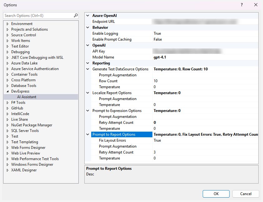
#Create Expressions with Natural Language
Our Visual Studio Report Designer and WinForms End-User Report Designer allow you to generate Criteria Language expressions with AI assistance, within both the DevExpress Expression Editor and Filter String Editor. Instead of writing complex expressions, users can describe the desired logic in plain text.
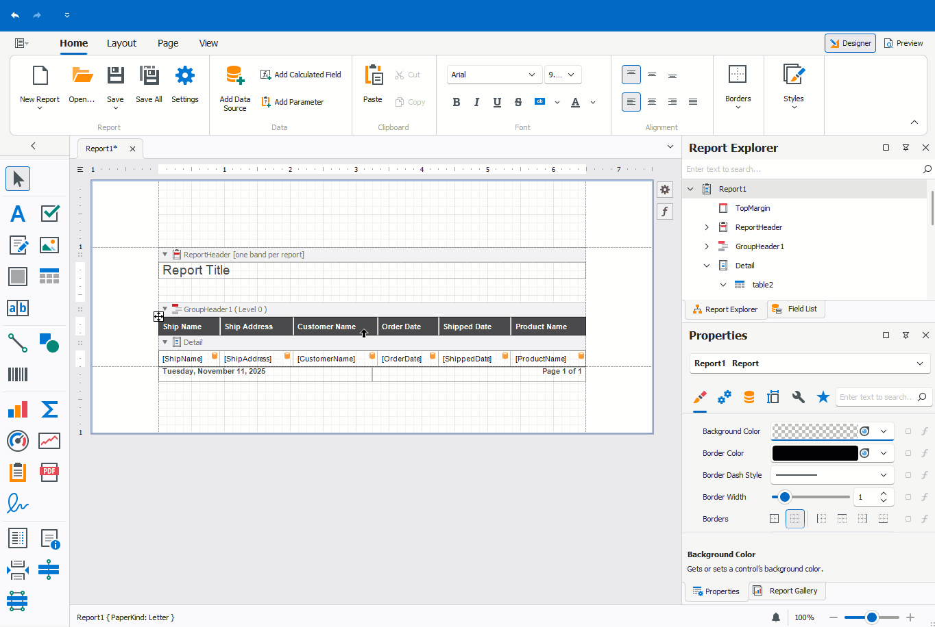
Documentation:
#Preview Reports with AI-generated Test Data
You can generate AI-powered test data to preview reports without connecting to a live data source directly within the Visual Studio Report Designer and End-User Report Designers for WinForms/WPF. This will be of value if you design a report and wish to quickly check recent changes without access to a real data source. It also allows report creators to share report documents without including actual data.
Visual Studio Report Designer
Click the Test Data tab to preview a report with AI-generated test data. Our Report Designer requests data from an LLM and populates the report with meaningful values for preview.
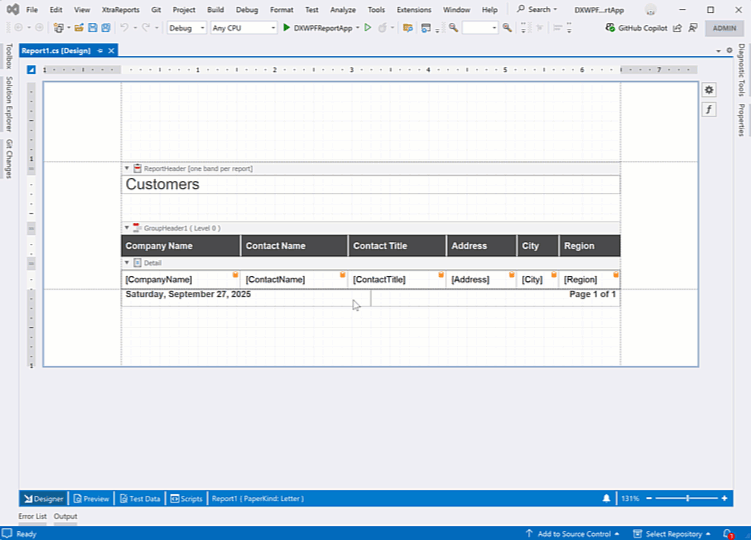
End-User Report Designer for WPF
To activate AI-generated Test Data in the WPF Report Designer, create a ReportTestDataSourceBehavior and configure its RowCount and Temperature settings:
<dxrud:ReportDesigner x:Name="reportDesigner">
    <dxmvvm:Interaction.Behaviors>
        <dxai:ReportTestDataSourceBehavior x:Name="testDataSourceBehavior"
                RowCount="10"
                Temperature="0"/>
    </dxmvvm:Interaction.Behaviors>
</dxrud:ReportDesigner>
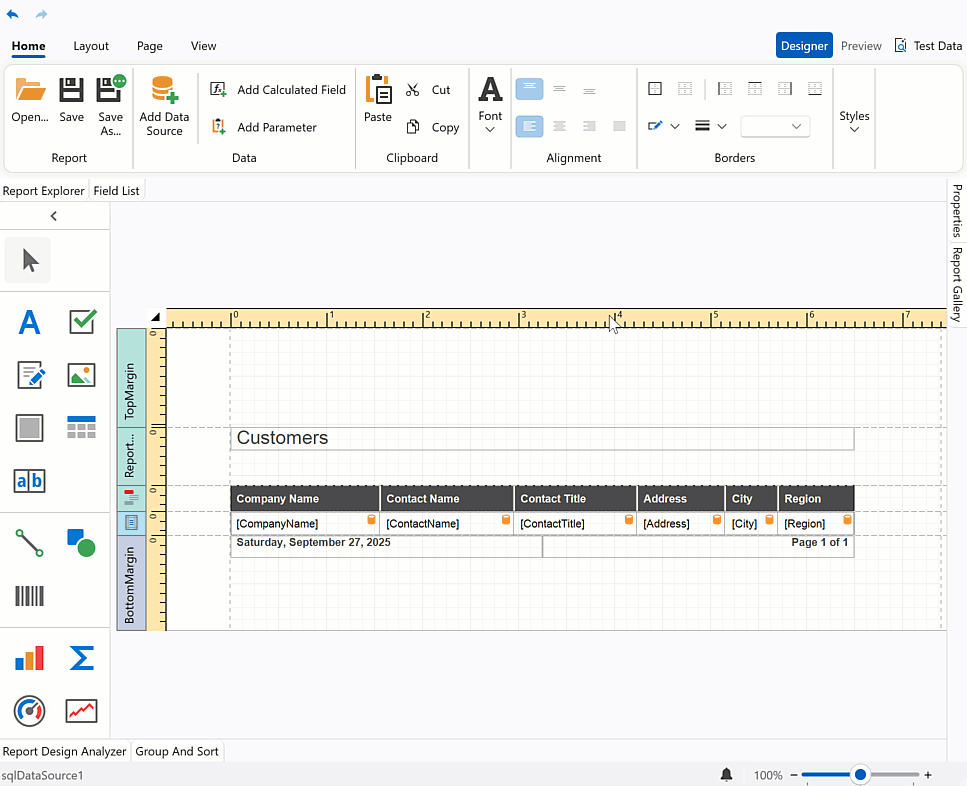
End-User Report Designer for WinForms
Follow the steps below to attach a Report Test Data Source Behavior to the WinForms Report Designer at design time:
Drop the BehaviorManager component from the Toolbox onto a Form with the WinForms Report Designer.
Invoke the BehaviorManager's smart tag menu and click Edit Behaviors to open the Behavior Collection Editor.
Add a Report Test Data Source Behavior and specify its RowCount and Temperature settings.
Documentation:
#Localize Reports with AI
AI-powered Report Localization allows you to translate report elements into a target language directly within the Visual Studio Report Designer and End-User Report Designers for WinForms/WPF.
Our Localization Editor displays a Localize with AI button and automatically collects all static strings within a report and sends them to the AI service of choice for translation.
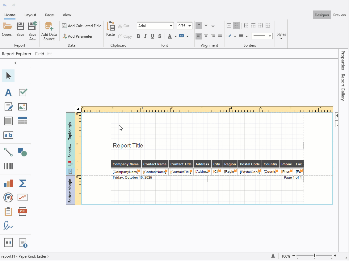
End-User Report Designer for WPF
Attach the ReportLocalizationBehavior to the WPF Report Designer to leverage AI-powered localization:
<dxrud:ReportDesigner x:Name="reportDesigner">
    <dxmvvm:Interaction.Behaviors>
        <dxai:ReportLocalizationBehavior/>
    </dxmvvm:Interaction.Behaviors>
</dxrud:ReportDesigner>
Documentation:
#Create AI-powered Reports Using Report Wizard (CTP)
You can leverage AI to create report layouts based on natural language prompts directly within the Visual Studio Report Designer and End-User Report Designers for WinForms/WPF.
Add a DevExpress Report item to your project or open the Report Wizard for an existing report using the report's smart tag menu. In the Report Wizard, select AI Prompt-to-Report and follow on-screen instructions.
In the Enter Report Description step, enter a prompt or choose a predefined prompt and modify it as needed. Once complete click Finish.
AI-powered report generation supports two data source modes:
No Data Source
Creates a complete report structure based on a user’s natural language description.
Add Data Source
Creates and configures a report data source. The Report Wizard displays the data source structure and automatically includes this metadata in the LLM prompt. Users can reference available data source fields as they create data-bound report elements.
Use the following settings to configure AI-powered report generation:
| Setting | Description |
FixLayoutErrors |
When enabled, AI automatically attempts to correct layout issues (for example, misaligned controls or overlapping elements) in the generated report.
|
RetryAttemptCount |
Specifies the number of times AI should retry report generation if the initial attempt fails.
|
Temperature |
Controls randomness in AI output and produces more deterministic results. Higher values increase variation.
|
PromptAugmentation |
Specifies additional instructions that modify the prompt before processing.
|
End-User Report Designer for WPF
To activate this feature in a DevExpress AI-powered WPF application, use ReportPromptToReportBehavior:
<dxrud:ReportDesigner x:Name="designer">
    <dxmvvm:Interaction.Behaviors>
        <dxai:ReportPromptToReportBehavior/>
    </dxmvvm:Interaction.Behaviors>
</dxrud:ReportDesigner>
Documentation:
#AI-powered Inline Report Translation — WPF Document Viewer
WPF Document Preview includes a new Translate Inline command in the AI context menu. Unlike the Translate command, Translate Inline translates report content directly within the preview and prints/exports the translated document (displaying a notification about AI-generated content before processing).
To activate Translate Inline in your DevExpress-powered WPF application, attach the DocumentTranslateInlineBehavior to the Document Preview control:
<dxp:DocumentPreviewControl Name="preview">
    <dxmvvm:Interaction.Behaviors>
        <dxai:DocumentTranslateInlineBehavior>
                <dxai:LanguageInfo Culture="de-DE"/>
                <dxai:LanguageInfo Culture="pt-BR"/>
        </dxai:DocumentTranslateInlineBehavior>
    </dxmvvm:Interaction.Behaviors>
</dxp:DocumentPreviewControl>
Documentation
#Optimized Token Consumption for AI Report Operations
We improved system prompts and AI tools used when generating/modifying reports (to help optimize token consumption).
#System Prompt Augmentation — Custom Context
DevExpress AI-powered Report Extensions now support system prompt augmentation with custom context. For example, you can supply industry-specific terminology to the AI-powered localization extension to ensure correct word usage, exclude specific report items from translation, and specify the source language.
Reporting for Blazor
#Report Viewer — New Events
The DevExpress Blazor Report Viewer includes additional events designed to extend functionality and give you greater control over user interactions.
Click events can help identify the clicked report element and execute custom actions (such as handling URL navigation, retrieving clicked row data to generate a separate report, canceling a drill-through operation, or displaying a custom popup).
The following code snippet handles the OnPreviewClick event and displays the text associated with the clicked "brick". It also suppresses the default action for the Label 2 brick:
@using DevExpress.Blazor.Reporting
@using DevExpress.Blazor.Reporting.Models
@using DevExpress.XtraReports.UI

<div>Clicked: @Clicked</div>

<DxReportViewer @ref="viewer"
                Report="Report"
                OnPreviewClick="OnPreviewClick"
                OnReportOpened="OnReportOpened" />

@code {
    private DxReportViewer? viewer;
    private XtraReport Report = new TestReport();
    private string? Clicked;

    private Task OnPreviewClick(PreviewClickEventArgs e)
    {
        if (e.Brick is null) {
            Clicked = "Empty area";
            return Task.CompletedTask;
        }

        // Suppresses the default action for "Label 2".
        if (e.Brick.Text == "Label 2") {
            e.Handled = true;
        }
        Clicked = e.Brick.Text;
        return Task.CompletedTask;
    }
}
Handle the OnReportOpened event to activate a specific tab in the Report Viewer's tab panel. The following code snippet activates the Parameter Panel tab when a report is opened (the report's RequestParameters property is set to false):
void OnReportOpened(ReportOpenedEventArgs args) {
    reportViewer.TabPanelModel.ActivateTab(TabId.Parameters);
}
#Report Viewer — 'Select All' for Multi-Value Parameters
The Multi-Value Parameter Editor in the Blazor Report Viewer now includes a Select All option and updated UI/UX.
Reporting for Web
#MongoDb Data Source Wizard and API to Register Predefined Connections
The DevExpress Web Report Designer allows users to connect to MongoDB data sources. To display the MongoDB option in the Data Source Wizard, you must:
The MongoDB option appears in the Select Data Source page of the Data Source Wizard.
Documentation
#New Time Zone Conversion Expression Functions
v25.2 introduces built-in expression functions designed to convert UTC date/time values to/from the users's local time zone. Users in different regions can view and analyze report data in their own time zones.
Use the following expression functions to integrate this functionality:
| Expression Function | Description |
UtcToLocalTime(datetime) |
Converts a UTC date-time value to the local time zone.
|
LocalTimeToUtc(datetime) |
Converts a local date-time value to UTC.
|
To specify the local time zone for date values displayed in reports, implement the ITimeZoneProvider interface and register it in the application's service collection.
The following code snippet registers the CustomTimeZoneProvider service in an ASP.NET Core application and obtains the time zone identifier from the timezone browser cookie:
//Services/CustomTimeZoneProvider.cs

using System;
using DevExpress.XtraReports.Services;
using Microsoft.AspNetCore.Http;

namespace MyReportingApplication.Services {
    public class CustomTimeZoneProvider : ITimeZoneProvider {
        private readonly string timeZoneId;

        public CustomTimeZoneProvider(IHttpContextAccessor httpContextAccessor) {
            timeZoneId = httpContextAccessor.HttpContext?.Request.Cookies["timezone"];
        }

        public TimeZoneInfo GetCurrentTimeZone() {
            var tzId = timeZoneId ?? "UTC";

            try {
                return TimeZoneInfo.FindSystemTimeZoneById(tzId);
            } catch {
                return TimeZoneInfo.Utc;
            }
        }
    }
}

//Program.cs
...
using DevExpress.AspNetCore.Reporting;
using DevExpress.XtraReports.Services;
using DevExpressApp.Services;

var builder = WebApplication.CreateBuilder(args);
//...
builder.Services.AddScoped<ITimeZoneProvider, CustomTimeZoneProvider>();
//...
var app = builder.Build();
// ...
app.Run();
Documentation
#Line Spacing in Labels and Table Cells
The Web Report Designer now applies the LineSpacing property to text rendered in labels and table cells.
#Angular 21 Support
Reporting for Desktop
#Data Source Wizard — Favorite (Pinned) Data Sources
You can pin frequently used database providers as favorites in the Data Source Wizard for Visual Studio and WinForms/WPF Report Designers. Pinned providers appear at the top of the list on the Select a Data Connection Type page.
Documentation
#WinForms End-User Report Designer — Designer Settings Dialog
The WinForms Report Designer ships with a new Designer Settings dialog. This dialog allows users to configure report design and document generation settings globally at the app level. The dialog consolidates frequently used options, simplifies panel management, and streamlines customization of new reports created with the Report Wizard.
The Designer Settings dialog "groups" settings into the following categories:
- General – Report Designer UI and dock panel settings
- Data – Application-wide data binding and schema discovery settings
- New Report – Default layout, appearance, and script settings for newly created reports
- Export – PDF and CSV export-related settings
You can restrict access to the Designer Settings dialog and prevent users from changing global report design or export settings. To disable access to this dialog, call the XRDesignMdiController.SetCommandVisibility method:
reportDesigner1.SetCommandVisibility(ReportCommand.Settings, CommandVisibility.None);
Documentation
#WinForms End-User Report Designer — High-DPI and Per-Monitor v2 Rendering
We enhanced high-DPI and Per-Monitor v2 rendering for multiple Report Designer UI elements (to ensure consistent display quality and precise scaling in any display configuration, including multi-monitor setups with different DPI settings).
Updated elements include:
- Query Builder
- Master-Detail and Federation Data Source Editor
- Report Control Drag Handles
- Report Designer Toolbox
- Smart Tags and Verbs
- Data Source Drop-Down Editors
PDF Export
#Object Stream Compression
Object stream compression also applies to PDF export from other DevExpress products — Reporting, Rich Text Editor, and Spreadsheet Controls. To enable object stream compression in these products, set the static PrintingSettings.CompressPdfWithObjectStreams property to true:
using DevExpress.XtraPrinting.Native;

// Enable object stream compression for PDF export
PrintingSettings.CompressPdfWithObjectStreams = true;
SQL Data Source
#Connection Provider Enhancements
Our SqlDataSource now supports the most recent versions of the following database engines:
-
PostgreSQL 18.0
-
Microsoft SQL Server 2025
Documentation
Survey - Reports
Your Feedback Matters!
Please
login to complete the survey.
Survey Completed
Thank you for taking the time to complete this survey. Your responses have now been posted. If you want to follow up with additional information, feel free to send us an email at clientservices@devexpress.com anytime.
You've Already Completed This Survey
Our records show that you have already completed this survey. If you want to follow up with additional information, send us an email at clientservices@devexpress.com.
This survey has expired
If you want to share your feedback or request new functionality, please submit a new support ticket via the DevExpress Support Center. We’ll be happy to follow up.
.NET 10 & Visual Studio 2026 Support
DevExpress BI Dashboard now supports .NET 10 and Visual Studio 2026.
DevExpress Template Kit
#New Project and Item Templates
DevExpress Template Kit v25.2 includes new BI Dashboard-related templates for WinForms, WPF, and ASP.NET Core Blazor projects.
BI Dashboard Viewer Application
Creates a WinForms application and includes the DevExpress BI Dashboard Viewer to display key metrics from a sample data source.
ASP.NET Core Blazor BI Dashboard Application
Creates a web application (Blazor Server or Blazor WebAssembly Hosted) and includes the DevExpress BI Dashboard Control.
Dashboard
Adds an empty DevExpress BI Dashboard to a WinForms/WPF project.
WinForms Dashboard Designer
#Data Source Wizard — Favorite Data Sources
The WinForms Data Source Wizard allows users to mark frequently used data providers as favorites. Favorite data providers appear at the top of the Select a Data Connection Type page (improves access to preferred providers).
Documentation
Web Dashboard Designer
#MongoDB Data Source Wizard
The Web Dashboard Data Source Wizard allows users to create data sources based on MongoDB connections and schemas defined by application developers.
To display the MongoDB option in the Data Source Wizard, you must:
- Install the MongoDB.Driver NuGet package.
- Register the MongoDB connection.
- Open the Data Source Wizard and select MongoDB as the data source type.
- Specify the connection, choose the collection, and define queries and filters.
Documentation
#Angular 21 Support
SQL Data Source
#Connection Provider Enhancements
Our SqlDataSource now supports the most recent versions of the following database engines:
-
PostgreSQL 18.0
-
Microsoft SQL Server 2025
Documentation
Your feedback matters.
Please, review the description of DevExpress Office File API-related features below and leave your feedback at the end of the section.
Go to the survey now.
AI-powered Document Processing APIs
DevExpress Office File API products (Word and PDF Processing Document API, Presentation API library) now support NLP-powered text transform extensions. AI-powered extensions allow you to enhance the way users interact with and manage text-based content. These DevExpress extensions leverage advanced natural language processing (NLP) technologies and enable you to integrate advanced language models directly into document processing scenarios.
The following features are available:
- Summarization
- Translation
- Proofreading
- Contextual Q&A ("Ask AI")
using DevExpress.AIIntegration;
using DevExpress.AIIntegration.Docs;
using Microsoft.Extensions.AI;

// Configure Azure OpenAI endpoint and API key via environment variables.
string azureOpenAIEndpoint = "AZURE_OPENAI_ENDPOINT";
string azureOpenAIKey = "AZURE_OPENAI_APIKEY";
var modelName = "gpt-4o-mini";

// Register an Azure OpenAI client and obtain the
// default AI extensions container.
    IChatClient client =
        new Azure.AI.OpenAI.AzureOpenAIClient(
            new Uri(azureOpenAIEndpoint),
            new System.ClientModel.ApiKeyCredential(azureOpenAIKey))
        .GetChatClient(modelName)
        .AsIChatClient();

AIExtensionsContainerDefault defaultAIExtensionsContainer =
    AIExtensionsContainerConsole.CreateDefaultAIExtensionContainer(client);
Documentation
#Translate & Proofread Word Documents, PDF Files, and Presentations
Office File API v25.2 ships with the following AI-powered translation and proofreading capabilities:
- Proofread and translate entire Word documents and PowerPoint presentations (or specific sections including paragraphs, slides, custom ranges). Our extensions automatically update selected files and preserve original formatting.
- Translate entire PDF documents or specific pages/regions and obtain text responses.
using DevExpress.AIIntegration.Docs;
using DevExpress.XtraRichEdit;
using Microsoft.Extensions.AI;

// Create a document processing service instance
// from the AI extensions container.
var docProcessingService = new AIDocProcessingService(defaultAIExtensionsContainer);

using (var wordProcessor = new RichEditDocumentServer()) {
    // Load source document (ensure file exists in relative Documents folder).
    wordProcessor.LoadDocument("Documents/FirstLookShortened.docx");

    // Proofread entire document (culture en-US).
    await docProcessingService.ProofreadAsync(wordProcessor, new System.Globalization.CultureInfo("en-US"));

    // Translate the document to German.
    await docProcessingService.TranslateAsync(paragraph.Range, new System.Globalization.CultureInfo("DE-DE"));
    wordProcessor.SaveDocument("Documents/translation.docx", DocumentFormat.Docx);
}
#Ask Questions about the Word Document and PDF Files
Our new AskAI extension methods allow you to ask contextual questions about a document using custom prompts.
using DevExpress.AIIntegration.Docs;
using DevExpress.Pdf;
using Microsoft.Extensions.AI;

// Create a document processing service instance
// from the AI extensions container.
var docProcessingService = new AIDocProcessingService(defaultAIExtensionsContainer);

using (var pdfDocumentProcessor = new PdfDocumentProcessor()) {
    FileStream fs = File.OpenRead(
        Path.Combine(
            AppDomain.CurrentDomain.BaseDirectory,
            @"Documents/Document1.pdf"));
        pdfDocumentProcessor.LoadDocument(fs, true);
    fs.Close();

    string result =
        await docProcessingService.AskAIAsync(
            pdfDocumentProcessor,
            "What terms does this document contain?");
}
Documentation
#Summarize Word Documents, PDF Files, and Presentations
Use Summarize extension methods to generate a short summary of a document or a presentation. The following summarization modes are available:
Abstractive Summarization
Understands original text context and rephrases it in a new, concise form. AI "writes" a new summary based on its understanding and generates new sentences (instead of reusing the original wording).
Extractive Summarization
Selects and extracts key sentences/phrases from the original text. AI identifies the most important content and combines them into a summary without altering the original wording.
using DevExpress.AIIntegration.Docs;
using DevExpress.Docs.Presentation;

// Create a document processing service instance
// from the AI extensions container.
var docProcessingService = defaultAIExtensionsContainer.CreateAIDocProcessingService();

var presentation = new Presentation(File.ReadAllBytes("Documents/Presentation.pptx"));
string summary = await docProcessingService.SummarizeAsync(
    presentation,
    SummarizationMode.Extractive,
    CancellationToken.None);
PDF Document API
#Object Stream Compression and Optimization
DevExpress PDF Document API now supports automatic object stream compression (to reduce file size when saving documents). Object streams (PDF 1.5+) pack multiple PDF objects into a single compressed stream without affecting document content or quality.
When you save a document, our API recreates all objects within new compressed streams to improve internal structure and compression efficiency.
To enable object stream optimization, you must:
The following code snippet merges multiple PDF files and removes duplicate object streams:
using DevExpress.Pdf;

using (PdfDocumentProcessor processor = new PdfDocumentProcessor()) {
    // Create an empty document with object stream optimization
    var saveOptions = new PdfSaveOptions() {
        UseObjectStreams = true
    };
    processor.CreateEmptyDocument("Merged.pdf", saveOptions);

    // Append multiple PDF files
    processor.AppendDocument("Document1.pdf");
    processor.AppendDocument("Document2.pdf");
    processor.AppendDocument("Document3.pdf");
    // Duplicate object streams are automatically eliminated
}
Documentation:
#Object Stream Compression for PDF Export in Other DevExpress Products
PDF export operations in DevExpress Reports, Rich Text Editor, and Spreadsheet Controls also supports object stream compression. To activate object stream compression in these products, set the static PrintingSettings.CompressPdfWithObjectStreams property to true:
using DevExpress.XtraPrinting.Native;

// Enable object stream compression for PDF export
PrintingSettings.CompressPdfWithObjectStreams = true;
#Enhanced Image Compression Support - Grayscale & Bitonal
DevExpress PDF Document API includes specialized compression algorithms for grayscale and bitonal (black-and-white) images. You can also convert color images to grayscale to reduce file size when color accuracy is not essential.
The following code snippet optimizes a PDF document using new compression options:
using DevExpress.Pdf;

using (PdfDocumentProcessor processor = new PdfDocumentProcessor()) {
    processor.LoadDocument("Document.pdf");

    // Configure optimization options
    var optimizationOptions = new PdfOptimizationOptions();

    // Convert color images to grayscale
    optimizationOptions.ImageCompression.ConvertGrayscale = true;

    // Set compression for grayscale images
    optimizationOptions.ImageCompression.GrayscaleCompressionType =
        PdfGrayscaleImageCompressionType.Jpeg;
    optimizationOptions.ImageCompression.JpegQuality = 80;

    // Set compression for bitonal (black and white) images
    optimizationOptions.ImageCompression.BitonalCompressionType =
        PdfBitonalImageCompressionType.CCITTGroup4;

    // Optimize and save the document
    processor.OptimizeDocument(optimizationOptions);
    processor.SaveDocument("Optimized.pdf");
}
Documentation
#Remove Optional Content During Optimization
DevExpress PDF Document API v25.2 allows you to optimize file size by removing optional content, such as:
- Metadata (author, creation date, etc.)
- Embedded files and attachments
- Bookmarks
- Page preview thumbnails
- Interactive JavaScript code
- Accessibility and structure information
The following code snippet removes unnecessary content from a PDF file:
using DevExpress.Pdf;

using (PdfDocumentProcessor processor = new PdfDocumentProcessor()) {
    // Load the document
    processor.LoadDocument("Document.pdf");

    // Configure optimization options
    var options = new PdfOptimizationOptions() {
        // Remove unnecessary elements
        RemoveMetadata = true,
        RemoveAttachments = true,
        RemoveThumbnails = true,
        }
    };

    // Optimize the document
    processor.OptimizeDocument(options);

    // Save the result
    processor.SaveDocument("Document.optimized.pdf");
}
Documentation
#PDF/A Processing Enhancements
We've enhanced PDF/A file processing capabilities (import, edit, and save) when using the DevExpress PDF Document API. This capability ensures that files remain PDF/A-compliant after modifications. We also added APIs to determine the current PDF/A and PDF/UA compatibility state for a document and reset this state.
The following code snippet checks the PDF/A and PDF/UA state for a loaded PDF file, and resets compatibility settings:
using DevExpress.Pdf;

PdfDocumentProcessor pdfProcessor = new PdfDocumentProcessor();
pdfProcessor.LoadDocument("document.pdf");
// Obtain current PDF/A and PDF/UA state
var pdfA = pdfProcessor.Document.PdfACompatibility;
var pdfUA = pdfProcessor.Document.PdfUACompatibility;
//Reset document compatibility
pdfProcessor.Document.ResetCompatibility();
#Custom Font Support for PDF Content
DevExpress PDF Document API now supports custom fonts from DXFontRepository when generating or updating PDF content. This enhancement ensures visual consistency across annotations, form fields, and digital signature appearances.
You can apply custom DXFontRepository fonts to:
- Form fields (AcroForms) and annotations (FreeText, Redaction).
- Digital signature appearance generated with PdfDocumentSigner.
NOTE
Custom font resolution applies only when you explicitly set the font name via the API.
Word Processing Document API
#Mail Merge Enhancements - Merge Data with Detail Regions
The mail merge engine used within the DevExpress Word Processing Document API supports nested regions. You can merge data with any number of hierarchical levels (master-detail-subdetail and beyond) within a single template. Existing MailMerge methods work for both single-level and multi-level documents, no additional settings/toggles required.
Use TableStart:RegionName and TableEnd:RegionName merge fields to mark regions that contain data from a single record (master or detail). Merge regions can be defined within paragraphs or tables. Regions placed in tables automatically expand the table with source data during the merge.
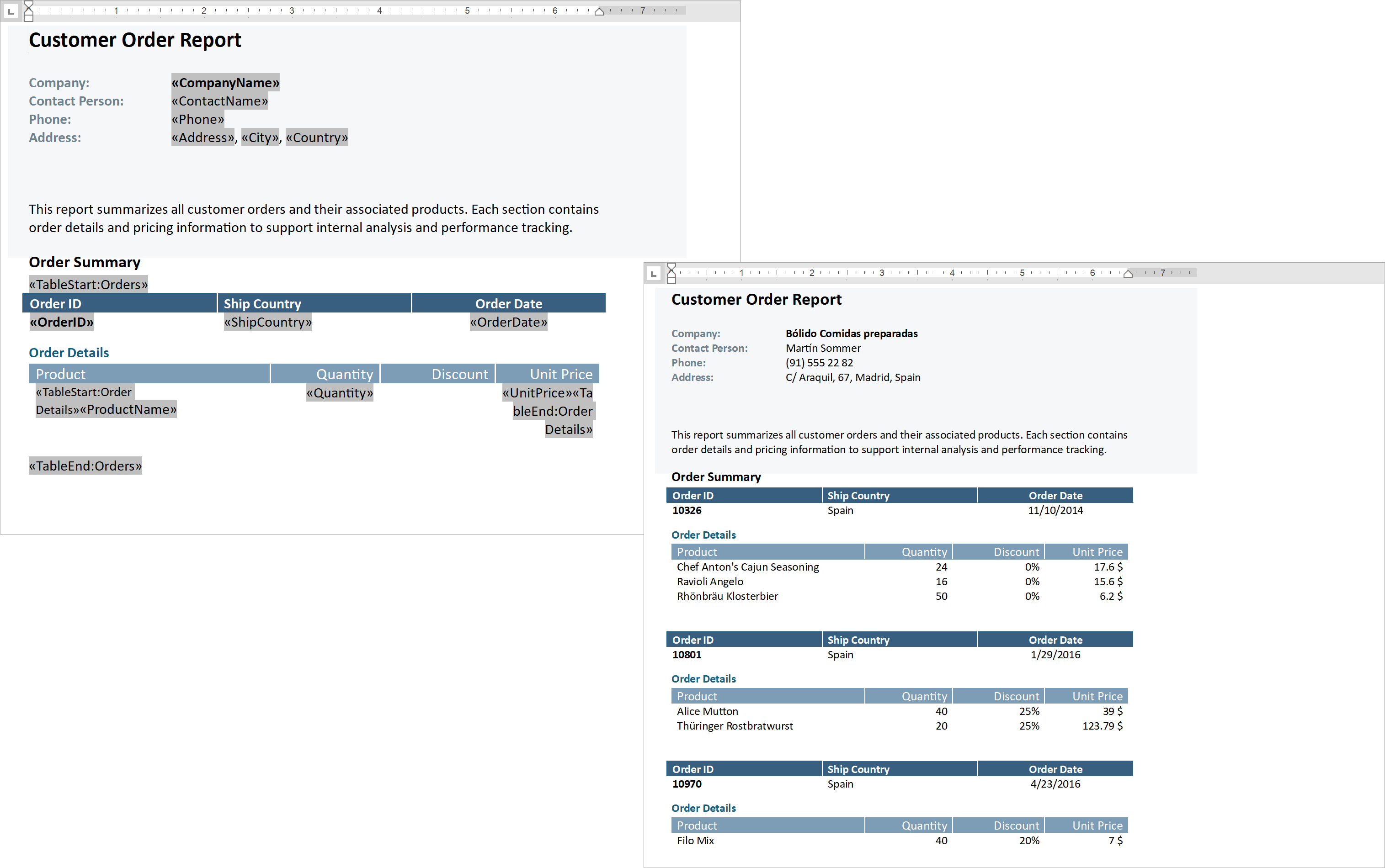
Additional Mail Merge and Field API enhancements:
The following code snippet merges data, and handles the MailMergeRecordStarted event to log the merge process:
// Read JSON data to a database object
string dataPath = Path.Combine(AppDomain.CurrentDomain.BaseDirectory, "nwind_data.json");
string json = File.ReadAllText(dataPath);
NWind? nwind;
nwind = JsonSerializer.Deserialize<NWind>(json);

// Create a RichEditDocumentServer instance
using var wordProcessor = new RichEditDocumentServer();

// Load the template into the word processor instance.
var templatePath = Path.Combine(AppDomain.CurrentDomain.BaseDirectory, "template.docx");
wordProcessor.LoadDocument(templatePath);

// Create mail merge options.
MailMergeOptions myMergeOptions = wordProcessor.Document.CreateMailMergeOptions();

// Assign the data source.
myMergeOptions.DataSource = nwind?.Customers;

// Register event handlers to customize merge behavior (progress output and dynamic variables).
wordProcessor.MailMergeRecordStarted += WordProcessor_OnMailMergeRecordStarted;

// Execute the mail merge.
wordProcessor.MailMerge(myMergeOptions, "result.docx", DocumentFormat.Docx);


// Event handler outputs diagnostic info for each mail merge region
// and its sub-regions when a record merge starts.
void WordProcessor_OnMailMergeRecordStarted(object sender, MailMergeRecordStartedEventArgs e)
{
    var region = e.MailMergeRegionInfo;
    if (region != null)
    {
        Console.WriteLine($"Merging region: {region.Name}\r\n Merge Fields: {region.MergeFields.Count}");
        if (region.Regions != null && region.Regions.Count > 0)
        {

            foreach (var subRegion in region.Regions)
            {
                Console.WriteLine($" Sub-region: {subRegion.Name}\r\n Merge Fields: {subRegion.MergeFields.Count}");
            }
            Console.ReadKey();
        }
    }
}
Documentation
#PDF/UA Export - Form Field Tagging
DevExpress Word Processing Document API v25.2 automatically adds accessible tags to PDF form fields when users export Word documents with Content Controls to accessible PDF formats.
PowerPoint Presentation API
#PowerPoint Tables
We added support for PowerPoint tables. You can now upload and save PowerPoint presentations with tables and manage them programmatically (customize, read, delete, or create new tables from scratch). Table support includes the following features/capabilities:
- Insert tables with a specified number of rows and columns.
- Modify table location on a slide.
- Insert, delete, and resize rows, columns, and cells.
- Fill, modify, and clear table cell data.
- Merge and split table cells.
- Apply predefined themed table styles.
- Manage styling for banded rows and columns, the first and last column, the header and total row.
- Format individual cells - apply borders, shading, alignment, background fills and more.
using DevExpress.Docs.Presentation;

namespace PresentationApiSample;

public class Program {
    public static void Main(string[] _) {

        // Create an in-memory Presentation document
        Presentation presentation = new Presentation();
        presentation.Slides.Clear();

        // Create a blank slide and add it to the presentation
        Slide slide = new Slide(SlideLayoutType.Blank);
        presentation.Slides.Add(slide);

        // Create a 5x7 table (rows x columns) and add it as a shape to the slide
        Table table = new Table(5, 7);
        slide.Shapes.Add(table);

        // Populate table cell text (row, column) for demonstration
        table[0, 0].TextArea.Text = "Month";
        table[0, 1].TextArea.Text = "PM2.5 (µg/m³)";
        table[0, 2].TextArea.Text = "PM10 (µg/m³)";
        table[0, 3].TextArea.Text = "NO₂ (ppb)";
        table[0, 4].TextArea.Text = "O₃ (ppb)";
        table[0, 5].TextArea.Text = "CO (ppm)";
        table[0, 6].TextArea.Text = "AQI (Average)";

        table[1, 0].TextArea.Text = "January";
        table[1, 1].TextArea.Text = "42";
        table[1, 2].TextArea.Text = "78";
        table[1, 3].TextArea.Text = "28";
        table[1, 4].TextArea.Text = "18";
        table[1, 5].TextArea.Text = "0.9";
        table[1, 6].TextArea.Text = "120";

        table[2, 0].TextArea.Text = "February";
        table[2, 1].TextArea.Text = "35";
        table[2, 2].TextArea.Text = "65";
        table[2, 3].TextArea.Text = "25";
        table[2, 4].TextArea.Text = "22";
        table[2, 5].TextArea.Text = "0.8";
        table[2, 6].TextArea.Text = "105";

        table[3, 0].TextArea.Text = "March";
        table[3, 1].TextArea.Text = "30";
        table[3, 2].TextArea.Text = "58";
        table[3, 3].TextArea.Text = "20";
        table[3, 4].TextArea.Text = "30";
        table[3, 5].TextArea.Text = "0.7";
        table[3, 6].TextArea.Text = "95";

        table[4, 0].TextArea.Text = "April";
        table[4, 1].TextArea.Text = "25";
        table[4, 2].TextArea.Text = "52";
        table[4, 3].TextArea.Text = "18";
        table[4, 4].TextArea.Text = "40";
        table[4, 5].TextArea.Text = "0.6";
        table[4, 6].TextArea.Text = "85";

        // Specify the table style
        table.Style = new ThemedTableStyle(TableStyleType.LightStyle1Accent4);
    }
}
Documentation
#New Formats
The DevExpress PowerPoint Presentation API allows you to upload and save presentations in the following formats (in addition to PPTX):
- PPTM (PowerPoint Macro-Enabled Presentation)
- POTX (PowerPoint Template)
- POTM (PowerPoint Macro-Enabled Template)
Pass a DocumentFormat to the Presentation constructor or SaveDocument method to upload or save documents from/to the chosen format. All compatible document elements are preserved when you convert documents from one format to another.
// Convert macro-enabled presentation to macro-enabled template
using var presentation = new Presentation(inputStream, DocumentFormat.Pptm);
var outputStream = new MemoryStream();
presentation.SaveDocument(outputStream, DocumentFormat.Potm);
Documentation
#Text Manipulation APIs - Search, Replace, Remove, Highlight
The following APIs allow you to search for text and replace/format matches across an entire presentation, individual slides, or specific shapes:
TextArea.FindText | Slide.FindText | Presentation.FindTextTextArea.ReplaceText | Slide.ReplaceText | Presentation.ReplaceTextTextArea.RemoveText | Slide.RemoveText | Presentation.RemoveTextTextArea.ModifyTextProperties | Slide.ModifyTextProperties | Presentation.ModifyTextProperties
Documentation:
#Themes
New theme APIs allow you to read, apply, and modify PowerPoint themes programmatically. With these APIs, you can:
- Read and apply existing presentation themes.
- Customize theme color palettes, effects, fonts, and background styles.
- Override themes for individual slides or slide layouts.
- Manage and update slide color maps.
// Get the theme from the slide master
var myTheme = mySlideMaster?.Theme;

// Set theme name
myTheme.Name = "My Custom Theme Name";

// Configure accent colors
myTheme.ColorScheme.Accent1 = new OfficeColor(Color.Green);
myTheme.ColorScheme.Accent2 = new OfficeColor(HslColor.FromRgb(Color.Orange));
myTheme.ColorScheme.Accent3 = new OfficeColor(Color.Aqua);

// Add custom fill styles
List<Fill> themeFills = new List<Fill>() {
    new SolidFill(Color.Yellow),
    new SolidFill(Color.Cyan),
    new SolidFill(Color.Magenta)
};
myTheme.FormatScheme.Fills.ResetTo(themeFills);

// Add custom background fills
List<Fill> themeBackgroundFills = new List<Fill>() {
    new SolidFill(Color.Green),
    new SolidFill(Color.Red),
    new SolidFill(Color.Blue)
};
myTheme.FormatScheme.BackgroundFills.ResetTo(themeBackgroundFills);


// Set theme fonts
myTheme.FontScheme.MinorFont = new ThemeFont("Calibri", "Calibri Light", "Calibri");
myTheme.FontScheme.MajorFont = new ThemeFont("Comic Sans MS", "Comic Sans MS", "Comic Sans MS");

// Add custom line styles

List<LineStyle> lineStyles = new List<LineStyle>() {
    new LineStyle { Width = 50, DashType = LineDashType.Dot, Fill = new SolidFill(new OfficeColor(Color.Blue)) },
    new LineStyle { Width = 5, DashType = LineDashType.DashDot, Fill = new SolidFill(new OfficeColor(SchemeColors.Accent3)) },
    new LineStyle { Width = 5, DashType = LineDashType.DashDot, Fill = new SolidFill(new OfficeColor(SchemeColors.Accent3)) }
};

myTheme.FormatScheme.LineStyles.ResetTo(lineStyles);

// Create and configure a shadow effect
var effect1 = new ShapeEffectProperties {
    OuterShadow = new OuterShadowEffect() {
        RotateWithShape = false,
        BlurRadius = 18.75f,
        Distance = 6.25f,
        Angle = 90,
        HorizontalScaleFactor = 137,
        VerticalScaleFactor = 137,
        Color = new OfficeColor(Color.Black) {
            Transforms = {
        new AlphaColorTransform(63)
    }
        }
    }
};

myTheme.FormatScheme.Effects.ResetTo(new List<ShapeEffectProperties> { effect1 });

// Apply a themed background to the slide
slide.Background = new ThemedSlideBackground(2);
Documentation
#Rendering Enhancements
We refined our internal document layout engine to deliver more accurate rendering of PowerPoint presentation content. This update improves how text, shapes, and layout elements are measured and drawn when you print or export presentations to PDF.
Spreadsheet Document API
#Extended OLE Object Support
DevExpress Spreadsheet Document API library allows you to import/export linked and embedded OLE Objects in binary Excel formats (XLS and XLSB). You can create, edit, or remove OLE objects in Excel documents and save these document to binary formats without content loss.
Survey - Office File API
Your Feedback Matters!
Please
login to complete the survey.
Survey Completed
Thank you for taking the time to complete this survey. Your responses have now been posted. If you want to follow up with additional information, feel free to send us an email at clientservices@devexpress.com anytime.
You've Already Completed This Survey
Our records show that you have already completed this survey. If you want to follow up with additional information, send us an email at clientservices@devexpress.com.
This survey has expired
If you want to share your feedback or request new functionality, please submit a new support ticket via the DevExpress Support Center. We’ll be happy to follow up.
Your feedback matters.
Please, review the description of Cross-Platform .NET App UI (XAF) and Web API Service related features below and leave your feedback at the end of the section.
Go to the survey now.
.NET 10 and Visual Studio 2026 Support
XAF Blazor/WinForms UI and Web API Service now support .NET 10 and Visual Studio 2026.
Microsoft Downloads
XAF No Longer Supports Microsoft's .NET Framework
#WebForms/WinForms
As documented in our Roadmap (published in August 2025), v25.2+ marks the official end of XAF WebForms & WinForms .NET Framework support. We also removed all XAF .NET Framework and legacy .NET modules/APIs, and older/deprecated Security System implementations from our source code.
Moving forward, we will focus our efforts on .NET (Blazor & WinForms & Web API Service) and scalable, multi-tenant/SaaS-based apps. We will also ship security and other critical fixes for v25.1.XX minor builds (.NET Framework 4.8) for as long as we can.
Migration Guidelines | Future Plans
Cross-IDE Project and Item Template Kit
#.NET, Windows, macOS
With v25.2, DevExpress Template Kit is fully integrated into JetBrains Rider (including macOS support). You can create new projects and items using the same set of DevExpress templates already available in Visual Studio and VS Code.
The new Template Kit also ships with our Unified Component Installer and replaces our legacy XAF Solution Wizard. The "DevExpress 25.2 Template Kit" item is available within the following Visual Studio 2022+ dialogs:
-
File > New > Project
-
Add > New Item/Add > Class
Documentation
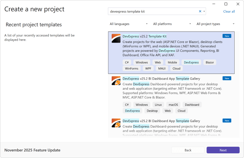
XPO ORM - Connection Provider Updates
We now support the most recent versions of the following database engines (for both .NET and .NET Framework):
-
PostgreSQL 18.0
-
Microsoft SQL Server 2025
Documentation
Common Enhancements — Blazor UI
#Middle Tier Security: Official Release/RTM
XAF Blazor now supports Middle Tier Security for secure communication between the frontend and backend, helping to protect sensitive data and enforce stricter access controls.
General Security Considerations | Security-Related Blog Posts
#Fluent Themes and Icons: Official Release/RTM
We released Dark and Light Fluent Themes for XAF Blazor v25.2 and expanded our SVG icon pack with colorful XAF-specific icons that match the Fluent Theme and its dark/light palettes.
You can now set the Primary Accent Color using our Theme Chooser.
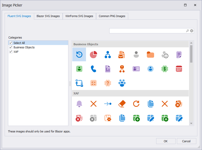
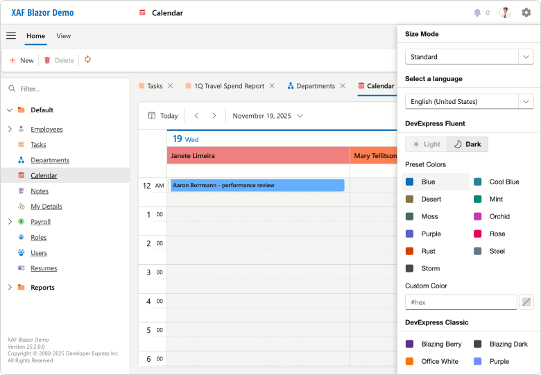
#Ribbon UI Support
With XAF v25.2, you can display the application main menu as a Ribbon UI (combined with a Tabbed MDI by default). Our implementation supports Ribbon UI command merge operations: XAF Controller's Actions are processed across main and detail form templates (just like our XAF WinForms implementation).
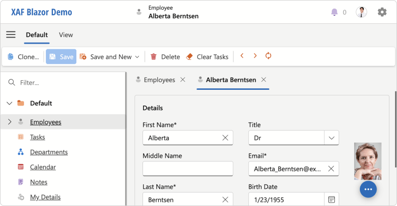
Open the Model Editor and set the IModelOptionsBlazor.FormStyle property to Ribbon to activate this feature. You can use the new ActionDesign | ActionToRibbonMapping node to customize the Ribbon's structure.
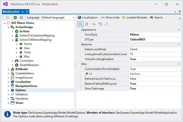
#Native Blazor Filter Builder Integration (CTP)
v25.2 ships with our new CriteriaPropertyEditor (available as a Community Technology Preview). CriteriaPropertyEditor uses the new DevExpress Blazor Filter Builder component and supports simpler localization, better performance, and native Blazor themes/palettes.
You can manually activate and test the CriteriaPropertyEditor in the Model Editor or in code. We hope to replace our existing JS-based FilterPropertyEditor with the new CriteriaPropertyEditor in v26.1.
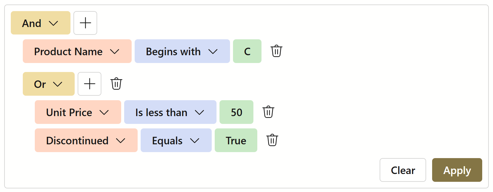
Cross-Platform Enhancements
#Cross-Platform Property and List Editor Enhancements (XAF Blazor and WinForms UI)
v25.2 includes the official release of our TagBox, ComboBox, and Progress Bar Property Editors.
TagBox and checked ComboBox are two popular options if you need to save space in detail forms (for collection data and as an alternative to large data grids)
Progress Bar displays the progress of an operation in both List and Detail Views (now supports inline-editing).
TagBoxListPropertyEditor] | ComboBoxListPropertyEditor] | ProgressBarPropertyEditor]
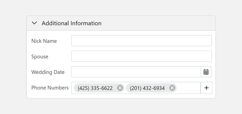
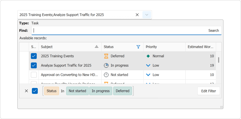
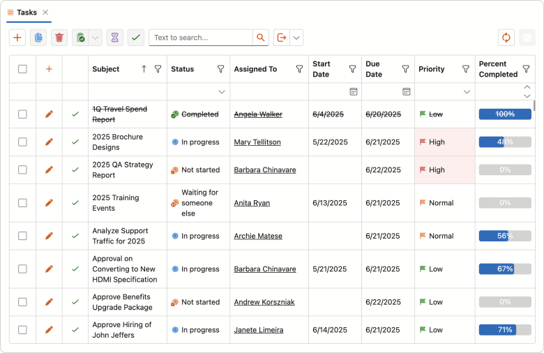
#PDF Viewer Property Editors: Official Release/RTM
In our v25.1 release cycle, we introduced the PDF Viewer Property Editors as a Community Technology Preview (CTP) for XAF Blazor and XAF WinForms. v25.2 marks its official release, complete with new customization options designed to enhance usability and flexibility within your WinForms applications. New features include:
- Customizable Ribbon and Toolbar. The WinForms PDF Viewer allows you to display the command interface as a Ribbon, Toolbar, or hide it entirely. You can also customize the available command set as requirements dictate.
- Open in a Separate Window. A new context menu option opens the PDF Viewer in a standalone window for a more focused viewing experience.
- PDF Field Editing. The WinForms PDF Viewer now allows you to edit fillable form fields and save these changes to the database.
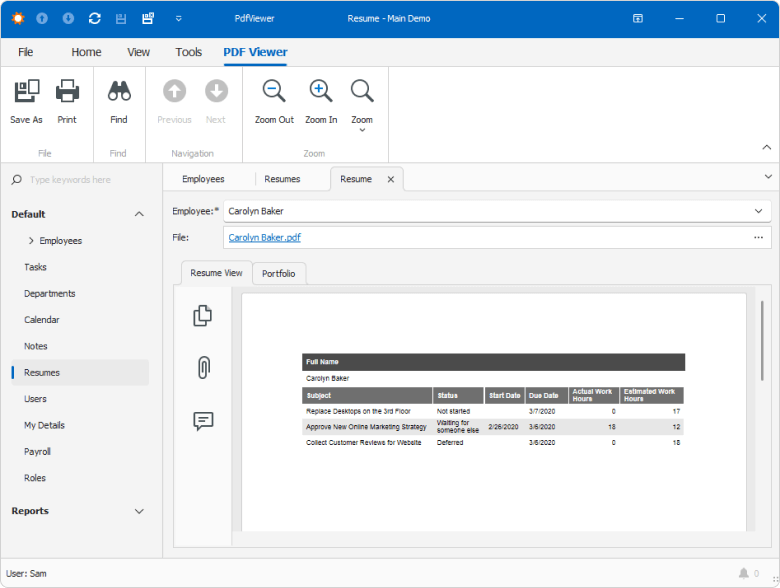
Documentation
#Simplified Access to Column Settings for Grid List Editors
You can write platform-agnostic code (see below) or access platform-specific column settings via ColumnWrapper descendants:
protected override void OnViewControlsCreated() {
    base.OnViewControlsCreated();
    if (View.Editor is ColumnsListEditor listEditor) {
        foreach (var column in listEditor.Columns) {
            column.ShowInCustomizationForm = false;
        }
    }
}
Documentation
Survey - XAF & Web API Service
Your Feedback Matters!
Please
login to complete the survey.
Survey Completed
Thank you for taking the time to complete this survey. Your responses have now been posted. If you want to follow up with additional information, feel free to send us an email at clientservices@devexpress.com anytime.
You've Already Completed This Survey
Our records show that you have already completed this survey. If you want to follow up with additional information, send us an email at clientservices@devexpress.com.
This survey has expired
If you want to share your feedback or request new functionality, please submit a new support ticket via the DevExpress Support Center. We’ll be happy to follow up.
Download Your Copy Today
Once you're ready to upgrade, simply login to the DevExpress Client Center and download the appropriate installer to proceed.
Download Free Trial (VCL)VCL Demos v25.2
Your feedback matters.
Please, review the description of VCL-related features below and leave your feedback at the end of the section.
Go to the survey now.
RAD Studio 13 Support
VCL v25.2.1+ and v25.1.4+ officially support the most recent versions of RAD Studio (Delphi 13 and C++Builder 13 for both 32-bit and 64-bit compilers).
Support Deprecation: Delphi/C++Builder 10.3, 10.2, 10.1, 10.0
Embarcadero first released IDE version 10.0 a decade ago. With our most recent update (v25.2), our VCL libraries only support 10.4 Sydney and more recent versions of RAD Studio (11.3, 12.3, 13.vLast).
Refer to the following for additional information: Prerequisites: Supported IDEs, Frameworks, and SDKs.
ExpressReports – Official Release
This update marks the official release of our AI-enabled VCL Reporting Platform (ExpressReports). New features/capabilities include:
-
Subreport support
-
Report Parameters
-
UI Localization enhancements
-
Unified VCL backend and enhanced Dependency Management
-
Updated Demos and enhanced documentation
Documentation | FAQ
Subreports
Subreports allow you to embed a report into a parent report (to enhance modularity and flexibility of your report design). Each subreport represents as an independent/reusable report template layout, ideal for designing recurring document sections such as headers, footers, and cover pages. Subreports are specifally effective for constructing master-detail structures and merged or side-by-side reports.
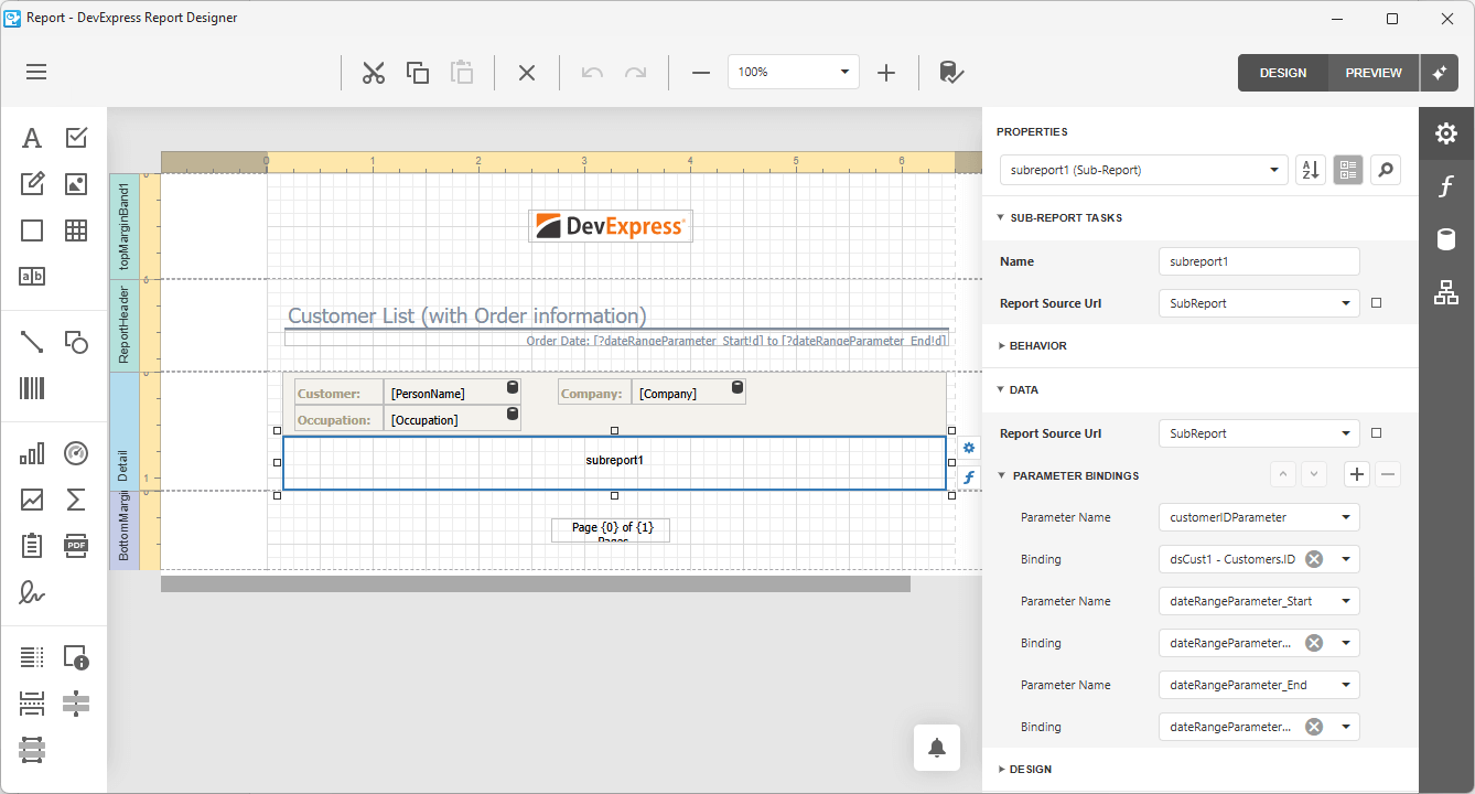
Report Parameters
New report parameters allow you and your users to filter report data dynamically using a straightforward/intuitive interface.
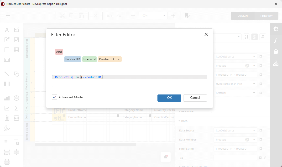
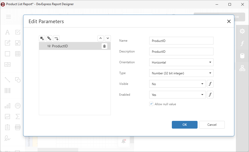
VCL v25.2 also makes it easier to access and customize report parameters using Delphi/C++Builder code at the TdxReport and TdxReportParameter level (for instance, to specify initial values or switch between visibility/readonly states).
uses
  dxReport,
  dxReport.Parameters;
// ...

var AParameter: TdxReportParameter;
    dxReport1: TdxReport;
// ...
    AParameter :=  dxReport1.Parameters['ProductID'];
    AParameter.Value := 1978;
    AParameter.Visible := False;
    AParameter.Enabled := True;
// ...
UI Localization Enhancements
With v25.2, DevExpress VCL Report Designer/Report Viewer UI elements can be fully localized (form headers, inner controls, etc.). You can also localize report documents using AI-powered extensions or our built-in Localization Editor (available within the Report Designer).
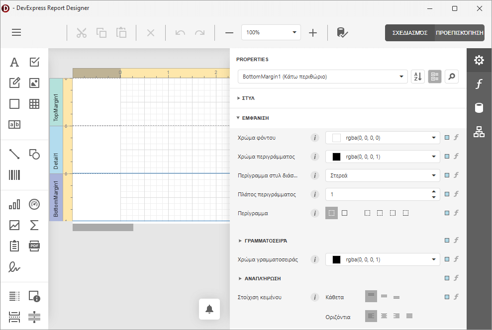
Unified VCL Backend and Enhanced Dependency Management
We refactored our shared ASP.NET Core-based backend to support both ExpressReports and BI Dashboard components. All dependencies are now managed via Central Package Management (CPM) across our .NET and JavaScript product lines. For additional information on the DevExpress VCL backend andits hybrid/web-based architecture, please refer to the following FAQ.
You can review our code to learn more about modern hybrid/web-based design. Full VCL backedn and WebView-related client-side code is available locally if you own the DevExpress VCL Subscription+. Local source is generally installed in the following directory: c:\Users\Public\Documents\DevExpress Demos 25.1\Components\Reporting\CS\VCLReportBackend\
To review .NET/JS source code:
Demo and Documentation Enhancements
Our ExpressReports compiled demo now includes additional modules for Subreports, Report Parameters, and other v25.2-specific features. We also added new GitHub examples for key usage scenarios:
-
Edit report templates at runtime using the End-User Report Designer and store these templates in a file system (GitHub).
-
Preview database-stored report templates within the app UI (GitHub).
-
Filter a report data source based on currently selected grid reports (GitHub).
-
Localize Report Viewer and Designer UI elements (GitHub).
A Preview of the Business Intelligence Dashboard (ExpressDashboards)
Our Delphi/C++Builder product line now includes a new VCL BI Dashboard (aka ExpressDashboards). ExpressDashboards is available as a Community Technology Preview (CTP).
Much like ExpressReports, DevExpress VCL Dashboard leverages our JavaScript Dashboard Designer and Viewer for native VCL apps (using modern web-based design capabilities via WebView and ASP.NET Core/JavaScript wrappers). All required .NET and JavaScript dependencies are embedded into a single self-contained EXE file. As such, you can use Delphi/C++Builder for many dashboard-specific customizations.
You can display/design BI dashboards either in modal full-screen mode or as an embedded/ad-hoc control on a form. Database, file system, and other dashboard template storage options are supported.
Documentation | FAQ
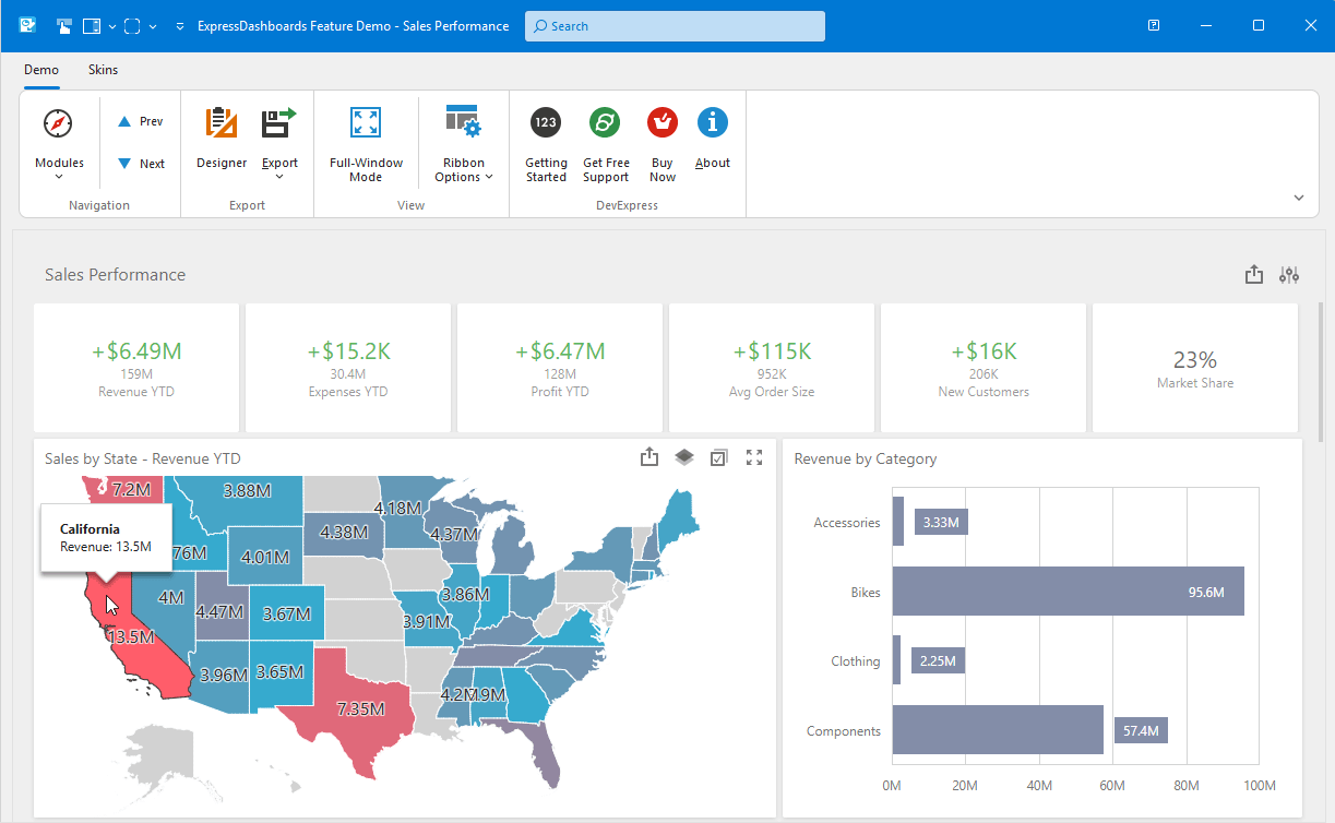
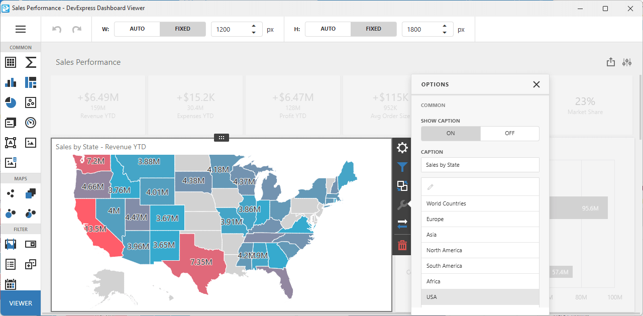
Accessibility, UI Automation, and Keyboard Navigation
VCL v25.2 includes accessibility (A11Y) enhancements for the following DevExpress VCL UI components:
- VCL Data Grid: Added group row support and additional control over cell data announcement.
- VCL Tree List: Key navigation support, read-only, and partial data editing usage scenarios (without complex interactions).
- Most popular VCL Data Editors: Key usage scenarios for both in-place and standalone editors.
Full VCL accessibility support is a significant undertaking and requires substantial development resources. We are committed to improve accessibility support for the DevExpress VCL Scheduler, Pivot Grid, remaining Data Editors (and other controls) throughout 2026.
Documentation
Artificial Intelligence (AI) Enhancements
v25.2 introduces AI-powered Smart Paste within the DevExpress VCL Data Grid and Layout Control. Smart Paste analyzes content and intelligently assigns correct values to appropriate layout fields or row cells (to transform traditional copy-and-paste operations):
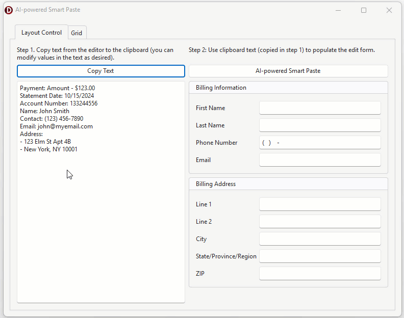
SmartCore AI Component Pack Integration
As you know, Embarcadero released brand new SmartCore AI Components shipped through the GetIt package manager. At present, the SmartCore AI platform is under active development. Once SmartCore APIs reach a production-ready state, we will integrate them into our AI-powered commands for native VCL controls. In the meantime, review the following integrations:
-
Smart/AI-powered menu commands for DevExpress VCL Text Editors, such as
TcxMemo or TdxRichEditControl (GitHub Example).
-
Smart/AI-powered semantic search/filter for the DevExpress VCL Data Grid (GitHub Example).
-
AI-powered Smart Paste functionality for the DevExpress VCL Data Grid and Layout controls (GitHub Example).
TIP: VCL developers can use SmartCore AI Components, connect third-party libraries, or implement custom support for different AI providers (GitHub Example).
Documentation
DevExpress MCP Server for AI-powered Documentation Access
We introduced an MCP server that connects GitHub Copilot Chat, Cursor, and other MCP-compatible AI tools directly to our comprehensive documentation database. The server provides instant access to over 300,000 help topics through natural language queries within your IDE. This allows you and AI coding agents such as Claude Code to access current DevExpress documentation directly within the AI assistant's context.
Refer to the following help topic for additional information: DevExpress Documentation MCP Server: Configure an AI-powered Assistant.
Easier SVG Assignment for Image Lists at Design Time
Since our v24.1 release, the DevExpress VCL Ribbon allows you to use a single image list for large and small SVG icons. VCL v25.2 adds this capability to the following components:
You can now configure large/small SVG icon settings for these components using new SVGOptions properties:
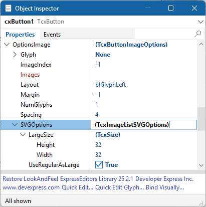
NOTE: Existing apps and usage habits will remain unaffected.
PDF Viewer Content Rendering Enhancements
BlendImage Support
We introduced BlendImage functionality with Darken and Multiply blend modes (additional modes will be added at a later time). You can now combine two images using multiple blending techniques.
Enhanced Gradient Rendering
We enhanced gradient rendering for image-to-fill and fill-to-image usage scenarios.
Optimized Embedded File Handling in PDF
We fixed issues related to nested PDF file embedding (for example, when a PDF contains another PDF). Additionally, binary data processing is now significantly faster because the parser no longer needs to pre-read embedded PDF data.
JBIG2Image Mask Support
Added support for predefined image masks in the JBIG2Image decoder. With v25.2, the JBIG2Image decoder supports predefined image masks and ensures correct rendering of PDF images that use mask data.
ColorSpaceName Persistence
We improved ColorSpaceName handling during document save operations to guarantee accurate color rendering.
Advanced Printing Features
When printing non-AsImage content, you can now print semi-transparent images or images with masks directly onto the printer canvas.
Shading Enhancements
Masks and transformation matrices are now applied correctly to final image output.
PNG Decoder Performance
Thanks to our optimized PNG decoder, you can expect up to a 30x speed improvement in certain decoding scenarios. Overall rendering performance has increased by 2–5x across multiple document types.
Text Rendering in TextClip Mode
Documents can now display multi-colored text, apply text fill effects, and overlay images on text. ClearType and Antialiasing at low DPI improve text rendering quality (compared to traditional clipping for small font sizes).
Enhanced HighDPI Support, Stability, and Performance
Hundreds of Quality Fixes
We continue to focus our efforts on quality bug fixes, performance and usability enhancements (especially for High DPI-related scenarios and vector skins). Refer to the following web page for a full list of enhancements in this regard: ~200 bug fixes and minor enhancements between VCL v25.1 and v25.2.
Faster Rendering of Vector Skin Elements
v25.2 introduces performance-related enhancements for VCL apps running on 4K and other high-resolution displays. We optimized caching algorithm used for SVG images (applies to all vector-based skins):
-
Approximately 20% rendering speed gains for apps using WXI/WXI Compact skins. Up to 10% performance improvement for other vector skins.
-
Up to 10-15% speed gain for UI element resize operations and reduced form flickering (especially noticeable with RibbonStatusBar-based forms).
-
Up to 60% rendering speed gain for complex form layouts using multiple editors in different states (disabled, read-only, etc.).
Updated RAD Studio Palette Icons
We "refreshed" the component icons in the IDE toolbox to help you distinguish them easier.
Survey - VCL
Your Feedback Matters!
Please
login to complete the survey.
Survey Completed
Thank you for taking the time to complete this survey. Your responses have now been posted. If you want to follow up with additional information, feel free to send us an email at clientservices@devexpress.com anytime.
You've Already Completed This Survey
Our records show that you have already completed this survey. If you want to follow up with additional information, send us an email at clientservices@devexpress.com.
This survey has expired
If you want to share your feedback or request new functionality, please submit a new support ticket via the DevExpress Support Center. We’ll be happy to follow up.
.NET 10 and Visual Studio 2026 Support
DevExpress .NET MAUI component libraries now support .NET 10 and Visual Studio 2026.
DevExpress Template Kit - macOS and Rider Support
With v25.2, our pre-designed .NET MAUI templates are fully available when developing on macOS. Our Template Kit now supports all major IDEs used for .NET MAUI development:
- Visual Studio (Windows)
- VS Code (Windows, macOS)
- JetBrains Rider (Windows, macOS)
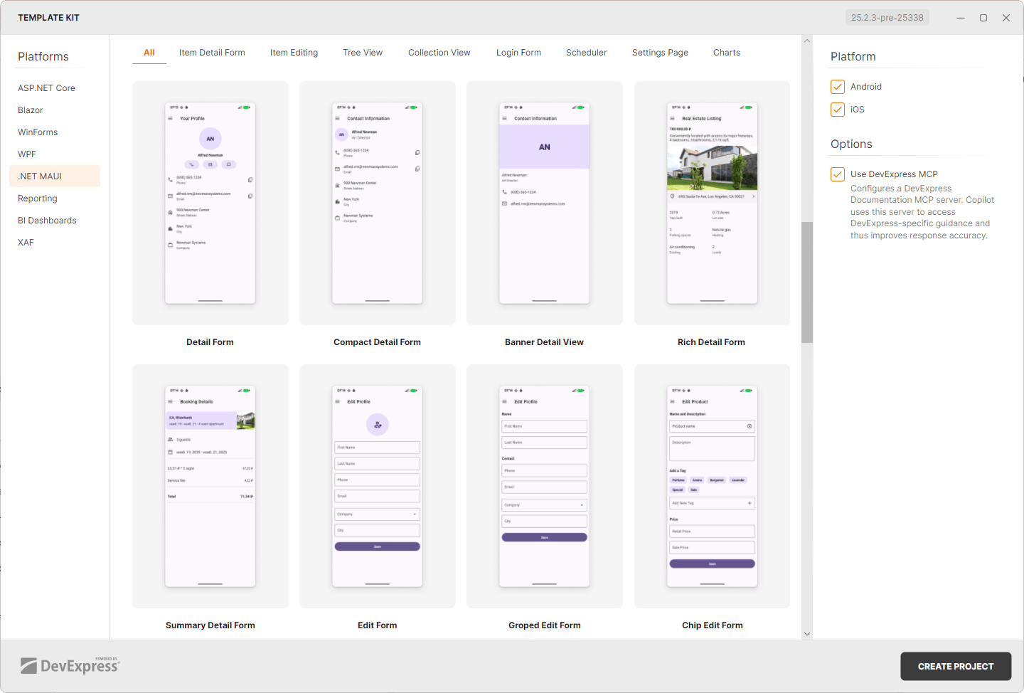
Android 16 KB Page Size Support
Starting November 1, 2025, Google Play requires all Android apps to support a 16 KB memory page size. We updated our .NET MAUI controls to meet this requirement. v25.2 ensures that you can continue to publish your .NET MAUI apps to Google Play without any compliance issues.
Improvements and Enhancements
We improved rendering, interaction response, and data-binding in our .NET MAUI controls for a smoother and more consistent experience. Our PDF Viewer, DataGrid, Editor, and Scheduler components now operate more reliably. DevExpress-powered mobile apps feel smoother and more stable.
See Resolved Issues
AI Features
AiGen and AiFind now work with more models and providers, supporting gpt-5 as well as Azure Open AI. We also support the Responses mode available in some AI models. You can configure these new model settings on the IDE/Cognitive/API Keys option page.
Visual Studio 2026 (CTP)
We patched number of features to improve their integration with Visual Studio 2026.
Code Formatting
We added new formatting settings:
- New options to format collection expressions. You can now define wrapping and spacing options for [1, 2, 3] expressions (C# 12).
- New options to wrap closing paren after parameters and arguments.
Code Cleanup
We updated the list of modifiers handled by the Sort Modifiers rule. It now contains all modifiers supported by modern versions of C#.
Refactorings
Implement IComparable and Implement IEquatable now allow you to select which members participate in their implementation, offering the same user experience as the Declare Menu, available via the Alt+Ins shortcut.