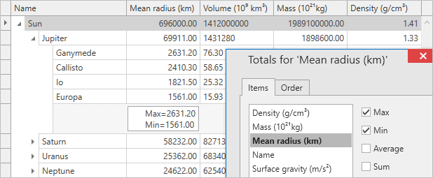
Data Grid Control
Merged Column Grouping
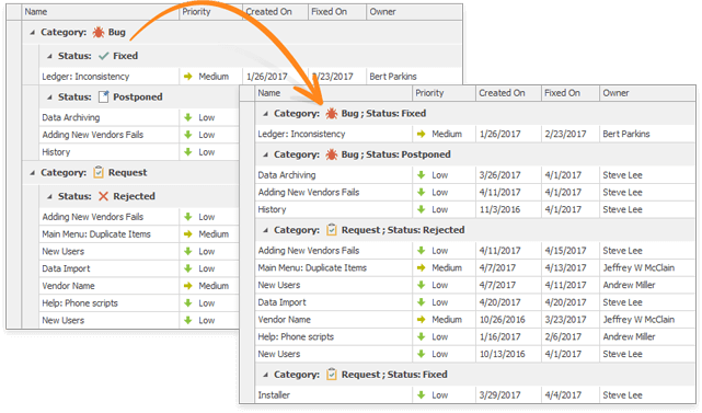
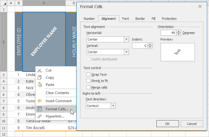
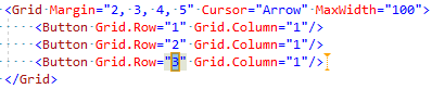
With v17.1, you can now merge grouped columns for both our WinForms and WPF Data Grid by dragging the appropriate column header(s) to the group panel and arrange them across a line while pressing the CTRL key. Drag column headers below or above this line to break merged grouping.
Blog Post Documentation
Office CompactView
With this release, we've extended our Grid's TileView with numerous customization options - allowing you to create a UX inspired by Office 365.
Blog Post
Our new Designer allows you to create a Tile Layout using a standard table design. You divide a tile template into rows and columns and place tile elements onto table cells using drag-and-drop. You can also merge table cells and create complex layouts.
Tile elements can be placed into table cells that resize proportionally. This allows you to create tiles that are adaptable to multiple resize operations.
You are not limited to using just one template for all tiles. You can create multiple tile templates and dynamically assign templates for individual tiles by handling corresponding event handlers.
Auto-Fill Empty Space
With this release, you can allow one column to automatically change its width in order to occupy any empty space within a view (GridView).
Documentation
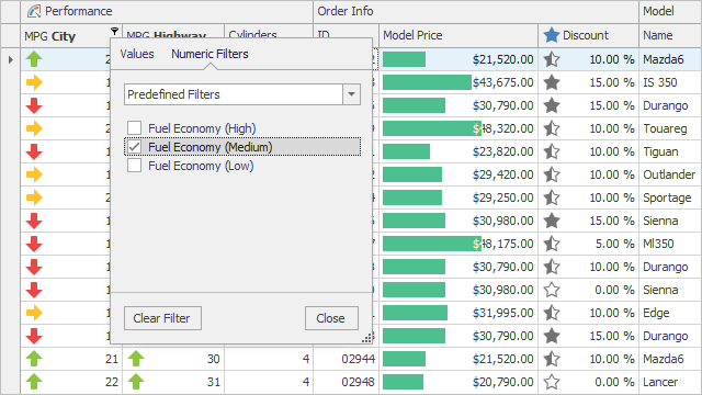
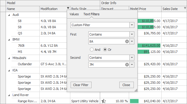
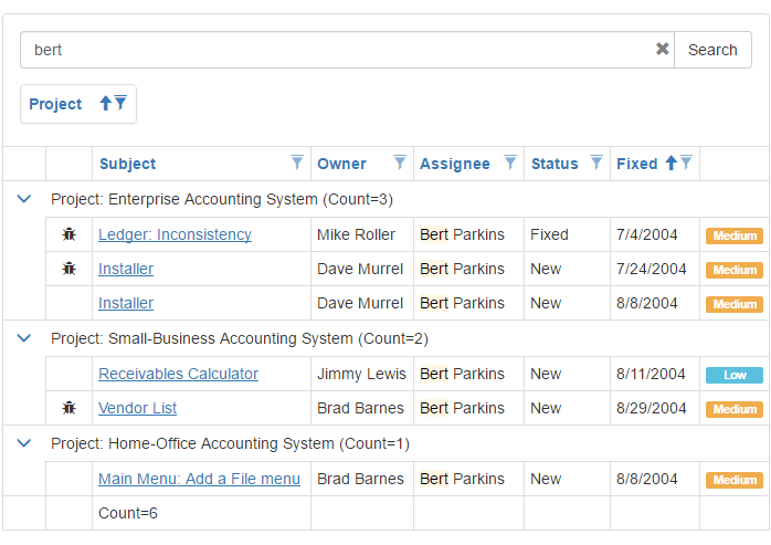
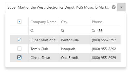
Excel Inspired Filtering Enhancements
In v17.1, we have extended Excel inspired filtering, first introduced last year. New features include:
- Excel-inspired filtering is now the default filtering mode.
- Filter by null or DBNull.
- Predefined custom filters.
- A new event handler allows you to change or remove filter items from the dropdown.
- New global static properties allow you to customize all excel-inspired dropdowns at once.
Blog Post
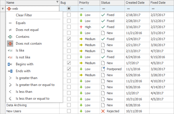
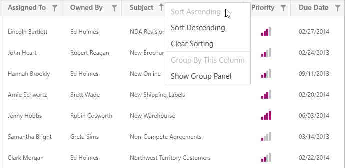
Selectable Filter Operators in Auto-Filter Row
With this release, end-users can specify WinForms Grid filter conditions for individual cells within the auto-filter row.
Documentation
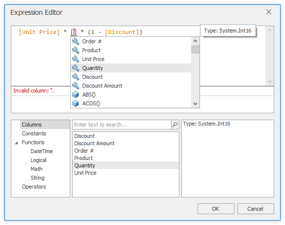
Intellisense Editor for Unbound Column Expressions
Our WinForms Data Grid, TreeList and Vertical Grid controls utilize a new Expression Editor for editing unbound column expressions. The DevExpress Expression Editor supports auto completion and syntax highlighting.
Documentation Blog Post
Column Best Fit Enhancements
In previous versions, the Best Fit operation iterated through every row and every cell editor to ensure that cells have enough space for their content. With this release, you can now set the BestFitMode property to 'Fast' to accelerate column Best Fit calculations. When used, Best Fit will calculate the approximate width for a column based on a cell's display text.
Performance Improvements
We've improved our WinForms Data Grid's performance when scrolling through rows and during cell update.
Code First - New Demo Module
We have added a new module to the Grid's main demo - 'Code First'. This module displays snippets used to perform basic and advanced operations on our WinForms Data Grid control. You can run the snippets directly from the module and immediately view its output. You can also modify the code prior to execution to test various use case scenarios.
Chart Control
Financial Charting Enhancements
v17.1 introduces the following financial charting enhancements:
Performance Improvements
With this release, we have improved our .NET Chart control to ensure faster execution in bound mode. Enhancements include optimized series data binding and multi-pane chart rendering. Chart performance in bound mode can now be compared to that available when using Charts in unbound mode. Our WinForms and WPF Chart controls now execute flawlessly with real-time data.
Blog Post
Legend Enhancements
DevExpress Chart legend items can now display a marker and check box simultaneously.
Diagram Control
Show/Hide Subordinate Shapes
Documentation

New Pan Tool
DevExpress Diagram ships with a new Pan tool, allowing you to move or pan a diagram in any direction.
Drag and Drop Enhancements
You can now drag and drop items between DevExpress Diagram Controls. New events allow you to process drag and drop operations manually.
Automatic Layout Enhancements
To help improve its presentation, our Diagram Control's automatic layout option recalculates connection point locations. Features include configurable page alignment for Tree, Tip-Over and Layered (Sugiyama) layouts. The Tree or Tip-Over layout can be applied to any portion of a Diagram.
Documentation
Diagram Designer - Flat UI
With this release, we have updated all Ribbon icons . Each icon is carefully crafted with vector in mind.
Background Customization
You can now specify the background image and color used for Diagram pages and canvas.
Documentation
Miscellaneous Enhancements
Additional updates include:
- Ability to move diagram items together with their subordinates.
- Ability to change the type of multiple connectors in code.
- End-users can now change the type of all diagram connectors at once.
- With this release, we have improved connector routing performance. Now it works much faster.
Editors
New Side Panel
v17.1 ships with our new WinForms Side Panel - a resizable pane with a one-pixel border which supports border snapping and overlay resizing.
Documentation
BarCode API Enhancements
Our WinForms BarCode includes a new 'ExportToImage(ImageFormat, float dpi)' method allowing you to export the BarCodeControl to various image formats and resolutions. In addition, you now have the ability to obtain the BarCodeControl's validity state.
Map Control
Large Vector Data Rendering Improvements
Both the performance and memory usage of our DevExpress WinForms Map control has been improved. Additionally, multiple MapPath items are now rendered with a single rendering passage. We've optimized scrolling and zoom operations and can now load large shapefiles faster.
Design-Time Enhancements
The following WinForms Map design-time features are now available:
PDF Viewer
Highlighted Text Display
With this release, our PDF Viewer can display highlighted text.
Pivot Grid Control
Performance Improvements
We have improved the in-memory data processing capabilities of the DevExpress Pivot Grid Control. It is now up to 3-7 times faster than previous versions.
KB Article Documentation
Property Grid
Intellisense Editor for Unbound Column Expressions
Our WinForms Data Grid, TreeList and Vertical Grid controls utilize a new Expression Editor for editing unbound column expressions. The DevExpress Expression Editor supports auto completion and syntax highlighting.
Blog Post
Scheduler Control
MS Outlook Inspired UI
With this release, we have updated the following WinForms Scheduler UI elements to better reflect the UX of MS Outlook.
- Time Cell;
- Cell Selection;
- Appointment Rectangle and its Inner Layout;
- Navigation Buttons;
- Day Headers;
- Date Navigation Bar;
- Cell Editors;
- Appointment Flyout/Tooltip;
- Appointment Status Colors.
Documentation
Miscellaneous Enhancements
- Smooth animated scrolling in Day, Work-Week, Full Week, Week, and Month views.
- Animated drag-and-drop.
- Redesigned resource color palette.
- Improved graphics performance.
Skins
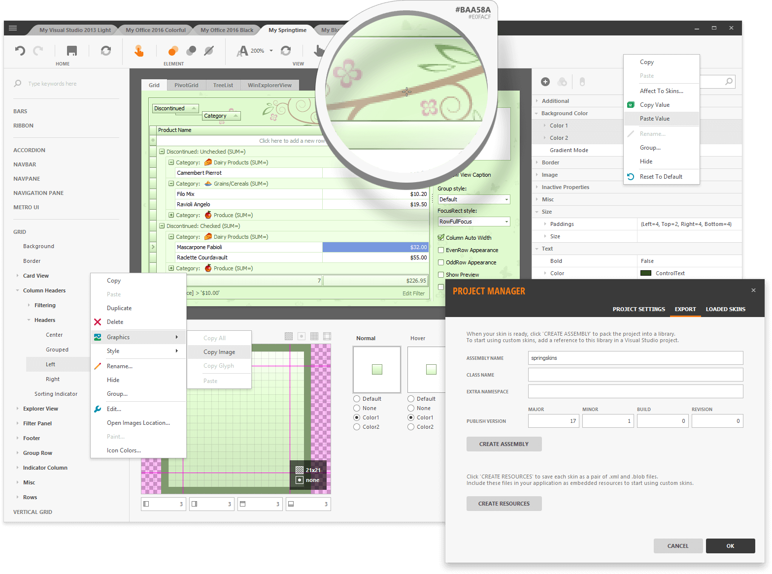
New Skin-Theme Editor
This release ships with a redesigned WinForms Skin Editor - designed to simplify skin-theme modifications.
Blog Post Documentation
Spreadsheet Control
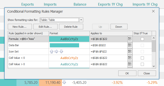
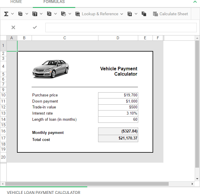
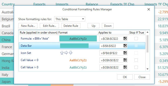
New Conditional Formatting Rules Manager
DevExpress Spreadsheet v17.1 ships with a new Conditional Formatting Rules Manager. With it, you can allow end-users to add new formatting rules, modify or delete existing rules applied to a selected cell range or the entire worksheet.
Blog Post Documentation
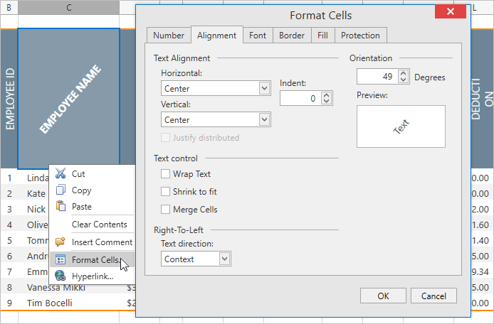
Rotated Text
With this release, DevExpress Spreadsheet gives you the ability to rotate text within individual spreadsheet cells. Rotated text can be printed and exported to PDF format.
Blog Post Documentation
Updated GUI with Support for Vector Icons
We have replaced all bitmap icons with SVG images to improve the look and feel of apps powered by DevExpress Spreadsheet for WinForms and WPF across high resolution monitors. Our previous GUI (bitmap images) has been retained for backward compatibility.
File Type Detection
With this release, you don't need to specify the document format when loading it from a stream or Byte array using the Spreadsheet's 'LoadDocument' methods. The file type is now identified automatically by the integrated file format detector.
TreeList Control
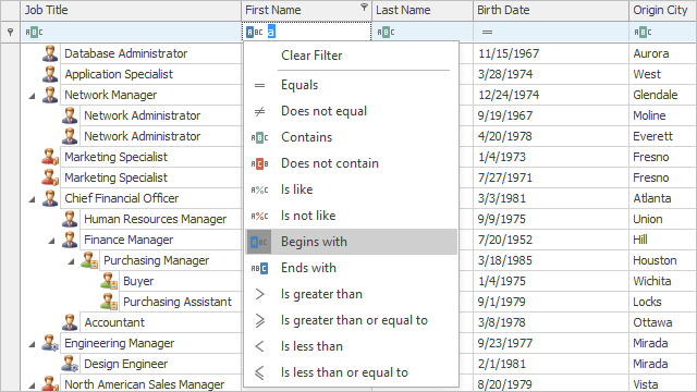
Excel Inspired Filtering
Much like its WinForms Grid counterpart, our WinForms TreeList control supports MS Excel-inspired column filter popups.
New filter popups consist of two tabs:
- The first tab allows you to select from among all available values.
- The second tab allows you to create a filter expression using a set of filter operators (Equals, Between, Contains, etc.).
Blog Post
Selectable Filter Operators in Auto-Filter Row
With this release, end-users can specify WinForms TreeList filter conditions for individual cells within the auto-filter row.
Blog Post Documentation
Intellisense Editor for Unbound Column Expressions
Our WinForms Data Grid, TreeList and Vertical Grid controls utilize a new Expression Editor for editing unbound column expressions. The DevExpress Expression Editor supports auto completion and syntax highlighting.
Blog Post
Performance Improvements
With this release, we have almost improved our WinForms TreeList to such a degree that it's on par with our WinForms Grid from a performance perspective. You will be pleasantly surprised as to how fast our WinForms TreeList executes the functions listed below.
Blog Post
API Enhancements
In this release, we have updated the Tree List's API so that it is more consistent and in-line with our WinForms Grid. These changes address common data operations and include:
- Obtaining and Setting Cell Values;
- Data Sorting and Filtering;
- Node and Cell Selection;
- Value Formatting;
- Hit Testing.
Our new WinForms TreeList API also includes a LINQ-friendly node iterator with lambda expressions support.
Blog Post
Code First - New Demo Module
We have added a new module to the TreeList's main demo - 'Code First'. This module displays snippets used to perform basic and advanced operations on our WinForms TreeList control. You can run the snippets directly from the module and immediately view its output. You can also modify the code prior to execution to test various use case scenarios.
Miscellaneous Enhancements
Design-Time Enhancements
With this release, all DevExpress WinForms controls can be customized using a fully integrated Designer. To invoke a control's Designer, use the 'All Properties' smart tag.
We have also added an 'Options' page to these Designers. The 'Options' page lists all control properties allowing you to customize a control without using the Visual Studio Properties window.
Improved Versioning and Support for Legacy Behaviors
As new features are introduced in our WinForms product line, default behavior may change over time. If you decide to migrate to the latest version of our WinForms controls and wish to retain control settings from a previous version, simply use the new DefaultSettingsCompatibilityMode property.
For example, setting the DefaultSettingsCompatibilityMode property to 'v16' enables the default behavior that was available in v16.x for all controls whose behavior has been modified in v17.1.
Documentation
Accordion Control Enhancements
We've extended the capabilities of our WinForms Accordion control with the following new features:
- Built-in separator to delimit navigation items.
- Ability to select an element on MouseDown.
- Smooth scrolling.
- Ability to customize an element's position during expansion.
OData v4 Support (Data Source Wizard)
With this release, our Data Source Wizard supports OData v4 data sources. OData is an open protocol initiated by Microsoft, allowing you to publish, read and edit resources defined in a data model using simple HTTP messages.
Documentation
Entity Framework Core Support (Data Source Wizard)
Our Data Source Wizard supports Entity Framework (EF) Core - a lightweight, extensible and cross-platform version of standard EF data access technology.
Documentation
Printing and WYSIWYG Export to Excel - Enhancements
Our WinForms Data Grid's group footer summaries are now displayed in group rows under corresponding column headers. Additionally, you can apply password protection for the XLS(X) file and export RTF data.
Data Aware Excel Export Enhancements
The following export enhancements ship as part of our v17.1 release:
- Ability to export node summaries (WinForms and WPF Tree List controls).
- WinForms Data Grid group footer summaries are now aligned in group rows under corresponding column headers.
- Password protection of an exported XLS(X) file.
- Ability to filter column values in the exported document in code.
- Ability to export RTF data.
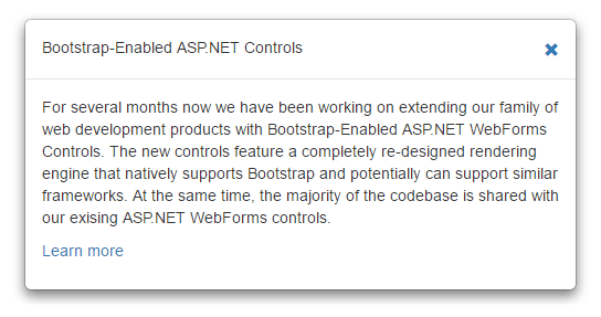
New Hint Control
This release ships with our new Hint Control for both ASP.NET Web Forms and ASP.NET MVC. As you might expect, the DevExpress ASP.NET Hint Control generates its content on demand and displays it within a box along with an arrow targeting the specified UI element on a web page.
Features include:
- A trigger action to display the hint (hover, click, focus, programmatic).
- Customizable delay before the display of the hint.
- Animation effects.
- Callout element availability.
- Position over the target element (bottom, top, left, right).
- Title text/markup (static or retrieved from the target element's attribute).
- Content text/markup (static or retrieved from the target element's attribute).
- Customizable size (height/width).
- Absolute positioning (x/y).
Demo: Web Forms
Demo: MVC
Blog Post
Documentation
GridView Control
Command Toolbar
With this release, our ASP.NET Grid, Card View, Vertical Grid and TreeList Control ship with customizable Toolbars - allowing you to group the most frequently used grid commands for quick access. You can add or remove toolbars, change their position and contents as necessary. Toolbar items can trigger standard grid commands (e.g. data item editing, deleting, creating, etc) and any custom actions.
Demo: Web Forms
Demo: MVC
Documentation
Touch-Enabled Customization Dialog
Our new mobile-friendly ASP.NET Web Forms Grid Customization Dialog allows you to apply column level data shaping operations with absolute ease when using touch-enabled devices. The new dialog is optimized for tablets, smartphones and desktops/laptops with touch screen displays. The following sections are available:
- Column Chooser
- Sorting
- Filtering
- Grouping
Demo: Web Forms
Demo: MVC
Documentation
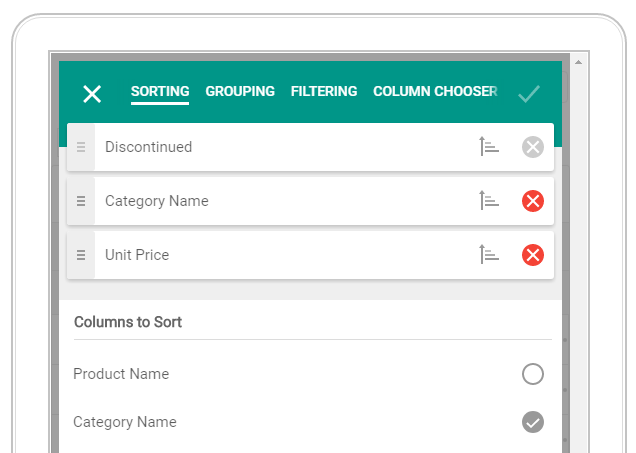
Chart Control
Client-Side Chart Designer Enhancements
The DevExpress Client-Side Chart Designer has been enhanced and now ships with the following features:
- Ability to configure secondary axes and additional chart panes.
- Ability to specify a summary function for a series and aggregate function for an axis.
Documentation
Legend Enhancements
DevExpress Chart legend items can now display a marker and check box simultaneously.
Persist Legend Check Box State for Auto-Generated Series on Callbacks.
With this release, you can optionally save legend checkbox state for auto generated series on callbacks. To activate this feature, enable the SaveStateOnCallback option.
Editors
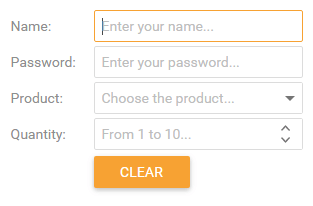
Display Null Text in a Focused Editor
To help web application usability, DevExpress Data Editors for ASP.NET Web Forms and ASP.NET MVC can now display null text in a focused editor.
Demo: Web Forms
Demo: MVC
Documentation
Html Editor
Improved MVC API
With this release, you no longer need to specify validation settings in multiple locations (in the view and the binder). A new model data attribute allows you to specify validation settings for the HTML markup entered into the HTML View directly in the editor's model.
Demo
Documentation
Client-Side API Enhancements
With this release, the DevExpress ASP.NET HTML Editor's client-side API ships with a set of new client methods, events and extended command arguments to help you process and customize standard dialogs as needed.
Demo
RTF Server-Side Processing
With this new property, you can force the DevExpress ASP.NET HTML Editor to process pasted RTF content on the server. This engine preserves images and retains original the formatting that was copied from a desktop word processing application, such as Microsoft Word, Microsoft Outlook, Apple Pages, Apple Mail, etc.
Documentation
Pivot Grid Control
Performance Improvements
We have improved the in-memory data processing capabilities of the DevExpress Pivot Grid Control. It is now up to 3-7 times faster than previous versions.
KB Article
Documentation
Rich Editor Control
Floating Objects
With this release, the DevExpress ASP.NET Rich Text Editor offers support for floating objects. End-users can now insert pictures and text boxes into a document as needed.
Demo: Web Forms
Demo: MVC
Blog Post
Documentation
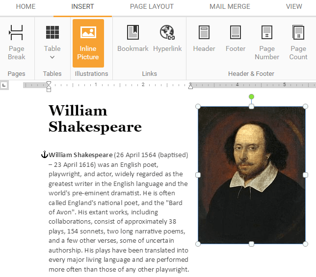
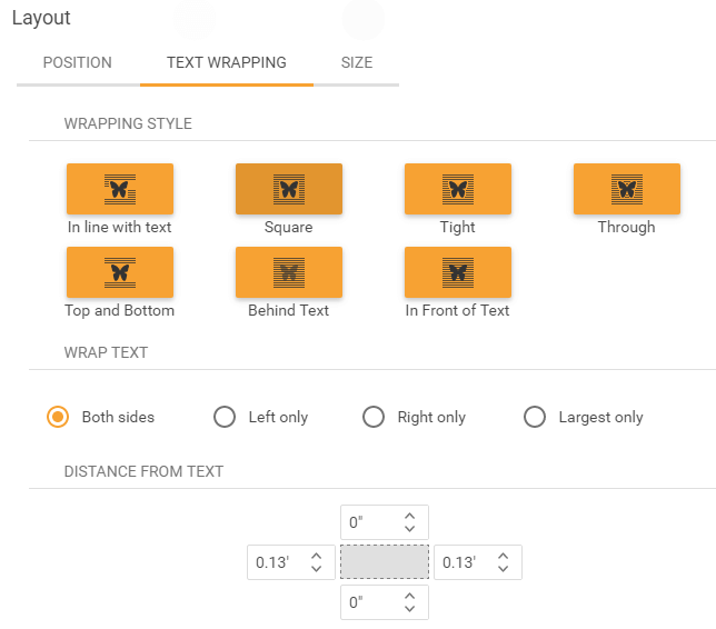
A new Layout dialog allows you to specify the size, position, rotation and text wrapping of floating objects.
Mail-Merge UI Enhancements
- The Create Field command exposes a sub-menu with multiple options allowing end-users to choose a new field's type.
- The Insert Merge Field dialog has now a search box providing end-users with an easy and straightforward way to locate data fields by typing the filter criterion.
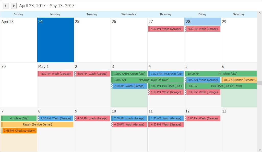
Scheduler Control
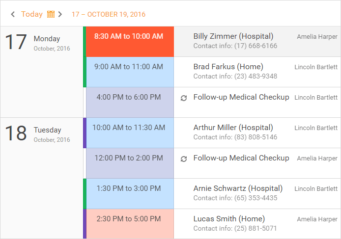
New Agenda View
The DevExpress ASP.NET Scheduler now ships with an Agenda View - a compact representation of a daily schedule.
Demo: Web Forms
Documentation
Blog Post
Timeline View Improvements
We've made our Timeline more readable when it has too many intervals. The new 'DisplayIntevalCount' option allows you to restrict the number of visible intervals and let the appointment text fit in the para. We've also added horizontal scrolling to view the rest of the intervals.
Demo
Blog Post

Keyboard Support
The DevExpress ASP.NET Scheduler Control now offers keyboard shortcut support for a variety of end-user actions including time cell and appointment navigation and selection, appointment editing and view switching. You can also create additional shortcuts and associate them with your custom client-side logic.
Demo
Blog Post
Spreadsheet Control
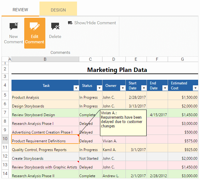
Excel-Inspired Comments
You can now annotate worksheets by using comments. Comments are displayed in a floating box anchored to a cell. End-users can add new comments, edit, hide or delete existing comments, move and resize the comment box.
Demo: Web Forms
Demo: MVC
Documentation
Context Menu Customization
With this release, you can handle a new client-side event and customize our ASP.NET Spreadsheet's context menu (insert new menu items, remove or disable existing items). Event parameters allow you to identify the worksheet element (a cell, row or column header, chart or picture) for which the context menu is invoked and prevent the menu from being displayed.
Demo: Web Forms
Demo: MVC
Documentation
Max Row and Column Count
You can now specify the maximum number of rows and columns to be displayed in a worksheet.
Demo: Web Forms
Demo: MVC
Documentation
Miscellaneous
Compact Version of Material Theme
v17.1 includes a new Material Compact Theme. As you can see, we've reduced paddings so that the appearance of web apps powered by this new theme appear more compact.
GridView Control
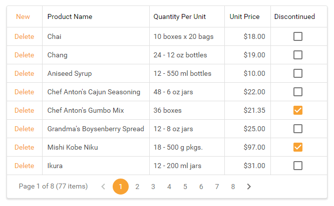
The Bootstrap Grid View control is a powerful and versatile data-aware grid with extensive data shaping functionality. Its features include:
- Data Binding (supports multiple data source types);
- Data Sorting and Grouping;
- Data Filtering;
- Data Editing;
- Summaries;
- Paging;
- Templates;
- Master-Detail Data Presentation.
Demo
Blog Post
Documentation
Accordion Control
The DevExpress Bootstrap Accordion allows you to incorporate intuitive navigation elements in your next web app. As you can see, the Accordion displays navigation items within groups.
Demo
Documentation
CallbackPanel
The Callback Panel is a lightweight para control that dynamically updates its contents using callbacks to the server - without reloading the entire page.
Charts
DevExpress Bootstrap Charts are a set of server-side wrappers for our JavaScript-based DevExtreme Chart widgets - allowing you to leverage your knowledge of ASP.NET to integrate DevExtreme Charts into your next web application. Bootstrap Charts ship with the following features:
- 30 chart series types.
- End-user interactivity.
- Rich server-side and client-side API.
- Wide range of customization options.
- Flexible data binding engine.
Demo
Editors
Button
The Bootstrap Button control extends standard button functionality with an extended API that includes the ability to modify button properties and respond to button events using client code.
Demo
Documentation
Button Edit
The Bootstrap Button Edit control displays a text editor with one or more buttons displayed in its client region.
Demo
Documentation
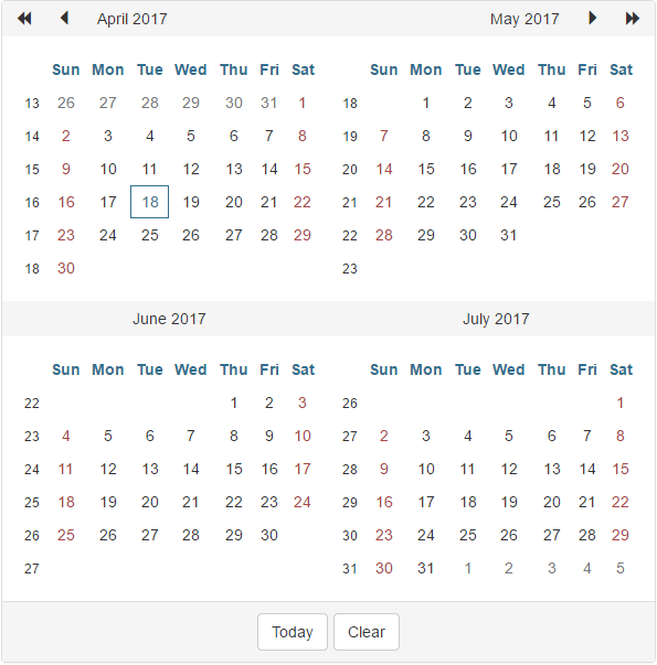
Calendar
The Bootstrap Calendar control allows end-users to select dates and navigate through individual months-years.
Demo
Documentation
Check Box
The Bootstrap Check Box can be used to visualize Yes/No or True/False conditions.
Demo
Documentation
Check Box List
The Bootstrap Check Box List editor represents a check box group and allows an end-user to select multiple items. Its contents can be generated dynamically by binding the editor to a data source.
Demo
Documentation
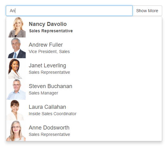
Combo Box
The Combo Box control is dropdown list editor allowing end-users to select from a list of specified values.
Demo
Documentation
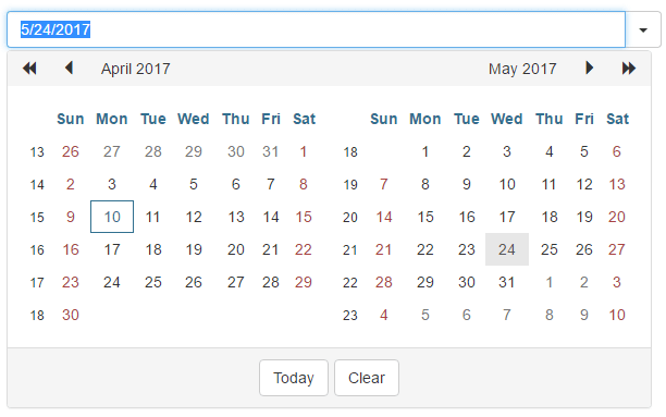
Date Edit
The Bootstrap Date Edit control is a date editor control that combines the functionality of a single-line text editor, button editor and dropdown calendar.
Demo
Documentation
List Box
The Bootstrap List Box control displays a list of selectable items.
Demo
Documentation
Memo
The Bootstrap Memo control allows end-users to edit data across multiple lines.
Demo
Documentation
Progress Bar
The Progress Bar control visually indicates the state of a given operation.
Demo
Documentation

Radio Button
The Bootstrap Radio Button editor allows users to select a specific item.
Demo
Documentation
Radio Button List
The Bootstrap Radio Button List represents a collection of radio buttons and gives users the ability to select a single item from the radio button group.
Demo
Documentation
Spin Editor
The Bootstrap Spin Edit control gives users the ability to modify numeric values by incrementing/decrementing data via spin buttons, mouse wheel, or the keyboard.
Demo
Documentation

Text Box
The Bootstrap Text Box control is a single-line text editor.
Demo
Documentation
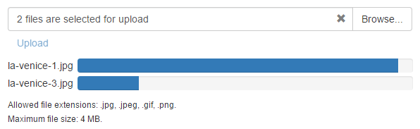
Upload Control
The Bootstrap Upload Control allows end-users to upload files to the server via the browser. End-users can select the appropriate file by invoking the standard Open File dialog or by dragging the file to the control.
Demo
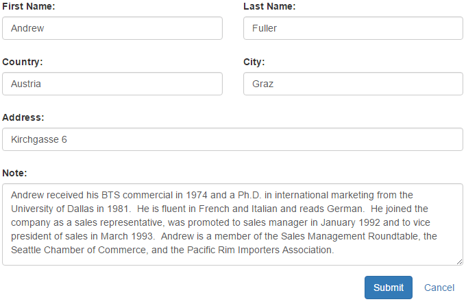
Form Layout
The Form Layout control simplifies the manner in which you create form layouts within Visual Studio. It allows you to construct complex layouts by manipulating the order and hierarchy of layout elements.
Demo
Documentation
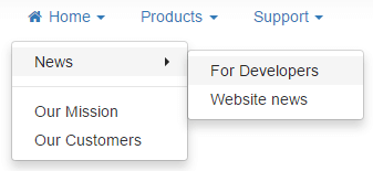
Menu
The Bootstrap Menu gives you an easy way to incorporate navigation elements within your web application. It is a multi-level menu control that can be populated with static data or bound to a site map data source.
Demo
Documentation
Pager
The Pager control provides a visual interface for custom paging solutions within your web application.
Demo
Documentation

Popup Control
The Bootstrap Popup Control allows you to display overlapping popup windows within web application.
Demo
Documentation
Popup Menu
The Bootstrap Popup Menu is a context sensitive menu that can be associated with a specific control on a webpage.
Demo
Tab and Page Controls
The Page Control and Tab Control allow you to present content as a set of tabbed pages. The Page Control allows you to associate specific content with each page, while the Tab Control displays tabs and requires you to update displayed content manually.
Demo
Documentation

TreeView Control
Our Bootstrap Tree View is a data-aware record navigation control designed to display hierarchical data within a tree-like UI metaphor.
Demo
Documentation

Accordion Control
Our new WPF Accordion Control is a feature-rich navigation control designed to extend the capabilities found in our existing Navigation Bar. The Accordion Control allows you to create a full-featured NavBar with multiple items (actions). Items can be combined into groups. Groups can contain nested groups so you can create an advanced hierarchical navigation menu.
The DevExpress Accordion Control ships with the following features:
- Unlimited number of hierarchy levels.
- Data binding support.
- Expand/collapse animation.
- Glyph support.
- Custom item content.
- Built-in search.
- Virtual mode.
- Ability to specify which items can be selected by an end-user.
Documentation
Blog Post
Data Grid Control
Merged Column Grouping
With v17.1, you can now merge grouped columns for both our WinForms and WPF Data Grid by dragging the appropriate column header(s) to the group panel and arrange them across a line while pressing the CTRL key. Drag column headers below or above this line to break merged grouping.
Blog Post
Live Data Update Indicator
The DevExpress WPF Data Grid can now indicate data change state when using Conditional Formatting. Features include:
- New Trigger condition.
- Animation effects for all format conditions. Animation executes each time a cell value changes.
Blog Post
Miscellaneous Enhancements
This release includes a number of enhancements for our WPF Data Grid including:
- Support for multi-cell selection in master-detail mode.
- Availability of a SortFieldName property for individuals columns, allowing you to specify a different field for sort operations.
- Ability to save/restore a layout with autogenerated bands.
- Ability to load a Grid without a focused row.
- Simplified method to display custom Grid Cell Tooltips.
Additionally, WPF Data Grid Footer Summaries are now aligned in group rows under corresponding column headers when exported in data-aware mode.
Chart Control
Financial Charting Enhancements
v17.1 introduces the following financial charting enhancements:
Performance Improvements
With this release, we have improved our .NET Chart control to ensure faster execution in bound mode. Enhancements include optimized series data binding and multi-pane chart rendering. Chart performance in bound mode can now be compared to that available when using Charts in unbound mode. Our WinForms and WPF Chart controls now execute flawlessly with real-time data.
We've also improved 2D series rendering with the default points model, allowing you to use all standard series types for apps that require real-time analytics.
Blog Post
MVVM Support
With this release, our WPF Chart Control ships with MVVM pattern support and incorporates the following new features:
- Multiple series types are now generated from the series source in a View Model.
- Custom axis labels and secondary axes are now generated from sources in a View Model.
Diagram Control
New Pan Tool
DevExpress Diagram ships with a new Pan tool, allowing you to move or pan a diagram in any direction.
Show/Hide Subordinate Shapes
Documentation
Automatic Layout Enhancements
To help improve its presentation, our Diagram Control's automatic layout option recalculates connection point locations. Features include configurable page alignment for Tree, Tip-Over and Layered (Sugiyama) layouts. The Tree or Tip-Over layout can be applied to any portion of a Diagram.
Documentation
Background Customization
You can now specify the background image and color used for Diagram pages and canvas.
Documentation
Drag and Drop Enhancements
You can now drag and drop items between DevExpress Diagram Controls. New events allow you to process drag and drop operations manually.
Miscellaneous Enhancements
DevExpress Diagram v17.1 ships with the following minor enhancements:
- Ability to move diagram items together with their subordinates.
- Ability to change multiple connector types in code.
- End-users can now modify all diagram connectors types simultaneously.
- Improved font quality and large shapes when a diagram is printed.
- Ability to create custom toolbars with the Diagram's Ribbon items.
PDF Viewer
Highlighted Text Display
With this release, our PDF Viewer can display highlighted text.
Pivot Grid Control
Performance Improvements
In v17.1, we have improved in-memory data processing of the Pivot Grid Control to work up to 3-7 times faster.
KB Article
Documentation
API Enhancements
The DevExpress WPF Pivot Grid v17.1 ships with the following enhancements:
- New PivotGridField.FieldFilterValues and PivotGridGroup.GroupFilterValues properties allow you to filter a Pivot Grid's data in XAML.
- Ability to define Pivot Grid fields and groups using MVVM via the FieldsSource and GroupsSource properties.
- New converter classes (EventArgsToCellInfoConverter, EventArgsToFieldValueInfoConverter) to help you obtain cell and field value information (data field, row and column values, drill-down data, etc.).
- Ability to obtain information about the currently focused cell (SelectedCellInfo).
- The PivotGridField.HeaderImage and TreeViewHeaderImage properties allow you to display an Image to the left of a field header.
- New PivotGridControl.CellStyle and FieldValueStyle properties allow you to set the cell's background and border colors.
Rich Text Editor
Integrated Ribbon UI
With v17.1, our WPF Rich Text Editor ships with an integrated Ribbon-based UI. Use the Rich Editor's properties and Ribbon actions to display, hide or customize the Ribbon UI as needed. Our previous Ribbon UI generation technique has been retained for backward compatibility.
Documentation
Blog Post
Document Source Binding in XAML
With this release, you can bind the DevExpress WPF Rich Editor to a document source from XAML using the DocumentSource property. We offer support for the following:
- Stream;
- String (document content or document path);
- Uri;
- FileInfo;
- Byte array;
- RichEditDocumentSource (allows you to set the bound document's format).
Documentation
Specify Options in XAML
With this release, you can now specify Rich Text Editor options in XAML or by using the Properties window. All options are now bindable.
Spreadsheet Control
New Conditional Formatting Rules Manager
DevExpress Spreadsheet v17.1 ships with a new Conditional Formatting Rules Manager. With it, you can allow end-users to add new formatting rules, modify or delete existing rules applied to a selected cell range or the entire worksheet.
Blog Post
Documentation
Integrated Ribbon and Formula Bar
The Ribbon UI and Formula Bar are now integrated into the Spreadsheet Control so that XAML markup is more compact and readable. You can display, hide or customize the Ribbon by setting the Spreadsheet control's properties or using Ribbon actions. Our previous Ribbon UI generation technique has been retained for backward compatibility.
Documentation
Rotated Text
With this release, DevExpress Spreadsheet gives you the ability to rotate text within individual spreadsheet cells. Rotated text can be printed and exported to PDF format.
Blog Post
Documentation
Updated GUI with Support for Vector Icons
We have replaced all bitmap icons with SVG images to improve the look and feel of apps powered by DevExpress Spreadsheet for WinForms and WPF across high resolution monitors. Our previous GUI (bitmap images) has been retained for backward compatibility.
Document Source Enhancements
In v17.1, the Spreadsheet Control's DocumentSource integrates the file format detector allowing you to load a document omitting its type. Documents can be loaded from a stream, Byte array or any other location specified by the full file path or Uri.
Documentation
Themes
New Office 2016 Themes (Special Edition)
In this release, we have re-worked our Office 2016 (White, DarkGray, Colorful) Themes and optimized their visual tree so that WPF applications powered by DevExpress Controls can execute significantly faster. These new 'Special Edition' Themes ship with a color palette so you can modify theme colors via our new Theme Designer.
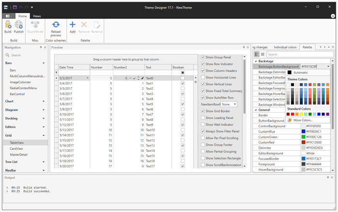
New Theme Designer (CTP)
Our new WPF Theme Designer allows you to create new themes by changing the color schemes of existing DevExpress Themes. Features include:
- Color palette and color scheme editing.
- Import existing schemes for editing.
- Quick preview.
- Automatic upgrade to new versions.
- Ability to build an assembly with a new theme.
Download WPF Theme Designer
TreeList Control
Node Summaries
With this release, our WPF TreeList control supports node summaries. End-users can display node totals for a column via the control's context menu.
Miscellaneous Enhancements
New Themed Window
Our new ThemedWindow control supports all DevExpress WPF Themes and automatically adjusts its appearance when you add a Ribbon or Tab Control to it.
PRISM Support
Our WPF product line now offers built-in support for Prism 5 and Prism 6. Our DevExpress.Xpf.PrismAdapters.v17.1 assembly provides adapters for the following controls:
- LayoutGroup;
- DocumentGroup;
- TabbedGroup;
- LayoutPanel;
- DXTabControl;
- NavigationFrame;
- NavBarGroup.
Grid Control
Input Validation and Error Indication
With this release, our Windows 10 Grid Control allows you to validate end-user data input and display error messages as necessary.
Documentation
Context Menu
With this release, our Windows 10 Data Grid control can display customizable context menus within its para.
Documentation
Text Trimming in Column Headers
Editors
Performance Improvements
Our Windows 10 TextEdit, SpinEdit and DateEdit controls load faster as a result of template optimizations and internal performance improvements.
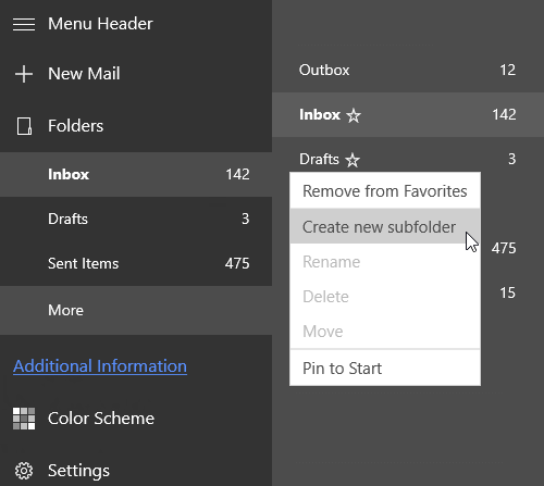
Hamburger Menu
Context Menu
Our Hamburger Menu can now display customizable context menus.
Documentation
Miscellaneous
Enhanced Theme Engine
v17.1 ships with an improved Windows 10 Theme Engine and simplified color scheme customization options.
Documentation
New SVG Icon Control
Our new Windows 10 SVG Icon control allows you to display vector images with fill color that is automatically updated based on the current theme.
Documentation
Context Menu
Our new context menu can be attached to any visual control.
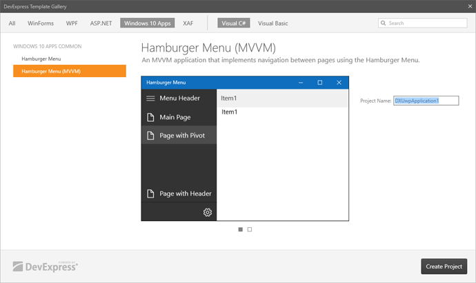
DX Template Gallery - New Hamburger Menu Template for MVVM
We've extended our DX Template Gallery with a new MVVM Hamburger Menu application template.
New DevExtreme React Grid (CTP)
DevExtreme v17.1 ships with our new React Grid. This new widget is not a wrapper over an existing jQuery widget but a native React component, rendered using Bootstrap 3. It has a composable and extensible architecture, supports both controlled and uncontrolled modes, and can be easily integrated with Redux.
Features include:
- Data Sorting and Grouping;
-
Data Editing (Edit Row, Edit Column, New Item Row);
- Filter Row;
- Detail Row;
- Paging;
- Multiple Row Selection;
- Virtual Scrolling.
Demos
Documentation
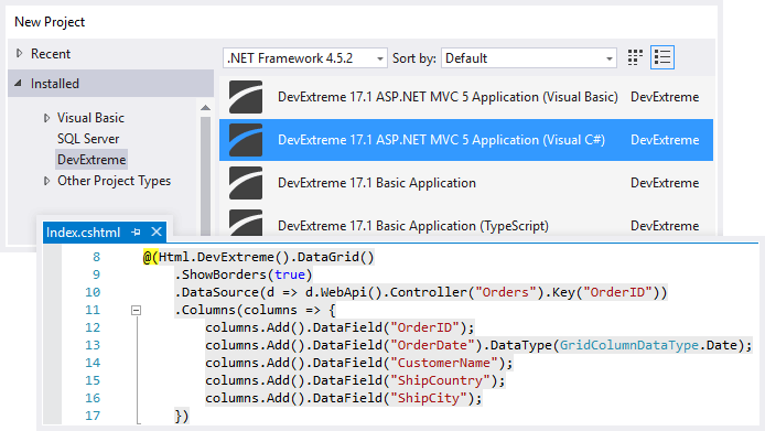
MVC Controls (RTM)
We are proud to announce the official release of our controls for ASP.NET MVC (v3 and higher) and .NET Core (v1.0 and v1.1). v17.1 also includes:
- Our Technical Demos cover over 200 use-case scenarios.
- Integrated Project Tools allow you to add DevExtreme controls to existing ASP.NET MVC and .NET Core projects.
- Visual Studio® 2017 Support.
- C# and Visual Basic Support.
Blog Post
Documentation
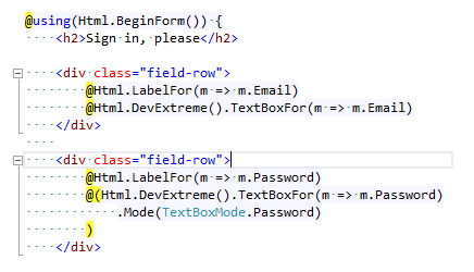
Strongly-Typed 'EditorFor' Helpers for DevExtreme Editors
'EditorFor' helpers simplify the data binding of DevExtreme editors to model properties. 'EditorFor' helpers auto populate widget properties (e.g. name, value, placeholder, validation settings, etc.).
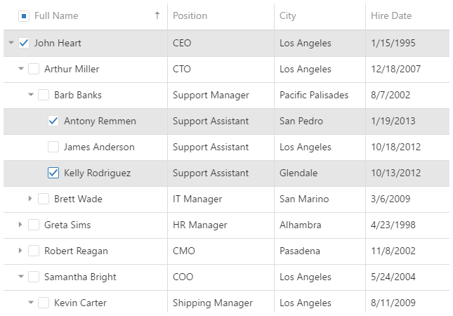
New TreeList
v17.1 introduces our new feature-complete, data-aware TreeView-ListView hybrid that can display information as a TREE, a GRID, or a combination of both with full data editing support. Its features include:
- Data Editing and Input Validation;
- Data Filtering and Search;
- Data Sorting
- Fixed and Band Columns;
- Keyboard Navigation;
- Virtual Mode;
- Virtual Scrolling and more.
Blog Post
Documentation
Video
Data Grid
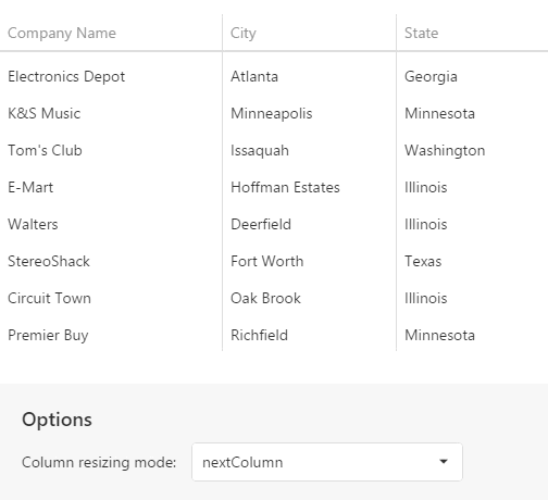
Advanced Column Sizing
With this release, you can set a column's minimum width and specify how columns are resized when users modify column width. You can specify whether to modify the width of the widget itself or whether to apply changes only to the column positioned after the resized column.
Blog Post
Documentation
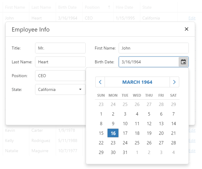
Popup Edit Form
This release includes a new HTML5 data editing mode. Our Data Grid's edit form can now be displayed within a popup window.
Blog Post
Documentation
Scheduler
Performance Enhancements
Our HTML 5 Scheduler is now able to render only new appointments, or those appointments whose size has been modified.
UI Widgets
DropDownBox Widget
Our new DropDownBox widget is an HTML 5 Editor that consists of a text field and linked drop-down content.
Documentation
Video
SelectBox and TagBox Enhancements
With this release, our Drop-Down List (in SelectBox and TagBox widgets) supports grouping.
TagBox Documentation
SelectBox Documentation
Our Select Box can now customize the drop-down button's appearance.
Documentation
All Platforms
End-User Sorting in Print Preview
End-users can now sort detail data and report groups. We have implemented several options allowing you to enable end-user sorting without writing code.
Documentation
Chart Filtering by Report Groups
With this release, you no longer need to write any code to visualize data in report groups when using charts.
Documentation
PDF Export Enhancements
With this release, we've extended the character set for non-embedded fonts supported by our PDF export engine from ISO Latin-1 to Adobe Glyph List. Additionally, you can now export Charts and Sparklines to PDF (in vector format) on Azure and Medium Trust environments.
Documentation
PDF Encryption
With this release, you can specify one of the following encryption algorithms for your PDF files:
- 128-bit AES (Advanced Encryption Standard) - used by default;
- 256-bit AES (Advanced Encryption Standard);
- 128-bit ARC4 (Alleged Rivest Cipher 4).
Documentation
Export to DOCX
Documentation
BarCode Validation
With our new BarCode runtime validation, you can ensure that a correct barcode is specified and that it is properly drawn on a document. If validation fails, a corresponding error message is displayed.
Documentation
Import from Crystal Reports (v13.0+)
Our new data import engine allows you to migrate existing reports from the latest version of Crystal Reports. The import engine supports SQL and Oracle data sources, summaries, parameters, and numerous other report features.
Documentation
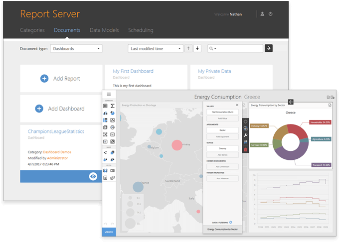
Report Server
Dashboard Support
This release integrates DevExpress Dashboard with our Report Server. You can now create dashboards using our integrated Web Dashboard Designer, bind to SQL data sources, schedule and send dashboard documents via e-mail, etc. Dashboards support all Report Server features including Data Model binding, revision storage and permission management.
Blog Post
Documentation
Working with Queries
We've supported SQL data sources provided by our Data Access Library, and improved a number of query related features, including:
- Support for parameters in filter expressions of a data model query.
- The ability to create queries within a specific report or dashboard.
- The ability to create relationships between tables that share no common key.
In some instances, you might need to update your scripts.
Documentation
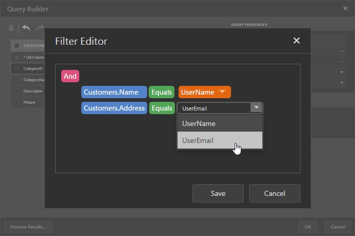
Filter by User-Related Functions
You can now filter data using account-related information (e.g. User Name, User Groups, Domain Name, etc.). This allows you to restrict data displayed within a report or dashboard for specific users.
Documentation
Web
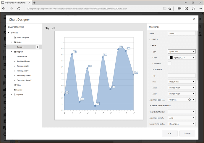
Chart Enhancements
v17.1 ships with a new Web Chart Designer with summary and data aggregation support. Additional features include the ability to customize the chart diagram, secondary axes, legends, constant lines and panes, scale breaks and strips.
Documentation
Web Report Designer for DevExtreme
The DevExpress Web Report Designer can now be seamlessly integrated into a DevExtreme HTML 5 web application.
Documentation
Web Report Designer - Report Explorer Enhancements
With this release, the Report Explorer ships with the following customization enhancements:
- Ability to reorder report bands and controls.
- Ability to move report controls between bands.
Documentation
Web Report Designer - Report Wizard Enhancements
Our Report Wizard now offers a SQL Data Source Wizard - allowing you to bind reports to a variety of SQL data sources.
Documentation
Web Report Designer - Field List Enhancements
You can now select multiple data fields and drag them onto a report. We've also introduced the ability to drag a data source onto a report and to drag data fields onto existing report controls (in order to bind these controls to corresponding fields).
Documentation
New Client-Side API
With this release, our client-side Web Report Designer and Document Viewer can be customized in code. A new API allows you to:
- Customize controls and their properties;
- Customize Report Designer and Document Viewer UI elements and actions;
- Localize the Report Designer and Document Viewer;
- Manage the Document Preview;
- Print and Export Reports
- and much more
Documentation
Miscellaneous Enhancements
-
Our Query Builder now offers support for the SELECT DISTINCT statement.
-
Our HTML5 Document Viewer can zoom a document page to fill all available space. Finally, we've improved the editors used to specify numeric parameter values.
WinForms
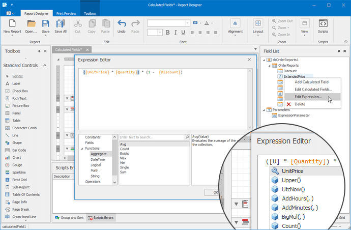
New Expression Editor
v17.1 ships with a new expression editor for calculated fields and formatting rules. The expression editor provides syntax highlighting and intelligent code completion options.
Documentation
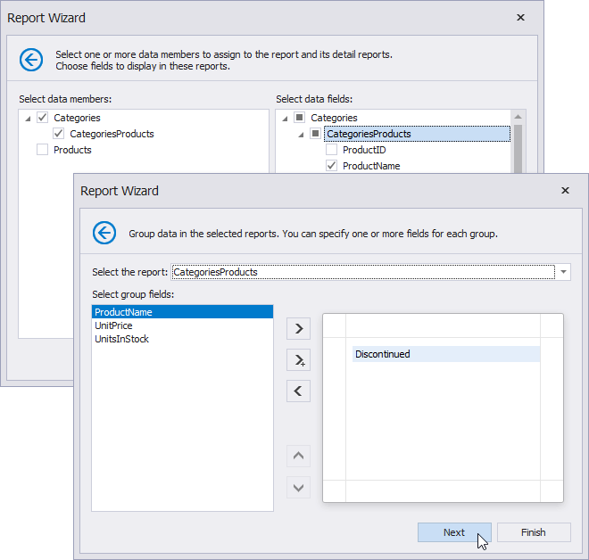
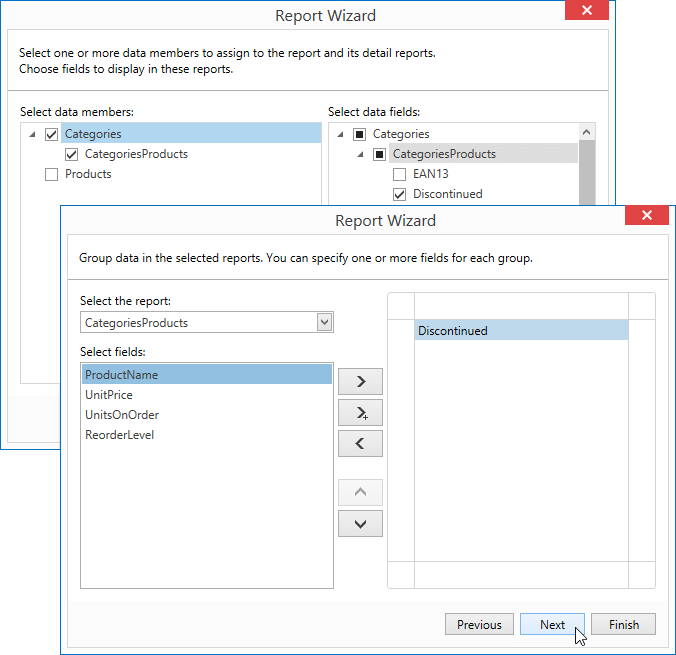
Create Master-Detail Reports in Report Wizard
Our Report Wizard allows you to create master-detail reports and specify associated group and summary options.
Documentation
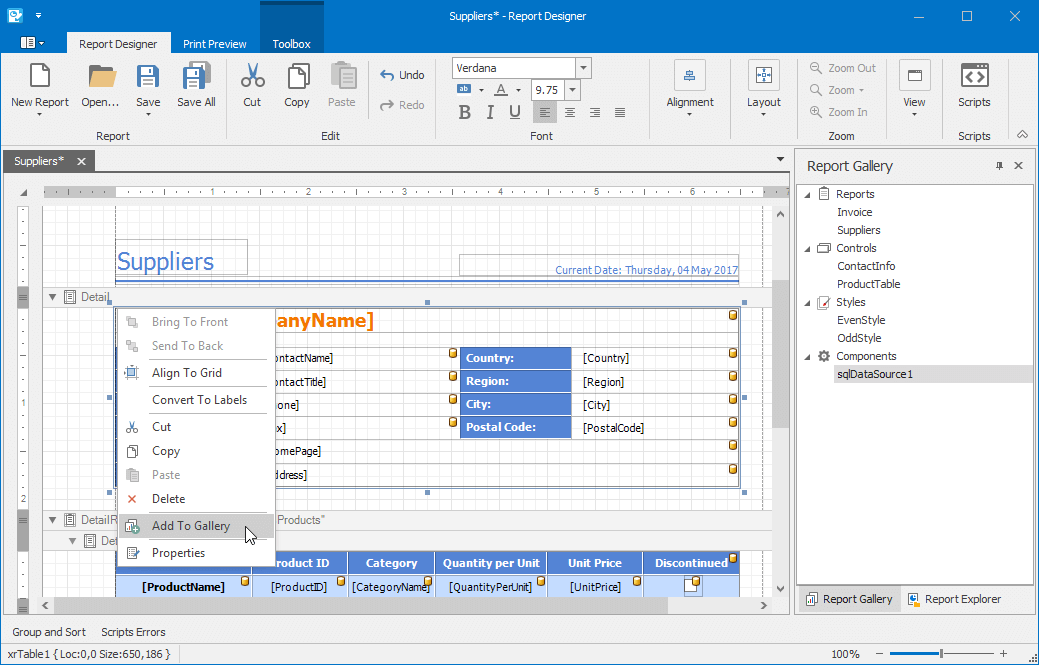
New Report Gallery
With our new Report Gallery, reports are created easier and faster. The Report Gallery lets you store report controls, data sources, layouts and styles, and keep them for later use.
Documentation
Miscellaneous Enhancements
You can now specify the XRRichText control's HTML and RTF data bindings via a smart tag. In addition, you now have the ability to specify group field names at design-time without having a report data source (e.g. runtime data binding).
WPF
New Expression Editor
v17.1 ships with a new expression editor for calculated fields and formatting rules. The expression editor provides syntax highlighting and intelligent code completion options.
Create Master-Detail Reports in Report Wizard
Our Report Wizard allows you to create master-detail reports and specify associated group and summary options.
Documentation
Miscellaneous Enhancements
-
Report Designer - Alignment and Layout actions have been added to the Ribbon.
-
You can now export components to separate Excel sheets using CompositeLink.
Core Enhancements
Optimized Controller Creation in Detail Collections
With this release, XAF powered applications with numerous Controllers associated with detail collections load faster. We no longer instantiate non-activated View Controllers due to TargetViewType, TargetViewNesting, TargetObjectType or TargetViewId restrictions.
Blog Post
Documentation
Immediate Synchronization of the Application Model and its UI
Keeping your Application Model synchronized with the UI no longer requires UI recreation. Call the new Frame.SetView(View, Boolean, Frame, Boolean) method instead.
Documentation
FIPS compliance improvements
With this release, we've added new options for those who need to deploy apps to production environments with the FIPS policy enforcement (government desktop computers or highly secured web servers). XAF's APIs now support FIPS compliant algorithms for more secure user passwords encryption and images hashing.
Documentation
Predefined Modes for Populating a New Action's Item List
With this release, you can specify the manner in which a new action's item list is populated. The following options are available:
- Default: The current business object type and all of its descendant types are added.
- ExcludeBaseType: All descendants of the current type are added. The current type itself is excluded.
- LastDescendantsOnly: Only the last types in the inheritance hierarchy of the current type are added.
Documentation
Mobile Platform Enhancements
New Mobile Map Module
With our new Maps module for XAF Mobile applications you can incorporate interactive maps and customize their providers and data source.
Blog Post
Documentation

UX Improvements
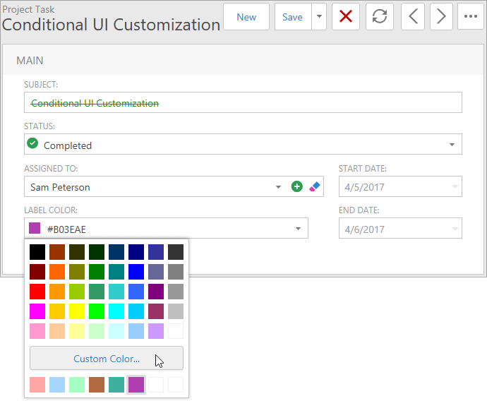
New Color Editor for Web XAF Applications
Our new Color Editor allows you to set color properties. You can type the value directly into the editor's text box, select a color from the color palette in the editor's dropdown window, or use the optional color picker to select a custom color. End-users can specify colors by entering a value directly within the edit box using longhand or shorthand hexadecimal notation (HEX) for RGB color values (#f0f, #D8D8D8, etc.), or by using standard HTML color names ('red', 'green', etc.), which are then automatically converted to color codes.
New Parameter Types for Parametrized Actions
With the v17.1 release, Parametrized Actions support the following parameter types;
Platform-Agnostic API for Text Notifications
Text notification display (e.g. confirmation messages, warnings, errors) has been simplified for desktop and Web XAF applications.
Documentation
High DPI Support
With this release, desktop apps powered by XAF will offer a consistent appearance across a wide variety of high-DPI display settings.Your WinForms XAF applications will now be scaled correctly when setting the scaling factor ('Change the size of text, apps and other items' option) to a value greater than 100%.
To enable the High DPI support, add the 'app.manifest' file to your project and enable the 'dpiAware' option.
The DPI-aware scaling is also enabled in XAF design-time tools.
Navigation Items are Rendered as Hyperlinks
In previous versions, XAF offered support for
Multiple Browser Tabs
. With this release, navigation items are rendered as hyperlinks giving you the ability to open independent XAF views within different browser tabs.
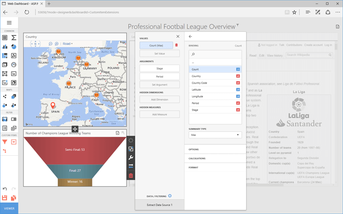
Web Dashboard
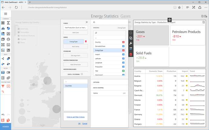
Our Web Dashboard continues to evolve and with this release, completely replaces the previously available Dashboard Viewer. The DevExpress Web Dashboard is now significantly faster, provides a rich client-side API for comprehensive dashboard customization, and supports Designer/Viewer or Viewer Only modes.
Demo
Online Video
Documentation
Custom Dashboard Items
DevExpress Dashboard v17.1 allows you to use JavaScript extensions to create custom Web Dashboard items. You can render desired HTML content inside your custom Dashboard item as needed. Features include the ability to describe item data binding, specify custom properties, apply interactivity, provide a Toolbox icon, configure export behaviors, etc.
Demo
Documentation
Custom JS Extensions
With our v17.1 release, DevExpress Dashboard ships with full support for web extensions (independent JavaScript modules/classes). By leveraging the flexibility of our extension engine, you can control feature availability within the Toolbox and Dashboard menu, modify element order and even create your own dashboard items.
Documentation
Saving and Restoring Client State
DevExpress Dashboard can now track the client state of web dashboard items and save or restore them as necessary. As you'd expect, this new feature has been designed so that end-users can customize a dashboard based on personal preferences and give you the means to load these changes on subsequent site visits.
You can save or load the following changes:
- Master Filtering
- Parameters
- Drill-down
- Selected index of a dashboard item
Documentation
Visualization
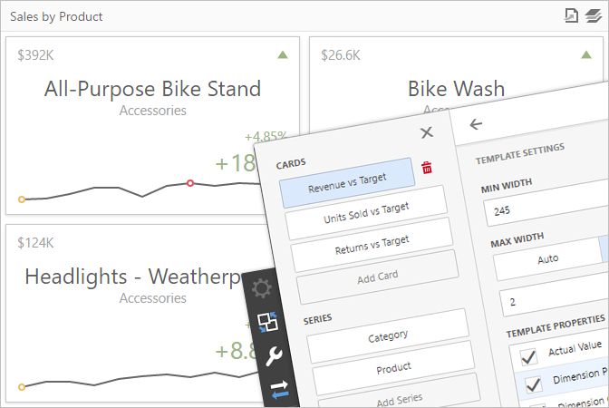
New Card Design and Customization Options
DevExpress Dashboard v17.1 ships with enhanced rendering algorithms for individual Cards items. Dashboard Cards are now rendered faster and offer additional layout options. You can now modify a card's layout and design its content using predefined templates.
Win: Documentation
Web: Documentation
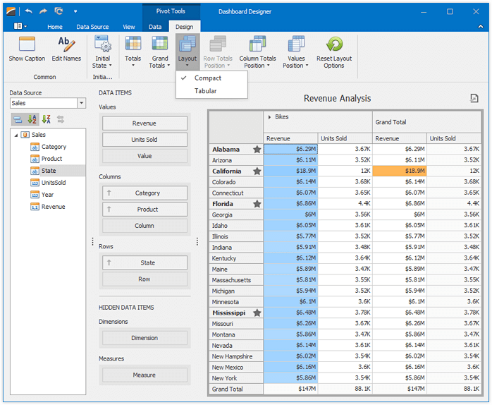
Pivot Table - New Layout Options
DevExpress Dasbhoard's Pivot Table includes additional options to control its layout and configuration (visibility of totals and grand totals, etc). With v17.1, you can now specify the following settings:
- Layout Type: Compact or Tabular
- Values Position and its Visibility
- Totals Position and its Visibility
Win: Documentation
Web: Documentation
Treemap - Drill-Down Support
With our Dashboard's new TreeMap Drill-Down feature, your end-users can quickly analyze the underlying data of a TreeMap by changing the control's detail level. As you'd expect, users can drill down for details or drill up for summarized information.
Win: Documentation
Web: Documentation
Exporting
Server-Side Dashboard Export
With our v17.1 release, DevExpress Dashboard ships with a new server-side export API, designed to execute export operations on the server. In previous versions, Dashboards could only be exported by end-users via the Web Dashboard viewer.
Documentation
Data Export Enhancements
DevExpress Dashboard ships with the following new export options:
Report Server
Dashboard Support
This release integrates DevExpress Dashboard with our Report Server. You can now create dashboards using our integrated Web Dashboard Designer, bind to SQL data sources, schedule and send dashboard documents via e-mail, etc. Dashboards support all Report Server features including Data Model binding, revision storage and permission management.
Blog Post
Documentation
PDF Document Processor
Create/Delete Interactive Form
With this release, you can programmatically add new form fields to a PDF document, remove existing form fields or the entire interactive form from the PDF document.
Documentation
Extended Set of Supported Characters for Non-Embedded Fonts
v17.1 extends the characters set for non-embedded fonts for both PDF Graphics and the AcroForm API from ISO Latin-1 to Adobe Glyph List.
Highlighted Text
With this release, our PDF Document Processor can render highlighted text.
Document Password Protection Enhancements
You can now use one of the following encryption algorithms to protect your PDF documents:
- 128-bit AES (used by default);
- 256-bit AES;
- 128-bit ARC4.
Our PDF Password Protection API can also work in partial trust environments.
Documentation
Spreadsheet Automation
Rotated Text
With this release, we give you the ability to rotate text within individual spreadsheet cells. Rotated text can be printed and exported to PDF format.
Documentation
File Type Detection
With this release, you don't need to specify the document format when loading it from a stream or Byte array using 'LoadDocument' methods. The file type is now identified automatically by the integrated file format detector.
New Naming Assistant
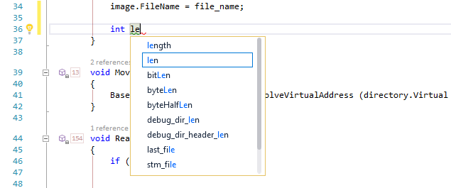
This release introduces the CodeRush Naming Assistant. It makes naming new members, variables, and parameters easier.
The Naming Assistant window automatically opens as you start typing a new symbol name. The suggestion list is filtered as you type. Suggestions are based on:
- Identifier names used in the solution and in the current code block;
- The type of the identifier;
- The identifier role (member, variable, or parameter).
To select a suggestion use the up/down arrow keys. Press Enter to accept the selected suggestion.
Documentation
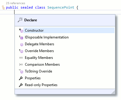
New Declare Menu
This release introduces the Declare menu, a quick and easy way to add frequently-needed code to your types. The following declarations are now available:
- Automatic Constructor generation (which also automatically initializes selected members and optionally generates encapsulating properties).
- Delegate Members is useful when you want to surface a field’s or property’s members to this parenting type. This provider creates members that wrap around the contained field’s or property’s members. For example, if your type contains a generic List of strings (as a field or property), you can wrap that List’s Count property in its own property, easily surfacing it in your type.
- IDisposable Implementation generates the Dispose pattern, disposing the specified fields and properties.
- Equality Members generates two Equals methods and a GetHashCode override, and optionally generates equality comparison operator overloads.
- Override Members overrides virtual and abstract methods (e.g. GetHashCode).
- Properties and Read-only Properties generate properties for the selected fields.
-
Comparison Members generates a CompareTo implementation, individually comparing the specified fields, and optionally implements the IComparable<T> and IComparable interfaces.
- Missing Members adds any missing members (e.g., from an unimplemented interface or an inherited abstract class with abstract members) to the active class.
- Partial Methods implements any partial methods missing from the active class.
- ToString Override.
You can access the Declare menu using the Alt+Insert shortcut.
Documentation
New Code Metrics
Improve code quality and measure code complexity with Code Metrics. Appearing in the editor (to the left of member declarations), code metric values allow you to immediately spot code that is difficult to read or maintain due to its complexity.
Three metrics are currently available: Maintenance Complexity, Cyclomatic Complexity and Line Count. We expect to extend this list in future releases.
Documentation

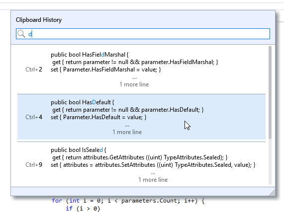
New Clipboard History
This release introduces the Clipboard History list, providing complete visual access to your ten most-recent clipboard operations. Instantly paste with the Ctrl+number shortcut. Filter through the list just by entering the text you’re looking for. Ctrl+Shift+V brings up the Clipboard History list.
Documentation
Refactorings and Code Providers
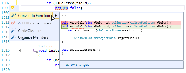
Convert to Function/Procedure
This code provider allows you to easily convert a method that returns void into a function that returns the appropriate type (matching the type of the expression returned) and vice versa. This refactoring is available when the caret is on a return statement that returns a value inside a void proc (or sub in VB).
Convert to Function Documentation
Convert to Procedure Documentation
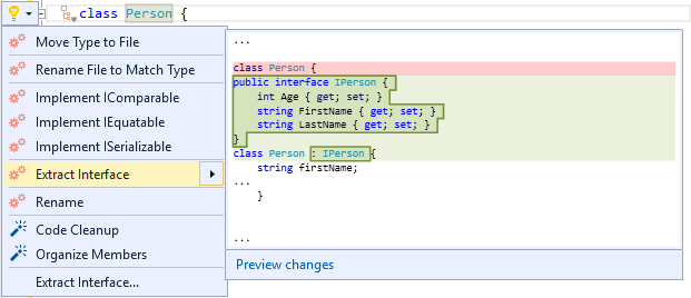
Extract Interface
This refactoring creates an interface based on the public members of the active class, and modifies the active class so it implements the extracted interface.
Documentation
Widen Scope (promote to field)
Use this to move a local variable declaration from inside a method body out to become a private field of the active class.
Documentation
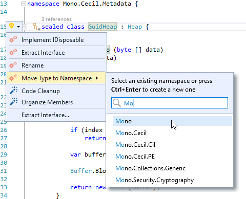
Move Type to Namespace
This refactoring changes the active type’s namespace and updates all references.
Documentation
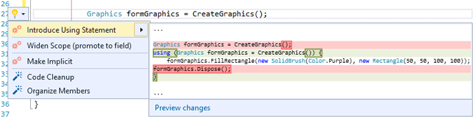
Introduce Using Statement
This refactoring replaces object creation and dispose code blocks with a using statement. This improves code readability and ensures that locally-used objects are properly disposed.
Documentation
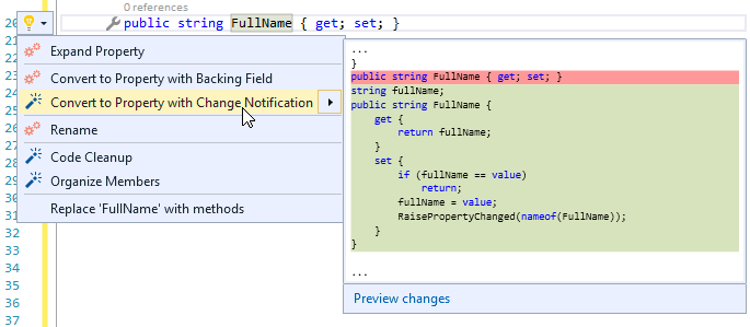
INotifyPropertyChanged Code Providers
We've added Introduce Change Notification and Convert to Property with Change Notification. These code providers help implement the INotifyPropertyChanged interface for the property at the caret.
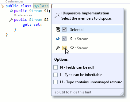
Implement IDisposable
This code provider makes it easy to implement the dispose pattern in your types.
Documentation
Encapsulate Property
This refactoring wraps specified field properties (declared by the field’s type) in new properties declared in the active class/struct. It's an easy way to surface properties from an owned field up to the containing class.
Documentation
Smart Duplicate Line Improvements
We have extended the Smart Duplicate Line functionality with the following improvements:
Smart Duplicate Line features are now available in XAML.
The hex, octal, float, double, and decimal literals are now automatically incremented.
Smart Duplicate Line recognizes camel case parts of an identifier name and create links between similar parts of different identifiers.
Smart Duplicate Line recognizes enum element references and automatically cycles through those elements (if a pattern of enum element cycling is detected in the surrounding code).
- If Smart Duplicate Line cannot recognize any pattern, it creates a text field around each identifier and literal in duplicated line.
- When duplicating items in collection initializers and in parameter lists, a comma is added automatically.
- You can now disable the 'smart' part of the Smart Duplicate Line feature so that it simply duplicates the line of code as is.
Smart Duplicate Line is available by pressing Shift+Enter.
Blog Post
Documentation
XAML Support
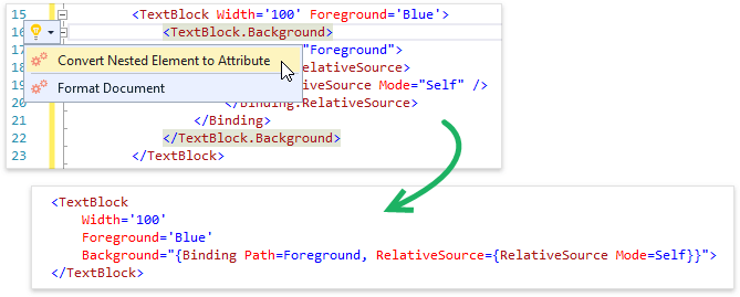
Convert Nested Element to Attribute/Attribute to Nested Element
We have added two new refactorings: Convert Nested Element to Attribute and Convert Attribute to Nested Element. Using them, you can extract an attribute from a XAML tag and make it a child element. You can also perform the reversed operation — inline a child element as an attribute of the parent tag. This refactoring may increase readability if you have too many attributes or a too deep nesting level.
Blog Post
Documentation
Miscellaneous XAML Improvements
- Navigation features now support XAML bindings.
- Duplicate Line features are now available in XAML.
Blog Post
Visualization Tools
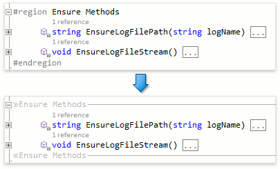
Region Painting
In v17.1, we have added the Region Painting feature, which adds low-contrast visual representation of #region directives, reducing visual noise where regions are used.
Documentation
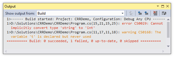
Output Highlighting
You can now highlight errors and warnings in the Output Window, making it easier to recognize important messages faster.
Documentation
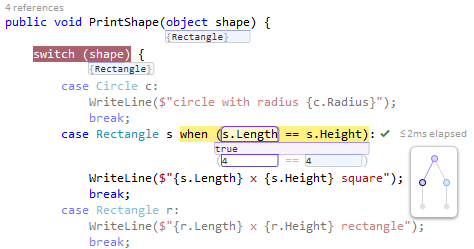
C# 7 and VB 15 Syntax Support
We have made several improvements to support the new C# 7 language:
- The Expand\Compress Ternary refactorings now support C# 7 syntax.
- Smart Return ('r' template) now supports C# 7 syntax.
- Declare menu providers support C# 7 syntax.
- The Use Expression Body refactoring now works on constructors, destructors, getters and setters.
-
We have added support for the new language features to the Debug Visualizer, including support for the new switch capabilities.
-
Smart Duplicate Line now understands the new language features, including binary literals and digit separators.
-
Expand Method, Expand Property, Expand Getter and Expand Setter refactorings all now support the new language features.
Unit Testing
Jasmine Test Runner
In this release, we're introducing the beta version of the Jasmine Test Runner for JavaScript and TypeScript. This feature, in its current state, should be considered a technical preview, but you can already run Jasmine tests with it using the CodeRush Test Runner window.
This beta works with the following restrictions:
-
Test discovery is not implemented yet. Every file with unit tests should reference the Jasmine framework (e.g., contain the following string at the beginning: "/// <reference path="'path"/to/jasmine.js' />").
-
Currently all of the project's JS files will appear in the Test Runner. You can Ctrl+click to multi-select the test files you want to run, or you can right-click a file and add it to a new or existing Test Runner session, allowing you to easily run all tests in all files held by that session at once.
-
Test Debugging and Code Coverage are not yet implemented.
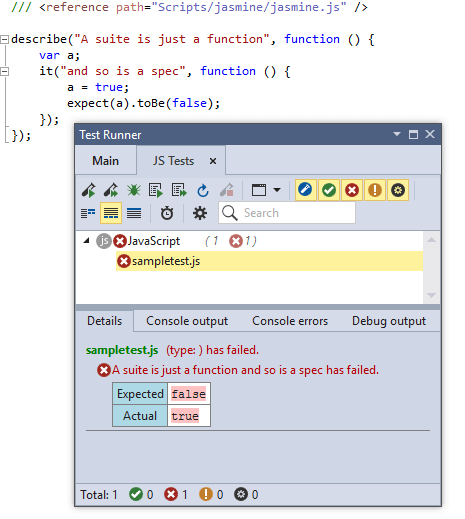
This technical preview feature is disabled by default, however you can enable it using the Unit Testing | Test Runner options page.
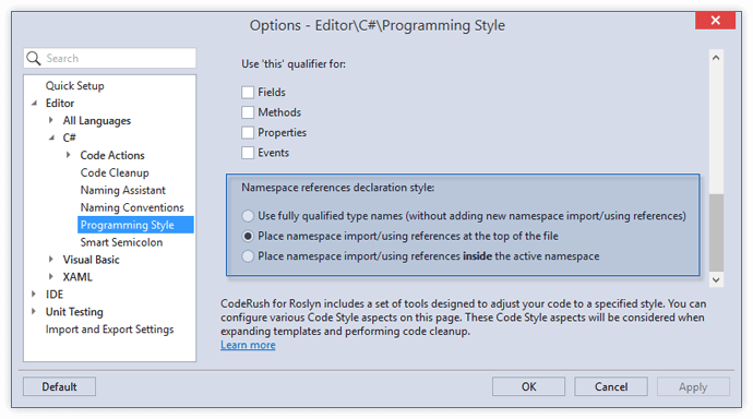
Code Style
Namespace References Declaration Style
We have added a new Code Style rule for placing new Namespace reference imports/using declarations. You can now choose one of three styles: use fully qualified type names, place new imports/using references at the top of the file, or place new imports/using statements inside the active namespace.
Stop on Build Error
You can now tell CodeRush for Roslyn to stop building a solution if project building fails and an attempt to build a dependent project is made.
Documentation
To get started with our newest release, download a free 30-day trial or renew your expired subscription online. If you'd like to get preferential pricing, be sure to contact us via email - we'll be happy to get you the best possible price so you can enjoy all the new features we're shipping in this release.
Start Download
Grid Control
Row Selection Improvements
v17.1 introduces the following row selection improvements:
- Optional web-style row selection using check boxes;
- Customizable check box position:
- Data rows;
- Group rows;
- The column header;
- The indicator or the first column.
- A new mode that assists end-users with persisting the current selection during row navigation;
- Optional synchronization of selected state between group rows and their child rows to help users make their selection with fewer mouse clicks.
Ribbon & Toolbars
This release adds the following enhancements:
- Ability to use custom panels (TdxStatusBarPanel descendants) in status bars;
- Ribbon GalleryItem - Ability to hide gallery item hints;
- Ribbon ColorGalleryItem - Optional borders for color palette items;
- Ribbon ColorGalleryItem - Ability to customize the Auto menu item's color.
Map Control
New Projections
- Braun stereographic;
- EPSG:4326 (also known as WGS 84 or WGS 1984);
- Kavrayskiy VII;
- Lambert cylindrical equal-area;
- Sinusoidal.

Asynchronous Zooming
End-user zoom functionality is now always asynchronous, helping you maintain your application's responsiveness. A new method allows you to asynchronously zoom in/out in code.
Customizable Display Formats for Navigation Panel Coordinates
With v17.1, you can specify display format masks for the X and Y coordinates. Each mask combines any custom text with one or more macros specifying a placeholder for a cardinal point, degree, minute, or second value, as well as the number of decimal places to display.
Miscellaneous Enhancements
- Ability to zoom the map to fit specific items;
- A new event allowing you to restrict end-user scrolling and keep the map centered on a specific point or area;
- Customizable font, color, and text color settings for navigation panel elements;
- Ability to customize the map control's background color.
PDF Viewer
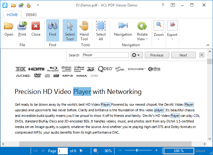
Text Search and Highlighting
With this release, we've extended the capabilities of our VCL PDF Viewer with the following new features:
- Ability to search text and adjust search settings. End-users can accomplish this using a built-in Find panel.
- Ability to display highlighted text. The text search functionality utilizes this ability to emphasize matches in a document.
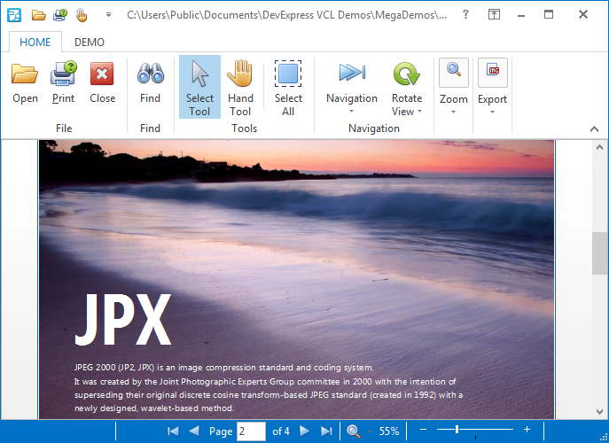
JPX Image Format Support
The PDF Viewer can now display JPX (also known as JPEG 2000 or JP2) images.
Spreadsheet Control
Rich Text Content
v17.1 introduces the ability to display and edit rich text formatted content in worksheet cells, and supports the following rich text attributes:
- Font face, size, style, and color;
- Subscript and superscript characters.
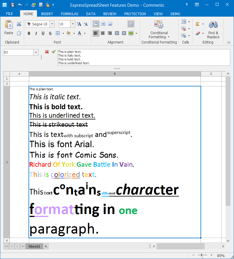
This feature, powered by our VCL Rich Edit Control, is enabled by default. Should you prefer not to use the feature, just unload the corresponding design-time package and remove the dxSpreadSheetFormattedTextUtils unit it adds to your project.
In addition, the Spreadsheet Control and Report Designer now provide an event allowing you to track and limit scrolling the worksheet content.
Layout Control
The DevExpress VCL Layout Control v17.1 ships with the following enhancements:
- Wrapped items now revert to a single-line layout on disabling the corresponding option of a layout control/group.
- Simplified localization due to an optimized layout persistence that saves only the element captions modified at runtime, and the ability to provide default captions.
- Ability to provide hints for group/item captions with additional information on UI elements.
- Rearranging layout elements on a form produces fewer changes to its DFM file. This functionality is especially useful if you are using a version control system (VCS), allowing you to decrease the number of changes included in your revisions.
- The layout control's background can be transparent regardless of the Windows theme setting.
Rich Edit Control
Support for DOC (Microsoft Word 97-2003) Binary Format Files
With this release, we've extended the list of supported document file formats with the DOC binary format.
Printing-Exporting Library
Rich Text Content
We've added support for exporting content in rich text format from our Grid, TreeList, or Vertical Grid control to XLS, XLSX, or HTML files. This functionality is powered by our VCL Rich Edit Control and, as with the Spreadsheet Control, you can enable it by adding the dxSpreadSheetFormattedTextUtils unit to your project.
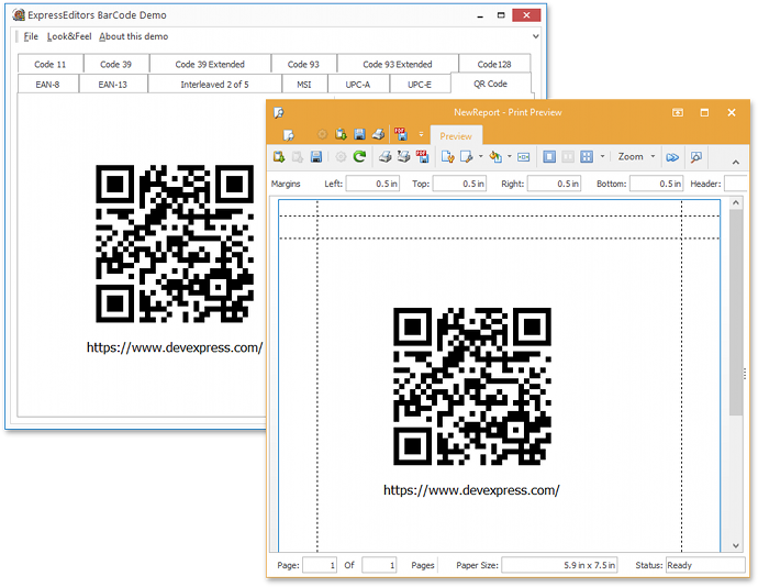
New Report Link Components
This release adds two report link components for unbound and data-aware Barcode Controls.
Data Editors and Controls
Color Editor and Gallery Control Enhancements
The following enhancements ship as part of our v17.1 release:
- Ability to show hints for color palette items;
- Optional borders for color palette items;
- Support for background transparency in the Gallery Control and its descendants, including the Color Gallery and Ribbon BackstageView Gallery Controls.
Incremental Filtering Options for Lookup Editors
The Lookup and Extended Lookup editors now include the following options for incremental filtering:
- Display only the values that start with or include a given search string;
- Highlight the search string in the results.

Installation
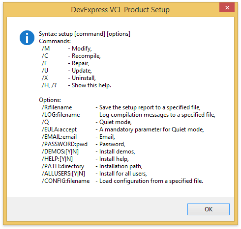
Quiet Mode
In this mode, no user interaction is required to configure and install our products. All you need is to run the VCL installer (Setup.exe) with the /Q command-line option. You can adjust default configuration settings, including the product list, target IDEs and memory platforms, by creating a specific XML file and referring to it using the /CONFIG command-line option.
Optional 64-bit Compilation
The installer now allows you to opt out of compiling 64-bit product libraries.
Miscellaneous
High-DPI Scaling Improvements
With this release, we've added support for per-monitor DPI awareness v1 to the following DevExpress VCL products:
- All editors (except for the Extended Lookup Editor);
- Ribbon and Toolbars;
- Layout Control;
- Docking Library;
- Gauge Control;
- Spell Checker;
- Skins Library;
- Page and Tab Controls.
We plan to extend this list in future releases.
Support for SVG Images
With this release, you can load and display SVG images using TdxSmartGlyph and TdxSmartImage containers and the TcxImageList control. In addition, we've replaced published TBitmap and TdxSmartImage properties in our controls with TdxSmartGlyph equivalents to enable built-in support for these vector graphics.