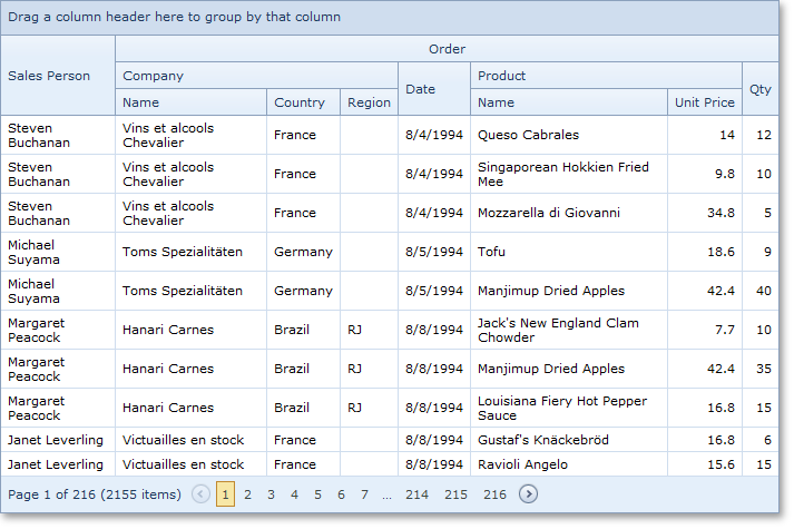
Data Grid Control
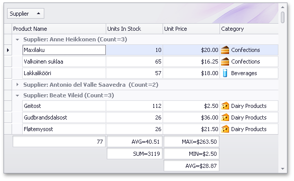
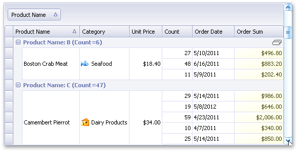
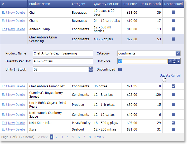
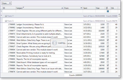
Multiple Column Summaries
You can now calculate multiple summaries for a single column and display them simultaneously within the grid's footer:
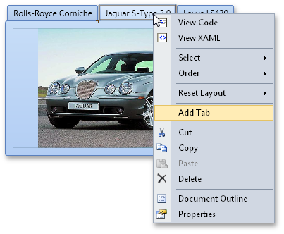
Multiple column summaries can be managed via code, or by using the grid's runtime context menuю
Blog Post
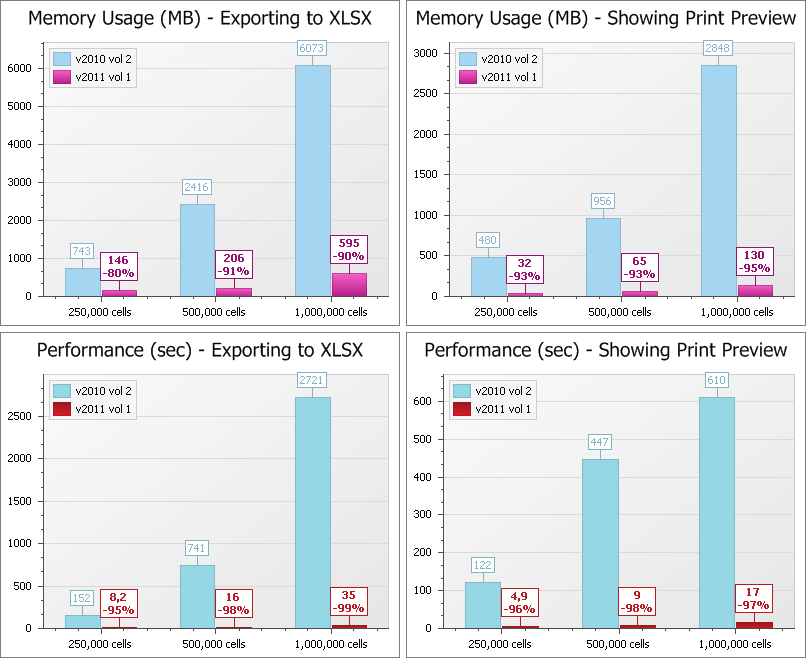
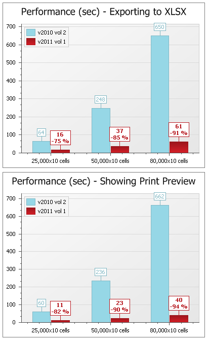
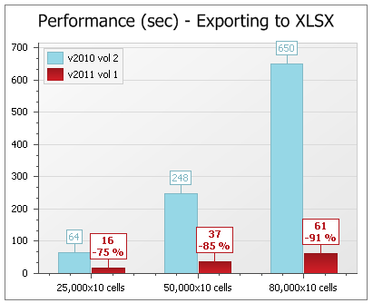
Export/Printing Performance and Memory Usage Boost
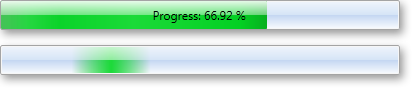
With this release, we have significantly improved print and export performance and memory usage. These optimizations affect all DevExpress Grid and Pivot Grid controls (XtraGrid, XtraPivotGrid, ASPxGridView, etc). You will see improvements of 80 to 99% when compared to previous versions. The following are internal test results:
In addition to the significant performance improvements in this release, we have added an optional progress window during export and/or print operations. You can display a Cancel button in this window to terminate export/print operations at any time.
Note that some changes have been made to the manner in which certain editors are exported/printed. CheckEdit, ImageComboBoxEdit, and ColorEdit will now be exported/printed as text, without an image element.
Blog Post
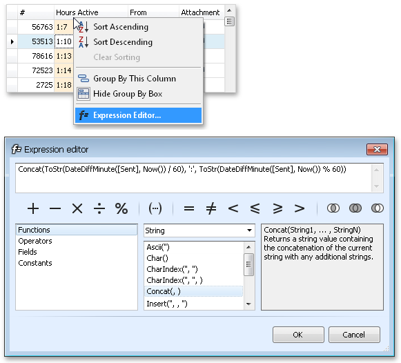
Expressions for Unbound Columns in Server Mode
With this release, unbound grid columns can be populated in server mode with data obtained from expressions. You can specify a formula referencing other columns and using many built-in functions and operators.
Blog Post
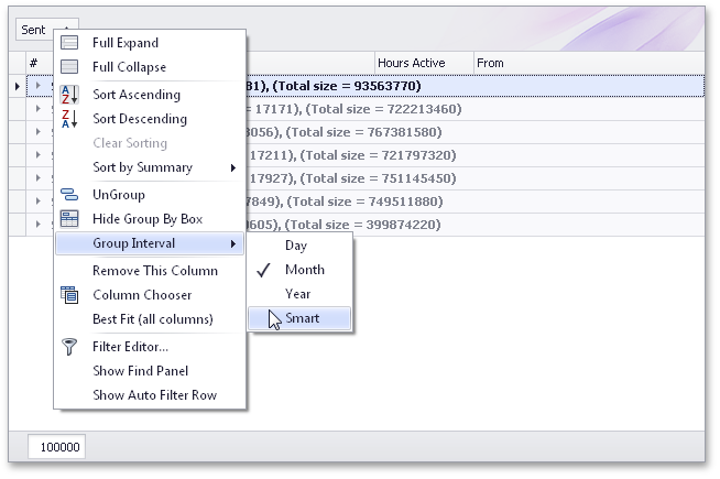
Group Intervals for DateTime Columns in Server Mode
We have added support for group intervals for date-time columns in server mode. You can now change group intervals using a single property setting in server mode.
Blog Post
New Scroll Mode - Fix Group Rows
We have implemented a new scroll mode for the XtraGrid – perfect when viewing large amounts of grouped data. When using this new scroll mode, the top row for the visible group will always be displayed as you scroll through grouped data. Additionally, an icon is displayed in the top group row to indicate that the grouped data is only partially displayed:
The new scroll mode is enabled by default in server mode and can be activated in regular binding mode via a property setting.
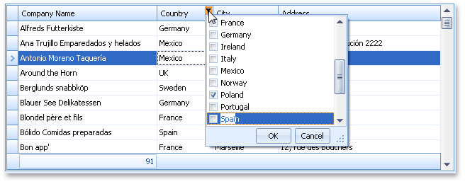
Incremental Search Support in Column Filter Dropdowns
Whether you choose to use regular or checked filter dropdowns for individual columns, you can now use the incremental search feature to locate values in dropdown lists. Simply enter the required value in order to locate it in the list. When typing, the text is highlighted in the list making it easy to locate:
Blog Post
Miscellaneous
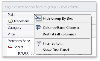
We have implemented a built-in context menu for bands in a grid's Banded Views. This menu contains general commands that are used to work with a View (these commands were previously available only in column context menus):
We have also extended the context menu for columns in Banded Views.
Bars
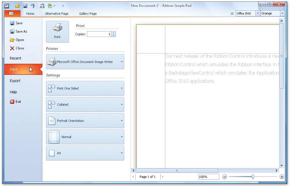
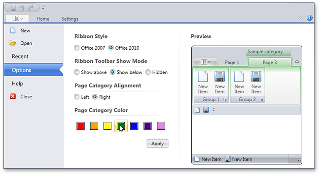
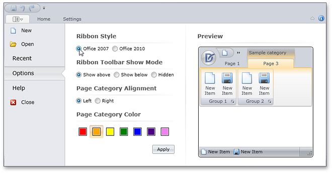
New BackstageView Control for Ribbon
DXperience v2011 vol 1 ships with the DevExpress BackstageView Control – allowing you to create two types of items: a standard item and a tab item.
Standard items act as buttons and tab items act as pages in a tab control. When using tab items, you can add and display any control within the Backstage View.
Though designed to be displayed as the ribbon's menu, the BackstageView Control can also be used on a form or within popup windows.
Ribbon Color Schemes
The Ribbon control supports multiple color schemes which affect the appearance of the Application Button and BackStageView Control (when used as a menu within the Ribbon).
These Ribbon schemes are only available when using Office 2010 skins.
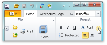
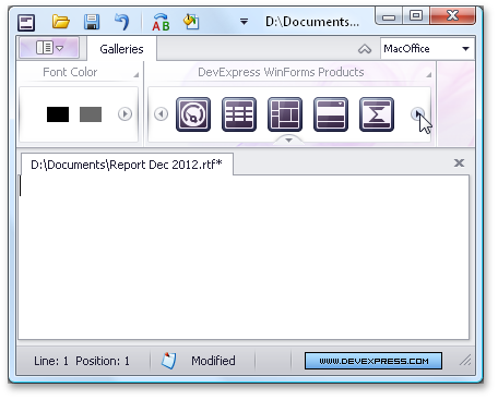
New MacOffice Paint Syle for Ribbon
Microsoft's new MacOffice Ribbon Style can now be emulated using the DevExpress WinForms Ribbon Control.
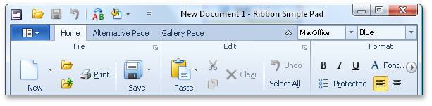
Key features of the new MacOffice style are:
Items are arranged in two rows (traditionally, they are arranged in three rows) with group captions displayed at the top, rather than at the bottom:
Page groups are never collapsed when reducing the Ribbon's width; Instead scroll buttons appear that enable Ribbon scrolling:
Inlinegallery items are horizontally arranged across one row, and are scrolled horizontally:
Although page category captions are always hidden in the MacOffice style, the Ribbon control has a feature that collapses page categories using an animation:
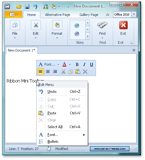
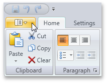
New Ribbon Mini Toolbar
If you have used the latest Microsoft Office applications, you may have noticed a small context-aware floating toolbar fade in when text or some other object is selected with the mouse.
The toolbar is aware of the mouse cursor's position: it will gradually fade out if you move the mouse cursor away.
We've now incorporated this behavior into our new Ribbon Mini Toolbar, a floating toolbar that will allow you to display context-specific commands in your applications.
You can display any commands within the mini toolbar (regular, checked, and split buttons, editors, galleries, etc). The opacity of the toolbar is dependent upon the distance of the mouse cursor from the toolbar's bounds: the closer in, the more opaque; the further away, the more transparent. At some predefined distance, the toolbar becomes completely hidden. We have provided dedicated properties to allow you to customize these opacity options.
Blog Post
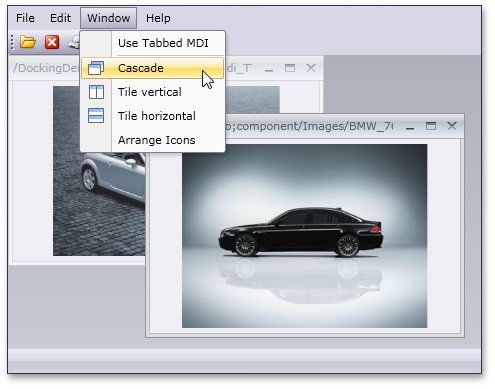
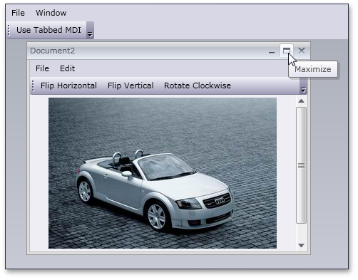
New Document Manager
We have developed the new WinForms Document Manager component to help improve the tabbed user interface in your MDI applications. It includes numerous benefits when compared with the older XtraTabbedMdiManager. First, you can choose whether to present MDI child windows as a native MDI or a tabbed user interface. The tabbed user interface emulates that of Microsoft Visual Studio 2010:
Blog Post
Alert Control - New Animation Effects
The newest version of the DevExpress WinForms Alert Control ships with four more animation effects. This image shows the Horizontal Slide effect:
Blog Post
Chart Control
8 New Series Views
Stacked Line, Full-Stacked Line, Step Area and Range Area series are now available both for 2D and 3D Chart Types.
Multi-Line Axis and Series Labels
Chart Appearance Adjusted to Match Skins
Editors
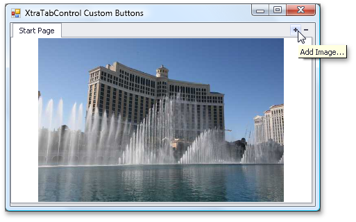
XtraTabControl - Support for Custom Buttons
You now have the ability to display custom buttons within the WinForms Tab Control. In addition to default buttons (Close, Next, and Prev), you can display a custom button with any display text or image (or both), and provide the appropriate tooltip when required.
Additionally, we have added a new event that will allow you to override the default behavior of built-in Close, Prev, and Next buttons.
Blog Post
Miscellaneous
The WinForms HyperLink Control allows you to launch a link either by clicking a point within the edit box or only the text itself.
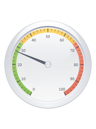
Gauge Control
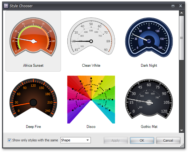
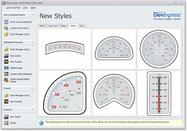
Style Chooser Dialog
With this release, we've added a Style Chooser dialog for our WinForms Gauge Controls. This new dialog allows you to quickly change the current gauge style (its shape, theme, or both).
This dialog can be invoked at runtime, allowing end-users to modify a gauge's appearance with ease.
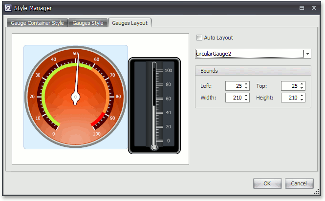
Style Manager Dialog
The Style Manager dialog is designed to control all gauge styles within a gauge container and to define associated layout settings.
Look and Feel Support
DevExpress WinForms Gauge Controls now support our WinForms look-and-feel system - Gauge background and border colors are automatically altered to match the characteristics of the appropriate skin. You can also control whether a Gauge control maintains its own look-and-feel or uses application-wide skin settings.
Note that all these settings can be modified for any skin using our Skin Editor tool.
Custom Draw for Gauge Elements
In this release, we've added a new event that allows you to manually draw gauge elements and thus fully redefine appearance.
Layout Enhancements
You now have a greater control over the layout of gauge elements in AutoLayout mode. You can specify padding and indent values when a gauge container automatically aligns individual gauge elements.
Pivot Grid Control
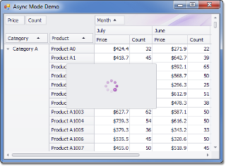
Asynchronous Mode
Asynchronous Mode is now available when using the WinForms Pivot Grid Control - allowing you to process data in a background thread. This ensures that your application does not freeze and allows for end-user interaction during complex Pivot Grid operations.
Export/Printing Performance Boost
With this release, we have significantly improved print and export performance - between 75 to 95% when compared to previous versions. Note that the more rows there are in a Pivot Grid, the greater performance boost you will get.
The following are internal test results:
Blog Post
Sort by Summary Default Order
You can now specify a default sort order when using the Sorting by Summaries feature. Field values are automatically arranged in this order when sorting by summaries is enabled for a field.
Memory Consumption Enhancements
-
Unbound Fields
Unbound field values use up to 4 times less memory as compared to older versions. Exact savings depends upon the unbound field's data type.
-
Collapsed States
We have reduced the amount of memory consumed by the collapsed states of field values when they are serialized. The actual savings depends upon the number of collapsed and expanded field values in the layout. The key benefit of this enhancement is that it decreases the empty space required for a pivot grid layout to be saved to external storage (an XML file, a stream, the system registry, etc.).
Rich Text Editor
New Rich Edit Document Server
RichEditDocumentServer is a word processing engine developed to automate common word processing tasks. It is the non-visual equivalent of the RichEdit control, with complete functionality available via its API.
Typical applications include conversion, editing and modification of different document types and formats (RTF, DOCX, DOC, XML, HTML, MHT, ODT, EPUB, and TXT formats are supported). The Document Server can also be used to create mail merge or reporting server solutions.
Mail Merge Enhancements
With this release, mail merge functionality has been extended to provide support for nested merge operations with control over templates and the resulting document when each record is merged. The following features are available:
Automatic Table of Contents
You can quickly set up automatic Table of Contents (TOC) for the entire document or a section, or produce an automated Table of Figures. Built-in styles, paragraph outline levels or TC fields can be used to build your Table of Contents. Table of Figures is based on automatic sequential fields (SEQ) placed within paragraphs that are used to label figures or tables.
Document Variables
Each document has a collection of variables. Their values can be inserted into the document using DOCVARIABLE fields. A special event fires when a DOCVARIABLE field is updated, allowing you to handle the event and provide custom content for display purposes.
DOC file format support
DOC is a proprietary binary format used by all versions of Microsoft Word to store word processing documents. The WinForms Rich Edit Control can read and save DOC files in Word 97-2003 format containing common formatting features and supports advanced features which are implemented natively by our control.
Automatic Correction
The AutoCorrect feature modifies text as you type and offers the following benefits:
- Replace Internet addresses, network paths, and e-mail addresses with hyperlinks.
- Correct two initial capitals.
- Detect and correct typos and misspelled words using a spellchecker component.
- Implement text expander functionality (i.e. to quickly insert symbols or any long piece of text, and even images, using table entries).
- Insert any information based on input.
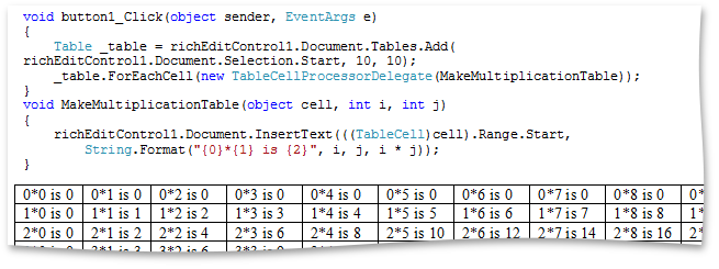
Table API
Table operations can be executed programmatically via our newly introduced table API. The table-specific object model provides methods that allow you to create tables or modify their content in code.
Syntax Highlighting
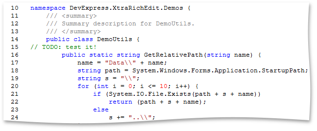
You can apply custom formatting on-the-fly to different categories of terms in the text of a document. To parse text you can use DevExpress CodeParser library or a custom text parser.
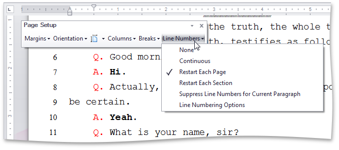
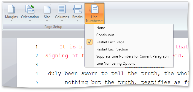
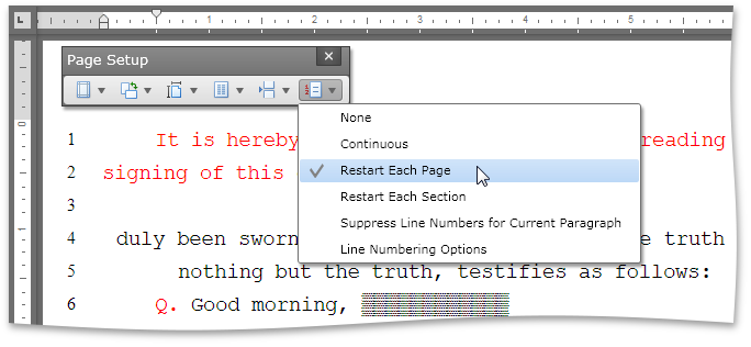
Line Numbering
You can add line numbering to document margins for certain types of legal documents. Line numbers can run continuously throughout the document, restart on each page or section or be suppressed for a specific paragraph.
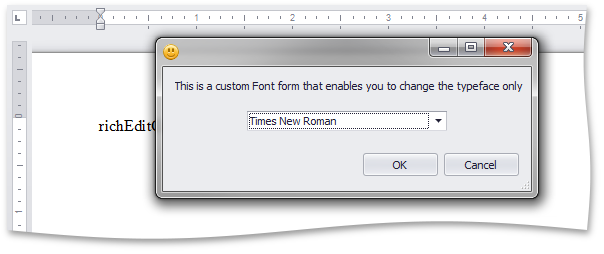
Built-in Dialogs Customization
Before a dialog form is displayed, a corresponding event fires. This allows you to create a form class descendant, modify its captions, behavior or add validation to editable fields, and invoke your custom form instead of the default.
Paste Special
The Paste Special command allows you to choose the format for data contained in the Clipboard and paste it within the document as if imported from the specified format.
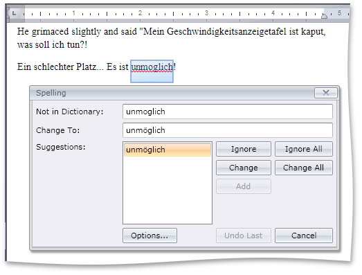
Spell Checker Control
Hunspell Dictionary Support
Hunspell allows dictionaries to define complex rules for compound word usage and was designed for languages with rich morphology and complex word compounding or character encoding. Its advantages include morphological analysis, Unicode support and reduced memory usage.
Hunspell dictionaries are used in the OpenOffice, FireFox, and OpenSpell spell check engines. As such, you can easily download existing dictionaries and thus streamline your deployment.
Load Dictionaries On Demand
A new option allows you to load a dictionary for a specific culture whenever the spell checker is switched to this culture. This option provides significant improvements in load time and memory consumption, especially for complex language dictionaries, such as Czech or Lithuanian.
Miscellaneous
Visual Studio 2010 Skin
In our continuing effort to address your business needs, we've introduced a Visual Studio style Application Wide Skin.
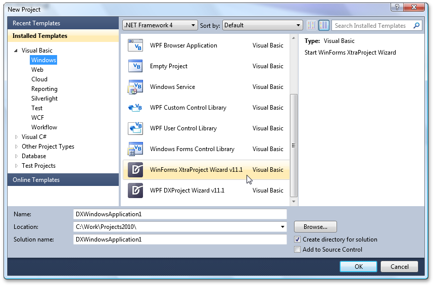
WinForms Project Wizard for Visual Basic
With this release, we've introduced a new Wizard to help you get started building Visual Basic based applications when using DevExpress WinForms controls.
How it works - Start by creating a new project in Visual Studio and select the "XtraProject Wizard" template:
This template then runs the wizard, which allows you to:
Specify the container (XtraForm, RibbonForm or standard Form) for your application:
Choose and customize DevExpress controls to be used in the form's commands, navigation and client areas:
Specify an application skin:
New Docking Suite
With this release, we have added a new ASP. NET Docking Suite to the ASPxperience Library.
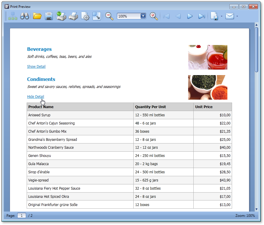
This suite offers three components - ASPxDockPanel, ASPxDockZone and ASPxDockManager. They allow you to manage content placeholders (dock panels), which can be moved by end-users between specific regions (dock zones) of a web page. A dock panel can either be docked to a dock zone or made to float. Dock zones can be placed within any section of a page; orientation and size is fully customizable. ASPxDockManager allows you to provide centralized programmatic control of all dock panels and dock zones contained within a page.
A typical usage scenario is the implementation of a personalized web page populated with web gadgets.
Blog Post
Data Grid View
Multi-Row Headers (Bands)
With DXperience v2011 vol 1, we have implemented support for multi-row headers - allowing you to organize grid columns across logical groups (bands).
The newly introduced band column type does not allow you to display data values within it. Its purpose is to organize columns (children) within its column collection. This allows you to easily maintain a hierarchy of nested bands. The flexible design of the DevExpress ASP.NET Grid allows you to place a data column and a band column at the same hierarchy level.
Bands can be dragged by end-users to re-order individual columns. This is extremely useful if you need to provide a quick way to re-arrange columns while preserving their logical grouping.
All existing grid functionality (such as export, scrolling, column freezing and resizing, etc.) is unaffected by the introduction of multi-row headers/bands.
Blog Post
Export Performance Boost
With this release, we have significantly improved export performance. You will see improvements of up to 20 times compared to previous versions. Note that the more rows there are in a grid, the greater performance boost you will get.
Blog Post
Gauge Control
Custom Draw for Gauge Elements
In this release, we've added a new event that allows you to manually draw gauge elements and thus fully redefine appearance.

Layout Enhancements
You now have a greater control over the layout of gauge elements in AutoLayout mode. You can specify padding and indent values when a gauge container automatically aligns individual gauge elements.
Chart Control
Miscellaneous Improvements
- We've introduced a new API allowing you to save a web chart's layout to a file or stream.
- The appearance of WebChartControl has been improved to better support DevExpress ASP.NET Themes. This includes the look-and-feel of a loading panel displayed for a chart.
Editors
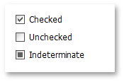
ASP.NET Check Box - Improvements
-
Third State Support
In addition to the two standard states, unchecked and checked, the ASPxCheckBox editor supports a third - indeterminate (also called "grayed") - state.
In three-state mode, you can control the manner in which the intermediate state is selected – either by end-users or programmatically.
-
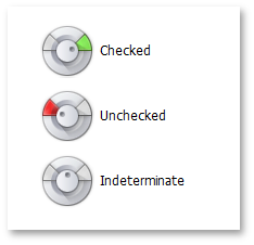
Custom Images for Check Box
A check box is now represented by an image within the ASPxCheckBox editor by default. You can also easily specify custom images to be displayed for different check box states.
-
Native Rendering
By setting a single property, ASPxCheckBox can now be rendered as a native HTML INPUT element (type CHECKBOX). This reduces the render size and improves the editor's overall performance. In native mode, ASPxCheckBox behaves and appears as a standard HTML check box - with two states and without check box images.
The new indeterminate check state and appearance customization options are available to other DevExpress ASP.NET controls that use the ASPxCheckBox editor and its code internally as a built-in component. These include the ASPxTreeView, ASPxTreeList, ASPxGridView, ASPxGridLookup, ASPxRadionButton, ASPxRadioButtonList.
Blog Post
File Manager
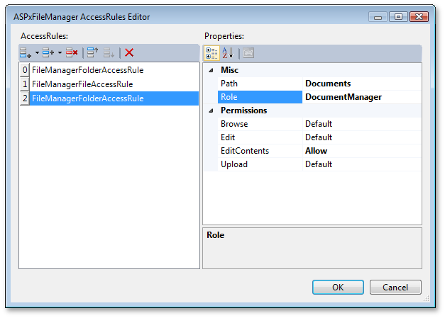
Access Rules
The ASP.NET File Manager allows you to define access permissions for folders and files using a set of folder/file access rules. An access rule specifies a path to which it is applied and lists permissions (allowed or denied actions) associated with the rule. You can easily set up access rules for folders (including their files and child folders) and individual files.
In addition, you can associate any number of access rules with specific security roles to group related permissions together. Related access rules should be assigned matching role names.
Any created role can be enforced on the ASPxFileManager via its specific role-related property. The file manager will then display folder and files and provide access permissions to them based on the assigned role.
Virtual File System Providers
Previously, ASPxFileManager could only work with a physical file system - it visualized the hierarchy of existing server files and folders starting from the specified root folder.
With this release, we have added two more capabilities. You can now:
-
Data bind the ASPxFileManager control and load the file/folder structure from a data source.
Blog Post -
Create your own custom provider for file system information
Blog Post
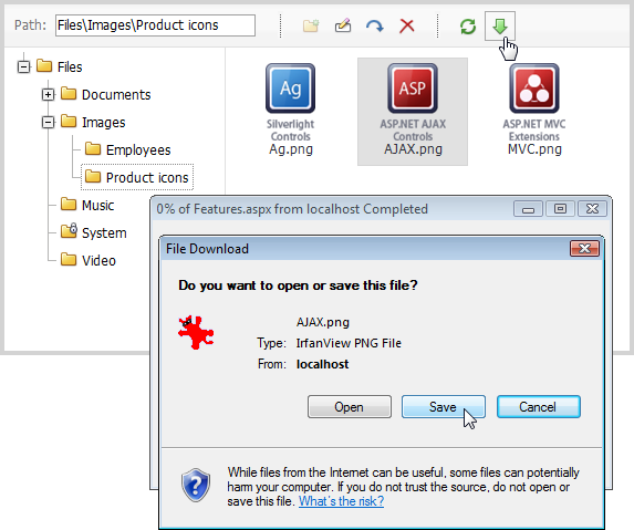
File Download
You can now offer your end-users the ability to download a file selected within ASPxFileManager. File download can be initiated via the user interface (the toolbar's Download button) or programmatically.
The newly introduced client and server events allow you to process the downloaded file and to cancel the file download when required. For example, you can use a server-side event to add a watermark to downloaded image files.
Blog Post
Uploaded File Validation
We have enhanced the server-side FileUploading event - it now provides you with the opportunity to process and validate the name and stream of the uploaded file. New event argument properties allow you to inspect the file's bytes and name and to determine whether the file should be processed.
Selected File Enhancement
A new server-side event has been introduced to help you process a selected file when an end-user tries to open it by double-clicking or pressing the Enter key.
Blog Post
HTML Editor
Document Selector
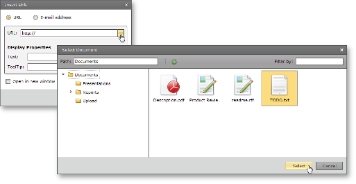
We have extended the Insert Link and Change Link dialogs with the ability to invoke the Select Document dialog - allowing end-users to manage documents stored on the server via a point-and-click UI, rather than entering image web address information manually. Because our File Manager control is integrated into the Select Document dialog, all file/folder management and upload capabilities (with full customization) are available to you out-of-the-box.
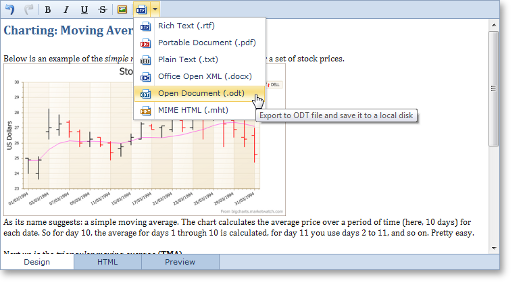
Export/Import Support
With DXperience v2011 vol 1, the ASPxHtmlEditor's contents can be imported and exported to/from multiple document formats including:
- Rich Text (.rtf)
- Office Open XML (.docx)
- MIME HTML (.mht)
- Open Document (.odt)
- Plain Text (.txt)
- Portable Document (.pdf). Available for export only.
You can allow end-users to export editor contents via a specially designed toolbar item (with all required functionality) or you can execute an export/import operation programmatically.
Blog Post
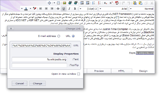
Right-To-Left Layout Support
This release includes right-to-left data presentation options for the DevExpress ASP.NET HTML control. When used, all HTML Editor contents and their associated UI elements (including Views, toolbars, toolbar items and built-in dialog forms) can be easily displayed using a right-to-left layout.
Blog Post
Pivot Grid Control
Export Performance Boost
With this release, we have significantly improved print and export performance - between 75 to 95% when compared to previous versions. Note that the more rows there are in a Pivot Grid, the greater performance boost you will get.
The following are internal test results:
Enhanced Layout Serialization
With this release, we have improved the layout serialization capabilities of the ASP.NET Pivot Grid control. You are now able to save the pivot grid's layout to a stream or a string, and also specify which layout options should be persisted (much like its WinForms counterpart). We have also implemented new events that allow you to respond to a layout update and to cancel layout changes after it has been loaded.
New Events
Events introduced in DXperience v2011 vol 1 allow you to perform the following:
- Discard end-user changes to field filter conditions.
- Prevent end-users from dropping fields into specific areas.
- Respond to data recalculations - beginning and end.
- Respond to data source changes.
- Respond to changes in unbound field expressions.
Sort by Summary Default Order
You can now specify a default sort order when using the Sorting by Summaries feature. Field values are automatically arranged in this order when sorting by summaries is enabled for a field.
Memory Consumption Enhancements
-
Unbound Fields
Unbound field values use up to 4 times less memory as compared to older versions. Exact savings depends upon the unbound field's data type.
-
Collapsed States
We have reduced the amount of memory consumed by the collapsed states of field values when they are serialized. The actual savings depends upon the number of collapsed and expanded field values in the layout. The key benefit of this enhancement is that the ASPxPivotGrid sends less data to the server on callbacks.
Popup Control
Scroll Bars
You can now display scrollbars within popup windows. The visibility of scrollbars is controlled by a single property. It can be set so that required scrollbars (horizontal or/and vertical) are automatically displayed if window content does not fit within the bounds of a popup window.
Resizing Limits
New properties have been introduced allowing you to specify maximum and minimum popup window width and height. This prevents popup windows from being resized by end-users beyond predefined limits.
Semantic (Lightweight) Rendering
We have optimized the rendering of the ASP.NET Popup Control. The control now uses semantic rendering combined with advanced CSS styles, which results in a dramatic decrease of HTML output, improved performance and a reduction on the server's workload.
Note that this new lightweight rendering also benefits other DevExpress ASP.NET controls that make use of the ASPxPopupControl. These include the ASPxHtmlEditor (all dialogs), ASPxTreeList and ASPxGridView (customization windows, popup edit forms, filter builder).
Blog Post
Scheduler Control
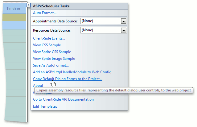
Dialog Form Templates Now Stored in Assembly
With this release, default templates for dialog forms are stored in the ASPxScheduler assembly resource files and automatically retrieved when necessary.
This approach provides the following benefits:
- Your web site does not contain extraneous form files;
- Opening a web page's Design View is faster at both design and runtime;
- Dialog forms are no longer compiled at runtime and thus improving performance.
For customization purposes, you can still retrieve default templates and copy them to your web project.
To do this, use the 'Copy Default Dialog Forms to the Project...' Smart Tag item associated with the ASPxScheduler within the Visual Studio designer.
Spell Checker Control
Hunspell Dictionary Support
Hunspell allows dictionaries to define complex rules for compound word usage and was designed for languages with rich morphology and complex word compounding or character encoding. Its advantages include morphological analysis, Unicode support and reduced memory usage.
Hunspell dictionaries are used in the OpenOffice, FireFox, and OpenSpell spell check engines. As such, you can easily download existing dictionaries and thus streamline your deployment.
Load Dictionaries On Demand
A new option allows you to load a dictionary for a specific culture whenever the spell checker is switched to this culture. This option provides significant improvements in load time and memory consumption, especially for complex language dictionaries, such as Czech or Lithuanian.
Upload Control
Appearance Customization
With this release, you can fully customize the appearance of the DevExpress ASP.NET Upload Control. This also means that all DevExpress ASP.NET Themes (Office 2010, Red Wine, etc.) are fully supported by the Upload Control.
You can use a single property to specify whether to render the control the older (native) or a new (fully customizable) appearance mode.
Blog Post
Large File Upload
This release includes a new advanced upload mode - By incorporating Silverlight, this new mode gives you the ability to seamlessly upload very large files (more than 1Gb) without server memory overflows.
Blog Post
MVC Project Templates
Document types have been modified in the DevExpress ASP.NET MVC Web Application project templates. They are now: XHTML 1.0 Strict - for MVC 2 and HTML5 - for MVC 3. These doctypes match Microsoft's latest ASP.NET MVC Web Application templates.
Blog Post
MVC Data Grid View
Multiple Built-in Edit Modes
GridView provides you with built-in editing capabilities allowing a data row to be edited directly within the grid. You can choose from several available edit modes such as In-Cell Editing, Edit Form, or Popup Edit Form.
Built-in Error Management
We have enhanced support for model-based validation whenever data is entered and submitted by an end-user within the grid. Now model error messages can be automatically displayed within invalid editors when validation fails. You can also display a custom error text message at the bottom of the grid's edit form.
Blog Post
Master-Detail Support
Master-detail data presentation (of any complexity) is now fully supported – allowing you to nest GridViews instantly.
Tag <ara> not implemented
Column Customization Window
We have added support for a customization window (field chooser) that displays hidden column headers and can be invoked as a popup window. This allows end-users to visually manipulate column visibility by dragging column headers to/from the customization window.
Blog Post

Miscellaneous
Consistent Rendering for Default Web Page Doctypes
Default document types used by Microsoft web development tools are as follows: XHTML 1.0 Strict is used in Visual Studio 2010, SharePoint 2010, ASP.NET MVC 2; HTML5 is used in ASP.NET MVC 3.
To conform to these changes, we have improved the rendering of our controls so that they look and behave properly and uniformly within web pages using one of the following document types:
- XHTML 1.0 Transitonal
- XHTML 1.0 Strict
- HTML5
Note that code generated by DevExpress ASP.NET controls is designed to fully comply with the XHTML 1.0 Transitional specification. In the other supported document types, our code works well but may not fully pass markup validation. Support for new doctypes applies across browsers, so our web controls appear and work identically under all supported browsers, including Microsoft Internet Explorer 6.0+, Mozilla FireFox 2.0+, Google Chrome 1.0+, Apple Safari 3.0+, Opera 9.0+ and Netscape Navigator 9.0+.
Blog Post
Right-To-Left Support for Three More Controls
With this release, three additional DevExpress ASP.NET controls support right-to-left languages:
- ASPxHtmlEditor
- ASPxSpellChecker
- ASPxFileManager
By changing a single property, you can invert a control's layout and text direction. Additionally, you can apply right-to-left layout to all DevExpress web controls within your web application by enabling an option within the web.config file.
Blog Post
MVC Data Editors - Model Errors Visualization
Model error messages can now be automatically displayed for invalid editors when validation fails. Error message appearance can be controlled at the editor level through built-in validation settings.
MVC Code Usability Improvements
New overload of the Add method has been introduced within our collections. It uses a lambda expression and makes your code more readable.
Blog Post
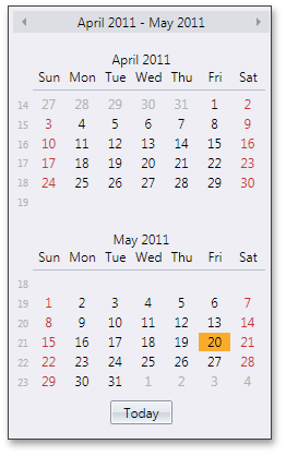
New Date Navigator
DevExpress v2011 vol1 introduces a new WPF Date Navigator. This is a multi-view control allowing an end-user to navigate in a calendar and choose a day or range of days.
Key features include:
-
Multiple Monthly or Yearly Calendars Onscreen
By default, the number of calendars displayed within the Date Navigator depends on the Date Navigator's size. You can explicitly specify the number of calendar rows and columns.
-
Multiple Calendar Views (Month, Year and Range of Years))
-
Navigation Pane
The navigation pane is displayed at the top. It displays the current month and navigation arrows used to move backwards and forwards through months/years.
-
Three Built-in Selection Modes
You can enable single day, multiple day or Outlook style selection.
-
Week Numbers Support
Date Navigator provides an optional display of week numbers. If required, you can define custom rules used to calculate week numbers.
-
Holidays and Special Days
Holidays are marked in Red. By default, these are Saturdays and Sundays. Date Navigator supports adding and removing holidays. Individual days can also be marked as special. These days are painted in bold.
-
Current Date Indication
-
Optional Today Button
The Today button switches to the Month view and navigates to the current date. This button is optional so you can hide it if required.
New Rich Edit Document Server
RichEditDocumentServer is a word processing engine developed to automate common word processing tasks. It is the non-visual equivalent of the RichEdit control, with complete functionality available via its API.
Typical applications include conversion, editing and modification of different document types and formats (RTF, DOCX, DOC, XML, HTML, MHT, ODT, EPUB, and TXT formats are supported). The Document Server can also be used to create mail merge or reporting server solutions.
Mail Merge Enhancements
With this release, mail merge functionality has been extended to provide support for nested merge operations with control over templates and the resulting document when each record is merged. The following features are available:
Automatic Table of Contents
You can quickly set up automatic Table of Contents (TOC) for the entire document or a section, or produce an automated Table of Figures. Built-in styles, paragraph outline levels or TC fields can be used to build your Table of Contents. Table of Figures is based on automatic sequential fields (SEQ) placed within paragraphs that are used to label figures or tables.
Document Variables
Each document has a collection of variables. Their values can be inserted into the document using DOCVARIABLE fields. A special event fires when a DOCVARIABLE field is updated, allowing you to handle the event and provide custom content for display purposes.
DOC File Format Support
DOC is a proprietary binary format used by all versions of Microsoft Word to store word processing documents. The WinForms Rich Edit Control can read and save DOC files in Word 97-2003 format containing common formatting features and supports advanced features which are implemented natively by our control.
Automatic Correction
The AutoCorrect feature modifies text as you type and offers the following benefits:
- Replace Internet addresses, network paths, and e-mail addresses with hyperlinks.
- Correct two initial capitals.
- Detect and correct typos and misspelled words using a spellchecker component.
- Implement text expander functionality (i.e. to quickly insert symbols or any long piece of text, and even images, using table entries).
- Insert any information based on input.
Table API
Table operations can be executed programmatically via our newly introduced table API. The table-specific object model provides methods that allow you to create tables or modify their content in code.
Syntax Highlighting
You can apply custom on-the-fly formatting to different categories of terms within document text. To parse text, you can use the DevExpress CodeParser library or a custom text parser.
Line Numbering
You can add line numbering to document margins for certain types of legal documents. Line numbers can run continuously throughout the document, restart on each page or section or be suppressed for a specific paragraph
Paste Special
The Paste Special command enables you to choose the format for data contained in the Clipboard and paste them into the document as if they are imported from the specified format.
New TreeList Control
The WPF Tree List is a TreeView-Grid multi-purpose data-aware control that can display information as a TREE, a GRID, or a combination of both - in either data bound or unbound mode.
Because of the common codebase, we have managed to migrate the majority of market-leading features exposed by the DevExpress WPF Grid, including:
- Data editing, automatic and custom sorting and filtering, full end-user customization options, editable unbound columns and DevExpress Expression editor, built-in validation, automatic and manual summary calculation, runtime column customization, UI virtualization and per-pixel scrolling, template and style support, UI localization, extendable context menus, etc.
Data Presentation Features
-
Representation of Hierarchical Data Relationships
With the WPF TreeList control you can represent any self-referenced data structure.
-
Unbound Mode Support
In unbound mode, you can manually create the entire tree in code or XAML. On-demand data loading in unbound mode is also supported.
View-Based Information Display
The WPF TreeList control uses the same View-based data presentation architecture as that found in the DevExpresss WPF Grid. This new view supports multi-column display of hierarchical data, data shaping and layout customization features such as Sorting and Filtering, Data Editing via Embedded Cell Editors, Column Auto Width, Column Reordering and Resizing, Fixed Columns, Field Chooser Window and Extendable Context Menus.
Asynchronous Loading of Visible Nodes
This new feature (which is also called Cascading Data Updates), was created to improve the TreeList's performance when scrolling nodes. Initially, when an end-user scrolls nodes, the TreeList synchronously loads all rows to be displayed on-screen. Once cascading data updates are enabled, visible nodes are asynchronously loaded one after another in the background. Multiple settings allow you to fine tune animation effects or provide a custom animations once node data has been retrieved from a data source.
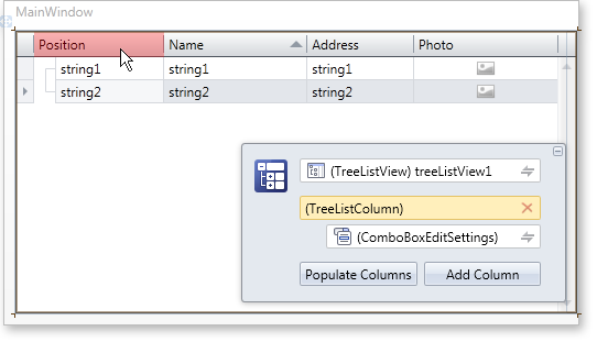
Design-Time Support
The WPF TreeList provides comprehensive design-time support within Visual Studio 2010 and Expression Blend. The DevExpress Quick Customization Panel allows you to access required objects, populate a view with columns, and assign column data editors.
Additional design-time capabilities include:
-
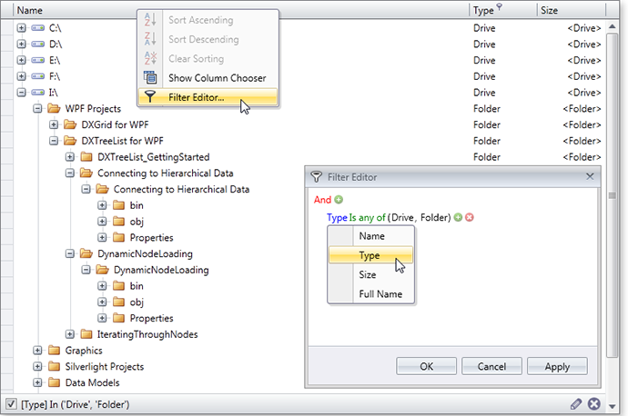
Specifying the treelist's filter using the built-in DevExpress Filter Editor.
-
Specifying a column's unbound expression using the built-in DevExpress Expression Editor.
-
Assigning a custom type as the TreeList’s design-time data source: The TreeList will then determine columns types and will allow you to populate the view with all available columns.
Tree-Traversal API
To simplify management of hierarchical data (without writing additional recursive code), the WPF TreeList ships with an easy to use API so you can sequentially traverse nodes.
Blog Post
Data Grid Control
New TreeList View
Note: The new WPF TreeList can be used on a standalone basis or as a View within the WPF Grid Control.
The TreeList View is a multi-purpose data visualization control that can display information as a tree, a list, or a combination of both.
The TreeList View fully supports standard presentation features you've come to expect from DevExpress container controls including: data editing, sorting, filtering, summary calculation, built-in validation, unbound columns, runtime column customization and more! Beyond these, the WPF TreeList ships with the following features:
-
Representation of Hierarchical Data Relationships
With the TreeList View, you can represent any self-referenced data structure in either bound or unbound mode.
-
Unbound Mode Support
In unbound mode, you can manually create the entire tree in code or XAML.
-
On-Demand Data Loading in Unbound Mode
In unbound mode, you can implement on-demand data loading (handle a special event to dynamically create child nodes before a parent node is expanded).
-
TreeNode Iterator
To simplify node traversal, the TreeListView ships with an easy to use node iterator class.
-
Node Images
You can explicitly specify node images or obtain images from a data source field with long binary data.
Blog Post
Instant Feedback™ UI
The DevExpress WPF Grid Control includes support for multiple binding modes, each designed to address a specific issue (Standard and Server Mode). With this release, Instant Feedback™ UI Mode is now available within the DXGrid for WPF.
Instant Feedback™ UI Mode is an asynchronous loading mode. When used, the WPF Grid Control and the host application will always remain responsive to user actions regardless of data operations initiated against the grid - from record scrolling, sorting, grouping and data filtering (because data loading is performed asynchronously, in a background thread).
The following animation demonstrates Instant Feedback™ UI Mode in action.
To activate this feature, use use one of the following data sources - LinqInstantFeedbackSource or XPInstantFeedbackSource .
Blog Post
Server Mode Improvements
-
Expressions for Unbound Columns in Server Mode
With this release, unbound grid columns can be populated with data in server mode using expressions. You can use the DevExpress Expression Editor to specify the formula used to reference other columns and use multiple functions and operators.
-
Group Intervals for DateTime Columns in Server Mode
The 'Group Intervals' feature for date-time columns is now available when using server mode.
Blog Post
Per-Pixel Vertical Scrolling
The DevExpress WPF Grid now supports per-pixel vertical scrolling. To provide visual feedback, per-pixel scrolling includes an option to display a custom animation.
Blog Post
Cascading Data Updates Support
This new features aims to speed the WPF Grid's performance when scrolling data rows. Initially, when an end-user scrolls grid rows, the grid synchronously loads all rows that must be displayed onscreen. When active, visible rows are asynchronously loaded, one after another, in a background thread.
To provide visual feedback, the grid plays an animation after row data has been retrieved from a data source. Multiple settings allow you to fine tune the associated animation effect.
Improved Print Preview
-
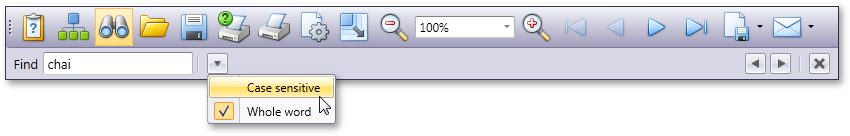
Searching within the Document Preview
With this release, the Document Preview allows you to search for an occurrence of a specified text string within the document.
-
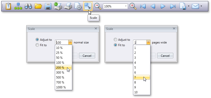
Report Scaling in Document Preview
The Document Preview now allows you to scale documents displayed within it.
Miscellaneous Enhancements
-
Attributes-Based Validation
You can now validate your business objects using Data Annotations attributes (required, range, regular expression, etc). You can also specify a custom validation method to validate a property or class instance.
-
Row Selection Attached Behavior (MVVM)
The new attached behavior allows you to manage selected rows directly from a ViewModel.
-
Column Data Binding Improvements
You can edit, group and sort grid columns connected to fields in a data source via WPF Data Binding. There is no difference when working with columns bound to data source fields using the FieldName or DisplayMemberBinding property.
Chart Control
Zooming and Scrolling in 2D Charts
With this release, Chart Control users can zoom in or out of a 2D XY chart diagram and scroll its contents whenever data points are out of the visible range. Zooming and scrolling can be performed both via axis scrollbars and using input devices (mouse buttons, mouse wheel, keyboard keys).
4 New Chart Types
Stacked Line, Full-Stacked Line, Step Line and Step Area 2D chart types are now available in the WPF and Silverlight versions of DXCharts.
Gauge Control
DXperience v2011 vol 1 includes our newest WPF and Silverlight Control Library – the DXGauges Suite. This initial version ships with two gauge types: Circular and Linear.
Each gauge type includes all required value indicators: needles or level bars, markers and range bars.
In addition, the following key features are available to you.

Built-in Models
The DXGauges Suite delivers more than 20 built-in models, each defining a consistent look-and-feel for all gauge elements. These models contain both element colors and element shapes, sizes and other associated parameters.
Scale Ranges
Circular and Linear scales can be divided into any number of ranges with their limits specified either in percents or in absolute values.
In addition, scale ranges provide support for end-user interaction. This is done by raising special events when any indicator enters or leaves a range and makes it possible to change a gauge's picture or perform any other action based upon current value.
End-User Interaction
In order to provide extended end-user interaction with the Gauge Control, we’ve included the ability to change indicator values at runtime along with comprehensive hit-test support. For example, you can create a knob-like gauge for use in your dashboards, then allow end-users to modify measurement criteria as needed.
Animations
All indicators in the DXGauges Suite can animate changes to their values by using one of the many animation effects that ship with the library.
Layout Control
Runtime Customization Enhancements
The newest features of our WPF Layout Control were created to significantly enhance the end-user’s runtime customization experience.
With this release, an end-user user can easily rename any layout item, group, tab or tab container via the customization toolbar which includes a customization button dedicated for this operation:
Blog Post
XML persistence
Our XML persistence engine has been updated to support all these new customization features. Your end-users will not lose any customization made to the layout.
Ribbon Control
New WPF BackstageView Control for DXRibbon
The WPF BackStageView Control allows you to emulate the application menu found in the latest Ribbon UI-based Microsoft Office products (e.g. Microsoft Word 2010).
In addition, the BackstageView Control can be displayed as a standalone control, when necessary.
When opened as a Ribbon menu, BackstageView Control is stretched to the window.
The control can display tab items along with regular buttons.
Tab items behave much like tab pages in a tab control - the contents of these items are opened when an item header is clicked. As you might expect, any custom control can be displayed within tab items.
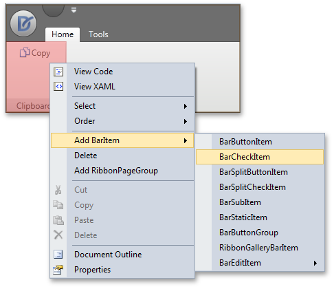
Ribbon Design Time Enhancements
The newest version of the DevExpress WPF Ribbon Control includes design-time improvements to simplify its use. Support for menus and on-form actions to help you add and access Ribbon elements on the fly are now included.
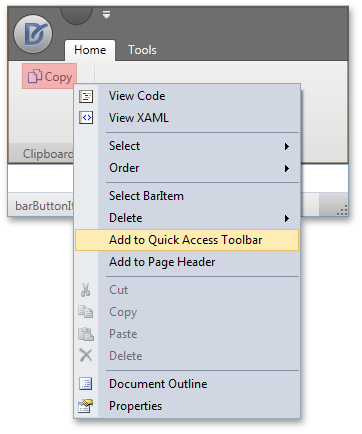
Bar items, Ribbon Pages, Page Groups and Categories can now be added to DXRibbon via a context menu. When adding a bar item, the item type can be selected using a sub-menu:
You can add items to a Ribbon Status Bar using the same approach. A context menu will help you add items at the status bar's left or rightmost edge:
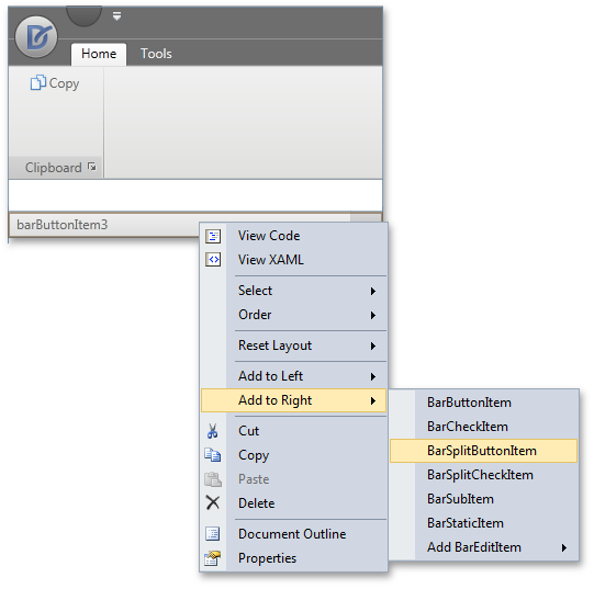
When you select a Ribbon item, its settings are listed in the Properties window, allowing for easy customization. The item's context menu will help you add the item to the Ribbon’s Quick Access Toolbar and Page Header:
Scheduler Control
MVVM Support
DXperience v2011 vol 1 introduces MVVM patterns support. You can now specify ViewModel as data context for the scheduler control and scheduler storage, and you can bind associated properties to ViewModel properties by using binding expressions in XAML.
In order to deliver this capability, SchedulerStorage is now inherited from FrameworkElement. SchedulerStorage provides the DataContext property to specify data binding source.
Date Navigator
DXperience v2011 vol1 introduces a new WPF Date Navigator that can be bound to the scheduler control to provide end-users with intuitive access to specific time frames.
An end-user can select a specific date, continuous range of dates, a single week, or multiple weeks via simple mouse operations - clicking and dragging within the Date Navigator. Each date change will automatically switch the associated scheduler view to the most appropriate display type in order to display the selected date or date range - the Day View if less than 7 days are selected - the Week View for 7 days - and the Month View for longer intervals. Non-continuous ranges can be selected by pressing the Ctrl key (the Scheduler displays them using the Day View).
Resource Navigator Options
We have implemented options for the embedded resource navigator so you can hide unnecessary buttons and added the capability to localize button hints.
Improved Resource Coloring
You can now assign a specific color schema to paint a specific visible resource from the scheduler resource storage.
This allows you to control visible resource coloring when using the resource filter control. In addition, this capability can be helpful if you need to paint appointment resources based upon certain conditions (for example, to highlight a selected resource or specify a certain color schema for a resource depending on its custom field value).
Spell Checker Control
Hunspell Dictionary Support
Hunspell allows dictionaries to define complex rules for compound word usage and was designed for languages with rich morphology and complex word compounding or character encoding. Its advantages include morphological analysis, Unicode support and reduced memory usage.
Hunspell dictionaries are used in the OpenOffice, FireFox, and OpenSpell spell check engines. As such, you can easily download existing dictionaries and thus streamline your deployment.
Load Dictionaries On Demand
A new option allows you to load a dictionary for a specific culture whenever the spell checker is switched to this culture. This option provides significant improvements in load time and memory consumption, especially for complex language dictionaries, such as Czech or Lithuanian.
Tab Control
The newest version of the DevExpress WPF Tab Control includes numerous new features – Among them design-time support for adding, deleting and selecting individual pages.
A new item in a tab control's context menu allows the developer to quickly add new tabs:
Any page header can be clicked at design time to view page contents and edit page settings via the Properties window.
To delete a page at design time, simply select it, then press the DELETE button on your keyboard.
In addition to these design time enhancements, the WPF Tab Control allows you to quickly hide page headers via a single property setting.
Miscellaneous Enhancements
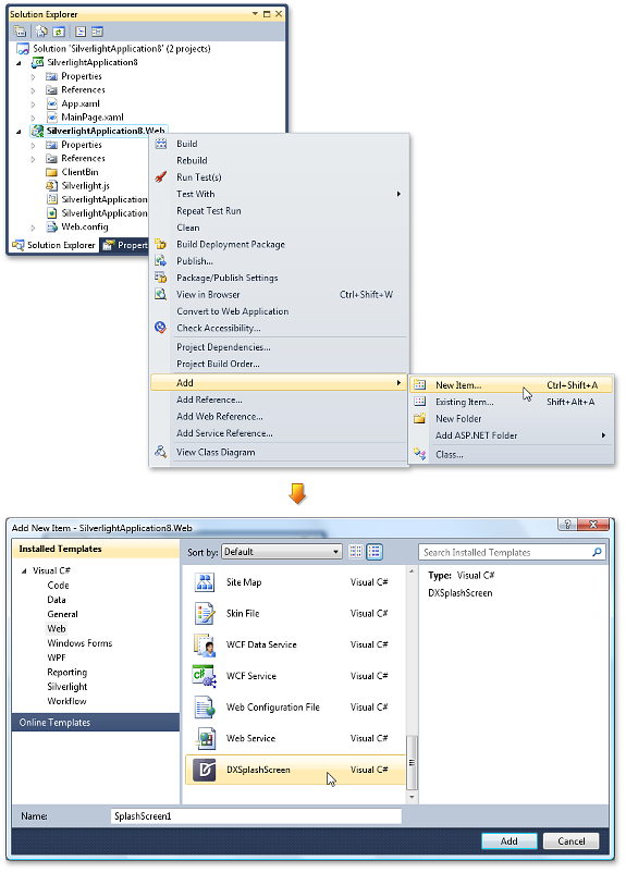
WPF Splash Screen
The DevExpress WPF Splash Screen can be added to your application with a few mouse clicks and gives you the ability to display an elegant splash screen to inform users of the state of your application during initial load.
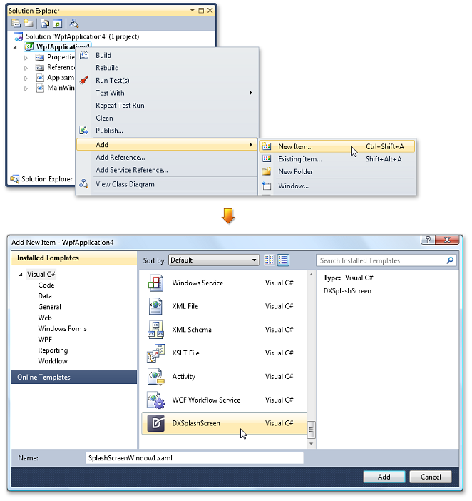
When adding DXSplashScreen to your project, a XAML file containing the splash screen is generated - A single line of code then invokes the splash screen on application startup and calls another statement to close the splash screen when resource loading is complete.
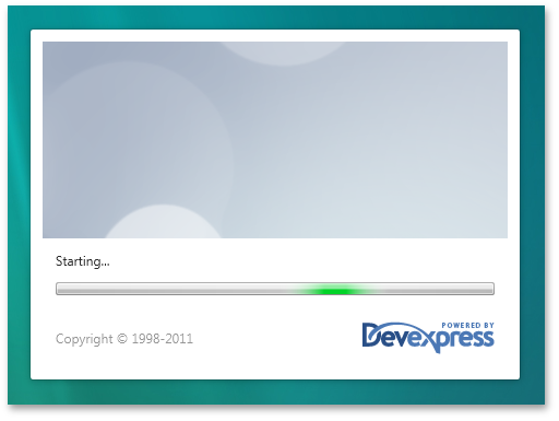
By default, the WPF Splash Screen contains a marquee progress bar. Its display mode can be changed to step through progress manually from code.
As a splash screen is rendered from a XAML file, the markup can be fully customized – one such example would be to display custom static and animated controls. Here is the default appearance of DXSplashScreen and how it can be customized by altering text, images, and more:
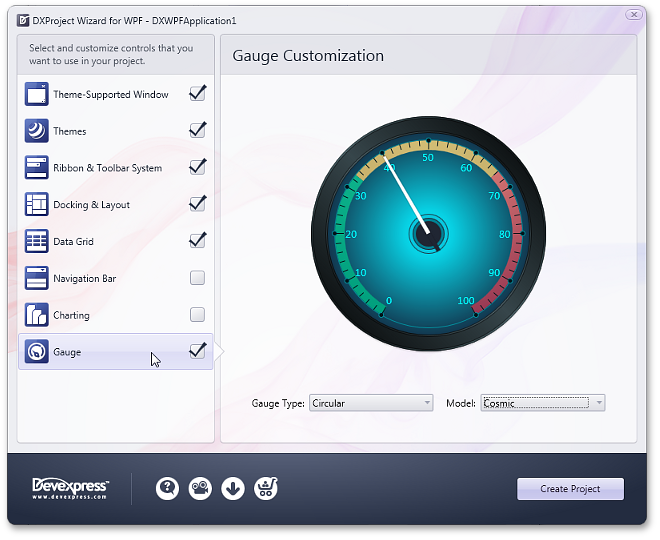
Project Wizard Enhancements
The WPF Project Wizard now includes support for 2 new controls shipping in DXperience v2011 vol 1.
Because the DXGrid now supports a TreeList View, the Project Wizard allows you to apply one of the following View types to the Grid Control: Table, Card or TreeList layout:
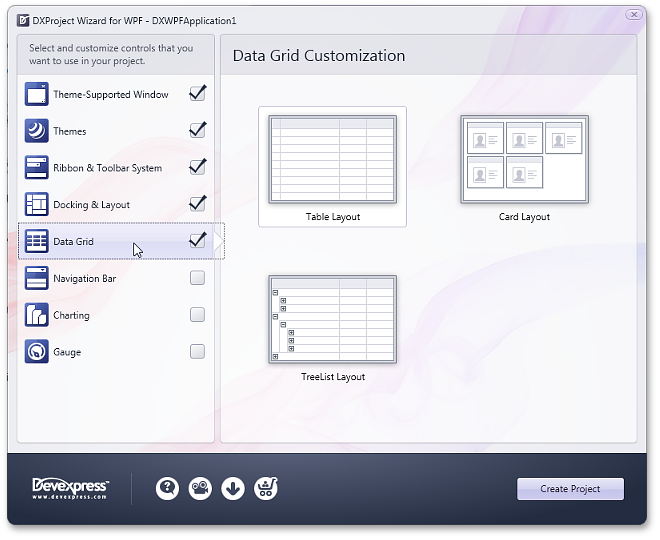
In addition, the Project Wizard also allows you to insert WPF Gauge Controls to your project. Gauge type and paint style can be selected and applied to the application:
New Rich Edit Document Server
RichEditDocumentServer is a word processing engine developed to automate common word processing tasks. It is the non-visual equivalent of the RichEdit control, with complete functionality available via its API.
Typical applications include conversion, editing and modification of different document types and formats (RTF, DOCX, DOC, XML, HTML, MHT, ODT, EPUB, and TXT formats are supported). The Document Server can also be used to create mail merge or reporting server solutions.
Mail Merge Enhancements
With this release, mail merge functionality has been extended to provide support for nested merge operations with control over templates and the resulting document when each record is merged. The following features are available:
Automatic Table of Contents
You can quickly set up automatic Table of Contents (TOC) for the entire document or a section, or produce an automated Table of Figures. Built-in styles, paragraph outline levels or TC fields can be used to build your Table of Contents. Table of Figures is based on automatic sequential fields (SEQ) placed within paragraphs that are used to label figures or tables.
Document Variables
Each document has a collection of variables. Their values can be inserted into the document using DOCVARIABLE fields. A special event fires when a DOCVARIABLE field is updated, allowing you to handle the event and provide custom content for display purposes.
DOC File Format Support
DOC is a proprietary binary format used by all versions of Microsoft Word to store word processing documents. The WinForms Rich Edit Control can read and save DOC files in Word 97-2003 format containing common formatting features and supports advanced features which are implemented natively by our control.
Automatic Correction
The AutoCorrect feature modifies text as you type and offers the following benefits:
- Replace Internet addresses, network paths, and e-mail addresses with hyperlinks.
- Correct two initial capitals.
- Detect and correct typos and misspelled words using a spellchecker component.
- Implement text expander functionality (i.e. to quickly insert symbols or any long piece of text, and even images, using table entries).
- Insert any information based on input.
Table API
Table operations can be executed programmatically via our newly introduced table API. The table-specific object model provides methods that allow you to create tables or modify their content in code.
Syntax Highlighting
You can apply custom on-the-fly formatting to different categories of terms within document text. To parse text, you can use the DevExpress CodeParser library or a custom text parser.
Line Numbering
You can add line numbering to document margins for certain types of legal documents. Line numbers can run continuously throughout the document, restart on each page or section or be suppressed for a specific paragraph.
New TreeList Control
The Silverlight Tree List is a TreeView-Grid multi-purpose data-aware control that can display information as a TREE, a GRID, or a combination of both - in either data bound or unbound mode.
Because of the common codebase, we have managed to migrate the majority of market-leading features exposed by the DevExpress Silverlight Grid, including:
Data editing, automatic and custom sorting and filtering, full end-user customization options, editable unbound columns and DevExpress Expression editor, built-in validation, automatic and manual summary calculation, runtime column customization, UI virtualization and per-pixel scrolling, template and style support, UI localization, extendable context menus, etc.
Data Presentation Features
-
View-Based Information Display
The Silverlight TreeList control uses the same View-based data presentation architecture as that found in the DevExpresss Silverlight Grid. This new view supports multi-column display of hierarchical data, data shaping and layout customization features such as Sorting and Filtering, Data Editing via Embedded Cell Editors, Column Auto Width, Column Reordering and Resizing, Fixed Columns, Field Chooser Window and Extendable Context Menus.
-
Representation of Hierarchical Data Relationships
With the Silverlight TreeList control you can represent any self-referenced data structure.
-
Unbound Mode Support
In unbound mode, you can manually create the entire tree in code or XAML. On-demand data loading in unbound mode is also supported.
-
Asynchronous Loading of Visible Nodes
This new feature (which is also called Cascading Data Updates), was created to improve the TreeList's performance when scrolling nodes. Initially, when an end-user scrolls nodes, the TreeList synchronously loads all rows to be displayed on-screen. Once cascading data updates are enabled, visible nodes are asynchronously loaded one after another in the background. Multiple settings allow you to fine tune animation effects or provide a custom animations once node data has been retrieved from a data source.
Design-Time Support
The Silverlight TreeList provides comprehensive design-time support within Visual Studio 2010 and Expression Blend. The DevExpress Quick Customization Panel allows you to access required objects, populate a view with columns, and assign column data editors.
Additional design-time capabilities include:
- Assigning a custom type as the TreeList's design-time data source: The TreeList will then determine columns types and will allow you to populate the view with all available columns.
- Column settings can now be accessed by clicking individual column headers.
Tree-Traversal API
To simplify management of hierarchical data (without writing additional recursive code), the Silverlight TreeList ships with an easy to use API so you can sequentially traverse nodes.
Blog Post
Data Grid Control
New TreeList View
Note: The new Silverlight TreeList can be used on a standalone basis or as a View within the Silverlight Grid Control.
The TreeList View is a multi-purpose data visualization control that can display information as a tree, a list, or a combination of both.
The TreeList View fully supports standard presentation features you've come to expect from DevExpress container controls including: data editing, sorting, filtering, summary calculation, built-in validation, unbound columns, runtime column customization and more! Beyond these, the Silverlight TreeList ships with the following features:
-
Representation of Hierarchical Data Relationships
With the TreeList View, you can represent any self-referenced data structure in either bound or unbound mode.
-
Unbound Mode Support
In unbound mode, you can manually create the entire tree in code or XAML.
-
On-Demand Data Loading in Unbound Mode
In unbound mode, you can implement on-demand data loading (handle a special event to dynamically create child nodes before a parent node is expanded).
-
TreeNode Iterator
To simplify node traversal, the TreeList View ships with an easy to use node iterator class.
-
Node Images
You can explicitly specify node images or obtain images from a data source field with long binary data.
Instant Feedback™ UI
The DevExpress Silverlight Grid Control includes support for multiple binding modes, each designed to address a specific issue (Standard and Server Mode). With this release, Instant Feedback™ UI Mode is now available within the DXGrid for Silverlight.
Instant Feedback™ UI Mode is an asynchronous loading mode. When used, the Silverlight Grid Control and the host application will always remain responsive to user actions regardless of data operations initiated against the grid - from record scrolling, sorting, grouping and data filtering (because data loading is performed asynchronously, in a background thread).
The following animation demonstrates the Instant Feedback™ UI Mode in action.
To activate this feature, use the following data source - XPInstantFeedbackSource .
Per-Pixel Vertical Scrolling
The DevExpress Silverlight Grid now supports per-pixel vertical scrolling. To provide visual feedback, per-pixel scrolling includes an option to display a custom animation.
Blog Post
Cascading Data Updates Support
This new features aims to speed the Silverlight Grid's performance when scrolling data rows. Initially, when an end-user scrolls grid rows, the grid synchronously loads all rows that must be displayed onscreen. When active, visible rows are asynchronously loaded, one after another, in a background thread.
To provide visual feedback, the grid plays an animation after row data has been retrieved from a data source. Multiple settings allow you to fine tune the associated animation effect.
Blog Post
Design-Time Support
In v2011 vol1, our Silverlight Grid control provides enhanced design-time support within Visual Studio 2010 and Blend. Among these enhancements are:
Improved Print Preview
-
Searching within the Document Preview
With this release, the Document Preview allows you to search for an occurrence of a specified text string within the document.
-
Report Scaling in Document Preview
The Document Preview now allows you to scale documents displayed within it.
Miscellaneous Enhancements
-
Attributes-Based Validation
You can now validate your business objects using Data Annotations attributes (required, range, regular expression, etc). You can also specify a custom validation method to validate a property or class instance.
-
Row Selection Attached Behavior (MVVM)
The new attached behavior allows you to manage selected rows directly from a ViewModel.
-
Column Data Binding Improvements
You can edit, group and sort grid columns connected to fields in a data source via Silverlight Data Binding. There is no difference when working with columns bound to data source fields using the FieldName or DisplayMemberBinding property.
-
Direct Columns Access from Code-Behind
Grid columns and their edit settings can be referred from code-behind by Name (or x:Name attribute).
-
Column Binding Improvements
Thanks to data context and element name binding support, grid columns and edit settings can be bound to an MVVM ViewModel as well as any other UI element within the application.
Chart Control
Zooming and Scrolling in 2D Charts
With this release, Chart Control users can zoom in or out of a 2D XY chart diagram and scroll its contents whenever data points are out of the visible range. Zooming and scrolling can be performed both via axis scrollbars and using input devices (mouse buttons, mouse wheel, keyboard keys).
4 New Chart Types
Stacked Line, Full-Stacked Line, Step Line and Step Area 2D chart types are now available in the WPF and Silverlight versions of DXCharts.
Gauge Control
DXperience v2011 vol 1 includes our newest WPF and Silverlight Control Library – the DXGauges Suite. This initial version ships with two gauge types: Circular and Linear.
Each gauge type includes all required value indicators: needles or level bars, markers and range bars.
In addition, the following key features are available to you.
Built-in Models
The DXGauges Suite delivers more than 20 built-in models, each defining a consistent look-and-feel for all gauge elements. These models contain both element colors and element shapes, sizes and other associated parameters.
Scale Ranges
Circular and Linear scales can be divided into any number of ranges with their limits specified either in percents or in absolute values.
In addition, scale ranges provide support for end-user interaction. This is done by raising special events when any indicator enters or leaves a range and makes it possible to change a gauge's picture or perform any other action based upon current value.
End-User Interaction
In order to provide extended end-user interaction with the Gauge Control, we've included the ability to change indicator values at runtime along with comprehensive hit-test support. For example, you can create a knob-like gauge for use in your dashboards, then allow end-users to modify measurement criteria as needed.
Animations
All indicators in the DXGauges Suite can animate changes to their values by using one of the many animation effects that ship with the library.
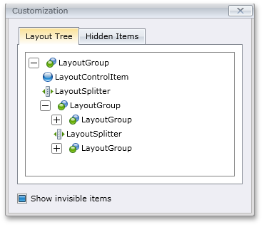
Docking Control
MDI Mode
DevExpress Silverlight Dock Controls allow you to create MDI user interfaces - where a parent container displays child windows. All classic MDI layout features are available to end-users - from maximizing or collapsing windows to automatic arrangement using Cascade, Vertical Tiling or Horizontal Tiling styles.
Optionally, Tabbed MDI management can be enabled to display child windows as tabbed pages.
Both parent and child windows can contain their own menus and toolbars. With this release, we've added support for menu and toolbar merging for Silverlight. When a child window is maximized, its main menu is merged into the parent's menu. Toolbars can also be merged when required:
The Prism framework can be used together with our Docking control. You can generate views and easily inject them into dock panels, tabbed groups and document groups using Prism attributes. This is especially useful in MDI mode, where MDI child windows are automatically created based on your business model. When using Prism, you can create bars within views using our BarManager control. These Bars support automatic toolbar merging along with the implementation of custom toolbar merging logic using events.
Layout Functionality
Silverlight Docking Control provides built-in layout functionality. You can add controls to individual dock panels or directly to the Docking Control - where they will be automatically aligned without overlap. At runtime, end-users can modify the layout in customization mode:
A dedicated customization window allows end-users to view the hierarchical structure of the layout, access hidden items and move items between the main page and customization window via drag-and-drop:
Design-Time Improvements
With our new Customization Window, you can easily rename, focus and add panels - save and load layouts:
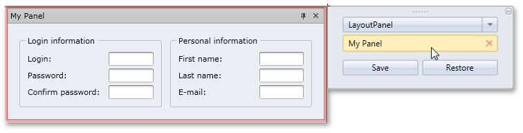
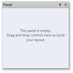
When a panel is added, you can drag-and-drop controls from the toolbox onto the panel:
If you select a layout item, a customization window is displayed, allowing you to rename the selected item and add new items:
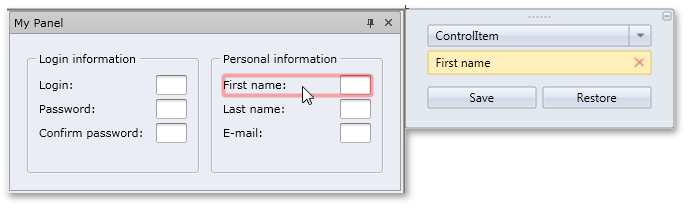
All your design-time customization actions are automatically reflected in XAML code.
Editors
New Control - Silverlight Progress Bar
DXperience v2011 vol 1 introduces a new Silverlight progress bar that can an be used as a standard or marquee progress bar. Like other DevExpress Data Editors, both standalone and embedded versions are available.
Key features include:
- Standard or marquee (intermediate) style
- Current value display
- Customizable maximum and minimum values
- Horizontal or vertical orientation
Layout Control
Runtime Customization Enhancements
The newest features of our Silverlight Layout Control were created to significantly enhance the end-user's runtime customization experience.
With this release, an end-user user can easily rename any layout item, group, tab or tab container via the customization toolbar which includes a customization button dedicated for this operation:
Blog Post
XML persistence
Our XML persistence engine has been updated to support all these new customization features. Your end-users will not lose any customization made to the layout.
Ribbon Control
New Silverlight BackstageView Control for DXRibbon
The Silverlight BackStageView Control allows you to emulate the application menu found in the latest Ribbon UI-based Microsoft Office products (e.g. Microsoft Word 2010).
BackstageView Control is an advanced version of a menu - designed to be the main menu in Ribbon-UI based applications. It is generally displayed when an end-user clicks the Application Button:
In addition, the BackstageView Control can be displayed as a standalone control, when necessary.
When opened as a Ribbon menu, BackstageView Control is stretched to the window.
The control can display tab items along with regular buttons.
Tab items behave much like tab pages in a tab control - the contents of these items are opened when an item header is clicked. As you might expect, any custom control can be displayed within tab items.
Blog Post
Ribbon Design Time Enhancements
The newest version of the DevExpress Silverlight Ribbon Control includes design-time improvements to simplify its use. Support for menus and on-form actions to help you add and access Ribbon elements on the fly are now included.
Bar items, Ribbon Pages, Page Groups and Categories can now be added to DXRibbon via a context menu. When adding a bar item, the item type can be selected using a sub-menu:
You can add items to a Ribbon Status Bar using the same approach. A context menu will help you add items at the status bar's left or rightmost edge:
When you select a Ribbon item, its settings are listed in the Properties window, allowing for easy customization. The item's context menu will help you add the item to the Ribbon's Quick Access Toolbar and Page Header:
Spell Checker Control
Hunspell Dictionary Support
Hunspell allows dictionaries to define complex rules for compound word usage and was designed for languages with rich morphology and complex word compounding or character encoding. Its advantages include morphological analysis, Unicode support and reduced memory usage.
Hunspell dictionaries are used in the OpenOffice, FireFox, and OpenSpell spell check engines. As such, you can easily download existing dictionaries and thus streamline your deployment.
Load Dictionaries On Demand
A new option allows you to load a dictionary for a specific culture whenever the spell checker is switched to this culture. This option provides significant improvements in load time and memory consumption, especially for complex language dictionaries, such as Czech or Lithuanian.
Splash Screen
The DevExpress Silverlight Splash Screen can be added to your application with a few mouse clicks and gives you the ability to display an elegant splash screen to inform users of the state of your application during initial load.
This generates a splash screen, adding necessary XAML and JavaScript files to your project and registering the splash screen to ensure its automatically running on application startup. Here is the default splash screen:
A splash screen is rendered from a XAML file - it can be customized to fit your needs.
Blog Post

Tab Control
The newest version of the DevExpress Silverlight Tab Control includes numerous new features – Among them design-time support for adding, deleting and selecting individual pages.
A new item in a tab control's context menu allows the developer to quickly add new tabs:
Any page header can be clicked at design time to view page contents and edit page settings via the Properties window.
To delete a page at design time, simply select it, then press the DELETE button on your keyboard.
In addition to these design time enhancements, the Silverlight Tab Control allows you to quickly hide page headers via a single property setting.
Performance Improvements
This release brings a host of improvements to the overall performance of our Silverlight Controls.
-
On-demand theme loading
Theme resources that were loaded because of control dependencies are now excluded. One such example is the exclusion of themes for the DXDocking and Printing Library when the only control being utilized in the application is a DXGrid Control with Print Preview functionality implemented. This leads to the dependency themes only loading when a print preview is displayed, thus improving the grid's load time.
- XAML refactoring to reduce the size of XAML files and improve loading performance.
- Improving code for themes libraries allow different theme modules to be unlinked, resulting in better performance results.
To compute memory consuption, two sample applications were developed and tested locally on a machine with the following configuration:
-
Intel Core 2 Duo CPU 3.00 GHz, RAM 4 GB
-
Windows 7 Enterprise, Service Pack 1, 32-bit
-
Internet Explorer 9
-
Microsoft Silverlight Version: 4.0.60310.0
In each test, we performed a sequence of actions that caused a gradual increase in memory allocation. First, we measured memory consumption on startup, then sequentially switched paint themes while continuing to measure memory usage.
These two applications were run against v2010 vol 2 and v2011 vol 1 of DevExpress Silverlight Controls. In the first test application, we used a DXGrid control bound to a data source. Here is the chart that shows test results for this application:
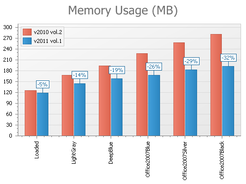
The second test application is an Outlook-like program where DXGrid, DXRibbon and DXNavBar controls were used. This allows us to get cumulative benchmark results for a typical application consisting of multiple controls:
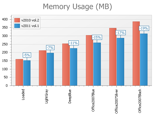
You'll also notice considerable memory consumption improvement in our Silverlight demos – up to 40% on the startup of our Silverlight DXGrid demo.
ASP.NET Reporting
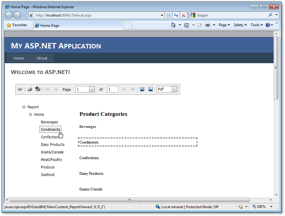
Web Document Map
You can now easily implement client-side navigation for your Web reports using the ReportDocumentMap control that ships with the XtraReports Suite.
Blog Post
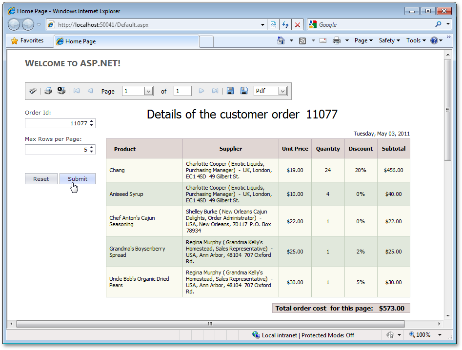
Web Parameters Panel
DXperience v2011 vol 1, allows you to incorporate a Web report parameters user interface using the ReportParametersPanel control that ships with the XtraReports Suite.
Blog Post
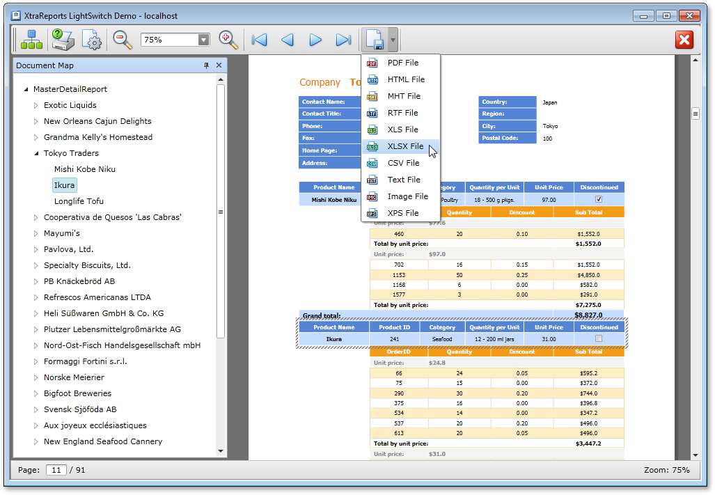
LightSwitch Support
This release introduces support for the newest member of the Visual Studio family: LightSwitch. This integration interacts seamlessly with entities created within LightSwitch and provides a native and consistent experience when developing reports.
This integration leverages the ease of use of our award winning reporting solution with the natural UI experience developed in LightSwitch.
Common tasks such as data binding, grouping, and sorting within LightSwitch becomes a simple and repeatable process with XtraReports for LightSwitch.
Blog Post
MVC Reporting
With this release, XtraReports introduces two specialized controls for MVC Reporting: MVCxReportViewer and MVCxReportToolbar.
Blog Post
Silverlight Reporting
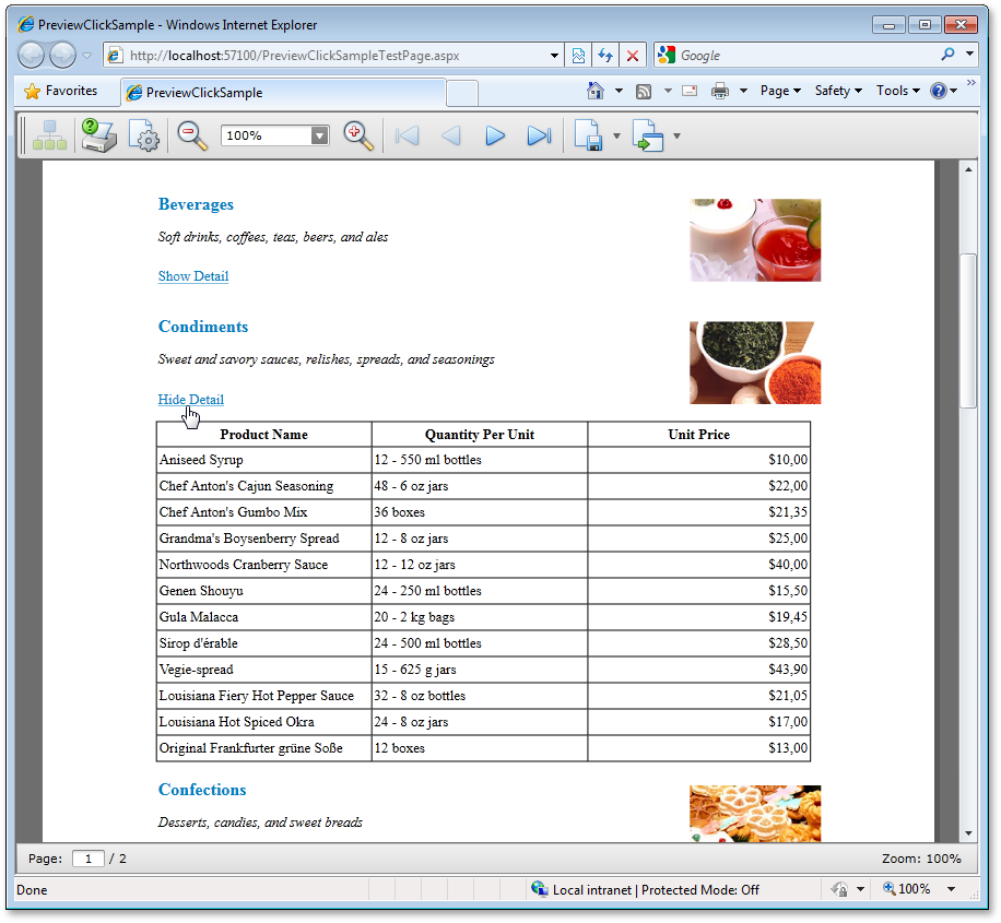
Interactive Document Preview
You can quickly introduce end-user interactivity to your Document Preview by using the following new events: PreviewClick and PreviewMouseMove.
Once implemented, your end-users can drill-down and drill-through reports, and execute other operations (such as sorting) within the Document Preview.
Blog Post
New Zooming Modes
The following new document zooming modes are available:
- Fit to whole page
- Fit to page height
- Fit to page width
Miscellaneous Enhancements
- Now, you can display the Document Preview in a new window.
- Improved server error diagnostics.
-
The Silverlight-enabled XtraReports Service item template in Visual Studio® now generates a ReportService-derived class - to more easily override some of its methods.
WPF Reporting
Interactive Document Preview
You can introduce end-user interactivity to your Document Preview by using the following new events: PreviewClick, PreviewDoubleClick and PreviewMouseMove.
Once implemented, your end-users can drill-down and drill-through reports, and execute other operations (such as sorting) within the Document Preview.
Blog Post
Searching within the Document Preview
With this release, the WPF Document Preview allows you to search for an occurrence of a specified text string within the document.
Blog Post
Report Scaling in Document Preview
The WPF Document Preview now allows you to scale documents displayed within it.
Blog Post
New Zooming Modes
The following new document zooming modes are available:
- Fit to whole page
- Fit to page height
- Fit to page width
Xtra Reporting
XML Serialization
With this release, you can save/load report definitions using a custom XML format in a stream or file. This serialization algorithm is twice as fast as that of CodeDOM, and consumes much less memory.
This functionality allows you to provide custom serialization for a report's data source and any custom report parameters types.
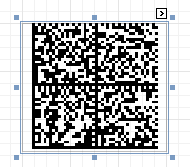
New Barcode Type - DataMatrix ECC200
Data Matrix code (the ISO/IEC 16022 standard) is a two-dimensional matrix barcode consisting of black and white "cells" arranged in a rectangular pattern. The information to be encoded can be text or raw data.
Every Data Matrix is composed of two solid adjacent borders in an "L" shape (called the "finder pattern") and two other borders consisting of alternating dark and light "cells" or modules (called the "timing pattern"). Within these borders are cell columns and rows that encode information. The finder pattern is used to locate and orient the symbol while the timing pattern provides a count of the number of rows and columns in the symbol.
Blog Post
ASP.NET UI Performance
With this release, we have significantly reduced the size of generated pages and reworked XAF internals to optimize page generation speed on the web server. In internal testing, network traffic was halved and page generation times were reduced by one-third.
Filter Editor
The Filter Editor available within List Views (GridControl) has been improved. End-users can now select nested object properties and apply aggregate functions to collections. As such, complex filters can be easily constructed at run time.
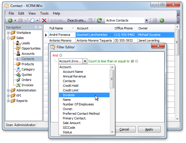
Model Editor
Image, Criteria and Edit Mask Editors
The Model Editor includes a number of string properties which specify image names, Criteria Language expressions and Edit Masks. These property values can now be modified with specially designed editors. Click the ellipsis button displayed to the right of a property value, and the respective editor will be invoked. You can choose images from the gallery, construct filters visually, specify and test editor masks.
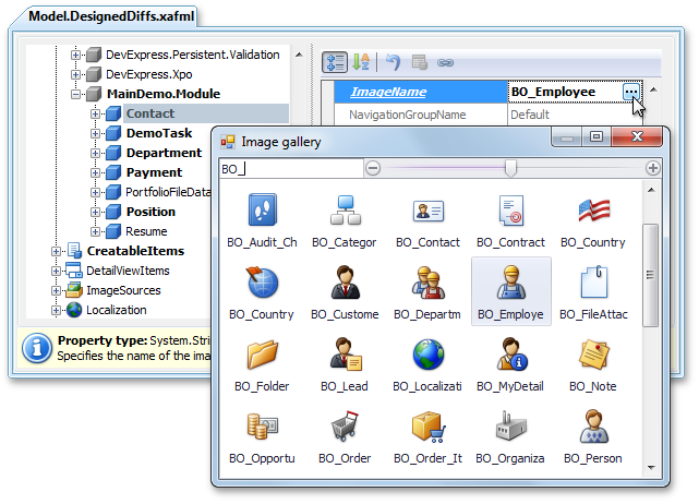
Nodes Groups and Links
Views, Controllers and BOModel child nodes can now be grouped by namespaces of their associated objects. The Group/Ungroup context menu command toggles grouping. For instance, you can use this feature to separate custom business object Views from those declared in other XAF modules.
Most nodes now include a "virtual" Links child node, which exposes links to nodes that contain references to the current node. You can edit properties of linked nodes in place, or navigate to an actual node location via the Go to Source command
Standalone Model Editor
The standalone Model Editor can be used by application administrators to edit the model of a deployed ASP.NET or WinForms application with the Edit Model action disabled. In previous versions, to start the standalone Model Editor, you had to pass the configuration filename or a module assembly filename as a command-line parameter. You can now execute it without parameters, and select the required file in the Open Model dialog.
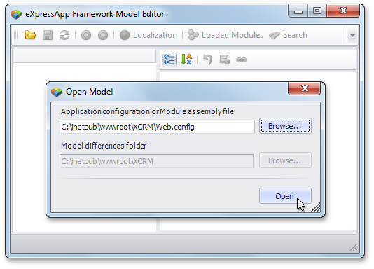
Startup Time
With DXperience v2011 vol 1, metadata information for the Application Model and domain components is generated only once - at first start up. The generated metadata is saved to disk and thus skipped in subsequent application runs.
We have optimized the process of collecting type metadata for controllers, business objects, modules and other domain entities. To achieve this, the ModuleBase class has been refactored and simplified. As a result, you can now explicitly specify in code the Controllers and business classes a Module must export to the Application Model - and thus skip costly automatic collection routines. All built-in XAF modules have been refactored to take the advantage of this capability.
These improvements should reduce an application's start up time by at least 20%.
Model Merge Tool
This release ships with the XAF Model Merge Tool - intended to merge Application Model customizations into an underlying model layer. This means that you can now customize a View item's layout in the application project layer or at run time, and then move these changes down into the module project layer. Of course, the layout is not the only customization that can be merged - you can merge all differences that can be applied to a target model layer. The most obvious use cases are those that involve the merging of Detail View and Dashboard layouts, grid customizations (column order, visibility, grouping, etc), chart and pivot grid settings.
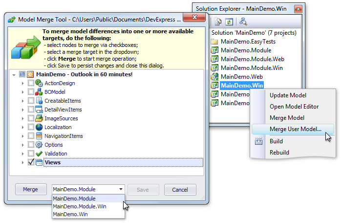
Application administrators can merge differences into a common model layer, typically stored in the Model.xafml file within the application folder. This can be done via the Merge Differences command available in the Model Editor at runtime.
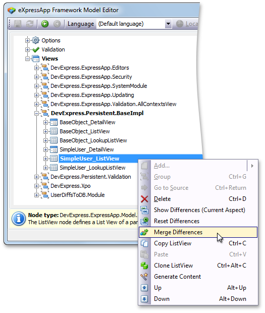
EasyTest Commands
New and Updated EasyTest Commands
A number of changes have been made to script commands within EasyTest - our functional testing framework. Several new commands have been introduced and existing command functionality has been extended. The primary objective behind these improvements is to simplify the generation of platform-independent functional tests. Although XAF can produce WinForms and ASP.NET applications with similar functionality, there are differences in behavior that influence tests implementation. Previously, you had to use the IfDef EasyTest command to control test flow. The following are changes we've introduced to minimize the use of IfDef .
-
In WinForms XAF applications, Validation results are displayed in the popup window. In ASP.NET applications, they are displayed at the current page, via the ErrorInfoControl. The new CheckValidationResult command supports both these representations.
-
A new OptionalAction command is available. This command is similar to the Action command, but does not require the target control to be visible and active. You can use this command in tests when you need to perform an action that is required in an ASP.NET application but is unavailable in a WinForms application (or vice versa). An example is the Edit action that must be executed in APS.NET applications to switch a Detail View to edit mode.
-
The HandleDialog command supports messages displayed via the ErrorInfoControl in ASP.NET applications. Another significant improvement is that this command supports a browser's confirmation messages (for instance displayed when executing an Action that has a ConfirmationMessage assigned).
-
The FillForm command can now be used to fill lookup values in ASP.NET applications.
-
The ExecuteEditorAction command can be used to execute an action displayed within a lookup when testing WinForms applications.
Blog Post
State Machine Module
The State Machine module allows you to easily manage a business object's status. A good example of a stateful object is a task - with the following states: not started, in progress, completed, paused, etc. Until a task is started, it cannot be completed . By using the State Machine module, you can define this logic by specifying valid state transitions. You can also specify appearance rules for different states so they will be applied when a state changes. The State Machine module automatically creates status change Actions and puts them into a Detail View.
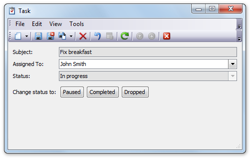
Additionally, the State Machine module ships with a predefined set of persistent objects to simplify state machine customization - your end-users can customize existing state machines and create new ones.
State machines are supported in both WinForms and ASP.NET XAF Applications.
Windows Workflow Foundation 4.0
DXperience v2011 vol 1 introduces complete Windows Workflow Foundation 4.0 support. To implement it within your solution, you only need to know the general concepts associated with workflow design - XAF will take care of the rest.
Blog Post
New Code Provider
The Declare Event code provider is now available. It declares an event for a reference to an undeclared event.
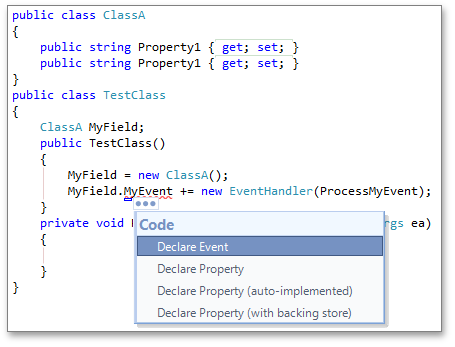
New Refactorings
The following refactorings are now available:
Convert to Point
Consolidates selected numeric parameters into a Point object.
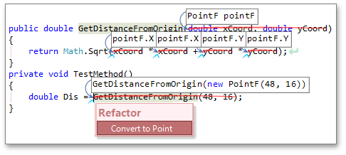
Convert to Tuple
Consolidates selected parameters into a Tuple object.
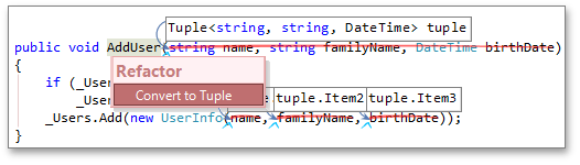
Inline Method
Replaces method calls with that method's body. If you apply the refactoring to a method call, it replaces only that call. But, if you apply Inline Method to a method declaration, it replaces all calls to that method.
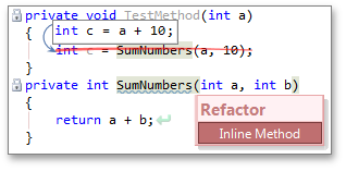
Inline Method (and delete)
Replaces method calls with that method's body, and deletes the original method. If you apply the refactoring to a method declaration, it replaces all calls to that method. The refactoring is also available for a method call, if there are no more calls to that method.
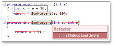
Use Named Arguments
Converts a method call with positional arguments into a named-argument call.
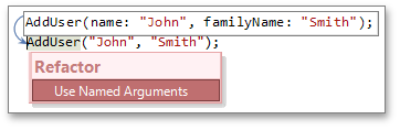
New Text Command
We have implemented the GoTo text command for use in CodeRush templates. GoTo places the text following it right before the first field, method, property, or constructor found in the current class. Valid arguments to the GoTo text command are: Fields, Methods, Properties, or Constructors .
New Contexts
The following contexts are now available:
HasConstructors
Satisfied if the active class has one or more constructors.
HasFields
Satisfied if the active class has fields.
HasMethods
Satisfied if the active class has methods.
HasProperties
Satisfied if the active class has properties.
New String Providers
The following string providers are now available:
MemberHeader
The region header for the specified declaration section. Can be one of Fields, Methods, Properties, or Constructors .
MemberFooter
The region footer for the specified declaration section. Can be one of Fields, Methods, Properties, or Constructors .
Code Formatting
With this release, CodeRush allows you to fine-tune formatting rules for your code. You can set options for spaces, blank lines, alignment, line breaks, and indentation in variety of code constructs.
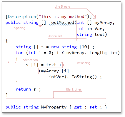
The code formatting options are stored in the Editor|Code Formatting section. Options on each page of the section are organized as a tree. It enables you to easily locate the desired option. To understand how the selected option will affect your code, review the code sample at the bottom of the option page.
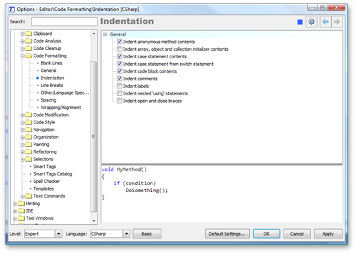
By default, CodeRush applies code formatting only to the code it generates. To apply CodeRush formatting whenever Visual Studio's active language service auto-formats the code, check the Adjust code style on autoformat option on the Editor|Code Formatting|General options page.
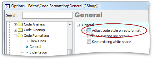
Code Cleanup
CodeRush can now automatically apply certain refactorings to a current file, project or solution. Use the Editor|Code Cleanup|Code Cleanup option page to specify changes you want to apply.
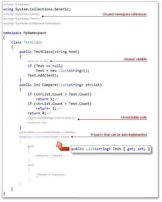
Here is the list of available changes:
- Convert "" to string.Empty
- Force braces in "do", "while" statements
- Force braces in "fixed" statement
- Force braces in "for", "foreach" statements
- Force braces in "if..else" statement
- Force braces in "using", "lock" statements
- Make properties auto-implemented
- Remove all comments, excluding XML comments
- Remove all regions
- Remove unreachable code
- Remove unused namespace references
- Remove unused variables
- Remove user blocks
- Sort enum elements
- Use explicit internal modifier
- Use explicit private modifier
To start cleanup, click the Cleanup button on the DXCore Visualize toolbar or choose the appropriate item from the Solution Explorer context menu.
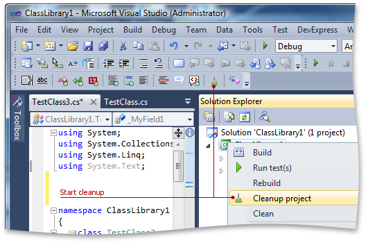
Deep Declare
We have extended CodeRush's Declaration from Usage functionality to deeply scan surrounding source code for hints about the type you want to declare. CodeRush now intelligently declares members for all found references. Watch the video below for an example.
The following code providers support Deep Declare :
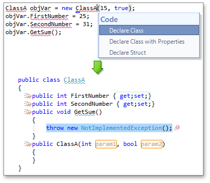
Cascading Refactorings
CodeRush now features several cascading refactorings. Cascading refactorings apply member signature changes across a class hierarchy with virtual/overridden members, or among interface implementers. Cascading refactorings can also be automatically applied throughout a combination of interface implementers and class hierarchies tied together by a class that both belongs to the hierarchy and implements an interface, when the member being refactored is virtual/overridden in the class hierarchy and also declared in the interface. Availability for these cascading refactorings has also been extended to feature all member references (e.g., method calls and property references) in addition to the member's declaration. For example, you can now add a parameter to a method when the caret is on a method call instead of having to go to the method declaration.
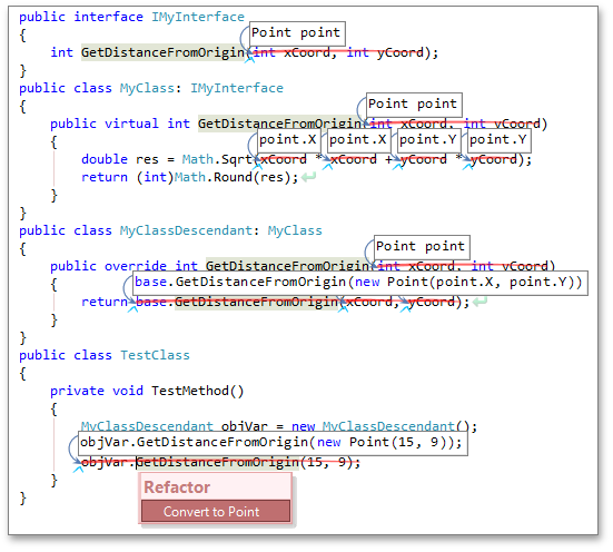
Razor Support
We implemented MVC 3 Razor support. You can now navigate through code elements, and apply local-level refactorings within Razor code blocks.
Unit Test Runner Improvements
We have extended CodeRush Unit Test Runner functionality. Unit Test Runner now supports the MSpec testing framework.
Changes in Refactoring Options
Changes in Optimize Namespace References refactoring options
The Optimize Namespace References refactoring can now ignore namespace references you specify. Simply check the Never remove the following references option and add the appropriate references to the list.
The p?Type? Template Changes
The GoTo text command allowed us to improve the template for declaring properties with backing store, "p?Type?". Now CodeRush places the generated field right before the first field or constant found in a current class or struct.

If the current class or struct does not contain fields or constants, CodeRush generates the "fields..." region right before the property declaration, and places the generated field into this region.
Grid Control
Layout View
In Layout View, data records are displayed as cards.
This new View extends the Card View, in that it gives end-users the ability to visually remodel card structure via drag-and-drop operations. In customization mode, end-users can manually rearrange card rows within cards in the following ways:
- Combine card rows into layout groups. These groups in turn can be nested within other groups, allowing a layout hierarchy of any level. Children contained in a group can be tabbed, organized vertically (one under another) or horizontally (across the group).
- Span card rows over neighboring rows and layout groups.
- Add auxiliary layout elements (empty regions, separators and labels) to the card from the Customization Form.
- Temporarily hide unnecessary card rows and layout elements in the Customization Form, or delete layout elements created at runtime which will not be further used during the application session.
Blog Post
New Chart View Options
This release includes enhanced Chart Views and new Chart View options.
Chart diagrams provide the following features:
- Missing data representation. Missing values can be displayed as either empty points or zero values.
- Transparency support for filled diagrams (requires the Microsoft GDI+ Library).
- Antialiasing. For a better-looking chart, you can enable a smoothing option (requires the Microsoft GDI+ Library).
Blog Post

Locked View Image
For time-consuming operations, such as bulk data updates, the grid can optionally display a "Locked View" image informing end-users that the View is awaiting updates.
As illustrated in the screenshot below, a “Locked View” can be displayed with dark and light visual effects.
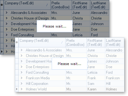
New 'Group By' Panel Layout
The "Group By" panel provides two options to display dropped column headers. The first uses a standard layout, in which headers are shown hierarchically. In the new layout, column headers are aligned horizontally, taking up less space vertically.
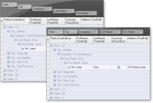
Grid Navigator Enhancements
The Grid Navigator is equipped with an "Info Panel" section. This panel displays information about the total number of records and the focused record's position within the recordset.
You can change output format along with text font - and handle mouse click events using the Navigator's API.
Blog Post
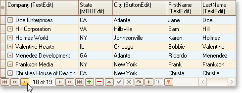
Multi-Line Editor Autosizing
New sizing options for our multi-line editor include:
- In-place editor sizing. In the edited data cell, an editor is sized vertically to populate entered content. When the end-user has completed data editing, the height of the edited row is automatically changed to fit the new data.
- Row sizing. The entire row being edited is dynamically sized when wrapping to the next line within the editor.
- Single-line scrollable text input. You can opt to disable sizing for all items or just for certain items.
Autosizing is not supported by drop-down editors, nontext editors, and input mask text editors.
Blog Post
Alternate Hints for Column Headers
As an alternative to the default hint, you can provide any explanatory text specific to the column within the hint window. This hint can be displayed even when the column caption is not clipped.
Data Export Enhancements
The QuantumGrid supports export to the XLSX (Microsoft Excel 2007 and higher). When using new export routines, image format in the final output is the same as that defined in the grid.
Blog Post
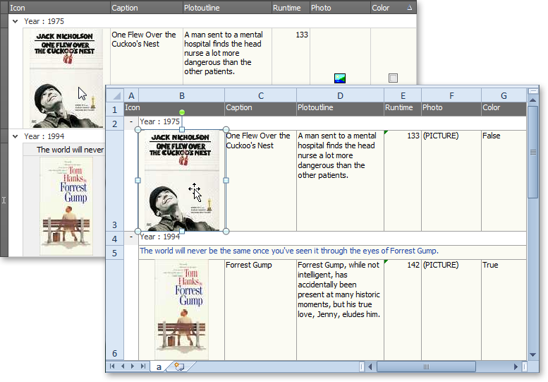
Filtering Enhancements
Incremental filtering mode for the Filter Row has been extended with a “deferred update” option. If this option is enabled, the View will be updated after a specified delay. This behavior allows an end-user to make several changes within the Filter Row (to create a more complete filter) before applying the entered filter criteria. When filtering large amounts of data, the deferred update option will reduce the amount of work being done and the number of filter requests generated compared to filtering the data with each keystroke.
Filtering performance for large datasets has been significantly improved.
New Card Stretch Options for Layout View
With v2011 vol 2, you can make a card displayed in SingleRecord mode stretch vertically or horizontally in the View, or occupy the entire View.
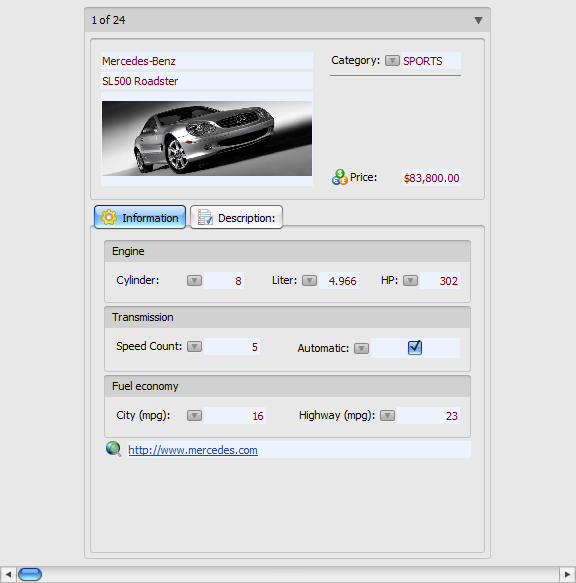
New Display Mode for Column Filter Buttons
In this mode, the filter button is displayed for a column either when an end-user hovers the mouse pointer over the column's header (and hence imitating a smart tag) or when the grid is filtered by the column's values. End-users can then easily discern which columns have a filter applied.
Alternate Band Captions
Now you can provide alternate captions to distinguish bands that have the same caption, if they were moved to the Customization Form or displayed in the Quick Customization dropdown, via the corresponding band property.
New Design-time Context Menus
We've added some new context menus in the grid designer. With these menus, you can create columns or bands for the currently selected column(s) and/or band(s), or delete selected View items.
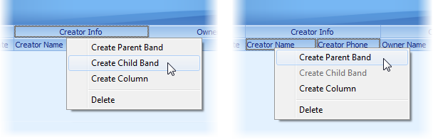
Automatic Creation of View Items at Design Time
If you open the IDE's Fields Editor for a dataset, table, query, or any other TDataSet descendant, you can drag its fields directly to a data-aware Table View, Banded Table View, Card View, or Layout View. This will automatically create View items (columns or card rows) bound to these fields. The grid will automatically create a data source and link it to the dataset if needed.
Bars
New Ribbon Styles
In addition to the existing DevExpress Office 2007 style Ribbon, the newest release includes two new Ribbon style options:

The following Ribbon UI elements have been modified to emulate corresponding UI elements found in Microsoft Office 2010™:
Ribbon Gallery
You can now provide an icon and descriptive text for each gallery item within the In-Ribbon Gallery.
Pinned shortcuts within the Application Menu's extra pane. This feature allows certain shortcuts to remain on the pane in a scrollable list. All Ribbon interfaces support skins shipping as part of the ExpressSkins Library.
Blog Post
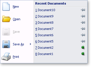
Skin Chooser Gallery
Originally written as an optional part of the Ribbon UI, this component provides an efficient way for end-users to apply skins from the ExpressSkins Library (including custom skins) specified in the application's uses clause, without any additional coding on your side.
Blog Post
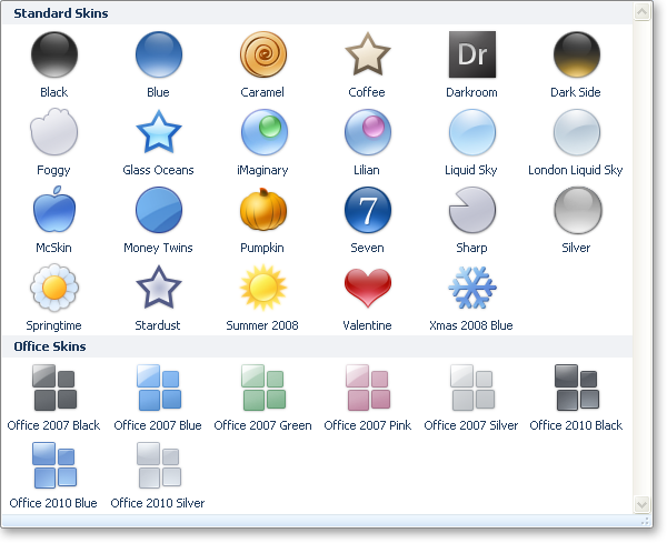
Ribbon Mini Toolbar Component
This customizable counterpart of a Ribbon context menu is now context-sensitive. In reaction to text selection via the mouse, it automatically pops-up using an animated fade while providing relevant (contextual) commands.
Blog Post
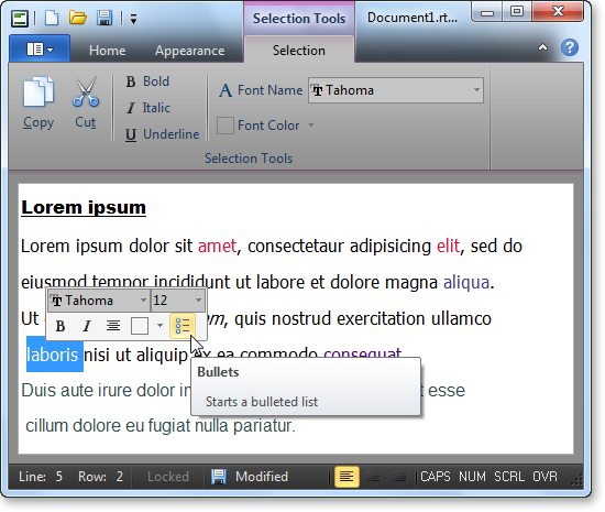
Tabbed MDI Manager
The component provides a tabbed document interface within MDI applications. In the tabbed MDI layout, all child forms are displayed as tabbed pages on the main form.
Blog Post
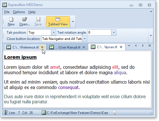
Extra Pane Visibility
The Ribbon Application Menu's extra pane can be hidden in order to optimize work space.
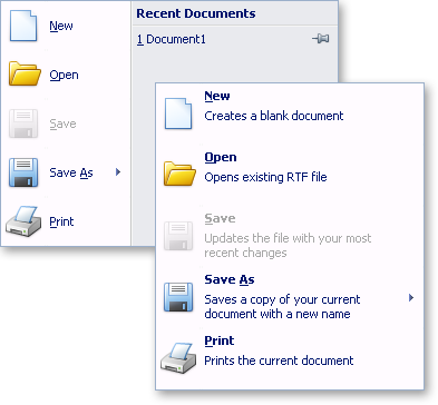
Arbitrary ordering of bar items and galleries in a dropdown menu
A bar item can now be placed ahead of a gallery in a dropdown menu. In turn, the gallery is displayed in the menu as a dropdown gallery.
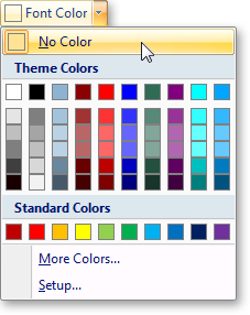
TdxRibbonGallery Inheritance
The gallery item's collection type was changed from TCollection to TcxComponentCollection. This change overcomes limitations associated with gallery state persistence in descendant forms. Inherited forms can now use the parent form's gallery settings.
Design-Time Enhancements
Ribbon Gallery Designer. In previous versions, gallery items could not be moved from one group to another. With this release, gallery items can be freely moved between different gallery groups via drag and drop within the Ribbon Gallery Designer.
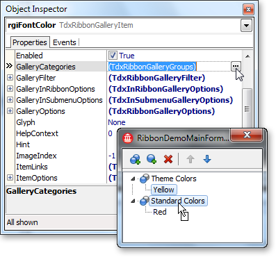
Menu conversion. To simplify conversion of standard menus into bar items, the TdxBarConverter component was replaced with the corresponding command in the bar manager's design-time context menu.
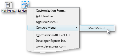
-
Automatic Bar Manager binding. When dropped onto a form, the TdxBarDockControl automatically links the bar manager on the form, using the BarManager property.
Docking Control
Tab Container Enhancements
Dock controls utilize the DevExpress Page Control in order to provide a full-featured tabbed interface within applications using docked windows.
New Dock Style
New docking logic replicates MS Visual Studio-style docking. With the help of docking selectors, the docking operation is performed automatically by the dock control. It eliminates the need to manually place a dockable window at a precise location.
Blog Post
Editors
New Alert Window Manager
The new Alert Window Manager component allows developers to build applications with Microsoft Outlook or Skype style alerts.
Key features include:
- Automatic arrangement of alert windows.
- Built-in animation effects.
- The ability to stick an alert window to screen edges.
- Message browsing within an alert window.
- Pin and Close buttons to help end-users manage their alert windows on screen.
- The capability to display custom buttons and popup menus for alert windows.
Blog Post
New Breadcrumb Control
In addition to the existing hierarchical data navigation controls, we provide a breadcrumb control that presents hierarchical data in a linear form.
The breadcrumb control has three separate versions that differ according to the data mode being used:
- Bound. The data is loaded from the linked dataset. This dataset is assumed to contain data that is self-referential.
- Virtual. The hierarchical data is loaded dynamically using a special event.
- System Shell. The data is read from the Windows shell environment.
Blog Post
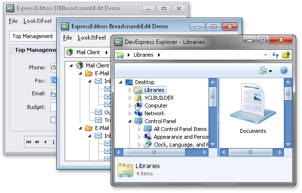
New Clock Control
The new Clock control is a standalone control that displays the current time. The clock display can be made transparent and overlay other parts of the application.

New Bevel Control
The new Bevel control is a drop-in replacement for the standard VCL bevel control that adds support for our skins.
New Scroll Box Control
This control is a skinnable replacement for the standard VCL scroll box.
New Scroll Bar Control
The new Scroll Bar control is a fully-skinnable independent scroll bar.
Windows 7 Taskbar Progress Visualization
With the new TaskBarProgress component, you can visualize the progress of a task that your application is currently carrying out in the application's icon displayed in the Windows 7 taskbar.
Features include:
- Customizable progress parameters providing data for visualization.
- Completion and marquee progress types with the paused and error state indication.
- Capability to link to a progress bar control to visualize its progress.

Layout Control
Layout Structure Inheritance
All layout elements can now be transferred to descendants of the layout control.
New Layout Settings
- New options for tabbed groups. With these settings, you can customize a tabbed group's appearance in various ways.
- Layout group button alignment. Group buttons can be positioned either on the group's left or right side.
- Layout group caption alignment and position customization.
- Layout element padding customization. You can specify padding for each side of a layout element. Once specified, padding can be quickly triggered by changing individual padding options.
Customization Form Enhancements
- Automatic tree expansion when dragging. In the Customization Form, a collapsed layout group is automatically expanded if a dragged layout element is positioned over the group's caption.
- Automatic tab switching when dragging. When the Customization Form is in tabbed View, dragging a layout element over the Layout Tree View or Available Items tabs automatically switches panes.
- Lock icon for layout groups. To ensure that end-users can see that a group is locked, the layout control displays a lock icon above the group's icon in the Customization Form.
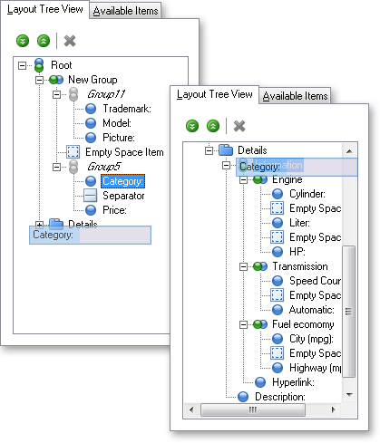
Runtime Customization Context Menu Enhancements
The following commands have been added to the context menu:
- Layout element settings.
- Expand button visibility.
- Group/Ungroup commands. Selected layout elements can be combined into a new layout group with one click using the Group menu command. Unnecessary layout groups can be removed from the container hierarchy using the menu's Ungroup command.
Design-Time Enhancements
- Automatic layout item generation for controls placed on the layout control.
- Automatic layout generation for bound data via the layout control's context menu.
Miscellaneous Enhancements
- Custom layout settings persistence. Custom layout settings can be persisted using an external storage.
- Optional repainting on sizing. You can disable the repainting of controls when resizing.
- TdxLayoutGroup.OnTabChanged event. This event informs you of active tab changes.
Page Control
Tab Navigation Enhancements
- Navigation without tab switching. Tab selection can be suppressed if you need to navigate between tabs without having to activate tab pages.
- Disabled tab select. A disabled tab is now also selected when navigating through tabs. You can control the selection of disabled tabs by using the control's OnPageChanging event.
Miscellaneous UI Enhancements
- New tab button. The New tab button allows end-users to display a new tab at runtime.
-
Display settings for the close tab button. These settings allow end-users to modify the placement of close buttons:
- Only on the active tab
- On all tabs
- In the Tab Navigator
- In the Tab Navigator and on the active tab
- Always hidden
- Tab highlight icon. An alternate tab image is used as an indication of a highlighted tab. It substitutes a tab image when a tab is hot-tracked.
- Drag-and-drop tab indicators. To help ensure that a tab is dropped in the correct location, the page control uses drop indicators to display possible drop locations when dragging the tab.
- Custom drag-and-drop images. Default painting can now be replaced with an application-specific drag and drop image, or you can provide a custom image for each drag and drop operation by using a specially designed event.
- A new style option for the Go dialog. The Go dialog can be optionally rendered in a style replicating ExpressBars dropdown windows.
Pivot Grid Control
New Layout Style
In our new Compact Layout View, field values in the Row Area are grouped across a single column, providing more space for the report.
To make different field values standout in the column, rows are indented in a tree-like manner.
Blog Post
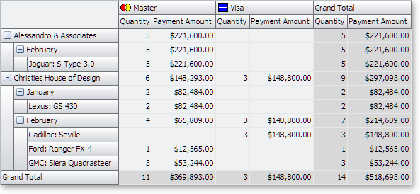
Customization Form Enhancements
In advanced mode, the Customization Form displays additional panes mirroring related drop areas. This can be useful when fields in the View are clipped or drop areas are hidden. Manipulating fields across panes allows end-users to modify the report from within the Customization Form, without changing the View layout.
By default, end-user actions in the Customization Form automatically result in updates to the View. Optionally, update commitments can be made explicitly by the end-user. For this purpose, the Customization Form provides a "Defer Layout Update" check box and an "Update" button at the bottom.
Control over the Customization Form's positioning is also very useful. It can be displayed in a standalone window or hosted within any windowed control.
Blog Post
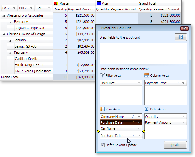
Performance Enhancements
Filter dropdown performance for large datasets has been significantly improved.
OLAP Mode Improvements
Rich Text Editor
The rich edit provides some of the advanced capabilities introduced in Microsoft Rich Edit version 4.1:
-
Table Support. You can nest tables, insert and remove rows, and apply formatting to individual cells.
- Text Formatting. Features include character formatting, paragraph formatting, bulleted and numbered lists.
Scheduler Control
New Gantt View Elements
Task group and milestone elements have been added to the View to visually indicate summary tasks and the completion of important events.
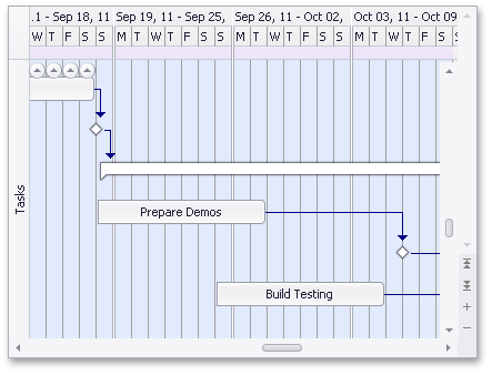
Persistence of Schedule Holidays and Locations
This provides the capability to use holidays and locations across scheduling applications.
iCal (iCalendar 2.0) Data Format Support
Exchanging data with other applications is made easier with the new support for the iCal data format.
Shell Control
-
All shell controls now support file masks to make it easier to work with only certain types of files.
-
We've improved performance significantly (up to 500%) for the Shell Tree View and Shell Combo Box controls when loading data initially and when opening folders that contain a large number of files and subfolders.
-
Shell List View now can show thumbnails and large icons.
Skins
New Skin Options
Nine new skins have been added to the ExpressSkins Library.
Click on a skin name below to view its appearance when applied to an application built with DevExpress controls.
Blog Post
Miscellaneous
New Hint Style
A new hint style - three-sectioned ScreenTip - previously used in the ExpressBars Suite, is now available to all DevExpress controls via the hint style controller.
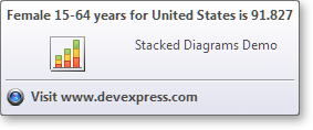
Traditional and enhanced hint styles support native painting and skinning. For a consistent display, a hint automatically determines the associated control's painting scheme.
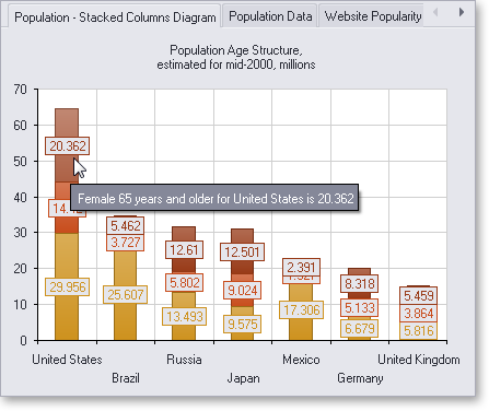
Hint windows can be drawn using a specific paint style.
Generated ScreenTips are automatically stored in the ScreenTip repository and can be shared across applications.
Support for Embarcadero Delphi XE2 (64-bit) and C++ Builder XE2
This Build adds support for Delphi XE2 (64-bit) and C++ Builder XE2 to all our components.
Demos Now Use Standard Datasets
We have redesigned most of our demos to use TClientDataSet or TdxMemData as data sources, rather than BDE data access components.