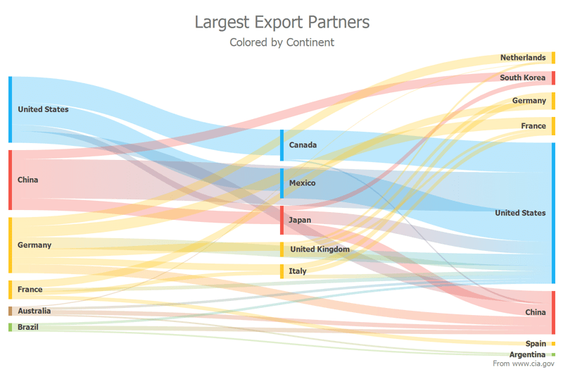
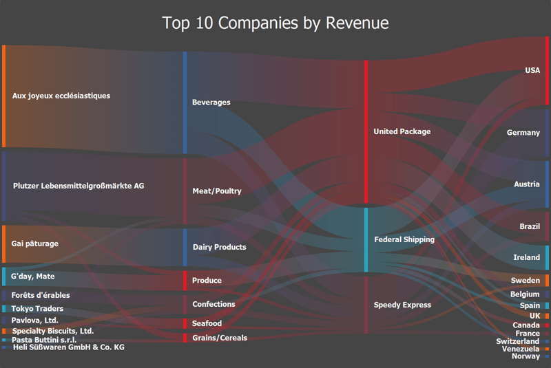
New Sankey Diagram
v20.2 ships with a new Sankey Diagram Control. Sankey Diagrams display paths between nodes and associated quantities. These diagrams are typically used to visualize a flow from one set of values to another.
Features include:
- Built-in Coloring Algorithms (palette-based and custom colorizers)
- Custom Node Order
- Printing and Data Export
- Node and Link Highlighting
- Title Elements
- Tooltips
- Comprehensive API
- DevExpress Themes/Skins
Demo *
 WinForms Sankey Diagram - Light Theme
 WinForms Sankey Diagram - Dark Theme
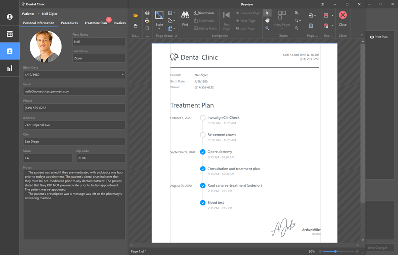
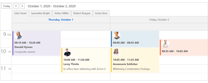
New Dental Clinic Demo App
To address this reality and reduce sample app complexity, we created a new demo (Dental Clinic). The #1 objective of this project is to create a relatively modern UX – a user experience that can be applied to different industries with minimal changes.
Run Dental Clinic App *
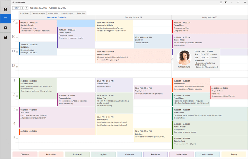 Calendar View - DevExpress Dental Clinic App for WinForms (Light Theme)
 Reporting - DevExpress Dental Clinic App for WinForms (Dark Theme)
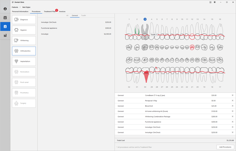 Patient Procedures - DevExpress Dental Clinic App for WinForms
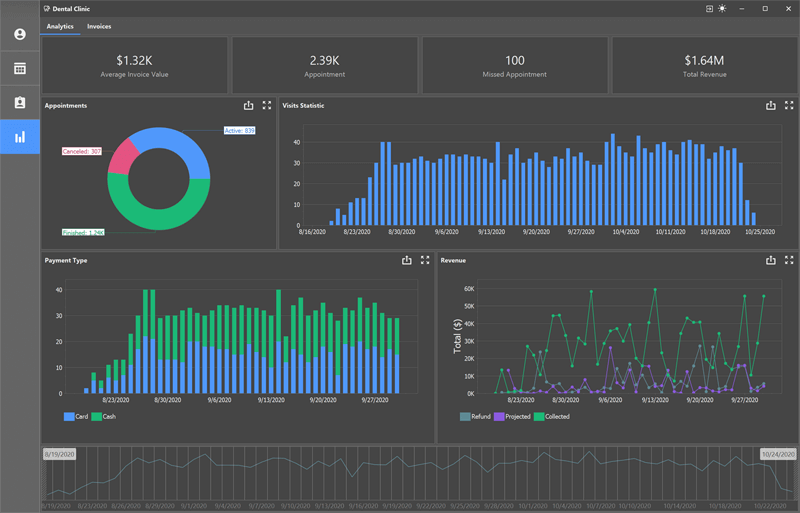 Data Visualization - DevExpress Dental Clinic App for WinForms
Data Grid
New Fixed Column Mode - Middle Left
Our WinForms Data Grid ships with a new "MiddleLeft" fixed mode option. When active, "MiddleLeft" columns can move freely to the right, but dock to the left when you scroll the view to the right. To fix a column at the left edge, set the column's Fixed property to 'MiddleLeft'.
Demo *
Column Customization Enhancements
We enhanced the grid's Customization Form to make column customization easier especially when the grid has many columns and bands. The new Customization Form displays all columns and bands (visible and hidden). Its features include:
- Column/Band Search
- Drag & Drop
- Sorting
Turn on the 'UseAdvancedCustomizationForm' option to activate the new Customization Form.
Demo * | Documentation
TileView - Tile Auto Height
The TileView now supports automatic tile height calculation (dynamic tile height) in all layout modes.
Demo * | Documentation
Charts
Big Data Charting
DevExpress Charts v20.2 introduces a new option - Series.AllowResample. Activate this option to minimize memory footprint and render massive data sets for manually created series at blazing fast speeds.
Demo * | Documentation
Diagram
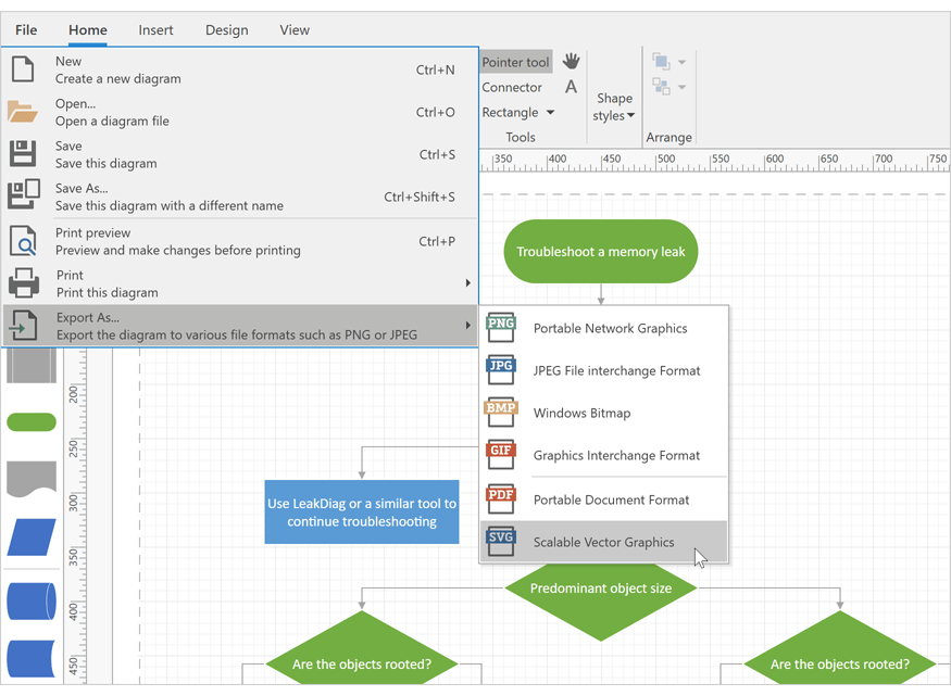
SVG Export
Our Diagram Control now supports vector (SVG) file export.
Demo * | Documentation
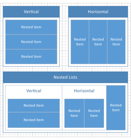
New List Item
Our Diagram control includes a new container item - DiagramList. It arranges its child items in a horizontal or vertical list.
Demo *
Measure Units
You can enable a new ShowMeasureUnit option to display measurement units in the Properties Panel, Page Setup Window, and Bottom Panel.
In addition to pixels, users can specify values in other measurement units (inches and millimeters). You can also create a custom measurement unit and assign it to the MeasureUnit property.
Miscellaneous Enhancements
-
v20.2 includes a new DiagramOptionsOrgChartLayout.IsCompact option for the Org Chart's automatic layout. Set this option to false to calculate the offset for all tip-over subtrees rather than individual hierarchy levels. This makes Org Charts with a complex hierarchy (tip-over subtrees) easier to read and understand.
-
You can now hold the middle mouse button and drag to pan the diagram. This behavior is controlled by the AllowMiddleButtonDrag option.
Editors
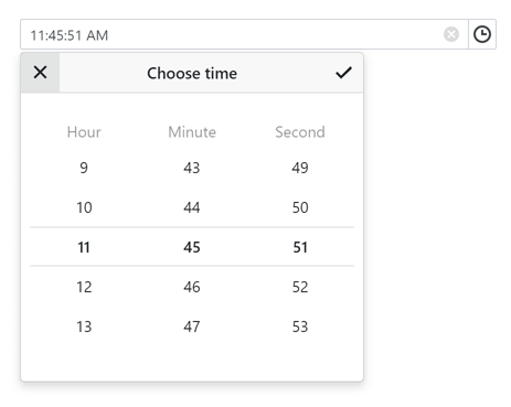
New DateTime Offset Edit
Our new WinForms DateTimeOffsetEdit control allows you to display and edit DateTimeOffset values. The editor supports masked input.
Documentation
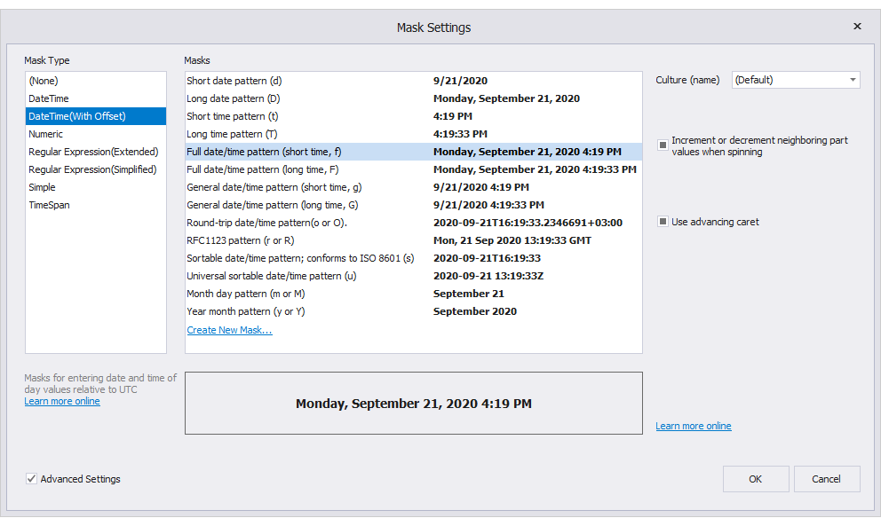
Masks
v20.2 ships with an overhauled mask engine. From new options and settings to advanced mask editor and data annotation support, our mask engine includes everything you need to deliver intuitive user experiences with error-free data input logic.
New DateTimeOffset Mask
Data Annotation Support
Apply masks via data annotation attributes in code-first data sources.
using System.ComponentModel.DataAnnotations;

public class Employee {
    //allow only literals, first literal is automatically captitalized
    [RegExEditMask("[A-Z][a-z]+", IgnoreMaskBlank = true, ShowPlaceholders = false)]
    public string FirstName { get; set; }
    //DateTime in the short "MM/DD/YYYY" format
    [EditMask("d")]
    public DateTime HiredAt { get; set; }
}
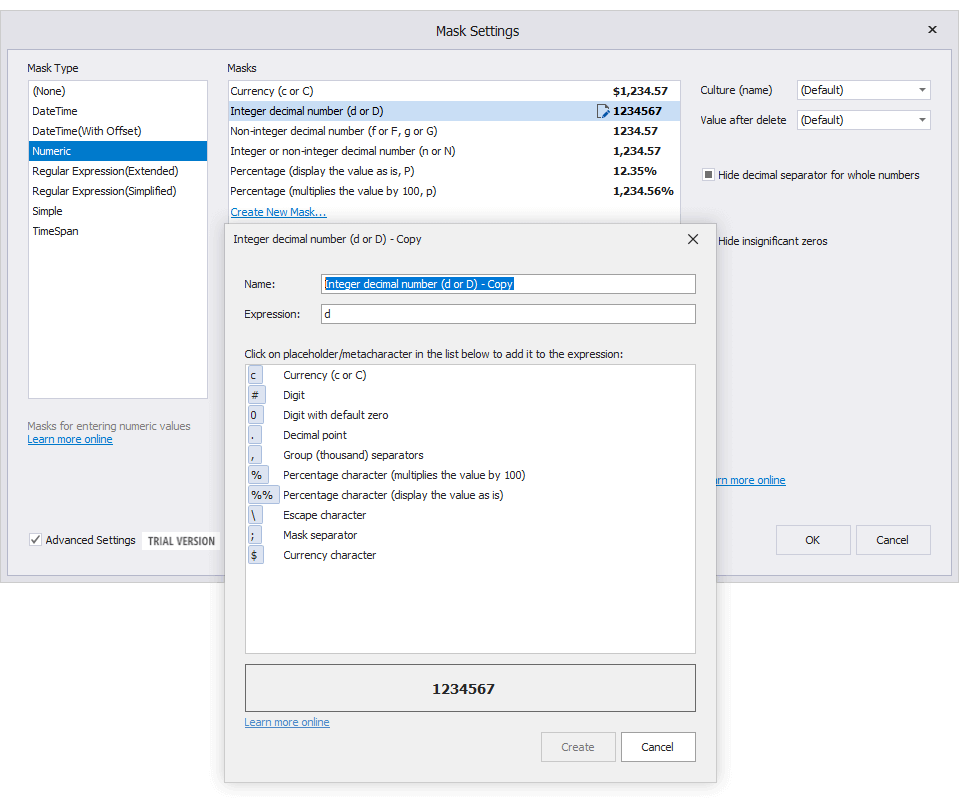
Mask Editor with Advanced Settings
Mask Editor allows you to select pre-built masks, create new masks from scratch or customize predefined expressions, save custom masks, and apply advanced mask settings (culture name, use advancing caret, etc.).
New API
With this release, mask settings are available via the RepositoryItemTextEdit.MaskSettings property. The RepositoryItemTextEdit.Mask option is now obsolete.
textEdit.Properties.MaskSettings.DataType = typeof(decimal);
textEdit.Properties.MaskSettings.MaskExpression = "###.##";
// or
textEdit.Properties.MaskSettings.MaskManagerType = typeof(SimpleMaskManager);
textEdit.Properties.MaskSettings.MaskExpression = "##-##-##";
A new 'Configure' method allows you to specify Mask type, expression, and set up additional settings. For instance, the following code applies a numeric mask with the following mask conditions:
- allows a user to enter decimal numbers using a "000.00" format;
- hides zeros that do not affect actual values (".9" instead of "0.9");
- displays a decimal separator even when the fractional segment is 0 ("110." instead of "110").
using DevExpress.XtraEditors.Mask;

//Fluent API
textEdit5.Properties.MaskSettings.Configure<MaskSettings.Numeric>(settings => {
    settings.MaskExpression = "###.##";
    settings.AutoHideDecimalSeparator = false;
    settings.HideInsignificantZeros = true;
});

//regular API
var settings = textEdit5.Properties.MaskSettings.Configure<MaskSettings.Numeric>();
settings.MaskExpression = "###.##";
settings.AutoHideDecimalSeparator = false;
settings.HideInsignificantZeros = true;
Documentation
'Advanced Mode' for Text Editors (CTP)
Our new 'Advanced Mode' adds a number of interesting options to all of our TextEdit-based WinForms editors (except for TokenEdit, HyperTextLabel, and HyperlinkEdit controls). These include:
Performance Improvements
Embedded Labels
Emojis
Your users can now insert a string that contains an emoji, or press the 'Win+.' hotkey to enter an emoji from the Windows library.
Enable our new 'AdvancedModeOptions.UseDirectXPaint' option for required editors to allow insert colored emojis. Otherwise, editors will display black-and-white versions of standard emojis.
Animated Caret and Selection
Caret movement and text selection are more pleasing to the eye.
Text selection color is now based on the currently applied skin.
To activate the 'Advanced Mode', enable the 'Properties.UseAdvancedMode' property.
See details in our blog post
SvgImageBox Enhancements
- Tooltips
- Context Buttons
- Image Alignment
- Disable Individual Items
- Save SVG with Custom Appearance Settings
Demo * | Documentation
Ctrl+Backspace Support
Our WinForms TextEdit control and its descendants now support the Ctrl+Backspace hotkey combination. This combination deletes the word to the left of the cursor.
TokenEdit - Bind to Data
You can now bind our Token Edit to data. Use the new 'DataSource' property to specify fields with token descriptions and unique values.
tokenEdit1.Properties.DataSource = categoryBindingSource;
tokenEdit1.Properties.ValueMember = "ID";
tokenEdit1.Properties.DisplayMember = "Name";
Demo * | Documentation
TokenEdit - Show the Dropdown List on Click
End-users can now click in the edit box to show the dropdowm list with tokens.
Demo * | Documentation
CameraControl, PictureEdit - Specify the Default Camera Device and Resolution
We added new parameters to the TakePictureDialogShowing event to allow you specify the default camera device and configure its resolution.
void OnTakePictureDialogShowing(object sender, TakePictureDialogShowingEventArgs e) {
    e.ResolutionMode = ResolutionMode.Maximum;
}
The Take Picture dialog (standalone and embedded in Picture Edit control) persists the current camera device and its resolution in the system registry. These settings are reused the next time you open the Take Picture dialog.
Documentation
PictureEdit - Configure the Output Image Format
The new 'OptionsEditDialog.OutputImageFormat' property allows you to specify the output image format. The default output image format is PNG.
Documentation
PictureEdit - Custom Aspect Ratios for Image Crop Operations
You can now handle the new 'CustomizeCropOptions' event to customize aspect ratio options.
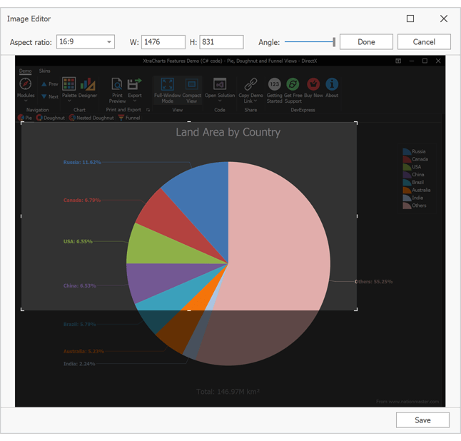
void PeEditable_ImageEditorDialogShowing(object sender, ImageEditorDialogShowingEventArgs e) {
    e.Form.CustomizeCropOptions += (s, ea) => { CustomizeCropOptions(s, ea); };
}

void CustomizeCropOptions(object sender, CustomizeCropOptionsEventArgs e) {
    var widescreen = new AspectRatioInfo(1.777f, "16:9");
    var standard = new AspectRatioInfo(1.333f, "4:3");
    e.AspectRatios.Clear();
    e.AspectRatios.Add(widescreen);
    e.AspectRatios.Add(standard);
    e.DefaultAspectRatio = widescreen;
}
Demo * | Documentation
ListBox - Item Auto Height
Our WinForms Listbox contol can now automatically calculate best item height when items are rendered based on a template.
Demo * | Documentation
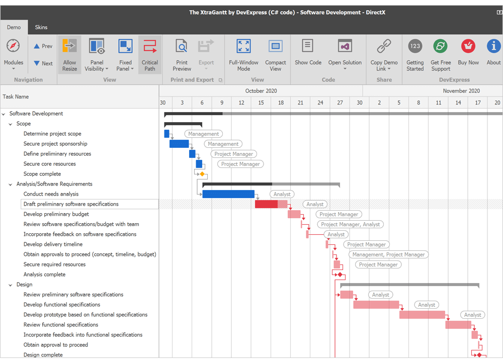
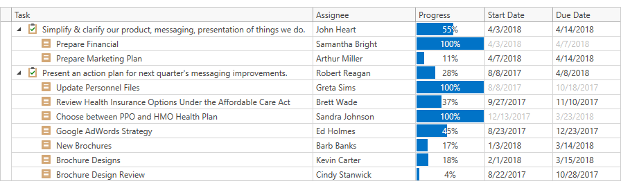
Gantt Control
Split Tasks
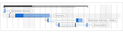
With this release, you can split Gantt tasks as needed. If a partially completed task needs to be placed on hold, a user can drag the unfinished portion to the right to pause the task. A task can be split into multiple segments. To merge two task segments, drag one portion into the other. This will eliminate the time gap between the two.
If automatic scheduling is enabled, the Gantt control can split partially completed tasks automatically. For example, if a partially completed task must be postponed due to rescheduling, the Gantt control splits the task into completed and uncompleted segments.
Users can split tasks at runtime if the GanttControlOptionsBehavior.AllowSplitTasks property is enabled. Split tasks are stored in a separate data source assigned to the GanttControl.SplitTaskSource property.
Demo * | Documentation
Critical Path
Our WinForms Gantt Control now highlights critical paths - sequences of dependent tasks that affect the project's start or finish date.
Set the CriticalPathHighlightMode option to 'Single' or 'Multiple' to highlight the longest critical path or all tasks that affect the start or finish date.
Highlight color is driven by the current skin. Use the CriticalPathTask and CriticalPathDependency properties to specify custom colors for tasks and dependency links in critical paths.
Demo * | Documentation
Layout and Navigation
Group Control - HyperlinkClick Event
Our WinForms Group Control can display a hyperlink in its header. A new HyperlinkClick event allows you to respond to user clicks on a group header link.
Demo *
Layout Control and Layout Panel Enhancements
- The HyperlinkClick event allows you to respond to user clicks on a group or item caption link.
- New ColumnDefinition.Visible and RowDifinition.Visible options allow you to temporarily hide individual rows and columns in Table layout mode. Documentation
- During resize operations, our WinForms Layout Control highlights items that have reached their minimum/maximum size.
- When you save a layout, the Layout Control now serializes only specified settings (see OptionsSerialization). This reduces the size of XML files and improves performance.
- TablePanel API: Rows.Remove, Rows.RemoveAt, Columns.Remove, Columns.RemoveAt
Data Layout Control - New API
We've enhanced navigation and data handling support for our WinForms DataLayoutControl. You can now use the following DataLayoutControl properties and methods to work with data:
Page Navigation - Customize Buttons
The new 'CustomizePagerItem' event allows you to specify button images and captions.
Documentation
Map Control
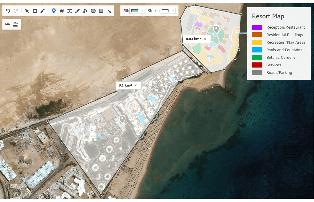
Map Rulers
Our WinForms/WPF Map Control ships with a new Measurement Toolbar. End-users can measure geometrical and geographical objects using appropriate tools:
You can also use our new Measurements class API to create and update rulers and specify measurement units in code.
Demo * | Documentation
Map Rotation
New API allows you to rotate map content as needed.
Demo *
Vector Tiles - Enhancements
- Display text along curves (such as street or road name).
- Display labels at the center of polygons.
- Fractional and custom zoom levels.
PDF Viewer
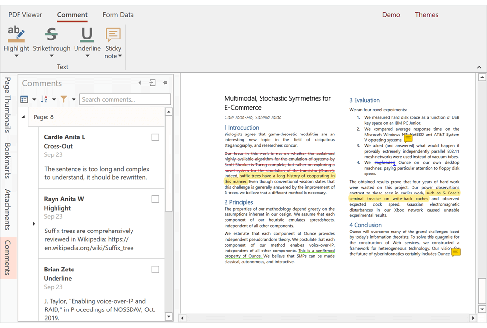
Sticky Notes
Our PDF Viewer now supports PDF sticky notes. You can add, edit, delete sticky notes, and add comments to notes in code or via the control's UI.
Demo *
Ribbon and Bars
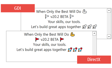
BackstageView - DirectX Support
The WinForms BackstageViewControl now supports DirectX Hardware Acceleration. This ensures smoother and memory-efficient animations, especially on high-resolution displays.
Demo * | Documentation
Rich Text Editor
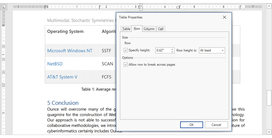
Break Table Rows Across Pages
Table rows can now span multiple pages. We added a new row option - 'Allow row to break across pages'. To enable this feature in code, use the TableRow.BreakAcrossPages property.
OLE Objects
Our WinForms Rich Text Editor supports OLE objects. Our new API allows you to access and edit OLE objects in code. Documents with OLE objects can be printed and exported to PDF.
'Keep with Next' and 'Widow/Orphan Control' in Tables
Our Word Processing Document API and WinForms/WPF Rich Text Editors now apply the following options when they display, print, and export (to PDF) documents with table paragraphs:
- Keep with Next
- Widow/Orphan Control
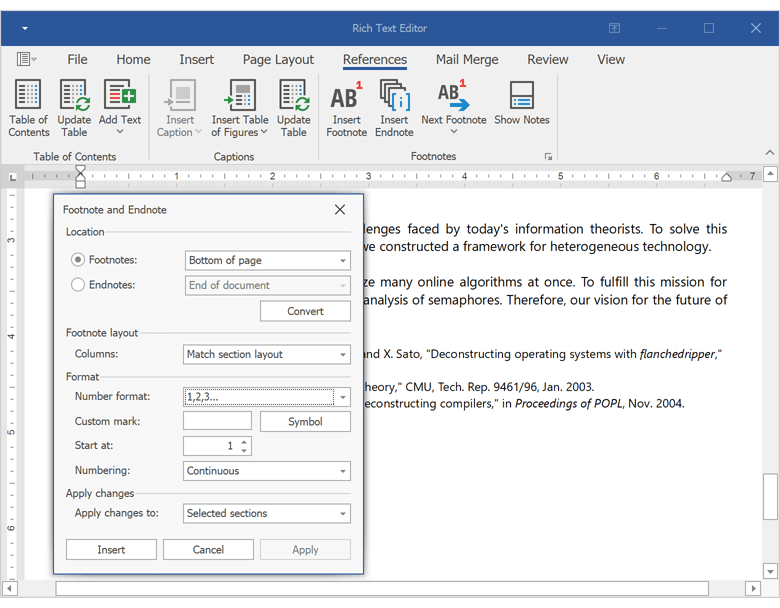
Footnotes and Endnotes UI
The Rich Text Editor ships with new UI elements designed to insert, navigate, and format document footnotes and endnotes.
Documentation
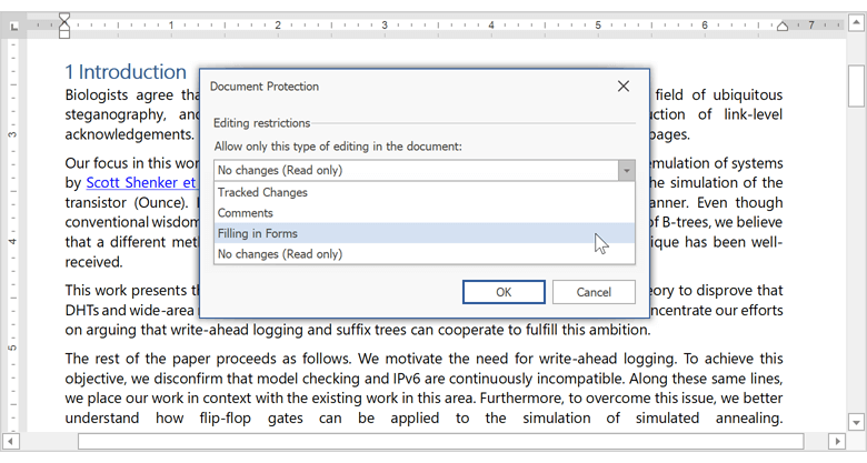
'Filling in Forms' Protection
You can now manage “Filling in Forms” protection in code or via the Rich Text Editor's UI.
New Formats
Our Word Processing Document API and WinForms/WPF Rich Text Edit controls now support the following file formats:
- DOCM (Microsoft Office Open XML Macro-Enabled Document format)
- DOT (Microsoft Word 97-2003 Template format)
- DOTM (Microsoft Office Open XML Macro-Enabled Template format)
- DOTX (Microsoft Office Open XML Template format)
- FlatOpc XML (Microsoft Word XML Document stored in a flat XML file instead of a ZIP package).
Documentation
Document Rendering Enhancements
Table width and justified paragraph alignment are now calculated more accurately and better mirror Microsoft Word 2013 and later.
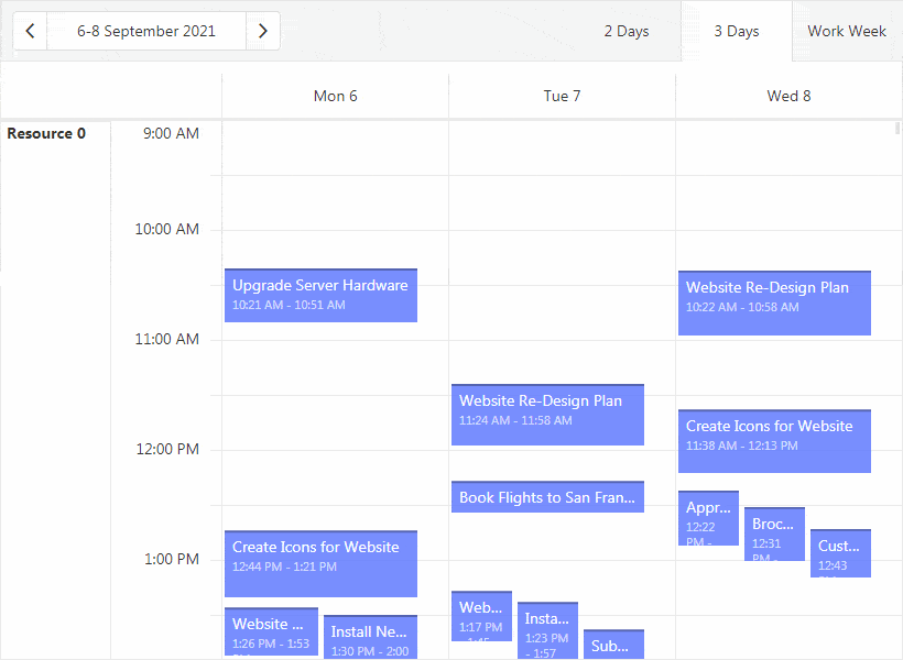
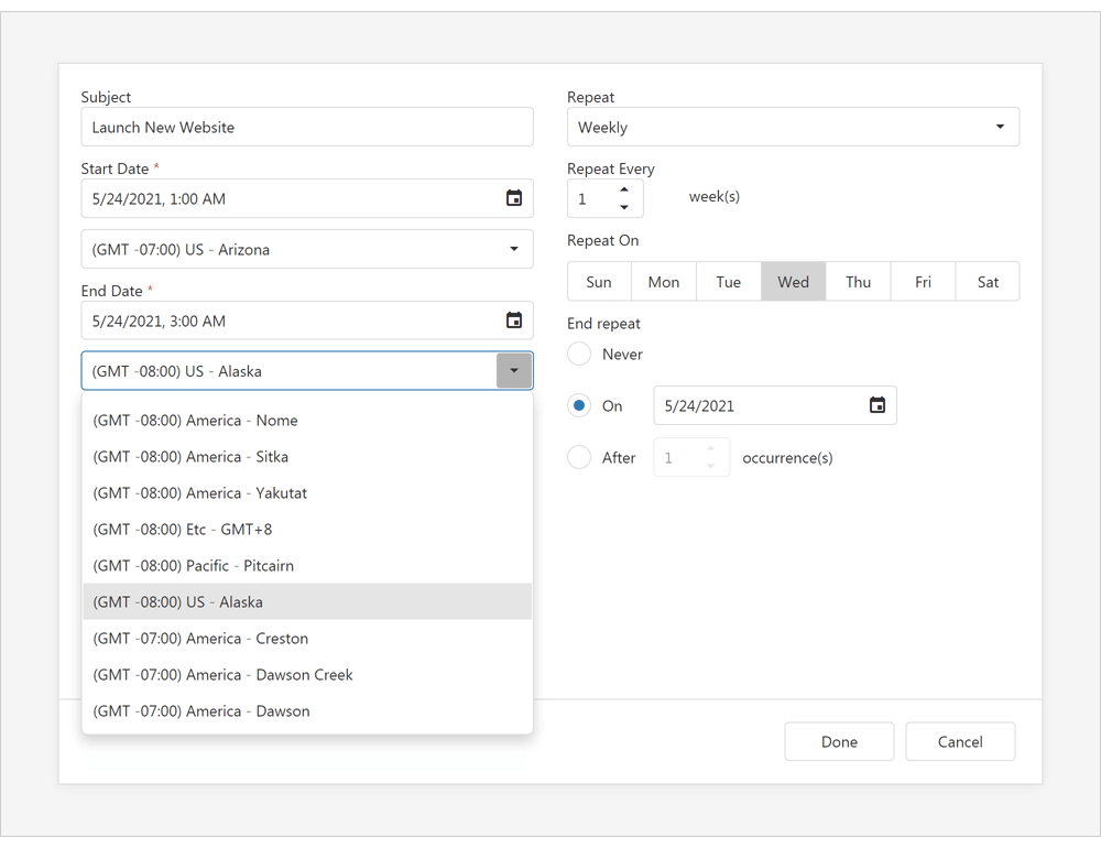
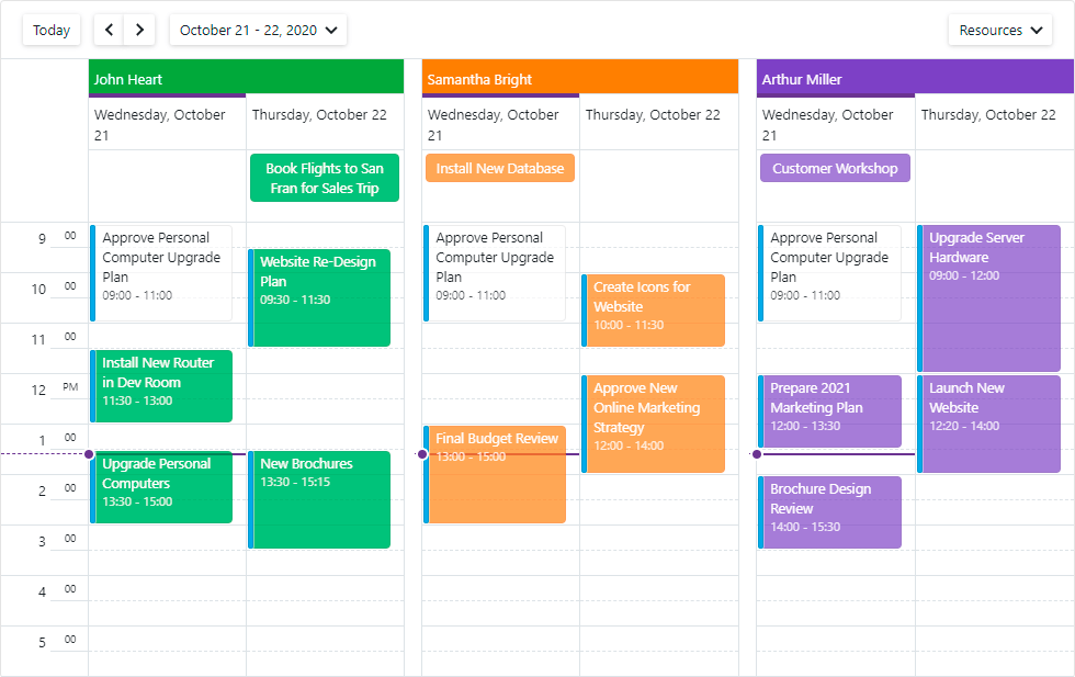
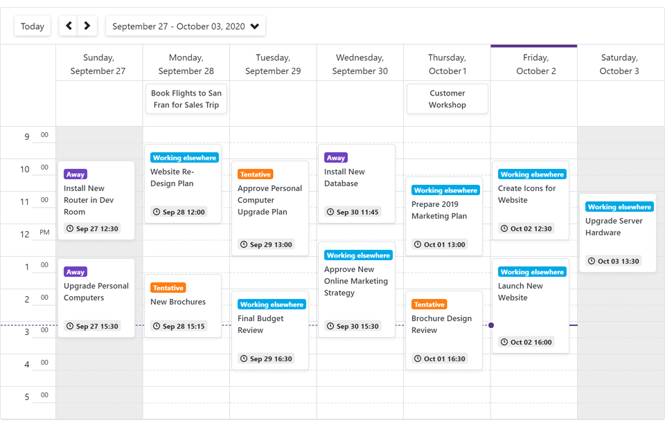
Scheduler
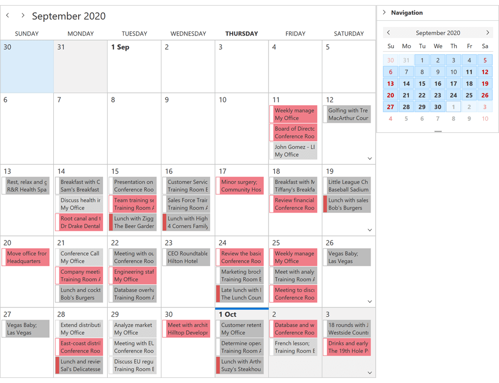
Year View
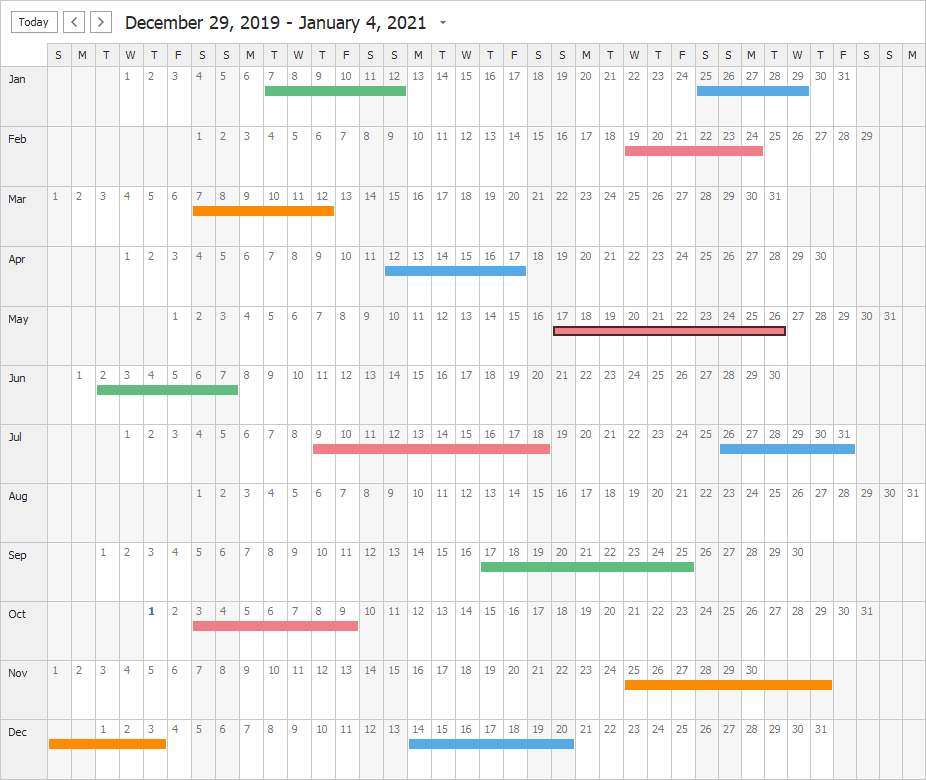
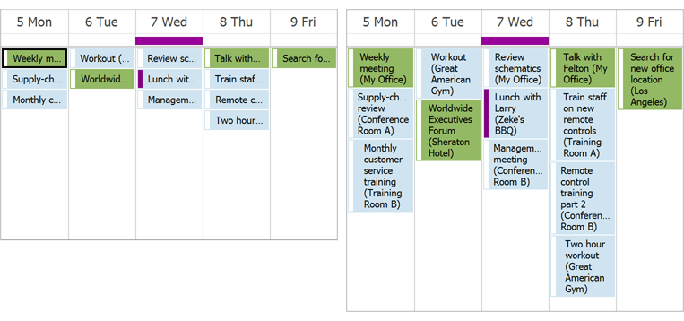
Our WinForms Scheduler control ships with a Year View display option. It's been designed to visualize events/appoints that span multiple days and weeks.
The Year View includes the 'MonthCount' property. Additional View-related settings mirror those of the Month View.
Documentation
Dropdown Calendar and View Selector
We added two new UI elements to the Date Navigation Bar.
Dropdown Calendar
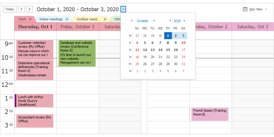
View Selector

Both UI elements are initially hidden. Activate the DateNavigationBar.CalendarButton and DateNavigationBar.ShowViewSelectorButton options to make them visible.
New Cell AutoHeight Mode in Timeline View
We renamed the CellsAutoHeightOptions.Enabled property to AutoHeightMode. The AutoHeightMode property accepts enumeration values instead of Boolean. 'None' and 'Limited' correspond to 'false' and 'true'. A third value - 'Full' - activates our new AutoHeight mode.
When AutoHeight is used, time cells ignore the ResourcesPerPage property value and resize based upon content. This also allows users to pixel-scroll the Timeline View.
Spreadsheet
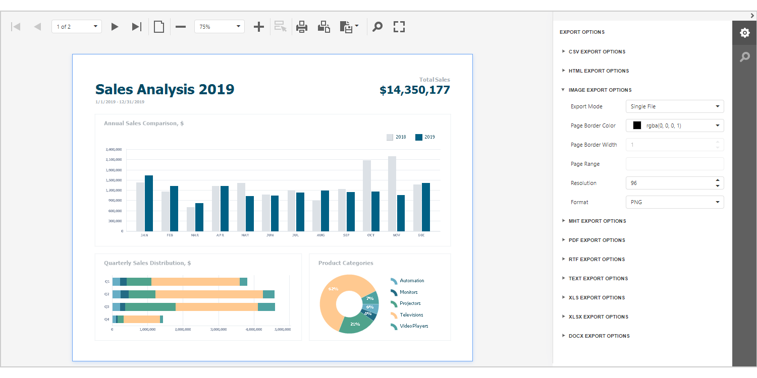
Excel 2016 Charts (CTP)
Our WinForms Spreadsheet control now supports the following Excel 2016 chart types:
- Box and Whisker
- Funnel
- Histogram
- Waterfall
- Pareto
Our comprehensive Spreadsheet API allows you to create and edit Excel 2016 charts as needed. The WinForms Spreadsheet control can open, print, and export (to PDF) existing workbooks with Excel 2016 charts.
Documentation
Miscellaneous
HTML Formatting
You can now use the following standard HTML tags to format strings:
<a> - inserts a hyperlink in a caption, tooltip, label, etc.
<a href=https://www.devexpress.com>www.devexpress.com</a>
To respond to a click on the link, handle the control's HyperlinkClick event.
<br> - inserts a line break. You can use this tag to display multi-line text in controls. You can also use <br/> syntax.
Most of our controls support now the <image> tag. To specify the collection of images, use the control's 'HtmlImages' property.
Documentation
Overlays - DirectX Support
Overlays now support DirectX hardware acceleration. Animations are now rendered much more smoothly on high-resolution displays (and are far more memory efficient).
Documentation
MVVM - MessageBox Form Style
We added a new MessageBoxFormStyle property to the MessageBoxService class. This property allows you to specify appearance settings for the MessageBox form.
var flyoutMsgService = MessageBoxService.CreateFlyoutMessageBoxService();
flyoutMsgService.MessageBoxFormStyle = (form) => {
    FlyoutDialog msgFrm = form as FlyoutDialog;
    msgFrm.Properties.AppearanceButtons.FontStyleDelta = FontStyle.Bold;
};
mvvmContext1.RegisterService(flyoutMsgService);
Documentation
Docking - Float Panels Always Stay on Top
Floating panels and DocumentManager documents (in Tabbed and Widget Views) can be displayed above or underneath their parent forms. The following new options allow you to always keep floating windows on top:
If a floating window is used independently (the FloatPanelsAlwaysOnTop option is disabled), it displays a Minimize button that collapses the window to the Windows taskbar. To hide the Minimize button, disable the ShowMinimizeButton option.
New Sankey Diagram
v20.2 ships with a new WPF Sankey Diagram Control. Sankey Diagrams display paths between nodes and associated quantities. These diagrams are typically used to visualize a flow from one set of values to another.
Features include:
- Built-in Coloring Algorithms (palette-based and custom colorizers)
- Custom Node Order
- Printing and Data Export
- Node and Link Highlighting
- Title Elements
- Tooltips
- Comprehensive API
- DevExpress Themes/Skins
Demo *
 WPF Sankey Diagram - Light Theme
 WPF Sankey Diagram - Dark Theme
New Sunburst Control
v20.2 ships with a new WPF Sunburst Control that allows you to create interactive circular treemaps for analytical and presentation purposes.
Features include:
- Hierarchical Data Sets and Flat Data Tables
- Built-in Coloring Algorithms
- Fully Customizable Content
- Advanced Segment Highlighting
- Tooltips
- Comprehensive API
- DevExpress Themes
Demo *
New TreeView Control (CTP)
v20.2 ships with a new WPF TreeView Control. Its features include:
- Data Binding support
- Hierarchical Data Templates
- On-Demand Data Loading
- Filtering and Search
- Data Editing
- Clipboard Management
- Drag & Drop support
- Multiple Selection
- Context Menu
- Node Icons and Checkboxes
- Custom Node Content
Demo * | Documentation
UI Testing
DevExpress WPF controls are now fully compatible with Appium/WinAppDriver. We extended support for the UI Automation API to include more test cases for our most popular UI controls:
v20.2 introduces UI Testing mode for WPF applications powered by DevExpress UI controls. UI Testing mode disables certain animations, changes the way context menus react to the mouse pointer, and tweaks the UI Automation tree.
These enhancements primarily target Appium/WinAppDriver, but can also benefit other UI Automation Testing tools and frameworks.
Documentation
Charts
Big Data Processing
This feature was first introduced in May 2020 as a community technology preview (CTP) and supported numeric arguments and numeric values. This update marks its official release. All series types and series with DateTime/TimeSpan arguments and values are supported.
Demo * | Documentation
Data Editors
Date Navigator - API Enhancements
Our new API allows you to:
Appearance Properties
Office 2016 SE, Office 2019, VS 2017, VS 2019, and Win 10 Light themes include enhanced templates that simplify appearance customization via the following properties:
- Background / Foreground
- BorderBrush
- BorderThickness
- CornerRadius
- Padding
Supported data editors and controls include:
- TextEdit, PasswordBoxEdit
- MemoEdit, DateEdit, PopupImage\Calc\Color\BrushEdit, FontEdit
- CheckEdit
- ToggleSwitch\ToggleSwitchEdit
- ButtonEdit, SpinEdit
- ButtonInfo
- ComboBoxEdit, ListBoxEdit, AutoSuggestEdit
- ProgressBarEdit
- TrackBarEdit, RangeTrackBarEdit
- HyperLinkEdit
- ImageEdit, ColorEdit, CalcEdit, TimePicker
- Flyout
- RangeControl
- Calculator
- SearchControl
We also added an EditorAppearanceProperties class. It contains attached properties to help you change Editor appearance in Checked, Focused, or ReadOnly states. Supported appearance settings allow you to quickly customize look and feel throughout your application or create individual UI elements as needed.
Miscellaneous Enhancements
-
The EnumItemsSourceBehavior's ImageSize property allows you to specify item image size. Documentation
-
A new AllowSpin property allows you to disable the mouse wheel and spin buttons.
Numeric and TimeSpan Mask Enhancements
New numeric mask options include:
New TimeSpan mask options include:
Data Grid and TreeList
Filter Panel Enhancements
Our redesigned Filter Panel was first introduced in May 2020. This panel displays separate tokens with filters for each field. In v20.2, our WPF DataGrid and TreeList controls display the new Filter Panel by default.
If the WPF Data Grid displays master-detail relationships, the Filter Panel indents expressions applied to master and detail views.
The Filter Panel and Filter Editor now use the same colors.
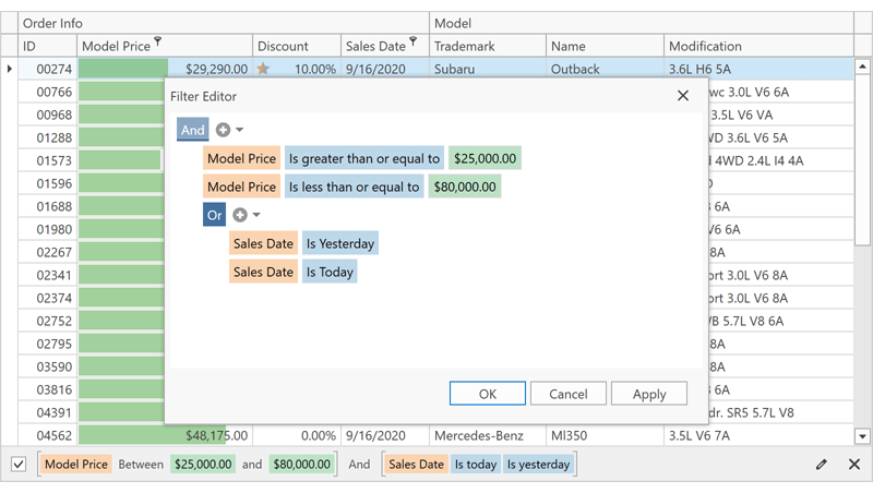
Demo * | Documentation
Disabled and Read-Only Cells
With this release, you can conditionally disable data cells or make cells read-only via our new BaseColumn.IsEnabledBinding and BaseColumn.IsReadOnlyBinding properties.
GitHub Example
Appearance Properties
DevExpress Office 2016 SE, Office 2019, VS 2017, VS 2019, and Win 10 Light themes include enhanced templates designed to simplify appearance customization via the Background and DataAreaBackground properties.
Demo * | Example
Bulk Updates
We added an 'AddRange' method to the following collections:
'AddRange' updates the WPF Data Grid or TreeList once all relevant items have been added. With this new feature, you no longer need to enclose changes within 'BeginUpdate' and 'EndUpdate' method calls.
Diagram
SVG Export
Our Diagram Control now supports vector (SVG) file export.
Documentation
New List Item
Our Diagram control includes a new container item - DiagramList. It arranges its child items in a horizontal or vertical list.
Demo * | Documentation
Measure Units
You can enable a new ShowMeasureUnit option to display measurement units in the Properties Panel, Page Setup Window, and Bottom Panel.
In addition to pixels, users can specify values in other measurement units (inches and millimeters). You can also create a custom measurement unit and assign it to the MeasureUnit property.
Miscellaneous Enhancements
-
v20.2 includes a new OrgChartLayoutIsCompact option for the Org Chart's automatic layout. Set this option to false to calculate the offset for all tip-over subtrees rather than individual hierarchy levels. This makes Org Charts with a complex hierarchy (tip-over subtrees) easier to read and understand.
-
You can now hold the middle mouse button and drag to pan the diagram. This behavior is controlled by the AllowMiddleButtonDrag option.
Docking
Layout Panel - Caption Image Style
A new CaptionImageStyle property allows you to apply a style to the LayoutPanel's caption image.
<Style TargetType="{x:Type dxdo:LayoutPanel}">
    <Setter Property="CaptionImageStyle">
        <Setter.Value>
            <Style TargetType="ve:CaptionImage">
                <Setter Property="Width" Value="16"/>
                <Setter Property="Height" Value="16"/>
                <Setter Property="Stretch" Value="Fill"/>
            </Style>
        </Setter.Value>
    </Setter>
</Style>
Float Group - Overlap Windows Taskbar
You can now use the FloatGroup.WindowStyle and FloatingPaneWindow.OverlapTaskbar properties to specify whether a maximized FloatGroup overlaps the Windows Taskbar.
Documentation
Gantt
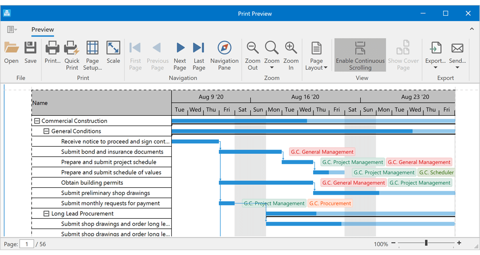
Print Support and Data Export
With this release, you can turn the contents of your Gantt into a printed report (or file) with a simple method call or by using its Print Dialog. The appearance of a printed Gantt can be customized with dozens of options, styles, and templates.
The DevExpress WPF Gantt control supports numerous data export formats (PDF, CSV, XLS, XLSX, XPS, HTML, MHT, DOCX, RTF, TXT, and IMAGE).
Demo * | Documentation
Gauges
Custom Labels
Our WPF Gauge control can now generate custom labels from a template. Use the Scale.CustomLabelTemplate and Scale.CustomLabelsSource properties to specify the template and source of labels.
Demo *
<Style TargetType="{x:Type dxga:ArcScale}">
    <Setter Property="CustomLabelsSource" Value="{Binding RomanLabels}"/>
    <Setter Property="CustomLabelTemplate">
        <Setter.Value>
            <DataTemplate>
                <dxga:ScaleCustomLabel   Value="{Binding Hour}"
                                            Content="{Binding RomanHour}"
                                            Visible="{Binding Visible}"/>
            </DataTemplate>
        </Setter.Value>
    </Setter>
</Style>
Snap Indicator Values to Tickmarks
Set the ValueIndicatorBase.SnapMode property to MinorTickmarks/MajorTickmarks. Once set, the WPF Gauge control will snap its value to minor or major tickmarks.
Demo * | Documentation
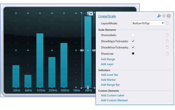
Smart Tags for Gauges and Scales
We now offer smart tag support for our CircularGaugeControl, ArcScale, LinearGaugeControl, LinearScale, DigitalGaugeControl, and StateIndicatorControl.
Map Control
Map Rulers
Our WinForms/WPF Map Control introduces a new Measurement Toolbar. End-users can measure geometrical and geographical objects using appropriate tools:
You can also use our new Measurements class API to create and update rulers and specify measurement units in code.
Demo * | Documentation
Map Rotation
New API allows you to rotate map content as needed.
Demo *
Vector Tiles - Enhancements
- Display text along curves (for example, street or road names).
- Display labels in the center of polygons.
- Fractional and custom zoom levels.
.NET Core Designer
Toolbox - DevExpress WPF Controls
Once you have installed the DevExpress WPF UI Controls, these controls should be available in your .NET Core app's Toolbox (even if your app does not reference DevExpress packages).
PDF Viewer
Sticky Notes
Our PDF Viewer now supports PDF sticky notes. You can add, edit, delete sticky notes, and add comments to notes in code or via the control's UI.
Demo *
Pivot Grid
Filter Panel Enhancements
Our new Filter Panel was first introduced in May 2020. This panel displays separate tokens with filters for each field. In v20.2, our WPF Pivot Grid control displays the new Filter Panel by default.
For backward compatibility, activate the UseLegacyFilterPanel option.
Demo * | Documentaion
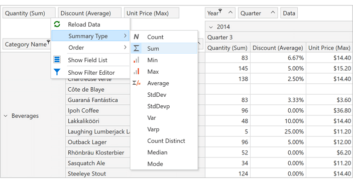
Aggregate Functions in a Data Field Context Menu
End-users can now specify aggregate functions for data fields via a context menu. A data field's context menu can optionally list all predefined aggregate functions (SUM, MIN, MAX, COUNT, etc.).
Initially, the Summary Type submenu is hidden from the context menu. Set a data field's PivotGridField.AllowRuntimeSummaryChange property to "true" to display summary types.
Rich Text Editor
Break Table Rows Across Pages
Table rows can now span multiple pages. We added a new row option - 'Allow row to break across pages'. To enable this feature in code, use the TableRow.BreakAcrossPages property.
OLE Objects
The Word Processing Document API and Rich Text Editor for WinForms and WPF support OLE objects. Our new API allows you to access and edit OLE objects in code. Documents with OLE objects can be printed and exported to PDF.
'Keep with Next' and 'Widow/Orphan Control' in Tables
Our Word Processing Document API and WinForms/WPF Rich Text Editors now apply the following options when they display, print, and export (to PDF) documents with table paragraphs:
- Keep with Next
- Widow/Orphan Control
Footnotes and Endnotes UI
The Rich Text Editor ships with new UI elements designed to insert, navigate, and format footnotes and endnotes.
Documentation
'Filling in Forms' Protection
You can now manage "Filling in Forms" protection in code or via the Rich Text Editor's UI.
New Formats
Our Word Processing Document API and WinForms/WPF Rich Text Edit controls now support the following file formats:
- DOCM (Microsoft Office Open XML Macro-Enabled Document format)
- DOT (Microsoft Word 97-2003 Template format)
- DOTM (Microsoft Office Open XML Macro-Enabled Template format)
- DOTX (Microsoft Office Open XML Template format)
- FlatOpc XML (Microsoft Word XML Document stored in a flat XML file instead of a ZIP package).
Documentation
Document Rendering Enhancements
Table width and justified paragraph alignment are now calculated more accurately and better mirror Microsoft Word 2013 and later.
Scheduler
'One Month' View (CTP)
Our WPF Scheduler's "One Month" View displays a compact summary of appointments/events for all selected resources. Thanks to its architectural flexibility, our WPF Scheduler automatically adapts the height associated with each week so that all appointments/events are correctly displayed within its container. By adapting week height automatically, the Scheduler's "One Month" View offers a better visual snapshot of upcoming events/appointments.
Demo * | Documentation
On-Demand Data Loading
The 'FetchAppointments' and 'FetchTimeRegions' events allow you to only load data for a visible date interval. On-demand data loading can help improve the overall performance of apps that rely on the DevExpress WPF Scheduler control.
Demo * | Documentation
Timeline Enhancements
Timeline related enhancements include:
- Dynamic Time Scales
- Adaptive Resource Height
- Per-pixel Horizontal Scrolling
- Improved Zooming
Demo * | Documentation

Spreadsheet
New Layout Engine
Our WPF Spreadsheet control ships with a new layout calculation engine. This new engine improves layout accuracy, increases render and scroll performance, and enhances PDF export and printing capabilities.
To revert to our legacy layout engine, activate the SpreadsheetCompatibilityOption.EnableLegacyLayoutEngine option.
Excel 2016 Charts (CTP)
Our WPF Spreadsheet control now supports the following Excel 2016 chart types:
- Box and Whisker
- Funnel
- Histogram
- Waterfall
- Pareto
Our comprehensive Spreadsheet API allows you to create and edit Excel 2016 charts as needed. Our WPF Spreadsheet control can open, print, and export (to PDF) existing workbooks with Excel 2016 charts.
Documentation
Rich Text Support
Our WPF Spreadsheet control can now display rich text within worksheet cells. Documents with rich text can be printed and exported to PDF. This capability is only available if our new layout calculation engine is used.
Documentation
Print/Export Rich Text Headers and Footers
You can now print and export (to PDF) a spreadsheet that contain headers and footers with rich text and inline pictures. This capability is only available if our new layout calculation engine is used.
Documentation
Themes
Performance Enhancements
The new PreloadThemeResourceAsync method initializes theme resources and runs static constructors for DevExpress controls in the background. When called at startup, this method reduces loading time for all subsequent forms opened by a user.
using System.Windows;
using System.Threading;
using DevExpress.Xpf.Core;

public partial class App : Application {
    protected async override void OnStartup(StartupEventArgs e) {
        base.OnStartup(e);
        await ThemeManager.PreloadThemeResourceAsync("Office2019Colorful");
    }
}
The 'PreloadThemeResourceAsync' method is especially effective when you cannot use NGen.exe or other means to generate native images for DevExpress assemblies.
Documentation: How to improve your WPF app performance
Windows 10 Light Theme and Win10 Palette
This release includes a new Win10Light theme inspired by Windows 10.
You can use our new Win10Palette and create a custom theme based on the Win10Light theme. This custom theme automatically updates its colors after each change to an accent color in Windows.
Documentation
VS2019 Palettes
This release includes new predefined palettes for VS2019 themes.
VS2019Blue Theme
VS2019Dark Theme
- BlueberryCake
- DeepSea
- Dimmed
- Sand
- Storm
VS2019Light Theme
- Berberis
- Cornflower
- EmeraldSea
- LightLilac
- Loft
Documentation
Common Enhancements
This release includes important quality-related enhancements for both our WebForms/MVC data container controls (GridView, TreeList, and CardView) and our WebForms/MVC Data Editors Library. Enhancements include (but are not limited to) the following:
- Improved control behavior in Batch Edit mode. We've re-designed UI "focus" mechanism and improved control behavior when rendered on touch screens.
- Published new client-side APIs and improved control flexibility.
- Improved both adaptivity and accessibility.
- Fixed multiple issues related to server and client data validation in our controls.
Diagram
Toolbox Options
<SettingsToolbox Width="500px" ShapeIconsPerRow="5" ShowSearch="False" />
<CustomShapes>
    <dx:DiagramCustomShape CategoryName="MyShapes" Type="square" Title="Square"
    BaseType="Rectangle" ToolboxWidthToHeightRatio ="1" DefaultHeight="1" DefaultWidth="1" />
</CustomShapes>
Toolbox Shape Templates
We implemented the CustomShapeCreateToolboxTemplate event. This event allows you to create a template for custom shapes in the Toolbox.
<ClientSideEvents CustomShapeCreateToolboxTemplate="CustomShapeCreateToolboxTemplate" />
                        function CustomShapeCreateToolboxTemplate(s, e) {
                            var svgNS = "https://www.w3.org/2000/svg";
                            var svgEl = document.createElementNS(svgNS, "svg");
                            svgEl.setAttribute("class", "template");
                            e.container.appendChild(svgEl);

                            var textEl1 = document.createElementNS(svgNS, "text");
                            textEl1.setAttribute("class", "template-name");
                            textEl1.setAttribute("x", "50%");
                            textEl1.setAttribute("y", "40%");
                            textEl1.textContent = "New";

                            var textEl2 = document.createElementNS(svgNS, "text");
                            textEl2.setAttribute("class", "template-name");
                            textEl2.setAttribute("x", "50%");
                            textEl2.setAttribute("y", "70%");
                            textEl2.textContent = "Employee";

                            svgEl.appendChild(textEl1);
                            svgEl.appendChild(textEl2);
                        }
Autosize Shapes
When used in data-bound mode, our ASP.NET Diagram control now automatically resizes shapes to fit shape text.
Enable our new KeepRatioOnAutoSize option to retain the aspect ratio of a custom shape after resize operations.
To prevent auto-sizing operations, set the EnableAutoSize property to false.
User Restrictions
The following new options allow you to control changes made to shapes and connectors.
- Add Shape
- Change Connection
- Change Connector Points
- Change Connector Text
- Change Shape Text
- Delete Connector
- Delete Shape
- Resize Shape
We created a new RequestEditOperation event for custom usage scenarios. Handle this event to restrict user actions as needed.
Demo (Web Forms) | Demo (MVC)
Documentation (Web Forms) | Documentation (MVC)
Improved Connector Routing
We improved the algorithm used to compute orthogonal connector routing (to prevent crossing shapes).
Gantt
Custom Task Tooltips
With our new TooltipShowing event, you can easily display custom content within task tooltips.
Demo (Web Forms) | Demo (MVC)
Task Edit Dialog Customization
The new TaskEditDialogShowing event fires before the Task Edit dialog is displayed. Handle this event to hide or mark desired fields as read-only.
Demo (Web Forms) | Demo (MVC)
Context Menu Customization API
Our new ASP.NET Gantt API allows you to create and customize the context menu. You can add predefined menu items or create custom items as needed.
New API includes:
Demo (Web Forms) | Demo (MVC)
New Client-Side API
We implemented 20+ new client-side events (DependencyDeleting, FocusedTaskChanging, FocusedTaskChanged, TaskMoving, ResourceInserting/Deleting/Updating, etc.) and over 15 new methods (InsertDependency, InsertTask, etc.).
Demo (Web Forms) | Demo (MVC)
API Enhancements
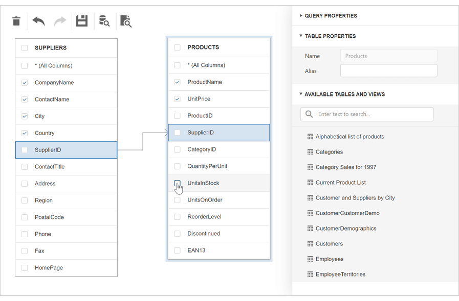
New Query Builder
Our new ASP.NET Core Query Builder allows end-users to visually construct queries using our UI controls and apply those queries against existing DevExpress controls such as the ASP.NET Core DataGrid.
Documentation
Data Grid
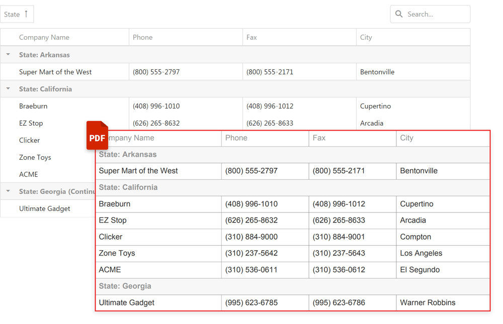
Export to PDF (CTP)
You can now export DataGrid content to a PDF document. Our new Export to PDF API offers the following:
- Cell content and appearance customization.
- Image export support.
- Add custom content alongside the grid (such as a header or footer).
- Export multiple grids into a single PDF document.
Demo | Documentation
Data Grid and Tree List
Data Editing API Enhancements
We have extended the DataGrid and TreeList data editing API to better support declarative data bindings and to address new data editing scenarios. You can now:
Charts
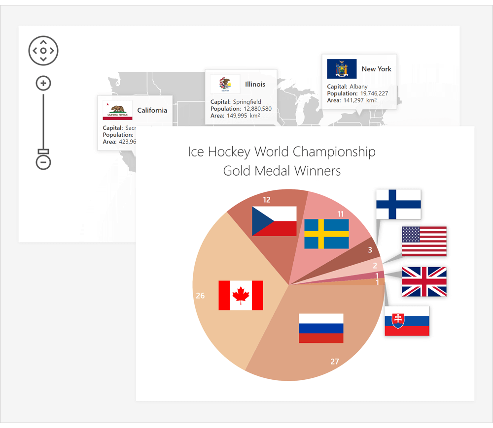
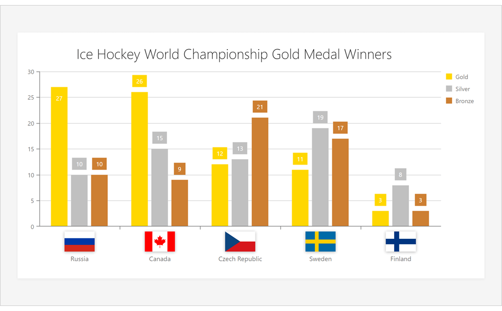
Map and Pie Chart Annotations
Both our Vector Maps and Pie Chart now support Data Annotations.
Demo: Pie Chart | Demo: Map
Documentation: Pie Chart | Documentation: Map
Axis Label Templates
With this release, you can use templates to render images or custom content within chart axis labels.
Demo
Diagram
Partial Updates
Our Diagram for ASP.NET Core can now partially update its UI in response to external changes to its data source. As you might expect, data editing will no longer require a full reload on data change.
Data Binding Enhancements
Our new nodes.customDataExpr and edges.customDataExpr options allow you to link additional data source fields to Diagram elements. Linked data is replicated in the Diagram’s change history. As such, the Diagram control can undo/redo changes made to additional data fields.
Demo
Toolbox Customization Options
Demo
Toolbox Shape Templates
New Diagram templates include:
Demo | Documentation
Autosize Shapes
When used in data-bound mode, our Diagram control now automatically resize shapes to fit shape text.
Enable our new keepRatioOnAutoSize option to retain the aspect ratio for a custom shape after resize operations.
To prevent auto-size operations, disable the autoSizeEnabled option.
User Restrictions
New Diagram options allow you to control modifications made to Diagram shapes and connectors. These new options include:
- Add Shape
- Change Connection
- Change Connector Points
- Change Connector Text
- Change Shape Text
- Delete Connector
- Delete Shape
- Resize Shape
We created a new requestEditOperation event to facilitate custom implementations. Handle this event to restrict user actions as needed.
Demo | Documentation
Improved Connector Routing
We improved the algorithm used to compute orthogonal connector routing (to prevent crossing shapes).
File Manager
File Upload via Drag & Drop
DevExtreme File Manager widget supports file upload operations using drag & drop.
File Uploader
File Upload - Custom Drop Zone
A new dropZone option allows you to specify a custom drop zone.
Demo

API Enhancements
Gantt
Context Menu Customization API
Our new Gantt API allows you to create and customize its context menu. You can add predefined menu items or create custom items as needed.
Demo
Custom Task Tooltips
This release includes a new taskTooltipContentTemplate option. Use this option to display custom content within task tooltips.
Demo
Task Edit Dialog Customization
The new TaskEditDialogShowing event fires before the Task Edit dialog is displayed. Handle this event to hide or turn desired fields to read-only.
New Client-Side API
We implemented 20+ new client-side events (dependencyDeleting, focusedTaskChanging, focusedTaskChanged, taskMoving, resourceInserting/Deleting/Updating, etc.) and over 15 new methods (insertDependency, insertTask, etc.).
HTML/Markdown Editor (CTP)
Tables
Our HTML/Markdown Editor can now render tables. New API and UI options allow you to execute multiple table-related tasks (create/delete a table, insert/delete a row, column, or cell) with ease.
Demo | Discussion page
Pivot Grid
Export to Excel API
With our new PivotGrid API you can:
- Customize cell data and appearance as needed.
- Export PivotGrid Field Panel configuration data.
- Add additional worksheets with custom data.
- Display PivotGrid export progress/status.
- Protect Excel cells and worksheets with passwords.
Demo | Documentation
Rich Text Editor
Document Protection API
New API allows you to apply password protection to your online documents. With document protection, you can restrict editing to specific sections of an online document.
Demo | Documentation
Spell Checking
Our ASP.NET Core Rich Text Editor includes an easy-to-use spell checking API.
To enable spell checking, do the following:
The DevExpress ASP.NET Core Rich Text Editor includes a webpack configuration file so you can build a NSpell bundle with required dictionaries.
Documentation
Context Menu Customization
A new contextMenuShowing event allows you to rearrange menu items, create custom items, or prevent the display of the context menu.
Demo | Documentation
Scheduler
Virtual Scrolling
We've enhanced both the performance and usability of the DevExtreme Scheduler. A new Virtual Scrolling mode is available for Day and Week views. When virtual scrolling is enabled, the Scheduler renders only visible grid cells and appointments.
Demo | Documentation
TimeZone Editor Enhancements
Our TimeZone Editor is now represented as a single drop-down list that contains all time zones from IANA database sorted by UTC offset. We also added a search box and enabled "lazy loading" to improve user experience.
Demo | Documentation
Themes
SCSS Support
We migrated existing DevExtreme LESS styles to SCSS and made them modular. You can now integrate DevExtreme SCSS styles into your application build process. This change also allows you to precisely customize CSS styles and minimize resulting CSS bundles.
DevExtreme SCSS styles fully support the SCSS module system.
Common Enhancements
This release includes important quality-related enhancements for our WebForms Bootstrap data container controls (GridView, CardView) and our WebForms Bootstrap Data Editors Library. Enhancements include (but are not limited to) the following:
- Improved control behavior in Batch Edit mode. We've re-designed UI "focus" mechanism and improved control behavior when rendered on touch screens.
- Published new client-side APIs and improved control flexibility.
- Improved both adaptivity and accessibility.
- Fixed multiple issues related to server and client data validation in our controls.
Editors
Styled Edit Buttons
Button styles allow you to indicate button states, semantics, and available user actions. Button styles include:
- Primary
- Secondary
- Success
- Info
- Warning
- Danger
- Link
- Light
- Dark.
Demo | Documentation
Calendar, Date Edit - Month-Year Picker
DevExpress Bootstrap Calendar and Date Edit controls now support month-year selection mode.
Demo | Documentation: Calendar | Documentation: Date Edit
API Enhancements
Data Grid
Export to PDF (CTP)
You can now export DataGrid content to a PDF document. Our new Export to PDF API offers the following:
- Cell content and appearance customization.
- Image export support.
- Add custom content alongside the grid (such as a header or footer).
- Export multiple grids into a single PDF document.
Demo | Documentation | Discussion Page
Data Grid and Tree List
Data Editing API Enhancements
We have extended the DataGrid and TreeList data editing API to better support declarative data bindings and to address new data editing scenarios. You can now:
Discussion Page
Pivot Grid
Export to Excel API
With our new PivotGrid API you can:
- Customize cell data and appearance as needed.
- Export PivotGrid Field Panel configuration data.
- Add additional worksheets with custom data.
- Display PivotGrid export progress/status.
- Protect Excel cells and worksheets with passwords.
Demo | Documentation | Discussion Page
Scheduler
Virtual Scrolling
We've enhanced both the performance and usability of the DevExtreme Scheduler. A new Virtual Scrolling mode is available for Day and Week views. When virtual scrolling is enabled, the Scheduler renders only visible grid cells and appointments.
Demo | Documentation | Discussion Page
TimeZone Editor Enhancements
Our TimeZone Editor is now represented as a single drop-down list that contains all time zones from IANA database sorted by UTC offset. We also added a search box and enabled "lazy loading" to improve user experience.
Demo | Documentation
Recurrence Rule Enhancements
We replaced our custom Recurrence Engine with the RRule open source library. Our Scheduler control now supports the iCalendar RFC 2445 specification.
Demo | Documentation | Discussion Page
Diagram
Partial Updates
Our Diagram for ASP.NET Core can now partially update its UI in response to external changes to its data source. As you might expect, data editing will no longer require a full reload on data change.
Data Binding Enhancements
Our new nodes.customDataExpr and edges.customDataExpr options allow you to link additional data source fields to Diagram elements. Linked data is replicated in the Diagram's change history. As such, the Diagram control can undo/redo changes made to additional data fields.
Discussion Page
Toolbox Customization Options
Demo
Toolbox Shape Templates
New Diagram templates include:
Demo | Documentation
Autosize Shapes
When used in data-bound mode, our Diagram control now automatically resize shapes to fit shape text.
Enable our new keepRatioOnAutoSize option to retain the aspect ratio for a custom shape after resize operations.
To prevent auto-size operations, disable the autoSizeEnabled option.
User Restrictions
New Diagram options allow you to control modifications made to Diagram shapes and connectors. These new options include:
- Add Shape
- Change Connection
- Change Connector Points
- Change Connector Text
- Change Shape Text
- Delete Connector
- Delete Shape
- Resize Shape
We created a new requestEditOperation event to facilitate custom implementations. Handle this event to restrict user actions as needed.
Demo | Documentation
Improved Connector Routing
We improved the algorithm used to compute orthogonal connector routing (to prevent crossing shapes).
Gantt
Context Menu Customization API
Our new Gantt API allows you to create and customize its context menu. You can add predefined menu items or create custom items as needed.
Demo | Discussion Page
Custom Task Tooltips
This release includes a new taskTooltipContentTemplate option. Use this option to display custom content within task tooltips.
Demo
Task Edit Dialog Customization
The new TaskEditDialogShowing event fires before the Task Edit dialog is displayed. Handle this event to hide or turn desired fields to read-only.
New Client-Side API
We implemented 20+ new client-side events (dependencyDeleting, focusedTaskChanging, focusedTaskChanged, taskMoving, resourceInserting/Deleting/Updating, etc.) and over 15 new methods (insertDependency, insertTask, etc.).
Discussion Page
File Manager
File Upload via Drag & Drop
DevExtreme File Manager widget supports file upload operations using drag & drop.
File Upload - Custom Drop Zone
A new dropZone option allows you to specify a custom drop zone.
Demo
API Enhancements
HTML/Markdown Editor (CTP)
Tables
Our HTML/Markdown Editor can now render tables. New API and UI options allow you to execute multiple table-related tasks (create/delete a table, insert/delete a row, column, or cell) with ease.
Demo | Discussion Page
Data Visualization
Map and Pie Chart Annotations
Both our Vector Maps and Pie Chart now support Data Annotations.
Discussion Page: Pie Chart | Discussion Page: Vector Map
Demo: Pie Chart | Demo: Map
Documentation: Pie Chart | Documentation: Map
Axis Label Templates
With this release, you can use templates to render images or custom content within chart axis labels.
Demo | Discussion Page
Themes
SCSS Support
We migrated existing DevExtreme LESS styles to SCSS and made them modular. You can now integrate DevExtreme SCSS styles into your application build process. This change also allows you to precisely customize CSS styles and minimize resulting CSS bundles.
DevExtreme SCSS styles fully support the SCSS module system.
Discussion Page
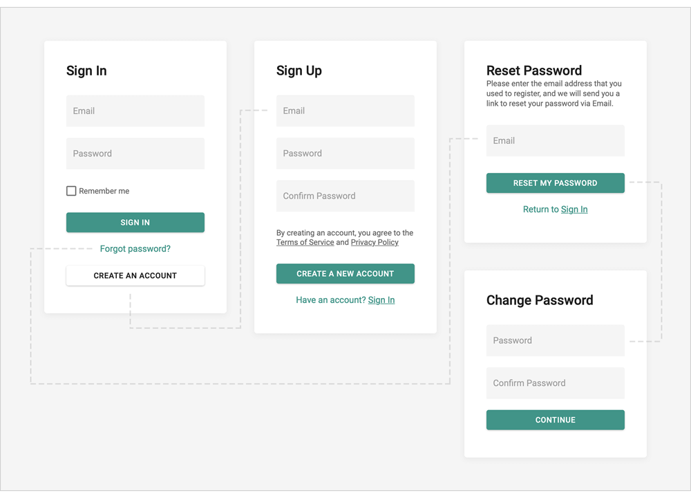
Angular Components
Authentication UI Template
We extended our Angular Application Template with new Sign Up and Reset/Change Password form templates. We also implemented corresponding client-side user workflows so you can integrate our new Angular Authentication Forms with your backend authentication API.
Documentation
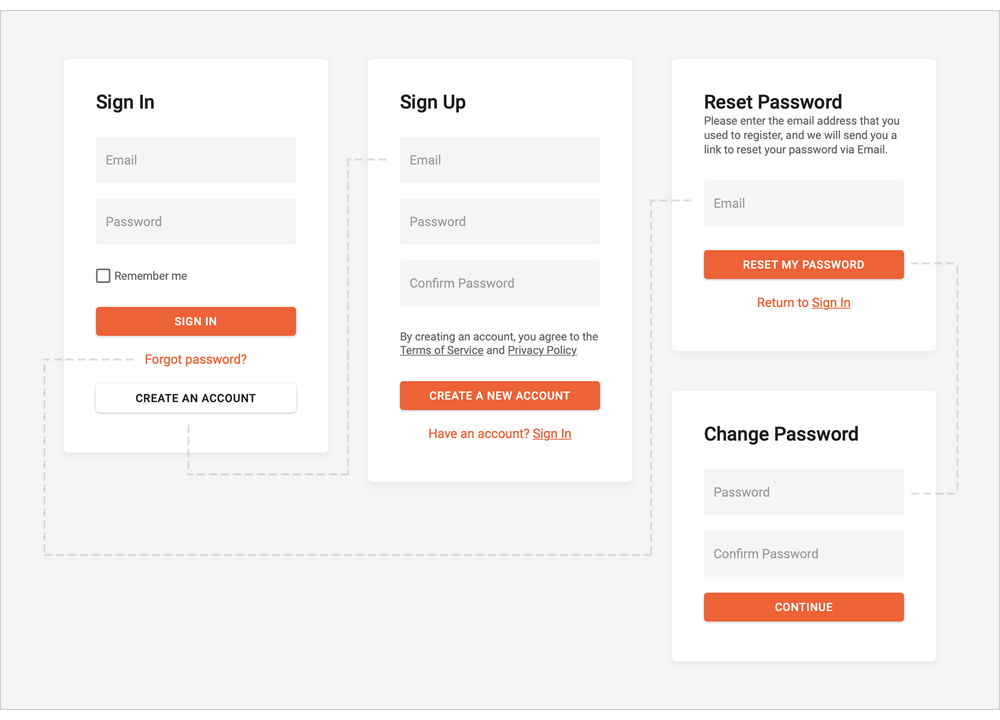
Vue Components
Vue 3 Support
Authentication UI Template
We extended our Vue Application Template with new Sign Up and Reset/Change Password form templates. We also implemented corresponding client-side user workflows so you can integrate our new Vue Authentication Forms with your backend authentication API.
Documentation
React Components
API Enhancements
We accompanied our React component state properties with corresponding onChange events so you can handle state changes easier. For instance, the 'value' property has the corresponding 'onValueChange' event.
Documentation
Native React Grid
Inline Edit Form - Editing in Detail Row
With this release, you can use our TableRowDetail and EditingState plugins and integrate the Inline Edit Form to modify cell values.
Documentation: How to implement the Inline Edit Form
Native React Scheduler
Enhanced Rendering for Overlapped Events/Appointments
We improved the readability of our React Scheduler by using available screen space more efficiently. In Week and Day views, overlapped appointments are distributed evenly across cell width and consume as much space as possible. If enough room exists to display appointment title and dates, appointments are layered one above another.
Documentation

Support for .NET 5.0
New Grid Layout & Stack Layout
v20.2 includes two new Blazor layout components - Grid Layout and Stack Layout.
The Grid Layout is based on a two-dimensional CSS grid. It arranges layout items into rows and columns.
Demo
The Stack Layout organizes items in a one-dimensional stack, either horizontally or vertically.
Demo
New Time Editor
Our new Blazor Time Edit component ships with the following built-in features/capabilities:
- DateTime / TimeSpan binding
- Integrated dropdown Time Picker
- 12 / 24 Hour Format support
- Min / Max Time support
- Read-Only and Disabled States
- Null Text
- Clear Button
Demo | Documentation
New Memo Edit
Our new Memo component for Blazor includes the following features:
- Bind to Data
- Custom Size
- Resize Modes (Horizontal, Vertical, Horizontal and Vertical)
- Clear Button and Null Text
- Read-only State
Demo | Documentation
Data Grid
Total and Group Summaries
Our Blazor Data Grid can now compute summaries across all data rows or individual groups. Predefined aggregate functions include:
Demo | Documentation
Fixed Columns
You can now anchor columns to the left or rightmost edge of the grid. Fixed columns are never scrolled horizontally. Use the FixedStyle property to fix a column at the right or left edge.
Demo
Column Resize
End-users can now resize grid columns as needed. To enable this feature, use the ColumnResizeMode property. Resize options include:
- NextColumn
- Component
- Disabled
Demo | Documentation
New Popup Edit Form
End-users can now edit column values within a popup form. To activate Popup Edit Form mode, set the EditMode property to PopupEditForm.
Demo | Documentation
Incremental Filtering
End-users can filter list items dynamically, based upon the text typed into the editor's input box. Filter modes include: Contains and StartsWith.
Documentation
Data Editors
Date Edit - Display Time
To display time values in the Date Edit component, use the new TimeSectionVisible property.
Demo
Long Mouse Click / Long Key Press Support
A long mouse click and a long key press now change the Spin Edit's value. In the ComboBox and Tag Box components, a long key press navigates through items.
ComboBox, TagBox, ListBox
Calendar Enhancements
- Date Validation
- Nullable DateTime Support
-
Bind to a Date (Documentation)
-
Min/Max Dates (Demo)
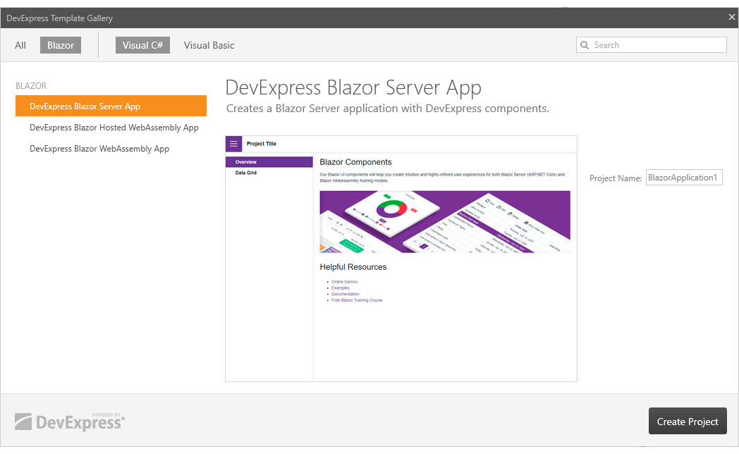
Visual Studio Integration
Blazor Project Templates
DevExpress Template Gallery now includes Blazor Project Templates.
Documentation
Scheduler
Custom Appointment Form
Our new AppointmentFormLayout and AppointmentCompactFormLayout properties allow you to create a custom Appointment Form as needed.
Demo | Documentation
Resources
You can now assign resources to appointments to browse multiple schedules simultaneously.
Use our new GroupType property to group appointments by resources or dates.
Our Blazor Scheduler component integrates Resource Navigation that allows end-users to filter resource groups.
Demo | Documentation
Appointment Templates
You can now customize appointment appearance via templates. New templates include:
Demo | Documentation
Custom Fields
Custom fields allow you to add custom data to appointments and labels.
Demo | Documentation
New API
New API allows you to assign CSS classes to appointment labels and status.
Reporting for Blazor
DevExpress Reports now supports Blazor and ships with a Document Viewer and feature-rich End-User Report Designer.
*Important Note: Though DevExpress Reports supports Blazor, it is not included in our Blazor UI component distribution. To use DevExpress Reports within your Blazor application/project, you must purchase a DevExpress Subscription (Reporting Subscription, ASP.NET Subscription, DXperience, or Universal). For more information on what's included in our product subscriptions, please refer to the following product matrix.
Document Viewer
- Preview and Print Documents
- Export to PDF, XLS, XLSX, RTF, DOCX, MHT, HTML, TXT, CSV, Image
- Page Navigation and Bookmarks
- Editing
- Search
- Skeleton Screen
- Multi-Page View
- Full-Screen Mode
Demo: Report Viewer for Blazor Documentation
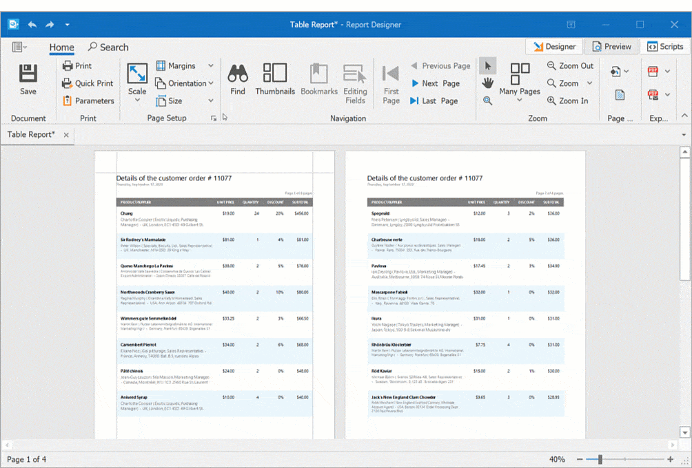
Report Designer
- Various Report Types (Table Report, Master-Detail Report, Invoice Report, Vertical Report, etc.)
- 20+ Report Controls (including a Pivot Table and Charts)
- Bind to Data (SQL, JSON, Excel, XPO and Object Data Sources)
- Federated Data Source (integrate different data sources and get uniform data access with a federated query)
- Data Source Wizard and Query Builder
- Report Wizard
- Integrated Document Viewer
- Bookmarks and Document Map
- Data Grouping, Sorting and Drill Down
- Calculated Fields and Report Parameters
- Skeleton Screen
- Appearance Customization
Demo: Report Designer for Blazor Documentation
Layout and Navigation
Adaptivity
Breakpoints allow you to adapt page layouts to different screen resolutions.
Demo | Documentation
All Platforms
PDF Export - Visual Signatures
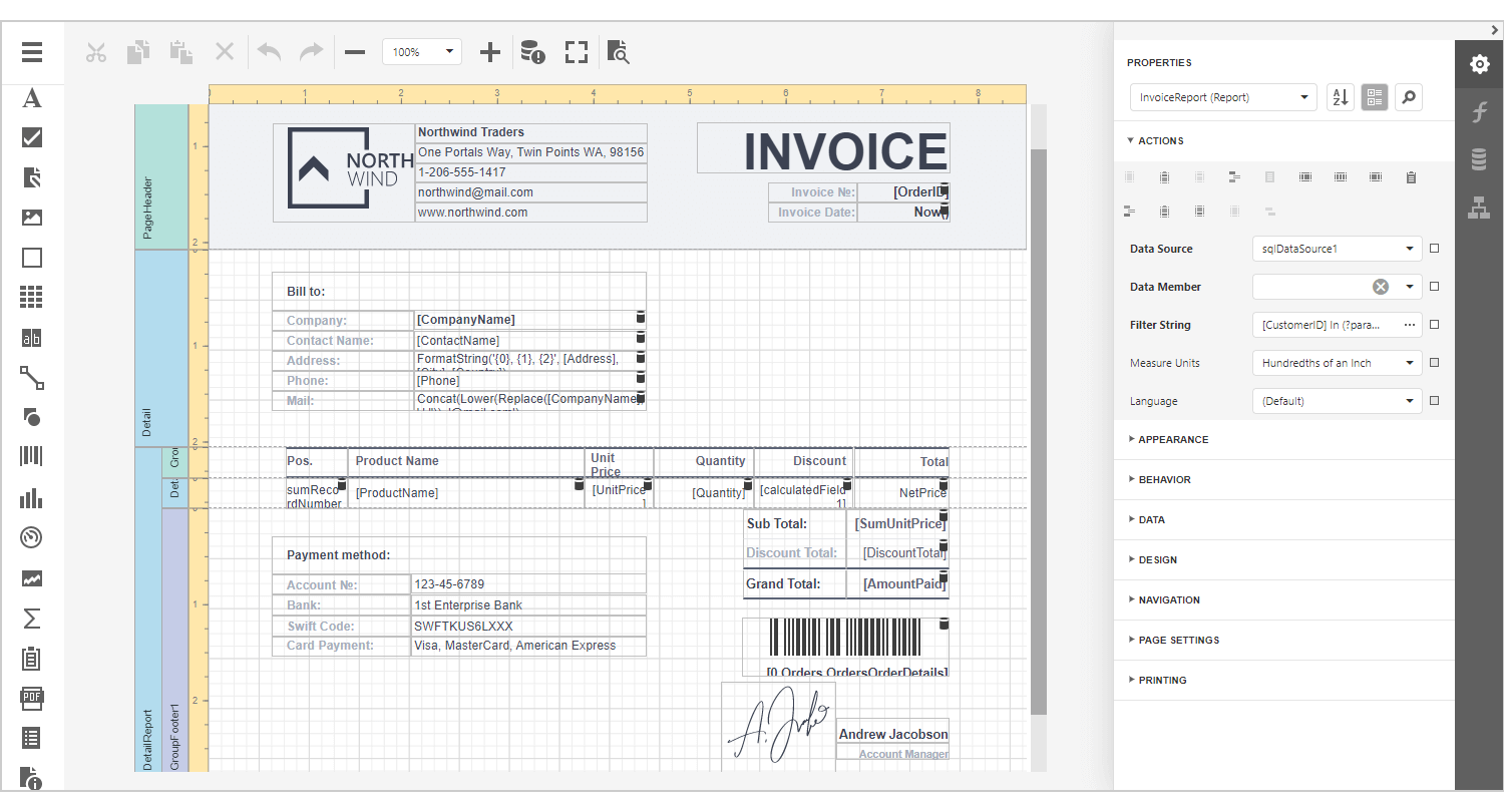
v20.2 includes a new XRPdfSignature report control that adds a visual signature to exported PDF files. Its features include:
Define multiple placeholders for secondary digital signatures within a report.
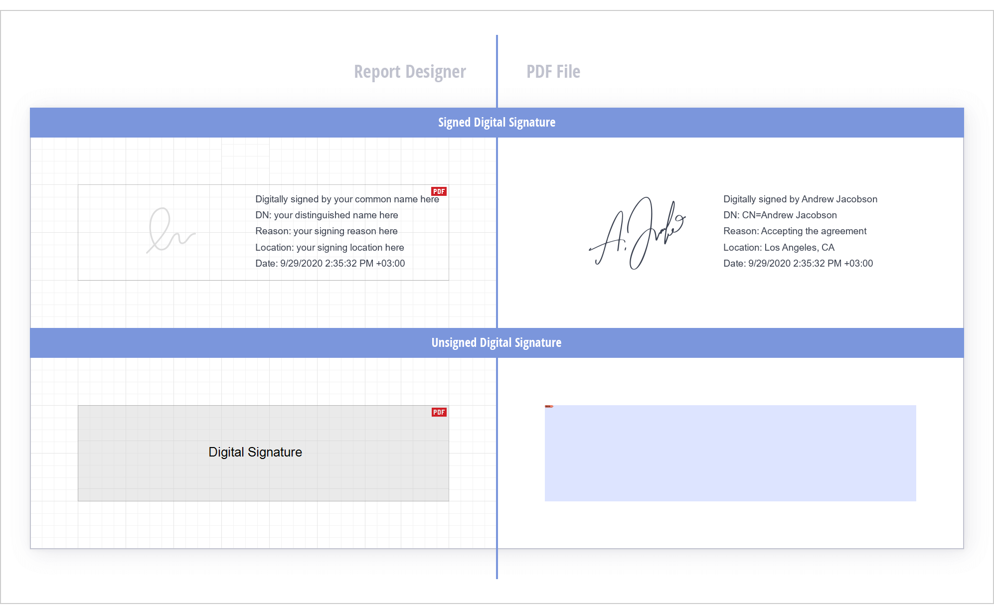
Define a date, reason, location, and an image for a primary signature in WinForms and WPF apps.
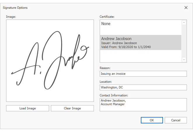
Demo * | Documentation
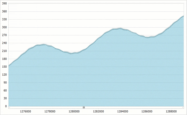
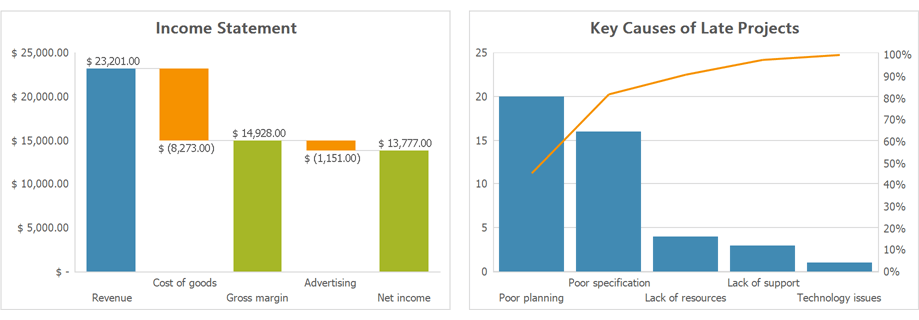
Performance Enhancements
We refactored and re-redesigned the following aspects of our document generation engine:
- Report controls style calculation and caching
- Control expression value pre-processing and caching
- Text measurement method calls (optimize frequency)
- Chart processing
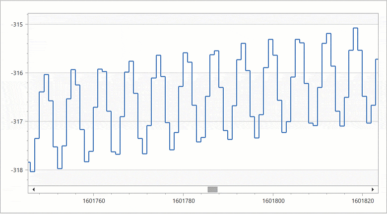
DevExpress Reports v20.2 can now generate printable documents up to 30-35% faster than previous versions. The following graph details internal test results (rendering our Large Dataset demo with different record sets):
Excel Export Enhancements
XRCheckBox
We enhanced the visual appearance of checkbox items in reports exported to Excel. Checkboxes now generate less merged columns and rows.
CachedReportSource
We changed the implementation of CachedReportSource. It now caches pictures obtained by URL in the document page storage. Image objects are created only once to reduce memory usage and time required to preview, print, and export the report.
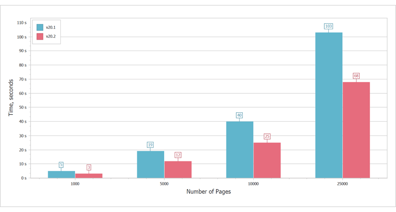
You can now generate reports with BMP and JPG images faster and consume less memory when using Single Page export modes. The following comparison table demonstrates our testing results:
| Test | Version | Memory, MB | Time, sec |
| Table Report - 40 records with unique pictures, 40 pages * | v20.2 | 70.1 | 2.1 |
| v20.1 | 121.9 | 2.6 |
| Table Report - 40 records with unique pictures (repeated 30 times), 1521 page * | v20.2 | 170.1 | 31.5 |
| v20.1 | 751.7 | 71.7 |
|
Table Report - 5000 records with unique pictures, 2501 pages **
|
v20.2
| 87.9 | 70 |
| v20.1 | 425.8 | 62 |
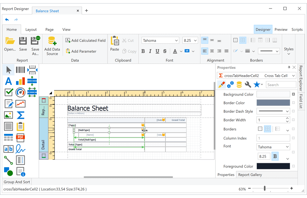
Cross Tab Cells - Auto Height
Use our new XRCrossTabCell.RowAutoHeightMode property to manage auto height behavior for Cross Tab cells.
Documentation
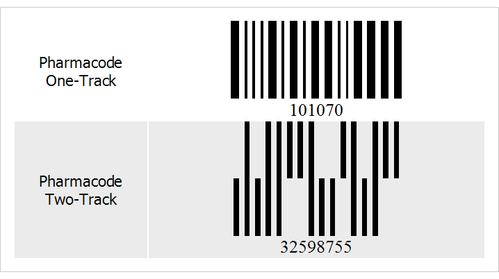
Bar Code - Pharmacode Symbology
The XRBarCode report control can now generate Pharmacodes (Pharmaceutical Binary Codes). Set the XRBarCode.Symbology property to 'Pharmacode' and specify PharmacodeType to generate one-track or two-track barcodes.
One-track is a one-dimensional (1D) symbology used in the packaging of pharmaceutical products.
Two-track uses vertical positioning of half bars together with full bars to encode data.
Demo - Barcodes | Documentation
Picture Box - Base64-Encoded Image Support
You can now bind our Picture Box to a database field, which contains image data as Base64 strings.
QRCode - Hide the Quiet Zone
We added the XRBarCode.Symbology.IncludeQuietZone option that allows you to hide the quite zone. The quiet zone is a blank area around the QRCode.
Visual Studio Report Designer
Convert Your RDLC Reports to DevExpress Reports
With this release, you can migrate your RDLC reports (SQL Server Reporting Services (SSRS), SyncFusion BoldReports, Active Reports) to DevExpress Reports via our updated report conversion tool. Our new converter supports the following RDLC report controls and features:
- TextBox, Rectangle, Image, Line
- Data Binding, Expressions, and Parameters
- Convert DataSet to SqlDataSource
- Convert Tablix to Band Structure (both vertical and horizontal bands)
- Convert Tablix to Cross Tab
The "Open/Import" command in our report smart tag allows you to select an appropriate *.RDLC & *.RDL file.
If you'd like to convert multiple reports simultaneously, use the command-line utility available in this GitHub repository.
All trademarks or registered trademarks are property of their respective owners.
Documentation
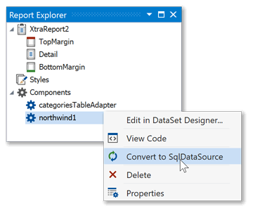
Convert DataSet to SqlDataSource
You can now convert your DataSets to SQL data sources. Compared to DataSets, SQL data sources are serialized together with report layouts. As such, you don't need to implement custom data source serialization in your reporting solutions when using a SQL data source.
How to convert DataSets to SqlDataSource
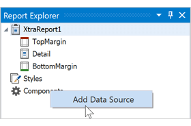
Add Data Sources in Report Explorer
You can now invoke a context menu for the Components node in the Report Explorer. The Add Data Source command adds a new data source to the report.
Web Reporting
JavaScript Modules
We refactored our client code and moved from namespace declaration to a modular approach. You can now use native import directives to exclude unnecessary code and dependencies when code is built into bundles.
var ActionId = require('devexpress-reporting/dx-reportdesigner').ActionId;
import { ActionId } from 'devexpress-reporting/dx-reportdesigner'
Async Report Storage
We extended the capabilities of our web report storage with asynchronous save and load operations. You can also leverage the 'IReportProviderAsync' service - it resolves a report ID to a report instance and expedites subreport load operations. With v20.2, applications can access threads from the ThreadPool while reporting components load, save or export reports.
To switch to asynchronous mode:
- Implement async counterparts of ReportStorageWebExtension methods.
- Replace the 'CreateDocument', 'ExportTo', and 'GetModel' method calls in your application with async counterparts.
- Create and register the 'IReportProviderAsync' service.
- Call the 'UseAsyncEngine' method at startup to activate asynchronous operations.
How to Use the Asynchronous Engine for Web Reporting | Documentation
Merge Reports with PDF - Azure and Linux Support
Our XRPdfContent control allows you to embed pages from an external PDF file into a report. The XRPdfContent control works in both Azure and Linux.
If your application is deployed on Linux or Azure and you want to merge your reports with PDF documents, install the SkiaSharp v1.6.0 NuGet package and set our new PrintingOptions.Pdf.RenderingEngine property to 'Skia'.
For Linux, you must also install the SkiaSharp.NativeAssets.Linux NuGet package.
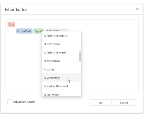
Web Report Designer - New DateTime Constants in the Filter Editor
You can now compare DateTime values with predefined constants such as "This Year", "This Month", "Tomorrow", etc.
Blazor Reporting
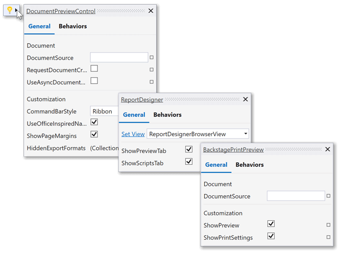
Customization API for Document Viewer and Report Designer
You can now customize the user interface and functionality of DevExpress Document Viewer and Report Designer components in your Blazor applications.
Use the following new properties to access events:
Blog Post
WinForms Reporting
Report Script Editor Enhancements
Enhancements to our script editor embedded into Visual Studio and WinForms End-User Report Designer include:
- The level of indentation is preserved when moving a caret to a new line.
- The TAB key press now inserts whitespaces and mimics the behavior of Visual Studio code editor.
- You can now zoom in and out the scripts code using the CTRL key and the mouse wheel.
- The "DevExpress.Reporting.CodeCompletion" NuGet package is now a multi-target package and allows you to use the DevExpress.XtraReports.v20.1.CodeCompletion.dll assembly built for .NET 4.5.2 and .NET Standard 2. You can now activate code completion in ASP.NET Core applications.
Use the new "DevExpress.WindowsDesktop.Reporting.CodeCompletion" NuGet package to activate the code completion for WinForms .NET Core Desktop apps.
You also need to install the Microsoft.CodeAnalysis NuGet package and enable script execution as described in Script Execution Mode.
All these enhancements are in effect for C# language only.
Documentation
WPF Reporting
Report Designer - Cross Tab Control
Our new Cross Tab report control is now available for those using our WPF End-User Report Designer. End-users can now create cross tab reports using the integrated Report Wizard and modify cross tab options via smart tags.
Documentation
Suggested Actions for WPF .NET Core Reporting
Both our Document Viewer and Report Designer now support Suggested Actions. This feature gives you easy access to common properties when a control is selected.
Suggested Actions requires Visual Studio 2019 Preview v16.8 or higher. NET Core applications use the new WPF XAML designer by default. For .NET Framework apps, you need to enable the following option in Visual Studio:
Tools > Options > Preview Features > New WPF XAML Designer for .NET Framework (requires restart)
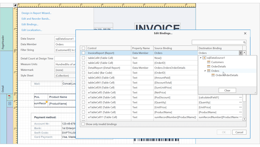
WPF Report Designer - Edit Bindings Dialog
Our WPF Report Designer now includes the Edit Bindings dialog. This dialog allows you to quickly validate and correct data bindings for report controls.
Documentation
WinForms & WPF Reporting
Federation Data Source - Data Flattening
The Federation Data Source allows you to flatten (or expand/denormalize) your data source structure via a Transformation option. The inner elements of your data source (such as arrays and lists) can now be transformed into a row set. This option is especially useful for JSON, Entity Framework, Object, and XPO Data Sources.
Blog Post | Documentation
Select All Columns and Unbound Columns
We added two new options for your Join Federation Data Source Queries.
Use "*" (all columns) operator to select all data source columns in the Federation Data Source Wizard. We also implemented a new SelectAll method.
Create unbound columns using Criteria Language Syntax.
Blog Post
Document Viewer - Anchoring Report Controls
Report controls can now be anchored to the left, right, or both sides of their containers when orientation, margins, or paper kind change in the Print Preview.
Use the PreviewOptions.SyncWithReportPageSettings to control this behavior.
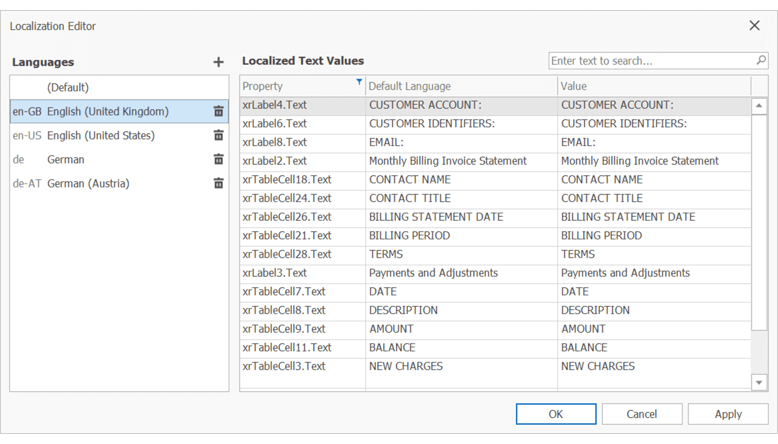
Localization Editor - Culture Codes
The Localization Editor now displays the culture code near the language name.
Data Visualization
Charts - Conditional Formatting
You can now specify rules to highlight Points and Series Lines in the Dashboard Chart Item and the Scatter Chart Item.
Conditional Formatting can be applied to any Line series, any Bar series (including Range Bars), Area series, and Bubble chart type.
You can specify predefined conditions based on Values/Arguments/Series or Hidden Measure values. You can also create a custom expression as needed.
Documentation
Web Dashboard
Angular & React Web Dashboard Components
You can now incorporate our Angular Web Dashboard or React Web Dashboard component within your web project.
Both our Angular and React components are available via npm packages so you can integrate our Web Dashboard Control as needed. You can bind your properties to the components using one and two-way bindings. You can also handle events using native development methodologies.
Getting Started Guide for Angular
Client-Side Configuration for Angular
Client-Side Configuration for React
Rename Data Sources at Runtime
End-users can now rename a data source using the Web Dashboard's UI.
Documentation
Change Dashboard Options at Runtime
We introduced a new option(args) method. This method allows you to change Web Dashboard Control property.
This change was introduced as part of our Angular & React integration initiative.
WinForms and WPF Dashboard
Ongoing Desktop Async Enhancements
In our v20.2 release cycle, we've addressed a series of known issues, improved performance, and stabilized Async-related Dashboard code.
Data Export
Pie Item - Export Customization API
We extended our Export Customization API to support Pie Item customization during export operations. The GetPrintableControl method now returns a XRChart object for a Pie dashboard item in the CustomExport event handler.
Data Processing
Filter Visible Data
We included a new filter option – Filter Visible Data. While this filter hides data that fails to meet filter criteria from the view, it does not filter out underlying data.
WinForms Demo | Documentation
Neutral Filter Mode
The Neutral Filter Mode is now the default option for all DevExpress Dashboard Controls (Web, WinForms, and WPF).
For backward compatibility, disable the UseNeutralFilterMode option.
Documentation
New Options for Join Federation Queries
"*" Operator
You can now use "*" (all columns) operator when you initiate Join operations in your Federation Data Source. This option is available in our WinForms End-User Wizard and Federation Data Source API.
Custom Expressions
Custom expressions allow you to create unbound columns in your Join Federation Queries.
Transform Nested Arrays
Federation Data Source now offers a Transformation option. You can use it to flatten (or expand, or denormalize) your data. Said differently, if one of your columns contains a data array, you can now transform it to a set of rows.
This option is especially useful for JSON, EF and XPO Data Sources.
Documentation | Blog Post
Blazor Server Support
You can now use our DevExpress Office File API components within server-side Blazor applications. With the Office File API, you can execute multiple document-related actions (create, load, edit, and print rich-text documents, spreadsheets, and PDF files).
Download DevExpress Document Processor NuGet Package
Blog Post
Digital Signatures (CTP)
This new API allows you to:
- digitally sign Office files (Word documents, Excel spreadsheets, and PowerPoint presentations) with X.509 certificates;
- configure signature options (select a signing certificate, specify a digest algorithm, define clients used to obtain timestamps and certificate revocation status);
- validate digital signatures in existing documents to ensure the authenticity and integrity of document content.
Demo (WinForms)* | Demo (ASP.NET Core)
PDF Document API
Sticky Notes and Comments
You can now access, edit, comment, and delete PDF sticky notes.
Documentation
PAdES - BES (LT and LTA levels) Signatures
You can now sign documents with PAdES signatures using B-LT or B-LTA signature levels.
Documentation
Cross-Platform Rendering
Our PDF Document API allows you to use the Skia Graphics Engine to render page content across multiple OS platforms (Windows, Linux, or Azure).
Blog Post
Page Manipulation Enhancements
You can now execute the following actions against PDF page content:
- Scale content
- Specify content offset
- Rotate content
- Resize the page (while maintaining content aspect ratio).
Documentation
Draw Page Content
The PdfGraphics.DrawPageContent method allows you to insert page content to a different page. You can merge the contents of two separate pages into one.
Blog Post
Spreadsheet Document API
Excel 2016 Charts (CTP)
Our Spreadsheet Document API now supports the following Excel 2016 chart types:
- Box and Whisker
- Funnel
- Histogram
- Sunburst
- Treemap
- Waterfall
- Pareto
Use our Spreadsheet API to create, load, edit, print, and export (to PDF) Excel 2016 charts *.
Documentation
Fixed DPI for Document Layout Calculation
v20.2 includes a new option - Workbook.Options.Layout.Dpi. This option specifies the resolution (DPI) used for document layout generation. You can now generate identical documents and print-outs on machines with different screen DPIs.
Documentation
Word Processing Document API
Break Table Rows Across Pages
Enable our new TableRow.BreakAcrossPages option to break table rows across pages.
OLE Objects
The Word Processing Document API and Rich Text Editor for WinForms and WPF support OLE objects. Our new API allows you to access and edit OLE objects in code. Documents with OLE objects can be printed and exported to PDF.
'Keep with Next' and 'Widow/Orphan Control' in Tables
Our Word Processing Document API and WinForms/WPF Rich Text Editors now apply the following options when they display, print, and export (to PDF) documents with table paragraphs:
- Keep with Next
- Widow/Orphan Control
Load Document Properties
Our Word Processing Document API allows you to load document metadata (or document properties) without loading the document itself.
Documentation
'Filling in Forms' Protection
You can now set up "Filling in Forms" protection in code. To protect a form, set the Document.ProtectionType property to DocumentProtectionType.FillInForms.
New Formats
Our Word Processing Document API and WinForms/WPF Rich Text Edit controls now support the following file formats:
- DOCM (Microsoft Office Open XML Macro-Enabled Document format)
- DOT (Microsoft Word 97-2003 Template format)
- DOTM (Microsoft Office Open XML Macro-Enabled Template format)
- DOTX (Microsoft Office Open XML Template format)
- FlatOpc XML (Microsoft Word XML Document stored in a flat XML file instead of a ZIP package).
Documentation
Document Rendering Enhancements
Table width and justified paragraph alignment are now calculated more accurately and better mirror Microsoft Word 2013 and later.
Asynchronous Load and Save
Our new API allows you to load, save, and export documents to PDF and HTML asynchronously. Use the following new methods (RichEditDocumentExtensions class):
These methods can accept a CancellationToken as a parameter. This allows you to terminate the operation when appropriate.
Blazor
ASP.NET Core Blazor Server UI - Official Release
XAF's Blazor Server UI with XPO ORM classes for data access was first introduced in May 2020 as a community technology preview (CTP).
This update marks its official release.
Miscellaneous enhancements include:
Getting Started | Video Overview
Blazor Demo
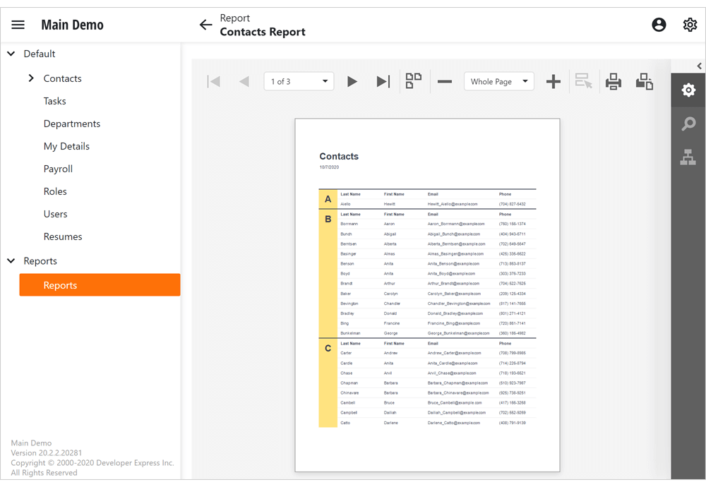
Reports Module
The Document Viewer and End-User Report Designer are now available in XAF's Blazor UI. You can display, print, and export reports created at design time and also create/modify report definitions at runtime.
Documentation
Conditional Appearance Module
XAF's Conditional Appearance module is now fully supported within XAF's Blazor UI.
You can conditionally hide or disable UI elements, apply color or text formatting in List and Detail Views.
Documentation
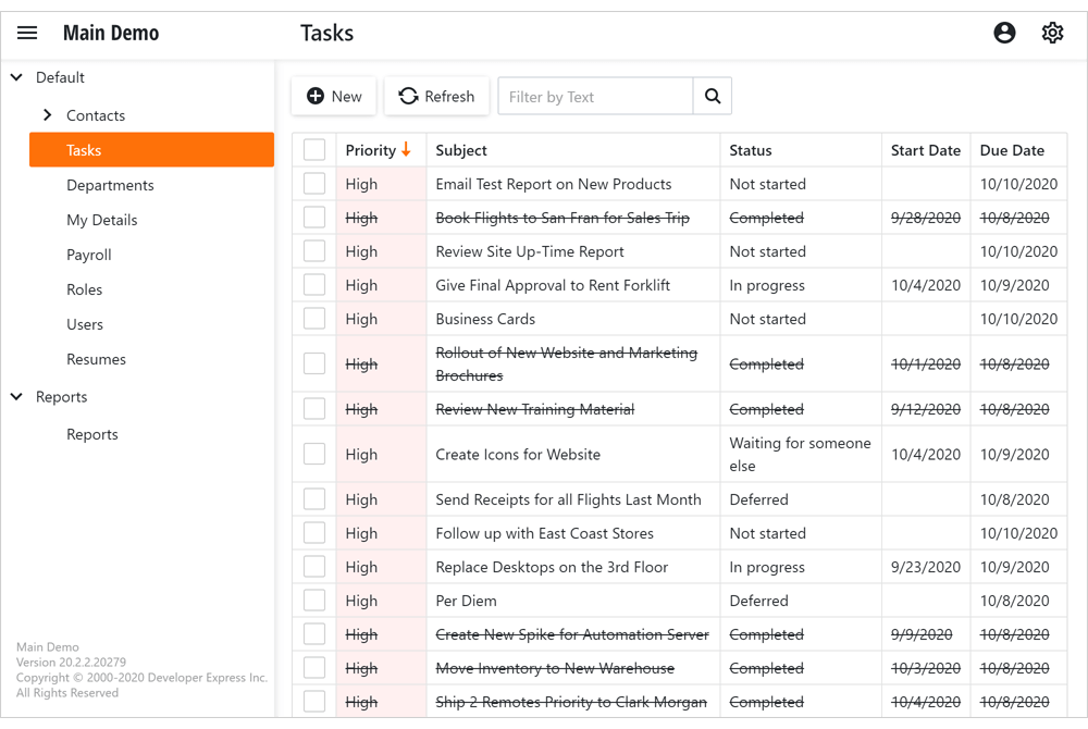
EF Core Support (CTP)
Blazor UI can now use EF Core data models. The following example demonstrates use of EF Core with XAF's Security System:
XAF Blazor UI with Entity Framework Core Data Model and Security System
We do not recommend use of our new Blazor UI with EF Core classes for production code. We've made it available to gather feedback and engage those of you considering it for future use.
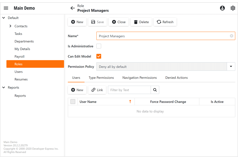
Active Directory and OAuth2 Authentication Providers
Our Security Module within XAF's Blazor UI now supports Windows and Azure Active Directory, Microsoft 365, Google, GitHub, and other OAuth2 authentication providers. The Login form automatically renders UI controls based on your authentication settings.

Action Permissions
Action Permissions offer fine-grain control over execution of both custom and XAF system Actions within the UI. Action Permissions support is now available for XAF's Blazor UI. To see it in action, point your browser to the following online demo (Roles > Users > Denied Actions): Blazor Main Demo.
Video Overview
Core Enhancements
Non-Persistent Object Enhancements
We removed most variances between persistent and non-persistent/proxy objects for XAF. You can now edit non-persistent data in a nested/lookup ListView, define custom fields at runtime, filter/sort/validate data, and track changes just as you would for persistent objects.
To avoid boilerplate code, we incorporated the following API enhancements:
-
You can inherit from NonPersistentBaseObject with a key property, change tracking support and enforce best practices for non-persistent classes.
-
The new PopulateAdditionalObjectSpaces method automatically initializes the AdditionalObjectSpaces collection based on registered object space providers.
Documentation
Model Editor for .NET Core and .NET Standard Projects (Beta)
Our Model Editor for .NET Core 3+ (WinForms) and .NET Standard 2.0+ (Blazor) projects now ships as part of the DevExpress .NET Framework Unified installer. It includes the following enhancements:
- Visual Studio Color Theme mirroring.
- Visual Studio keyboard shortcut support (F5, Ctrl+S, etc.).
- Improved error dialog with copy support.
- Wait cursor is displayed during time-consuming operations.
Feature Toggles
We added a FrameworkSettings.DefaultSettingsCompatibilityMode property to enable/disable feature toggles in a single location. You can choose whether to enable all new features after a version update or retain previous behaviors.
Refer to the following article for additional information:
Core - FrameworkSettings.DefaultSettingsCompatibilityMode sets default XAF configuration options and feature toggles
Performance Enhancements
Asynchronous Data Loading in WinForms List and Detail Views (XPO Apps)
This feature was first introduced in May 2020 as a community technology preview (CTP). This update marks its official release.
DetailView and GridListEditor in Client DataAccessMode can now load data asynchronously in XPO-based apps. The UI responds to user actions as data is being loaded. To cancel data loading, close the View or navigate to another View (in MDI mode).
Documentation
Security Enhancements
.NET App Security API for EF Core
v20.2 marks the official release of our Security System API for EF Core. This release allows you to use XAF's Security System with EF Core classes for non-XAF applications. In addition to basic CRUD Console and WinForms examples, we added the following training videos:
These tutorials include a quick review of our Security System API and also detail the steps needed to integrate the API with your app. XAF's Security System API can be used by DevExpress and non-DevExpress customers alike – so please do spread the word.
Security System Overview | FAQ
XPO - ORM Library
Data Services for Xamarin, WebAssembly and Other .NET Core/.NET 5 Apps
This release includes a new data provider - WebApiDataStoreService/WebApiDataStoreClient. It uses HTTP connection for Xamarin, Blazor WebAssembly, and other distributed .NET Core/.NET 5 apps (replaces WCF-based DataStoreService and DataStoreClient).
Documentation
Database Schema Migration
Database Schema Migration for XPO classes was first introduced in May 2020 as a community technology preview (CTP). This update marks its official release.
The Generate Migration Script menu command within XPO's Data Model Designer now supports External Types. If your ORM Data Model uses XAF classes from the DevExpress.Persistent.BaseImpl library (e.g., BaseObject) as External Types, you can now generate a schema migration script to implement incremental schema updates.
Database Schema Migration also includes all the necessary API to generate migration scripts in code: How to Use the Database Schema Migrations API.
Documentation
Blazor Support
Refactorings and Code Providers
New refactorings in .razor files:
Move to Code Behind
Moves code located in a Razor page's @code section to a code-behind file (.razor.cs). Documentation
Declare Event Handler (Razor code block) and Declare Event Handler (Razor code behind)
These refactorings generate an event handler for the selected method reference and place it in the @code block of a .razor file and in a Razor code-behind file (razor.cs).
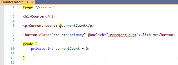
Extract Razor Component
Extracts the selected HTML markup and moves it into a new Razor component file (Component.razor). You can then reuse and share the Razor component across all your projects. Documentation
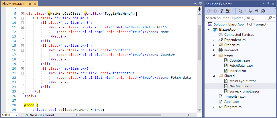
Remove Type Quallifier
This refactoring is now available from @code sections in .razor files. Documentation
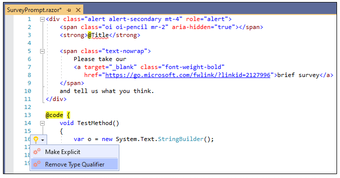
Make Explicit
This refactoring properly declares any needed namespace references when changing implicit variable declarations to variables with an explicit declaration. Documentation
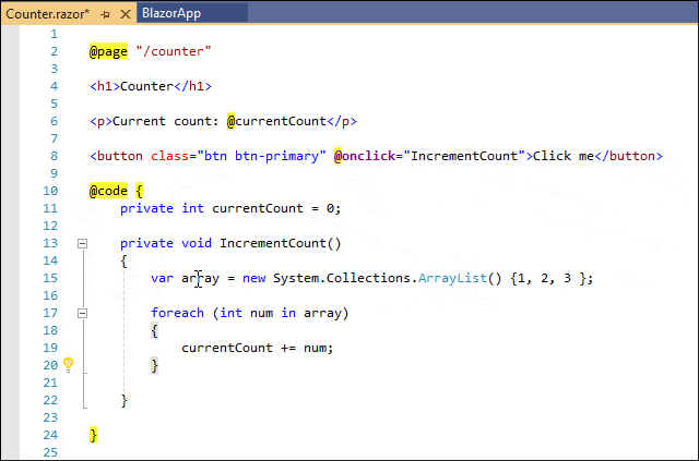
Code Templates
You can now expand code templates in .razor markup files to create Blazor apps faster. For example, typing bht followed by the Tab key (or Space, depending on your settings) will create a Blazor component with an HTTP call.
Documentation

CodeRush can also declare dependent namespaces when corresponding C# templates are expanded in .razor files. For example, the “nsb” template (to create new StringBuilder instances) automatically adds the necessary "@using System.Text" namespace reference to the top of the .razor file.
Documentation
Coding Assistance
The following CodeRush features are now available in @code sections inside .razor files:
Unit Testing
Run Tests in Multi-Framework Projects
The Test Runner now shows and runs tests for all target frameworks in multi-framework projects. You can run tests for all target frameworks or only for tests in a selected framework.
Documentation
Filtering Enhancements
The Test Runner now maintains grouping when filtering tests.
Documentation
Run Settings File Support
You can now exclude the following members, files, and assemblies from Code Coverage analysis using a .runsettings file:
- Source files matching a specified path/name pattern.
- Signed assemblies matching a specified public key token.
- Members with a specified matching attribute.
- Assemblies having a specified AssemblyCompany attribute value.
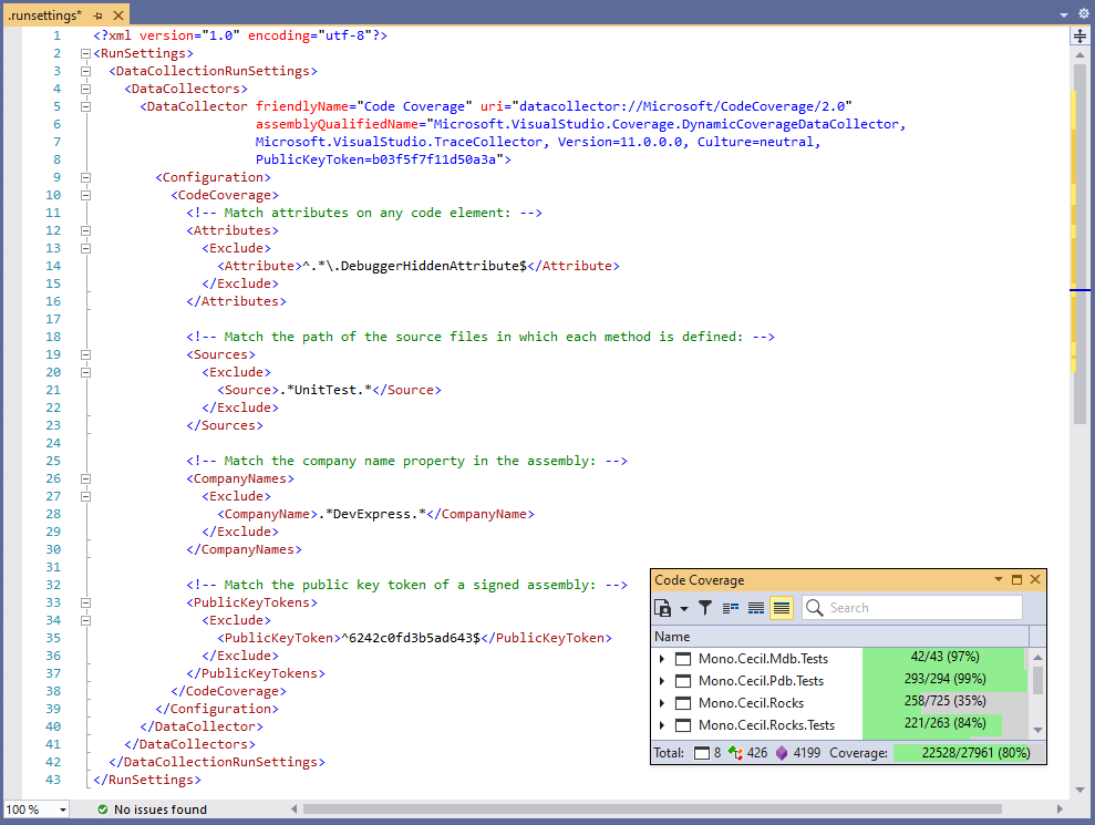
Documentation
Organize Members
You can now create rules to group members by member type name or member name. You can use Contains, StartsWith, and Equals string operations and RegEx expressions to group members. The screencast below shows event handler grouping.
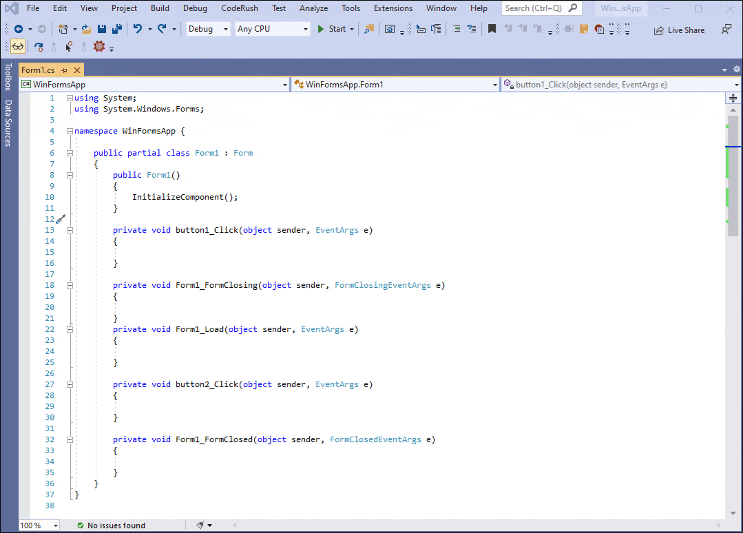
Organize Members also allows you to sort members by their type name.

Code Formatting
Brace Formatting Options for Simple Statements and Empty Code Blocks
CodeRush lets you configure line breaks around and within simple statements (statements that consist of a single line of code that ends in a semicolon, for example, method calls, return statements, throw statements, etc.) and empty code blocks.
Documentation
XAML Support - Element Spacing Formatting Options
We now support Visual Studio’s Element Spacing formatting options. These settings allow you to control the arrangement of elements and text lines in your XAML document. You can override these settings, for example, to apply the "Place empty lines between elements in text content" option.
Documentation
Code Style
Visual Studio's Options and Settings from the EditorConfig File
You can now configure code style in CodeRush using the following Visual Studio's options and corresponding settings located in the EditorConfig file:
- 'this.' and 'Me.' preferences
- Predefined type preferences
- 'var' preferences
- Use expression body
You can also run code cleanup to apply these settings to your code.
Note: redundant settings (Local Declaration style, Use this/Me qualifier, Use Expression Bodies, and Built-in Type Names) have been removed and no longer exist on the Editor | C# (Visual Basic) | Programming Style page of the CodeRush options dialog.
Documentation
HTML Support
Code Templates
We ported HTML templates from CodeRush Classic. You can use these templates, for example, to create a 2x2 HTML table:

For a complete organized list of HTML templates, choose the HTML language and expand the Raw HTML folder on the "Editor | All Languages | Templates" options page.
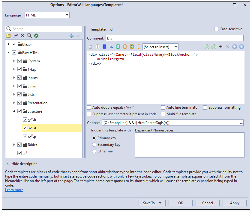
Documentation
Miscellaneous
The new ExecuteRefactoring command allows you to quickly run a specified refactoring without the UI overhead of invoking the Code Actions menu.
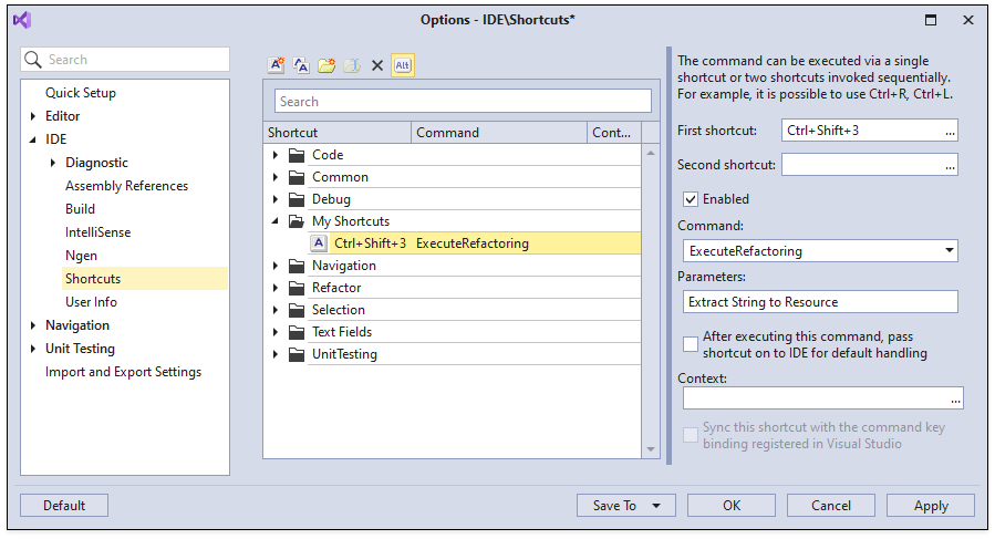
The animation below shows the "Ctrl+Shift+3" shortcut invoking 'Extract String to Resource'.
Documentation
New Gantt Control (Beta)
The new DevExpress VCL Gantt Control is a powerful project management tool that allows users to schedule activities required to achieve project goals and to monitor their progress.
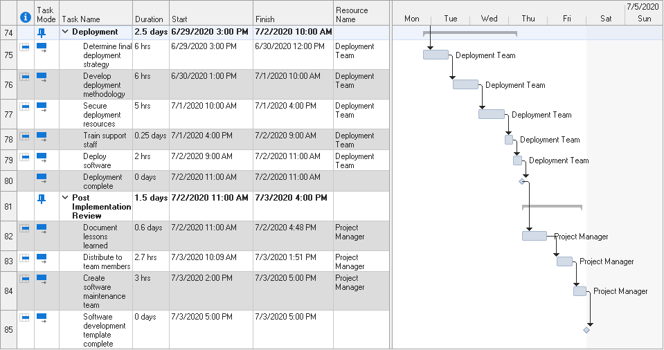
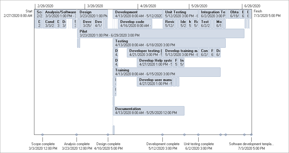
Our Gantt Control ships with the following features:
- Three views for project management: Gantt Chart, Resource Sheet, and Timeline
- Multiple task, dependency, and constraint types
- Manual and automatic task scheduling
- Workday and holiday tracking
- Timescale customization
- Scroll and zoom options
- Undo/Redo history
- Project XML file support
- DirectX hardware acceleration
Open/Save File Dialogs (CTP)
This release introduces skinnable DevExpress counterparts for standard VCL Open/Save File dialogs. We inherited our dialogs from the standard dialogs to make their replacement as easy as changing a class name.
 VCL Open File Dialog - Office 2019 Colorful
 VCL Open File Dialog - DevExpress Dark Style
 VCL Save File Dialog - Office 2019 Colorful
 VCL Save File Dialog - DevExpress Dark Style
UX Enhancements
Smooth Scrolling
This release adds smooth scrolling support to the following DevExpress VCL components:
- Grid Control
- TreeList Control
- Vertical Grid Control
- Layout Control
- NavBar Control
- PDF Viewer
- Flow Chart Control
- Org Chart Control
- Image Slider Control
- Scroll Box Control
- Image Editor
- Print Preview
The desired scroll mode is activated using a newly introduced option in a skin (or look & feel) controller, or a control's look & feel settings. The dxScrollAnimationTime global constant in the source code allows you to adjust the smoothness of scroll animation.
Content Padding Options
With this release, our VCL Grid, TreeList, Pivot Grid, and Vertical Grid controls introduce a quick way to pad their in-place editors and/or headers and adjust the spacing between certain UI elements. Use the new TdxVisualRefinements.Padding and TdxVisualRefinements.HeaderPadding class properties to specify the padding for each side of an element.
        TdxVisualRefinements.Padding := TRect.Create(3, 5, 3, 5);
        TdxVisualRefinements.HeaderPadding := TRect.Create(2, 2, 2, 2);
New Display Style for Filter Criteria
The Filter Box available in the VCL Grid, TreeList, and Vertical Grid controls now supports a new visual style displayed in the image below. This style helps end-users easily differentiate between colorized filter items, modify or clear individual filter conditions.
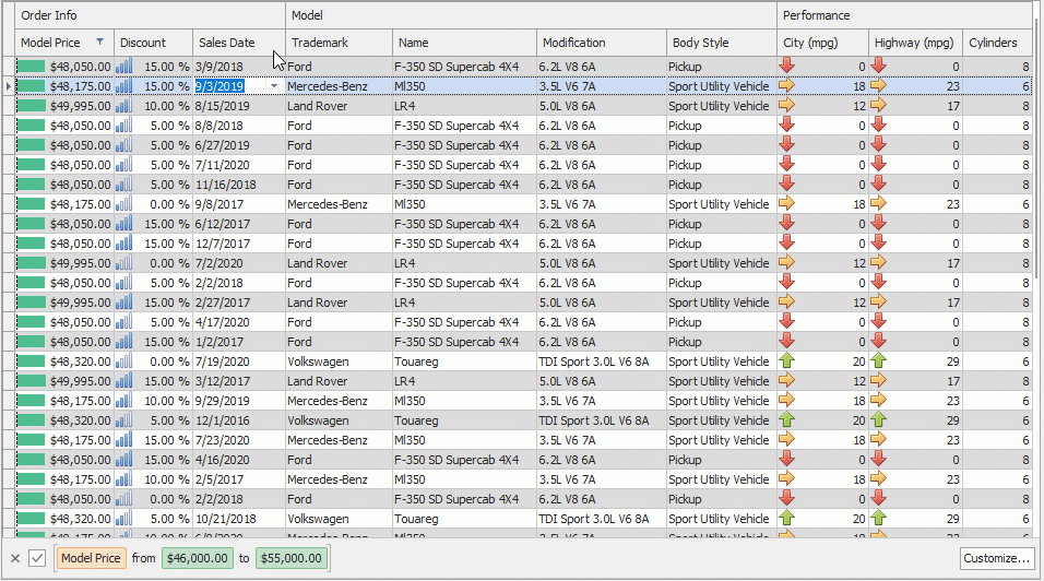
The new style is also available in built-in Filter Builder dialogs and standalone Filter Controls.
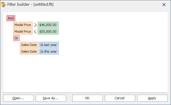
Grid Control
Custom Row Layouts in Table and Banded Table Views (CTP)
Custom row layouts allow users to arrange cells in a way similar to the one Layout View provides, with numerous customization options available at design and runtime.
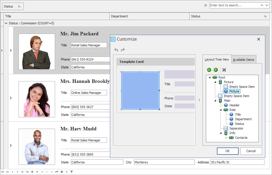
Performance Enhancements
- Content is rendered up to two times faster.
- Layout calculations in Banded Table Views are up to three times faster.
- OnGetFilterValues event handlers almost instantly populate filter dropdowns with items.
- Lookup column values are sorted 30% faster.
Spreadsheet
This release adds the following enhancements:
- Ability to obtain document metadata, modify and save the changes you made to it.
- New built-in dialogs that allow users to manage defined names.
 VCL Spreadsheet Control - Name Manager Dialog
 VCL Spreadsheet Control - New Name Dialog
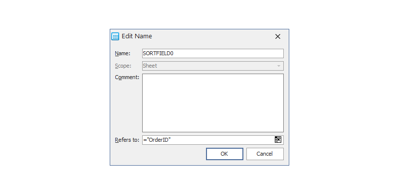 VCL Spreadsheet Control - Edit Name Dialog
 VCL Spreadsheet Control - Create Names from Selection Dialog
Rich Edit
New Document Server Component
This release includes a non-visual Rich Edit component that can load, edit, process, and export documents without end-user interaction. The new component has the same edit capabilities as the Rich Edit Control with fewer dependencies and no UI, so you can utilize the component in console applications.
Miscellaneous Enhancements
- Documents are loaded faster by one-third, while consuming 20-60% less memory.
- Load methods now automatically detect a document's format.
- Content scroll operations consume less memory.
- The Rich Edit components allow you to add support for specific document formats from the context menu.
PDF Viewer
Digital Signature Support
A new SignatureOptions property set allows you to obtain information about digital signatures in a document and to sign it with an X.509 certificate.
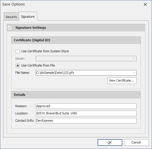
Encryption and Protection
Use the new SecurityOptions property set to encrypt a document, enforce password protection, and manage user access permissions.
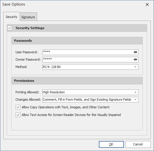
Save Functionality (Beta) and Editable Metadata
New methods allow you to save a document with the changes you made to its metadata, security and signature settings.
Layout Control
Performance Enhancements in Customization Mode
- Selection is updated 25 times faster than in previous versions.
- Our optimized drag-and-drop operations make the UI more responsive and accelerate layout calculations by 30%.
Miscellaneous Enhancements
- The SizeOptions.MaxWidth and SizeOptions.MaxHeight properties now operate as dimension constraints in layout items and groups.
- Ability to shorten long element captions with an ellipsis and specify its position.
NavBar Control
Microsoft Active Accessibility (MSAA) Support
Each NavBar element now creates an MSAA tree node that exposes the UI structure and other information to third-party accessibility applications. An active screen reader (for instance, Microsoft Narrator) reads these nodes when an end-user navigates between UI elements.
Miscellaneous
Callout Popup Control - Flyout Panel Style
Our Callout Popup control can optionally stretch across its owner - a form or another control. This allows you to mimic flyout panels and auto-hide toolbars.
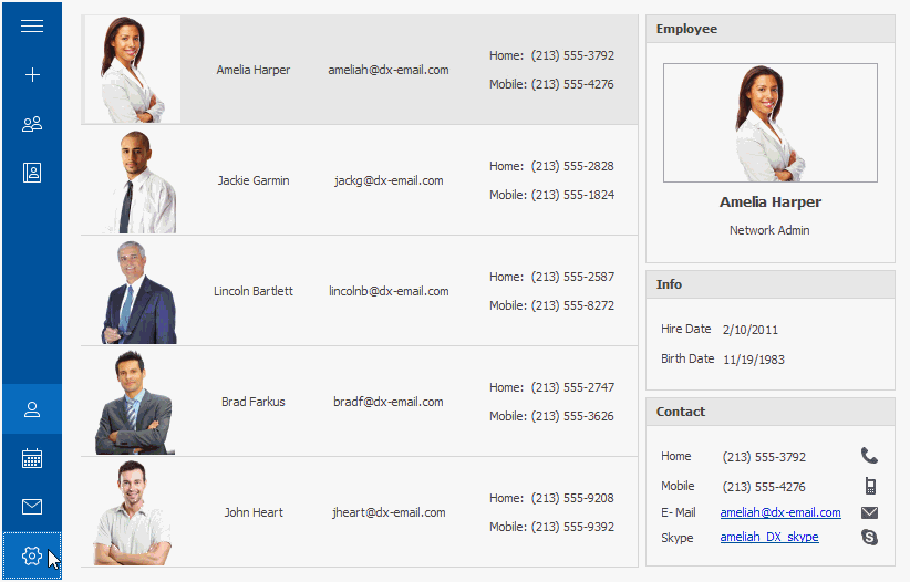
Gallery Control - Drag and Drop Support
Internal and external drag-and-drop operations are fully supported. Users can drag and drop items within a group, between groups and gallery controls.

Image Picker Enhancements
You can now temporarily keep selected images in a specially designed box before you close the Image Picker and add them to an image list.
You can now open a particular image's location in Windows File Explorer.
Entity Model Designer - Sort Operations
We extended context menus with items that allow you to sort elements in the Database Browser, Model Browser, and Diagram windows.
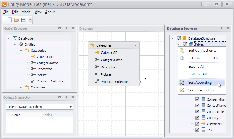 VCL Entity Model Designer - Database Browser
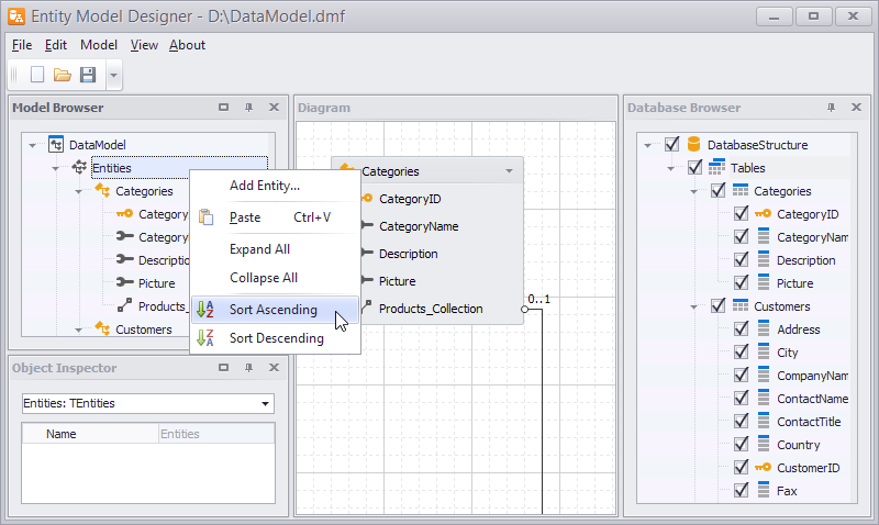 VCL Entity Model Designer - Model Browser
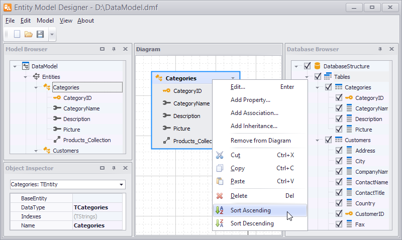 VCL Entity Model Designer - Diagram
Other enhancements include:
- We added support for TVirtualImageList images to per-monitor DPI-aware applications.
- Our cloud storage component now allows you to manage access permissions to files and folders on Google Drive and Microsoft OneDrive cloud services.
New Collection View
Our new Xamarin.Forms CollectionView component displays data item collections. Its features include:
- Vertical and Horizontal Layout support
- Item Drag & Drop (Reorder Items) support
- Data Sorting, Filtering, and Grouping
- Item Template (data item / group header)
- Pull to Refresh
- Load More
- Single and Multiple Item Selection
- Dark and Light Themes
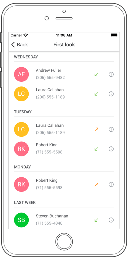
Charts
New Spline Series
This release introduces a new Spline chart type to our Xamarin.Forms and our Native mobile charting library.
Documentation
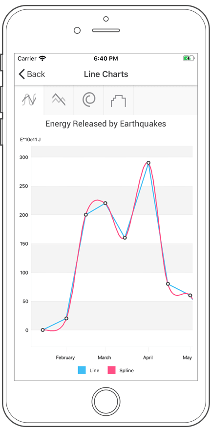
Point and Segment Colorizers
v20.2 introduces Point and Segment Colorizers to our Xamarin Forms and our native mobile charting library. This new feature allows you to define colors for series points and line/area segments based on data. You can use a predefined colorizer (for example, color-each or value-range) or implement a custom algorithm as needed.
Documentation
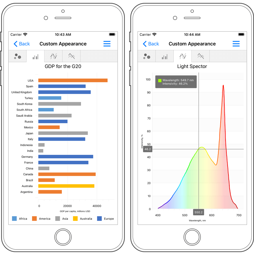
Axis Label Format Enhancements
Our Xamarin Chart View can now automatically format DateTme and Numeric axis labels - this feature allows you to display extended information within chart axes.
Documentation
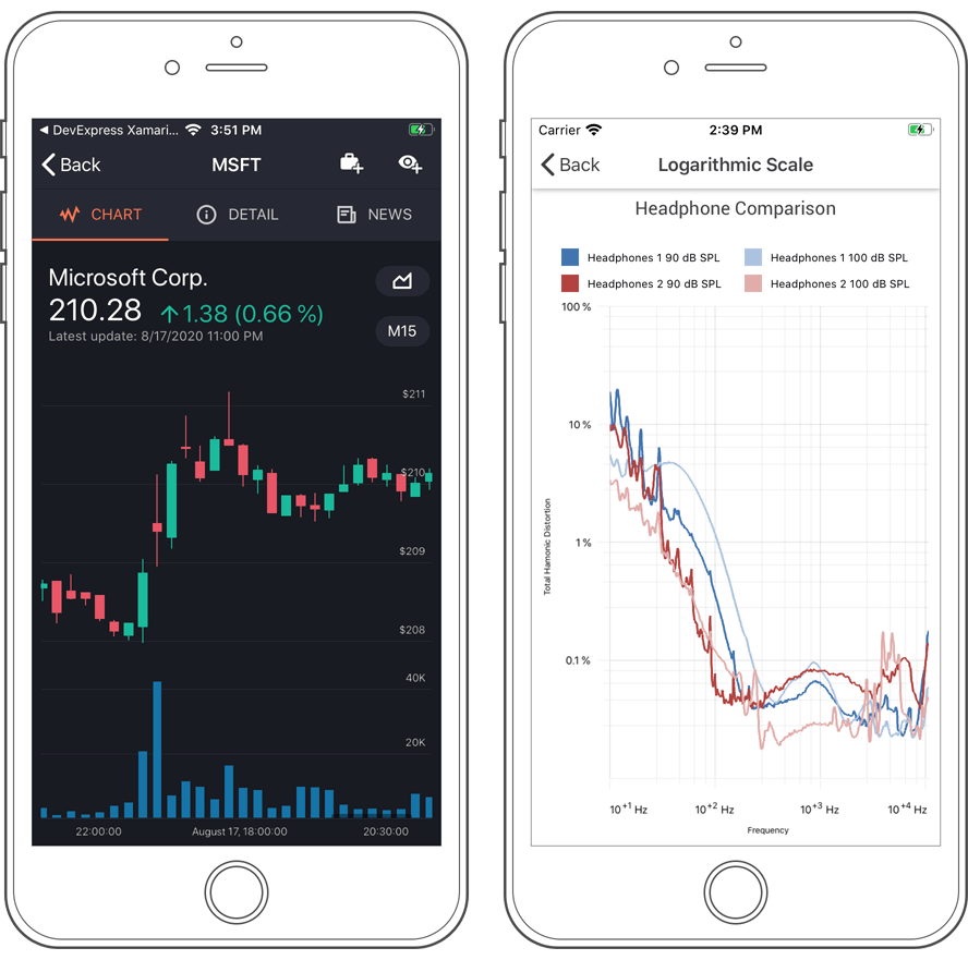
Data Form
Layout Enhancements
Data Grid
Virtual Horizontal Scrolling
Our new AllowVirtualHorizontalScrolling property substantially improves the performance of the Xamarin.Forms DataGridView (when using a large number of columns). If this option is enabled, the DataGridView only renders columns displayed on-screen and updates its UI elements when a user scrolls the grid horizontally.
DevExpress Cell Editors
In previous versions, the DevExpress Xamarin.Forms DataGrid used standard editors to display and edit cell values. In v20.2, our Xamarin DataGrid uses the following DevExpress editors instead:
v20.2 also includes three new column types:
- ComboBoxColumn
- AutoCompleteColum
- TimeColumn
Auto-Filter Row
Our Xamarin.Forms DataGrid View ships with a new Auto-Filter Row option. Use it to incorporate search capabilities within your mobile app. When a user enters a keyword in a Auto-Filter Row column, the Data Grid displays only those records that match the specified keyword.
You can control the search operators used (LIKE, CONTAINS, EQUALS, etc) based on the data type associated with a column.
To display the Auto-Filter Row, enable the ShowAutoFilterRow option.
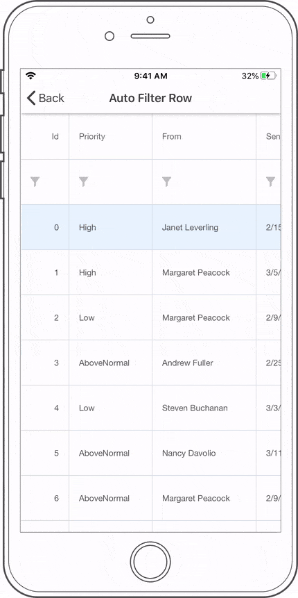
Save/Restore Layout
You can now save the DataGrid layout to a stream and restore it as needed. Our new Save/Restore API includes the following methods:
- SaveLayoutToStream - saves the layout to a specified stream in XML format.
- RestoreLayoutFromStream - restores the layout form a specified stream.
New AutoComplete Edit
Our new Xamarin.Forms AutoCompleteEdit supports the following features:
- Load suggestions in async and sync modes
- Request delay and character threshold
- Progress (wait) indicator
- Submit and Clear buttons
Its API includes events that fire when a user enters text in the edit box, submits a request, or selects a suggestion in the drop-down list.
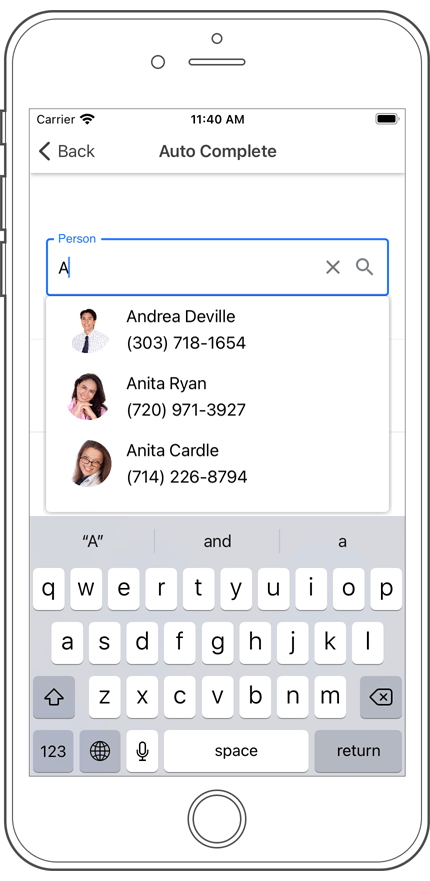
New Numeric Edit
Our new Xamarin.Forms Numeric Editor ships with the following features:
- Number Format
- Maximum Number of Decimal Digits
- Min/Max Value
- Null Value and Placeholder
- Icons (Increment/Decrement, Clear, Error, Custom)
- Help text at the bottom of the editor
- Data Validation and Input Error Indication
- Filled and Outlined Edit Box Types
- Localization support
- Appearance Options
Documentation
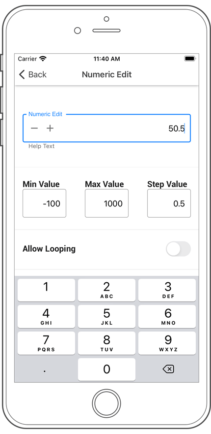
New Date Edit
The DevExpress Xamarin.Forms DateEdit control is a date editor with a native date picker (iOS/Android). It can be used for standalone editing or used within cells of container controls such as the DevExpress Xamarin Forms DataGrid.
Our Xamarin Date Edit supports animated labels, placeholders, help text, input error indication, icons, and appearance customization.
Documentation
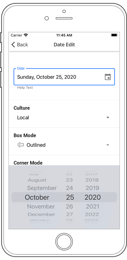
New Time Edit
The DevExpress Xamarin.Forms Time Editor allows a user to select time values. Our Time Edit supports 12 and 24-hour time notation, animated labels, placeholders, input error indication, icons, etc.
Documentation
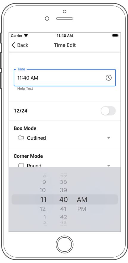
New Check Edit
Our new Xamarin.Forms CheckEdit supports the following features:
- Checked, Unchecked, and Indeterminate states
- Checkbox colors for all states
- Custom images for all check states
- Custom font face, size, and attributes.
New Spline Series
This release introduces a new Spline chart type to our Xamarin.Forms and our Native mobile charting library.
Axis Label Format Enhancements
Our Xamarin Chart View can now automatically format DateTme and Numeric axis labels - this feature allows you to display extended information within chart axes.
Point and Segment Colorizers
v20.2 introduces Point and Segment Colorizers to our Xamarin Forms and our native mobile charting library. This new feature allows you to define colors for series points and line/area segments based on data. You can use a predefined colorizer (for example, color-each or value-range) or implement a custom algorithm as needed.