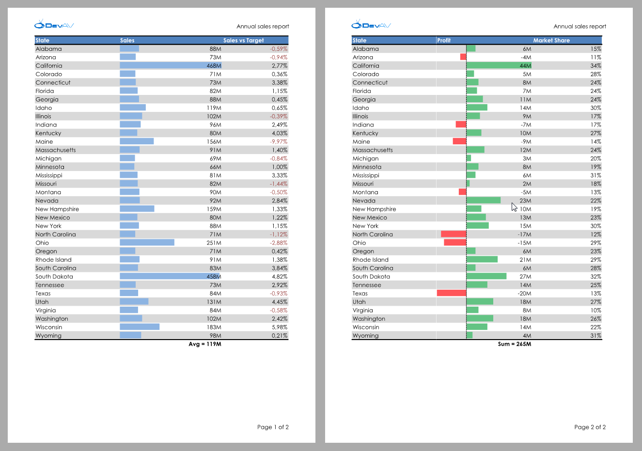
Data Grid Control
Kanban Mode for Tile View
Documentation
Excel Inspired Filtering
v16.2 introduces new MS Excel-inspired column filter popups which make creating filter criteria easier.
New filter popups consist of two tabs:
- The first tab allows you to select from among all available values.
- The second tab allows you to create a filter expression using a set of filter operators (Equals, Between, Contains, etc.).
Documentation
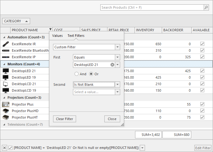
Chart Control
End-User Chart Designer Enhancements
- Localization.
- Property filtering.
- Ability to change the Designer's caption and icon.
Documentation
Crosshair Enhancements
The DevExpress WinForms Chart Control v16.2 ships with the following enhancements:
- Obtain the highlighted Series Point via hit-testing.
- HTML Formatting (Crosshair series labels).
- Value duration formatting.
- Specify a label's background color.
- New API allows you to display the Crosshair cursor in code.
- Customizable text settings (font, anti-aliasing, etc.).
- New Snap Mode allows you to display information about points with the same argument.
Diagram Control
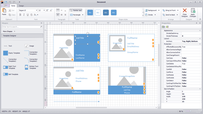
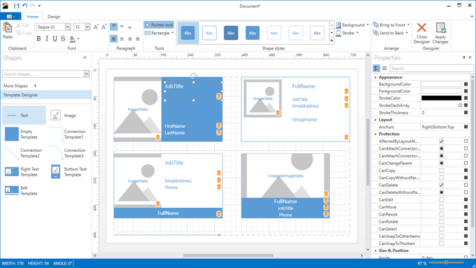
Item Template Designer for Visual Studio
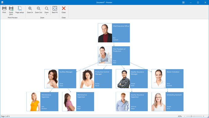
Our new Template Designer for Visual Studio allows you to create templates for diagram items bound to data (including OrgChart elements).
New Diagram Layouts and Settings
New layouts include:
- Circular
- Compact Tree
- Tip-Over Tree
We've also introduced new settings allowing you to configure item spacing, alignment, direction, etc.
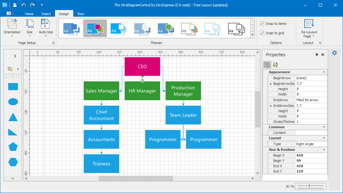
Data Binding Enhancements
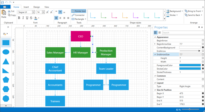
With this release, our WinForms Diagram Control can generate items based on a collection of data objects.
- OrgChartController - Creates an organizational chart from a hierarchical data source with self-referential or nested data structures.
- DataBindingController - Creates graphs of any complexity.
Both data controllers ship with the following features:
- Items and connectors are generated based on templates provided by our Template Designer.
- The ability to generate and update items in code by handling corresponding events.
- Serialization: items can be copied/pasted, saved and loaded preserving bound data.
- Undo/Redo support.
- Automatic layout type selection (Tree, Tip-Over Tree, Sugiyama or Circular).
- If the source collection has been modified, you won't need to worry about keeping the diagram updated. The diagram will be updated automatically.
Video
Item Data Binding
DevExpress Diagram ships with data bindings that can be specified at the diagram item level. Data bindings support Criteria Operator expressions, serialization and deserialization.
Integrated Dock-based UI
With this release, our WinForms Diagram control introduces Microsoft Visual Studio-inspired dock-based UX. This includes built-in support for auto-hide windows, splitters and dock hints.
Item Protection
With this release, you can specify allowed actions for diagram shapes, connectors, containers and other diagram items.
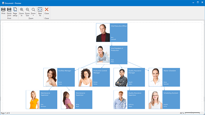
Print Preview
DevExpress Diagram now offers Print Preview support.
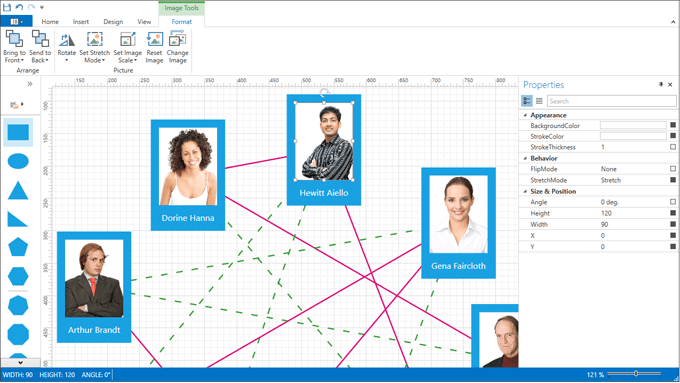
New Image Item
With this release, you can display bitmap images on the Diagram's surface. Capabilities include:
- Ability to load images from a file or stream.
- Image serialization to XML as a file name or as raw data.
- Three stretch modes (stretch, uniform, uniform to fill).
- Image rotation, scaling and flipping.
- Contextual Ribbon Tab with image settings.
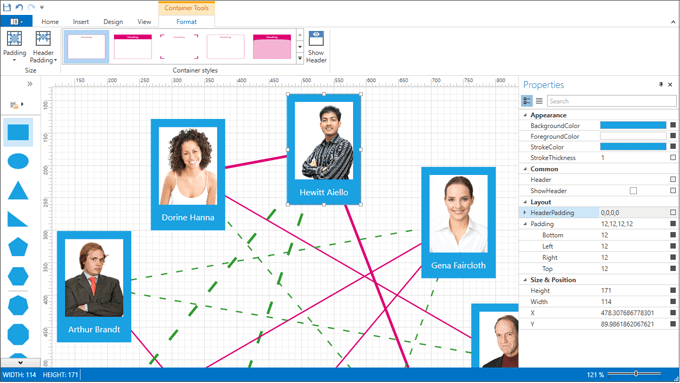
Organizing Diagrams with Containers
DevExpress Diagram now supports use of item containers to help you keep information organized and easier to understand. This includes:
- Customizable headers and paddings.
- Built-in container shapes.
- Ability to create custom container shapes.
- Themes and styles.
- A Ribbon gallery with available containers.
- Contextual Ribbon tab with container settings.
Item Appearance Customization
With this release, you can paint items manually by handling the CustomDrawItem event.
Right-Angle Connector Route Customization
End-users can now customize Right-Angle connector routes by dragging individual line segments.
Miscellaneous Enhancements
- Ability to hide the QuickShapes stencil from the Toolbox.
- Proportional item resizing.
- Ability to drag containers by any point (not just by its border).
- Items partially covered by the selection rectangle can also be selected.
- New Ribbon commands allow end-users to display the Toolbox and Properties Window.
- New events allow you to specify which item properties should be serialized and/or displayed within the Properties Window.
- Ability to easily create custom tools and replace the standard ones in the Ribbon.
Editors
New Page Number Editor
A new PageNumberEdit control emulates the page selectors in popular PDF Viewer applications. It allows you to select a page number while displaying the total number of pages. The control is adapted to be used in-place within DevExpress Bars and Ribbon controls.
New Input Box Control
Custom Control Behaviors
This release introduces custom Behaviors for WinForms editors and controls. A Behavior is an external class that implements a certain functionality for a control using its public API. These include:
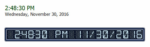
ClockBehavior
Displays the current date and/or time. This Behavior can be attached to LabelControl, BarStaticItem and DigitalGauge.
BannerBehavior
Transforms a PictureEdit control into an image slider.
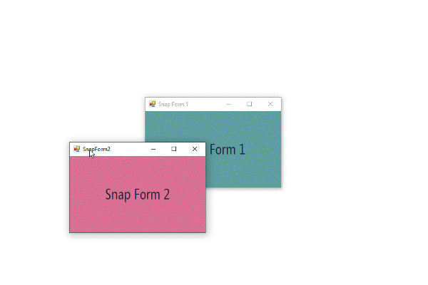
SnapWindowBehavior
Turns standard and DevExpress forms into sticky windows that can snap to other windows and screen edges.
PersistenceBehavior
This behavior can be attached to a form to restore its previous position and size at runtime.
Documentation
Wait Indicator Inspired by Visual Studio
With this release, we've introduced a new wait indicator (Line) for the Progress Panel and Transition Manager.
Miscellaneous Enhancements
Radio Group
Items can now be aligned to the top and left edges.
Checked ComboBox Edit
We've implemented the DrawItem event allowing you to paint items manually.
MemoEx Edit
New API includes properties allowing you to hide OK and Cancel buttons in the popup window.
Image Slider
v16.2 introduces the auto-play feature.
Layout Manager
Layout Control Enhancements
Expand\Collapse via Splitter Items
The Splitter item, which is used to resize layout elements on-the-form, supports the expand/collapse functionality. This allows end-users to temporarily hide a part of a layout with a single mouse click.
Animation Effects
Animation effects are now used when expanding/collapsing layout groups and when switching between tabs.
Tabbed Control Group Custom Header Buttons
You can add custom buttons in the group's header region to implement various context specific tasks.
Custom Draw
New custom draw events allow you to paint or highlight individual layout items.
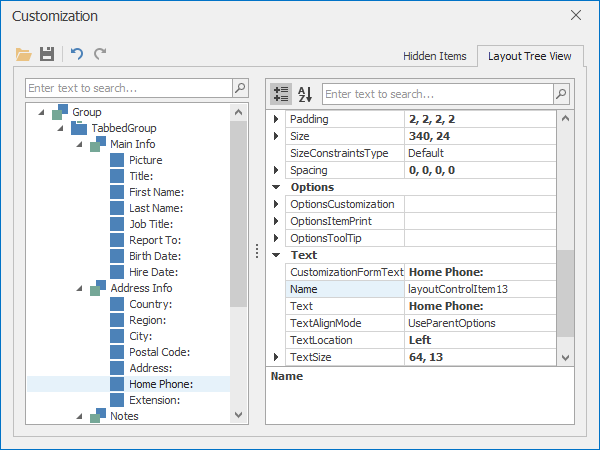
Customization Form and Context Menu - Updated UI
The Customization Form features the new, more compact layout of controls, still providing easy access to layout items, tree structure and templates. The Context Menu has been revamped by rearranging commands in a more consistent way, and by adding new actions. The Add Control action helps you add common DevExpress controls to the form with a single click. Elements of the Customization Form and Context Menu now use new SVG images, which automatically adjust their colors according to the current skin.
Data Layout Control - New UI for Data Binding Wizard
The Data Binding Wizard now features a new modern looking UI, helping you easily specify data binding options and select fields to be retrieved from the bound data source.
DataLayoutControl - Support for Collection Properties
To display and edit collection properties, the DataLayoutControl can now automatically generate a grid control. This feature can be enabled with the AllowGeneratingCollectionProperties option, and in the control's Data Binding Wizard.
Flow Layout Mode - Multiple directions support
With the new FlowDirection property, you can choose the item arrangement direction - top-to-bottom, bottom-to-top, right-to-left, and the default left-to-right.

Design-Time Enhancements
Item resizing has been improved to provide smooth user experience.
Map Control
Vector Map - Performance Improvements
Shapefiles are now loaded faster. It will also take less time to render vector items (except bubbles and pies) in the following cases:
- Items with the same fill color are drawn faster;
- Path segments with same color are drawn faster;
- Detailed shapes are simplified on small zoom levels.
Design-Time Enhancements
- MapControl displays its visual elements (e.g. minimap, legends and overlays).
- Ability to select visual elements.
- The structure tree displays map layers and their data providers and allows you to select map elements.
- Smart tags are now displayed for each element within the structure tree allowing you to configure an element's options.
- You can add a new layer with the specified data provider (if any) using the context menu.
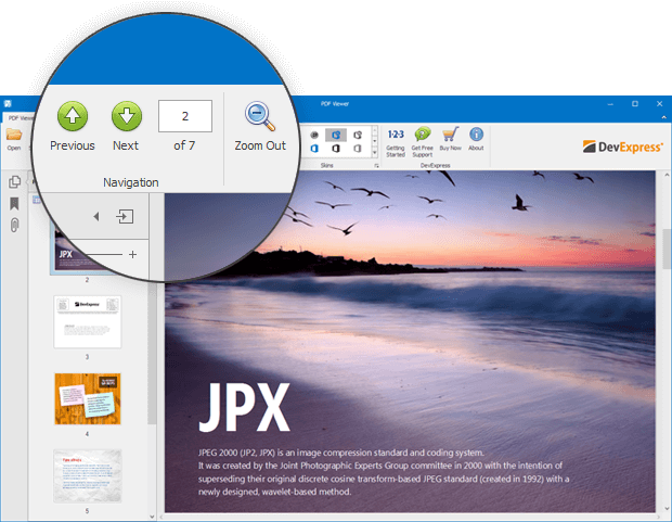
PDF Viewer
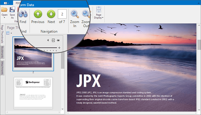
Pager
With the v16.2 release, we’ve added a pager to the ribbon and bar toolbars. The pager indicates the current page number and the total number of pages.
Documentation
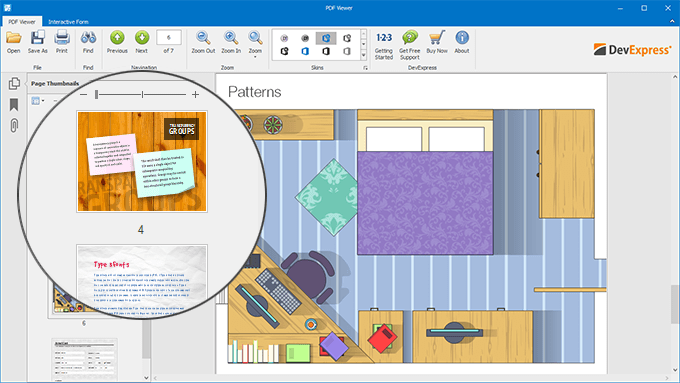
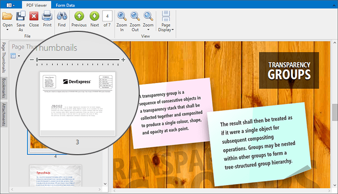
Thumbnail Navigation
With the v16.2 release, we've introduced navigation by page thumbnails. Page thumbnails represent document page previews. The Page Thumbnails panel allows you to do the following:
- Navigate through the PDF document by clicking page thumbnails.
- Enlarge or reduce thumbnails size.
- Print pages which correspond to selected thumbnails.
Documentation
Marquee Zoom
The DevExpress PDF Viewer introduces the Marquee Zoom tool allowing you to zoom either entire PDF document or a selected page area.
Documentation
Performance Enhancements
Text documents are now rendered up to 30% faster. We have also optimized document printing. For instance, text documents can be printed to the XPS writer up to four times faster. In addition, the resulting XPS file is approximately 20 times smaller.
Blog Post
Pivot Grid Control
Olap Ragged Hierarchy Support
Our WinForms Pivot Grid Control now supports OLAP ragged hierarchies.
Property Grid
Miscellaneous Enhancements
Our WinForms Vertical Grid now offers Data Annotation Attributes Support. You can customize row, data and validation settings at the data source level.
We've also improved scrolling behavior and control resizing.
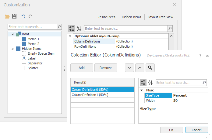
Collections are now edited using our new DX Collection Editor. The new Collection Editor supports DevExpress skins, search, multi-select and assembly version display.
Ribbon and Bars
Ribbon and Toolbar Enhancements
v16.2 ships with the following Ribbon and Toolbar enhancements:
The Ribbon control's ColorScheme property has been extended to support new color variations in Office 2016 and Office 2013 themes. This allows you to colorize the Ribbon UI (title bar, main menu and main application button) with distinct colors (even when using the same skin across apps).
Documentation
Bar items without images assigned can now display a 'stub' caption-based glyph. The first or second initials are displayed with a colored background. You can customize color options, font attributes, text alignment, text case mode and background shape.
Documentation
Embedded editors (BarEditItems) can now be grouped into non-breaking containers (BarButtonGroups) in the Ribbon Control.
Via our new on-the-form commands, it's never been easier to add Ribbon Pages, Page Groups and Page Categories at design-time.
SVG Support
This release adds support for vector images.
Documentation
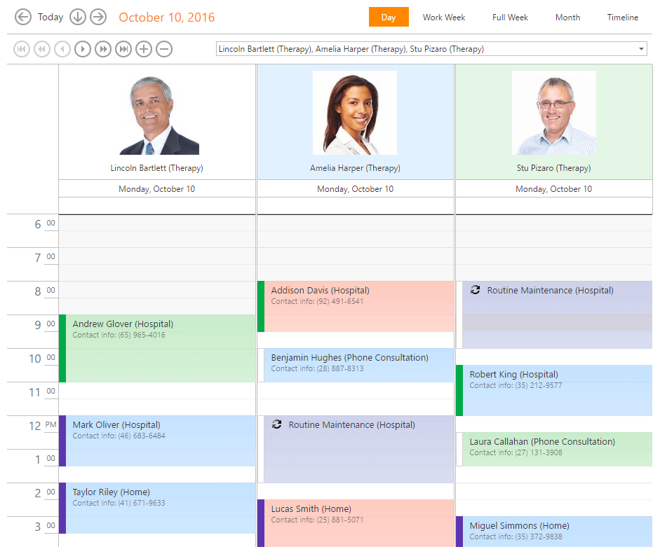
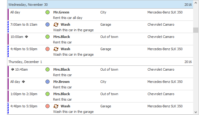
Scheduler Control
Performance Improvements
This release includes performance enhancements aimed at improving scrolling speed and rendering when changing from one Scheduler View to another (Month, Timeline and Gantt Views).
Accessibility Support Enhancements
With this release, we've introduced improved screen reader support. MS Narrator and third-party screen reader applications can now read and spell all significant visual elements. The accessibility level of all Scheduler Views is now comparable to that of Microsoft Outlook.
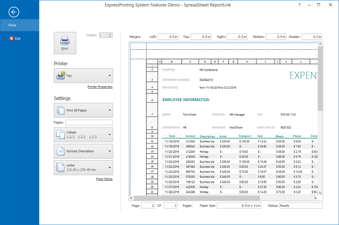
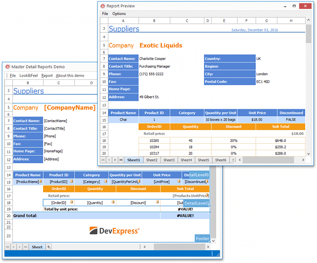
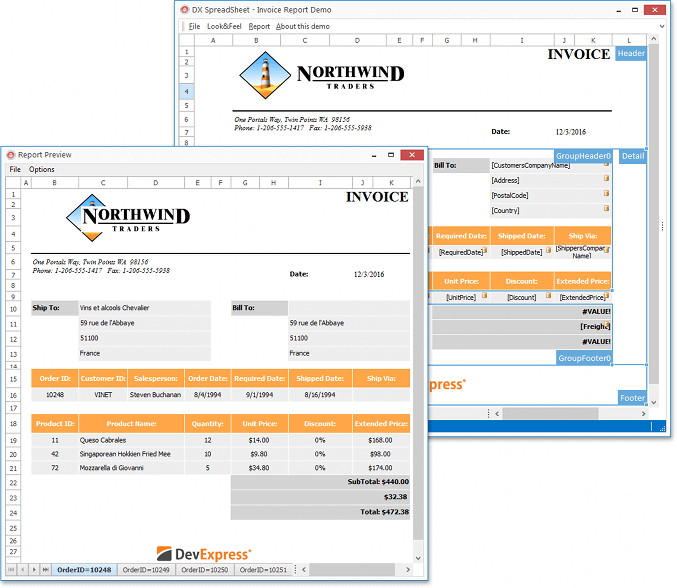
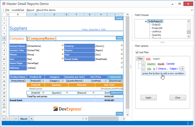
Spreadsheet Control
Two-Way Data Binding
With this release, our Spreadsheet Control provides a simple and consistent way to manipulate data. You can now bind a worksheet or specific cell range to a data source.
A cell range can also be used as a data source for any DevExpress or third-party data-aware control (Data Grid, Chart, etc.). All data-related modifications affecting the worksheet are immediately propagated to bound controls and changes made within external controls are immediately reflected in the worksheet.
Documentation
Blog Post
Print Titles
DevExpress Spreadsheet allows you to print titles for individual documents. If a worksheet occupies more than one page, you can repeat row or column headings on each printed page in order to help improve readability.
Documentation
Blog Post
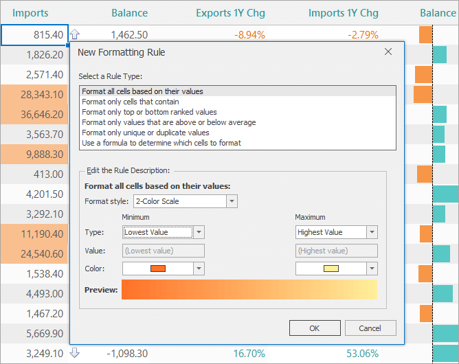
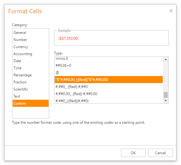
New Formatting Rule Dialog
v16.2 ships with a new Formatting Rule dialog. It allows end-users to create format conditions and customize the appearance of cells as needs dictate.
Documentation
Blog Post
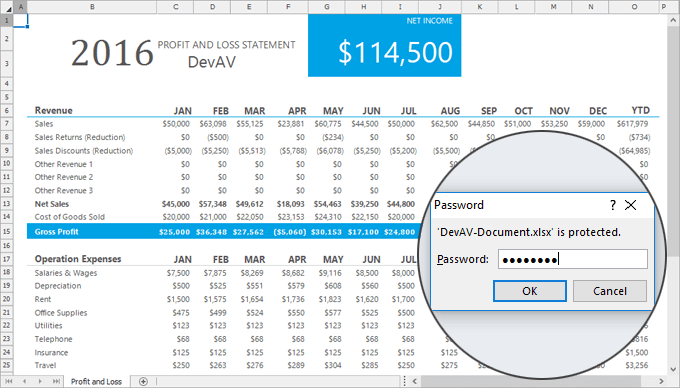
XLSX/XLSM File Encryption
With this release, the Spreadsheet Control supports XLSX/XLSM file encryption. You can encrypt documents using standard or agile encryption.
Documentation
Blog Post
Design-Time Enhancements
DevExpress designers have been adapted to support hi-resolutions display devices.
Additionally, pressing F1 in a Designer's Properties window will now display the corresponding help topic. And, the 'Learn more online' action will now navigate to a help topic that describes the selected control/component.
Miscellaneous
Data-Aware Export Enhancements
Unbound Column Export (Data Grids)
If a Data Grid (WinForms, ASP.NET or WPF) contains an unbound column whose values are calculated based on an expression, you can choose to export the column's calculated values or the column's expression. If a column's expression is exported, column values will be calculated by the worksheet.
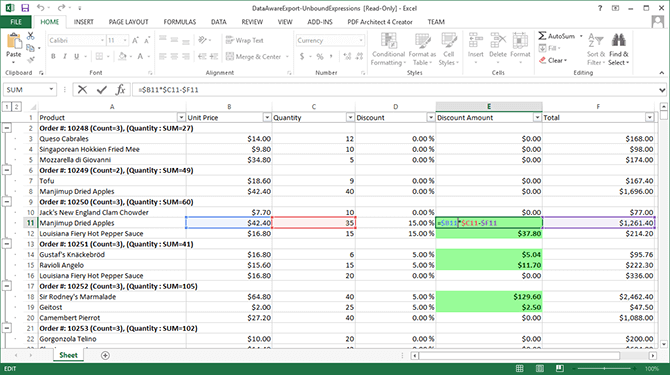
Export to Native Excel Table
With this release, you can also export data from Data Grids into native Excel tables. This option offers numerous formatting options and makes data analysis and management much easier. A new BeforeExportTable event allows you to customize a table prior to its export to Excel.
Animations
With the v16.2 release, the DevExpress Text Editor and its descendants can display animated GIF files.
The following controls support animated transitions when their states are changed:
- ProgressBarControl (value changing)
- PictureEdit (value changing)
- SparklineEdit (value changing)
- XtraTabControl (switching between tabs)
- TabForm (switching between tabs)
- Tabbed Groups in Layout Managers (switching between tabs)
- Data Grid (data sorting)
- TextEdit (switching to another ContextImage)
All these controls provide their own properties to enable and customize these animation effects. We've also added a new WindowsFormsSettings.AnimationMode global setting that allows you to:
- Disable all animation effects in all controls;
- Enable all animation effects;
- Enable animation effects when required.
Sticky Forms and Dock Panels
This release adds support for the 'snapping' feature in Windows and DevExpress forms, which helps you stick the form to the screen edges, a grid or other sticky forms.
The 'snapping' feature can be enabled for built-in Customization Forms (Column Choosers) in the Data Grid, Tree List, Pivot Grid and Layout Manager. You can specify whether Customization Forms are allowed to stick to the screen edges, owner control, owner form and/or other sticky forms.
The snapping feature is also provided for floating Dock Panels and floating documents implemented with the App UI Manager (DocumentManager component). The same snap modes are available as for Customization Forms.
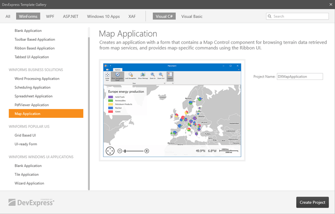
Template Gallery - New Templates
In this release we expanded our template gallery with new project and project item templates. Among them are:
- PdfViewer Application
- Map Application
- Wizard Form
MVVM Support - For certain project templates, you can now choose between traditional and MVVM-aware modes. These project templates provide the 'MVVM Ready' option, which enables the generation of the View and ViewModel layers.
Flyout Dialog Enhancements
- Ability to specify the default (highlighted) button.
- Keyboard navigation support.
- Ability to add buttons to a dialog when the dialog is already displayed.
Workspace Manager Enhancements
- New events allow you to cancel serialization and deserialization of required properties.
- Ability to specify the layout serialization options for individual controls.
- Ability to respond to changes within the workspace collection by handling the corresponding event.
- The workspace name is now stored inside saved files locally.
Accordion Enhancements
- Ability to assign control and edit text, image and context buttons to Accordion elements via a customization popup form.
- Ability to add and remove accordion elements at design time using a context menu.
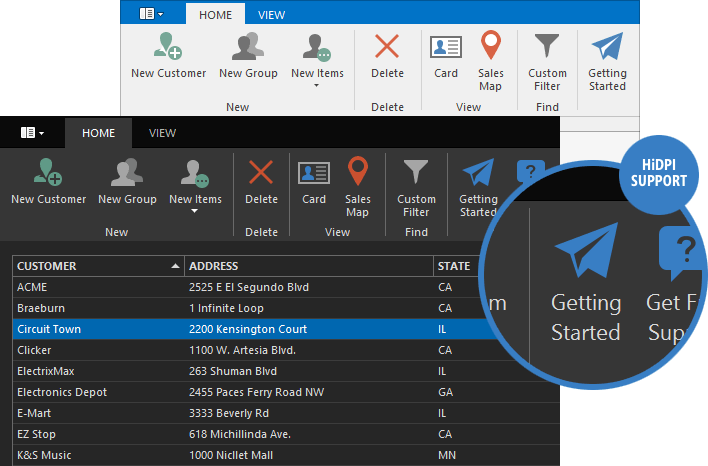
- HiDPI Support (Automatic image scaling).
TabForm Improvements
- Play animation when switching between tabs.
- Animated GIF files in tab headers.
- Ability to specify a tab's minimum width.
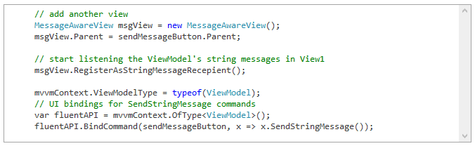
MVVM Enhancements
- Binding improvements include: formatting and converting values, error handling and validation.
- New behaviors allow you to bind commands to specific keyboard keys (the KeyToCommand behavior) and call required methods when a command is executed (the CommandToMethod behavior).
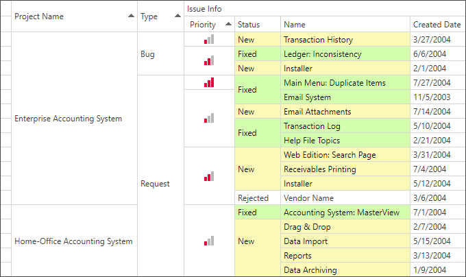
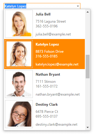
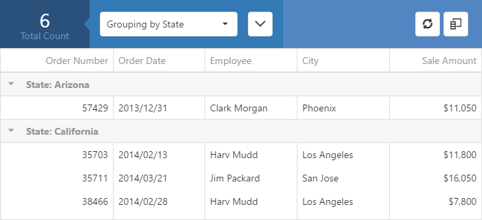
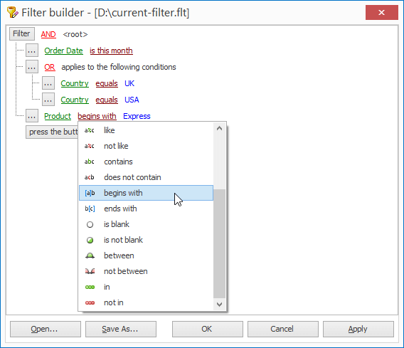
Data Grid Control
Excel Inspired Filtering
v16.2 introduces new MS Excel-inspired column filter popups which make creating filter criteria easier.
New filter popups consist of two tabs:
- The first tab allows you to create a filter expression using a set of filter operators (Equals, Between, Contains, etc.).
- The second tab allows you to select from among all available values.
Documentation
Fixed Rows
The DevExpress WPF Grid Control allows end-users to pin required data rows to top and bottom.
Documentation
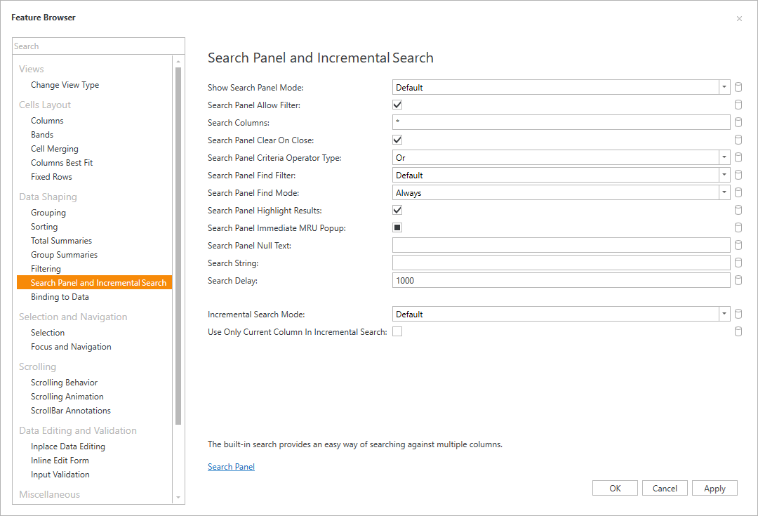
Feature Browser for Visual Studio
With this release, design-time experience becomes easier and intuitive. Our new Feature Browser allows you to quickly locate and specify the grid's feature-specific settings.
Documentation
Cell Merging in Banded View
Documentation
Generate Bands from a BandSource
With this release, our WPF Grid Control can populate its bands from a ViewModel.
Documentation
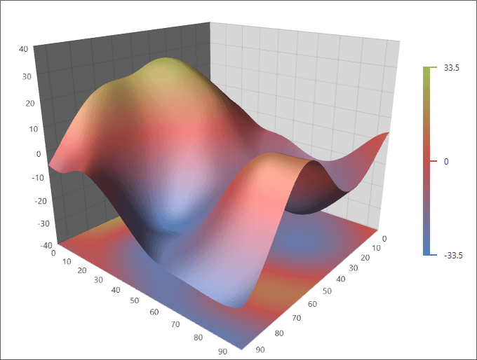
Chart Control
New Chart 3D Control
This release includes our new Chart 3D Control for WPF. This control allows you to visualize 3D data sets as Surface, 3D Bars, 3D Scatter Points or Bubbles.
Features include:
- Flexible binding options.
- Built-in series colorization algorithms.
- Legends.
- Titles.
- Interactivity (Crosshair, hit-testing, runtime interaction, etc).
Documentation
Crosshair Improvements
-
Value duration pattern formatting.
Total values for value duration (total days, hours, minutes, etc.) can be formatted with standard double formats using new placeholders (VDTD, VDTH, VDTM etc.).
- Crosshair Popup Template.
-
New out of visual range series points Crosshair behavior.
Series points which are out of axis' visual range can now be shown in the crosshair label.
- Ability to display the Crosshair cursor using code.
-
Ability to always show group headers. Now crossrair group headers can be always shown if the following conditions are met:
- header pattern is specified;
- headers are enabled.
-
New CrosshairOptions.SnapMode (Only points with the same argument are shown in the Crosshair).
We add the capability to select how to take points for the Crosshair. Now points can be selected as before (default mode), taken from some range around the crosshair cursor and by certain axis value specified by the crosshair cursor.
Diagram Control
Item Template Designer for Visual Studio
Our new Template Designer for Visual Studio allows you to create templates for diagram items bound to data (including OrgChart elements).
OrgChart Enhancements
- Serialization (diagram items can be copied/pasted, saved and loaded preserving bound data).
- Undo/Redo support.
- Templates created using DevExpress Template Designer for Visual Studio.
- Automatic layout type selection (Tree, Tip-Over Tree, Sugiyama or Circular).
- Automatic diagram updates (when the source collection is modified).
Video
Data Binding Enhancements
With this release, we've implemented data binding. Our WPF Diagram control can now automatically generate graphs of any kind and complexity based on a collection of data objects.
The new DataBindingBehavior object accepts two collections and creates diagram items with required connections. The new binding behavior supports templates (created in XAML or using the DevExpress Template Designer for Visual Studio), implements customization events, supports our built-in layout algorithms, etc.
Item Data Binding
DevExpress Diagram ships with data bindings that can be specified at the diagram item level. Data bindings support Criteria Operator expressions, serialization and deserialization.
New Diagram Layouts and Settings
New layouts include:
- Circular
- Compact Tree
- Tip-Over Tree
We've also introduced new settings allowing you to configure item spacing, alignment, direction, etc.
Item Protection
With this release, you can specify allowed actions for diagram shapes, connectors, containers and other diagram items.
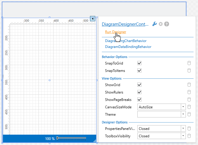
Run the Diagram Designer from a Smart Tag
Print Preview
DevExpress Diagram now offers Print Preview support.
New Image Item
With this release, you can display bitmap images on the Diagram's surface. Capabilities include:
- Ability to load images from a file or stream.
- Image serialization to XML as a file name or as raw data.
- Three stretch modes (stretch, uniform, uniform to fill).
- Image rotation, scaling and flipping.
- Contextual Ribbon Tab with image settings.
Organizing Diagrams with Containers
DevExpress Diagram now supports use of item containers to help you keep information organized and easier to understand. This includes:
- Customizable headers and paddings.
- Built-in container shapes.
- Ability to create custom container shapes.
- Themes and styles.
- A Ribbon gallery with available containers.
- Contextual Ribbon tab with container settings.
Right-Angle Connector Route Customization
End-users can now customize Right-Angle connector routes by dragging individual line segments.
Miscellaneous Enhancements
- Ability to hide the QuickShapes stencil from the Toolbox.
- Proportional item resizing.
- Ability to drag containers by any point (not just by its border).
- Items partially covered by the selection rectangle can also be selected.
- New Ribbon commands allow end-users to display the Toolbox and Properties Window.
- New events allow you to specify which item properties should be serialized and/or displayed within the Properties Window.
- Ability to easily create custom tools and replace the standard ones in the Ribbon.
Editors
New Toggle Switch Editor
Documentation
New Hyperlink Editor
The new Hyperlink editor displays its content as a hyperlink. The editor can function in both standalone and cell-based mode.
Documentation
Token Editor Enhancements
- Token styling via custom WPF styles.
- Clipboard Support.
- Improved MVVM support and API for in-place data editing.
MVVM & Scaffolding
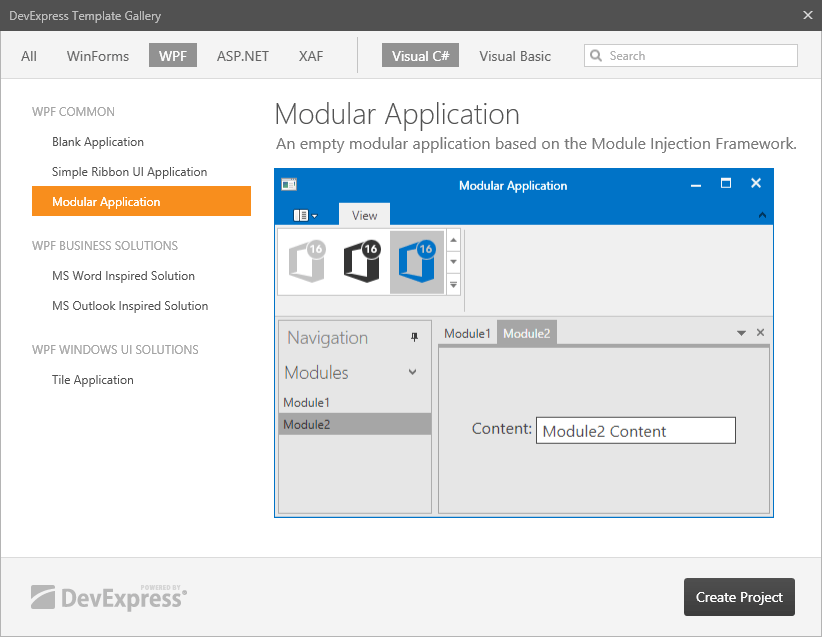
New Module Injection Framework (BETA)
Our new Module Injection Framework (MIF) makes it easier to develop, test, maintain, and deploy modular applications built with loosely coupled modules.
The frameworks's key features include:
- Automatic persistence of the application's logical state and layout.
- Code separation into logical modules coupled with straightforward navigation.
- Unit Testing.
Blog Post
Localization Support
Scaffolding can now generate localization resources for multiple languages.
All generated views will use localization strings stored in common resources.
Entity Framework Core Support
We now offer Entity Framework Core Data Layer support.
Unit of Work Policy
Now a single UnitOfWork can be shared across multiple ViewModels. This makes it possible to change multiple entities in a single transaction.
View Customization Enhancements
With this release, all common view styles are stored in the Resources folder. This allows you to customize view settings in a single location and avoid code duplication.
PDF Viewer
Pager
With the v.16.2 release, we’ve added a pager to the ribbon and toolbars. The pager displays the current page number and the total number of pages and allows your end-users to quickly navigate pages.
Documentation
Page Thumbnails Panel
This release introduces the Page Thumbnails panel that shows page thumbnails of an active PDF document. The panel is located in the Navigation pane.
Page thumbnails provide miniature previews of document pages. You can perform the following actions in the Page Thumbnails panel:
- Navigate through the document by selecting the page thumbnails.
- Enlarge or reduce thumbnails size.
- Print pages that correspond to selected thumbnails.
Documentation
Performance Enhancements
Text documents are now rendered up to 30% faster. We have also optimized document printing. For instance, text documents can be printed to the XPS writer up to four times faster. In addition, the resulting XPS file is approximately 20 times smaller.
Blog Post
Pivot Grid Control
Olap Ragged Hierarchy Support
Our WPF Pivot Grid Control now supports OLAP ragged hierarchies.
Spreadsheet Control
Two-Way Data Binding
With this release, our Spreadsheet Control provides a simple and consistent way to manipulate data. You can now bind a worksheet or specific cell range to a data source.
A cell range can also be used as a data source for any DevExpress or third-party data-aware control (Data Grid, Chart, etc.). All data-related modifications affecting the worksheet are immediately propagated to bound controls and changes made within external controls are immediately reflected in the worksheet.
Documentation
Blog Post
Print Titles
DevExpress Spreadsheet allows you to print titles for individual documents. If a worksheet occupies more than one page, you can repeat row or column headings on each printed page in order to help improve readability.
Documentation
Blog Post
UI Enhancements
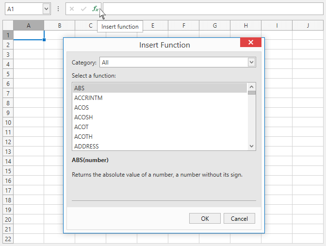
Our new Insert Function and Function Arguments dialogs allow end-users to select the desired function from a list, insert it into a cell formula and specify function arguments.
Our New Formatting Rule dialog allows end-users to create a new conditional formatting rule and customize the appearance of cells that meet specific conditions.
XLSX/XLSM File Encryption
With this release, the Spreadsheet Control supports XLSX/XLSM file encryption. You can encrypt documents using standard or agile encryption.
Documentation
Blog Post
Toolbar and Menu
Any Image Size Support
In this release, we've simplified the use of bar item images. You can now add images of any size and optionally specify their proportions using the CustomGlyphSize property. If this property isn't specified, the glyph will be scaled automatically based on item content.
Hide Item Glyphs from Popup Menus
You can now hide bar item glyphs displayed in popup menus by disabling the bar manager's ShowGlyphsInPopupMenus option.
Miscellaneous
Data-Aware Export Enhancements
Unbound Column Export (Data Grids)
If a Data Grid (WinForms, ASP.NET or WPF) contains an unbound column whose values are calculated based on an expression, you can choose to export the column's calculated values or the column's expression. If a column's expression is exported, column values will be calculated by the worksheet.
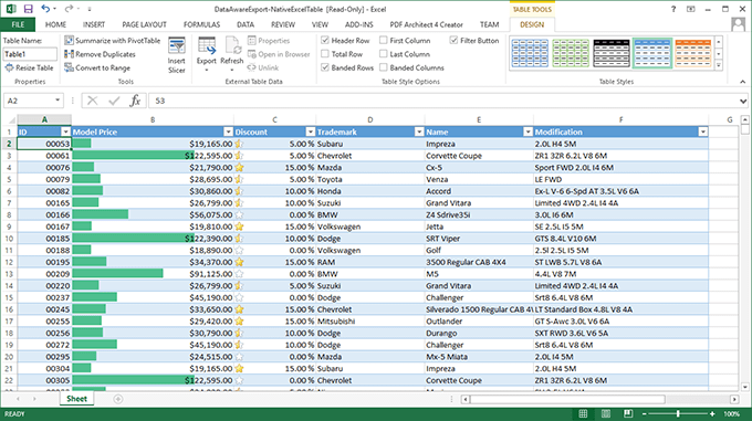
Export to Native Excel Table
With this release, you can also export data from Data Grids into native Excel tables. This option offers numerous formatting options and makes data analysis and management much easier. A new BeforeExportTable event allows you to customize a table prior to its export to Excel.
GridView Control
Accessibility Enhancements
This release incorporates a number of accessibility specific enhancements so you can deliver accessible web applications for people with disabilities - including those who use assistive technologies such as screen readers.
The rendering of our ASP.NET Grid Controls has been improved by adding WAI-ARIA attributes to identify features and elements for user interaction. The following grid features and UI elements support assistive technologies and can be identified and read by screen readers:
- Batch edit mode (GridView, CardView, VerticalGrid);
- Header filter popup (GridView, CardView, VerticalGrid);
- Page size selector (all controls with the built-in pager);
- In-callback updates (improved notification).
Our new client-side API allows you to send custom messages that can then be read by screen readers.
Demo Web Forms
Demo MVC
Fixed Column Enhancements
With this release, we've improved the functionality of fixed columns within our ASP.NET Grid Control so it is able to support complex layouts. The following layout features are now fully compatible with fixed columns:
- Grouping
- Detail rows
- Previews
- Filter, footer and data row templates
- Edit form
- Error row
Demo Web Forms
Demo MVC
Client-Side Processing of Column Reordering
Our ASP.NET Grid Control now offers a client-side "column reordering" mode. In this mode, when an end-user moves a grid column using drag-and-drop, the GridView re-renders itself to reflect new layout changes without initiating a round trip to the server.
Demo Web Forms
Demo MVC
Documentation
Postponed Column Resizing
With our v16.2 release, your web app can now postpone column resizing. By default (Live resizing), the DevExpress ASP.NET Grid is redrawn continuously as an end-user drags a column. When using our new Postponed mode, column resizing is visually indicated by a resizable frame, while the grid itself is redrawn only after resize operations have been completed. This new mode is also available in our ASP.NET TreeList Control.
Demo Web Forms
Demo MVC
Documentation
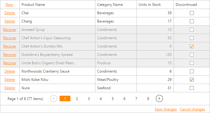
Highlight Removed Rows (Batch Edit Mode)
In previous versions, when an end-user deleted a data row with batch edit mode enabled, the deleted row was hidden from view. With this release, deleted rows are not hidden and instead marked with the specified color. We've also added a Recover command that cancels the delete operation.
This new feature is also available in our Vertical Grid and Card View Controls.
Demo Web Forms
Demo MVC
Banded Columns - End-User Layout Customization
End-users can now create multi-line column layouts via drag and drop operations.
Demo Web Forms
Demo MVC
Documentation
Chart Control
Crosshair Enhancements
v16.2 introduces the following Crosshair features (Web Forms and MVC):
- Value duration formatting.
- Ability to specify a label's background color.
- New API allows you to display the Crosshair cursor programmatically.
- Ability to customize text settings (font, anti-aliasing, etc.).
- New Snap Mode allows you to display the information about points with the same argument.
API Improvements (ASP.NET MVC)
New action methods simplify chart initialization and make code more readable:
- No type casting is required to get a Diagram, SeriesView or SeriesLabel object.
- Ability to add elements to the following collections: Series, Panes, Legends, Indicators, Constant Lines, Strips, Titles, Axes, Annotations, etc.
- Ability to access SeriesTemplate, DefaultPane and DefaultLegend settings.
Editors
List Editors - Customizable Item Appearance
With this release, you can now customize the appearance and content displayed within our ASP.NET List-based Editors (ComboBox, ListBox, TokenBox). The following customization options are available:
- Server-side item templates.
- New server-side events allow you to change item style settings.
- Client-side API allows you to customize an item's tooltip, CSS styles and inner HTML.
Demo Web Forms
Demo MVC
Html Editor
Upload Files to a Cloud via Insert Media Dialogs
In this release, our ASP.NET HTML Editor introduces built-in Insert Media Dialogs allowing end-users to upload files to cloud services (Azure, Amazon, Dropbox).
With this new API, you no longer need to implement custom file saving logic. You are allowed to programmatically modify a file's name and content before the file is saved to storage.
Demo Web Forms
Demo MVC
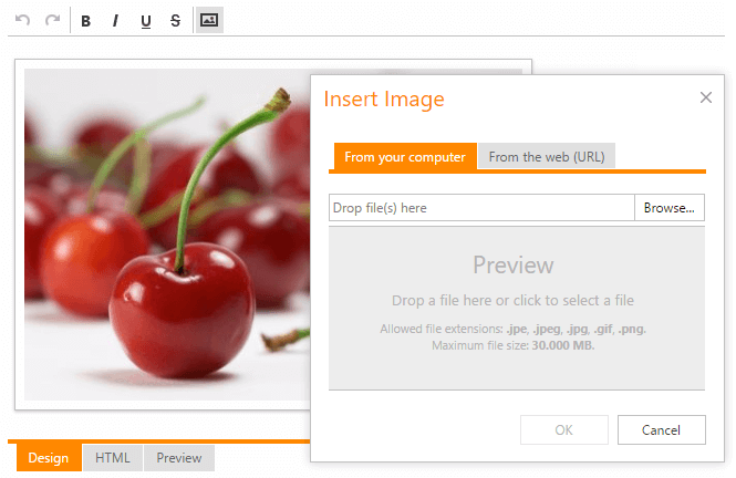
Auto-Save Binary Images (Dropped or Pasted) to the Server
Binary images that are added via drag and drop operations or pasted from the clipboard can now be auto-saved to the server. This makes the output HTML document smaller in size since images don't contain base64 data.
Demo Web Forms
Demo MVC
Pivot Grid Control
Olap Ragged Hierarchy Support
Our ASP.NET Pivot Grid Control now supports OLAP ragged hierarchies.
Scheduler Control
Time Ruler and Day Header Highlighting
With this release, our ASP.NET Scheduler Control can now highlight coordinates of the currently selected time interval within its time ruler and day headers.
Client-Side Rendering
v16.2 ships with the following client-side rendering improvements:
- The Scheduler's client receives required data in JSON and updates its view accordingly across all end-user operations that do not require updates to the Scheduler’s layout (e.g., navigation between dates or resources).
- Client-side rendering speeds up web app execution because it reduces the amount of markup produced on the server.
Documentation
Blog Post
UI Enhancements
This release ships with the following visual enhancements:
- A new lightweight layout for appointments.
- Updated color scheme for appointment resources.
- Appointment selection status is now indicated by the appointment’s opacity for modern web themes.
- Time cell background color has been modified for modern web themes. White is used for work time cells. Light Gray is used for free time cells. You can also specify which portion of a grouped view to fill with resource color: time cells, resource headers or both.
Demo Web Forms
Spreadsheet Control
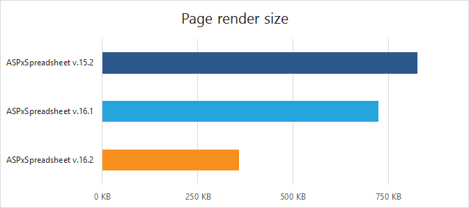
Performance Enhancements
- We've reduced the size of the rendered HTML code. The size of JSON synchronization package for default styles is also smaller.
- Web pages and documents now load faster.
- Command execution is faster.
Blog Post
New 'Format Cells' Dialog
The new 'Format Cells' dialog allows you to format worksheet data. You can specify a cell's background, font color and style, change content alignment, apply cell borders, etc.
End-User Restrictions
Our ASP.NET Spreadsheet continues to extend its worksheet protection support. In this release, we've supported end-user restrictions (e.g. inserting or deleting columns/rows, editing objects, sorting, auto-filtering, etc.) that are already defined in a document.
Demo Web Forms
Demo MVC
Custom Functions
With with release, you can create your own functions. Custom functions are available for spreadsheet calculations and can be used in formulas. Custom functions are not saved in a workbook file. You must add them in code.
Demo Web Forms
Demo MVC
Miscellaneous
File Upload to Web Farms and Web Gardens
Our ASP.NET Upload Control supports IIS clustering technologies (Web Farms or Web Gardens). You can now upload files to Web Farms or Web Gardens from all DevExpress ASP.NET Controls that rely upon our Upload Control (File Manager, Html Editor, Spreadsheet, Rich Text Editor, etc).
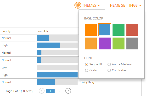
Predefined Themes Customization
You can now modify base color and font settings for prebuilt DevExpress Themes. Theme settings can be specified declaratively in web.config or dynamically in code.
Demo Web Forms
Demo MVC
Accessibility Improvements
- Our new ASPxClientUtils.SendMessageToAssistiveTechnology(string) method allows you to customize assistive technology output (e.g. screenreader's pronunciation);
- In-callback updates (improved notification).
Demo Web Forms
Demo MVC
Angular 2 Support (RTM)
Webpack and Angular CLI Ready
With the v16.2 release, DevExtreme Angular 2 components can be seamlessly used with Webpack and installed into an application created with Angular CLI.
DevExtreme Validation
All built-in DevExtreme validation features are now available inside the DevExtreme Angular 2 components. You can use dx-validator, dx-validation-group, dx-validation-summary components and all available validation rules in your Angular 2 application.
Demo
New Configuration Components
With the v16.2 release, we've introduced two types of configuration components. The first type provides a convenient and efficient way for binding ‘deep’ properties. The second type allows you to declare collection property items (e.g. DataGrid columns, TabPanel tabs, etc.) via markup.
Demo
Documentation
MVC Wrappers (RC)
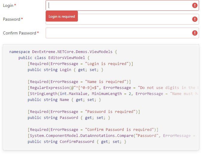
Data Editors - Client-Side Validation
This release introduces integrated client-side data validation and error indication. Validation rules can be defined in a model by attaching Data Annotation attributes (e.g. Required, StringLength, etc.) to corresponding properties.
Demo 1
Demo 2
Documentation
Ability to Submit HTML Forms with Nested DevExtreme Editors
With this release, you can submit HTML forms (e.g. @Html.BeginForm, @Ajax.BeginForm) with nested DevExtreme editors out of the box.
Documentation
Add MVC Wrappers to an Existing Visual Studio Project
Visual Studio developers can now add resources required by ASP.NET MVC Wrappers to an existing MVC project.
Documentation
jQuery 3.x Support
DevExtreme is ready to use with jQuery version 3.x.
Localization
v16.2 introduces ECMAScript Internationalization API support. You can now localize your DevExtreme applications using the Intl global object.
Documentation
Data Grid
Optimized Remote Paging for Grouped DataGrid
The grouped DataGrid can request data only for visible groups instead of loading complete data for all groups. This significantly improves the performance of the DataGrid in scenarios involving large amounts of data.
Documentation
Toolbar Customization
The new onToolbarPreparing event allows you to customize toolbar items (add/delete items, customize item settings).
Demo
API Improvements
Row Selection Improvements
We have made the following improvements in the row selection feature.
Single-Page Selection
Previously, an end user could select all rows on all pages. In this release, we have added a new mode that allows an end user to select all rows within a single page.
Demo
Documentation
Deferred Selection
In deferred mode, the Data Grid does not make requests for data until you demand this in code. This feature is especially useful in scenarios with large amounts of data.
Demo
Documentation
Pivot Grid
Remote Data Processing
With this release, we've made our Pivot Grid work faster by delegating all data intensive operations (filtering, grouping, summary calculation) to the server.
Documentation
Scheduler
Cell Customization
New templates allow you to customize scheduler cells (resource cells, cells within a table, date and time cells).
Demo
View Customization Enhancements
New options allow you to customize scheduler views individually.
Demo
Documentation
UI Widgets
Collection Widgets - Selection Enhancements
-
Select All
With this release, end-users can select all list items across all pages while previously this could be done for loaded pages only.
-
Selection by Item Keys
List, Tabs, Accordion and NavBar widgets allow you to select items in code by item keys.
Demo
Scroll View - Performance Improvements
We have improved the performance of all our widgets with non-native scrolling.
Tree View - Load Data On Demand
With this release, DevExpress HTML5 Tree View introduces dynamic data loading mode. In this mode, only root-level nodes are created when the application starts. Child nodes are loaded when their parent nodes are being expanded.
Demo
Documentation
Data Visualization
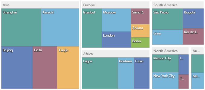
Tree Map - Truncate Overflowing Labels
Demo
Editors
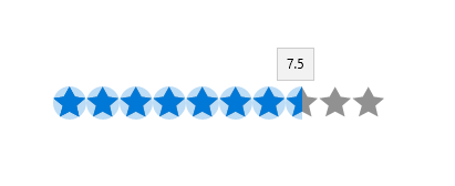
New RatingEdit Control
This release includes a new Rating Editor. Its features include:
- Horizontal and vertical orientation.
- Custom glyphs support.
- Customizable glyph size and color.
- Partly selected glyphs.
Text Editor - Maximum Length
With this release, you can limit the maximum number of characters an end-user can enter.
Grid Control
Column Resizing
End-users can now resize grid columns by dragging a column header's left or right edge.
Incremental Data Loading
With this release, we've supported ISupportIncrementalLoading collections (incremental data loading).
Column Content Alignment
New column options allow you to specify a cells's content alignment (vertical and horizontal).
Miscellaneous
TileBar Enhancements
The DevExpress Windows 10 Controls now include a new TileBarFrame component - a special container for the TileBar control and navigation pages. With a single option, the TileBar can now be placed along any of the four edges of the TileBarFrame, with the active page displayed in the center.
New properties in the TileBarItem class (NavigationTarget, NavigationParameter, NavigationTargetName) simplify the creation and handling of the Tile UI. Automatic synchronization of the currently selected TileBarItem with the active page in the TileBarFrame is supported out-of-the-box.
DXFrame - Hide the Back Button
The Back button can now be hidden from the window's title using the HideBackButton property.
Splash Screen - Progress State
With this release, our default Splash Screen view can display the custom text indicating the current state of the operation.
RangeControl Clients - Application Theme Support
Color schemes first introduced in v16.1 are now fully supported by all Range Control clients.
MVVM - View State Handling Enhancements
With the v16.2 release, we've extended our ISupportNavigationEvents interface to make the process of saving and loading a view state easier. You don't need to implement both ISupportNavigation and ISupportSaveLoadState interfaces because ISupportNavigationEvents provides all required functionality.
MVVM - SplashScreen API Enhancements
- We've implemented the Cancel command. End-users can now cancel SplashScreens and stop the execution of a background operation.
- You can now trigger a command or bind to a property defined in a parent view model using the SplashScreenViewModel.ParentViewModel property.
All Platforms
New Character Comb Control
The XRCharacterComb control allows you to display text so that each character is printed inside an individual cell (e-forms).
Documentation
Document Editing in Print Preview
With this release, you can edit a previewed document prior to printing or export.
Documentation
PDF/A Compliance
We now support PDF/A - an ISO-standardized version of the Portable Document Format. Documents can now be exported to one of the following conformance levels:
Blog Post
Report Server
Billing Statement (Invoice) for Multiple Users
With v16.2, users can schedule and deliver reports (invoices) tailored and addressed to specific recipients. Each task can now generate multiple reports at once based on a single template.
Documentation
Connection String Configuration UI
With this release, configuration of database connections has been simplified and made more intuitive.
Documentation
Scheduled Tasks Management - API Improvements
- Ability to obtain reports generated by a scheduled job.
- Ability to manage subscribers.
- Ability to manage scheduled jobs from a custom application.
Documentation
Web
Document Viewer for Mobile Devices
v16.2 ships with a Document Viewer for mobile devices.
Documentation
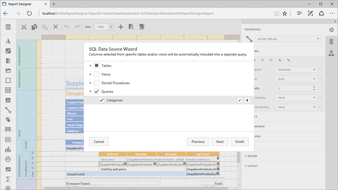
Improved Data Source Wizard
Our new Data Source wizard allows you to create multiple queries and master-detail relationships.
Documentation
WinForms
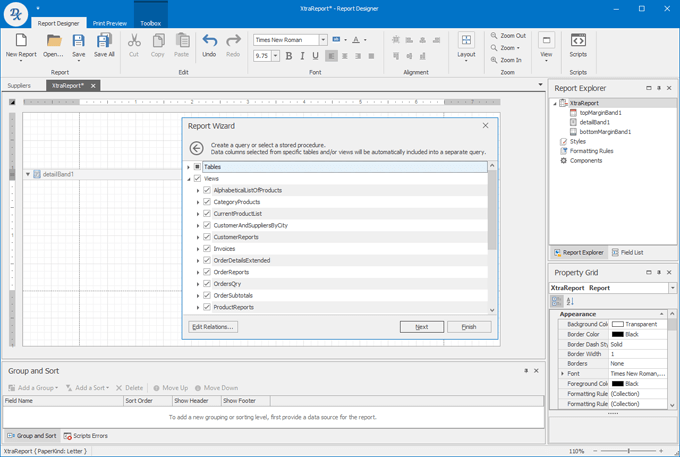
Improved Data Source Wizard
The new Data Source Wizard allows you and your end-users to create multiple queries and master-detail relationships.
Documentation
Updated GUI with Support for Vector Icons
To improve the look and feel of apps powered by DevExpress Reports across high resolution monitors, all bitmap icons have been replaced with SVG images (both in the End-User Report Designer and in the Document Viewer control).
Documentation
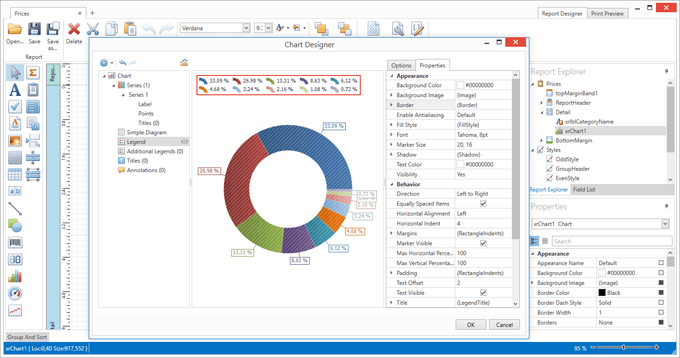
WPF
Report Designer - Charts Designer
With this release, the DevExpress WPF Report Designer ships with an integrated Chart Designer.
Report Designer - Wizard Customization API
With this release, we've implemented a new API that allows you to customize our wizards (Data Source Wizard and Report Wizard) as your application requirements dictate (modify page UI, customize appearance, implement custom logic, etc.).
Documentation
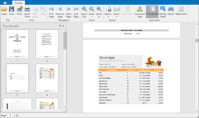
Document Preview - Thumbnails Support
Documentation
Report Designer - Table of Contents
You can now insert a table of contents into a document.
Documentation
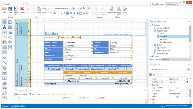
Report Designer - SubBands
v16.2 includes support for SubBands.
Mobile Platform (CTP)
Mobile Platform Enhancements
This release introduces the following UI enhancements:
- New UI layouts optimized for desktop and tablet devices.
- Improved look and feel.
- Application Simulator no longer requires an internet connection.
- 'Active' and 'Enabled' action states are now context-dependent.
Demo
FAQ
Tutorial
Video
Data Analytics Enhancements
New Dashboards Module (Windows and Web)
XAF continues to evolve and in this release, gives you the ability to create interactive dashboards for Windows and Web apps by leveraging the flexibility of DevExpress Dashboard. DevExpress Dashboard integration has become much easier.
Documentation
Video
ASP.NET Enhancements
Criteria Editor Enhancements (Web UI)
XAF's ASP.NET Criteria Property Editor now supports many of the features available in its WinForms counterpart, including:
- ability to display full object hierarchies, including members of reference and collection properties;
- use of built-in XAF editors for value types that don't have a native editor;
- ability to edit criteria as a string;
- display user-friendly criteria strings within the grid footer.
Documentation
Support for Multiple Browser Tabs
XAF now supports multiple independent XAF views within different browser tabs. To enable this new feature, simply activate the WebApplication.EnableMultipleBrowserTabsSupport option. Use-cases include the ability to include hyperlinks to different XAF views inside a customer email. Once clicked, these links will open separate browser tabs so that an end-user can work with them independently.
Documentation
Security System Enhancements
Security Permissions for Navigation Items and Groups
With this release, you can grant or deny access for specific navigation items and groups.
Documentation
Video
Core Enhancements
Improved Customization of Action Controls
The customization of UI controls used to visualize XAF Actions has been simplified. With v16.2, each Action exposes the CustomizeControl event that provides access to the underlying control including its context information.
Documentation
Platform-Agnostic API for Displaying Dialogs
With this release, the display of Dialog Views (configurable confirmation messages, reminders, etc.) has been simplified for both Windows and Web based XAF applications. We've implelemented a new platform-independent Application.ShowViewStrategy.ShowViewInPopupWindow method.
Documentation
Instant Feedback UI Mode in WinForms GridListEditor
With this release, XAF List Views support our server-side data processing engine - Instant Feedback UI Mode. When used, your apps will remain responsive regardless of dataset size. To enable this feature, set the ListView's DataAccesMode property to InstantFeedback.
Documentation
Faster App Startup
With this release, you can load an Application Model's cache in multiple threads and disable caching of empty nodes.
Documentation
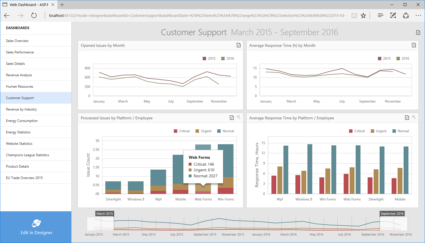
New Web Dashboard Control
v16.2 marks the official release of new Web Dashboard Control. As you would expect, the DevExpress Web Dashboard Control ships with a comprehensive feature set designed to elevate its design capabilities and bring it in line with its Windows counterpart. These include:
- Integrated Viewer and Designer
- Integrated Data Source Wizard and Query Builder
- OLAP Support
- Conditional Formatting
- Coloring
- Calculations
- Predefined Date Ranges
- Dashboard Item Conversion
- Client-Side API
- Dark Theme Support
- Localization
Demo
Documentation
Video
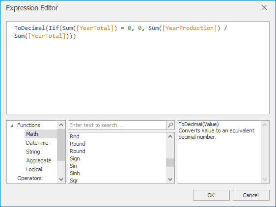
WinForms Designer
New Expression Editor
The DevExpress Dashboard ships with a new Expression Editor for its WinForms Dashboard Designer. The new Expression Editor supports code auto-completion, syntax highlighting, error handling and much more.
Documentation
Data Binding
OLAP Ragged Hierarchies Support
With this release, DevExpress Dashboard supports OLAP ragged hierarchies.
Visualization
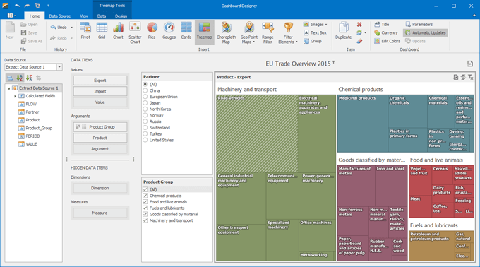
New Treemap Dashboard Item
Use our new Treemap dashboard item to display hierarchical data as a set of nested rectangles that are sized and ordered by a quantitative variable. The new dashboard item supports the following features:
- Multiple Layout algorithms: Slice and Dice, Squarified and Striped.
- Ability to visualize flat and hierarchical data.
- Interactive capabilities allowing end-users to select tiles or groups to filter a dashboard.
- Coloring support.
- Configurable tooltips for individual tiles and groups.
Demo
Documentation
Video
Miscellaneous
API Enhancements
- Ability to customize the Print Preview's Ribbon.
- Ability to customize exported reports. You can add a logo to a page header- footer or rearrange a report's layout. You can also access the IPrintable interface to exclude individual dashboard items when exporting the entire dashboard.
- Handle one event instead of two. Use the new MasterFilterDefaultValues event instead of SingleFilterDefaultValue and FilterElementDefaultValues. This event handler allows you to specify multiple filter values.
- The new CustomPalette event allows you to customize colors within the default palette.
PDF Document Processor
PDF/A Compliance
We now support PDF/A - an ISO-standardized version of the Portable Document Format. Documents can now be exported to one of the following conformance levels:
Blog Post
Interactive Forms Flattening
With this release, our PDF Document Processor can flatten interactive forms. This replaces the interactive fields with content such as text, images or shapes. You can flatten the entire form or a specific field on the form.
Documentation
Blog Post
Performance Enhancements
Text documents are now rendered up to 30% faster. We have also optimized document printing. For instance, text documents can be printed to the XPS writer up to four times faster. In addition, the resulting XPS file is approximately 20 times smaller.
Blog Post
Spreadsheet Document Automation
Two-Way Data Binding
With this release, our Spreadsheet Control provides a simple and consistent way to manipulate data. You can now bind a worksheet or specific cell range to a data source.
A cell range can also be used as a data source for any DevExpress or third-party data-aware control (Data Grid, Chart, etc.). All data-related modifications affecting the worksheet are immediately propagated to bound controls and changes made within external controls are immediately reflected in the worksheet.
Documentation
Print Titles
DevExpress Spreadsheet allows you to print titles for individual documents. If a worksheet occupies more than one page, you can repeat row or column headings on each printed page in order to help improve readability.
Documentation
XLSX/XLSM File Encryption
With this release, the Spreadsheet Control supports XLSX/XLSM file encryption. You can encrypt documents using standard or agile encryption.
Documentation
Code Analysis
Focused Analysis
You can now run Code Analysis on the active project or active file.
More Detailed Report
Code Analysis reports now include information for source files.
Naming Conventions Continuous Check
We have added the ability to check naming conventions continuously in background.
Performance
Code Analysis performance has been improved.
Navigation Enhancements
Jump to Everything
We have added the new Jump to Everything navigation provider, which allows you to jump to any file and symbol in the solution.
Unit Test Runner
.NET Core Tests
Now you can run and debug .NET Core tests, created with NUnit, xUnit or MSTest frameworks. CodeRush's Code Coverage calculation is also supported for .NET Core tests.
XAML Support
XAML Code Formatting
We have added the ability to format XAML documents. This feature adds and removes the line breaks and indentations at the required places, so that the tag indentation matches its nesting level.
Additionally, you can reorder elements and attributes according to rules you specify.
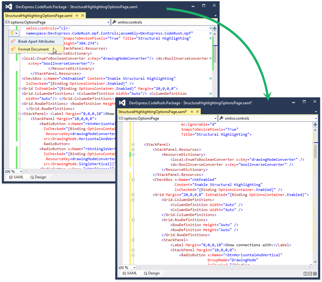
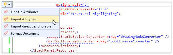
Import All Types
This code provider declares all namespace references appearing in the XAML file.
Refactorings and Code Providers
Reorder Parameters
Change method parameter order, without any dialogs to slow you down. The method signature and all references are updated. This is the fastest, most effortless way to reorder parameters.
Convert to System Type/Built-in Type
Easily switch between CLR types and their keyword aliases, for instance between int and System.Int32.
Split String
Divide a string into two at the caret position. You can also divide one string into three concatenated strings – just select the portion you want to break out and apply this refactoring.
Break Apart/Line Up Parameters/Arguments
Either collapse a list of method parameters or passed-in arguments into a single line, or break them apart into separate lines (one for each parameter or argument).
Remove Type Qualifier
Remove explicit namespace references from your code, automatically adding that namespace to the using/imports list if needed. You can use this refactoring on a single identifier, on all identifiers in the current file, or as a code cleanup rule.
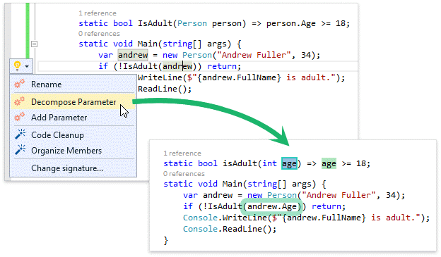
Decompose Parameter
Change the method signature, passing in only the part or parts of the parameter that are actually used in the method, instead of the parameter itself. This refactoring often promotes reuse by reducing the sophistication of the arguments needed to call a method.
For example, if a method accepts a Person instance but only references that Person's Age property, Decompose Parameter will change that method signature and update all calling sites, so only the Age is passed in.
Extract String to Resource
Move string literals to a *.resx file (creating a new *.resx file if necessary), replacing that string with a link to the resource. You can also optionally extract all string literals within a method or property accessor.
Declare Parameter
Add the active identifier to the method signature, updating all usages inside the method and all calls to the method.
Rename
Visual Studio's Rename refactoring is now accessible from the refactoring menu.
Sorting Code Actions Menu Items
Light-bulb menu items can now be sorted based on their most recent usage in a given context.
Hiding Duplicated Code Actions Menu Items
You can now optionally hide redundant light-bulb menu items that ship with Visual Studio if these features overlap with more efficient CodeRush for Roslyn functionality. For example, if this option is selected, when CodeRush's Declare Method is available, Visual Studio's Generate method stub menu item will be hidden.
Miscellaneous
Smart Duplicate Line
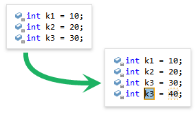
The Duplicate Line feature is now called Smart Duplicate Line. Now it watches and learns from your changes to improve the duplicate line experience. Currently, Smart Duplicate Line creates text fields for the segments of the line that are likely to change. The feature also automatically increments integer values if an incrementing or doubling pattern is detected in the code.
Press Shift+Enter to duplicate a line using the Smart Duplicate Line feature.
Space to Expand
We have added a shortcut to collapse/expand code regions using keyboard. When the caret is located at the beginning of a string containing the #region directive, pressing the Space key will expand or collapse this region.
Editors
New Barcode Control
v16.2 introduces a new Barcode Control that allows you to generate barcode images within your VCL application. The initial version supports the following barcode symbologies:
- QRCode
- Code 11
- Code 128
- Code 39
- Code 39 Extended
- Code 93
- Code 93 Extended
- EAN-8
- EAN-13
- Interleaved 2 of 5
- MSI
- UPC-A
- UPC-E
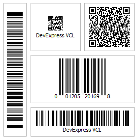
Unbound, data-aware, standalone, and in-place versions of the Barcode Control are available.
New Token Editor
This release ships with a new advanced text editor inspired by behaviors found in modern mail clients such as Microsoft Outlook and Google Gmail.
Unbound, data-aware, standalone, and in-place versions of the Token editor are available.
New Range Control Editor
The Range Control is designed to help end-users select intervals and data ranges. When integrated with the DevExpress VCL Scheduler Control, it behaves like a timeline track bar, and allows quick timeline navigation and selection of date intervals.
The Range Control features:
- Multiple ways to select a range
- Animated scrolling and zooming
- Four built-in clients for range selection
- Support for custom clients.
Four built-in clients provide support for:
- Date range selection in a linked Scheduler control
- Numeric (integer, float, or currency) range selection
- Date-time range selection
- Date-time range selection using clickable intervals.
Grid Control
Selectable Filter Operators in Filter Row Cells
With this release, you can help end-users filter grid data faster, by selecting a required filter operator directly from Filter Row cells.
Merged Column Grouping
This release introduces a new data grouping mode that enables you and your end-users merge grouping columns, allowing for a more compact row list. Pressing and holding the Ctrl key while dropping a column header adjacent to another one located in the Group By box merges the two columns.
Data-Aware Export to Excel
The new data-aware export is optimized for subsequent analysis of grid data within Microsoft Excel. The following data shaping options that are applied within the grid control are retained in the output XLS and XLSX documents.
- Data grouping - with the capability to collapse/expand groups within a worksheet;
- Totals and group summaries - with the capability to modify/change formulas;
- Excel-style format rules;
- Fixed columns.
Scrollable Group Content in Layout Views
With v16.2, you can limit the card size in Layout Views and enable card content scrolling using scrollbars. This functionality is useful in cards containing multiple elements.
Layout Control
Group Content Scrolling Enhancements
- The content of a layout group can now be scrolled by dragging a layout element over the layout group's scrollbar.
- End-users can now use the mouse wheel to scroll the content of a layout group that displays a vertical scrollbar while hovering over this group in a focused layout control.
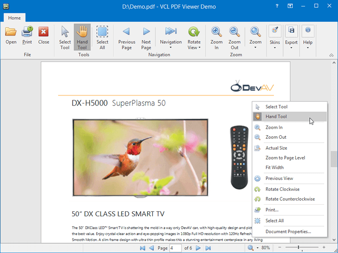
PDF Viewer
The DevExpress VCL PDF Viewer was first released as a community technology preview in v16.1. This update marks its official release and includes the following new features:
- Ability to rotate pages.
- Ability to select and copy images and text.
- The history of view states.
- The Hand tool for panning document pages.
- Ability to obtain and display document information.
- The context menu with commonly used commands.
Pivot Grid Control
OLAP Mode Enhancements
- You can now obtain drill-down data for any cell displayed by the Pivot Grid connected to an OLAP cube using the ADO MD provider.
- We have also added KPI support to this provider.
Printing-Exporting Library
Embeddable Preview Window
The Print Preview window is now available as a component, so that you can add it from the Tool Palette into any container control.
Print Rotated Text or Export to PDF
Text that is rotated can now be printed or exported to PDF.
Scheduler Control
Agenda View
With v16.2, the DevExpress VCL Scheduler allows you to display a list of appointments grouped by day within its new Agenda View.
Spreadsheet Control
Report Designer Enhancements
Ability to Generate Master-Detail Reports
The DevExpress VCL Spreadsheet Report Designer now allows you to create master-detail relationships between bound datasets and enable end-users to generate multi-level reports. Output reports can be stored as one worksheet, multiple worksheets or workbooks.
Capability to Group the Report Content by a Bound Dataset's Field Values
In this version, you can group report data by values of one or more dataset fields and provide header and footer sections for each group.
Ability to Sort the Report Content by a Bound Dataset's Field Values
In addition to grouping, you can now sort report data against one or more dataset fields.
TcxFilterControl Support
You can now allow end-users to filter report data using our Filter Control component.
Automatically Created Format Templates for Date-Time Values
Parsing input to cells has been improved and now automatically creates format templates for date-time values in the short date format based on the regional settings.
New Formula Functions
SUMPRODUCT, SUMX2MY2, SUMX2PY2, and SUMXMY2 functions are now available (for summing products, squares, and their differences).
Rich Edit Control
64-bit C++Builder Support
The ExpressRichEditControl Suite is now supported with RAD Studio XE8 or later in 64-bit apps created with C++Builder.
Miscellaneous
New Filter Operators
The data controller now allows users to build filter conditions with the Contains, NotContains, BeginsWith, and EndsWith comparison operators. This capability is available across all our controls that provide a data controller, including the Grid, Vertical Grid, Pivot Grid, and data-aware editors.
Layout Control Integration into DevExpress Dialogs
With v16.2, the Layout Control is integrated into majority of our dialogs to improve UI element alignment at any DPI setting and achieve better quality when rendering on transparent backgrounds.