Data Grid Control
DirectX Hardware Acceleration Support
The DevExpress WinForms Data Grid and WinForms Cell Editors can now use DirectX hardware acceleration, allowing you to deliver outstanding performance on high-DPI devices. To activate DirectX painting, call the static WindowsFormsSettings.ForceDirectXPaint method.
Blog Post
Drag and Drop Manager for Data Grid and Tree List
v17.2 ships with an automatic drag-and-drop engine for both the WinForms Data Grid and Tree List control. With our new DragAndDropBehavior (part of the Behavior Manager), you can initiate drag-and-drop operations between the Data Grid, Tree List and ListBox controls in various combinations, with a few lines of code.
Run Demo
* Requires installation of WinForms Subscription v17.2. Download
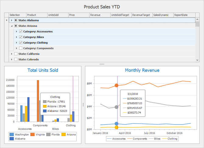
Binding a Chart to Bound Controls (via the ControlRowsSource)
You can now seamlessly connect a chart to Grid data at both design and runtime.
Run Demo
* Requires installation of WinForms Subscription v17.2. Download
Grid-Based Lookup Edit - Render Lookup Records as Tiles or Modern Style Lists
In addition to standard grid formats, our WinForms Grid-based Lookup control allows you to render lookup records using an embedded TileView. The TileView (part of the WinForms Data Grid control) supports multiple data presentation formats, including:
- Default Tile Mode
- Kanban
- List
Run Demo
* Requires installation of WinForms Subscription v17.2. Download
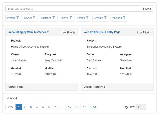
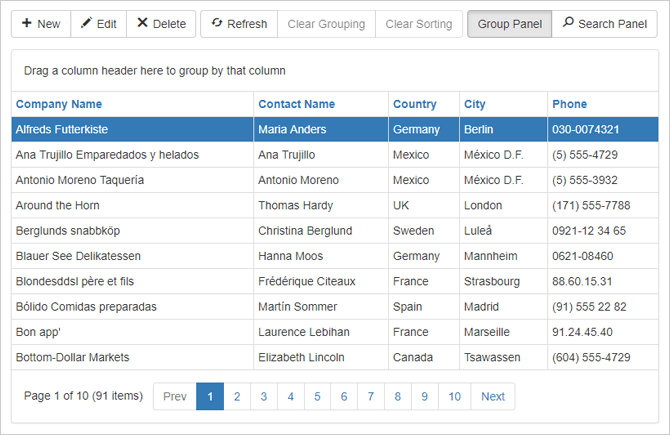
Clipboard Management: Pasting to the Grid and TreeList
This release extends the Data Grid and TreeList control's clipboard capabilities by adding support for paste operations. End-users can now copy data from Microsoft Excel, an external Data Grid or another source and then paste information directly into a target Data Grid/TreeList. Data can be added into existing cells or new rows appended.
New events have been introduced to help you dynamically customize or cancel certain paste operations.
Run Demo
* Requires installation of WinForms Subscription v17.2. Download
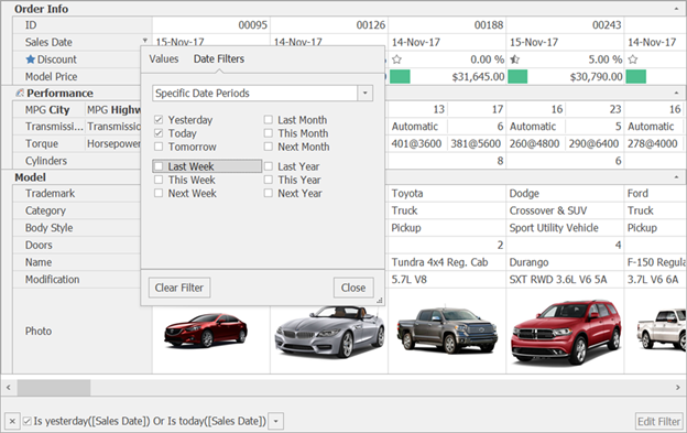
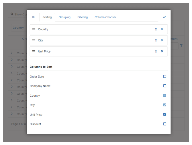
Excel Inspired Filtering Enhancements
Our new PrepareTemplate and CustomizeTemplate events allow you to customize column filter dropdowns. In addition, you can:
-
Add filter items with HTML formatting and custom images by handling the FilterPopupExcelData event.
-
Use new predefined filter items for 'Date Filters' and 'Values' tabs ('Is Same Day' and 'Blanks').
-
Incorporate RadioGroup-based filtering (allows end-users to select only one filter item).
Run Demo
* Requires installation of WinForms Subscription v17.2. Download
Chart Control
Unified Criteria-Based Filtering
With this release, the series DataFilter property has been replaced with the FilterCriteria and FilterString properties. This change allows you to use either the Filter Control or our new Filtering UI to manage data represented within a chart.
Note that old DataFilters are backwards compatible, available via API and data filters will be replaced by criterias with the first serialization.
Blog Post
Run Demo
* Requires installation of WinForms Subscription v17.2. Download
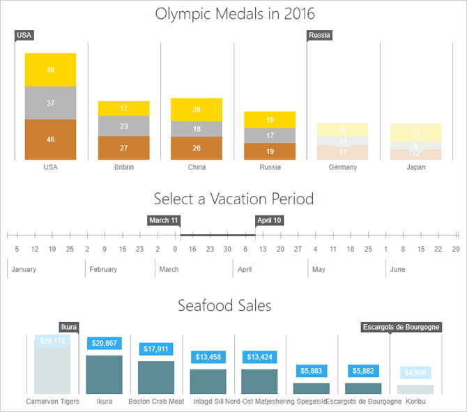
Totals Labels for Stacked Bars and Pies
With this release, the DevExpress Chart Control is shipped with the ability to calculate total labels for stacked bars and pies automatically.
Bar total labels are labels that display series group total values and are outside groups. Total labels are available for the following Bar series:
- Stacked Bars
- Side-by-Side Stacked Bars
- Full-Stacked Bars
- Side-by-Side Full-Stacked Bars
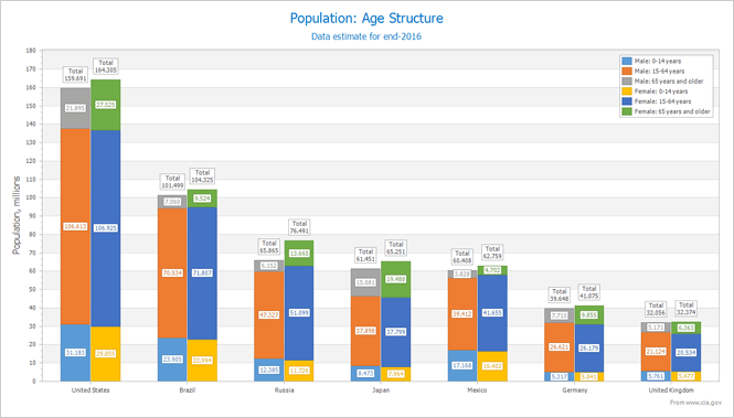
Pie (Donut) total labels are labels displayed in the center of a Pie (Donut) for series point total values. The Pie Total label is available for all 2D Pie (Donut) series.
The {TV} pattern introduced in this release allows you to display total values in both series labels and series titles.
Run Demo
* Requires installation of WinForms Subscription v17.2. Download
Data Grid Integration
You can now populate a chart with data from a Data Grid via the ControlRowSource control. ControlRowSource allows you to specify the Data Grid rows to be visualized: selected, currently visible or all. You can also use provide chart data from a Vertical Grid and Tree List control.
Additionally, our Data Grid can more easily display a Chart within its cell (due to its implementation of the DevExpress.XtraEditors.CustomEditor.IAnyControlEdit interface).
Run Demo
* Requires installation of WinForms Subscription v17.2. Download
Qualitative Data Aggregation
In addition to both numeric and date-time data aggregation, the DevExpress WinForms Chart control can aggregate series data rows with the equal qualitative argument.
Indicator Animation
Our WinForms Chart control can animate the appearance of its indicator. All data driven UI elements can be animated to reflect changes to underlying data.
LegendTextPattern for a Series with the Disabled ColorEach Mode
With this release, the LegendTextPattern property allows you to configure legend text for a series using the disabled ColorEach mode. This feature helps you modify legend text without the need to handle CustomDrawSeries events.
Export a Chart to an SVG image
You can now export charts to a vector image file format (SVG).
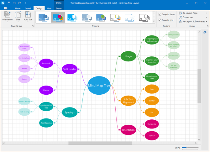
Diagram Control
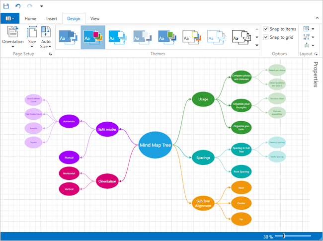
Mind Map Layout
The new Mind Map automatic layout algorithm is used to create non-linear hierarchical diagrams arranged around a central idea or subject.
Binding Behavior Enhancements
DevExpress Diagram's binding mechanism has been updated with the following new capabilities:
- Two-way synchronization between the diagram and the data source: You can customize synchronization using events.
- Binding to hierarchical data: paras are now used to represent multiple levels of hierarchy.
Run Demo
* Requires installation of WinForms Subscription v17.2. Download
New Scrolling Mode
DevExpress Diagram ships with a new scrolling mode. When this mode is enabled, scrollbars are displayed only when diagram content is not fully visible (regardless of current page size).
SVG Enhancements
DevExpress Diagram v17.2 ships with a new SVG rendering engine and features extended support for various SVG elements. In addition, you can now override the default colors used for bichromatic SVG images.
API Enhancements - New Notification Events
With this release, we've implemented new events that fire in response to various user actions:
- moving, copying and modifying diagram items;
- changing shape connetors;
- using diagram tools, and many more...
Handle these events to override the default behavior and/or restrict end-user actions.
Run Demo
* Requires installation of WinForms Subscription v17.2. Download
DPI Awareness
DirectX Hardware Acceleration Support
The DevExpress WinForms Data Grid and WinForms Cell Editors can now use DirectX hardware acceleration, allowing you to deliver outstanding performance on high-DPI devices. To activate DirectX painting, call the static WindowsFormsSettings.ForceDirectXPaint method.
DPI-aware Image Collection
Blurred icons are no longer an issue on Hi-DPI screens with our new DPIAwareImageCollection component. This component automatically provides images for linked controls based upon screen DPI settings.
A built-in designer allows you to set up the component by adding DPI-specific versions of individual images.
Editors
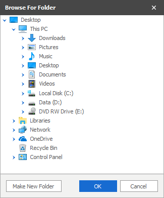
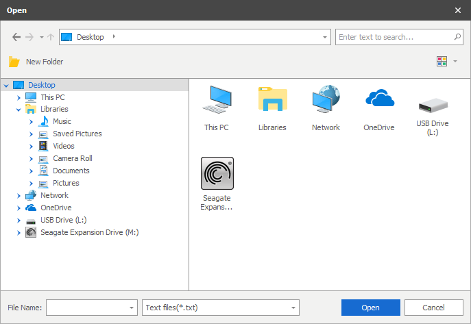
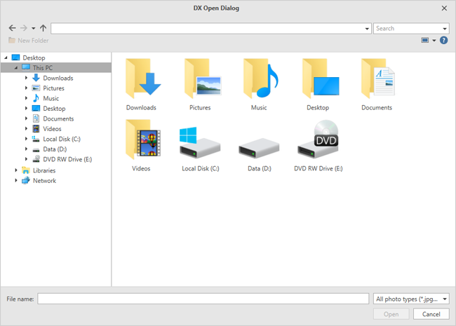
Folder Browser and Open/Save File Dialogs (CTP)
This release introduces skinnable DevExpress counterparts for standard WinForms FolderBrowser and Open/Save File dialogs.
Run Demo
* Requires installation of WinForms Subscription v17.2. Download
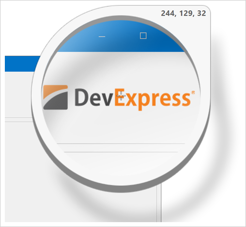
New Magnifier Dialog
The Magnifier first intruduced in our WinForms Skin Editor is now available as a stand-alone tool. You can pick RGB or HEX colors from anywhere on the screen and save them to the clipboard.
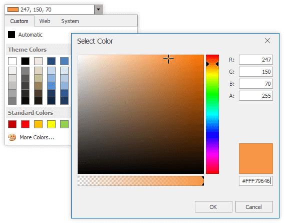
Updated Color Picker Dialog
This release includes a simplified color pick dialog for the Color Edit and Color Pick Edit editors.
Run Demo
* Requires installation of WinForms Subscription v17.2. Download
Simplified HTML in Data Grid, TreeList and para Cells
With this release, we've made it much easier to display formatted text within Data Grid and Tree List cells. By embedding a new HypertextLabel in a cell, you can format data using simplified HTML syntax. As you might expect, you can change font and color attributes for all or a portion of the text, insert images, hyperlinks or line breaks as needed.
Run Demo
* Requires installation of WinForms Subscription v17.2. Download
List Box - Item Templates
Item templates are now available to all ListBox controls (ListBoxControl, ImageListBoxControl and CheckedListBoxControl). This new feature helps you render each listbox item as needs dictate. Each item can display multiple elements arranged in any manner, and painted using different appearance settings.
A built-in designer helps you build a template with just a few mouse clicks. You can create any number of item templates and dynamically apply them to list box items when necessary.
Run Demo
* Requires installation of WinForms Subscription v17.2. Download
PDF Viewer
Document Display Enhancements
The scaling factor specified in the operating system's display settings is used when a document is displayed on high DPI devices.
The images below demonstrate the impact of this new feature. The zoom level of the PDF Viewer is set to 100%. The desktop scaling factor (greater than 100%) is set to 125% in the operating system's display settings. Note that the DPI-Aware option must be set to true in the application manifest.
Learn more: Writing DPI-Aware Desktop and Win32 Applications
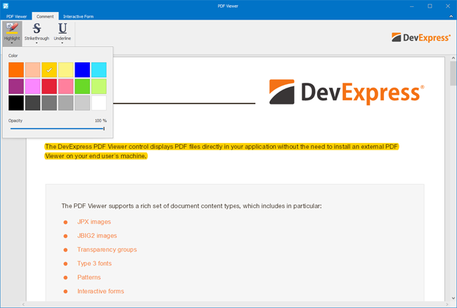
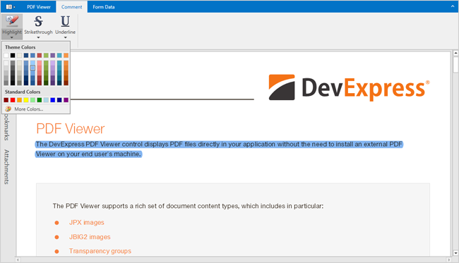
Text Markup Annotations
You can highlight, strikethrough or underline text using the corresponding tool in the WinForms PDF Viewer’s Comment toolbar. You can also select the text markup annotation, change its properties or delete the markup annotation from a document.
Documentation
Rendering Very Large Images
Large image rendering (unpacked size is 200+ Mb) is now supported.
Pivot Grid Control
Excel-inspired Filtering
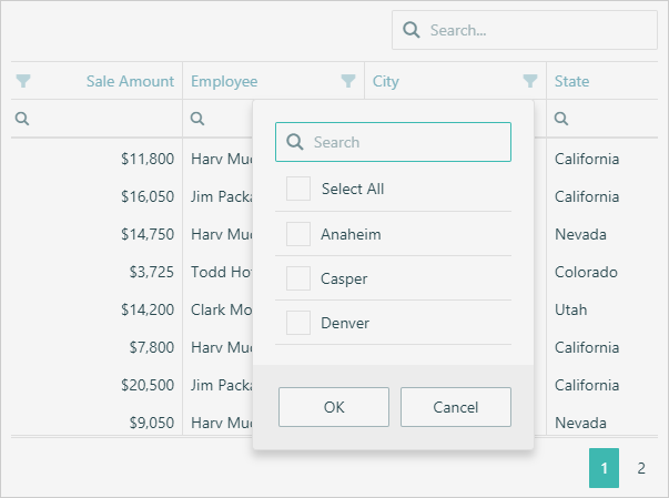
Much like the DevExpress WinForms Grid and TreeList controls, our WinForms Pivot Grid control now supports Excel-inspired column filter popups for column and row fields.
Run Demo
* Requires installation of WinForms Subscription v17.2. Download
Performance Enhancements
This release includes significant enhancements to the in-memory data processing capabilities of the DevExpress Pivot Grid Control. It is now up to 2-5 times faster when compared to earlier versions.
Intellisense Editor for Unbound Field Expressions
Much like other DevExpress WinForms controls, our Pivot Grid utilizes now uses an Expression Editor for editing unbound field expressions.
Run Demo
* Requires installation of WinForms Subscription v17.2. Download
Support for SVG Icons
The Pivot Grid can now use vector SVG icons instead of bitmap images to help improve rendering on High-DPI displays.
Ribbon and Bars
SVG Support
This release adds support for vector images.
Skins
New SVG Skin
v17.2 ships with a new WinForms skin (The Bezier) based entirely on SVG images, which allows our controls to look perfect on any screen with any DPI settings. You can create new variations of this skin using our updated Skin Editor - without the need to rely upon a third-party graphics editor.
Blog Post
Color Swatches
The Bezier is the first skin that ships with UI elements that allow users to instantly change the skin palette and re-paint a skin at runtime. You can easily create a custom pallete to apply a corporate style to your application.
SVG Icon Builder
A productivity tool designed to simplify the creation of custom SVG icons by combining graphical elements we ship as part of our Icon Library. Icons generated via the SVG Icon Builder fully support the DevExpress skin colorization feature.
Snap
Chart API
With this release, our data-aware RTF Control (Snap) allows you to create and modify charts in code.
Documentation
Spreadsheet Control
Chart Sheets
With this release, DevExpress Spreadsheet for WinForms and WPF gives you the ability to place a chart on a separate worksheet by creating a chart sheet (view, edit or print the chart within its own page).
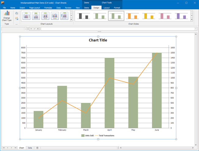
Run Demo Documentation
* Requires installation of WinForms Subscription v17.2. Download
TreeList Control
Drag and Drop Manager for Data Grid and Tree List
v17.2 ships with an automatic drag-and-drop engine for both the WinForms Data Grid and Tree List control. With our new DragAndDropBehavior (part of the Behavior Manager), you can initiate drag-and-drop operations between the Data Grid, Tree List and ListBox controls in various combinations, with a few lines of code.
Run Demo
* Requires installation of WinForms Subscription v17.2. Download
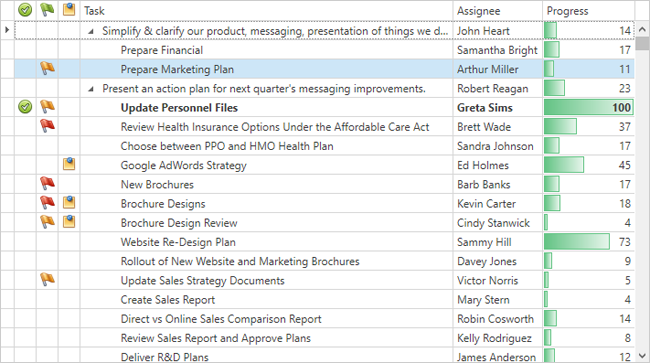
Hierarchy Column
In previous versions, the TreeList's hierarchy column (the one that displays expand and collapse buttons) was always the first visible column. With this release, you can explicitly specify the hierarchy column for your TreeList. This allows you to move the column and its associated hierarchy information to any position.
Run Demo
* Requires installation of WinForms Subscription v17.2. Download
Miscellaneous Enhancements
This release includes numerous enhancements to our WinForms TreeList including:
New TreeView Data Presentation Option: You can now emulate the appearance of the standard TreeView control (no column headers, no lines between rows, modified row highlighting style, etc) when displaying a single column of hierarchical data.
High Performance Best Fit Option: The TreeList now offers a BestFitMode option - allowing you to select between its default (Full) and the new fast mode. The latter significantly improves rendering performance for large record sets.
Auto-Fill Empty Space: With this release, you can force a column to automatically change width and populate any empty space within the TreeList's para.
Loading Panel: You can now visually indicate the status of data loading processes.
Ability to specify a column's maximum width (the 'MaxWidth' property).
You can now indent/outdent individual TreeList nodes (new Indent and Outdent methods).
In addition, the TreeList ships with options to custom paint entire nodes, ability to specify which mouse actions activate in-place editing (MouseDown, MouseUp, DoubleClick, etc.), and an improved design-time UX (including changes to the Designer, Nodes Editor and smart tags).
Vertical Grid Control
Vertical Grid - Data Filtering
The DevExpress WinForms Vertical Grid now supports the same filtering capabilities found in our WinForms Data Grid and Tree List controls. End-users can filter data using filter dropdowns and our advanced Filter Editor. By default, our Excel-inspired filtering UI is active.
Run Demo
* Requires installation of WinForms Subscription v17.2. Download
Filtering
Filtering UI Context Enhancements
Filtering UI Context component has been refined. Now, you can associate a target control (e.g., a Grid View or Chart Control) with a couple of clicks at design time and thereby instantly generate all the filtering UI editors required.
Run Demo
* Requires installation of WinForms Subscription v17.2. Download
Unified Criteria-Based Filtering
With this release, the filtering system becomes common across all grid controls (Data Grid, Property Grid, Pivot Grid and Vertical Grid) and uses a criteria-based language to define filters.
Miscellaneous
SVG Image Collection
In this release, DevExpress controls gain support for SVG vector icons. To store and provide these icons to controls, use the new SvgImageCollection. Like other image collections, it can be populated from local storage, form resources, DevExpress Image Gallery, or a project assembly.
DPI-aware Image Collection
Blurred icons are no longer an issue on Hi-DPI screens with our new
DPIAwareImageCollection component. This component automatically provides images for linked controls based upon screen DPI settings.
A built-in designer allows you to set up the component by adding DPI-specific versions of individual images.
Data Source Wizard Enhancements
The DevExpress WinForms Data Source Wizard ships with the following enhancements:
- Support for DevExpress Visual Studio Themes.
- Support for .Net Standard 2.0 data sources: EF Core 2.0+.
- Dashboards integration.
- Binding charts to data-aware list-controls.
Appearance Object Editor
Using this dialog, you can now save appearances applied to one UI element and instantly share it across others.

LayoutControl Enhancements
DevExpress WinForms Layout Tools (Layout Control and Data Layout Control) ship with a number of performance and usability enhancements:
- Data Layout Control: A new context menu allows you to change or assign a Binding to control at Design Time.
- Enhanced design-time performance during multiple item selection and property change operations.
- Ability to choose item navigation direction when using the TAB key: Across then down (default) or Down then across.
- New API (deleting items and disposing of their controls, moving individual items, updating a table layout, etc.)
- A Property Grid is now available in the Layout Control's Customization window at Design Time.
- Ability to edit the properties of hidden items at design and runtime.
MVVM Enhancements
This release includes the following MVVM related enhancements for our WinForms product line:
- A new NavigationService that allows you to navigate between Views. Navigation history is stored automatically.
- The ViewModelCreate event includes a static version (available from the static MVVMContextCompositionRoot class). Both events can be handled to retrieve full-fledged ViewModel instances at runtime.
Run Demo
* Requires installation of WinForms Subscription v17.2. Download
New Hamburger Menu
The new DevExpress WPF Hamburger Menu can be used to emulate the navigation metaphor found in today's most popular web apps. Features include:
- Adaptive Layout.
- Main menu with support for top and bottom alignment for individual menu items.
- Multiple navigation item types: standard menu item, check and radio buttons, and hyperlinks.
- Sub menus that can display items within side panels and 'favorite' items directly in the main menu.
- A compact bottom bar
- MVVM Support
New Scheduler Control
New WPF Scheduler Control
v17.2 includes an entirely new WPF Scheduler Control - designed to address its predecessor's shortcomings.
Our new WPF Scheduler Control is better aligned with the core WPF principles and delivers improved performance.
Documentation
New Dialogs (CTP)
Folder Browser and Open/Save File Dialogs
This release includes DevExpress counterparts to the following standard WPF dialogs:
- Open File Dialog
- Save File Dialog
- Folder Browser
Our new dialogs support all DevExpress WPF themes/skins.
Data Grid Control
Performance Enhancements
This release includes significant enhancements to the text rendering. Our WPF Grid Control can now render data rows up to 50% faster than its predecessor.
Drag-and-Drop Enhancements
The DevExpress WPF Grid control ships with native drag-and-drop support and allows you to:
- Reorder records within all view types, including the Card View.
- Reorder records within Master-Detail Views.
- Move records outside the GridControl to external controls.
- Move records to and from external applications.
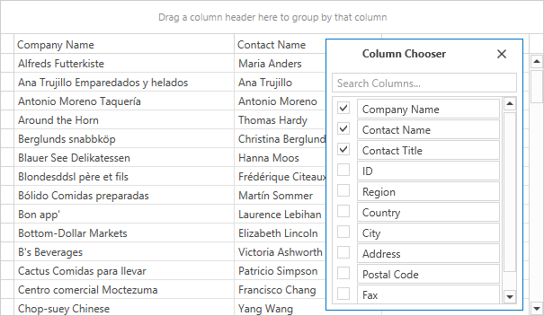
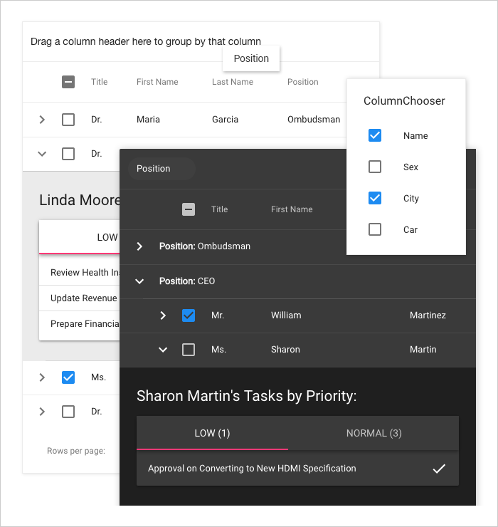
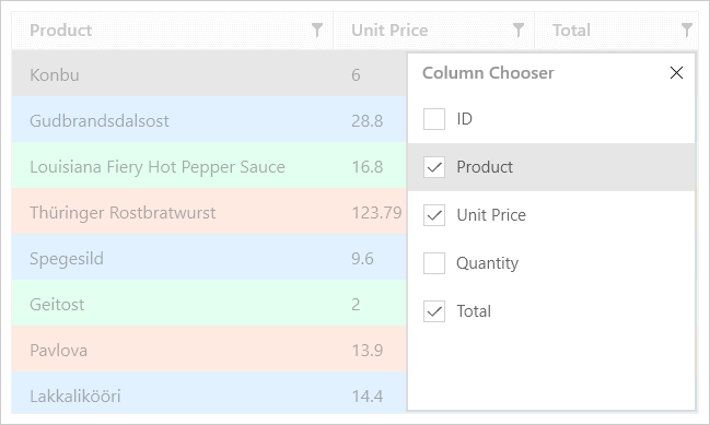
Column Chooser Enhancements
The column chooser allows and-users to:
- Hide/display columns using checkboxes instead of dragging column headers.
- Reorder columns within the column chooser via drag and drop.
- Locate columns using built-in search.
- Manage band hierarchies.
Master Detail Enhancements
- You can now display different detail records for different master rows.
- You can define custom margins for detail rows.
- The Grid allows you to store/restore detail views' layouts.
- Ability to hide Group Panels from detail views when they are not grouped.
Compact Grid Mode
Our WPF Data Grid can now dynamically adapt its content based upon control dimensions. In compact mode, the Grid displays a compact panel inspired by Microsoft Office that allows you to sort, group and filter records.
New Expression Editor for Unbound Field Expressions
The DevExpress WPF GridControl ships with the Expression Editor with built-in AutoComplete support and syntax highlighting.
Clipboard Management: Pasting to the Grid and TreeList
This release extends the Data Grid and TreeList control's clipboard capabilities by adding support for paste operations. End-users can now copy data from Microsoft Excel, an external Data Grid or another source and then paste information directly into a target Data Grid/TreeList. Data can be added into a new row or existing cells.
New events have been introduced to help you dynamically customize or cancel certain paste operations.
Miscellaneous Enhancements
- You can specify a column header image using the 'Image' property.
- You can rearrange column header elements.
- A new AddingNewRow event allows you to initialize a newly added record.
- New CanSelectRow/CanUnselectRow and CanSelectCell/CanUnselectCell events to dynamically control row/cell selection.
- Export to DOCX.
Accordion Control
Accordion Collapse Mode
v17.2 ships with a customizable compact view.
Accordion Item Customization
This release adds the following customization options to our WPF Accordion control:
- Item glyph can be displayed at top of text.
- New RootItemDisplayMode property allows you to enable a uniform style for root and subordinate items.
- New item Command property allows you to specify the command to be executed when an end-user clicks an item.
Chart Control
Criteria Based Unified Filtering
With this release, the series DataFilter property has been replaced with FilterCriteria and FilterString properties. This change allows you to use either the Filter Control or Data Layout Control to manage data represented within a chart.
Note that old DataFilters are backwards compatible, available via API. Data filters will be replaced by criterias with first serialization.
Chart Designer Enhancements
Our WPF Chart Designer ships with the following new features:
- A layout/structure that is similar to the Chart Designer for WinForms.
- You can add, remove and hide chart elements via the structure tree.
- A new Options tab allows you to configure major chart element properties.
- A new Data tab helps you populate an individual series with data or populate a chart with series via series templates.
Note that you can use our previous Chart Designer UI by calling the 'ShowDesigner' method with the 'windowKind' parameter set to DesignerWindowKind.Ribbon.

Totals Labels for Stacked Bars and Pies
With this release, the DevExpress Chart Control allows you to calculate total labels for stacked bars and pies automatically.
Bar total labels are labels that display series group total values and are outside groups. Total labels are available for the following Bar series:
- Stacked Bars
- Side-by-Side Stacked Bars
- Full-Stacked Bars
- Side-by-Side Full-Stacked Bars
Pie (Donut) total labels are labels displayed in the center of a Pie (Donut) for series point total values. The Pie Total label is available for all 2D Pie (Donut) series.
The {TV} pattern introduced in this release allows you to display total values in both series labels and series titles.
Range Control Integration
- Display or hide an individual series in the Range Control.
- Configure series representation (Line, Bar, Area) within the Range Control.
- Calculates the Range Control's grid automatically (based on the Chart's axis scale parameters).
Scale Breaks
A chart's axis scale can now include scale breaks.
Qualitative Data Aggregation
Our WPF Chart control can now aggregate data with the equal qualitative argument.
Bubble Series - Automatic Calculation Min and Max Sizes
Indicator Animation
Legend Enhancements
Chart legend items can simultaneously display a marker and check box.
BarSideBySideSeries2D - Display Series Point Labels for Zero Values
Our WPF Chart Control can now display series labels for zero values.
LegendTextPattern for a Series with the Disabled ColorEach Mode
Use the LegendTextPattern property to configure legend text for series using the disabled ColorEach mode. This feature helps you modify legend text without the need to handle CustomDrawSeries events.
Extended MVVM Pattern Support
The following chart elements can be generated from an item source using the item template:
- Panes
- Annotations
- Legends
- Custom legend items
- Strips
- Constant lines
- Indicators
Diagram Control
Mind Map Layout
The new Mind Map automatic layout algorithm is used to create non-linear hierarchical diagrams arranged around a central idea or subject.
Binding Behavior Enhancements
DevExpress Diagram's binding mechanism has been updated with the following new capabilities:
- Two-way synchronization between the diagram and the data source: You can customize synchronization using events.
- Binding to hierarchical data: Containers are now used to represent multiple levels of hierarchy.
New Scrolling Mode
DevExpress Diagram ships with a new scrolling mode. When this mode is enabled, scrollbars are displayed only when diagram content is not fully visible (regardless of current page size).
SVG Enhancements
DevExpress Diagram v17.2 ships with a new SVG rendering engine and features extended support for various SVG elements. In addition, you can now override the default colors used for bichromatic SVG images.
API Enhancements - New Notification Events
With this release, we've implemented new events that fire in response to various user actions:
- moving, copying and modifying diagram items;
- changing shape connetors;
- using diagram tools, and many more...
Handle these events to override the default behavior and/or restrict end-user actions.
Docking
Miscellaneous Enhancements
The DefaultMenuItemNames class stores fields used to identify context menu items. The BaseLayoutItem.CloseCommand now provides a parameter.
Map Control
Theme Support
With this release, you can use the DevExpress WPF Theme Manager to control our WPF Map control's appearance.
Circular Scrolling
The DevExpress WPF Map Control now supports circular scrolling.
Legend Appearance Customization
Legend labels can now be customized using the Legend Item Label template.
PDF Viewer
Rendering Very Large Images
Large image rendering (unpacked size is 200+ Mb) is now supported.
Text Markup Annotations
With this release, you can highlight, strikethrough or underline text using the corresponding tool in the viewer's Comment toolbar. You can also select the text markup annotation, change its properties or delete the markup annotation from a document.
Documentation
Pivot Grid Control
Performance Enhancements
This release includes significant enhancements to the in-memory data processing capabilities of the DevExpress Pivot Grid Control. It is now up to 4 times faster than its predecessor.
Intellisense Editor for Unbound Field Expressions
The DevExpress WPF Pivot Grid ships with an Expression Editor that supports auto completion and syntax highlighting.
Rich Text Editor
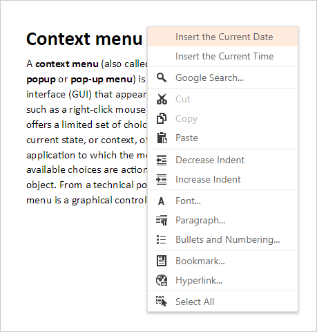
Context Menu Customization
With this release, the DevExpress WPF Rich Text Editor gives you the ability to customize its context menus. You can add or remove menu items by specifying necessary customization actions in XAML.
Documentation
MVVM Related Enhancements
The DevExpress WPF Rich Text Editor ships with the following MVVM related enhancements:
-
All basic control properties (ActiveViewType, LayoutUnit, ReadOnly, etc.) are now bindable.
-
RichEditSpellChecker behavior configuration is now available in the RichEditControl smart tag.
Documentation
UI Enhancements
The WPF Rich Text Editor v17.2 ships with the following new UI elements:
-
Language, Table Styles, Bullets and Numbering and Table of Contents dialogs;
Documentation
-
Table Style gallery;
-
Table Options and Shape Styles ribbon groups.
Spell Checker
Behavior Configuration
A Spell Checker Behavior has been added to the DevExpress WPF Rich Text Editor (RichEditSpellChecker) and to other supported text editors (DXSpellChecker). This feature allows you to configure spell-checking functionality in XAML and the corresponding control's smart tag.
Documentation
Spreadsheet Control
Chart Sheets
With this release, DevExpress Spreadsheet allows to place a chart on a separate worksheet by creating a chart sheet (view, edit or print the chart within its own page).
Documentation
Miscellaneous Enhancements
Our DevExpress WPF Spreadsheet ships with the following enhancements:
-
Section 508 support.
-
New Spreadsheet UI elements:
- Cell Styles, Chart Styles, Table Styles, and PivotTable Styles galleries.
- Change Chart Type and Print dialogs.
- Number Format and Border drop-down menus.
Themes
New WPF Themes
This release includes the following new themes:
- Office 2016 Black (SE)
- Visual Studio 2017 Dark
- Visual Studio 2017 Blue
- Visual Studio 2017 Light
All themes include a color palette so you can easily modify theme colors via our WPF Theme Designer.
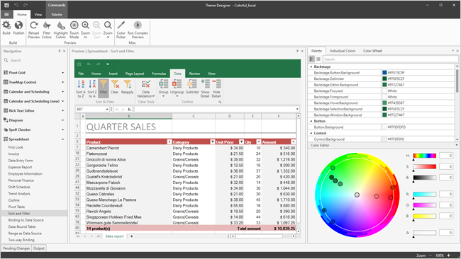
WPF Theme Designer
The WPF Theme Designer was first released as a community technology preview in v17.1. This update marks its official release.
The WPF Theme Designer allows you to easily create personalized themes for DevExpress WPF Controls. This release includes new instruments and improvements that simplify theme editing.
- Filter Colors - displays only the selected element's colors.
- Highlight Colors - highlights elements with the selected color on the preview.
- Color Picker - allows you to select a color from any application on screen.
- Color Wheel - a fast way to edit palette of a theme.
- 40+ new previews.
Read about WPF Themes and Designer Video
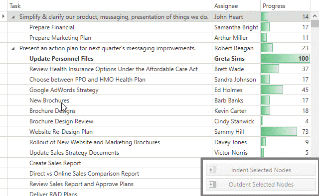
TreeList Control
Indent/Outdent Nodes
You can now indent/outdent individual TreeList nodes.
Hierarchy Column Custom Position
The TreeListControl can display hierarchy column in any position, not only at the left side.
Miscellaneous Enhancements
- Native drag-and-drop support.
- The new Column Chooser.
- Ability to automatically adapt content to control dimensions: compact mode.
- An autocomplete expression editor used to edit unbound column expressions.
- DOCX export.
- New events allow you to dynamically control whether an end-user can select or deselect nodes/cells.
TreeMap Control
WPF Theme Support
The DevExpress WPF ThemeManager can now control the appearance of our WPF TreeMap control.
WPF Expression Editor
This release includes an updated WPF Expression Editor with built-in AutoComplete support, syntax highlighting and expression validation support.
Miscellaneous Enhancements
AppBar Control
AppBar now supports left and right alignment.
Typed Styles
Typed styles provide a simplified way to define styles for standard and DevExpress controls.
SVG Support in EnumItemsSource and EnumItemsSourceBehavior
With this release, you can specify the 'Image' attribute with SVG uri reference to EnumItemSource and EnumItemSourceBehaviour.
GridView Control
Merged Column Grouping
With this release, you can now merge the Grid View's grouped columns by dragging appropriate column header(s) to the group panel and arranging them across a line.
Web Forms Demo MVC Demo Documentation
Data Export
You can now export data using built-in functionality and no longer need to use an external export engine. The new 'Export' command item can be added to the built-in toolbar without any code. In addition, we now support export to DOCX.
Web Forms Demo MVC Demo Documentation
Adaptive Popup Dialogs
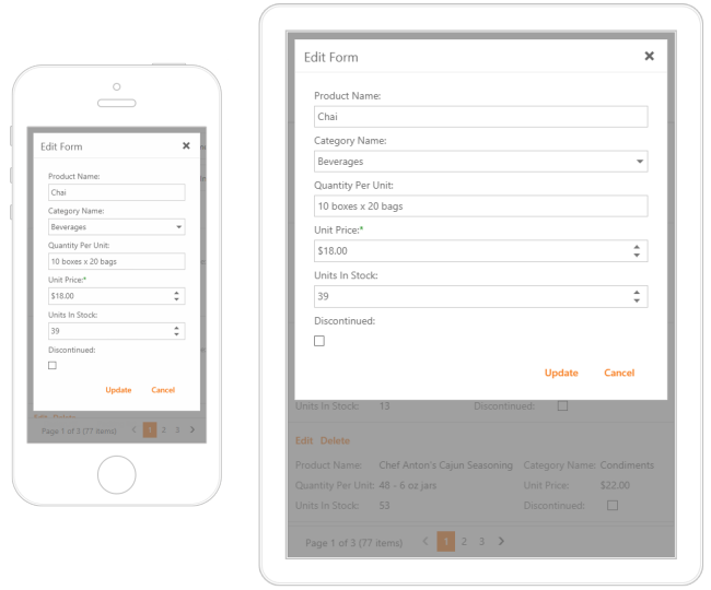
With this release, the DevExpress Data Grids ship with adaptive popup dialogs (header filter's dropdown, popup edit form, filter builder).
Filtering UI Enhancements
You can now display our filter editor within the Header Filter's dropdown. Once you begin entering a search string, the dropdown item list is automatically updated with relevant/matching items.
Web Forms Demo MVC Demo Documentation
Chart Control
Criteria Based Unified Filtering
With this release, the series DataFilter property has been replaced with the FilterCriteria and FilterString properties. This allows you to use the Filter Control to manage data represented within a chart.
Demo
Totals Labels for Stacked Bars and Pies
With this release, the DevExpress Chart Control is shipped with the ability to calculate total labels for stacked bars and pies automatically.
Bar total labels are labels that display series group total values and are outside groups. Total labels are available for the following Bar series:
- Stacked Bars
- Side-by-Side Stacked Bars
- Full-Stacked Bars
- Side-by-Side Full-Stacked Bars
Pie (Donut) total labels are labels displayed in the center of a Pie (Donut) for series point total values. The Pie Total label is available for all 2D Pie (Donut) series.
The {TV} pattern introduced in this release allows you to display total values in both series labels and series titles.
Demo
LegendTextPattern for a Series with the Disabled ColorEach Mode
Use the LegendTextPattern property to configure legend text for series using the disabled ColorEach mode. This feature helps you modify legend text without the need to handle CustomDrawSeries events.
Display a Chart Using the SVG Format
DevExpress Charts for ASP.NET and MVC can now render a client-side chart as an SVG image.
Demo
Export a Chart to an SVG Image
You can now export charts to a vector image file format (SVG).
Dock and Popups
Popup Control - Adaptivity
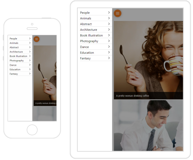
The DevExpress Popup for Web Forms and MVC now supports an adaptive display mode. When used, its content is rearranged and adapted to any screen resolution. Fields are positioned one under another and are arranged within one column when the browser window changes its width.
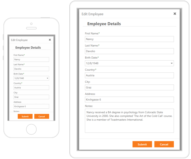
Web Forms Demo MVC Demo Documentation
Editors
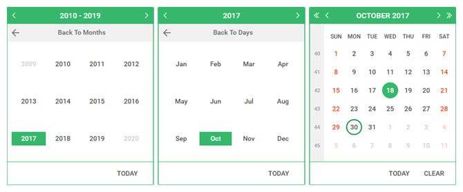
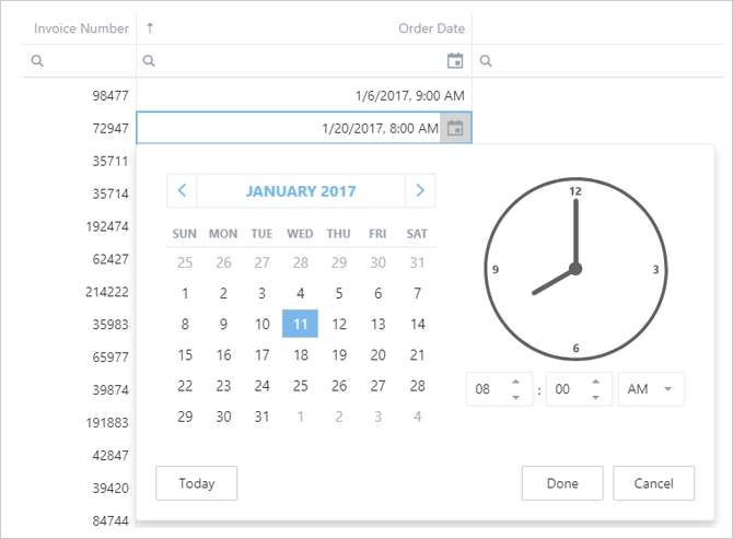
Calendar and DateEdit – Inline Selection Mode
Our ASP.NET Calendar and DateEdit controls now offer the inline mode for more efficient date navigation/selection. The control includes settings that allow you to control navigation depth and navigation button visibility.
Web Forms Demo MVC Demo Documentation
Check Box - Toggle Switch
Our Web Forms and MVC Check Box allows you to transform the default representation of a checkbox and display it as a toggle switch.
Demo Documentation
Date Editor - Adaptivity
With this release, the DevExpress DateEdit Control for Web Forms and MVC can adapt its content based on browser window size. When used, the time region moves below the calendar region within the control's dropdown.
Web Forms Demo MVC Demo Documentation
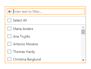
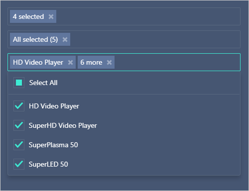
List Box - Select All
End-users can now select all ListBox items using the 'Select All' check box located at the top of the control.
Web Forms Demo MVC Demo
ListBox - Filtering
The DevExpress ASP.NET ListBox can now filter data. End-users can filter list box items by entering text into the filter editor located above the list. When entering a filter string, the item list is automatically updated so that the ListBox only displays relevant items (those that match the filter string).
Web Forms Demo MVC Demo Documentation
Client API Enhancements
Our client API has been extended with new methods that allow you to detect changes on a form and notify users of the need to save/cancel changes before leaving the page.
Web Forms Demo MVC Demo
File Manager & File Upload
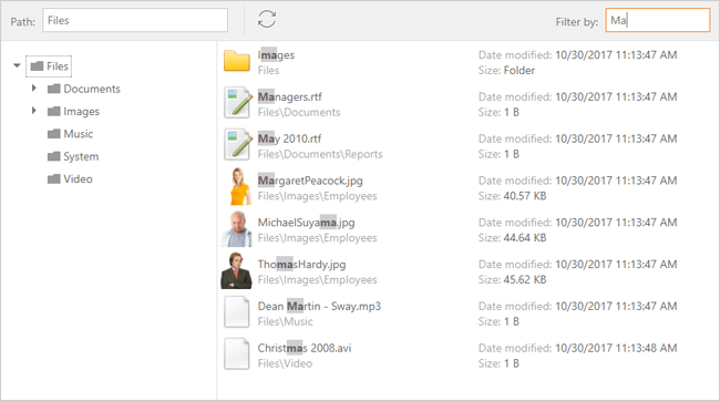
Advanced Filtering
With this release, we've extended the filtering capabilities of the DevExpress ASP.NET File Manager. You can now allow end-users to filter file manager items within the current folder and all subfolders. In addition, a new server-side API allows you to implement custom filters for the File View (when you need to implement filters to locate files by extension, modification time, etc.).
Web Forms Demo MVC Demo
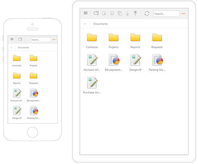
Adaptivity
The DevExpress ASP.NET File Manager ships with a new adaptive mode. Once enabled, File Manager elements are automatically rearranged based upon browser size.
Web Forms Demo MVC Demo
Miscellaneous Enhancements
- Item metadata management.
- Item tooltip customization.
- File/Folder Permission management.
HTML Editor
Resizable Images and Tables
The DevExpress ASP.NET HTML Editor allows end-users to resize images and tables.
Adaptive Popup Dialogs
Responsive Toolbars
In all toolbar modes (menu, ribbon, one-line ribbon), the DevExpress ASP.NET HTML Editor can automatically adapt its toolbar content depending on the viewport width.
Navigation and Layout
Menu - Adaptivity
Improved support for adaptive/responsive layouts.
Web Forms Demo MVC Demo
Pivot Grid Control
Performance Enhancements
We have improved the in-memory data processing capabilities of the DevExpress Pivot Grid Control for Web Forms and MVC. Based on usage scenario, the control is up to 3 times faster than previous versions.
Rich Editor Control
Document Protection
Our ASP.NET Rich Text Editor continues to extend its support for document protection. You can now specify permissions for a protected document in order to limit editing to a collection of users and user groups.
Documentation
Context Menu Customization
With this release, you can handle a new client-side event to customize our ASP.NET Rich Editor's context menu (insert new menu items, remove or disable existing items) or prevent the menu from being displayed.
Improved Support for Scalable Environments (Clouds/WebGardens/WebFarms)
This features is available as a CTP (community technology preview).
In previous versions, DevExpress ASP.NET Office-inspired controls (Spreadsheet, Rich Editor) maintained document states in memory. This offered the best performance, but affected scalability.
With our new stateless option, you can maintain document state in external storage (Redis and SQL server support has been implemented, base code for other external storage medium is also available). Though this new option is not as fast as our existing implementation, it does reduce multi-server issues (MS Azure) and it does offer web farm/garden support.
New Public Client-Side Events
This release includes numerous new client-side events designed to enhance control over Editor behavior:
- Receive or lose focus;
- Switch the active sub-document;
- Modify content (inserting/removing);
- Change character or paragraph properties;
- Handle mouse and keyboard actions.
Adaptive Popup Dialogs
Scheduler Control
Scheduler - Adaptivity Enhancements
In this release, Web Forms and MVC Scheduler provides improved support for a variety of screen resolutions. It also includes redesigned layout for the Appointment dialog in adaptive mode.
The Agenda View is now fully adaptive (including the View Selector and View Visible Interval elements).
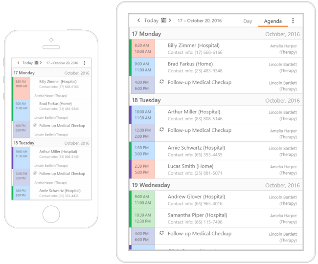
In v17.2, Scheduler dialogs can rearrange content and adapt to any screen resolution as needed. The dialog automatically arranges its fields into a single column (one under another) when a browser window changes width.
Web Forms Demo
Blog Post
Appointment Tooltip Presentation Modes
You can now specify the appointment tooltip mode – whether a tooltip is represented as a button or as a hint.
Documentation

New Dialog Customization API
A new server API enables you to work with default dialogs' view models (both declaratively and programmatically) and change dialog element characteristics (values, availability and layout) as needed, without the necessity of copying dialog form templates (UserControls) into your project.
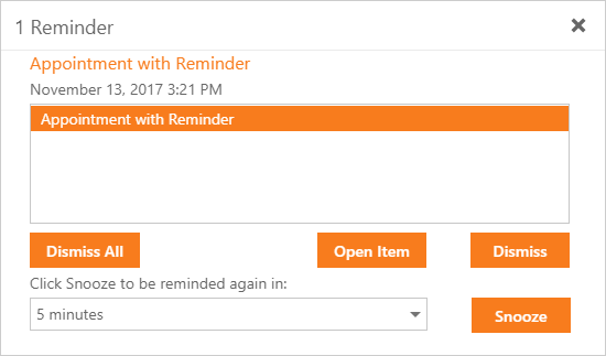
Reminder Dialog Enhancements
The DevExpress Scheduler's Reminders dialog has been improved. The dialog now provides detailed appointment information along with an 'Open Item' button.
Documentation
Touch UI Improvement
Our Scheduler allows end-users to easily manipulate appointments on touch devices (dragging an appointment and extending/reducing the selection).
Client API Enhancements
The DevExpress Scheduler's Client API has been extended with a number of new methods allowing to control the Resource Navigator and toolbar visibility, the control and scrollable area's height, and selection.
Agenda View Enhancements
We have extended the functionality of the DevExpress Scheduler’s AgendaView. You can now:
- Specify whether day headers are displayed vertically or horizontally. In adaptive mode, the Scheduler can automatically specify day header orientation mode based upon browser window width.
- Show or hide the Time section.
- Fix the day header while scrolling a long list of appointments.
- Control icon cell visibility.
Web Forms Demo MVC Demo
Spreadsheet Control
Improved Support for Scalable Environments (Clouds/WebGardens/WebFarms)
This features is available as a CTP (community technology preview).
In previous versions, DevExpress ASP.NET Office-inspired controls (Spreadsheet, Rich Editor) maintained document states in memory. This offered the best performance, but affected scalability.
With our new stateless option, you can maintain document state in external storage (Redis and SQL server support has been implemented, base code for other external storage medium is also available). Though this new option is not as fast as our existing implementation, it does reduce multi-server issues (MS Azure) and it does offer web farm/garden support.
Adaptive Popup Dialogs
TreeList Control
Full-Functional Filtering Support
With this release, we've equipped the DevExpress ASP.NET Tree List with filtering capabilities. End-users can filter Tree List data using the following UI elements:
- Auto-Filter Row
- Built-in Search Panel
- Column Header Filter Dropdowns
Web Forms Demo MVC Demo Documentation
Data Export
You can now export data using built-in functionality and no longer need to use an external export engine. The new 'Export' command item can be added to the built-in toolbar without any code. In addition, we now support export to DOCX.
Web Forms Demo MVC Demo
Adaptive Popup Dialogs
Miscellaneous Enhancements
Our Web Forms and MVC TreeList control includes the following new enhancements.
- The ability to change a column's display text. This option allows an end-user to sort/filter tree list data either by display text or value.
- Support for unbound columns that are not bound to any field in a data source. Data for this column type is calculated based on an expression or by using a specific event.
Themes
New Office 365 Theme
This release includes a new Office 365 theme for both desktop and touch-first devices.
CardView
Bootstrap Card View Control
The DevExpress ASP.NET Card View control for Bootstrap was designed so you can represent tabular data using a card UI metaphor. Our Card View control ships with numerous data shaping and layout customization options including:
- Data sorting
- Data filtering and search panel
- Data editing
- Customization via templates
- Multiple card selection
- Integrated paging
Demo

Charts
Bootstrap Range Selector Control
Our Bootstrap Range Selector control is a server-side wrapper for the Java Script-based DevExtreme Range Selector widget. It allows users to select a range of values via a customizable scale.
Demo
Editors
Bootstrap Binary Image
The Bootstrap Binary Image control allows you to upload and display images.
Demo
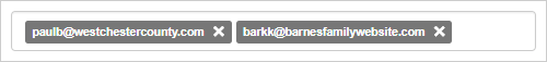
Bootstrap Tag Box
Our Bootstrap Tag Box control allows end-users to select multiple items from a list.
Demo
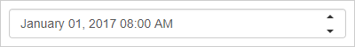
Bootstrap TimeEdit
The DevExpress Bootstrap Time Edit control allows you to display and edit date-time values. End-users can modify values by typing directly into the edit box or clicking spin buttons to increment or decrement months, days, hours, minutes or seconds.
Demo
GridView
Toolbar
With this release, the DevExpress Bootstrap Grid View control can display a toolbar with commands related to the Grid View and its data. You can customize the toolbar and incorporate commands that best address your business needs.
Demo
Adaptive and Responsive Modes
With this release, our Bootstrap Grid View control can function in both adaptive and responsive modes.
- In adaptive mode, the Bootstrap Grid View automatically switches to a compact presentation when screen resolution is less than or equal to a specified value.
- In responsive mode, the Bootstrap Grid View automatically hides columns that do not fit the current screen resolution and gives users the ability to view hidden data within an adaptive detail row.
Demo
Customization Dialog
Our Bootstrap Grid View control for ASP.NET now ships with a built-in customization dialog. The customization dialog is adaptive and offers easy access to all essential data shaping options on touch devices.
Demo
Layout
Bootstrap Popup - Adaptive Mode
With this release, our Bootstrap Popup Control can be displayed in adaptive mode. When the adaptive mode is applied, the popup window is displayed as a modal dialog that automatically rearranges its content to fit the browser window.
Demo
Navigation
Bootstrap Toolbar
The Bootstrap Toolbar Control for ASP.NET allows you to supply your web application with a lightweight adaptive toolbar interface. A toolbar is presented as a set of buttons arranged across groups.
Demo
Badges Support
With this release, DevExpress Bootstrap controls natively support Bootstrap badges allowing you to display supplementary information within the various visual elements of a control.
Demo
CardView
Bootstrap Card View Control
The DevExpress ASP.NET Card View control for Bootstrap was designed so you can represent tabular data using a card UI metaphor. Our Card View control ships with numerous data shaping and layout customization options including:
- Data sorting
- Data filtering and search panel
- Data editing
- Customization via templates
- Multiple card selection
- Integrated paging
Demo
Charts
Bootstrap Range Selector Control
Our Bootstrap Range Selector control is a server-side wrapper for the Java Script-based DevExtreme Range Selector widget. It allows users to select a range of values via a customizable scale.
Demo
Editors
Bootstrap Binary Image
The Bootstrap Binary Image control allows you to upload and display images.
Demo
Bootstrap Tag Box
Our Bootstrap Tag Box control allows end-users to select multiple items from a list.
Demo
Bootstrap TimeEdit
The DevExpress Bootstrap Time Edit control allows you to display and edit date-time values. End-users can modify values by typing directly into the edit box or clicking spin buttons to increment or decrement months, days, hours, minutes or seconds.
Demo
GridView
Toolbar
With this release, the DevExpress Bootstrap Grid View control can display a toolbar with commands related to the Grid View and its data. You can customize the toolbar and incorporate commands that best address your business needs.
Demo
Adaptive and Responsive Modes
With this release, our Bootstrap Grid View control can function in both adaptive and responsive modes.
- In adaptive mode, the Bootstrap Grid View automatically switches to a compact presentation when screen resolution is less than or equal to a specified value.
- In responsive mode, the Bootstrap Grid View automatically hides columns that do not fit the current screen resolution and gives users the ability to view hidden data within an adaptive detail row.
Demo
Customization Dialog
Our Bootstrap Grid View control for ASP.NET now ships with a built-in customization dialog. The customization dialog is adaptive and offers easy access to all essential data shaping options on touch devices.
Demo
Layout
Bootstrap Popup - Adaptive Mode
With this release, our Bootstrap Popup Control can be displayed in adaptive mode. When the adaptive mode is applied, the popup window is displayed as a modal dialog that automatically rearranges its content to fit the browser window.
Demo
Navigation
Bootstrap Toolbar
The Bootstrap Toolbar Control for ASP.NET allows you to supply your web application with a lightweight adaptive toolbar interface. A toolbar is presented as a set of buttons arranged across groups.
Demo
Badges Support
With this release, DevExpress Bootstrap controls natively support Bootstrap badges allowing you to display supplementary information within the various visual elements of a control.
Demo
New Color Schemes
New Color Schemes for the Generic Theme
You can now change your entire application's color palette by applying one of our newly implemented schemes: Soft Blue, Carmine, Green Mist, Dark Violet, and Dark Moon. These new color schemes are based on the DevExtreme Generic theme.
Blog Post
React Grid (Beta)
Enhancements
DevExtreme React Grid v17.2 ships with the following new features:
Blog Post
Data Grid
Column Header Filter and Column Chooser Search
You can now search through header filter values. You can activate this feature for all columns or only a specific column using the widget's or column's 'headerFilter.allowSearch' option.
Demo Blog Post
DateTime Data Type Support
Our HTML5 Data Grid fully supports time portions in Date-Time values:
- Proper time formatting is applied to cell display text.
- Cell drop-downs include time editing controls.
- The grid allows you to filter data while taking time values into account.
Blog Post
Custom Sorting
You can implement your own value comparison function and thus enable custom data sorting algorithms.
Blog Post
Data Visualization
Funnel / Pyramid Chart
Our new Funnel widget allows you to create funnel and pyramid charts for use within your HTML5-JavaScript applications.
Demo
Blog Post
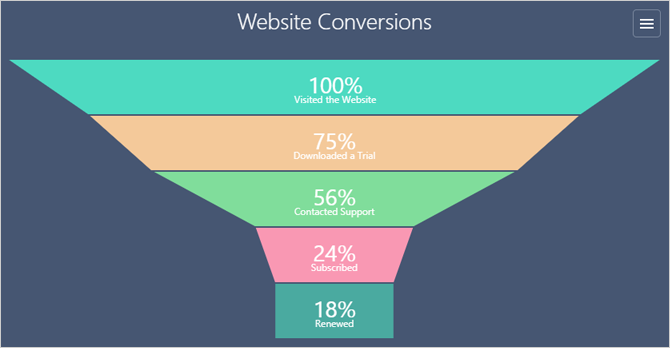
Chart Axis - Scale Breaks
DevExtreme HTML5-JavaScript Chart can automatically analyze your chart's data and apply scale breaks to improve readability. Manual scale breaks are also supported.
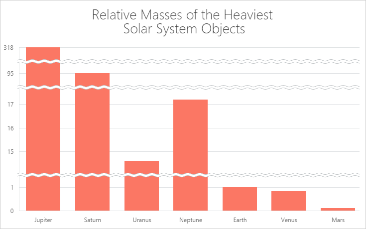
Chart Axis - Tick Mark Generation
DevExpress HTML5 Chart v17.2 ships with improved tick mark generation logic:
- Date-time ticks are always displayed at the start of standard date-time intervals: first day of week / month / year, start of a day, top of an hour, etc.
- You can force a numeric axis to generate ticks only at whole number positions.
- Numeric and date-time axis can now automatically adjust label formatting, improving readability with a compact display option.
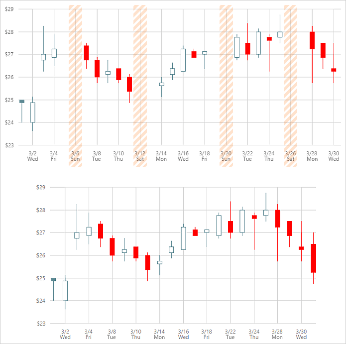
Date-Time Axis - Exclude Weekends and Holidays
You can now suppress weekends and holidays on the chart's arguments scale and provide an uninterrupted display for a dataset that only includes work days.
Pivot Grid
Column Header Filter and Field Chooser Search Panel
With this release, our HTML5-JavaScript Pivot Grid can display a search box within its Field Chooser dialog and Filter Dropdown.
Demo Blog Post

Scheduler
Display Multiple Days, Weeks, or Months in a View
Our HTML5-JavaScript Scheduler allows you to specify the number of Days, Weeks or Months to display within the Day View, Week View and Month View respectively.
Demo Blog Post
Compressed Appointment Display Option
You can limit the number of simultaneously displayed appointments in:
- a single cell in the Month View;
- a single all-day panel in the Day View or Week View.
If the number of appointments exceeds the specified value, our Scheduler collapses them into a single label (once selected, this label displays all events within a drop-down list).
You can customize drop-down list appearance using the 'dropDownAppointmentTemplate' option.
Demo Blog Post
Current Date-Time Indicator
Our HTML5-JavaScript Scheduler can indicate the current time in views that utilize a time scale. In addition, you can enable timetable shading up to the current time mark.
Blog Post
Tree List
Recursive Node Selection
Our HTML5-JavaScript Tree List now supports recursive node selection:
- When changing a parent node's selected state, all child nodes at all nesting levels are updated accordingly.
- Parent nodes can automatically change their state to selected, unselected or indeterminate, based upon the number of selected child nodes.
Demo Blog Post
Column Header Filter and Column Chooser Search
You can now search through header filter values. You can activate this feature for all columns or only a specific column using the widget's or column's 'headerFilter.allowSearch' option.
Blog Post
UI Widgets
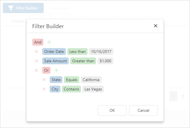
New Filter Builder Widget
Our new HTML5-JavaScript FilterBuilder widget allows users to construct complex filter expressions with absolute ease (supports an unlimited number of filter conditions). It can be used on a standalone basis or with the List, Data Grid, and TreeList widgets.
Demo Blog Post
TagBox - New Item Selection Options
The TagBox can now group multiple tags into a single label when all available tags are selected or when end-users select a predefined set. Users can access individual tags by clicking the joined label (invokes the dropdown selection list).
Demo Blog Post
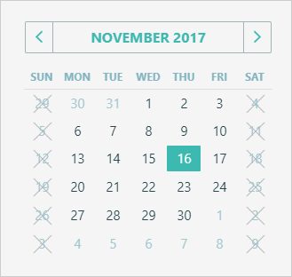
DateBox and Calendar - Disable Desired Dates
Our HTML5-JavaScript DateBox and Calendar widgets include a new 'disabledDates' option. As the name suggests, this new feature allows you to disable access to certain dates within the calendar - by either supplying a predefined date array, or implementing a function that determines whether a date should be available to end-users.
Demo Blog Post
TreeView and List - Search Panel
To simplify record selection, our HTML5-JavaScript List and TreeView widgets allows you to display a search box within its container.
Demo Blog Post
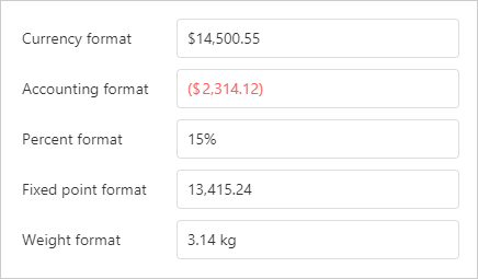
NumberBox - Display Text Formatting and Input Masking
The NumberBox widget now supports flexible display text formatting using Locale Data Markup Language (LDML) patterns. The specified format can also be used as a mask to control end-user input.
Improved Angular Support
This release includes the following Angular integration improvements:
Optional jQuery Dependencies
Disable jQuery dependencies and Increase Angular component performance by up to 30%.
Blog Post
Improved TypeScript Declarations
All Angular component properties are now declared with a specific type instead of any. This helps avoid type conversion errors.
Blog Post
Localization Enhancements
LDML Pattern Support
With this release, you can use Locale Data Markup Language (LDML) patterns to localize dates and numbers regardless of the localization library used.
Custom Decimal and Thounsands Separators
Our built-in localization engine now offers 'thousandsSeparator' and 'decimalSeparator' global configuration options.
Built-in Parser for Intl
You no longer need to implement a custom Date-Time parser when localizing widgets with Intl.
TypeScript Declarations
Improvements
DevExtreme can now utilize the benefits of TypeScript 2.0 or higher and use specific types instead of any wherever possible.
Blog Post
MVC Controls
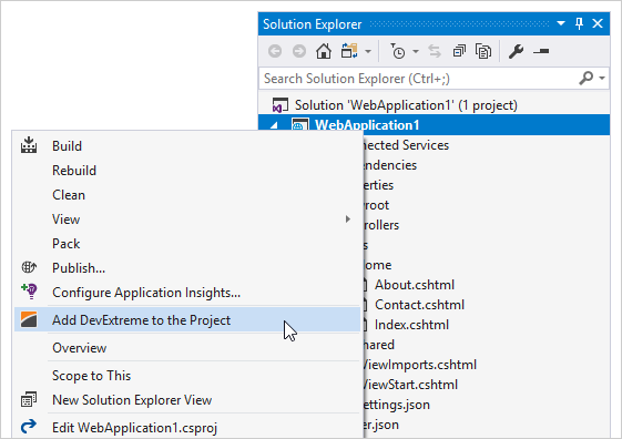
Easily Add DevExtreme MVC Controls to ASP.NET Core Projects
We have extended Visual Studio support with a new menu item that allows you to easily incorporate DevExtreme ASP.NET MVC Controls to an existing ASP.NET Core project.
Blog Post Documentation
.NET Core 2.0 Support
DevExtreme ASP.NET MVC Controls can now be used in Razor Page projects (introduced with .NET Core 2.0). In addition, our project templates and demos have been updated to .NET Core 2.0.
Blog Post Webinar
New Strongly-Typed HTML Helpers
You can now use lambdas when configuring Data Grid columns and summaries, PivotGrid fields, and Form items. This ensures compile-time type safety, enables IntelliSense, and automatically adds client-side validation based on Data Annotations defined in the model.
View:
                    @(Html.DevExtreme().DataGrid<Sale>()
                        .Columns(columns => {
                        columns.AddFor(m => m.CategoryID);
                        ...
Model:
                        public class Order {
                        [Required(ErrorMessage = "CategoryID field is required")]
                        [Display(Name = "Category ID")]
                        public int CategoryID { get; set; }
                        ...
Blog Post Documentation
New NamedTemplate Helper for Creating Complex Views
This release introduces a new 'NamedTemplate()' helper - allowing you to embed controls into one another. By leveraging its capabilities, you can reduce the amount of code needed to generate complex views.
Demo
Data Layer - Cross-domain Controller Support
The new 'RemoteController()' method allows you to consume API controllers hosted on external domains and identified by URLs.
                        @(Html.DevExtreme().DataGrid()
                        .DataSource(ds => ds.RemoteController()
                        .Key("OrderID")
                        .LoadUrl("http://www.example.com/Orders/GetOrders")
                        .InsertUrl("http://www.example.com/Orders/InsertOrder")
                        .UpdateUrl("http://www.example.com/Orders/UpdateOrder")
                        .DeleteUrl("http://www.example.com/Orders/DeleteOrder")
                        )
                        )
Blog Post Documentation
Data Layer - Areas Support
You can now access API controllers in different areas using the 'Area()' method added to the 'Mvc()' data source.
                        .DataSource(d => d.Mvc()
                        .Area("Area")
                        .Controller("Controller")
                        .LoadAction("Action")
                        )
Blog Post Documentation
Grid Control
Column Chooser
The Windows 10 Grid Column Chooser allows end-users to display, hide and rearrange columns at runtime.
Attributes-Based Validation
The DevExpress Windows10 Grid Control now supports DataAnnotations attributes.
Alternating Row Style
Miscellaneous
Master-Detail Pattern
This release includes a Master-Detail Pattern navigation layout. This feature allows you to repilcate the look and feel of the Windows 10 Mail app within your application.
Svg Icon Palettes
You can specify the global palette used to colorize SVG images in your application. In addition, you can apply a custom palette to individual icons and override the colors specified by the global palette.
All Platforms
Expression Bindings
This release includes an entirely new way to provide data to individual report controls. Instead of using data bindings (the default method used for previous versions), DevExpress Reports now uses binding expressions by default. Unlike the limited number of bindable properties permitted prior to this enhancement. this change allows you to assign values to a target report control property without using report scripts or conditional formatting.
Binding expressions should make it much easier for end-users to utilize expressions and understand expression criteria syntax (instead of writing script code in event handlers or using formatting rules to implement custom logic within a report).
The following is a summary of all binding options available to you:
Standard Data Binding - legacy binding mode available in all previous versions.
Expression Binding (simplified) - the default mode used in v17.2. With this mode, you can that previously required you to handle the BeforePrint script event and/or use conditional formatting.
Expression Binding (advanced) - use this mode to implement advanced scenarios where you need to set report control property values using the PrintOnPage event.
The use of expressions has made it much easier to calculate summaries and conditionally format report data. Expressions also allows end-users to evaluate summary results without handling script events (for example, to calculate the product of two summaries in a report).
The DevExpress Expression Editor supports all standard summary functions, allows you to access report bands/controls, and reference current data source values.
To help you migrate existing reports to our new binding mechanism, DevExpress ships an automatic report conversion tool. When enabled in your end-user reporting application, the end-user will be prompted – upon opening a legacy report - to convert said report to one that uses the newer binding mode. Backward conversion of reports (from using expressions back to legacy bindings) is not available.
Documentation Blog Post
PDF Export - Improved Performance
This release includes a new PDF export engine to help create a PDF file and report document simultaneously. Our PDF export engine supports two distinct modes: streaming and multi-threaded streaming. Multi-threaded streaming is nearly twice as fast and consumes less memory than in previous versions. When you are dealing with a limited number of threads (for example, in a web application), you can use the single-thread streaming.
We've also optimized in-memory export to generate fewer temporary objects. This allows you to decrease Garbage Collector load and memory consumption when exporting large reports.
Documentation
DOCX Export - Improved Performance
DOCX export is now 25% faster and consumes 5% less memory. Files take up to 50% less memory on the hard drive.
PDF Export – Acro Forms Support
You can now export a report's edit fields to PDF Acro Forms.
Documentation
Miscellaneous Enhancements
DOCX Export:
-
Right-to-left layout support.
-
Ability to specify document options for the exported file (Title, Subject, Keywords, Category, Comments and Author).
-
Object and Entity Framework Data Sources: Improved support for the display of nested properties within the wizard. You can create a master-detail report bound to an object or EF data source with a single run of the wizard (similar to using a SQL data source).
-
You can specify the resolution (in DPI) used to rasterize vector images (during export) for the following document formats: DOCX, RTF, XLS, XLSX, HTML, MHT and PDF.
Report Server
Dashboards and Report Import/Export
You can now transfer dashboard and report XML layouts between different instances of the DevExpress Report Server. Import/export options are available in the Document Details web page and the Web Designer menu.
Self-Service Registration
You can activate self-service registration when using Windows or an external authentication provider. This feature removes the need for Report Server admins to manually create accounts for new users. The account is automatically created when a user first logs in. The user is added to a group defined by the admin.
Documentation
External Authentication Providers
Support for the OpenID Connect and WS-Federation protocols allows you to integrate the Report Server with a compatible identity provider (e.g. IdentityServer or MS Azure Active Directory).
Documentation
Optimistic Document Locking
You no longer need to manually lock/unlock documents for exclusive access.
WinForms
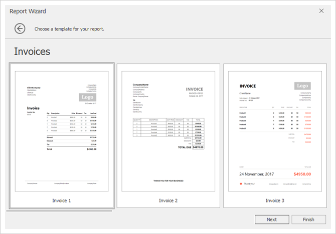
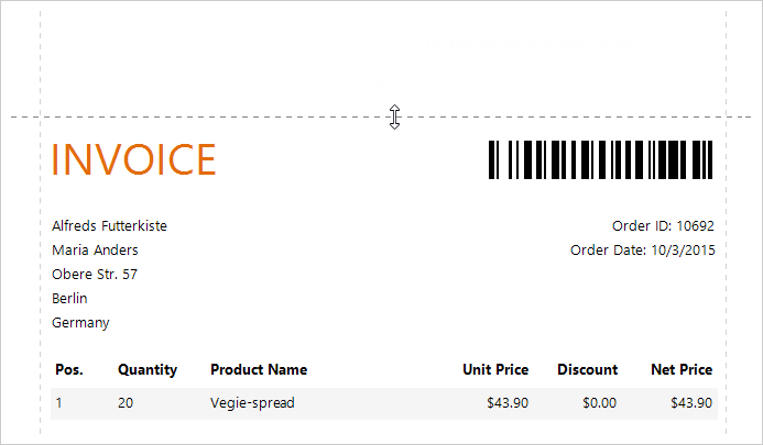
New Report Template Wizard
Choose from one of predefined templates to create professional-looking invoices in minutes. The updated Report Wizard allows you to map your database columns to predefined invoice fields, select currency formatting options and specify the discount/tax options.
Documentation
Web
ASP.NET Core Support (CTP)
You can now use DevExpress Report controls in ASP.NET Core applications targeting .NET Framework v4.6.1 (available as a Community Technology Preview).
Documentation
Property Grid
With our new Property Grid, you can disable property grouping, sort properties and search for a specific property within the grid.
Documentation
HTML5 Document Viewer - Optimized Multi-Page View Mode
We've improved performance and memory consumption for the DevExpress HTML5 Document Viewer when using the multi-page preview mode.
Expression Editor Enhancements
Our Expression Editor now offers code completion, validation, and an improved design.
Documentation
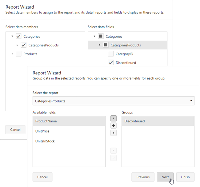
Master-Detail Wizard
Improved support for master-detail report generation using the Report Wizard (available within the Web Report Designer).
Documentation
ReactJS and Angular Support
We published code examples demonstrating how our reporting tools can be integrated into React and Angular2 based web applications:
Documentation
Filter Editor Enhancements
The Filter Editor features a new Advanced mode, allowing you to specify a filter string instead of using a visual editor.
Documentation
Visual Studio Project Templates
Use our Visual Studio templates to create a web-based report application containing the Report Designer and/or Document Viewer control and customize primary settings on-the-fly.
Documentation
NPM Support
Your reporting applications can now be deployed using the NPM package manager for Node.js. The package name is 'devexpress-reporting'.
Miscellaneous Enhancements
-
HTML5 Document Viewer - Improved editor for multi-value parameters.
-
Query Builder - Ability to search within tables.
WPF
Diagram-Based Query Builder and Master-Detail Editor
You can use the new Query Builder to visually construct queries and define relationships.
Interactive Margins in Document Preview
You can now customize document margins within the Print Preview.
Documentation
Support for SVG Icons
Your WPF reports can now use vector SVG icons instead of bitmap images (to help improve rendering on High-DPI displays).
Documentation
New Smart Tags for Report Elements in the Report Designer
You can use our new smart tags to quickly access the most popular report band settings within the End-User Report Designer for WPF.
Documentation
New Report Template Wizard
Choose from one of predefined templates to create professional-looking invoices in minutes. The updated Report Wizard allows you to map your database columns to predefined invoice fields, select currency formatting options and specify the discount/tax options.
Documentation
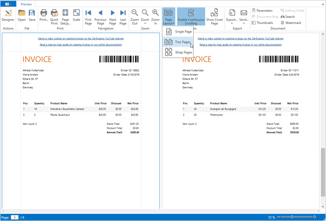
Multi-Page View Mode and Page-by-Page Scrolling
Display multiple pages (side by side) and disable continuous scrolling.
Documentation
Miscellaneous Enhancements
-
Selecting the XRRichText control in the Report Designer invokes a full-featured rich-text editor.
-
Support for drag and drop operations in the Field List and Report Explorer panels of the Report Designer.
- Field List - You can select and drop multiple fields to create a table with cells bound to data fields.
- Report Explorer - You can drag and drop styles and formatting rules.
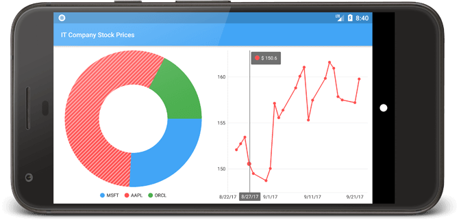
New Mobile Chart Controls
We are proud to announce our new Chart widgets for iOS, Android and the Xamarin mobile platform.
Download the Binaries and Documentation
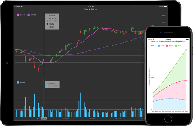
Available Platforms
- XCode development in Objective C and Swift.
- Android Studio development in Java.
- Xamarin for Visual Studio development in C# or VB.NET.
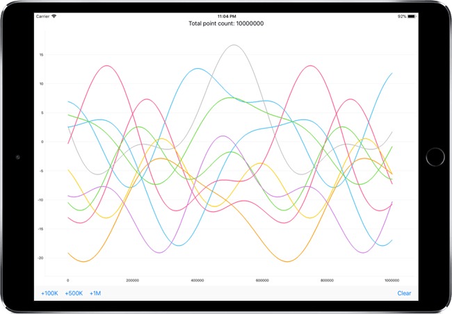
Developed for the Maximum Performance
- Hardware GPU acceleration for the fastest possible rendering speed.
- Support for large data sources (5-20 million points depending on the target device).
- Optimized real time data visualization.
Hassle-free Data Initialization
Hassle-free data initialization for all frequently used types including DateTime, Numeric, Qualitative and Financial (Open, Close, High, Low).
Interactivity
- Zoom and scroll operations.
- Series and point selection.
- Exploded points support for Pie and Doughnut charts.
- Crosshair cursor for tracking series point values.
Customization
- The ability to select a Theme that best matches your application design.
- Customizable appearance for all chart elements.
- Settings to modify behavior and the layout of Axes, Legends and Series Point Labels.
Download the Binaries and Documentation
PDF Document Processor
Rendering Very Large Images
Large image rendering (unpacked size is 200+ Mb) is now supported.
Text Markup Annotations
With this release, our Office File API supports for the following text markup annotations types:
- Highlight;
- Strikeout;
- Underline;
- Squiggly underline.
You can add new annotations to a document or customize/delete existing annotations.
Documentation
Snap Document Server
Chart API
With this release, our Snap Document Server library allows you to create and modify charts in code.
WPF Dashboard
WPF Dashboard Viewer (CTP)
This release includes the CTP version of our new WPF Dashboard Viewer that supports asynchronous data loading. In addition, it includes template support for customizing dashboard items and a rich set of WPF visual themes.
Documentation
Web Dashboard
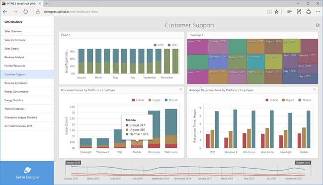
Client-Side Web Dashboard
With this release, our HTML5 JavaScript Dashboard control moved from CTP and can be used in production environments.
Demo Documentation
Web Dashboard Viewer for Mobile Devices (CTP)
v17.2 allows you to display dashboards on mobile devices. Note that this functionality is being made available as a CTP.
Demo Documentation
ASP.NET Core Dashboard (CTP)
This release includes a new ASP.NET Core Dashboard control. You can also use our HTML5 JavaScript Dashboard control with an ASP.NET Core back-end.
Documentation
Compact Theme for Web Dashboard
Our Web Dashboard now supports both compact light and dark themes within the Viewer.
Demo
Documentation
Web Dashboard Title and Caption Enhancements
With this release, we have redesigned the Dashboard's title and item caption and added new customization capabilities. You can now add your own command buttons with custom icons to incorporate custom functionality as needed.
Expression Editor Enhancements
Our Expression Editor now offers code completion, validation, and an improved design.
Data Processing
Performance Enhancements
By using new multi-threading algorithms for data aggregation, we have improved the in-memory data processing capabilities of DevExpress Dashboard for .NET.
Visual Studio Integration
New Visual Studio Capabilities
DevExpress Dashboard includes a series of new options within Visual Studio. They include:
Predefined templates allowing you to create a Dashboard Designer or Viewer application for both WinForms and web.
Documentation
A straightforward way to create design-time dashboards for display within the DashboardViewer control.
Data Source Configuration Wizard allowing you to supply a dashboard with data from existing project data sources such as ADO.NET DataSet or Entity Framework.
Documentation
Visualization
Search in Filter Elements
With this release, all filter elements, including the combo box, list box and tree view, include search support. This new feature allows end-users to locate required entries among multiple records.
Demo WinForms Documentation ASP.NET Documentation
Grid Dashboard Item - Hyperlink Support
The Dashboard's Grid item can now display hyperlinks so that end-users can navigate to web content related to displayed values. This functionality is available for both WinForms and web platforms.
Demo WinForms Documentation ASP.NET Documentation
Core Enhancements
Performance Enhancements
This release includes further optimizations to XAF's Controller creation process for popup windows, the DashboardViewItem and built-in Property Editors (for reference properties). These optimizations are designed to improve complex form loading performance and overall end user experience.
Additionally, due to optimizations in how user settings are saved, ASP.NET apps are now more responsive.
Documentation
Localization
Built-in XAF modules and non-XAF DevExpress components can now be fully localized using our Localization Service. It allows easier modification and reuse of translations in multiple XAF projects.
Documentation
Mobile UI (Beta)
Mobile UI Enhancements
The XAF's Mobile UI goes from CTP to Beta and ships with the following enhancements:
-
Support for ImmediatePostData, DataSourceCriteria, DataSourceProperty and DataSourceCriteriaProperty attributes.
-
PhoneGap Plugins integration through the MobileApplication.AdditionalPhoneGapPlugins property.
A new Localization Mobile module that automatically enables use of the appropriate UI language and value formatting based upon device settings.

With XAF Mobile Custom Modules, you can use third-party mobile controls, or register custom JavaScript functions (which can be called in client event handlers).
Online Demo
Security System Enhancements
Improved Permission Processing and Middle-Tier Application Server Optimizations
This release includes a reworked permission processing algorithm. It is now faster, supports more scenarios and simplifies our code maintenance.
We also accelerated the XAF's Middle-Tier Application configuration. Data is secured on the server, but permission information is passed to the client along with data, so that UI updates are done without extra requests and the client application works faster.
Documentation
UX Enhancements
Display Reports & Dashboards in a Maximized State within a Separate Browser Tab
ASP.NET users can now open dashboards and reports within a separate web browser tab (via UI or by direct URL) using all the available space on the page (without XAF navigation elements and toolbars).
Demo Video
New WinForms Light Style
The new Light Style form templates with both Ribbon and Standard menus are available for WinForms apps. The new style layout is much cleaner, as it eliminates excessive borders. Use the WinApplication.UseLightStyle property to enable this feature in existing apps.
Migration Guidelines
Unit Test Runner
JavaScript Test Runner
The JavaScript Test Runner is out of beta and you can now run & debug tests for client-side JavaScript code using the powerful CodeRush Test Runner.
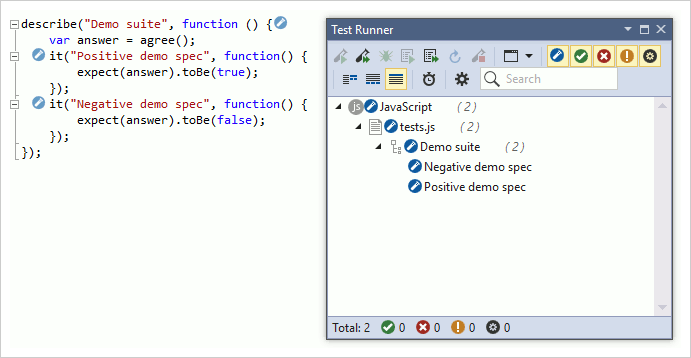
Our JavaScript test runner is based on Karma and supports the following testing frameworks:
If you don't use Karma, we also support unit tests linked to the tested code using triple-slash reference directives or a Chutzpah configuration file.
Documentation
Exclude from Coverage
You can now exclude specific projects from Code Coverage analysis using the *.runsettings file. For more details refer to Microsoft's article, Customizing Code Coverage Analysis.
Documentation
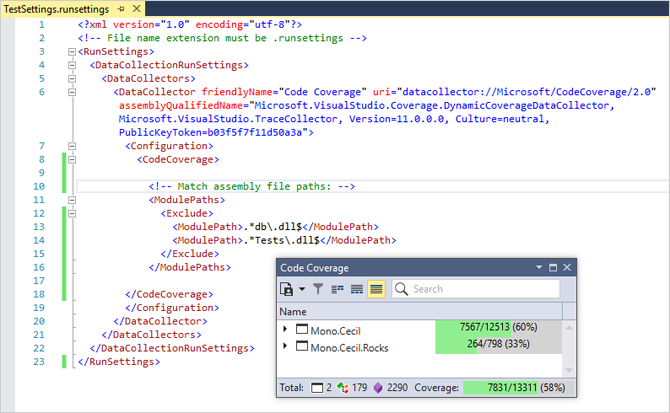
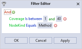
Code Coverage Filtering
You can now create and apply Filters to the Code Coverage report. For example, you can create a filter that only shows methods with test coverage between 1% and 40%, like this:
Documentation
.NET Core 2.0 Support
You can now use the CodeRush Unit Test Runner to run .NET Core 2.0 tests and calculate Code Coverage in Portable PDB debug-symbols-format projects.
Microsoft Fakes
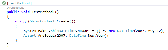
The CodeRush Test Runner now supports the Microsoft Fakes isolation framework.
Code Analysis
Unused Members
We have added a new analyzer that detects unused members.
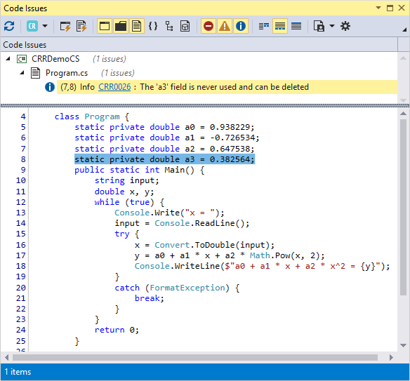
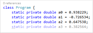
You can also configure the highlighting of such members (e.g., de-emphasize them) in the code editor (Editor | All Languages | Static Code Analysis | Highlight unused members).
Unused members can be safely deleted without impacting program behavior.
Documentation
NullReferenceException Analysis (beta)
CodeRush 17.2 introduces a beta version of a new feature we've been working on, NullReferenceException Analysis. This feature identifies unprotected code that may unintentionally raise NullReferenceExceptions.
CodeRush for Roslyn now identifies code that may be at risk to raising a NullReferenceException. You can turn this feature on for C# and Visual Basic (it is disabled by default) on the Editor | All Languages | Static Code Analysis options page.
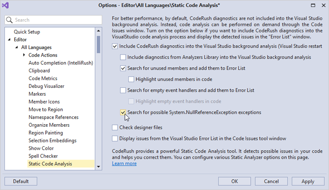
Async/Await Analyzers
We have added the following static analyzers focused on best practices for async and await:
-
Async method has no CancellationToken parameter.
-
CancellationToken parameter is never used.
-
Async void method should be in a try/catch block. Otherwise, that method's exceptions may cause a crash.
-
ConfigureAwait(true) is called implicitly. ConfigureAwait() should always be explicitly called, as the default behavior may cause a deadlock.
-
Redundant 'await'.
-
The 'await' keyword for the Task.FromResult expression is not required.
-
The returned Task is null. Use 'Task.FromResult()' instead.
-
Task.When is used in an async method. Use Task.Wait instead.
-
The 'await' expression is missing a cancellation token.
Spell Checker Improvements
The CodeRush Spell Checker can now:
- Check XML comments (<c> and <code> tags are ignored).
- Check File names.
- Exclude ToString() expressions.
Properly handle Microsoft.Naming suppressions. The Spell Checker now ignores words suppressed using the SuppressMessage attribute for CA1704 and CA1709 issues.
We have also added a new toolbar button to toggle the Spell Checker on and off.
Documentation
XAML Support
XAML Formatting in Markup Extensions
We have improved XAML Formatting with the ability to format markup extensions. You can now:
- Break arguments apart only if they exceed the specified number. You can set a threshold on the argument count, to determine whether argument splitting occurs, and you can also specify the maximum number of arguments per line.
- Align markup extension arguments with first argument.
Documentation
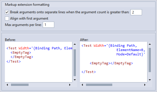
Normalize Whitespace in XML Comments
We have added the ability to normalize whitespace inside XML comments.
Documentation
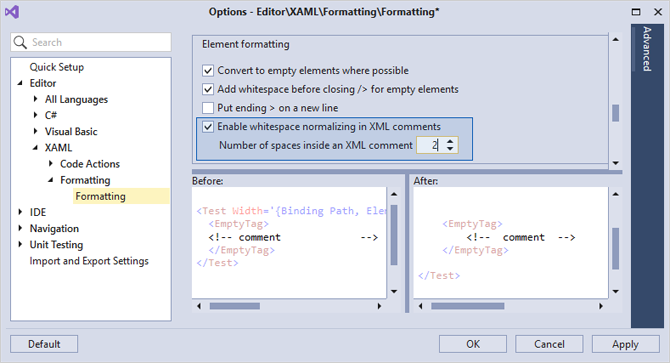
Code Style
Modifiers Order
You can now set your preferred order for member modifiers. CodeRush features will respect this order when adding or removing modifiers. For instance, you can set public and private keywords to appear before the static keyword. This feature is available only in C#, as Visual Studio automatically sorts modifiers in Visual Basic.
Documentation
Attribute List
We have added the new Attribute list Code Style & Code Cleanup rule, allowing you to combine two or more separate attributes applied to a single member into a single declaration.
Documentation
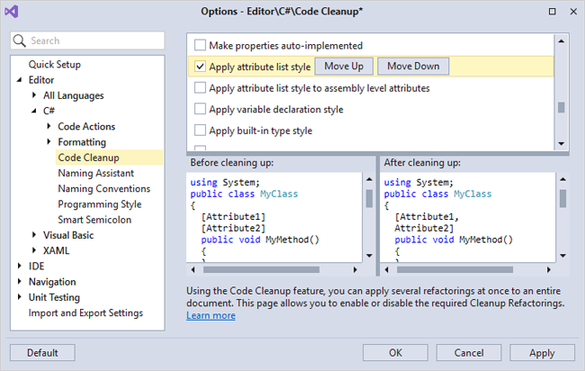
Visual Studio Code Style Settings Import
We are now synchronizing CodeRush Code Style settings with similar code style settings built into Visual Studio. The following settings are now imported from Visual Studio by CodeRush:
- Local Declaration Style
- Built-in Type Names
- this/Me Qualifier Usage
If you change any of these settings in Visual Studio, the corresponding settings in CodeRush will be updated to match your changes (going back and changing the CodeRush settings will not alter Visual Studio settings).
Braces in Statements
We have added a new Code Style rule called Braces in Statements. CodeRush can now remove or require (add) block delimiters in places where they are optional, such as around the single child statement of an if block.
Documentation
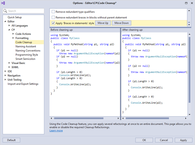
Navigation Enhancements
Drop Marker for Selections
We extended the Drop Marker feature, adding the ability to drop markers for selections, and then later return, restoring the selection when you collect the marker. Simply select the code and then drop a marker using Alt+Home. To collect markers press Esc or Alt+End.
Documentation
Recently Opened Items in Jump To Menu
Jump To File and Jump To Symbol windows now display Recently Opened Items.
Documentation
Initial Filter in Jump To Menu
The Jump to Symbol, Jump to File, and Jump to Everything menus can now use the identifier under the caret as the initial filtering option.
You can enable this feature on the Navigation | General options page.
Documentation
Navigation From Member Icons
You can now open the Navigation Menu using Member Icons.
Code Formatting and Cleanup
Document Formatting
Document Formatting lets you configure every aspect of code formatting in an entire solution in one step. CodeRush's Document Formatting is more flexible and offers more options than Visual Studio's built-in formatting feature.
Document Formatting offers full control over the following code style attributes:
Spacing
Wrapping
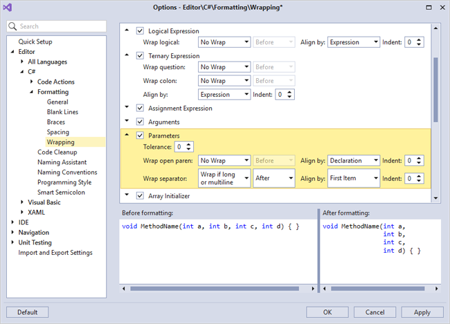
Line Breaks
For more details, refer to the documentation.
These formatting options are part of the Format Document rule, which can be optionally applied as part of Code Cleanup. You can specify which rules are applied on the Code Cleanup options page.
You can also bind the FormatDocument command to a shortcut and use it to invoke the Format Document functionality independently from Code Cleanup.
Documentation
Project-wide Code Cleanup
You can now run Code Cleanup for the entire project. Simply right-click the project you want to clean in the Solution Explorer and select Cleanup Project from the context menu.
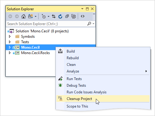
CodeRush cleans the project, displaying a progress window.
If you cancel code cleanup from the progress window, all code files will remain unchanged.
Note: This feature is in a preview state, and may break or change the behavior of your code. You can also undo the entire cleanup operation using Visual Studio's Undo command (available from inside any of the changed documents).
Documentation
Refactorings and Code Providers
Widening the Refactorings' Accessibility
We widened the accessibility of many refactorings and code providers, improving discoverability and making them available when the caret is anywhere on the line containing relevant code you want to change. Refactorings receiving wider accessibility include:
- Use Expression Body
- Collapse/Expand Property, Accessor, Method
- Reverse Conditional
- Flatten Conditional
- Compress/Expand Ternary Expression
Documentation
XPO Fields
We have implemented the XPO Fields feature based on the XPO EasyFields community plugin for CodeRush Classic. This is useful when working with eXpress Persistent Objects letting you automatically generate and update the XPO FieldsClass based on existing class members.
Documentation
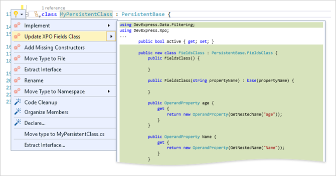
Code Actions Settings
We have added configuration options for generated members built by the following features:
- Declare menu items & Declare providers
- Add to Interface
- Add Getter/Setter
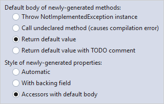
You can find these options on the Editor | Code Actions | Code Actions Settings options page.
Add XML Comments
We have added a new Add XML Comments code provider. Using it you can instantly add an XML doc comment to a member.
If you use Add XML Comments for a member that is an override or an interface implementation, the XML doc comment is based on the documentation found in the interface or ancestor class. If the target method has no base method or its base method or interface declaration has no XML comment, the code provider generates an empty XML comment with the correct structure.
Documentation
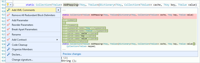
ForEach to Linq improvements
We have improved the ForEach to Linq refactoring so it generates cleaner code in more complex cases. The following Linq functions are now supported by the query generator: Where, Select, Cast, Distinct, FirstOrDefault, LastOrDefault, Aggregate, Any, All, and Count.
Documentation
Miscellaneous
Include Previous/Next Element
We have added the new Selection Tool called Include Previous/Next Element. You can now use this tool to select code blocks above and beyond the currently selected code block. Use Ctrl + Alt + Shift + Up Arrow or Ctrl + Alt + Shift + Down Arrow to select text from the current caret position to the end of the next code element. This is especially useful in combination with the Selection Expand/Reduce feature. If you unintentionally select too many blocks you can back up to the previous selections using Selection Reduce with Num - (minus) or Ctrl+Shift+W.
Documentation
Move Member to Region
We have ported the Move Member to Region feature from CodeRush Classic. You can now create regions and move members among them using a simple GUI. Now simply click a member icon, select Move To Region and choose the target region.
Documentation
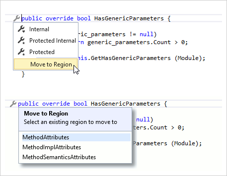
Entity Framework Data Source
- New API enables server-side data filtering at runtime.
- Our Data Source Wizards for WinForms and WPF allow you to filter Entity Framework data source tables.
Documentation
Expression Editor Enhancements
- Public API for Expression Editor customization.
- Improved Expression Editor GUI including rich-text support for function descriptions and tooltips.
Documentation
Query Builder
This release includes new methods for editing or adding a query at runtime using the DevExpress Query Builder.
Documentation
XPO
.NET Core / .NET Standard 2.0 Support (Beta)
From must-have features such as data grouping and integrated visual designer to WCF client support, from dynamic pooling to data caching in high-load systems... XPO brings unmatched data management capabilities to your next .NET Core app – be it a Windows Desktop application, or an ASP.NET Core website running on MacOS and Linux, or a Mobile apps built with Xamarin or UWP. The most popular RDBMS - SQL Server, MySql, PostreSQL, SQLite – are already supported and more are on the way.
Documentation Demo Blog Post
ORM Data Model Wizard Enhancements
- Extend database selection dialog with Oracle Managed Data Access driver.
- Nameof operator support.
- Added a 'threadSafe' parameter to the Connect method.
Connection Provider Enhancements
- Oracle 12c Support
- MS SQL Server 2016 Support (Row Level Security and Dynamic Data Masking)
New UI Adorner Manager
The VCL UI Adorner Manager is designed to display interactive objects and apply visual effects to better communicate the state of your application to end-users. It allows you to paint badges on top of all other UI elements and create guides to highlight specific UI elements using a translucent layered window.
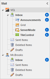
With its built-in element interactivity, the new component is a great way to build step-by-step instructions/guides and to emphasize specific spots or regions on a parent form.
Conditional Formatting
Our Grid, TreeList, and Vertical Grid controls now support Microsoft Excel-inspired conditional formatting of individual cells and entire rows/columns. You and your end-users can now highlight critical information, compare data, visualize trends and patterns using data bars, icons, and color scales.
Grid Control
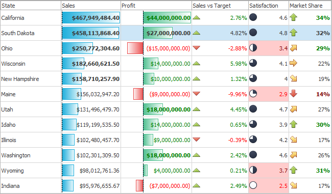
TreeList Control
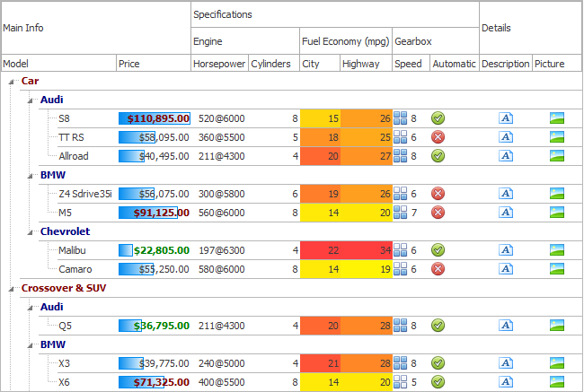
Vertical Grid Control

To help with rule customization at runtime, the cell formatting feature also provides the Conditional Formatting Rules Manager. Rule conditions built with Spreadsheet functions are also supported.
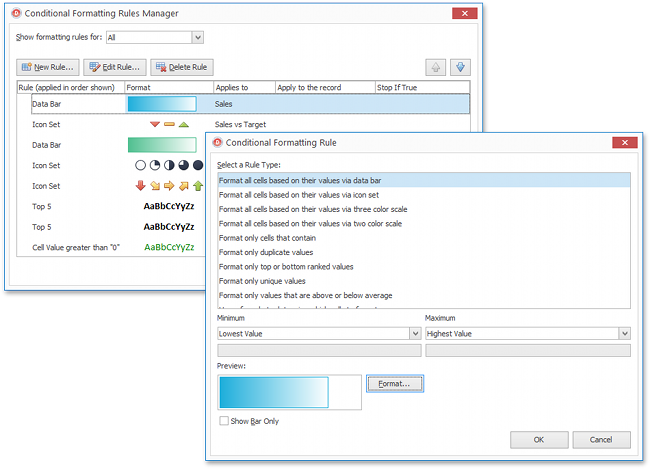
The formatted content can be exported to HTML, PDF, XLS, and XLSX files. Format conditions exported to Excel files are compatible with native conditional formatting rules and can be customized using the VCL Spreadsheet Control or Spreadsheet apps such as Microsoft Excel.
The new functionality is powered by the VCL Spreadsheet and TreeList controls, which are now installed with the Grid or Vertical Grid control.
DPI Awareness
Complete High DPI Awareness
With this release, we've added per-monitor DPI awareness support (v1) to our utility applications, demos, as well as the following DevExpress VCL products:
- Grid Control;
- Scheduler Control;
- Spreadsheet Control;
- Pivot Grid;
- Vertical Grid;
- PDF Viewer;
- Printing-Exporting Library;
- Extended Lookup Editor.
The entire VCL product line now supports per-monitor DPI awareness.
Touch-Friendly Scrolling
This release introduces a scrollbar mode optimized for touch-enabled applications. In this mode, the scrollbar thumb appears when an end-user hovers the mouse pointer over a control or scrolls through its content. The mouse pointer disappears if it is stationary or the control is not scrolled for some time. The scrollbar buttons are never displayed.
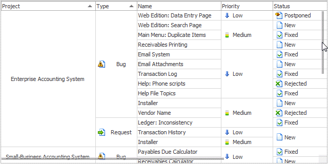
The new scrollbar mode is enabled by default. If you prefer classic scrollbars, just switch the corresponding option in a skin (or look&feel) controller or set the cxDefaultIsTouchScrollUIModeEnabled global constant to False in the source code.
Grid Control
Fixed Data Rows in Table and Banded Table Views
You can now allow end-users to anchor specific data rows to either the top or bottom of the grid, so that when scrolling the data the pinned rows stay visible. End-users can click row pins or select a corresponding option in the row context menu to fix/unfix data rows.
Miscellaneous Enhancements
- We have added skin support to built-in menus by dynamically converting them to ExpressBars popup menus.
- Table View and Banded Table Views can optionally display images that correspond to Image Combo Box columns' group values in group rows.
Scheduler Control
Modern-Style UI
With v17.2, we've added a new UI style to all scheduler Views, allowing you to better reflect the UX of Microsoft Outlook in your calendar and scheduling apps.
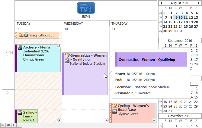
The new style is enabled by default. Should you prefer not to use it, just switch the scheduler's OptionsView.Style option or set the cxSchedulerDefaultViewStyle global constant to svsClassic in the source code.