What's New in Blazor Components
Blazor UI Components v21.2
Blazor UI Components v21.1
Blazor UI Components v20.2
Blazor UI Components v20.1
What's New in 21.2.7
Resolved Issues
See our Version History for a complete list of issues resolved in v21.2.7.
What's New in 21.2.6
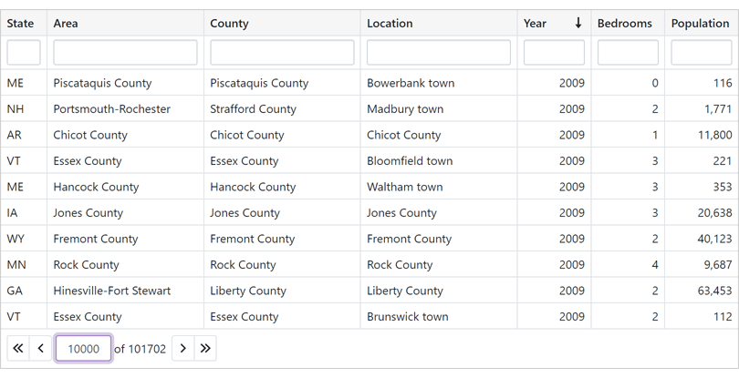
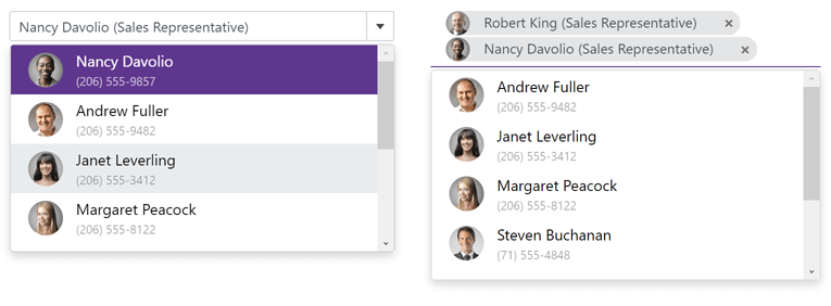
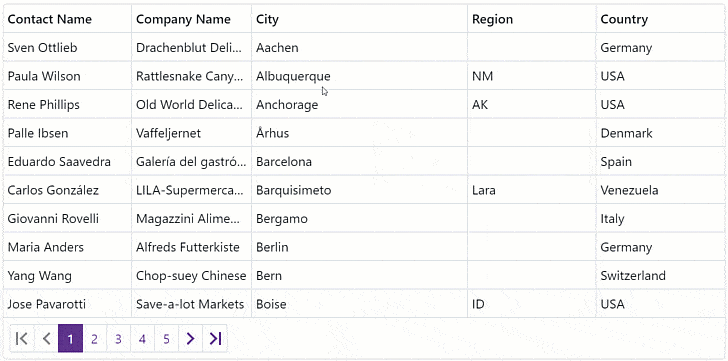
New Blazor Grid
Our Blazor Grid component was first introduced in v21.1 as a Community Technology Preview (CTP). This update marks its official release and includes the following new features.
Server Mode Data Source
The Grid supports our unique Server Mode data source for Blazor Server-based applications. This data source was designed to work with large data collections. Server mode has the following advantages:
- The grid loads data in small portions on demand. It does not load the entire dataset, which reduces memory consumption and improves usability.
- All data shaping operations (grouping, sorting, and so on) are delegated from the Blazor application itself to underlying services (EF Core, XPO, etc.). These services process operations more efficiently and increase overall performance.
Documentation
Online Demo
Support for Observable Data Collections (Real-Time Data Updates)
You can bind the Grid control to a data collection that implements the INotifyCollectionChanged or IBindingList interface. This collection notifies the Grid about relevant changes (when items are added or removed, when the entire collection is refreshed, etc.). The Grid will update its data automatically to reflect appropriate changes.
Documentation
Online Demo
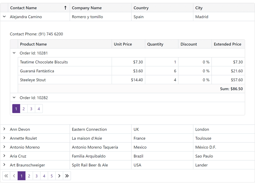
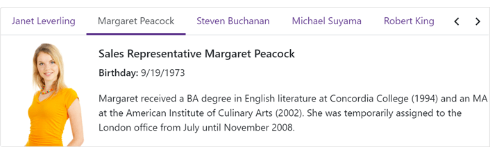
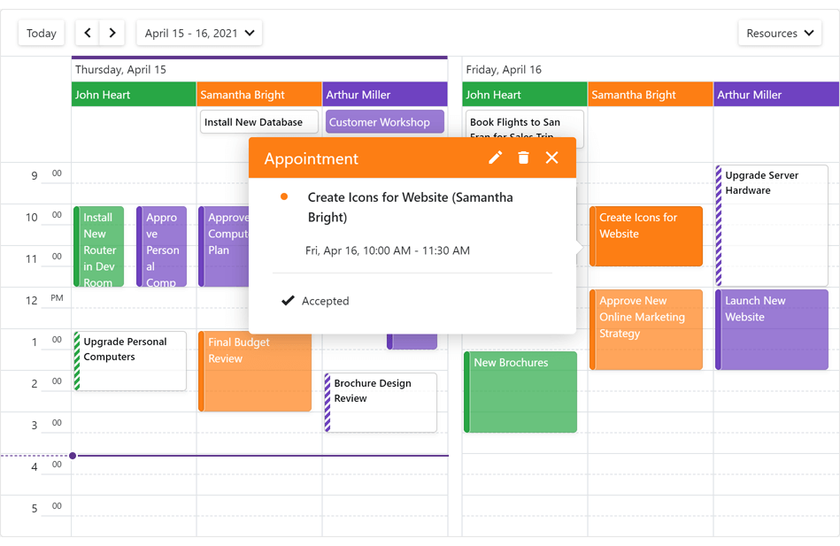
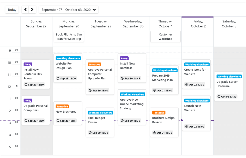
Master-Detail Support
Our Blazor Grid component allows you to create hierarchical layouts of any complexity and depth. For example, you can use a nested grid to visualize a master-detail relationship between two data tables or to display preview sections under each grid data row across all columns.
Documentation
Online Demo
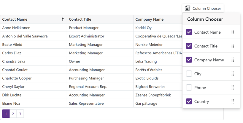
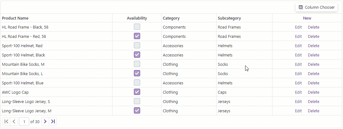
Column Customization and Column Chooser
Use the new Visible and VisibleIndex properties to manage column visibility and order.
Users can also display, hide, and reorder columns with the integrated Column Chooser.
Documentation
Online Demo
Grid in DevExpress Project Templates
DevExpress project templates now include the Grid component.
Scheduler Enhancements
Access Timescale from Header Templates
The SchedulerTimelineHeaderCellInfo object now contains the Scale property, which returns the timescale to which the Scheduler header cell belongs.
Breaking Changes
- T1071089 - The Data Grid component was moved to maintenance mode
- T1061297 - Rich Text Editor: A non-empty paragraph before a table cannot be removed
Resolved Issues
See our Version History for a complete list of issues resolved in v21.2.6.
What's New in 21.2.5
Breaking Changes
- T1059018 - DxTabs, DxFormLayoutTabPages – Active tab choice was introduced
- T1059760 - TagBox: The DropDown render has changed
Resolved Issues
See our Version History for a complete list of issues resolved in v21.2.5.
What's New in 21.2.4
Support for .NET 6
DevExpress Blazor UI components now support .NET 6.0. We've also updated the DevExpress Template Gallery to include new project templates for .NET 6.0.
New Blazing Dark Theme
In v21.2.4 we introduce a new Blazing Dark theme for Blazor applications. This theme was added to our online demos and Project Wizard.
Grid
Conditional Formatting
Handle the grid's new CustomizeElement event to customize the appearance of grid cells and rows according to their values.
Online Demo
Handle Row Clicks
New events - RowClick and RowDoubleClick, allow you to handle user clicks and double-clicks on grid rows.
Chart
Handle Series and Point Clicks
We added the SeriesClick and PointClick events that allow you to handle user clicks on series and series points, respectively.
Hover Modes
You can now use a new 'HoverMode' property that specifies which series elements to highlight when a user hovers over a chart element. This property was added to all series classes (for instance, DxChartLineSeries.HoverMode), legend, and point objects.
Date Edit - Configure Format for the Time Section
The new TimeSectionScrollPickerFormat property allows you to apply a custom format to values in the time section.
DropDown - Prevent Close on Outside Clicks
Use the new PreventCloseOnPositionTargetClick property to specify whether the drop-down window should be closed when a user clicks the position target element.
Breaking Changes
T1047433 - Scheduler - The SchedulerDayOfWeekHeaderCellInfo.Resources property has been renamed to SchedulerDayOfWeekHeaderCellInfo.Resource
Resolved Issues
See our Version History for a complete list of issues resolved in v21.2.4.
What's New in 21.2.3
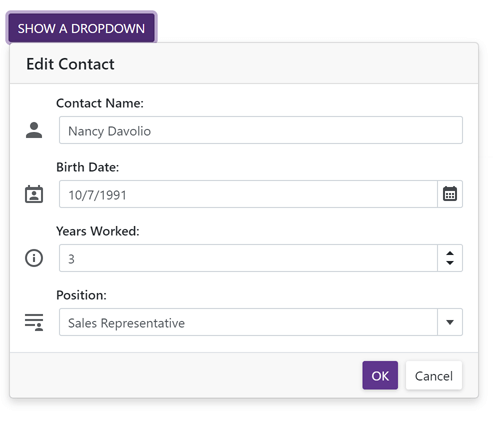
New Blazor DropDown
Our new Blazor DropDown component allows you to display a non-modal drop-down window within a Blazor application. The DropDown includes the following integrated features:
- Header, Body, and Footer Customization
- Position Customization
- Position Restrictions
- Custom Size
- Resizing
- Scrolling
- Show and Close Actions
Documentation
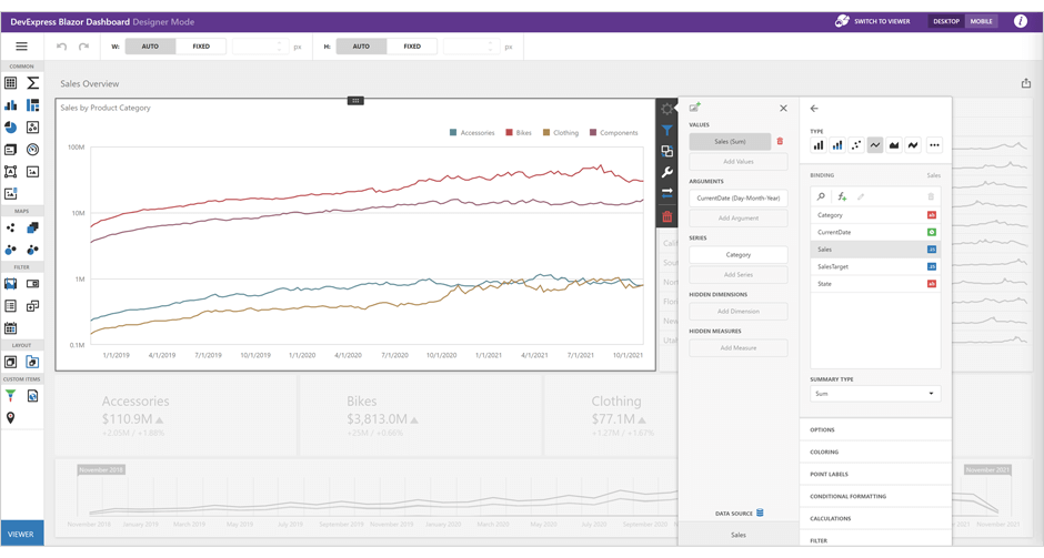
New Blazor Dashboard
Our Blazor Dashboard component was first introduced in May 2021 as a Community Technology Preview (CTP). This update marks its official release. v21.2 adds localization support and includes a new API to unregister extensions.
Note: DevExpress Dashboard ships as part of the DevExpress Universal Subscription.
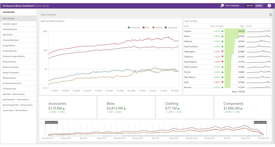
Online Demo
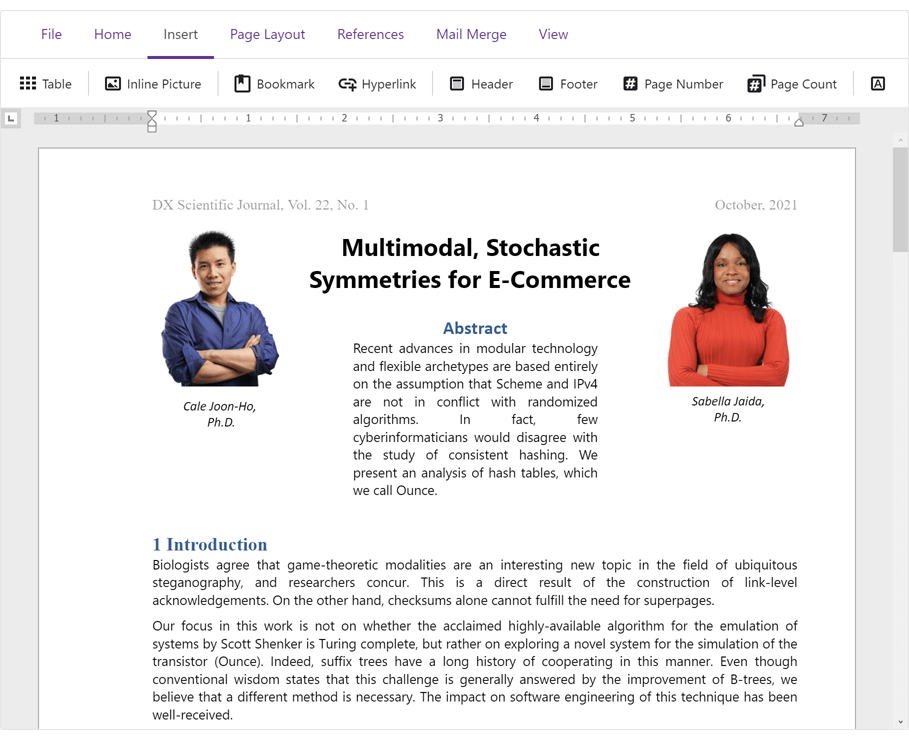
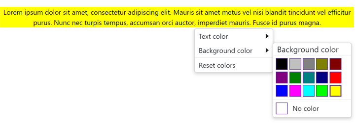
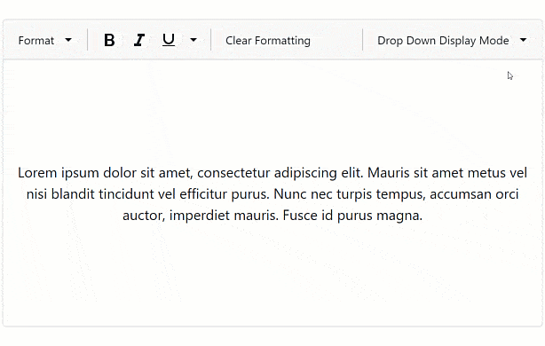
New Blazor Rich Text Editor
The DevExpress Blazor Rich Text Editor (Word Processor) was first introduced in May 2021 as a Community Technology Preview (CTP). This update marks its official release.
Our Rich Text Editor allows you to incorporate advanced text editing functionality into your Blazor app. You can create, open, edit, convert, save, and print rich-formatted text files (DOCX, RTF, TXT). Features include:
- Ribbon UI
- Print Layout / Simple View
- Horizontal Ruler
- Character & Paragraph Formatting
- Bullets & Numbering
- Header & Footer
- Document Sections
- Table of Contents
- Bookmarks & Links
- Page Numbers
- Fields
- Pictures & Text Inputs
- Dialogs
- Undo / Redo
- Localization
Documentation
Online Demo
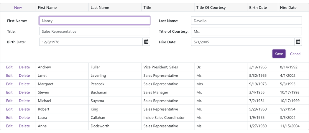
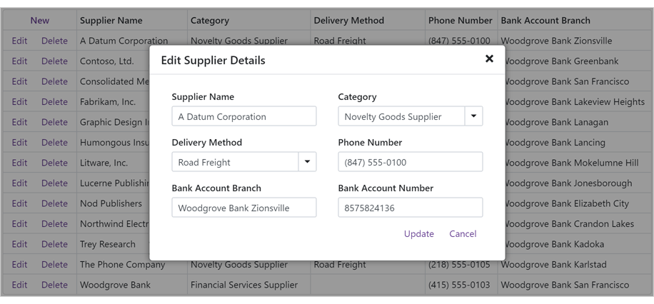
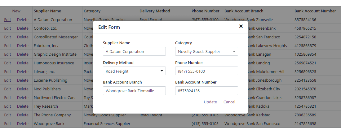
Blazor Grid (CTP)
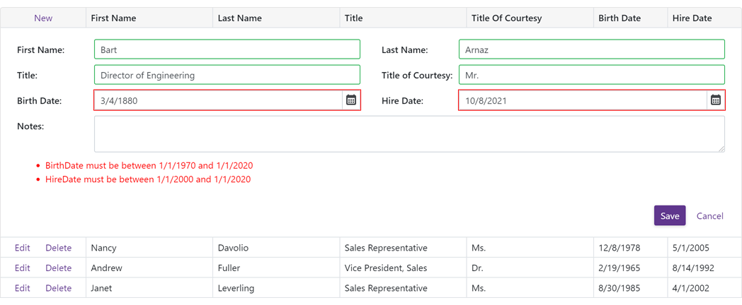
Data Editing and Input Validation
Our Blazor Grid now allows you to edit associated data within a standard edit form or a popup edit form. To enable data editing:
-
Create an edit form template and assign it to the EditFormTemplate property.
-
Handle the EditModelSaving event to post changes made in the edit form to a data source.
-
Set the EditMode property to 'PopupEditForm' to display the edit form as a popup.
Documentation
Online Demo
Our Blazor Grid automatically validates user input based on data annotation attributes. You can also apply and use custom data validation rules.
Online Demo
Row Selection
Our Blazor Grid now supports single and multiple row selection. Use the SelectionMode property to specify the desired selection mode. To select/deselect rows with a pointing device, enable the AllowSelectRowByClick option.
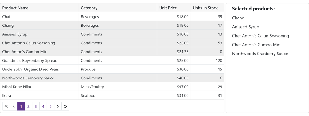
Our Blazor Grid also ships with a new column type - DxGridSelectionColumn. This column can display a checkbox (with multi-select support) or radio buttons in single selection mode.
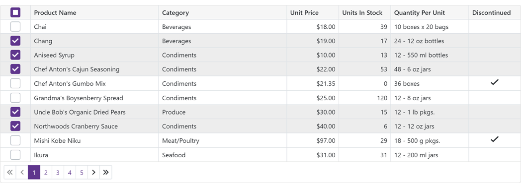
We also introduced new methods to help manage record selection in code.
To access selected data items in code, use the SelectedDataItems property.
Online Demo
Command Column
Our Blazor Grid's new Command Column (DxGridCommandColumn) can display CRUD-related commands (New, Edit, Delete) for each row. It can also clear the filter applied within the Grid's Filter Row.
Online Demo
Vertical and Horizontal Scrolling
Our Blazor Grid now displays a vertical scrollbar when content height exceeds the height of the component itself.
A horizontal scrollbar automatically appears when total width (of all columns) exceeds the width of the component itself.
Online Demo
Pager Customization
The DevExpress Blazor Grid includes the following pager-related customization options:
- PagerVisible - Specifies whether the Grid displays its pager.
- PagerPosition - Specifies pager position (at the bottom, the top, or both at the bottom and the top).
- PagerNavigationMode - Sets the navigation mode available to users (use numeric buttons, use the input box, or automatic).
- PagerSwitchToInputBoxButtonCount - Specifies the number of pages used when the pager automatically switches from numeric buttons to the input box.
- PagerAutoHideNavButtons - Hides the pager's built-in navigation buttons when all numeric buttons are displayed on-screen.
- PagerVisibleNumericButtonCount - Specifies the maximum number of numeric buttons displayed within the pager.
Online Demo
Page Size Selector
Users can now modify page size at runtime. To display the Blazor Grid's page size selector, enable the PageSizeSelectorVisible option. Use the PageSizeSelectorItems property to define available page size values.
To display all records in the underlying data source, enable the PageSizeSelectorAllRowsItemVisible option (the page size selector will include "All" within the page size list).
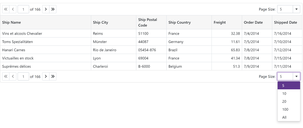
Online Demo
Column Width Enhancements
We improved the algorithm used to manage column width and also added a MinWidth property. By default, minimum column width is 50 pixels.
Column Text Alignment
Our Blazor Grid automatically aligns text within data cells/footer cells based on column type and bound data type. Use the new TextAlignment option to specify text alignment as needs dictate.
Access Data Item
You can now access the processed data item within data-related event handlers (CustomSort, CustomGroup, CustomSummary, etc) and the CellDisplayTemplate.
Blazor Chart
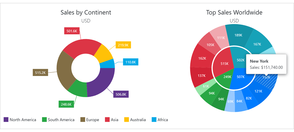
New Pie/Donut Chart Component
We split our Blazor Chart into two distinct components:
We also implemented the following new properties for the Pie/Donut Chart:
Localization
You can now localize months and days (numeric and date formats now correspond to the current thread locale).
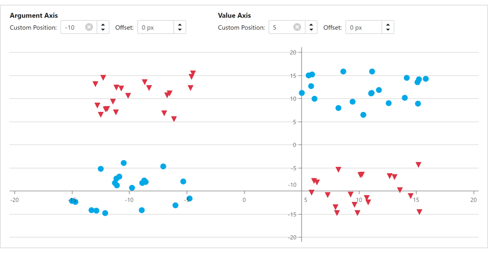
Custom Position of an X-Y Axis
The following new properties allow you to customize X-Y axis position:
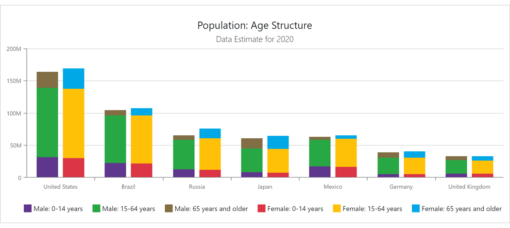
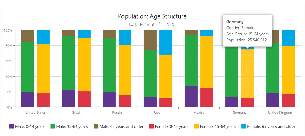
Side-by-Side Stacked & Full-Stacked Bar Charts
You can now create side-by-side Blazor Bar Charts. Use our new Stack property to specify the desired chart stack.
Series and Constant Line Appearance
Our new Blazor Charts DashStyle property allows you to specify a dash style for a line series or a constant line. We also added the following settings to control the appearance of constant lines:
Break Series on Empty Points
Our Blazor Chart component includes a new BreakOnEmptyPoints option. Enable this option to display empty points (points with undefined/null values) as breaks.
Axis Major and Minor Ticks
v21.2.3 includes two new Blazor components: DxChartAxisTick and DxChartAxisMinorTick. Use the following options to customize the appearance of major (AxisTick) and minor ticks (AxisMinorTick):
- Visibility (Visible)
- Color
- Length
- Shift
- Width
- Opacity
Zero Value Always Visible
Our Blazor Chart component's value axis always displays a zero value for Area and Bar series. For other series types (like Line, Point and Range), zero values may be omitted. To display a zero value regardless of series type and value(s), use the ZeroAlwaysVisible property.
Blazor Data Editors
Date Edit - Date Time Offset Type Support
You can now bind our Blazor Date Edit component to DateTimeOffset and DateTimeOffset? data types.
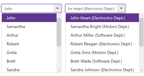
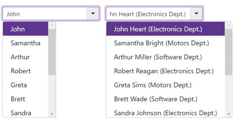
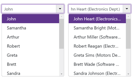
ComboBox, ListBox, and TagBox - Item Template
Our Blazor ComboBox, ListBox, and TagBox components now support item templates. Use the 'ItemTemplate' property to define your custom template.
SpinEdit - Enable/Disable Mouse Wheel
Our Blazor SpinEdit ships with a new AllowMouseWheel property (prevents users from modifying the editor's value with the mouse wheel).
Blazor Navigation and Layout
Tabs - Scroll Modes
Use the new DxTabs.ScrollMode property to specify navigation options when tabs do not fit within a container (width). The following tab scroll modes are available:
- NavButtons - Users can navigate to non-visible tabs in the following manner: via navigation buttons, or by hovering the mouse pointer over a tab, holding the Shift key, and scrolling the mouse wheel.
- Swipe - User can navigate to non-visible tabs in the following manner: via a wipe gesture or by hovering the mouse pointer over the container, holding the Shift key, and scrolling the mouse wheel.
- Auto - Tab scroll mode adapts to device type. Mobile and tablet devices use Swipe mode. Desktop devices use NavButtons mode.
- NoScroll - Users cannot scroll to non-visible tabs. Tabs that do not fit the container are moved to a new tab row.
online demo
Context Menu - Templates
You can now customize the content and appearance of Context Menu items. Use the following properties to specify common templates for all items and templates for individual items:
Online Demo
API Enhancements
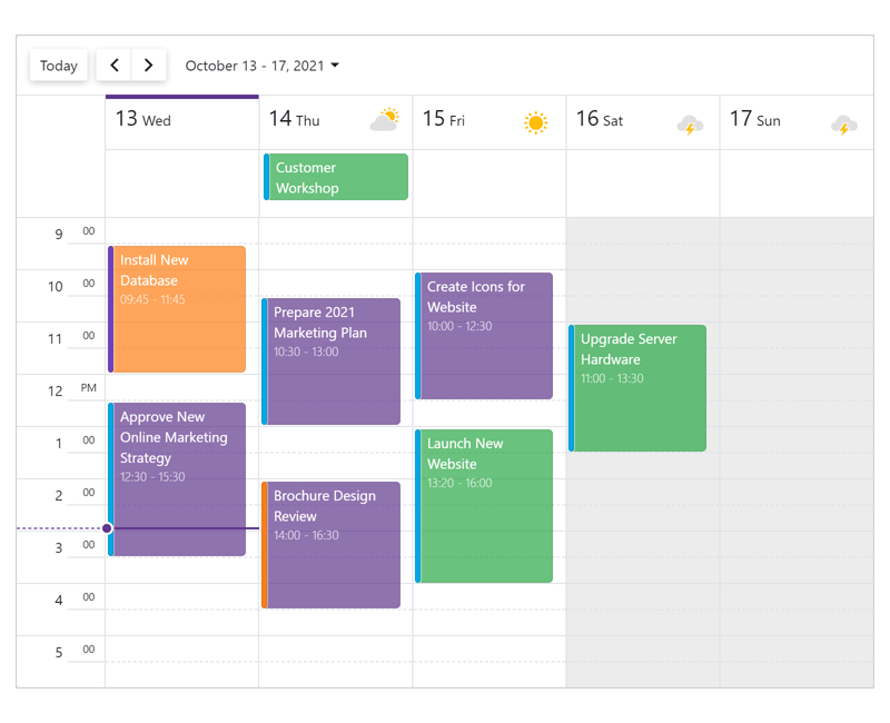
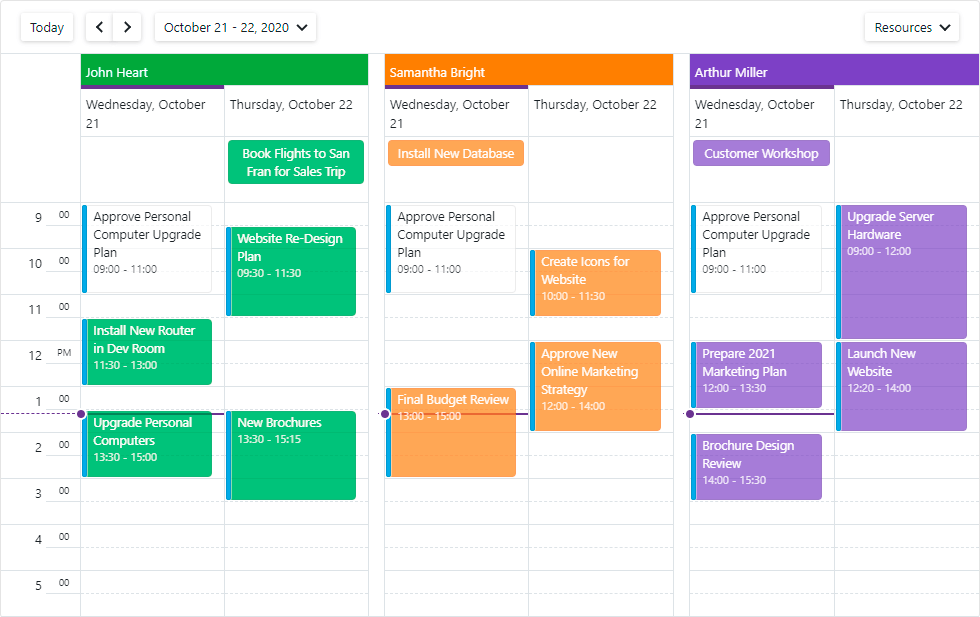
Blazor Scheduler
Date Header and Resource Header Customization
You can now customize the content and appearance of time cells, date headers, and resource headers.
Blazor Scheduler Component
 Date Header Customization
 Resource Header Customization
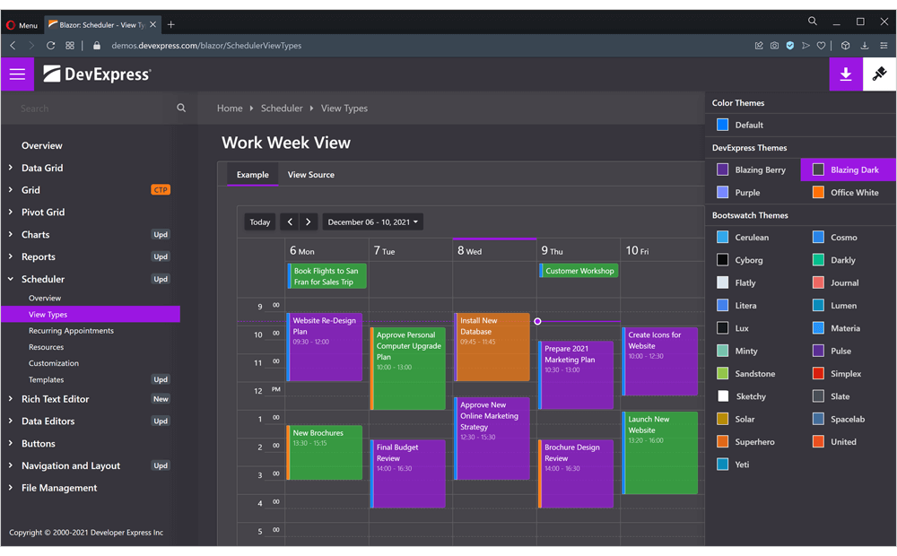
Day View, Work Week View, Week View
Month View
Timeline View
Online Demo
Snap to Cells
All Blazor Scheduler Views now include a SnapToCellsMode property. With this property, you can enable/disable the snapping of appointments to time cells or enable automatic snapping (based on appointment time intervals).
Responsive Layout - Enhancements
Our Blazor Scheduler component's Day, Week, and Work Week Views now have compact date headers. These Views also adapt date headers and the time ruler to small screens.
In addition, all Scheduler Views can hide appointment captions (when space limits the component's ability to display the caption in full).
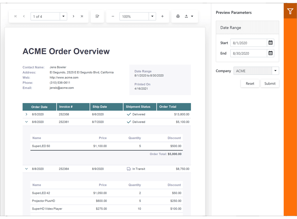
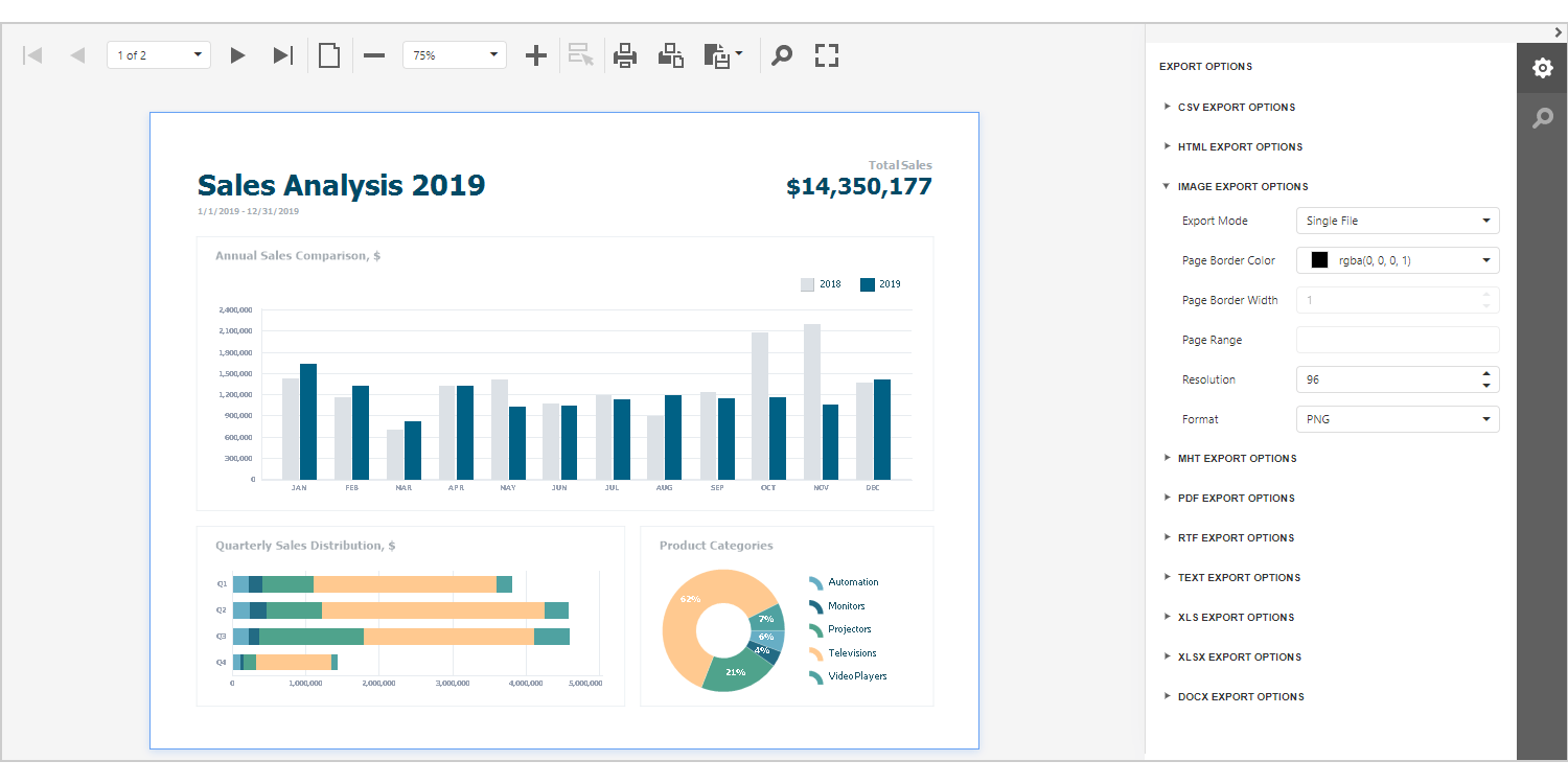
Blazor Report Viewer
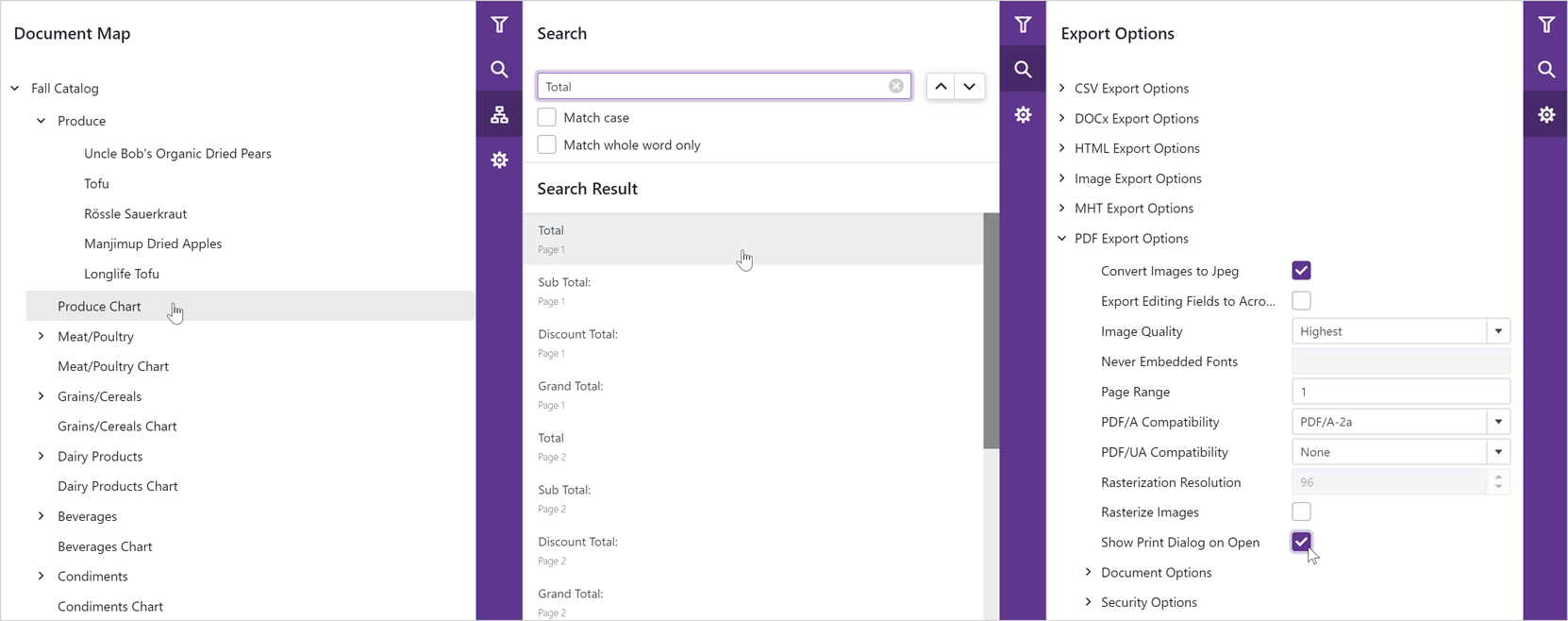
Search, Document Map and Export Options Panels
Our Blazor Report Viewer reached feature parity with our HTML5 Document Viewer. In v21.2, we added the following UI elements:
- Export Options Panel
- Search Panel
- Document Map with Bookmarks
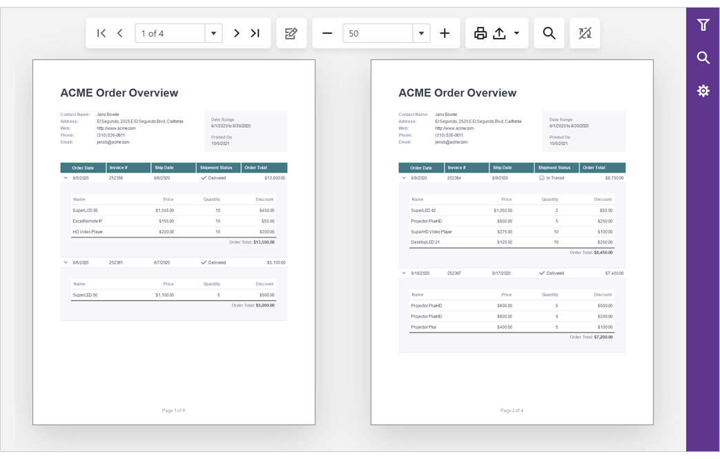
Multi-Page View
Our Blazor Report Viewer can now display the entire document. You can scroll pages and zoom the view to see multiple pages at once.
Content Security Policy (CSP) Support
You can now use our DevExpress Blazor components on websites with a Content Security Policy (CSP).
Breaking Changes
- T1034169 - Charts – Changed the default approach used to create pie and donut charts.
- T1028794 - Charts – The DxChartValueAxis.Position property is now obsolete.
- T1022279 - Charts – The axis label component does not support the CssClass property.
- T1022262 - Charts – Color properties now support Alpha channel.
- T1026454 - Charts - The Width and Height properties now use the invariant culture.
- T1032759 - Toolbar - The DropDown rendering has changed.
- T1035320 - ComboBox, Date Edit, and Time Edit - The DropDown rendering has changed.
- T1034641 - Scheduler - Day headers have been redesigned.
Resolved Issues
See our Version History for a complete list of issues resolved in v21.2.3.
What's New in 21.1.6
Scheduler - Cell Customization
We added the new TimeCellTemplate property to Scheduler view classes (for example, DxSchedulerMonthView.TimeCellTemplate). You can use this property to customize content and appearance of time cells in the Scheduler.
We also introduced the HtmlCellDecoration event that allows you to customize any Scheduler cell (time cell, date header, resource header, and so on).
Date Edit - Day Cell Template
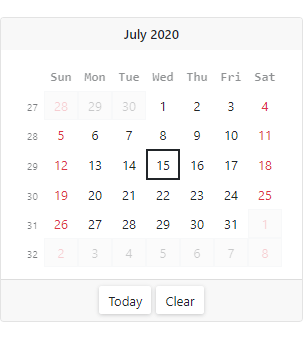
Use the Date Edit's new DayCellTemplate property to customize the content and appearance of cells in the Date Edit’s calendar.
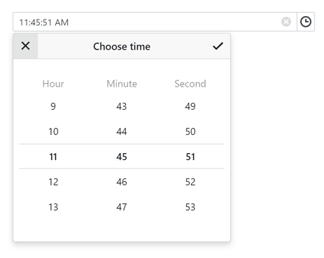
Time Edit - Scroll Picker Format
Our Blazor Time Edit component now includes the ScrollPickerFormat property. Use this property to specify the order and composition of the Time Edit's visible scroll picker columns (hour, minute, second, and period of the day).
List Box - Single Value
We added the new Value property that allows you to bind a List Box's value to a single object. We recommend that you use this property if you want to turn off multiple item selection and allow users to select only one item at a time. Otherwise, use the Values property.
Resolved Issues
See our Version History for a complete list of issues resolved in v21.1.6.
What's New in 21.1.5
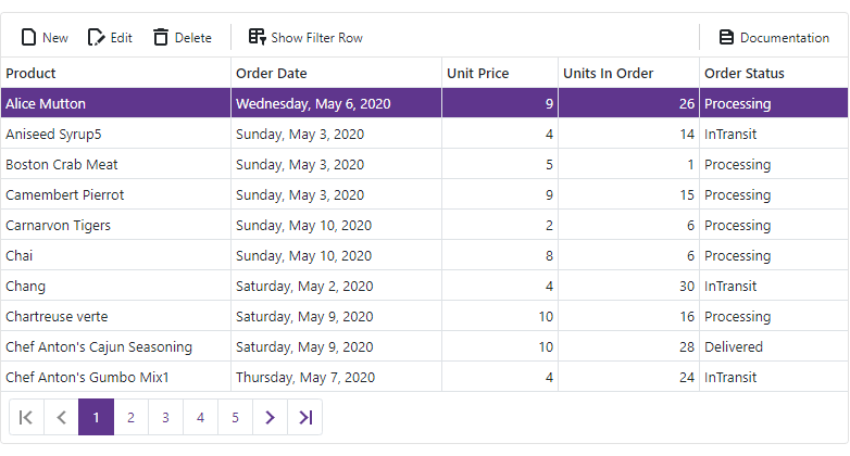
Data Grid Enhancements
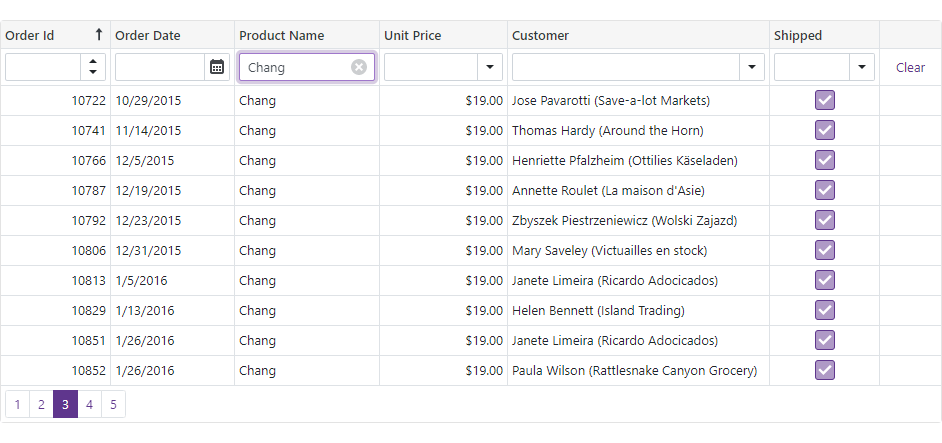
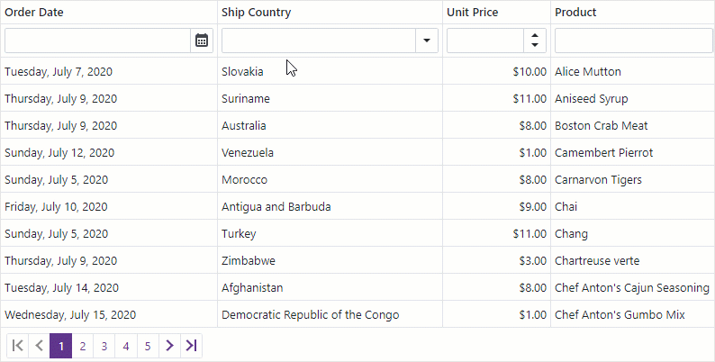
Data Filtering
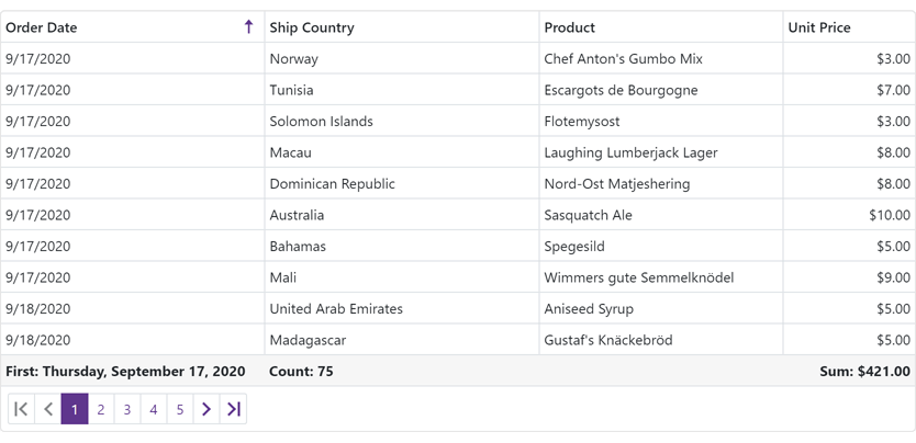
Our Blazor Data Grid now includes a filter row that allows users to filter data by entering text within its cells. To display the filter row, set the grid's ShowFilterRow property to true.
Filter row configuration options include:
- FilterRowOperatorType – Specifies the comparison operator used to create filter conditions (Equals, Contains, StartsWith, Greater, Less, etc.).
- FilterRowValue - Specifies the initial value in a filter row cell.
- FilterRowCellTemplate - Allows you to display a custom editor in a filter row cell.
We added the FilterBy and ClearFilter methods so you can apply and clear filters in code.
Online Demo
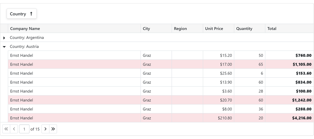
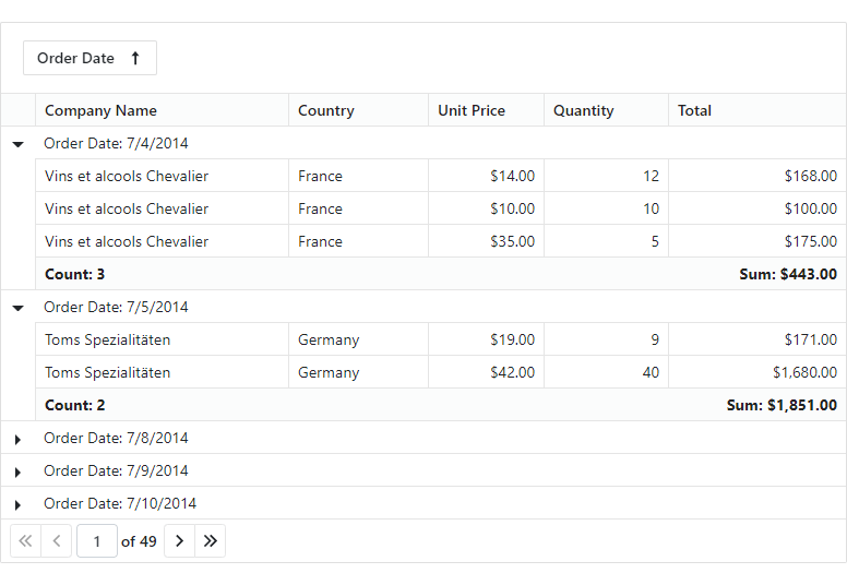
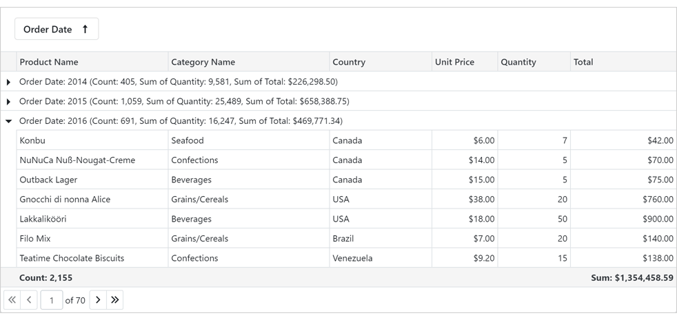
Group Footer & Group Summary
Our Blazor Grid can now display footers within groups. A group footer can be displayed if it contains a summary value or custom template content.
Use the GroupFooterDisplayMode property to specify which groups display footers (all, only expanded, none).
To display group summaries in group footers, use the summary item's FooterColumnName property.
The DxGrid.ColumnGroupFooterTemplate and DxGridColumn.GroupFooterTemplate properties allow you to customize the appearance and layout of all or individual group footers.
Online Demo
Column Name
Grid columns now have the Name property. Use this property to specify the column's unique identifier.
API Changes
Our Blazor Grid component now includes two types of columns:
We renamed the following properties:
Chart Enhancements
Refresh Chart Data and Rerender the Component in Code
In v21.1.5, we introduced two new methods to the Chart component:
- RefreshData - reloads chart data and redraws the component.
- RedrawAsync - re-renders the Chart and its child components.
ComboBox - Input Validation Enhancements
Value and display text can differ in a ComboBox component. You can use the new ValidateBy property to specify which component's property (Value or Text) is used for input validation.
Form Layout Enhancements
Group Header Customization
You can now specify a template for a group header. To do this, define the HeaderTemplate component within the group's markup, add the render fragment to the template, and wrap group items in the Items component.
To apply CSS classes to a group header, use the new 'HeaderCssClass' property.
Group Appearance Customization
To apply a CSS class to the entire group, use the new CssClass property.
Popup Enhancements
Initialization State
The Popup component cannot be shown until it is initialized. To track the initialization state from code, use the IsInitialized property. For example, you can check this property value before you call the ShowAsync(CancellationToken) method.
Button Enhancements
Navigate URL
Use the new NavigateUrl property to specify a URL where the client web browser navigates in response to a click on the button.
Resolved Issues
See our Version History for a complete list of issues resolved in v21.1.5.
What's New in 21.1.4
Navigation and Layout
Menu - Data Binding
You can now bind our Blazor Menu component to a data source. Use the Data and DataMappings properties.
Demo | Documentation
Context Menu, TreeView - Bind to Flat Data
You can now bind the Blazor Context Menu and TreeView components to flat data. Use the following properties:
Demo
Popup - Close Reason
The DxPopup.Closing event's arguments now include a new property - CloseReason, which allows you to identify an action that closes the Popup. Available actions include: Programmatically, EscapePress, CloseButtonClick, and OutsideClick.
Form Layout
Disabled and Read-Only Modes at Various Layout Levels
You can now activate disabled/read-only mode for all auto-generated editors at the following Form Layout levels:
- Form Layout component
- Layout Group, Tab, Tab Page
- Layout Item
Omit the Template Tag for Form Layout Items
You can now omit the <Template>...</Template> tag and specify the templates content in the item's markup. This improves the readability of the page layout code.
Blazor CheckBox
Allow/Restrict Indeterminate State
Use our new AllowIndeterminateState property to specify whether the CheckBox component supports the indeterminate state.
Wrap Mode for Long Labels
If the CheckBox label is too long to fit the parent component, use the new LabelWrapMode property to specify whether the Label's text should be wrapped or cropped.
Blazor Charts
Max Number of Automatic Scale Breaks
Use the new MaxAutoBreakCount property to limit the number of auto-created scale breaks.
Resolved Issues
See our Version History for a complete list of issues resolved in v21.1.4.
Breaking Changes
- T1001744 - TreeView, ContextMenu - Some API members related to data binding are now obsolete. A new data binding approach was introduced
- T1007681 - Scheduler - CRUD events changed their delegate type from Action to EventCallback
- T1003629 - The DxChartValueBreaks class is now obsolete
What's New in 21.1.3
New Rich Text Editor (CTP)
Our new Blazor Rich Text Editor (Word Processor) allows you to quickly incorporate advanced text editing functionality into your next Blazor app. You can create, open, edit, convert, save, and print rich-formatted text files (DOCX, RTF, TXT). Its features include:
- Ribbon UI
- Print Layout / Simple View
- Horizontal Ruler
- Character & Paragraph Formatting
- Bullets & Numbering
- Header & Footer
- Document Sections
- Table of Contents
- Bookmarks & Links
- Page Numbers
- Fields
- Pictures & Text Inputs
- Undo / Redo
 Rich Text Editor for Blazor UI, DevExpress
 Word-inspired formatting options are built-in.
 Navigate and explore documents with ease.
 Easy-to-use and highly customizable interface.
Demo | Get Started
New Blazor Grid (CTP)
v21.1 includes a new Blazor Grid Control (available as a CTP). To learn more about our new grid and how it fits into our long-term Blazor development strategy, please refer to the following blog post.
Blog Post | Demo
New Masked Input
Our new Blazor Masked Input component includes the following integrated features:
- Text, Numeric, Date-Time, and Regular Expression Mask support
- Read-only and Disabled States
- Null Text
- Clear Button
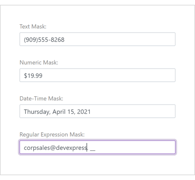
Demo
New Report Viewer
v21.1 ships with the first-ever native Blazor Report Viewer component. The new component targets the Blazor Server platform and features the following built-in features/capabilities:
- C# Public API
- Print / Export
- Toolbar UI
- Bootstrap Theme support
- Parameters Panel
- Drill-Down support
- Interactive Sorting
- Zoom support
Get Started
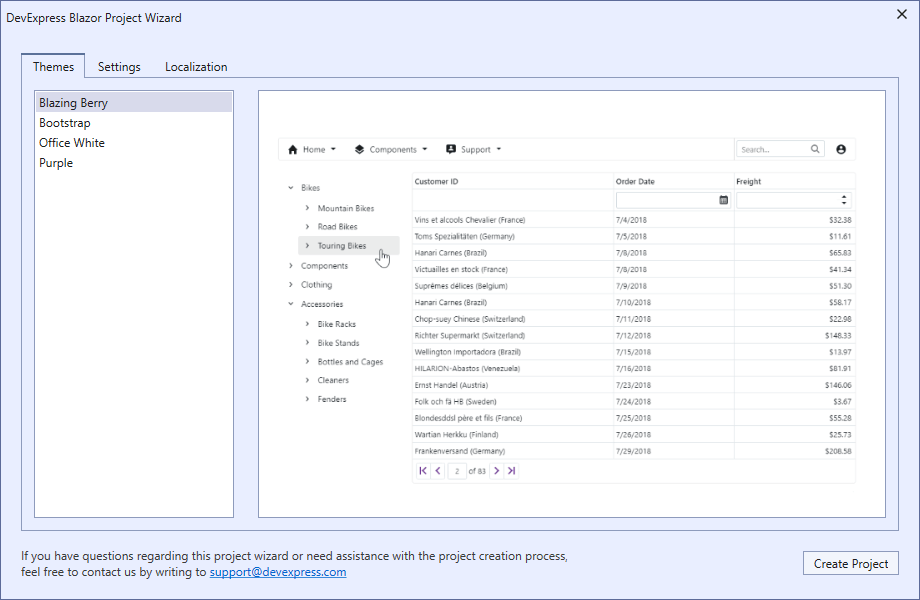
New Project Wizard
v21.1 ships with a new Blazor Project Wizard. This wizard allows you to choose a theme and specify the Bootstrap version, localization, and other settings for your Blazor application.
Bootstrap 5 Support
DevExpress Blazor UI components now support Bootstrap 5. Set the global BootstrapVersion option to 'v5' and follow the migration guide to get started.
Migration to .NET 5.0
DevExpress Blazor UI components now support .NET 5.0 (exclusively). All Project Templates in the DevExpress Template Gallery have been updated to reflect this change.
Chart
Pan and Zoom
Users can now zoom and pan the chart area with the mouse wheel or touch gestures. To enable this feature, add the DxChartZoomAndPanSettings component to the Chart's markup and specify its ArgumentAxisZoomAndPanMode and ValueAxisZoomAndPanMode properties."
Demo
Axis Label Format
The new ChartElementFormat class defines format settings for axis labels. You can specify various numeric and date-time formats along with format specific settings like precision. You can also use the FromLdmlString method to create the desired custom format.
Add/Remove Extra Margins to Outermost Series Points
The new EndOnTick option determines whether Chart axes begin and end on ticks.
The SideMarginsEnabled option adds extra margin space between outermost series points and chart boundaries.
Custom Chart Size
Use the Width and Height properties to specify the Chart's size.
Disable Chart Animation
To disable chart animation, add the DxChartAnimationSettings component into the Chart's markup and disable the Enabled option.
Data Aggregation
The DevExpress Blazor Chart component now offers data aggregation support. Data aggregation significantly improves rendering performance (when rendering a chart against an extremely large set of data points). Aggregation methods include: Auto, Average, Count, Financial, Max, Min, Range, and Sum.
Demo | Documentation
Data Editors
Input Masks
DevExpress Blazor data input UI components allow you to apply input masks with ease. Masks define data entry constraints and help ensure data consistency and information integrity.
Our Blazor data input UI components support the following mask types:
Documentation
Move Focus to an Editor in Code
Our Blazor Data Editors include a new 'FocusAsync' method. FocusAsync allows you to focus the input field in code.
Navigation and Layout
Popup - Header, Body, and Footer Customization
Our Blazor Popup API now offers extended customization options for the following UI elements:
Demo
Popup Size
Our new MinHeight, MaxHeight, MinWidth, and MaxWidth properties allow you to explicitly define a popup's size constraints whenever a popup adapts itself to content.
You can also use the Height and Width properties to manually specify Popup size.
Run Demo
Popup Position
Use our new HorizontalAlignment and VerticalAlignment properties to position a Popup on screen.
Demo
Popup - Show and Close Actions
In addition to the Close button, you can now press Escape or click outside the Popup's boundaries to close a Popup. This release includes two customization options - CloseOnEscape and CloseOnOutsideClick. These options can be used to disable this functionality.
Our new ShowAsync and CloseAsync methods allow you to asynchronously display and hide a Popup in code.
We've also implemented the following new events:
- Showing - Fires before the Popup is displayed and allows you to cancel this action.
- Shown - Fires after the Popup is displayed.
- Closing - Fires before the Popup is closed and allows you to cancel this action.
- Closed - Fires after the Popup is closed.
Demo
Tabs - Tab Content Render Modes
Use the new DxTabs.RenderMode property to specify how the DevExpress Blazor Tab component loads tab content. Render modes are as follows:
- Default. Adds tab content to the DOM each time a tab is activated (replaces the content of the previously active tab).
- All Tabs. Renders all tab content on initial load and persists it within the DOM. This mode should only be used for apps with a few tabs in its layout (as it can increase page load time).
- On Demand. Renders tab content when a tab is activated and persists it in the DOM.
API Enhancements
Blazor Scheduler
New Month View
Our Blazor Scheduler ships with a new Month View option. The Month View includes the MonthCount property.
Demo
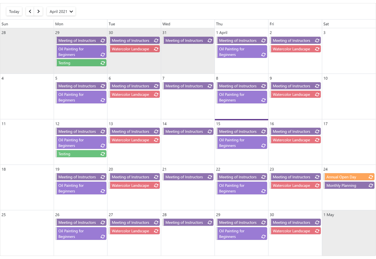
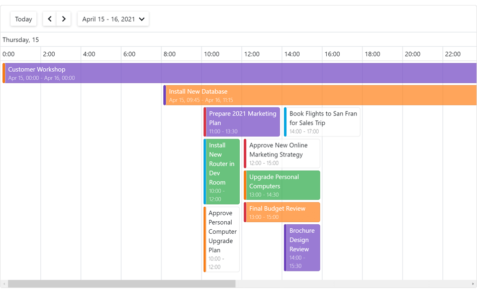
New Timeline View
Our new Blazor Timeline View arranges events and appointments across an easy-to-read horizontal timeline. Thanks to its flexible design, our Timeline View allows you to display multiple time rulers with different scales.
Demo
Appointment Tooltip Customization
You can now customize appointment/event tooltips as needed. Use the new AppointmentTooltipTemplate property to specify custom layouts and custom appearance settings for your tooltip.
Demo
Restrict User Actions
The following new options allow you to configure/control Scheduler-related actions available to end users:
Demo
API Enhancements
What's New in 20.2.6
Data Grid Enhancements
Combobox Column - Dropdown Width Modes
Content or Editor
Content
Editor
Documentation
Data Editors
HTML Events
Data editors based on the standard HTML input element now apply common event handlers to the input element. The following help topic lists data editors and supported event handlers: HTML Attributes and Events.
Spin Edit
You can now use the mouse wheel to change an editor's value.
Chart - Tooltip Position
The DxChartToooltip.Position property specifies whether the Chart displays tooltips inside or outside the series.
Demo
Scheduler Enhancements
The DxSchedulerDataStorage.RecurrenceSettings property defines common settings for all recurrent appointments.
CodeRush Templates
CodeRush now includes templates that allow you to quickly create DevExpress Blazor components in Visual Studio.
Templates for DevExpress Blazor Components
Resolved Issues
See our Version History for a complete list of issues resolved in v20.2.6.
Breaking Changes
T971305 - Charts - The DxChartTooltip.Enabled property should be set to true to display tooltips with templates
What's New in 20.2.5
New Menu Component
Our new Blazor Menu component includes the following features:
- Horizontal/Vertical Orientation
- Display Modes: Auto, Desktop, and Mobile
- Adaptive Layout
- Templates (menu item, item text, and item submenu)
Demo | Documentation
Chart Enhancements
Grid Lines
With this update, our Blazor Charts can display both horizontal and vertical grid lines. Use the axis's Visible property to show/hide grid lines.
Scheduler Enhancements
New API includes the StartDateChanged event.
Resolved Issues
See our Version History for a complete list of issues resolved in v20.2.5.
Breaking Changes
T958401 - Popup - The CloseButtonClick event - changed the delegate type from Action to EventCallback
What's New in 20.2.4
Grid Layout
Named Areas for Responsive Layouts
You can now create named areas, assign them to layout items, and place these areas in grid rows to create responsive layouts.
Demo | Documentation
Data Editors
Input CSS Classes
The new InputCssClass property allows you to apply predefined or custom CSS classes to the input element of the ComboBox, Date Edit, Spin Edit, Text Box, and Time Edit.
Memo – Text Area CSS Class
The new TextAreaCssClass property allows you to apply a predefined or custom CSS class to the Memo's text area.
Date Edit and Calendar – First Week of the Year
Use the WeekNumberRule property to specify the first week of the year in the calendar.
Upload
Authentication and Cancel Upload
Handle the new FileUploadStart event to add authentication information to upload requests, cancel an upload based on a condition or change the upload URL.
Blazor Project Templates - .NET 5.0 Support
The DevExpress Template Gallery now allows you to create a Blazor application that targets .NET 5.0.
Resolved Issues
See our Version History for a complete list of issues resolved in v20.2.4.
Breaking Changes
- T939823 - Scheduler - Renamed API members
- T934943 - Reporting for Blazor - Renamed API members
What's New in 20.2.3
Support for .NET 5.0
Blazor UI Components in the DevExpress Installer
You can now use the DevExpress .NET Product Installer to install DevExpress Blazor UI Components.
Documentation
Visual Studio Integration
Blazor Project Templates
DevExpress Template Gallery now includes Blazor Project Templates.
Documentation
New Grid Layout & Stack Layout
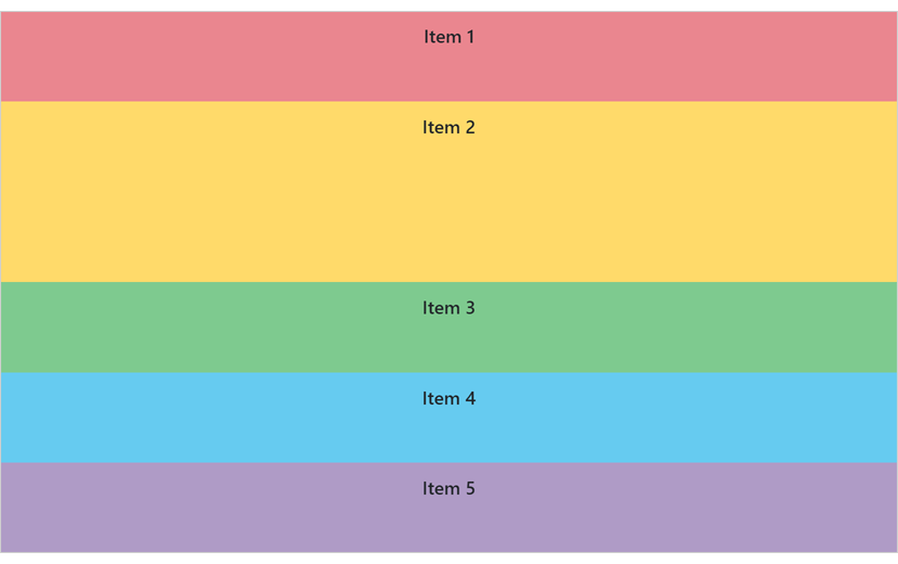
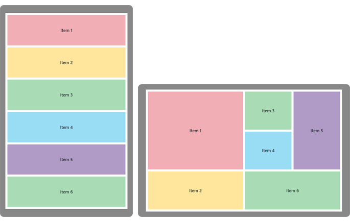
v20.2 includes two new Blazor layout components - Grid Layout and Stack Layout.
The Grid Layout is based on a two-dimensional CSS grid. It arranges layout items into rows and columns.
Demo
The Stack Layout organizes items in a one-dimensional stack, either horizontally or vertically.
Demo
New Time Editor
Our new Blazor Time Edit component ships with the following built-in features/capabilities:
- DateTime / TimeSpan binding
- Integrated dropdown Time Picker
- 12 / 24 Hour Format support
- Min / Max Time support
- Read-Only and Disabled States
- Null Text
- Clear Button
Demo | Documentation
Layout and Navigation - Adaptivity
Breakpoints allow you to adapt page layouts to different screen resolutions.
Demo | Documentation
Data Grid Enhancements
Total and Group Summaries
Our Blazor Data Grid can now compute summaries across all data rows or individual groups. Predefined aggregate functions include:
Demo | Documentation
Fixed Columns
You can now anchor columns to the left or rightmost edge of the grid. Fixed columns are never scrolled horizontally. Use the FixedStyle property to fix a column at the right or left edge.
Demo
Column Resize
End-users can now resize grid columns as needed. To enable this feature, use the ColumnResizeMode property. Resize options include:
- NextColumn
- Component
- Disabled
Demo | Documentation
Scheduler Enhancements
Custom Appointment Form
Our new AppointmentFormLayout and AppointmentCompactFormLayout properties allow you to create a custom Appointment Form as needed.
Demo | Documentation
Resources
You can now assign resources to appointments to browse multiple schedules simultaneously.
Use our new GroupType property to group appointments by resources or dates.
Our Blazor Sheduler component integrates Resource Navigation that allows end-users to filter resource groups.
Demo | Documentation
Data Editors
Date Edit - Display Time
To display time values in the Date Edit component, use the new TimeSectionVisible property.
Demo
Long Mouse Click / Long Key Press Support
A long mouse click and a long key press now change the Spin Edit's value. In the ComboBox and Tag Box components, a long key press navigates through items.
Resolved Issues
See our Version History for a complete list of issues resolved in v20.2.3.
Breaking Changes
- T939823 - Scheduler - Renamed API members
- T934943 - Reporting for Blazor - Renamed API members
What's New in 20.1.11
Resolved Issues
See our Version History for a complete list of issues resolved in v20.1.11.
What's New in 20.1.10
Resolved Issues
See our Version History for a complete list of issues resolved in v20.1.10.
What's New in 20.1.9
Resolved Issues
T951686 - .NET 5.0: The "Microsoft.WebTools.Shared.Exceptions.WebToolsException: Build failed." error occurs while publishing a project with v20.1.8
What's New in 20.1.8
.NET 5.0 Support
Resolved Issues
See our Version History for a complete list of issues resolved in v20.1.8.
What's New in 20.1.7
.NET Core 3.1.8 Support
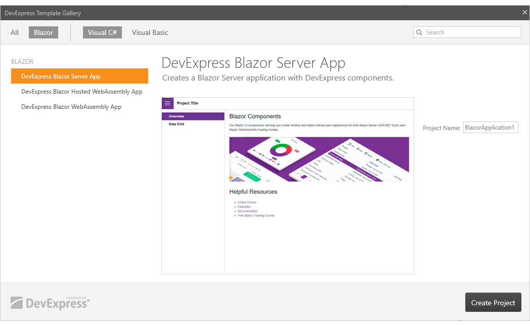
DevExpress Project Templates
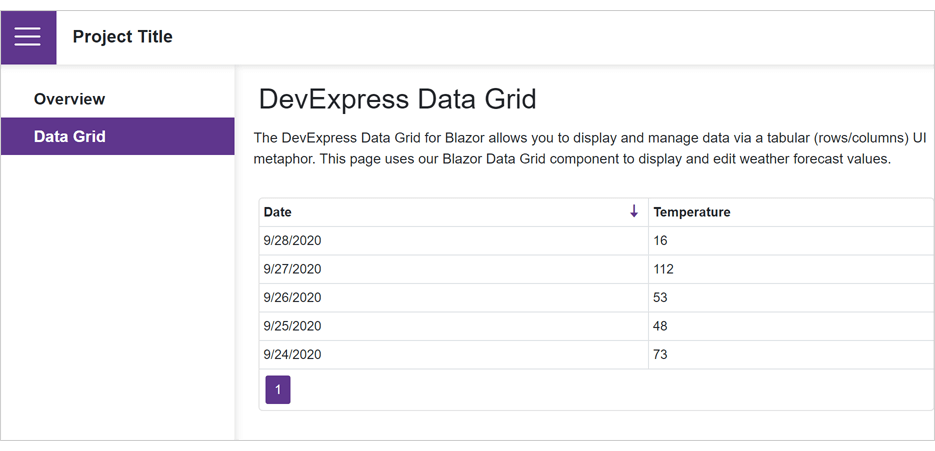
You can now create Blazor Server and WebAssembly apps based on DevExpress project templates:
- DevExpress Blazor Server App
- DevExpress Blazor WebAssembly App
- DevExpress Blazor Hosted WebAssembly App
Project templates include:
- References to the DevExpress Blazor NuGet package and DevExpress resources
- Sidebar Navigation based on DevExpress TreeView
- DevExpress DataGrid Component
- DevExpress Blazing Berry Theme
Documentation
Data Grid Enhancements
A new PopupEditFormHeaderText property allows you to specify the popup Edit Form's title.
Data Editors Enhancements
Date Edit
Calendar
We added a new Calendar.VisibleDateChanged event. This event fires each time month or year changes.
ComboBox, TagBox, ListBox
You can now specify custom column captions for multi-column editors. Use the DxListEditorColumn.Caption property.
Demo
Disabled State
Our data editor now includes a new option - Enabled. Turn off this option to disable an editor. Users cannot interact with disabled editors and change their values/states.
Form Layout Enhancements
Toolbar Enhancements
We added a new option - CloseMenuOnClick. This option specifies whether to close a sub-menu once a user clicks its item.
Resolved Issues
See our Version History for a complete list of issues resolved in v20.1.7.
Breaking Changes
T933584 - Date Edit - The DateEdit_AdaptiveDatePickerNotification localization string has been replaced with the DateEdit_DisabledDateNotification and DateEdit_OutOfRangeNotification strings
What's New in 20.1.6
.NET Core 3.1.7 and Blazor WebAssembly 3.2.1 Support
New Memo Component
Our new Memo component for Blazor includes the following features:
- Bind to Data
- Custom Size
- Resize Modes (Horizontal, Vertical, Horizontal and Vertical)
- Clear Button and Null Text
- Read-only State
Demo | Documentation
Data Grid Enhancements
New Popup Edit Form
End-users can now edit column values within a popup form. To activate Popup Edit Form mode, set the EditMode property to PopupEditForm.
Demo | Documentation
Scheduler Enhancements
Appointment Templates
You can now customize appointemnt appearance via templates. New templates include:
Demo | Documentation
Custom Fields
Custom fields allow you to add custom data to appointments and labels.
Documentation
New API
New API allows you to assign CSS classes to appointment labels and status.
Data Editors Enhancements
ComboBox, TagBox, ListBox
Calendar Enhancements
- Date Validation
- Nullable DateTime Support
-
Bind to a Date (Documentation)
Input Element ID
A new InputId property allows you to specify an input element's unique identifier (ID). Supported by CheckBox, ComboBox, DateEdit, SpinEdit, and TagBox.
Form Layout Enhancements
You can now assign CSS classes to layout items and captions of items, tab pages, and groups.
Event Processing
We've changed a delegate type from Action to EventCallback in several components.
Resolved Issues
See our Version History for a complete list of issues resolved in v20.1.6.
Breaking Changes
- T921319 - API members from the majority of base classes have been moved to descendant classes
- T920147 - Specific events have changed their delegate type from Action to EventCallback
- T900424 - Calendar - The DateExpression property has been replaced with the SelectedDateExpression and SelectedDatesExpression properties
- T900084 - Calendar - The DxCalendar class and specific API members have become generic-typed
- T921360 - The ComboBox, List Box, and TagBox components' API and declaration have been changed
- T921348 - Data Grid field-related properties have been renamed
- T921344 - Form Layout - The DxFormLayoutItem.CaptionFor property value is no longer assigned to the ID property of editors in the template
- T917294 - Pivot Grid - The PivotGridSummaryType.NotSet enumeration value has been removed and the SummaryType default value has been changed to Sum
- T905067 - The DxDataGridColumn.AllowSort and DxDataGridColumn.EditorVisible property's value type has been changed from DefaultBoolean to nullable Boolean
What's New in 20.1.5
.NET Core 3.1.5 Support
Data Grid Enhancements
You can now disable individual cells in the Filter Row and prohibit filtering in corresponding grid columns. Documentation
New ComboBox column options include:
Incremental Filtering
End-users can filter list items dynamically, based upon the text typed into the editor's input box. Filter modes include: Contains and StartsWith.
Documentation
Virtual List Render
In this new mode, the ComboBox renders list items displayed in the viewport. Use Virtual mode to render long lists faster.
Data Editors Enhancements
ComboBox, TagBox - Drop-Down Width Modes
Content or Editor Width
Content Width
Editor Width
Demo | Documentation
Calendar, Date Edit - Min/Max Dates
Demo | Documentation: MinDate | Documentation: MaxDate
Toolbar Enhancements
Our Blazor Toolbar component can now display drop-down lists in a modal dialog.
Demo | Documentation
Upload Enhancements
Resolved Issues
See our Version History for a complete list of issues resolved in v20.1.5.
Breaking Changes
- T903275 - Data Grid - The filter row has become hidden by default
- T899859 - ComboBox and TagBox - The default width of the drop-down lists has been changed
- T899965 - Date Edit - The first day of a week has become culture-dependent
What's New in 20.1.4
.NET Core 3.1.4 and Blazor WebAssembly 3.2.0
We issued support for .NET Core 3.1.4 and Blazor WebAssembly 3.2.0 Release.
New Reporting for Blazor *
DevExpress Reports now supports Blazor and ships with a Document Viewer and feature-rich End-User Report Designer.
*Important Note: Though DevExpress Reports supports Blazor, it is not included in our Blazor UI component distribution. To use DevExpress Reports within your Blazor application/project, you must purchase a DevExpress Subscription (Reporting Subscription, ASP.NET Subscription, DXperience, or Universal). For more information on what's included in our product subscriptions, please refer to the following product matrix.
Document Viewer
- Preview and Print Documents
- Export to PDF, XLS, XLSX, RTF, DOCX, MHT, HTML, TXT, CSV, Image
- Page Navigation and Bookmarks
- Editing
- Search
- Skeleton Screen
- Multi-Page View
- Full-Screen Mode
Demo: Document Viewer for Blazor Documentation
Report Designer
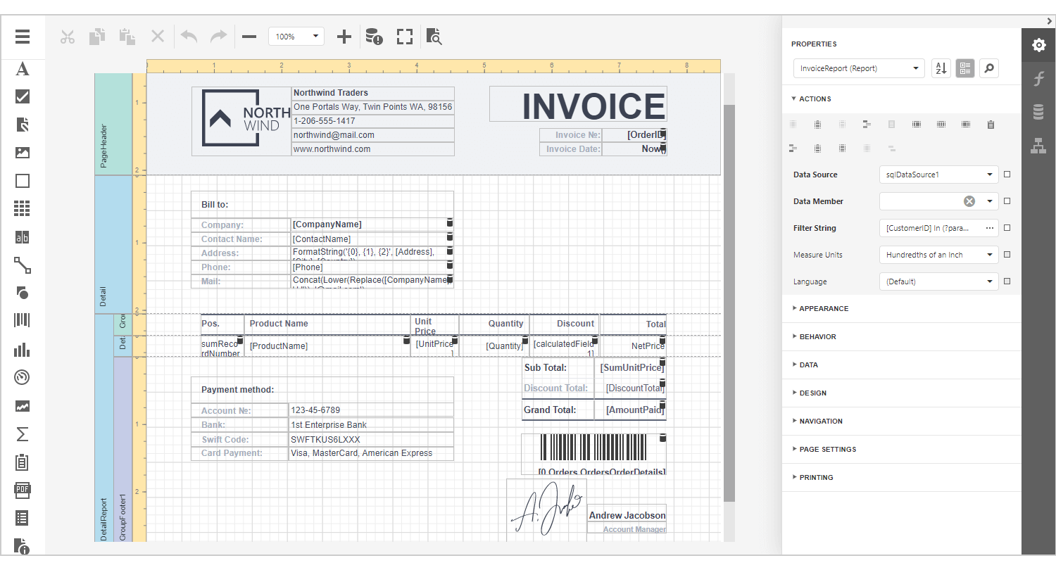
- Various Report Types (Table Report, Master-Detail Report, Invoice Report, Vertical Report, etc.)
- 20+ Report Controls (including a Pivot Table and Charts)
- Bind to Data (SQL, JSON, Excel, XPO and Object Data Sources)
- Federated Data Source (integrate different data sources and get uniform data access with a federated query)
- Data Source Wizard and Query Builder
- Report Wizard
- Integrated Document Viewer
- Bookmarks and Document Map
- Data Grouping, Sorting and Drill Down
- Calculated Fields and Report Parameters
- Skeleton Screen
- Appearance Customization
Demo: Report Designer for Blazor Documentation
New Toolbar Component
Our new responsive Toolbar component for Blazor allows you to build intuitive and easy-to-navigate apps. It supports the following command types:
- Button
- Drop-Down List
- Check Item
- Radio Group
- Link
Demo: Toolbar for Blazor Documentation
New Context Menu Component
Our new Blazor Context Menu component ships with the following features:
- Bind to Data
- Unbound Mode
- Item Groups
- Appearance Customization
Demo: Context Menu for Blazor Documentation
Sizing (Density) - Small, Medium, Large
With this update, you can control how components and their elements are spaced and sized. You can specify a global option that affects the sizing of all components in your Blazor app, or specify sizing for individual components.
DevExpress Blazor UI includes three sizing scales: small, medium, and large.
Documentation
Data Grid Enhancements
Column Chooser
The Column Chooser allows a user to show/hide and reorder grid columns.
Demo | Documentation
Header Template
Demo | Documentation
Charts Enhancements
Data Editors Enhancements
Resolved Issues
See our Version History for a complete list of resolved issues.
Breaking Changes
- T874276 - The default size of some components was changed
- T874276 - Data Grid - Format-related properties of the Spin Edit and Date Edit columns have been renamed
- T875624 - TreeView - Click on a node's expand/collapse button no longer invokes an action associated with a click on the node itself
- T878784 - TreeView - The TreeViewNodeInfo class has been moved to an internal namespace
- T874294 - The default date format is now culture-dependent
- T874294 - Form Layout - The ValueEditingContext class has been renamed to ValueEditContext