#New Radial Menu
Inspired by Microsoft OneNote, the DevExpress WinForms Radial Menu allows you to extend your applications and create contextual and quick access touch-centric interfaces for the WinForms platform.
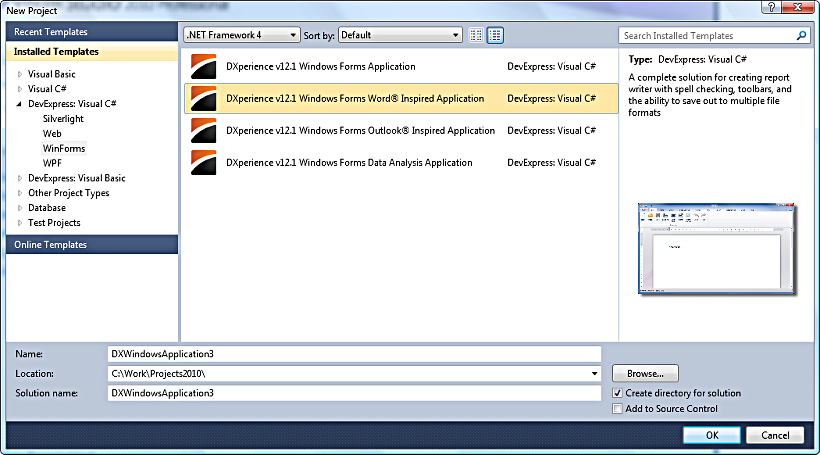
#New Word Inspired Reporting
Inspired by Microsoft Word, Snap by DevExpress allows you to deliver an intuitive reporting solution to your end-users – one that's easy to understand and use, without the learning curve associated with traditional banded reporting tools.
#
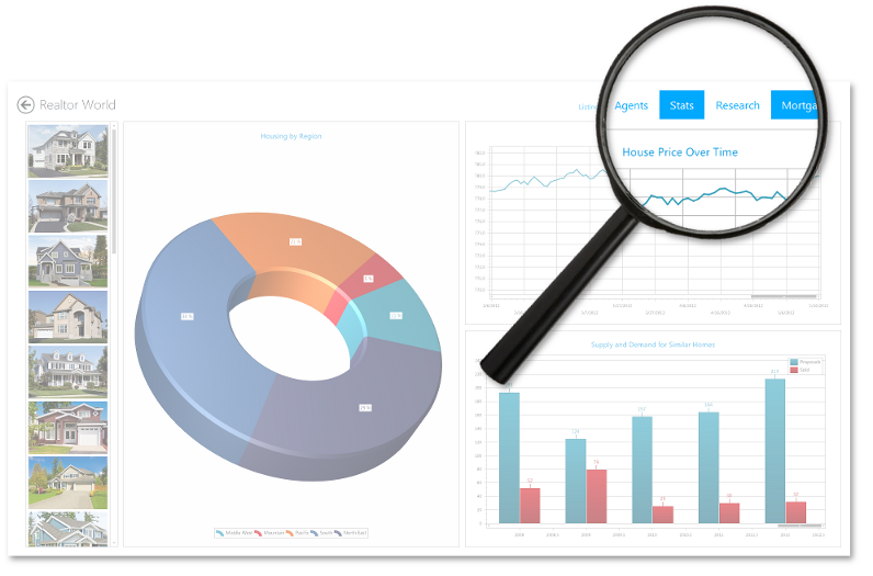
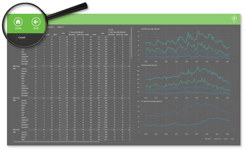
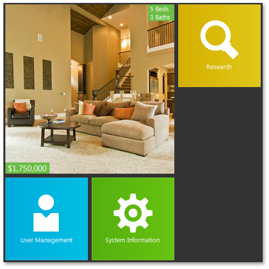
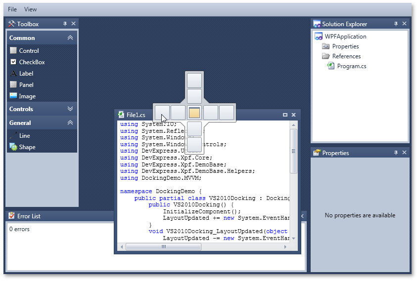
New Project Templates
We have created a set of project templates that will help you automatically generate applications that replicate the feature of today's most popular business solutions.
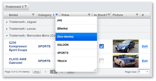
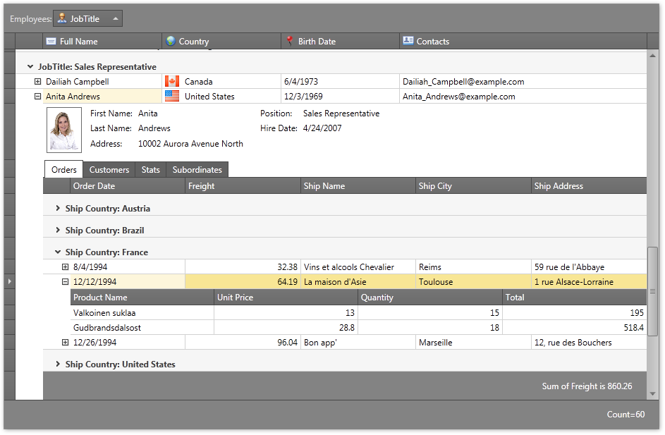
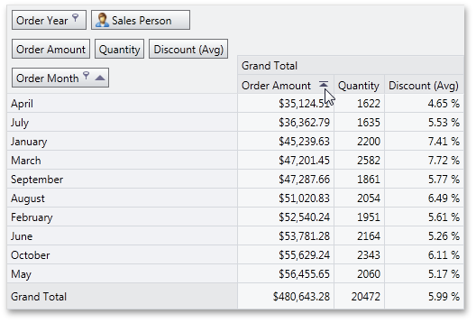
#Data Grid Control
Find Panel Improvements
-
A search for numeric values against numeric columns has been improved in server mode. With this release, when you enter a numeric value in the search box, the Grid Control searches against numeric columns using the Equals comparison operator.
-
We've added options allowing you to control visibility of the Clear and Find buttons in the Find Panel.
-
Contents of preview fields can now be searched when performing a search via the Find Panel.
-
The state of the Find Panel is saved/restored when the Grid Control's layout is saved/restored.
Search LookUp Edit Enhancements
-
"Best-fit" Functionality - Columns in the SearchLookUpEdit control can be proportionally resized to fit their contents when you open the editor's dropdown window.
If needed, you can also enable the dropdown window to be resized to fit all columns.
-
The SearchLookUpEdit control now supports Instant Feedback Mode, when using the control as an in-place editor within the XtraGrid control.
Master-Detail Enhancements
Properties of generic IList<T> and IEnumerable<T> collections can now be recognized as collection properties, providing detail data for the Grid Control. Contents of these collections will be automatically displayed within Detail Views.
Miscellaneous
-
New methods have been added to help you manually show and hide the Loading panel.
-
You can now expand all group rows corresponding to a specific grouping column using a single method call. Note that this feature is not supported in Server Mode.
-
We have added the ability to select a range of rows via the Ctrl+Shift+Home and Cltr+Shift+End key combinations.
-
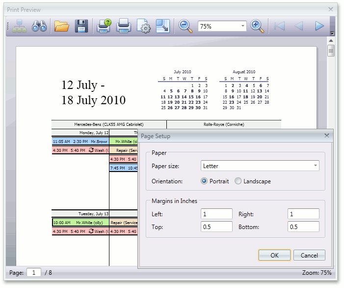
A new event has been added to help you customize print settings before the Grid Control is printed or exported. For instance, you can customize the orientation setting of the printed document.
#Bars
Document Manager MetroUI View
The Document Manager now ships with a MetroUI view that helps you build applications optimized for Windows 8. The Metro View is much more than just tiles.
You can create compound application trees, where each node is an application screen.
By using a Document Manager MetroUI View you can:
Present documents (which are Forms or UserControls) as tiles, tabbed groups, slide groups or single documents.
Different layout containers are designed for each of these metaphors;
Easily navigate through application nodes with the help of the application bar, displayed on a right mouse click.
The application bar can combine both embedded buttons (such as 'Back', 'Home' or 'Exit') and custom buttons;
Only load required documents using the Deferred Load feature;
- Use the contextual zoom feature - navigate from the currently viewed node to the overview (upper level) or detailed view (underlying level);
Choose one of the available animation effects to visualize active screen change;
Get an attractive streamlined UI out of the box with a built-in splash screen and skins support.
Non-Document Mode for the Document Manager
When DockManager is used along with a Document Manager within a single application, the DockManager gains additional features including:
- Ability to use a Document Selector to navigate both panels and documents;
- Docking hints painting - when both DocumentManager and DockManager are used in an application, docking hints are painted using the same style;
- New option in DockPanels' context menu - 'Dock as Tabbed Document', which docks the current panel to a DocumentManager as a tab;
- Panel snapping - ability to dock to the screen edge when dragged into it.
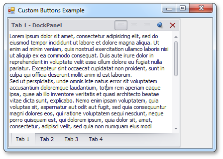
If you want to use any of these features, but do not need a Document Manager to display multiple documents (as views require), use the new Non-Document Mode. In this mode a Document Manager contains a single control (Grid Control, RichEdit Control, etc).
The image below demonstrates Non-Document Mode in action - the Document Manager hosts a RichEdit Control and is used along with the DockManager:
Non-MDI Mode for the Document Manager
With this release, a Document Manager can be hosted within a UserControl.
Deferred Documents Load
If your application contains a Document Manager with lots of documents, your users no longer have to wait until all documents are loaded before they can start working.
With the Deferred Documents Load feature, only tab headers and an empty container for documents are displayed.
Clicking a tab raises an event that loads and displays the contents of the respective document.
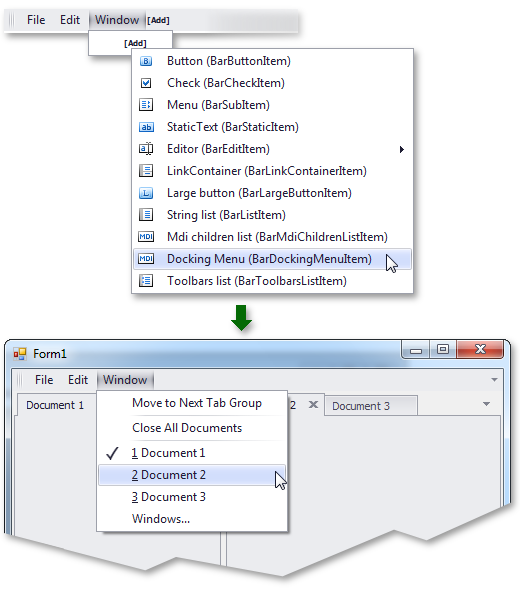
Bar Docking Menu Item
The new Bar Docking Menu Item, when placed to a menu (a Bar), displays docking commands within the menu as buttons.
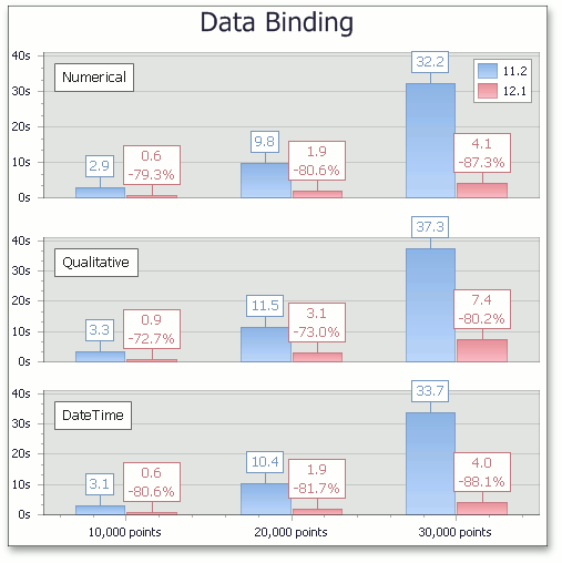
#Chart Control
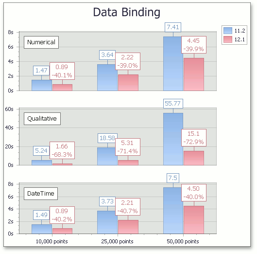
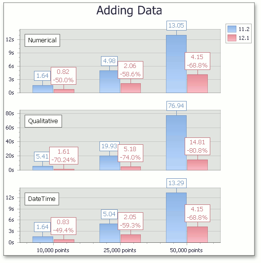
Performance Enhancements
With this release, we've improved the performance of the XtraCharts Suite for various data binding scenarios and for chart rendering during resizing and changes to data.
The following table describes performance improvements associated with different data binding scenarios:
The following table describes performance improvements when adding large numbers of data points to a chart.
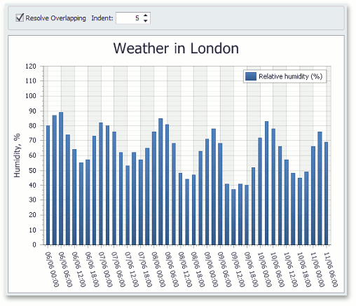
Resolve Overlapping for Axis Labels
This release introduces a new resolve overlapping algorithm for chart axis labels. When automatic resolution is enabled, chart axis labels are adjusted automatically to avoid overlaps during resizing.
Automatic Data Type Detection
With this release, XtraCharts can automatically detect the data type of series arguments. You no longer need to specify scale type before providing data for a chart.
Built-in Tooltips and Crosshair Cursor
This release introduces built-in tooltips and a crosshair cursor. These features do not require a single line of code and are enabled by default where appropriate.
Tooltips can display any information about the hovered chart element. You can embed any control for tooltip content - even display another chart to represent detailed drill-down data.
A crosshair cursor provides important interactivity and allows you to track series point values in crosshair and axis labels.

Chart Ribbon and Toolbar
In this version, we've introduced a chart Ribbon and toolbar – allowing you to quickly customize a chart. To start using these tools, locate the corresponding ChartControl's smart tag on your form.
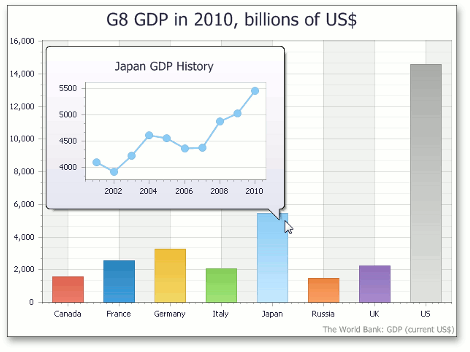
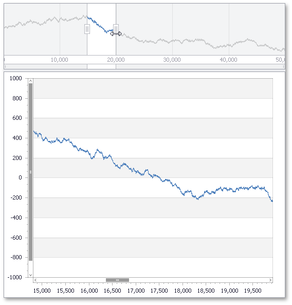
Range Control Integration
A Chart Control can be connected to the newly released Range Control. When you select the interval in a Range Control, a chart automatically adjusts its axes ranges to a value corresponding this interval.
#Coded UI Test Extension
Coded UI Test Extension for DevExpress WinForms controls is an extension of Microsoft Coded UI Tests (CUIT), designed to help you create automated tests of your user interface. Using these tests, you can perform functional testing of the UI and validation of UI controls. This feature is only licensed as part of DXperience Universal Edition. Please contact ClientServices@DevExpress.com for additional information.
Coded UI Test Extension for DevExpress WinForms controls is tailored to facilitate the UI testing on DevExpress WinForms controls. There are four levels of CUIT support:
- Basic Record and Playback
- Rich Property Validation
- Code Generation
- Aggregated Actions
For the majority of WinForms controls, all four levels are supported, making the code generated by CUIT more readable and maintainable. These controls are:
-
Grid Control, GridLookUpEdit and SearchLookUpEdit
-
Editors and controls shipped with the XtraEditors library
-
RibbonControl, BarManager, DocumentManager and DockManager
-
Printing Library
-
Xtra Form
-
NavBar Control
The following controls are partially supported:
-
Pivot Grid Control
-
XtraReports
#Docking Control
DXperience v2012 introduces the following Dock Manager and Document Manager enhancements.
Custom Header Buttons
Along with default 'Close', 'Maximize' and 'Auto-Hide' buttons, DockPanels can now have custom header buttons of Push or Check type.
Check type buttons can additionally unite in radio button groups.
DockManager and Document Manager Interplay
If your application contains both the DocumentManager and DockManager components, DockPanels gain several additional features.
These are: docking hints are painted in the same style for both of the components, the Document Selector displays DockPanels along with documents, DockPanels have an additional option in their context menus - 'Dock as Tabbed Document'.
Integration in Other Controls
The Document Manager is now integrated in Printing, Reports and XAF.
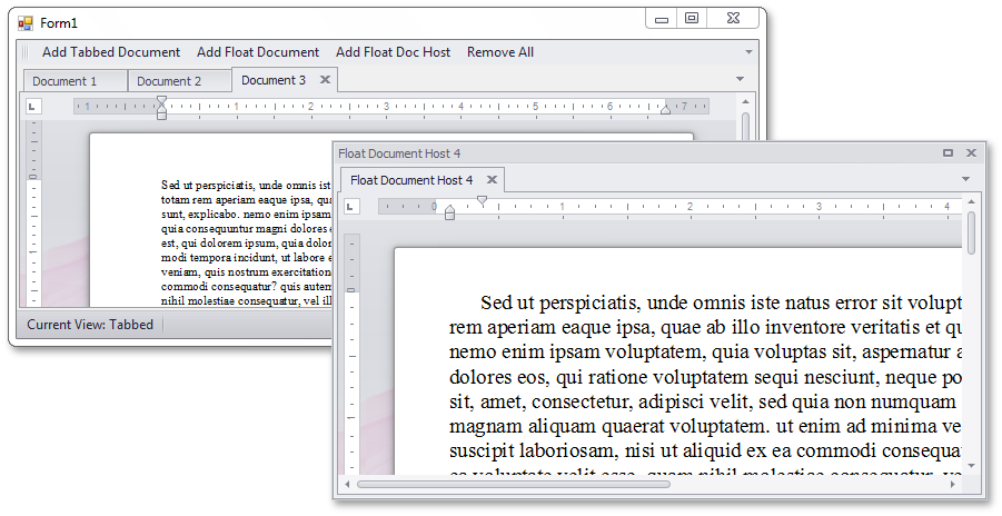
Floating Documents Hosts
Floating documents can now serve as independent containers themselves to which other documents and Dock Panels can be docked.
#Editors
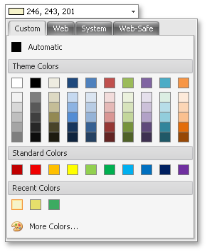
Color Pick Edit Control
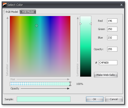
The new Color Pick Edit is an advanced color editor, allowing you to pick a color from a number of palettes - a predefined color palette, Web, Web-Safe and System.
A click on the More Colors button opens a color selection dialog, where you can pick any color using the RGB or HSB color model:
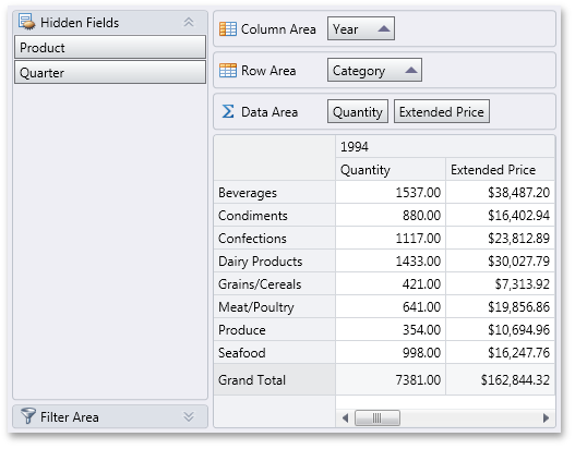
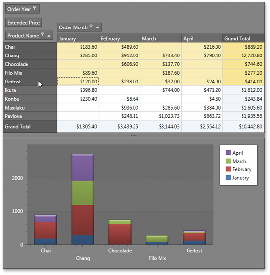
#Pivot Grid Control
Filtering by Summary Values
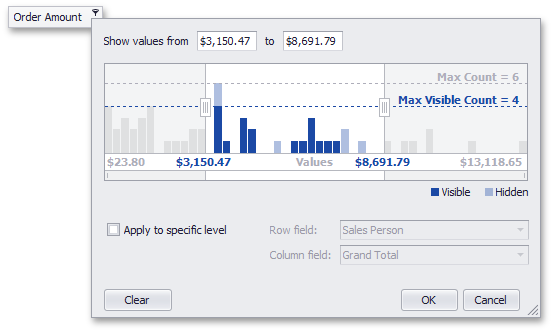
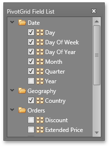
With this release, we have introduced a new Summary Filter that extends your ability to refine data within the pivot grid. When the control is bound to a tabular datasource, the Summary Filter allows you to specify a range of summary values that you would like to see in the report for each data field.
Our new Summary Filter popup window displays the actual distribution of summary values helping you evaluate how many summary values will be shown and hidden by the current filter. In the same distribution chart, you can also see how many of these values are already hidden by Summary Filters (light blue bars).
In addition, you are free to configure summary filtering for any data level: summary, Total or Grand Total values.
Improved OLAP Browsing in Field List
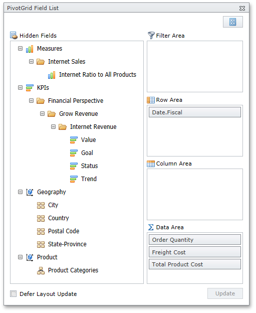
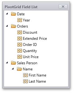
In OLAP mode, the DevExpress WinForms PivotGrid Control automatically retrieves measure groups and folders from the server and displays them in the Field List. KPI measures are now shown within a separate category.
User Folders in Field List
For standard data source mode, this release introduces the ability to arrange fields into user-defined folders in the Field List. To implement this new feature, specify a folder for each field. Whenever the field is displayed in the Field List, it will be shown in the specified folder. As you would expect, you can create folder hierarchies, by placing folders one into another.
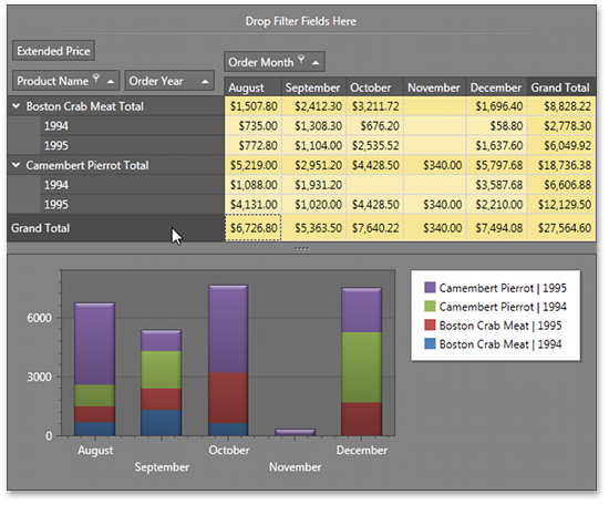
Charting Automation Features
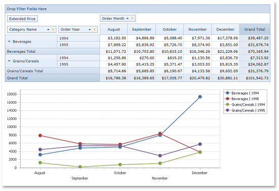
When displaying the PivotGrid Control’s data in a chart, you rarely need to compare cell values to Totals or Grand Totals as these values differ significantly. At the same time, when selecting large cell blocks, Total values inevitably appear within the selection. To solve this with previous versions, you had to manually disable a few options that controlled Total value visibility within the bound chart control.
With this release, PivotGrid automatically defines which values should be passed to ChartControl. It analyzes the current selection, finds the lowest-level data and excludes all higher-level Totals. The following animation shows how selection changes are reflected within a bound Chart control.

Yet another new automation feature "rotates" the chart by changing series into arguments and vice versa depending on the current selection. In this mode the control makes sure that the number of series never exceeds the number of arguments.

Filtering by OLAP Member Unique Names
By default, a pivot grid identifies field values by the corresponding OLAP member values. With this release, you can configure the pivot grid to use OLAP member unique names instead. This option is useful if your cube contains several members with the same value, as it enables the pivot grid to distinguish between such members.
Optimized Performance and Memory Consumption for OLAP
The WinForms PivotGrid consumes much less memory when fetching summary values if the layout contains one to three data fields. The query generation engine has also been optimized, giving you up to two times faster performance against certain operations (such as expanding field values).
Simplified OLAP Binding
You no longer need to create data source objects nor reference additional assemblies to bind the pivot grid to OLAP cubes using ADOMD.NET or XMLA. Simply specify the connection string (as you would with OLE DB), and select the required data provider via the newly introduced OLAPDataProvider property.
Improved Best Fit Performance
Best Fit performance has been significantly improved.
Miscellaneous Enhancements
-
Improved Top N Values Feature
We have introduced a new way to define the number of top values to be displayed (an update for the Top N Values feature – available in OLAP mode). You can now specify the maximum allowed sum of the corresponding summary values and the pivot grid will display the maximum number of field values whose summaries do not exceed the specified number in total.
-
New Event for Easy Customization of Data Passed to a Chart
We have introduced a new CustomChartDataSourceRows event that allows you to add, modify and remove specific rows from the chart data source.
-
Improved Clipboard Interaction
We have added several settings that allow you to control clipboard interaction, including the copying of fragmentary multi-selections and field value hierarchies with both collapsed and expanded values.
#Range Control
Numeric Types Support
Range Control provides an elegant solution for end-users to select ranges of data.
At first glance, this might resemble a Range Track Bar.
However, its ability to select and visualize data ranges are much more flexible. Unlike a Range Track Bar, which only supports integer type ranges, the Range Control supports any numeric type (integer, float, double and decimal):
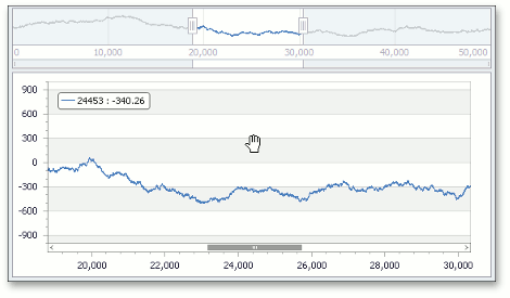
Chart Control Integration
In addition to support for different range types, the control allows for range zooming and scrolling via a dedicated bar and animated range selector. The Range Control works flawlessly with the Chart Control:
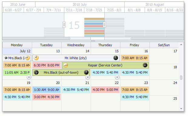
Scheduler Control Integration
The Range Control is also integrated into the Scheduler Control, where it is used as a timeline bar:
Pivot Grid Control Integration
Here is an another example of the Range Control embedded into the Pivot Grid Control (used for the 'Filtering by Summary' UI):
Miscellaneous
By using the Range Control you can add support for range selection and visualization for any custom control (where appropriate) – all you need is to implement a dedicated interface.
Horizontal and vertical orientations for the Range Control are supported.
#Ribbon
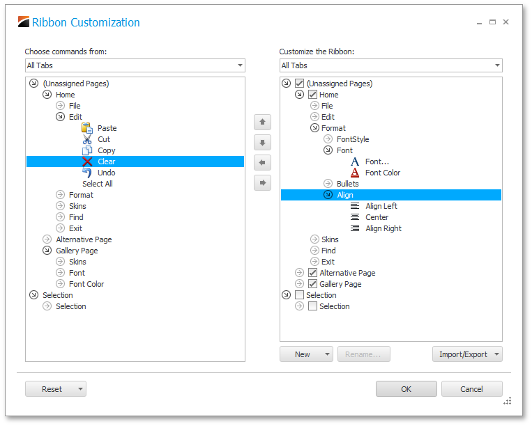
Ribbon Customization
DXperience v2012 vol 1 ships with runtime Ribbon customization options much like those found in Office 2010.
To initiate customization, you simply right-click the Ribbon Control’s "free space" and select the Customize Ribbon menu item. When you enable this feature, your end-users can:
-
Add new pages/groups or hide existing pages/groups.
-
Re-arrange existing/custom pages and page groups as needs dictate.
-
Add existing commands to default and custom page groups.
-
Save your custom layouts in XML files.
-
Import layout settings to quickly configure a Ribbon Control's appearance.
-
Easily restore the original Ribbon Control layout.
-
Stay at their customized layout each time your application runs with the help of the auto-save layout feature.
Mac Office Ribbon
The UI that is part of Mac Office is defined by its unique Ribbon implementation. If your requirements dictate the use of the Mac Office Ribbon, you are only a property setting away with the DevExpress WinForms Ribbon.
Office 2013 Ribbon
When only the best will do. The DevExpress WinForms Ribbon now supports the Office 2013 UI experience.
#Rich Text Editor
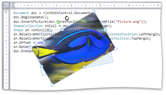
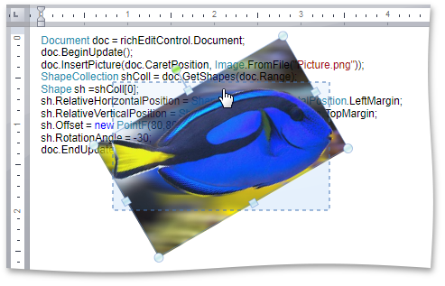
Floating Objects
This release introduces support for floating objects (pictures and text boxes) within a document - including rotation of floating objects and associated API.
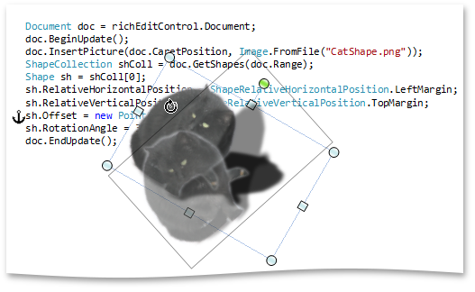
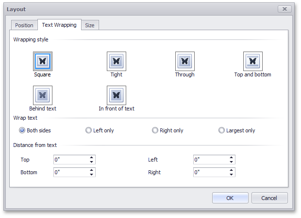
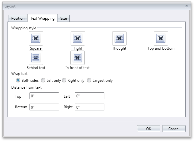
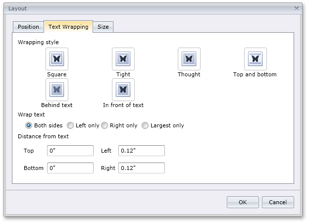
Floating Object Layout Dialog
End-users can insert pictures and text boxes by executing commands accessible via a bar or Ribbon UI. The Layout dialog allows end-users to specify text wrapping, size and position of floating objects.
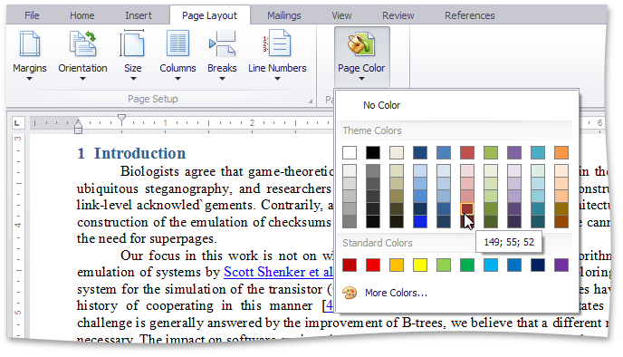
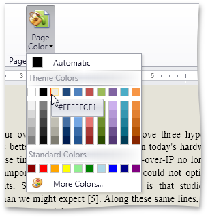
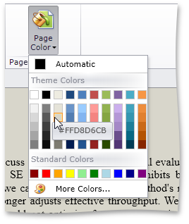
Page Background Color
Background color of the page can be set by end-users or programmatically. Background color can be optionally applied to the printout when printing the document.
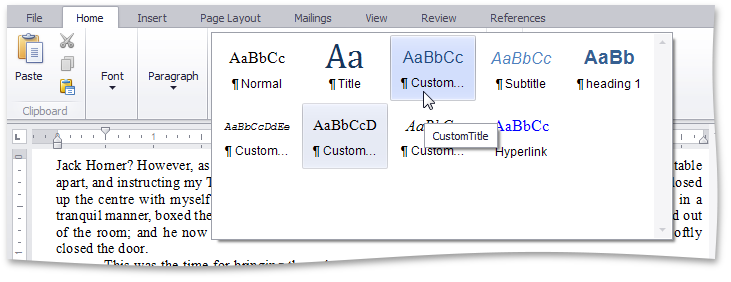
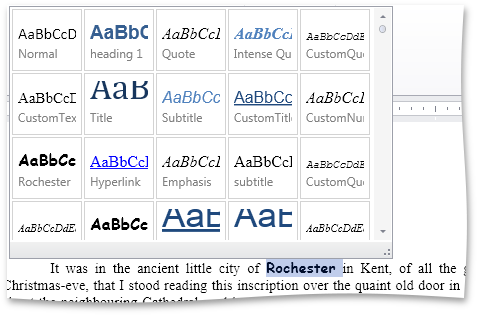
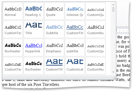
Style Gallery
The DevExpress WinForms RichEdit control provides end-users with a Style Gallery similar to the Quick Styles gallery in Microsoft Word®. Style Gallery displays a preview of text formatting for each individual style.
Word® Inspired Application
An application based on the RichEditControl with Ribbon UI can be created using MS Visual Studio project template.
#Scheduler Control
Bar and Ribbon UI
In DXperience v2012 vol 1, our WinForms SchedulerControl includes design-time improvements to simplify the process of creating Bar or Ribbon UI for your next calendar/scheduling application. You can now use a scheduler smart tag to automatically generate required toolbars in less than a minute and you do not have to write a single line of code.
Additionally, we have extended the set of toolbars available for the SchedulerControl. Your end-users can perform the following basic operations in a scheduler via a toolbar or Ribbon UI:
-
Import and export scheduler data using the iCalendar (.ics) format.
-
Print a scheduler, show its print preview and specify print settings.
-
Navigate through dates.
-
Zoom in and zoom out of the scheduler area.
-
Change active view.
-
Specify scheduler view layouts.
-
Select the type of grouping for scheduler data.
-
Select time scales.
-
Create, edit and delete simple and recurring appointments.
ResourcesTree Filtering
With this release, the DevExpress ResourcesTree control supports an automatic filtering. This allows your end-users to filter resources on the fly by typing text into the auto-filter row - a filter condition is automatically created based upon the entered values, and applied to the focused column of the tree. After a filter has been applied, a filter panel can be optionally displayed. This panel contains a string representation of the applied filter criteria and can be used by end-users to do the following:
-
Clear the filter.
-
Temporarily disable and enable the current filter.
-
Invoke a list of recently used filters.
-
Open the Filter Editor to build complex filter criteria.
Animation Effects
A new option allows you to display an animation effect when end-users navigate through scheduler dates and resources.
Integration with RangeControl
The following features are now available between the DevExpress WinForms RangeControl and SchedulerControl:
-
Two-way synchronization between SchedulerControl and RangeControl
-
Auto switching a SchedulerControl view to the most appropriate display type for showing the time range selected in RangeControl
-
Multi-level scales for RangeControl
-
A set of predefined scale collections (hour, day, week, month, quarter, year, fixed-interval ) for RangeControl
-
The ability to create custom scales and scale collections for RangeControl
-
Auto-formats for header captions of RangeControl scales
-
Clicking a scale header in RangeControl selects a corresponding time interval in RangeControl and displays it in SchedulerControl
-
Two available types of appointment data projection in RangeControl - as numbers or thumbnails
-
The ability to set the maximum number of intervals that can be selected in RangeControl
-
A slider under RangeControl allows end-users to change the number of visible intervals in RangeControl and scroll the RangeControl area
#
Tile Control
TileControl Headers and Tile Group Headers
New properties allow you to display headers for the TileControl and individual TileGroups:
Extra Large Tiles
These are large items that occupy two, three or more rows. You can easily transform large items into extra large tiles by specifying the row count.
New Tile Animation Transition Effects
When enabling the tile animation feature, you can choose among from 4 scrolling effects (Top->Down, Down->Top, Left->Right, Right->Left) and 3 fade effects (fade, segmented fade and random segmented fade):

Miscellaneous Enhancements
Ability to change visibility of tile groups has been added.
#
TreeList Control
HTML Text Formatting in Column Headers
You can now use a set of HTML tags to format text in TreeList column headers. You can make a part of text bold or italic, customize the font, size and color of any text element or insert an image at any position within the text.
Extended Clipboard Capabilities
With this release, users can copy data to the Clipboard in either Hierarchical or Flat format. Both formats are fully supported by spreadsheet apps such as Microsoft Excel.
#Windows 8 Inspired Tile Control
Originally shipped in December 2011, the DevExpress Windows 8 Inspired Tile Control for WinForms has been extended with key usability features so you can create dashboards and touch-centric applications with ease.
#Windows 8 Inspired Buttons
To help you emulate the Windows 8 experience on the WinForms platform, new buttons ship as part of DXperience.
#New Image Slider Control
Display and navigate images with both an Image Area and a Navigation Bar. The ASP.NET Image Slider Control includes integrated touch (sliding) support.
#New MVC Scheduler Extension
We introduce our new ASP.NET MVC Scheduler Extension - it gives you many of the same great features as our ASPxScheduler control.
Five Buit-in Views
Day view, Work Week view, Week view, Month (Multi-week) view, Timeline view - give you detailed or large-scale views of appointments for different scheduling purposes.
Date Navigator Control
Provides the ability to select several dates (days, weeks, etc.) continuously or randomly to display them together in the scheduler. Automatically switches to the most appropriate view.
Recurrence SupportReminders for AppointmentsGrouping by Dates or ResourcesCustom Templates
You can completely customize the appearance or layout of visual elements and dialogs using any HTML content.
Reporting
Provides extreme flexibility in constructing print styles for the Scheduler data. You can load previously saved report templates, preview and export reports to various formats (including PDF and BMP).
iCalendar Format
Import and export using iCalendar format for easy data interchange between calendar applications.
Time Zones
Support for different client and server time zones.
Client-Side API
#New MVC Docking Extension
With this release, we have added a Docking Suite to our MVC Extensions Library.
This suite offers three components - DockPanel, DockZone and DockManager. They allow you to manage content placeholders (dock panels), which can be moved by end-users between specific regions (dock zones) of a web page. A dock panel can either be docked to a dock zone or made to float. Dock zones can be placed on any section of a page; and orientation and size is fully customizable. DockManager allows you to provide centralized programmatic control of all dock panels and dock zones contained within a page.
A typical use scenario is the implementation of a personalized web page populated with web gadgets.
#New MVC Popup Menu Extension
A new PopupMenu extension allows you to enrich your MVC-powered sites with context-sensitive action lists. The PopupMenu extension allows you to create a hierarchical menu structure of any complexity. Popup menus can be invoked by clicking, right-clicking or hovering the target element with the mouse pointer.
#New MVC Loading Panel Extension
A new LoadingPanel extension can be used to display a custom 'Loading...' text and image. It notifies users that a callback is currently processing, and helps to prevent an end-user from clicking away before the callback has been completed. LoadingPanel can be displayed in the center of the page or can relate to any container.

#GridView Control
New Multi-Select Mode for Header Filter
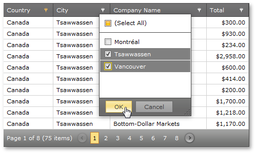
We have added a new multi-select mode to ASPxGridView's header filter. In multi-select mode, the header filter dropdown contains a check box list, allowing end-users to select multiple items to be included in the filter criteria. Select All is automatically added to the top of the popup list, helping end-users quickly select all items in the list. This is useful, when a user needs to exclude just a few items from the filter criteria. After the desired selection is made, an end-user can click the OK button to filter the grid based upon the selected values.
#Chart Control
Performance Enhancements
With this release, we've improved the performance of the XtraCharts Suite for various data binding scenarios and for chart rendering during resizing and changes to data.
The following table describes performance improvements associated with different data binding scenarios:
Resolve Overlapping for Axis Labels
This release introduces a new resolve overlapping algorithm for chart axis labels. When automatic resolution is enabled, chart axis labels are adjusted automatically to avoid overlaps during resizing.
Automatic Data Type Detection
With this release, XtraCharts can automatically detect the data type of series arguments. You no longer need to specify scale type before providing data for a chart.
#Docking Control
New Zone Orientation Mode
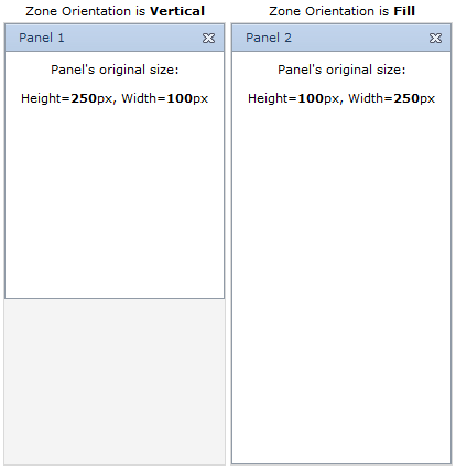
A new dock zone orientation mode - Fill - has been added to the previously available Horizontal and Vertical modes. You can now specify a dock zone's orientation so that when a dock panel gets docked to the zone, it is automatically resized to fill the entire zone client area. In this instance, only one panel can be docked to a zone at a time.
#Form Layout Manager
Radically simplify the way in which you create ASP.NET input forms and deliver web solutions to market in a fraction of the time when compared with traditional web form layout.
#Metro Inspired Theme
Create elegant Windows 8 inspired web applications for ASP.NET and MVC with the newest DevExpress Theme.
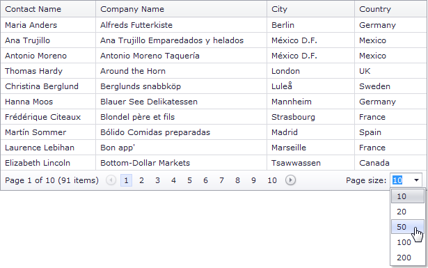
#Pager Control
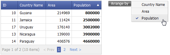
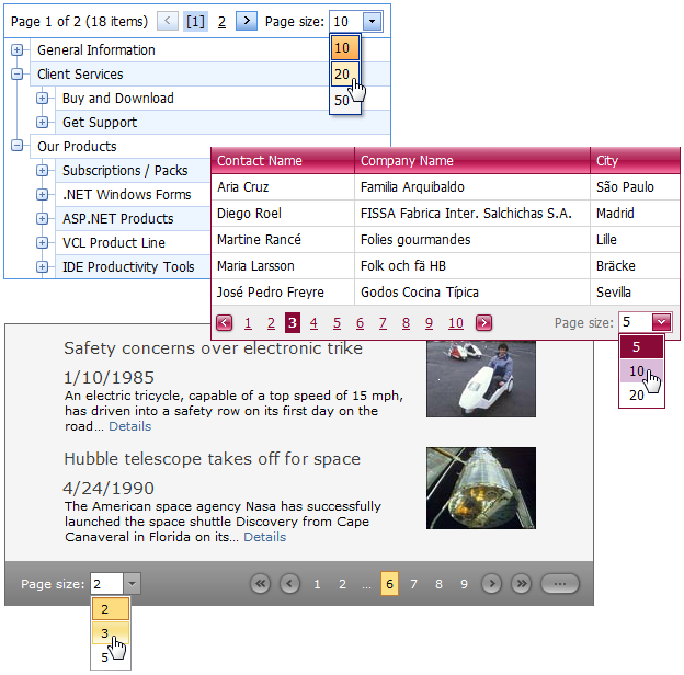
Page Size Selector
This release introduces a new page size selector UI for the ASPxPager. This feature benefits complex data-aware controls that use built-in pager functionality (the ASPxNewsControl, ASPxGridView, ASPxDataView, ASPxPivorGrid, ASPxTreeList). Activating the page size selector allows your end-users to dynamically change the number of data items (rows) displayed within a data control (such as a grid).
A page size selector is a pager section that consists of a descriptive label and a combo box containing page size values. Both elements - label text and value list - are customizable. You can easily compose a list of custom page size values and enable the All item providing the ability to show all data items at once. The page size selector section can be horizontally aligned to the left or right side of the pager.
The page size selector provides keyboard support. All page size change operations (such as showing/hiding a dropdown list, changing the page size, applying/canceling changes) can be performed using a keyboard as an alternative to a pointing device.
#Popup Control
Fade-in Animation
We have extended predefined animation types used to show a popup window with a new fade-in effect. Your popup window can now be displayed by fading it from transparent to opaque.
#Pivot Grid Control
ADOMD.NET and XMLA Support for OLAP Binding
With this release, we have introduced full support for ADOMD.NET and XMLA data providers.
ADOMD.NET offers all the features supported by OLE DB and additionally allows you to retrieve format strings and properties of OLAP members from the server.
XMLA is an open XML-based standard that does not require any data access libraries or data providers to be installed on the system. Nevertheless, it supports all OLAP features available in ADOMD.NET.
Browsing OLAP Cubes in Field List
If a Pivot Grid is bound to an OLAP cube, the Field List shows pivot grid fields as they appear in a cube browser - dimension fields are arranged in folders and grouped by dimensions, while named and KPI measures are shown within two separate categories, arranged in measure groups and/or display folders.
User Folders in Field List
For standard data source mode, this release introduces the ability to arrange fields into user-defined folders in the Field List. To implement this new feature, specify a folder for each field. Whenever the field is displayed in the Field List, it will be shown in the specified folder. As you would expect, you can create folder hierarchies, by placing folders one into another.
Charting Automation Features
When displaying the PivotGrid Control’s data in a chart, you rarely need to compare cell values to Totals or Grand Totals as these values differ significantly. At the same time, when selecting large cell blocks, Total values inevitably appear within the selection. To solve this with previous versions, you had to manually disable a few options that controlled Total value visibility within the bound chart control.
With this release, PivotGrid automatically defines which values should be passed to ChartControl. It analyzes the current selection, finds the lowest-level data and excludes all higher-level Totals. The following animation shows how selection changes are reflected within a bound Chart control.
Yet another new automation feature "rotates" the chart by changing series into arguments and vice versa depending on the current selection. In this mode the control makes sure that the number of series never exceeds the number of arguments.
Filtering by OLAP Member Unique Names
By default, a pivot grid identifies field values by the corresponding OLAP member values. With this release, you can configure the pivot grid to use OLAP member unique names instead. This option is useful if your cube contains several members with the same value, as it enables the pivot grid to distinguish between such members.
Optimized Performance and Memory Consumption for OLAP
The ASP.NET PivotGrid consumes much less memory when fetching summary values if the layout contains one to three data fields. The query generation engine has also been optimized, giving you up to two times faster performance against certain operations (such as expanding field values).
Simplified OLAP Binding
You no longer need to create data source objects nor reference additional assemblies to bind the pivot grid to OLAP cubes using ADOMD.NET or XMLA. Simply specify the connection string (as you would with OLE DB), and select the required data provider via the newly introduced OLAPDataProvider property.
Miscellaneous Enhancements
Improved Top N Values Feature
We have introduced a new way to define the number of top values to be displayed (an update for the Top N Values feature – available in OLAP mode). You can now specify the maximum allowed sum of the corresponding summary values and the pivot grid will display the maximum number of field values whose summaries do not exceed the specified number in total.
New Event for Easy Customization of Data Passed to a Chart
We have introduced a new CustomChartDataSourceRows event that allows you to add, modify and remove specific rows from the chart data source.
#Splitter Control
Pane Auto Sizing
By implementing a couple of properties for splitter panes, we have provided support for pane auto sizing mode. You can now customize individual splitter panes, so they automatically resize to fit the size of their content when changed dynamically. For a pane, you can specify whether it should automatically change its width, height, or both.

#MVC Grid View Extension
New Page Size Selector UI
We have added a new page size selector UI to GridView's built-in pager. Enabling the page size selector allows your end-users to dynamically change the number of rows displayed within a grid.
A page size selector is a pager section that consists of a descriptive label and a combo box containing page size values. Both elements - label text and value list - are customizable. You can easily compose a list of custom page size values and even enable the All item, providing the ability to show all grid rows at once. The page size selector section can be horizontally aligned to the left or right side of the pager.
The page size selector provides keyboard support. All page size change operations (such as showing/hiding a dropdown list, changing the page size, applying/canceling changes) can be performed using a keyboard as an alternative to a pointing device.
#MVC Data View Extension
Effectively present information to your end-users with the easy-to-use DevExpress MVC Data View Extension.
#MVC Pivot Grid Extension
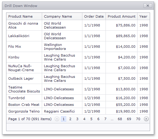
Drill Down
MVC Pivot Grid allows you to obtain the underlying data that was used to calculate specific summary values.
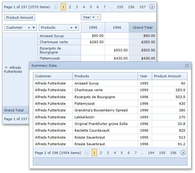
Summarized Data Output
You can extract summarized data from MVC Pivot Grid and display this data in a different manner.
Standalone Field List
With this release, we have introduced a Pivot Customization extension, which has the same appearance and provides the same functionality as the Field List window. You can now have a Field List anywhere on your page instead of having your end-users invoke it in a popup window.

#MVC TreeList with Editing
The new DevExpress MVC TreeList extension offers you the flexibility of a TreeView and the editing power of a Grid. Built with a hybrid design, it allows you to represent data to end-users in the form of a tree, a list or a grid – all within a single presentation control with full create, edit, and delete capabilities.
#Touch, Gesture & Animation
Extended Touch, Gesture and Animation Support
Build highly functional, elegant and easy-to-use ASP.NET web applications for iOS and Chrome and Microsoft Surface with extended touch and gesture support across pageable controls such as the DevExpress ASP.NET Grid.
#Miscellaneous
New Project Wizard
This release introduces a new step-by-step Wizard that simplifies the project management process, be it creating a new web project (via Visual Studio's "New Project" or "New Web Site" dialogs) or modifying settings of an existing project. By using our Wizard, you can easily set up the layout of site pages (for new projects), select a theme for the site, define the application's localization, set up different configuration options for DevExpress controls and the entire web site.
The Wizard's main project management functionality is checking web.config file integrity in relation to DevExpress controls and updating the configuration file with both DevExpress related information (the required assembly references and project-wide settings) and defined site customization settings.

New Project Templates
We have created a set of new project templates to help you automatically generate drafts of common application types and layouts. Some of these run our new Project Wizard allowing you to easily configure the generated application.
Empty Web Application
An empty web site ready for DevExpress ASP.NET AJAX Controls. Contains only web.config file with DevExpress-related settings.
Standard Web Application
An ASP.NET web site based on the default VS project template, but configured by DevExpress ASP.NET Project Wizard and powered by DevExpress ASP.NET AJAX Controls. Available layouts: Standard, Microsoft Outlook inspired, Custom.
Web Application for Tablet Devices (ASP.NET version only)
An ASP.NET tablet web application to be configured by DevExpress ASP.NET Project Wizard and powered by DevExpress ASP.NET AJAX Controls. Available layouts: Mobile Store or Custom.
Microsoft Outlook Inspired Web Application
An ASP.NET web site using an Outlook layout pattern implemented with the help of specific DevExpress web controls, including the ASPxGridView and ASPxScheduler.
These project templates are developed for different platforms (ASP.NET, MVC), view engines (such as MVC's default and Razor) and programming languages (C#, VB).

Theming Mechanism - Enhancements
You can now more easily apply a DevExpress theme to the entire web site or to an individual control. To apply a theme, you no longer need to extract skin files to the project's App_Themes folder using ASPxThemeDeployer tool - all the required resources will be automatically applied from a theme assembly.
We have implemented a flexible mechanism to apply a theme to all DevExpress controls for an entire web site. You can do this either in web.config (using the new theme-related options of our 'devexpress' configuration section) or programmatically (by setting specially added static properties).
Available themes can now be previewed at design-time using a new control-related design-time editor.
New iOS-like Theme
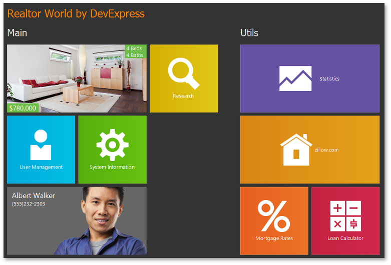
In our continuing effort to address your business needs, we have introduced a new iOS-like application-wide theme. Although this theme does not fully emulate iOS element appearance, it is designed and optimized for touch interfaces. We have modified the size of tap-able UI elements to fit the average size of a fingertip, thus making them fingertip-size control elements.
The new iOS-like theme is widely used in our new 'Home Realtor' RWA demo.
#New Theme Wheel Control
The new Theme Wheel allows you to edit theme colors using a color wheel. The Theme Wheel can also organize colors by hue or RGB distance into the specified number of groups, so that you can customize color parameters for these entire groups instead of doing this for multiple individual colors.
#New Layout Control
New Data Layout Control
The Data Layout Control is a data-aware version of the Layout Control and allows you to quickly build a layout of controls for the WPF and Silverlight platforms. Once bound to an object, the Data Layout Control fetches the object's public properties and automatically builds a layout for editing these properties.
In-place editors for editing underlying data are selected based on a property's data type. For instance, a Check Edit control is used to edit Boolean properties, a ComboBox Edit control is used to edit enumeration properties, etc. You can mark properties on a bound object using specific attributes to indicate that these properties should be edited using multi-line text editors, password edit boxes, or text editors with a phone mask enabled.
Automatic arrangement of in-place editors into groups and tabbed groups is supported. You can mark a property on a bound object with a dedicated attribute specifying the name of a target group or tabbed group. The in-place editor will go directly into this group during layout generation. If there is no group/tabbed group with this name, it will be automatically created. As such, you can combine multiple editors into the same group, group box, tabbed group or individual tabs.
Examples of supported attributes are shown in the code above.
Miscellaneous
A new IsRequired property has been added that allows you to mark specific fields as those that require mandatory data input. Labels for mandatory items use bold fonts. In the following image, the first two layout items have this property enabled:

#Data Grid Control
Master-Detail Printing and Export
The DevExpress WPF Grid has been enhanced with native printing and data export when displaying master-detail data on-screen – including the ability to control the manner in which detail rows are printed.
Simplified Data Binding
A new easy-to-use design time wizard allow user to bind the WPF Grid Control to different ItemsSource types and specify the desired data binding options (InMemory List, ServerMode, InstantFeedback Mode).
Master-Detail Support
With this release, you can easily display “one-to-many“ data relationships using the new Master-Detail Data Representation feature of the DevExpress WPF Grid. Since there are no limits to the number of relationships or nesting levels, each record can expand multiple detail grids and each detail record can have its own detail information.
DXGrid ships with a dedicated placeholder for detail records allowing you to select the manner in which information is displayed for your end users. If you choose to display data using a grid control, you will have access to a fully-synchronized detail view that supports nearly all of the features you’ve come to expect from our market leading grid control including: data editing, sorting & grouping, filtering, summary computation, column customization and so much more. Your users will have access to a single scrollbar for the entire grid with integrated smooth scrolling capabilities. If you choose to group or filter data, you’ll do that using the master view’s Group By box or filter panel – which is visible at all times.
If you choose to embed custom templates within details sections, you will find numerous enhancements in the DXGrid – including built-in detail expansion buttons and tabbed containers for details. The latter is an extremely effective way in which to present detail information to end users.
In this release, you can add Card Views or TreeList Views via custom templates.

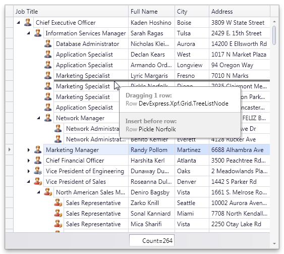
Drag-and-Drop Support
The DevExpress WPF Grid Control introduces drag-and-drop support across Table Views and Tree List Views. Enabling drag and drop you allow your end-users to reorder rows in Table Views, rearrange node hierarchy in Tree List Views and move data objects (rows or nodes) outside the grid to external controls that support drag and drop.

Search Panel
With this release, our Grid Control introduces a Search Panel across view types - delivering an easy and straightforward way for end-users to locate information within the grid.

Fixed Total Summary Panel
In DXperience v2012 vol 1, the grid control can display two distinct summary panels (calculated against all rows). The difference between the new Fixed Total Summary Panel and Total Summary Panel (available in previous versions), is that this panel is displayed below the scrollable view and its content is always visible on-screen.

Runtime Grid Summary Display Format Editor
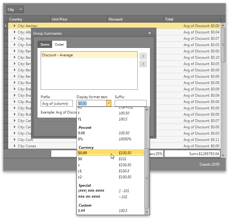
A runtime grid summary editor allows end-users to manage total and group summaries (create, remove, customize). In DXperience v2012 vol 1, we've improved the summary editor to allow the end-user to specify patterns used to format summary values.

TreeListView Printing and Exporting
By using the DevExpress WPF Printing Library, you can now render TreeListView contents with ease (including all current customization settings such as data sorting, summaries, column visibility, etc). You can also export your reports to other file formats, including PDF and XLSX.

#Chart Control
Charting and Financial Analysis
A wide range of financial indicators have been added to the DevExpress WPF Charting Suite, including: Trend Line, Regression Line, Fibonacci, Simple Moving Average, Weighted Moving Average, Exponential Moving Average, and Triangular Moving Average.
Performance Enhancements
With this release, we’ve improved the performance of DXCharts for various data binding scenarios and for chart rendering during resizing and changes to data.
Automatic Data Type Detection
With this release, DXCharts can automatically detect the data type of series arguments. You no longer need to specify a scale type before providing data for a chart.
Built-in ToolTips and Crosshair Cursor
This release introduces built-in tooltips and a crosshair cursor. These features do not require a single line of code and are enabled by default where appropriate.
Tooltips can display any information about the hovered chart element. You can embed any control for tooltip content - even display another chart to represent detailed drill-down data.
A crosshair cursor provides important interactivity and allows you to track series point values in crosshair and axis labels.
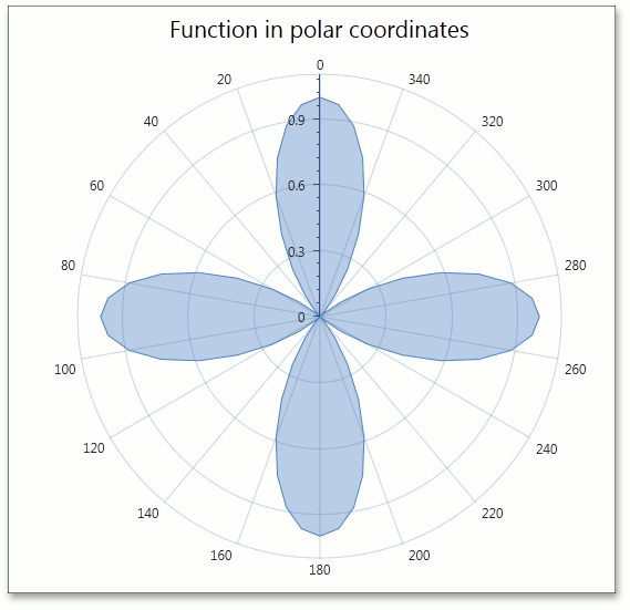
6 New Chart Types
Radar Area, Radar Line, Radar Point, Polar Area, Polar Line and Polar Point 2D chart types are now available.
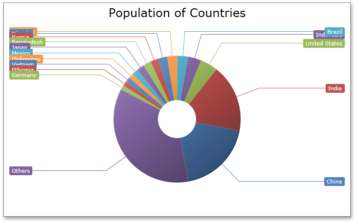
Resolve Labels Overlapping in Pie Series
This release introduces new algorithms to resolve overlapping of pie series labels. When the Resolve Overlapping mode is enabled, pie series labels are automatically arranged to avoid overlaps.
This feature is available for Outside Label placement and for Two Column mode.
#Docking Control
New VS2010 Style for the DockManager
Applying the new VS2010 Style to a DevExpress WPF DockLayout Manager changes its behavior to fully emulate the capabilities found in Microsoft Visual Studio 2010 (including changing docking hints and restricting DocumentPanels from being docked anywhere other than DocumentGroups).
#Editors
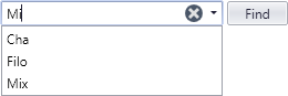
New Search Control
With this release, the DevExpress WPF Data Editors Library introduces a new Search Control – delivering an easy and straightforward way for end-users to locate information within data editors (list boxes, combo boxes, etc). To execute a search, enter text within the Find box and data editors linked to the Search Control will display those records that have matching values:
Various options are available to control the display and behavior of the Search Control. You can specify search columns, choose between automatic and manual search modes, optionally display control buttons, etc.
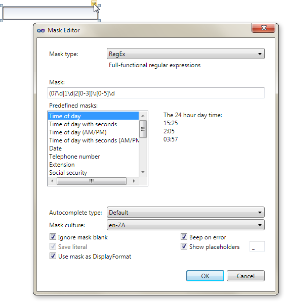
Design-Time Enchancements - New Mask Editor
DXperience v2012 vol 1 introduces a new Mask Editor – allowing you to quickly create and customize masks of any complexity at design-time.

Miscellaneous Enhancements
-
Performance Optimization for inplace editing
-
Edit Value Conversion
It is now possible to specify the edit value's type treatment using the EditValueType property. For example, if a user enters '100' within the text editor whose EditValueType property is set to System.Int32, the editor automatically converts the input string to an integer value and assigns it to the EditValue property.
-
Extended data filtering in ComboBoxEdit, LookUpEdit and ListBoxEdit controls
These data editors now provide a FilterCriteria property allowing you to specify the required filter criteria in XAML or code behind.
#Map Control
Support for Microsoft Bing Services
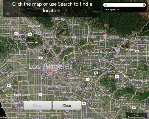
With this release, the DevExpress Map Control supports Microsoft Bing Search, Bing Route and Bing Geocode services. These services significantly extend the Map Control's functionality allowing you to build a map application that meets diverse business requirements.
For example, you can find and calculate any route between two or more geographical points on a map using Bing Search and Bing Route services. The Bing Geocode service is useful when you need to obtain supplemental information about any object on a map.
The following screenshot demonstrates how these services can be used for creating a navigation system.
Map Pushpin
The Map Control includes a new visual element - Pushpin. Use it when you need to mark any location on a map or to specify a route between multiple points.

Local Cache
This release introduces local cache support – when desired, loaded maps are automatically saved to hard disk.
#Pivot Grid Control
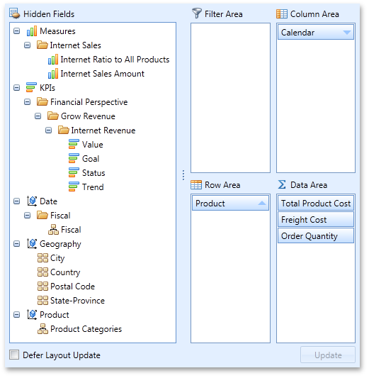
Standalone Field Header Areas
With this release, the DevExpress WPF PivotGrid Control allows you to arrange its Field Header Areas via a custom display. This feature is based on the ability of standalone FieldList controls to display both hidden fields and fields from any specified pivot grid area. You need only create individual FieldList controls, configure them to display fields from different areas and place them wherever required. You can even create a tabbed or dock-based layout.

Improved OLAP Browsing in Field List
In OLAP mode, the DevExpress WPF PivotGrid Control automatically retrieves measure groups and folders from the server and displays them in the Field List. KPI measures are now shown within a separate category.
User Folders in Field List
For standard data source mode, this release introduces the ability to arrange fields into user-defined folders in the Field List. To implement this new feature, specify a folder for each field. Whenever the field is displayed in the Field List, it will be shown in the specified folder. As you would expect, you can create folder hierarchies, by placing folders one into another.
Displaying and Hiding Fields via Field Lists
Field Lists can now optionally display both visible and hidden fields. In this mode, each field header is accompanied by a check box that allows end-users to control the visibility of corresponding fields.
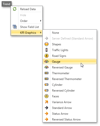
KPI Support
If an OLAP cube contains KPI (Key Performance Indicator) information, the pivot grid automatically recognizes it and display it using the appropriate format. KPIs are also available for tabular data sources - if a data field contains only 1, 0 and -1 values, you can easily enable KPI graphics for such a field.
An end-user can select the graphics used via the context menu.

Charting Automation Features
When displaying the PivotGrid Control’s data in a chart, you rarely need to compare cell values to Totals or Grand Totals as these values differ significantly. At the same time, when selecting large cell blocks, Total values inevitably appear within the selection. To solve this with previous versions, you had to manually disable a few options that controlled Total value visibility within the bound chart control.
With this release, PivotGrid automatically defines which values should be passed to ChartControl. It analyzes the current selection, finds the lowest-level data and excludes all higher-level Totals. The following animation shows how selection changes are reflected within a bound Chart control.
Yet another new automation feature "rotates" the chart by changing series into arguments and vice versa depending on the current selection. In this mode the control makes sure that the number of series never exceeds the number of arguments.

Data Field Popup Windows
If data field headers do not fit within the Data Header Area, they are displayed in a popup invoked when hovering over the Data Header Area.
Filtering by OLAP Member Unique Names
By default, a pivot grid identifies field values by the corresponding OLAP member values. With this release, you can configure the pivot grid to use OLAP member unique names instead. This option is useful if your cube contains several members with the same value, as it enables the pivot grid to distinguish between such members.
Optimized Performance and Memory Consumption for OLAP
The WPF PivotGrid consumes much less memory when fetching summary values if the layout contains one to three data fields. The query generation engine has also been optimized, giving you up to two times faster performance against certain operations (such as expanding field values).
Simplified OLAP Binding
You no longer need to create data source objects nor reference additional assemblies to bind the pivot grid to OLAP cubes using ADOMD.NET or XMLA. Simply specify the connection string (as you would with OLE DB), and select the required data provider via the newly introduced OlapDataProvider property.
Interactive Sort by Summary Indicator
The Sort by Summary indicator now displays actual sort order and allows end-users to switch it via a mouse click.
Context Menu Enhancements
-
Context Menus for Data Cells
This release adds support for the creation of custom context menus invoked when right-clicking data cells.
-
New Event for Customizing Context Menus
Handle the newly introduced PopupMenuShowing event to create and modify context menus on the fly.
Miscellaneous Enhancements
-
Multirow Filter Area
When the Filter Area contains too many fields to fit within a single line, they are displayed across multiple lines.
-
Improved Top N Values Feature
We have introduced a new way to define the number of top values to be displayed (an update for the Top N Values feature – available in OLAP mode). You can now specify the maximum allowed sum of the corresponding summary values and the pivot grid will display the maximum number of field values whose summaries do not exceed the specified number in total.
-
New Event for Easy Customization of Data Passed to a Chart
We have introduced a new CustomChartDataSourceRows event that allows you to add, modify and remove specific rows from the chart data source.
-
Improved Clipboard Interaction
We have added several settings that allow you to control clipboard interaction, including the copying of fragmentary multi-selections and field value hierarchies with both collapsed and expanded values.
#Ribbon Control
Aero Window Support
The DevExpress WPF Ribbon Control now supports the Microsoft Aero Interface when used within a DXWindow:
#Rich Text Editor
Floating Objects
This release introduces support for floating objects (pictures and text boxes) within a document - including rotation of floating objects and associated API.
Floating Object Layout Dialog
End-users can insert pictures and text boxes by executing commands accessible via a bar or Ribbon UI. The Layout dialog allows end-users to specify text wrapping, size and position of floating objects.
Page Background Color
Background color of the page can be set by end-users or programmatically. Background color can be optionally applied to the printout when printing the document.
Style Gallery
The DevExpress WPF RichEdit control provides end-users with a Style Gallery similar to the Quick Styles gallery in Microsoft Word®. Style Gallery displays a preview of text formatting for each individual style.
DXperience v12.1 WPF Forms Word® Inspired Application
An application based on the RichEditControl with Ribbon UI can be created using MS Visual Studio project template.
#Scheduler Control
Scheduler Printing
With this release, you can now print the contents of the DevExpress WPF Scheduler Control with ease. You can compose a printable report based on scheduler data, show its print preview and specify print settings via a collection of ready-made report layout templates that can be used for a wide range of scheduler/calendar reports. For advanced report customization, a set of validation events are available. For example, you can use these events to amend a collection of appointments and resources to be passed to the report, or specify a report time interval or work time where necessary.
#
Tile Group Headers
With this release, you can now display headers for each tile group.
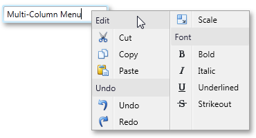
Multi-Column Menus
When using menus, commands are arranged across a single column by default.
If your menu contains numerous commands, you can enable the new multi-column feature - which includes scroll buttons to help simplify navigation between individual commands.
#Tree List
Drag-and-Drop Support
With this release, the DevExpress WPF Tree List Control introduces drag-and-drop support – allowing your end-users to rearrange node hierarchies and to move nodes outside the Tree List Control to external controls that support drag and drop.
Focus the required node or select multiple nodes, drag and drop them onto the required location. If a node(s) is dropped onto another node, it is appended to the child nodes collection of the target node. If you require manual control over drag and drop operations, handle the appropriate events.
Instant WYSIWYG WPF Reporting by Rendering-Printing-Exporting the DevExpress WPF Tree List Control
By using the DevExpress WPF Printing Library, you can now render the contents of the WPF TreeList with ease (including all customization settings such as data sorting, summaries, column visibility, etc). You can also export your reports to other file formats, including PDF and XLSX.
Fixed Summary Panel
DXperience v2012 vol 1 adds the ability to display data summaries in a Fixed Summary Panel. Whether you scroll the view horizontally, reorder or hide columns, data summaries displayed within the Fixed Summary Panel are always visible.
Miscellaneous Improvements
-
UI Automation Support and Section 508 Compliance
-
Column Data Binding Improvements
Columns can be connected to fields in a data source via WPF Data Binding. There is no difference when working with columns bound to data source fields using the FieldName or DisplayMemberBinding property.
#Themes
DXperience v2012 vol 1 ships with three new themes.
#New Data Layout Control
The Data Layout Control is a data-aware version of the Layout Control and allows you to quickly build a layout of controls for the WPF and Silverlight platforms. Once bound to an object, the Data Layout Control fetches the object's public properties and automatically builds a layout for editing these properties.
In-place editors for editing underlying data are selected based on a property's data type. For instance, a Check Edit control is used to edit Boolean properties, a ComboBox Edit control is used to edit enumeration properties, etc. You can mark properties on a bound object using specific attributes to indicate that these properties should be edited using multi-line text editors, password edit boxes, or text editors with a phone mask enabled.
Automatic arrangement of in-place editors into groups and tabbed groups is supported. You can mark a property on a bound object with a dedicated attribute specifying the name of a target group or tabbed group. The in-place editor will go directly into this group during layout generation. If there is no group/tabbed group with this name, it will be automatically created. As such, you can combine multiple editors into the same group, group box, tabbed group or individual tabs.
Examples of supported attributes are shown in the code above.

Miscellaneous
A new IsRequired property has been added that allows you to mark specific fields as those that require mandatory data input. Labels for mandatory items use bold fonts. In the following image, the first two layout items have this property enabled:
#Data Grid Control
Master-Detail Support
With this release, you can easily display “one-to-many“ data relationships using the new Master-Detail Data Representation feature of the DevExpress Silverlight Grid. Since there are no limits to the number of relationships or nesting levels, each record can expand multiple detail grids and each detail record can have its own detail information.
DXGrid ships with a dedicated placeholder for detail records allowing you to select the manner in which information is displayed for your end users. If you choose to display data using a grid control, you will have access to a fully-synchronized detail view that supports nearly all of the features you’ve come to expect from our market leading grid control including: data editing, sorting & grouping, filtering, summary computation, column customization and so much more. Your users will have access to a single scrollbar for the entire grid with integrated smooth scrolling capabilities. If you choose to group or filter data, you’ll do that using the master view’s Group By box or filter panel – which is visible at all times.

If you choose to embed custom templates within details sections, you will find numerous enhancements in the DXGrid – including built-in detail expansion buttons and tabbed containers for details. The latter is an extremely effective way in which to present detail information to end users.
In this release, you can add Card Views or TreeList Views via custom templates.
Drag-and-Drop Support
The DevExpress Silverlight Grid Control introduces drag-and-drop support across Table Views and Tree List Views. Enabling drag and drop you allow your end-users to reorder rows in Table Views, rearrange node hierarchy in Tree List Views and move data objects (rows or nodes) outside the grid to external controls that support drag and drop.
Search Panel
With this release, our Grid Control introduces a Search Panel across view types - delivering an easy and straightforward way for end-users to locate information within the grid.
Fixed Total Summary Panel
In DXperience v2012 vol 1, the grid control can display two distinct summary panels (calculated against all rows). The difference between the new Fixed Total Summary Panel and Total Summary Panel (available in previous versions), is that this panel is displayed below the scrollable view and its content is always visible on-screen.
Runtime Grid Summary Display Format Editor
A runtime grid summary editor allows end-users to manage total and group summaries (create, remove, customize). In DXperience v2012 vol 1, we've improved the summary editor to allow the end-user to specify patterns used to format summary values.
TreeListView Printing and Exporting
By using the DevExpress Silverlight Printing Library, you can now render TreeListView contents with ease (including all current customization settings such as data sorting, summaries, column visibility, etc). You can also export your reports to other file formats, including PDF and XLSX.
#Bars
Multi-Column Menus
When using menus, commands are arranged across a single column by default. If your menu contains numerous commands, you can enable the new multi-column feature - which includes scroll buttons to help simplify navigation between individual commands.

#Chart Control
Performance Enhancements
With this release, we've improved the performance of the XtraCharts Suite for various data binding scenarios and for chart rendering during resizing and changes to data.
The following table describes performance improvements associated with different data binding scenarios:
The following table describes performance improvements when adding large numbers of data points to a chart.
Resolve Overlapping for Axis Labels
This release introduces a new resolve overlapping algorithm for chart axis labels. When automatic resolution is enabled, chart axis labels are adjusted automatically to avoid overlaps during resizing.
Automatic Data Type Detection
With this release, XtraCharts can automatically detect the data type of series arguments. You no longer need to specify scale type before providing data for a chart.
Built-in ToolTips and Crosshair Cursor
This release introduces built-in tooltips and a crosshair cursor. These features do not require a single line of code and are enabled by default where appropriate.
Tooltips can display any information about the hovered chart element. You can embed any control for tooltip content - even display another chart to represent detailed drill-down data.
A crosshair cursor provides important interactivity and allows you to track series point values in crosshair and axis labels.
6 New Chart Types
Radar Area, Radar Line, Radar Point, Polar Area, Polar Line and Polar Point 2D chart types are now available.
Resolve Labels Overlapping in Pie Series
This release introduces new algorithms to resolve overlapping of pie series labels. When the Resolve Overlapping mode is enabled, pie series labels are automatically arranged to avoid overlaps.
This feature is available for Outside Label placement and for Two Column mode.
#Docking Control
New VS2010 Style for the DockManager
Applying the new VS2010 Style to a DevExpress WPF DockLayout Manager changes its behavior to fully emulate the capabilities found in Microsoft Visual Studio 2010 (including changing docking hints and restricting DocumentPanels from being docked anywhere other than DocumentGroups).
#Editors
New Control - Search Control
With this release, the DevExpress Silverlight Data Editors Library introduces a new Search Control – delivering an easy and straightforward way for end-users to locate information within data editors (list boxes, combo boxes, etc). To execute a search, enter text within the Find box and data editors linked to the Search Control will display those records that have matching values.
Various options are available to control the display and behavior of the Search Control. You can specify search columns, choose between automatic and manual search modes, optionally display control buttons, etc.

Design-Time Enchancements - New Mask Editor
DXperience v2012 vol 1 introduces a new Mask Editor – allowing you to quickly create and customize masks of any complexity at design-time.
Miscellaneous Enhancements
- Performance Optimization for inplace editing
- Edit Value Conversion
It is now possible to specify the edit value's type treatment using the EditValueType property. For example, if a user enters '100' within the text editor whose EditValueType property is set to System.Int32, the editor automatically converts the input string to an integer value and assigns it to the EditValue property.
- Extended data filtering in ComboBoxEdit, LookUpEdit and ListBoxEdit controls
These data editors now provide a FilterCriteria property allowing you to specify the required filter criteria in XAML or code behind.
#Map Control
Support for Microsoft Bing Services
With this release, the DevExpress Map Control supports Microsoft Bing Search, Bing Route and Bing Geocode services. These services significantly extend the Map Control's functionality allowing you to build a map application that meets diverse business requirements.
For example, you can find and calculate any route between two or more geographical points on a map using Bing Search and Bing Route services. The Bing Geocode service is useful when you need to obtain supplemental information about any object on a map.
The following screenshot demonstrates how these services can be used for creating a navigation system.
Map Pushpin
The Map Control includes a new visual element - Pushpin. Use it when you need to mark any location on a map or to specify a route between multiple points.
Local Cache
This release introduces local cache support – when desired, loaded maps are automatically saved to hard disk.
#Pivot Grid Control
Standalone Field Header Areas
With this release, the DevExpress Silverlight PivotGrid Control allows you to arrange its Field Header Areas via a custom display. This feature is based on the ability of standalone FieldList controls to display both hidden fields and fields from any specified pivot grid area. You need only create individual FieldList controls, configure them to display fields from different areas and place them wherever required. You can even create a tabbed or dock-based layout.
Improved OLAP Browsing in Field List
In OLAP mode, the DevExpress Silverlight PivotGrid Control automatically retrieves measure groups and folders from the server and displays them in the Field List. KPI measures are now shown within a separate category.

User Folders in Field List
For standard data source mode, this release introduces the ability to arrange fields into user-defined folders in the Field List. To implement this new feature, specify a folder for each field. Whenever the field is displayed in the Field List, it will be shown in the specified folder. As you would expect, you can create folder hierarchies, by placing folders one into another.

Displaying and Hiding Fields via Field Lists
Field Lists can now optionally display both visible and hidden fields. In this mode, each field header is accompanied by a check box that allows end-users to control the visibility of corresponding fields.

KPI Support
If an OLAP cube contains KPI (Key Performance Indicator) information, the pivot grid automatically recognizes it and display it using the appropriate format. KPIs are also available for tabular data sources - if a data field contains only 1, 0 and -1 values, you can easily enable KPI graphics for such a field.

An end-user can select the graphics used via the context menu.
Charting Automation Features
When displaying the PivotGrid Control’s data in a chart, you rarely need to compare cell values to Totals or Grand Totals as these values differ significantly. At the same time, when selecting large cell blocks, Total values inevitably appear within the selection. To solve this with previous versions, you had to manually disable a few options that controlled Total value visibility within the bound chart control.
With this release, PivotGrid automatically defines which values should be passed to ChartControl. It analyzes the current selection, finds the lowest-level data and excludes all higher-level Totals. The following animation shows how selection changes are reflected within a bound Chart control.
Yet another new automation feature "rotates" the chart by changing series into arguments and vice versa depending on the current selection. In this mode the control makes sure that the number of series never exceeds the number of arguments.
Data Field Popup Windows
If data field headers do not fit within the Data Header Area, they are displayed in a popup invoked when hovering over the Data Header Area.

Filtering by OLAP Member Unique Names
By default, a pivot grid identifies field values by the corresponding OLAP member values. With this release, you can configure the pivot grid to use OLAP member unique names instead. This option is useful if your cube contains several members with the same value, as it enables the pivot grid to distinguish between such members.
Optimized Performance and Memory Consumption for OLAP
The Silverlight PivotGrid consumes much less memory when fetching summary values if the layout contains one to three data fields. The query generation engine has also been optimized, giving you up to two times faster performance against certain operations (such as expanding field values).
Simplified OLAP Binding
You no longer need to create data source objects nor reference additional assemblies to bind the pivot grid to OLAP cubes. Simply specify the connection string via the OlapConnectionString property.
Interactive Sort by Summary Indicator
The Sort by Summary indicator now displays actual sort order and allows end-users to switch it via a mouse click.

Context Menu Enhancements
-
Context Menus for Data Cells
This release adds support for the creation of custom context menus invoked when right-clicking data cells.
-
New Event for Customizing Context Menus
Handle the newly introduced PopupMenuShowing event to create and modify context menus on the fly.
Miscellaneous Enhancements
-
Multirow Filter Area
When the Filter Area contains too many fields to fit within a single line, they are displayed across multiple lines.
-
Improved Top N Values Feature
We have introduced a new way to define the number of top values to be displayed (an update for the Top N Values feature – available in OLAP mode). You can now specify the maximum allowed sum of the corresponding summary values and the pivot grid will display the maximum number of field values whose summaries do not exceed the specified number in total.
-
New Event for Easy Customization of Data Passed to a Chart
We have introduced a new CustomChartDataSourceRows event that allows you to add, modify and remove specific rows from the chart data source.
- Improved Clipboard Interaction
We have added several settings that allow you to control clipboard interaction, including the copying of fragmentary multi-selections and field value hierarchies with both collapsed and expanded values.
#Rich Text Editor
Floating Objects
This release introduces support for floating objects (pictures and text boxes) within a document - including rotation of floating objects and associated API.
Floating Object Layout Dialog
End-users can insert pictures and text boxes by executing commands accessible via a bar or Ribbon UI. The Layout dialog allows end-users to specify text wrapping, size and position of floating objects.
Page Background Color
Background color of the page can be set by end-users or programmatically. Background color can be optionally applied to the printout when printing the document.
Style Gallery
The DevExpress Silverlight RichEdit control provides end-users with a Style Gallery similar to the Quick Styles gallery in Microsoft Word®. Style Gallery displays a preview of text formatting for each individual style.
DXperience v12.1 Silverlight Forms Word® Inspired Application
An application based on the RichEditControl with Ribbon UI can be created using MS Visual Studio project template.
#
Tile Group Headers
With this release, you can now display headers for each tile group.
#Tree List Control
Drag-and-Drop Support
With this release, the DevExpress Silverlight Tree List Control introduces drag-and-drop support – allowing your end-users to rearrange node hierarchies and to move nodes outside the Tree List Control to external controls that support drag and drop.
Focus the required node or select multiple nodes, drag and drop them onto the required location. If a node(s) is dropped onto another node, it is appended to the child nodes collection of the target node. If you require manual control over drag and drop operations, handle the appropriate events.
Tag <inlinegallery> not implemented
Instant WYSIWYG Silverlight Reporting by Rendering-Printing-Exporting the DevExpress Silverlight Tree List Control
By using the DevExpress Silverlight Printing Library, you can now render the contents of the Silverlight TreeList with ease (including all customization settings such as data sorting, summaries, column visibility, etc). You can also export your reports to other file formats, including PDF and XLSX.
Fixed Summary Panel
DXperience v2012 vol 1 adds the ability to display data summaries in a Fixed Summary Panel. Whether you scroll the view horizontally, reorder or hide columns, data summaries displayed within the Fixed Summary Panel are always visible.
Miscellaneous Improvements
-
UI Automation Support and Section 508 Compliance
-
Column Data Binding Improvements
Columns can be connected to fields in a data source via Silverlight Data Binding. There is no difference when working with columns bound to data source fields using the FieldName or DisplayMemberBinding property.
#Themes
DXperience v2012 vol 1 ships with three new themes.
#Grid Control
Built to be blazing fast and lightweight, the touch-enabled DevExpress Windows 8 Grid ships with the essential data shaping and analysis features such as sorting and data summaries.
#Data Editors
The DevExpress Windows 8 Data Editors Library was built to enhance data entry validation and as such, offers full support for numeric, date-time and regular expression masks. In addition to simplified keyboard input, we fully leverage the touch capabilities of Windows 8 with touch-optimized editors like the Data Picker Control.
#Chart Controls
Re-designed from the ground up, the DevExpress Windows 8 Chart Controls takes full advantage of the Windows 8 platform so you can deliver an unrivaled end-user experience. The new controls which make up this product support 18 chart types and use Direct2D for blazing fast drawing.
#Gauge Controls
Whether you need to build a digital dashboard or animate your application's Live Tile with a circular indicator, the DevExpress Windows 8 Gauge Control has a solution waiting for you. This native Windows 8 Control supports touch, offers elegant animation choices and end-user interactivity.
#Map Control
The DevExpress Windows 8 Map Control can be powered by raster maps from Microsoft Bing Maps and OpenStreetMap services, or vector maps in Shapefile and KML formats.
#Range Selector
The DevExpress Windows 8 Range Selector Control simplifies the way in which a range of values are selected within the Windows 8 touch-first UI environment and offers 3 distinct display metaphors, including Cartesian Chart, Date Range and Spark.
#Application Layout & Navigation
Bring products to market faster with the DevExpress Windows 8 App Layout and Navigation Control. Easily specify the pages to display within your solution and how end-users are to navigate them. Automatically preserve application states whenever your application is suspended and then restored.
#Page Layout
The DevExpress Windows 8 Page Layout Control radically simplifies the way in which you create forms for Windows 8 by automatically arranging controls using Windows UI Guidelines and making certain that proper adjustments are applied when changing device orientation.
Today's applications no longer live on one computing platform. Application boundaries have shifted and customers now expect solutions to be accessible across computing devices. Multi-channel suggests building applications that span devices and optimize for the best parts of each platform. The new DXTREME ENTERPRISE Suite enables developers to build applications for touch-enabled devices like the iPad and Microsoft Surface as well as iPhone and Android smartphones. With DXTREME developers can create a single Visual Studio solution that crosses platforms and devices making it easy to reuse content assets and application code.
#Multi-Channel Framework
DXTREME tools deliver an innovative solution for developers who want to create stunning, multi-screen applications across platforms and devices, from Windows 8 devices and the iPad to smartphones like the iPhone and Android. With the power of HTML5, CSS and JavaScript tools in DXTREME developers can also build interactive and engaging web applications that push the boundaries of user experiences to a new level.
#Data Visualization Widgets
Meet and exceed the data visualization needs of your end-users and bring information to life on the web with the HTML 5 JS Widgets that ship as part of DXTREME ENTERPRISE: HTML 5 Charting, Gauge and Range Selector Widget by DevExpress.
#Data Multi-Use Widgets
DXTREME includes the following HTML JS Widgets to be used either with the DXTREME Multi-Channel Application Framework or on standalone basis within an interactive web application: Button, Check Box, Date Box, Field Set, Gallery, Load Indicator, Lookup, List, Maps, NavBar, Number Box, Overlay, Popup, Range Slider, Scroll View, Slider, Switch, Tabs, Text Box, Tile View, Toolbar.
#
Identical Content Merging
Process duplicate values by merging the identical content of a control into a single line of text.
#Data Matrix GS1 Barcode
GS1 DataMatrix uses a special start combination to differentiate the GS1 DataMatrix symbol from the other Data Matrix ECC 200 symbols. The Bar Code control now supports this symbology.
#Isolated Platform Dependencies
We have optimized the dependencies existing across the supported platforms, for the multi-platform reporting to become truly platform-independent. There is no more need to deploy more assemblies than it is necessary to provide reporting functionality to the platform of your choice.
#The Report Designer
The Report Designer improvements
You can easily calculate aggregated functions (Avg, Count, Exists, Max, Min, Single, Sum) within a calculated field's expressions. If required, your expression can include fields from nested tables, with specific conditions applied to them. There is no limitation imposed on the nesting level. You can also fully customize the context menus in the End-User Designer.
#All Platforms
New Barcode Type - Intelligent Mail
The XtraReports Suite's collection of barcodes has been expanded to include one more popular barcode type: Intelligent Mail.
Look-Up Parameter Editors
We have simplified the process of creating report parameters.
With this release, you can easily provide a list of static values for parameters without writing any code.
Once a report is previewed, end-users can select specified values from a look-up editor.
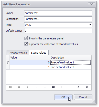
#WinForms Reporting
The Ability to Create Custom Report Galleries
You can create custom template galleries for your business.
Unlike the report gallery from DevExpress (available only at design time), your custom gallery will be available in the End-User Designer so that your end-users can upload a pre-defined template as business needs dictate.

The Binding Updater
After your end-user has selected and uploaded a template from your custom report gallery, the report's data bindings can be easily updated by using the binding updater provided for the End-User Designer.
Using a couple of mouse-clicks, an end-user can substitute all data bindings with the ones available in his/her actual data source.
#WPF Reporting
WPF End-User Report Designer
This release introduces a runtime Report Designer for WPF.
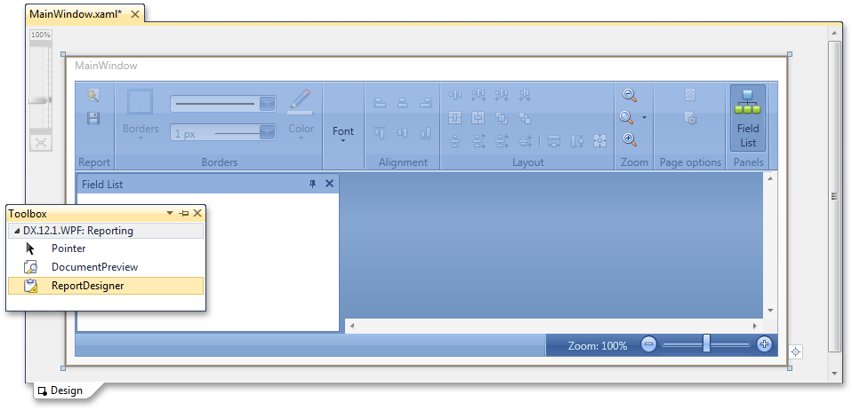
Additional Enhancements
We have added the ability to render the XRRichEdit control in vector format (instead of an image) within a DocumentPreview.
#Silverlight Reporting
End-User Report Designer for Silverlight
Line and Shape controls are now supported by the Silverlight Report Designer.
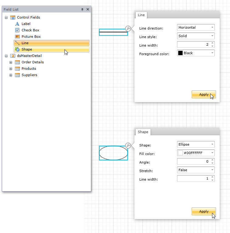
Additional Enhancements
#Entity Framework
Improved Entity Framework Support
Now the most of XAF extra modules are EF compatible and the Code First data model is supported.
XPO-independent XAF Core and Entity Framework Support (CTP)
In this release, we have taken steps towards to the support of the Entity Framework in XAF applications. Now XAF core is free from XPO dependencies and you can use either an XPO-based or Entity Framework-based Object Space. There are, however, built-in modules that are still XPO-dependent - if building an XAF application based on the Entity Framework, you must not use these built-in modules.
#Security Enhancements
Domain Components and New Security System Integration
A number of changes in the Security System and Domain Components engines were made to support their simultaneous usage.
Application Server and Security System Improvements
The new Security System introduced in the previous release has been improved as follows:
-
Ease of Use
Security System now provides a single Security Strategy which unites the simplicity of the Simple Security Strategy and flexibility of the Complex Security Strategy. As before, users have associated roles, but by enabling a single IsAdministrative option you can grant all possible permissions to a role. Roles can be organized in a hierarchical structure defined via the MasterRoles and ChildRoles collections.
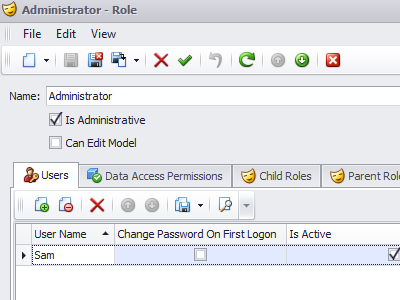
The use of the Standard Authentication is simplified, as the presence of the "Anonymous" user is no longer a requrement. Implementing the Middle Tier scenario, both for Remoting and WCF connection types, is now more straightforward and requires less coding. The use of the Application Server when debugging has been simplified, because of the Console Application Server project template. With this template, there is no need to re-install the Application Server Service when there are changes in your code.
-
Flexibility
Client-side security can now operate in the integrated mode which does not require a Middle Tier to filter out protected data. The newly introduced Object Space type (SecuredObjectSpace) filters data with respect to the current user permissions.
-
Performance
There are no longer additional requests to the database to check whether or not certain property values should be shown as 'Protected Content'. This information is passed together with data. So, the secured data is loaded faster in List Views.
#Tooltip Support
Integrated Tooltip Support for UI Elements
You can now specify the tooltip for the business class property, and this setting will be automatically applied to all related UI elements - Detail View items, List View columns, etc.
#ASP.NET Templates
Easy-to-Upgrade ASP.NET Templates
The ASP.NET application project now contains minimum of markup that will not be changed from version to version, as the XAF pages default content is now embedded to the DevExpress.ExpressApp.Web assembly.
#Lookup List Views
Dynamic Criteria for Lookup List Views
Filter the lookup collections via the new DataSourceCriteriaProperty attribute - the criteria expression can be updated in code when required.
#Records Navigation
Records Navigation in Detail Views in Server Mode
Now, the records navigation actions (Previous Record/Next Record) can be used even when the underlying server-mode List View is closed because XAF caches the objects list.
#Designer Improvements
UI-Driven Business Object Designer Improvements
You can now follow the UI-First development workflow faster as we have improved the designer usability.
#Object Designer (CTP)
UI-Driven Business Object Designer (CTP)
A standard XAF approach for designing a business model for your application is to first implement domain objects or domain components in code and then to customize the auto-generated UI using the Model Editor. In this release, we introduce a new "UI-first" approach so you can start from designing screens as they should appear in the application using a Business Object Designer. These screens are List and Detail Views of business classes. While designing, code is generated for these business classes and Application Model changes are saved. You can therefore run the application and view all the designed screens without having to write a line of code. This application will be running on a newly created database with the tables and relationships corresponding to that which has been designed. Note that you are not limited to the Business Object Designer. The auto-generated code is a standard XAF business class. So, you can extend it by adding additional properties or implementing the required business logic.
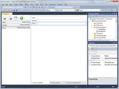
#MDI for Desktop
Enhanced MDI for Desktop Applications
We have updated our MDIShowViewStrategy. It now uses the Document Manager that ships as part of the XtraBars Suite. Like before, you can choose TabbedMDI or StandardMDI mode. This release, however, introduces numerous new benefits. You can now dock, group and arrange tabs or windows as desired. The arrangement is saved when closing the application and restored when opening it. Delayed loading is implemented for restored tabs to optimize performance (inactive tab controls are not created on application startup). Tabs are now accompanied with context menus, similar to the ones you can find in Visual Studio. Tabs now open faster and close more smoothly.
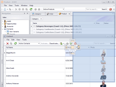
#Server Mode Support
Server Mode Support in Nested and Lookup List Views
Server Mode is now available for Nested and Lookup List Views. Detail Views that include large collections will be loaded much faster.
#
Popup Windows
Enhanced Popup Windows in Web Applications
The usability of dialog windows in ASP.NET application has been improved, as XAF now has the integrated support of the ASPxPopupControl. The browser's popup windows are no longer invoked when an end user opens a lookup, modifies an aggregated object or clicks a PopupWindowShowAction.
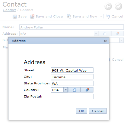
#Miscellaneous Enhancements
Easy ASP.NET Themes Integration
With this release, all ASP.NET themes are available by default in a newly created XAF application. To apply a theme, you no longer need to extract skin files to the project's App_Themes folder using ASPxThemeDeployer tool - all the required resources will be automatically applied from a theme assembly. In addition, you can add an assembly with custom themes if required. At runtime, end-users will be able to switch between all these themes.
Linked Objects are Excluded from Link List Views
Objects that have already been linked to a nested List View are not displayed in the Link List View that is invoked when using the Link Action.
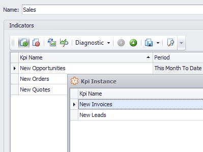
Improved Usability - Parametrized Actions
We have added a Clear button to Parametrized Actions so that end-users can easily reset the currently entered text
When the input is empty, the text specified via the NullValuePrompt option is displayed.
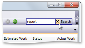
#Business Intelligence Dashboard
Shipping exclusively in DXperience Universal, the tools that make up the WinForms Executive Dashboard Suite have been engineered so you can quickly deliver compelling, customizable, and easy to use business intelligence solutions to market.
DevExpress Dashboard is the right tool for business because it delivers flexible, interactive and fully customizable user experiences that are optimized for real-time data consumption and analysis.
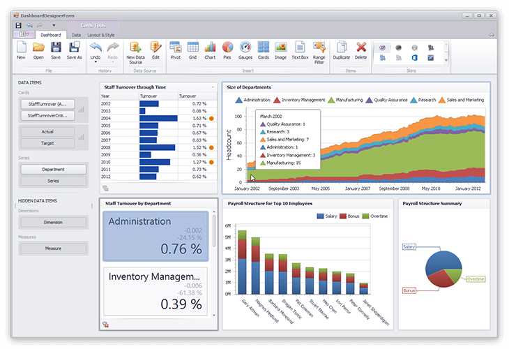
#New Enterprise Reporting
Shipping as part of the Universal Subscription the DevExpress Report Server is a powerhouse reporting platform: a combination of a high-performance server and an elegant client which fully exploits all the key features of the award winning DevExpress End User Report Designer.
The DevExpress Report Server is easy to setup and allows you and your team to instantly focus on your business requirements and spend minimal time on server configuration. The Report Server's UI is easy-to-use and is designed to simplify the way in which user accounts are generated.
The DevExpress Report Server includes 4 unique built-in security groups associated with the document creation process: System Administrator, Data Administrator, Document Creator and Document Viewer.
#New Code Providers
Add Default Case Branch
Adds a default case branch to the current switch statement. This code provider can be used to fix a Default branch is missing code issue.
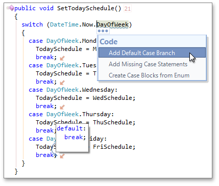
Add Missing Case Statements
Adds case statements for all uncovered cases to the current switch statement. This code provider can be used to fix a Case statements do not explicitly handle all enum values code issue.
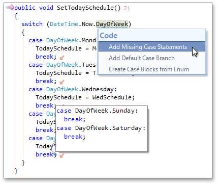
#New Refactoring
We have implemented the Convert to Size refactoring. This refactoring consolidates two numeric parameters called "width" and "height" into a single Size or SizeF object.
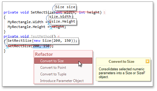
#Feature Advisor
The Feature Advisor reveals templates and other CodeRush features you can use in the future to create the same code block you have just entered manually.
#Color Themes
We have implemented the "Visual Experience" options page that enables you to create and choose color themes for CodeRush tool windows, and modify color settings for all CodeRush visual elements.
#Training Window
We have rebuilt the CodeRush training window, which shows templates, code providers, refactorings, navigation providers, and shortcuts available wherever you are in your code.
#Decompiler Tool Window
The Decompiler tool window enables you to view the source code of compiled .NET assemblies in C# or Visual Basic. You can also right-click a method call in the code and choose Jump to… | Declaration to see a decompile of that method.
#Debug Visualizer
The Debug Visualizer is a new feature to improve the debugging experience, speed the discovery of bugs, and help developers more quickly understand complex expressions. See expression values right inside the code, preview the result of the active line before it executes, and drill down into a complex expression to see how all the values contribute to the final result.
#Settings Schemes
With this release we have improved the CodeRush options engine. You can now create different sets of options and switch between them when needed.
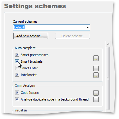
#FrictionFree Mode
This release introduces a FrictionFree mode for users who want CodeRush to leave standard Visual Studio behavior unchanged.
FrictionFree mode is a settings scheme that disables the following:
- Code Metrics
- Comment Painter
- Duplicate Line
- Flow Break Evaluation
- IntellAssist
- Smart Brackets
- Smart Enter
- Smart Paste
- Smart Parens
Certain code issues are also disabled:
- Fields can be read-only
- Member can be static
- Redundant this qualifier
- Can initialize conditionally
- Delegate can be replaced with lambda expression
- Default branch is missing
- Can implement base type constructors
- Case statements doesn't explicitly handle enum values
- Redundant field initialization
- Redundant delegate creation
- Fields should be disposed
- Property can be auto-implemented
- Redundant base constructor call
- Redundant base qualifier
- Undeclared element
- Undisposed local
- Can inline temporary variable
- Declaration can be a constant
- Can combine initialization with declaration
- Impicit variable can be used
In addition, FrictionFree mode changes the primary template expansion key from SPACE to TAB .
If you want to enable or disable features in FrictionFree mode, use the Settings schemes options page or feature options page.
Note that you cannot delete the FrictionFree scheme nor the Default .
#Duplicate Detection
Duplicate Detection and Consolidation Enhancements
With this release, we have improved the code consolidation engine. We have made it more intelligent and flexible. You can now modify consolidation options via the
Editor|Code Analysis|Code Consolidation options page.
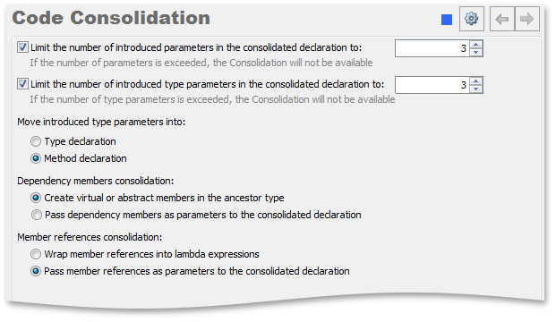
#Unit Test Runner
CodeRush allows you to avoid the building of a project each time you perform unit tests. Enable the Do not build required project before testing option
on the Unit Testing|Test Runner options page to activate this feature.
This release implements UnitTestsRunCategory and the UnitTestsDebugCategory actions that execute tests related to the specified categories in standard or debug mode appropriately.
This allows you to create shortcuts that execute tests of certain categories. The following screenshot shows settings of the shortcut that executes tests of the "Default values" and "Big tests" categories.
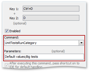
The Test tree in the Unit Test Runner window supports multiselection. This allows you to specify the tests you want to perform and run them with a single click.
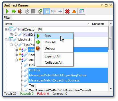
The results of failed test are shown in a single table with expected results, clearly showing all mismatches.
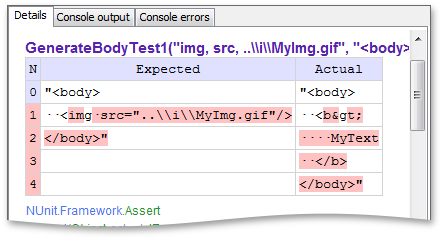
#Keyboard Mapping Window
If you do not remember a shortcut for the CodeRush action you want to execute, press CTRL+ALT+/ to open the CodeRush Keyboard Mapping window. The window lists the main CodeRush shortcuts
grouped by categories. You can edit the list of shortcuts shown in the window and modify window appearance settings via the IDE|Keyboard Mapping Window options page.
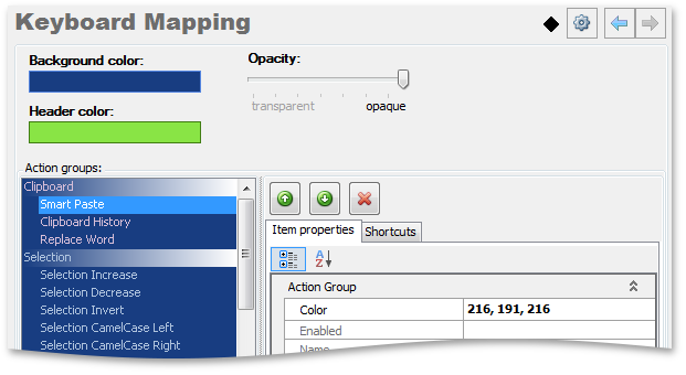
#Clear Solution Cache
We have added a Clear Solution Cache button to the DXCore Visualization toolbar. You can now clear the current solution cache with a single click. Click this button if you see invalid code issues or if you encounter other issues which may be caused by errors in a cached solution.
#Open Files Hotbar
The Open Files window now shows hotbars. Hot bar visually shows how long ago the file had been edited. It appears when a file has been saved and gradually
decreases during the specified time span.
Note that the Hotbar is disabled by default. You can enable it and modify its settings via the Tool Windows|Open Files options page.
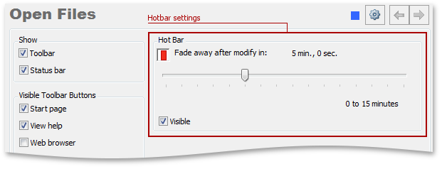
#Click Identifier
When you place the mouse pointer over an identifier with CTRL pressed, CodeRush shows a Code Preview hint with the identifier declaration code.
Note that the feature is disabled by default. Check the Show declaration code if any option on the Editor|Navigation|Click Identifier options page to enable the feature.
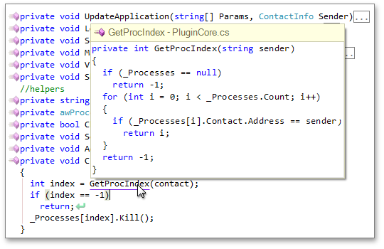
#Smart Constructor
You can now use the checkbox at the header of the Smart Constructor hint to select or deselect all items of the list of members suggested for initialization within a new constructor.
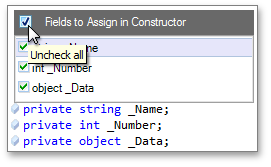
#Code Issues Window
We have added a new button to the Code Issues tool window toolbar allowing you to quickly collapse or expand all nodes of the Code Issues tree.
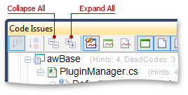
#Cycle Scope Up/Down
Cycle Scope Up/Down and Visibility Icons improvements
We have made CodeRush visibility changing features cascading. If you change a member visibility, CodeRush will accordingly change the visibility of corresponding members in all parent and descendant classes.
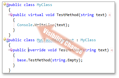
With this release Cycle Scope Up/Down can be applied separately to each property accessor.
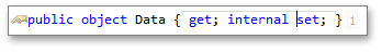
#Miscellaneous
The 'Default Branch is Missing' code issue changes
Now CodeRush shows the Default Branch is Missing code issue if the switch statement does not cover all available cases.
Spell Checker tool window
This release includes a Spell Checker tool window, which allows you to check the spelling of your entire solution with only a single click and view the results in a single window.
Click the Check solution button to check spelling in the current solution.
You can process the results directly in the tool window. Call the context menu for the issue and replace it with the correct value, add the word to the dictionary, or open the issue in the code editor.
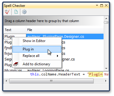
Message Log changes
With this release we have added the ability to open previously saved log files in the Messages tool window.
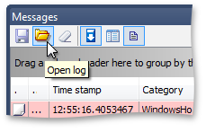
Code Cleanup Rules options changes
We have added the Format Code option to the Rules options page. This option specifies whether CodeRush applies the specified code formatting options to the code after the clean-up operation has been performed.
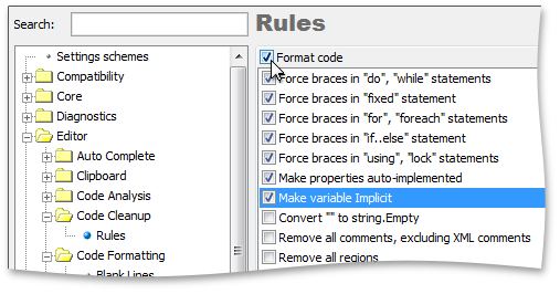
Documentation structure changes
We have merged CodeRush and Refactor! documentation. Now all documentation on IDE Tools is contained in the CodeRush help project.
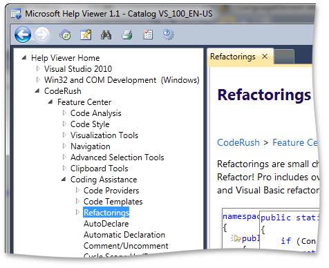
#New Tile Control
The new VCL Tile Control allows you to reimagine the way in which your end-users interact with a Windows application. Build and deliver fully engaging customizable business dashboards that will delight your most demanding users. Unleash the power of touch and target next generation devices and operating systems with a Metro-inspired UI.
The Tile control ships with all the features you'd expect in a Tile Layout Control:
- Touch Support
- Stunning Animations
- Drag & Drop Operations on Any Tile Items
- Windows 8 Inspired Behaviors
With a flexible layout architecture, advanced animation support, integrated touch and drag drop support, the Tile control represents your bridge to the future.
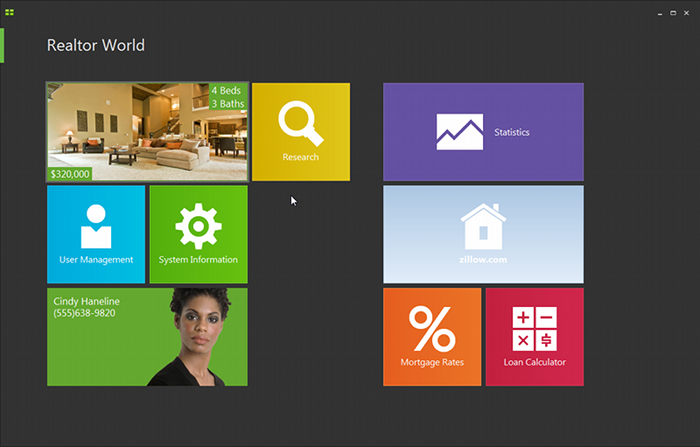
#New Generic Gallery Control
This control helps you easily implement business-specific galleries in your application.
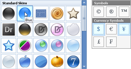
#Grid Control
Blazing-Fast Data Binding Mode for Large Datasets
The VCL Grid control now supports Server Mode – an ultra-fast, super-efficient data binding mode specially designed to work with large datasets (those with more than 50,000 records). In this mode, the initial page will be displayed immediately regardless of the number of records in the complete data source, and subsequent data will be loaded rapidly when scrolling. Loading records in small sets, and performing data-aware operations on the data server side are the key features of Server Mode that ensure fast access to data, even if the sorting, grouping, filtering, and summary features are used.
The Grid control ships with the Server Mode Table View and two data source components, which allow you to bind the View to a database either via an ADO or dbExpress connection.
This version currently provides server mode support for MS SQL Server databases only. With subsequent releases, we shall add support for other popular databases.
#Editors
New Office-like Color Galleries
The new galleries provide color selection capabilities similar to those of Microsoft Office. You can choose a palette to display and its theme.
We provide both the unbound and data-aware versions of the color galleries.
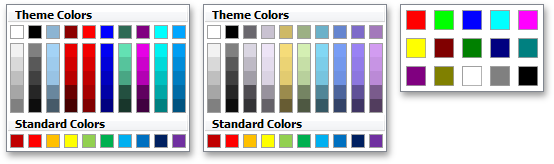
New Office-like Color Editors
These editors display the new color galleries in a drop-down window. Like other ExpressEditors, you can use the new editors as standalone controls or embed them as in-place editors to ExpressBars or container controls (such as the ExpressQuantumGrid, ExpressQuantumTreeList, etc.)
As with the color galleries, both the unbound and data-aware versions of the editors are available.
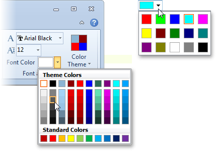
Capability to Add Custom Buttons to Navigator Controls
All navigator controls (including standalone and embedded versions) now expose a new collection property that allows you to elegantly customize buttons. As with default buttons, you can specify button images and hints, control button visibility and accessibility, and handle button clicks to implement functionality associated with these buttons.

Capability to Group Radio Buttons
The new GroupIndex property allows radio buttons to work together as a group. Radio buttons with matching GroupIndex property values are considered a group – only one button in this group can be selected at a time.
Optimized Painting Mechanism for Intersecting Transparent Controls
The painting performance of intersecting transparent controls has been significantly improved. Our tests show that painting is now more than 10 times faster than v2011 vol 1 and v2011 vol 2.
Fewer GDI Objects Created for cxLabel Controls
With this release, a TcxLabel or TcxDBLabel control with default settings creates no GDI objects. One or more GDI objects are created only when shadow effects are applied, the label is rotated, etc.
'My Documents' Added to Shell Browse Locations
The Root.BrowseFolder list in shell controls now includes the "My Documents" folder.
#Layout Control
Improved Performance when Creating Complex Form Layouts
We have removed the IdxLayoutDragAndDropHelper, IdxLayoutItemsHelper, IdxLayoutFontHelper, and IdxLayoutControl helper interfaces and all the associated implementations. Our tests show that complex form layouts are now created up to 30% faster as compared to Build v2011 vol 2.5.
#Navigation Bar
Look and Feel Support
The new LookAndFeelView allows you to select a scheme that maps look and feel styles to NavBar Views. Once a look and feel style is applied to the NavBar control, the corresponding mapped View is activated. You can select a predefined scheme (Explorer Bar View or Side Bar View) or define a custom scheme.
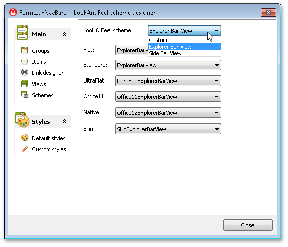
View Category Filters in the Design-Time Editor
The NavBar design-time editor now allows you to filter registered Views by their categories thus simplifying View style selection. These Views now expand to the left and display an arrow facing to the left as well, suggesting their expansion direction.
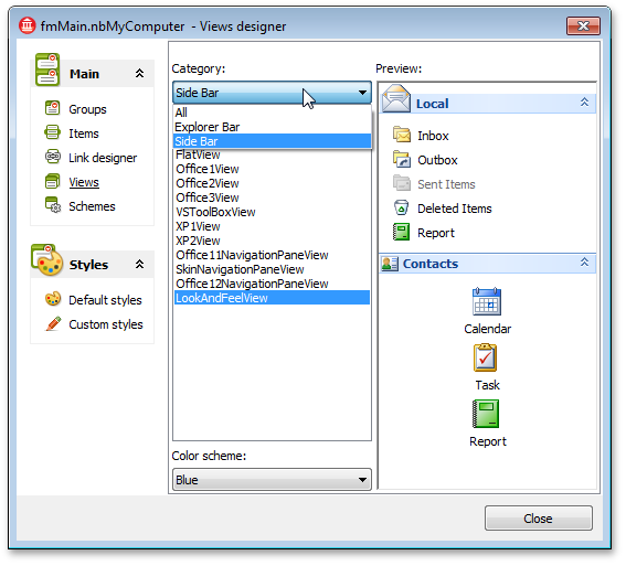
Enhancements in Right-Aligned Navigation Pane Views
These Views now expand to the left and display an arrow facing to the left as well, suggesting their expansion direction.
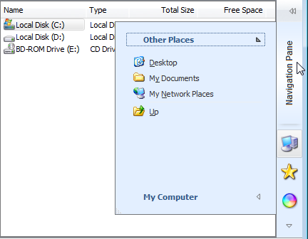
#Page Control
New Close Button Options
We have introduced a new Close button mode, in which the Close button is only displayed for a currently active tab or for an inactive tab located under the mouse pointer. In addition, you can directly control the visibility of this button within individual tabs via a new tab option.
Web Browser-like Tab Management
End-users can optionally click the middle mouse button (or the mouse wheel if it is clickable and acts as a middle button) in order to close the tab located under the mouse pointer. This behavior mimics tab management in modern web browsers. In addition to tab/page controls we have added this capability to dock controls, layout control, and tabbed MDI manager.
Public Method to Close Tabs
To programmatically close a tab, call the new CloseTab method available for a tab/page control.
Hints for Individual Tabs and Buttons
Tab/page controls and tabbed MDI managers now provide options and events to let you enable hints for tabs and buttons, dynamically specify them, and control their visibility.
#Pivot Grid Control
Named Sets Support
End-users can now drag named sets into a pivot grid to create reports based on named set values thus expanding the choice of analysis reports they can build. Named sets associated with a cube dimension are listed in the Sets folder.
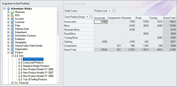
More Sort Options for Fields
In addition to sorting by values, you can now sort fields by their display text, level member ID, key, or default values (as specified at the database creation). To accomplish this, switch sort options via a field's SortMode property.
New Display Mode for Field Filter Buttons
In this mode, the filter button is displayed for a field either when an end-user hovers the mouse pointer over the field's header or when the pivot grid is filtered by the field's values. End-users can then easily discern which fields have a filter applied.
In addition, you can opt to replace filter buttons with much smaller icons imitating smart tags.
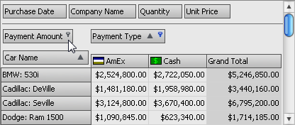
Capability to Customize the Filter Builder Dialog's Content
You can handle the new OnPrefilterDialogShow event to customize the visibility of the Filter Builder dialog's UI elements and initialize the filter criteria.
#Printing
Optimized Image Resources
We have moved the images from the majority of our built-in dialog windows to resource files. This has eliminated many duplicate images in dialog DFM files and has reduced the total size of related source files by approximately one-third (about 1.7 MB). So you can expect a similar reduction in size for your executables if they are rebuilt with the optimized image resources.
Cached Print Preview Dialog Contents
We have introduced a per-page caching mechanism for the Print Preview dialog to improve its display and navigation performance. Now the dialog caches only a limited number of pages rather than the entire report. You can specify the number of cached pages via the dxPreviewCachedPagesCount variable defined in the dxPreVw unit.
#Ribbon Control
Application and Form Templates
With this release, we provide IDE templates that help you create Ribbon Office 2007 and 2010 style applications and Ribbon forms. Click File | New> Other... in your favorite IDE to open the New Items dialog and browse the corresponding folders for the available templates.
The form templates create a simple Ribbon form with the essential set of our Ribbon components required for the selected Ribbon style. The application templates create an empty project prior to adding the Ribbon form to it.
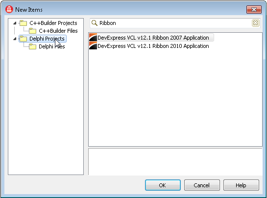
Integrated MDI Merging Options
Now MDI child windows always merge their Ribbon control into the parent window's Ribbon when maximized. You can adjust merge options for Ribbon elements or provide your merge logic via a bar manager's OnMerge event.
Color Scheme Accents
You can now emphasize the appearance of Office 2010 and Windows Scenic Ribbon styles with five color accents found in Microsoft Office 2010 and native Windows applications - Yellow, Blue, Green, Orange, or Purple. Use these accents as color codes to help your end-users distinguish Ribbon applications that share one color scheme.
You can create skins based on the Office2010Blue, Office2010Silver, and Office2010Black built-in skins to provide your custom color accents.
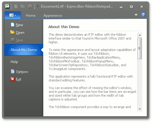
Fading Animation Options for UI Elements
The new OptionsFading property set introduced to the Ribbon control let you configure fading animation options for the following elements:
- Bar items
- Tabs
- Tab groups
- The Application button
Dynamic ScreenTips
Bar items now expose the OnGetScreenTip event that enables you to dynamically provide ScreenTips. For instance, you can show distinct ScreenTips based on bar item states.
Customizable State Restrictions for Tab Groups
A new tab group option has been provided so that you can prohibit specific tab groups from expanding and/or collapsing. This ensures that a tab group layout remains immutable in response to Ribbon size changes and helps you keep relevant commands prominently displayed.
Ribbon Gallery Items and Skin Chooser Gallery Items Availability
You can now embed the Ribbon Gallery item or Skin Chooser Gallery item to a SubItem to make them available in traditional toolbars and menus.
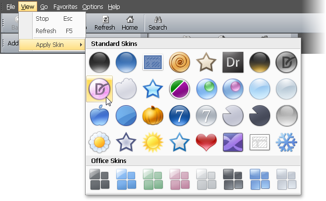
#Skins
New High-Speed Paint Mode
With this release, we have enhanced our skinning engine with the capability to paint all skin elements using simple gradients. You can now specify color attributes to completely replace bitmap images with gradient alternatives, or make hybrid skins that boast of both speed and appeal. This enhancement greatly improves painting performance (almost doubling the speed of element drawing) and is especially useful on terminal systems and in low color modes.
With a single skin controller option, you can easily switch between the various paint modes: the traditional method, the new gradient-enhanced one, or to let the skin engine decide based on the current system color mode. The last option – letting the engine decide based on the environment – is the default one.
We have assigned gradient settings to the following built-in skins to add support for the new paint mode:
- Office2010 (Black, Blue, and Silver)
- Office2007 (Black, Blue, Silver, Green, and Pink)
- DevExpressStyle and DevExpressDarkStyle
- Seven and SevenClassic
- Sharp and SharpPlus
- HighContrast
- VS2010
- Caramel
You can use these skins as is or as templates for your new high-performance skins. You can also add gradient settings to your existing skins to automatically get this performance boost when using the new paint mode.
#Vertical Grid Control
Both the TreeList and VerticalGrid controls now provide a navigator similar to that found in our Grid control. The navigator offers essential data management and navigation capabilities, which you can easily extend via the custom buttons introduced in this release.