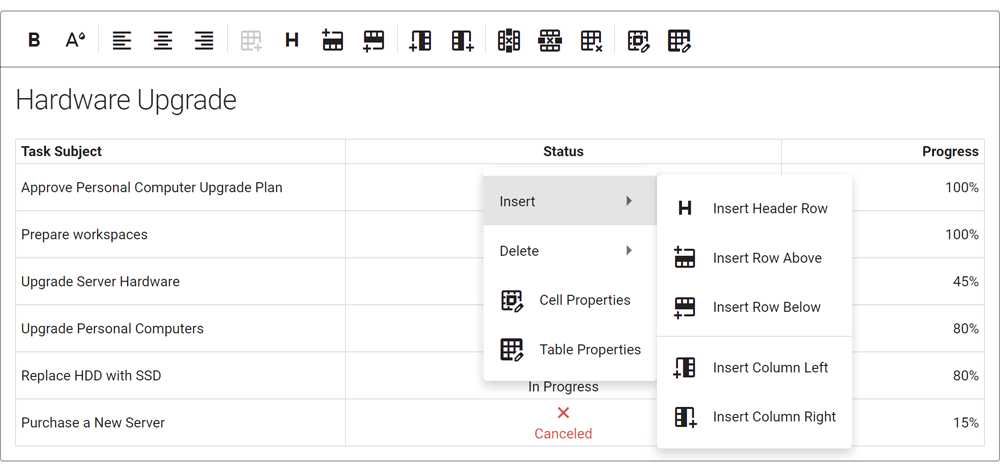
DevExpress installers now ship separate VSIX extensions for Visual Studio 2022 to ensure that all major design-time tools (like the "DevExpress" menu, DevExpress Template Gallery, Toolbox, etc.) are fully functional.
Blog Post
Our desktop controls/components (WinForms and WPF) support the latest Preview build of .NET 6. In addition, the DevExpress Template Gallery includes WinForms and WPF templates for .NET 5 and .NET 6.
#New HTML & CSS Templates (CTP)
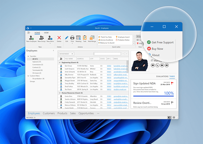
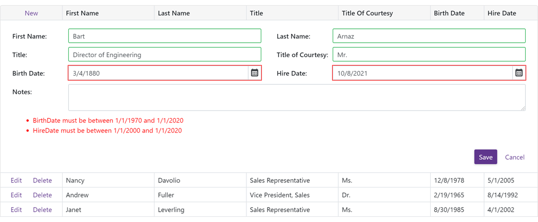
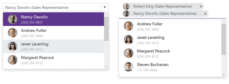
You can now define data-aware templates for DevExpress WinForms UI Controls with HTML-CSS markup (see the list of currently supported HTML tags and CSS attributes). This feature allows you to ditch traditional control customizations based on properties and CustomDraw events in favor of the unmatched flexibility of web-inspired markup.
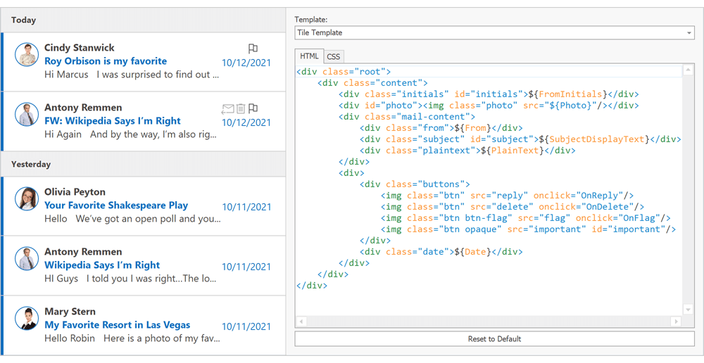
New HtmlContentControl
A brand-new control designed to render the template assigned to it. You can use it to create a variety of UI elements including buttons, toolbars, search panels, etc. Note that this control is designed to render tags and CSS attributes supported by our WinForms controls. You cannot use this component to create web browsers.
Documentation
New HtmlContentPopup
Much like our HtmlContentControl, this new component renders HTML-CSS templates and displays results as a pop-up menu.
Documentation
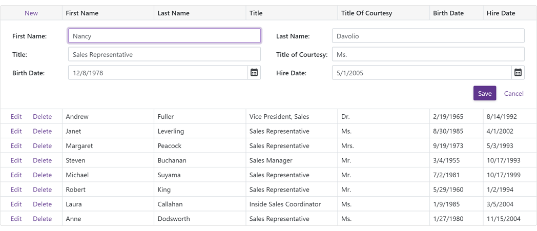
New ItemsView for the DevExpress WinForms Data Grid
ItemsView is a web template-compatible Data Grid View. This View does not have default data representation. Its appearance and record layout is driven by the template assigned to it.
Documentation
We created a collection of small samples to help you explore the capabilities of this new feature and apply web-inspired customizations to our desktop controls.
#New File Manager (CTP)
Our new WinForms FileExplorerAssistant component allows you to build a file/folder manager for both local storage and virtual folder hierarchies.
This new component allows you to display three UI elements on a Form or UserControl:
- Main Client Region: Uses the DevExpress WinForms Data Grid.
- Side Navigation (tree view): Uses the DevExpress WinForms TreeList.
- Address Bar: Uses the DevExpress WinForms BreadcrumbEdit control.
You can combine UI elements as needed. For example, you can display all three controls to emulate Windows Explorer or display two grid-based panels side-by-side (alongside the Address Bar) to replicate 3rd-party file managers like FAR and Total Commander.
UI controls (Grid, TreeList, and Breadcrumb editor) are pre-customized via extensions - objects similar to WinForms Behaviors. Extensions specify the appearance/behavior of controls, and an API to implement communication between UI controls (for example, update the Grid control when a user selects a Tree List node).
We also enhanced the underlying architecture of our WinForms File Dialogs (Open, Save, Browse Folder). Please see the following breaking change - T1033914.
Documentation
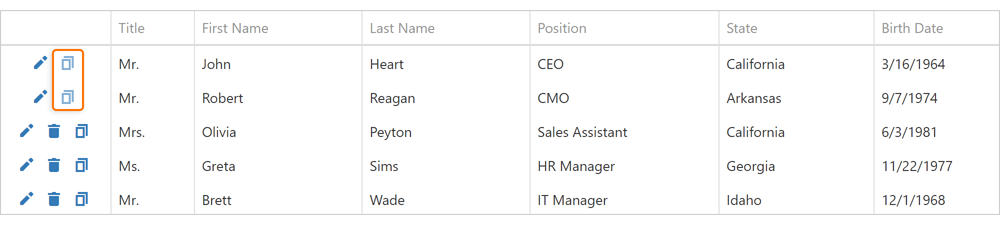
WinForms File Manager
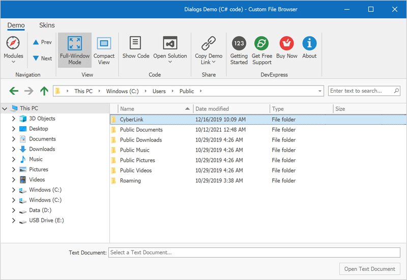 Windows Explorer UI
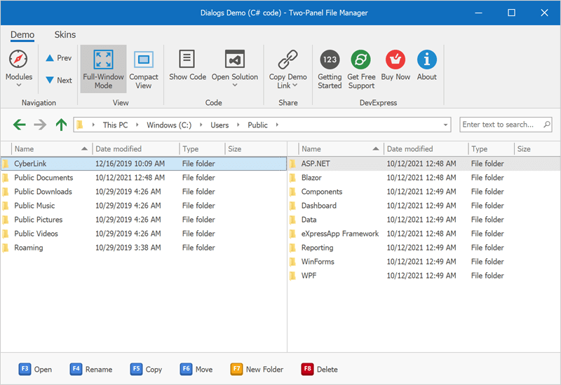 FAR / Total Commander UI
#Windows 11 Support - Rounded Corners
We updated our UI to better match the Windows 11 user experience. Your DevExpress-powered WinForms apps can now include rounded corners to match the look and feel of Windows 11.
Enable the new 'WindowsFormsSettings.AllowRoundedWindowCorners' setting to apply rounded corners to DevExpress-powered forms, dialogs, flyouts, and panels. Note: This setting affects apps running on Windows 11. You cannot display rounded corners on Windows 10 or earlier versions of the Windows operating system.
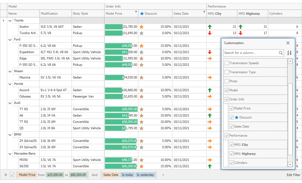
#Data Grid
WinExplorer View - HTML Templates
Our WinForms Data Grid's WinExplorer View now supports HTML/CSS templates. Options include:
The 'WinExplorerViewStyleOptions.HtmlTemplate' property is now available for each individual WinExplorer View Style (large icons, tiles, details, etc.). Use this property to apply a default HTML template for a style.
The 'WinExplorerView.HtmlTemplates' property stores your templates. To dynamically apply HTML templates, handle the 'QueryItemTemplate' event.
Documentation
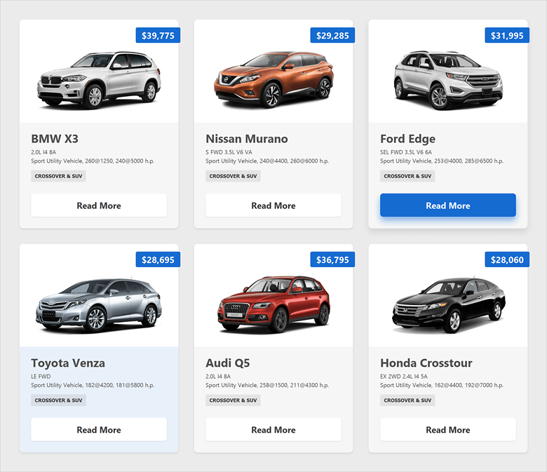
Tile View - HTML Templates
You can now create web-inspired tiles and bind them to data fields as needed. To create a web-inspired tile, assign your HTML template to the 'TileView.TileHtmlTemplate' property.
You can create multiple HTML templates and add them to the TileView.TileHtmlTemplates collection. Handle the CustomItemTemplate event to apply templates to tiles.
Documentation
Named Placeholders
You can now use field names as placeholders for CardCaptionFormat and RecordHeaderFormat properties.
cardView1.CardCaptionFormat = "Record # {0}, {Name}";
In previous versions, you had to reference required fields by the index of corresponding grid columns:
cardView1.CardCaptionFormat = "Record # {0}, {2}";
New 'Text Search' Mode for Search Boxes within Column Headers
Search boxes within column headers now offer full text search support. In our previous version (v21.1x), search boxes used filter mode instead - values that did not match the search strings were hidden. To activate Text Search mode, set the 'OptionsFilter.InHeaderSearchMode' property to 'TextSearch'.
Note: This option searches within visible data rows (collapsed and group rows are ignored), and does not work in server mode.
Documentation
Data Source Configuration Wizard for .NET 5 Designer
Our Data Source Configuration Wizard is now available for .NET 5. Wizard options for traditional data source types that require (yet to be implemented) Microsoft DataSet components are not functional, but you can now use this Wizard to connect your existing data-aware controls to the following data source types:
- ADO.NET DataSet
- XPO
- Entity Framework
- MongoDB
- JSON
- Excel sheets
- Unbound or xml data
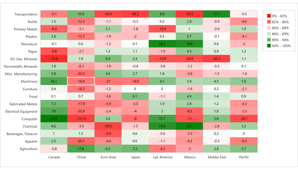
#New Heat Map Control
v21.2 ships with a new WinForms Heatmap Control Features include:
- Data Binding
- Unbound Mode
- Coloring Algorithms
- Zoom and Scroll
- Cell Highlighting
- Tooltip Support
- Titles
- Cell Labels
- Legend
- Customizable axes
- Hit-testing
Documentation
WinForms Heatmap Control
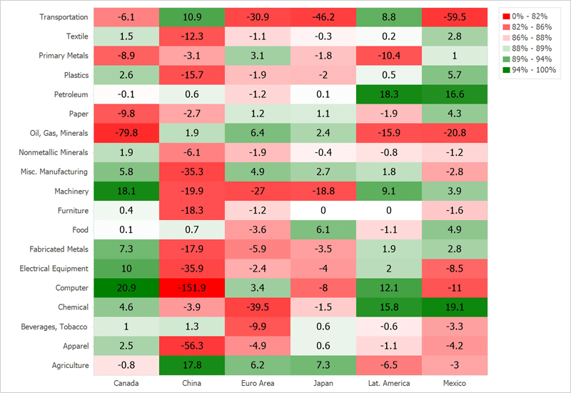 Balance of Trade
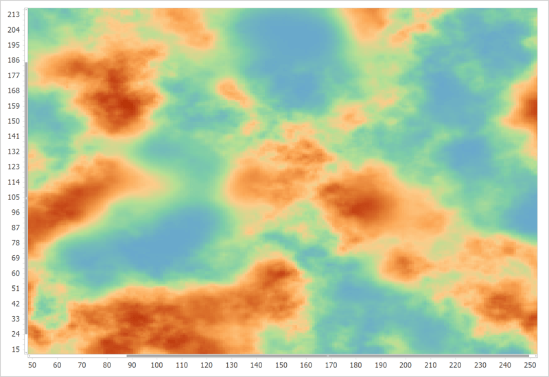 Heightmap
#Charting
Customizable Empty Points
Our WinForms Chart Control can now process gaps (within a data source) as empty points (points with undefined values). The appearance of these gaps can now be customized with different style options (based on Series view type). You can fully customize the appearance of point markers, line, and area segments for empty points.
You can also draw 'mock' points instead of gaps (based on values for neighboring Series points). Set the series view’s EmptyPointOptions.ProcessPoints property to 'Interpolate'.
Documentation
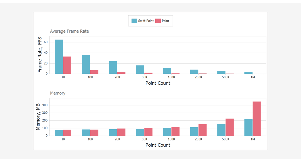
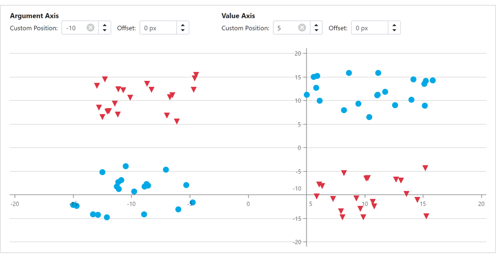
Fast (Swift) Point Series
We added a new lightweight Swift Point Series to quickly render large data sets as a scatter (XY) plot. Documentation
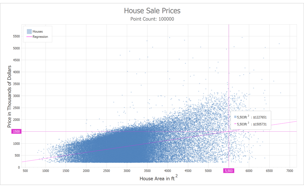
Here are some data points that illustrate the benefits of Swift Point compared to a standard Point Series with default settings.
#Data Editors
Text Editor - Advanced Mode Enhancements
You can now specify a data source with suggestions for our Text Editor when using "Advanced" mode. This data source will be used by the Text Editor to display automatic suggestions as users enter text into the Text Editor.
We also added a MRU (most recently used) option. Our WinForms Text Editor can now display previous values in its "Recently Used" list.
API enhancements include:
- In Advanced mode, the Text Editor throws a handled exception when you try to access its MaskBox property. This exception warns you that the MaskBox property is not available in Advanced Mode.
- We implemented new methods to extract a specific character or a line from the text box, including 'GetCharFromPosition', 'GetFirstCharIndexFromLine', 'GetPositionFromCharIndex', and more.
SvgImageBox - Virtual Keyboard Support
We added new options to our WinForms SvgImageBox control so you can implement a custom virtual keyboard in your WinForms apps. These include:
- Pressed state and pressed appearance support.
- Ability to change text for text elements.
- QueryUniqueItemId - a new event that allows you to assign unique IDs to cloned elements (when an SVG file contains 'use' elements).
WinForms Tips & Tricks — Virtual Keyboard and New Customer Cases
#Gantt Control
HTML Templates
You can now use HTML-CSS templates to customize the appearance of the following Gantt-related UI elements:
- Tasks, Summaries, and Milestones
- Regular and Summary Task Progress
- Regular, Summary and Milestone Task Baselines
- Text Labels
- Interaction Tooltips
- Split Tasks
To create a template, use our Visual Studio integrated HTML Template Editor . To invoke the Template Editor, click the ellipsis button next to the 'GanttControl.HtmlTemplates' property in the Visual Studio Properties window. Once your template is ready, handle the 'GanttControl.QueryItemTemplate' event to assign the template to the appropriate UI element. Documentation
#Map Control
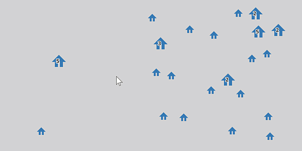
Radial Visualization for Clusters
Our WinForms Map control now supports radial visualization for clusters. This new feature allows you to quickly view all vector items in a cluster without zoom.
Use the 'MapControl.InteractiveClusterMode' property to enable this option. To expand a cluster on mouse hover, set this property to 'MouseHoverInteractiveClusterMode'.
The following interfaces allows you to expand/collapse clusters:
- ExpandCluster
- CollapseCluster
- CollapseAllClusters
And of course, you can implement a custom algorithm to position elements as needed when expanding a cluster. To expand a cluster, create a class that implements our 'ExpandedClusterLayoutBase' interface.
Documentation
Lambert Azimuthal Equal-Area Projection
This release includes support for a new projection type – the European Terrestrial Reference System 1989 - Lambert azimuthal equal-area (ETRS89-LAEA) projection. You can use this projection to display European Union (EU) maps with minimal distortion.
To enable this new projection, set the GeoMapCoordinateSystem.Projection property to Etrs89LambertAzimuthalEqualAreaProjection.

Generate Polylines and Polygons from a Collection of Points
Our ListSourceDataAdapter can now generate polylines and polygons from a collection of coordinates in the data source.
We added two new property mapping types for multi-point shapes (MapPolylines and MapPolygons):
#Pivot Grid
Accessibility and UI Automation Support
Accessibility options include:
- Screen readers can now obtain information from field headers, field value items, cells, and filter panel.
- We added AccessibleName and AccessibleDescription properties to pivot fields.
The DevExpress WinForms Pivot Grid control also supports UI automation. You can now test the following UI elements:
- Pivot Grid: Grid and Table patterns
- Cells: GridItem, TableItem, Value and Invoke (Select) patterns
- Headers: Invoke (Select) pattern
- Field Value Items: Value and Invoke (Expand/Collapse) patterns.
Use the 'WindowsFormsSettings.UseUIAutomation' property to enable UI Automation.
#Rich Text Editor
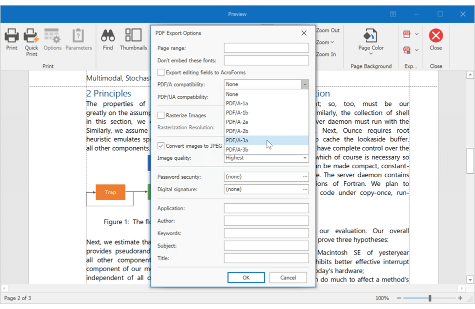
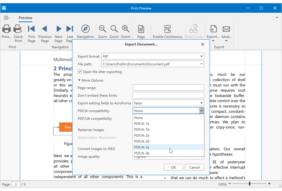
PDF Export - Accessible PDF Support
Our WinForms Rich Text Editor can generate tagged (accessible) PDF documents to address needs of those who use screen readers and other assistive technologies.
We now support the following standards:
- PDF/A-1a, PDF/A-2a, PDF/A-3a
- PDF/UA
Documentation
Custom Font Loading Engine
Our WinForms Rich Text Editor can now use fonts that are not installed on a target system. This feature avoids font substitution effects when you display, print, or export (to PDF) documents with non-standard fonts. You will be able to load necessary fonts from files, streams, or byte arrays. These fonts will be available to all instances of the DevExpress Rich Text Editor within a given project.
Documentation
Field Enhancements
The DevExpress WinForms Rich Text Editor now supports SECTIONPAGES, REF, and STYLEREF fields. We've also included the following field-related enhancements:
- You can now replace fields with field values.
-
New UpdateAllFields method: Allows you to update all document fields (including fields located in headers, footers, text boxes, footnotes, and endnotes).
- You can now suppress DOCVARIABLE field updates for loaded documents.
Documentation
Watermark Enhancements
We extended our Watermark API. You can now execute the following actions:
- Insert watermarks into individual section headers.
- Modify existing watermarks (change watermark options and replace watermark image or text).
- Remove watermarks from individual sections.
Documentation
#Scheduler
HTML Templates
The WinForms Scheduler control supports our new HTML Template engine. We added the 'HtmlTemplates' property to all Scheduler Views. Use this property to assign HTML templates to appointments and all-day events.
Stretch Appointments
Appointment display settings for MonthView, TimelineView, GanttView and YearView ship with a new setting - StretchAppointmentsMode. This setting allows you to control cell rendering behavior (when a cell contains too many appointments). It is available when the 'StretchAppointments' option is enabled.
Available options include:
- GrowOnly (default value) - the Scheduler displays as many appointments as possible without clipping text, and hides remaining appointments under the 'More Appointments' button.
- GrowAndShrink - appointments are not limited by cell height. Cells can grow/shrink as needed.
Appointment and Column Width
You can now use the 'ColumnWidth' property to specify column width, or you can use the 'AppointmentWidth' property to specify appointment width.
The 'ColumnWidth' property works when the 'StretchAppointments' property is set to "Fixed".
The 'AppointmentWidth' property works when the 'StretchAppointments' property is set to "Auto".
Both settings are available in Day, Work Week, and Full Week Views.
#Skins and Vector Icons
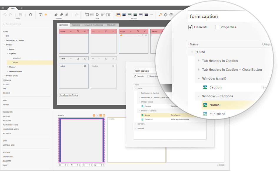
Skin Editor - UX Enhancements
v21.2 includes a number of UX-related enhancements:
The "Find Element" dialog (Ctrl+F) now groups elements by categories. The search has been improved.
It is now easier to locate required skin elements: all elements found under the mouse pointer (Ctrl+Click) now display both legacy and alias names. The Ctrl+Click shortcut behavior has been improved for XtraForms and Dialog Forms.
The "Highlight Skin Elements" Ribbon command now highlights elements for both active and inactive states.
We created an interactive quick start guide for new users.
#Spreadsheet
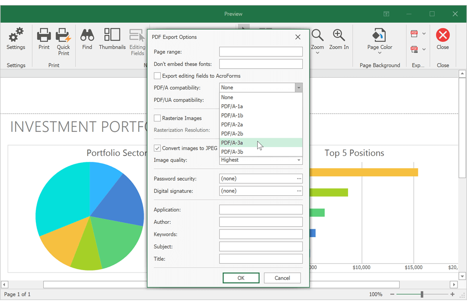
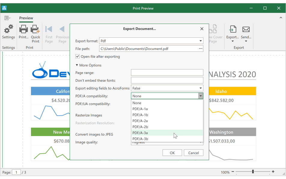
PDF Export - Accessible PDF Support
Our WinForms Spreadsheet control can generate tagged (accessible) PDF documents to address needs of those who use screen readers and other assistive technologies.
We now support the following standards:
- PDF/A-1a, PDF/A-2a, PDF/A-3a
- PDF/UA
Documentation
Custom Font Loading Engine
Our WinForms and WPF Spreadsheet controls can now use fonts that are not installed on a target system. This feature avoids font substitution effects when you display, print, or export (to PDF) documents with non-standard fonts. You will be able to load necessary fonts from files, streams, or byte arrays. These fonts will be available to all instances of the DevExpress Spreadsheet within a given project.
Documentation
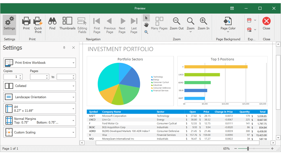
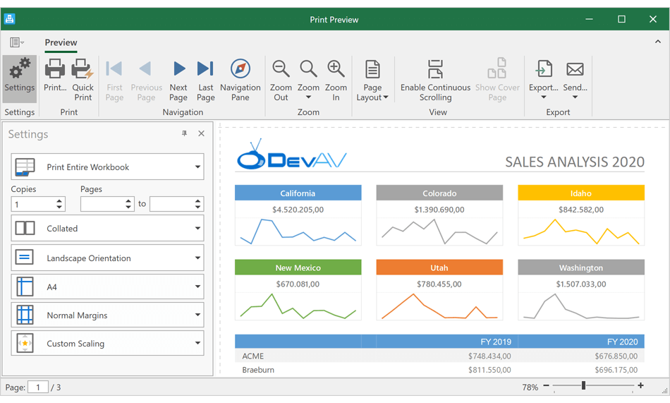
Set Print Settings in Print Preview
The 'Print Preview' window includes a new Settings pane. This pane allows you to specify the following print-related settings:
- Select spreadsheet content to print. You can print the entire workbook or print a portion of the document.
- Specify the number of copies to print.
- Customize page settings (document orientation, paper size, and page margins).
- Set print scaling.
Documentation
New CellEditorOpened Event
We created a new CellEditorOpened event. This event allows you to:
- Access the active in-cell editor.
- Handle the editor's keyboard events to execute custom actions or implement custom shortcuts.
- Spell check text in the editor.
- Handle the editor's TextChanged event to track text changes and validate user input.
Custom Paper Size Support
With this release, you can specify non-standard paper sizes when printing documents. Use our new 'Worksheet.ActiveView.SetCustomPaperSize' method to define custom paper size for a worksheet.
Documentation
#TreeList
Advanced Customization Form
We enhanced the TreeList's Customization Form and made column customization easier (especially useful if your TreeList includes multiple columns and bands). The new Customization Form displays all columns and bands (visible and hidden). Features include:
- Toggle Column and Band Visibility
- Column/Band Search
- Drag & Drop
- Sorting
Activate the 'UseAdvancedCustomizationForm' option to incorporate our new TreeList Customization Form.
#Vertical Grid
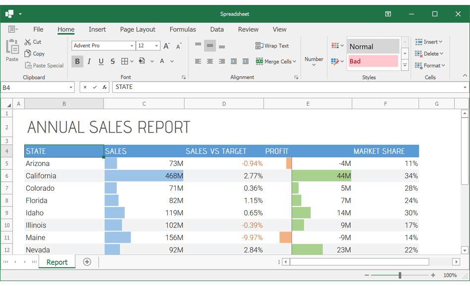
Grid Title and Record Headers
Our WinForms Vertical and Property Grid controls can now display a caption/title. Use the grid's 'Caption' property to specify the caption, and enable the 'ShowCaption' option to display it on screen.
The Vertical Grid control now supports record headers. These fully customizable headers (including HTML-formatted text strings, custom painted and click-able elements) allow you to display any custom data within two-dimensional data views.
Compare Records Side-by-Side
End-users can now compare individual records side-by-side, temporarily hiding other records. To compare individual records, simply right-click a record's header and select "Add to Comparison" (or select the record using the checkbox). When all required records are selected, invoke the context menu once again and select "Show Comparison".
We also implemented new API so you can compare records in code. These include:
- AddToComparison
- RemoveFromComparison
- ShowComparison
- HideComparison
- ClearComparison
- IsInComparison
Row Smart Tags
We added smart tag menus with common settings so you can quickly and easily customize our WinForms Vertical and Property Grid controls at design-time.
#New Heat Map Control (CTP)
Our new WPF Heatmap control uses color variations to visualize data trends (tabular format). Features include:
- Data Binding
- Unbound Mode
- Multiple Coloring Algorithms
- Zoom and Scroll
- Cell Highlighting
- Tooltip Support
- Titles
- Cell Labels
Documentation
#New Windows 10 Dark Theme
Our new Win10Dark theme was inspired by the dark mode on Windows 10. Much like the Win10Light theme, the Win10Dark theme supports Win10Palette that can update theme colors after each change to an accent color in Windows. Applications developed with DevExpress WPF UI controls can now automatically switch between dark and light themes based on OS setting.
Documentation
#Windows 11 Support
Your DevExpress WPF Themed Windows can now include rounded corners to match the look and feel of Windows 11.
Enable our new ThemedWindow.RoundCorners setting to apply rounded corners to DevExpress Themed Windows and dialogs.
#.NET 5 & .NET 6
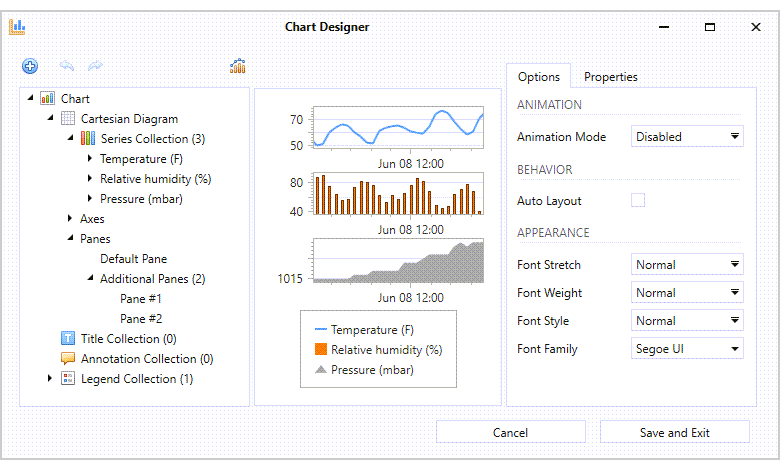
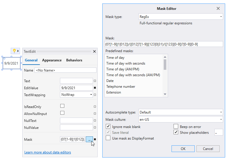
New XAML Designer Extensions for .NET 5 & .NET 6
We added the following extensions to the WPF XAML Designer for .NET 5 and .NET 6 apps.
Chart Designer
The Chart Designer is implemented as a separate window and allows you to create new and customize existing charts with ease. Documentation
Mask Editor
The Mask Editor allows you to quickly create and customize masks of any complexity. Documentation
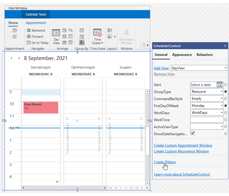
New Quick Actions
The new Create Ribbon action allows you to generate a Ribbon UI for our WPF Spreadsheet, Rich Text Editor, and Scheduler controls. We added new quick actions to our Data Grid so you can generate grid columns and invoke the grid's Conditional Formatting Editor.
We also improved startup performance for dialogs and wizards invoked via quick actions.
ARM64 Support
You can now execute DevExpress-powered WPF apps on ARM64 devices.
.NET 6 Support
DevExpress WPF UI controls support the latest Preview build of .NET 6.
DevExpress Template Gallery - .NET 5 & .NET 6 Support
The DevExpress Template Gallery includes WinForms and WPF project templates designed for .NET 5 & .NET 6.
.NET Core Migration Tool
We developed a tool that helps you to easily migrate your .NET Framework projects to .NET 5 and .NET 6.
Documentation
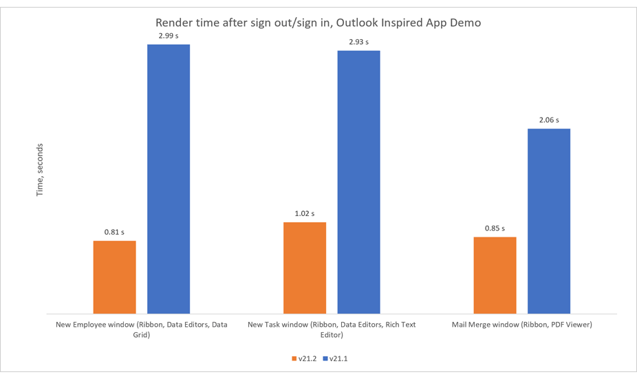
#Remote Desktop Performance
Our theme cache engine - enabled by default for all built-in and custom WPF themes - now supports multiple sign in/sign out operations. This new option enhances the performance of all WPF apps developed with DevExpress UI components. Performance gains are especially significant for applications executed remotely (using tools such as Microsoft Remote Desktop Services or Citrix), where sign in/sign out operations are more common.
To help visualize performance related benefits associated with this enhancement, we measured how long it takes to render a WPF Spreadsheet control normally and after sign in/sign out:
#Charting
Customizable Empty Points
The DevExpress Chart Control can now process gaps (within a data source) as empty points (points with undefined values). The appearance of these gaps can now be customized with different style options (based on Series view type). You can fully customize the appearance of point markers, line, and area segments for empty
points.
You can also draw 'mock' points instead of gaps (based on values for neighboring Series points). Set the series view’s EmptyPointOptions.ProcessPoints property to 'Interpolate'.
Documentation
#Data Grid and TreeList
MVVM Command API
Our WPF Data Grid and WPF TreeList controls include the following new commands:
- AddingNewNodeCommand
- CustomNodeFilterCommand
- CustomUnboundColumnDataCommand
- CellMergeCommand
- CellValueChangedCommand
- CellValueChangingCommand
- InitNewRowCommand
- InitNewNodeCommand
- InvalidRowExceptionCommand
- NodeChangedCommand
- ValidateCellCommand
These command properties act as counterparts to standard events and allow you to shape data and respond to user input at the ViewModel level without writing code in the View.
<dxg:GridControl CustomUnboundColumnDataCommand="{Binding UnboundColumnDataCommand}">
                            [Command]
                            public void UnboundColumnData(DevExpress.Mvvm.Xpf.UnboundColumnRowArgs args) {
                                if(args.IsGetData) {
                                    Product item = (Product)args.Item;
                                    args.Value = item.UnitPrice * item.UnitsOnOrder;
                                }
                            }
Documentation
Lock TreeList Updates
You can now fully lock calculations and tree hierarchy updates within the WPF TreeList.
                            public void UpdateSource() {
                                TreeListControl.View.BeginDataUpdate(true);
                                // Update source
                                TreeListControl.View.EndDataUpdate();
                            }
As you might expect, this new API will help improve performance for large data sets (when/if large record sets must be updated simultaneously).
Documentation
New CRUD API
These APIs are fully compatible with MVVM. We created an example that binds our WPF Data Grid to various sources (local, Infinite, Paged, InstantFeedback, Server Mode) and executes CRUD operations.
How to implement CRUD operations within the WPF Data Grid
#Map Control
Lambert Azimuthal Equal-Area Projection
This release includes support for a new projection type – the European Terrestrial Reference System 1989 - Lambert azimuthal equal-area (ETRS89-LAEA) projection. You can use this projection to display European Union (EU) maps with minimal distortion.
To enable this new projection, set the GeoMapCoordinateSystem.Projection property to Etrs89LambertAzimuthalEqualAreaProjection.
Create Lines, Polylines and Polygons from a View Model (MVVM)
In our on-going effort to improve MVVM bindings, we extended ListSourceDataAdapter to generate lines, polylines, and polygons from a collection of coordinates in a View Model.
We added two new mapping types (MapLineMappingInfo and MapMultipointItemMappingInfo) for lines and multi-point shapes (MapPolylines and MapPolygons).
#Rich Text Editor
PDF Export - Accessible PDF Support
Our WPF Rich Text Editor can generate tagged (accessible) PDF documents to address needs of those who use screen readers and other assistive technologies.
We now support the following standards:
- PDF/A-1a, PDF/A-2a, PDF/A-3a
- PDF/UA
Documentation
Custom Font Loading Engine
Our WinForms and WPF Rich Text Editors can now use fonts that are not installed on a target system. This feature avoids font substitution effects when you display, print, or export (to PDF) documents with non-standard fonts. You will be able to load necessary fonts from files, streams, or byte arrays. These fonts will be available to all instances of the DevExpress Rich Text Editor within a given project.
Documentation
Field Enhancements
The DevExpress Word Processing Document API and WinForms/WPF Rich Text Editors now support SECTIONPAGES, REF, and STYLEREF fields. We've also included the following field-related enhancements:
- You can now replace fields with field values.
-
New UpdateAllFields method: Allows you to update all document fields (including fields located in headers, footers, text boxes, footnotes, and endnotes).
- You can now suppress DOCVARIABLE field updates for loaded documents.
Documentation
Watermark Enhancements
We extended our Watermark API for the DevExpress Word Processing Document API and WinForms/WPF Rich Text Editors. You can now execute the following actions:
- Insert watermarks into individual section headers.
- Modify existing watermarks (change watermark options and replace watermark image or text).
- Remove watermarks from individual sections.
Documentation
#Spreadsheet
PDF Export - Accessible PDF Support
Our WPF Spreadsheet control can generate tagged (accessible) PDF documents to address needs of those who use screen readers and other assistive technologies.
We now support the following standards:
- PDF/A-1a, PDF/A-2a, PDF/A-3a
- PDF/UA
Documentation
Custom Font Loading Engine
Our WinForms and WPF Spreadsheet controls can now use fonts that are not installed on a target system. This feature avoids font substitution effects when you display, print, or export (to PDF) documents with non-standard fonts. You will be able to load necessary fonts from files, streams, or byte arrays. These fonts will be available to all instances of the DevExpress Spreadsheet within a given project.
Documentation
Set Print Settings in Print Preview
The 'Print Preview' window includes a new Settings pane. This pane allows you to specify the following print-related settings:
- Select spreadsheet content to print. You can print the entire workbook or print a portion of the document.
- Specify the number of copies to print.
- Customize page settings (document orientation, paper size, and page margins).
- Set print scaling.
Documentation
New CellEditorOpened Event
We created a new CellEditorOpened event. This event allows you to:
- Access the active in-cell editor.
- Handle the editor's keyboard events to execute custom actions or implement custom shortcuts.
- Spell check text in the editor.
- Handle the editor's TextChanged event to track text changes and validate user input.
Custom Paper Size Support
With this release, you can specify non-standard paper sizes when printing documents. Use our new 'Worksheet.ActiveView.SetCustomPaperSize' method to define custom paper size for a worksheet.
Documentation
#Accessibility
Screen Reader Support for Validation Errors
Screen readers can now inform a user of validation errors within focused WPF editors and data cells.
Documentation
Visual Studio & Office Themes - Enhanced Contrast Palettes
Our enhanced Contrast palettes use carefully selected color combinations to help individuals with vision impairment (to distinguish text, borders, selection states, and other visual elements). Enhanced Contrast palettes are available for the following themes:
- Office2016SE
- Visual Studio 2017
- Office 2019
- Visual Studio 2019
Documentation
#Compile-Time ViewModel Generator
v21.2 includes the following enhancements:
- WinUI Project Support
- Nullable Annotation Support
The ViewModel Generator now accounts for the nullable context to create null-safe code and avoid compiler warnings.
-
Generic and Nested Classes
The ViewModel Generator can now work with generic and nested classes.
-
Comments
You can add XML comments to fields/methods, which will then be copied to corresponding properties and commands.
- Optimized Memory Allocation and Performance Improvements
- ISupportParentViewModel Support
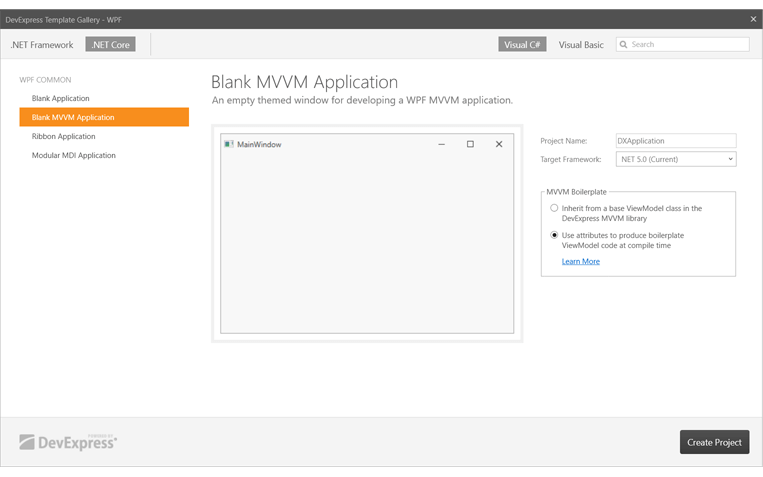
You can now use the ViewModel and Blank MVVM Application templates in our Template Gallery to automatically create a project with a configured ViewModel code generator.
#Miscellaneous
SVG Enhancements
Our internal SVG image parser can now display raster images embedded in SVG.
Splash Screen Enhancements
We added the showDelay and minDuration parameters to the SplashScreenManager.Show method so you can show a splash screen with a time delay.
#Reporting for WinUI*
DevExpress Reports supports WinUI and ships with a fully integrated Visual Studio Report Designer.
* Important Note: DevExpress Reports is not included in our WinUI component distribution. To use DevExpress Reports within your WinUI application/project, you must purchase a DevExpress Subscription (Universal, DXperience, or Reporting Subscription).
WinUI Document Viewer
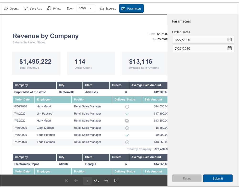
Our new WinUI DocumentViewer Control allows you to preview, export, and print reports created with the DevExpress Reporting Platform. Features include:
- Preview and Print Reports
- Export to PDF, XLS, XLSX, RTF, DOCX, MHT, HTML, TXT, CSV, Image
- Page Navigation and Zoom
- Report Parameters / Parameters Panel
Documentation
Visual Studio Report Designer for WinUI
The DevExpress Visual Studio Report Designer allows you to quickly create reports. You can use integrated report and data source wizards, group and sort data, drag and drop report controls/fields onto the report design surface, localize reports, handle events, and preview reports.
#Windows 11 Support
DevExpress WinUI controls now support Windows 11 appearance guidelines and adhere to style standards introduced in Windows App SDK 1.0.
#Data Grid
Preview. Print. Export
You can now render WinUI Data Grid content to paper just like a traditional WYSIWYG report or export data to numerous file formats. With this API, you can save your data as:
- PDF
- XLS, XLSX, CSV
- MHT
- HTML
- RTF, DOCX
- TXT
- Image
And yes, our new Document Viewer allows users to preview results and customize page margins, document orientation, paper size, and relevant page settings.
Documentation
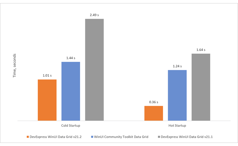
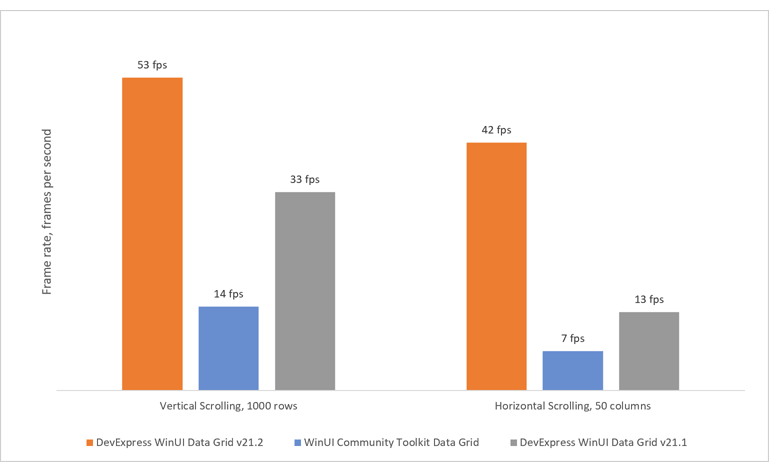
New Row/Cell Rendering Engine
The UI portion of our WinUI Data Grid - the portion responsible for row/cell rendering - has been completely rewritten. It now offers blazing fast loading speed and unmatched scrolling performance.
Startup Performance
Scrolling Performance
New Appearance API
Our new WinUI DataGrid API offers simplified appearance customization options for data rows, group rows, and cells:
New settings replace previous styles and templates. You can use them to customize the grid's appearance without impacting its loading and scrolling speed.
                        <dxg:GridControl.RowStyleSettings>
                            <dxg:RowStyleSettings Background="LightGray"
                                SelectedBackground="PaleVioletRed"
                                FocusedBackground="LightBlue"
                                FocusedSelectedBackground="Orange"
                                HoverBackground="LightGreen"
                                FocusedBorderBrush="Red"
                                FocusedBorderThickness="1"
                                FocusedCornerRadius="5"
                                MinHeight="19"/>
                        </dxg:GridControl.RowStyleSettings>
#Compile-Time ViewModel Generation
Compile-Time ViewModel Generator now supports WinUI projects. It uses C# Source Generators introduced in .NET 5 to generate boilerplate code for your ViewModels at compile time. Command declarations, property change notifications, and service support will be automatically added to a partial class linked to your ViewModel.
// manual part
using DevExpress.Mvvm.CodeGenerators;
[GenerateViewModel]
public partial class ViewModel {
    [GenerateProperty]
    int _Count;
    [GenerateCommand]
    public void Increment() => Count++;
}

// generated part
partial class ViewModel : INotifyPropertyChanged {
    public event PropertyChangedEventHandler? PropertyChanged;
    protected void RaisePropertyChanged(PropertyChangedEventArgs e) => PropertyChanged?.Invoke(this, e);
    public int Count {
        get => _Count;
        set {
            if(EqualityComparer<int>.Default.Equals(_Count, value)) return;
            _Count = value;
            RaisePropertyChanged(CountChangedEventArgs);
        }
    }

    DelegateCommand? incrementCommand;
    public DelegateCommand IncrementCommand {
        get => incrementCommand ??= new DelegateCommand(Increment, null);
    }
    static PropertyChangedEventArgs CountChangedEventArgs = new PropertyChangedEventArgs(nameof(Count));
}
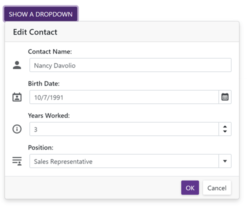
#New Blazor DropDown
Our new Blazor DropDown component allows you to display a non-modal drop-down window within a Blazor application. The DropDown includes the following integrated features:
- Header, Body, and Footer Customization
- Position Customization
- Position Restrictions
- Custom Size
- Resizing
- Scrolling
- Show and Close Actions
Documentation
#New Dashboard
Our Blazor Dashboard component was first introduced in May 2021 as a Community Technology Preview (CTP). This update marks its official release. v21.2 adds localization support and includes a new API to unregister extensions.
Note: DevExpress Dashboard ships as part of the DevExpress Universal Subscription.
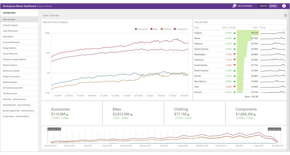
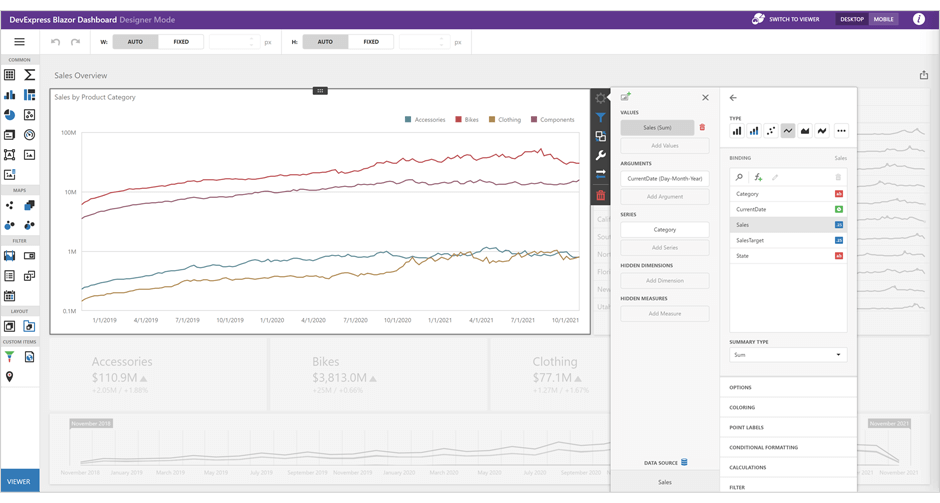
Online Demo
#New Rich Text Editor
The DevExpress Blazor Rich Text Editor (Word Processor) was first introduced in May 2021 as a Community Technology Preview (CTP). This update marks its official release.
Our Rich Text Editor allows you to incorporate advanced text editing functionality into your Blazor app. You can create, open, edit, convert, save, and print rich-formatted text files (DOCX, RTF, TXT). Features include:
- Ribbon UI
- Print Layout / Simple View
- Horizontal Ruler
- Character & Paragraph Formatting
- Bullets & Numbering
- Header & Footer
- Document Sections
- Table of Contents
- Bookmarks & Links
- Page Numbers
- Fields
- Pictures & Text Inputs
- Dialogs
- Undo / Redo
- Localization
Documentation
Online Demo
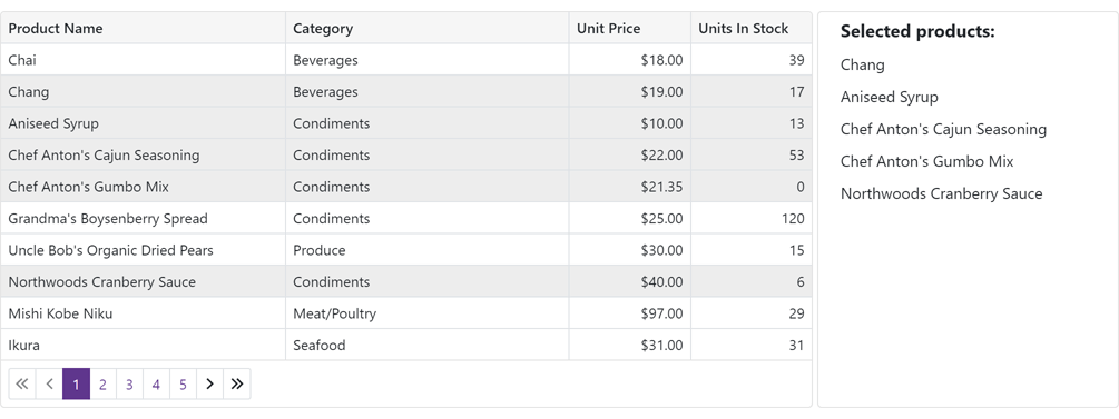
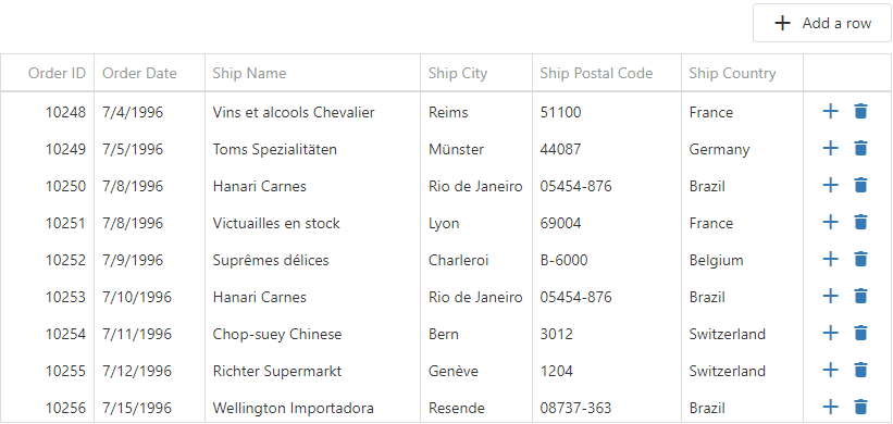
#Grid (CTP)
Data Editing and Input Validation
Our Blazor Grid now allows you to edit associated data within a standard edit form or a popup edit form. To enable data editing:
-
Create an edit form template and assign it to the EditFormTemplate property.
-
Handle the EditModelSaving event to post changes made in the edit form to a data source.
-
Set the EditMode property to 'PopupEditForm' to display the edit form as a popup.
Documentation
Online Demo
Our Blazor Grid automatically validates user input based on data annotation attributes. You can also apply and use custom data validation rules.
Online Demo
Filter Row
Our Blazor Grid ships with an integrated Filter Row. The Filter Row displays in-place text editors for all associated data columns. The Grid creates a filter condition based on editor values and applies this condition to the corresponding column. To display the Filter Row, enable the ShowFilterRow option.
We added the following new options to help you customize the Filter Row as requirements dictate:
You can also manage filter options in code. Call the FilterBy method to filter Grid data and the ClearFilter method to reset the applied filter.
Documentation
Online Demo
Command Column
Our Blazor Grid's new Command Column (DxGridCommandColumn) can display CRUD-related commands (New, Edit, Delete) for each row. It can also clear the filter applied within the Grid's Filter Row.
Online Demo
Row Selection
Our Blazor Grid now supports single and multiple row selection. Use the SelectionMode property to specify the desired selection mode. To select/deselect rows with a pointing device, enable the AllowSelectRowByClick option.
Our Blazor Grid also ships with a new column type - DxGridSelectionColumn. This column can display a checkbox (with multi-select support) or radio buttons in single selection mode.
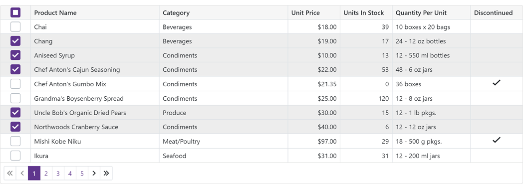
We also introduced new methods to help manage record selection in code.
To access selected data items in code, use the SelectedDataItems property.
Online Demo
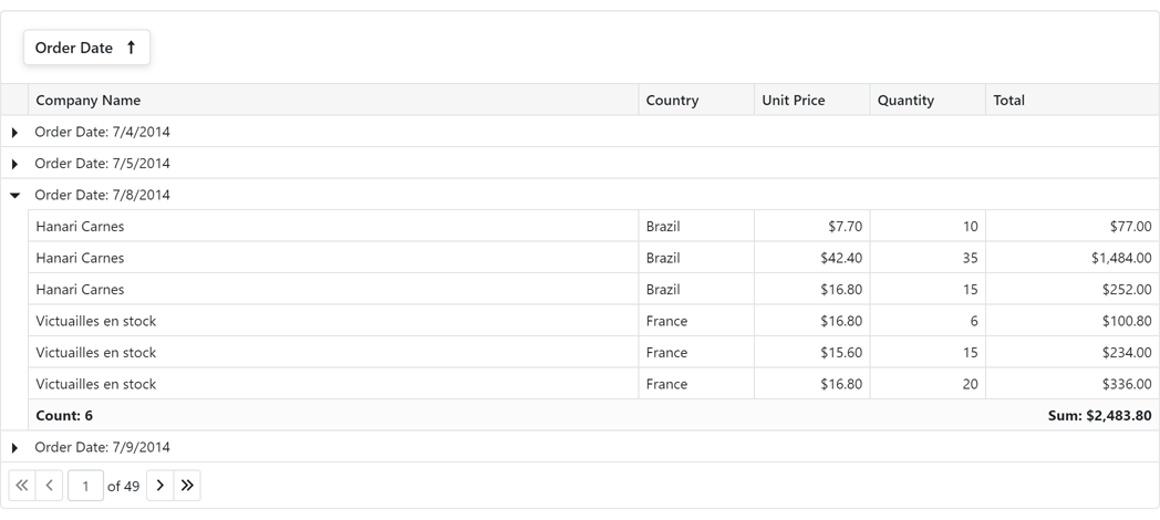
Group Footer Summary
You can now display group summary values within group footers. To display group summary values, set the summary item’s FooterColumnName property to the name of a group footer column.
Online Demo
Group Footer Templates
Our Blazor Grid's new DxGrid.ColumnGroupFooterTemplate and DxGridColumn.GroupFooterTemplate properties allow you to customize group footers as needed.
Group Footer Display Mode
Our new GroupFooterDisplayMode property allows you to specify the manner in which group footers are displayed.
Available options include: Auto, Always, Never, and IfExpanded.
Online Demo
Vertical and Horizontal Scrolling
Our Blazor Grid now displays a vertical scrollbar when content height exceeds the height of the component itself.
A horizontal scrollbar automatically appears when total width (of all columns) exceeds the width of the component itself.
Online Demo
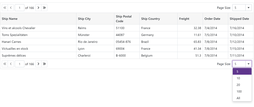
Pager Customization
The DevExpress Blazor Grid includes the following pager-related customization options:
- PagerVisible - Specifies whether the Grid displays its pager.
- PagerPosition - Specifies pager position (at the bottom, the top, or both at the bottom and the top).
- PagerNavigationMode - Sets the navigation mode available to users (use numeric buttons, use the input box, or automatic).
- PagerSwitchToInputBoxButtonCount - Specifies the number of pages used when the pager automatically switches from numeric buttons to the input box.
- PagerAutoHideNavButtons - Hides the pager's built-in navigation buttons when all numeric buttons are displayed on-screen.
- PagerVisibleNumericButtonCount - Specifies the maximum number of numeric buttons displayed within the pager.
Online Demo
Page Size Selector
Users can now modify page size at runtime. To display the Blazor Grid's page size selector, enable the PageSizeSelectorVisible option. Use the PageSizeSelectorItems property to define available page size values.
To display all records in the underlying data source, enable the PageSizeSelectorAllRowsItemVisible option (the page size selector will include "All" within the page size list).
Online Demo
Column Width Enhancements
We improved the algorithm used to manage column width and also added a MinWidth property. By default, minimum column width is 50 pixels.
Column Text Alignment
Our Blazor Grid automatically aligns text within data cells/footer cells based on column type and bound data type. Use the new TextAlignment option to specify text alignment as needs dictate.
Column Name
We added a Name property to all Grid columns. Use this property to specify the column’s unique identifier.
Access Data Item
You can now access the processed data item within data-related event handlers (CustomSort, CustomGroup, CustomSummary, etc) and the CellDisplayTemplate.
#Data Grid
While most of our development effort is focused on our Next-Gen Blazor Grid control (DxGrid), we have extended the capabilities of our original Blazor Data Grid (DxDataGrid) with the following features:
- We optimized JS interop operations for speed and stability.
- A column's Visible, SortIndex, SortOrder, GroupIndex, VisibleIndex properties now support two-way data binding.
- You can now bind the grid to a dynamic object with compound property names.
- HtmlDataCellDecoration event now supports INotifyPropertyChanged data objects.
- You can now create/render grid columns based on a condition.
                                <DxDataGrid Data="@forecasts">
                                    <Columns>
                                        <DxDataGridDateEditColumn Caption="Date" Field="Date" />
                                        @if (isTempInFahrenheit) {
                                            <DxDataGridColumn Caption="Temperature F" Field="TemperatureF" />
                                        } else {
                                            <DxDataGridColumn Caption="Temperature C" Field="TemperatureC" />
                                        }
                                    </Columns>
                                </DxDataGrid>
#Charting
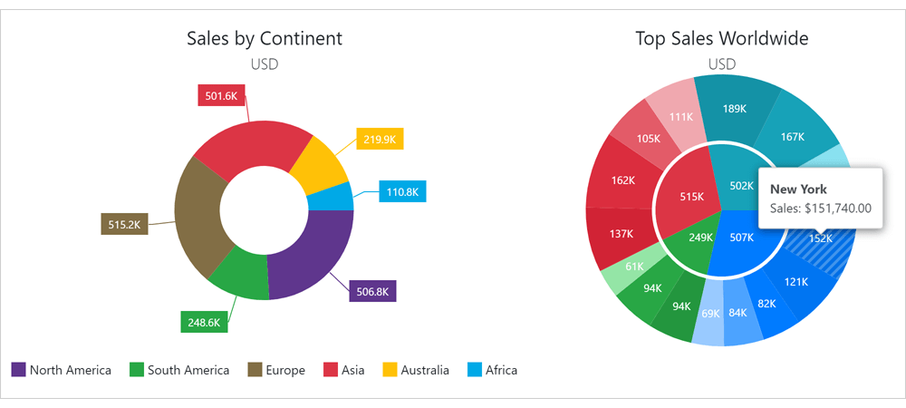
New Pie/Donut Chart Component
We split our Blazor Chart into two distinct components:
We also implemented the following new properties for the Pie/Donut Chart:
Localization
You can now localize months and days (numeric and date formats now correspond to the current thread locale).
Custom Position of an X-Y Axis
The following new properties allow you to customize X-Y axis position:
Side-by-Side Stacked & Full-Stacked Bar Charts
You can now create side-by-side Blazor Bar Charts. Use our new Stack property to specify the desired chart stack.
Series and Constant Line Appearance
Our new Blazor Charts DashStyle property allows you to specify a dash style for a line series or a constant line. We also added the following settings to control the appearance of constant lines:
Break Series on Empty Points
Our Blazor Chart component includes a new BreakOnEmptyPoints option. Enable this option to display empty points (points with undefined/null values) as breaks.
Axis Major and Minor Ticks
v21.2 includes two new Blazor components: DxChartAxisTick and DxChartAxisMinorTick. Use the following options to customize the appearance of major (AxisTick) and minor ticks (AxisMinorTick):
- Visibility (Visible)
- Color
- Length
- Shift
- Width
- Opacity
Zero Value Always Visible
Our Blazor Chart component's value axis always displays a zero value for Area and Bar series. For other series types (like Line, Point and Range), zero values may be omitted. To display a zero value regardless of series type and value(s), use the ZeroAlwaysVisible property.
Refresh and Redraw Blazor Charts Manually
You can now refresh and redraw your Blazor Chart as needs dictate.
- RefreshData - updates the Chart control to reflect changes made to the underlying data source and then redraws the Chart control.
- RedrawAsync - forces the Chart control to redraw itself (immediate redraw).
Limit the Maximum Number of Auto-Generated Scale Breaks
Use the MaxAutoBreakCount property to limit the maximum number of auto-generated value axis breaks (when the AutoBreaksEnabled property is set to 'true').
#Data Editors
Date Edit - Date Time Offset Type Support
You can now bind our Blazor Date Edit component to DateTimeOffset and DateTimeOffset? data types.
ComboBox, ListBox, and TagBox - Item Template
Our Blazor ComboBox, ListBox, and TagBox components now support item templates. Use the 'ItemTemplate' property to define your custom template.
ComboBox - Validate by Text or Value
Use the ValidateBy property to validate the editor based on its text or underlying value.
SpinEdit - Enable/Disable Mouse Wheel
Our Blazor SpinEdit ships with a new AllowMouseWheel property (prevents users from modifying the editor's value with the mouse wheel).
Button - Navigate URL
Our Blazor Button component ships with a new NavigateUrl property (URL used when a button is clicked).
CheckBox - API Enhancements
v21.2 includes the following Blazor CheckBox-related API enhancements:
#Navigation and Layout
Form Layout - Disabled and Read-Only States
Our Blazor Form Layout component and its associated layout elements (items, groups, and tab pages) now support disabled and read-only states (new Enabled and ReadOnly properties).
Form Layout - Tab Page Header CSS
Our DxFormLayoutTabPage component ships with a new HeaderCssClass property (applies a custom CSS class to tab page headers).
Form Layout Groups - Header Template and API Enhancements
Groups within our Blazor Form Layout component now support header templates - HeaderTemplate.
You can also use the HeaderCssClass property to assign a custom CSS class to a group header. To assign a CSS class to the entire group, use the CssClass property.
Tabs - Scroll Modes
Use the new DxTabs.ScrollMode property to specify navigation options when tabs do not fit within a container (width). The following tab scroll modes are available:
- NavButtons - Users can navigate to non-visible tabs in the following manner: via navigation buttons, or by hovering the mouse pointer over a tab, holding the Shift key, and scrolling the mouse wheel.
- Swipe - User can navigate to non-visible tabs in the following manner: via a wipe gesture or by hovering the mouse pointer over the container, holding the Shift key, and scrolling the mouse wheel.
- Auto - Tab scroll mode adapts to device type. Mobile and tablet devices use Swipe mode. Desktop devices use NavButtons mode.
- NoScroll - Users cannot scroll to non-visible tabs. Tabs that do not fit the container are moved to a new tab row.
online demo
Context Menu - Templates
You can now customize the content and appearance of Context Menu items. Use the following properties to specify common templates for all items and templates for individual items:
Online Demo
Context Menu, TreeView - Bind to Flat Data
You can now bind our Context Menu and TreeView components to flat data with the following:
Online Demo
Menu - Bind to Data
You can now bind the Menu component to a data source. To bind a menu, use the component's Data and DataMappings properties. In bound mode, data source items are used to auto populate menu items.
Documentation
Online Demo
Popup Enhancements
-
You can now use the IsInitialized property to track a Popup's initialization state within code.
-
The Closing event's arguments include a new property - CloseReason. This property identifies the action that initiated the close operation: Programmatically, EscapePress, CloseButtonClick, or OutsideClick.
API Enhancements
#Scheduler
Date Header, Resource Header, and Time Cell Customization
You can now customize the content and appearance of time cells, date headers, and resource headers.
Blazor Scheduler Component
 Date Header Customization
 Resource Header Customization
Day View, Work Week View, Week View
Month View
Timeline View
Online Demo
Snap to Cells
All Blazor Scheduler Views now include a SnapToCellsMode property. With this property, you can enable/disable the snapping of appointments to time cells or enable automatic snapping (based on appointment time intervals).
Responsive Layout - Enhancements
Our Blazor Scheduler component's Day, Week, and Work Week Views now have compact date headers. These Views also adapt date headers and the time ruler to small screens.
In addition, all Scheduler Views can hide appointment captions (when space limits the component's ability to display the caption in full).
HTML Cell Decoration
Our new HtmlCellDecoration event allows you to customize the appearance of Scheduler cells.
#Blazor Report Viewer
Search, Document Map and Export Options Panels
Our Blazor Report Viewer reached feature parity with our HTML5 Document Viewer. In v21.2, we added the following UI elements:
- Export Options Panel
- Search Panel
- Document Map with Bookmarks
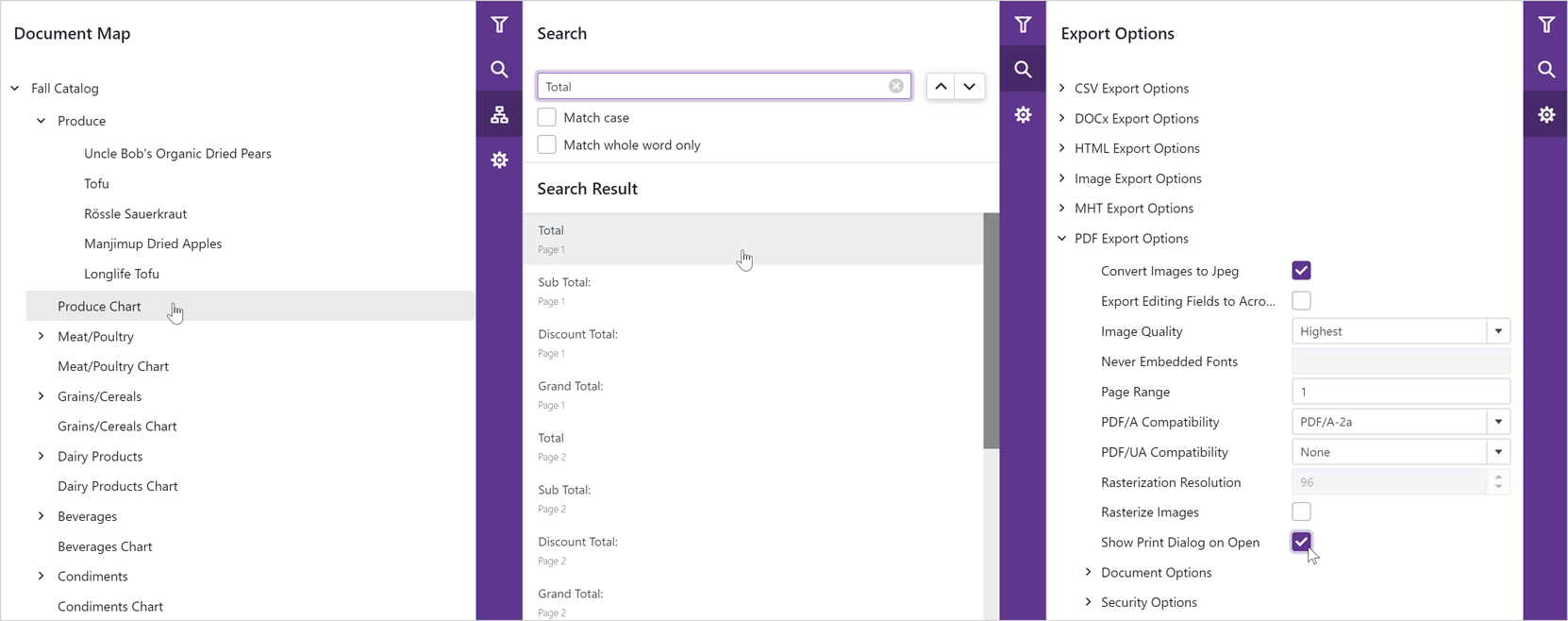
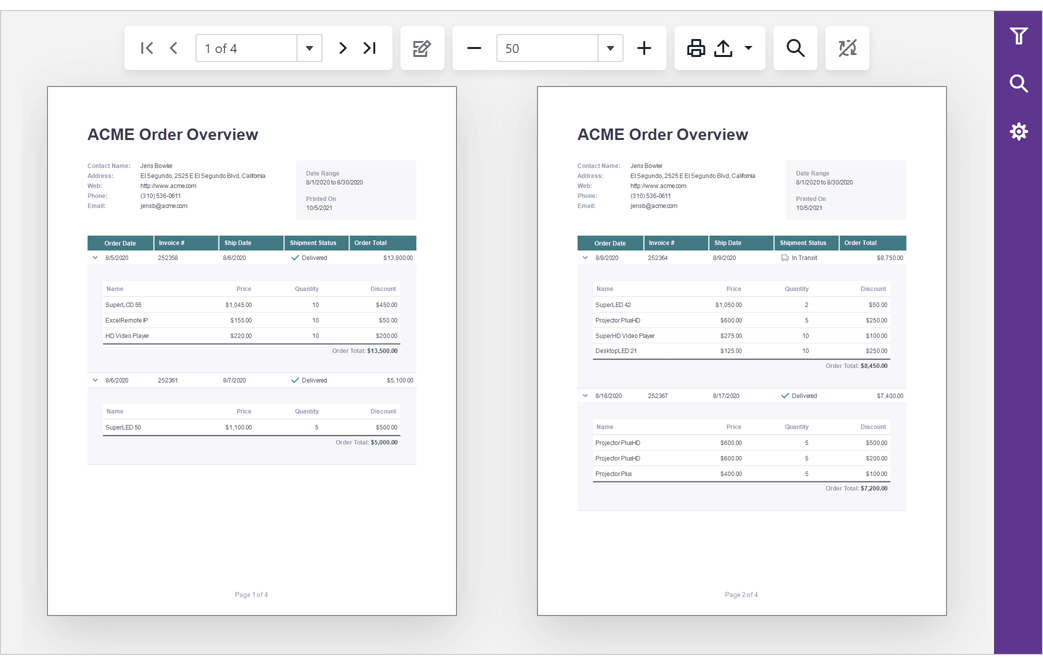
Multi-Page View
Our Blazor Report Viewer can now display the entire document. You can scroll pages and zoom the view to see multiple pages at once.
#Content Security Policy (CSP) Support
You can now use our DevExpress Blazor components on websites with a Content Security Policy (CSP).
#Data Grid and Tree List
API Enhancements
New Toolbar Customization API
You can now customize our DataGrid/TreeList Toolbar on-the-fly:
- You can alter Toolbar items dynamically, at any time (in the past, you could only do so once when the Toolbar was created).
- When using our DataGrid/TreeList within a React, Angular or Vue app, you can customize the toolbar declaratively without direct DOM manipulation.
We added a new toolbar property that allows you to customize toolbar items in much the same way as a standalone Toolbar. Each DataGrid/TreeList Toolbar item can be specified as an object with the same structure as a standalone Toolbar. In addition, you can specify an item using a predefined string name from the list of built-in DataGrid/TreeList commands (such as 'addRowButton', 'applyFilterButton','columnChooserButton', 'exportButton', 'groupPanel', 'revertButton', 'saveButton', 'searchPanel').
Online Demo
Disable Command Buttons
You can now disable certain command buttons for specific rows using the new disabled column button's property.
Online Demo
Custom Command Button Enhancements
You can now use the onClick, cssClass, hint, and disabled button properties if you have specified a custom command button template.
Extended navigateToRow API
Our navigateToRow method now returns a Promise object. You can now be notified when a background operation has finished.
Virtual Scrolling Enhancements
We reworked our DataGrid/TreeList's Virtual Scrolling engine and introduced the following enhancements:
- Optimized our row rendering algorithm to increase overall FPS.
- Optimized our data loading algorithm to reduce the number of remote data requests.
- Introduced a new scrolling.renderAsync property so you can render rows synchronously or asynchronously.
Documentation
Online Demo
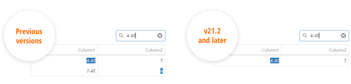
Improved Search
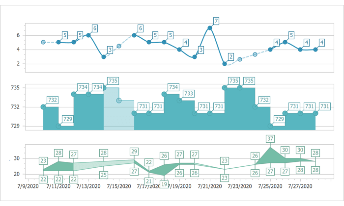
We reduced false-positive matches when users search for numbers within the DataGrid's Search Panel. Our DataGrid now matches search string with both original and formatted cell values, respecting column formatting.
For instance, if your numeric column uses a $#.# format and a cell displays '$12,000.1', you can locate the record by either '12000.1' or '$12,000.1'. Conversely, '12000.1m' doesn't match a '12000.1' number cell value as it did previously.
The following image illustrates the difference between our previous/current implementation.
#Data Grid
Add New Row at a Specified Position
You can now specify where to insert a new row when using insertBeforeKey or insertAfterKey properties. Both properties accept a key for the row before/after which to insert the new row. For popular use cases, we added a newRowPosition property with a set of shortcut values:
- "first"/"last" - Insert a new row at the beginning/end of the dataset.
- "pageTop"/"pageBottom" - Insert a new row at the top/bottom of the current page.
- "viewportTop"/"viewportBottom" - Insert a new row at the top/bottom of the viewport.
Online Demo
#HTML/Markdown Editor
Table Management
This update includes the following table-related features:
- Support for the 'thead' HTML tag (table headers).
-
Support for table and column resize operations via our new tableResizing configuration option.
-
Context menu for table-related operations. To enable the menu, activate the tableContextMenu setting.
-
Multiple paragraph support (<p> tag) within a table cell.
- Table Context Menu customization.
- Manage table/cell properties via built-in dialogs.
Online Demo
Soft Line Breaks
Our HTML/Markdown Editor includes a new allowSoftLineBreak configuration option. When enabled, users can break text within a single block element into multiple lines (via the <br> tag using the new Shift+Enter keyboard shortcut). This feature allows you to break a list item (<li>) into multiple lines or add multiline cells.
Online Demo
#Diagram
Touch Support Enhancement
We improved touch screen support in Chromium-based browsers (Google Chrome, Microsoft Edge, Opera).
Online Demo
#Gantt
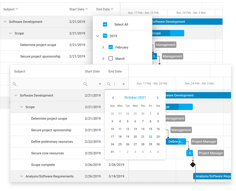
Visible Date Range
You can now specify the visible data range using the startDateRange and endDateRange properties.
Online Demo
Sorting
You can now sort tasks by one or more columns. Use our new sorting option to configure corresponding UI elements and their behavior.
Online Demo
Export to PDF
You can now export Gantt data to PDF. Export options allow you to set document size and page orientation; limit data export to a specific date range; specify whether to export only chart area, tree list area, or the entire Gantt component.
Documentation
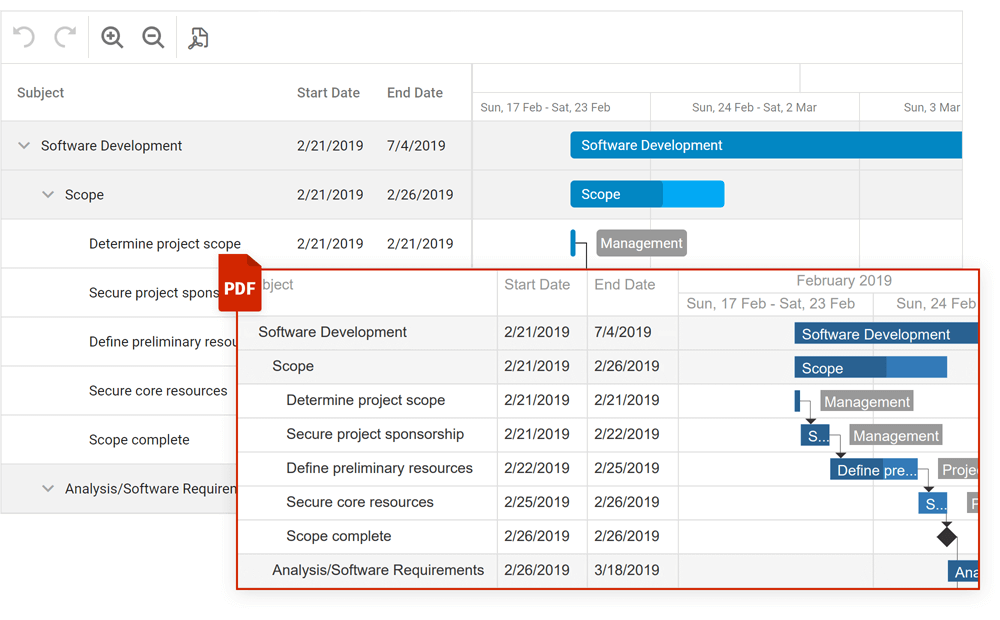
Online Demo
Filtering
Our Gantt control now supports filtering. End-users can filter tasks using the header filter or filter row. To filter tasks in code, use the following API:
Demo: Header FilterDemo: Filter Row
New API to Expand/Collapse Tasks
Task-related (expand/collapse) API enhancements include:
API Enhancements
Gantt control API enhancements include:
Online Demo
#File Manager
New API
Our File Manager ships with the following new API:
#UI Components
Overlay and Popup Enhancements
-
New onShowing and onHiding events allow you to manage the display of a popup.
-
The new wrapperAttr property allows you to add custom HTML attributes to the popup root element.
- Popup can now automatically adjust its position when its content changes.
- The new hideOnParentScroll property allows you to close the popup when a user scrolls its container.
- The new dragAndResizeArea property specifies boundaries for drag and resize operations.
- The new dragOutsideBoundary property specifies whether the Popup can overlap container (and window) boundaries during drag operations.
-
The new restorePosition property specifies whether the Popup restores its initial position or whether the Popup maintains its position after drag/resize operations.
CheckBox, TagBox, List Enhancements
CheckBox enhancements include the following:
- blur method: Removes focus from the component.
- iconSize setting: Specifies desired icon size.
-
You can now assign a 'null' value to the CheckBox value property (to set an indeterminate state).
- CheckBox text is now automatically centered by its icon.
The new selectAllText property allows you to specify custom text displayed within the "Select All" switch in our List and TagBox components.
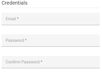
Floating Labels
Text input/placeholders now support the use of floating labels (conforms to Google's Material Design guidelines) so you can eliminate field labels from all your forms.
Documentation
Miscellaneous Enhancements
PivotGrid - Export Merged Cells to Excel
Our new mergeColumnFieldValues and mergeRowFieldValues properties allow you to disable/enable cell merge while exporting.
TreeView
The DevExtreme TreeView widget ships with native scrolling support. Set the useNativeScrolling property to 'true' to enable this feature.
ScrollView - RTL Support
ScrollView fully supports RTL rendering mode. Documentation

Button Group - New Selection Mode
Our ButtonGroup ships with a new selection mode - 'none'. In this mode, group buttons are not selected on click. Documentation
#Material Theme Enhancements
We applied changes to our product libraries to mirror some of Google’s most recent Material Design Guidelines. For instance, Google deprecated the ‘underlined’ styling mode for inputs and elected to use ‘filled’ mode by default. We preserved both modes and you can switch back to the previous display style when necessary.
#Architectural Enhancements
TypeScript
- We reduced the number of 'any' type entries in our API.
- Properties, events, and methods are now typed based on data.
Discussion page
Tree Shaking
We optimized internal module dependencies. This enhancement allowed us to reduce bundle size/code chunk size for specific usage scenarios (e.g. when using Code Splitting).
#Native React Grid
Keyboard Navigation
End-users can now navigate through grid cells/rows with the keyboard.
#Charting
Customizable Empty Points
The DevExpress Chart Control can now process gaps (within a data source) as empty points (points with undefined values). The appearance of these gaps can now be customized with different style options (based on Series view type). You can fully customize the appearance of point markers, line, and area segments for empty points.
You can also draw 'mock' points instead of gaps (based on values for neighboring Series points). Set the series view's EmptyPointOptions.ProcessPoints property to 'Interpolate'.
Documentation
#Diagram
Touch Support Enhancement
We improved touch screen support in Chromium-based browsers (Google Chrome, Microsoft Edge, Opera).
#Gantt
Custom Callbacks
Our new client-side PerformCallback method and server-side CustomCallback event allow you to send and handle custom requests between the server and the client.
Visible Date Range
You can now specify a visible data range using the following server-side properties: GanttViewSettings.StartDateRange and GanttViewSettings.EndDateRange. To specify the visible date range on the client side, use the SetStartDateRange and SetEndDateRange methods.
Display/Hide Dependencies
We added a new UI element alongside new APIs to display/hide dependencies in the Gantt chart:
New Gantt API
v21.2 ships with the following new APIs:
#General Enhancements
v21.2 includes quality-related enhancements for both our Web Forms/MVC data container controls (GridView, TreeList, and CardView) and our Web Forms/MVC Data Editors Library. Major enhancements include:
- New client-side API for Batch Mode.
- Improved adaptivity and accessibility.
- Enhanced client and server architecture.
#Data Grid
Add New Row at a Specified Position
You can now specify where to insert a new row when using InsertBeforeKey or InsertAfterKey methods. Both properties accept a key for the row before/after which to insert the new row. For popular use cases, we added a NewRowPosition method with a set of shortcut values:
- "first"/"last" - Insert a new row at the beginning/end of the dataset.
- "pageTop"/"pageBottom" - Insert a new row at the top/bottom of the current page.
- "viewportTop"/"viewportBottom" - Insert a new row at the top/bottom of the viewport.
#Data Grid and Tree List
API Enhancements
New Toolbar Customization API
You can now customize our DataGrid/TreeList Toolbar on-the-fly:
- You can alter Toolbar items dynamically, at any time (in the past, you could only do so once when the Toolbar was created).
- When using our DataGrid/TreeList within a React, Angular or Vue app, you can customize the toolbar declaratively without direct DOM manipulation.
We added a new Toolbar method that allows you to customize toolbar items in much the same way as a standalone Toolbar. Each DataGrid/TreeList Toolbar item can be specified as an object with the same structure as a standalone Toolbar. In addition, you can specify an item using a predefined string name from the list of built-in DataGrid/TreeList commands (such as 'addRowButton', 'applyFilterButton','columnChooserButton', 'exportButton', 'groupPanel', 'revertButton', 'saveButton', 'searchPanel').
Online Demo
Disable Command Buttons
You can now disable certain command buttons for specific rows using the new Disabled column button's method.
Online Demo
Extended navigateToRow API
Our navigateToRow method now returns a Promise object. You can now be notified when a background operation has finished.
Virtual Scrolling Enhancements
We reworked our DataGrid/TreeList's Virtual Scrolling engine and introduced the following enhancements:
- Optimized our row rendering algorithm to increases overall FPS.
- Optimized our data loading algorithm to reduce the number of remote data requests.
- Introduced a new scrolling.renderAsync property so you can render rows synchronously or asynchronously.
Documentation
Online Demo
Improved Search
We reduced false-positive matches when users search for numbers within the DataGrid's Search Panel. Our DataGrid now matches search string with both original and formatted cell values, respecting column formatting.
For instance, if your numeric column uses a $#.# format and a cell displays '$12,000.1', you can locate the record by either '12000.1' or '$12,000.1'. Conversely, '12000.1m' doesn't match a '12000.1' number cell value as it did previously.
The following image illustrates the difference between our previous/current implementation.
#HTML/Markdown Editor
Table Management
This update includes the following table-related features:
- Support for the 'thead' HTML tag (table headers).
-
Support for table and column resize operations via our new TableResizing method.
- Context menu for table-related operations. To enable the menu, activate the TableContextMenu method.
-
Multiple paragraph support (<p> tag) within a table cell.
- Table Context Menu customization.
- Manage table/cell properties via built-in dialogs.
Online Demo
Soft Line Breaks
Our HTML/Markdown Editor includes a new AllowSoftLineBreak method. When enabled, users can break text within a single block element into multiple lines (via the <br> tag using the new Shift+Enter keyboard shortcut). As you would expect, this feature allows you to break a list item (<li>) into multiple lines or add multiline cells.
Online Demo
#Diagram
Touch Support Enhancement
We improved touch screen support in Chromium-based browsers (Google Chrome, Microsoft Edge, Opera).
#Gantt
Visible Date Range
You can now specify the visible data range using the StartDateRange and EndDateRange methods.
Online Demo
Sorting
You can now sort tasks by one or more columns. Use our new Sorting method to configure corresponding UI elements and their behavior.
Demo
New API to Expand/Collapse Tasks
Task-related (expand/collapse) API enhancements include:
API Enhancements
Gantt control API enhancements include:
Demo
Export to PDF
You can now export Gantt data to PDF. Export options allow you to set document size and page orientation; limit data export to a specific date range; specify whether to export only chart area, tree list area, or the entire Gantt component.
Documentation
Demo
Filtering
Our Gantt control now supports filtering. End-users can filter tasks using the header filter or filter row. To filter tasks in code, use the following API:
Demo: Header FilterDemo: Filter Row
#File Manager
New API
Our File Manager ships with the following new API:
#UI Components
Overlay and Popup Enhancements
-
New OnShowing and OnHiding methods allow you to manage the display of a popup.
-
The new WrapperAttr method allows you to add custom HTML attributes to the popup root element.
- Popup can now automatically adjust its position when its content changes.
- The new HideOnParentScroll method allows you to close the popup when a user scrolls its container.
- The new DragAndResizeArea method specifies boundaries for drag and resize operations.
- The new DragOutsideBoundary method specifies whether the Popup can overlap container (and window) boundaries during drag operations.
-
The new RestorePosition method specifies whether the Popup restores its initial position or whether the Popup maintains its position after drag/resize operations.
CheckBox, TagBox, List Enhancements
CheckBox enhancements include the following:
- blur method: Removes focus from the component.
- IconSize method: Specifies desired icon size.
- You can now assign a 'null' value to the CheckBox 'value' property (to set an indeterminate state).
- CheckBox text is now automatically centered by its icon.
The new SelectAllText method allows you to specify custom text displayed within the "Select All" switch in our List and TagBox components.
Floating Labels
Text input/placeholders now support the use of floating labels (conforms to Google's Material Design guidelines) so you can eliminate field labels from all your forms.
Miscellaneous Widgets Enhancements
PivotGrid - Export Merged Cells to Excel
Our new MergeColumnFieldValues and MergeRowFieldValues properties allow you to disable/enable cell merge while exporting.
TreeView
The DevExtreme TreeView widget ships with native scrolling support. Call the UseNativeScrolling property to 'true' to enable this feature.
ScrollView - RTL Support
ScrollView fully supports RTL rendering mode.
Button Group - New Selection Mode
Our ButtonGroup ships with a new selection mode - 'none'. In this mode, group buttons are not selected on click.
#Material Theme Enhancements
We applied changes to our product libraries to mirror some of Google’s most recent Material Design Guidelines. For instance, Google deprecated the ‘underlined’ styling mode for inputs and elected to use ‘filled’ mode by default. We preserved both modes and you can switch back to the previous display style when necessary.
#All Platforms
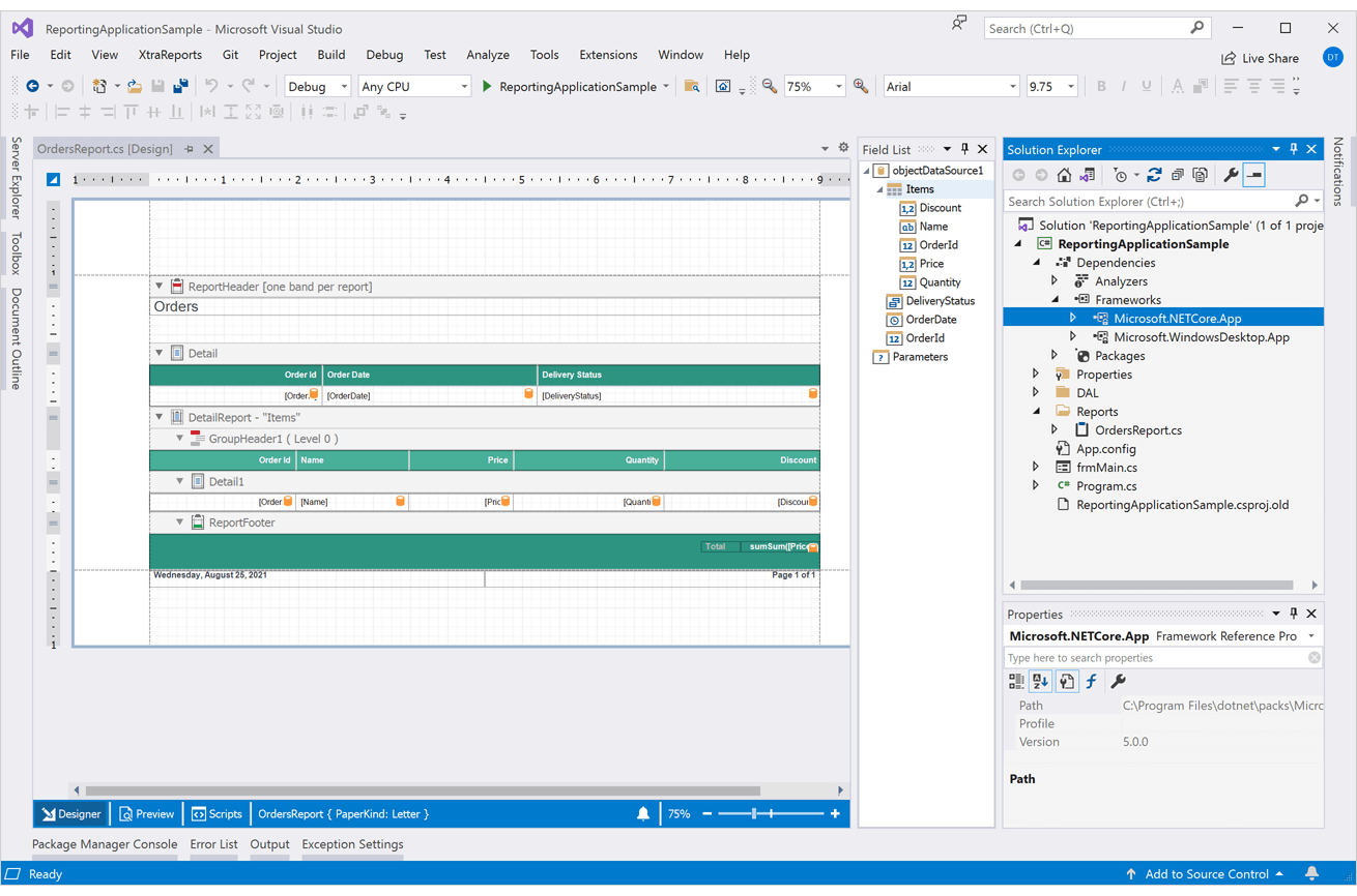
Visual Studio Report Designer for .NET Apps
Our market-first Visual Studio-integrated Report Designer ships with the following enhancements:
- You can now open standard XtraReport class files (*.cs) with our updated Visual Studio Report Designer. We now offer a unified design time experience for both .NET Framework and .NET (.NET Core) apps.
- Visual Studio 2022 RC3 and Preview 7 support.
- .NET Core, .NET 5 and .NET 6 RC2 support.
- Improved startup time - at least twice as fast as v21.1.
- Improved custom type discovery (from your assemblies) for both ObjectDataSource and EFDataSource.
- With this release, this new out-of-process Report Designer is enabled by default.
- XPObjectSource support.
- System.Data.DataSet support.
Documentation
PDF Content - Embed PDFs into Report Pages
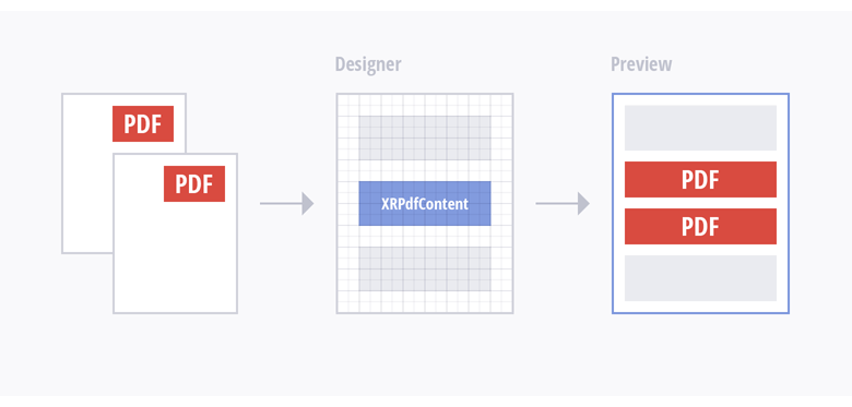
The XRPdfContent report control exposes a new 'GenerateOwnPages' property – a property that manages operation mode. This control can act like a subreport when the property is disabled. With the help of a control placeholder, you can limit the area to scale and embed PDF files directly into your report. Refer to the following diagram for more information on our implementation:
This new mode is useful when:
- You need to embed PDF file content into a report with common headers/footers (headers/footers will be printed on PDF file pages as well).
- You need to print specific content (pictures, bar codes, page numbers, a report watermark) over the contents of your PDF file.
- You need to design a pre-printed form and use a PDF file as a watermark.
- You need to create a report document with an A4 paper kind and include a PDF file with different page dimensions.
Documentation
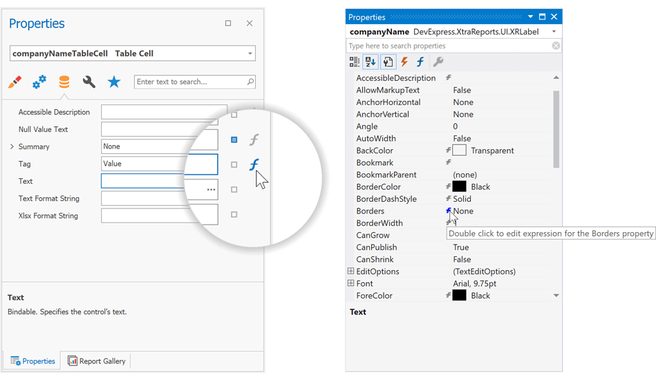
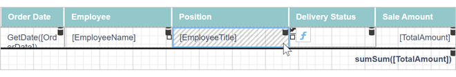
Report Designer - Expression UI Enhancements
It is now easier to define expression bindings within the DevExpress Report Designer. New enhancements include:
A new f-symbol button is displayed next to the selected control. This button allows you to invoke the Expression Editor instantly.
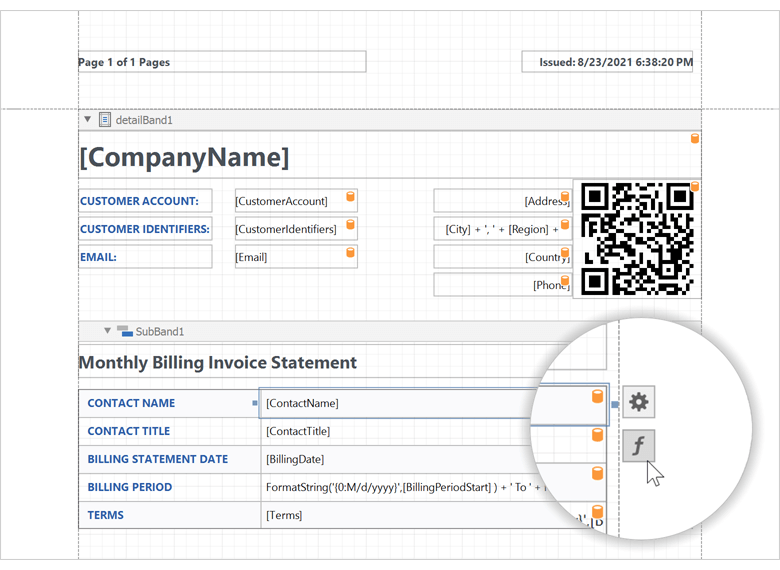
We enhanced the Expression Editor so you can set up expression bindings for various report control properties within the Expression Editor itself. A glowing formula-f symbol indicates that a property has an expression assigned.
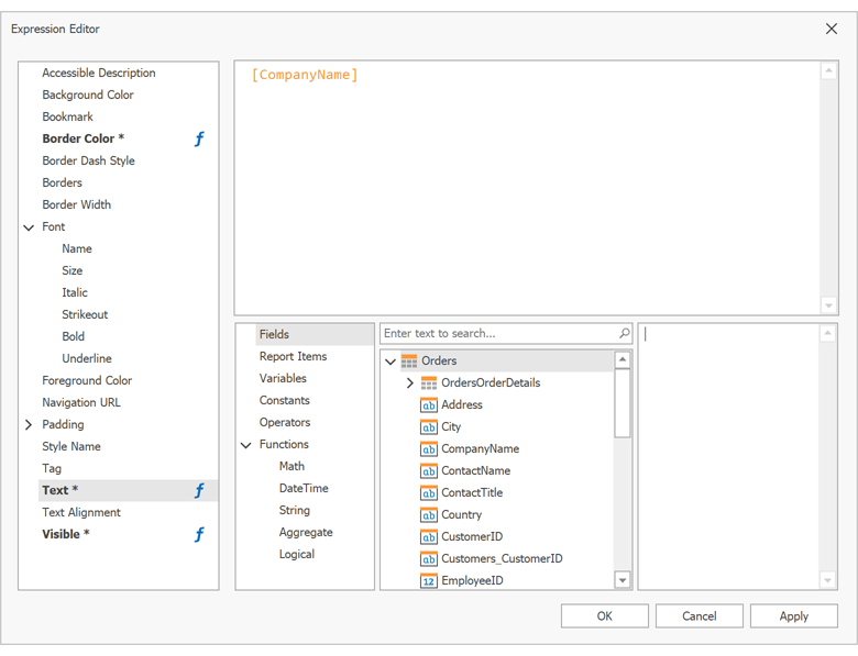
The Properties Panels (displayed within our End-User and Visual Studio Report Designers) now highlight bindable properties with a formula symbol.
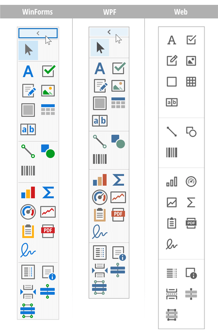
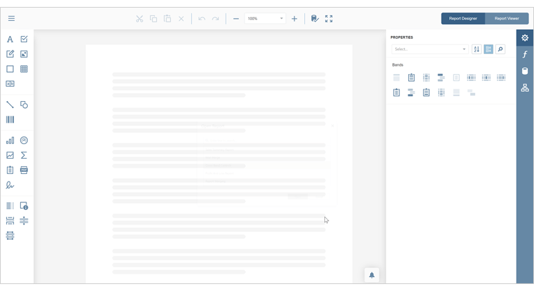
Report Designer - New Toolbox
All runtime Report Designers feature a new two-column toolbox layout (and displays the entire set of report controls). You can expand/collapse the toolbox in the desktop version of DevExpress Reports (WinForms and WPF).
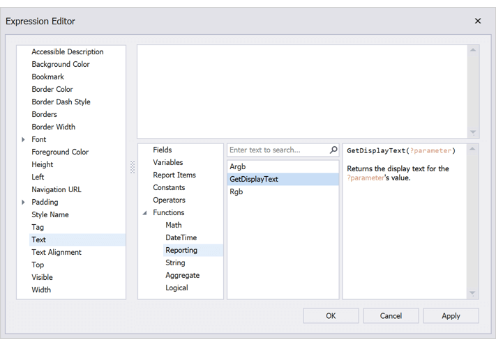
Parameters - Print Display Values
The Expression Editor features a new 'GetDisplayText' function. This function allows you to print selected display values for a lookup parameter.
Documentation
#Blazor Report Viewer
Search, Document Map and Export Options Panels
Our Blazor Report Viewer reached feature parity with our HTML5 Document Viewer. In v21.2, we added the following UI elements:
- Export Options Panel
- Search Panel
- Document Map with Bookmarks
Documentation
Multi-Page View
Our Blazor Report Viewer can now display the entire document. You can scroll pages and zoom the view to see multiple pages at once.
Documentation
#Web Reporting
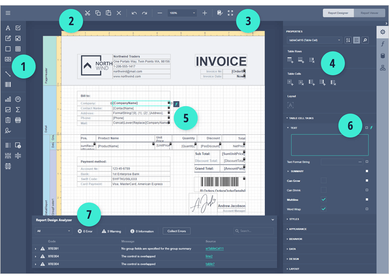
Report Designer and Document Viewer - Updated User Interface
In v21.2, we updated the UI of our web reporting components. UI enhancements include:
1. The two-column toolbox displays the entire set of report controls at once.
2. A new centered toolbar and a separate button that allows you to switch between design view and preview.
3. New vector-based icon set is used across our entire web reporting product line (including Blazor).
4. Enlarged icons for quick actions in the Properties panel make these actions distinguishable for Web Report Designer users.
5. A new f button is displayed next to the selected control and allows you to invoke the Expression Editor right here, right now.
6. A new f indicator within the properties panel reflects a property's data-bound state. This will allow users to determine if a property supports data binding or if it is already bound to a data column.
7. Report Design Analyzer panel. To learn more about this new feature, please refer to the blog post:
Avoid Mistakes in Report Creation with The Help of Report Design Analyzer (v21.1).
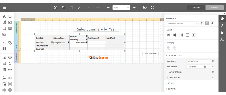
Web Report Designer - Cross-Tab
Our Web Report Designer ships with a new Cross-Tab report control. v21.2 also includes a Cross-Tab report wizard so you can create cross-tab reports faster and easily.
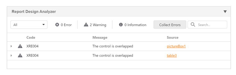
Web Report Designer - Report Design Analyzer
We integrated the Report Design Analyzer panel into the Web Report Designer. Our Report Design Analyzer was designed to help you isolate, diagnose, and address common report design/layout-related issues.
Documentation
Development Mode API for ASP.NET Core
Use this API to ensure that you use the same version of client side and backend libraries before you deploy your ASP.NET Core applications with reporting components. The following code enables development mode and validates if the client-side and .NET backend library versions match:
services.ConfigureReportingServices(builder => {
    builder.UseDevelopmentMode();
    //or disable version validation manually
    //builder.UseDevelopmentMode(x => x.CheckClientLibraryVersions = false);
});
Miscellaneous Enhancements
Document Viewer: Use the ShowPrintNotificationDialog property to disable displaying a dialog that allows users to download the PDF file sent to printing.
Web Report Designer now displays the skeleton loading screen while opening a report.
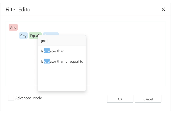
Filter Editors in Web Report Designer now allow you to search through filtering functions.
A striped background is applied to hidden report controls whose Visible property is set to false.
#WinForms Reporting
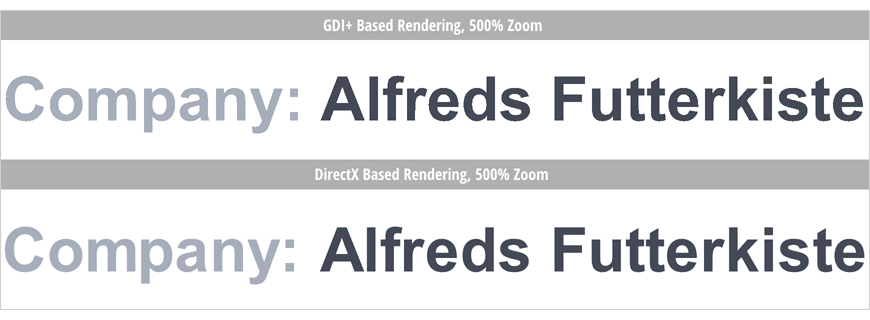
Document Viewer - DirectX Support
Our WinForms Document Viewer control now supports DirectX rendering for both UI elements and the report document. The benefits of DirectX rendering are numerous and include:
- Up to 80% faster document rendering.
- Smoother scrolling experience.
- Enhanced responsiveness in multi-page view.
- Enhanced glyph rendering quality thanks to DirectWrite.
Enable the viewer's UseDirectXPaint property to switch from the default GDI+ rendering to DirectX. Use the EnableSmoothScrolling property to change the scrolling mode.
Watch the following videos to see DirectX in action and compare its performance and rendering capabilities to GDI.
Documentation
Miscellaneous Enhancements
Report Explorer and Field List panes now integrate instant search.
The Filter Editor's expression input area now uses the monospaced Consolas font for consistency with the user interface of the Expression Editor.
The intelligent code completion drop-down in the Scrips Tab now displays SVG icons.
A striped background is applied to hidden report controls whose Visible property is set to false.
#WinForms and WPF Reporting
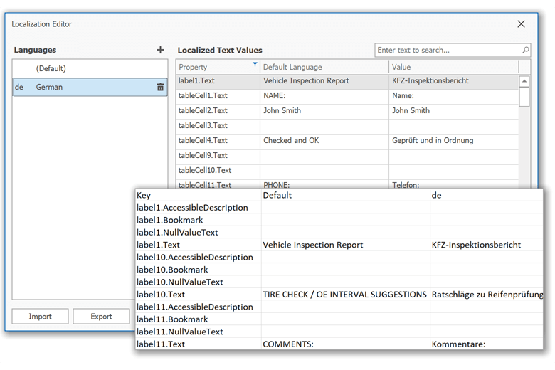
Localization - CSV Import/Export
You can now export report localization strings to a CSV file and use this file to translate report elements with the help of third-party services. In addition, our Localization Editor can import translations made within a CSV file and apply them to a report.
Documentation
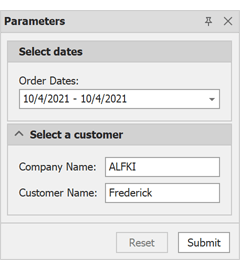
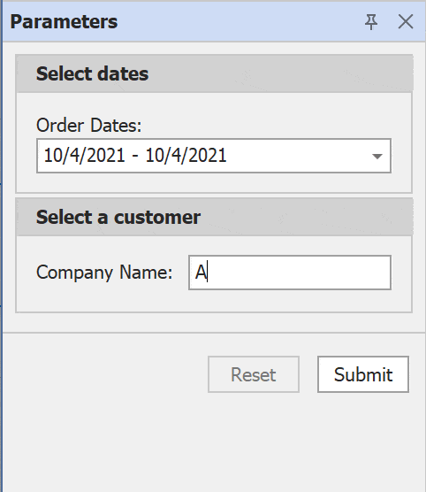
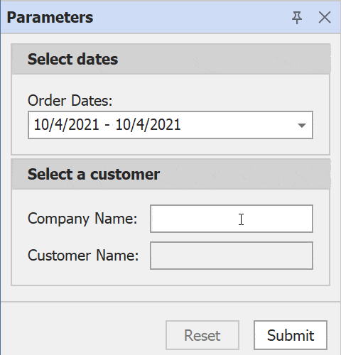
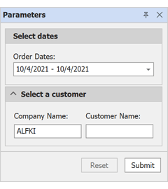
Parameters Panel - Customization API
You can now create custom layouts of our Parameters panel. New API addresses the following usage scenarios (Documentation).
- Reposition labels with parameter description.
-
Insert horizontal separators.
ParameterPanelFluentBuilder.Begin(report)
    .AddParameterItem(report.Parameters[0], p => p
        .WithLabelOrientation(DevExpress.XtraReports.Parameters.Orientation.Vertical)
    )
    .AddSeparatorItem()
    .End();
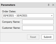
- Arrange parameter editors into expandable groups.
ParameterPanelFluentBuilder.Begin(report)
    .AddGroupItem(g1 => g1
        .WithTitle("Select dates")
        .AddParameterItem(report.Parameters[0], p0 => p0
            .WithLabelOrientation(DevExpress.XtraReports.Parameters.Orientation.Vertical)
        )
    )
    .AddGroupItem(g2 => g2
        .WithTitle("Select a customer")
        .WithShowExpandButton(true)
        .AddParameterItem(report.Parameters[1], p1 => p1)
        .AddParameterItem(report.Parameters[2], p2 => p2)
    )
    .End();
- Show/hide parameter editors based on a condition.
ParameterPanelFluentBuilder.Begin(report)
    .AddGroupItem(g0 => g0
        .WithTitle("Select dates")
        .AddParameterItem(report.Parameters[0], p => p
            .WithLabelOrientation(DevExpress.XtraReports.Parameters.Orientation.Vertical)
        )
    )
    .AddGroupItem(g1 => g1
        .WithTitle("Select a customer")
        .WithShowExpandButton(true)
        .AddParameterItem(report.Parameters[1])
        .AddParameterItem(report.Parameters[2])
    )
    .End();

report.Parameters["CustomerName"].ExpressionBindings.Add(new DevExpress.XtraReports.Expressions.BasicExpressionBinding() {
    PropertyName = "Visible",
    Expression = "!IsNullOrEmpty(?CompanyName)",
});
- Enable/disable parameter editors based on a condition.
ParameterPanelFluentBuilder.Begin(report)
    .AddGroupItem(g0 => g0
        .WithTitle("Select dates")
        .AddParameterItem(report.Parameters[0], p => p
            .WithLabelOrientation(DevExpress.XtraReports.Parameters.Orientation.Vertical)
        )
    )
    .AddGroupItem(g1 => g1
        .WithTitle("Select a customer")
        .WithShowExpandButton(true)
        .AddParameterItem(report.Parameters[1])
        .AddParameterItem(report.Parameters[2])
    )
    .End();

report.Parameters["CustomerName"].ExpressionBindings.Add(new DevExpress.XtraReports.Expressions.BasicExpressionBinding() {
    PropertyName = "Enabled",
    Expression = "!IsNullOrEmpty(?CompanyName)",
});
- Display parameter editors side-by-side.
ParameterPanelFluentBuilder.Begin(report)
    .AddGroupItem(g1 => g1
        .WithTitle("Select dates")
        .AddParameterItem(report.Parameters[0], p0 => p0
            .WithLabelOrientation(DevExpress.XtraReports.Parameters.Orientation.Vertical)
        )
    )
    .AddGroupItem(g2 => g2
        .WithTitle("Select a customer")
        .WithShowExpandButton(true)
        .WithOrientation(DevExpress.XtraReports.Parameters.Orientation.Horizontal)
        .AddParameterItem(report.Parameters[1], p1 => p1
            .WithLabelOrientation(DevExpress.XtraReports.Parameters.Orientation.Vertical)
        )
        .AddParameterItem(report.Parameters[2], p2 => p2
            .WithLabelOrientation(DevExpress.XtraReports.Parameters.Orientation.Vertical)
        )
    )
    .End();
Report Designer - Enhanced Manage Queries Dialog
Our Manage Queries dialog now integrates the Query Builder and lists all types of queries (SQL queries, custom queries, and stored procedures). You can create, copy (clone), edit, and delete queries.
Documentation
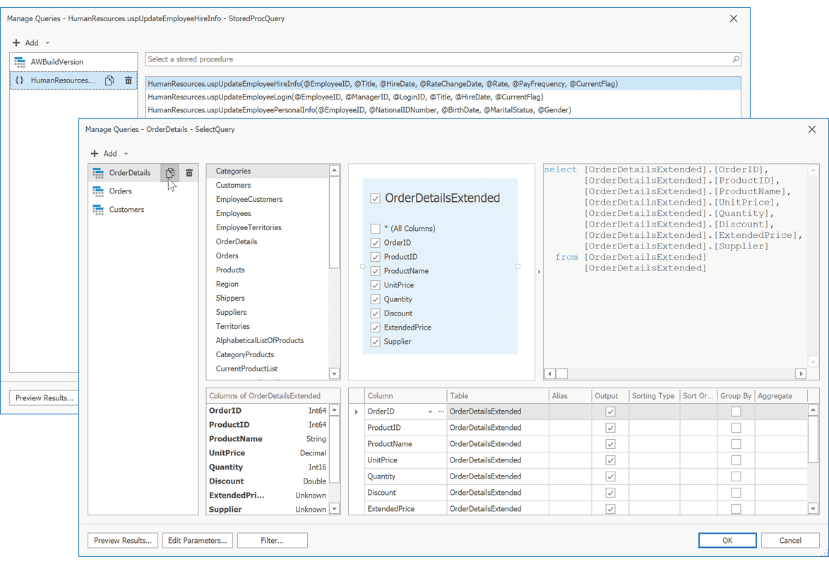
SQL and Data Federation Data Sources - Right Outer Join and Full Outer Join
Our SQL and Data Federation Data Sources now support Right Outer and Full Outer join types.
Documentation
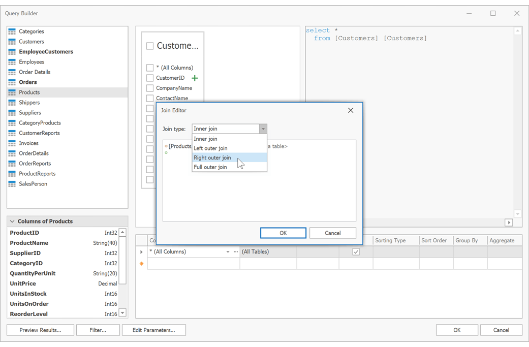
#WinUI Reporting
New Report Viewer for WinUI
DevExpress Reports for WinUI is now available. Our WinUI Document Viewer control includes the following features:
- Preview and Print Reports
- Export to PDF, XLS, XLSX, RTF, DOCX, MHT, HTML, TXT, CSV, Image
- Zoom and Page Navigation
- Parameters Panel
Note: Unlike other DevExpress WinUI components, DevExpress Reports for WinUI is not free. You must own a active DevExpress Reports Subscription (or higher), to use DevExpress Reports within a WinUI project.
Documentation
#PDF Export - Accessible PDF Support
Our Spreadsheet Document API and Word Processing Document API can now produce tagged (accessible) PDF documents for those who use screen readers and other assistive technologies.
You can generate PDF files that conform to the following standards:
How to: Export a Word Document to PDF | How to: Export a Workbook to PDF
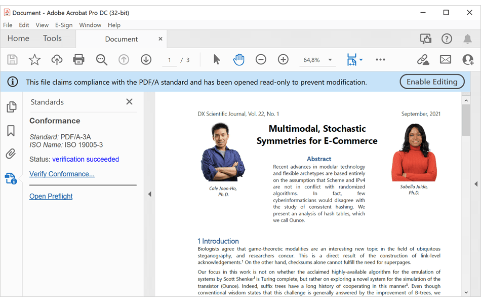
#Custom Font Loading Engine
Our Spreadsheet Document API and Word Processing Document API now allow you to use fonts not installed on a given operating system. This feature allows you to avoid font substitution when you print or export (to PDF) documents with non-standard fonts.
You can load a custom font from a file, stream, and byte array.
Documentation
#PDF Document API
Annotation Enhancements
The DevExpress PDF Document API supports the following annotation types:
- Caret
- Rubber Stamp
- Shape (Circle, Square)
- File Attachments
- Free Text
- Ink
- Link
- Line, Polyline, and Polygon
Our Annotation Facade API allows you to add, edit, add replies and reviews, flatten, and remove all available annotations.
Documentation
Remove Document Content
The DevExpress PDF Document API (v21.2) ships with a new ClearContent method. You can use this method to clear document content (within a specific page region). (Documentation)
PDF Export - EMF Support
Our PDF Document API supports Enhanced Metafile (EMF) graphics. EMF graphics are no longer converted to raster images when you generate graphics context in PDF files, or export Word and Excel documents to PDF.
#Spreadsheet Document API
Generate Thumbnails for Worksheets and Chart Sheets
You can now use our new 'Worksheet.CreateThumbnail' and 'ChartSheet.CreateThumbnail' extension methods to generate thumbnails for worksheets and chart sheets. These methods allow you to specify thumbnail size/resolution, set scale percentage, define background color, etc. Documentation
Custom Paper Size Support
With this release, you can specify non-standard paper sizes when printing documents. Use our new 'Worksheet.ActiveView.SetCustomPaperSize' method to define custom paper size for a worksheet. Documentation
#Word Processing Document API
Field Enhancements
The DevExpress Word Processing Document API and WinForms/WPF Rich Text Editors now support SECTIONPAGES, REF, and STYLEREF fields. We've also included the following field-related enhancements:
- You can now replace fields with field values.
-
New UpdateAllFields method: Allows you to update all document fields (including fields located in headers, footers, text boxes, footnotes, and endnotes).
- You can now suppress DOCVARIABLE field updates for loaded documents.
Documentation
Watermark Enhancements
We extended our Watermark API for the DevExpress Word Processing Document API and WinForms/WPF Rich Text Editors. You can now execute the following actions:
- Insert watermarks into individual section headers.
- Modify existing watermarks (change watermark options and replace watermark image or text).
- Remove watermarks from individual sections.
Documentation
#New Dashboard Component for Blazor
Our Blazor Dashboard component was first introduced in May 2021 as a Community Technology Preview (CTP). This update marks its official release. v21.2 adds localization support and includes a new API to unregister exte
nsions.
Note: DevExpress Dashboard ships as part of the DevExpress Universal Subscription.
Online Demo
#Common Enhancements
Custom Aggregation Functions
In addition to predefined aggregate functions, our BI Dashboard for WinForms, Web, and WPF now offers custom aggregate function support in client (in-memory) mode.
Example: How to aggregate data by string concatenation
Dashboard Fixed Width and Height
DevExpress Dashboard automatically stretches or shrinks content (dashboard items) to fit available screen space horizontally and vertically.
With v21.2, you can set content size in pixels. Use the Dashboard's Width and Height properties to specify exact content width and height. If width or height is too large, the Dashboard control displays a scrollbar. And yes, you can use fixed width alongside auto-height and vice versa.
This feature is available in our BI Dashboard for WinForms, WPF, and Web.
Documentation
#Export Enhancements
New Dashboard Export Component
Our new non-visual DashboardExporter component allows you to export the Devexpress BI Dashboard to PDF, XLS, XLSX and Image (PNG, JPEG, GIF) without referencing dashboard UI controls (DashboardDesigner/Viewer, ASPxDashboard, etc.) or DashboardConfigurator.
To integrate DashboardExporter in a service, register the DevExpress NuGet feed as a package source and install the DevExpress.Dashboard.Core package.
Example
#Web Dashboard
End of Support for Internet Explorer 11
To learn more about this decision, please review the following blog post: End of support for Internet Explorer 11.
New Command Toolbar
v21.2 includes a new command toolbar (DesignerToolbarExtension). This UI element can display predefined and custom commands in Dashboard Designer mode.
Documentation
#Blazor
BI Dashboard Module
You can now use the BI Dashboard component to design and preview dashboards from within your XAF-powered Blazor app.
Documentation
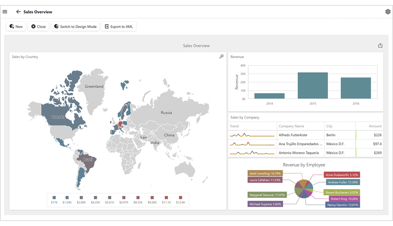
Functional Testing
You can now use Easy Test to test your XAF-powered Blazor or Web Forms application within Google Chrome/Microsoft Edge.
Note: We no longer support Internet Explorer (see End of support for Internet Explorer 11).
Documentation
Enhanced Lookup Editor Buttons
Our Lookup Editor can now display a Clear button. To display the Clear button, enable the Lookup Editor's AllowClear model option.
User Profile Picture
You can specify a user profile picture and display it in the upper right hand corner of your application page.
Documentation
Office Module (Rich Text Editor)
XAF's Blazor UI now supports the DevExpress Rich Text Editor component (as part of XAF's Office Module).
Documentation
New Grid List Editor (CTP)
XAF's Blazor UI includes a new UI element - Grid List Editor (DxGridListEditor). This new UI element is built atop the new DevExpress Blazor Grid control. Features include:
- Client and Queryable Mode for XPO
- Protected Content Placeholders for Secured Data Rows
- Property Editors as Cell Templates
- Grouping, Sorting, Filtering
- Group and Total Summaries
- Save layout settings in the Application Model
- Selection API
- Context-dependent Menu Toolbar
Documentation
Edit Mask and Display Format
You can specify EditMask and DisplayFormat settings for your ASP.NET Core Blazor XAF Property Editors.
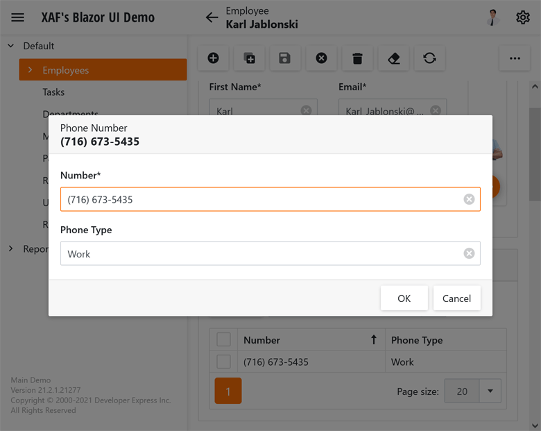
Template Customization
You can now modify our predefined (built-in) templates or you can create a custom template based on an existing template.
Documentation
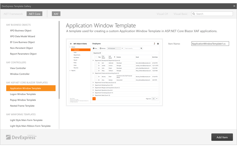
#Core Enhancements
Pre-Built Error Diagnostics (CTP)
You can now check your solution with pre-built error diagnostics and view a detailed error report in the Error List window.
Code Diagnostics
v21.2 includes the following diagnostics that will help you accurately define your business model and Controllers:
- XAF0001: Implement XPO business class constructors correctly
- XAF0002: XPO business class properties should not be overridden
- XAF0003: XPO business classes should be public
- XAF0004: Implement XAF controller constructors correctly
- XAF0005: XAF Сontroller classes should be public
And yes, you can integrate these diagnostics into your CI system.
Documentation
Project Diagnostics
The following diagnostics ensure a stable operation of the Model Editor:
- XAF0006: Invalid target platform. Change the target platform to "Any CPU" in the project or solution properties
- XAF0007: The Build Action property of the XAFML file must be set to Embedded resource
- XAF0008: The current Visual Studio version is not supported or .NET 5.0+ SDK is not installed
Documentation
Audit Trail for EF Core
Our Audit Trail Module for EF Core was first introduced in May 2021 as a Community Technology Preview (CTP). This update marks its official release. The Audit Trail Module supports both XAF-powered Blazor and WinForms UI apps.
Documentation
Model Editor Enhancements
- New "View in Model" Action - invokes the Model Editor at runtime and automatically expands a model node with settings used for the current View or its associated business class.
- Model properties that refer to an object type now display a fully qualified type name for all nodes.
- Primary UI elements (including menus, trees, tables and property grids) now inherit Visual Studio font settings.
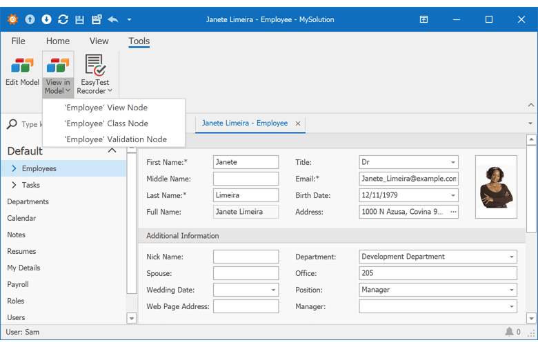
#Security
FREE OFFER - .NET App Security API (Role-based Access Control)
Registered DevExpress users are entitled to a free copy of .NET Role-based Access Control & User Authentication API powered by Entity Framework (EF Core) and DevExpress eXpress Persistent Objects ORM (XPO).
To download your free copy, please verify your contact information and click Register on the following web page: https://www.devexpress.com/security-api-free.
Middle Tier Application Server for .NET 5 (CTP)
Our Solution Wizard can now create a Middle Tier application server for an XPO-based .NET 5 WinForms application.
Web API Backend Service (CTP)
Our new Web API backend service (Swagger: OpenAPI) allows you to reuse XAF application data, logic, and modules within non-XAF apps. The Solution Wizard adds the Web API service to new Blazor applications and allows you to add it to existing Blazor apps.
To test an application, create a new XPO-powered Blazor project, run the application, and navigate to https://localhost:44318/swagger/index.html.
We've incorporated this functionality within XAF's MainDemo Blazor application. The demo app is installed in the following folder: %PUBLIC%\Documents\DevExpress Demos 21.2\Components\eXpressApp Framework\MainDemo.Blazor
Documentation
#WinForms UI
Enhanced Mask Configuration in the Model Editor
The Model Editor now uses the DevExpress WinForms Mask Settings Editor.
Note: We have disabled the EditMask and EditMaskType properties.
Documentation
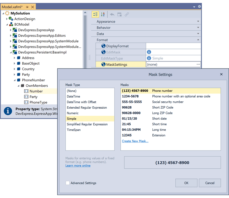
#Data Grid
Our .NET MAUI Data Grid is a high-performance data editing/data shaping component with dozens of high-impact features so you can easily display/manage information on mobile platforms. Integrated features include:
- High-Performance / Large Dataset Support / Smooth Scrolling
- Auto Generated Columns
- Multiple Data Type Support (Text, Numeric, Date, Image, and Boolean)
- Template Column
- Multi-Row Cell Layout
- Auto Row Height
- Fixed Columns
- Multi-Column Sorting
- Data Summaries, Grouping and Filtering API
- Inline Data Editing & Edit Form
- Pull To Refresh
- Load More (Infinite Scroll)
- Swipe Support
- Row Drag&Drop
- Templates for UI Elements (column header, group row, group row caption, group summary, total summary, and swipe item)
- Appearance Customization
- Dark and Light Themes
#Charting
Our .NET MAUI Chart control ships with a comprehensive collection of 2D graphs and includes dozens of UI customization and data analysis options. Built-in chart types/features include:
- Financial Charts
- Area, Bar, Line, and Spline Charts
- Point and Bubble Charts
- Pie and Donut Charts
- High-Performance Real-Time Data Updates
- Smooth Navigation and Zoom
- Series and Point Selection
- Point and Segment Colorizers
- Multiple Axes / Tooltips
- Crosshair Cursors
- Dark and Light Themes
#Collection View
The DevExpress .NET MAUI Collection View displays data item collections. Features include:
- Templates for Data Items and Group Headers
- Vertical and Horizontal Scrolling
- Item Drag and Drop (Reorder Items)
- Data Sorting, Filtering, and Grouping
- Pull to Refresh
- Load More (Infinite Scroll)
- Single and Multiple Item Selection
- Swipe Gestures
- Dark and Light Themes
#Data Editors
Our .NET MAUI Data Editors library includes the following UI components:
- TextEdit
- PasswordEdit
- MultilineEdit
- ComboBoxEdit
- AutoCompleteEdit
- NumericEdit
- DateEdit / TimeEdit
- CheckEdit
- SimpleButton
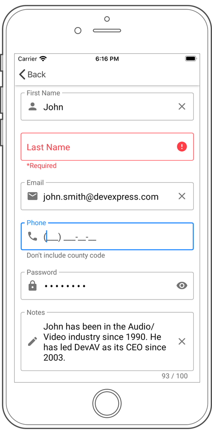
#Scheduler
.NET MAUI Scheduler component ships with the following features:
- Day, Week, Work Week and Month Views
- Recurring Appointment Support
- Appointment Editor
- Event Reminder API
- Time Zones
- Styles and Templates
- Dark and Light Themes
#Navigation Controls
Our navigation components allow you to organize UI elements more effectively and improve overall usability.
The DevExpress .NET MAUI TabView and TabPage help organize and divide content into meaningful sections (and maximize the use of available screen space). The Drawer View and Drawer Page help deliver intuitive user experiences. The Drawer can be permanently visible or opened and closed by tapping its navigation menu icon.
Documentation | TabView Demo | TabPage Demo | Drawer View Demo | Drawer Page Demo
#Chips for .NET MAUI
Chips are small but highly functional visuals that allow users to make selections, filter content, input tokens, or trigger actions. In this release, we supported the following chip types:
- Action chips are like compact buttons and allow users to invoke an action related to primary content.
- Filter chips allow users to select multiple options from a set. You can use filter chips to replace toggle buttons/checkboxes or display filters.
- Choice chips allow users to select a single option from a set. Choice chips are best used when only one choice is possible and can be a good alternative to radio buttons and combo boxes.
- Input chips display user input as a single piece of information (may be validated, deleted, or modified). Input chips can be used to enter entities like places, activities, roles, tags, or email addresses.
Chips Demo
#Data Form
Our MAUI Data Form allows you to create registration forms, employee profiles, shipping address information, and everything in between. The Data Form control automatically generates editors for each field in the business object and displays them one below the other on screen.
Data Form Demo
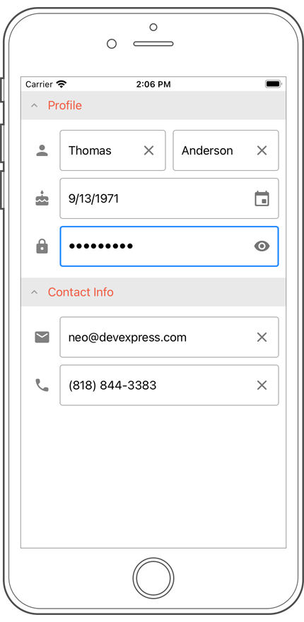
#Popup
Our new .NET MAUI Popup component acts as a dialog or dropdown (when you attach it to a view visible on-screen). The Popup's features include:
- Horizontal & Vertical Alignment
- Configurable Position on the Screen
- Fade-in / Fade-out Animations
- Shadow Configuration Options, and more...
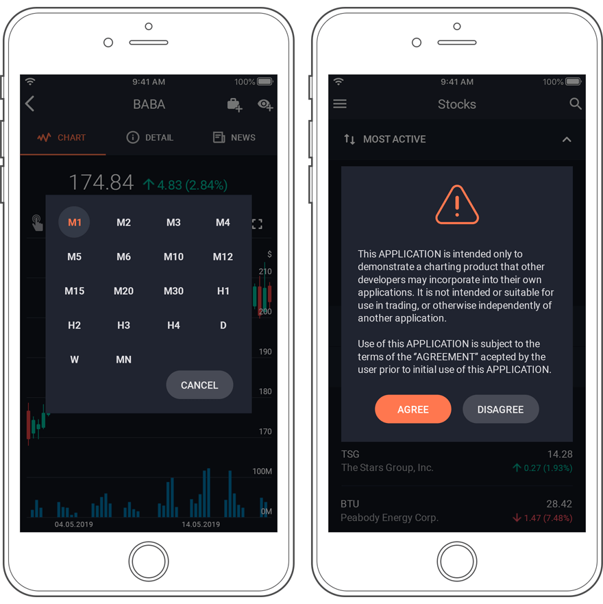
#Project Templates
You can now use our .NET MAUI Project Templates for Visual Studio 2022 (to quickly generate your new cross-platform .NET MAUI app). Your project will include references to all DevExpress .NET MAUI NuGet packages and will register all required handlers (the main page will also declare XAML namespaces for all DevExpress controls). To begin, simply create a new .NET MAUI project in the following dialog:
Documentation
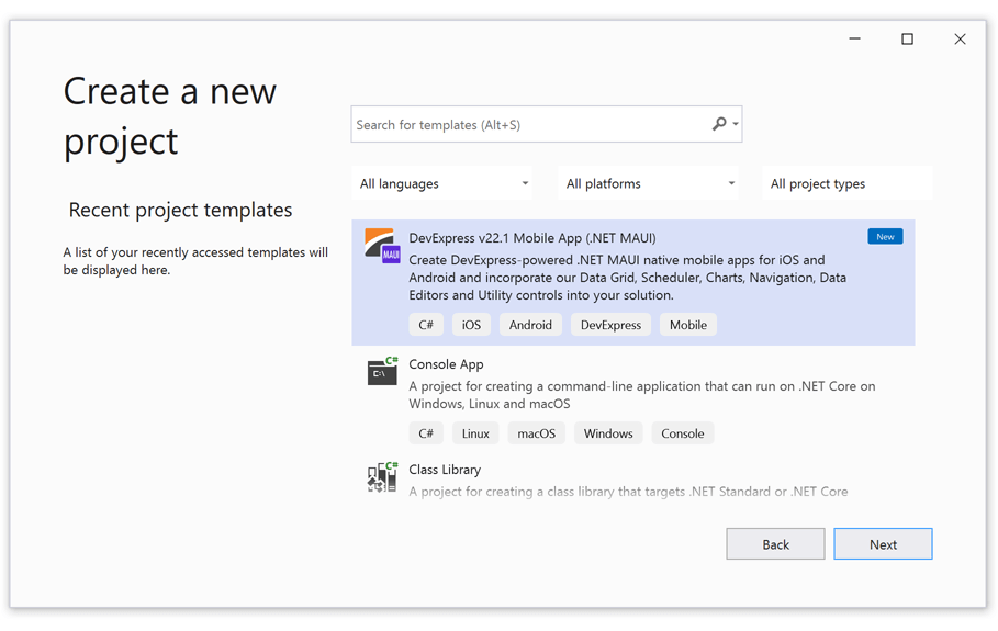
#Chips
Chips display information in a discrete and compact form. They allow users to select, filter content, or trigger actions. The following chip types are supported:
Input chips display user input as a single piece of information (may be validated, deleted, or modified). Input Chips can be used to enter entities like places, activities, roles, etc or used to enter tags or email addresses.
Choice chips allow users to select a single option from a set. These chips are best used when an only one choice is possible. For example, use Choice chips to select the size of an item placed in a shopping cart. Choice chips can be a good alternative to radio buttons and combo boxes.
Filter chips allow users to select multiple options from a set. You can use Filter chips to replace toggle buttons/checkboxes (they display information in a more compact and clear form) or use Filter chips to display filters applied to content.
Action chips are like compact buttons and allow users to invoke an action related to primary content. Example: An action chip may be used to display documents attached to emails.
#Visual Studio Project Templates
v21.2 ships with the following project templates for Xamarin-powered applications:
DevExpress Xamarin Templates also include Sign Up, Log In, About, and other auxiliary pages. These templates can be configured to address business needs and requirements. (Documentation)
You can download our Xamarin Templates from the Visual Studio Marketplace:
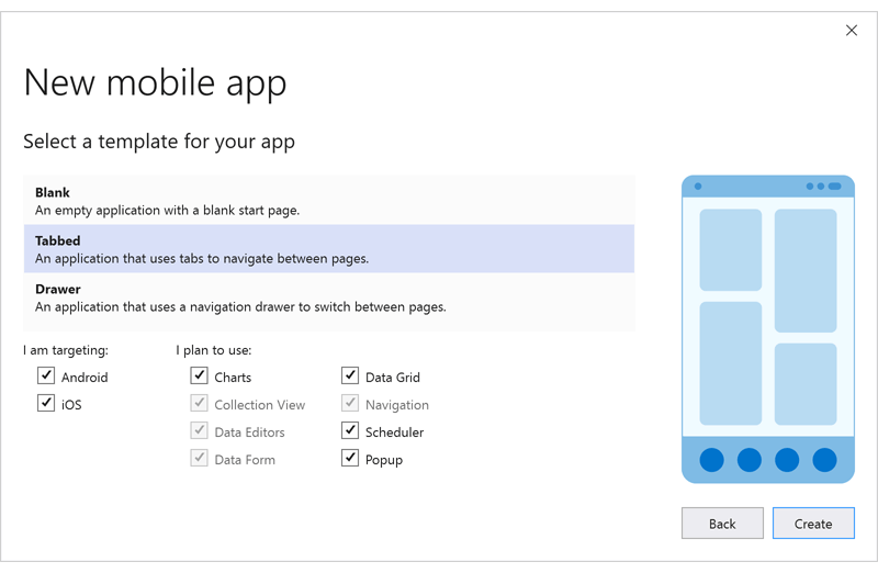
#Miscellaneous Enhancements
-
A new 'EditBase.CharacterCasing' property: Automatically converts characters entered into an editor to lowercase or uppercase.
-
You can now define a template for ComboBoxEdit items (SelectedItemTemplate, ApplyItemTemplateToSelectedItem).
- Our data grid and collection view can automatically reduce their overall size (the minimum space needed for data items). This option can be useful when grid/collection view content size is less than the size of available space (parent container or screen).
#Visual Studio 2022 Support
CodeRush now installs and runs in Visual Studio 2022. You can use one of the following ways to add the CodeRush extension to Visual Studio 2022:
- Visual Studio Marketplace
Download the "CodeRush for VS 2022" extension from the Visual Studio Manage Extensions window and run the VSIX installer to install CodeRush. - Download Manager
If you already have a CodeRush subscription, you can download a registered version using the DevExpress Download Manager and install with the .exe installer.
Blog Post
#Performance Enhancements
Improved Startup Performance
We have improved startup performance by optimizing our internal services. We also decreased the time required to open CodeRush windows and visual elements.
Blog Post
Improved Typing Performance
Typing performance is faster in the following scenarios: editing documents, working with files and using Rich Comments. We've reduced the time required to expand code templates (the first time), and to show the “Paste Image” context menu. We've also improved performance when CodeRush applies code cleanup on saving a document or when CodeRush checks the availability of the Code Cleanup action on the toolbar.
Optimized Memory Use
We've reduced memory consumption in the “Jump to Symbol” feature and the XAML engine used in refactorings, navigation, code analysis, and other CodeRush features for projects containing XAML files.
Optimized Tool Windows
The Code Coverage and References tool windows now load faster when run the first time. We've also decreased the member graph build time.
Optimized Debug Visualizer
The Debug Visualizer is now faster when stepping over, into, or out of code blocks.
#Code Places - Reorder Members with Drag & Drop
The 'File Places' tab of the Code Places window now supports drag & drop to quickly reorder members for the opened file.
Documentation
#Unit Testing
Test Runner
The Unit Test Runner now shows white spaces and line breaks in test run results (Documentation).
The Test Runner can also display "pretty-formatted" names for xUnit test cases in .NET Core projects.
To enable this functionality, check the "Collect tests from assemblies when opening a solution and rebuilding projects" option on the Unit Testing | Test Runner options page:
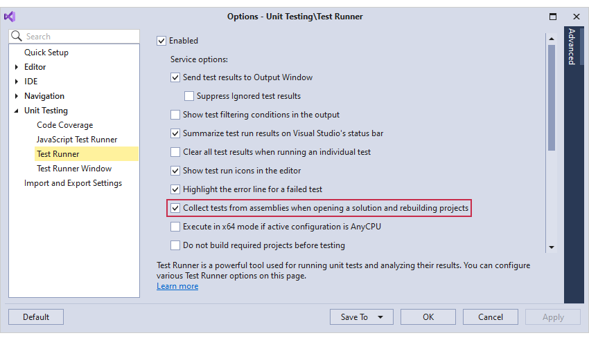
Documentation
#Refactorings
Move File to Folder
The "Move File to Folder" refactoring moves a file to a folder matching the current namespace. If a corresponding folder does not exist in the solution, this refactoring will create one.
Documentation
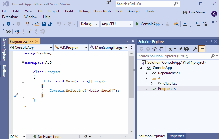
Move All Types to Files
The "Move All Types to Files" refactoring allows you to quickly move all types (or only selected types) contained in one file into new separate files (one file per type). Each file will have the same name as the type it contains.
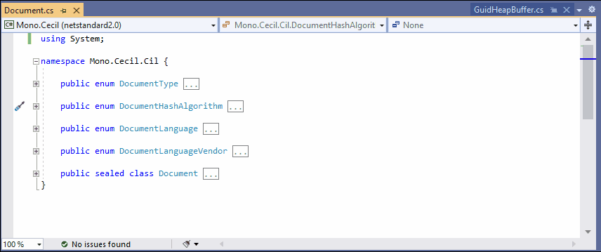
You can also run this refactoring from the Solution Explorer, targeting a selected project, folder, or folders containing source files with multiple types inside.
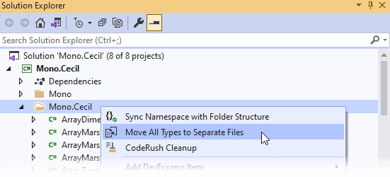
If you want to apply the "Move All Types to Files" refactoring during code cleanup, enable the corresponding options for the 'Move types to separate files' rule on the Editor | C# (Visual Basic) | Code Cleanup options page.
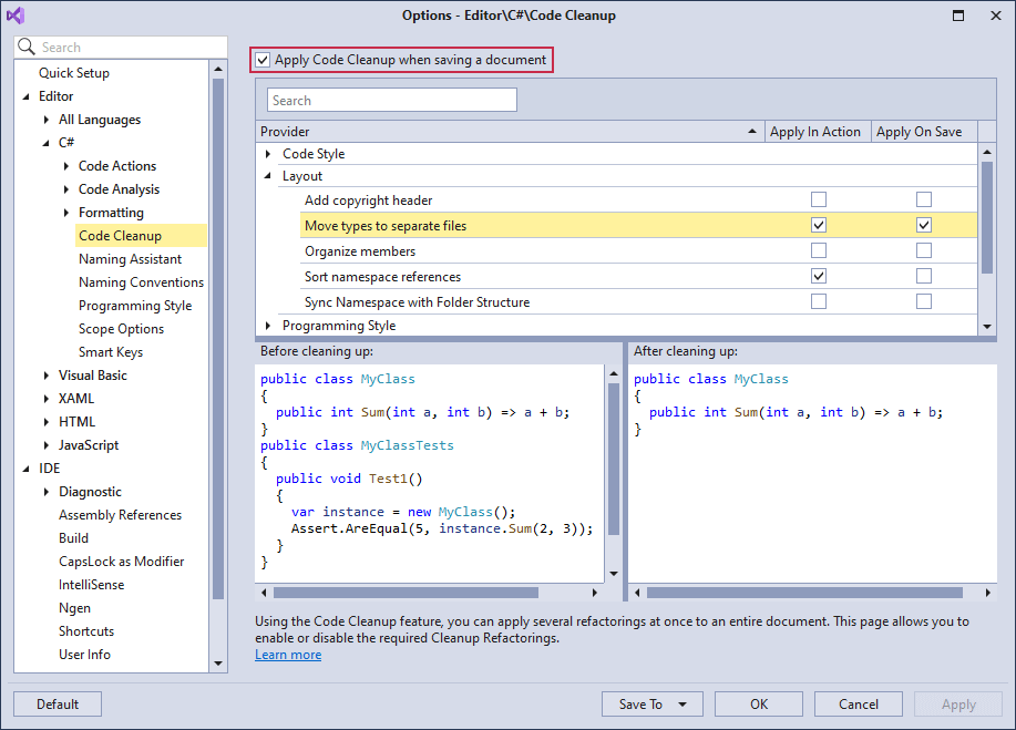
Documentation
#Organize Members
You can now create rules for properties with backing fields to group and sort them with the following criteria:
Documentation
#Rush Snippets Update for VS Code
The latest Rush Snippets release introduces the following features:
New snippets for JavaScript projects.
React Hooks
Rush Snippets now supports snippets for the following hooks: useState, useEffect, useContext, useReducer, useCallback, useMemo, useRef, useLayoutEffect, and useDebugValue.

Advanced imports generation.
With improved import generation, Rush Snippets adds any needed imports to the top of the file where they belong.

InstallBlog Post
#Download Your Copy Today
Once you're ready to upgrade, simply login to the DevExpress Client Center and download the appropriate installer to proceed.
Download and InstallFree Trial
#New Chart Control (Early Access Preview)
The new DevExpress VCL Chart Control is a powerful tool that allows you to transform data to its most concise and readable visual representation.
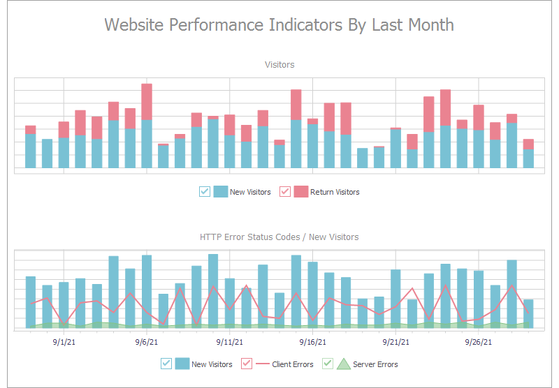 VCL Chart Control - Multiple Diagrams
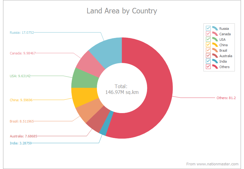 VCL Chart Control - Donut Series
 VCL Chart Control - Pie Series
 VCL Chart Control - Line Series
 VCL Chart Control - Stacked Bar Series
 VCL Chart Control - Stacked Area Series
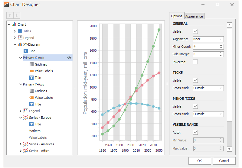 VCL Chart Control - Built-in Chart Designer
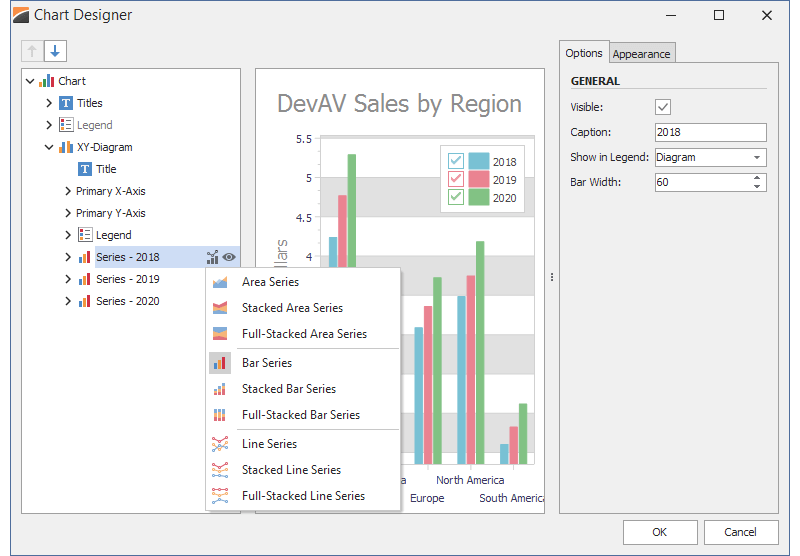 VCL Chart Control - Series Type Change
The Chart Control Early Access Preview ships with the following features:
- DirectX, GDI+, and GDI support
- Eleven view/series types: Area, Bar, Line, their stacked and full-stacked versions, Pie, and Donut
- Ability to create any number of diagrams and display any number of series/series points in each diagram
- Data-aware and Unbound data binding modes
- Numerous customization options, including the built-in Chart Designer (available at both design and runtime)
Blog Post
Note: The VCL Chart Control Early Access Preview is available for all customers with an active DevExpress VCL Subscription. It is not available in the VCL Subscription trial version.
#Windows 11 Support - Rounded Corners
We have updated our UI to better match the Windows 11 user experience. The windows and dialogs for your DevExpress-powered VCL apps can now include rounded corners to match the look and feel of Windows 11. We made these rounded corners available even when using previous versions of Windows.
You can apply the desired corner style via a new 'FormCorners' option in a skin controller. The 'dxSkinFormCorners' global variable in the source code allows you to select the corner style used by default.
#Open/Save Picture Dialogs
This release ships with new skinnable replacements for the standard VCL Open/Save Picture dialogs. Our dialogs can preview images from a number of different formats, including SVG.
 VCL Open Picture Dialog - Office 2019 White
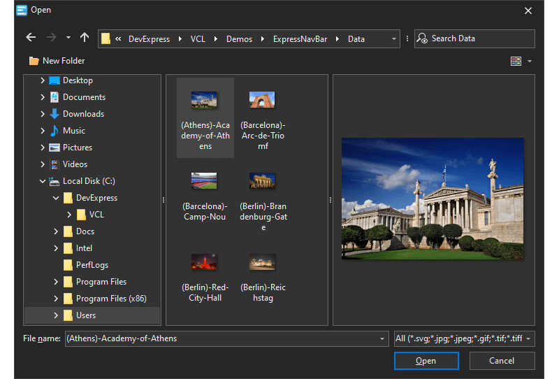 VCL Open Picture Dialog - Office 2019 Black
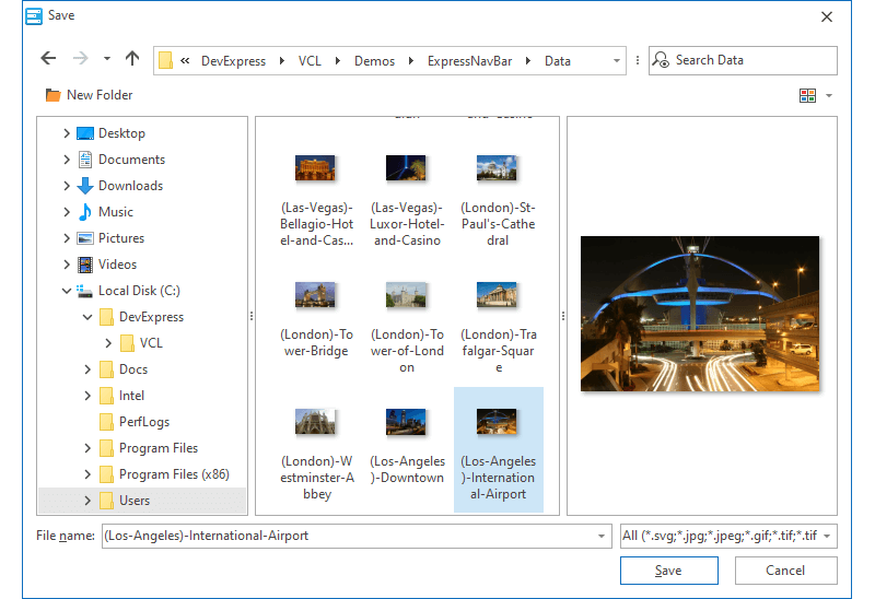 VCL Save Picture Dialog - Office 2019 White
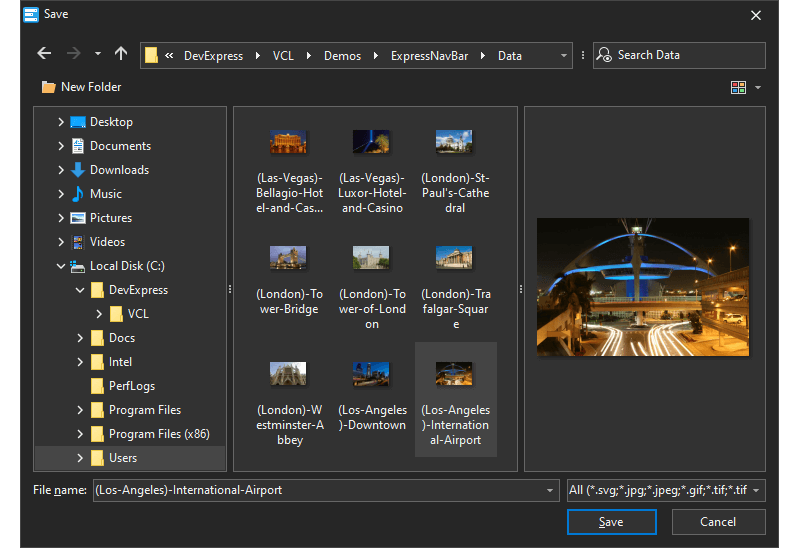 VCL Save Picture Dialog - Office 2019 Black
#Message Dialog Boxes
We have added skinnable counterparts for the system message dialog boxes so you can keep the appearance of message boxes consistent with other DevExpress VCL controls. The new message boxes also allow you to format their text with the BBCode-inspired markup tags introduced in v19.2. Our VCL controls now use these new message boxes by default.
Methods that invoke the new message dialog boxes are fully API-compatible with those found in the standard VCL and Win32 APIs. If you prefer using standard message dialog boxes in your application, set the 'dxUseStandardMessageDialogs' global variable to True.
#New Shell TreeView and Shell ListView Controls (CTP)
The new DevExpress VCL TdxShellTreeView and TdxShellListView controls are designed to replace our TcxShellTreeView and TcxShellListView controls. The new controls implement the same functionality, offer improved performance, and support the following features:
- Per-pixel scrolling
- Hybrid, touch-friendly, and classic scrollbars
- Full DPI awareness
- Can use all DevExpress skins
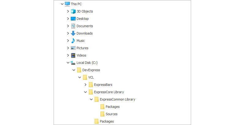 VCL Shell TreeView Control - Office 2019 White
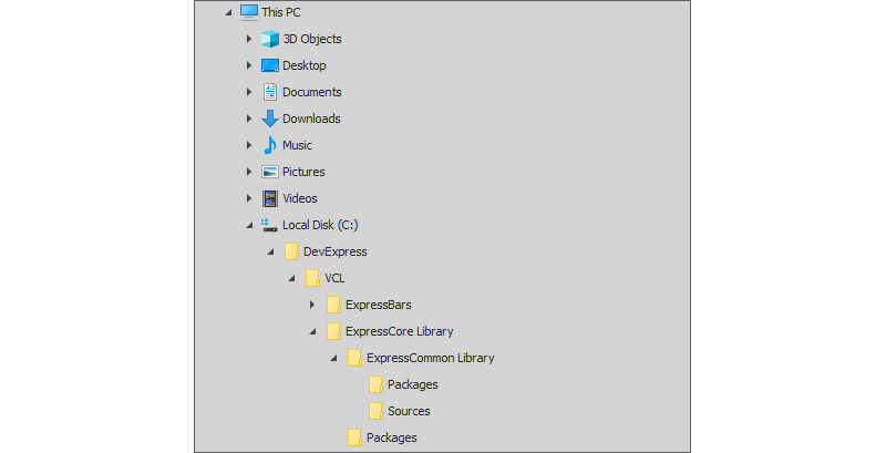 VCL Shell TreeView Control - Office 2016 Dark
 VCL Shell TreeView Control - The Bezier
 VCL Shell ListView Control - Office 2019 White
 VCL Shell ListView Control - Office 2016 Dark
 VCL Shell ListView Control - The Bezier
#Open/Save Dialogs
File Preview
Our file dialogs can now include a preview pane. This pane shows either the file content or the file thumbnail depending on system and dialog settings.
File Search
Users can now enter a query in the Search box to find a file whose name or content matches the query.
Favorites/Quick Access
With this release, our dialogs show Favorites (known as Quick Access in Windows 10 or later) much like those found in Windows File Explorer.
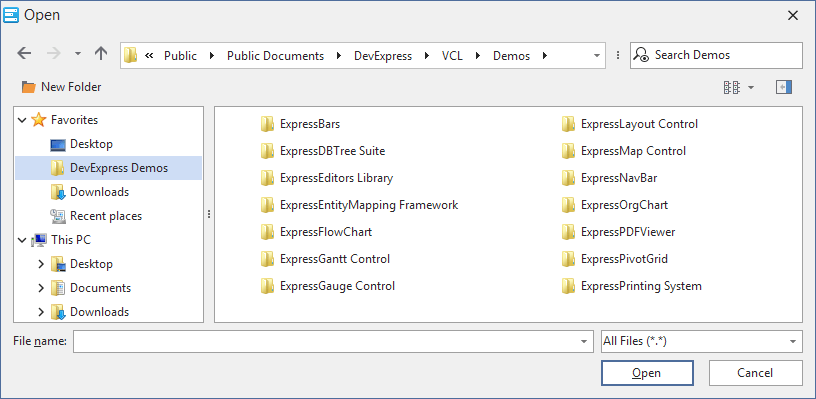
#Grid Control
New Fixed Column/Band Modes in Table and Banded Table Views
You can now anchor columns to the left or right edge of the VCL Table View as you do in the Banded Table View. This release also introduces a new fixed mode that allows Table View columns and Banded Table View bands to move freely to the right, but dock to the left when you scroll the View to the right.
#Gantt Control
Baseline Support
The DevExpress VCL Gantt control now supports baselines – data snapshots that allow users to track how well the actual project progress matches the planned one.
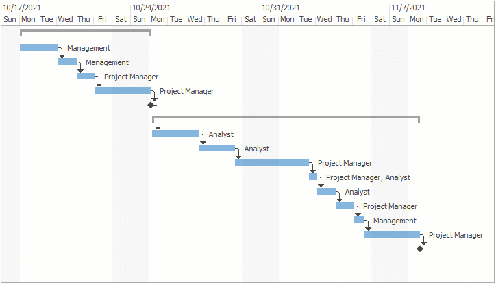
Miscellaneous Enhancements
Our Gantt control ships with the following new features/capabilities:
- Export to SVG, PNG, BMP, TIFF, JPEG, EMF, WMF, and GIF
- Ability to control task and dependency operations in the chart area
- Popup menu customization
- Task and dependency color customization
- Read-only mode
#PDF Viewer
Support for Interactive Forms and the Field Edit Functionality (CTP)
With this release, the VCL PDF Viewer allows users to edit interactive fields in documents.
An extensive form-based API allows you to:
- Import and export field values in FDF, XFDF, XML, and TXT formats.
- Populate interactive fields programmatically.
- Flatten interactive forms or individual fields and save the result.
#Data Editors and Controls
Microsoft UI Automation (UIA) Support
We first introduced accessibility support in v20.2, and have now extended it with UIA support in the editors and controls shipped with the ExpressEditors Library. Every UI element now creates a UIA tree node that exposes the UI structure and related information to accessibility applications. A screen reader such as Microsoft Narrator can read these nodes when a user navigates between UI elements.
#TreeView and ListView Controls
This update marks the official release of our TdxTreeViewControl introduced in June 2021 as a community technology preview (CTP). TdxListViewControl is available as a beta.
#Image List Editor Enhancements
Clipboard Operations
You can cut/copy/paste one or more images into or between the Image List Editors. Multiple images are combined into one when cut or copied to the clipboard.
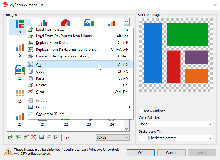
Color Palette-Based Preview for SVG Images
The Image List Editor allows you to apply any color palette available in the active skin to the previewed SVG image.
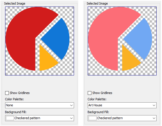
Locate Source Images in the Icon Library
With v21.2, you can load an image from the DevExpress Icon Library to the image list or the Image Picker's Selection box, and later use the image's context menu to return to the image's location in the Library.
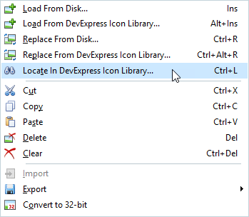
#Miscellaneous
- The VCL Layout Control improved its design-time performance in complex layouts, up to 20 times faster.
- Our Shell Breadcrumb control now allows you to load previously used paths from the system and navigate to files via the relative paths (for instance, 'Downloads', 'Libraries\Documents', etc.)
- You can reverse the scroll direction in ScrollBar controls.
- This release adds support for the following SVG elements: image, pattern, and radialGradient.
- Use the new 'OptionsBehavior.ItemHotTrack' property to specify if the Gallery control tracks mouse movements across items.
#.NET Core Desktop Product Installer Has Been Deprecated
With v21.2, our standalone .NET Core Desktop Product Installer has been removed from our distribution and no longer available via the DevExpress Download Manager/Evaluation webpage. If you need to install our products for .NET Core, please use our Unified Component Installer instead.
#Portable PDB Support for Windows and Linux Debugging
We added Portable PDB Symbols to our v21.2 distribution. Unlike traditional symbol files (PDB) for Windows, portable PDBs can be created and read across all supported .NET Core platforms.
#NuGet Authentication with Personal Access Tokens
We added support for NuGet authentication using a token or an authorization key (especially useful for GitHub Dependabot, GitHub Actions, and Azure DevOps).
When using an authorization key, use https://nuget.devexpress.com/api as the package source.
Login and password authentication example:
"nuget sources add -name DevExpress -source https://nuget.devexpress.com/api -username DevExpress -password {TOKEN}"
For more information, please review the following help topics:
Blog Post