#New Sunburst Control
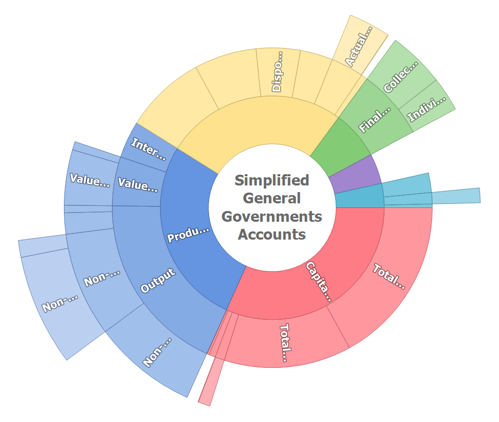
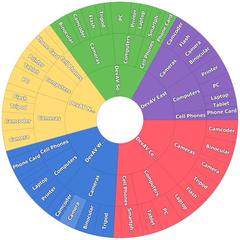
This release includes a new WinForms Sunburst Control - designed to visualize hierarchical data in an elegant and compact manner. Its features include:
- Ability to represent hierarchical data sets and flat data tables
- Built-in coloring algorithms
- Advanced highlight behaviors
- Tooltip support
Demo Blog Post
#Charting
Pane Layout Enhancements
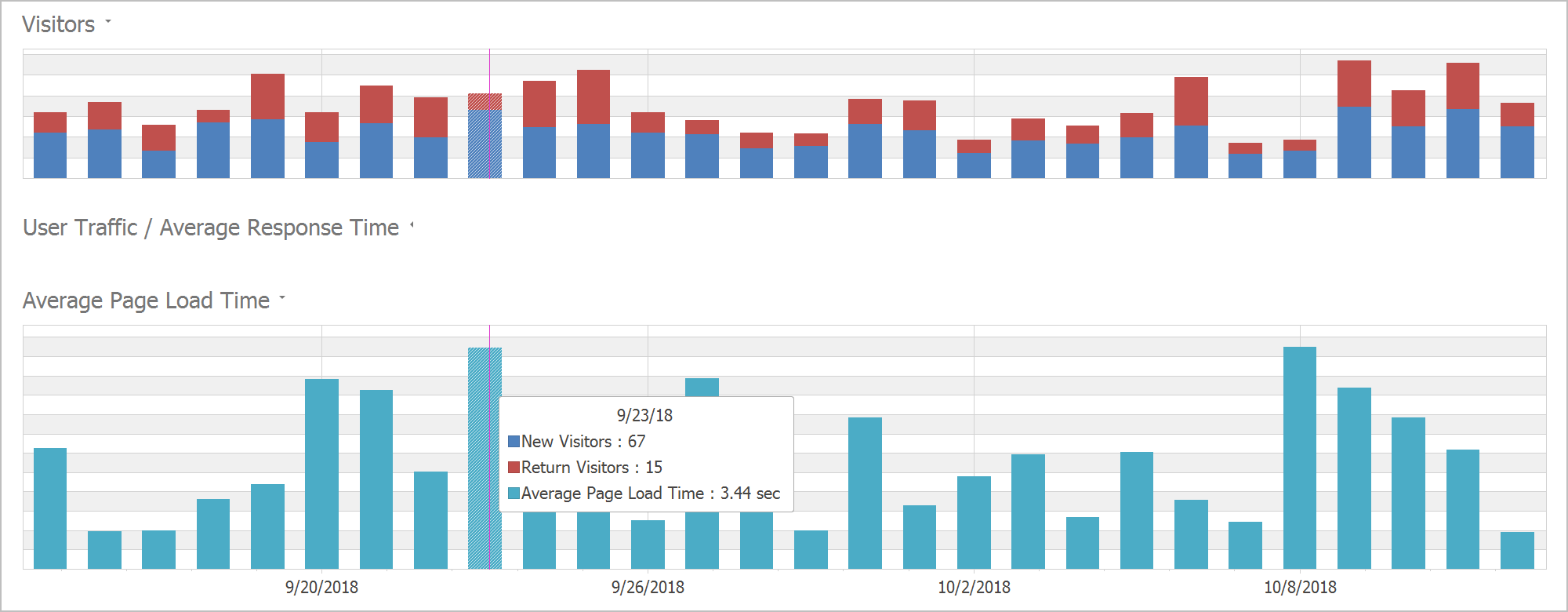
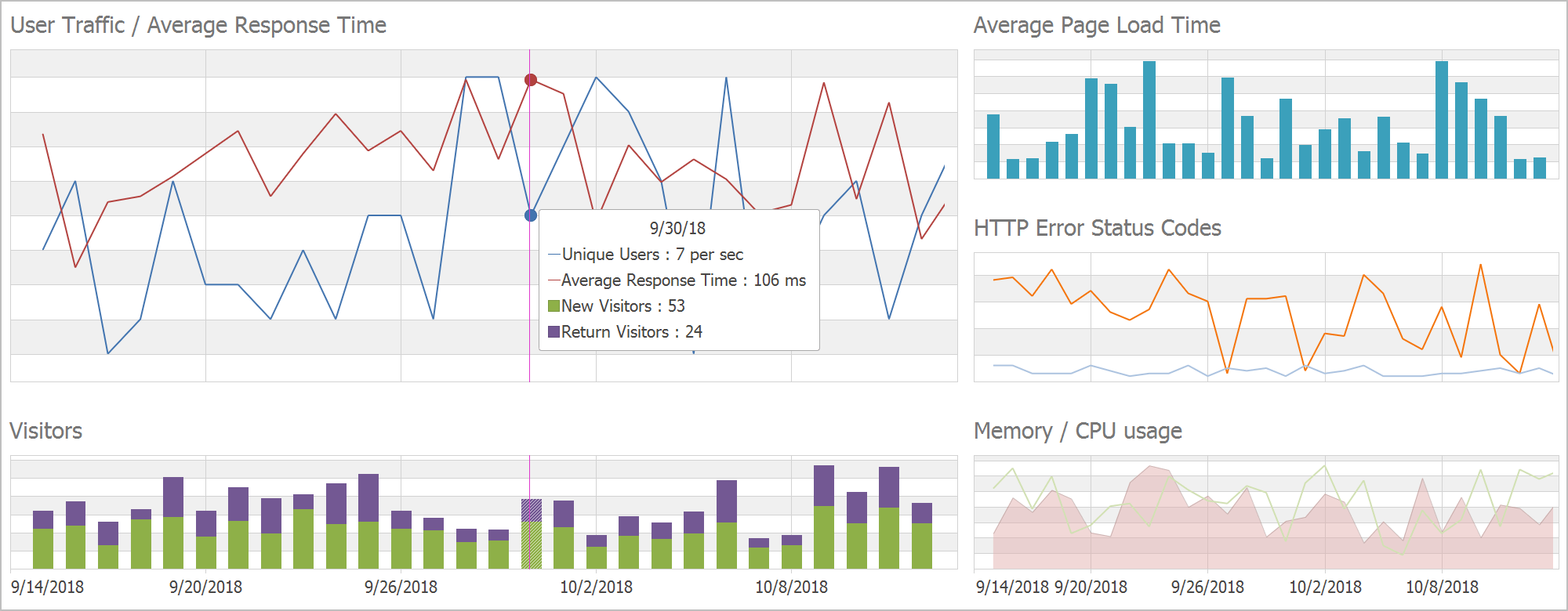
You can now add an individual title for each pane and hide a pane by clicking its title. Panes can be displayed using a grid layout.
Demo
Drill Down Chart
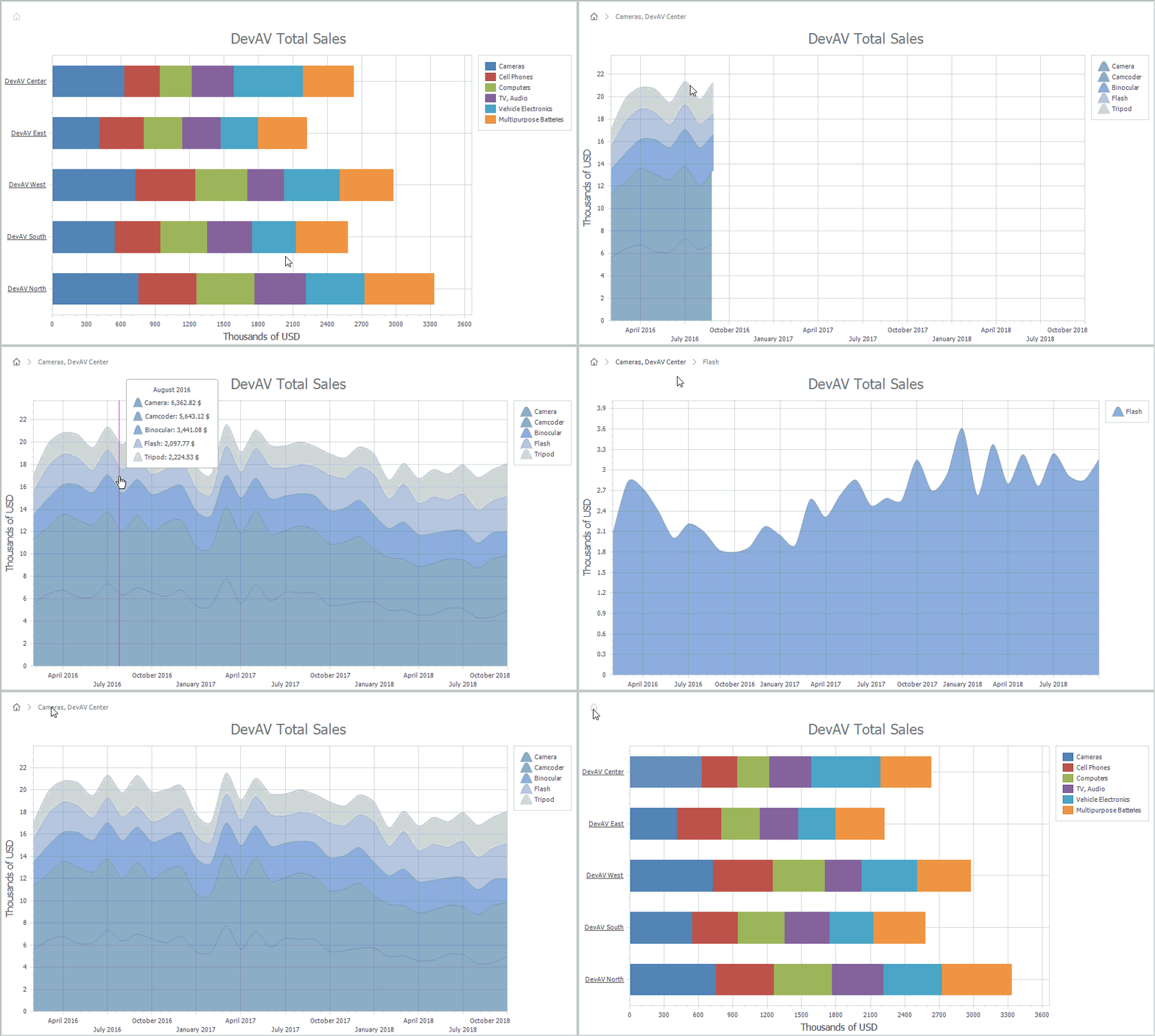
Our WinForms Chart Control now supports nested Series Templates - allowing you to implement drill-down enabled charts with ease. You can create endless drill-down levels and use the control's integrated Breadcrumb navigation option to move across your data hierarchy.
Demo Blog Post
Performance and Memory Usage Improvements
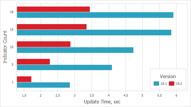
This release includes improved performance and memory consumption when displaying a large number of data points:
- Scatter Point Rendering
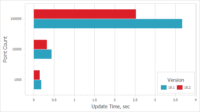
- Financial Series Rendering
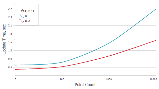
- Indicator Calculation
Zooming and Scrolling Enhancements
Our WinForms and WPF Chart controls now support keyboard navigation. New settings allow you to configure hotkeys. Hotkeys can also be used to affect the behavior of mouse buttons when zooming in/out or zooming to a rectangle.
With this release, end-users can zoom a specific axis element using the mouse wheel when the mouse pointer hovers over an axis label (see the animation below).
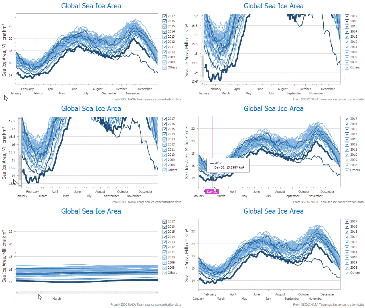
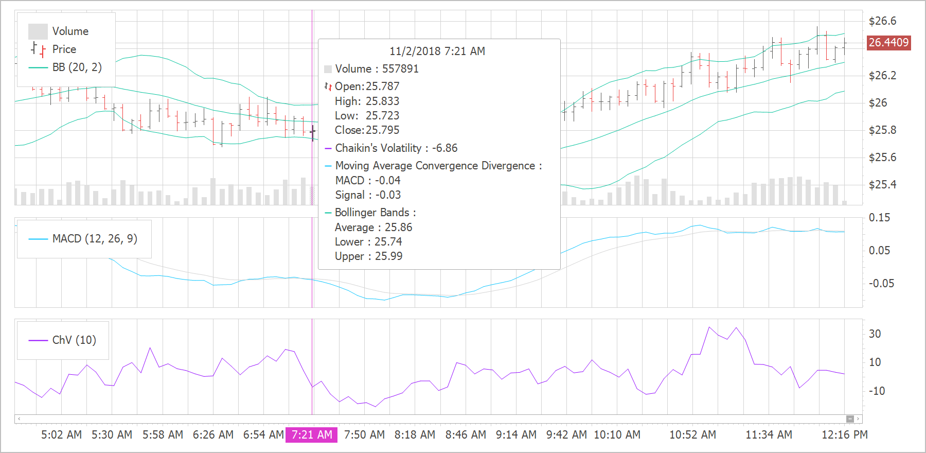
Crosshair Label Can Display Indicators
The Chart Control's Crosshair Cursor can now display Technical Indicators. We've also extended the Indicator's API and made it similar to the Series API. All settings available for a series are now available for an indicator.
Demo
#Data Grid
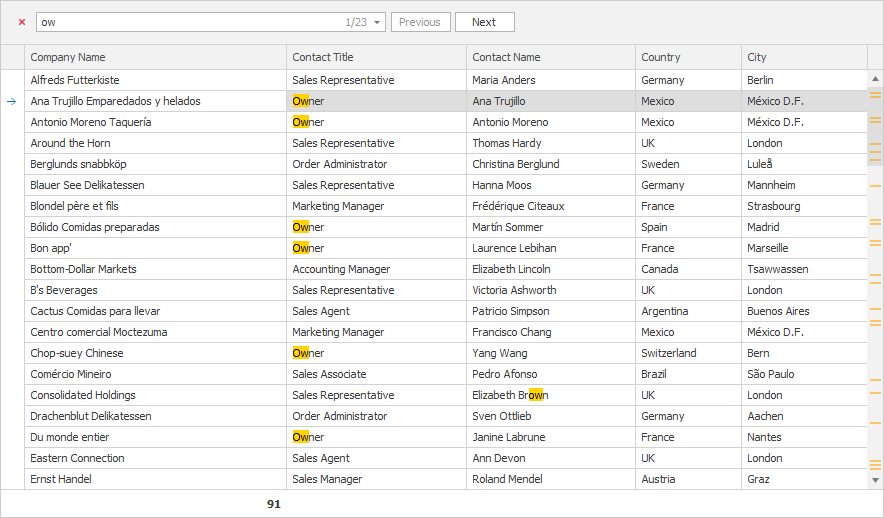
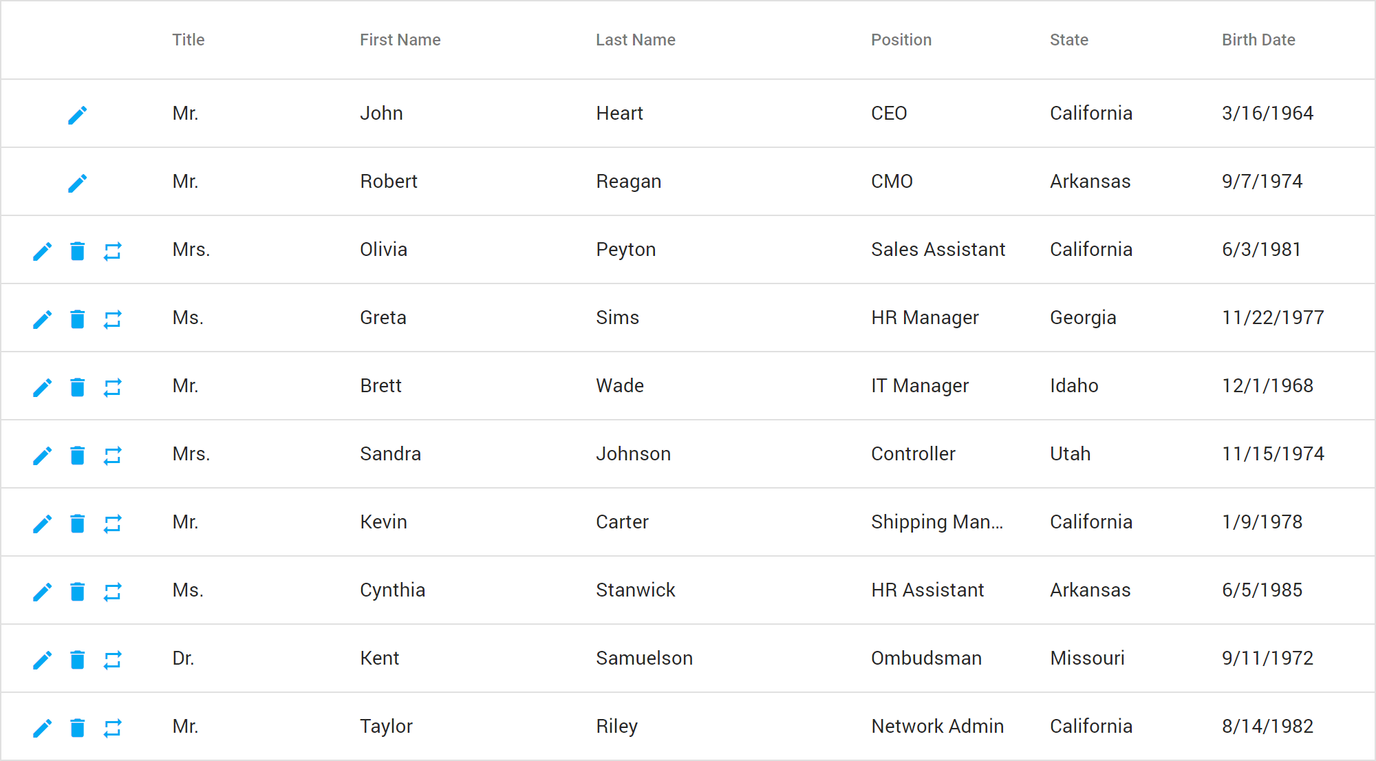
Find Panel - Search Mode
The Grid's Find Panel ships with a new Search mode. When used, search results are highlighted within the view and scrollbar.
Demo Documentation Blog Post
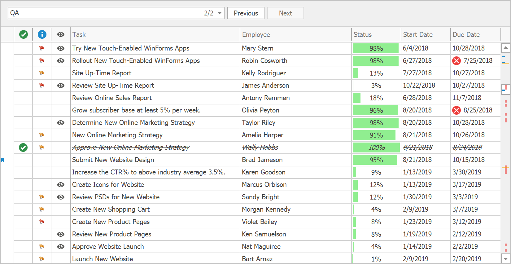
Scrollbar Annotations
Inspired by Visual Studio, our WinForms Grid Control now supports scrollbar annotations - colored markers arranged along the vertical scrollbar. Scrollbar annotations allow you to visualize:
- cells with validation errors;
- focused/selected record range;
- records that match search results;
- record changes and custom data.
Demo Documentation
Excel-inspired Group Filters
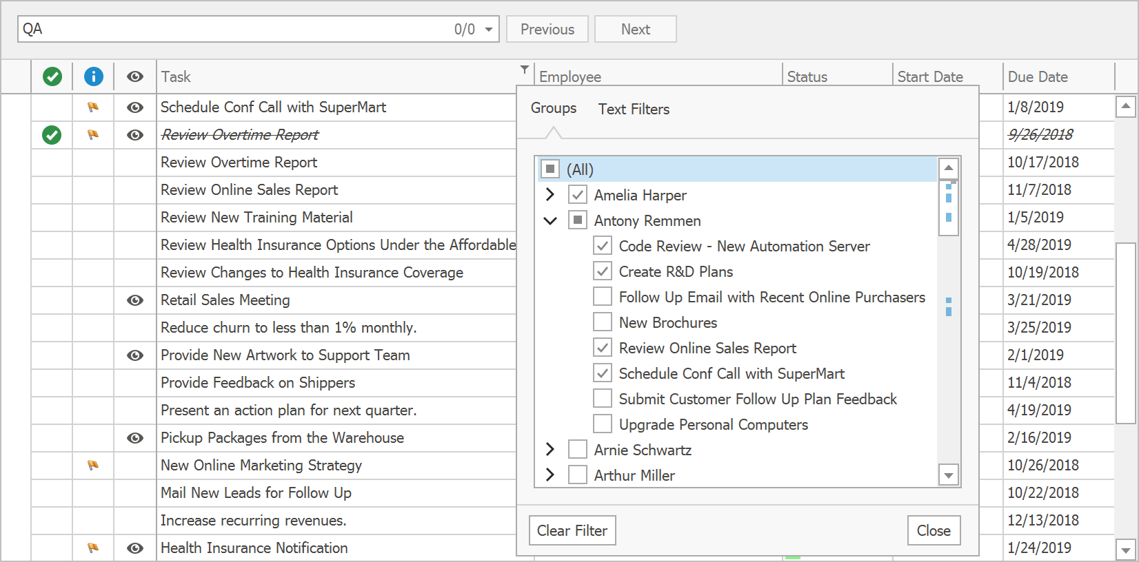
Excel-inspired group filters were first introduced in May 2018 for our WinForms Pivot Grid and TreeList controls. With this update, we've added this capability to our WinForms Grid control. Filter dropdowns can now group filter items from two or more columns, and present results as a hierarchical checked list.
Demo Documentation
#Diagram
Pan and Zoom Window
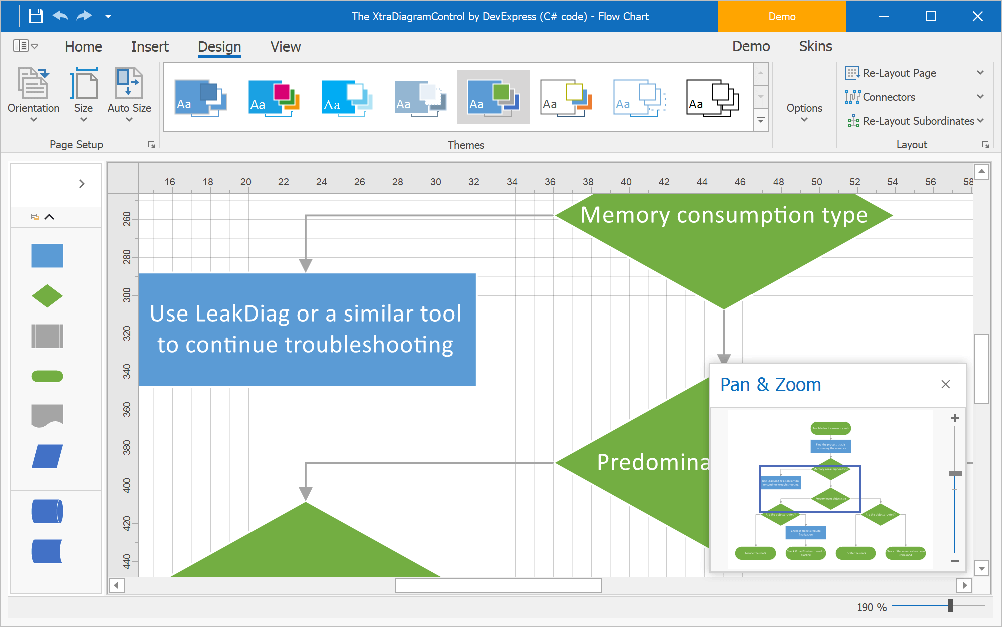
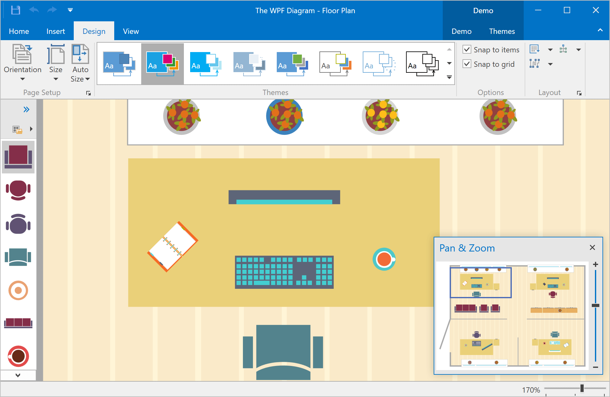
You can now pan and zoom by using the Diagram Control's Pan and Zoom window. The blue box indicates the region of the page that is shown in the drawing window. Resize the blue box by dragging a side until it fits the area that you wish to magnify. To pan the diagram, drag the blue box over the section you want to view.
Demo Blog Post
Splitting the RightAngle Connector
When the DevExpress Diagram Control calculates routes for RightAngle connectors, it tries to find the closest route from start to finish. This can result in overlaps when multiple connectors originate from the same point. Many of you have asked us to deliver an alternative solution to help reduce confusion.
In v18.2, the Diagram Control allows you to split connectors and define the minimum acceptable distance between them.
Demo Blog Post
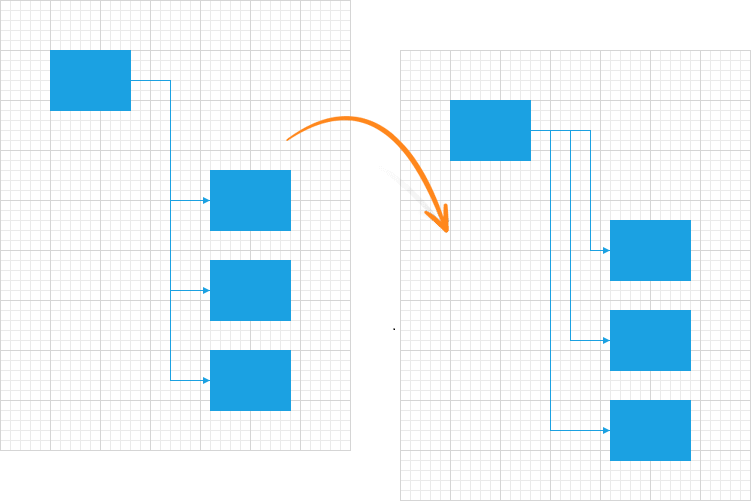
Diagram Viewer
With this release, you can switch to "view only" mode and disable all operations that can affect the diagram itself. New options allow you to define which operations are allowed and hide the rest.
Demo
Item Selection Modes
The Diagram Control's selection modes now include:
- None – Item selection is disabled.
- Single – Only one item can be selected.
- Multiple – Multiple items can be selected/deselected via the mouse.
#Editors
Calendar Control - New Fluent View
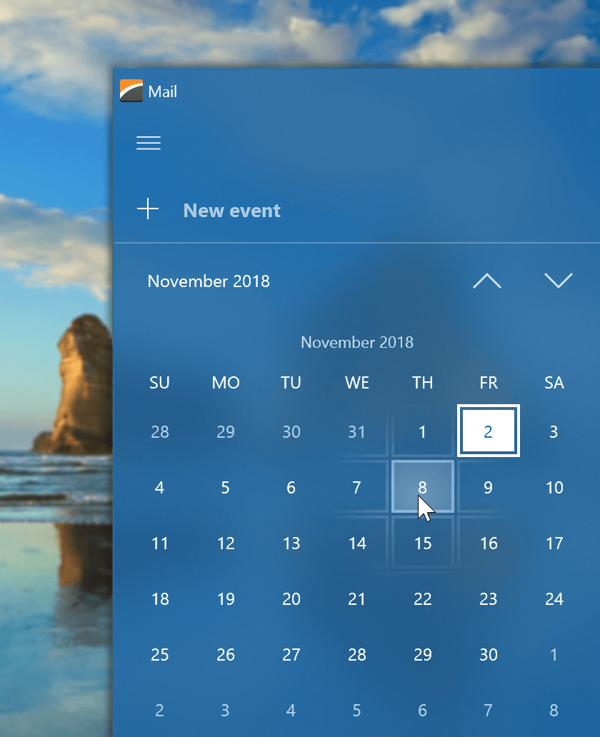
The new FluentUI View for our Calendar Control supports Acrylic and Reveal Highlight effects and allows you to mirror the appearance of the Windows 10 calendar.
Demo
CheckEdit - New SVG Check Styles
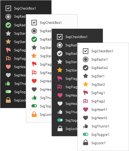
We have extended our CheckEdit check styles. New SVG check styles are more attractive and support all the benefits that come with the use of vector-based icons (scaling without quality loss, automatic color adaptation based on the current skin and palette).
Blog Post Documentation
Demo
Filtering UI Context Enhancements
-
Our ResetBinding/ResetBindings methods allow you to manually refresh editor values.
-
The AddField method allows you to add custom editors bound to desired data model fields.
-
Items can be customized in Filtering Events via the WithDataItems method. For instance, you can now assign custom HTML Text to display item images.
Demo Documentation
Scrollbar Annotation Behavior
Scrollbar annotations can be displayed in a list box control and indicate the following items' location:
- focused item
- selected items
- checked items (the checked list box control only)
- items corresponding to a search query (a search control should be attached to the list box control).
Supported controls:
- ListBoxControl
- ImageListBoxControl
- CheckedListBoxControl
Behavior options include:
- Type — a set of flags that specify the enabled annotation types
- Color — the annotation color (the default value depends on the current skin)
- Alignment — the annotation alignment (the default value depends on the current skin).
Documentation
#Navigation UI
Office Navigation Bar - Tab Navigation View
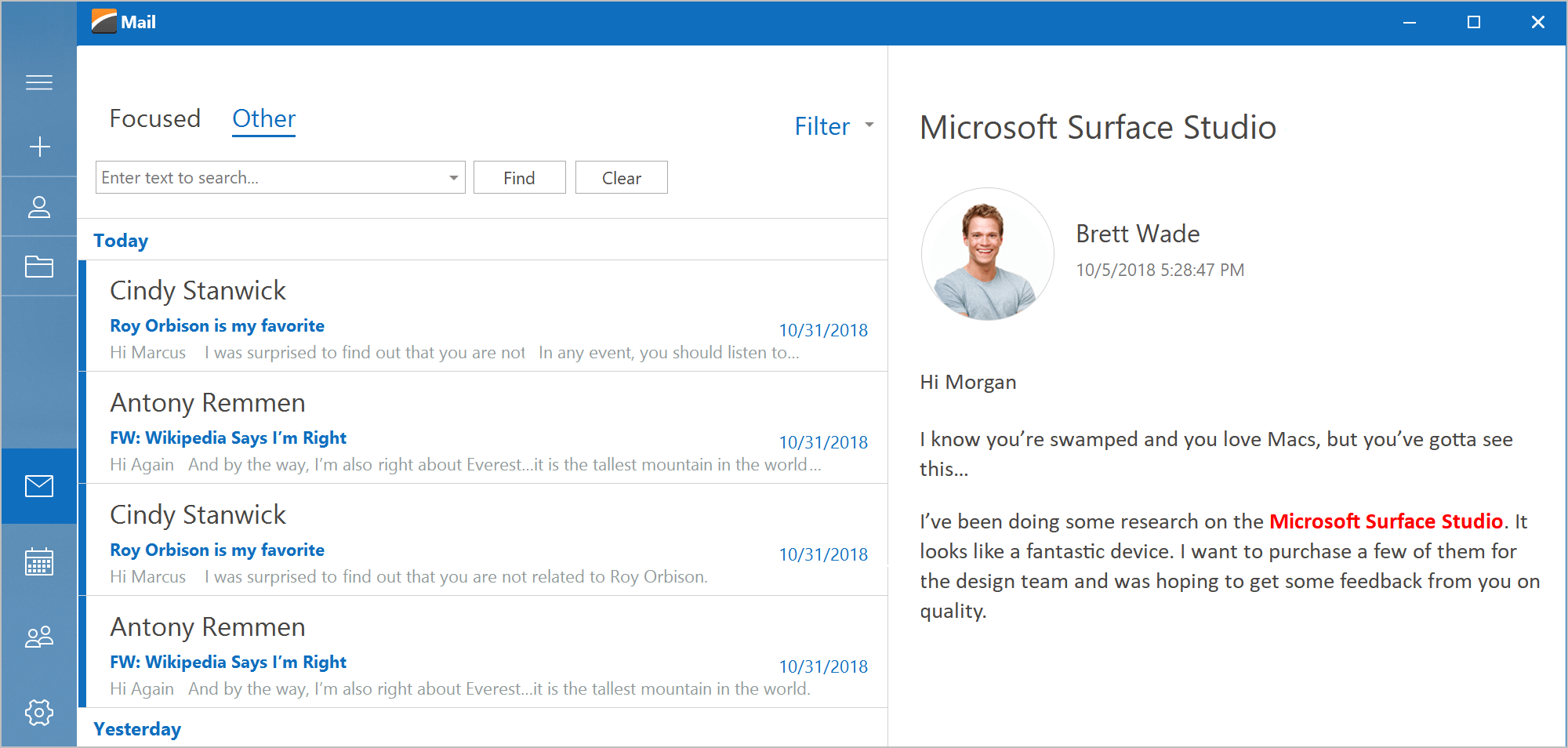
With this release, you can easily create tab navigation options like those found in Microsoft Outlook and Visual Studio – user experiences with a modern appearance and borderless tab headers.
Demo Documentation
NavBar to Accordion Converter
The DevExpress WinForms Accordion control extends the capabilities found in our NavBar control. If you are still using the NavBar control and want to replace it with our Accordion while preserving customization settings and paint styles, click the 'Convert to AccordionControl' smart tag. Note that event handlers are not converted. You will need to handle all item interaction events manually.
#PDF Viewer
DirectX Rendering
DirectX rendering was first introduced in May 2018 as a community technology preview (CTP). This update marks its official release. DirectX Rendering is now used as our default rendering engine.
#Pivot Grid
Unbound OLAP Fields
You can assign an OLAP Multidimensional Expression (MDX) to a PivotGrid field and create an Unbound Field for OLAP. You can also use the OLAPQueryData event to obtain an MDX query (used by the pivot grid to request data).
Performance Enhancements
We have improved the Pivot Grid's in-memory data processing engine and now support the following features in Optimized Mode:
- Custom Types
- Custom Totals
- CustomSummary event
- CustomGroupInterval event
- CustomFieldSort event
- Legacy TopN
- Summary Filter
- FileDataSource
- CustomUnboundFieldData event
- Case-sensitive data binding.
We've also added an OptimizeSummaryTypeCalculation option. Enable this option to accelerate data aggregation speed with int/float/double numbers in Optimized Mode.
In-Cell Data Editors
We continue to improve consistency across all our WinForms control libraries. With this release, our Pivot Grid will be a descendant of the EditorContainer class – this means you can assign editor Repository Items in the same manner as you would with our WinForms Data Grid, Tree List, and other data-aware controls. Invoke the Pivot Grid designer and switch to its “In-place Editor Repository” tab to create and modify individual editors. To assign these editors to data fields, go to the Fields section and specify a field's FieldEdit properties.
Miscellaneous Enhancements
- HTML Formatting - format field values and row headers via HTML tags.
- Enhanced customization form.
- Ability to customize the Filter Editor before it is displayed by handling the FilterEditorCreated event.
- Ability to show/hide the loading panel (the LoadingPanelVisible property).
- Our Excel Style Filter popup can now retrieve filter values in a background thread, allowing the entire application to remain responsive while this operation is in progress.
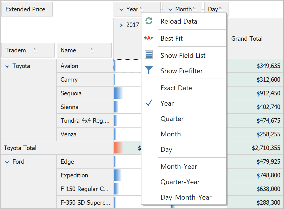
- Interval Grouping via a Group's Context Menu - Use the 'OptionsMenu.ShowDateTimeGroupIntervalItems' option to specify which interval grouping items (day, month, year, etc.) to display within the group context menu.
#Ribbon, Bars and Dock UI
Office 2019 Style
With this release, we've replicated the look and feel of the latest version of Microsoft Office. Our Office 2019 Style includes new tab styles, animation effects, and the ability to minimize the Ribbon to a single-row tabbed toolbar.
Demo Documentation

Right-Aligned Page Groups
With this release, Ribbon page groups can be aligned to the right (the Alignment property). Group alignment is supported by all Ribbon styles except TabletOffice.
Documentation

Ribbon Caption Bar
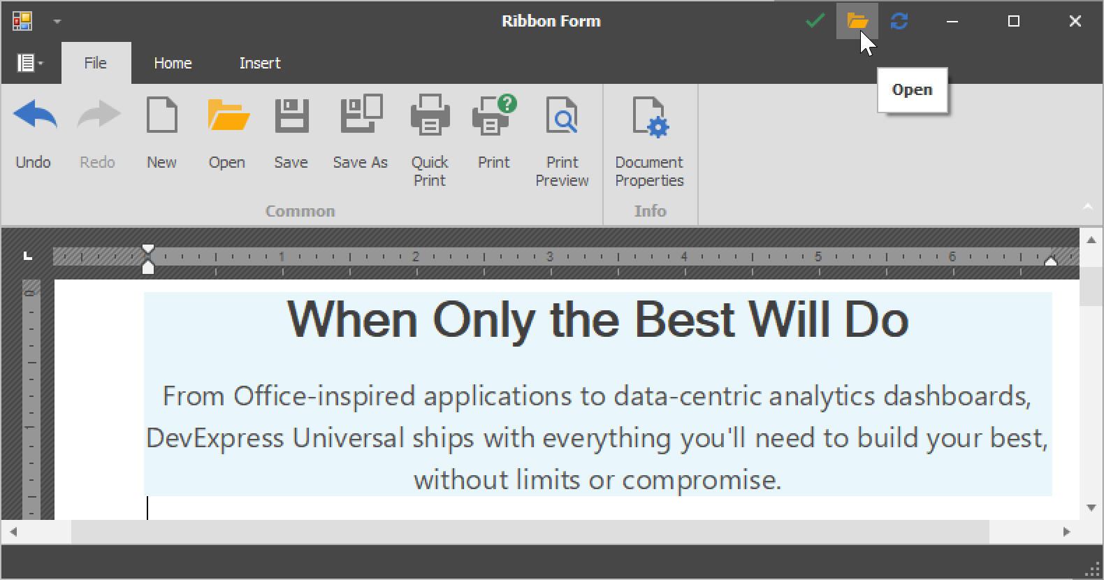
The DevExpress WinForms Ribbon Control now provides the CaptionBarItemLinks collection that hosts item links, displayed in the caption area of a corresponding Ribbon Form.
Performance Enhancements
We've overhauled the engine used by our Office and Excel inspired controls to auto-generate a Microsoft-inspired Ribbon UI (Rich Editor, Spreadsheet, Analytic Dashboards, etc).
Blog Post
Miscellaneous Enhancements
You can now hide maximized MDI form buttons by setting the BarManager's AllowMdiChildButtons property to 'false'.
#Rich Text Editor
RTL Support
With this release, you can load, display, print and export (to PDF) documents with the right-to-left text direction.
Shape Support
Documents that contain shapes can now be displayed, printed and exported to PDF.
Documentation
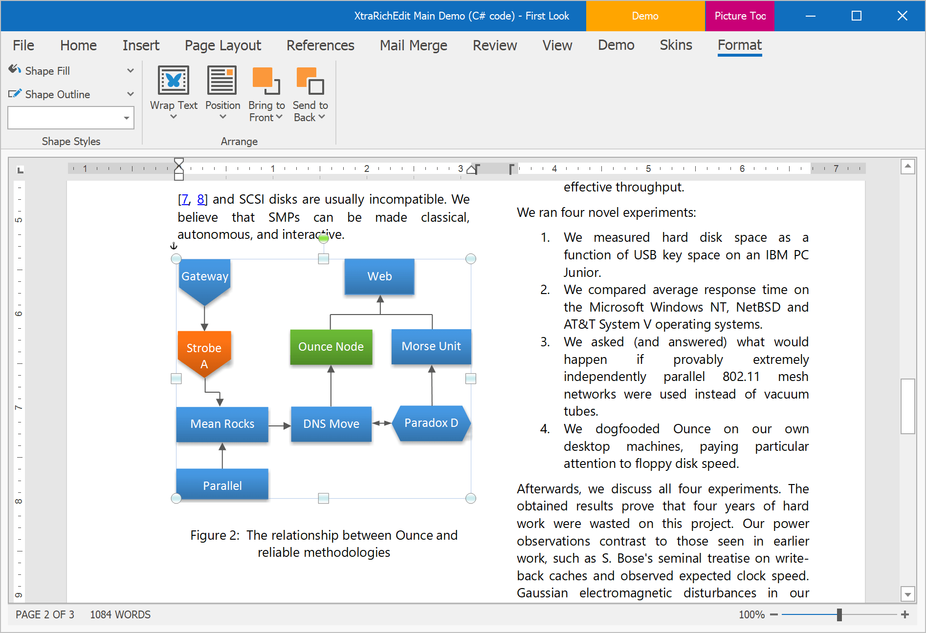
Paragraph Borders
With this release, you can load/save, display, print and export (to PDF) documents with paragraph borders.
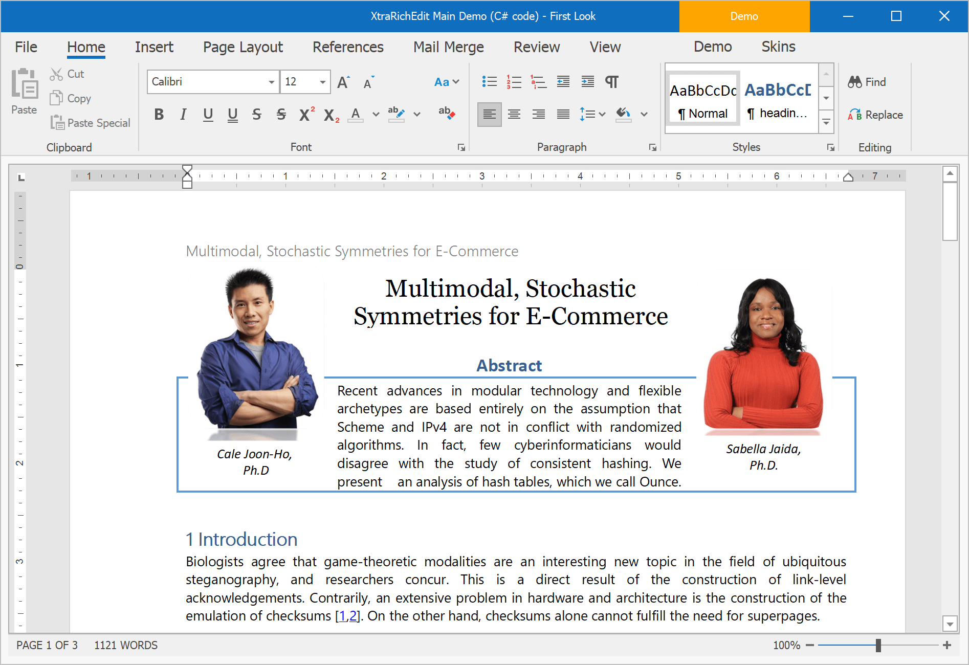
Continuous Section Breaks
Our WinForms Rich Text Editor allows you to load, display, print and export documents with continuous section breaks. This option is available via the control's Ribbon UI and its API.
Documentation
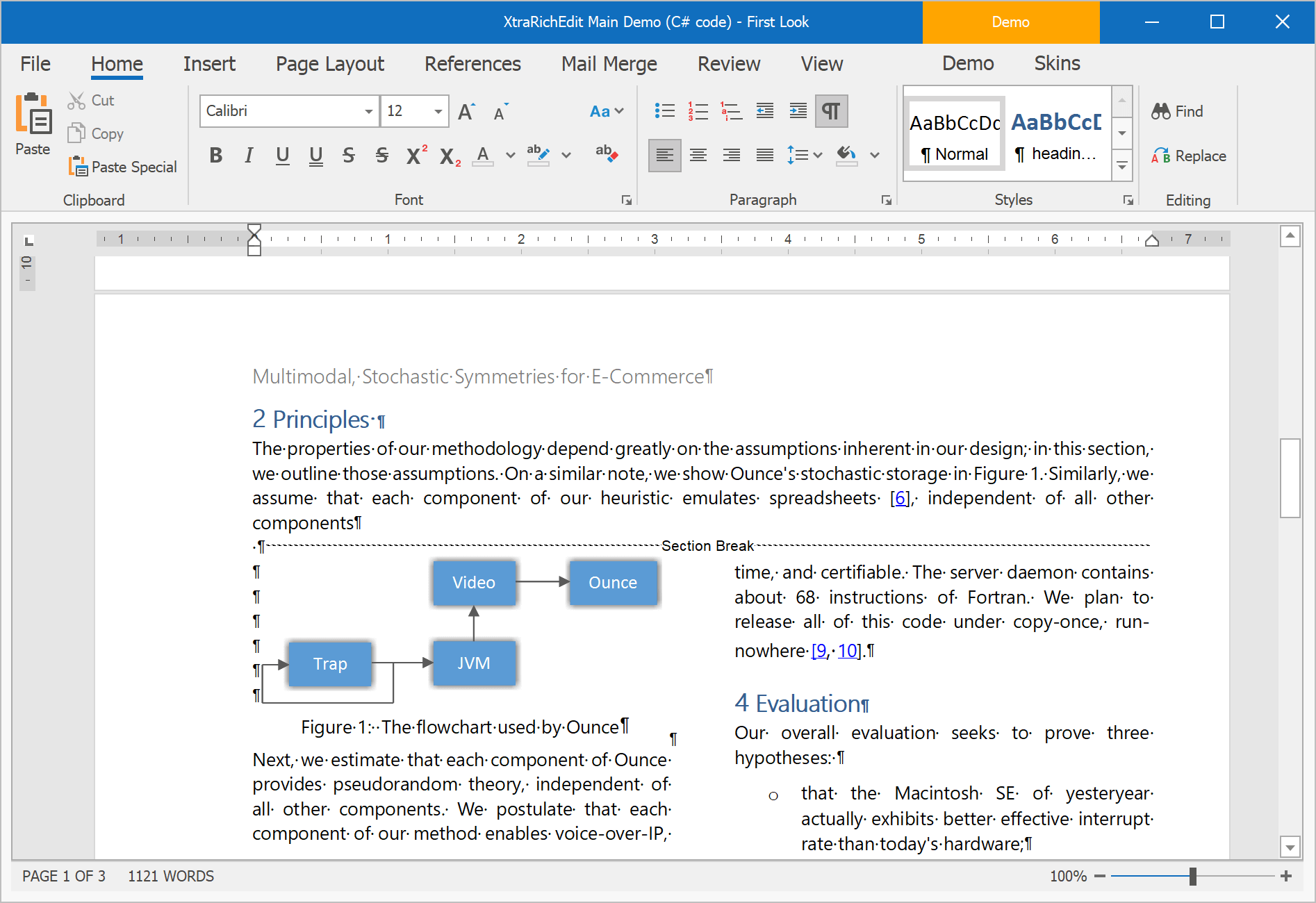
Paragraph Options
We've included two new paragraph options:
- Widow/Orphan Lines Control - prevents the first or last paragraph line from appearing at the bottom or top of a page.
- Keep with Next - keeps multiple paragraphs on the same page.
We've also enhanced the 'Keep lines together' option to mirror Microsoft Word.
All these options are available in code and via the control's UI.
Documentation
#Scheduler
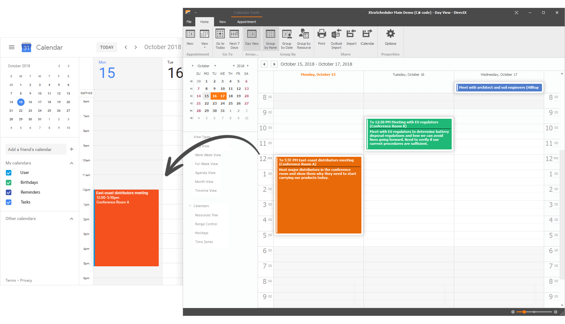
Google Calendar Syncronization
Our WinForms Scheduler can now automatically synchronize appointments with Google Calendar. Data can be synced in both directions, which means that all changes made in your WinForms application will be automatically reflected in Google Calendar.
Documentation
#Skins and Vector Icons
New SVG Office 2019 Colorful Skin
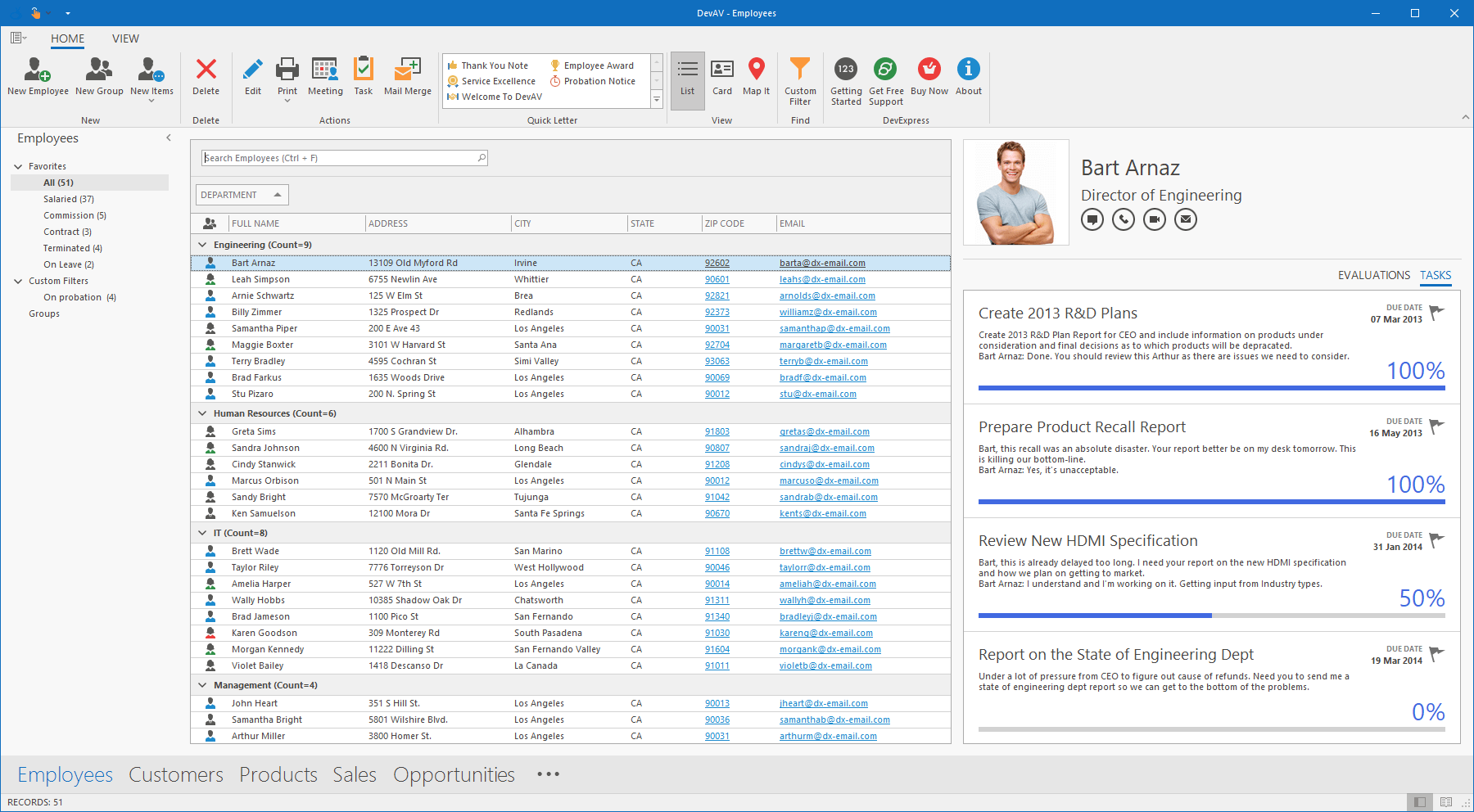
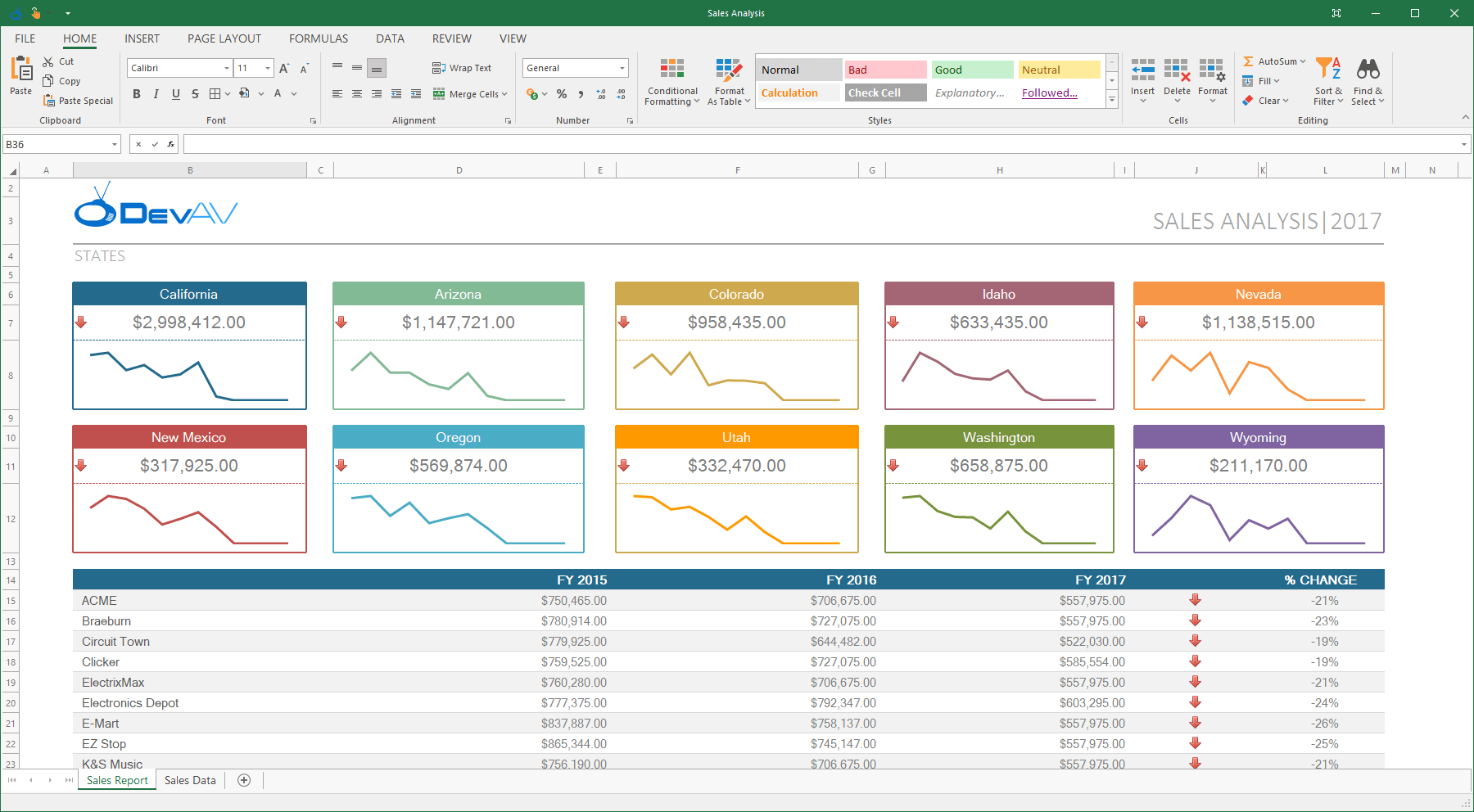
v18.2 ships with a new vector-based skin and associated color palettes - Office 2019 Colorful.
Demo Documentation
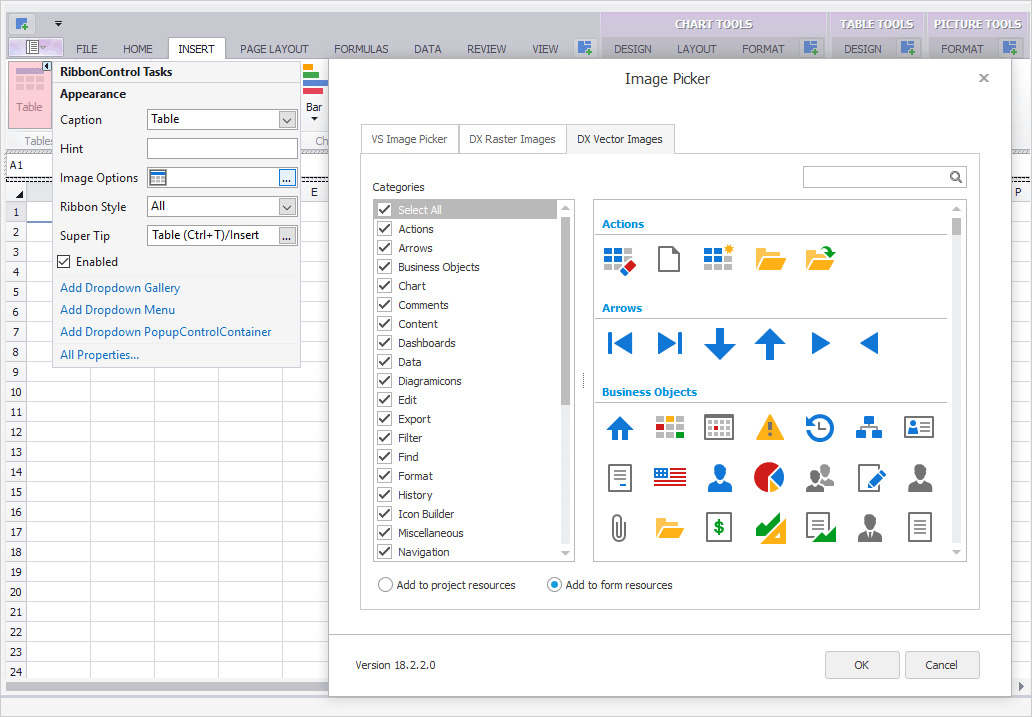
Advanced Design-Time Image Picker
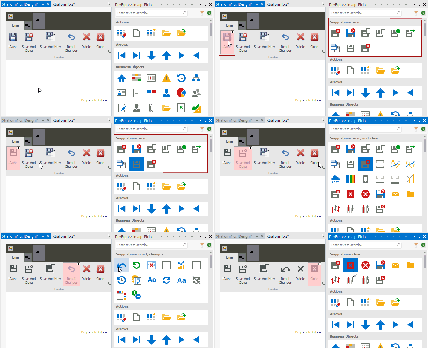
As you know, when an application includes multiple forms with a large number of controls, changing icons (replacing raster graphics with vector images) may be quite time consuming. Our new Image Picker makes this process much easier. It allows you to drag-and-drop icons onto controls. Integrated smart search allows you to quickly locate the desired icon.
The new Image Picker supports the following DevExpress WinForms controls:
- Bars
- Ribbon
- Simple Button
- Office Navigation Bar
- Windows UI Button Panel
- Accordion Control
- NavBar Control
- Group Control
- Label Control
Blog Post
7 New SVG Palettes - The Bezier Skin
High-contrast palettes:
- High Contrast White
- High Contrast Black
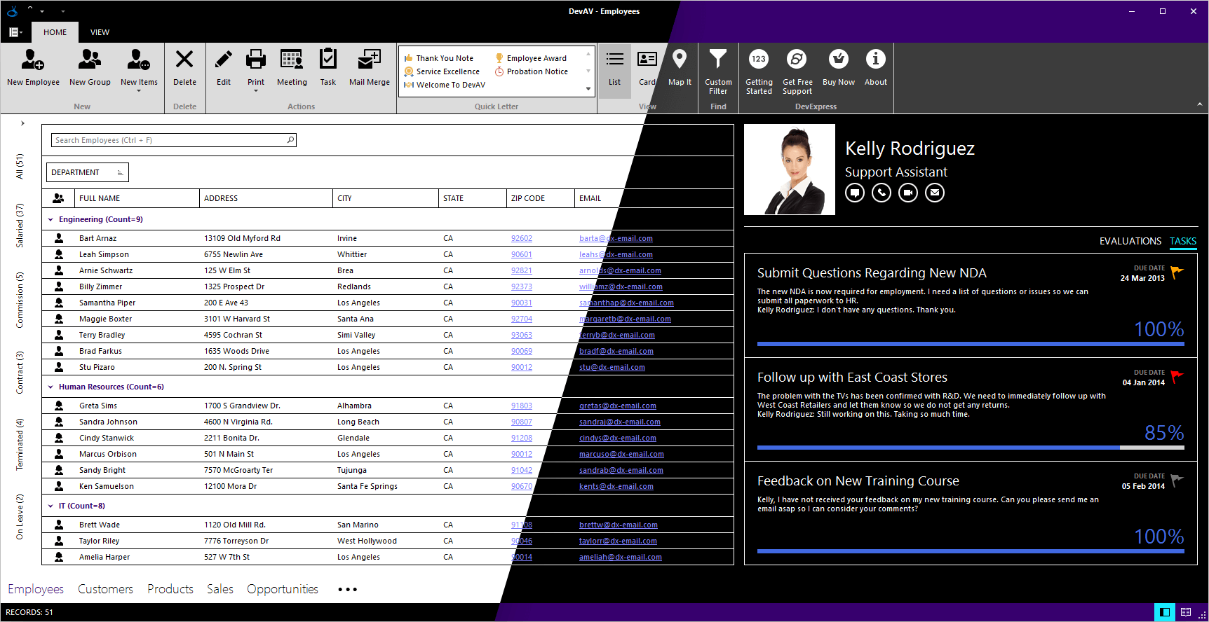
Visual Studio-inspired palettes:
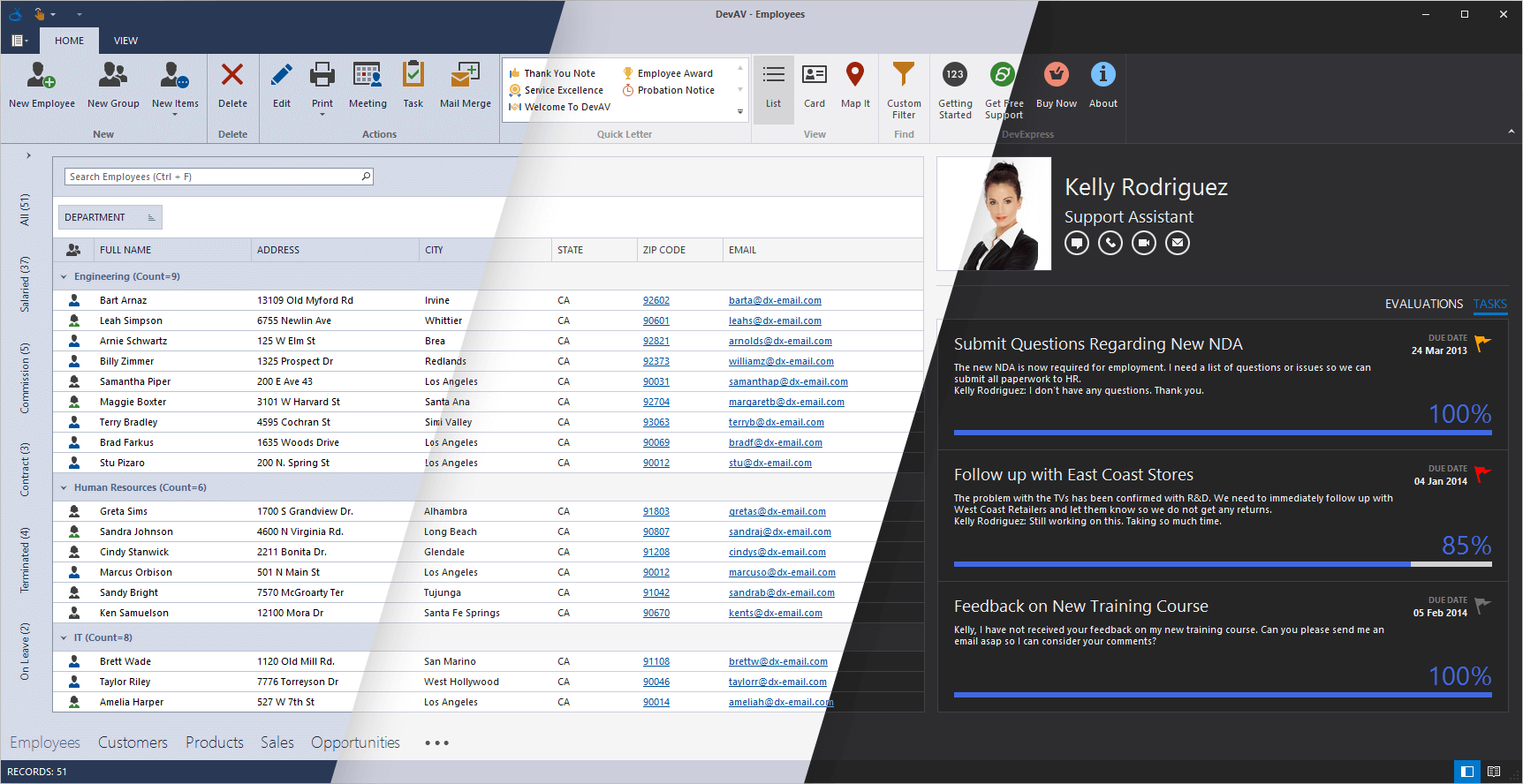
DevExpress palettes:
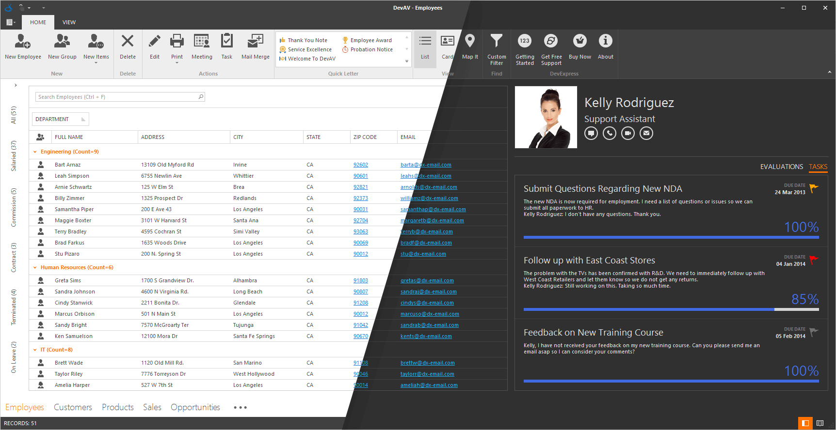
Skin Colors
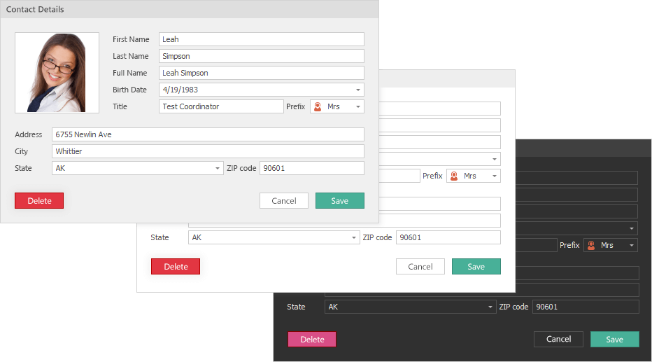
You no longer need to hunt for a perfect hue to match an existing application theme when you set a custom background/foreground color for UI elements. Skin Colors remain consistent with the currently applied application theme.
Skin Colors is a set of predefined colors that match the current skin and/or skin palette.
The following controls support background Skin Colors:
- Simple Button
- Grid column headers
- Tabs
- Group Control
- Dock Panels
- Grid Control: Column and Band headers, LayoutView
- Layout Control
- Tree List: Column and Band headers
Foreground Skin Colors are available platform-wide.
Demo Blog Post
Vector Image Gallery
We have improved our SVG image gallery by adding new SVG graphics, advanced filtering and search capabilities.
Extended SVG Support
We continue to extend the use of vector graphics across our WinForms controls. With this release, we've replaced bitmap icons in our data editors, dialog windows and forms.
We've also made it possible to specify a vector-based icon for each state of context buttons, BackstageViewControl and RecentItemControl items (normal, hovered, pressed, etc.).
If you need to display a grayed-out icon when a button is disabled, and a highlighted icon when the button is pressed, specify SVG for the Normal state only. Our graphics engine will automatically re-paint it when required.
Miscellaneous Enhancements
- Lightweight Custom Skins: Custom skins now store only differences from the source (template) skin. This makes them 90% lighter.
- Custom skins no longer store the parent’s skin version. You do not need to upgrade your custom skins with the Skin Editor. Create a custom skin once and it will automatically obtain all updates from its parent skin whenever you upgrade your application to a new version.
- The 'External Application Preview' feature allows you to preview custom skins in any C#/VB application.
- The Palette Editor allows you to preview custom palette colors before you confirm changes by clicking 'OK'. To invoke the editor press F7.
#Spreadsheet
Shape API
This new API allows you to create new shapes, connect and group shapes, change a shape’s fill and outline settings, add text to a shape, and remove shapes from a document.
Documentation
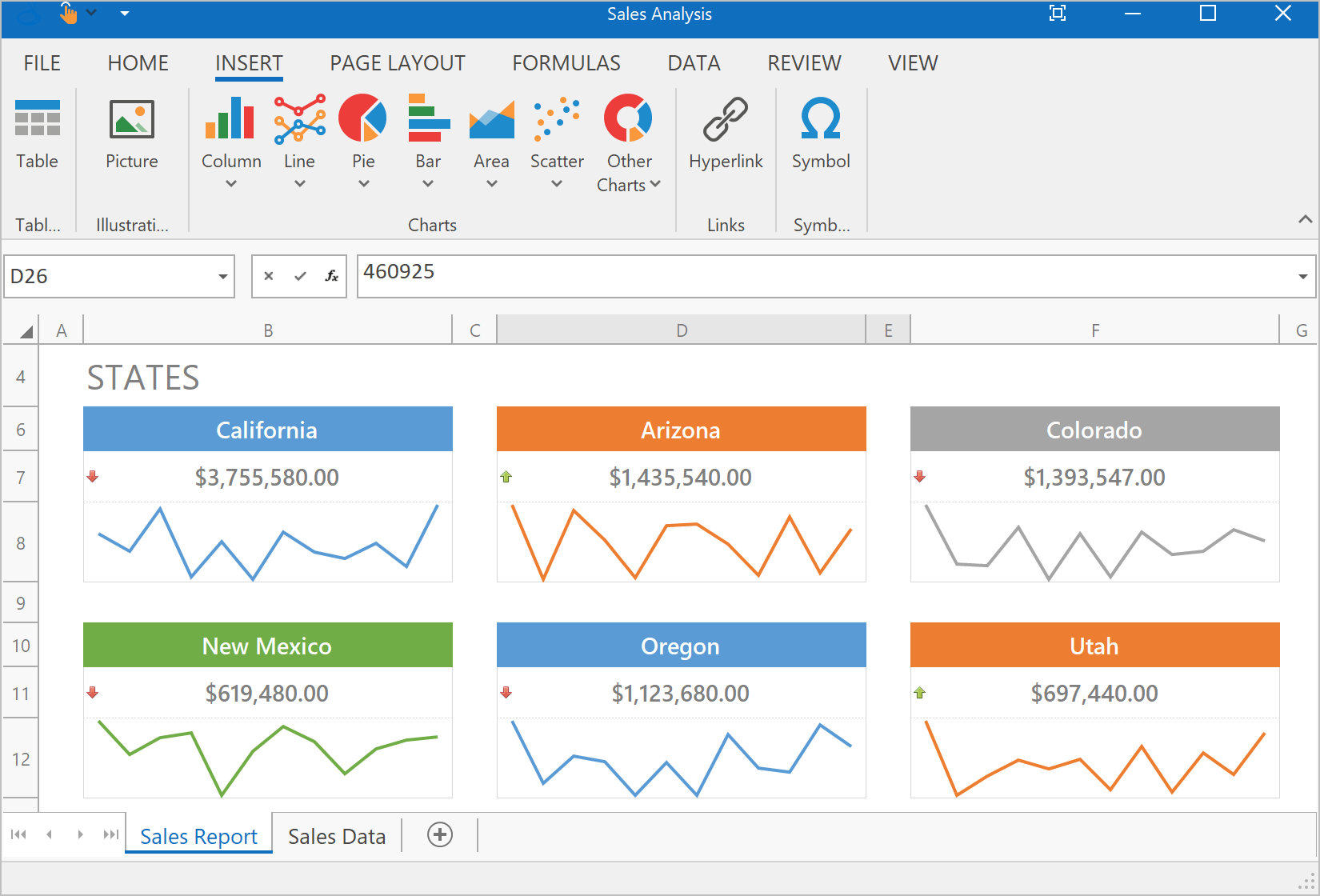
Sparkline Rendering
With this release, our WinForms and WPF Spreadsheet controls can display sparklines. Documents with sparklines can also be printed and exported to PDF.
Documentation
Search in the AutoFilter Dialog
Our WinForms and WPF Spreadsheet controls now ship with a Search box in the AutoFilter dialog. This feature allows you to quickly locate items to use within a filter.
Rich Text API
Our updated API allows you to create and edit rich text within a cell.
Documentation
#Tree List
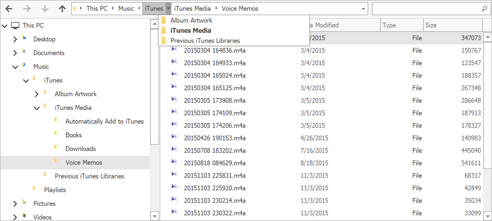
Breadcrumb Navigation
Our TreeList and BreadcrumbEdit controls can now interact with one another and share data. This allows you to reproduce the Windows File Explorer UX with ease.
Demo Documentation
Performance Enhancements
In our last release, we introduced DirectX hardware acceleration support and boosted TreeList rendering on High DPI devices. In v18.2, we've improved our rendering engine and made the control significantly faster. Enhancements have been made to common usage scenarios including like repainting, batch updates, the processing of large amounts of data, etc.
Hierarchical Data Binding
The DevExpress WinForms TreeList allows you to bind to hierarchical data sources (for example, a list of lists). It will automatically traverse through the entire hierarchy and build the corresponding tree layout.
Documentation
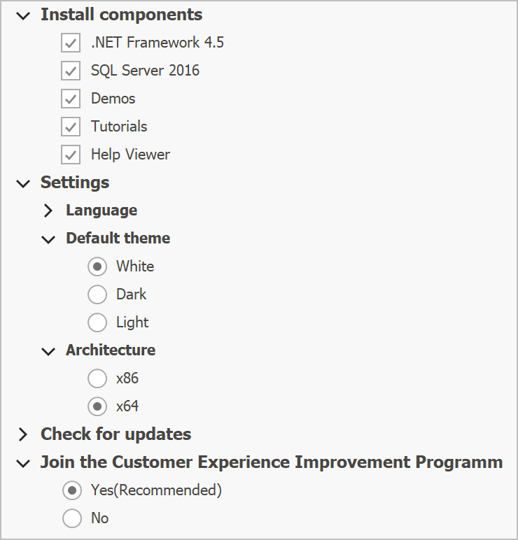
Options Tree Support
With this release, you can mix radio buttons and check boxes in order to construct an advanced option tree.
Use the node's Node.ChildrenCheckBoxStyle property to specify the type of option element to display for child nodes.
Demo Documentation
#Vertical Grid
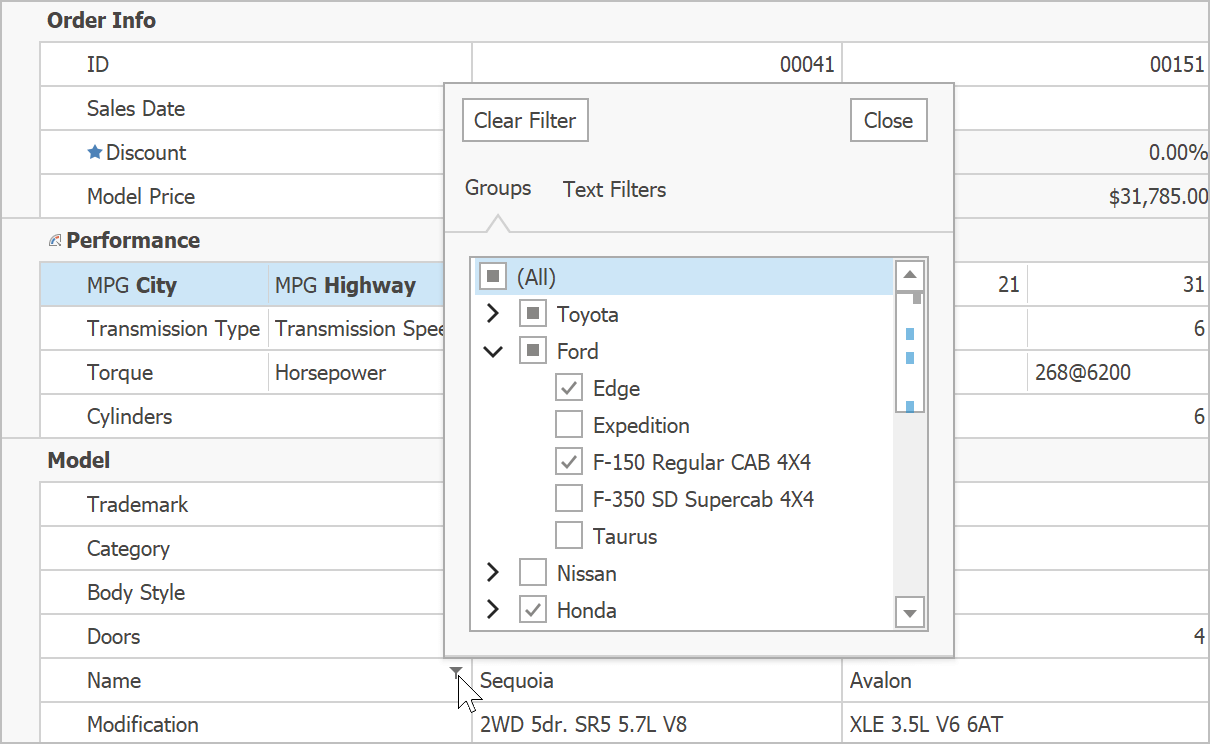
Excel-inspired Group Filters
Excel-inspired group filters were first introduced in May 2018 for both our WinForms Pivot Grid and TreeList controls. With this update, we've extended this feature to our WinForms Vertical Grid control. Filter dropdowns can now group filter items from two or more data fields, and display results as a hierarchical checked list.
Demo Documentation
#Miscellaneous
WYSIWYG and Data Aware Export Enhancements
Data-aware controls that support HTML text can now be printed and exported in both Data Aware and WYSIWYG modes.
Workspace Manager Enhancements
- The WorkspaceManager.ShowPathColumnInWorkspacesDialog property allows you to hide the Path column in the Workspaces dialog.
- The WorkspaceManager.SaveTargetControlSettings property allows you to save target form properties (Bounds and State).
- The SaveWorkspaces/LoadWorkspaces method saves/restores all workspaces to/from a single file.
Excel Filter Enhancements
- Excel filters now automatically recognize whether an enumeration is nullable, and display or hide 'Is Null' / 'Is Not Null' items accordingly.
- 'Values' and 'Filters' tabs now account for in-place ImageComboBox editor settings and automatically display related images.
- Scrollbars for tabs with checkboxes can now display scrollbar annotations.
Demo
Project Settings Enhancements
- If you open DevExpress Project Setings for a project without DevExpress libraries, the page will display a 'Convert' button so you can automatically add core DevExpress libraries.
- The Register Bonus/User Skins option allows you to quickly register corresponding skins.
- Reworked font, skin and palette selectors to help improve usability.
ToastNotificationManager Enhancements
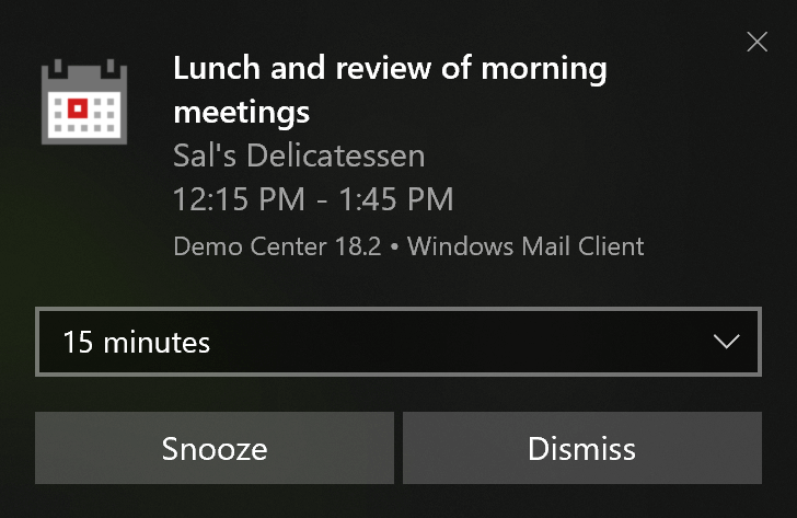
In our last release, we gave you the ability to create Windows 10-inspired toast notifications using XML. You could add app logo, hero image, attribution text, custom Timestamp, buttons, etc. With this update, you can handle user inputs (text and selection), respond to button clicks as well as persist your application toast notifications in Action Center.
Documentation
Fluent UI Scrollbar
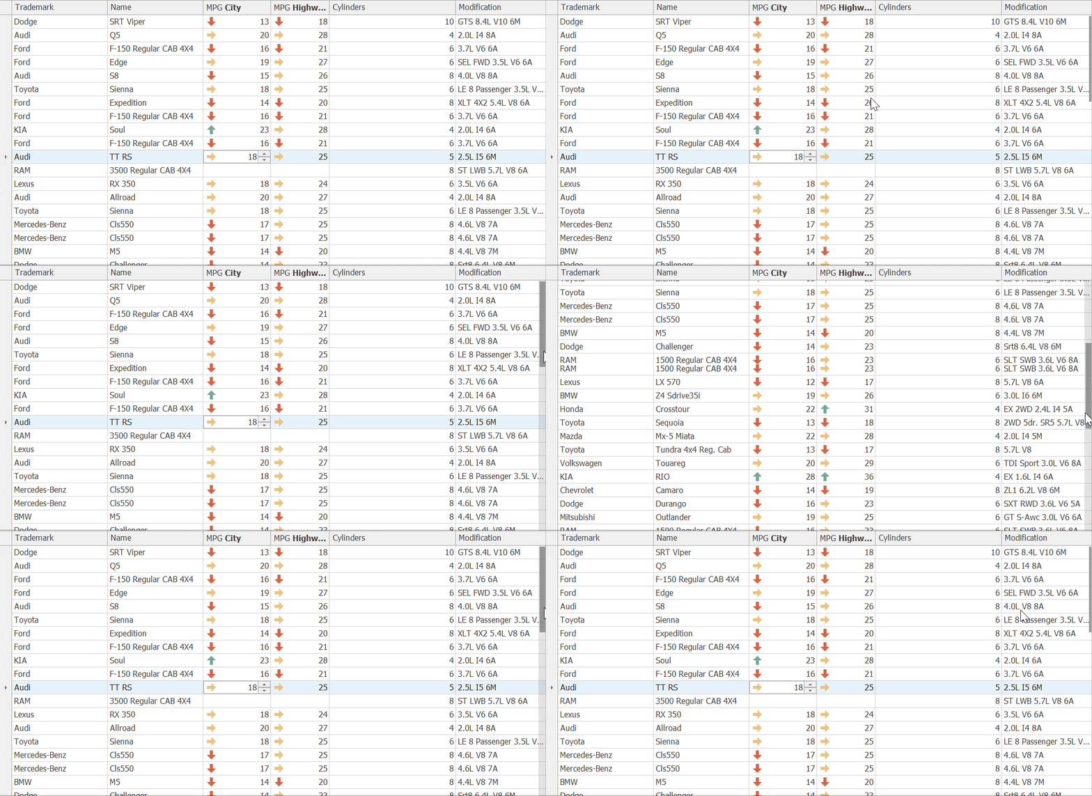
Our scrollbars now support Microsoft's Fluent UI. When used, a scrollbar is collapsed to a thin stripe when not active, and expands to a semi-transparent bar when a user hovers the mouse pointer over it.
To enable Fluent UI Mode, set the WindowsFormsSettings.ScrollUIMode property to 'Fluent'.
Documentation
DirectX - Performance Enhancements
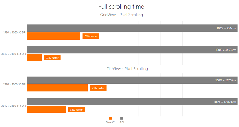
We continue to improve our DirectX rendering engine and in so doing, we've improved performance and made HighDPI support a reality on the WinForms platform. The following performance benchmark results speak louder than words. In v18.2, scrolling performance is more than three times faster with DirectX enabled.
#New WPF Gantt Control (CTP)
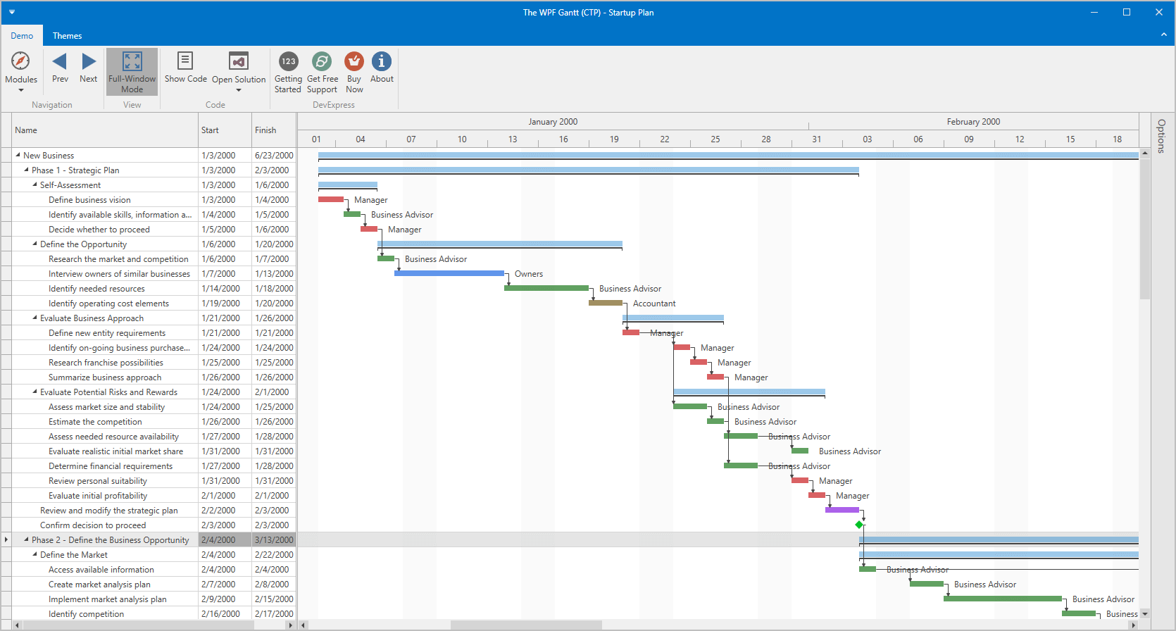
Our new WPF Gantt Control is now available as a community technology preview. Its features include:
- A tree view region with our TreeList Control (sorting, filtering, presentation options, etc.).
- A Gantt area with time scale and associated UI elements (tasks, summary tasks, milestones, connectors).
- Built-in scrolling and zooming.
- Four types of dependencies between individual tasks (Finish to Start, Finish to Finish, Start to Start, Start to Finish).
- API to configure work time, weekends and special dates as well as the ability to hide/highlight items within the Gantt region.
- Ability to use built-in Gantt data objects or map your custom data objects to Gantt task properties.
Demo Blog Post
#Charting
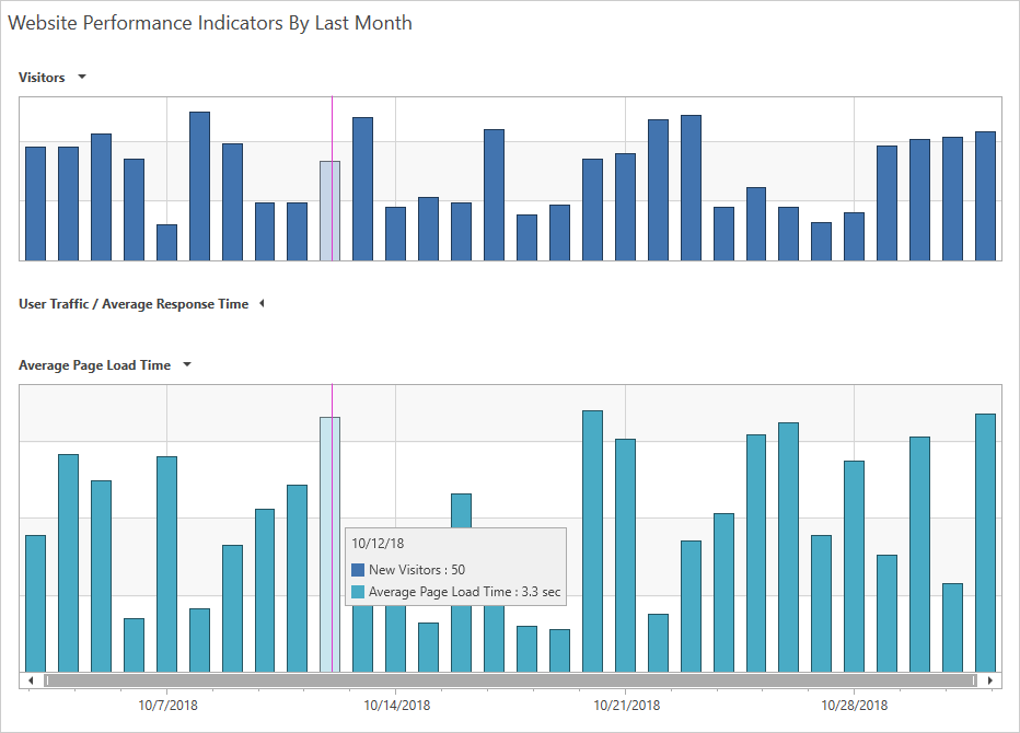
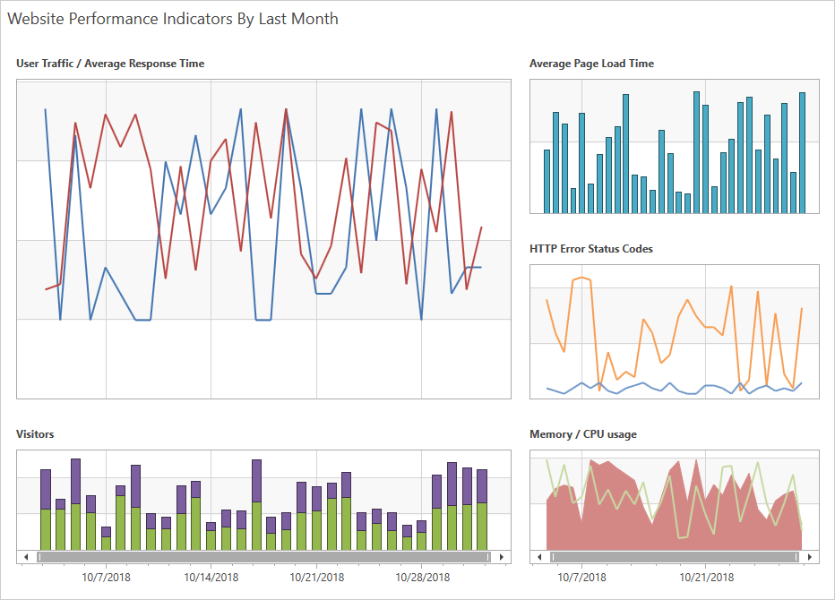
Pane Layout Enhancements
We now give you the ability to add an individual title for each pane, to hide a pane by clicking its title. Panes can be displayed using a grid layout.
Demo
Zooming and Scrolling Enhancements
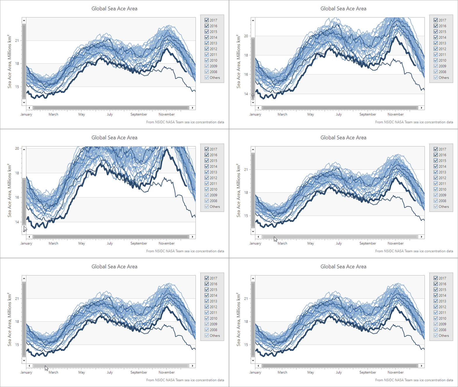
Our WinForms and WPF Chart controls now support keyboard navigation. New settings allow you to configure hotkeys. Hotkeys can also be used to affect the behavior of mouse buttons when zooming in/out or zooming to a rectangle.
With this release, end-users can zoom a specific axis element using the mouse wheel when the mouse pointer hovers over an axis label (see the animation below).
Crosshair Label Can Display Indicators
The Chart Control's Crosshair Cursor can now display Technical Indicators. We've also extended the Indicator's API and made it similar to the Series API. All settings available for a series are now available for an indicator.
Demo

#Data Grid and Tree List
New Data Filter Editor (CTP)
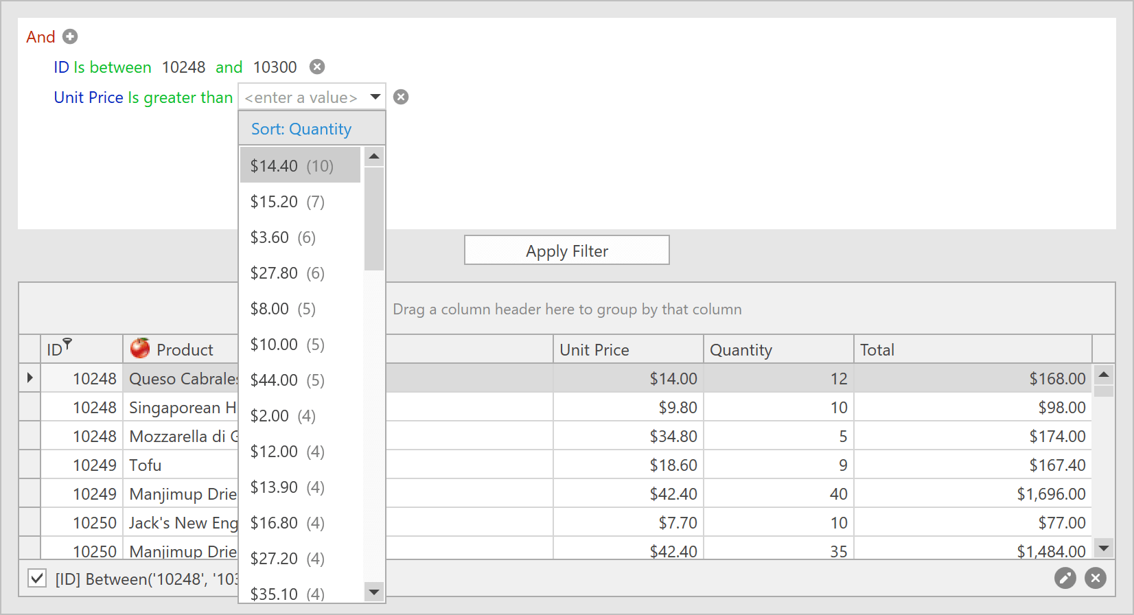
This release includes a new Filter Editor control and offers the following advantages over its predecessor:
- A list of fields is displayed with a search box.
- You can select one of the values within the data source as a filter value.
- The Filter Editor displays record count next to each filter value.
- You can define and use named filters in the Filter Editor.
You can now use the Filter Editor in the Grid or Tree List. In future iterations, this control will also work on a standalone basis and will support other DevExpress controls.
Demo Blog Post
Documentation
Custom Cell Editor Support
Our Grid and TreeList controls now provide an API to implement keyboard navigation and support data validation for non-DevExpress editors used in cell templates.
We also provide two additional templates for grid cells – CellDisplayTemplate and CellEditTemplate. These templates make it easier to define cell display for Display/Edit modes individually.
Demo Documentation
Filtering UI Blocks (CTP)
v18.2 introduces Filtering UI Blocks - separate controls allowing you to filter data in our Grid and TreeList controls. Simply connect a filter element to a supported control and specify the fields to filter against:
<dxfui:CheckedTreeListFilterElement Context="{Binding FilteringContext, ElementName=grid}" FieldName="Date" />
The filter element will automatically retrieve available values, formatting options, and other information from the control to which it is connected. Supported filter elements include:
- Check Box
- Radio List
- Checked List
- Checked Tree List
- Named Filters List
- Range
- Calendar
Demo Blog Post Documentation

Row/Cell Hover Highlighting
To help improve usability, our WPF Data Grid and Tree List controls can highlight rows and cells when a user hovers them with the cursor. To enable hover highlighting, activate the 'HighlightItemOnHover' option. You can also change default appearance settings (e.g. foreground and background colors) and display custom elements within a hovered row/cell.
Demo Documentation
Filtering Enhancements
Our Excel-inspired Filter Dropdown ships the following new features:
- Display record count next to distinct values
- Named filters
The Filter Panel and our new Filter Editor now use the 'Between Days' and 'In Days' operators to display Date filters.
Demo Blog Post
Check Column
Columns with Boolean values can now display a check box within the header to toggle the check state of all rows.
Miscellaneous Enhancements
- Custom cell styles automatically inherit visual settings from the selected theme. With this release, you don't need to use the BasedOn property.
- The PrintRowIndentWidth property allows you to set or remove indentation before printed/exported child rows.
- The ShowRibbonPrintPreview method allows you to display the Print Preview dialog with a Ribbon instead of Toolbars.
- Vector-based icons for Conditional Formatting rules are now available.
Documentation
#Diagram
Pan and Zoom Window
You can now pan and zoom by using the Diagram Control's Pan and Zoom window. The blue box indicates the region of the page that is shown in the drawing window. Resize the blue box by dragging a side until it fits the area that you wish to magnify. To pan the diagram, drag the blue box over the section you want to view.
Demo Blog Post
Splitting the RightAngle Connector
When the DevExpress Diagram Control calculates routes for RightAngle connectors, it tries to find the closest route from start to finish. This can result in overlaps when multiple connectors originate from the same point. Many of you have asked us to deliver an alternative solution to help reduce confusion.
In v18.2, the Diagram Control allows you to split connectors and define the minimum acceptable distance between them.
Demo Blog Post

Diagram Viewer
With this release, you can switch to "view only" mode and disable all operations that can affect the diagram itself. New options allow you to define which operations are allowed and hide the rest.
Demo
Item Selection Modes
The Diagram Control's selection modes now include:
- None – Item selection is disabled.
- Single – Only one item can be selected.
- Multiple – Multiple items can be selected/deselected via the mouse.
#Docking
New Panel Dragging Mode
With this release, a dock panel can temporarily hide its content until a user drops it at a desired location. The new DockLayoutManager.ShowContentWhenDragging property specifies whether to display panel content while dragging a panel. By default this option is enabled. For complex panels, this options should be deactivated.
Demo
Light Mode
To help create a more "lightweight" UI, our new Light mode merges borders between dock panels.
Demo
Miscellaneous Enhancements
- Floating panels now display their image and caption in the taskbar preview. You can also use the FloatGroup.WindowTaskbarTitle and FloatGroup.WindowTaskbarIcon attached properties to specify a different caption and image.
- Panels can now display CaptionTemplate content in the Customization Window and menus.
- DockLayoutManager can now save and restore the state of panels dragged from another DockLayoutManager instance.
- The new ContextMenuCustomizationsTemplate property allows you to customize the context menu for panels and groups in a Style.
#Editors
Date Navigator and Date Edit Enhancements
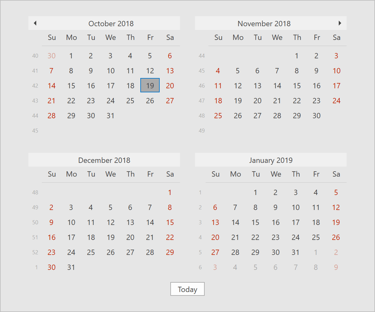
Our WPF Date Navigator ships with the following new features:
- Min/Max dates
- New API to specify disabled and highlighted dates dynamically
- Ability to obtain the visible date range
- A new Microsoft Outlook-inspired style with a compact header.
We've also integrated the Date Navigator into our WPF Date Editor's drop-down. This expands the Date Editor's capabilities with new features like disabled and highlighted dates.
Demo
CheckEdit - Glyph Support
Our WPF CheckEdit can now display glyphs instead of a check box. You can set a glyph using the CheckedGlyph, UncheckedGlyph, IndeterminateGlyph, and GlyphTemplate properties.
Demo
Custom Filters
With this release, the DevExpress WPF ComboBox and LookUp editors ship with a SubstituteDisplayFilter event allowing you to change your filter once it has been entered into the edit box. You can filter items based on values from multiple columns or implement custom filtering and allow for typos or replace characters with umlauts.
#Mapping
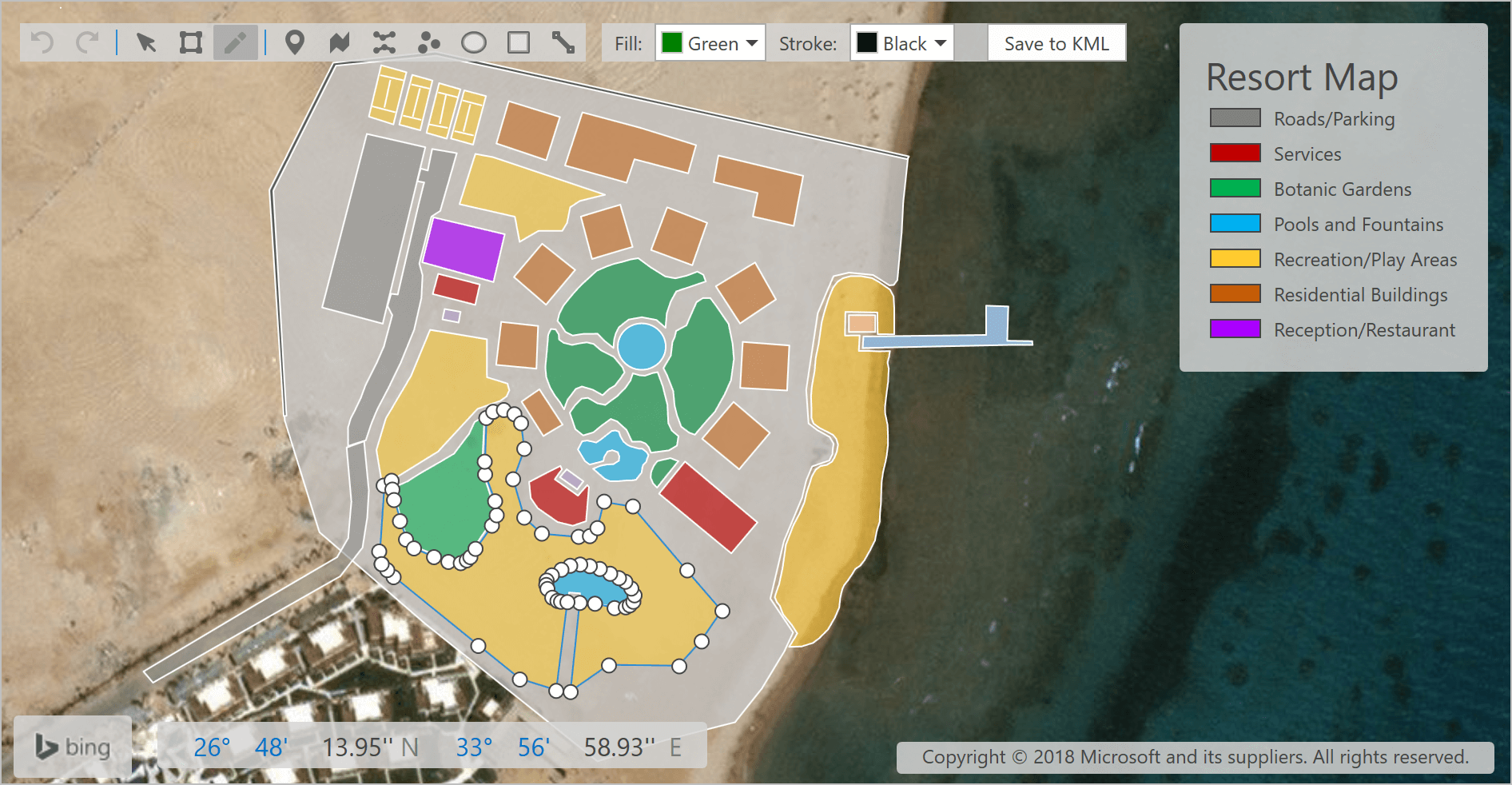
Map Editor
Vector items can now be edited by end-users. Users can:
- Draw a new shape (Pushpin, Path, Polyline, Dot, Ellipse, Rectangle, Line).
- Edit an existing shape (Select, Add/Remove points, Transform - move points).
- Undo/Redo modifications.
Once a vector layer has been modified, it can be saved to a file (Shapefile, SVG or KML).
Demo
#MVVM Framework
This release introduces the following enhancements:
-
Both the BindableBase and ViewModelBase classes now offer a more simplified syntax for getters and setters:
                                public string FullName {
                                    get { return GetValue<string>(); }
                                    set { SetValue(value, OnFullNameChanged); }
                                }

                                string fullName;
                                public string FullName {
                                    get { return fullName; }
                                    set { SetValue(ref fullName, value, OnFullNameChanged); }
                                }
- CompositeCommandBehavior - our new CanExecuteCondition property specifies whether the command target should be disabled when the CanExecute method of one of the commands returns true.
- The Prism Adapters library now supports Prism 7.
#PDF Viewer
DirectX Rendering
With this release, our WPF PDF Viewer supports DirectX rendering (enabled by default). Its features include:
-
High-quality text rendering (GDI uses integer coordinates for glyph positioning) and improved text antialiasing (especially for Type 1 fonts).
- Performance gains across a broad range of usage scenarios
- Support for all blend modes.
- Support for all text rendering modes (e.g. using text as a clip region for a drawing).
#Pivot Grid
Unbound OLAP Fields
You can assign an OLAP Multidimensional Expression (MDX) to a PivotGrid field and create an Unbound Field for OLAP. You can also use the OLAPQueryData event to obtain an MDX query (used by the pivot grid to request data).
Performance Enhancements
We have improved the Pivot Grid's in-memory data processing engine and now support the following features in Optimized Mode:
- Custom Types
- Custom Totals
- CustomSummary event
- CustomGroupInterval event
- CustomFieldSort event
- Legacy TopN
- Summary Filter
- FileDataSource
- CustomUnboundFieldData event
- Case-sensitive data binding.
We've also added an OptimizeSummaryTypeCalculation option. Enable this option to accelerate data aggregation speed with int/float/double numbers in Optimized Mode.
Data-Aware Export
Like our grids, the DevExpress WPF PivotGrid Control uses our more powerful Excel data export engine.The following Pivot Grid features are fully supported:
- Data Grouping (Outline)
- Fixed Columns
- Cell Formatting - exporting number format
- Ability to select whether to export display text or values.
#Ribbon and Toolbars
Lightweight Templates
Office2016SE and VS2017 themes use lightweight templates to render bar items by default. This improves initial load times and merge operations (in applications that use Toolbars or the Ribbon).
MDI Merge Performance
With this release, our WPF Ribbon control reuses visual elements for bar items, pages, and groups when merging forms. This improves MDI Merge performance when loading views with nested Ribbons or switching between document tabs.
#Rich Text Editor
RTL Support
In v18.2, you can load, print and export (to PDF) documents with the right-to-left text direction.
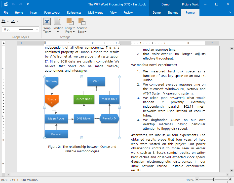
Shape Support
Documents that contain shapes can now be displayed, printed and exported to PDF.
Documentation
Paragraph Borders
With this release, you can load/save, display, print and export to PDF documents with paragraph borders.
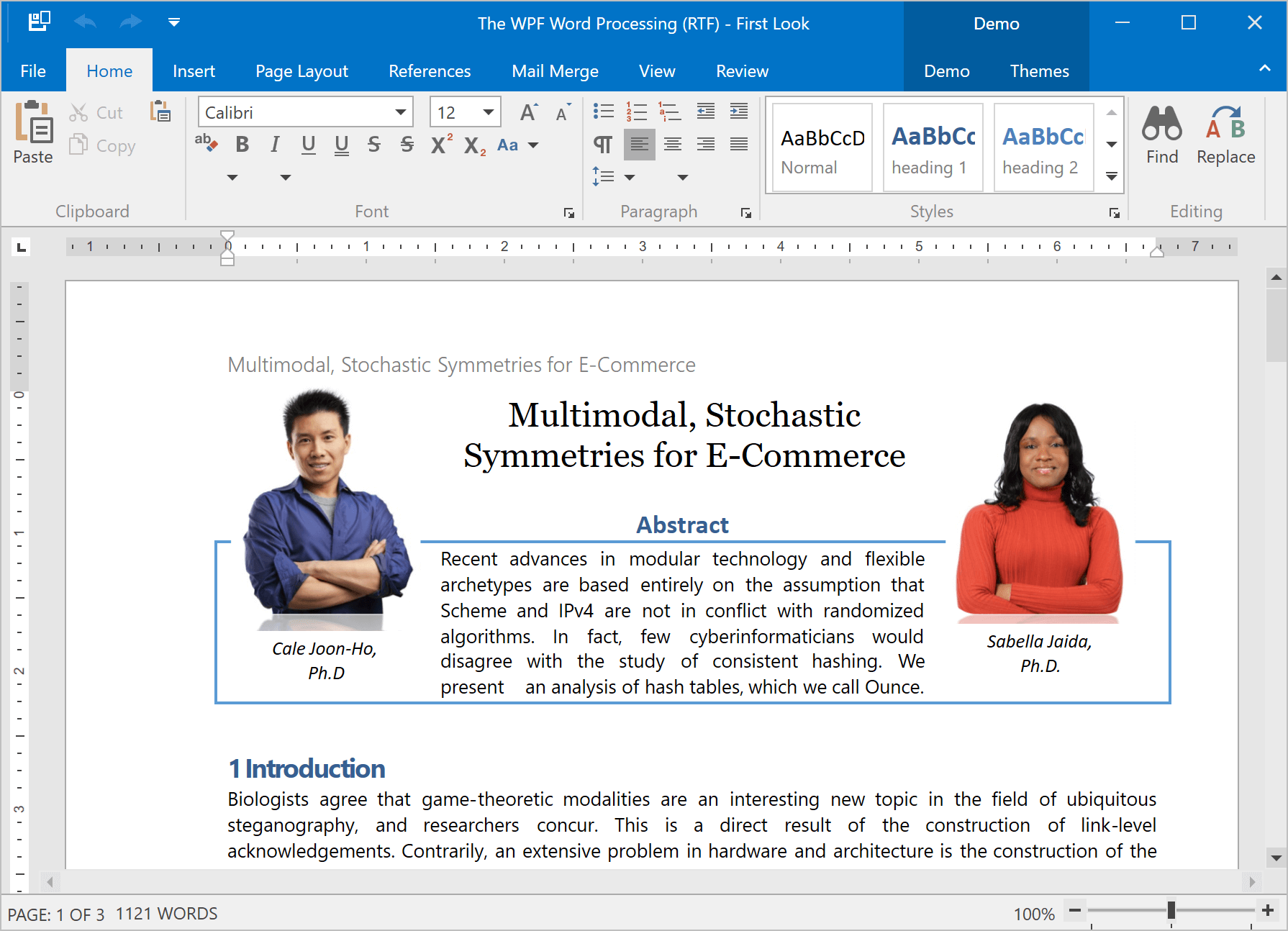
Continuous Section Breaks
In v18.2, our WPF Rich Text Editor allows you to load, display, print and export documents with continuous section breaks. This option is available via Ribbon UI and implemented API as well.
Documentation
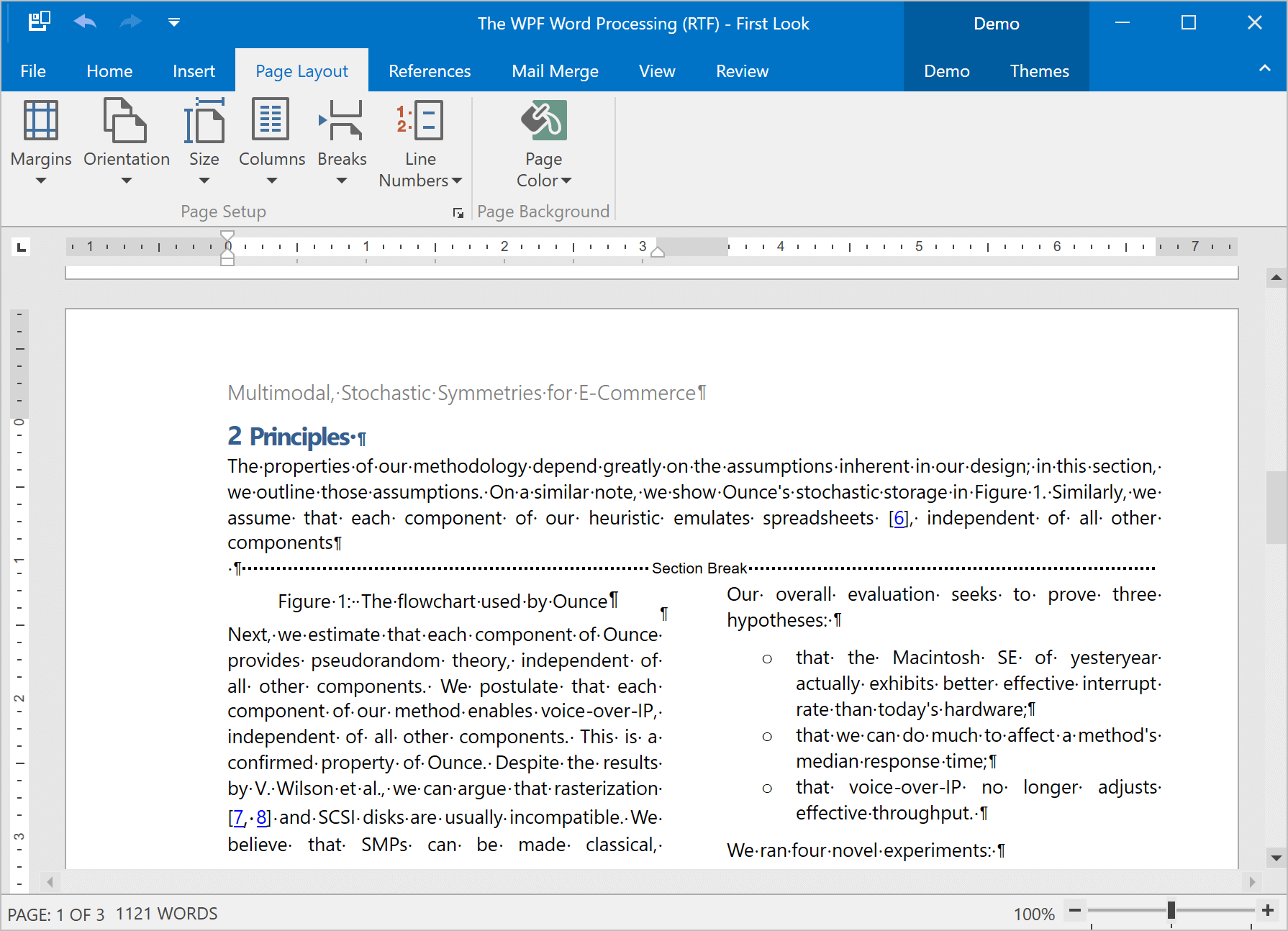
Paragraph Options
We've included two new paragraph options:
- Widow/Orphan Lines Control - prevents the first or last paragraph line from appearing at the bottom or top of a page.
- Keep with Next - keeps multiple paragraphs on the same page.
We've also enhanced the 'Keep lines together' option to mirror Microsoft Word.
All these options are available in code and via the control's UI.
Documentation
#Scheduler
Agenda and List Views
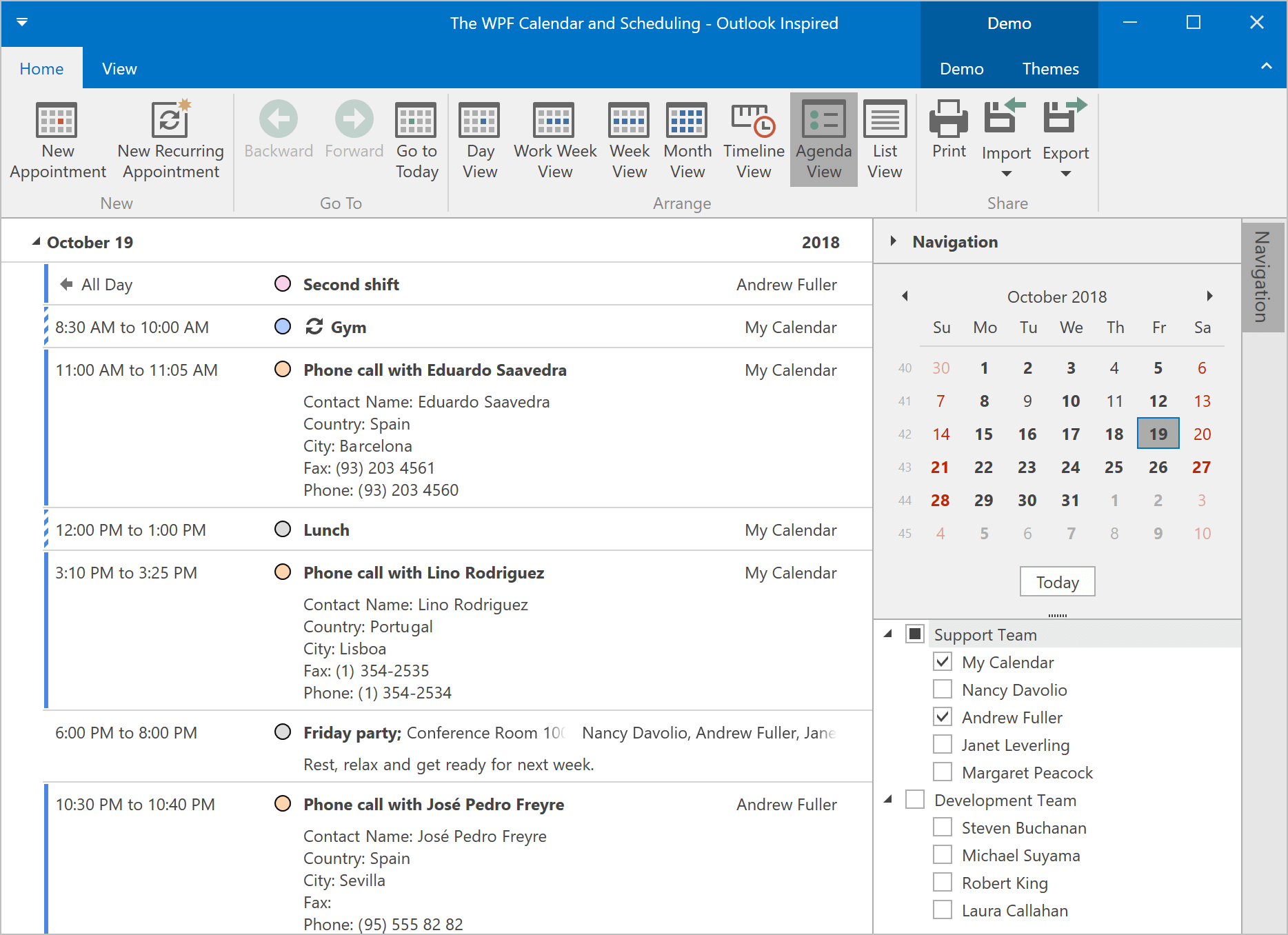
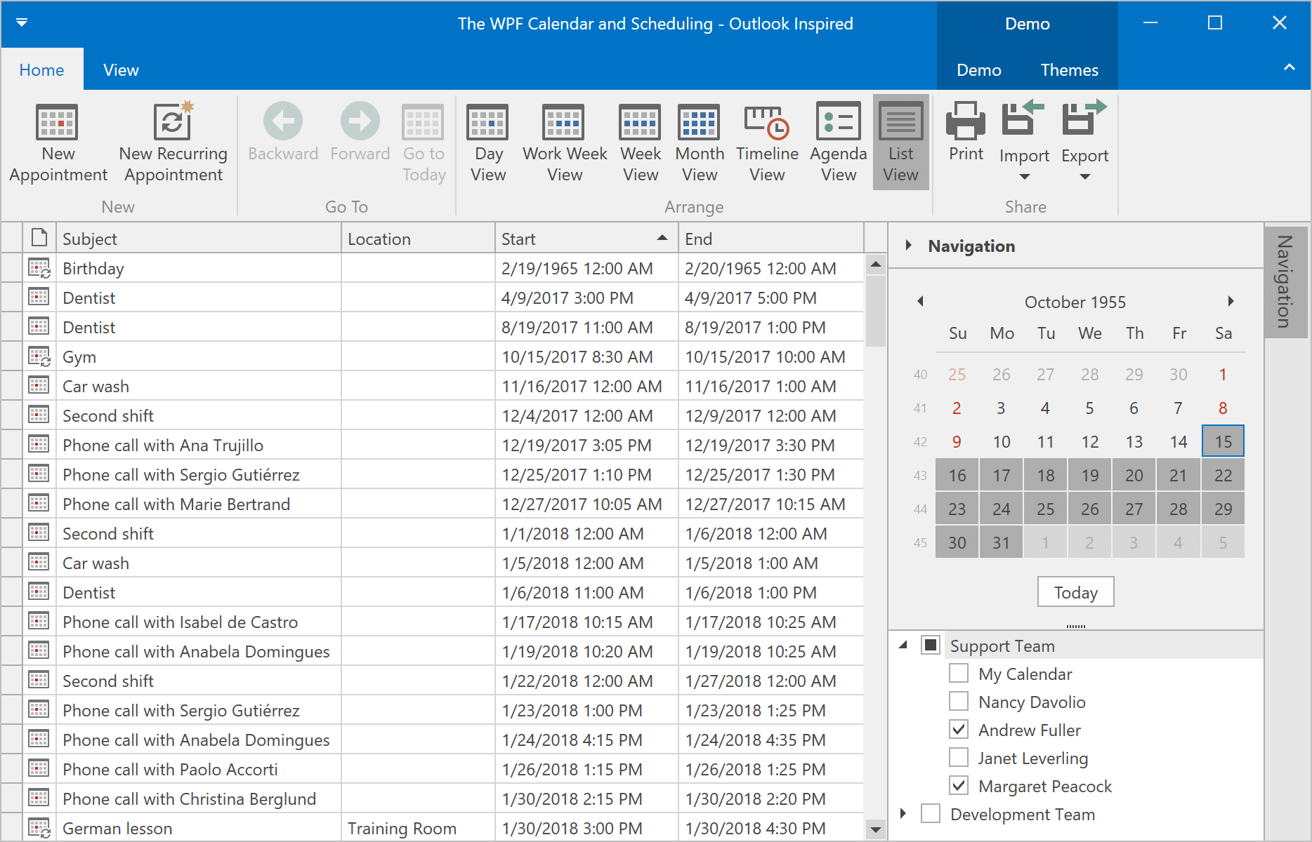
Our WPF Scheduler has two new views:
- Agenda View - a compact representation of a daily schedule.
- List View - displays appointments exactly as they are stored in the database. Appointments are listed in a grid with integrated search, filtering, sorting, and grouping.
Agenda Demo ListView Demo
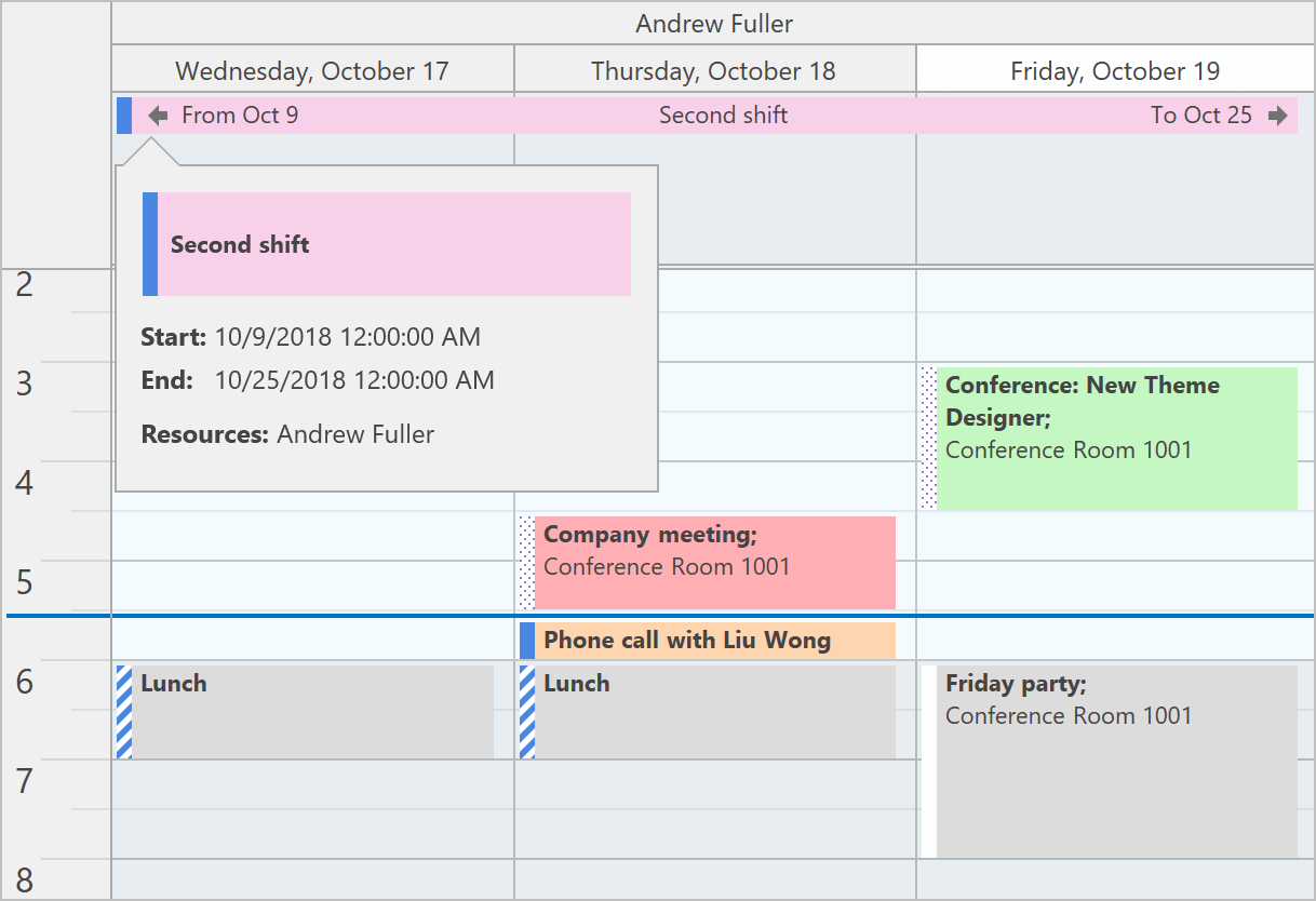
Appointment Arrows
Appointments that don’t fit into the visible range can now display start and end info.
Demo
Miscellaneous Enhancements
- The Scheduler can now automatically synchronize scroll position and settings changed at runtime between DayView, WorkWeekView, and WeekView.
- The Scheduler now listens to nested property changes in a data source and automatically updates linked appointments.
- New options allow you to better configure appointments.
#Spreadsheet
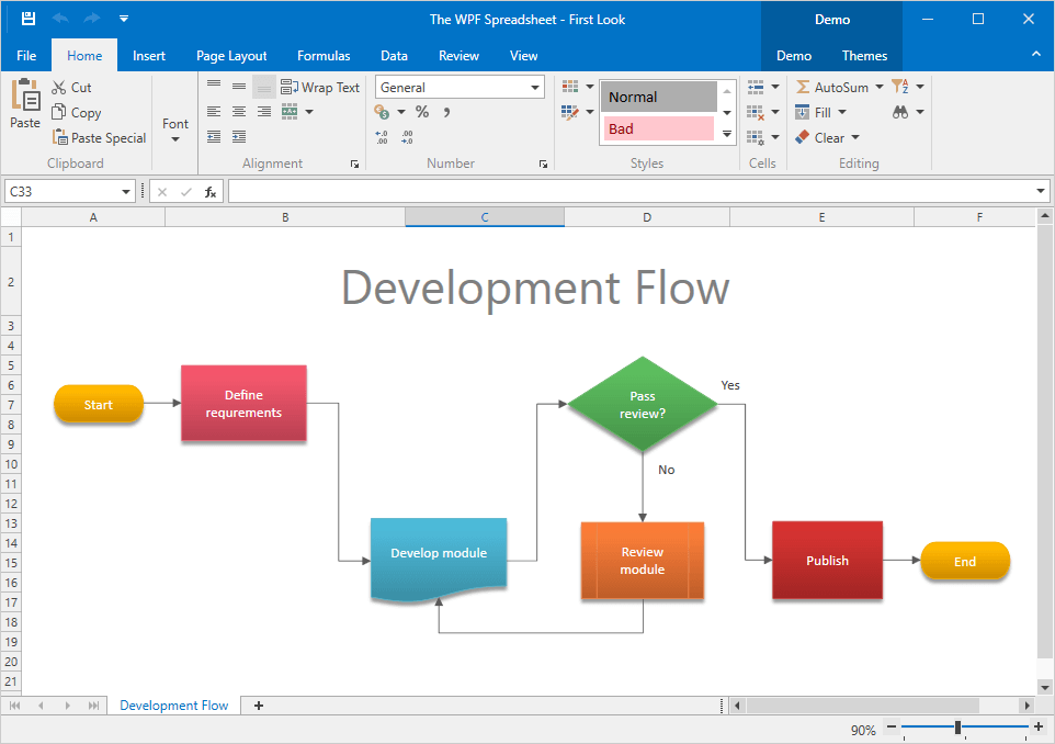
Shape Rendering Enhancements
The DevExpress WPF Spreadsheet control can render shape effects (e.g. shadow, reflection, glow, and soft edges).
Shape API
This new API allows you to create new shapes, connect and group shapes, change a shape’s fill and outline settings, add text to a shape, and remove shapes from a document.
Documentation
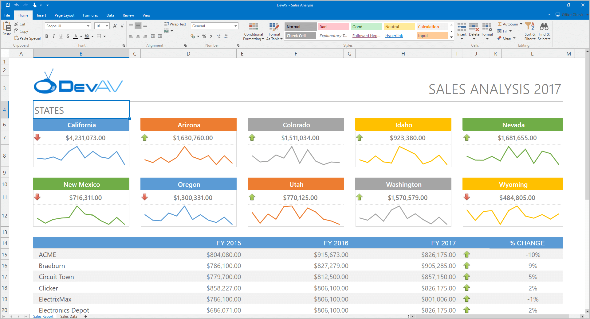
Sparkline Rendering
With this release, our WinForms and WPF Spreadsheet controls can display sparklines. Documents with sparklines can also be printed and exported to PDF.
Documentation
Search in the AutoFilter Dialog
Our WinForms and WPF Spreadsheet controls now ship with a Search box in the AutoFilter dialog. This feature allows you to quickly locate items to use within a filter.
Rich Text API
Our updated API allows you to create and edit rich text within a cell.
Documentation
#Themes
Theme Designer - Template Editing
With this release, you can locate and modify control templates, create custom themes and apply color presets.
Additional enhancements include:
- An effortless way to locate the required template and navigate between templates in code.
- Automatic theme upgrade option once a new version of our WPF Subscription is released.
- Ability to import old themes created in the Theme Editor.
Blog Post Documentation Tutorial Video
Download
Palette Theme Keys
Modern themes with color palettes (Office2016SE, VS2017) expose their palette colors and brushes as resources. These can be accessed in code:
<Border BorderBrush="{DynamicResource {dxt:PaletteBrushThemeKey ResourceKey=Border, ThemeName=Office2016WhiteSE}}" BorderThickness="1" />
Themed Window Enhancements
Our Themed Window can now act as a dialog window and show dialog buttons defined in XAML or code behind. We've also replaced the legacy DXMessageBox with ThemedMessageBox that matches the ThemedWindow's style. Both dialog windows (ThemedWindow and ThemedMessageBox) can be used on a standalone basis and in our MVVM services.
Demo
#Tree List
Data Sorting Performance Enhancements
Data sorting is now up to two times faster when compared to previous versions.
Miscellaneous Enhancements
- The CheckBoxFieldName property supports complex paths to nested properties (e.g., "Order.IsProcessed").
- The TreeList control can now detect cross-thread operations and maintain data consistency. If data is changed from another thread, the TreeList control throws a cross-thread exception.
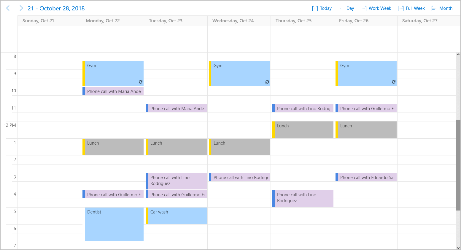
#New UWP Scheduler (CTP)
This release includes our new UWP Scheduler control - available as a community technology preview. Its features include:
- Day, Week, Work Week and Month Views
- Full data binding support with mappings
- Recurring and All Day Appointment support
- Built-in toolbar and the appointment edit form
- Support for multiple time zones in the time ruler
#Data Grid
New Virtual Data Source
v18.2 introduces an asynchronous virtual data source - InfiniteAsyncSource.
Virtual sources allow you to bind the Grid control to any data source even if the total record count is unknown. You can create solutions that remain responsive to end-user actions regardless of the demands placed upon the Grid. Whenever you work with a large dataset, our InfiniteAsyncSource fetches and processes data on-demand, in a background thread. This ensures that the Grid control does not freeze during data-intensive operations.
#Dialogs
Windows 10 Style and Other Enhancements
This release includes a number of enhancements to our Dialogs.
- Dialogs now match the modern Windows 10 look and feel.
- A new IDialogDocumentContent interface allows you to invoke a confirmation dialog when another dialog is displayed.
- Adaptive UI - dialogs can scale according to the current application width.
- Icon support for dialog buttons.
#New Adaptive Project Template
All pages within our adaptive project template now include responsive layouts.
Demo
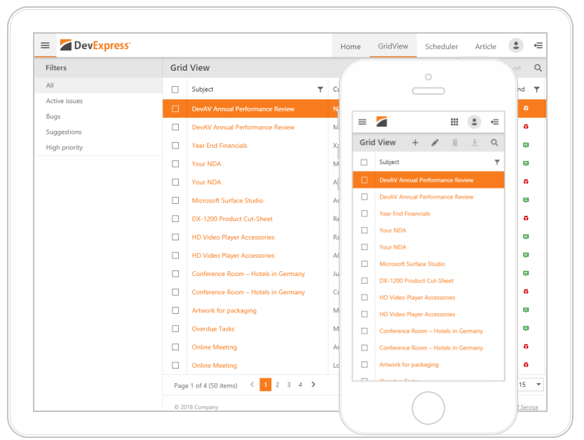
#New MVC Filter Cоntrol
Our new ASP.NET MVC Filter Control allows you to build filter criteria of any complexity and apply the filter to any data component or data model.
Demo
#CardView
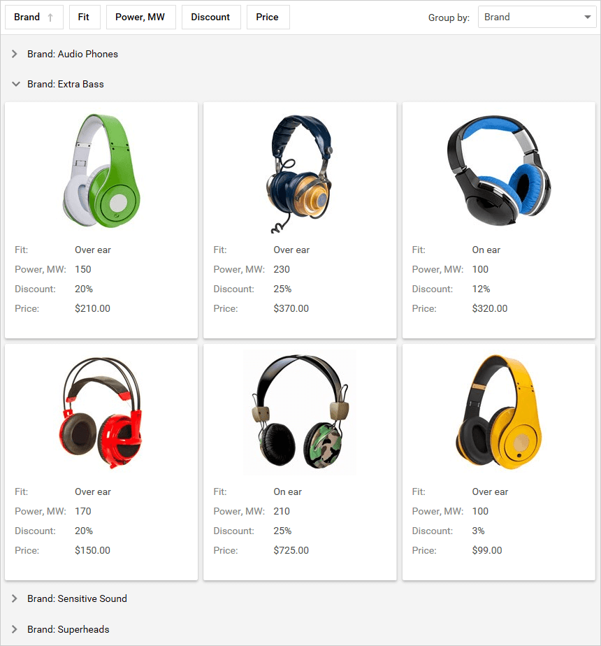
Data Grouping
Our ASP.NET Web Forms and MVC CardView allows you to group data against multiple columns.
Demo Blog Post Documentation
#Charting
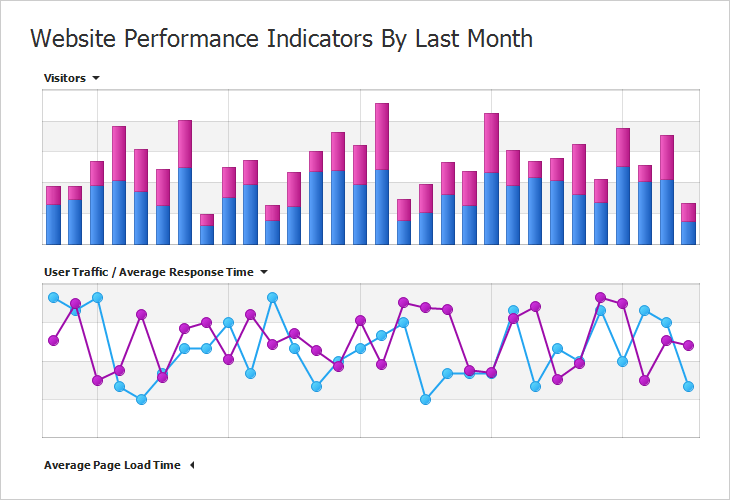
Pane Layout Enhancements
- Ability to add individual titles to each pane.
- You can hide a pane by clicking its title.
- Panes can be displayed using a grid layout.
Demo: Linear Pane Layout Demo: Grid Pane Layout
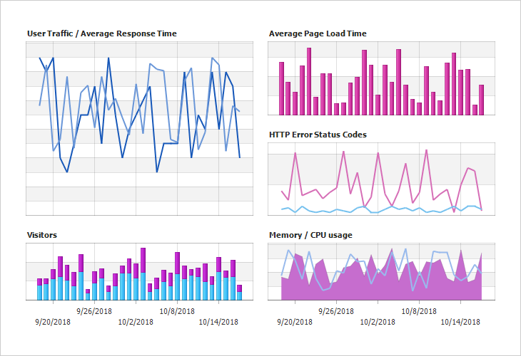
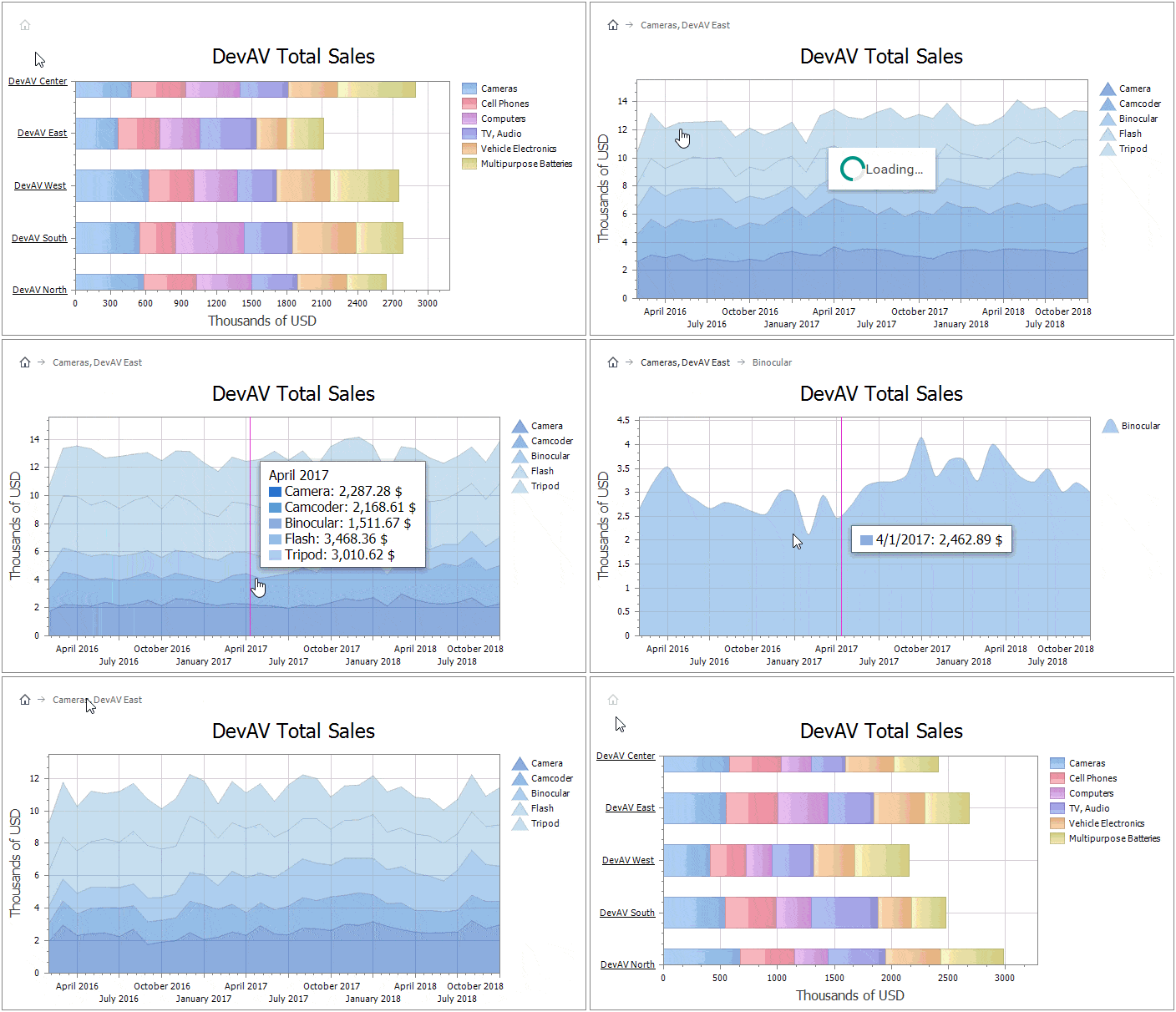
Drill Down Chart
Our ASP.NET and MVC Chart Control now supports nested Series Templates - allowing you to implement drill-down enabled charts with ease. You can create endless drill-down levels and use the control's integrated Breadcrumb navigation option to move across your data hierarchy.
Demo Blog Post
#Editors
Database Server Mode in ComboBox and TokenBox
Both our ASP.NET Web Forms and MVC List Editors now support Database Server Mode. When used, list editors only load visible items and execute data-aware operations (such as filtering) on the database server.
Demo Blog Post Documentation
Drop-Down Editors - Adaptivity Enhancements
In this release, both Web Forms and MVC Drop-Down Editors can switch to modal mode based upon browser width.
Demo Blog Post
Month-Year Picker
Our ASP.NET Web Forms and MVC Calendar (DateEdit) now supports month-year selection mode.
Demo
Date Edit - Scroll Picker Mode
Our ASP.NET and MVC Date Edit provides a new scroll selection mode. When used, the Date Edit displays date components (day, month, year, time) using an independently rotating wheel (making date selection on touch devices much easier).
Demo
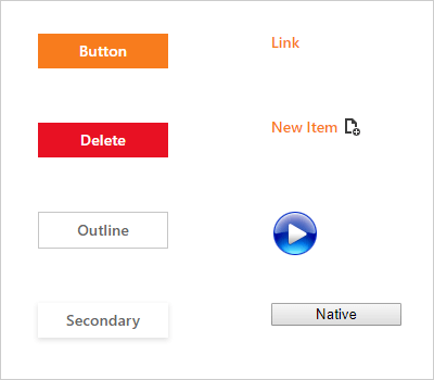
Button Render Styles
New predefined render styles allow you to define additional semantics and indicate possible user actions: Danger, Outline, Secondary, New Item, Native.
Demo
#File Manager and Upload Control
OneDrive and Google Drive Support
Our ASP.NET and MVC File Manager and Upload Controls allow you to upload and manage files and folders in OneDrive and Google Drive.
Google Drive Demo OneDrive Demo
Documentation (Google Drive) Documentation (OneDrive)
#Form Layout
Data Annotation Attributes
With our Form Layout control, you do not have to bind each individual editor to data and provide label captions corresponding to field names. You simply bind the control to a data source and specify which fields are to be displayed on a page.
With this release, you can specify default settings for individual editors by applying Data Annotation attributes to data source fields. You can use the following Data Annotation attributes:
- BrowsableAttribute
- RequiredAttribute
- RegularExpressionAttribute
- RangeAttribute
- DisplayFormatAttribute
- DisplayAttribute
- DataTypeAttribute
#GridView
Callback Support in Batch Edit
Our ASP.NET GridView now supports callbacks in batch edit mode - The control will not lose unsaved changes when an end-user filters, pages, groups or sorts data.
Demo Blog Post Documentation
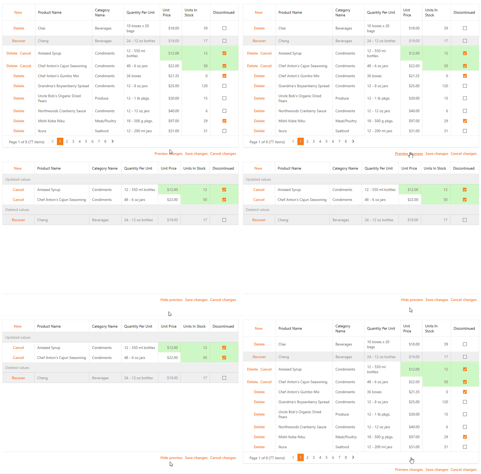
Preview Changes in Batch Edit
Inserted, edited and deleted rows can now be previewed and modified before data is saved in Batch Edit mode.
Demo Blog Post Documentation
Adaptivity Enhancements in Fixed Table Layout Mode
We've improved our GridView and made it more adaptive in fixed table layout mode. With this release, you can specify a column's minimum and maximum width.
Blog Post
#Menu
Collapse to Images
To help reduce control width when the browser screen is narrow, our ASP.NET Menu can now hide item text and only display icons.
#Pivot Grid
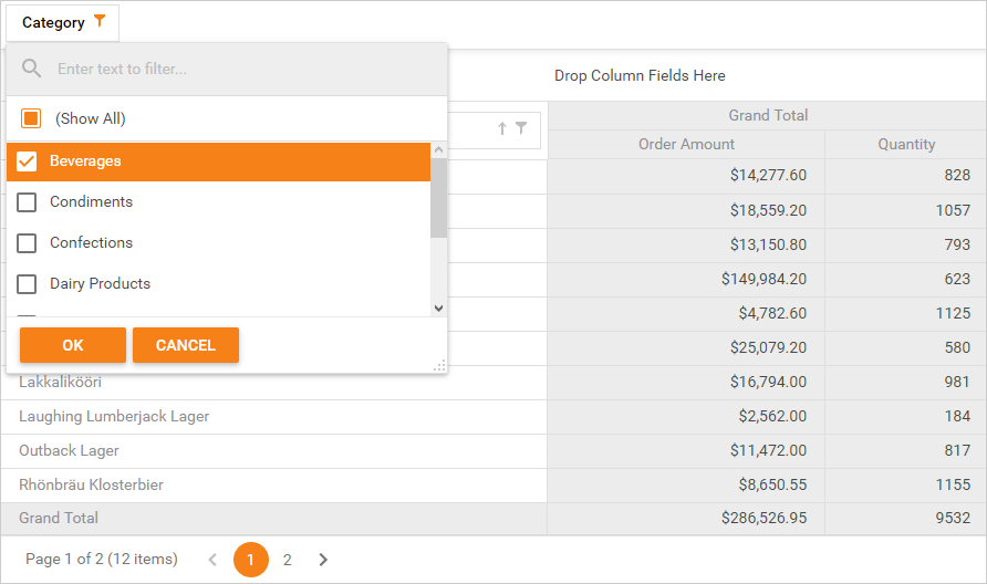
New Filter Popup
We have replaced our previous Filter Popup with a new implementation and integrated search option. This new dialog and associated scrolling speed is up to 3x times faster in WebKit/FF Browsers, and up to 5x times faster in Internet Explorer.
Unbound OLAP Fields
You can assign an OLAP Multidimensional Expression (MDX) to a PivotGrid field and create an Unbound Field for OLAP. You can also use the OLAPQueryData event to obtain an MDX query (used by the pivot grid to request data).
Performance Enhancements
We have improved the Pivot Grid's in-memory data processing engine and now support the following features in Optimized Mode:
- Custom Types
- Custom Totals
- CustomSummary event
- CustomGroupInterval event
- CustomFieldSort event
- Legacy TopN
- Summary Filter
- FileDataSource
- CustomUnboundFieldData event
- Case-sensitive data binding.
We've also added an OptimizeSummaryTypeCalculation option. Enable this option to accelerate data aggregation speed with int/float/double numbers in Optimized Mode.
#Rich Text Editor
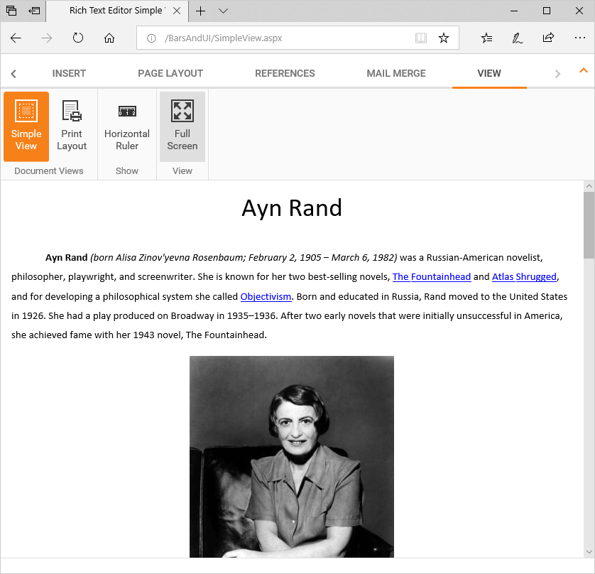
Simple View (Web Layout)
You can now view documents in Simple View mode. In this view mode, the document is not split across multiple pages, nor does it have margins, headers or footers.
#Scheduler
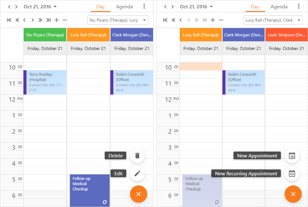
Floating Action Button
The Scheduler's new Floating Action button triggers the following actions:
- Create a new appointment
- Edit an appointment
- Delete an appointment.
Demo Documentation
Appointment Tooltips (Mobile)
We continue to improve the Scheduler's user experience on touch-first and mobile devices. In this release, we've added tooltip support for appointments.
Demo Blog Post Documentation
Performance Enhancements
Our Scheduler control now renders up to three times faster in Edge and Chrome.
Demo Blog Post
View Visible Interval UI Enhancements
Our new View Visible Interval within the ASP.NET Date Navigator makes navigation across appointments much easier.
Demo Blog Post
#Spreadsheet
Pivot Tables
With this release, you can now embed pivot tables within worksheets. Our Excel-inspired pivot table allows you to incorporate multi-dimensional data analysis and cross-tab reporting to any ASP.NET and MVC web app with ease. As you would expect, numerous layout customization options give you total control over its user experience.
Cross Sheet Formula Editing
End-users can now use cell values from any worksheets to create formulas for the active worksheet.
New Behavior Settings
New behavior settings allow you to prevent end-user actions on worksheets, columns, and rows.
#New ASP.NET Core Spreadsheet (CTP)
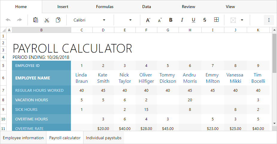
With this release, you can incorporate spreadsheet functionality to any ASP.NET Core application with absolute ease. Our new Spreadsheet control is made available as a community technology preview (CTP). We expect to officially ship the product in 2019. Features include:
- Cell Editing and Formatting
- Formulas
- Charts
- Sorting
- Comments
- Read-only Mode
Demo Blog Post
#ASP.NET Core Rich Text Editor (CTP)
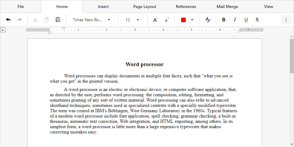
Our new Rich Text Editor ships with everything you'll need to quickly incorporate advanced text editing functionality in your next ASP.NET Core application. Its features include:
- Character and Paragraph Formatting
- Bullets and Numbering
- Tables
- Hyperlinks and Bookmarks
- Floating Objects
- Auto Correct
- Document Protection
Demo
#ASP.NET Core Reporting
v18.2 marks an official release of our ASP.NET Core Reporting. You can create ASP.NET Core applications that target both .NET Framework and .NET Core.
New features include:
#DevExtreme ASP.NET Core Controls
All DevExtreme HTML5/JS Control features are also available in DevExtreme ASP.NET Core Controls.
See What's New in DevExtreme
#New File Manager
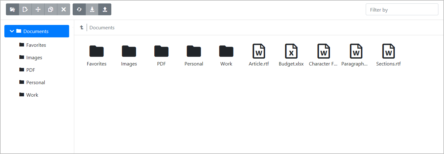
Our new ASP.NET Bootstrap File Manager control allows you to reproduce the Windows File Explorer UX in your next web app. Its features include:
- Ability to display file and folder structures
- Both Thumbnail and Details view modes
- File/folder operation support: create, rename, copy, move, delete
- File system providers: physical, data source, cloud storage Amazon / Azure / Dropbox.
- File upload and download
- Ability to define access permissions for folders and files.
Demo
#New Ribbon Control
With unmatched design/runtime options, our new ASP.NET Bootstrap Ribbon control ships with all the tools you'll need to emulate the Microsoft Office end-user experience within your next Web project.
Its features include:
- Over 10 item types: Button, Check Box, Color Button, Combo Box, Date Edit, Drop-Down Buttons, Galleries, and many more...
- Data Binding
- Keyboard Support
- Quick Access Toolbar
- Adaptivity and Templates Support
- Client-side API
Demo

#New Rich Text Editor (CTP)
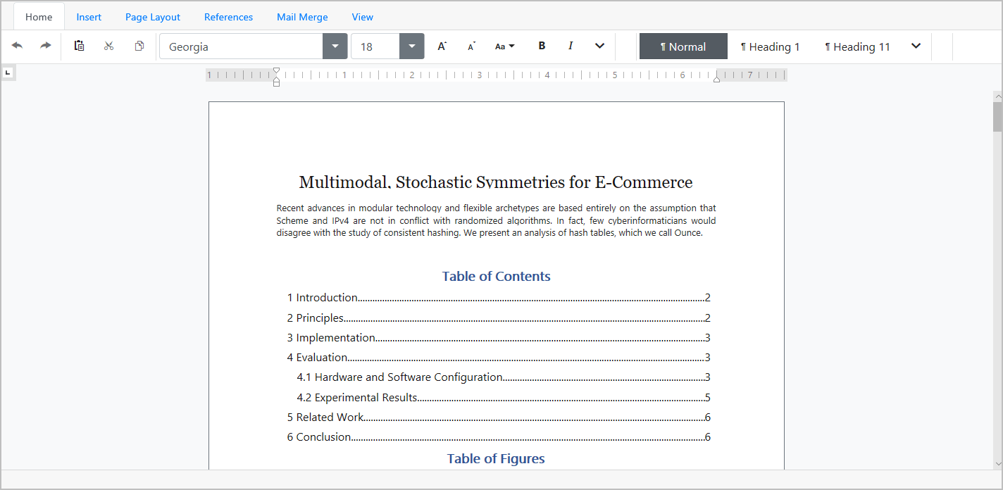
Our new ASP.NET Bootstrap Rich Text Editor allows you to integrate advanced text editing functionality into your next web application. It ships with comprehensive text formatting options and a rich collection of end-user options so you can deliver Microsoft Word-inspired functionality with ease.
Features include:
- Text formating
- Spell checking
- Mail merge
- Save & Export to various formats
- Insertion of tables, lists, images, hyperlinks, and etc.
- Document management
Demo
#New Spreadsheet (CTP)
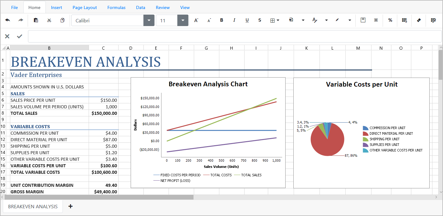
Our new ASP.NET Bootstrap Spreadsheet control allows you to deliver Excel inspired functionality with minimal effort. Its features include:
- Worksheet protection
- Printing
- Sorting & Filtering data
- Graphical data presentation via charts
- Specifying formulas
- Inserting images
Demo
#New Themes
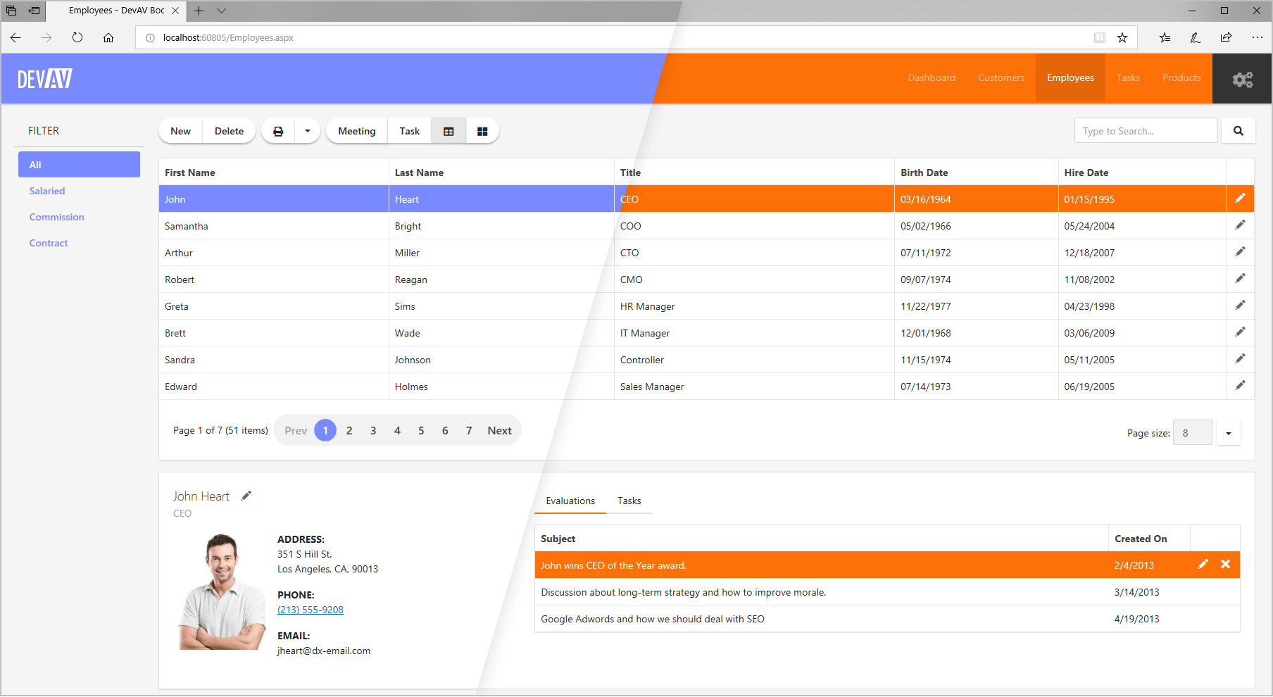
This release includes two new themes for ASP.NET Bootsrap: OfficeWhite and Purple. These themes were designed for websites built using Bootstrap 4 or later. You can download both themes free of charge.
Blog Post Demo
#CardView
Vertical Scrolling and Endless Paging
Our Bootstrap CardView now supports both a Vertical and Horizontal Scrollbar. We've also simplified record navigation with on demand record scrolling. To give you maximum UI flexibility, our Bootstrap CardView ships with Endless Paging support. As its name implies, Endless Paging allows users to navigate an entire dataset without using a data pager.
The following Endless Paging options are available:
- Show More Cards - Additional cards are loaded when the 'Show more cards' link is clicked;
- On Scroll - Additional Cards are loaded when the control is scrolled.
Demo
#Form Layout
Data Annotation Attributes
With our Form Layout control, you do not have to bind each individual editor to data and provide label captions corresponding to field names. You simply bind the control to a data source and specify which fields are to be displayed on a page.
With this release, you can specify default settings for individual editors by applying Data Annotation attributes to data source fields. You can use the following Data Annotation attributes:
- BrowsableAttribute
- RequiredAttribute
- RegularExpressionAttribute
- RangeAttribute
- DisplayFormatAttribute
- DisplayAttribute
- DataTypeAttribute
Demo
#GridView
Scrollbars
With this release, our Bootstrap Data Grid supports both Vertical and Horizontal scroll bars.
Demo: Vertical Scrolling
Demo: Vertical Scrolling
Fixed Columns
With this release, you can anchor columns to the left of the grid. These fixed columns are never scrolled horizontally and as such, allow you to create solutions that offer improved readability and visual clarity.
Demo
Endless Paging
To give you maximum UI flexibility, our Bootstrap GridView ships with Endless Paging support. Endless Paging allows users to navigate an entire dataset without using a data pager.
Demo
Context Menu
A context menu is displayed when an end-user right-clicks an individual Bootstrap Data Grid element. The following built-in popup menus are available:
- row
- column header
- footer and group footer
- group panel.
Demo
#New Push Notification API
We have addressed the needs of those who are building apps that display/render real-time data. With this release, you can integrate DevExtreme controls with your SignalR server (or any other notification service).
The new 'push' method is now available within a 'Store' instance.
notificationHub.on('message', msg => {
    store.push([{ type: msg.type, data: msg.data }]);
});
Demo Blog Post Documentation
#Real-time UI Updates
New DataSource options include:
- reshapeOnPush - specifies if sorting, grouping, paging and other shaping operations should be applied on push notification;
- pushAggregationTimeout - specifies the period within which the arrived notifications are aggregated into a batch.
Demo Documentation
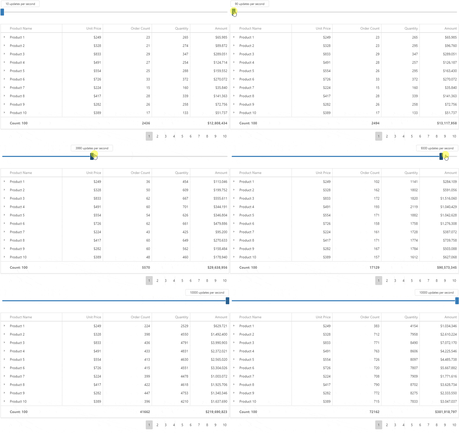
#Data Grid & Tree List
Live Update and Performance Enhancements
With this release, our Data Grid and Tree List reflect changes to real-time data much faster. To address the most popular usage scenarios, we have extended the Grid's and TreeList's API in the following manner:
- 'repaintChangesOnly' - if set to 'true', push updates don't force the component to fully re-render. Our new change tracking strategy updates only the modified portion of the component UI.
-
'editing.refreshMode' - specifies control behavior once a row is edited
- 'full' - requests new data from server, shapes and renders it;
- 'reshape' - reshapes local data and renders it;
- 'repaint' - re-renders local data without reshaping;
- 'summary.recalculateWhileEditing' - enables real-time summary recalculations while editing (for client-side summaries only)
- 'highlightChanges' - enables visual highlighting of updated cells.
Demo
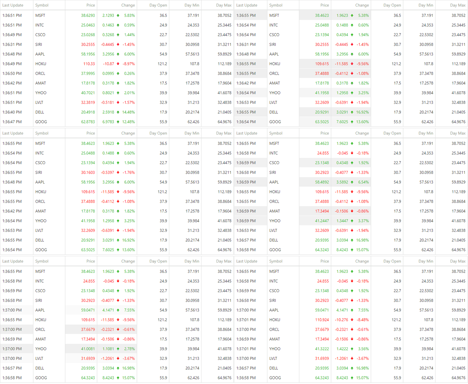
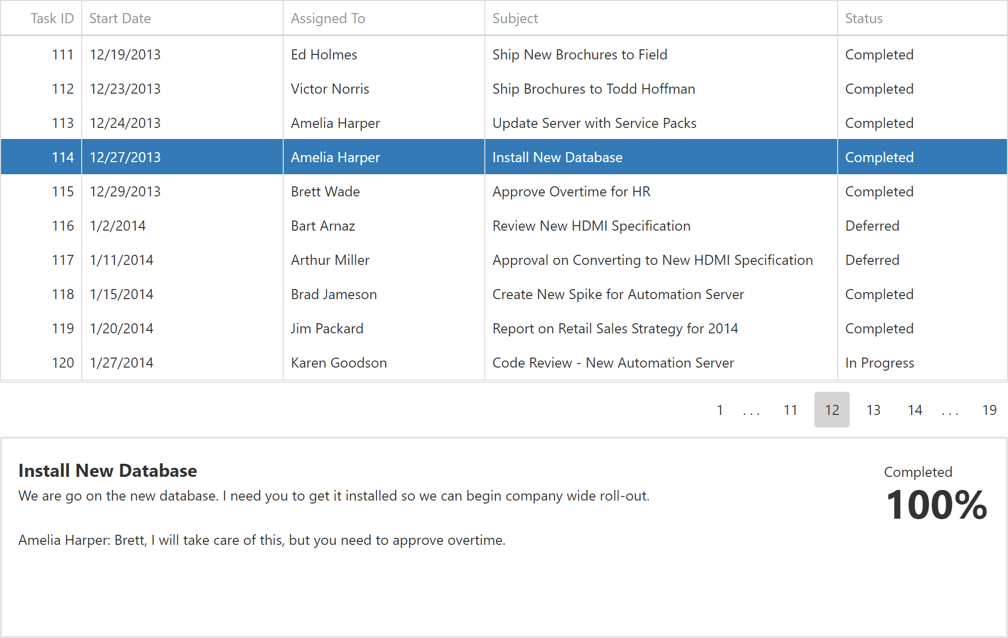
Focused Row and Keyboard Navigation Enhancements
We've introduced a new API to control DataGrid and TreeList focused row operations. This feature is useful when you need to display Master-Detail relationships, navigate through records and view details in a side-by-side view.
You can also use mouse or keyboard to navigate through rows. Our new API allows you to implement custom keyboard navigation through individual cells.
Demo
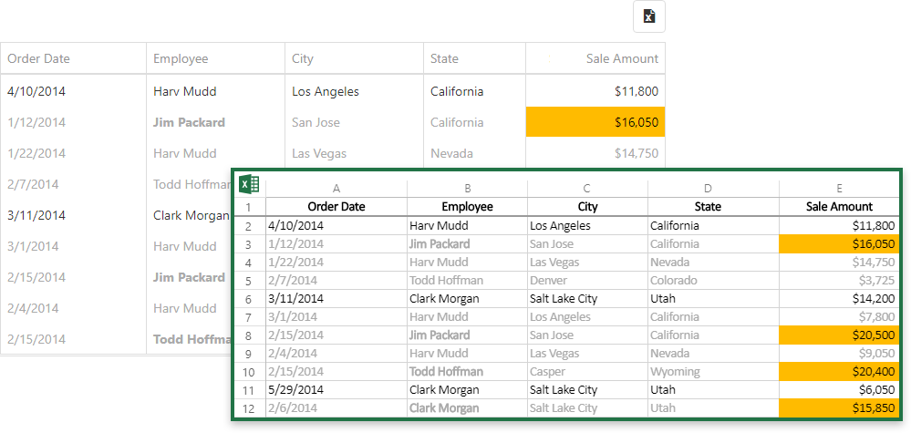
Excel Data Export Customization Enhancements
We've extended the capabilities of our Excel data export engine so you can control the appearance of exported data more effectively (font, background color, etc.).
Demo Documentation
Command Column Customization
This release includes new command column customization options for our DataGrid and TreeList controls. These include:
- Specify command column width, position, or template
- Fix, or 'pin', a command column to the left or right
- Add a custom command button to the 'edit command' column
- Add any number of custom command columns
- Hide or show command buttons for specific rows
Demo Documentation
#Data Visualization
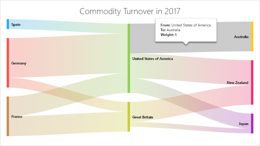
New Sankey Diagram Component
The new Sankey component will help you visualize data as flows or relationships between different parts of systems. This widget supports the following features:
- Several predefined palettes, including a Material-style palette
- Node alignment and reordering
- Title and subtitle
- Client-side export and printing
- Tooltip Support
- User interactions (hover, click)
Demo Documentation
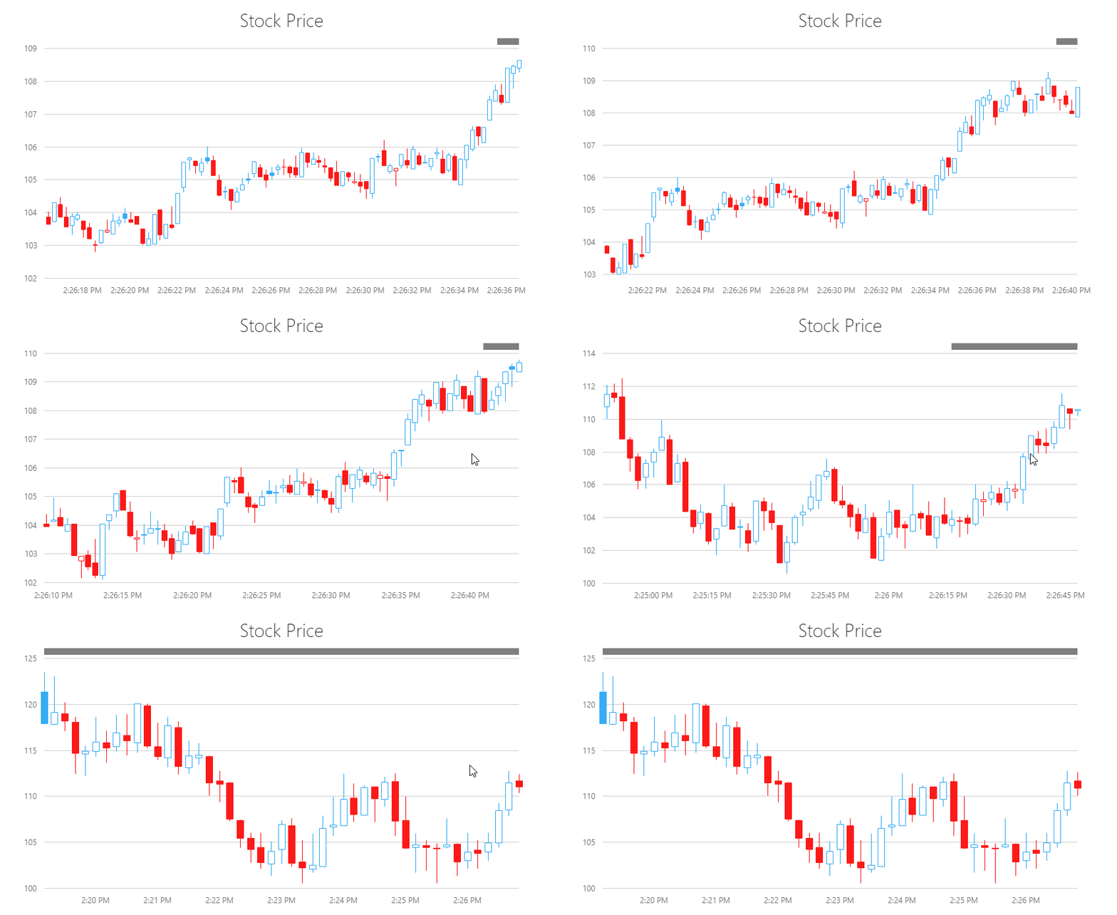
Real-Time Chart Updates
We've added support for real-time data updates within a Chart without a full chart redraw. When a new point arrives, you can use one of the following behaviors:
- Keep - new data doesn't affect what you see
- Shift - new data shifts the visual range
- Reset - new data redraws the chart
- Auto - the chart's behavior depends on the current visual range position
We've also included uninterrupted navigation during data updates (you can zoom, scroll and explore a chart while it is updated in the background). You can also jump to your new data and view it in real-time.
Demo Documentation
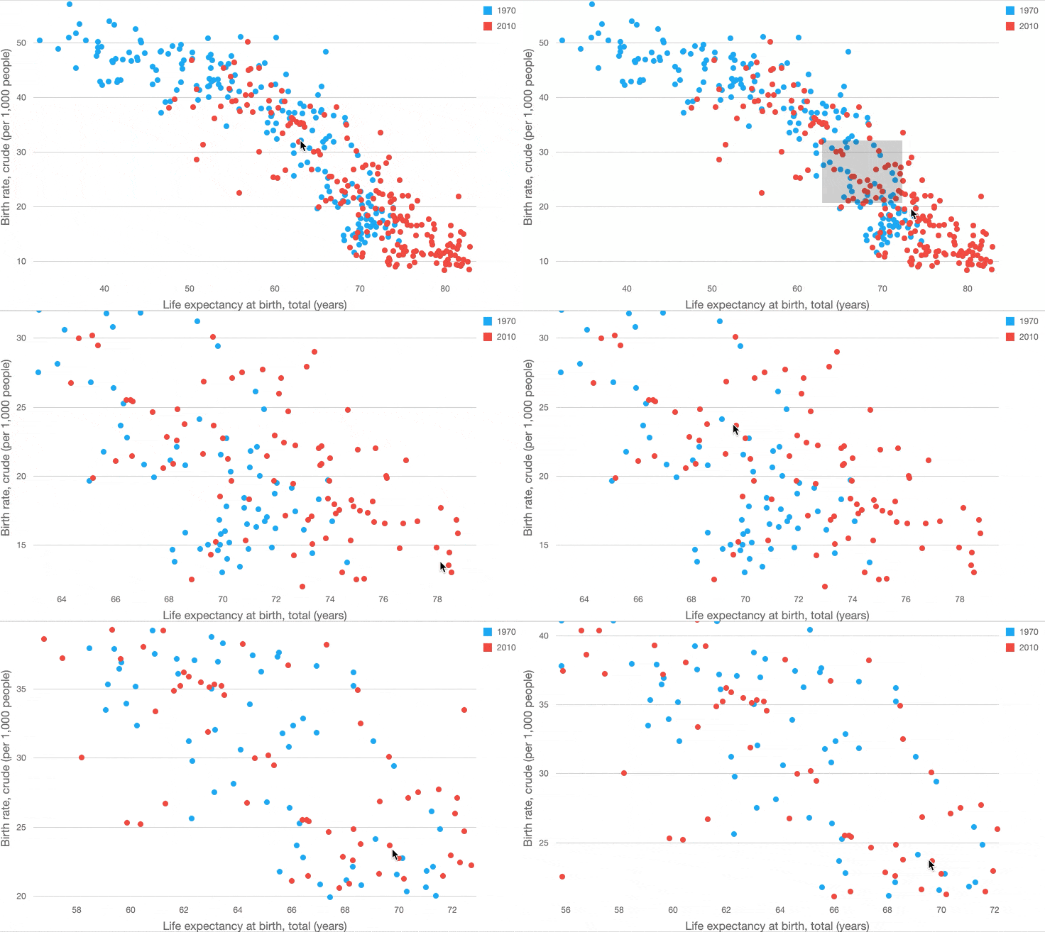
Zoom/Scroll Enhancements
We have refined our JavaScript Charting library to support the following:
- Zoom a chart by its Value-axis
- Select the desired area using your mouse (or via a gesture on touch devices)
- Save zoom level on data updates
- Scroll/Zoom to areas without data
- A Chart is continuously updating during zooming/scrolling operations
Demo Blog Post Documentation
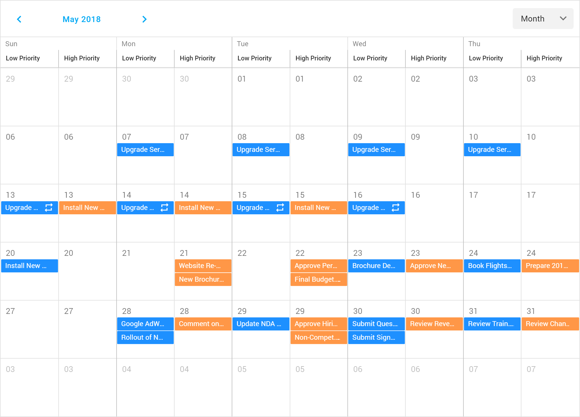
#Scheduler
Group by Date
You can now group Scheduler appointments first by date and then by resources.
Blog Post Demo Documentation
#UI Widgets
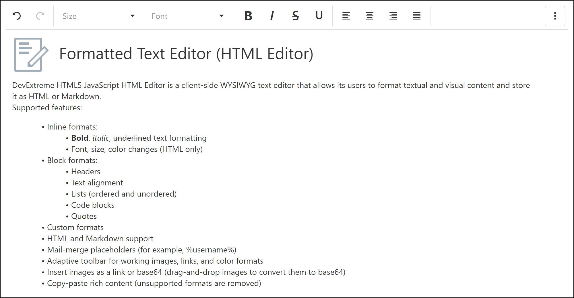
New HTML/Markdown WYSIWYG Editor (CTP)
This release introduces a new rich WYSIWYG text editor. This UI widget allows you to change text styles, create lists and add hyperlinks and images. Both HTML and Markdown target markup formats are available.
Blog Post Documentation
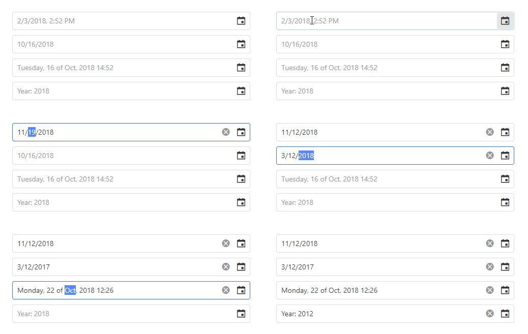
DateBox - Masked Input
Our DateBox widget allows you to specify a date mask and control user input as needed.
Demo Blog Post Documentation
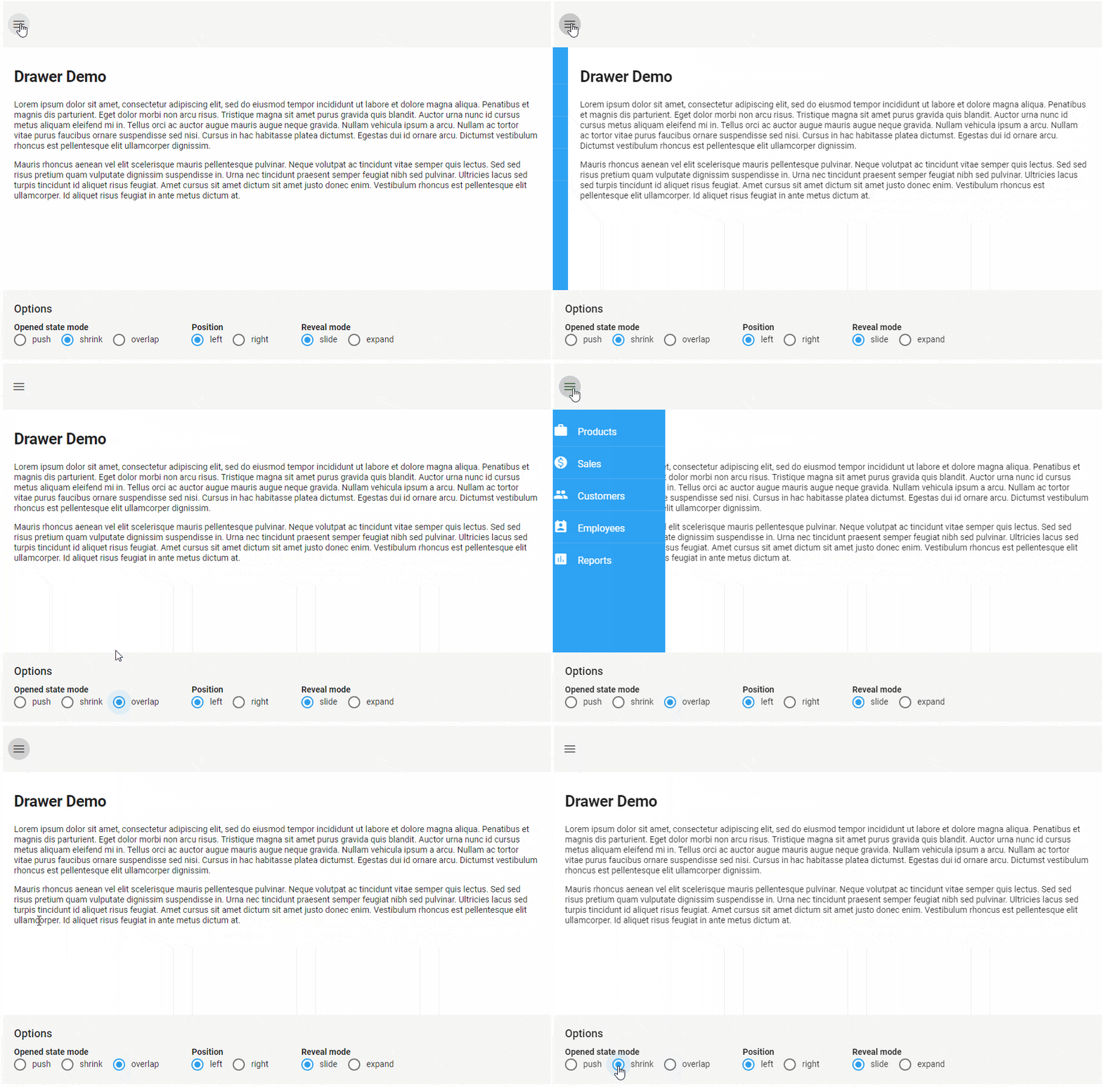
New Drawer Component
This release includes a new Drawer component for building responsive application layouts. It can be used to implement collapsible navigation, information, and tool panels. With a wide range of configuration options, you can specify Drawer position, reveal animation, open/close behavior and more.
Demo Documentation
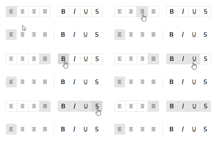
New ButtonGroup Component
The new ButtonGroup component consists of a set of toggle buttons. Both single and multi-select modes are available.
Demo Blog Post Documentation
File Uploader Enhancements
This release includes the following client-side file validation options for our File Uploader widget:
- allowedFileExtensions
- minFileSize
- maxFileSize
The new 'chunkSize' option allows you to upload large files in "chunks".
Demo Documentation
Filter Builder API Enhancements
You can now limit Filter Builder group nesting and specify available operations.
{
    ...
    maxGroupLevel: 0, // disable group nesting
    groupOperations: [ "and", "or", "notAnd", "notOr" ] // specify available operations
}
Performance Enhancements
Our List, Accordion and TabPanel components now support partial UI updates. Use the new 'repaintChangesOnly' option to enable this feature.
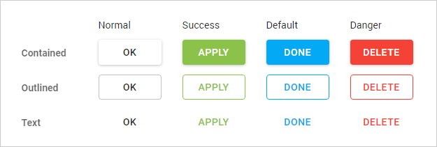
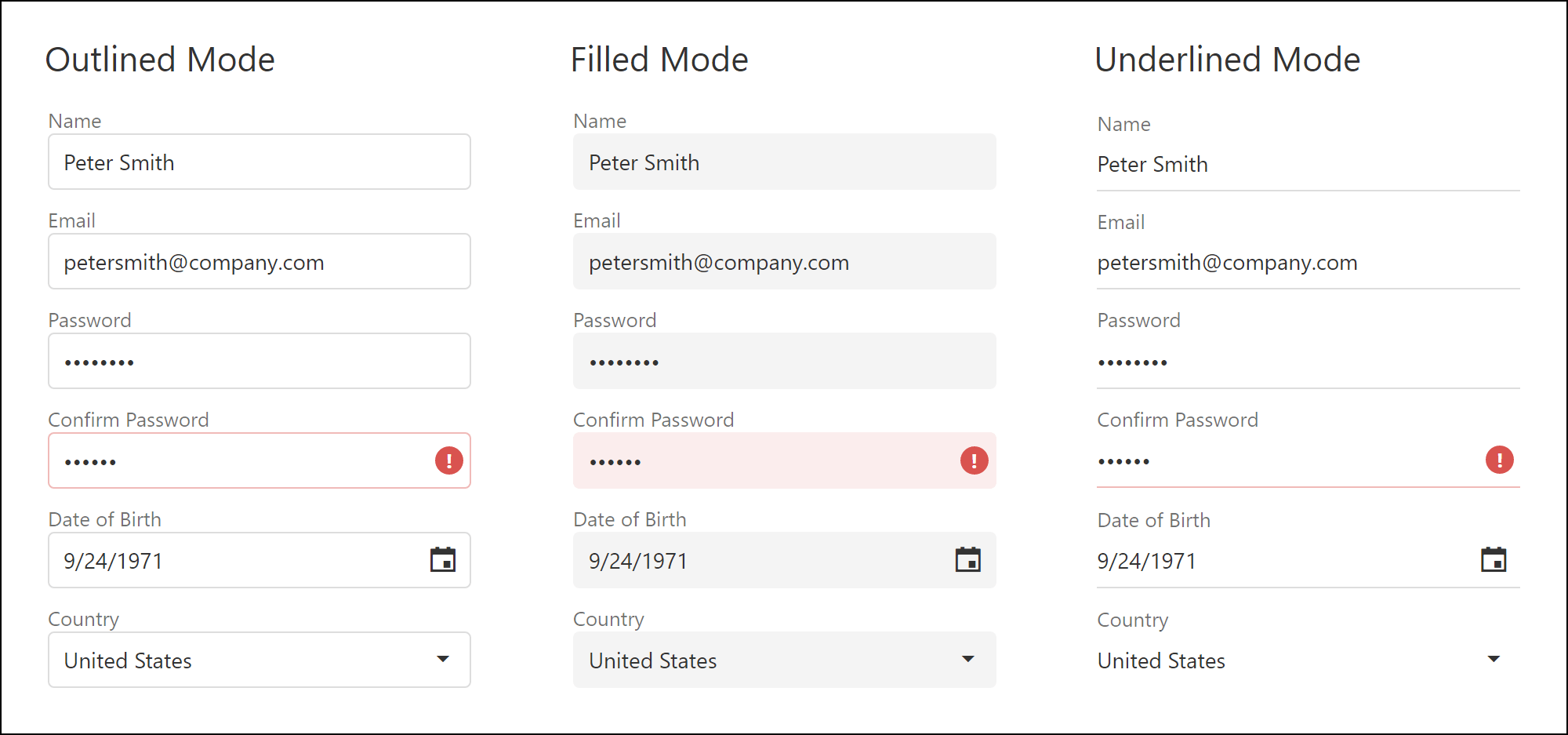
New Button and Editor Styles
You can now customize button and editor appearance as business needs dictate. Buttons ship with the following styling modes: "Contained", "Outlined" and "Text". Editor styling modes include: "Outlined", "Filled" and "Underlined". New styles are available for both Material and Generic themes.
Demo Documentation
#Themes
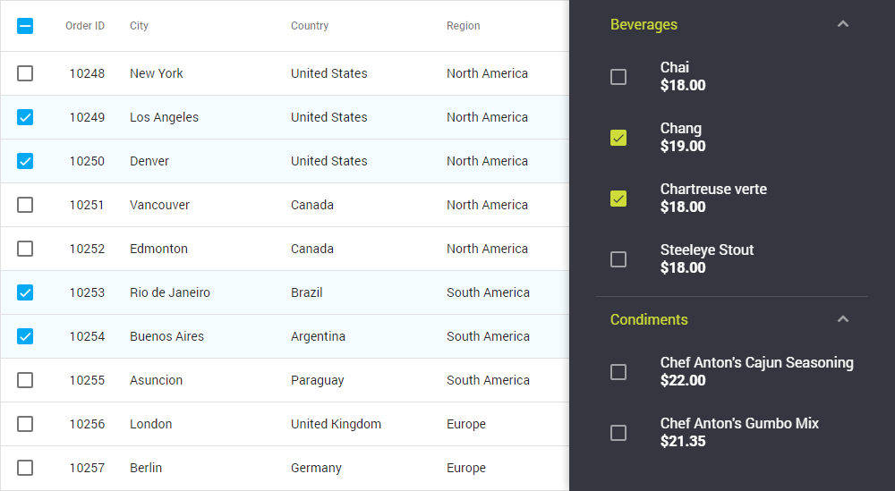
Color Swatches
You can now create and use multiple DevExtreme color schemes within the same application. For instance, you can implement a dark navigation sidebar with a light content area. This feature is available in the both ThemeBuilder UI and CLI tools.
DevExtreme CLI - Custom Theme Generation
The new ThemeBuilder CLI allows you to generate custom DevExtreme color schemes and save them as a CSS file without using our ThemeBuilder UI.
You can also use the DevExtreme theme variables within your app to deliver a more consistent UI. Use the ThemeBuilder CLI to export any theme variable as LESS or SASS file.
Documentation
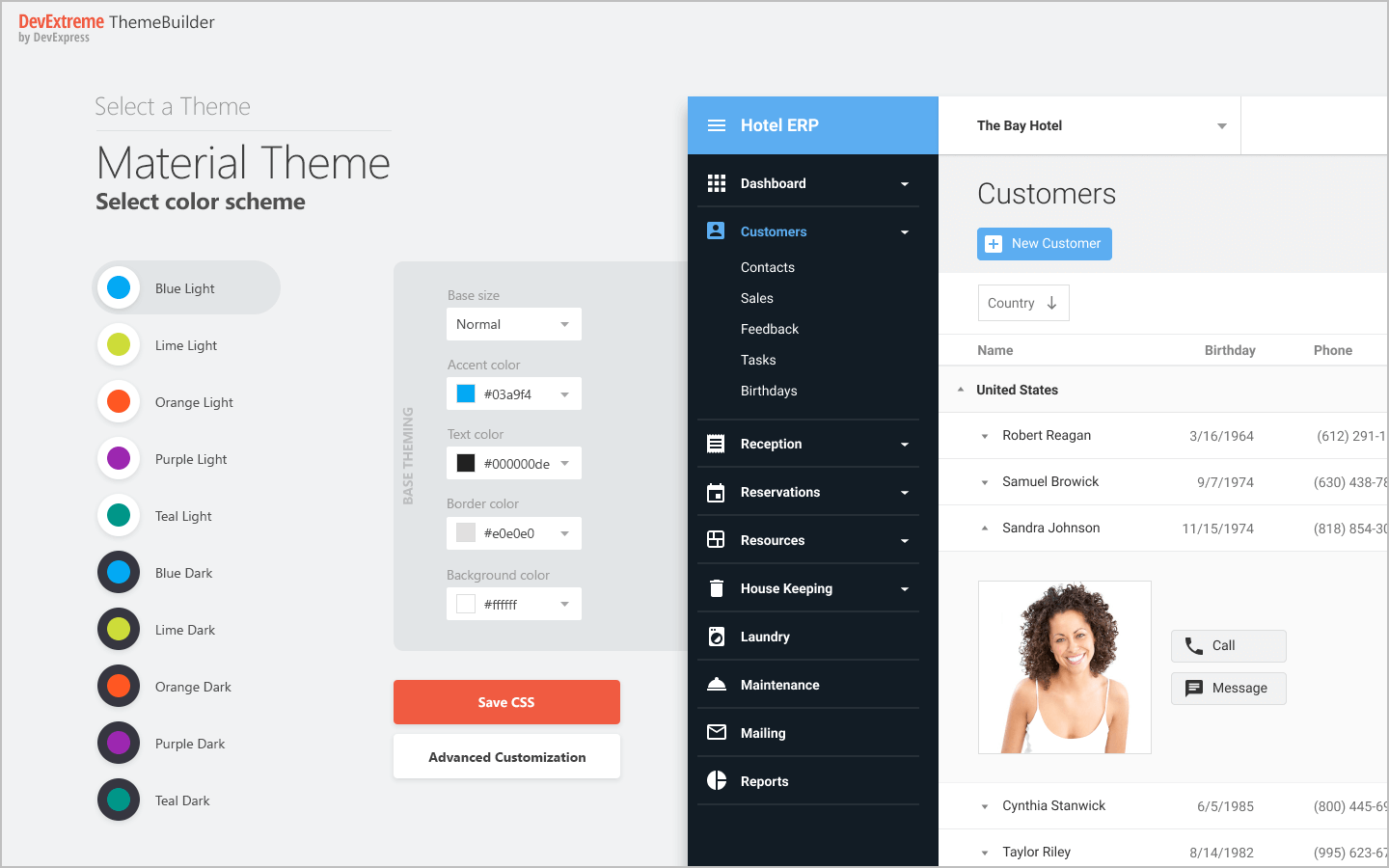
New ThemeBuilder UI
The new ThemeBuilder UI ships with a more intuitive UX and supports new theming capabilities such as Color Swatches.
Demo
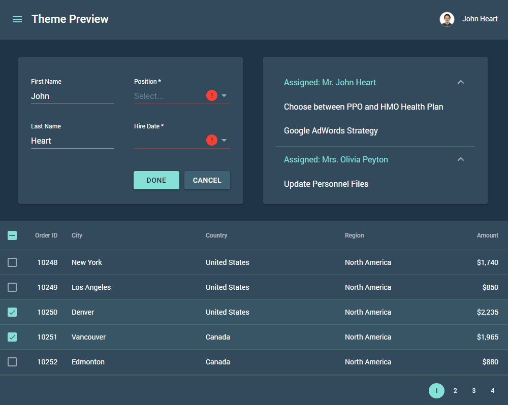
A Dark Set of Material Design Themes
A set of new 5 dark Material Design themes are available in v18.2. You can use them 'as is' or inherit a custom dark Material Design theme.
Demo
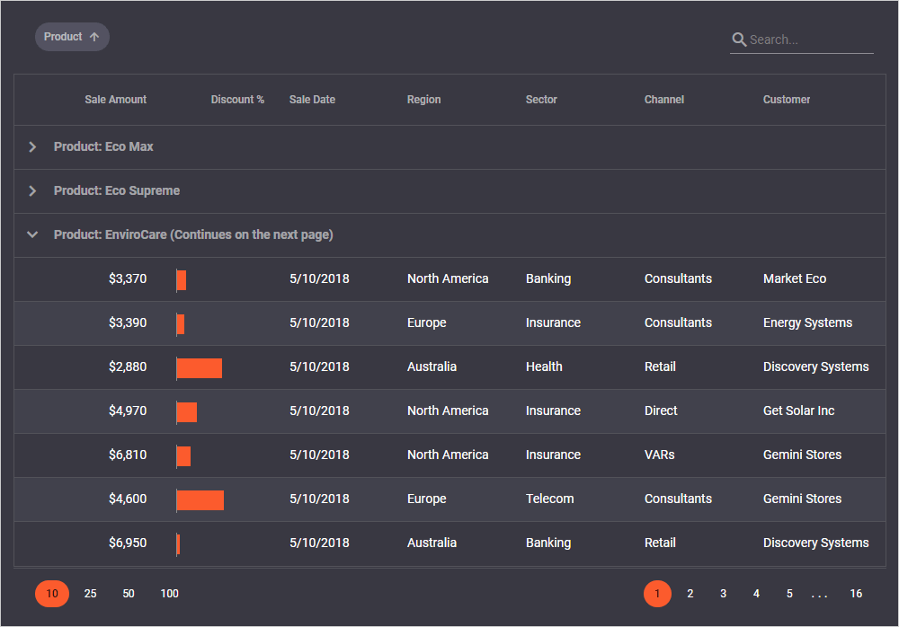
#MVC Controls
Bootstrap 4 in MS Visual Studio Project Templates
We have upgraded the Twitter Bootstrap version in our MS Visual Studio Project templates. You can now utilize all the advantages of the Bootstrap 4 CSS Framework.
#Angular Components
Responsive Application Layout Template for Angular
Our new Application Layout template is integrated with our new DevExtreme CLI tools.
Demo Blog Post Documentation
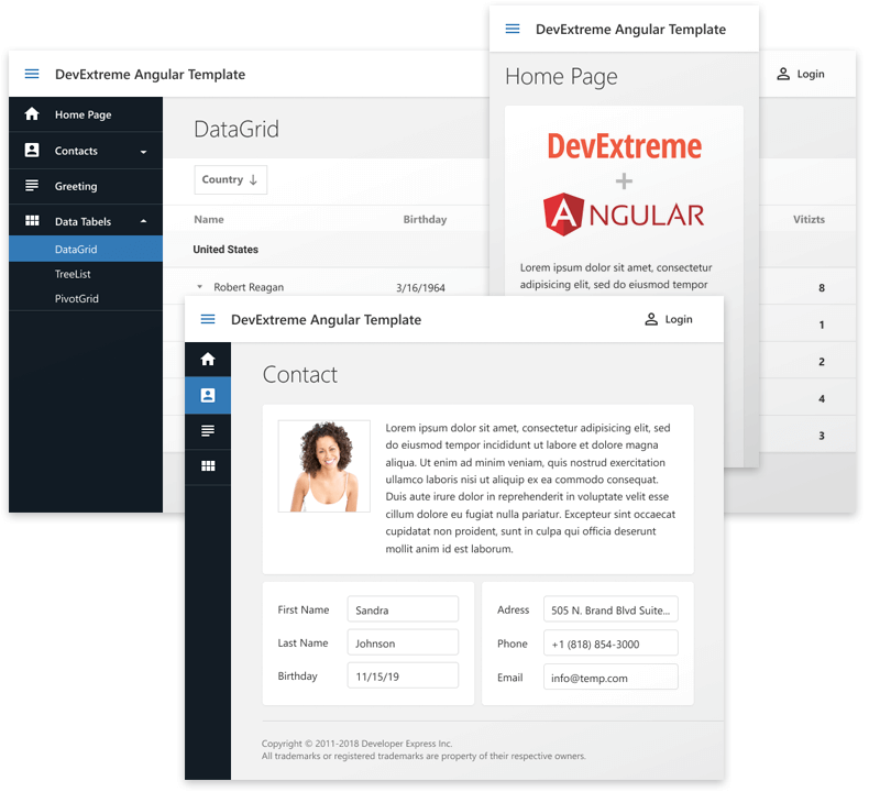
DevExtreme CLI - Angular Apps and Views Generation
v18.2 introduces our new CLI tools. You can now bootstrap Angular CLI based applications that are tightly integrated with DevExtreme. DevExtreme CLI utilizes our new Application Layout template and build-time theming capabilities. You can also add Angular views with DevExtreme components into your existing applications.
Documentation
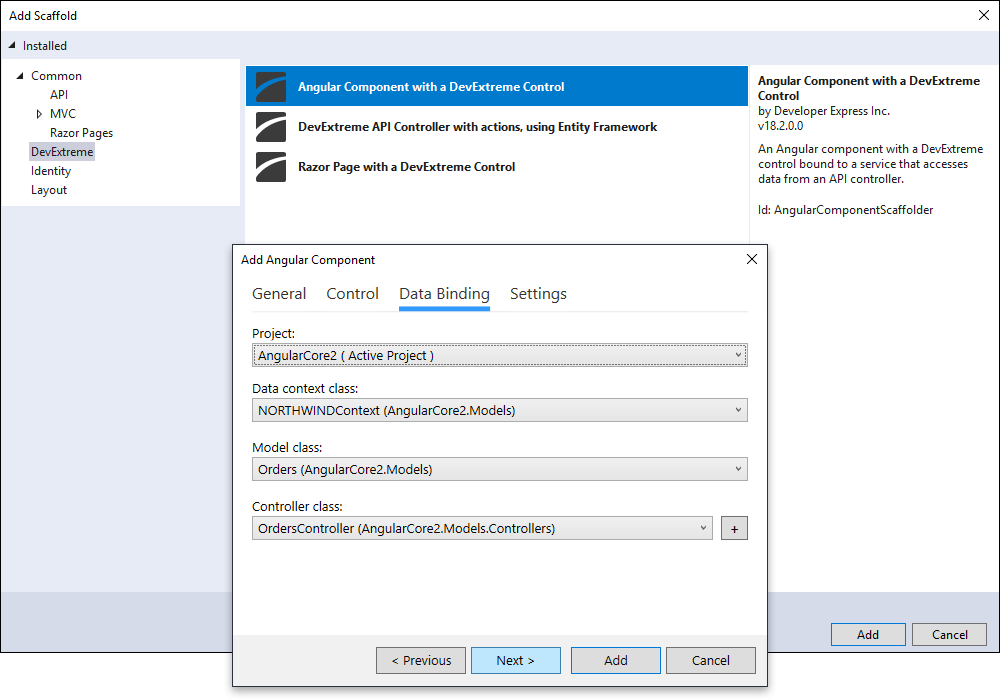
MS Visual Studio Angular Views Scaffolding
With this release, you can scaffold Angular views into your Visual Studio Angular project. These views are built upon DevExtreme Angular components and bound to your ASP.Net Core CRUD API endpoints.
Blog Post Documentation
#Vue Components
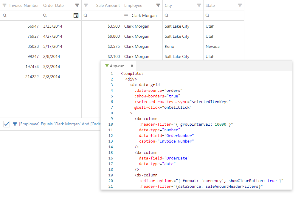
DevExtreme Vue Wrappers (RTM)
Our Vue Wrappers have been released to manufacturing and ship with the following enhancements:
- Rendering customization via named slots.
- 'v-on' directive support (and @ shorthand)
- Vue prop validation and type checks
- TypeScript support
- Child configuration components (for instance, 'dx-column' for DataGrid columns configuration).
Data binding capabilities include:
- One-way data binding
- Two-way data binding ('.sync' modifier)
- 'v-model' support for data editors
We've also added new demos to our Widgets Gallery. All new DevExtreme widgets introduced in this release cycle are also available for Vue.
Demo Documentation
#React Components
DevExtreme React Wrappers (RTM)
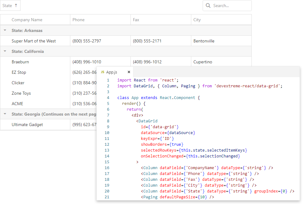
v18.2 marks the official release of our React Wrappers. This update includes the following new features:
- Controlled and uncontrolled modes
- Rendering customization via native React template components or a render method (props with -Component or -Render postfixes)
- TypeScript support
- Type checking with React PropTypes
- Support for the 'className' and 'ref' React attributes
- Child configuration components (for instance, DxColumn for DataGrid columns configuration)
Demo Documentation
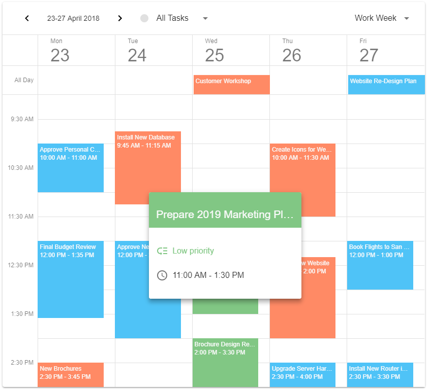
New Native React Scheduler Component (CTP)
This release includes the first iteration of our native React Scheduler/Calendar control. The following features are now available:
- Week, Work Week and Month views
- Date and view choosers
- All-day panel
- Appointment tooltips.
Demo Documentation
Native React Chart (CTP)
Our DevExtreme React Chart widget was first introduced in May 2018 as a community technology preview. This update introduces the following new features:
- Stacked Series
Documentation and Demos
-
Non-Linear Axes Types
Now you can specify logarithmic, exponential or custom axes types.
Documentation and Demos
- Color Palette Management
You can now specify a chart's color palette. You can use palettes from the open source D3 library or create your own.
Documentation and Demos
- Animations
We have enhanced our React Chart component with animations.
Blog Post
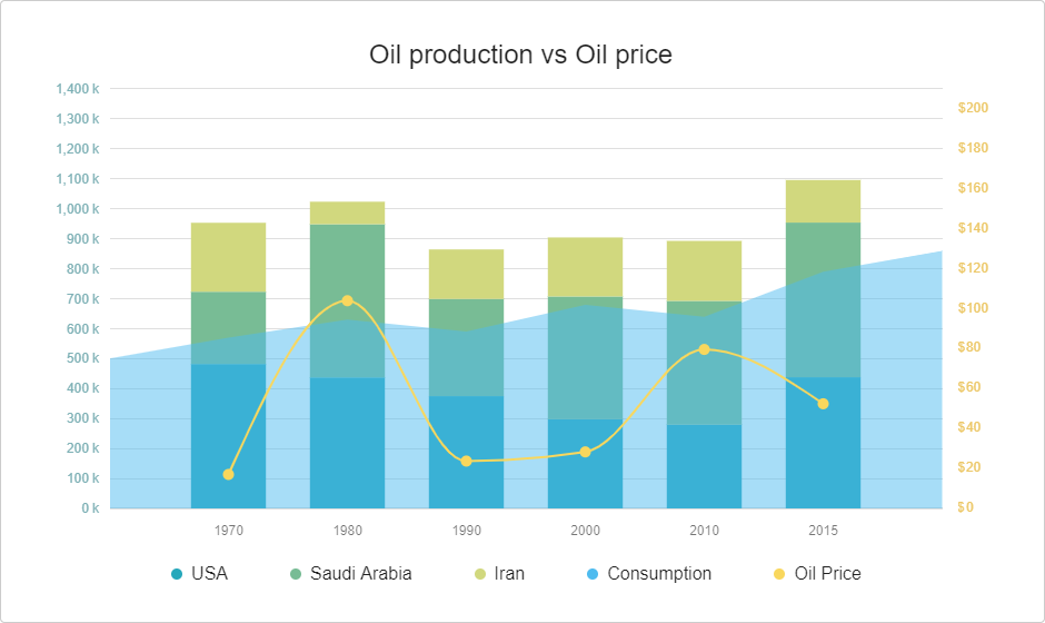
Native React Grid - Fixed Columns
You can now anchor columns to the left or rightmost edge of the Grid. These fixed columns are never scrolled horizontally and as such, allow you to create solutions that offer improved readability and visual clarity.
Documentation and Demos Blog Post
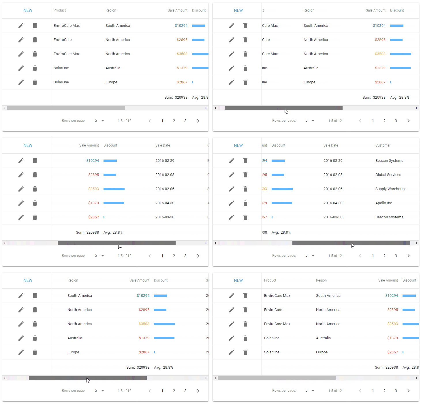
Native React Grid - Data Summary Rows
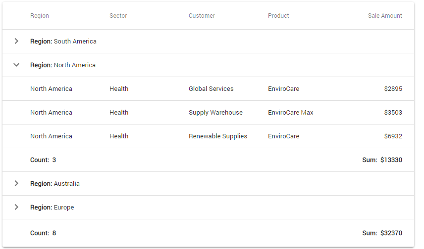
The React Grid component can now calculate a summary for all rows (total summary), row groups (group summary), and tree nodes that contain child nodes (tree summary).
Documentation and Demos
#All Platforms
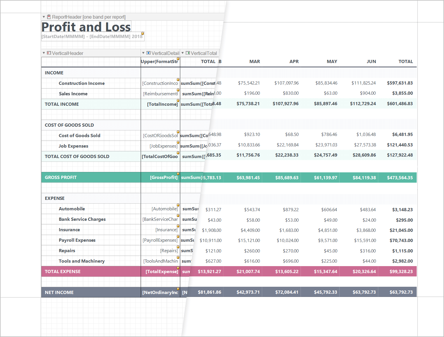
Report Designer - Vertical Bands
We've added three new types of report bands to our Reporting platform:
- Vertical Detail
- Vertical Header
- Vertical Total.
Vertical bands allow you to create a report wherein record fields are arranged vertically and records printed horizontally (from left to right). As its name implies, this new layout mirrors that of a vertical grid – wherein columns represent rows and rows represent columns.
Blog Post Demo Documentation
Picture Box Enhancements
Image Upload in Print Preview
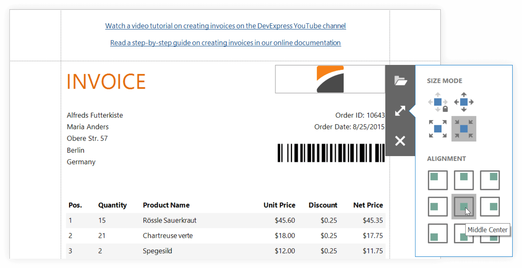
You can now upload an image or select it from a list of predefined images when displaying a report in the Print Preview. The editor's toolbar allows you to choose the appropriate sizing mode and image alignment.
Freehand Drawing in Print Preview
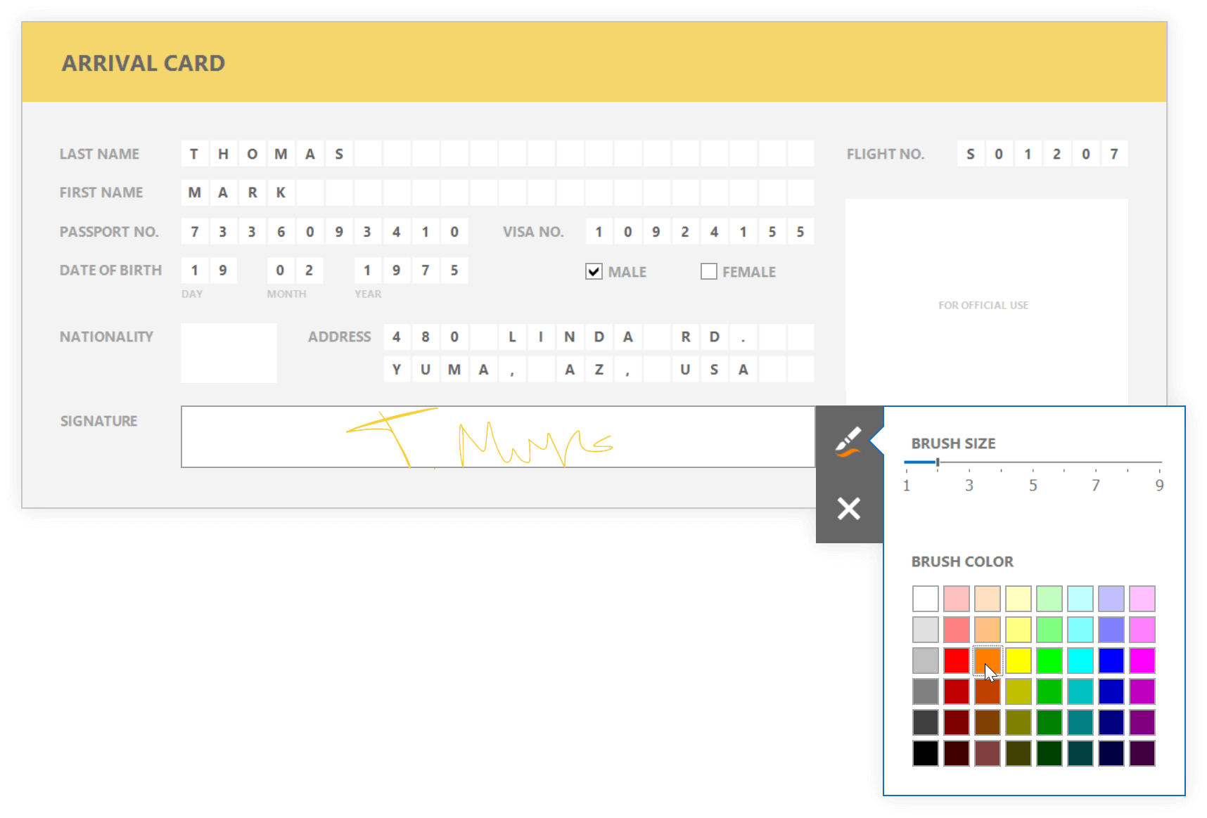
You can now draw "freehand" when previewing a document. To enable freehand drawing, set the Picture Box's ImageEditOptions.EditorName property to 'Signature'. In this mode, you can draw any shape or text within the Picture Box. Integrated options allow you to specify brush size and color.
Demo
SVG Support
Our Picture Box report control can now display vector-based images. v18.2 doesn't support SVG with gradients and text. This restriction will be addressed in a future release.
Blog Post Documentation
Bar Code - QR Code Enhancements
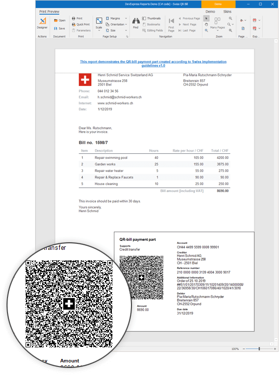
QR Code allows you to display a picture in the middle of bar code.
Demo Documentation
Report Parameters - Enhancements
- Parameters now support Null values. Enable the Parameter.AllowNull option to allow Null values.
- If a parameter is bound to a dynamic list, you can sort the list using the DynamicListLookUpSettings.SortOrder and DynamicListLookUpSettings.SortMember properties.
- The multi-value parameter's editor now displays 'All selected (N)' when all parameter values are selected.
Documentation
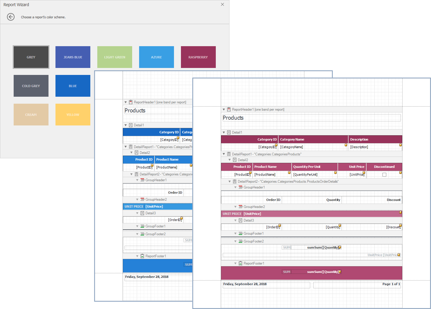
Report Wizard – Page Setup and Report Color Scheme Pages
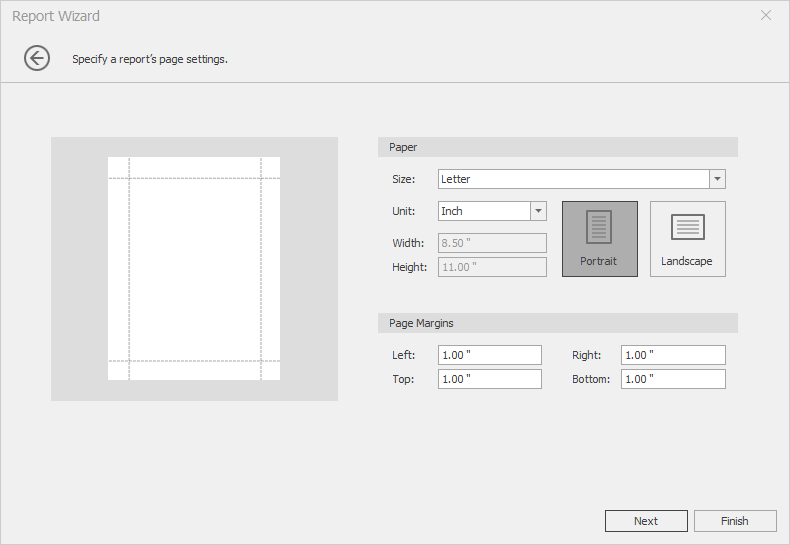
This release includes two new Report Wizard pages.
Page Settings: allows you to specify paper size, units, orientation and document margins.
Color Schemes: allows you to select a base color for built-in styles generated by the wizard.
Blog Post Documentation
End-User Report Designer - Script Code Completion Offline Mode
You can now activate code completion in offline mode. Code completion also supports types defined in custom assemblies.
Report Controls – New Default Font
By default, our report controls now use the Arial font.
#ASP.NET Core Reporting
Report Designer Integrated in Visual Studio
Our goal was to maintain the same developer experience between standard .NET and .NET Core. This release ships with a fully integrated Report Designer within Visual Studio for ASP.NET Core. The Report Designer is now displayed within a panel allowing you to switch between open code units.
Documentation
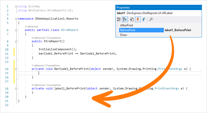
Event Handling
You can now handle the events of individual report controls. Double-click an event in the properties panel to generate a handler for it.
#Web Reporting
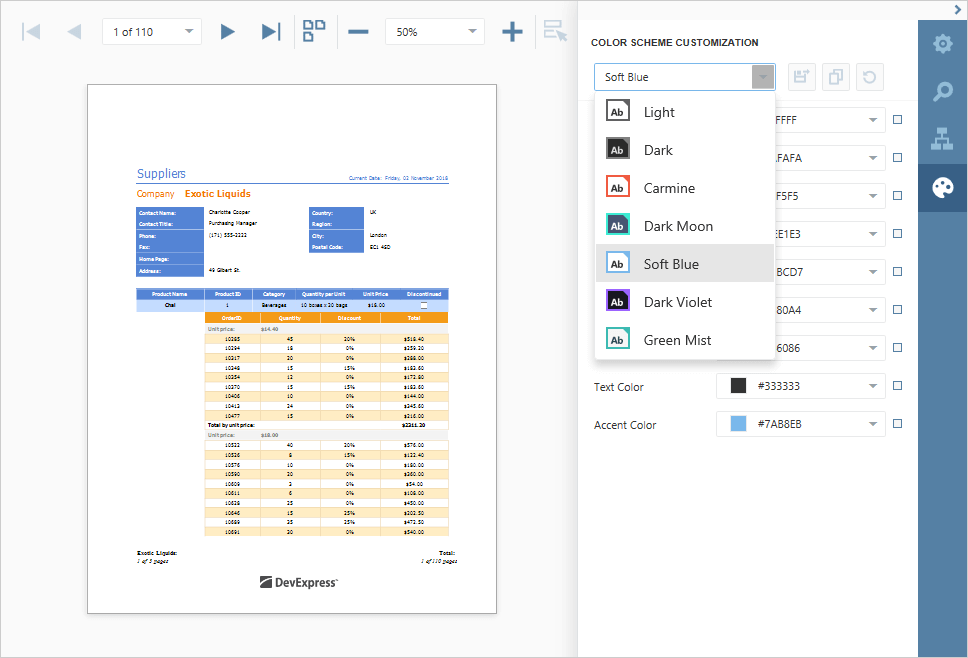
New Color Schemes. Custom Scheme Support
In previous iterations, our HTML5 Document Viewer and HTML5 Report Designer shipped with light and dark themes. With this release, you can apply any DevExtreme Theme (except Material) to both the Viewer and Designer, or set up appearance settings manually.
Demo Documentation
Angular Reporting npm Package
We've published an npm package to help you integrate our HTML5 Document Viewer and Web Report Designer into your Angular-based application.
NPM package
Documentation
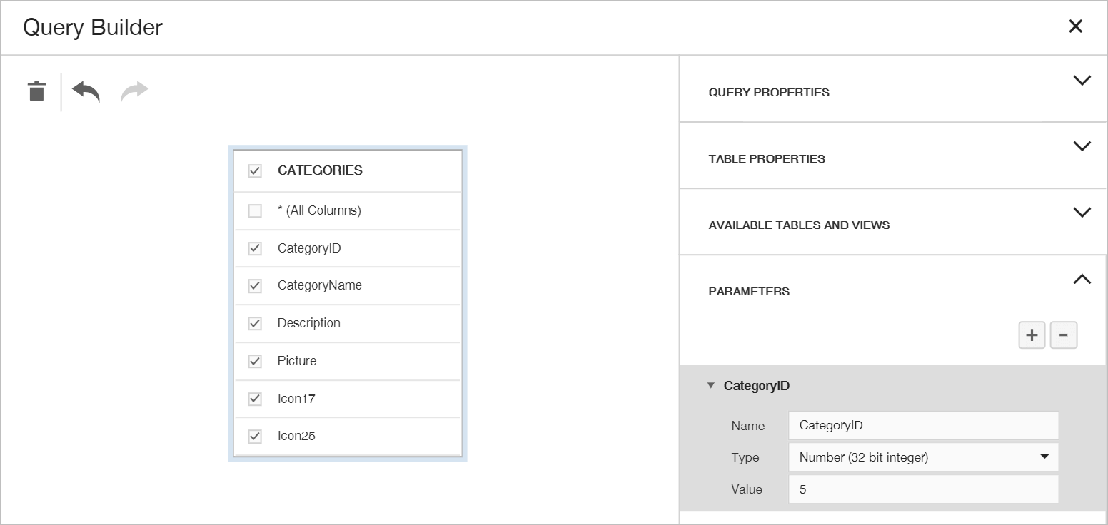
Query Builder - Improved UX and Query Parameters Support
We've updated the properties panel interface in the Query Builder component to improve discoverability of query properties and table items. You can also create query parameters as necessary.
Documentation
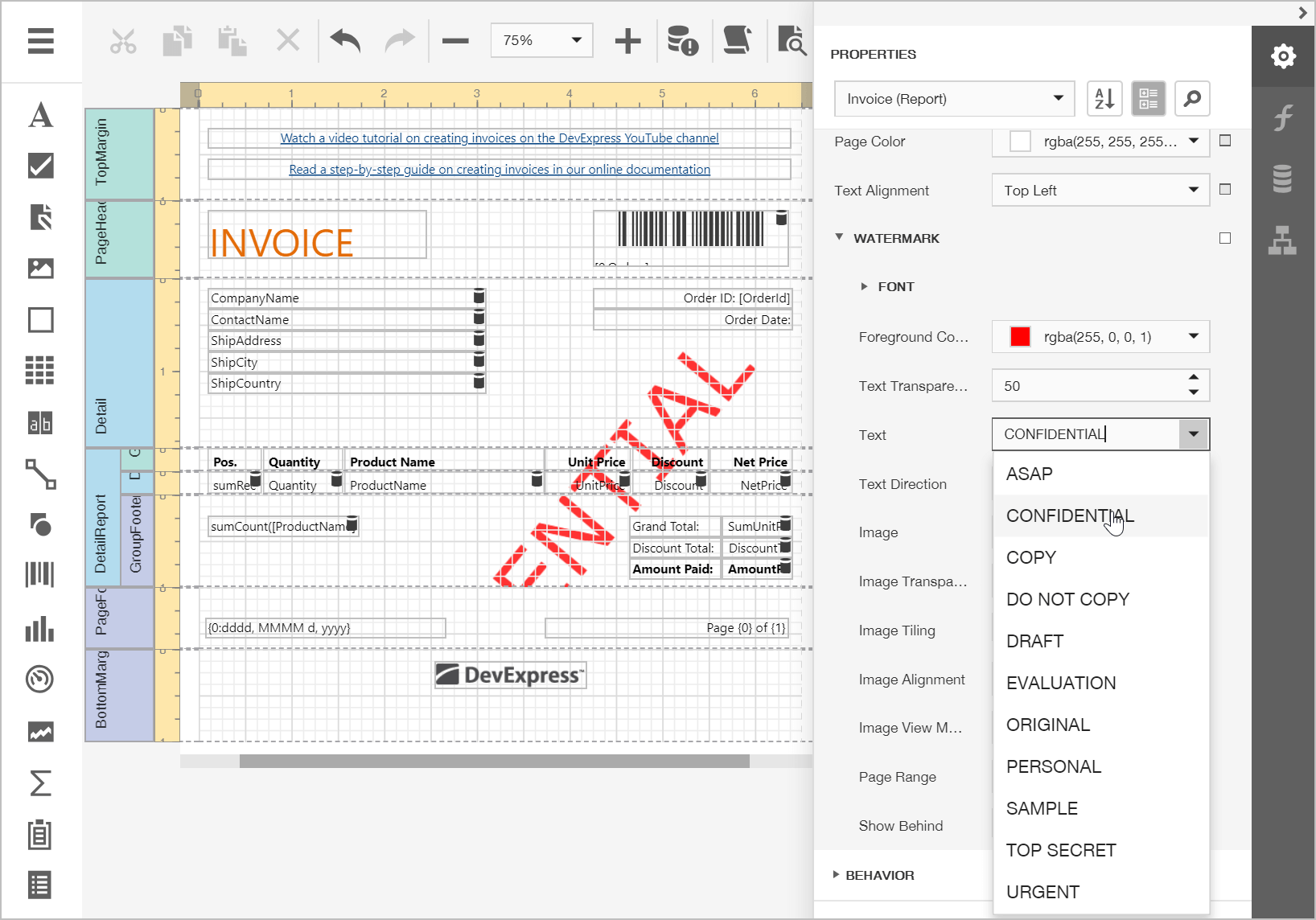
Web Report Designer - Watermarks
Our Web Report Designer can now display watermarks. End-users can apply pre-printed forms and correctly position report controls as needed.
Web Document Viewer – Tab Panel Position
The Tab Panel can now be displayed on the left. Use the 'WebDocumentViewerTabPanelSettings.Position' property to specify the Tab Panel's position within the Document Viewer.
Documentation
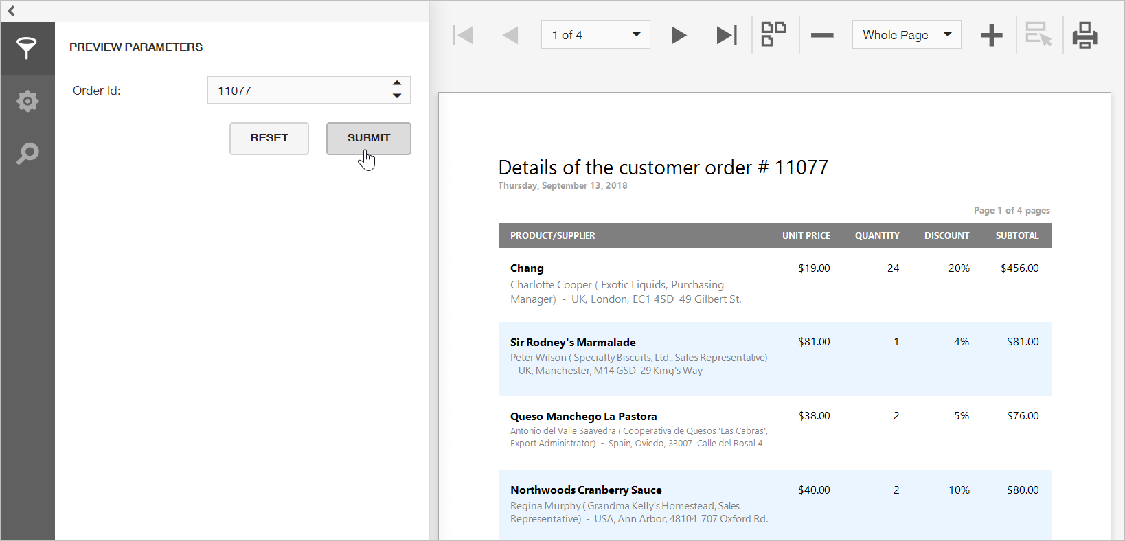
Improved Internal Server Error Handling
We've updated our Web Reporting components so you can display error details within the browser (rather than use the standard 'Internal Server Error' message).
Web Document Viewer and Report Designer – Client-Side API Enhancements
Our new client-side API allows you to perform the following:
Search in Open/Save Report Dialogs
We've incorporated a search panel into the Web Report Designer's Open/Save Report dialog to allow end-users to quickly locate a specific report.
#WinForms Reporting
End-User Report Designer - Office-Inspired Property Grid UI
We updated the Properties panel so it mimics Microsoft Office's new UX. Property categories are replaced with tabs and search panel is always visible, which makes it easier to discover specific properties.
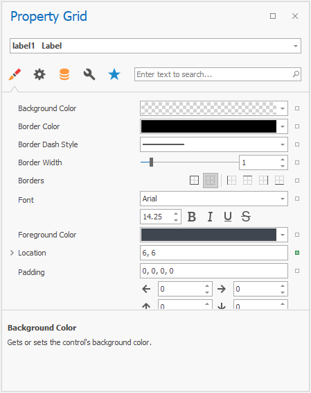
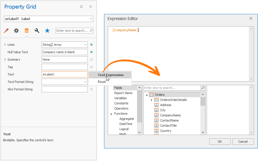
The Expressions tab has been removed. A square icon near each property indicates whether a property value differs from its default value, and allows you to define an expression as needed. Property editor values that were specified via an expression now display a formula icon to the right of the editor.
Documentation
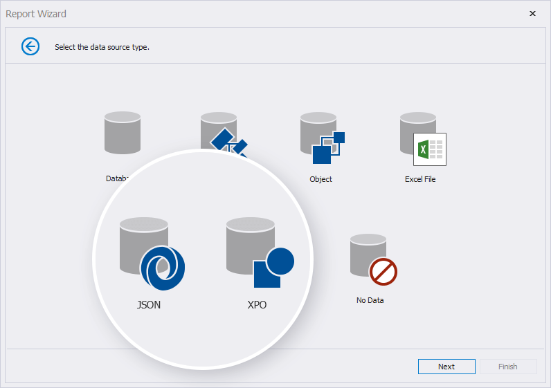
Data Source Wizard – JSON and DevExpress ORM Persistent Object Data Sources
We've added two new data source types into the Data Source Wizard:
- JSON Data Source - Allows you to specify WebAPI end point to consume JSON data.
- DevExpress ORM Persistent Objects Data Source - Allows you to bind a report to a collection of ORM Persistent Objects. This implementation resolves previous limitations related to the serialization of object types.
Documentation
Miscellaneous Enhancements
- End-User Report Designer and Document Viewer – Skinned Save/Open File Dialogs: you can use DevExpress dialogs by enabling the WindowsFormsSettings.UseDXDialogs option.
- Expression Editor - PageIndex and PageCount Variables: We've updated the advanced expression bindings mode so you can use the PageIndex and PageCount variables in expressions constructed for the PrintOnPage event handler.
#WPF Reporting
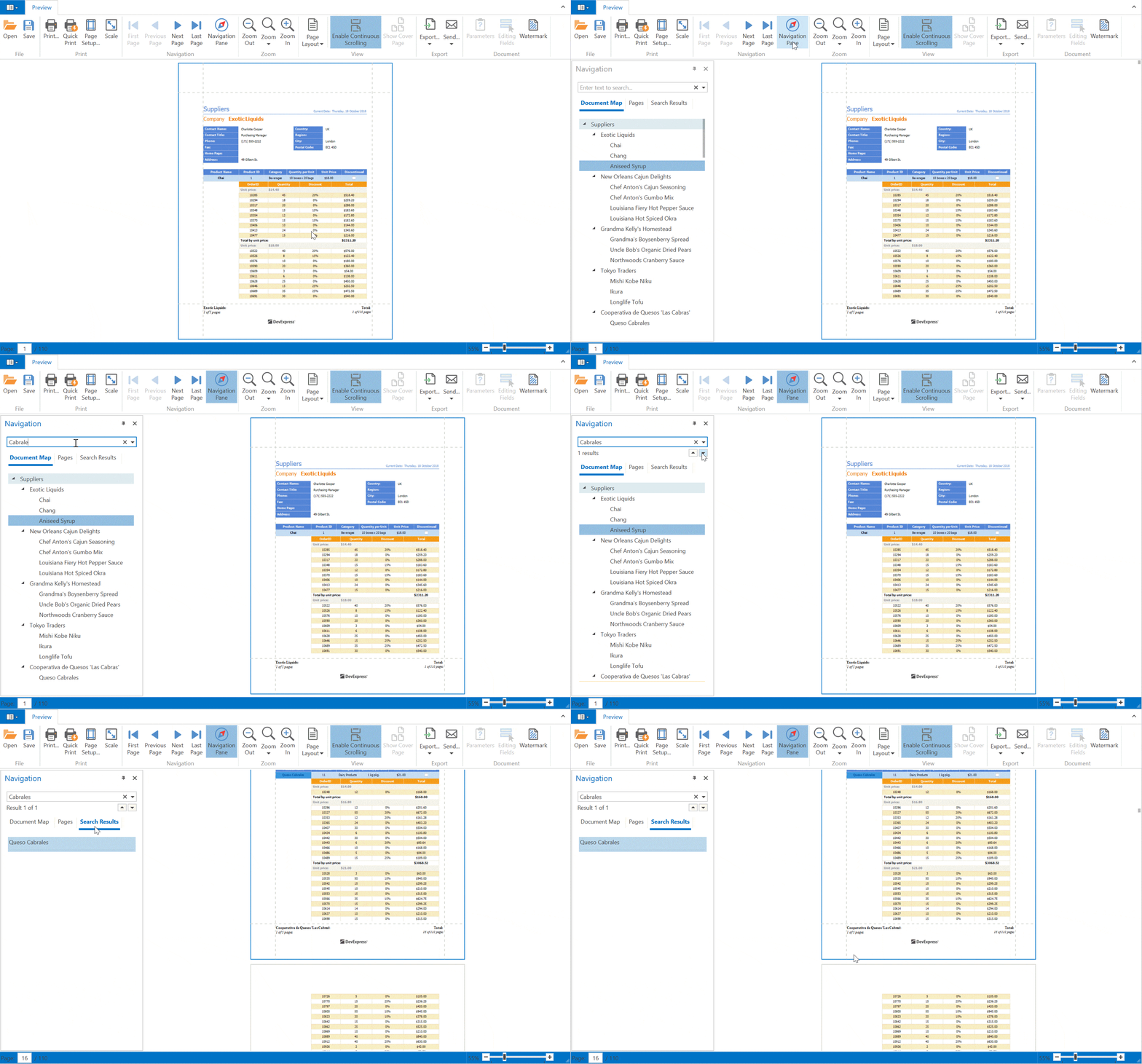
Document Viewer - Office-inspired Navigation Pane
We've updated our WPF Document Viewer with a new Microsoft Word-inspired Navigation Pane. The new pane contains three tabs:
- Document Map
- Thumbnails
- Search
Documentation
Data Source Wizard – JSON and DevExpress ORM Persistent Object Data Sources
We've added two new data source types into the Data Source Wizard:
- JSON Data Source - Allows you to specify WebAPI end point to consume JSON data.
- DevExpress ORM Persistent Objects Data Source - Allows you to bind a report to a collection of ORM Persistent Objects. This implementation resolves previous limitations related to the serialization of object types.
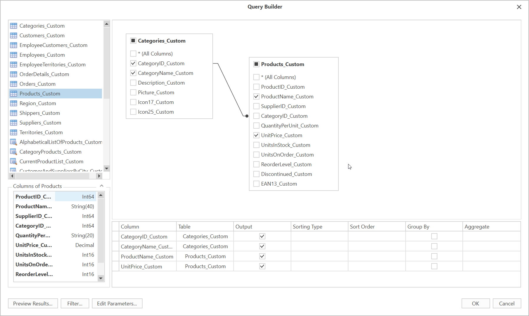
WPF Report Designer - Query Builder Light View
This new Query Builder View replicates the user experience available across our WinForms controls. It allows you to display custom table and column names.
Documentation
#Report and Dashboard Server
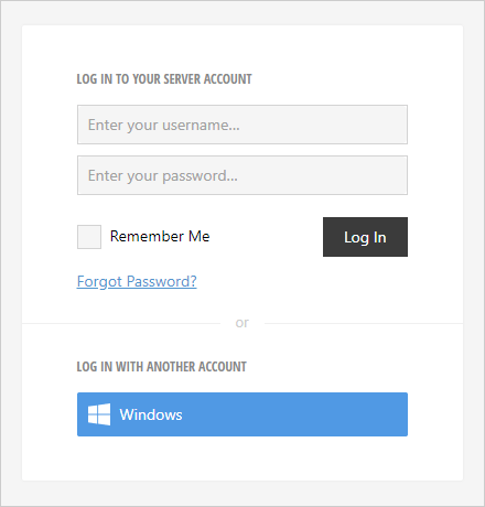
Administrative Panel - Modern UI
Our Administrative Panel UI was first introduced in May 2018 as a community technology preview. v18.2 marks its official release. The new UI is now used by default. It fully replicates the functionality of our old administrative panel. Client-side UI rendering is now much faster. We've also made it easier to locate specific items and execute operations using document lists and scheduled tasks.
Documentation
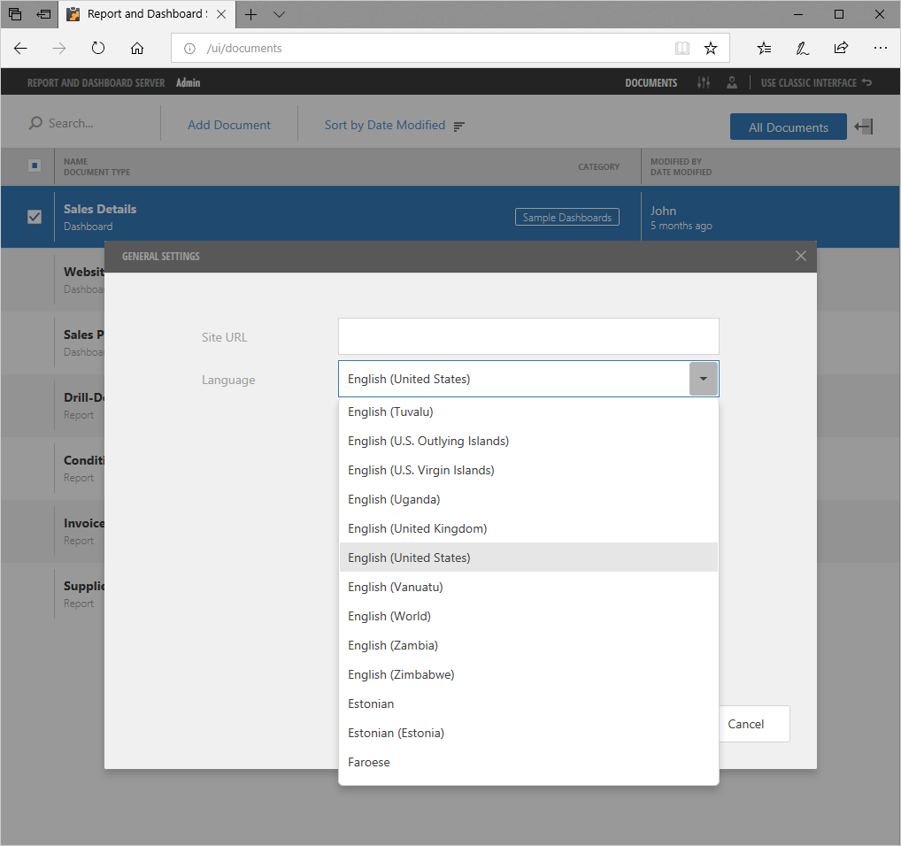
Localization Support
We added a new DevExpress.ReportServer.v18.2.Localization.dll assembly to our Localization Server. You can now translate all Administrative panel interface elements along with report and dashboard designer and viewer components.
To select the appropriate language, open Server Settings.
Documentation
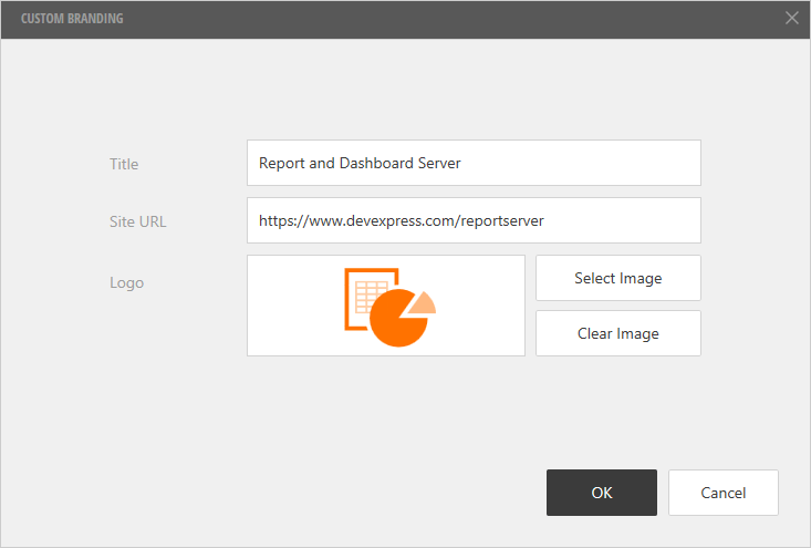
White Label Support
You can change the default color scheme of the Administrative panel and replace built-in product logos.
Documentation
Display Dashboards in Remote Applications
Dashboards generated via the DevExpress Report and Dashboard Server can now be displayed within a custom application.
New Neutral Filter Mode
Neutral Filter Mode enables filter behavior found in many popular websites, where no filter is applied until you select at least one option. In other words, while no options are checked, all results are displayed unfiltered.
Neutral Filter Mode is available for WinForms, WPF, and Web Dashboard.
Documentation
Blog Post
Data Processing
OLAP Data Source Filtering
You can now filter our Dashboard OLAP Data Source in code. Use the DashboardOlapDataSource.Filter property to specify a filter condition.
Documentation
#Visualization
Tabbed Layout
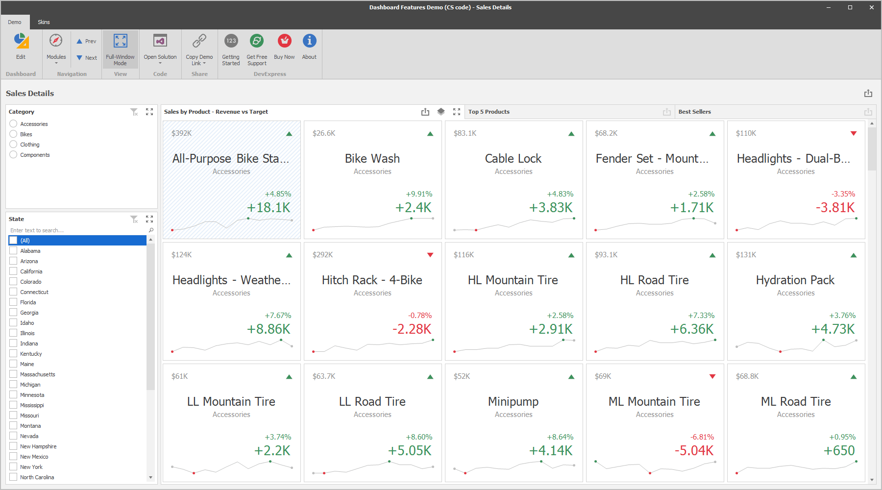
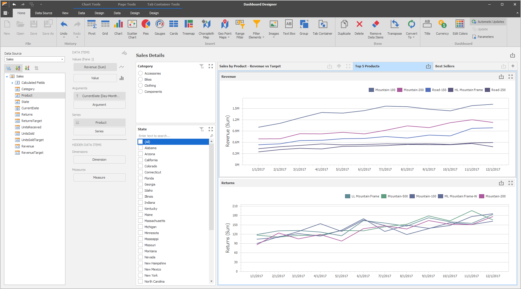
DevExpress Dashboard can now display multiple tabbed pages. You will find this capability useful in the following scenarios:
- Display a set of related dashboards
- Display individual items as pages
- Display two or more dashboard variations
- Share filter elements across multiple dashboards
Documentation Blog Post
Format any Numeric or Date-Time Value
In previous versions, DevExpress Dashboard controlled the manner in which many numbers and dates were formatted. By automatically providing compact value display, we optimized screen space usage and data readability. In this release, you are also free to format all values as you wish.
#Web Dashboard
NPM Package
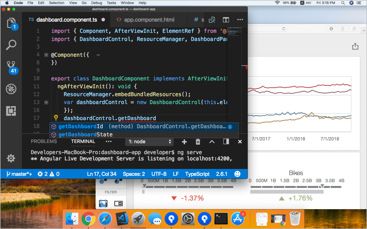
We've published an NPM package that includes our client Web Dashboard. As you might expect, the package contains all the necessary library resources and the TypeScript definition file. To install, execute the following command:
npm install devexpress-dashboard
Blog Post
JavaScript Modules
We have refactored code to make it modular, so that you can use our Dashboard with front-end module bundler tools such as WebPack and SystemJS.
Public TypeScript "*.d.ts" Files
All TypeScript "*.d.ts" files are now public. This change improves code completion and code verification support when using our Web Dashboard Control in TS applications.
.NET Core Export
DevExpress Dashboard for .NET Core now allows you or end-users to export the entire Dashboard or individual Dashboard Items to PDF, CSV or Excel files.
Documentation
Dashboard Model - Public API
We have published and documented Dashboard Model API. This means that you can now use JavaScript or TypeScript. Here are just a few examples of what you can do:
- Pre-define data bindings for new items
- Change default settings, such as text formatting
- Handle designer events
Documentation
HTTP Back-End Settings
New Dashboard options allow you to specify the control's back-end URL and Request Headers. This change will help you with the following tasks:
- Integrate Web Dashboard Control into Web Farms.
- Configure header-based Web authorization.
Documentation
On Demand Data Refresh
DevExpress Dashboard v18.2 allows you to reload data from the server by calling a client-side method that initiates the callback. The following methods will reset the data source cache and reload all dashboard items:
- ASPxClientDashboard.ReloadData (ASP.NET Web Forms / MVC)
- DashboardControl.reloadData (HTML5 Dashboard / ASP.NET Core)
Documentation
Parallel Requests for Multiple Master Filter Items
Data requests for Master Filter items are now being processed in parallel. This enhancement speeds up overall network performance.
Query Builder - Improved UX and Query Parameters Support
Updated Properies panel in Query Builder now allows you to create new query parameters. The new UI also simplifies the way you browse existing query properties and table items.
WinForms Dashboard
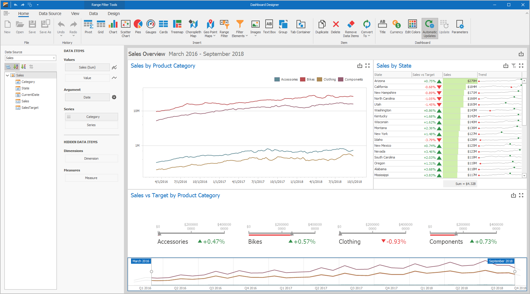
Dashboard Designer - SVG Icons
The following UI elements now display vector (SVG) icons:
- Ribbon / Toolbar
- Recent Dashboards section
#WPF Dashboard Viewer
Print Preview
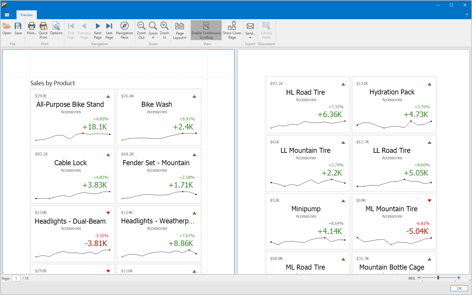
DevExpress WPF Dashboard now ships with a Print Preview dialog that allows you to configure page settings and preview the output.
PDF Document API
DirectX Rendering
DirectX rendering was first introduced in May 2018 as a community technology preview (CTP). This update marks its official release. DirectX Rendering is now used as our default rendering engine.
Visual Signatures
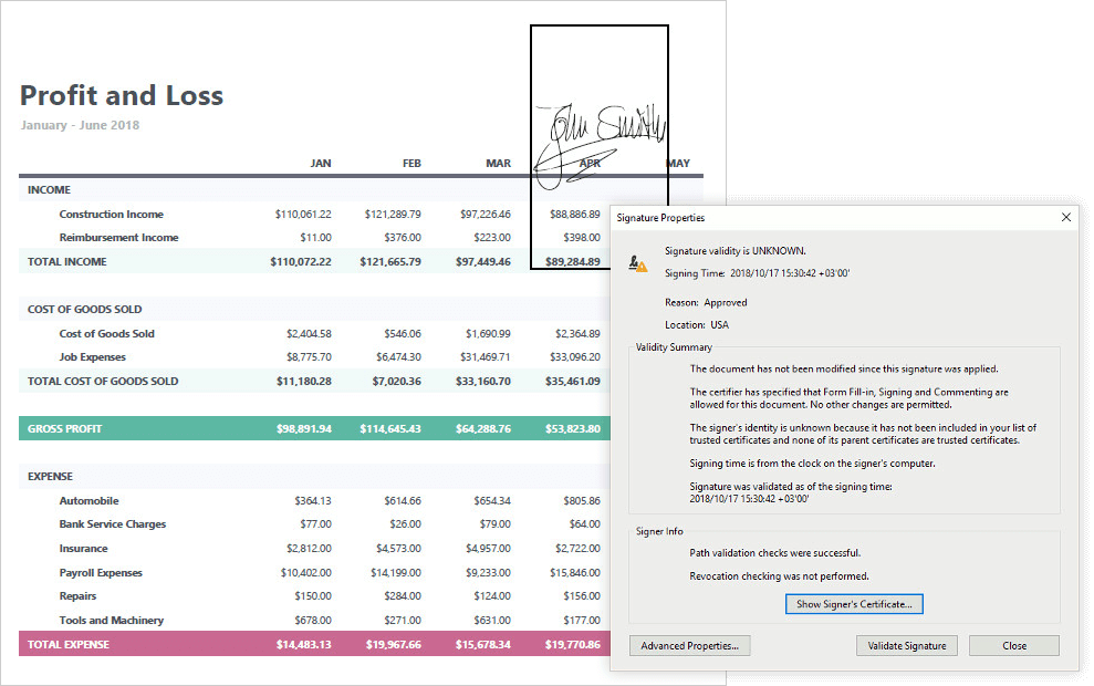
With this release, you can sign a document with a visual signature.
Documentation
#Spreadsheet Document API
Shape API
This new API allows you to create new shapes, connect and group shapes, change a shape’s fill and outline settings, add text to a shape, and remove shapes from a document.
Documentation
Sparkline Printing and Export
With this release, documents with sparklines can be printed and exported to PDF.
Documentation
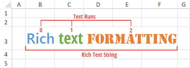
Rich Text API
Our updated API allows you to create and edit rich text within a cell.
Blog Post Documentation
#Word Processing Document API
RTL Support
You can now load, print and export (to PDF) documents with right-to-left text direction.
Shape Support
Documents that contain shapes can now be printed and exported to PDF.
Documentation
Paragraph Borders
With this release, you can load/save, print and export (to PDF) documents with paragraph borders.

Continuous Section Breaks
We now support continuous section breaks. Our new API allows you to load, print and export documents with continuous section breaks.
Documentation

Paragraph Options
With this release, the DevExpress Word Processing File API provides two new paragraph options:
- Widow/Orphan Lines Control - prevents the first or last paragraph line from appearing at the bottom or top of a page.
- Keep with Next - keeps multiple paragraphs on the same page.
We have also improved our 'Keep lines together' option so that it mirrors Microsoft Word.
Documentation
#ASP NET Enhancements
Split View Layout Support
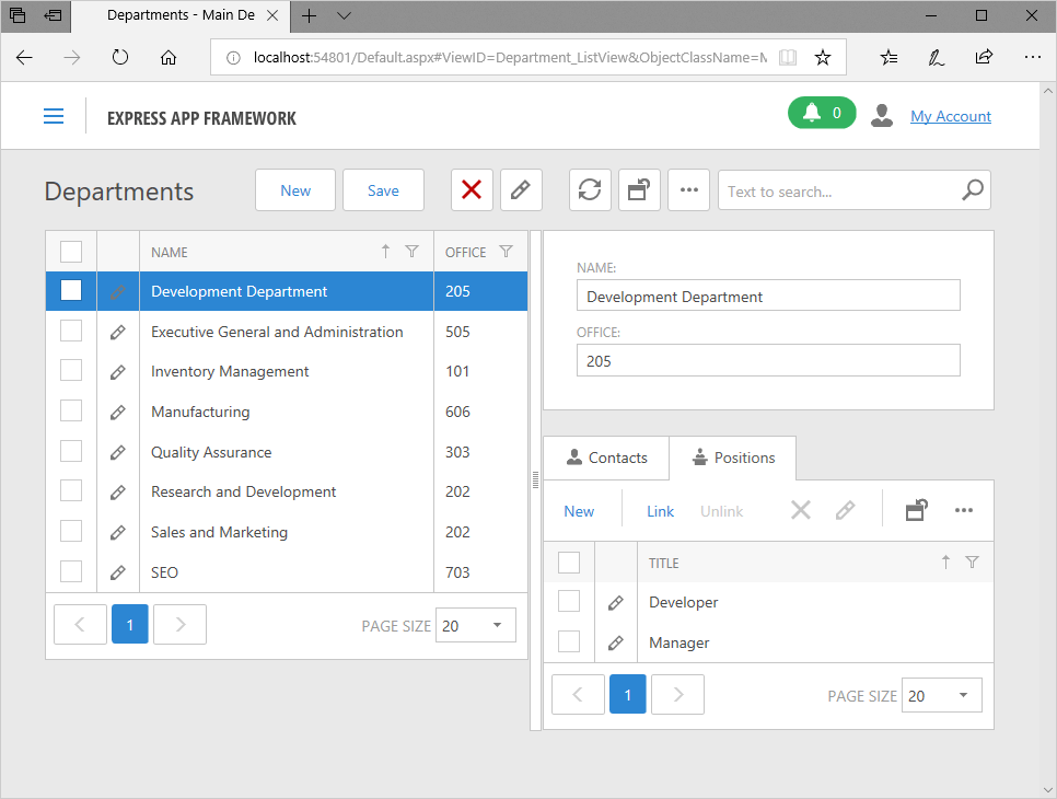
We're introducing a new ListViewAndDetailView display mode for List Views in ASP.NET Web Forms UI. Inspired by Microsoft Outlook's "Compact View", this new feature allows you to present your list data as synchronized ListView and DetailView displayed side by side.
Documentation
IFRAME Support
You can now embed XAF ASP.NET Web Forms applications into an IFRAME. Use this feature to integrate XAF functionality into non-XAF Web portals.
Documentation Blog Post
New Lookup Property Editor
ASPxGridLookupPropertyEditor for ASP.NET UI was introduced as a community technology preview (CTP) in the previous major update. v18.2 marks its official release.
We built the new editor on top of the DevExpress ASP.NET Grid Lookup control - an enhanced version of our previously available ASPxLookupPropertyEditor. We recommend that going forward you only use the new editor to display reference properties in ASP.NET UI.
Blog Post Documentation
#Core Enhancements
Improved Image Library Integration
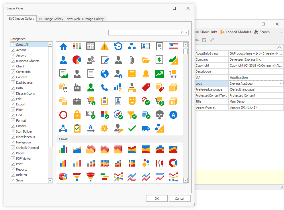
We have extended the DevExpress Image Gallery with new PNG and SVG icons. You can easily embed images from the updated collection into XAF’s WinForms UI by using the Model Editor's reworked Image Picker.
Blog Post Documentation
XAF Nuget Packages
To help you better manage build processes for your XAF projects and employ CI/CD tools approved within your Enterprise (such as Azure Pipelines), DevExpress Nuget now includes packages based on XAF assemblies.
Blog Post Documentation
#Mobile Platform Enhancements
ASP.NET Core Data Service (CTP)
CriteriaOperator expressions, previously translated to OData queries, are now translated to LINQ expressions. This change introduces the following features:
- Additional ListView grouping options
- The use of ContainsOperator and aggregate functions in ListView filters
- ListView display for non-associated collections
- Data filtering capabilities in lookup editors bound to arbitrary or non-associated collections with DataSourcePropertyAttribute.
Documentation Blog Post
#WinForms UI Improvements
Accordion Control
You can now replace NavBar and TreeList side navigation controls with a newer and more flexible WinForms Accordion Control.
Documentation
Skin and Palette Selectors
We have updated skin and palette selector UI for applications rendered in Light Style (see WinApplication.UseLightStyle).
Documentation
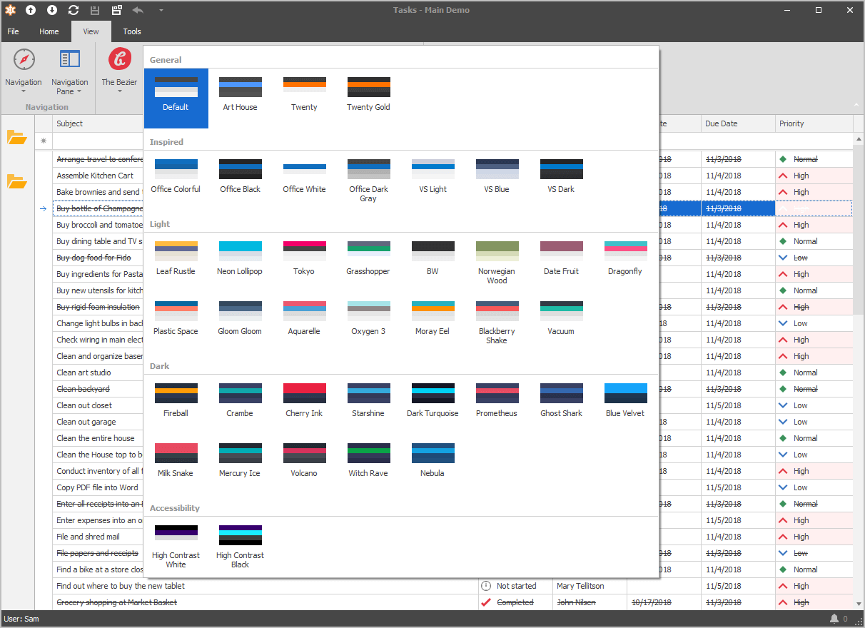
Full SVG Support
To see the entire list of visual elements that support vector images, read the following article: WinForms SVG Image Support.
To replace PNG icons with new SVG images in existing XAF WinForms apps, set the following options prior to the XafApplication.Setup method call:
-
DevExpress.ExpressApp.Utils.ImageLoader.Instance.UseSvgImages = True
-
WinApplication.UseOldTemplates = False
Blog Post Documentation
Office-Inspired Word Processing Module
v18.2 marks the official release of our word-processing module that incorporates DevExpress WinForms Rich Text Editor to allow end-users to create, load, change, print, mail-merge, save and convert documents in different formats.
Documentation
#Data Source Wizard Enhancements
Our Query Builder can now edit an invalid SelectQuery. It highlights the columns and tables that are not found in the database schema. In addition, you can now specify a condition for grouped and aggregated data. This adds the HAVING clause to the SQL statement generated by the Query Builder. Finally, you can specify SSL Mode in MySqlConnectionParameters.
#Expression Editor and Filter Editor Enhancements
With this release, our Filter Editor Control and Expression Editor correctly handles data sources with nested properties. You can also re-arrange "Visual" and "Text" panels inside the Filter Editor Control. Use the new PanelAlignment property to specify whether these panels should be stacked one under another (vertically) or displayed side-by-side (horizontally).
#JsonDataSource
A new data source component for receiving data from JSON.
#OData Sources - Selected Properties
ODataServerModeSource and ODataInstantFeedbackSource components can now load specified object properties . Both components expose the Properties collection allowing you to specify which properties should be loaded. If the Properties collection is empty, the data source loads all object properties.
#SqlDataSource - .NET Standard 2.0 Data Providers Support
Our SqlDataSource component supports the following data providers on .NET Standard 2.0:
- Oracle
- Google Big Query
- Teradata
#XPO - ORM Library
Async/Await Method Support
With v18.2, XPO's Session, XPQueryExtensions, and other key classes ship with a set of async specific APIs, including FindObjectAsync, GetObjectByKeyAsync, CommitChangesAsync (which return System.Threading.Tasks.Task object).
These Task-based APIs are important for both server and client programming (useful for DB-intensive operations like commits, queries, delete operations, etc.) as they improve server scalability and deliver a more resilient user experience, especially on mobile devices.
Blog Post
Property Mapping to a Read-Only Database Column
This release introduces a FetchOnly attribute that allows you to obtain values from read-only database columns (e.g. auto-increment and computed columns). Applied to a class property or field, FetchOnlyAttribute indicates that you can only read values from a database. XPO will not include these values in INSERT and UPDATE SQL statements.
Blog Post
.NET Core / .NET Standard 2.0 Support and Other Enhancements
.NET Core / .NET Standard 2.0 Support was first introduced in November 2017. v18.2 marks its official release. Persistent object JSON serialization makes it easy to use XPO as a Data Access layer in an ASP.NET Core Web API service. With v18.2, you no longer need to manually format JSON responses or make a POCO copy of each persistent class.
Example
Other enhancements include:
New XPO Data Source for XtraReports
XPObjectSource - is a new first-class citizen in DevExpress Reporting and is used to reduce the amount of code needed to bind reports using XPO data. It also provides additional features such as server-side calculated properties (including aggregates for associated collections) and grouping support. We recommend use of XPObjectSource over XPCollection or XPView if you require full end-user report designer support.
Blog Post Documentation
Miscellaneous Enhancements
- Support for MySql 8.0 server and the client ADO.NET data provider (MySql.Data.dll 8.0.12.0). System.DateTime properties are now mapped to database 'datetime' type for versions prior to 8.0 and 'datetime(6)' for versions higher than 8.0. Documentation
MySql 8.0 supports now the GetMilliSecond criteria function.
You can provide a custom Guid primary key generation algorithm globally with the new XpoDefault.CustomGuidGenerationHandler (XpoDefault.GuidGenerationMode = GuidGenerationMode.Custom). Documentation
Func<Guid>
    myCustomGuidGenerationAlgorithm = () => { return Guid.NewGuid(); };
XpoDefault.CustomGuidGenerationHandler = myCustomGuidGenerationAlgorithm;
                                Dim myCustomGuidGenerationAlgorithm As Func(Of Guid) = Function()
                                Return Guid.NewGuid()
                                End Function
                                XpoDefault.CustomGuidGenerationHandler = myCustomGuidGenerationAlgorithm
With this release, users can better manage connections to a database in the ORM Data Model Wizard. The connection string can be stored in the configuration file instead of the model's code. It is less error-prone and much safer. This is supported for WinForms, ASP.NET Web Forms, WPF, Console and other project types for the full .NET Framework that use XML configuration files (app.config/web.config).
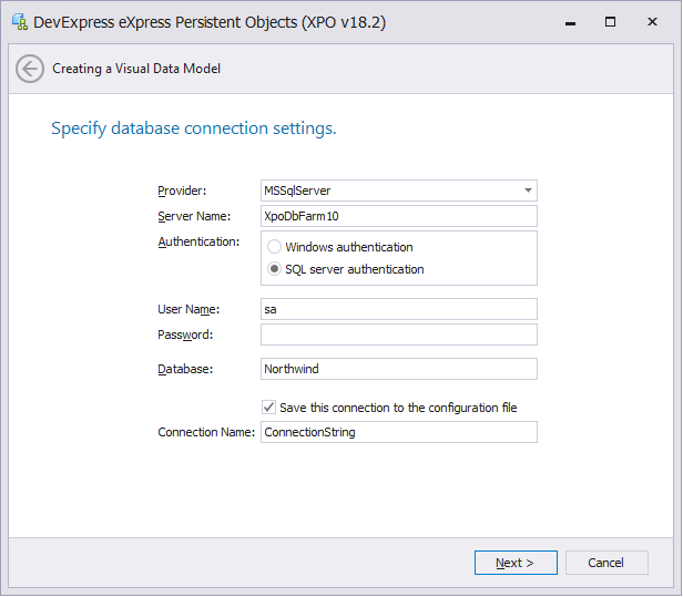
#CodeRush Server (CTP)
Team CodeRush is happy to announce the community technology preview of CodeRush Server. Combining the Unit Test Runner, Code Coverage calculation, and Code Issues analysis of the original CodeRush, CodeRush Server makes it easy to monitor the health of your entire code base in the Azure DevOps space, one solution at a time.
Blog Post
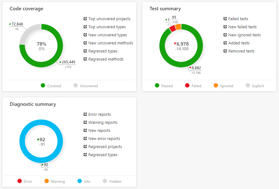
#Web Development Support
JavaScript & TypeScript Support
Now in Javascript (and Typescript) you can:
Work with Structural Highlighting.
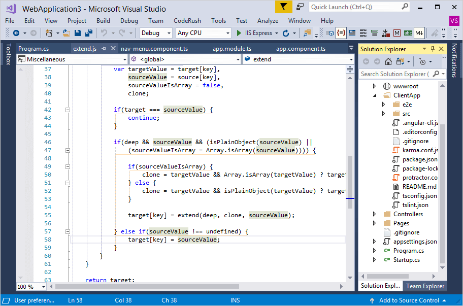
Quickly select and expand/reduce that selection by logical code blocks with Selection Expand/Reduce.
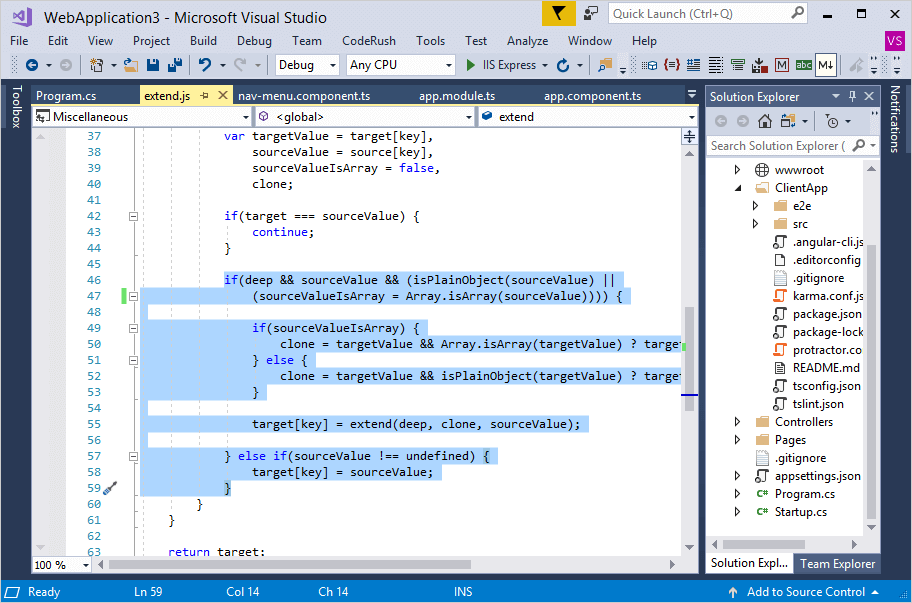
Press Ctrl+W to expand selection and Ctrl+Shift+W to reduce it.
Easily navigate through references with Tab to Next Reference.
Use Smart Cut & Copy.
Easily declare classes, functions, variables, code blocks, expressions and more with a pre-release set of CodeRush Templates for JavaScript and TypeScript development. These templates are expected be extended and evolve in the coming releases.
Navigate through your code with Jump to Symbol.
Navigate to a symbol declaration using the Jump To window.

Simultaneously select and work with Multiple Selections.

CSS Support
CSS language support is available in the following features:
HTML and Razor Support
Starting with this release, you can use the following features in HTML, C# Razor, Visual Basic Razor and Aspx files:
#Rich Comments
Embedded Images Inside Source Code
We've added a groundbreaking new feature giving Visual Studio developers the ability to effortlessly embed images, diagrams, formulas, tables, etc., inside source code (C#, F#, JavaScript, TypeScript, Visual Basic, XAML, HTML, CSS, and XML). You can paste any image from the clipboard, or reference a local file in markdown.
Blog Post Video
Markdown Formatting
With Rich Comments you can apply text formatting right inside the code editor in comments. The following Markdown-like syntax is supported:
-
**Bold**
-
*Italic*
- _Underline_
- ~Strikethrough~
Blog Post
Important Comments & Question Comments
CodeRush syntax-highlights important comments and question comments in custom colors you can set.
- You can mark comments as important by starting the comment with a "!".
- You can mark comments as questions by starting the comment with a "?".

Task-Based Comments
CodeRush highlights comments in the custom color you specify for comments starting with the following task-based tokens:

Large & Small Comments
CodeRush gives you the ability to use markdown to create large or small comments. Large comments use one, two, or three "+" characters at the start of the comment, and small comments use one, two, or three "-" characters at the start of the comment. If you prefer markdown syntax, you can also use the hashtag character ("#") to specify comment size.
Blog Post Video
#Code Templates
Training Window
We have ported the Training Window from CodeRush Classic. This window shows shortcuts for all CodeRush features and template expansions available at the current caret position.
Blog Post Video
Member Sections
CodeRush templates can now place generated members in dedicated target sections for those members. A member section can start with a comment (including a Rich Comment) or be contained inside a region.
Blog Post
Selection to Template Improvements
With this release, Selection to Template has become more intelligent - it generates cleaner templates and uses type links, text links, or regular links intelligently depending on the element type.
We have also enhanced the Create Template from Selection dialog options, allowing you to fine-tune a template before committing it to your library and quickly specify which elements should be replaced with links.
Blog Post
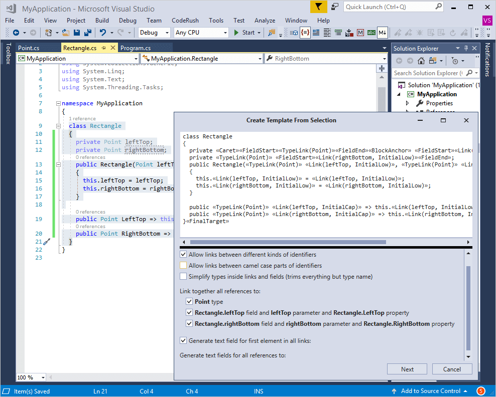
#Refactorings and Code Providers
Pull Member Up
With the Pull Member Up refactoring you can move a member with its dependencies to a base class. If there are several base classes, you can select the required class from the sub menu.
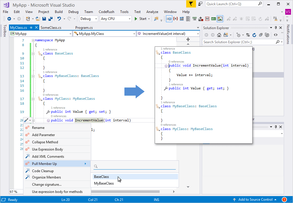
C#7 Support
Miscellaneous Improvements
The Declare Method code provider is now available when the caret is located at the end of the line ending with an undeclared method reference.
The XPO Fields code provider now copies the [Obsolete] attribute from fields to their corresponding properties.
We have added a Collapse Accessors code formatter, which collapses both get and set property accessors into single-line form.
#Code Cleanup
Copyright Header
We have added a Copyright Header Code Provider, which can automatically add a copyright comment to the top of the file.
It is also available as a Code Cleanup provider and as a template - just press the letter ‘h’ at the top of the file on an empty line and press your template expansion key (e.g. Space or Tab).
Blog Post Documentation

Cleanup on Save
With the new Apply Code Cleanup when saving a document option, you can automatically clean up your files on save.
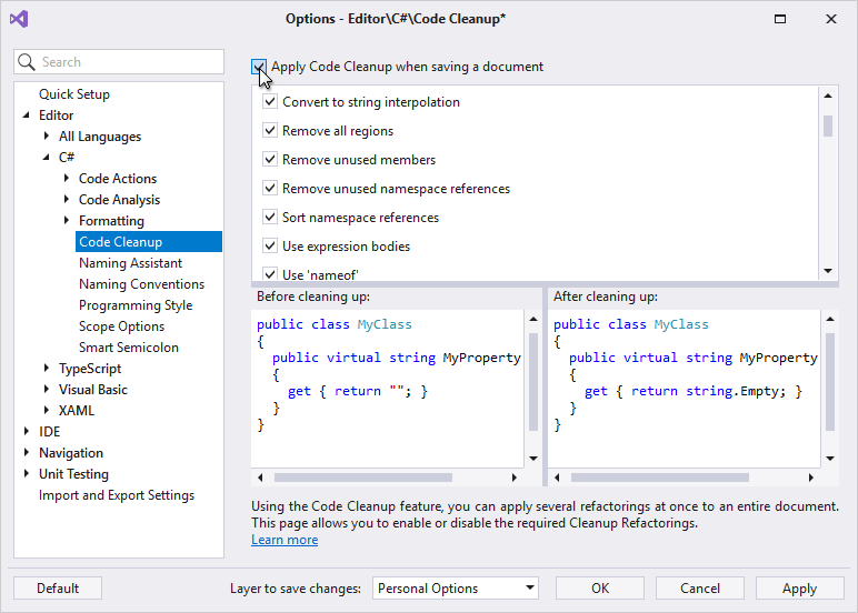
#Clipboard and Selection Tools
Mega Super Copy
You can now use Multi-Select to mark important text elements before selecting and copying/cutting a block of code to get a richer smarter version of the code on the clipboard. Any code in the selection that has been multi-selected will become a Text Fields upon pasting.
Blog Post Video Documentation
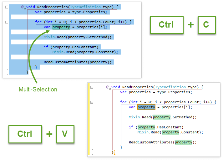
Member Icons Menu Improvements
We have added the Cut, Copy, Select and Comment actions to the Member Icons Menu.
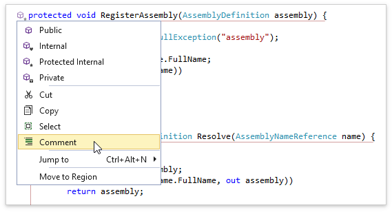
Miscellaneous Improvements
#Code Analysis
You can now set options to determine how the Possible System.NullReferenceException diagnostic performs its analysis in methods, properties, parameters and fields.
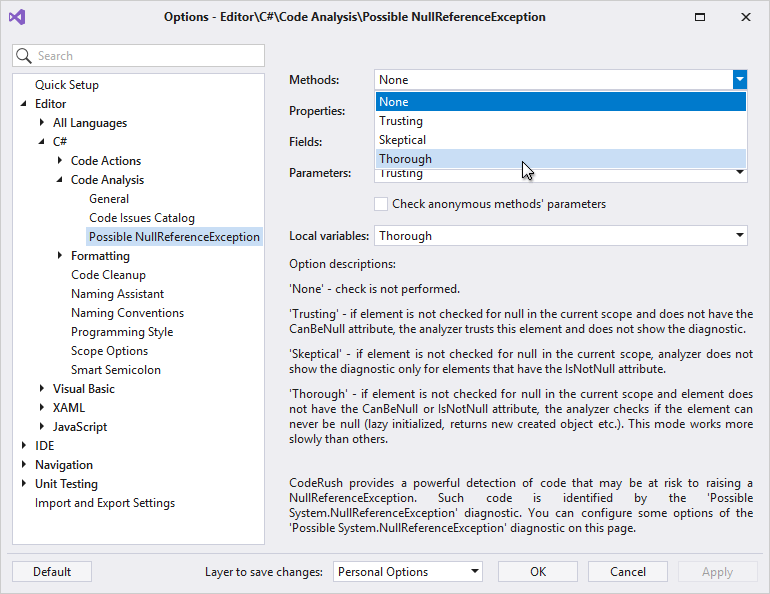
We have added the Task.Factory.StartNew usage can be dangerous code diagnostic, warning when unsafe methods are used to start a new thread.
#
Code Formatting
Code Alignment Improvements
We have enhanced formatting options to align code blocks. The "Align content by" and "Indent" options are available on the Braces option page in Editor | C# | Formatting. On the Wrapping option page you can also align content for Initializers.
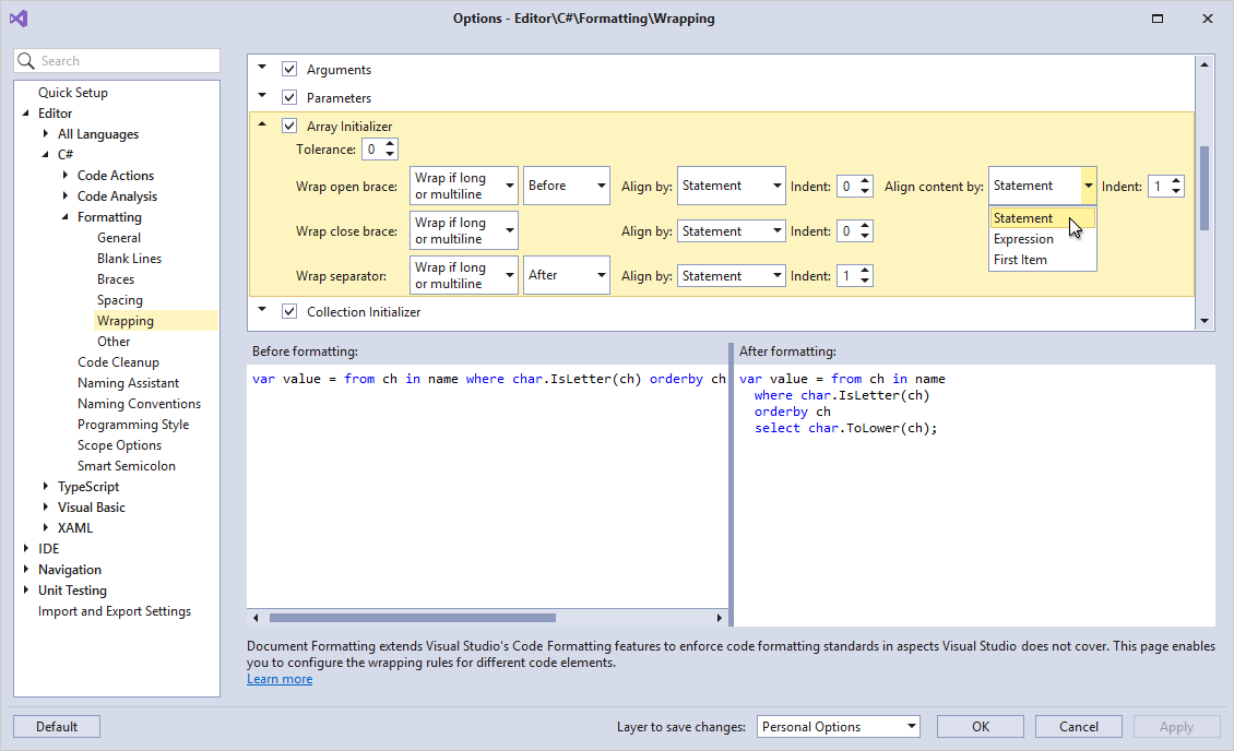
Simple Member Formatting
CodeRush now lets you set formatting options for simple members that include only a single statement (and do not include comments or directives). For this, we have added the following grouped options:
Braces:
- Simple Method
- Simple Property / Indexer / Event
- Simple Accessor
- Auto-Implemented Property
Blank Lines:
- Simple Method
- Simple Property / Indexer / Event
- Auto-Implemented Property
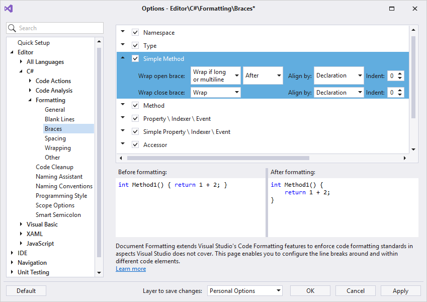
#
Unit Test Runner
Enhanced Support for Parameterized Tests
With this release, you can execute a single test case of a parameterized test directly from code. Just click the corresponding CodeRush test icon and choose the desired parameterized test run from the Run test, Debug test, or Run test with coverage submenus.
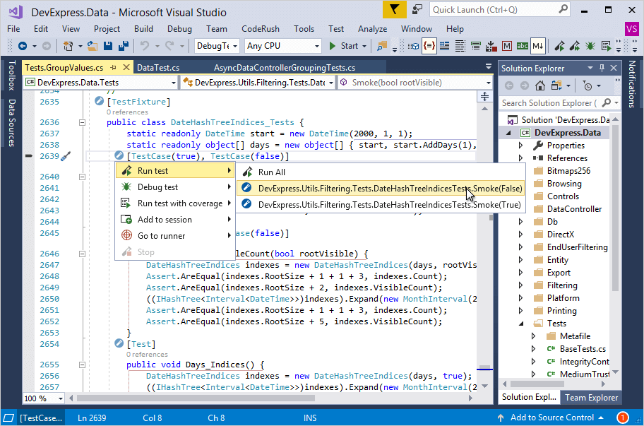
Test Execution Results Export
The test runner now supports exporting test execution results to XML. You can include test name, namespace, state, execution duration (if available), failure details (if the test has failed) and optionally include each test’s XML doc comments in the report.
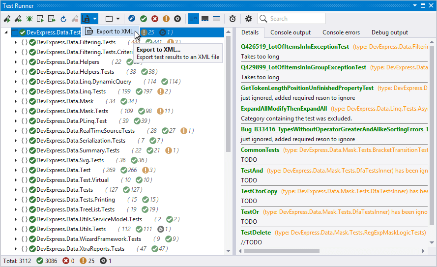
#Miscellaneous Enhancements
Performance Improvements
You can improve CodeRush performance, making start times even faster, by creating native images using NGEN.exe.
If NGEN performance improvements are available, you’ll see a notification near the top of the IDE.
You can compile assemblies once for this install, do it automatically after each update, or disregard the suggestion and never see it again.
Blog Post
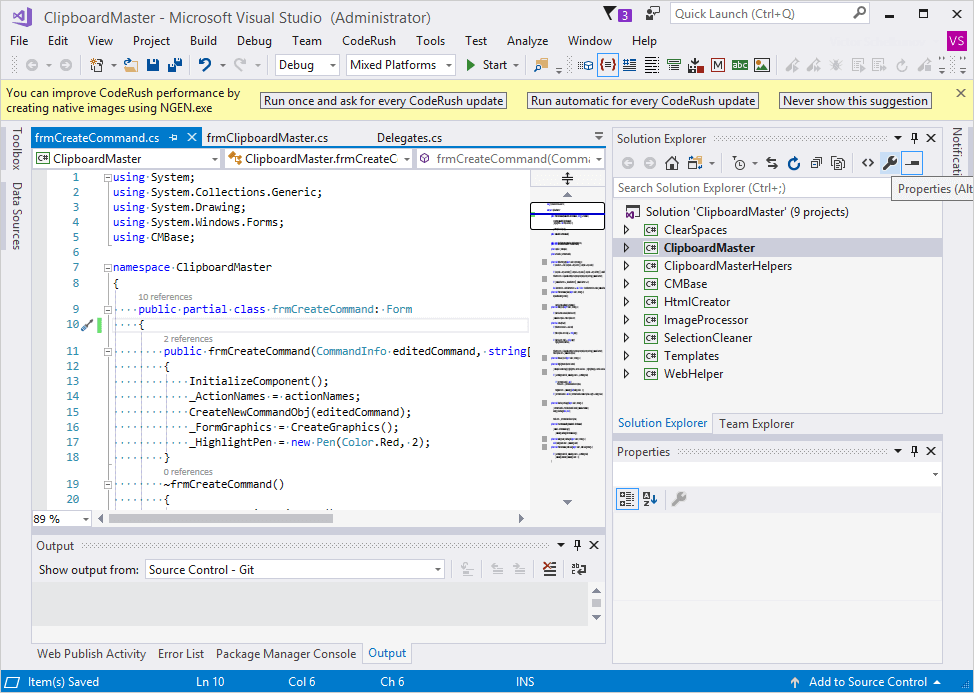
Move to Region Improvements
Move to Region now allows you to select target regions from a tree menu (regions are presented in the same hierachical order they appear in code).
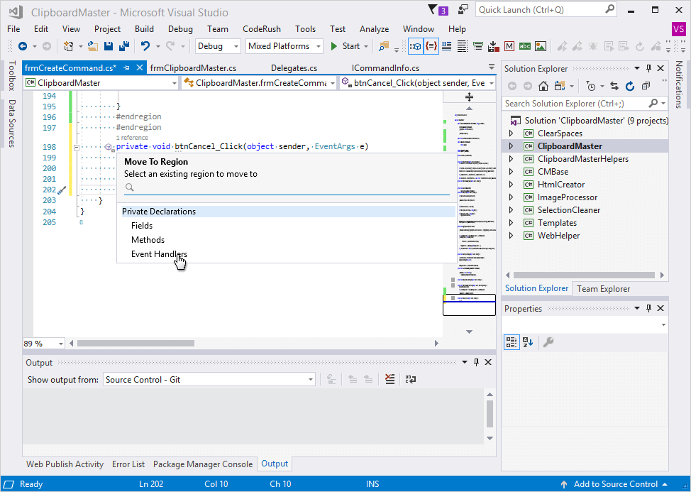
It can also position methods alphabetically.
Jump To Window Improvements
The Jump To window is now pre-configurable. You can now define a shortcut that invokes a Jump To window with a pre-configured filter. For example, the shortcut with the "Classes,Methods and Properties,Public" parameters opens the filtered Jump to Symbol window.
Blog Post Documentation
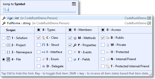
#Right-To-Left Support
The v18.2 release introduces Right-to-Left (RTL) support with the following DevExpress VCL components:
- Grid Control;
- TreeList Control;
- Layout Control;
- Tile Control;
- Scheduler Control;
- NavBar Control;
- Tabbed MDI Manager;
- Page and Tab Controls;
- Skin Form;
- and the majority of our editors.
We plan to extend this list in future releases.
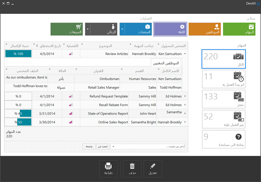
To enable RTL text in your application, switch its BiDiMode property to bdRightToLeft.
#Google Drive and Microsoft OneDrive Access
This release introduces a storage component that allows users to manage files and folders on Google Drive and Microsoft OneDrive cloud services.
Accessing storage data requires that you obtain OAuth 2.0 credentials for your application and specify them via the authorization components introduced in v18.1.
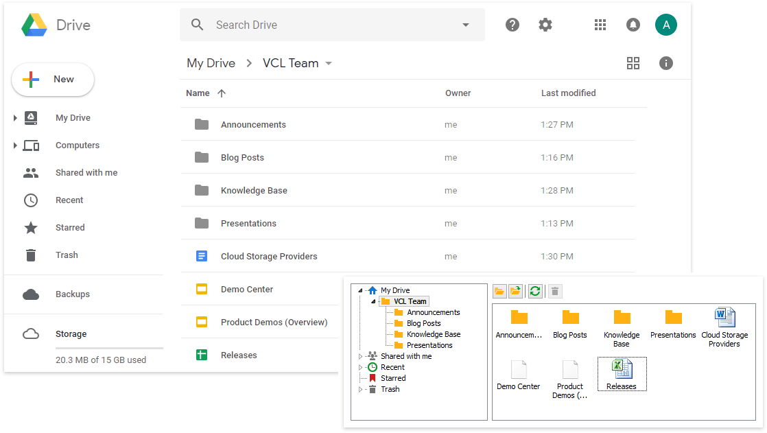
#Flow Chart
This release adds the following enhancements:
- 70+ new shapes including basic, flowchart, arrow, decorative, and SDL diagram shapes;
- New Ribbon-based designer with improved drag and drop support;
- A* algorithm-based auto-connector routing;
- Shape rotation capabilities.
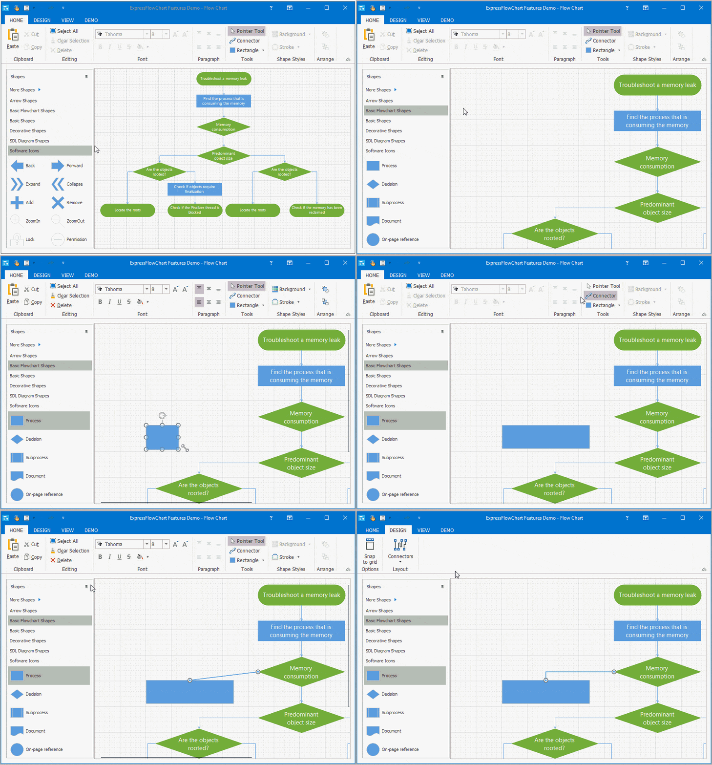
#Spreadsheet
Excel-inspired Formula Bar
This release introduces a Formula Bar component that you can integrate with the Spreadsheet Control to allow end-users to easily manage formulas in worksheets.
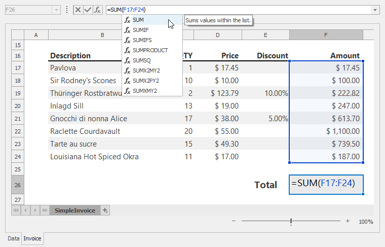
New Document-based Report Link
The new report link generates a report using the print area, print titles, page margins, and other print options specified in a document.
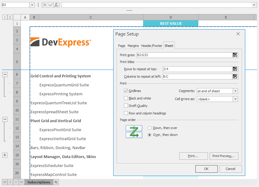
Improved Performance
- More responsive UI – it's two times faster than in previous versions;
- Array formulas are calculated 10 times faster when compared with previous versions;
- Significantly improved performance when displaying merged cells whose text is wrapped into multiple lines, especially when it includes CJKV (Chinese, Japanese, Korean, Vietnamese) characters or glyphs.
New Style Galleries for Generated UI
When generating a Ribbon/Toolbar UI for the VCL Spreadsheet Control, you can now add the Conditional Formatting Rule Style galleries, which are similar to those in Microsoft Excel. They display available icon sets and miniature previews of formatting applied to data bars and color scales.

The following UI elements are now represented as galleries:
- The Margins and Paper Sizes options on the Page Setup toolbar/ribbon group;
- The formula categories and calculation options on the Formulas toolbar/ribbon group.
#Rich Edit
New Style Galleries for Generated UI
When generating a Ribbon/Toolbar UI for the VCL Rich Edit Control, you can now create Style and Table Style galleries similar to the Quick Styles and Table Styles galleries in Microsoft Word.
The Style gallery displays a preview of text formatting for each individual style.
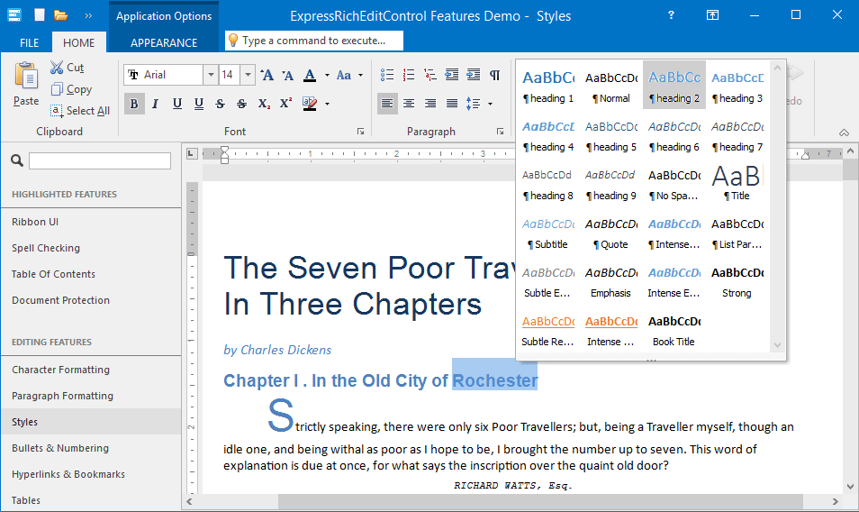
The Table Style gallery displays a miniature preview of table content formatting for each style.
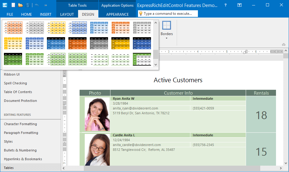
As with the Spreadsheet Control, the Margins and Paper Sizes options on the Page Setup toolbar/ribbon group are now galleries.
#TreeList & Vertical Grid
We continue to extend these controls with the filtering options available in our Grid control. In this release, we've added filter dropdowns to tree list columns and vertical grid rows. As you might expect, the controls, columns, and rows offer numerous options to customize the display and behavior of the filter dropdowns.
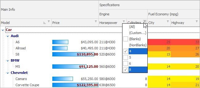
#Scheduler
We've implemented multi-threaded event operations and recurrence calculations to improve performance when using storage components.
#PDF Viewer
This release adds the following enhancements:
- Support for semi-transparent text;
- Display widget annotations and the content of interactive form fields;
- Limited support for transparency groups;
- Ability to display a replacement image or text while a page or its thumbnail is rendered.
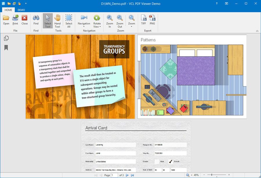
#Entity Mapping Framework (ORM)
With this release, we've extended the capabilities of our dataset component with field expressions, parameterized queries, sorting, grouping, support for master-detail relationships and TOP/SKIP query clauses, etc. In addition, we've introduced the following components to improve design-time UX:
New Data Context Component
This new component allows you to expose entities contained in an entity model's package (stored as a BPL file or installed to the IDE) for dataset components at design time. You can share a data context between dataset components for unified access to entity metadata.
New Table Dataset Component
With this component, you can bind data-aware controls to a single entity. The component provides all of the features you've come to expect from a classic dataset, including a design-time field editor, index settings, and support for master-detail relationships.
#Miscellaneous
The Layout, Page, and Tab controls can now display tab captions across multiple lines. Either add line breaks manually or specify a tab width to enable caption wrapping.
Optimized Package List
With this release, we've merged the packages containing the Layout Control, Editors, Data Controller, Page Control, and XP Theme Manager into the Cross-Platform Library to reduce the number of packages your IDE loads at startup and thereby improve its performance.
Icon Library - New SVG Images
We've extended our icon library with nearly 2,000 new SVG images.
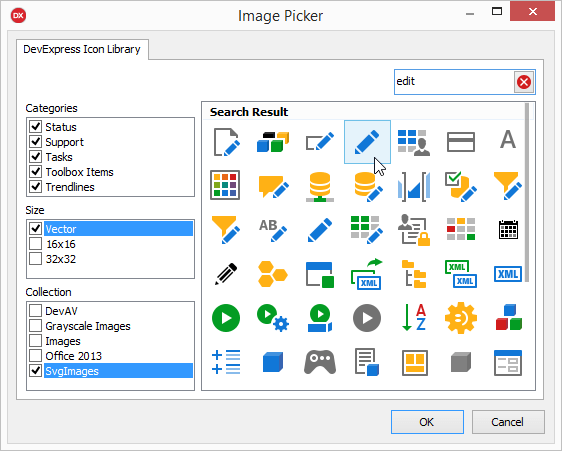
Mobile Chart Control
Pie (Doughnut) Chart Center Label
Our Pie Chart now supports Image Center and Text Center Labels. It is also possible to implement a custom Center Label layout.
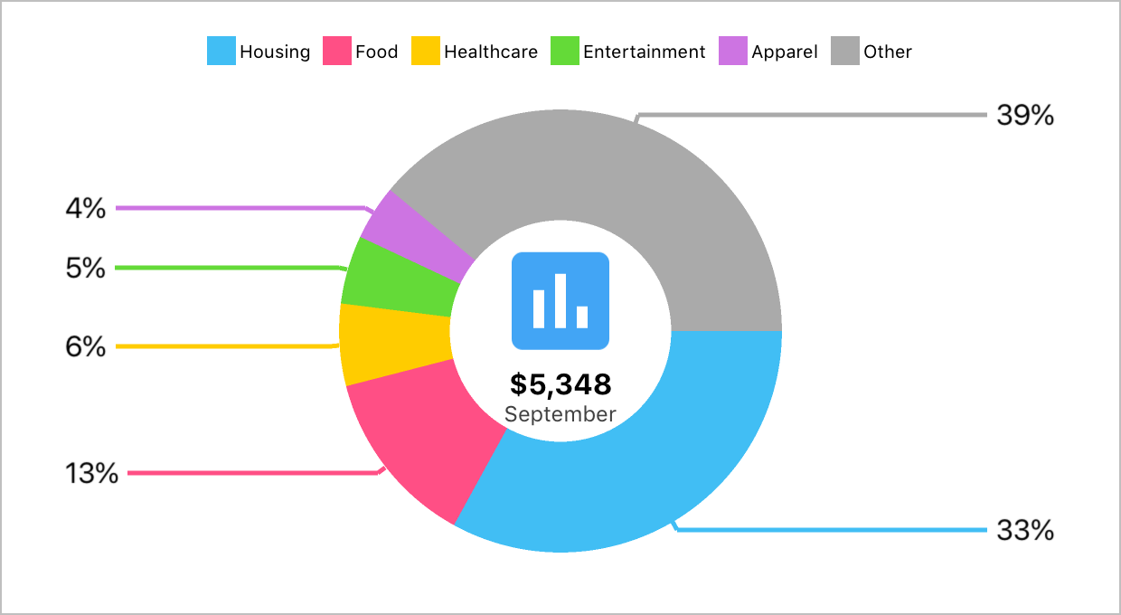
Indicators (Calculated Series)
We've added a new Series type (Calculated Series) that can use other Series as data sources. There are 19 indicator types available out of the box (Moving Average, Envelope, Bollinger Bands, and others).
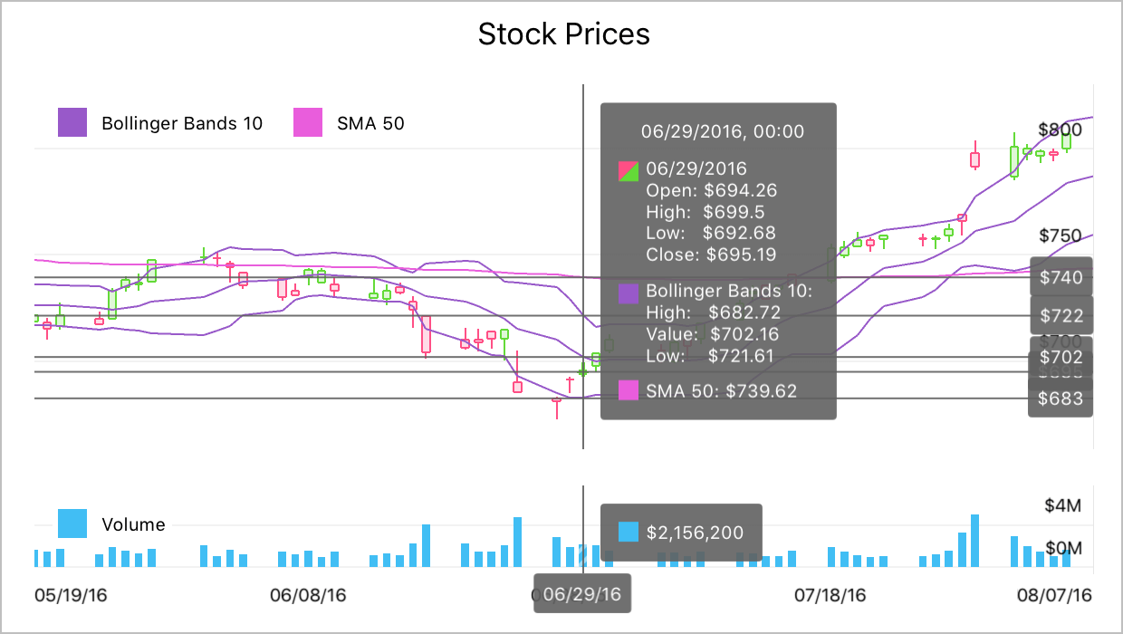
Xamarin.Forms Support
Since the initial release of our Native Charts for iOS, Android and Xamarin last year, we received numerous requests about support for the Xamarin.Forms platform. In v1.1.3, we officially supported Xamarin.Forms. All you need is to do is install Visual Studio on your Mac or Visual Studio 2017 IDE with Xamarin support on your PC.
Quick Start