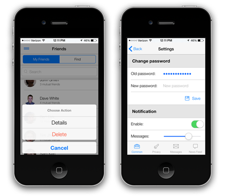
#
New Control Designer UI
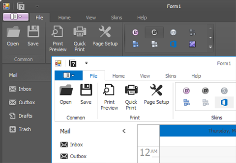
Design-time customization dialogs for our WinForms Controls have been re-designed for improved usability and a more consistent user experience.
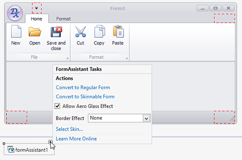
#New Form Assistant
This helper component is designed for first time users. When placed on the application form, it allows you to:
- Convert between various form types (Form, XtraForm, RibbonForm)
- Select a skin
- Automatically initialize a skin engine to enable form skinning
- Add the BonusSkins library to the project's References section
- Specify basic form settings
#
New Live Tile Manager
A bridge from your existing WinForms applications to the Windows 8 Start Screen. With this new control, WinForms Applications can transfer their data to Windows 8 tiles so that multiple tile frames can be set up for an animation.
#
New Flyout Panel
The new DevExpress WinForms Flyout Panel offers a perfect way to create auto-hide toolbars…A perfect choice when screen real-estate is at a premium or when you wish to replicate UI experiences that mimic those found on today’s most popular mobile apps. It can be docked to a form’s border and is automatically hidden when not in use.
#
New Taskbar Assistant
The new Taskbar Assistant component was built to simplify the customization of the Windows taskbar button, its live preview (displayed when you hover your mouse over the taskbar button) and to help you create jump lists (when you right click the taskbar button). Its features include the following:
- Overlay image on top of the application icon.
- Progress indication, including regular or marquee progress bars, pause and error display styles.
- Custom buttons in the live preview window (displayed when hovering over the application icon).
- Configurable task list or document list (displayed when right-clicking the application icon).
Blog Post
#
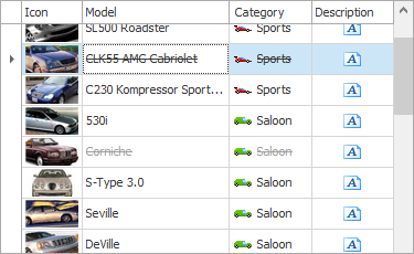
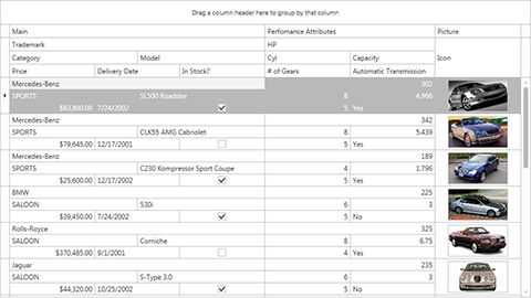
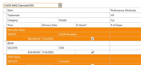
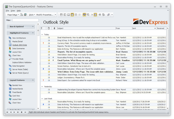
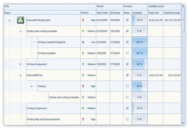
Data Grid Control
Windows Explorer View
The WinExplorer View emulates the Microsoft Windows Explorer user interface. You can display records with captions, descriptions, images and check boxes using one of the following options:
- Small Icons
- Medium Icons
- Large Icons
- ExtraLarge Icons
- Tiles
- List
- Content
Data grouping is supported so you can more effectively organize information and display it on screen for your end-users.
Blog Post

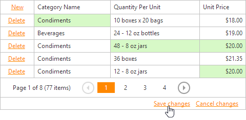
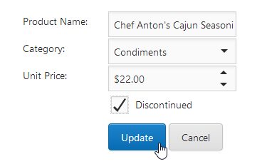
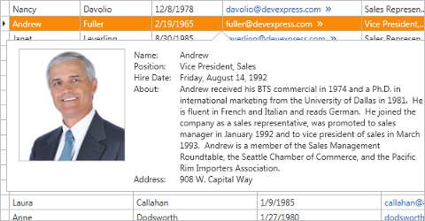
Inline Data Editing with Built-In Edit Forms
The DevExpress WinForms Grid now ships with three built-in edit modes to help simplify data entry and reduce the code you need to write to deliver the UI experience most suited to your enterprise.
- Inline Edit Form
- Popup Edit Form
- In-Line Editing
This new option allows you to incorporate an auto-generated layout within the edit form or a custom layout via the DevExpress Layout Control.
Blog Post
Web Style Row Selection
With this release, you can now select multiple grid rows via checkboxes. Check boxes can be optionally displayed within data rows, group rows and the column header.
Grid Pixel Scrolling
Our WinForms grid now provides flawless pixel-based vertical scrolling.
#
Application Themes
The DevExpress application theme collection continues to evolve and in this release, we’ve introduced 3 new skins inspired by Microsoft Visual Studio 2013.
- Visual Studio 2013 Blue
- Visual Studio 2013 Black
- Visual Studio 2013 Light
Blog Post
#
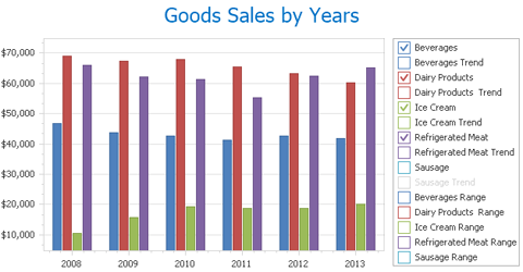
Chart Control
Legend Check Boxes
This release includes legend checkboxes which allow end-users to toggle the visibility of various chart elements.
Blog Post
Data Dependent Aggregation
The DevExpress WinForms Chart Control is now able to aggregate data based upon chart size and its current zoom level.
Blog Post
#
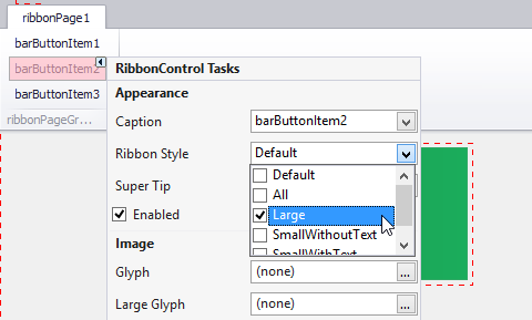
Contextual Smart Tags
WinForms Navigation Controls (including the Ribbon, Toolbars, NavBar) now display Smart Tags for their individual elements. This allows a customer to customize the control's layout and main settings with a few simple clicks, without using the Property Grid. We've also reviewed and extended our Smart Tags based on the usage experience of the controls.
#
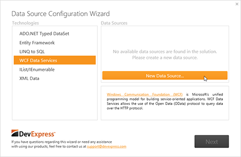
Data Source Wizard
Available via a Smart Tag or the clickable label on any DevExpress data-aware control, this wizard helps you set up your Data Source in three easy steps.
In the first step, the Wizard lists all data sources found in the solution, categorized by the data access technologies. If needed, you can select a data access technology and create a new data source.
Once the data source has been selected or created, you choose a data binding mode from a list (all list items have short descriptions and links to our online documentation). Finally, the third step allows you to customize Control and Data Source specific settings. After you click Finish, the wizard adds a data source component to the form, binds the control and generates all necessary code.
#
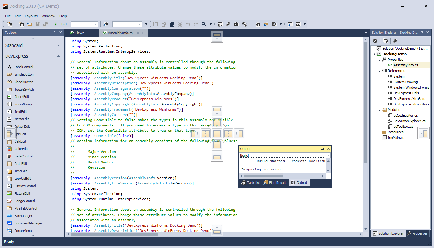
Docking
This release includes the following enhancements to our dock windows library so you can deliver Visual Studio 2013 inspired user experiences with ease.
- Whether your document is tabbed or floating, Toolbar/Menu and Ribbon controls from child documents are now merged into the main application form.
- Dock Hints are now painted using the current application theme.
- The new Float All command undocks all tabs and places them into a Floating Document Container.
- The new Move To Main Document Group command returns the selected document into the main tabbed container.
- You are now able to drag a Floating Document Container and dock all its Documents at the same time to a specific location.
- Clicking toolbar/ribbon commands within the main form does not take input focus away from Documents and Panels.
#
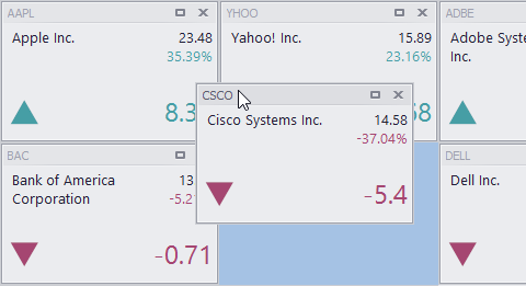
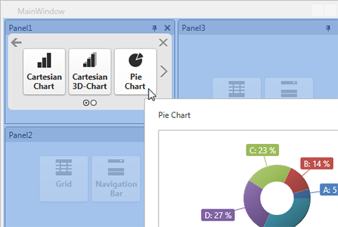
Document Manager
The new Widget View allows you to group your Documents into horizontally or vertically oriented Stack Groups and create Dashboard-like user experiences. End-users can maximize or minimize required Documents and drag them from one Stack Group to another. Flexible star-measured length for Stack Groups applies dynamic WPF-like scaling to your content, so you can be certain that Documents are always displayed as required when a form is resized.
The WidgetView includes built-in animations when repositioning individual widgets, when minimizing/maximizing a widget and when changing form size.
Blog Post
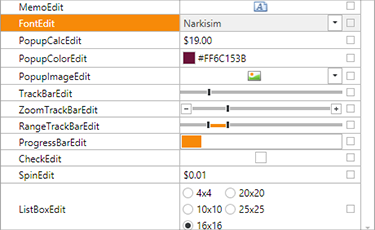
#Editors
TreeListLookUpEdit
A lookup editor that utilizes our TreeList for its drop-down list.
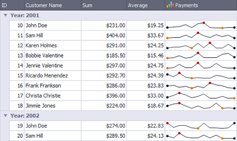
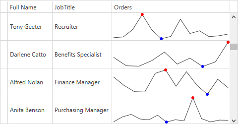
SparklineEdit
Sparklines are used to visualize data in a highly condensed manner allowing end-users to quickly consume and compare data. The DevExpress Sparkline is designed for use in 3 use-case scenarios: standalone, inside data-aware container controls like the WinForms Data Grid or within Reports.
PopupGalleryEdit
A new drop-down editor that displays a GalleryControl within its popup.
New Touch-Optimized Controls
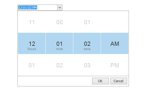
Multiple new touch-friendly controls are now available, including DatePicker, TimePicker, ToggleSwitch.
#Gauge Control
Logarithmic Scale for circular and linear gauges
New styles
Flat Light and Flat Dark styles
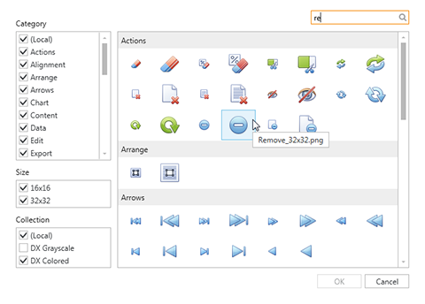
#Icon Library
Grayscale Icons with Skin Synchronization
If you are using grayscale icons from the new DevExpress Icon Library, you can now enable automatic color adjustment depending on the currently applied skin. If a dark skin is used, all icons will automatically switch to light colors thus maintaining appropriate contrast. These icons will also update colors for hot-tracked and pressed states.
This feature is available across our WinForms Navigation controls including toolbars, menus, Ribbon and Navbar.
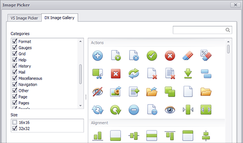
Released in June, 2013, the Icon Library includes a rich collection of icons and images created by our design team. Using the design-time DevExpress Image Picker, you can access images from the Gallery and assign them to specific controls.
The design-time Image Picker has powerful search and filtering mechanisms to locate images. The DevExpress Image Picker and extended smart tags work together to provide a superior design-time experience.
#
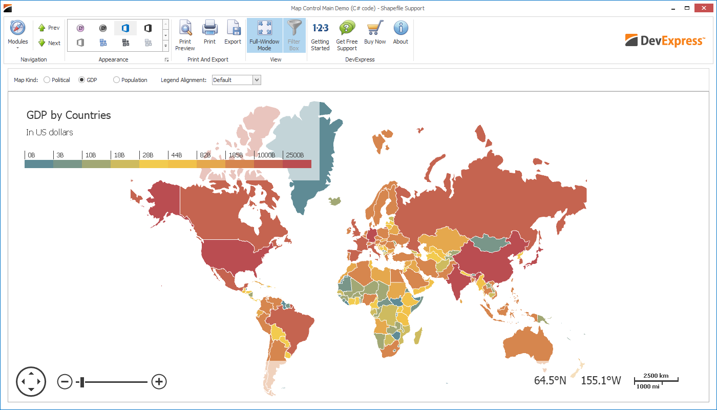
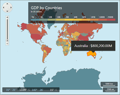
Map Control
The DevExpress Map Control was introduced in 2013 and included the following built-in features:
- Support for DevExpress Application Themes
- Animated scrolling and zooming
-
Support for Bing Services (Search, Geocode and Route)
- Zooming: Ability to zoom in/select a specific region and display current map information
- Printing: Ability to preview and print the contents of the Map control
- Support for Bing Maps and OpenStreetMap data providers
- Multiple Layers: Ability to show an unlimited number of map layers
- Support for Loading Vector Data from Shapefile and KML formats
- Vector Elements: Numerous built-in vector elements such as Line, Rectangle, Polyline, Polygon, Callout and many others
- Navigation Panel: Contains various UI elements that help end-users scroll and zoom the map area
- Colorizer: Ability to automatically color map shapes (added manually or loaded from different shape formats) based on geographic data
- Color Legend: Support for two types of a color legend: color scale and color list
- Data Binding: Ability to generate elements from a data source
- Selection: Ability to select map elements in several selection modes such as Single, Multiple, Extended
- Built-in Tooltips: Does not require a single line of code and is enabled by default where appropriate
Blog Post
#
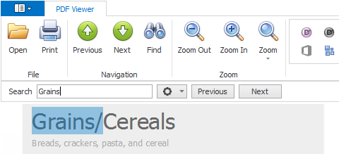
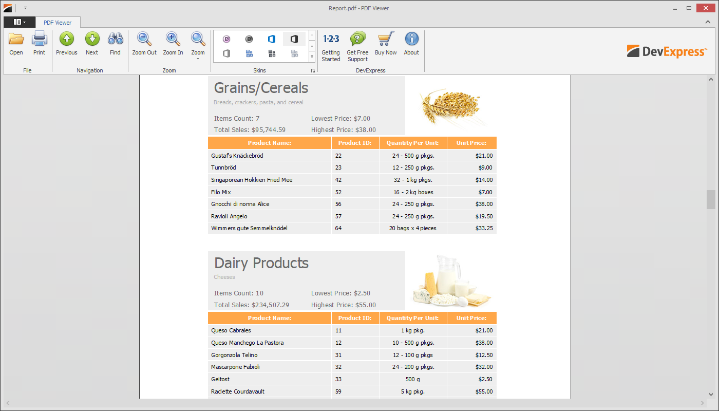
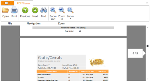
PDF Viewer
The DevExpress WinForms PDF Viewer now ships with full Text Search support and a built-in search UX.
With the PDF Viewer control, you can display PDF files directly in your WinForms application without the need to install an external PDF viewer application on your end user's machine. This control supports printing, text search, zooming, scrolling, embedded fonts, continuous page layout and provides a ready-to-go Ribbon tab, so you can quickly incorporate it into your application. The WinForms PDF Viewer supports:
- Exporting of any page to image.
- Document information.
- Password-protected documents.
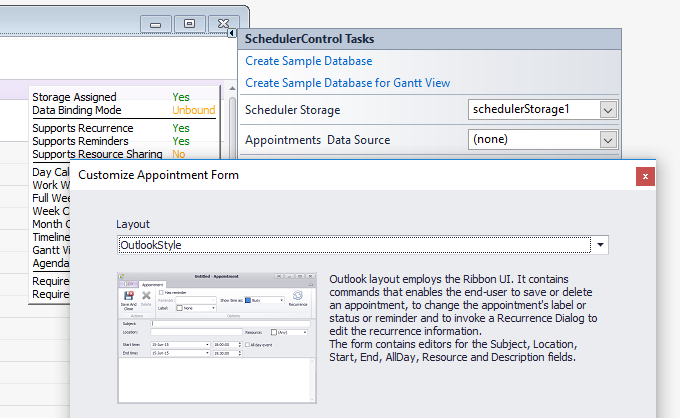
#Scheduler Control
The design-time smart tag panel of the XtraScheduler control includes a smart tag that invokes an assistant to help you create custom appointment forms. The wizard allows you to select a form template, adds template to the project and automatically inserts the code required to display a custom form instead of the default appointment form.
#
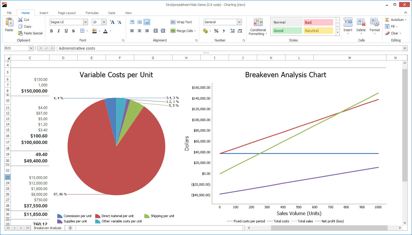
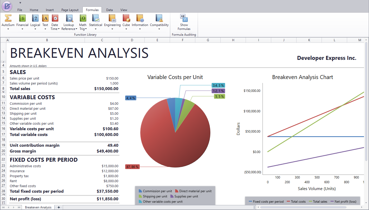
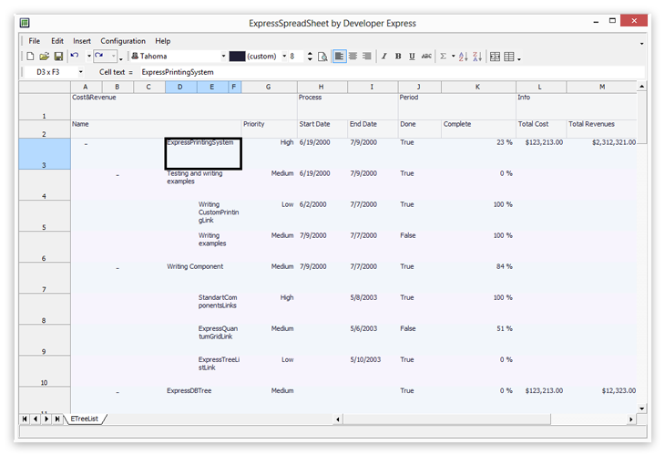
Spreadsheet Control
- Charting
- Mail-Merge
- Conditional formatting
- In-place cell editing
- Support for XLSX, XLS, CSV and TXT file formats (export and import)
- Print and Export to PDF
- Formula calculations
- Comprehensive worksheet, row, column and cell management
- Embedded pictures support
- Cell appearance and value formatting
- Automatically-generated Ribbon UI
Blog Post
#
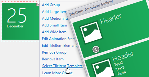
Tile Control Template Gallery
The DevExpress WinForms Tile Control was inspired by Microsoft Windows 8 and offers you a rich set of UI options so you can deliver solutions that emulate Windows 8 Live Tiles on the WinForms platform. With this release, you can now choose from 46 built-in templates, designed to automatically generate all necessary UI elements and frames, apply appropriate font settings and arrange text blocks. All you’ll have to do is to change the default element text to your own and enjoy a Live Tile experience that fully meets Microsoft Tile Guidelines.
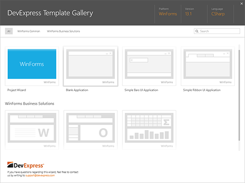
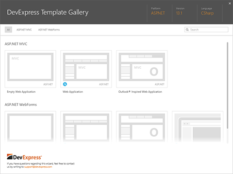
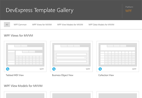
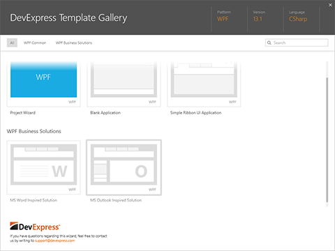
#Visual Studio Template Gallery
Prior to 13.1, we offered numerous Project/Item Templates that were created over many release cycles. These templates could be found in various locations within Visual Studio. This release includes a fully consolidated DevExpress Template Gallery - the entry point for all Project/Item Templates. The Template Gallery provides a unified way to use DevExpress templates, features powerful filtering and searching mechanisms and contains sample images and descriptions for each template, thus simplifying the way in which selections are made for individual projects. 13.1 also includes improvements to shipping templates and offers additional template options.
#
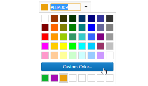
New Custom Color Picker
The new ASP.NET Color Picker allows you to select custom colors via its dropdown. The collection of custom colors can be maintained in cookies.
#
New Ribbon Control
Our new ASP.NET Ribbon helps you introduce the look, feel and behavior of a Ribbon based UI in your next ASP.NET Web project.
- Data Binding
- Responsive Layout
- Rich Client Side Events
- Templates
#
New Spreadsheet Control (CTP)
The new ASP.NET Spreadsheet control ships with the following features:
- Automatically Generated UI
- Automated Formula Calculation Engine
- Built-in Spreadsheet Functions
- Cell References and Formatting
- Cell and Cell Ranges
- Rows and Columns
- Charting, Pictures
- Worksheet Management
#
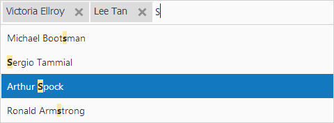
New Token Box Control
Our new ASP.NET Token Box control gives you and your users the ability to easily select values from a predefined list.
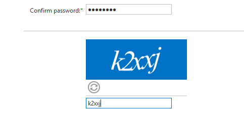
#New MVC Captcha Extension
Based on the DevExpress ASP.NET AJAX Captcha engine, this new MVC extension supports the following features:
- Customizable element appearance
- Custom character sets
- Code length control
- Font family and style customization
- Customizable error messages
- Comprehensive client-side API
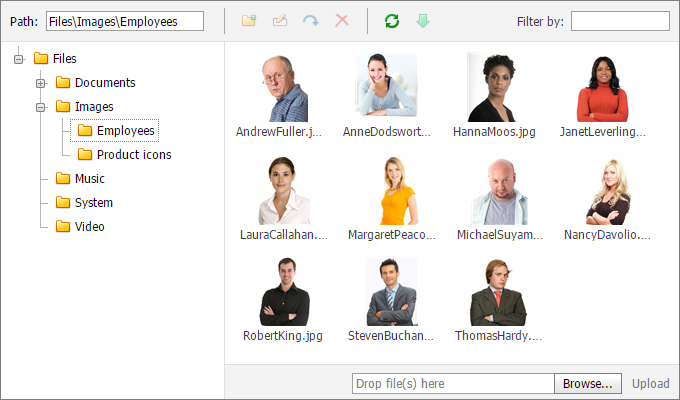
#New MVC File Manager Extension
Based on the DevExpress ASP.NET AJAX File Manager engine, this new MVC extension supports the following features:
-
File multi-select support (Online Demo)
-
Two view modes: Details and Thumbnails (Online Demo)
- Automatic folder and file alphabetic sorting
- Automatic thumbnails for image files
- Rename, move and delete files and folders
- Create new folders
- Upload files using a built-in upload panel
- Download files
- Update the file list dynamically via callbacks
-
Modify access permissions (Online Demo)
- Respond to file selection and submission
- Search for files using a built-in filter box
- Keyboard support
#
New MVC Form Layout Extension
Much like the DevExpress ASP.NET Web Forms Layout engine, this new MVC extension supports the following features:
- Data Binding
- Seamless Integration with DevExpress Data Editors
- Support for Third-Party Components
- Help Text Rendering
- Tab and Group Box Containers
#
New MVC Rating Extension
This new MVC extension replicates the features of its Web Forms counterpart and includes the following options:
- Customizable titles for each extension item
- Customizable number of items (stars)
- Customizable item fill if the extension value is a fractional value
- Customizable item images
- Read-only mode support

#
Grid View Control
Grid Batch Editing
The award-winning DevExpress ASP.NET Grid Control now supports a Batch Edit mode. Modify a batch of records on the client side and send it to the server in one request. Batch editing will help you create high performance apps that eliminate superfluous data updates. When used, you'll only need to update the grid control once - after all necessary changes have been made by the end-user.
Endless Paging
Indefinite data loading when paging or scrolling the following DevExpress ASP.NET Controls:
#
Application Themes
The DevExpress application theme collection continues to evolve and in this release, we’ve introduced a new themes - Moderno and Metropolis Blue.
#
Chart Control
Legend Check Boxes
This release includes legend check boxes which allow end-users to toggle the visibility of various chart elements.
Data Dependent Aggregation
The DevExpress ASP.NET Chart Control is now able to aggregate data based upon chart size. (Blog Post)

#
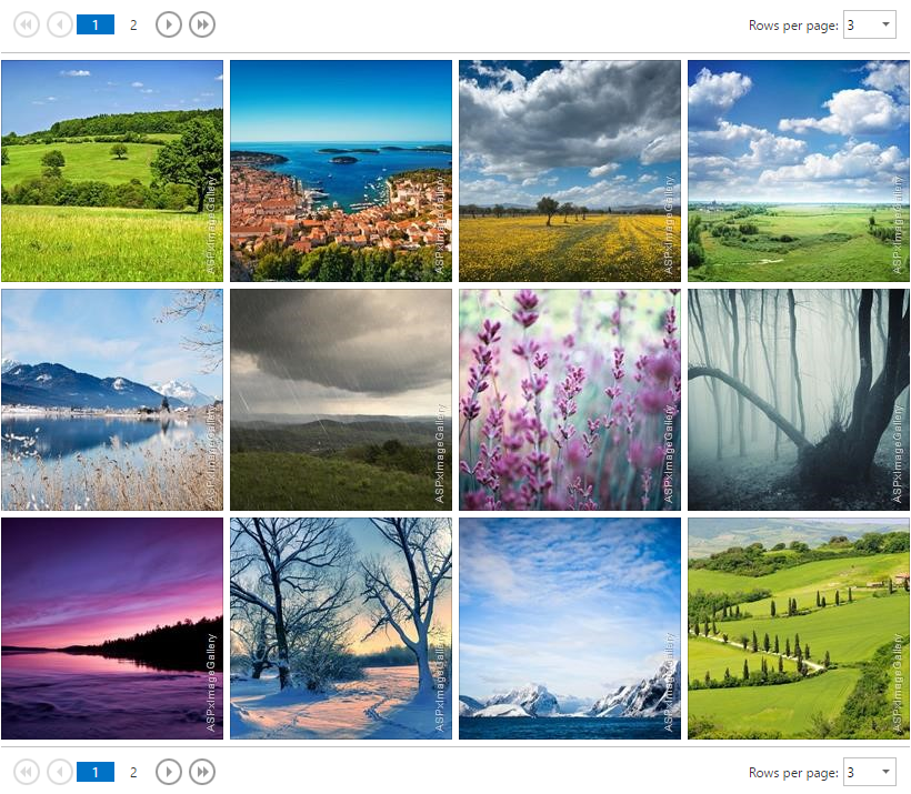
Image Gallery
Effectively displays image collections using a tabular layout with dynamic layout adaptation, integrated pager and built-in image slider.
-
Loads images from a folder (Online Demo)
- Automatic thumbnail generation
- Touch gesture support
-
Responsive layout (Online Demo)
- Endless paging support - more images are loaded when scrolling the page or by clicking the 'Show more items' button
- Template support
#
Image Slider
DevExpress ASP.NET Image Slider now supports the following features:

#
Support for SharePoint 2013
ASP.NET controls can be used at design-time within SharePoint projects.
#Visual Studio Template Gallery
Prior to 13.1, we offered numerous Project/Item Templates that were created over many release cycles. These templates could be found in various locations within Visual Studio. This release includes a fully consolidated DevExpress Template Gallery - the entry point for all Project/Item Templates. The Template Gallery provides a unified way to use DevExpress templates, features powerful filtering and searching mechanisms and contains sample images and descriptions for each template, thus simplifying the way in which selections are made for individual projects. 13.1 also includes improvements to shipping templates and offers additional template options.
#Miscellaneous Enhancements
- Grid View - New Filter Row mode - Ability to filter data based upon multiple criteria in a single request.
-
New Icon Collection - Access a rich collection of icons and assign them to specific elements using the design-time DevExpress Image Picker. (Blog Post)
-
HTML Editor - Formatting command improvements (bold, italic, underline, etc) and ability to customize dialog options.
-
HTML Editor - Ability to enable FullScreen mode in HTML and Preview views via a shortcut or client-side API.
-
File Manager - Ability to copy files.
-
ComboBox and Grid Lookup - Null Text Support - Can now display text when value is null. (Online Demo)
- Upload Control - Support for HTML 5 mode - Ability to use advanced features (like multi-select) without Silverlight.
- File Manager – Improved performance with the use of Virtual folders mode (SettingsFolders.EnableCallbacks = true).
-
Form Layout - Data binding support - Ability to generate the control's structure (using our editors) based on a data object or a data source and ability to bind the control's editors to data. (Online Demo)
- HTML 5 Support - DevExpress ASP.NET controls can now be rendered in HTML 5 document type compliance mode.
#
New Spreadsheet Control
The new DevExpress WPF Spreadsheet Control ships with the following features:
-
Cell editing in the formula bar or directly in the cell
- Support for XLSX, XLS, CSV and TXT file formats (export and import)
- Print and Export to PDF
- Built-in and custom functions for formula calculations
- Comprehensive worksheet, row, column and cell management
- Embedded pictures support
- Cell appearance and value formatting
- Conditional formatting
- Automatically-generated Ribbon UI
- Embedded charts support
#
New PDF Viewer
With the PDF Viewer control, you can display PDF files directly in your WPF application without the need to install an external PDF viewer application on your end user's machine. This control supports zooming, scrolling, embedded fonts, continuous page layout and provides a ready-to-go Ribbon tab, so you can quickly incorporate it into your application. The WPF PDF Viewer supports:
- Exporting of any page to image.
- Document information.
- Password-protected documents.
- Asynchronous page rendering.
Blog Post
#New Touch-Friendly Range Control
The WPF Range Control allows you to define a DateTime range with ease.
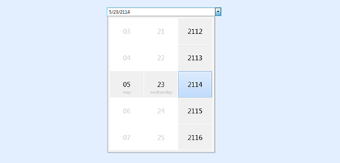
#New Touch-Friendly Date Picker
The DevExpress WPF DateEdit control allows DateTime values to be edited using a drop-down calendar. The new touch-friendly WPF Date Picker allows you to edit both the date and time portions of the DateTime value.
#
New Data Source Wizard
Available via a Smart Tag on any DevExpress data-aware control, this wizard helps you set up your Data Source in three easy steps.
In the first step, the Wizard lists all data sources found in the solution, categorized by the data access technologies. If needed, you can select a data access technology and create a new data source.
Once the data source has been selected or created, you choose a data binding mode from a list (all list items have short descriptions and links to our online documentation). Finally, the third step allows you to customize Control and Data Source specific settings. After you click Finish, the wizard adds a data source component to the form, binds the control and generates all necessary code.
#New Range Control
The Range Control is designed to help end-users select intervals and data ranges. When integrated with the DevExpress WPF Scheduler Control, it behaves like a timeline track bar, and allows quick timeline navigation and selection of date intervals.
#New Scaffolding Wizards
-
Windows 8 UI.
-
Visual Basic Support.
-
WCF Data Services Support.
-
Fluent API and Data Annotations Support.
-
EntityFramework 6.0 Support.
-
POCO ViewModels Support.
- DevExpress Tabbed MDI View Wizard: Creates all MVVM parts (Model, ModelViews, and Views) from an Entity Framework Model. This wizard creates a fully-functional Tabbed MDI application that performs CRUD operations against data tables from the selected Entity Framework Model.
- Entity Framework Data Model Wizard: Creates the Data Access Layer that encapsulates access to real data through interfaces, implements access to real data at runtime and sample data at design time.
- Collection View Model Wizard: Creates a ViewModel that provides functionality for managing a collection of data objects (entities).
- Single Object View Mode: Creates a ViewModel that represents a single object (entity) and provides functionality for posting entity changes to the database and deleting the entity.
- Collection View Wizard: Creates a Collection View based on an existing ViewModel that exposes a public collection property. A collection of entities will be presented via the Grid Control.
- Single Object View Wizard: Creates a View based on an existing ViewModel. All public entity properties will be presented by corresponding data editors and arranged using the Layout Control.
#
New Sparkline Control
Sparklines can be used to visualize data and communicate cause/effect in an ultra-efficient manner. As an example, use it inside grid cells to display trends associated with a given record.
#
New Flyout Control
Push information to your end-users via hints or use it as a popup panel displayed on the side of your application window.
#
New Win 8 Dialog & Message Box
Emulate the Windows 8 user experience on the WPF platform with our new message box and dialog controls.
#
New Windows UI Style Controls
The following new controls, in conjunction with our new touch-enabled theme, allow you to introduce Windows 8 style touch-first user experiences to your WPF applications.
- FlipView
- PageView
- SlideView (illustrated in the Utility Controls demo)
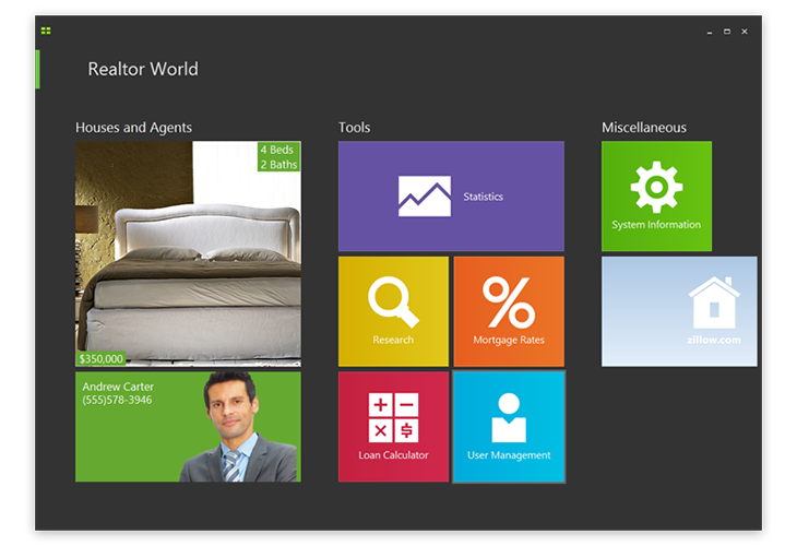
- Full integration with the WPF MVVM framework (illustrated in the WPF Realtor World Demo)
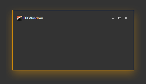
#New Window Visual Effects
The DXWindow WPF component provides Border Highlighting Effects like Visual Studio 2012. Users can customize the glow color both for active and inactive window states.
#
Data Grid Control
Banded View
Ability to fix, print, export and serialize bands. Support for horizontal virtualization and hit testing. Ability to arrange column headers into Bands and create multi-row layouts.
Group Footer
Ability to display group summaries within group footers.
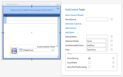
Design-Time Enhancements
Smart-tags, ItemsSource Configuration Wizard.
Printing/Export
Print selected rows, print/export all details in Master-Detail, print/export group summaries aligned by columns.
#Chart Control
MVVM Improvements
The Chart control provides MVVM support in the series selection and data points scenarios.
Legend Check Boxes
The chart control introduces legend checkboxes which allow end-users to toggle visibility of various chart elements.
Design-Time Improvements
-
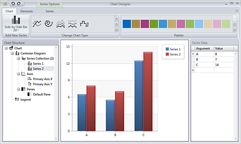
A new easy-to-use and quick-to-invoke сhart wizard. This is a powerful tool for quickly building charts of any complexity from scratch and customizing existing charts without using the Visual Studio Properties window. This powerful wizard can also be invoked at runtime to allow end-user chart customization.
-
Ability to customize the Chart control's appearance and behavior using the Properties window.
-
Ability to select series.
#Design-Time Extensions
- Smart Tags for DevExpress WPF controls: Allows you to set and bind common properties and modify the layout of controls (for instance, add a column to the Grid Control and BarItem to the RibbonControl). Properties can be bound to ViewModels via a dedicated Binding dialog.
- Smart Tags for standard WPF controls (available for Visual Studio 2012): Allows you to set/bind commonly used properties. You can easily bind to objects in ViewModels via a special Binding dialog.
#Grid Lookup
Row Multi-Select
This control uses a built-in grid control in its popup thus providing you advanced data layout options. You can now also enable the grid's row multi-select mode to allow multple value selection.
#Icon Library
This release includes a rich collection of icons and images created by our design team. Using the design-time DevExpress Image Picker, you can access images from the Gallery and assign them to specific controls. The design-time Image Picker has powerful search and filtering mechanisms to locate images. The DevExpress Image Picker and extended smart tags work together to provide a superior design-time experience.
#Instant Layout Assistant
Instant Layout Assistant (available for Visual Studio 2012): Allows you to create complex layouts with a few clicks. A special menu appears within an empty design space. The menu contains items that allow you to create common layouts of individual controls (ribbon, bars, grid, etc).
#
Map Control
-
Support for item virtualization via web services to provide faster performance.
- Colorizer: Ability to automatically color map shapes (added manually or loaded from different shape formats) based on geographic data.
- Color Legend - Support for two types of color legends: color scale and color list.
- Built-in Tooltips - Does not require a single line of code and is enabled by default where appropriate.
- Selection - Select map elements using selection modes such as Single, Multiple, Extended.
- Data Binding – Ability to generate elements from a data source.
#Property Grid Control
- Ability to edit multiple objects.
- Custom Templates.
- Supports DataAnnotation attributes.
- Supports MVVM.
- Appearance can be fully customized.
- Filtering and Searching: Allows you to locate required properties with ease. You can also filter properties that are displayed for end-users.
- Collection Editing: Allows you to browse and edit collections using a built-in collection editor (add, remove, update).
- New Item Initializer: Ability to define how to create new object instances.
- Allows use of the DevExpress WPF Data Editors Library to display and edit properties.
- Supports default .NET design-time attributes and type converters.
- Provides a flexible way to customize properties' layout.
#
Themes
New Office inspired themes: Office 2013 Dark Gray and Office 2013 Light Gray.
A new TouchlineDark theme for WPF and Silverlight. This theme was created so you can create touch-enabled experiences on next-gen Windows 8 devices.
#
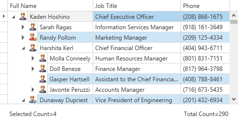
Tree List Control
With comprehensive cell selection support provided by the WPF Tree List Control, your end-users can now select individual or multiple cells as needed.
#Visual Studio Template Gallery
Prior to 13.1, we offered numerous Project/Item Templates that were created over many release cycles. These templates could be found in various locations within Visual Studio. This release includes a fully consolidated DevExpress Template Gallery - the entry point for all Project/Item Templates. The Template Gallery provides a unified way to use DevExpress templates, features powerful filtering and searching mechanisms and contains sample images and descriptions for each template, thus simplifying the way in which selections are made for individual projects. 13.1 also includes improvements to shipping templates and offers additional template options.
#
New Windows UI Style Controls
The following new controls, in conjunction with our new touch-enabled theme, allow you to introduce Windows 8 style touch-first user experiences to your WPF applications.
- FlipView
- PageView
- SlideView (illustrated in the Utility Controls demo)
- Full integration with the WPF MVVM framework (illustrated in the WPF Realtor World Demo)
#Data Grid Control
Banded View
Ability to fix, print, export and serialize bands.
Support for horizontal virtualization and hit testing.
Group Footer
Ability to display group summaries within group footers.
Banded View
Ability to arrange column headers into Bands and create multi-row layouts.
Design-Time Enhancements
Smart-tags, ItemsSource Configuration Wizard.
Printing/Export
Print selected rows, print/export all details in Master-Detail, print/export group summaries aligned by columns.
#Chart Control
MVVM Improvements
The Chart control provides MVVM support in the series selection and data points scenarios.
Legend Check Boxes
The chart control introduces legend checkboxes which allow end-users to toggle visibility of various chart elements.
#
Map Control
Support for item virtualization via web services to provide faster performance.
- Colorizer: Ability to automatically color map shapes (added manually or loaded from different shape formats) based on geographic data.
- Color Legend - Support for two types of color legends: color scale and color list.
- Built-in Tooltips - Does not require a single line of code and is enabled by default where appropriate.
- Selection - Select map elements using selection modes such as Single, Multiple, Extended.
- Data Binding – Ability to generate elements from a data source.
#
Tree List Control
With comprehensive cell selection support provided by the Silverlight Tree List Control, your end-users can now select individual or multiple cells as needed.
#
Themes
This release ships with 2 new Office inspired themes: Office 2013 Dark Gray and Office 2013 Light Gray.
A new touch-friendly theme called TouchlineDark is also available.
#
New Flyout Control
Can be represented by a hint or popup panel displayed to either side of the screen.
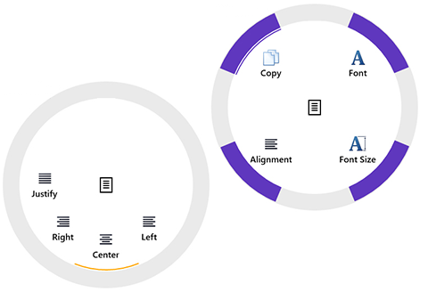
#New Radial Menu Control
Inspired by Microsoft OneNote, the DevExpress Windows 8 XAML Radial Menu allows you to extend your applications and create contextual and quick access touch-centric interfaces.
#Grid Control Enhancements
Row and Cell Selection
With comprehensive row/cell selection support your end-users can select individual or multiple rows/cells.
End-User Column Customization
End-users can rearrange columns and group data via drag & drop.
Data Filtering
Column headers can now display filter buttons that invoke Microsoft Excel style filter dropdowns. The resulting filter criteria is now displayed within a specially designed Filter Panel located at the control's bottom-most edge.
Horizontal Virtualization
This new feature significantly increases performance for grids displaying large numbers of columns. The grid now creates only those columns that are in the viewable region (not scrolled out of the view).
Optimized Scrolling Implementation
With this release, the DevExpress Windows 8 XAML Grid takes full advantage of the new Scroll Viewer introduced in Windows 8.1. Non-scrollable regions, like the column header panel, are now natively supported by the framework thus providing a more responsive UI.
Another Enhancements
- Ability to display group summaries.
- Ability to display total summaries within the Summary Panel under corresponding columns.
- In-place data editing support.
- Cell Navigation support.
- Predefined column types (Boolean, Date-Time, Numeric, ComboBox, etc.).
#Full Support for Windows 8.1
DevExpress Windows 8 XAML Controls have been overhauled to fully support Windows 8.1 and take advantage of new features including the following:
- New application resizing mechanism.
- Faster XAML loading thanks to precompilation to a binary format.
- On-demand style loading.
#PDF Viewer Control
This early preview of DevExpress XAML 8 Controls v13.2 introduces a PDF Viewer Control which allows your Windows XAML applications to load, display or print PDF documents with ease. The control uses the new Windows 8.1 API that renders PDF file content directly to a DirectX drawing surface, minimizing resource consumption and improving performance.
The new PDF Viewer can accept data from different mediums including files, streams or resources. You can also load documents from WCF services. This capability is demonstrated in a shipping demo. It displays data provided by a service transmitting PDF files generated by our Reporting Tool. This allows you to quickly build a report viewer for your Windows 8.1 XAML application.
End-users can navigate the document using touch gestures – including zooming in and out, scrolling between pages, zooming to the thumbnail view and back to page view.
#Windows 8.1 Style Hub Tiles
In this release, we've introduced a new tile type that provides codeless support for three animation modes available in Windows 8.1 tiles and allows you to build tiles of any size found in the new OS.
#
Supported Platforms
The DevExtreme Mobile Framework supports a broad range of device platforms. With this release we officially extend support to Tizen and iOS7.
#
New Data Visualization Widgets
dxSparkline
A compact chart designed to illustrate trends within your data. Multiple series types are available for data presentation: line, area, bar, spline, spline area, step line, step area and win/loss.
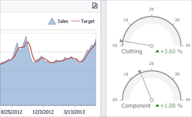
dxBullet
A small chart that indicates measured data by a bar and a comparative measure as a target. This widget allows users to visually estimate how close the currently measured value is to the target.
dxVectorMap
Allows you to quickly configure a map with markers, tooltips, zooming, centering – and process end-user interaction with the contents of the map (area and marker selection).
dxExporter
A panel that can be located anywhere on a page and bound to the dxChart widget so that end-users can easily print the contents of a chart widget or export it to a desired file format.
#
New Mobile Widgets
dxPivot
Much like a traditional tab control, dxPivot is optimized for the phone and simplified end-user interaction. Widget items (tabs) are placed horizontally next to one another and navigated by flicking or panning to the left, to the right, or by choosing the desired pivot header. While you always see the content of one item (tab), the pivot header of the next item is visible so users can clearly see that more items are available. This widget is often used to present lists of data filtered by different criteria. Though created as an analog of the native WindowsPhone8 Pivot widget
dxPanorama
A full screen widget that allows you to locate widgets, display data and provide services by using a long horizontal canvas that extends beyond the frames of the screen. Content can be explored by panning and flicking between items. When viewing an item, you will be able to see a portion of the item next to it. This widget is often used as a navigation map on the first page of an application. Though created as an analog of the native WindowsPhone8 Panorama widget
dxPopover
An overlay with an arrow that points to the UI element that has been clicked or taped. You can provide a custom template for the overlay's content.
dxSelectBox
A dropdown list of selectable items.
dxRadioGroup
A set of options presented as radio buttons. Checking one radio button unchecks any previously selected item.
dxAutocomplete
A textbox that suggests ways to complete the text being typed. The available completions are loaded from a specified array.
dxToast
Auto-disappearing popup notification. Useful for things like "Network error occurred" etc.
dxTextArea
A multi-line text field with CSS specific to each supported platform and MVVM support.
dxActionSheet
Provides a set of choices related to a particular task. By default, it is just a bunch of buttons displayed together. However, you can define a template to be used to display the choices.
dxDropDownMenu
A drop-down menu that provides additional actions for a toolbar.
#
New Themes
Android Holo Light
With the addition of the Holo Light theme, you can now select between dark and light themes when targeting the Android platform.
Generic
If you prefer to introduce UI consistency across all supported devices, this release includes a platform-agnostic theme so you can create elegant mobile experiences without using a platform specific theme such as iOS 7 or Android Holo Light.
#
AngularJS Approach Support
DevExtreme widgets can now be used in applications built with the AngularJS framework. DevExtreme includes an AngularJS module registered under the name "dx". This module contains registered directives for all DevExtreme widgets.
#
Localization
You can now fully localize DevExtreme applications as required. Dictionaries for the text, captions, and messages that are added by the framework to your applications are supplied with the product. In addition, you can now generate custom user dictionaries with the strings used in your application. Linking all appropriate dictionaries will yield you a fully localized app. When the user runs the app, the framework will apply the corresponding localization based on the user's system locale, or you can explicitly specify a language.
#
Mobile Widget Improvements
List Edit Mode
The dxList widget is now editable and at your discretion, allows end-users to select and/or delete items. You can set one of the predefined HTML templates for selectable and/or deleteable items, or define a custom template as needed.
Custom Date Picker for the dxDateBox Widget
The native DateBox widgets for the Android and Windows Phone 8 platforms do not have a native date picker. Because we've implemented a custom data picker for each of these platforms, our dxDateBox widget provides a native look, feel and experience whenever it's used on an Android or Windows Phone 8 app.
Native Scrolling
All scrollable widgets can now be switched to native scrolling mode for improved performance. Moreover, the "Pull down to refresh" feature is also available in this mode.
Overflow Menu on Toolbar
Mouse/Touch and Gesture Events
Custom events can now be handled on page elements (including widgets).
#
Performance and UX
Performance
Navigation between views is now significantly faster. In addition, you can now apply scroll content natively.
UI Layouts
- A new layout based on the dxPivot widget is now available for Windows Phone 8 applications.
- You can now change a view layout based upon app navigation context.
- View layouts have been extended with a command container that is displayed using the new overflow menu.
User Action UI Feedback
All user interactions within an application's UI are highlighted visually. For instance, if a user taps a button, it changes its background. The same occurs with lists, bars and other interactive widgets. This ensures that the user is aware of action states and whether they've started.
Scrolling and Transitions
Both scrolling and transition performance have been improved. DevExtreme automatically selects the most effective scrolling strategy for each supported platform, producing unmatched scrolling performance for any target device.
View Rendering
Views are now rendered up to 10 times faster than previous releases.
Loading Indicator
DevExtreme layouts have been updated in order to notify users about long actions during the 'show-view' cycle. When a view is not in the cache, the user will see a loading indicator until the view is rendered.
Visual Enhancements
Visual enhancements such as improvement to colors, borders, margins and fonts for each supported platform.
#
Visual Studio Integration
TypeScript Support
You can now use TypeScript (instead of JavaScript) when developing mobile apps with the DevExtreme Mobile Framework. The distribution includes a project template that references the framework's TypeScript definition files and provides sample TypeScript code required when developing a DevExtreme application.
DevExtreme View Designer Enhancements
Intellisense is now supported for all nested levels of an object. In addition, object properties can now be expanded in the Property Grid so that you can specify values for all nested levels of an object.
Localizable Native Packages
DevExtreme View Designer Enhancements
- Widgets can be moved to their required position within the design window.
- Widgets can be dropped from the toolbox to the markup window.
- IntelliSense is supported for DevExtreme widgets and their properties within the markup window.
- Views from the Shared project can be displayed in the context of a specified project in the design window. This allows you to see how shared views will appear in the final application.
New Build Package Wizard
A straightforward way to build native packages is now available.
DevExtreme Project Wizard Improvements
- You can generate a model for an entity without generating a view.
- Views can be generated within shared or platform-specific projects, as required.
- Lookups are now created in the view markup for reference properties.
- A view for an additional entity can be generated after a multi-channel project is created.
Build a PhoneGap-Ready ZIP package
Custom Native Application Template Support
A native package can be built using custom application templates. This makes it easier for you to add extended app functionality by using PhoneGap plugins.
#
Data Viz Library Enhancements
New Series Type
New Bubble chart series type has been added to the dxChart widget.
Constant Lines
You can now indicate a particular argument(s) and/or a value(s) using a straight line with a desired style.
Crosshair
To help you determine the value and/or argument of a specific point(s) on a chart, you can now enable crosshairs. All required style options for the crosshair have been implemented.
Shared Tooltip
A tooltip can now be shared between the points with a particular argument and show all the information about these points.
Individual Point Customization
You can now set a custom style for individual points on a chart. In addition, you can use an image instead of a marker for a point.
Data Aggregation
To improve chart performance, you can now enable series point aggregation.
Auto Mode for Axis Label Overlapping
You can now address axis labels arrangement issues (when labels overlap) by using the new automatic axis label mode.
Logarithmic Axis
You can now use a logarithmic axis to help visualize datasets with rapidly-growing values. You can choose a base for the logarithm so that generated axis ticks provide the most effective display of information.
Pie Chart Animation
The appearance of a pie chart can now be animated.
Improved Interactivity
You can now handle legend item clicks and the change of point/series selection states.
TypeScript Support
All the widgets that are supplied with the DevExtreme data visualization library can be configured and accessed using TypeScript. Simply reference the TypeScript file with ChartJS definitions in your code.
AngularJS Support
You can now use the data visualization widgets that ship with DevExtreme in AngularJS applications. Just add the "dx" module to the list with the dependencies of your application module. The "dx" module contains registered directives for all ChartJS widgets.
Chart new series types
New series types have been added to the dxChart widget:
Custom Bar Width Support
A custom bar width can be set for bar series in the dxChart widget. Demo
Empty Points Support
Missing points are indicated in a chart. The series presentation stops before the missing point and then continues after the point.
New Label Layout in the dxPieChart
You can now position labels in two columns - on the left and right sides of the chart. Demo
Multiple Series/Points Selection
Multiple series and point selection is now supported in a chart.
Series Templates
When the series count can change during the chart's life cycle, define a template for the series. All the series that come from the data source will be displayed in the same manner. Individual series customization is supported as well.
dxRangeSelector Scale Data Types
dxRangeSelector now accepts string data. You can specify a scale data type to convert string data and define a numeric or date-time scale.
#
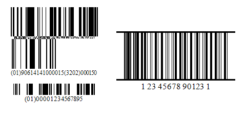
New Barcodes
This update includes support for 2 new barcode types:
GS1 DataBar and UPC Shipping Container Symbol (
ITF-14).
#
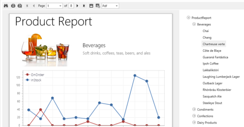
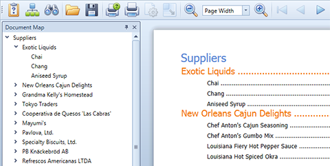
New Document Viewer Control
This releases introduces a new Document Viewer control with integrated document map and parameter support for the ASP.NET and MVC platforms.
#
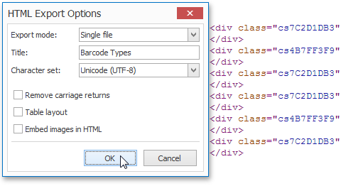
New HTML Export Mode
When exporting a report, you can now choose whether the resulting HTML file markup uses an up-to-date 'fluid' layout or the more conventional table layout paradigm.
#
New Report Control: Sparkline
Sparklines are used to visualize data in a highly condensed manner, thus allowing end-users to quickly consume and compare data.
#
New Ribbon UI Viewer
A new RibbonDocumentPreview control is available so you can easily create a Ribbon-based report preview.
#
Preprinted Forms
With this release, the XtraReports Suite is now able to generate reports based upon the design of pre-printed forms with pinpoint accuracy. To get started, simply place an image of your pre-printed form below the report designer's surface and align report elements precisely to match those of your form's fields.
#
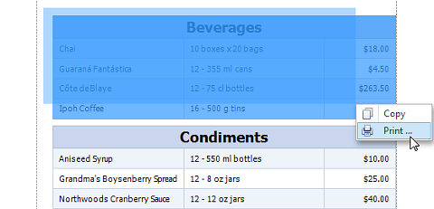
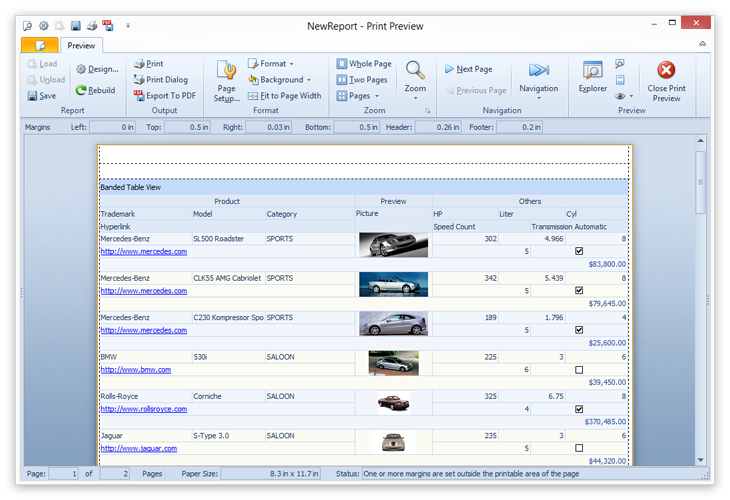
Print Preview Enhancements
DevExpress Print Preview Dialog for WinForms ships with the following new features:
- Select a part of document and then copy or print selection.
- Navigate to a page by pressing CTRL+G to invoke the new Go To Page dialog.
- Provide custom Print and Page Setup dialogs.
- Preview, print and export documents defined by System.Drawing.Printing.PrintDocument objects.
#
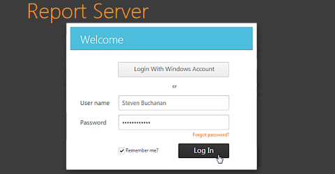
Report Server Enhancements
This release includes the following new features:
- Support for Stored Procedures
- New Mixed Mode user authentication mechanism
- Server Notifications: HTML Emails / Email Templates Editor & selectable delivery format for scheduled reports
- Various Web interface usability improvements
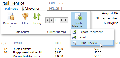
#SNAP Reports
WinForms
-
New data source mode to create mail-merge reports. Ranging from a simple form letter to a complex business report, these reports integrate dynamic data into static document templates.
- Integrated Query Builder and support for parameters.
- Support for Sparklines.
- A new wizard to connect to data sources on the fly.
- Support for Nested Fields.
- API to create snap reports from code.
- Ability to edit table cell styles.
- Hyperlink data field.
#
Table of Contents
New Report Control Table of Contents
New XRTableOfContents control generates a table of contents based on bookmarks specified for report elements.
#
WinForms Management Controls
New Report Designer and Management Controls for WinForms
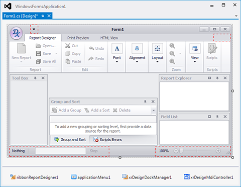
New StandardReportDesigner and RibbonReportDesigner components. We now provide a single instrument to create end-user reporting applications instead of a set of segmented controls.
PrintControl, PringBarManager and PrintRibbonController have been replaced with a single DocumentViewer control. Assign an XtraReport, PrintingSystem or a remote source (Silverlight Report Service or Report Server) to its DocumentSource property to create a document and show it in a print preview.
#Miscellaneous Enhancements
- The WinControlContainer control has been replaced with PrintableComponentContainer, to embed into reports not only Windows Forms controls, but ASP.NET controls, by using printing links.
- Improved scripts debugging using the Visual Studio Error List panel (instead of the previous Script Errors panel). This panel displays report generation errors along with report script errors.
- Table Control: Ability to convert table cells into individual labels and to freely position them across a report.
- Table Control: Instant column headers.
- Export to PDF: Support for image transparency in PDF.
#
Business Class Names
Business Class Name Conflict Resolution
Support for business classes with the same name located in different namespaces. This enhancement is important for large business applications when a data model is split across multiple assemblies and contains hundreds of business object types.
#
Business Object Members
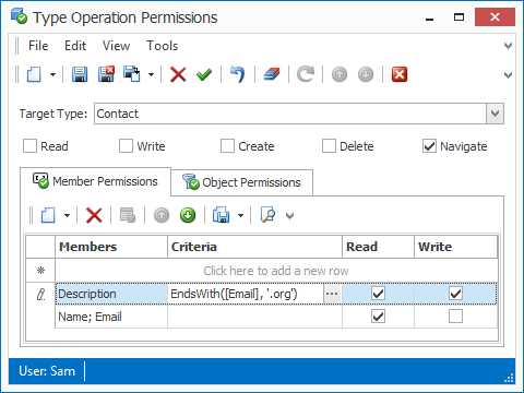
Secure Business Object Members with Access Criteria
You can now specify member access criteria. A member will be accessible only if the current object satisfies the given criteria.
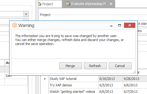
#Concurrent Record Updates
Merging of Concurrent Record Updates
With this release WinForms XAF applications can correctly handle concurrent record updates and merge changes made by different users in cases of conflict.
#
Custom Fields
End users can now alter a business model at runtime, without recompiling XPO-based XAF applications. Custom fields can be calculated (an expression used to compute the field value must be provided), or persistent (a new column is added to the database table automatically).
Blog Post
#Entity Framework
Improved Entity Framework Support
The StateMachine Module now supports the Entity Framework data model.
#List Views
Multiple Record Editing in List Views
Users can now modify multiple records in an editable List View at once and save changes only when necessary. You can also commit changes automatically when a View is closed.
#
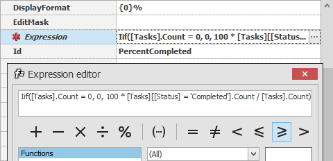
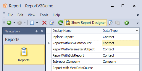
ReportsV2 Module
This new module integrates XtraReports at design time and makes it easier for you to work with Stored Procedures, SubReports and to host custom components. The design time report is available as a template at runtime and your end-users can make an editable copy and continue designing it as needed.
Blog Post
#
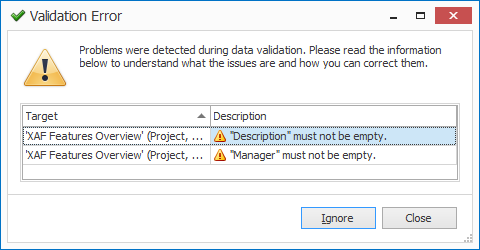
Soft Validation Rules
You can now define validation rules that can be ignored by end-users. This functionality is useful when you want to warn a user that the data is invalid, but allow commits nonetheless.
Blog Post
#SplashScreenManager Integration
XAF now supports splash forms powered by the DevExpress WinForms SplashScreenManager Control.
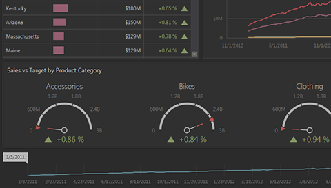
#A New ASP.NET Dashboard Theme
Create elegant and highly interactive user experiences with our newest ASP.NET Dashboard Theme.
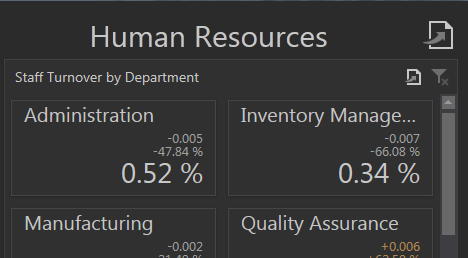
#Dashboard Title
Dashboard Titles can now display a text label, an image and command buttons.
#
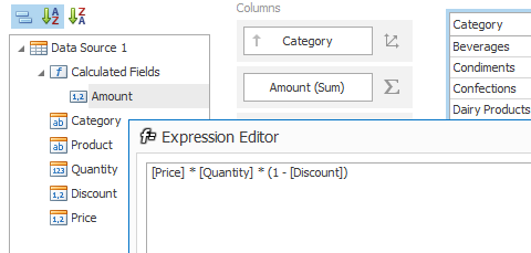
Calculated Fields
This release includes support for unbound calculated fields.
#
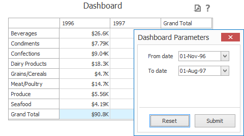
Dashboard Parameters
Dashboard parameters allow you to pass data to your dashboard when necessary. Usage scenarios include the ability to pass specific values to a data source filter string or to calculated fields.
#
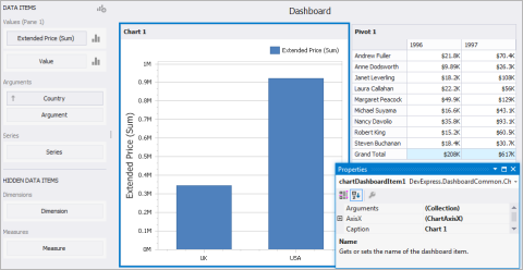
Full Visual Studio IDE Integration
You can now create dashboards from scratch within Visual Studio at design time. To add a dashboard item to your dashboard, select it in the Toolbox and drag it onto the dashboard's design surface.
#
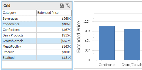
Multiple Selection in Master Filter
The new Dashboard Master Filter mode gives you the ability to select multiple elements in a Master Filter item (chart bars, pie segments, grid records, etc.) and to filter data in other dashboard items by the selected value(s).
#
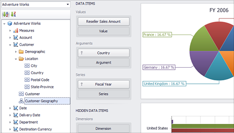
OLAP Server Mode
You can now bind your dashboards to MS SQL Server Analysis data sources with support for dimensions, measures, hierarchies and hierarchical filter. By using server-side data processing, you'll be able to achieve amazing performance results.
To bind to an OLAP Cube, select MS SQL Server Analysis Services as the data provider and enter connection parameters. The cube schema will be fetched automatically so you can simply drag-and-drop OLAP dimensions, measures and hierarchies to your dashboard.
#Printing
ASP.NET Dashboard Viewer Enhancements
The ASP.NET Dashboard Viewer allows you to specify various options when exporting the contents of a dashboard to PDF and image formats.
Printing and Export
The newly implemented Printing and Export for Windows and Web, including printing of individual dashboard items or the entire dashboard. The engine provides the following features:
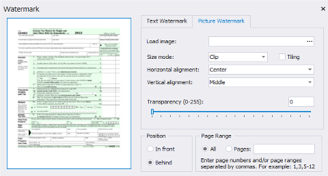
- Print Preview form. Available in the Dashboard Designer and WinForms Viewer. This form provides the tools for document navigation, zooming and scaling. In Print Preview, you can modify document print settings, specify its watermark settings or send it to a printer.
- Export to PDF and image formats in WinForms and Web applications.
- Print or export the complete dashboard or individual dashboard items.
- Dashboard state (Master Filtering, drill-down, selection, scrolling state, etc) is preserved in the printed or exported dashboard.
#
Shapefile Maps
You can now integrate shapefile maps in your dashboard. This new UI option allows you to load both shape contours and supplementary information as needed and to display data relevant to the user within tooltips.
#
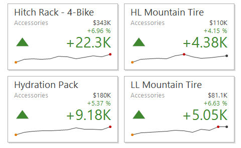
Sparklines
Sparklines are used to visualize data in a highly condensed manner allowing end-users to quickly consume and compare data. You can use this new feature to efficiently display historical data within both the Grid and Card Dashboard elements.
#Miscellaneous Enhancements
-
New API allows you to connect to various types of data stores using dashboard data providers.
-
New API allowing you to control the dashboard's layout.
-
Use the secondary axis in a chart to visually combine multiple charts into one.
-
End-user actions such as master filtering, drill down and drill up can be executed using the DashboardViewer API.
-
Override default Connection Error dialog via new ConnectionError events.
- Load dashboards to the ASP.NET Viewer from a stream via the new DashboardLoading event.
- Filter data on the DBMS by using the new CustomFilterCriteria event.
- Override the New, Open and Save commands in the Designer via newly implemented events.
- New client-side API for reloading data at runtime in the ASP.NET Viewer.
#
Archives
Compression and Archive Generation
The DevExpress Document Server includes a .NET Compression Library that's written with 100% managed code and available in Medium-Trust environments (stream and memory array compression/decompression operations).
- Create new zip files or update existing zip files on disk or in memory
- Zip or unzip to and from disks or memory
- Compress or decompress .NET stream
- Compress or decompress byte arrays
- Zip password encryption with support for AES encryption with of 128, 192, and 256 bits
- Supports different encryption passwords for each file
- Set individual file comments
- Allow file overwrite on a per file basis
- Programmatically filter files to process
- Progress tracking mechanism that allows cancelling archive operations
- Comprehensive API that enables you to control each archive item and all actions
- Object model designed for easy extensibility
#
Barcode Generation Library
With built-in support for numerous industry standard barcode types, the DevExpress Document Server allows you to easily generate barcode images within your .NET application.
#
PDF Document Processor
The DevExpress .NET Document Server ships with a high performance and low memory footprint PDF Document Processor. It includes the following integrated feature-set:
- Extract text from PDF documents
- Find text in PDF documents and retrieve results (text relative to search results, e.g. - next or previous words)
- Exporting of any page to an image
- Printing
#
Rich Edit Document Server
The DevExpress RichEdit Document Server is a word processing engine designed to fully automate common word processing requirements and use-case scenarios. It is the non-visual equivalent of the DevExpress RichEdit Control, with complete functionality available via its powerful API. Features include:
- Microsoft Word compatibility (DOCx, DOC, RTF)
- PDF, TXT, XML, ODT, EPUB, compatibility
- Medium Trust support
- Mail merge with master-detail support
- Extended text formatting options
- Comprehensive table support
- Floating objects
- Document protection and end-user restrictions
#
Snap Document Server
The DevExpress Snap Report Server allows you to create and customize Snap documents on the server via its straightforward API. Though it does not offer a visual interface, you can use all the capabilities of Snap Reports directly from code.
- Snap Report documents on the server
- Text formatting, styles, tables and lists
- Export Snap Report documents
- Charts, barcodes, and more...
#Spreadsheet Document Server
The DevExpress .NET Document Server ships with a high performance and low memory footprint Spreadsheet Server and includes the following integrated features:
- Mail Merge
- Data Export
- Conditional formatting
- Microsoft Excel compatibility (XLS, XLSx)
- Medium Trust support
- Print and export to PDF support
- Built-in formula calculation engine
- Create and modify Worksheets
- Manipulate Cells and Cell Ranges
- Pictures
- Rows and Columns
- Data Management
- Cell Styles and Formatting
- Table Support
#
Unit Conversion
This library provides you with a set of extension methods for the System.Double data type. It enables you to easily perform conversions between different units of measurement and to operate with quantity values, i.e. physical values expressed in units of measurement.
#XAML Support
Extended XAML Support
This release extends CodeRush support for XAML. You can now rename identifiers with the CodeRush Rename tool and navigate through references within XAML documents using Tab to Next Reference.
The following XAML specific code issues are also available:
- Undeclared static resource – highlights the reference to an undeclared static resource.
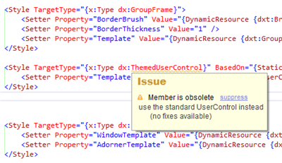
- Member is obsolete – highlights obsolete members and types in XAML documents.
Automatic Code Completion in XAML
We have improved automatic code completion in XAML. CodeRush suggests the available continuations for binding path expressions, TemplateBinding arguments, Binding.ElementName, Setter.TargetName, Trigger.SourceName values, and suggests resource key completions for StaticResource and DynamicResource markup extensions. The available continuations suggested by CodeRush are located on the DevExpress tab of the Intellisense popup window.
CodeRush includes the following XAML specific code providers:
- Declare Namespace References – adds a namespace reference for the active qualifier.
- Declare All Namespace References – adds namespace references for all undeclared qualifiers in the current file.
The following XAML specific code cleanup rules are also available:
- Remove All Comments - removes all XAML comments.
- Remove Default Values – removes control attributes initialized to default values.
#Debug Visualizer
- With this release we have added the ability to generate unit tests for public methods using runtime values of a method's input parameter. This action is available if the current solution includes a project that references a unit testing framework and the current project.
- The CodeRush Debug Visualizer has been enhanced to better evaluate expression values. Underlying lines are moved down only if there is not enough empty space below to display expression values.
- We have extended support for Visual Basic and JavaScript. The Debug Visualizer now evaluates arguments and variables in these languages.
- We have added a shortcut hint for Debug Visualizer actions. You can quickly discover which action has been executed and view the shortcuts for available continuations.
- We have improved the layout of displayed values. CodeRush does not show duplicate value hints for an assignment statement. It displays only one hint for both right and left statement parts.
-
Unique display for out and ref (ByRef) arguments, which allows you to see current and future argument values at the same time. The value of such an argument is displayed as "currentValue -> futureValue" if a method call has already been evaluated, and as "currentValue -> ?" if a method is not yet evaluated.
- We have extended the support of common debug workflows, such as stepping into LINQ queries and stepping into nested lambda expressions. In addition, if you expand an expression at a breakpoint, the Debug Visualizer keeps it expanded to enable you to monitor value changes each time program execution is stopped at the breakpoint.
- CodeRush now shows the standard Visual Studio data tip instead of a tooltip for expression values when Visual Studio allows for it.
- We have increased the number of automatically evaluated expressions. The need to “refresh” to obtain an expression value is now much rarer.
- CodeRush marks expressions causing an exception with a red icon. Place the mouse pointer over the icon to view the tooltip with exception details.
- The Debug Visualizer supports XAML bindings in Silverlight 5. You can easily evaluate XAML binding properties while debugging XAML code.
- The new “Exceptions and Stack Traces” tool window allows you to collect the information on all exceptions that occurred during debugging.
- CodeRush animates line height changes when showing or hiding debug visualizer visual elements (expression values or Expression Explorer).
- The following actions are now available: Toggle Expression Values (CTRL+SHIFT+ALT+F10), Focus Next Expression (TAB), Focus Previous Expression (SHIFT+TAB)
- We have added a “Show historical values” option to the “Editor | Debug | Visualizer” options page. It specifies whether to show values only for the current code line or for all code lines within the current method.
- CodeRush de-emphasizes the code out of the current execution path (missed if, else, case statements etc.).
- We have implemented a counter that displays the depth of recursive method calls. The counter appears when a method was called from itself at least one time.
- CodeRush shows an icon indicating whether the current Boolean expression is true or false for “case” statements in Visual Basic.
#Asynchronous Smart Tag Menu
With this release, CodeRush loads a smart tag menu asynchronously to decrease its loading time. CodeRush displays the menu immediately after you have clicked a smart tag or pressed Ctrl+`. Menu items are added to the menu as they are loaded.
If the required menu item is already shown in the menu, you do not have to wait until loading has finished. You can use the required refactoring or code provider immediately.
If you close the menu, CodeRush stops checking refactoring and code provider availability.
Use the “Use asynchronous Smart Tag Popup Menu” option on the “Editor | Smart Tags” options page to specify whether to load smart tag menu synchronously or asynchronously.
If menu items are taking long to load, CodeRush displays a progress hint.
#Enhanced Automatic Initialization
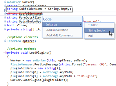
We have added a "Editor | Code Modification | Type initializers" options page that allows you to specify default values for type initializers.
We have implemented an Initialize code provider that initializes the variable, field or property under caret with the values specified on the “Editor | Code Modification | Type initializers” options page or default values.
CodeRush adds default type values specified on the “Editor | Code Modification | Type initializers” options page to the DevExpress tab of Intellisense popup window when the caret is on a value part of an initializer.
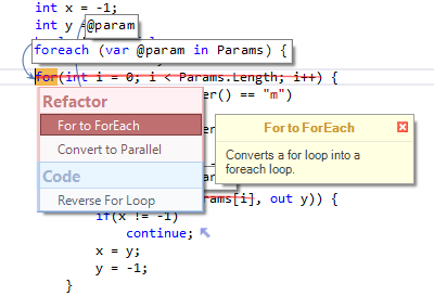
#Variable Declaration Enhancements
CodeRush can now declare local variables implicitly. Use the “Use implicitly typed local variables” option on the “Editor | Code Style | Programming Style” options page to specify whether to use implicit or explicit local variable declarations. The value of this option affects all CodeRush features that declare local variables.
#Smart Constructor Enhancements
We have added an option that specifies whether Smart Constructor initializes unselected fields with the default values within the generated constructor, or does not initialize these fields.
#Linked Identifiers Enhancements
This release adds a “Use deferred text propagation if there are 20 or more linked identifiers” option to the “Editor | Painting | Linked Identifiers” options page. Activating this option accelerates processing of multiple linked identifiers (over 20) located in a single file. For instance, when you rename an identifier, the changes you make affect only the current identifier and do not affect other linked identifiers until you commit the changes.
#Data Grid Control
The high performance DevExpress VCL Grid is a feature-complete editing and data shaping component allowing your end-users to easily manage information and display it on-screen as business requirements dictate. The grid ships with dozens of options including a built-in printing engine for instant ad-hoc reporting, without the need to write a single line of code.
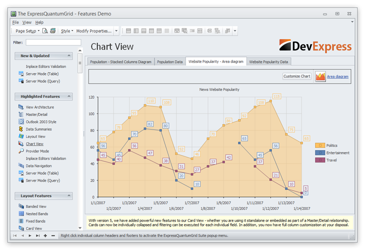
#Chart Control
Use five different chart views to visualize your data in a standalone control or within the ExpressQuantumGrid's detail views.
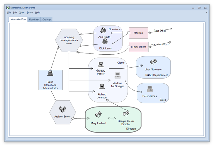
Flow Chart
The ExpressFlowChart is designed to help you present charts, schemes, hierarchies, and graphs of any complexity with minimal coding and programming effort.
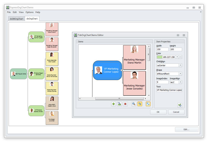
Org Chart
Use the ExpressOrgChart to display and edit hierarchical tree data structures such as a Company reporting structure or file system on a disc.
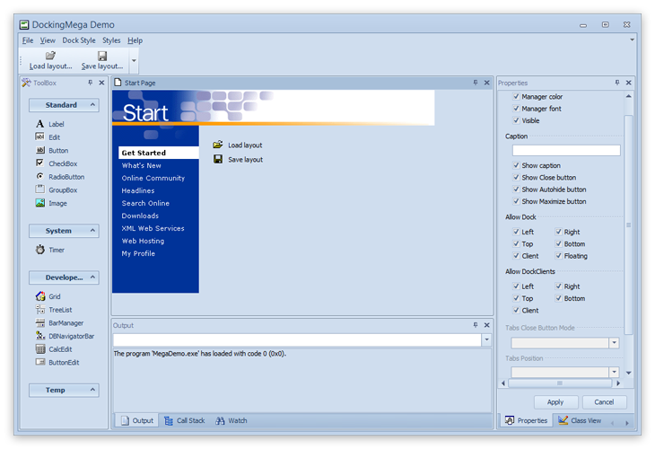
#Docking
The flexibility of the DevExpress Docking Library and advanced Theme choices found in the VCL Subscription make it possible to extend dock-based user interfaces to your Microsoft Office inspired business solutions.
#Form Layout Manager
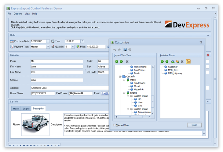
The DevExpress VCL Layout Control allows you to create, manage and maintain elegant user interfaces – with full runtime customization options - in the shortest possible time. From auto-arrangement of individual controls to screen resolution independence, the Layout Control delivers a comprehensive form design feature set that will dramatically reduce the number of UI modifications and rebuilds you need to make over time.
#Navigation Bar
The Outlook navigation bar - first introduced in Office'97 – has evolved to be an integral part of countless business applications. The DevExpress VCL Navigation Bar meets and exceeds the UI standards set by the Office team and ships with countless display options; be it the Office 2010 NavBar or the Windows Explorer Bar.
#Object Inspector
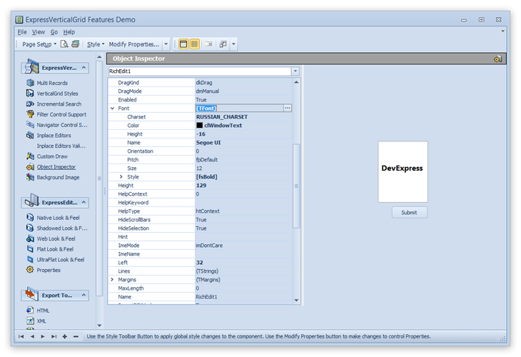
With the ExpressVerticalGrid Suite, you will no longer have the traditional hassles associated with positioning and aligning field labels and controls.
#Pivot Grid Control
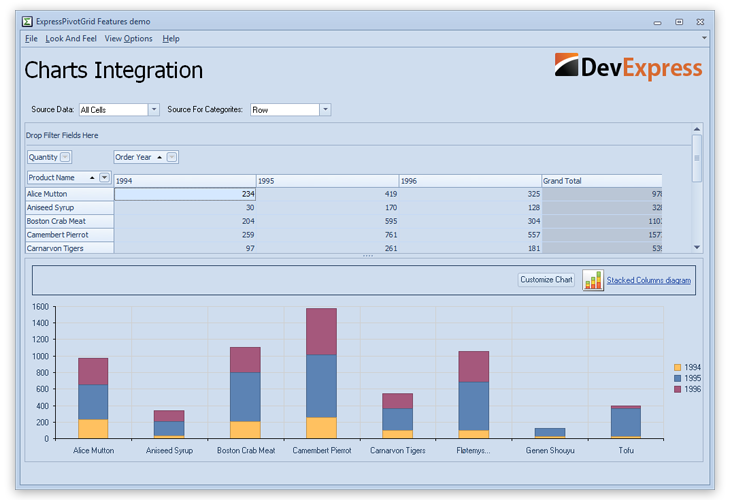
Dig deep into data and better understand the metrics relevant to your enterprise. The DevExpress Pivot Grid is an Excel-like pivot table engineered for multi-dimensional data analysis and cross-tab report generation. Numerous layout customization options give you total control over its UI and unmatched user-centric features make it easy to deploy.
#Reporting
The highly customizable UI you can create via DevExpress VCL Controls can also be printed and exported using the DevExpress Printing System. With a simple method call, you can print and export the contents of the DevExpress Grid and Chart (and many other controls) to radically reduce the number of reports you would have to generate manually using standard reporting tools.
#Ribbon Control
An Office-inspired application demands a feature-rich Ribbon and one that fully meets the UI guidelines established by Microsoft. The DevExpress VCL Ribbon Component supports countless UI and theme options, and like Office is fully customizable at runtime.
#Scheduler Control
Whether your next VCL project requires an Outlook-style scheduler or you must present information to end-users within timelines, the DevExpress VCL Scheduler has been engineered to exceed expectations. And with key productivity options like built-in printing/reporting options you can build the next great schedule manager - quickly, without hassles.
#Spell Checker Control
An Office inspired VCL Spell Checker Control ships as part of the DevExpress VCL Subscription. Whether you need to provide spell checking for rich or standard text editors, or to allow users to check spelling in other DevExpress container controls such as the VCL Grid and TreeList, you'll find that the VCL Spell Checker mimics many of the features you've come to expect from Microsoft Office, including "check as you type" when used within Rich Text Controls.
#Spreadsheet Control
Introduce Excel-inspired spreadsheet functionality into your next software project with the DevExpress VCL Spreadsheet Component.
#Tile Control
Active Tiles are key to Windows 8, and with the DevExpress VCL Tile Component, this same UI metaphor can be introduced to your existing VCL applications instantly. Whether you want your application to behave like a Windows 8 “metro” app or you need to build an informational dashboard, the Tile Control is ready to take on your toughest UI challenge.
#TreeList Control
Flexibility lies at the heart of all DevExpress Controls and the VCL TreeList is no exception. Built to offer you choices, its hybrid design allows you to represent data to end-users in the form of a tree, a list or a grid; all within a single presentation control.
#
New Web Testing Framework
Test Anything, Anywhere
- With TestCafé, you can run tests in any browser that supports HTML 5.
- TestCafé is operating system agnostic so you can run tests on Windows, Mac or Linux machines.
- Run tests on remote computers and mobile devices.
- Run tests in multiple browsers and on multiple machines in parallel.
- Run tests in the background on any machine.
#
Web Development Experience
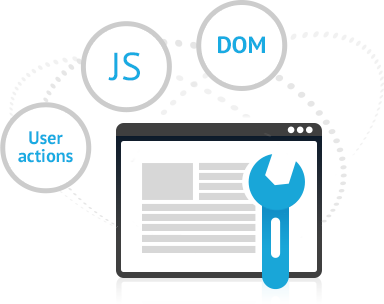
- Smart script injection allows you to communicate directly with the webpage DOM and intercept user actions.
- TestCafé eliminates out-of-process browser plug-ins and puts control back in your hands.
- It's extremely straightforward API means wrapper-free access to DOM via jQuery or the browser's API.
- Your tests are JavaScript files with only a dozen new functions for you to learn.
- TestCafé allows you to test web pages by leveraging your existing knowledge and re-using your existing JavaScript libraries.
- Add, modify or remove locally installed browsers from your test target list. Remember, TestCafe supports all HTML 5 browsers so you can restrict your tests to those used within your enterprise or BYOD world.
- Quickly modify TestCafe settings such as hostname, Control Panel port and Proxy port.
#
A Powerhouse Testing Framework
- Run tests on-demand on your machine or embed into a Continuous Integration system.
- TestCafé's traffic analysis notifies you about missing resources, response codes and JavaScript errors.
- Markup analysis makes certain your webpage elements are actually available and visible to users.