#Data Grid Control
More Data Shaping Options for End-Users
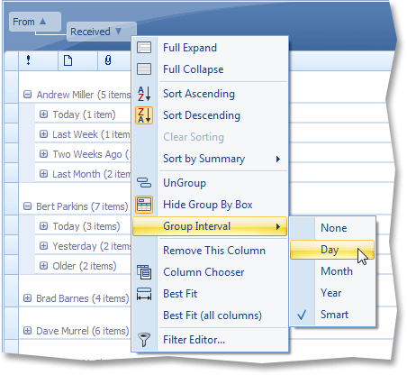
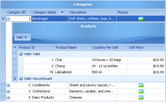
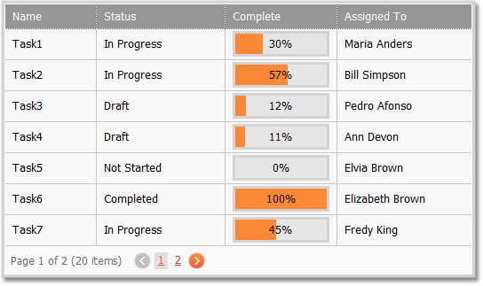
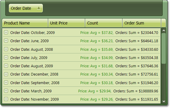
When data is grouped against a date-time field, end-users can now use the group column's context menu to change the group interval. They can choose between yearly, monthly, daily or Outlook style grouping.
The same menu now allows you to invoke a dialog specifying group summaries for a column.
Windows Vista Style Filtering for Date-Time Columns
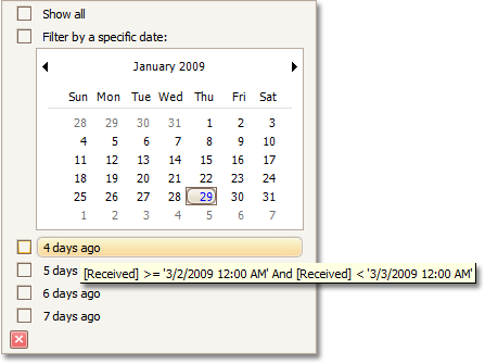
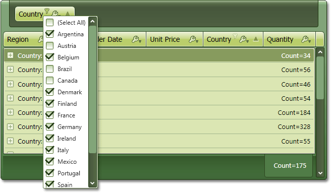
You can now easily filter data (date-time columns) using a Windows Vista style dropdown window.
Note that end-users can easily select multiple dates, month or years by using drag and drop.
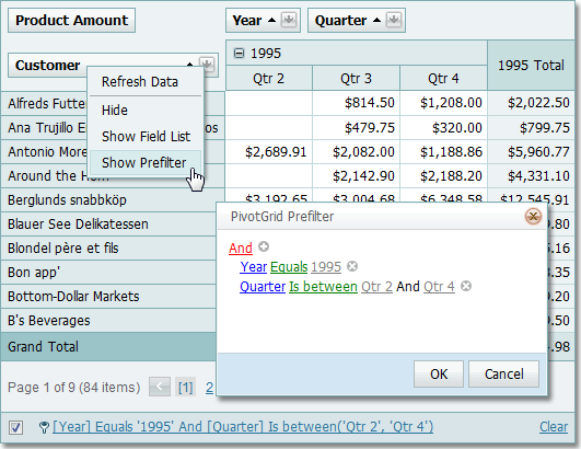
Custom filter conditions are also allowed. You can populate the list below the calendar with any criteria you need, for instance "Last Fiscal Year". Note that if you do so, end-users will see the information about the actual start and end dates in the filter item's hint, without you having to write any code.
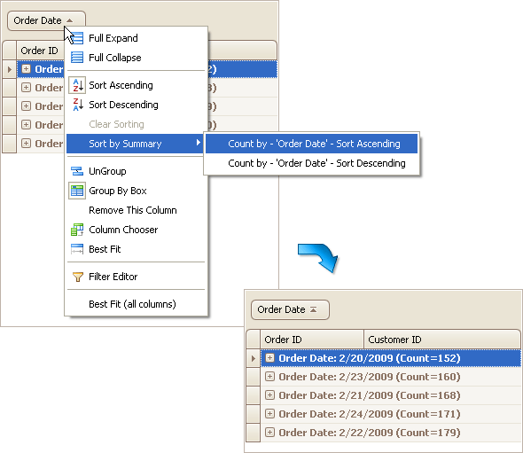
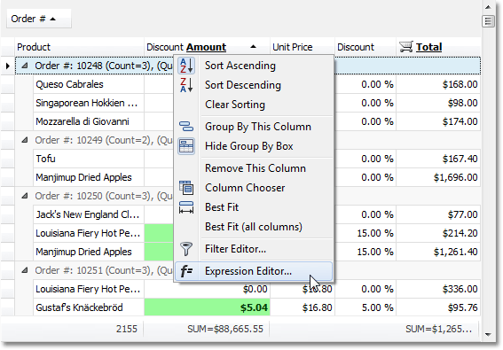
Sorting by Summary - End-User Capabilities
End-users can now sort group rows based on group summary values. For this purpose, we've added appropriate items to grouping column header menus.
When data is sorted by group summaries, a special glyph is displayed within the corresponding grouping column's header.
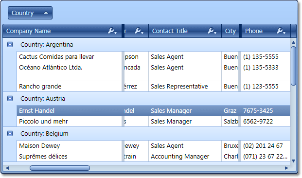
Captions for Grid Views
You can now show titles for grid views, including the root view and all details. Newly introduced properties allow you to change font settings, alignment and foreground color for the title's text.
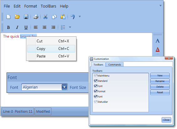
Improved Grid Layout Persistence
We now provide support for automatic saving and restoring of format conditions.
Format conditions specify the appearance of cells or rows depending on their data. Style conditions can now be saved when the grid layout is saved to a data store (for instance, an XML file). Similarly, style conditions are correctly restored when loading a grid layout. You can therefore create style conditions at runtime and they will be correctly stored and restored without any additional code.
In addition, you now have the ability to automatically save and restore the information on sorting group rows by summary values. Since end-users can now change how group rows are sorted, the grid saves and restores these settings with other layout options.
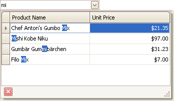
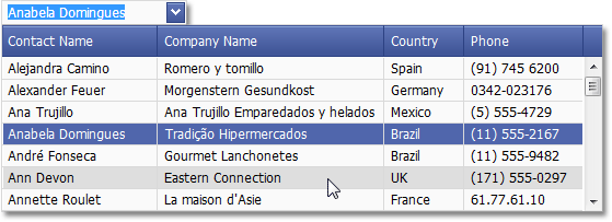
Advanced Incremental Filtering in Lookup Editors
If text editing is enabled in a GridLookUpEdit control, an end-user can search for rows by typing text within the edit box. Previously, end-users could only search for entries that begin with the specified text. The current default behavior is to search for rows that contain the entered text at any position in the row's value. You can obviously enable the previous behavior, if necessary.
Miscellaneous Enhancements
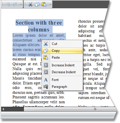
- A new option allows cell values to be copied to the clipboard without the corresponding column header captions.
- We've significantly overhauled the LayoutView painting. We've changed how the main toolbar and cards are painted and added some custom draw events.
- XtraGrid now supports merged cell printing.
- You can now print or export only the currently selected rows.
-
By default, the grid displays detail data compactly, without extra indents. The new version allows you to change detail view paddings.
-
Hints for truncated summary values are now displayed.
-
In Grid Views, you can now specify maximum width for columns. This option is in effect if the auto-width feature is enabled for a Grid View. In these cases, increasing the grid's width proportionally resizes all columns. If you want to maintain a given width for certain columns, specify their maximum width.
- New options have been added to Banded Views that allow you to prevent all bands from being resized and moved.
- With this version, copying cells to the clipboard also copies column captions to the clipboard, allowing easy identification of cell data.
- By default, when an end-user navigates through grid cells using the TAB key, all row cells are processed one after another. In the new version, you can use the TabStop option to prevent cells from being focused by the TAB key.
- When the grid is bound to a data source, columns are created for all fields in the data source. By default, the Caption properties of columns are set to empty strings. Now the grid is smart enough to transform, say, "CustomerName" to "Customer Name".
- You can now enable automatic summary calculation for columns displaying TimeSpan values. No coding is required.
#Chart Control
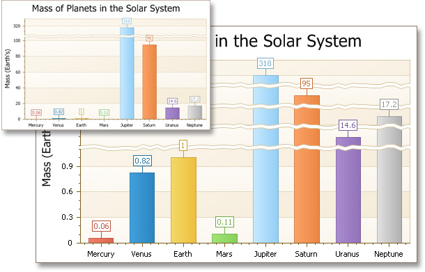
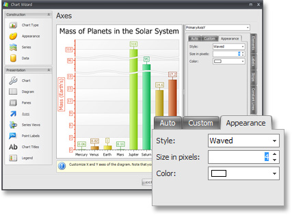
Manual and Automatic Scale Breaks
Scale breaks help make a chart more readable if there is a significant variance between individual values. Without these breaks, the smaller values could be difficult to visualize and differentiate.
When you chart data that has outliers (values that lie significantly outside the range of the remaining elements) they tend to obscure information. For example if you were to graph the mass of the planets, the mass of Jupiter would obscure all the remaining data because it's so large by comparison. It would be impossible from looking at such a chart to tell for example whether Uranus was larger than Neptune, or discern much information about the terrestrial planets.
Scale breaks help to resolve this by allowing you to remove an outliers effect on the scale of the chart without removing the outlier from participating in the chart. So in the following you can see that by adding just 1 scale break (Jupiter) you can start to answer that question.
Scale breaks are also very useful when your chart includes multiple series and values. For example, suppose your chart has multiple series, and the values in the one are much greater than the values in the another. To alleviate this problem, just add a scale break so that you can differentiate the smaller values more easily. This makes the chart easier to analyze in order to compare trends, for example.
The Chart axes now expose a collection of scale breaks which can be populated manually. And there's no limit to the number of items in this collection.
You can also set the chart to automatic scale breaks, where you simply specify the maximum number of possible scale breaks and the chart control then optimizes the visual difference between the chart values. For example in our planetary comparison allowing a maximum of 4 scale breaks would be sufficient to prevent the masses of any of the gas giants from obscuring the information from the terrestrial planets.
Scale breaks can be customized for the best visual appearance. You can set the width, color, and border line style, and also use either straight, ragged or wavy lines.
End-users can manage and customize both automatic and manual scale breaks using the Chart Wizard dialog.
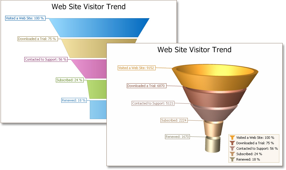
New Chart Types - 2D and 3D Funnel Charts
With this release we've added a new chart type called the Funnel chart which is used to chart progressively decreasing or increasing proportions through stages. Funnel charts are typically used to illustrate processes like a sales process, where you want to see how many prospects are converted into customers.
For example you might want to show Website visitor trends where the widest segment at the top might indicate visitors landing on the home page, of which some may decide to trial your product, engage with your support team, purchase a product and eventually in the smallest segment at the bottom become a repeat customer. The slope of each funnel segment will show the conversion rate of each step in the process.
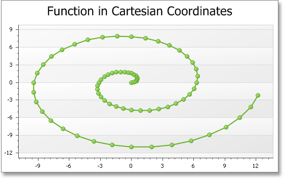
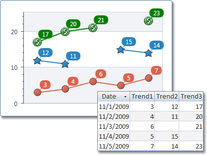
Scatter Line View
The new Scatter Line chart type allows you to connect series points based on their order in a points collection, unlike the Line chart type. Points aren't sorted by their argument values as it's done by the Line View. With a scatter line chart, you can easily generate a chart where lines can intersect the same argument point multiple times. To see a sample, check out this screenshot:
Automatic Date-Time Scales
Two new date-time scale operation modes have been added in this release. They both have the ability to automatically determine the time interval that is most suitable for the chart's width. For example, if a chart cannot reliably show monthly data because it doesn't fit horizontally, then it will show the values by years instead. When you resize the chart so that there's now enough space, the monthly data will automatically be shown.
So if you are charting say daily sales volumes and there were too many elements the chart can automatically collapse days into months, and then if you resized your chart so that it couldn't display all the months it would collapse into showing just years.
You can choose whether you want the collapsed data to be summed (such as in a Sales volume) or Averaged (such as in Daily Rainfall).
These date-time scaling modes can be applied by end-users using the Chart Wizard dialog.
Regression Lines
Regression Lines automatically display a trend line for the current series. The chart control calculates the linear dependency between the arguments and their values and displays a straight line approximating this trend.
You can customize this line's color, thickness and style.
Side-by-Side Bars with Different Value Axes
With this enhancement, all side-by-side bar, range bar and Gantt series are placed side-by-side regardless of corresponding axes.
New Option for Resolving Overlapped Labels
With every recent XtraCharts release, we’ve added new algorithms to perfect the resolution of overlapped labels. XtraCharts v2009 vol 1 allows you to use a new mechanism that simply doesn't display a label if it overlaps with the label displayed for the previous point.
Callback Compression in ASP.NET AJAX Applications
Since the release of DXperience v2008 vol 3, most DevExpress ASP.NET controls can compress callback data. XtraCharts v2009 vol 1 adds support for this feature.
Swift Plot (Quick Line Chart)
This new lightweight view type has been introduced to quickly render charts with a significant number of arguments. It can also be used to create real-time charts with large data changes.
These chart types support key features, including trendlines, regression lines, Fibonacci Indicators, secondary axes and multiple panes.
New Models for 3D Bars Representation
You can now choose a model for 3D Bar series representation: Box (default), Cylinder, Cone or Pyramid.
For flat-top models (Box and Cylinder), you can select whether the top-facet should be displayed.
Miscellaneous Enhancements
- Word wrapping support now available in chart titles.
- Custom draw events are now provided for axis label items.
-
Hit-testing can now determine axis label items and axis titles.
#Editors
Rich Text Editors in Grid Cells
Previously our XtraRichEdit engine could be used only to display rich text content within data-aware control cells. In addition to read-only mode, you can now use the same repository item to edit HTML, RTF, Plain Text, MHT and DOCX data stored in your data fields.
Note: This feature shipped in a minor service update for DXperience v2009 vol 1.
Animated Icons in Tab Page Headers and Labels
You can now assign animated GIF images to page headers and labels and their animations will be displayed correctly.
Incremental Searching in ListBox Controls
Your end-users can now search for information more effectively within our ListBox Controls.
Customizable Menu Contents in Filter Controls
You can now customize the content of all menus used within Filter Controls. This allows you to remove unnecessary columns or operations from built-in menus.
In addition to menu customization, you can also handle newly implemented events to customize data editors on the fly.
Auto-Collapsing Panels
You can now enable the auto-collapsing feature in the SplitContainerControl. With this feature, an end-user can click the splitter to minimize one panel, and thus maximize another.
Prompt Text in Empty Editors
You can now easily enable input prompt text for editors with null values. This text immediately disappears when the editor gets focus.

Advanced Tooltips for Tab Control's Pages
Our tab control now supports SuperToolTips so that you can display rich information about tab pages, including images and memo fields.
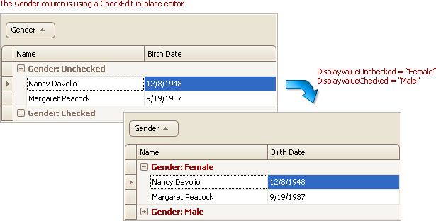
Custom Text Representations of Check Box Values
If a grid column or tree list column contains Boolean values, you can use CheckEdit controls for data visualization. When grouping data against these column, displaying their filter dropdown list and in some other instances, true and false values are represented by "Unchecked" and "Checked" strings. You can manually specify the strings that should be displayed instead of true and false.
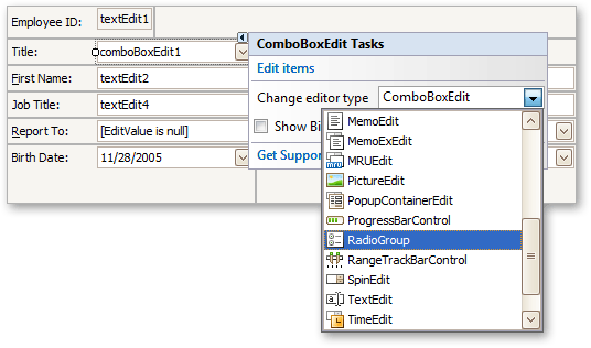
Automatic Editor Type Switching
With this release, all DevExpress WinForms Editor controls used on a form can be converted to another editor using the dropdown available through the control's smart tag. This procedure automatically preserves the control's size and location so as not to break form layout and copies all common settings and event handlers - freeing you from any manual modifications.
Minor Enhancements
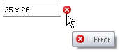
You can show error icons for editors using the DXErrorProvider component. By default, error icons are displayed at a control's left edge. You can now change the icon's location for standalone editors.
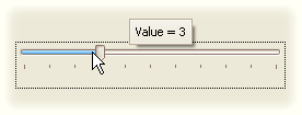
You can now enable tooltips for a track bar control's indicator, to display the current value. By default, only the value is displayed. However, you can handle an event to apply display text formatting or to provide custom display text.
- Built-in support for ICO files have been added to our image editors.
- New skin elements have been added - TabPageButton and TabHeaderButton. These elements are used to paint XtraTabControl's Close buttons. Previously, these buttons were painted using another skin element, that was also used by other controls. Now, a dedicated skin element is available.
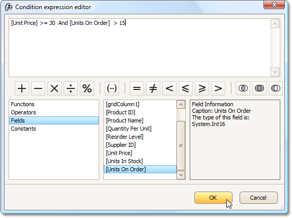
#Expression Editor
In previous versions, the only way to specify unbound column values was to handle an event and write the appropriate code. The same applied if you needed conditional formatting driven from complex criteria. With this new release, DevExpress WinForms controls now allow you to address both these requirements using an intuitive design-time editor.
An updated version of the DevExpress Expression Editor (the first version was introduced in XtraReports v2008 vol 2) is now available to our main WinForms Grid controls. You can use it to specify formulas for unbound column values or to set up conditional formatting. The DevExpress controls that support this new feature are the XtraGrid and XtraPivotGrid.
For unbound columns, you can also enable the end-user customization of expressions. Simply enable an appropriate option and the column's header menu will include a link to the Expression Editor.
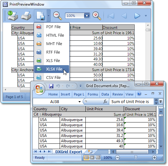
#Export to XLSX
The XtraPrinting Library - our data printing and export library for Windows Forms - has been extended with XLSX support. You can now export your grids, tree-lists, vertical grids, pivot tables and banded reports to the latest version of Excel's file format. Because the new format supports more spreadsheet columns and rows (16,384 columns and 1,048,576 rows compared to 256 columns and 65,536 rows in XLS), you can now export bigger datasets.
#New Functions
Not only have we shared the Expression Editor between our main WinForms Grid controls, we've also extended the supported function set with about 50 new functions. These include the following:
-
Math : Abs, Cos, Sin, Atn, Exp, Log, Rnd, Tan, Power, Sign, Round, Ceiling, Floor, Acos, Asin, Atn2, BigMul, Cosh, Log10, Sinh, Tanh.
-
String : PadLeft, PadRight, IsNullOrEmpty, Ascii Char, ToStr, Replace, Reverse, Insert, CharIndex, Remove.
-
DateTime : GetDate, GetMilliSecond, GetSecond, GetMinute, GetHour, GetDay, GetMonth, GetYear, GetDayOfWeek, GetDayOfYear, GetTimeOfDay, Now, UtcNow, Today, AddTimeSpan, AddTicks, AddMilliSeconds, AddSeconds, AddMinutes, AddMinutes, AddHours, AddDays, AddMonths, AddYears.
Note that this function list matches the list of new functions supported by eXpressPersistent Objects.
#Pivot Grid Control
Excel 2007 Style Customization Window
The XtraPivotGrid's customization window now has a new operation mode that mimics the appearance and behavior of Microsoft Excel 2007 Pivot Tables.
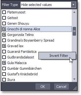
New Capabilities of Filter Dropdowns
This release extends the Pivot Grid's filter dropdowns with the following new features:
- Incremental search support.
- Context menu allowing end-users to inverse the currently applied filter.
- An optional combo box specifying whether to show or hide selected items.
- The ability to select multiple items by pressing the SHIFT or CTRL key when clicking or navigating. After items have been selected, their check state can be reversed by pressing SPACE.
Suppressing Empty Columns When Displaying Trends
When displaying trends (summary variations), the first column or row in each group is always empty because there are no preceding values to calculate the difference. You can now suppress these empty cells by toggling a single option.
Improved Data Editing Functionality
- You can specify when editor buttons should be displayed in data cells. They can be visible for all cells, for the focused cell or when entering edit mode.
- Different editors can be assigned to cells corresponding to the same field. Note that different editors can be used for edit and browsing modes.
- Keyboard activation of cell editors is now possible.
- You can now specify individual column width.
- Several events and event parameters have been added making it easier for you to control changes to cell values.
#Rich Text Editor
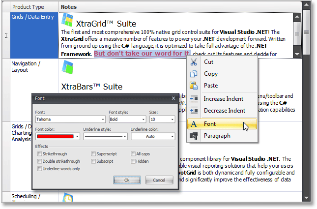
Context Menu Support
Context menus are now available which makes it easy to access frequently used formatting and text management commands.
Check Spelling As You Type
With this release, you can enable automatic spell checking that will highlight mistakes with red wavy lines as you type. The editor's built-in context menu will offer you a list of suggestions for incorrect words.
Built-in Color Pickers
You can now easily change text and background colors using built-in color pickers. To invoke them, click the dropdown arrow next to the Text Color or Background Color button.
Improved Mouse Support
In this release, when selecting text using the mouse, the view scrolls automatically when the pointer is close to the document's boundaries.
API Enhancements
Newly introduced members allow you to do the following:
- Get or set the current caret position.
- Change text selection.
- Obtain editor's content as plain text.
- Save and load content in RTF format.
#Scheduler Control
New Report Control for Formatted Time Interval Display
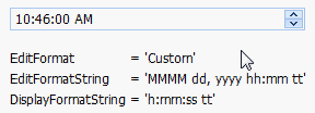
With this release, we've implemented a new control showing the time interval displayed within the bound scheduler element. In addition to automatic font scaling (based on size), it can automatically determine the appropriate date-time formatting based on the bound element type. You can also customize formatting for both dates displayed within the control. There's a wide range of predefined formats and the ability to specify any custom format string.

Customizable Borders for Printed Scheduler Elements
In previous versions, when printing the XtraScheduler via the XtraReports Suite, double borders appeared when placing different printed elements side-by-side. This effect has now been eliminated.
You can control border visibility for every report control provided by our schedulers.
Customization of Printed Elements via Events and Services
Similar to the WinForms Scheduler control, printed scheduler elements also expose events allowing you to modify appointments when they are about to be rendered. These events allow basic customization functions like showing an additional image within an appointment or customizing its text. For advanced customization, you can create a scheduler customization "service" - a class implementing a specific XtraScheduler interface.
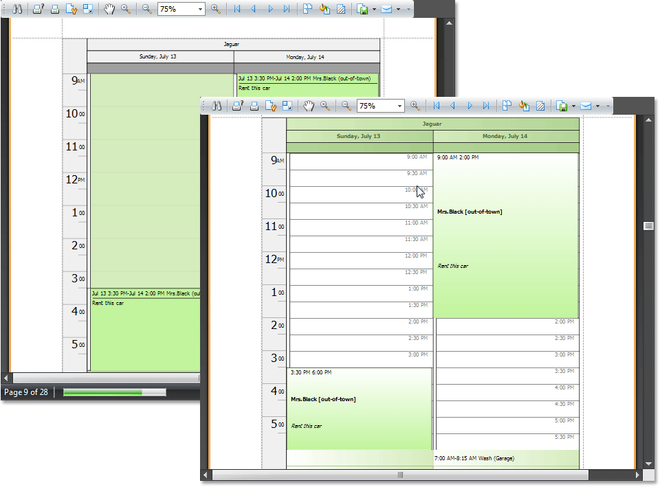
All printed elements also have custom painting events allowing you to override default element painting. See the following image for an example of element customization using these events.
Better Design-Time Usability of Scheduler Reports
With this release, we've improved the design-time behavior of various report elements - including the addition of automatic control binding when dropped on a report and the revision of the smart tag content with several new functions.
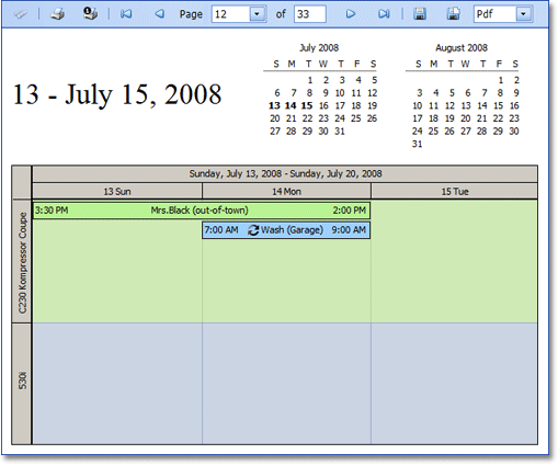
Advanced Printing and Exporting for Scheduled Appointments
Our Scheduling team has come up with an excellent addition to XtraScheduler that will allow you to produce professional diaries and PIM-style reports from your appointments. This new functionality is ONLY available if you own both the XtraScheduler and XtraReports Suites (it uses functionality from each product library).
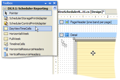
Our team’s primary goal was to maintain as much flexibility as possible. This wasn't to be a "print screen" type solution, but a solution that should be designed. Hence the need for XtraReports: the new XtraScheduler Suite in v2009 vol 1 has a new control that descends from the XtraReport class called XtraSchedulerReport. This has the normal banded report designer that you're used to from XtraReports, and there are a set of new report controls that you can drop onto the designer surface to build up a scheduler report.
The report gets its data through a print adapter. The main purpose of this adapter object is to compose a data set that will be used in the report. We provide two print adapters: a storage and control adapter. Since the print adapters provide a set of validation events, you can easily filter the scheduler data to suit the report.
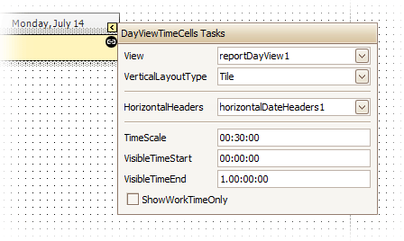
The next layer is the report view. This is much like the view that exists in the XtraScheduler control, so there are ReportDayView, ReportWeekView, ReportMonthView, ReportTimelineView components.
Finally, as stated above, the report itself is a container for report bands, and each band has a set of controls placed inside them.
We provide two distinct sets of controls. The first, and most important set consists of controls that represent time cells with appointments. They are: DayViewTimeCells, HorizontalWeek, FullWeek, and TimelineCells. The second set of controls, the auxiliary controls if you like, include:
-
Headers - the HorizontalResourceHeaders, VerticalResourceHeaders, HorizontalDateHeaders, DayOfWeekHeaders, and TimelineScaleHeaders.
-
Calendar - the CalendarControl control
-
Time ruler - the DayViewTimeRuler control
-
Information - controls used to display miscellaneous information, such as the TimeIntervalInfo and ResourceInfo controls
They are similar to the XtraReport controls you know now (in that they're only there to drop on the report designer surface, you can't use them elsewhere), although they have their own peculiarities.
This way, you can easily create a nearly endless array of scheduling reports.
Note that since this functionality uses our XtraReports engine, the End-User Designer is also available so that end-users or application administrators can freely modify scheduling reports without you having to re-build your projects.
Appointment Accessibility Improvements
All-day area cannot occupy more than 50% of the Scheduler's working area, so not all appointments may be visible if they do not fit. You can now enable a vertical scrollbar within this area so that all appointments can be accessed by your end-user.
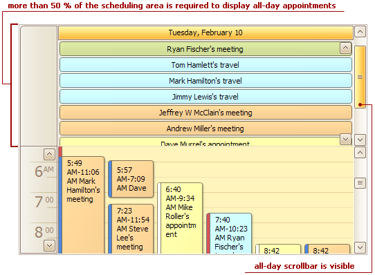
You can also vertically scroll a TimeLine view area when appointments do not fit within the current view.
#Skins
New Skinning Option for Windows Forms Controls
DXperience v2009 vol 1 extends our Skinning engine with yet another unique visual style – Springtime.
#New HTTP Handler for Resources
Instead of the standard HTTP Resource handler provided by ASP.NET to acquire resources from the server, we've implemented our own handler which allows us to significantly increase performance. The DevExpress handler allows transmission of compressed scripts, images and CSS files, which makes round-trips to the server much faster. It also reduces code size by providing shorter links to resources.
Another performance advantage is the result of smarter script transmission to the client side. Previously, all scripts required by a particular assembly were joined in a single batch and were always sent to the client, even when some parts were not required. With this new HTTP Handler, our controls can analyze which scripts are actually needed, join those scripts dynamically into a single batch and then send them to the client.
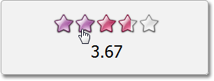
#New Rating Control
This is a standard five-star control allowing end-users to click a star to submit ratings. Because the control can be fully customized, you can also:
- Change the number of elements (stars) in the control.
-
Specify the appearance of elements by providing custom images for normal, hot-tracked and pressed states.
- Change textual descriptions assigned to each element (star).
One more feature requiring special attention is customizable element fill mode. Since floating values are allowed, you can choose between three fill modes - fill entire stars only, use half-star precision or fill stars exactly as specified by the control's value.
#New Splitter Control
The ASPxSplitter control allows you to build web interfaces with user-resizable panes. When you place an ASPxSplitter on a web page, you get two container panes separated by a horizontal or vertical splitter. End-users can either drag the splitter to resize the panes or they can use the expand/collapse buttons to temporarily hide the panes they don't need.
You can build nested resizable layouts since the ASPxSplitter control maintains a hierarchical splitter pane structure.
Here's a brief list of features available to you when using the ASPxSplitter control.
- Live or postponed content resizing.
- Automatic scrollbars for pane content.
- Customizable maximum and minimum pane size.
- The capability to load another web page into a splitter pane.
- Comprehensive client-side API.
#Data Grid View
Masked Input
Masked input functionality has been added to the text editors (ASPxTextBox and ASPxButtonEdit) and date editor (ASPxDateEdit). Our ASP.NET mask engine supports literals, digit and letter placeholders, ranges, enumerations, and date format specifiers (yyyy, MM, dd, etc). The keyboard and mouse wheel can be used to incrementally modify portions of the edit value.
Virtual Paging
We've improved data navigation within the ASPxGridView. In previous versions, end-users had to use the built-in pager to switch between pages. Now, this can be done via the vertical scrollbar. When using the scrollbar, the grid automatically switches to the required page.
Horizontal Scrolling
If you need to display large numbers of columns within your grid, you can now limit the grid's width and enable horizontal scrolling.
Excel Style Column Freezing
When total column width exceeds the grid's width, you can freeze individual columns within the grid, allowing your end-users to scroll through the other columns. Columns can only be anchored to the left edge and the grid scrolls one column at a time when placed in this mode.
ASP.NET Progress Bar Control
A new progress bar component is available as a standalone control and can also be used to display cell values within the ASPxGridView.
New Column Types
In previous versions, you had to use templates to display images or progress bars within data cells. To make this process easier, we've added three additional column types:
Multi-Column Mode in List Box and Combo Box Controls
APSxComboBox and APSxListBox editors can now display multiple columns and thus show data from different fields of the bound data source. For each column, you can define header caption, width, visibility and tooltip text.
All advanced features of the ASPxComboBox, such as incremental filtering and loading items on demand via callbacks, are now supported in multi-column mode.
Prompt Text in ASP.NET Editors
Our ASP.NET text editors can now display a prompt text when their value is blank. The prompt text disappears as soon as the editor obtains focus.
Minor Enhancements
- Composite key fields are now supported. For instance, you can now specify a key field name in the following format: "FirstName;LastName;Phone;BirthDate".
- The grid can now render empty data rows to keep it's height regardless of its data. Previously, the grid would always shrink vertically depending on its content. With the new option enabled, you can make certain that page layout is unaffected by the data displayed within the grid.
- A new option allows you to specify whether a column should be displayed in the ASPxGridView's Filter Editor.
- In previous versions, incremental filtering in the ASPxComboBox initiated callbacks immediately after each key press. In the new version, you can define a time interval for callback invocation thus allowing end-users to type several characters before initiating data filtering.
- The grid's pager bar can now be customized using ASP.NET Template technology.
- A new server-side event allows you to replace the currently applied filter expression with a custom description.
- End-users can now resize popup edit forms.
- The ability to change the Customization Window's size has been added.
#Data View Control
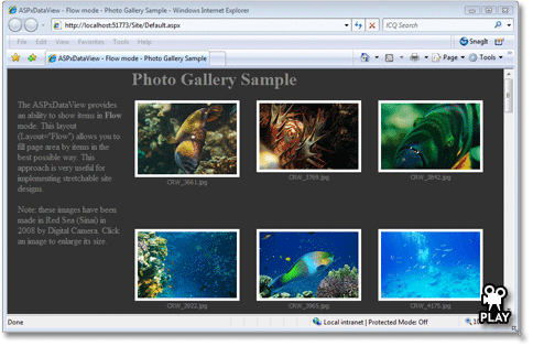
Flow Mode
With a flow layout, the items in the ASPxDataView will flow one after another even after the browser is resized. This allows you to automatically populate the page area in the most efficient way possible.
Let's say you've got a page that displays a bunch of images. A flow layout allows the site to be 'stretchable'. Therefore, if the user has a larger monitor and wants to see more items, the ASPxDataView in flow layout will expand and fill the page area. This frees you from having to choose 2, 3, or however many columns may fit into your target client browsers. For example, power users always want more data displayed but you still have to accommodate the small monitors, too. Flow layout helps with that.
The following animation illustrates the benefits of this new feature. The photo gallery populates the browser regardless of display resolution.
#Chart Control
Manual and Automatic Scale Breaks
Scale breaks help make a chart more readable if there is a significant variance between individual values. Without these breaks, the smaller values could be difficult to visualize and differentiate.
When you chart data that has outliers (values that lie significantly outside the range of the remaining elements) they tend to obscure information. For example if you were to graph the mass of the planets, the mass of Jupiter would obscure all the remaining data because it's so large by comparison. It would be impossible from looking at such a chart to tell for example whether Uranus was larger than Neptune, or discern much information about the terrestrial planets.
Scale breaks help to resolve this by allowing you to remove an outliers effect on the scale of the chart without removing the outlier from participating in the chart. So in the following you can see that by adding just 1 scale break (Jupiter) you can start to answer that question.
Scale breaks are also very useful when your chart includes multiple series and values. For example, suppose your chart has multiple series, and the values in the one are much greater than the values in the another. To alleviate this problem, just add a scale break so that you can differentiate the smaller values more easily. This makes the chart easier to analyze in order to compare trends, for example.
The Chart axes now expose a collection of scale breaks which can be populated manually. And there's no limit to the number of items in this collection.
You can also set the chart to automatic scale breaks, where you simply specify the maximum number of possible scale breaks and the chart control then optimizes the visual difference between the chart values. For example in our planetary comparison allowing a maximum of 4 scale breaks would be sufficient to prevent the masses of any of the gas giants from obscuring the information from the terrestrial planets.
Scale breaks can be customized for the best visual appearance. You can set the width, color, and border line style, and also use either straight, ragged or wavy lines.
End-users can manage and customize both automatic and manual scale breaks using the Chart Wizard dialog.
New Chart Types - 2D and 3D Funnel Charts
With this release we've added a new chart type called the Funnel chart which is used to chart progressively decreasing or increasing proportions through stages. Funnel charts are typically used to illustrate processes like a sales process, where you want to see how many prospects are converted into customers.
For example you might want to show Website visitor trends where the widest segment at the top might indicate visitors landing on the home page, of which some may decide to trial your product, engage with your support team, purchase a product and eventually in the smallest segment at the bottom become a repeat customer. The slope of each funnel segment will show the conversion rate of each step in the process.
Scatter Line View
The new Scatter Line chart type allows you to connect series points based on their order in a points collection, unlike the Line chart type. Points aren't sorted by their argument values as it's done by the Line View. With a scatter line chart, you can easily generate a chart where lines can intersect the same argument point multiple times. To see a sample, check out this screenshot:
Automatic Date-Time Scales
Two new date-time scale operation modes have been added in this release. They both have the ability to automatically determine the time interval that is most suitable for the chart's width. For example, if a chart cannot reliably show monthly data because it doesn't fit horizontally, then it will show the values by years instead. When you resize the chart so that there's now enough space, the monthly data will automatically be shown.
So if you are charting say daily sales volumes and there were too many elements the chart can automatically collapse days into months, and then if you resized your chart so that it couldn't display all the months it would collapse into showing just years.
You can choose whether you want the collapsed data to be summed (such as in a Sales volume) or Averaged (such as in Daily Rainfall).
These date-time scaling modes can be applied by end-users using the Chart Wizard dialog.
Regression Lines
Regression Lines automatically display a trend line for the current series. The chart control calculates the linear dependency between the arguments and their values and displays a straight line approximating this trend.
You can customize this line's color, thickness and style.
Side-by-Side Bars with Different Value Axes
With this enhancement, all side-by-side bar, range bar and Gantt series are placed side-by-side regardless of corresponding axes.
New Option for Resolving Overlapped Labels
With every recent XtraCharts release, we’ve added new algorithms to perfect the resolution of overlapped labels. XtraCharts v2009 vol 1 allows you to use a new mechanism that simply doesn't display a label if it overlaps with the label displayed for the previous point.
Callback Compression in ASP.NET AJAX Applications
Since the release of DXperience v2008 vol 3, most DevExpress ASP.NET controls can compress callback data. XtraCharts v2009 vol 1 adds support for this feature.
Miscellaneous Enhancements
- Word wrapping support now available in chart titles.
- Custom draw events are now provided for axis label items.
-
Hit-testing can now determine axis label items and axis titles.
#Editors
New Time Editor
This editor looks and behaves like our spin edit control - making it easier to display and edit date and time portions of date values. With integrated keyboard support, there are now 3 different ways to edit values:
- Type the date and time into the editor
- Using the mouse, change the values by pressing the up/down buttons
- Use the keyboard's tab and arrow keys to change values
#Hidden Field Component
With this new component, you can easily store a set of values without displaying them anywhere on your page. These values can be persisted and synchronized between server and client sides across round trips. The ASPxHiddenField control offers unique advantages when compared to the standard HiddenField control - publicly available client scripting API and simpler way in which to store multiple values.
#HTML Editor
Full Table Support
ASPxHtmlEditor now provides a complete UI for table management. All commands related to table generation/customization can either be placed into a separate toolbar or into a dropdown menu, as demonstrated in the following screenshot.
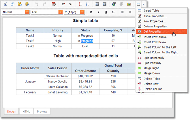
As you can see, the command list includes structure-related commands like splitting/merging cells and commands used to add/delete elements. There are also a number of items allowing you to customize table element styles. All these items invoke user-friendly designer dialogs.
Custom Processing on the Server Side
Our HTML Editor control now provides a client function allowing you to initiate a callback so that you can provide server side processing by handling a specially designed event.
#Menus
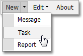
Dropdown Buttons
Menu items can now display dropdown buttons next to them. End-users can click these buttons separately to invokes a menu, where the first choice is the same as the source item. The menu then displays additional options. This item type allows you to emulate New menu items in Microsoft Office or Microsoft Visual Studio.
#Pager Control
SEO-Friendly Mode
What was previously available only for pagers embedded into the ASPxGridView is now implemented for all ASPxPager controls. Our pager control can now generate links that will be identified and followed by website crawlers. This wasn't available previously, because links in pagers invoked postbacks or callbacks via client-side API.
#Pivot Grid Control
Advanced Filter Editor
We've extended the ability to build complex filter expressions in the pivot grid. Your end-users can take advantage of the pivot grid's embedded filter editor – Prefilter – and construct complex filter criteria with an unlimited number of filter conditions combined with any logical operator.
We've also added the ability to replace the default text that represents the currently applied filter expression with a custom description (by handling the specially designed server-side event).
Improved Row Header Alignment
Field headers displayed within the Row Header Area are now aligned to the corresponding field values.
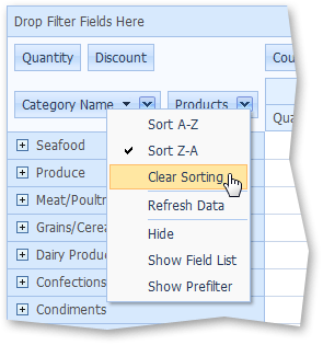
Disable Sorting in OLAP Mode
By default, Pivot Grid controls automatically sort field values (row and column headers) in either ascending or descending order. This can be replicated functionality when working with OLAP cubes since they can define their own value order. To handle these instances, our Pivot Grid controls allow you to disable header value sorting thus keeping the value sequence defined by the data source.
When you turn the automatic sorting feature off, Pivot Grids show additional items within field header context menus. These items allow end-users to apply or clear sorting.
Improved Memory Utilization
Previously, our Pivot Grid controls loaded the entire underlying dataset into the memory, regardless of which data needed to be displayed on screen. With this release, only the visible field data is being loaded which dramatically decreases memory consumption, especially for data sources with a large number of data fields (properties).
Yet another enhancement is that data caching is no longer enabled by default and is active if running totals need to be displayed.
#Progress Panel Control
Progress Indication while Uploading Files
The Progress panel provides comprehensive information during the upload process. It includes a progress bar and a cancel button.
#Scheduler Control
Reporting in ASP.NET
With this release, XtraReports allows you to generate schedule/calendar reports much like its WinForms counterpart. Not only does this allow for the printing of web schedules, it provides a shared reporting engine for both WinForms and ASP.NET allowing advanced customization of printed schedulers.
If you've already created reports for our WinForms Scheduler, you can use the same report files and generate ASP.NET versions instantly. It's the same engine - with the same report class and same controls in the toolbox.
By binding your report to our scheduler control or storage and dropping controls onto the report, you can create a nearly endless array of "schedule-based" reports. Note that scheduling controls can be used side-by-side with standard XtraReports controls. This makes it a flexible reporting solution allowing you to create printed schedulers with the look and feel your customers require.
Once you've created a report, you can use the ASP.NET Report Viewer and Report Toolbar controls from the XtraReports Suite to display a preview.
XtraReports Suite must be purchased to use this functionality.
Client-Side Management for Appointment Editor Dialogs
ASPxScheduler can now display Appointment Editor dialogs on the client side. The clever bit is that a callback is still initiated in the background, but it is used to fetch or submit only appointment data. HTML code required to render the appointment form is already on the client and thus not transmitted, which makes these callbacks much faster. The whole operation now looks as if it was completely done on the client side.
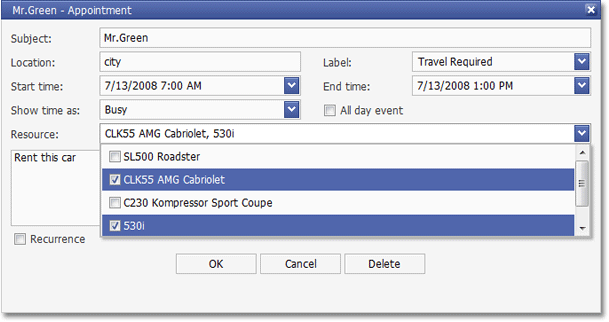
Built-in UI for Resource Sharing
While resource sharing was previously possible, our appointment editor form didn't have an appropriate multi-select control so that end-users could specify associated resources. You could only share appointments between resources programmatically.
This release includes an updated ASPxListBox control with several multi-selection options, we've used it in the Appointment Editor form to select associated resources. This means you can implement resource sharing for your end-users without having to write code or create a UI manually.
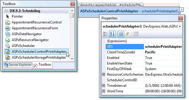
New Components for Scheduler-Report Binding
In this release we've added two new ASP.NET components that serve as a bridge between scheduler controls and their reports. These are the ASPxSchedulerControlPrintAdapter and ASPxSchedulerStoragePrintAdapter classes - specifying visual and data settings respectively. When creating a web scheduler report, you bind controls via these component and thus obtain more control over printed output.
Time Cell Customization Mechanisms
A new event is now available which occurs before a time cell is rendered. Handling this event allows you to specify the style and color of a particular time cell and insert a Literal control to display text.
A customization mechanism for the TimeCell interface elements, based on web templates, is implemented. It provides the capability to insert text, hyperlinks, images and additional web controls into Scheduler time cells. This method differs from the customization technique based on the HtmlTimeCellPrepared event in that you can insert an arbitrary web control but cannot change the container's style - text color, borders, background. This technique extends the series of web template customization features already available for appointments, headers and forms.
Dialog Window Customization
Several new events have been added to the ASPxScheduler so that you can customize caption, size and padding of Popup Editor Dialogs.
#Support for IE8 Standard Mode
All our ASP.NET controls are now correctly rendered in Internet Explorer 8 (standard mode).
#Theme Assembly
DevExpress ASP.NET Controls now provide a DLL file with themes – making our controls easier to deploy since you no longer need to deal with multiple CSS files and images in a hierarchical folder structure...The new DevExpress HTTP Handler obtains all required resources from the DLL.
#Title Index Control
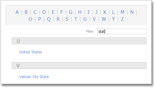
Easier End-User Filtering
The ASPxTitleIndex control doesn't force you to use wildcards when searching for text in the middle or at the end of its entries. You simply enter a portion of the string, and the control will display all matching items, regardless of sub-string position.
Note that this behavior is optional.
#CSS Image Sprites
CSS Image Sprites for Optimal Performance
With this release, we introduce support for image sprites - all images (except for background and animated images) can be stored in a single image. Sprites are referred to by their position and size within the image. A single request for the specified canvas image is performed to obtain all necessary images, which significantly improves performance.
Additional performance benefits can be achieved by defining image sprite settings within a CSS file and by storing this CSS file as a compressed resource in a themes assembly. This approach is now used by default within all our web controls.
Below is an example of a canvas image used in the Aqua theme of our ASPxperience Library.
#Miscellaneous
- Data View controls without display items are now rendered on the page with a message indicating that there's no data available.
- A new event allows you to prohibit end-users from closing Popup Windows.
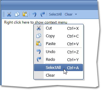
#New Context Menu Control
DXBars for WPF now allows you to create full-featured context menus.
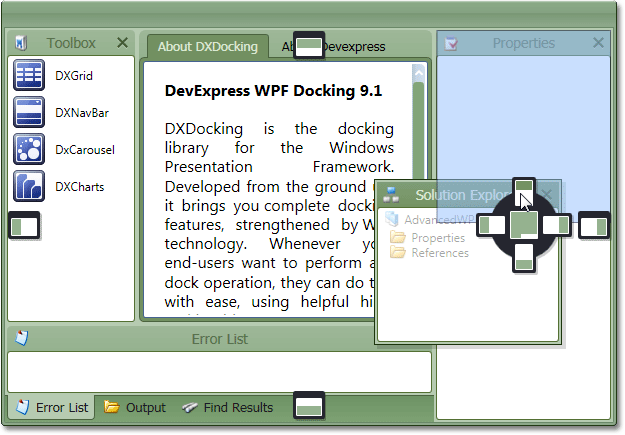
#New Docking Control
DXDocking for WPF allows you to build applications with docked window interfaces similar to those found in Microsoft Visual Studio and Microsoft Document Explorer.
Major features implemented in this release include:
- Microsoft Visual Studio style glyphs are displayed during drag and drop operations. These glyphs serve as drop targets and thus provide an intuitive way in which to dock windows.
- Dock windows can be organized into tabbed containers.
- Built-in close buttons allow end-user to hide unnecessary windows.
- Float state is supported.
- Automatically created splitters allow you to resize dock windows placed side-by-side.
Auto-Hide Panels
Dock panels created with DXDocking now replicate the auto-hide functionality of Visual Studio dock windows. In this mode, an Auto-Hide Panel is automatically minimized when the mouse pointer leaves its region - provided that controls within it do not have input focus.
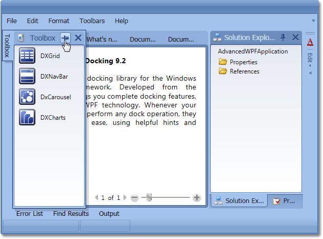
Note that in our unique implementation, end-users don't have to use pin buttons to toggle auto-hide mode. When dragging a panel, they can dock it and enable auto-hide mode simultaneously, by pointing to a smaller region of the docking glyph, as shown in the following image.
They can also dock a panel directly into the auto-hide headers area - above or below existing dock window headers.
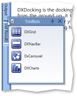
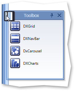
Easy Access to Closed Panels
With DXDocking, you can now activate a toolbar that displays buttons with closed panel captions. You can press a button to show the corresponding panel. The clicked button disappears and becomes visible only when you close the window again.
Note that this toolbar is created using DXBars, so it's available via the toolbar-menu customization window and menus. For instance, end-users can change this bar's visibility by checking or unchecking the corresponding item in the toolbar context menu.
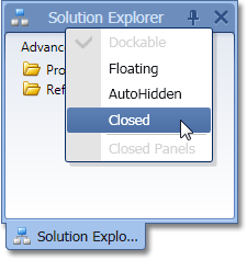
Dock Panel Behavior Customization
DXDocking v2009 vol 2 introduces many behavior options for dock panels, including the following:
- Close and auto-hide button visibility.
- Whether floating and docked states are allowed.
- End-user customization menu availability.
Toolbar-Menu Integration
With this new version, you can integrate a toolbar or menu into a dock window. It's as simple as adding a toolbar to a standard window.
You can also activate toolbar drag and drop between dock windows and the main window. This feature can be used to visually create a dock panel and toolbar layout. Simply run the application and drag toolbars where necessary and save your layout.
#New Layout Control
With this release, our WPF product portfolio has been extended with the availability of DXLayout for WPF. Much like its WinForms counterpart, DXLayout simplifies the way in which you create forms and eliminates the mundane activities associated with form and control layout.
Layout Customization
The DXLayout Control introduces a straightforward yet nearly limitless item arrangement metaphor for WPF developers - elements are placed into nested vertical or horizontal containers, allowing you to organize any element and/or group and build form layouts of any complexity.
End-User Capabilities
Among the significant advantages of the DXLayout Control vs. traditional form design is its ability to free you from the hassles associated with change requests. With our Layout Managers, your end-users can now reshape their forms in much the same way as they re-arrange toolbar buttons within Microsoft Office.
The benefits of runtime customization are many and include the ability to save and restore a given layout between application runs.
Layout Items
The basic unit in the layout control is a layout item, which is generally a single control or a label-editor pair. The layout control automatically calculates proper distances between its items and aligns them to one another. By simply dragging items or altering the order of XAML tags, the layout control will automatically update all offsets to provide the optimal UI for the current control order.
Layout Groups and DXDocking Integration
Items can be joined into group boxes or expandable groups. In addition, you can incorporate your UI elements into tabbed containers and dashboard style interfaces by exploiting the features of the DXDocking Library.
#New Toolbar Control
DXBars Suite extends our WPF toolset with a toolbar-menu system allowing you to easily emulate Microsoft Office interfaces.
Major features implemented in this release include:
- End-user drag-and-drop operations are fully supported. End-users can dock toolbars to any container edge or allow them to float.
- Main menu and context menu controls can be created. You can share the same commands between toolbars and menus.
- A status bar control is available.
- Editors can be integrated into toolbars and menus.
- Microsoft Office style layout customization is available. You can invoke the same Customization window to remove unnecessary toolbars or commands, create new toolbars, populate them with required items, etc.
- You can save and restore bar and menu layout.
#Data Grid Control
Performance Improvements
This release introduces horizontal scrolling virtualization which addresses performance issues when large number of columns are displayed. Our demos help illustrate the speed with which our WPF grid can handle datasets with up to 10 million rows and 10 thousand columns. Note that we don't simply display text in each cell - different columns have different editors assigned (with no impact on performance).
With the release of v2009 vol 2, we've changed the grid's visual tree structure to make it more lightweight. This makes the WPF grid's initial load times up to two times faster. You can experience performance improvements across the board - when assigning a new data source or during operations that require the grid to rebuild its visual tree (such as data grouping, group expansion, etc).
Instant WYSIWYG WPF Reporting by Rendering-Printing-Exporting the DevExpress WPF Data Grid
By using the newly introduced DevExpress WPF Printing Library, you can now render DXGrid contents with ease (including all current customization settings such as data filtering, sorting, grouping, summaries, column visibility, etc). As you might imagine, this new capability allows you to generate numerous WPF "reports" without hassles.
In addition to printing the grid, you can also export your reports to other formats, including PDF and XLS.
Since the DXPrinting Library prints the visual tree it obtains from controls, you can freely customize the templates used to render tree elements. The image below demonstrates what can be accomplished in this regard.
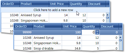
New Item Row
DXGrid can now display a Microsoft® Outlook style New Item Row. It's a service row displayed at the top and not affected by vertical scrolling. End-users can click it to add and initialize a new data row.
Display Text
The grid now provides an event allowing you to provide display text for data cells. Provided text values are used when sorting, grouping and filtering data.
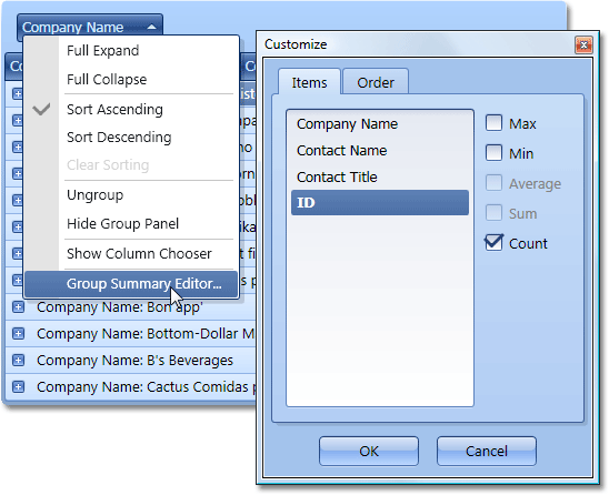
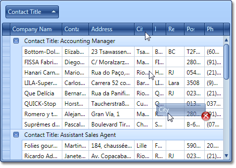
Context Menus and Summary Management UI
DXGrid for WPF now includes built-in context menus similar to those found in its WinForms counterpart the XtraGrid. Menus are invoked when right-clicking column headers, the group panel and footer panel. They allow you to sort and group data, change group panel and column chooser visibility, and customize data summaries.
When you click a grouping column or a footer cell, there are menu items that invoke a summary customization dialog.
If group summaries are displayed, end-users can now use column header context menu to sort group rows by summary values.
You can easily extend built-in context menus via XAML.
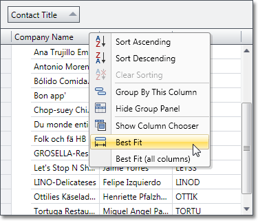
Best Fit for Columns
The DevExpress WPF Grid can now automatically adjust column width in a Table View to make a cell’s contents fully visible wherever possible. To activate this feature, simply double-click a column's right edge or use the context menu.
You can specify the parameters used when calculating column width:
-
text of all cells within this column
-
text of currently visible cells
-
text of all distinct values from the underlying data source
Row Indicator
Table Views now display a row indicator panel. This panel allows end-users to move row focus or select rows. It also indicates whether a row's values are being or have been updated.
Multi-Selection and Clipboard Support
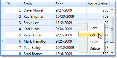
End-users can now select multiple rows or cards by using standard methods such as clicking records while holding the CTRL or SHIFT keys. Data from selected records can then be copied to the Clipboard using standard shortcuts. The data is copied in a TAB separated format that is supported by spreadsheet applications like Microsoft Excel. You can also implement grid-to-grid data transfer via the clipboard by using an event that fires when attempting to paste data into a grid.
Expressions for Unbound Columns
Prior to v2009 vol 3, you needed to write event handlers to supply data for unbound columns. This task has now become much easier with expression support. Much like our WinForms Grid control, you simply specify strings like "[Price] * [Quantity]" so that your unbound column gets its data by performing calculations on other data field values.
In addition to standard operators, the following functions are supported:
-
Math : Abs, Cos, Sin, Atn, Exp, Log, Rnd, Tan, Power, Sign, Round, Ceiling, Floor, Acos, Asin, Atn2, BigMul, Cosh, Log10, Sinh, Tanh.
-
String : PadLeft, PadRight, IsNullOrEmpty, Ascii Char, ToStr, Replace, Reverse, Insert, CharIndex, Remove.
-
DateTime : GetDate, GetMilliSecond, GetSecond, GetMinute, GetHour, GetDay, GetMonth, GetYear, GetDayOfWeek, GetDayOfYear, GetTimeOfDay, Now, UtcNow, Today, AddTimeSpan, AddTicks, AddMilliSeconds, AddSeconds, AddMinutes, AddMinutes, AddHours, AddDays, AddMonths, AddYears.
Drag and Drop Column Headers to Hide Them
End-users can now hide columns without having to invoke the Field Chooser each time. They can simply drag a column header and if it's dropped far enough from the column header panel, the grid hides the corresponding column.
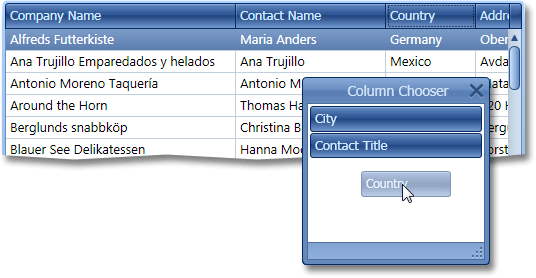
Outlook Style Column Chooser Window
Column visibility management via the Column Chooser window is now available. End-users can simply drag columns to that window to hide them and then drag them back to the column header panel to make them visible again.
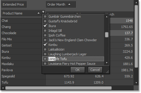
New Capabilities for End-User Data Filtering
This version introduces several new features making it much easier for end-users to filter grid data. The first is built-in support for Microsoft Excel style filter dropdowns. These dropdowns can display either a list with single value selection or a check list with multiple selection capability.
For many, displaying a large list of unique values is not the best filtering solution. In these specific instances, you can easily embed any control into the filter dropdown and thus provide a more effective UI for your end-users.
Yet another filtering UI enhancement is the Auto Filter Row displayed above all data rows. If enabled, end-users can filter data by simply entering values in this row's cells.
Note that all these features are available in both table and card views.
Sorting Group Rows by Summaries
DXGrid for WPF now provides you with the API required to sort group rows by their summary values. You simply specify the summary item and sort order for a grouping column.
The following image shows a grid where group rows are sorted by the average price in descending order.
Microsoft Excel Style Frozen Columns
You can now anchor columns to the left or right edge of the grid so that they are always visible and aren't affected by horizontal scrolling.
Miscellaneous Enhancements
-
Tooltips are now shown for cells with truncated content.
- Vertical grid lines are now displayed by default, but can be hidden if necessary.
#Chart Control
New 2D Chart Types
The following new 2D types have been implemented in this release:
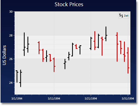
New 2D Charts - Financial Series
DXCharts v2009 vol 2 introduces two financial series - the Stock chart (aka OHLC chart) and the Candle Stick chart. Both are used for displaying the price movements of equities over time, and show the price the equity opened at, the highest price reached, the lowest price reached, and the price the equity closed at and whether the stock increased (black) or decreased (red) during the day.
New 3D Chart Types
The following five new 3D chart types have been added in this release.
Series Labels
In v2009 vol 2 we've ported algorithms used to address label overlapping from our WinForms Chart Control. You can now use four different mechanisms to avoid label overlapping (listed in the order they appear in the animation below):
-
Default - tries to keep a minimum offset between a label's initial position and its position when it does not overlap neighboring labels.
-
Hide Overlapped - simply hides labels that overlap neighboring labels.
-
Justify Around Point - moves the label around its marker to find a suitable position.
-
Justify All Around Point - similar to the previous algorithm, with two differences. It does not allow series labels to overlap markers and automatically calculates optimal angles used to position series point labels.
The latter two modes are only available for 2D Area, 2D Stacked Area, 2D Line, 2D Point, 2D Bubble series.
2D Diagram Improvements
The two primary improvements for 2D diagrams in this release are rotated diagrams and staggered labels.

Support for Common DevExpress WPF Visual Themes
In previous versions, DevExpress Charts for WPF maintained its own set of styles defining the appearance of points, borders, shadows, and other elements. With this release, we've added support for standard DevExpress WPF themes. This change allows you to create visually consistent applications when using DevExpress WPF controls. If your application’s theme is modified, DXCharts used within your application will be automatically synchronized to match all DevExpress controls used within the project.
Empty Points
Much like the XtraCharts Suite, DXCharts is now capable of processing data points that don't have a corresponding series value. This often takes place when you have several characteristics to measure and measurements are carried out against slightly different argument sets. Though arguments differ slightly, you can still store these measurements within a single data table and compare them in a single chart.
Empty points are displayed either as gaps or as missing bars and points, depending on the series type.
Blog Post
Axis Enhancements
The following axis-related improvements have been introduced in v2009 vol 3:
-
Axis Titles . You can now display text next to chart axes.
-
Reversed Axes . Toggling this option for any 2D axis will change its direction, so that all corresponding series are also mirrored.
-
Templates for Axis Labels . You can fully customize the appearance of axis labels.
Custom Draw for Series and Series Points
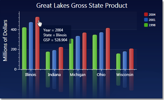
Two newly introduced custom draw events allow you to modify individual Series and Series Points. For example, the following image demonstrates how to change bar and label color based upon the current series point value.
Blog Post
SeriesPoint.Tag Property
You can now associate any arbitrary object with a series point by placing it into the Tag property. The important fact here is that if you bind a chart to data, you don't need to manually fill the Tag property for all series points. By default, this property contains a reference to the underlying data object (e.g. DataRowView) which corresponds to this series point.
This feature is invaluable when creating drill-down charts, and also when it's necessary to display custom information for every series point in a legend.
Blog Post
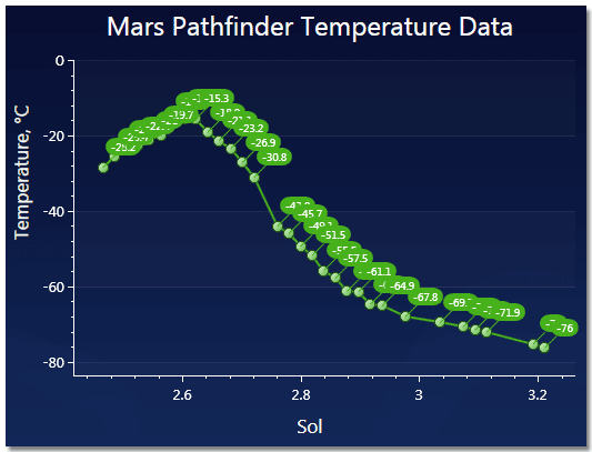
True Date-Time Value Axis
Previously, only numerical Y-axes were supported. With v2009 vol 3 release, you can also display charts with date-time values, as shown below.
Blog Post
Hit-Testing in 2D Charts
The chart control's API allows you to determine the series point that's currently under the mouse pointer. With this functionality, you can provide some degree of chart interactivity by displaying additional information about hot-tracked elements. The following screenshot demonstrates how our examples use this approach to display tooltips for series points.
#Customization Window
Microsoft Office style customization window now has a third tab with bar and menu options. It now also works in XBAP applications.
#Editors
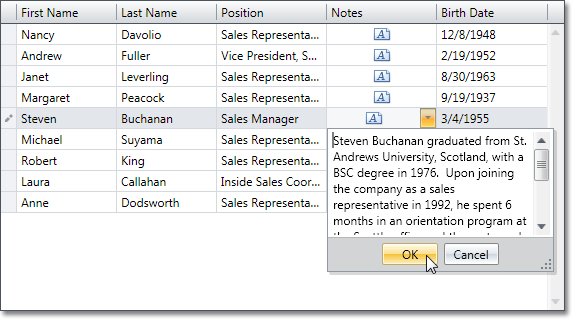
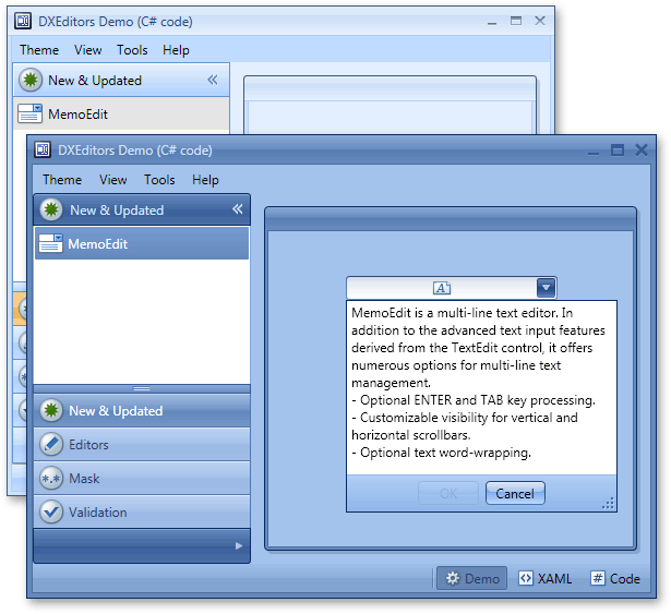
New WPF Memo Editor
In this version, the DXEditors Library extends its component list with a MemoEdit control - a dropdown multi-line text editor. This control is best utilized when you need to display memo information within grid cells.
In addition to the text input features derived from the TextEdit control, it offers a few features related to multi-line text management.
- Optional ENTER and TAB key processing.
- Customizable visibility for vertical and horizontal scrollbars.
- Optional text word-wrapping.
Window Control
Our common controls library now includes a Window control. This is a standard control descendant that features the same behavior and API, so you won't have problems replacing standard windows with our new control. By introducing full support for DevExpress WPF Themes, your title bars and window backgrounds will now match all other DevExpress controls in your application.
Unmatched Masked Input
With v2009 vol 1, we've ported our superior masked data input functionality from WinForms to WPF. This means that our text editor fully supports the following mask types:
-
Numeric
This mask type is the best choice when you need to restrict input to numeric values. The mask is specified using simple .NET Framework format strings. If you need to restrict input to currency values, you can simply specify one-character "c" mask. No literal characters will be allowed, the mask will not allow more than two digits after the decimal point, and end-users will be able to navigate though digits and increase or decrease their values using UP and DOWN arrows or mouse wheel.
-
Date-Time
This mask type has a lot in common with the Numeric mask, and is used for date-time values. You also specify the mask using .NET Framework format strings and the same end-user capabilities are available. They include navigation between value portions (days, months, years, hours, etc) and incremental value modifications using the keyboard and mouse wheel.
-
Simple Masks
This mask type is the best when you need to enter strings of limited length, such as phone numbers, zip codes, social security numbers, etc. The mask is specified using a sequence of characters. Some characters serve as placeholders for digits or letters, while others are literals used to separate value portions. An example of such literals is parentheses for area code in phone numbers.
-
Regular Expression Masks
If the mask types listed above do not meet your business requirements, you can use regular expressions which have no limitations - any regular expression can be used as a mask.
DXEditors demo application includes separate modules for each mask type, so you can easily see all of them in action.
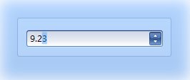
New SpinEdit Control
The DevExpress Editors Library for WPF now includes a spin edit control. Like other DevExpress data editors, this control can be used standalone or within grid cells. Its features include:
- Horizontal or vertical spin button orientation.
- Customizable increment/decrement value.
- Properties specifying minimum and maximum allowed values.
- Capability to disable the text box and allow modification only using the spin buttons.
- Built-in numeric mask that only allows entry of numeric values.
- Value increment acceleration - the longer you press the button, the faster the value changes.
Advanced Data Validation
With the new data validation system available in DXEditors, you can introduce the following features to your next WPF application:
- Specify when data validation should take place: with each text modification operation, on Enter key press or when trying to move focus away from the editor.
- Optionally block focus transition to other controls until a valid value is entered.
- Automatically display an animated error icon and corresponding tooltip showing the error message.
Null Value Input in Masks
Previously, an assigned mask implied that a value must be entered into the editor and this value must conform to the mask. With v2009 vol 2, you can input null values into masked editors, if there's no information available for the corresponding data field. To accomplish this, press CTRL+D or CTRL+0. An alternative is to select all within the editor and then press DEL.
#Pivot Grid Control
Built on top of our award winning Pivot Grid and Data Analysis technologies for WinForms and ASP.NET, the DXPivotGrid addresses the needs of developers requiring advanced analytics and reporting options for their next WPF application.
Capabilities available in this beta release include:
-
Easily Turn Table Data into Fully Customizable Drill Downs
- Provide Different Levels of Detail for Flexible Data Analysis
- Hierarchical Data Display - Raw and Summarized Data in a Single Report
- Automatic and Manually Calculated Totals
- Sort Data and Display Top or Bottom Values
- Integrated End-User Data Filtering
#Printing Library
DXPrinting System is a universal printing and export library for WPF. We call it universal because you are not limited to specific controls that can be rendered by the library nor do you have to write a lot of code to print or export your data or control.
With DXPrinting, you can print anything...simply define the XAML and off you go. This is obviously nothing new for WPF developers since the standard FixedDocument and FlowDocument classes can do the same in combination with the DocumentViewer...Unfortunately, this similarity only applies to tabular reports (multiple data records in a specific format) and that's where DXPrinting provides you with real options going forward.
If you're using the FixedDocument class, you'll have to manually split your document across multiple pages. If you're using FlowDocument, you won't be able to control page breaks and thus a feature like displaying headers on each page cannot be properly implemented. Both these classes don't allow you to export your documents to data files in XLS, PDF, HTML and other popular formats.
All these limitations in Microsoft's implementation are overcome by the DXPrinting. Among the main features we've implemented is the ability to automatically split documents across multiple pages (based on specific rules). As such, if you need column headers on every page or you want a page break before a group value - the Printing engine will deliver it for you.
Creating Data-Bound Tabular Reports using the DXPrinting Library
Two options are available to you when creating data-bound tabular reports.
When printing standard data, you need to specify two templates - one for the header and another to represent data records.
In addition to standard data support, DXPrinting allows you to create grouped reports. In this mode, you can provide additional templates and settings for group headers.
The templates listed above are only the starting point for report generation. Since DXPrinting is based on our XtraPrinting Library, a complete range of "report bands" is also available to you – including report headers and footer, page headers and footers, group headers and footers.
Export Your WPF Documents
Using the features described earlier, you can easily build and print tabular reports. If needed, you can also export data by setting a few attached properties for elements comprising your templates. The result is export to PDF, XLS, XPS, HTML, TXT and other popular formats, including images.
UI Consistency
Another advantage of DXPrinting is introduction of visual consistency within your WPF applications. When developing the DXPrinting Library, we've modified the standard document viewer by adding our controls and making it possible to use DXBars.
DXBars integration is a breeze and only requires a couple of lines of XAML. In brief, you integrate a "bar controller" into the Print Preview form. This controller creates all toolbars, menus and items required for the Print Preview window. You can also add custom controllers in order to add your own elements or remove those that you do not require.
Printing Data-Aware Controls
The DXPrinting engine makes it easy to automatically print and export advanced data-bound controls. In this release, we've introduced the ability to print and export our WPF DXGrid control. To learn more about this feature, review the What's New in the DXGrid webpage.
Immediate Preview
When the Print Preview window is invoked, our Printing Library immediately creates and displays the first report page. Other pages are rendered when the application is idle, thus not affecting UI responsiveness. This feature works regardless of report type - be it a manually generated banded report or a rendered DevExpress WPF Grid Control.
Automatic Page Numbering
To implement page numbering, we've added two new attached properties that indicate the current page number and the total page count. These properties can be visualized by any control in a page header or page footer section thus providing page numbers for your report.
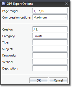
More Options for XPS Exporting
Like other export formats supported by the DXPrinting Library, you can now customize how documents printed to XPS. This means that you can specify a page range to be exported, select the compression level, and also specify various attributes of resulting XPS documents.
Print Preview Window Enhancements
In v2009 vol 3, we've implemented several enhancements to the Print Preview window:
Page Size specific zoom modes (Page Width, Page Height, Whole Page and Two Pages) update the current zoom factor when resizing the Print Preview window.
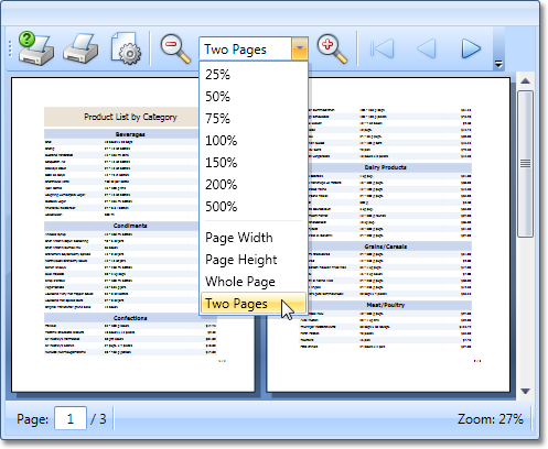
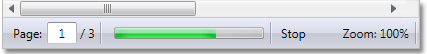
The status bar includes an editor that displays the current page number and allows you to navigate to a different page.
#New Visual Themes
All DevExpress WPF controls now support the following new themes.
Applying DevExpress Visual Themes to Standard WPF Controls
Previously, you had to manually apply custom templates to standard WPF controls if you needed to introduce visual consistency across your entire application when using DevExpress controls. With v2009 vol 2, any DevExpress visual theme for WPF can be applied to standard WPF controls by simply specifying the theme name for a control or for its parent element.
The following standard controls are currently supported: GroupBox, ScrollViewer, Scroll, RadoiButton, Button, ListBox, Slider, TabControl, Separator, ToggleButton, RepeatButton, Label, ListBoxItem, TabItem, ToolTip.
DevExpress WPF Controls use this new feature for their built-in UI elements. For instance, DXBars applies DevExpress themes to standard controls in its Customization Window.
#Layout Serialization Engine
In v2009 vol 2, we've introduced a new Layout Serialization Engine – specifically designed for user customizable controls like grids, toolbar-menu systems and dock windows. With this new feature, you can easily save and restore control layout and maintain layouts between application runs. This feature can also be used to provide end-users with multiple predefined layouts so that they can switch from one to another depending on their current requirements.
#Miscellaneous Enhancements
Centralized Control over Visual Themes within a Specific Window
In v2009 vol 3, we've introduced a new DXWindow class. This class can be used instead of a standard Window and is intended to provide centralized management of DevExpress visual themes for all controls within a specific window.
Colorizer Tool
If you're not satisfied with default palette, provided by any DevExpress WPF Theme, now it's possible to adjust it as you need. Colorizer is a handy tool which enables you to change different parameters of theme colors, such as total number of colors, their brightness, conrast, saturation, as well as the multi-sampling rule.
#New Animated Transitions Control
This new control starts animated transition effects whenever its content is changed. You simply place anything you need into this control's content and select the desired transition type. Once you assign new content, end-users will see the animation effect of choice.
Eight built-in transition effects have been implemented in this release, which are various combinations of fading, rotation and zooming animations. You can of course create your own transition.
#New Book Control
This Control - as the name implies - uses a book metaphor to display information on screen. To navigate contents, you "drag" individual pages to one side or the other. You can populate individual pages with info using content templates and bind the control to data, so that each page represents a single record.
#New Tab Control
Our Utility Control Library for Silverlight has been extended with a full-featured tab control.
This new control supports all the features you expect in a tab control, including the following:
- DevExpress Application Theme support
- Multiline tab header arrangement
- Customizable header position, alignment and orientation
- Automatic header scroll buttons
- Animated header scrolling
- Header list dropdown allowing easy access to all tabs regardless of visibility
#Data Grid Control
Improved RIA Services Support
Though data connectivity via RIA Services was possible prior to DXperience v2009 vol 3, the bound data grid was completely re-built with every data change. With v2009 vol 3, the AgDataGrid provides improved data update support when using RIA Services. This means that additional coding is no longer necessary and there are no performance issues when working in this data connectivity mode.
End-User Data Filtering UI Improvements
AgDataGrid can now display a filter panel within its footer. In addition to displaying the currently applied filter criteria, it also includes functions to temporarily disable the current criteria or cancel filtering. If multiple filter conditions have been applied, you can also invoke the most recently used filter condition list.
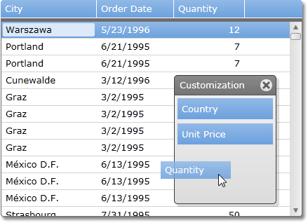
Outlook Style Column Chooser Window
Column visibility management via the Column Chooser window is now available. End-users can drag columns to customization window to hide them and then drag them back to the column header panel to make them visible again.
Excel Style Frozen (Anchored) Columns
When total column width exceeds the grid's width, you can freeze individual columns within the grid, allowing your end-users to scroll through the other columns. Columns can be anchored to both the left and rightmost edge. You can also control how the horizontal scrollbar is displayed.

Localization Support
All interface elements exposed by our Silverlight DataGrid control can now be localized so you can translate your application's UI into any target language.
New Editor Controls Used to Display and Edit Data
Previously, there were several column types in AgDataGrid - one for each data type. In this release, we've implemented several data editors that can be used to display and edit cell data. So all columns are now represented by the same column object that can use different data editors.
Group Summaries
In this release we're introducing a Group Summaries feature, which means that the grid can now calculate totals for individual data groups and display results within corresponding group rows. You can also specify group summary templates. For instance, our demo application shows how you can allow end-users to change summary types on the fly.
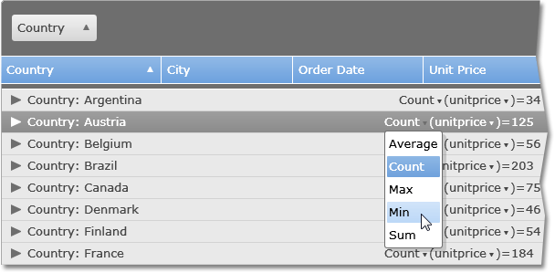
Sort Group Rows by Corresponding Summaries
Just like the DXGrid for WPF, our Silverlight data grid now supports sorting by summaries. This makes it much easier to locate data groups having best or worst performance indicators and thus see a more generalized view of your data.
Data Filtering
AgDataGrid now also allows end-user data filtering. Once again, the feature list is pretty similar to that of DXGrid for WPF. The first entry in this list is Microsoft Excel style filtering dropdowns.
We don't restrict you when displaying lists with unique values from the corresponding column. By using templates, you are free to embed any filtering control into these dropdowns.
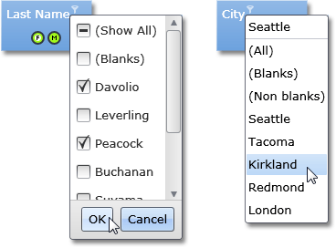
Finally, an Auto Filter Row has also been implemented.
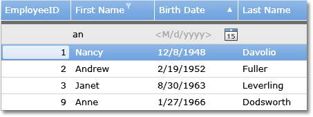
Multiple Row and Cell Selection
By simply changing a single option, you can enable multiple row selection or even multiple cell selection.
The grid's API then allows you to determine selected objects and obtain their data.
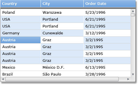
#Editors
Silverlight and WPF Editors Compatibility
DevExpress Silverlight Editors are now compatible with WPF Editor Controls, which means that you can use the same code when developing cross-platform applications.
New Silverlight Date Picker Control
With DXperience v2009 vol 3 we've extended our list of Silverlight editors with a date picker control. Much like its WPF, WinForms or ASP.NET counterparts, this control allows end-users to enter dates while using masks to control input. An alternative way to enter dates is using our Windows Vista style dropdown date picker that allows you to browse through months, years or decades.

Advanced Input Validation Support
The AgEditors Library ships with a data validation system. With it, you can introduce the following features into your next Siverlight application:
- Specify when data validation should take place: with each text modification operation, on Enter key press or when moving focus away from the editor.
- Optionally block focus transition to other controls until a valid value is entered.
- Automatically display an error icon and corresponding tooltip showing the error message.
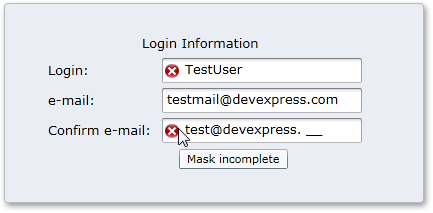
Text Box Control with Advanced Masked Input
In this release, we've introduced several Editor Controls for Silverlight derived from a common base class - the Text Editor.
The newly introduced Text Editor control uses our advanced masked input engine ported from our WinForms and WPF platforms. If you've used DevExpress masks on those platforms, you already know the feature list.
-
Numeric Masks
This mask type is the best choice when you need to restrict input to numeric values. The mask is specified using simple .NET Framework format strings. If you need to restrict input to currency values, you can simply specify the one-character "c" mask. No literal characters will be allowed, the mask will not allow more than two digits after the decimal point, and end-users will be able to navigate though digits and increase or decrease their values using UP/DOWN arrows or mouse wheel.
-
Date-Time Masks
This mask type has a lot in common with the Numeric mask, and is used for date-time values. You also specify the mask using .NET Framework format strings and the same end-user capabilities are available. They include navigation between value elements (days, months, years, hours, etc) and incremental value modifications using the keyboard and mouse wheel.
-
Simple Masks
This mask type is the best option when you must enter limited length strings - including phone numbers, zip codes, social security numbers, etc. The mask is specified using a sequence of characters. Some characters serve as placeholders for digits or letters, while others are literals used to separate value elements. An example of such literals is parentheses for area code in phone numbers.
-
Regular Expression Masks
If the mask types listed above do not meet your business requirements, you can use regular expressions which have no limitations - any regular expression can be used as a mask.
New Editor Controls - Combo Box, Check Box and Button Editor
The DevExpress control list for Silverlight now includes three more editor controls that can be used both standalone or within grid cells. All these controls have functionality similar to their analogs for other platforms like ASP.NET or WinForms.
#Layout Control
Design-Time Support in Blend 3
XAML can be edited manually, but with this release, AgLayoutControl introduces design-time support for Blend 3 to simplify the design and layout process.
Properties Pane
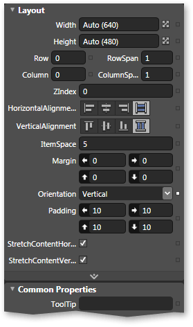
When you drag & drop controls from the Assets pane to the design surface, properties are initialized in order to simplify the setup process. The following layout was created simply by dropping 3 LayoutGroups and 6 LayoutItems on a LayoutControl:
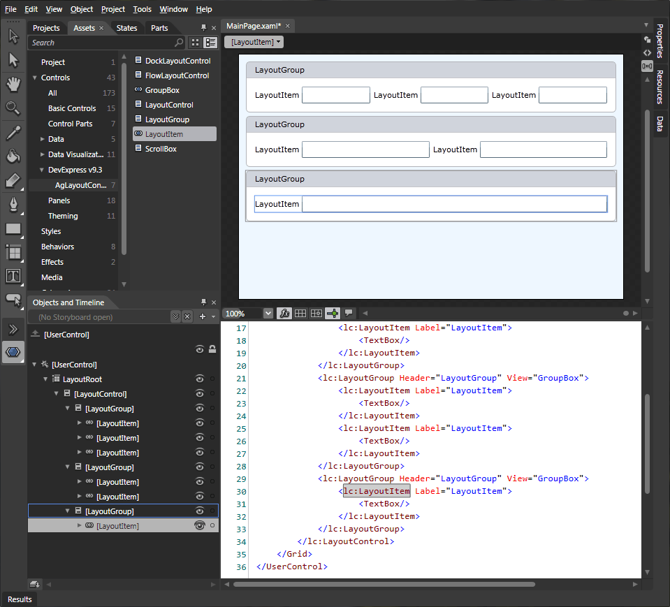
We provide customized context menus in order to make it easier to change control properties and those of their children.
Perhaps the most important design-time feature is the ability to change the layout of the LayoutControl using drag & drop operations (this was only available at runtime previously):
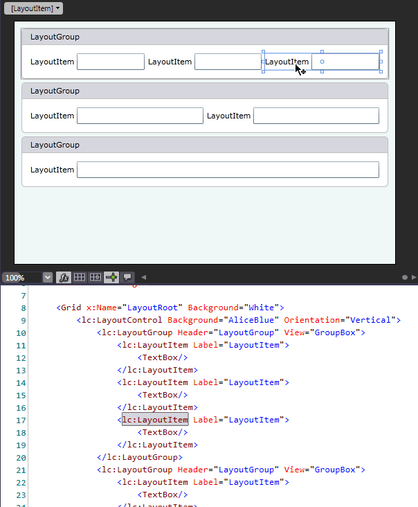
You can select and drag any control inside LayoutControl (even complex controls with their own children). For example, you can select a FlowLayoutControl inside a LayoutControl using its entire area, including children.
You can press ESC to select a parent control and move up the layout's hierarchy. The 0..9 keys can be used to change the ItemSpace property of the selected LayoutGroup and the arrow keys can be used to change its Padding property.
All this functionality is available because, by default, LayoutControl is in customization mode at design-time. If, for some reason, you want to turn this mode off, you can do it via the LayoutControl's context menu shown at the "Objects and Timeline" pane or within Blend’s design surface.
In v2009 vol 3, we've made certain that you can restyle any element of any control in the AgLayoutControl Suite. Review the styling properties available for each control in the Properties pane (Miscellaneous category) or the Object submenu of Blend's main menu (Edit Additional Styles/Edit Additional Templates submenus).
This same level of design-time support is also available in Visual Studio 2010 but because VS 2010 is in beta, we recommend the use of Blend instead. We are working closely with Microsoft to address outstanding IDE issues prior to the official release of Visual Studio 2010.
Group Boxes
Nearly all applications - be it a company web site, online store or line-of-business application - groups information or data entry fields into group boxes of some kind. These group boxes typically contain a set of label-data editor pairs, where content can be a read-only piece of information or an entry field. To make the UI look elegant and easier to use, labels are usually aligned relative to one another...not only within the group box, but also across different group boxes.
When using Silverlight 3, you have to employ many simple elements to construct such a UI and properly align everything. If you then need to modify your UI, you will be forced to reassign quite a few properties, move elements around, create new objects and realign labels. As you can imagine, this is time-consuming work that does not add real business value to your application.
AgLayoutControl addresses these difficult issues by creating and maintaining your control layout...With this release, you can now present any LayoutGroup as a group box by setting a single property. The Header property helps you specify the content to be displayed within the group header. Any text or any object is allowed.
The style of the group box (including header data template) can be easily modified by simply setting styling properties:
Of course you can still use drag and drop when in customization mode to move group boxes inside your LayoutControl, move elements within or between groups and have the modified layout stored to / restored from XML.
Here is another example that uses group header templates.
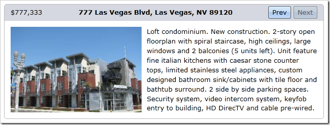
Editor-Label Pairs
In order to better organize the information, you can use a new LayoutItem control. It is a content control that can hold any UIElement to represent its content. It can also have a label (any object), which can be positioned to the left or to the top of the child element.
You can customize the look of LayoutItems using the following properties:
- Label position.
- Label horizontal and vertical alignment.
- Label data template and style: LayoutItem's label is a unique control which can be styled or defined by a DataTemplate. For instance, you can change the label's foreground color using a style without retemplating it using a data template.
- Spacing between label and content.
If you have numerous LayoutItems in your LayoutControl and you want to customize their appearance, you wouldn't want to restyle every single LayoutItem individually - Ideally, you'd do it once for all items or group of items. Our LayoutGroup class introduces a new property which does exactly this...Once you set it, all layout items inside a layout group (including items inside child layout groups) will use this style (if they do not have another style explicitly set for them).
You might also have noticed in the screenshot above that labels are aligned inside each layout group and even between layout groups - see the "Interior Features" and "Exterior Features" groups. Layout items with the same absolute horizontal offset will have their labels aligned, giving the UI a much better appearance.
You can override label alignment for individual groups...as its demonstrated in the "Additional Information" group.
In the following screenshot, all layout items have the same gray foreground color.
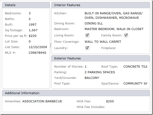
Miscellaneous Features
- The Layout Control allows you to show splitters (you can see one between "Details" and two other groups in the screenshot above). In previous versions, you could drag splitters to change the size of the element it's attached to or double click them to resize the element based on its content. With this release, if you double-click a splitter for a second time, the associated element is hidden - You can then double-click the splitter or drag it to make the element visible again.
- The Layout control's look and feel has been updated to match our default DevExpress themes so you can build visually consistent applications.
#Rich Text Editor
Bookmarks
Both the AgRichEdit and XtraRichEdit controls allow you to create named bookmarks at the current caret position or based on the current selection. The document stores a list of bookmarks so you can select them as hyperlink targets by choosing the required bookmark from the saved list.
XtraRichEdit v2009 vol 3 ships with a complete bookmark management end-user UI. AgRichEdit only allows you to create and manage bookmarks within code; a pre-built UI is to be included in a future update.
Hyperlink Support
Both WinForms and Silverlight Rich Editors now support hyperlinks. This new features allows you to embed a link to an external resource, such as a file on disk or a web page, or to a bookmark within the current document. The XtraRichEdit provides a complete end-user UI allowing you to create and edit hyperlinks. The current version of AgRichEdit only allows you to handle hyperlinks within code.
You can also enhance the end-user experience by providing custom handling for hyperlink clicks. One way to use this approach is to invoke popup controls to help provide a more intuitive data entry system in your document.
Support for Two More Document Formats
Both AgRichEdit and XtraRichEdit can now open and save document in the following formats:
- OpenDocument Format (.odt)
- WordprocessingML Format (Microsoft Office 2003 XML format)
Miscellaneous Features
Mail-Merge Functionality
DevExpress Rich Text Editor controls now allow you to introduce mail merge functionality in your Silverlight applications. Introducing this capability is a breeze – simply specify a data source for your editor and add individual data-bound fields to your document.
As you might expect, you don’t need to print the contents of the entire dataset associated with your mail merge document. You or your end-users can select the desired records prior to printing.
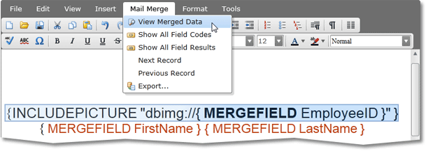
Field Support
Our WinForms and Silverlight Rich Text Editors now support Microsoft Word® style fields – important for mail merge purposes. These fields are data placeholders that allow you to create documents with dynamic data…for instance, if you want today's date inserted into a document, you don't have to update the document each and every day. You can insert Fields by pressing a toolbar button or using the CTRL+F9 shortcut. As a result you get an empty field wherein you can write a command that will insert data into the placeholder.
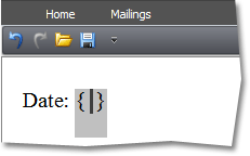
DevExpress Silveright and Windows Forms Rich Text Editors currently support five commands. You can enter a command with its parameters and then you can see the resulting value by choosing Toggle Field Codes from the context menu. As you can see, there's also a command to update a field value.
Note the two additional buttons on the Mail Merge toolbar - allowing you to switch between result and syntax views for all fields at once.
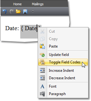
Hidden Text
AgRichEdit and XtraRichEdit v2009 vol 2 allow you to hide text portions. This feature is used by us internally to support Fields and Mail Merge, but is also available to end-users. Similar to text processors like Microsoft Word®, this feature allows you to hide or display selected text by using a check box in the Font customization dialog or by pressing CTRL+SHIFT+H. The Show/Hide toolbar button allows end-users to toggle hidden text visibility.
New Supported Document Formats - HTML and DOCX
Our Text Editor controls now support HTML and DOCX formats (Important: Table support has not yet been implemented).
Note that our controls can also save and restore MHT files. They automatically locate and take into account CSS files when loading. And with a few lines of code, you can load images referenced from HTML files.
Context Menu and Float Toolbar in Silverlight Editor
With this release, we've increased the editor's usability by adding context menu support. Since right-clicks are overridden to display the Silverlight popup menu, The Silverlight Rich Text Editor's menu is invoked by holding CTRL and clicking with the left mouse button.
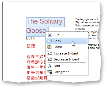
Yet another enhancement is support for Microsoft Word style floating toolbars. If you place the mouse pointer over a selection for a brief period of time, a toolbar with the most popular commands will appear on-screen.
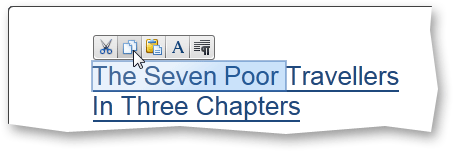
Extended API
We have added new properties and methods so you can fully control newly added features within code and also extended API that supports functionality implemented in previous releases. New classes and members allow you to control the following:
- Field management
- Mail merge feature
- Batch updates
- Embedded image management
- Setting and getting text in different formats
- Сharacter formatting settings
#Standalone Spell Checker
Our spell checker component - previously available as part of AgRichEdit - can now be used as a standalone control to check spelling in the following controls.
- DevExpress Silverlight DataGrid
- DevExpress Silverlight Text Editor
- Standard Silverlight Text Editor
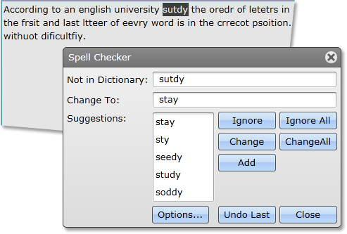
#Styling for Silverlight
Our Silverlight core library now allows you to apply DevExpress styling to standard Silverlight controls.
With this feature, you can build visually consistent applications using both DevExpress and standard controls.
The following image shows a few standard Silverlight controls with DevExpress themes applied to them.
#Window and Dialog Controls
Our Silverlight control collection now includes a Window control that supports the following features.
- Dialog mode - Window automatically displays user feedback buttons and provides a means to handle user choices.
- Optional end-user resizing.
- Modal mode for dialog windows.
- Position persistence.
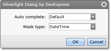
#Application-Wide Theme Support
A number of improvements have been made in v2009 vol 3 regarding the appearance of Silverlight applications built with DevExpress controls.
- This release ships with two themes - one similar to the default appearance of our Silverlight controls and another replicating the Microsoft Office 2007 UI.
- You can specify a theme for any container control and propagate the theme to all child controls, unless overridden.
-
Your applications will be visually consistent even if you use standard Silverlight controls side-by-side with DevExpress components. Skinnable standard controls include: Button, CheckBox, ComboBox, ListBox, RadioButton, ScrollBar, ScrollViewer, Slider, TextBox and ToggleButton.
- DevExpress Silverlight themes are extensible, meaning that even if there's no style definition for a control you need to use, you can add that style definition manually, and then re-use it with the theme as required.
The following are the two themes currently supported by our application-wide theme engine.
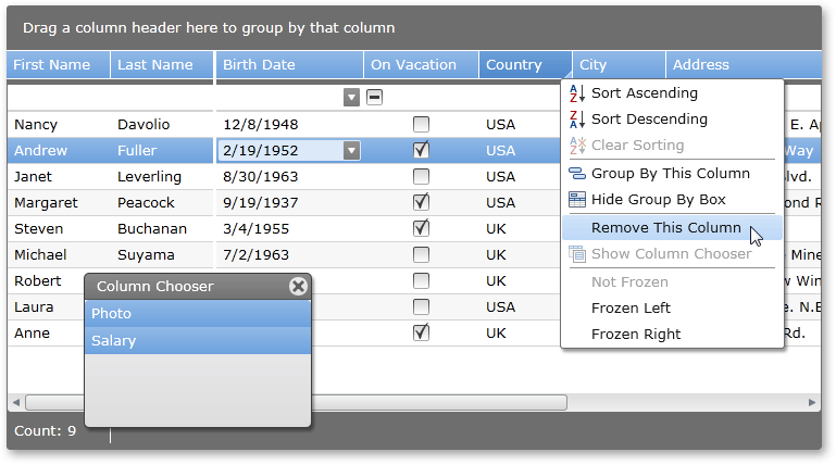
#New Script Editor
Prior to v2009 vol 3, all XtraReports scripts were available via individual properties and were edited in individual popup windows. It was hard to review the entire script code in the editor, hard to navigate between method and maintain common functionality.
To overcome these script management issues, this new version introduces a new improved script editor that provides centralized access to all event handlers for your report. To access the new editor, simply click the Scripts tab at the bottom.
As you can see, the new editor provides two combo boxes so you can easily declare a new or find existing event handler. A special button allows you to validate your code and find syntax errors. Since all code is now shown in a single location, it's much easier to review, edit and share data between handlers.
Blog Post
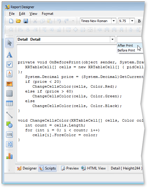
#WinForms Reporting
Straightforward HTML Content Assignment for the Rich Edit Control
The XRRichText control now supports an HtmlText property. This allows you to easily provide HTML content to the editor.
XtraReports Menu in Visual Studio
XtraReports now remembers your window visibility preferences. If a window is closed then you can make it visible again by using the newly implemented XtraReports menu item.
Previously, the XtraReports designer loaded all the service windows when a report was opened. For instance, it didn't matter if you closed the Field List window during your previous session, on opening a report it would be visible again.
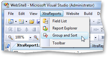
Page Numbering within Groups and Details
The XtraReports Suite now allows you to indicate a page's position within its parent data group or detail using the XRPageInfo control. You can display the total number of pages occupied by the current data group or detail and the current page within the page range.
Two-Dimensional Barcode Support (PDF 417)
Our Barcode control has been extended with support for the PDF 417 format, a 2D Barcode.
This symbology can be used to generate postage accepted by the United States Postal Service, and is the standard for RealID compliant driver licenses and state issued identification cards.
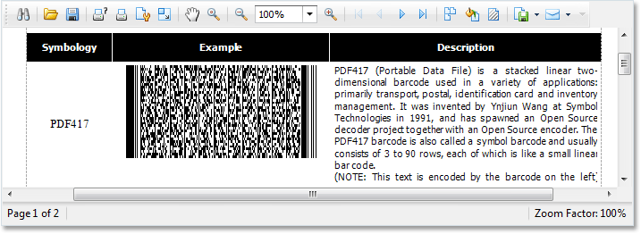
#ASP.NET Reporting
ASP.NET Search Dialog Improvements
In v2009 vol 2, we've completely re-designed our Search dialog. It is now fully built using our ASP.NET Controls and placed on our ASP.NET Popup Control. Though the functionality remains the same, the new dialog is visually consistent with the other DevExpress ASP.NET Controls you use in your web applications. Note that this new implementation has no rendering issues within Internet Explorer 7.
Miscellaneous Enhancements
- Images used within DevExpress ASP.NET reports are now loaded with the help of the newly implemented DevExpress HTTP Handler. This greatly reduces server-side workload because XtraReports no longer needs to construct the entire ASP.NET page on the server when an image is requested.
- ASP.NET Report Toolbar localization is now fully supported.
#Report Designer Enhancements
Our report editor has gone though a significant overhaul.
- We've updated themes to make auxiliary elements more subtle. This includes the grid, band headers, resizing grips, selection and focus rectangles.
- The Toolbox now shows only icons by default, thus providing more space for the design surface.
- Both left and right margins can now be customized in the editor (only the right margin was previously available).
- Microsoft Visual Studio style snap lines are now available for easier control alignment.
Blog Post
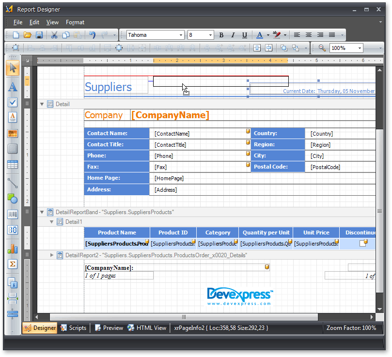
#Sort and Group Panel
In this release, we're introducing a Group and Sort Panel, which makes it easier to apply grouping/sorting to your report. You no longer need to manually add group header and footer bands, invoke their Group Fields editor dialog, create grouping fields and define their properties. This can be done with a couple of mouse clicks in our new panel.
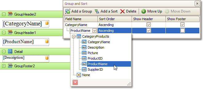
#Miscellaneous
A newly introduced event allows you to manually compute values for calculated fields.
With this release, exporting is executed via postbacks. This is a more reliable approach compared to the callbacks algorithm used previously. It allows us to avoid problems when exporting a report on the client side using different web browsers.
#Audit Module Enhancements
The Audit Trail System supports several object auditing modes:
-
Full - All object changes are fully audited. This mode is enabled by default.
-
Lightweight - Only object creation, deletion and modification are audited. Names and values of changed properties aren't being logged.
-
Creation Only - Object creation is audited. Intended for data import purposes.
Views that display audit information are now read-only and so audit information cannot be edited by end-users. New audit entries are immediately accessible after corresponding changes to an object are saved.
#ConditionalEditorState Module
This newly introduced module allows you to disable or hide editors in Detail Views and List Views depending on a specified rule. The rules are defined via attributes.
This functionality is available in both Windows Forms and ASP.NET applications.
#Detail View Items Layout
- In previous versions, you could specify whether to display a property in a List View by applying the VisibleInListView and VisibleInLookupListView attributes to this property. You can now affect the visibility of a property in a Detail View. For this purpose, use the newly introduced VisibleInDetailView attribute.
- You can now set the display order of business class properties in Detail Views. Note that in a Detail View, editors are grouped according to particular rules. So setting indexes in code may help you determine editor order only if you are certain that they will be displayed within the same group.
#Detail View Layout Manager
The following new features have been added to both WinForms and ASP.NET layout managers:
The following list describes new features specific to the WinForms layout manager.
The following enhancements relate to the ASP.NET Layout Manager.
With this release, the Show View Strategy used in ASP.NET XAF applications has two modes of operation - View and Edit. The new default behavior for collection properties is to be read-only in View mode.
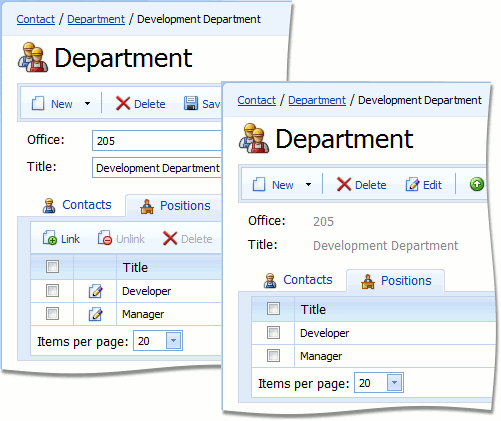
- Layout creation can now be easily customized. Several methods have been marked as virtual and can be overridden to implement custom logic. An event has been introduced to customize layout items when they are created. For superior customization, the layout manager now supports layout item templates and group templates.
Layout item caption position can now be changed much like WinForms applications:
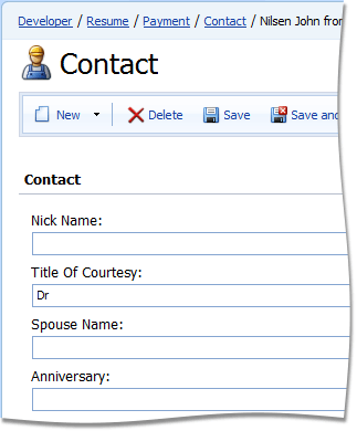
#EasyTest CTP
With this release, the eXpressApplication Framework ships with EasyTest - a test framework designed to perform functional testing on XAF applications. The main idea behind EasyTest is to create acceptance tests using simple syntax so that your users can understand and use it.
#EasyTest Script Recorder
EasyTest now ships with a script recorder which keeps track of all actions you perform, and saves them to an EasyTest script file. This feature is available for both WinForms and ASP.NET applications.
#FileAttachments Module
You can now specify the file types that must appear in the Open dialog's "Files of type" box. A new attribute has been introduced for this purpose. Currently, this attribute is only supported in Windows Forms applications.
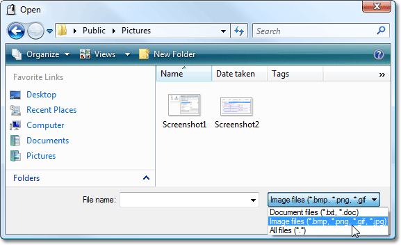
#Filter by Text
When filtering by text, the eXpressApp Framework previously looked in every persistent property trying to find a match for the whole filter phrase. With this release, the search engine splits that phrase into individual words and is capable of finding word matches in different properties – which makes it more likely that you'll find the required data.
You can now also specify which properties should be taken into account when filtering.
#Grid List Editors
We've improved the ASPxGridListEditor and GridListEditor, which are used by default to represent List Views in ASP.NET and Windows Forms applications, respectively. The following features are now available:
You can now select all records in a grid in ASP.NET applications.
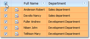
We've added a combobox to the ASPxGridListEditor to allow end-users to set the number of rows that can be viewed on the page. Note that this combo box can be removed using the Model Editor.
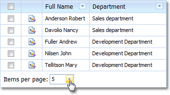
Grids used within ASP.NET applications now support column customization via the Column Chooser window (which gives end-users access to invisible columns). End-users can drag headers between the Column Chooser and the grid's column header to change visibility.

Just like its WinForms counterpart, the New Item Row is now available for ASP.NET.
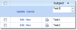
The eXpressApp Framework now supports filtering in List Views by using the ASPxGridView's Filter Bar. This bar is automatically displayed after the grid's data has been filtered via the Auto Filter Row or Filter Dropdowns.
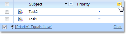
Data grouping has become more flexible. You can now specify a group interval so that groups are created not for each unique value, but for specific value ranges. For instance, you can group a List View by a DateTime property setting the GroupInterval to DateMonth. In this instance, all dates that fall into the same month will be displayed within the same group. Note, this feature is implemented both in Windows Forms and ASP.NET applications.

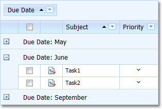
List Views now support MS Outlook Style Preview Row feature exposed by the XtraGrid and ASPxGridView controls.
#Image Library
Custom images can now be assigned to the Application Model's nodes displayed in the Model Editor.
Previously, setting images or captions for enumeration values wasn't very intuitive. With this release, you can use the ImageName and DevExpress.Xpo.DisplayName attributes to specify images and captions that will represent enumeration values in the UI.
#Image Property Editor
Improvements in Image Property Editor for ASP.NET
Previously, in List Views, the ASPxImagePropertyEditor displayed the name of the image assigned to an Image type property. Now, this Property Editor can show the assigned image directly in a cell, in a drop-down or popup window.
In Detail Views, the improved ASPxImagePropertyEditor can display an Image type property's value in a drop-down or popup window.

#Integrated Report Wizard
In this release, the report wizard used in XtraReports is now available to both XAF developers and end-users. The wizard dialog resembles that found in Microsoft Access thus providing a user experience consistent with Office applications.
#List Views
'Auto Commit Changes' Mode in List Views
In Windows Forms applications, you can make a List View editable or display an editable Detail View next to a List View. Previously, to commit changes made to an object, you had to select another object in the List View or move focus away from the grid. You also couldn't cancel changes.
In the new version, Save and Cancel Actions are available for editable List Views. If the previous behavior is preferred, you can of revert back as needed.
#Navigation System
Previously, the navigation structure of XAF based applications could only have two levels - navigation groups and the items within them. Now, the navigation adopts a tree structure that can have an unlimited number of nesting levels. If a tree item has the ViewID property set, then clicking the item will navigate to the corresponding view. Otherwise, the corresponding item in the navigation control acts as a tree node.
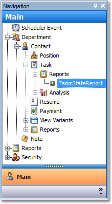
You can now choose different navigation control styles. The NavigationItems node and its child nodes have attributes which define the navigation control's appearance.
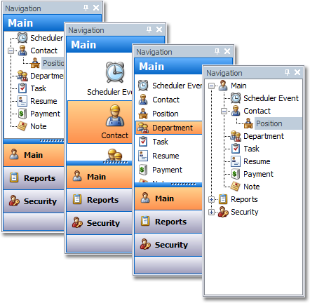
XAF's navigation system now supports contextual navigation. An extensibility point has been added to allow modules to affect the process of generating the navigation items in the navigation control. For example, the View Variants module can add children to items which point to Views that have predefined View Variants. This functionality is disabled by default, but can be enabled via the Application Model. You can also implement custom contextual navigation.
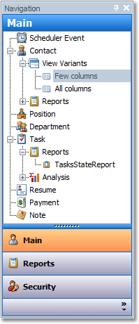
#Printing Module
The following capabilities are now available:
#TreeListEditors Module
Previously, the TreeListEditor module worked only in Windows Forms applications. In this release, we're introducing the ASPxTreeListEditor, an ASP.NET List Editor that displays tree-like data structures.
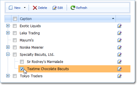
A class implementing the ITreeNode interface can now support an additional ITreeNodeImageProvider interface to supply node images. This functionality is supported by both Windows and Web Tree List Editors.
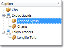
Both these editors can now implement an interface to support conditional formatting.
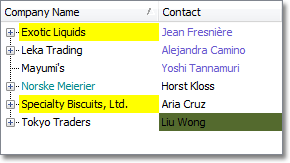
An Outlook style Column Chooser window is now available for WinForms XAF applications.
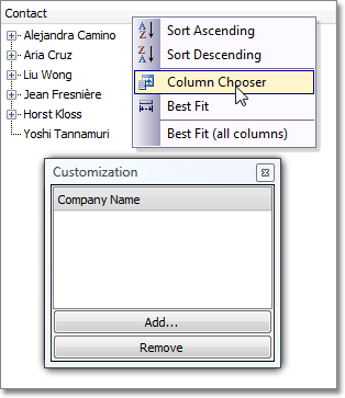
A new data loading mode - deferred node loading – allows you to load only those nodes that must be displayed on screen, thus significantly improving application performance.
#Validation Module
You can now apply built-in validation rules to collection properties involved in relationships (marked with the Association attribute). In this instance, a validation rule ensures that each collection element is valid. There's a separate parameter to specify an element's property that must be checked.
Certain validation rules, such as RuleRange and RuleValueComparison, can use aggregate functions. In this instance, the validation rule doesn't check individual elements, but checks the aggregate function's value instead.
In this release, we're introducing a new validation attribute - RuleCombinationOfPropertiesIsUniqueAttribute. You can apply it to a Business Class to demand that a set of its property values is unique.
#Windows Forms Layout Manager
Previously, resetting the customizations made to a Detail View layout required you to delete the Model.User.xafml file. The eXpressApp Framework now provides a more intuitive way to accomplish the same task. Simply right-click on a Detail View's empty space, and select Reset Layout from the context menu.
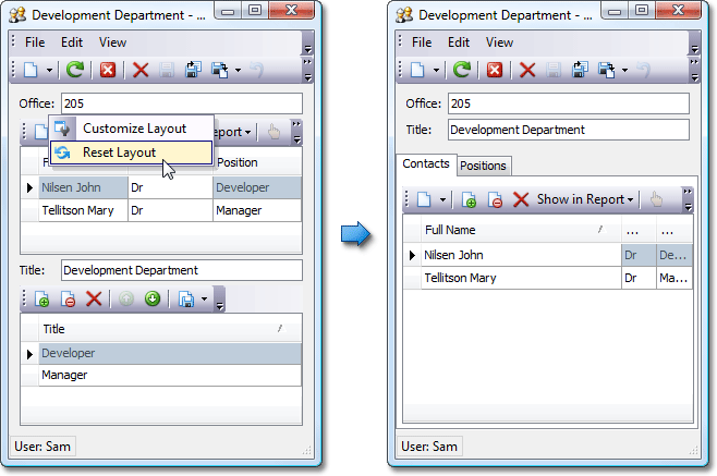
You can now create multi-line tabbed groups by setting the Application Model's MultiLine attribute.
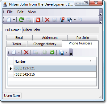
#Miscellaneous Enhancements
#New Code Providers
The following code providers have become available:
-
Add XML Comments
Imports XML comments from a base type or an interface if they exist, otherwise creates a new XML comments stub.
-
Convert to Integer
Converts the current expression to an integer, using a call to Math.Ceiling(), Math.Floor(), or Math.Round().
-
Create Ancestor
Creates an ancestor class, making the current class its descendant.
-
Create Implementer (Explicit)
Creates a class that explicitly implements an interface.
-
Declare Class With Properties
Declares a class with properties initialized to the parameters passed to the constructor.
-
Use Explicit Typecast
Converts an "as" operator expression into an explicit typecast.
-
Use Implicit Typecast
Converts an explicit typecast into an "as" operator expression.
#New Encapsulation Refactorings
There are new refactorings which make it easy to wrap a property or method of a field inside a new member of the class that owns the field. For example, if the caret was on a field of type Timer, you could expose the field's Interval property or the field's Start method as new members of the class where the field is declared.
-
Encapsulate Method
Wraps access to a field's method in a method exposed in the active class. If the method is a function, the wrapper is also a function of the same type that returns the value returned by the call into the field's corresponding method.
-
Encapsulate Property
Wraps access to a field's property in a new property (of the same type as the field's property) exposed in the active class. The getter returns the value of the field's property and the setter assigns the value to the field's property.
-
Encapsulate Event
Wraps access to a field's event in a new event exposed in the active class.
#
New Parallelization Refactorings
We've introduced new refactorings which make it easier to move between parallel and serial code execution.
-
Convert to Parallel
Converts the specified code to run in parallel.
-
Execute Statements in Parallel
Executes the selected independent statements in parallel.
-
Execute Statements in Serial
Moves the child statements out from a Parallel.Invoke() call to convert to serial execution.
#Background Progress Bar
CodeRush now shows progress for background parsing and symbol loading as you open a new solution. This progress bar is essentially your countdown to the moment when you can refactor instantly anywhere in the code. Note that you can work normally with Visual Studio before the background parse process ends. Closing this window does not break the background parsing process.
#CodeRush Feature Availability
Better Capabilities for Controlling CodeRush Feature Availability
We have added a feature that allows beginner users to better understand what CodeRush is doing and easily decide which features should be kept enabled. Whenever CodeRush does something, it now shows a hint which explains what has happened. Thus, you can easily learn new features, and more importantly, you can instantly disable a feature you do not require.
The same UI is also used to show conflicting DXCore and Visual Studio shortcuts. When a DXCore shortcut is conflicting with Visual Studio, DXCore shows a hint providing options to rebind this shortcut, enable Visual Studio shortcut or enable DXCore shortcut.
With the newly introduced Code Issues management, we also allow you to suppress code issue highlighting using similar hint windows.
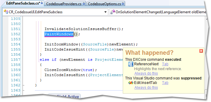
#Collapse to Projects
The "Collapse to Projects" menu item is available in the Solution Explorer context menu, allowing you to collapse all items at the project level.
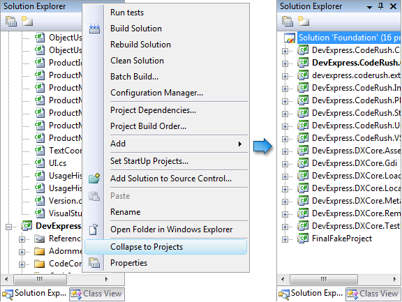
#DXCore Version Switcher
The DXCore Version Switcher lets you switch among several versions of DevExpress IDE Tools installed side-by-side.
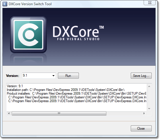
#Reduced Memory Consumption
CodeRush 9.2 uses dramatically less memory. Project symbols are now cached, and only loaded when needed. Recently-accessed members are kept in memory, while stale members are aggressively released. As a result, customers with large solutions can expect reductions in overall memory consumption by 100MB-200MB. More details on the memory savings can be found here.
#Settings Merge on Upgrade
With this release we introduce a new XML storage engine for CodeRush settings. This settings engine is backwards compatible - customer settings stored in the older INI files are merged with new settings stored in XML files (the INI files are not deleted). This engine will allow DevExpress to enhance default settings without losing customer changes.
#Support for Preprocessor Directives
Conditional compiler directives are now supported.
#Visualization Toolbar
The new Visualization toolbar displays buttons that allow you to enable or disable code visualization features: member icons, structural highlighting, code issues, code metrics, regions, etc.
#Unit Test Runner
The CodeRush Unit Test Runner executes your unit tests, navigates through tests, and facilitates test results processing.
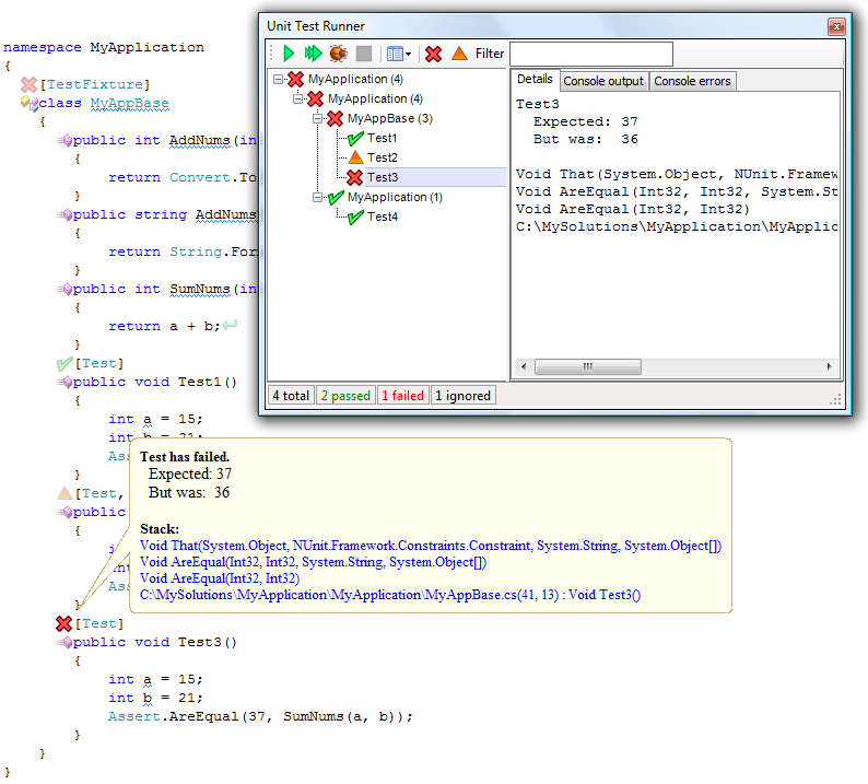
There are several ways to run tests.
-
Unit Test Runner
Choose a test from the list and click the Run button on the window toolbar.
-
Source Code Editor
Right-click a test and choose Run Test from the context menu.
-
Solution Explorer
Right-click a solution explorer item containing tests and choose Run Tests from the context menu.
-
Programmatically
Use the CodeRush.UnitTests.Execute() method located in the DevExpress.CodeRush.Core namespace.
The status of all tests (passed, failed, ignored, etc.) are indicated within the code editor with an icon to the left of the test attribute. To get more information on a failed test, simply place the mouse pointer over the appropriate marker in the source code. Test execution status is also reported in the Unit Test Runner. You can right-click a test listed in the Unit Test Runner and select "Go to Test" to navigate to that test. Detailed test execution results are displayed in Visual Studio's Output window.
You can filter test results to see only failed or ignored tests. Just click the corresponding tab on the Unit Test Runner window toolbar.
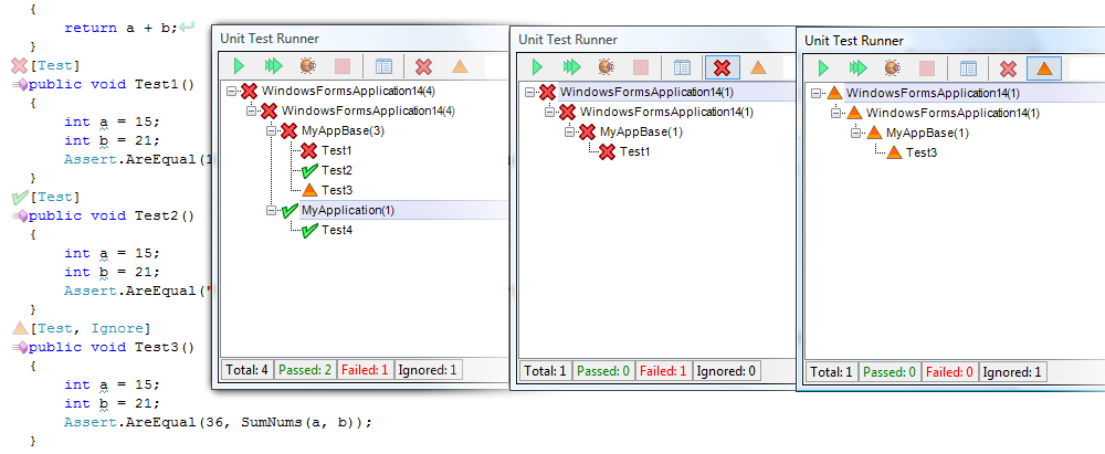
You can filter the tests listed by entering a portion of the test method name.
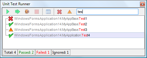
The Unit Test Runner supports NUnit , MSTest , MbUnit and xUnit frameworks. The Unit Test Runner also supports dynamically-generated unit tests including RowTests and Theories .
Source code for the plug-ins that support each of these frameworks is included as part of the CodeRush install, so it's easy to extend our existing support or use this source code as starting point to add support for a different unit test framework.
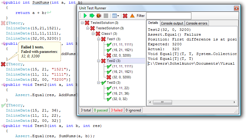
#User Experience
In this release, we've added a document bar hinting feature. It allows for quick navigation to code issues and displays issue preview hints so that you can immediately highlight and fix issues.
Version 2009 vol 1 also introduces several new actions used for keyboard interaction. The following new actions allow you to navigate though issues and manage them.
-
CodeIssueShowFixes - Opens code issue hint window with a list of available fixes.
-
NextIssue - Navigates to the next code issue.
-
PreviousIssue - Navigates to the previous code issue.
-
CodeIssueDisableForActiveFile - Disables code issue checks for the active file.
-
CodeIssueToggle - Toggles code issues on or off.
NextIssue and PreviousIssue actions can accept parameters to control issue type to navigate. You can navigate through all issues, hints, warnings, dead code, code smells and errors. Combinations are allowed.