For the next version of XtraBars, we’ve created a standalone version of the gallery from our ribbon control. This post shows you a quick preview of this control; it will be available in v2010 vol.2 later this year.
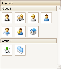
The new GalleryControl provides a way to show a list of items, categorized, if necessary, into groups. Here’s the ‘default’ look:

Of course, you are not limited just to the standard image. You can add a caption and a description to each image:

But wait! There is more. For example:
1. The Gallery control provides all the same options that the original Ribbon galley has. (See the help for the Ribbon Gallery for details.)
2. The Gallery control also supports group filtering. (See here for information on group filtering.)
3. The gallery implements automatic item checking. With this feature, clicking an item automatically checks the item. Not only that, but the gallery provides several “check modes”:
- Multiple items can be checked simultaneously
- Multiple items can be checked, but only within a single group
- Only a single item can be checked throughout the whole gallery
- A single item can be checked in each group
4. By default, when the end-user enlarges the gallery, it adds additional columns to fill the newly created free space. When they reduce the gallery’s width, it removes the columns that can no longer be shown. It's possible to disable this feature by setting the GalleryControl.Gallery.AutoFitColumns option to false. In this mode, the number of columns is specified by the gallery's ColumnCount property.
5. The default orientation of gallery items is vertical, as shown above. The gallery also supports a horizontal orientation. If you do set the the orientation to horizontal, you will also change the orientation of the gallery group headers, the layout of the items and the orientation of the scroll bar. As you can see in the following image, the GalleryControl's orientation is horizontal and its height has been reduced so that the control displays only one row of items (click to see the full size image):

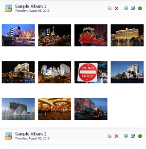
6. Instead of just text, you can display custom controls within the group headers. You can see this best in the new PhotoViewer demo, where the group headers show images, multiple labels, and buttons (clink to enlarge):

7. We’ve also implemented smooth scrolling of items, as you can see in this video:
There are also a bunch of minor features, such as:
- specifying the background image or background color for the gallery
- customizing the background image layout
- the ability to customize the horizontal alignment of the gallery's content
- providing multiple ways to specify how images are stretched within a gallery item
- the custom drawing of gallery items
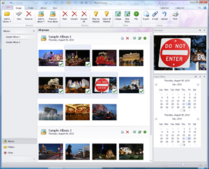
Of course, there’s a demo that demonstrates a real-world usage of the gallery control, a PhotoViewer application:

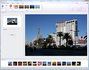
If you select one or more images from the gallery (use the Shift and/or Ctrl key as usual), and click View, the chosen images will be displayed in a special view, together with a horizontal gallery of selected images:

As I said above: this control is not available yet, but will be provided as part of DXperience v2010 vol.2.
Free DevExpress Products - Get Your Copy Today
The following free DevExpress product offers remain available. Should you have any questions about the free offers below, please submit a ticket via the
DevExpress Support Center at your convenience. We'll be happy to follow-up.